Category Archives: AO2 Explore Ideas

Filters

Author:
Category:

Guernsey Photography Festival

MARK WINDSOR

HISTORY OF THE FUTURE

The History of the future is nostalgia.

Mark Windsor was born in Guernsey, he studied at the London College of Printing and at Derby Lonsdale College before undertaking post-graduate study of community photography and Documentary Photography in the Visual Arts Department of Lancaster University.

He worked as a freelance writer in the UK before returning to Guernsey to work as a photographer/journalist. Mark continues to practice and study photography and has recently returned to freelance work and is now undertaking new commissions.

The layering of human history is implicit in any landscape in which people, over the centuries, have interacted. What remains, and what will be left later of humanity’s hard and soft materials? How will our descendants attach significance to them? Will digital photography leave visual archaeology that will have any meaning to future generations? Will contemporary art photography aid or hinder the communication of knowledge to our descendants?

This exhibition is part of a larger body of work, which is part record of Guernsey, and part speculation on the scope and limitations of photography in its capacity to impart information to future generations.
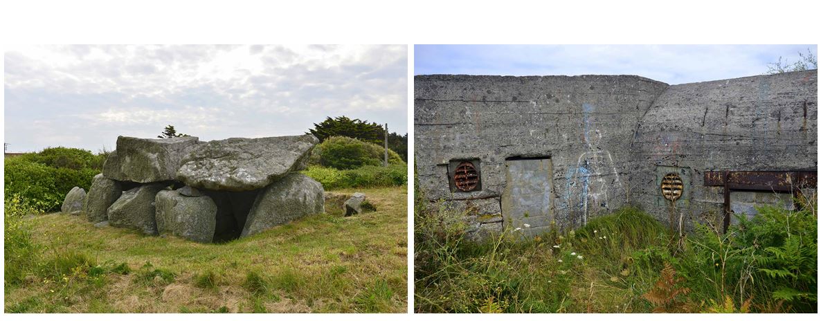
The visual clues to our past which are the subject of this project, often prompt memory and nostalgia. But what we leave in the picture and how we choose to remember it is a matter of choice – one which we could perhaps engage more consciously.

JAAKKO KAHILANIEMI

Jaakko Kahilaniemi received his BA in Photography from Turku Arts Academy Finland and his MA also in photography from Aalto University of Art, Design and Architecture in Helsinki Finland. He won the prestigious Majaoja/Backlight Prize and was selected as one of the Lens Culture Emerging Talents in 2017. He was one of the ten finalists in Hyéres Festival in 2018 and in Fotofestiwal Łódź. His work has been featured in many publications and his work has been exhibited at galleries worldwide.

100 HECTARES OF UNDERSTANDING

It’s impossible to overstate the significance of forests for Finland, both historically and economically. Over 71% of the total area of the country is covered by forests – that’s over 26 million hectares. 100 Hectares of Understanding is my attempt to understand the 100 hectare area of the forest I inherited in 1997 when I was only 8 years old. Recent explorations in the forest, and in the world of forestry have managed to provoke my interest towards the unfamiliar property of mine.

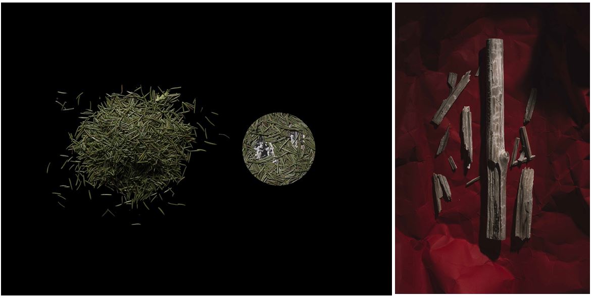
The 100 Hectares of Understanding project includes both tangible and intangible approaches and visualizations of what forest and forestry mean to me and how the unknown becomes familiar. I study what nature has to offer to urbanized people and I will try to create new ways of thinking and ways to experience and feel the forest. For the unknown to become familiar requires both physical and delicate acts: to nurture and to tame, to master and to yield. My photographs are testimonial, traces of my aspirations towards understanding and awareness.
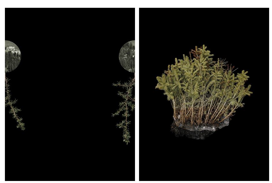
Taking inspiration from Fluxus and the traditions of Arte Povera, I seek to encounter the forest with a playful and open approach. 100 Hectares of Understanding consists of the objects that I’ve found, the acts that I’ve photographed, the sculptures I’ve made and visual secrets that I have created.
 

My Response To Lewis Bush

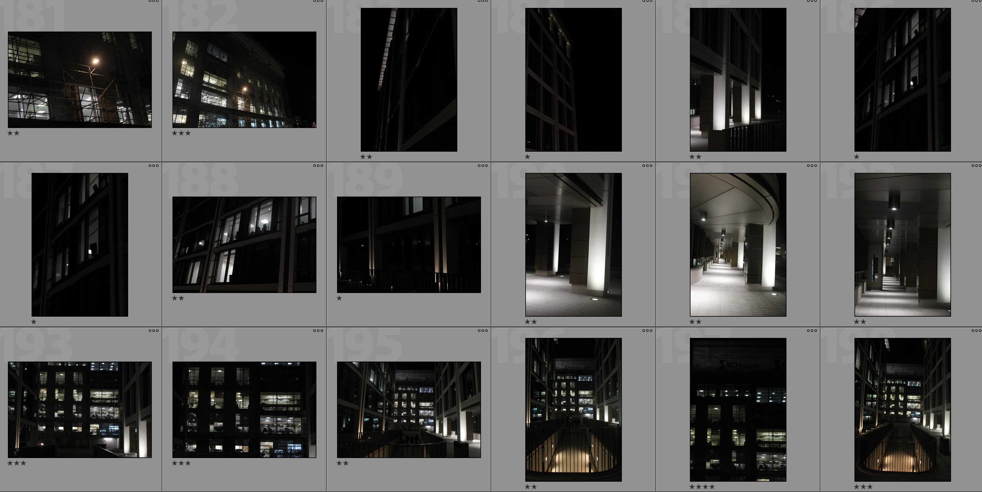
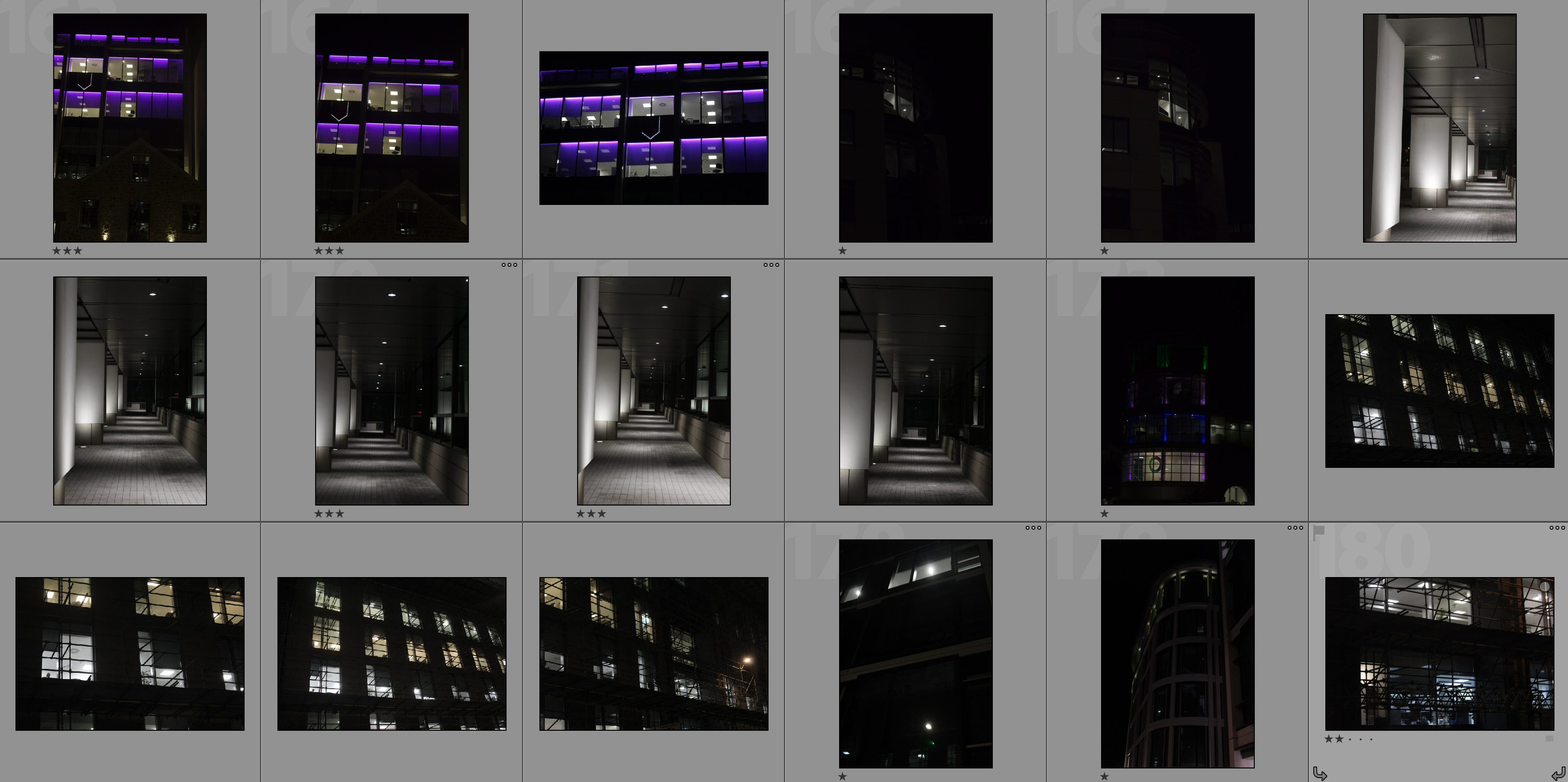
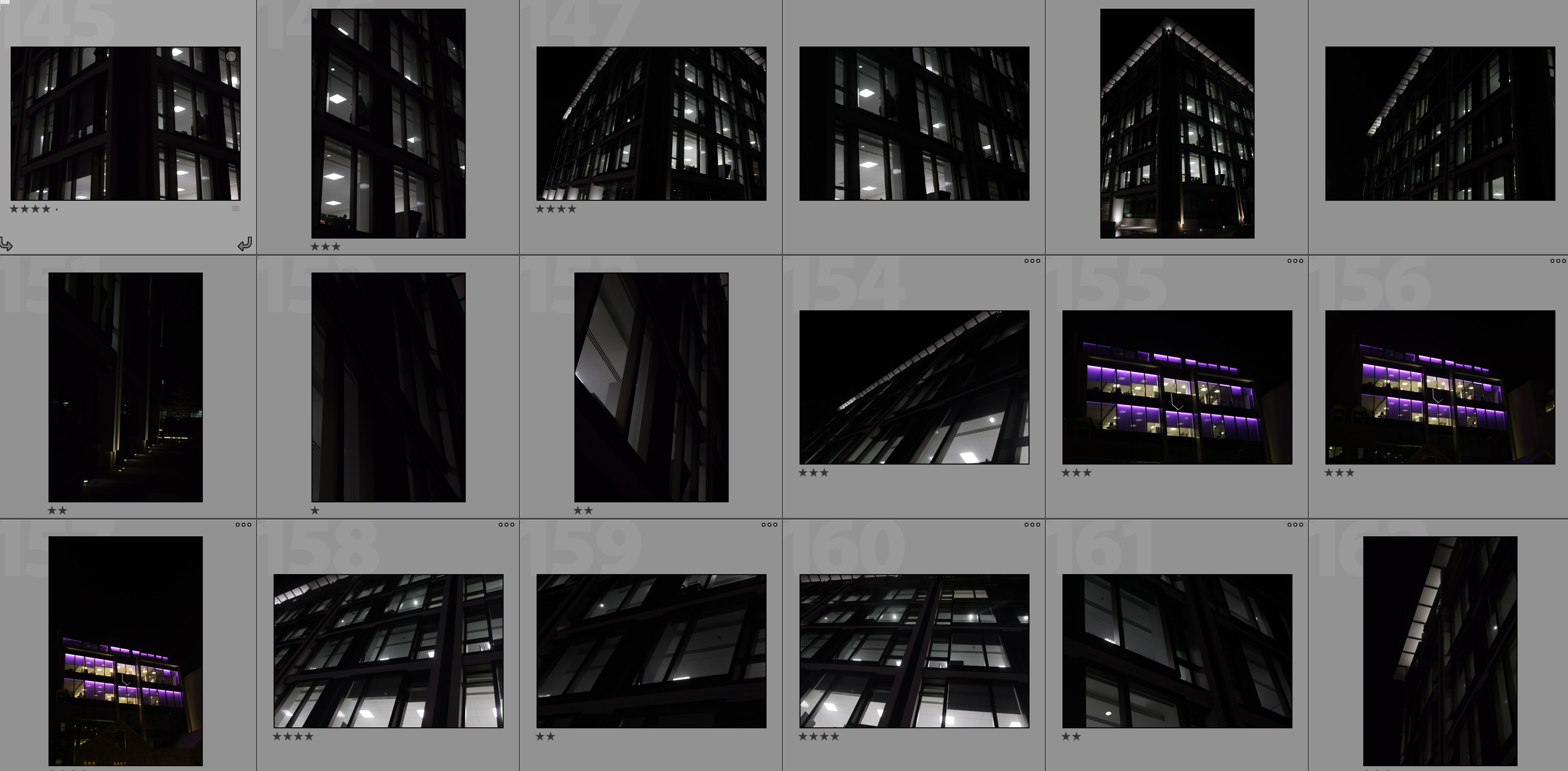
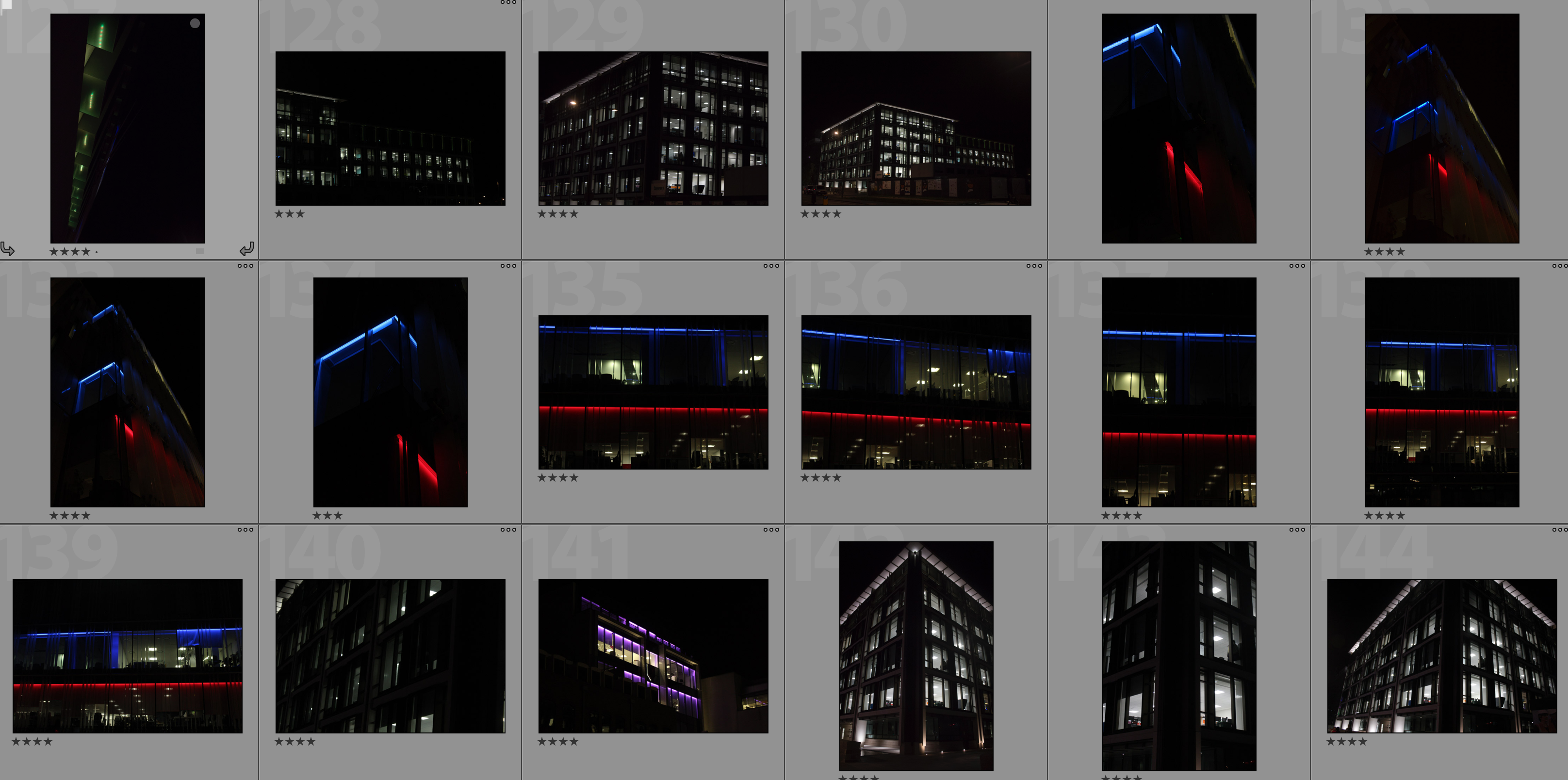
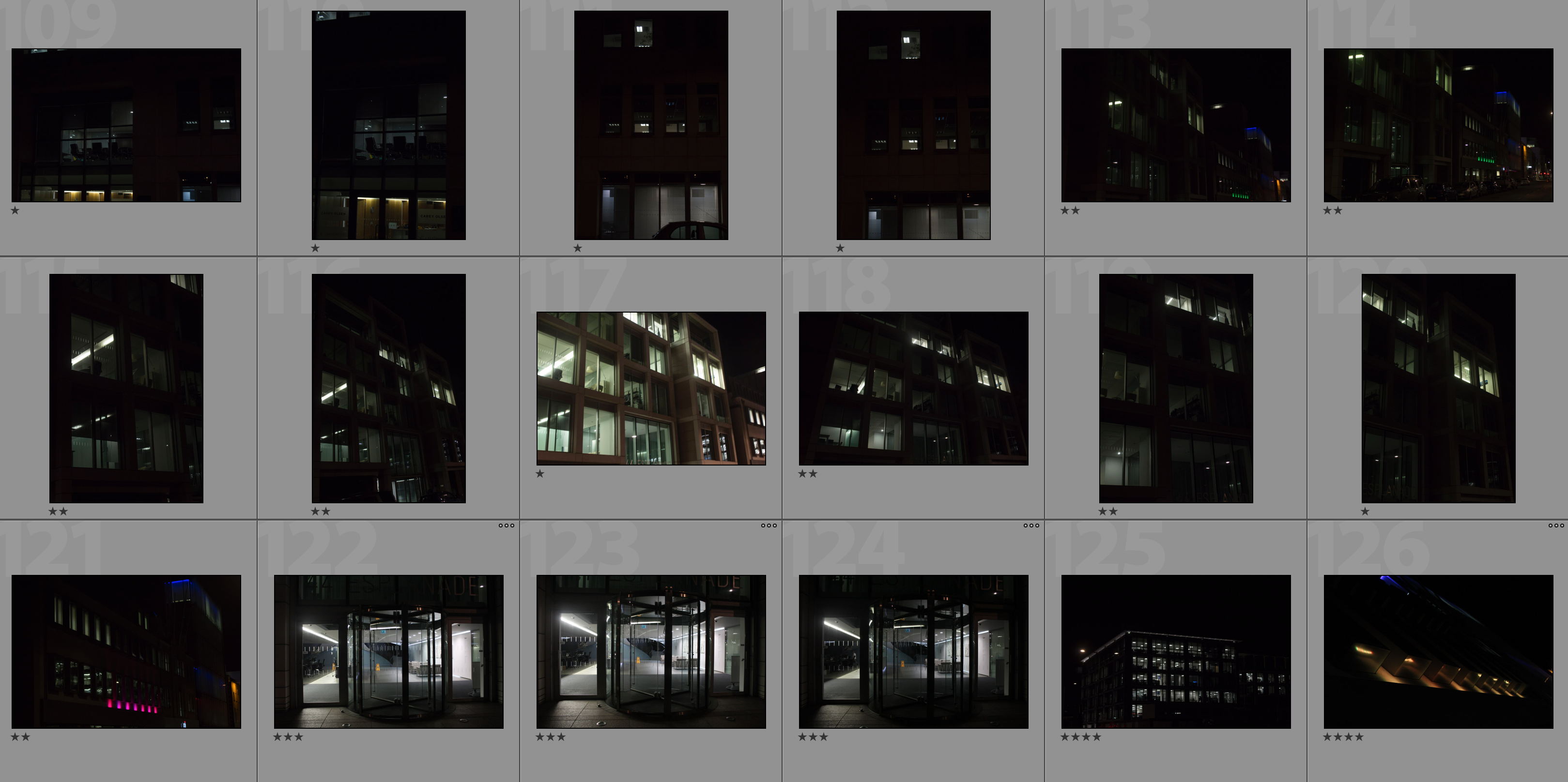
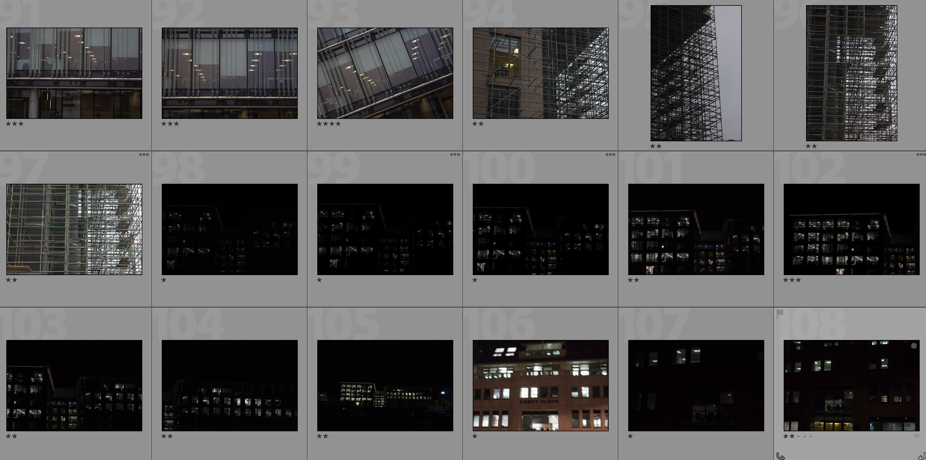
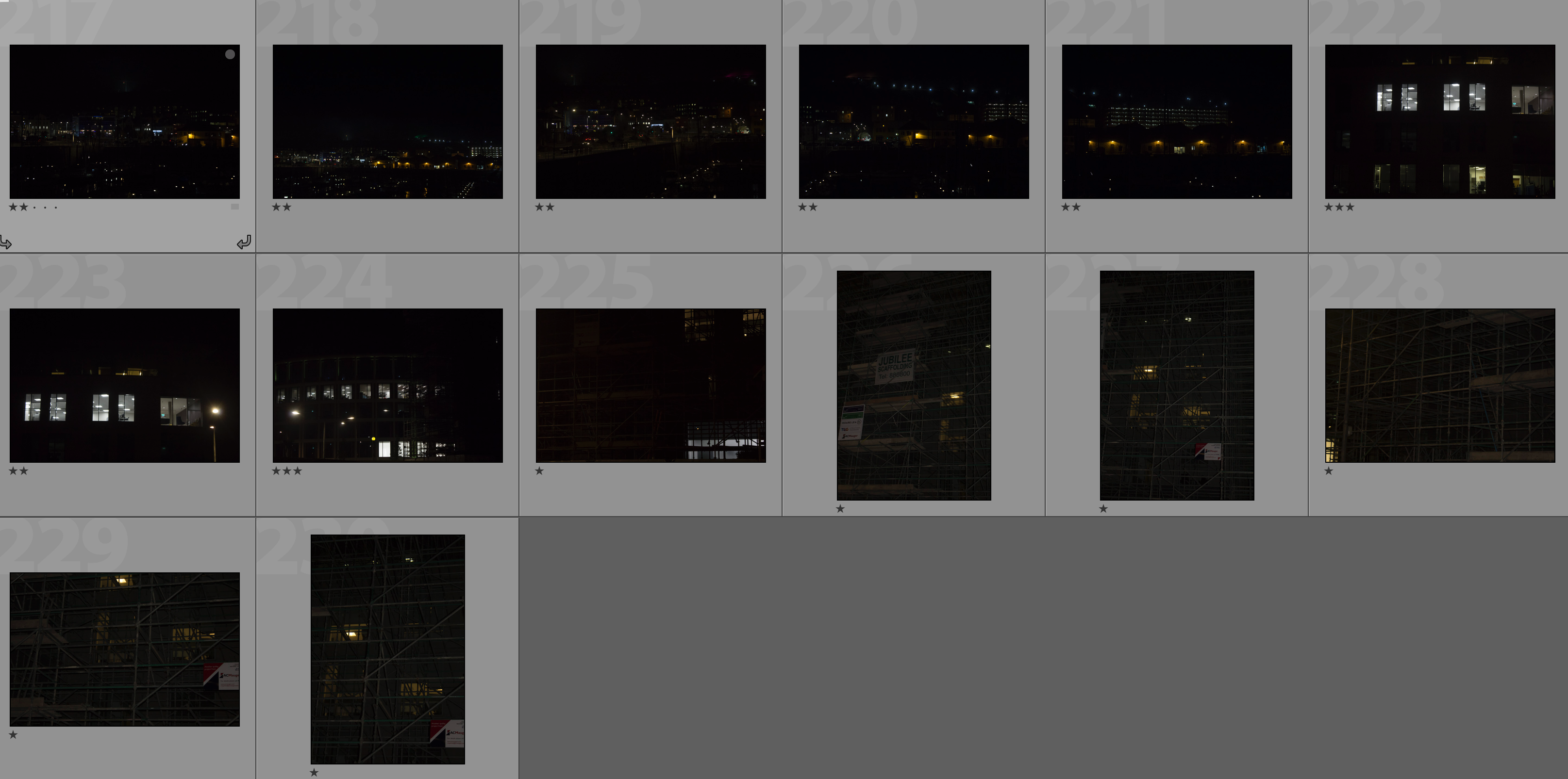
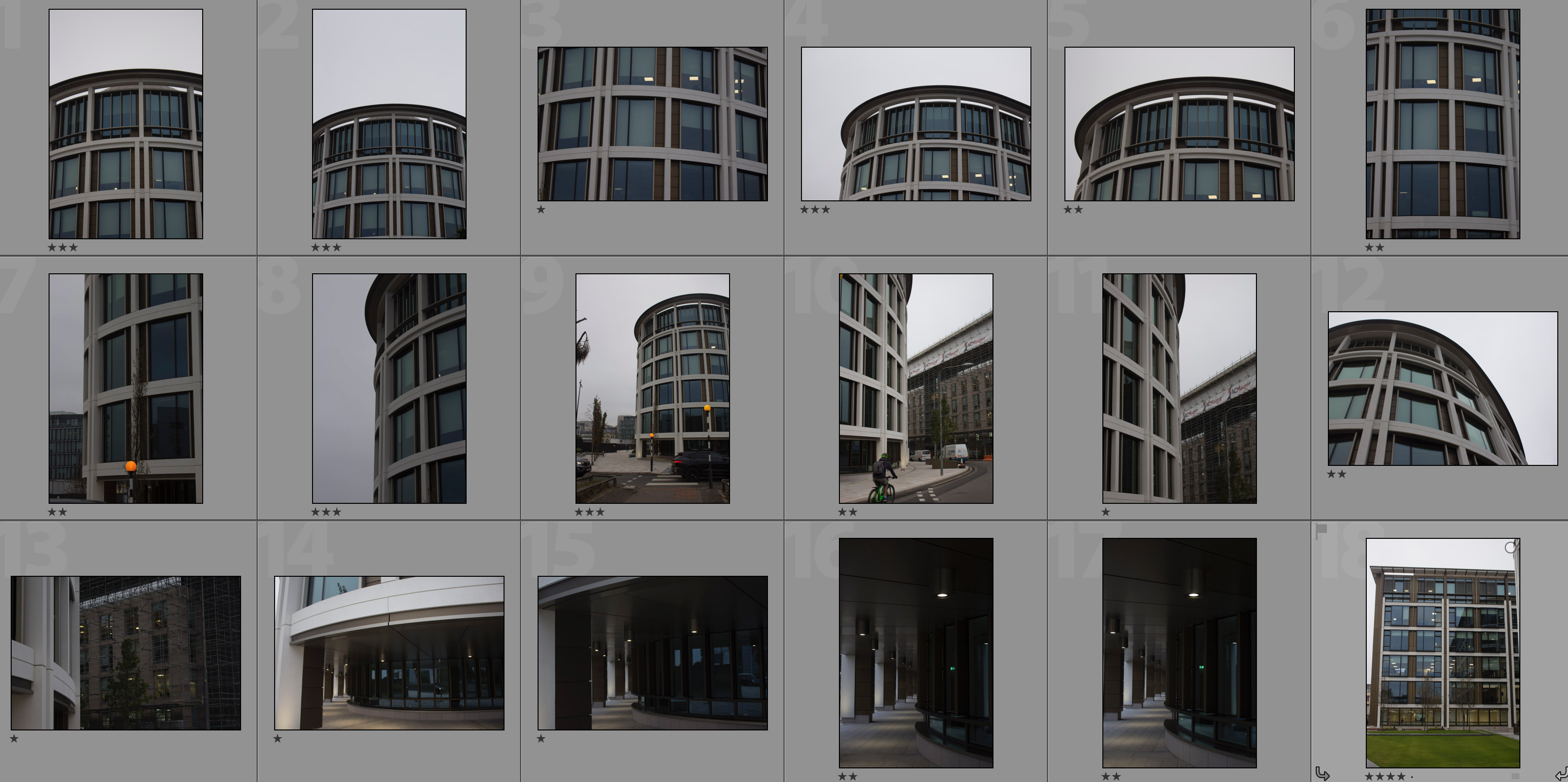
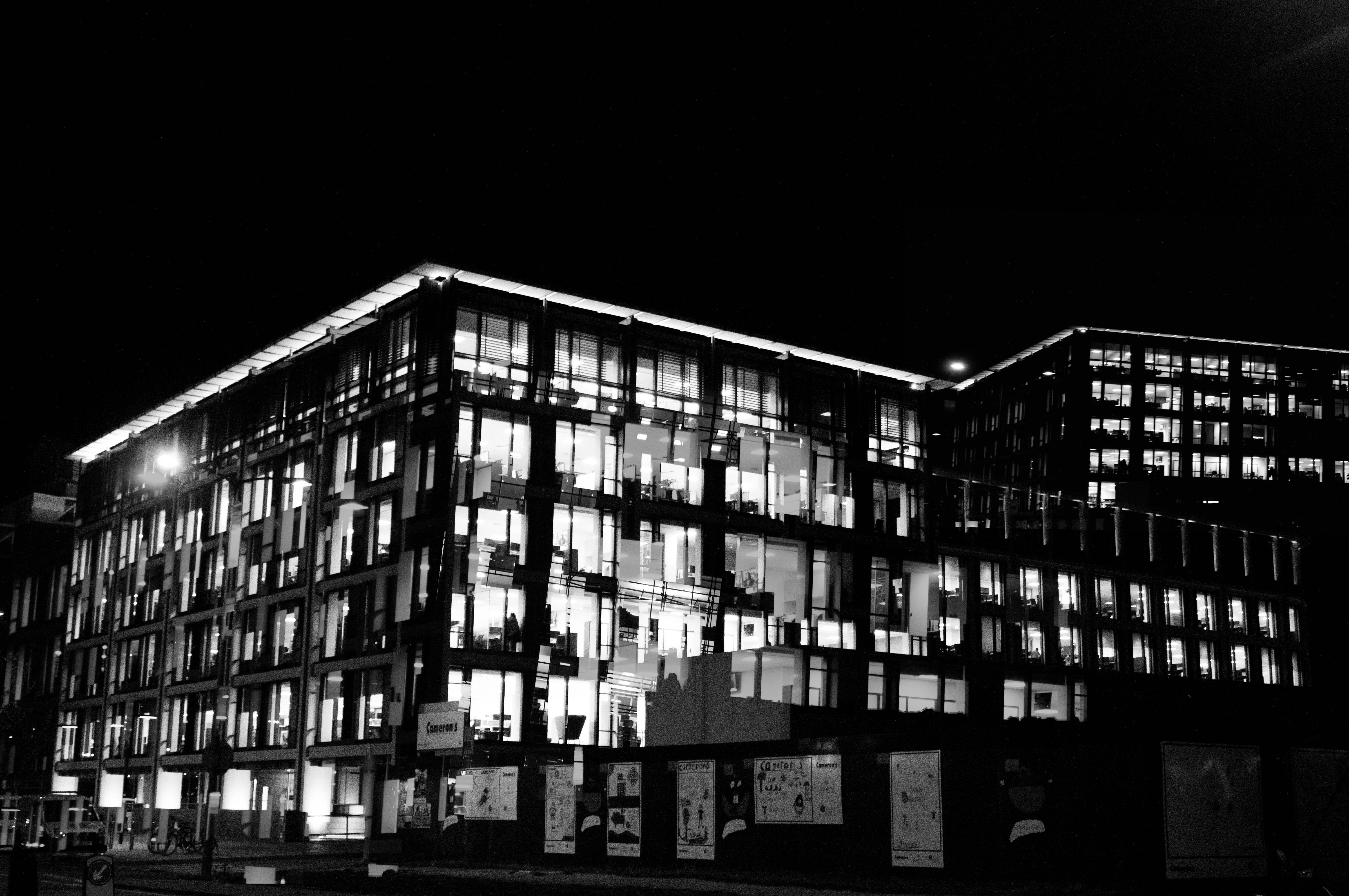
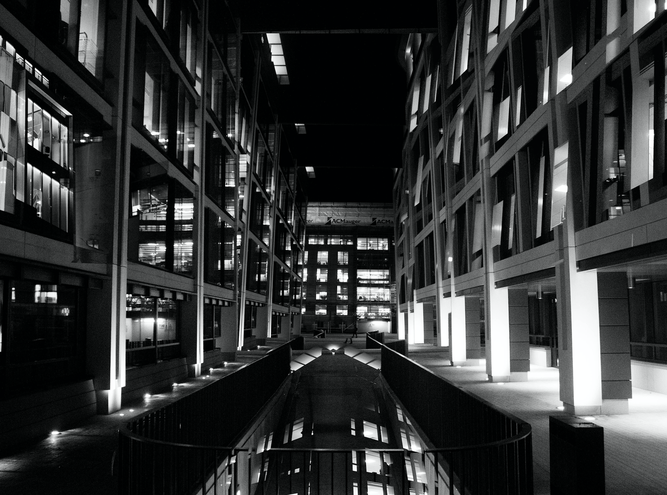
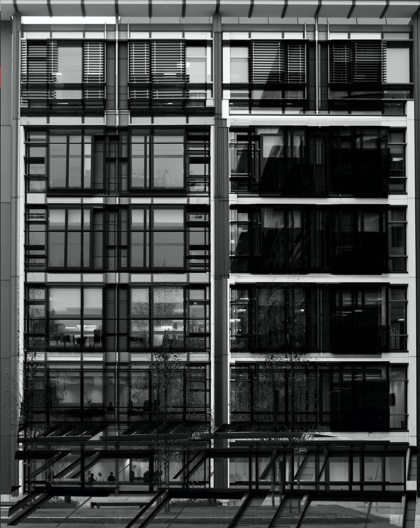
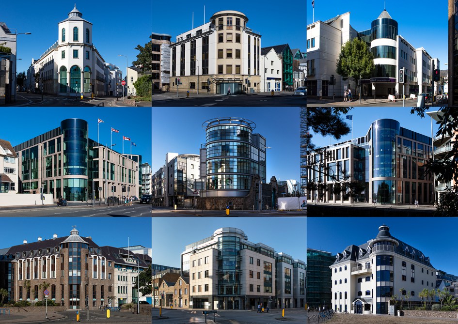
In my response to Lewis Bush I am going to be photographing the financial sector within St. Helier in both day and night and then creating a double exposure effect with these photographs in photoshop. The inspiration for photographing the financial sector comes from Bush’s ‘Trading Zones‘ and the use of double exposure comes from his project ‘Metropole‘ in which he used this technique throughout. I will be carrying out two photoshoots for this response – one in the daytime and one at nighttime. This will allow me to be able to work with a wide variety of photographs in order to create different effects and settings within the edits.
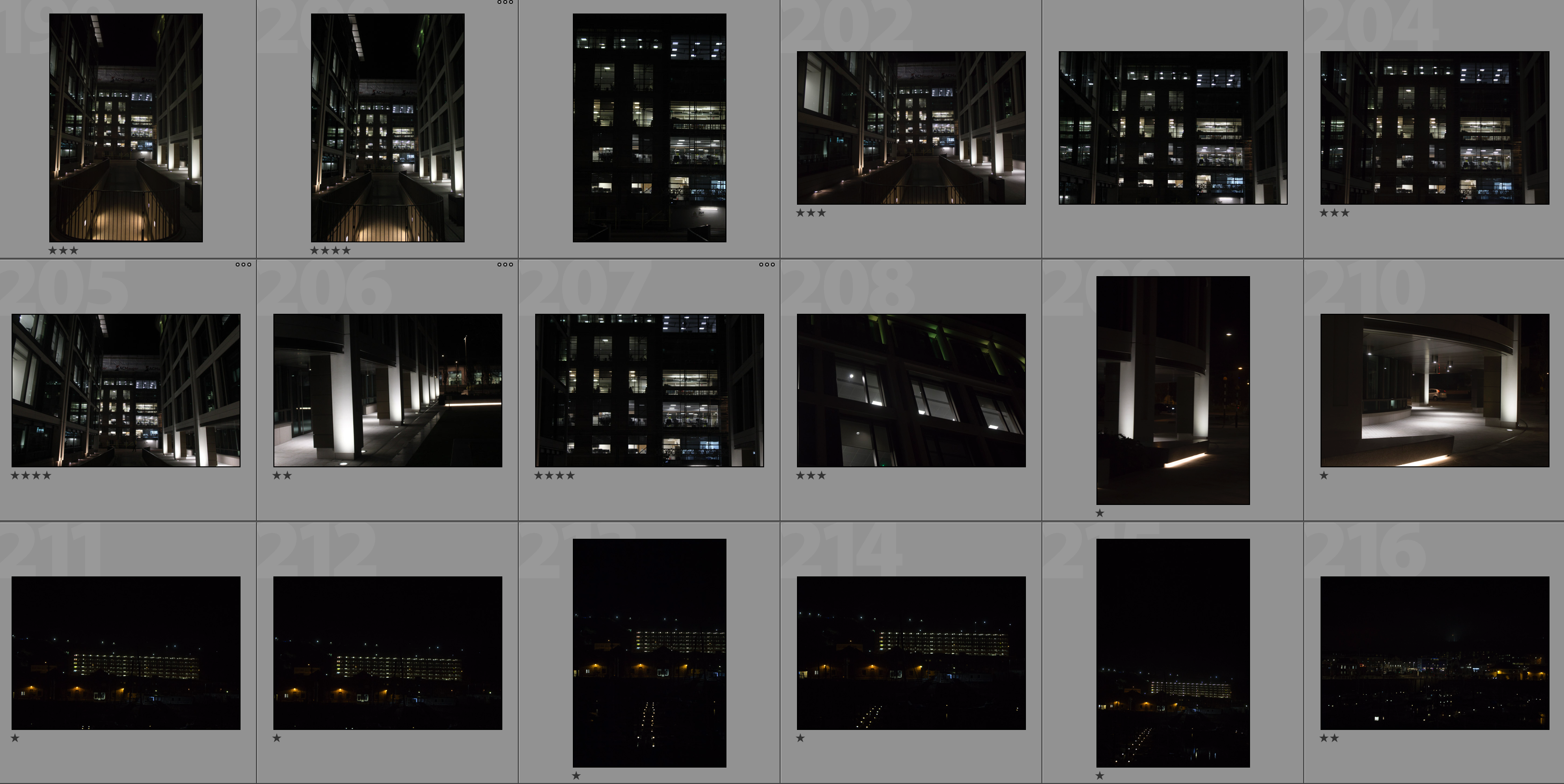
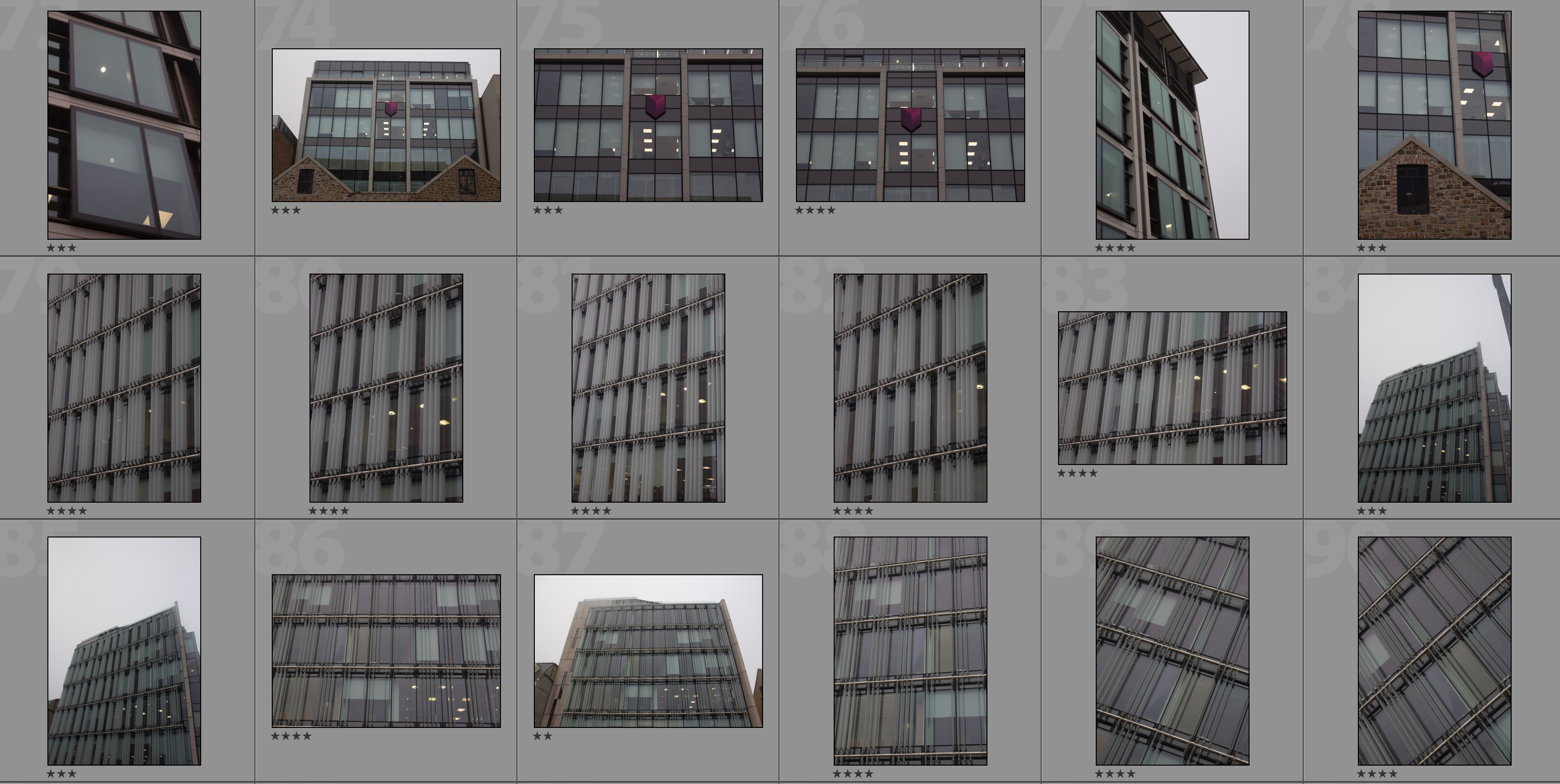
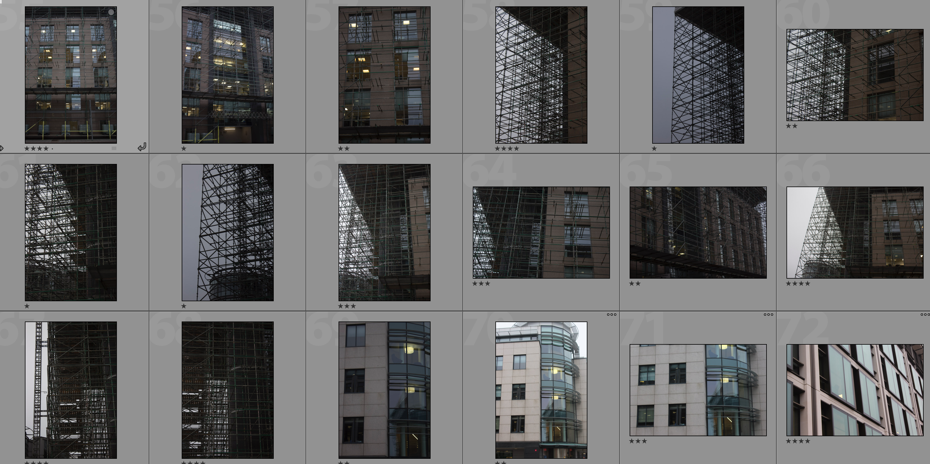
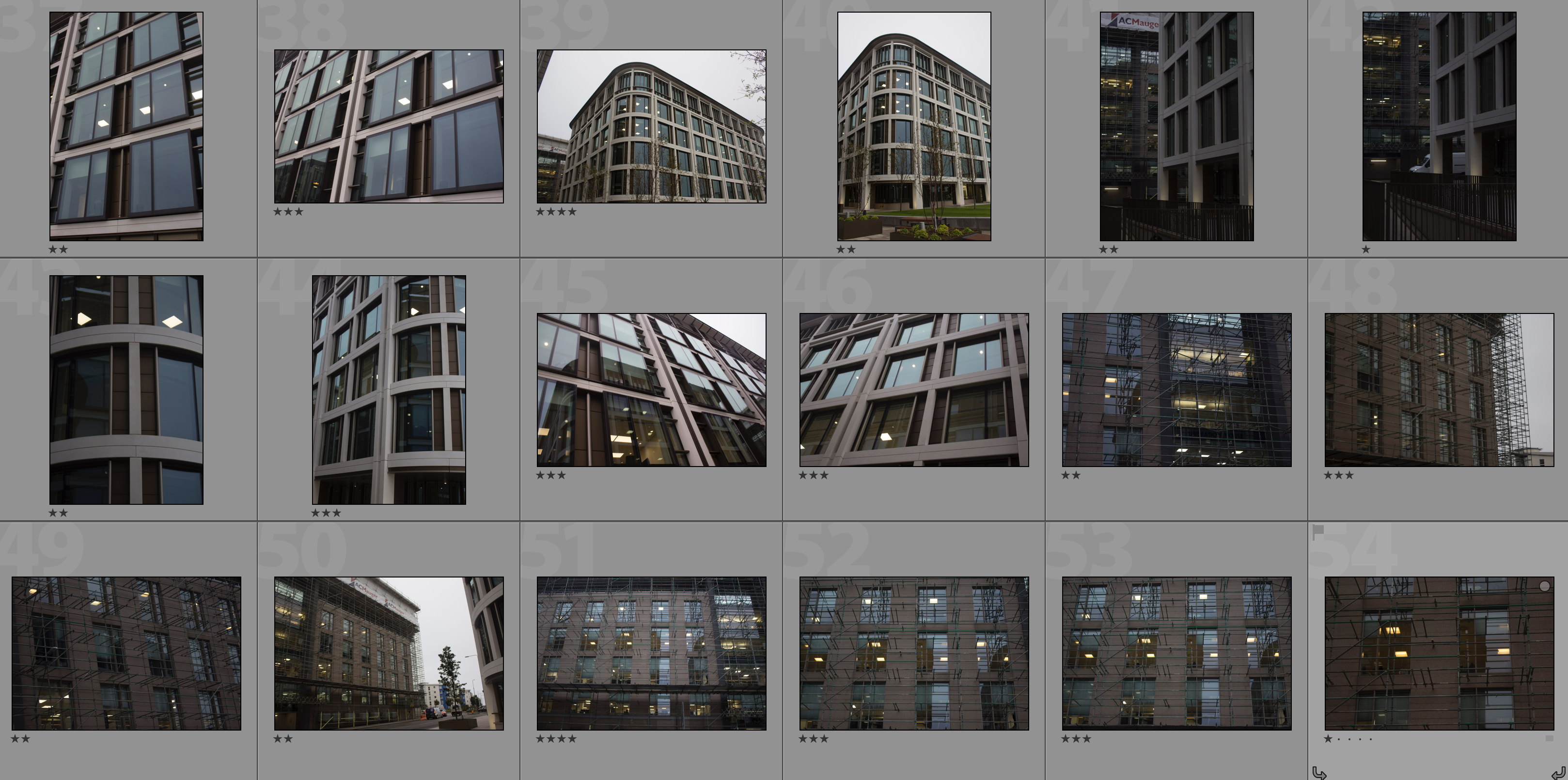
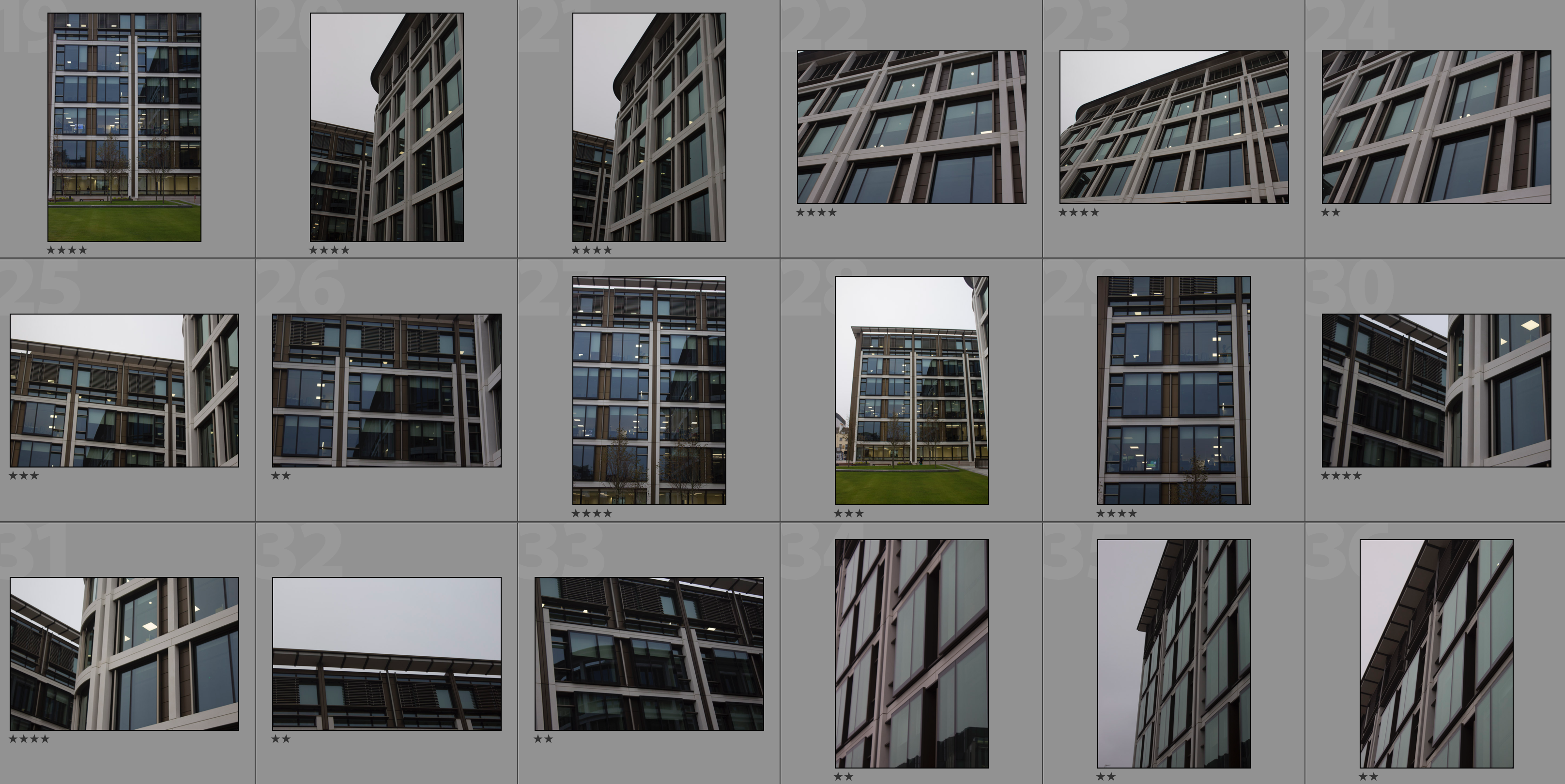
Contact Sheets

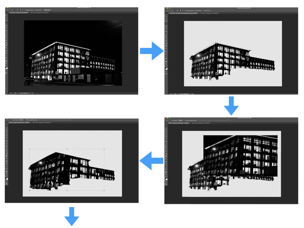
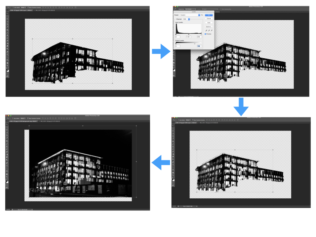
Editing Process

I carried out the double exposure editing on photoshop. I started by using the quick selection tool to separate the building from the rest of the photograph and clicked the ‘refine edge’ button to create a blank background. I then placed the second photograph over the base photograph and added a layer mask in order to shape the second photograph in line with the base photograph. After this I used command-L in order to edit the levels of the second photograph and so changing the black/white/grey properties. Next I selected the blending option as ‘lighten’ to allow the two photographs to merge. I repositioned the second photograph over the base photograph to create a double exposure effect then brought the background forward to reintroduce it to the composition. Finally I repeated this with multiple photographs to create a disorientating composition.

My Edits


Analysis

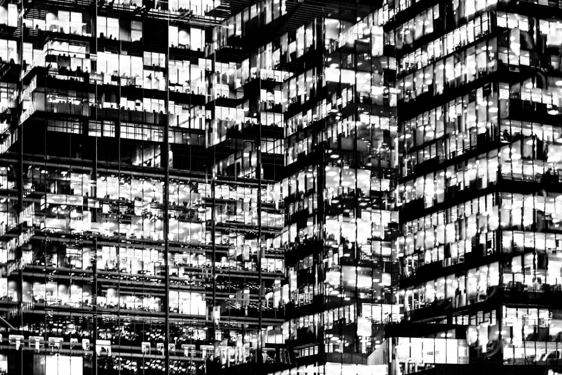
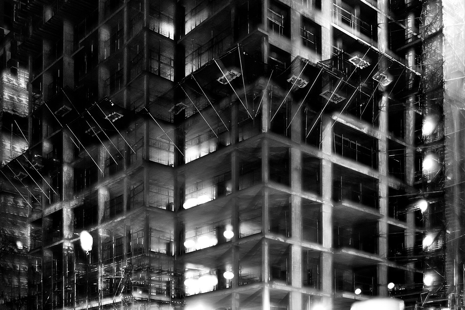
In this photograph I have used natural lighting in order to capture the natural shadows and contrast of the new finance centre in St. Helier.  This natural lighting allowed for reflections in all of the windows which creates a variety of tones throughout the composition. This variety of tones creates contrast between the dark black frames and the grey tones of the windows.  I used a deep depth of field to capture this photograph to ensure that every detail was in focus including the reflections in the windows.  By layering multiple photographs over the top of the original I have been able to create dark frames and dark shadows to contrast with the lighter tones – I think that this create a much more dramatic and slightly abstract photograph. I used a shutter speed of 1/60 to capture the original photograph along with a fairly low ISO of 200 in order to ensure that the photograph is exposed enough but is as high quality as possible. This high quality photograph allowed for the similar photographs overlayed on top to blend in well to provide more contrast and structure to the photograph.

There is no colour in this photograph as I thought that the black and white filter really allowed the black dark tones to come out to provide more contrast and shadows within the photograph. The lack of colour also allows the viewer to focus on the dark lines and paths running throughout the composition and so emphasising the disorientating intent of the photograph. The tones throughout this photograph are mostly gray with streaks of black running throughout it – there are not many bright tones in this photograph which I think works well as the grey and black tones allow the original photograph and the photographs on top to blend well together to create a photograph that is familiar to someone from Jersey but unfamiliar at the same time. From the way that I have cropped this photograph using perspective crop it is a very 2D and flat photograph except for the photograph overlayed in the bottom third of the photograph. This bottom third of the photograph appears to come towards the viewer which sends the rest of the photograph to the back, ultimately creating a sense of confusion within the viewer. The windows and lines throughout the photograph are very aesthetically pleasing as they create a pattern of squares and lines, making the photograph more intriguing. There is no immediate viewpoint that they eye is led to due to the abstractness and pattern throughout the photograph. The line straight down the middle of the photograph creates a sense of division within the composition as well as a sense of satisfaction due to the organisation of the placement.

I took inspiration for this photograph from Lewis Bush’s project ‘Metropole‘ in which he looked at the collapse of the British Empire and how in its place globalised capitalism grew as London has been rebranded as “a city of demolition, cranes, and glittering new high rises”.  ‘Metropole’ aims to record the effect of this on London through the form of documentary photography and I aim to show the effect of how Jersey has changed with the construction of the new financial centre and all the new flats and other offices within the area. St. Helier has changed drastically over the past couple decades and it may seem as if it is moving too fast for some of the residents that have lived through these stages. This photograph was taken as part of a shoot of the new financial centre, I took the original photograph and layered multiple photographs of the same centre over the top to create a disorientating effect.

I have attempted to recreate the double exposure that Bush used in his ‘Metropole‘ project in order to convey the idea that as the financial centre grows and as construction within the area goes on at the rate it is, the people of St. Helier are becoming more lost and disorientated as this is no longer the St. Helier that they’ve lived in for all of these years.  Bush used this effect in order to create the “sense of loss that many Londoners feel” in the big city. This theme of a feeling of loss within the city links to the genre of ‘political landscape’ as it looks at both the present and past in St. Helier showing how it has changed and how the residents of St. Helier are feeling about it all.  I think that the government of Jersey is focusing too much on construction and not what would really benefit and satisfy the people of Jersey.

Plan for second shoot

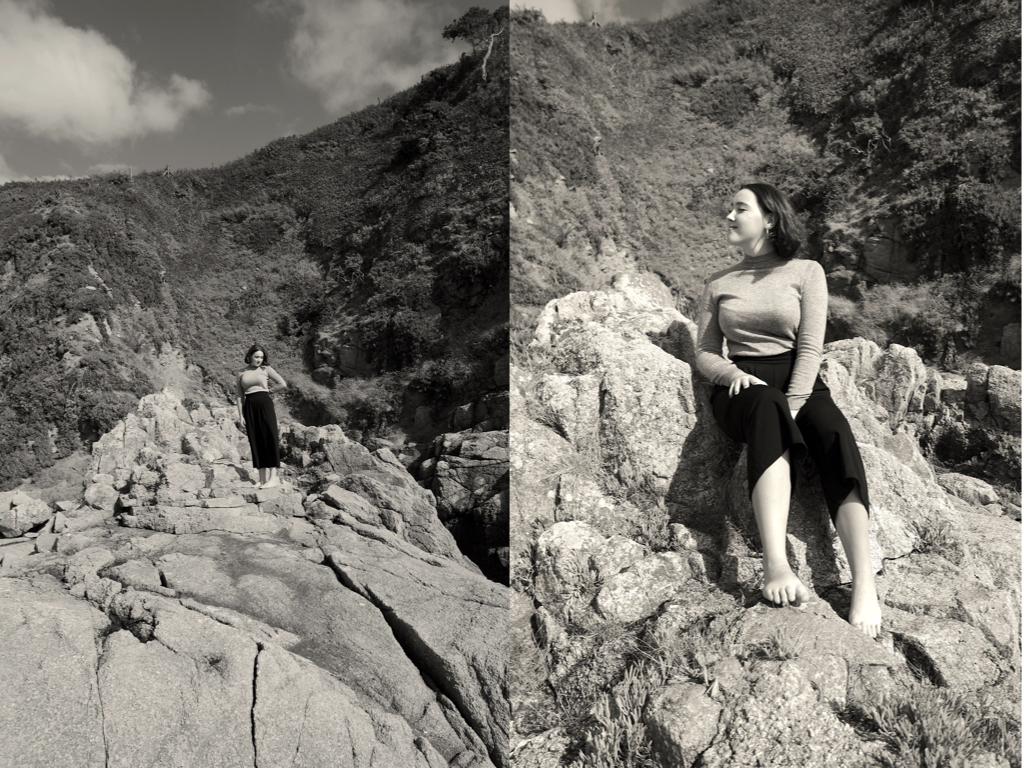
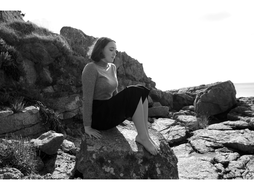
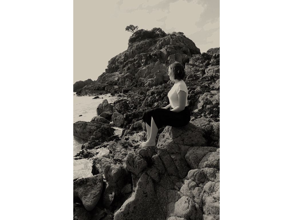
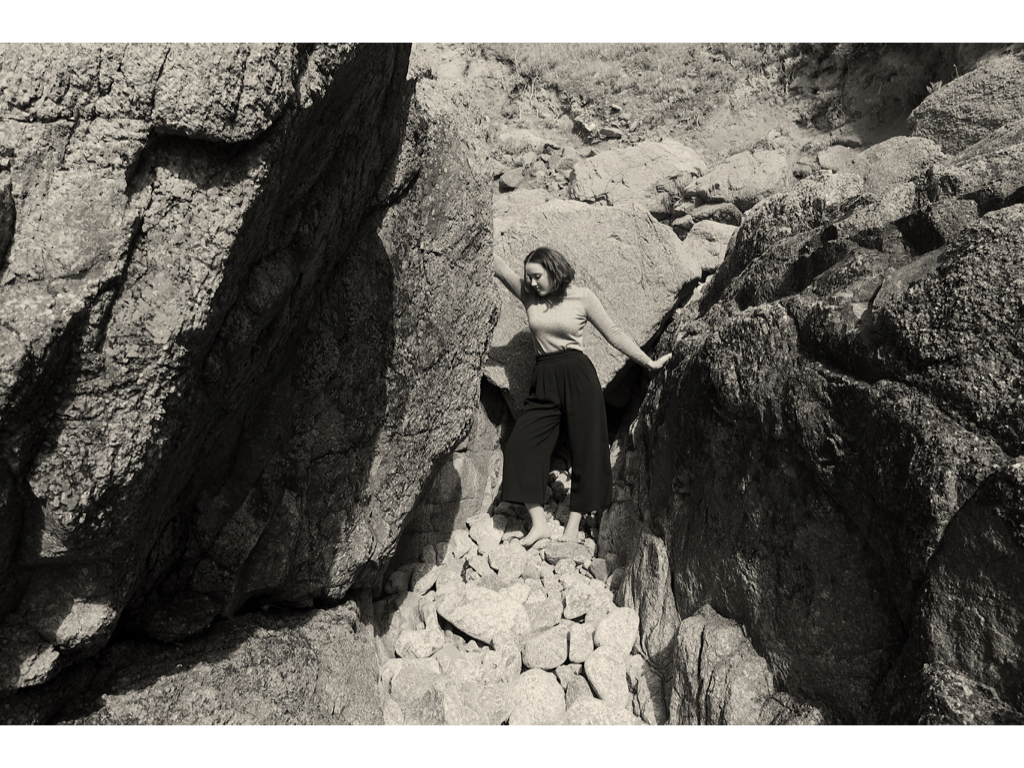
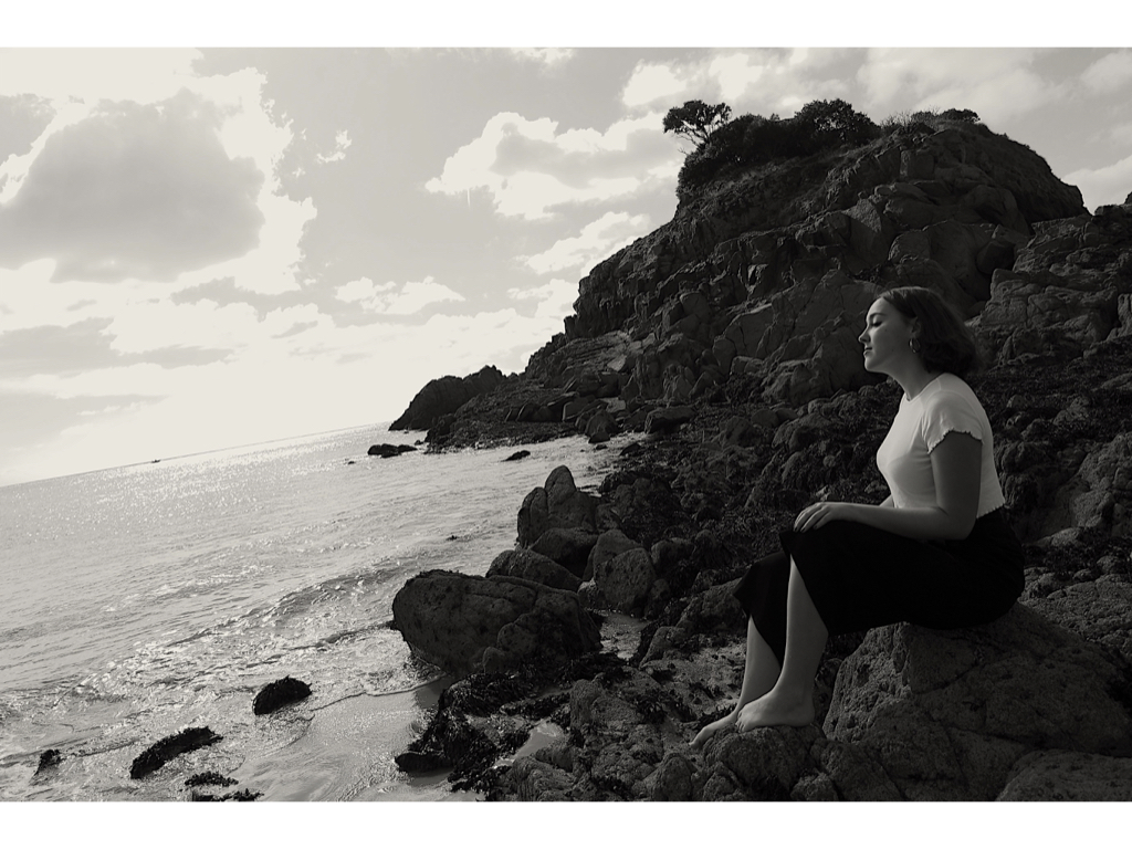
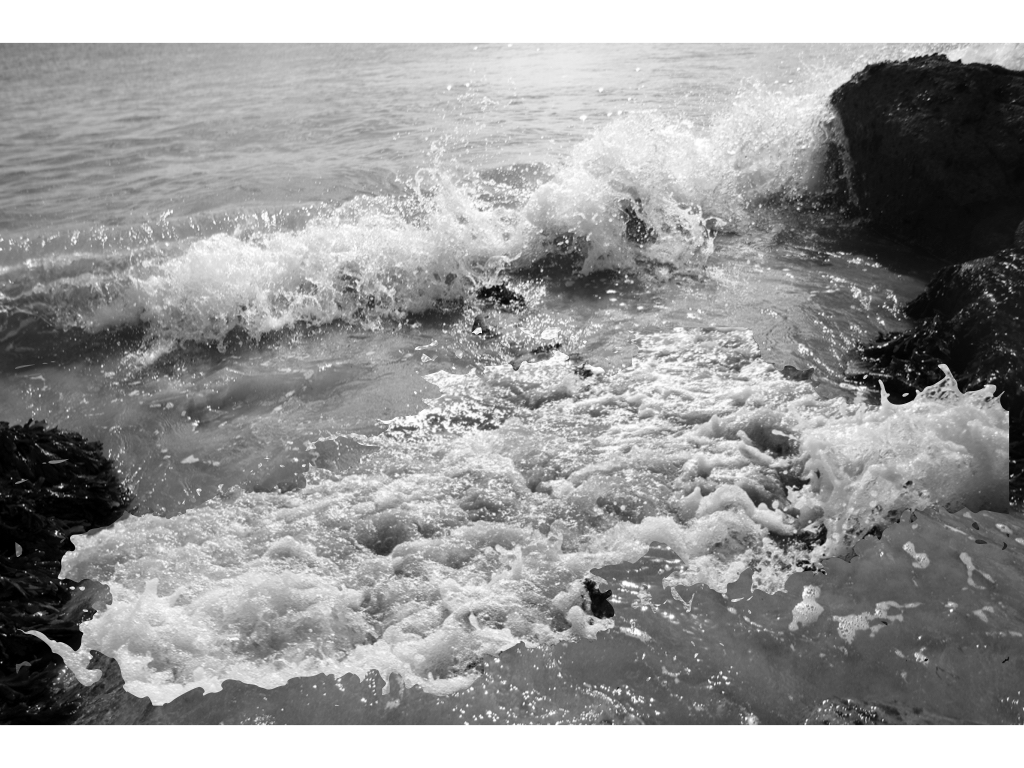
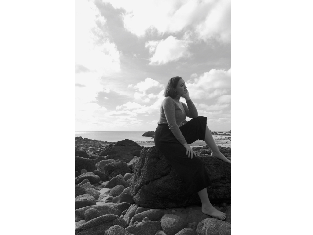
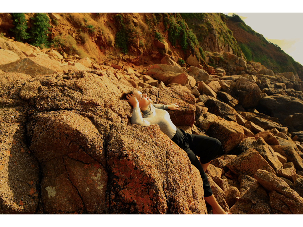
My plan for the third shoot is a clear influence from the exhibition of clare cauhn. I wanted to focus on the the political correctness of femininity and the political influence that can be shown through this girls positioning within the landscape and the fragility to the atmosphere she is surrounded by. I also want to capture more landscape images that she is surrounded by, this could be the movement and emotion of the sea and also how this movement and fluidity of the water is mimicking the women herself. I believe the impact of the sea shows a stronger connection to that of the sublime and nature having a really strong  power. I could in one of my next shoot like to focus on the way someone can go into the water and see both emotions within the person and movement and aggression of nature. I believe this would exactly hit my connection of the sublime, and this will really positively effect my shoot. Being submerged within an atmosphere in which you cannot breath and is deemed dangerous shows such a string emotion within the water and person. So a clear diegetic link between the shoot and emotions based of political bias.

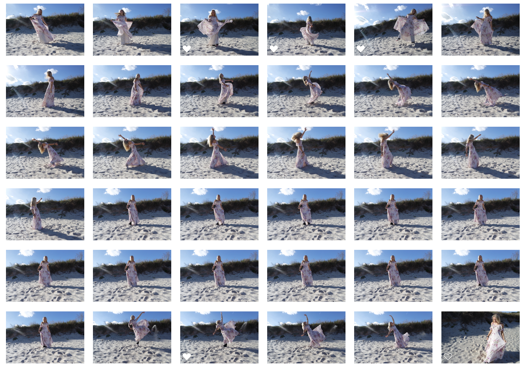
shoot images:

edits:

colour experiments

Experimentation:

For this edit I wanted to revert back to how I edited my previous shoot and how I focused upon the way these shapes, colours and lines can successfully impact a piece. I believe I should further experiment with the images and find more conceptual ways in which I could edit them. I do think the composition of these images are correct in the way it shapes from and connotes a sense of femininity within the images. This political bias is not necessarily seen through injustice but how the sublime environment enhances the femininity of the piece  which contributes to the political factors of women rights and a stance for the power to which a gender can hold.

Evaluation: Overall I do think this photoshoot is a clear presentation of my inspiration from claude chaun and additionally is successful in the recreation of softness and emotion within the landscape itself.

Artist Reference – Guernsey Photo Festival


Chloe Dewe Mathews – IN SEARCH OF FRANKENSTEIN

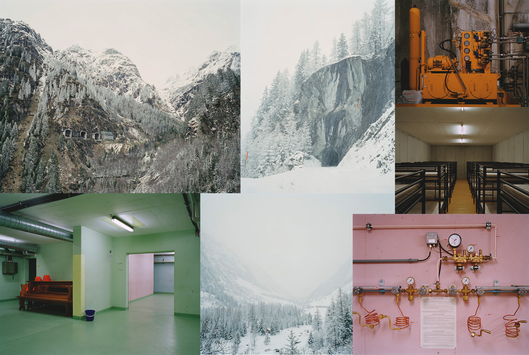
‘In Search Of Frankenstein’ by Chloe Dewe Mathews is a very thrilling and inspiring project. Mathews juxtaposes the cold, eerie and (in some cases) almost surreal Swiss landscape with the empty, man made bunkers. Although the two landscapes may feel like two, very different worlds, Chloe Dewe Mathews was able to photograph and capture the two settings at peace with each other, sharing very similar atmospheres and evoking the same feelings of awe in the audience.

The context behind this collection lies in the world known novel written by Mary Shelley, ‘Frankenstein’. The story looks at what happens when man decides to ‘play god’, in this case the protagonist, Victor Frankenstein, succeeds in giving life to one of his creation; this is not the perfect specimen he imagines that it will be, but rather a hideous creature who is rejected by Victor and mankind in general. The Monster seeks its revenge through murder and terror.

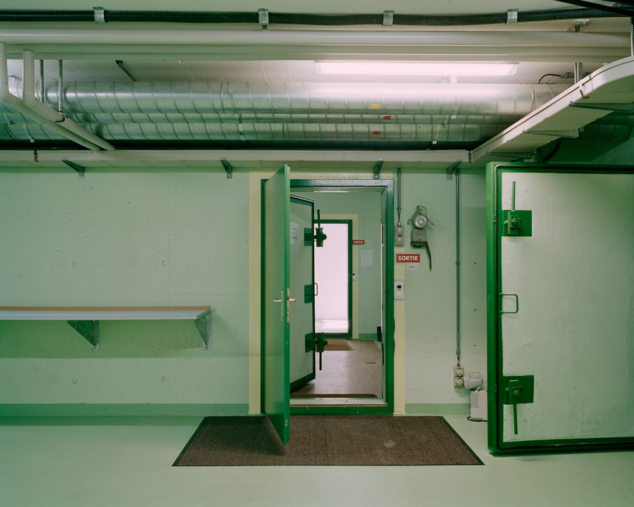
Chloe Dewe Mathews takes breath-taking photographs of the area that inspired the original author, Mary Shelley, to write the tale of Frankenstein. She also explores the near by bunkers, designed to protect the people in case of a nuclear war. Although the bunkers look clean and modern, there’s a sense of uneasiness about them that unsettles the reader; this is partially due to Mathews’ approach and method of photographing.

I like the composition of this image, the colors in this image usually connote a more natural and welcoming landscape, however, in this scenario they feel very fake. The emptiness of the room mixed with the hard metal locks and heavier doors make this place look more like a prison than a safe zone.  Mathews intentionally photographed the bunkers in a way that makes the audience feel trapped and isolated. This could be a direct reference to Frankenstein and the monster who felt trapped in his mind and life.

The significance of photographing the bunkers and juxtaposing them with the cold landscape plays a huge part in the appeal of this project as a whole. Chloe Dewe Mathews could have presented a collection of stunning landscape photography of the ice lakes and mountains that cover Switzerland, she didn’t. She chose to display them in contrast with

Sources :

http://www.chloedewemathews.com/

http://www.bjp-online.com/2018/05/chloe-dewe-mathews-frankenstein/

https://www.theguardian.com/artanddesign/2018/apr/12/frozen-with-fear-a-new-photographic-journey-into-the-icy-landscape-of-frankenstein


analysis from shoot 1 and investigating the sublime

Overall I chose these images as they connoted the strongest emotion within the image itself. I chose 20 final images to further develop depending on their strength and mimicking the emotion. What I think I developed well on this piece is the overall composition of placing the body and how I have used this in order to create a sense of emotion and impact. I wanted to use photoshop editing in order to really over-exaggerate the tones so changing the colour of areas within the piece too.

The sublime:

Is said to be ‘an aesthetics, the sublime (from the latin sublimins) is the quality of greatness, whether physical, moral, intellectual, metaphysical, aesthetic, spiritual, or artistic. The term especially refers to a greatness beyond all possibility of calculation, measurement, or imitation’

To measure an environment by how sublime it my feel or be perceived is interesting. As seen above there is a connection to physical greatness and spiritual and artistic elements. This to me is a clear indication of the wide range of possibilities this word has to offer. As said previous I am interested within the philosophy and how to conceptual human emotions into a landscape, I believe developing this further into the sublime would be useful to my project. I have further developed  research of emotions within the sublime and researched emotions within landscape will use this inspiration to power on my ideas further.

when sublime is connected to issues of emotion it focuses on a deep threat and a harsh reality of weather, this being seen through a storm or the deep seas. Many piece that include people are them diving into water and how being submerged into a world is abstract and different from the world to which we know and view as normal above land. It combines natures power of man and also the lack of breath and cruel reality fo nature to be something of greatness and also concern. My question is what is the sublime and how can i show this through my themes of emotion, politics and landscapes? Is sublime about a feeling, event or a persons state of mind? It means to be raised and on top but also further defined as having a quality of greatness and magnitude. I want my pieces to be temporarily overwhelmed by anyone who sees them. A quote about the sublime really stuck out to me, this was ‘by a kind of pleasurable terror’ This echoes the social conventions of politics and freedom to me,It demonstrates an image of people wanting to escape and taking a deep risk due to their political or negative governmental conditions.And how a big leap or jump for freedom is pleasurable to escape but filled with terror when alone and surrounded with a landscape that is not familiar.

The sublime was associated in particular with the immensity or turbulence of Nature and human responses to it. Consequently, in Western art, ‘sublime’ landscapes and seascapes, especially those from the Romantic period. To my mind this means a clear representation of vast storms and seas, it is a mixture of beauty found in a life Threatening position. I believe through my work it would be tangible for me to create a scenario like this but as a false sense of identity. I would create a constructed narrative set almost as a tabloid to make the image look dangerous and have a feel of the sublime but not being so. This is not possible when it comes to going outside and capturing a storm but it is when creating an infliction of worry which as someone underwater, or moving quickly in a dark space. I think the sublime should no longer be just considered a natures act and a landscape but allowed to be pulled into someones emotion ,reaction and cause fro distress clearly portrayed within themselves.

An artist who uses politics to effect and emotion and create sublime work is the artist Damien Hierst. His work focus on the notion of the contemporary sublime ,so removing the previous style fo only using a landscape of a storm.The  starting place for tracing such returns of the natural sublime is Damien Hirst’s art work, The Physical Impossibility of Death in the Mind of Someone Living 1991. he is such a symptomatic artists who’s work is uneasy and contradicts with what is expected within society.  it is said that ‘His best work condenses our lived contradictions into perplexing, unforgettable, iconic images, in just the way that dreams do’ This allows his work to have such a huge impact on the audience it is viewed as a terrible going against what is expected and perceived as normal but yet alongside with this is so fascinating. His work clearly echoes inspiration  from within the body, mortality, violence, pain and power.a ‘universal trigger’.  Hirests taste that it works as a powerful sublime piece as  ‘everyone’s frightened of sharks, everyone loves butterflies’. however the shark carries a powerful charges frisson and forms a universal response reaction of the sublime.


artist inspiration for shoot 2:TERJE ABUSDAL SLASH & BURN

While continuing to experiment within emotion mimicked by the power of nature caused by self emotions of politics I wanted to look more into the photographers who are able to tell a story with their images, this being seen within who they photograph, where they do so and what nature effects they add to the composition.

TERJE ABUSDAL

Link to Abusdal’s  website Visit website <– here.

Abusdal  is a visual storyteller from Norway working mainly works on independent projects in the intersection between fact and fiction. In 2017, his story on the Forest Finns – Slash & Burn. I was intrigued with his work due to the clear emotion he has successfully conveyed and how the clear cut conduct was strong in the composition and colouring of his work. Abusdal decided to take many photos alongside the coast of the Swedish boarder, where farming families from Finland settled in the early 1600s. The immigrants – called Forest Finns  were slash and burn farmers. This was an interesting perspective as it focused on the the ancient agricultural bountiful crops which required large areas of land and so soil and grounds were too quickly exhausted. other political influences were the population overgrowth which led to many wars, terrorism and migration where he lived.

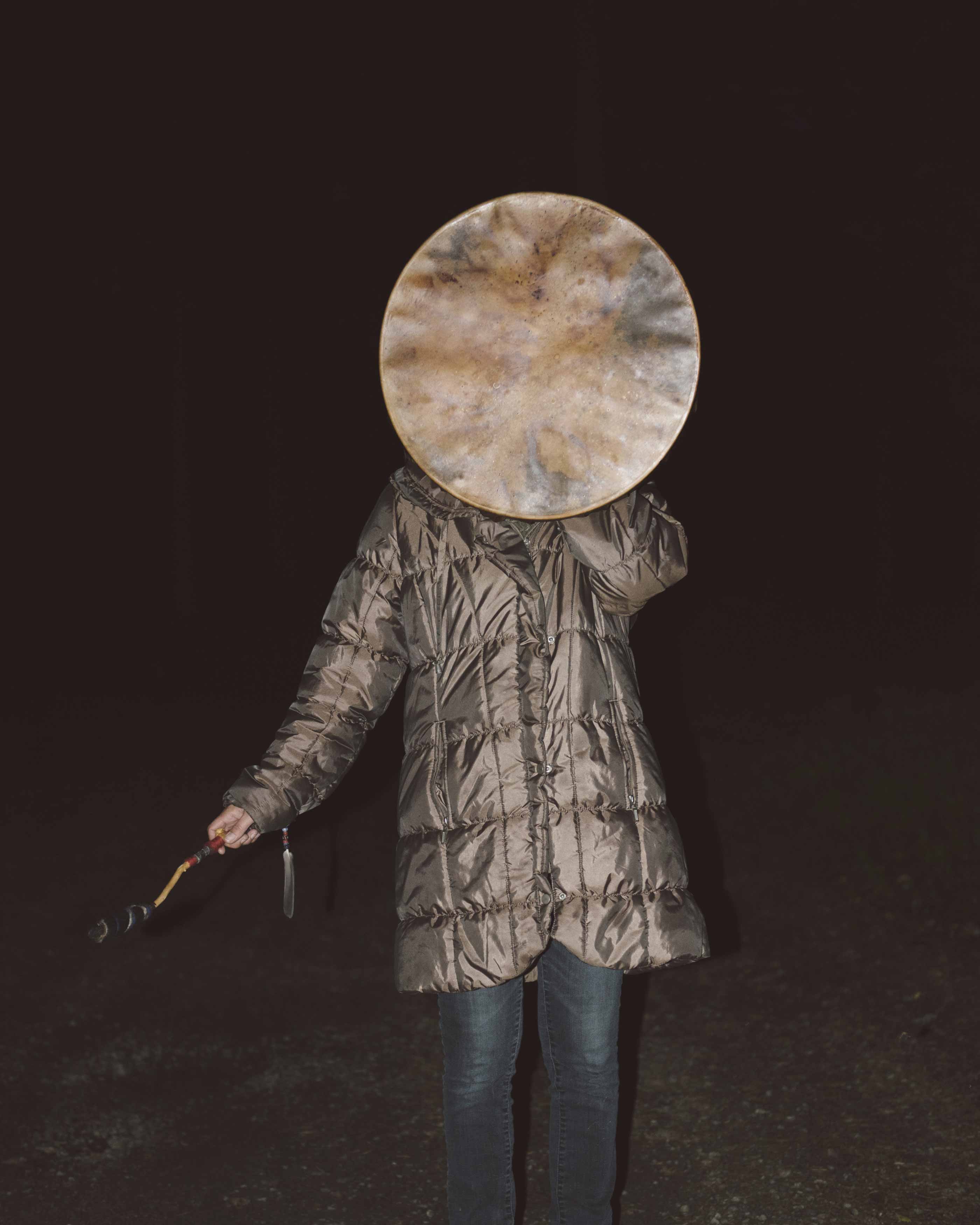
Because I do not live in an areas with these issues, although I think they are important and an interesting concepts I decided I will create a demonstration through more conceptual tablo photography in order to exaggerate the effect I desire. This will be further looked into when experimenting within what the photographer does with his work too to communicate these ideologies. His understanding of nature was rooted within his culture of eastern shamanistic tradition, and so associated with mystery. To my mind this comes across very clearly within his works the rituals, spell symbols as a practical tool for daily life. I think it is interesting the way in which a suffering due to the government and political issues should deem it acceptable for people to live in poor conditions and how this becomes their daily life. Additionally I wish to expand on this concept later too. The photographer has said that ‘This photographic project draws on these beliefs while investigating what it means to be a Forest Finn today, in a time when the 17th century way of life is long gone, and their language is no longer spoken’

The photography I am most keenly interested towards is called ‘slash and burn’ this uses many fires and warm and cold tones contrasting to create a harsh reality for daily lives of people who are submitted to feeling down and living in poverty due to politics.The two images that clearly demonstrate an angle of emotion that I am fascinated with are the following;

I believe this image is successful due to where it lies conceptually, the fire could connote many feeling and attitudes to which the women is trying to express. I believe this image is sublime as there is a clear personification through the flame of destruction to this persons life and mind. The burning could symbolises a stress and tiredness of overpopulation and the suffering to which she has faced. Additionally I like this image as it looks as though she is a real person and not just edited or shown as a photo burning. I think the contrasting tones between the flames and the complete black background drives the image forward as it develops the light and expresses the whole pieces through her face and also surrounding her.

I believe that this image is fascinating as it has an interesting aspect of editing to the image itself. I think instead of the environment of landscape being seen surrounding the person it has been shown as a self reflection over the person itself. The silver coat also insinuates the space theme and cultivates its purpose to be more profound in the landscape it is trying to mimic. I believe it would be an interesting concept to try and recreate landscape that people are not actually in themselves.

Political Landscape – Lewis Bush

Lewis Bush (born 1988 in London) is a British photographer, writer, curator and educator.  Bush studied history at the University of Warwick and gained a master’s degree in documentary photography from London College of Communication, where he lectures on photojournalism and documentary photography.  In his work bush seeks to draw attention to forms of invisible power that operate in the world – such as finance.  Bush has the standpoint that ‘power is always problematic because it’s natural resting state is arbitrary and untransparent’.  Bush’s projects tend to incorporate writing and he has written about photography for a range of national and international print and web titles.
In Bush’s ‘The Memory of History‘ from 2012, he travelling through a range of European countries to document the way in which the past was being politically manipulated in the context of the economic crisis and recession.  This project links to the theme ‘political landscapes’ as it shows how the invisible power of politics is used and abused in different places over time.

Bush is a photographer in residence at the Societe Jersiaise in Jersey where he is working on his project ‘Trading Zones‘ in  which he looks at the international finance industry.  It looks at the global economic crisis that began ten years ago and the resulting financial sector. Finance has been very unrepresented in documentaries due to its complexity and stature meaning that there is plenty of potential for investigation for documentary photographers such as Bush.  The project ‘Trading Zones’ is a result of six months spent as the 2018 Archisle photographer in residence at the Societe Jersiaise in Jersey, which is currently undergoing huge renovations in the financial sector.  Bush says he has used this time to “establish the foundations of what I anticipate will be a long term photographic inquiry into the financial services industry” as the project comes under documentary photography so this project will be ongoing over a long period of time.  Bush says in an interview with ASX “Finance here is the accidental product of events going back almost a thousand years, but is it also the result of very intentional choices made over the last half century” which links back to political landscape in the sense that trends and features change over time but often loop back around.  There are multiple methods of approach taken to this project by Bush – ‘Trading zones’ has inspiration stemming from different areas such as:

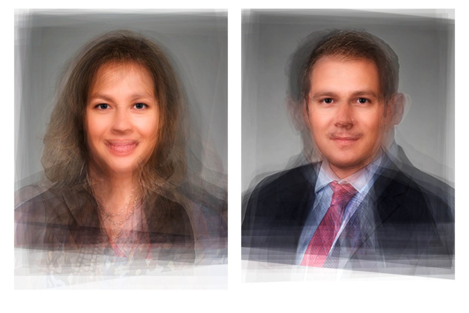
  • Portraits using a technique called ‘composite portraiture‘ developed by cousin of Charles Darwin, Francis Galton, who was an anthropologist.
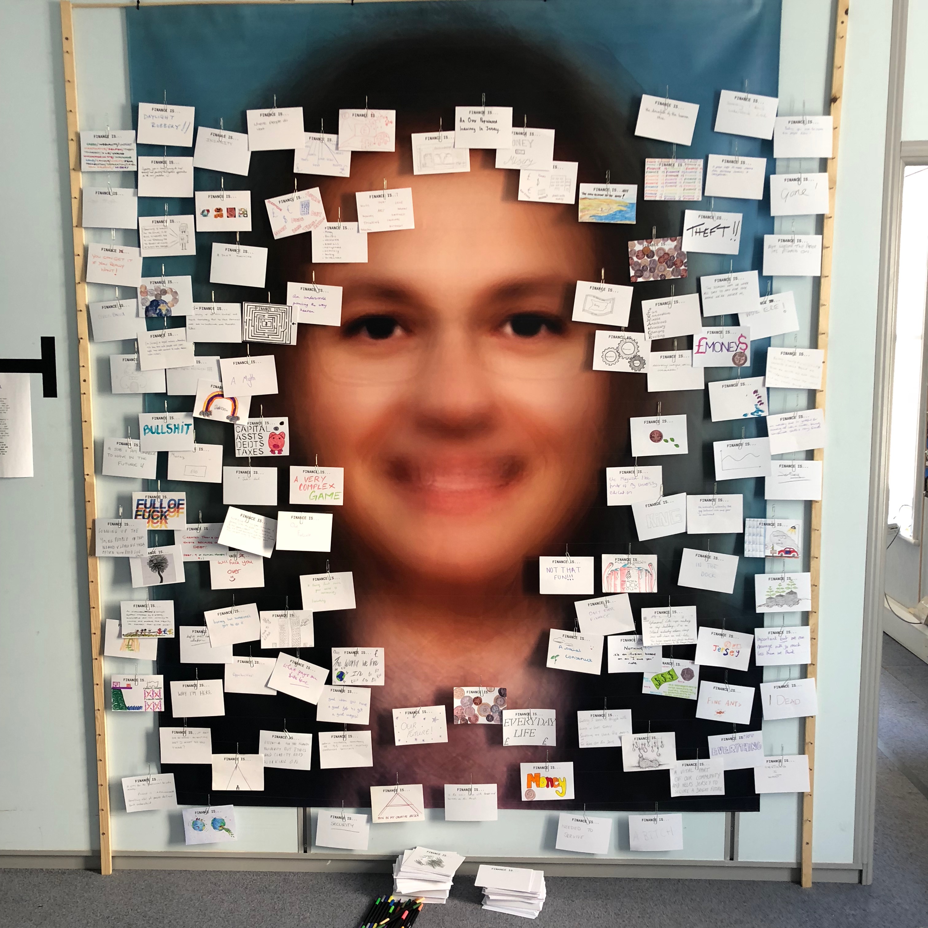
    • Bush merged hundreds of corporate portraits from a variety of countries specialising in different aspects of finance, resulting it what the average finance worker may look like.
  • Cards asking what the public thought of finance which drew inspiration from a project by EJ Major, who sent out cards asking ‘what love is’, expecting people to respond in whichever way they felt appropriate.

Bush’s residency finishes with an exhibition of ‘Trading Zones’ in the St. Helier Old Police Station where financial investigations unit of Jersey Police was based. This project is currently a work in progress and is continuously looking for future financial collaborators in order to develop this project further.

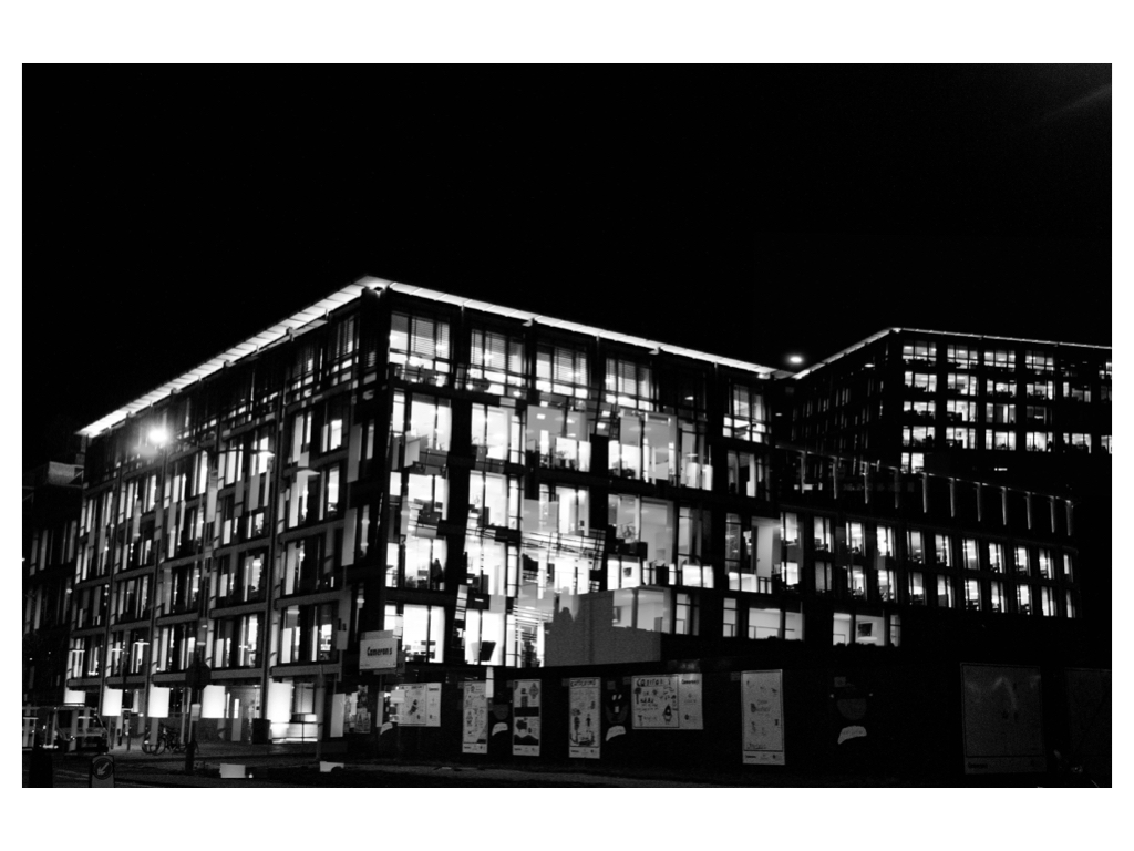
Analysis

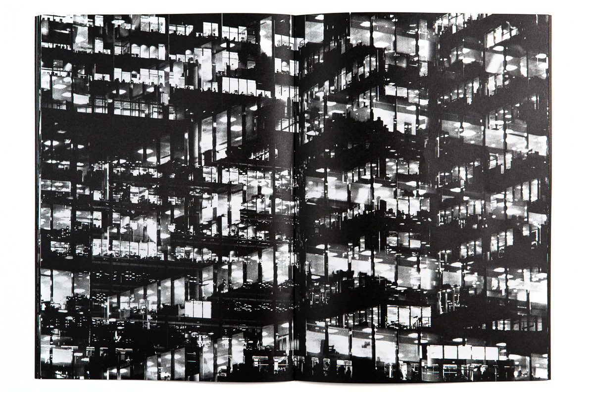
In this photograph it appears that lighting from within the inside of the building was used in what is possible night photograph. The use of this light is used to Bush’s advantage advantage as he uses double exposures to layer building over building creating a disorientating viewing along with contrast between the over-exposed lights and the dark shadows within the building. There is a wide tonal range within the photograph thanks to the range of shadows and lights within the photograph – this wide tonal range makes the photograph interesting in whichever segment the viewer looks as it creates intricate shapes and shadows throughout.  The lights and shapes are very intense as the viewer has to try piece the photograph together in order to understand it. It is unclear whether a short or deep depth of field will have been used in this photograph due to the disorientating nature of it – this adds to the mysterious elements of the photograph. A fairly slow shutter speed will have been used along with a low ISO in order for enough of the light to enter the lens from the dark environment whilst keeping the quality of the photograph as high as possible.

There is no colour in this photograph – only black and white along with the shades in between. This black and white approach to the photograph is very effective as it allows you to focus on the structure of the photograph and the buildings rather than being distracted by colours. The black and white effect also adds to the disorientating effect of the double exposure technique. Another addition that the black and white effect brings to the photograph is more contrast between the tones – especially between the bright white lights and the black shadows. The bright lights may be representative of a light at the end of the tunnel due to their glow in comparison to their environment. The photograph seems to have the texture of a graphite drawing which creates a really interesting viewing as what the viewer is seeing seems almost surreal. There is quite a 3D effect to the photograph due to the blending of photographs in order to create platforms coming out towards the viewer from the building. This 3D effect is complimented by the wide range of tones within the photograph. There are two points in the photograph to which the eye is initially drawn – these are the bright heaven-like lights and the platforms extending from the buildings – this is due to the lights contrasting in tone to the rest of the photograph and the platforms providing different shapes to the rest of the image. The platforms are also placed along the higher horizontal line of the rule of thirds meaning they add aesthetic to the photograph.

This photograph was taken from Bush’s project titled ‘Metropole‘.  This project looked at the collapse of the British Empire and how in its place globalised capitalism grew. London has been rebranded from “an investment opportunity” to “a city of demolition, cranes, and glittering new high rises”.  ‘Metropole’ aims to record the effect of this on London through the form of documentary photography. The project is titled ‘Metropole’ as London was once known as the Metropole meaning it was the mother city at the centre of a vast empire. These photographs were produced “during numerous winter night walks through the city”.

On Bush’s website he says that he used double exposure to create “increasingly disorientating and threatening as the series progresses” in order to create the “sense of loss that many Londoners feel” in the big city. This theme of a feeling of loss within the city links to the genre of ‘political landscape’ as it looks at the past of London and how it has changed – possibly for the worse. Bush continues this theme in his work on ‘Trading Zones’ in which he studies the Jersey financial sector. I think that through this exploration of disorientation and change Bush is trying to show that people often feel that the world is moving too fast for its own good as people get lost in temporary trends and patterns of life.

Project Idea

https://www.independent.co.uk/environment/plastic-recycling-oceans-rivers-pollution-investigation-environment-agency-a8591736.html

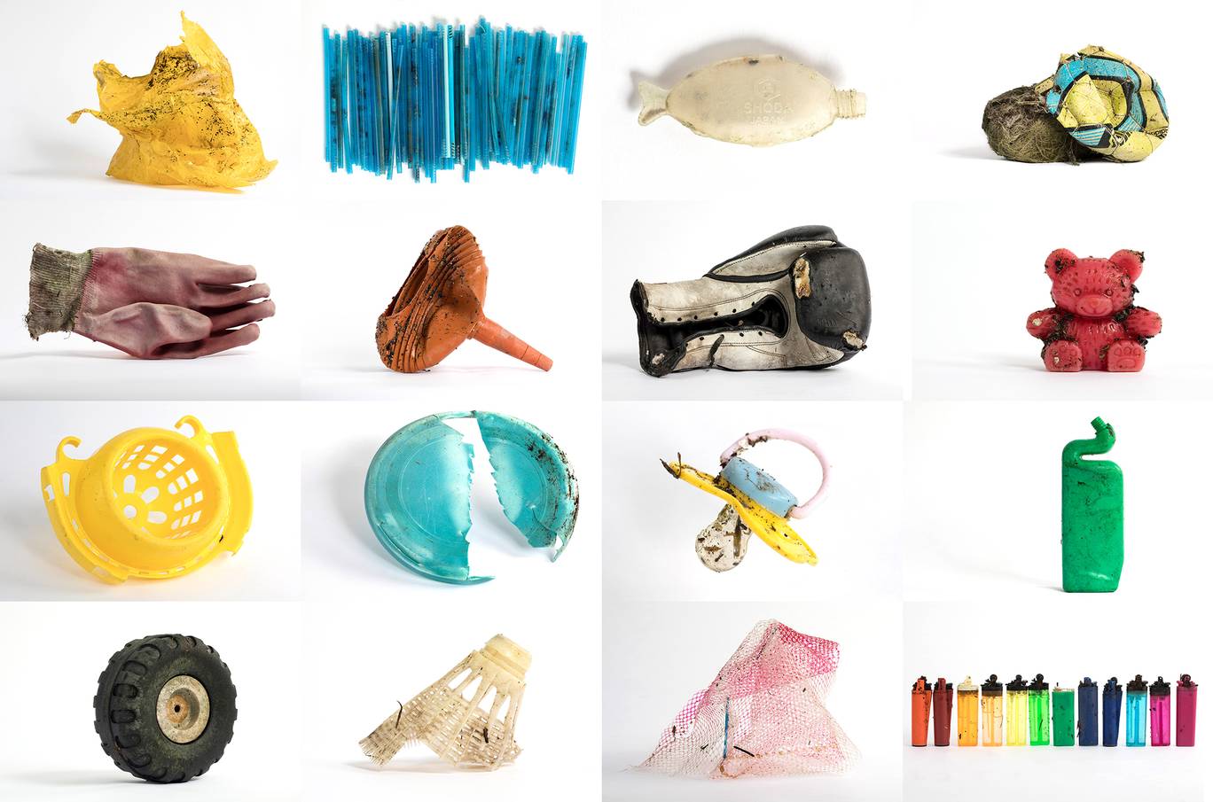
A composite image of items found on the shore of the Thames Estuary in Rainham, Kent. Tons of plastic and other waste lines areas along the Thames Estuary shoreline, an important feeding ground for wading birds and other marine wildlife.

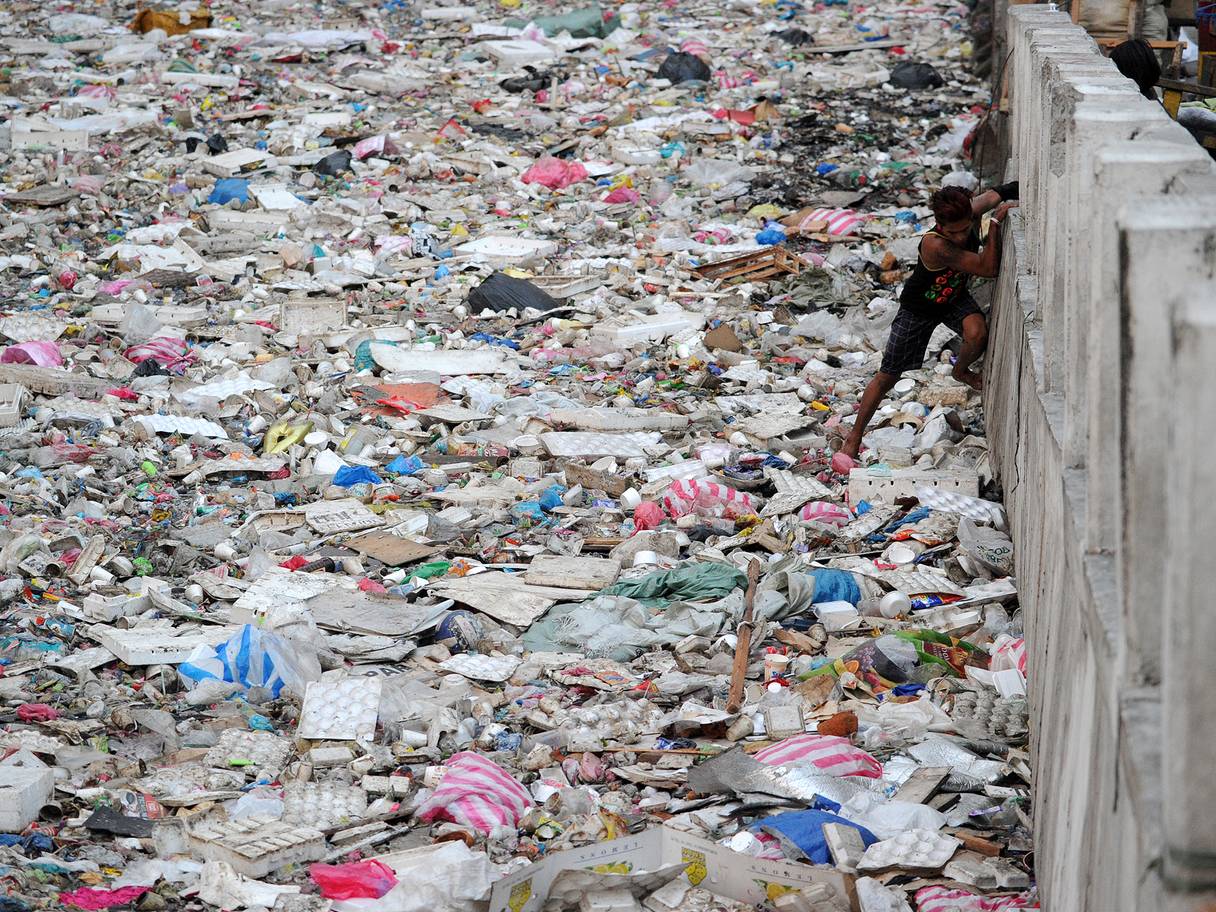
A man climbs down to a garbage filled river in Manila. Plastic rubbish will outweigh fish in the oceans by 2050 unless the world takes drastic action to recycle the material, a report warned in 2016.

Project Idea

Focusing on plastic pollution for my project is a very current issue in the world today, making the final images relevent and applicable to political landscapes. Many people have realised the detrimental effects on the world with the overusage of plastic and many people are trying to change that.  For example, The Independent’s campaign against single use plastics called Cut the Cup Waste was met with such rapid success Robert Jenrick, a Treasury minister, signalled that Philip Hammond, the chancellor, will be acting to reduce waste in this autumn’s budget. This is just one example of people trying to change people’s views on the way they use plastic, similar to what I want to do. I want to further emphasis the effects of plastic and pollution on the world and environment. I also want to explore how these consequences will effect future generations, also looking into personal archives or public archives at past generations and how they have contributed, making my project more personal. I intend to look at specific areas in Jersey and document what is there and what I find. There may have been many photography projects on the effects of plastic on the world, but i plan to look at it in an unconventional way.

Anthropocene:

relating to or denoting the current geological age, viewed as the period during which human activity has been the dominant influence on climate and the environment.

Cut the Cup Waste   https://www.independent.co.uk/voices/editorials/latte-levy-plastics-disposable-cups-coffee-mps-25p-bags-a8142141.html

https://www.independent.co.uk/voices/editorials/editorial-disposablecoffee-cups-latte-levy-tea-hot-drinks-plastic-tax-campaign-a8497431.html

Possible photographers to explore:

http://www.andyhughes.net/site/portfolio-2/uncategorized/plastiglomerate/

Andy Hughes: http://www.andyhughes.net/site/portfolio-2/uncategorized/plastika-alaska-2/

Mandy Barker: https://www.smithsonianmag.com/arts-culture/these-haunting-photographs-call-attention-plastic-trash-swirling-ocean-180963219/


archive,first shoot images

When looking for inspiration from the archive I wanted to focus on accessing specific areas of location on my shoot, so influential areas that connect to the history of jersey found within the achieve and possibly using this as a background for an emotional piece. Archival images are much more influenced by narrative and documentary style due to editing effects and camera effects not being around. Because of this the achieve is a good place to go in order for a clear representation of the world that used to be and a good reflection fo the peoples attitudes and feeling within a scenario.

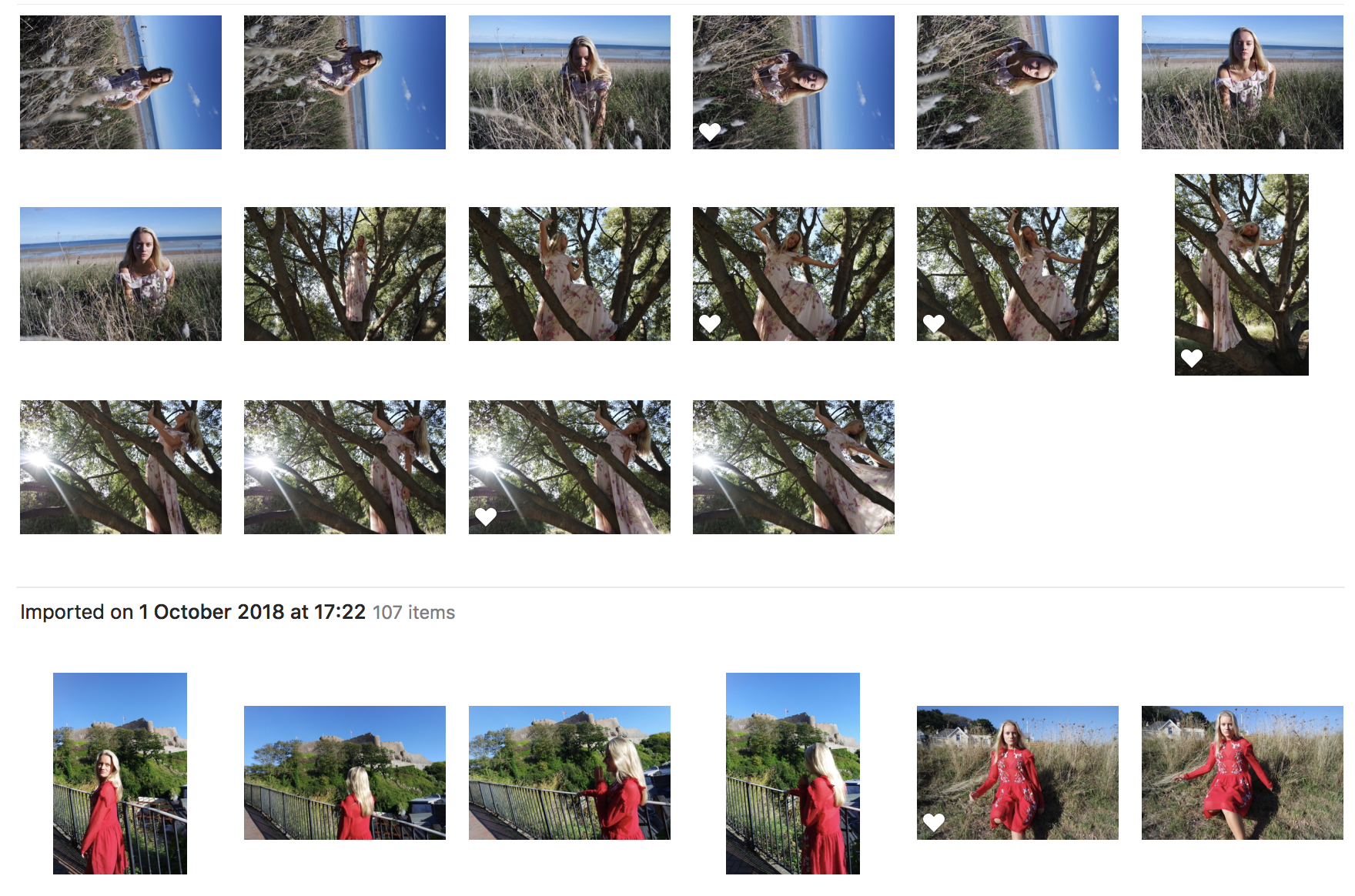
For my first shoot I went to three separate locations, being a beach, castle and towns full of archival images that have been around for a long period of time that are significant to jersey and its history. Within this shoot I wanted to incorporate three different emotions, The beach as being freedom and peace, this is reflected through the person I have chosen, having a great love and impact for the beach,It also shows that politics and negative impact on emotions is not always relevant when bought to an area of great love and admiration.  I want this to be reflected through the dress and positioning and way in which she is going to move.  I want to get many different interesting compositions and the way in which the body is held to reflect an emotion as-well as being incorporated into the landscape itself.

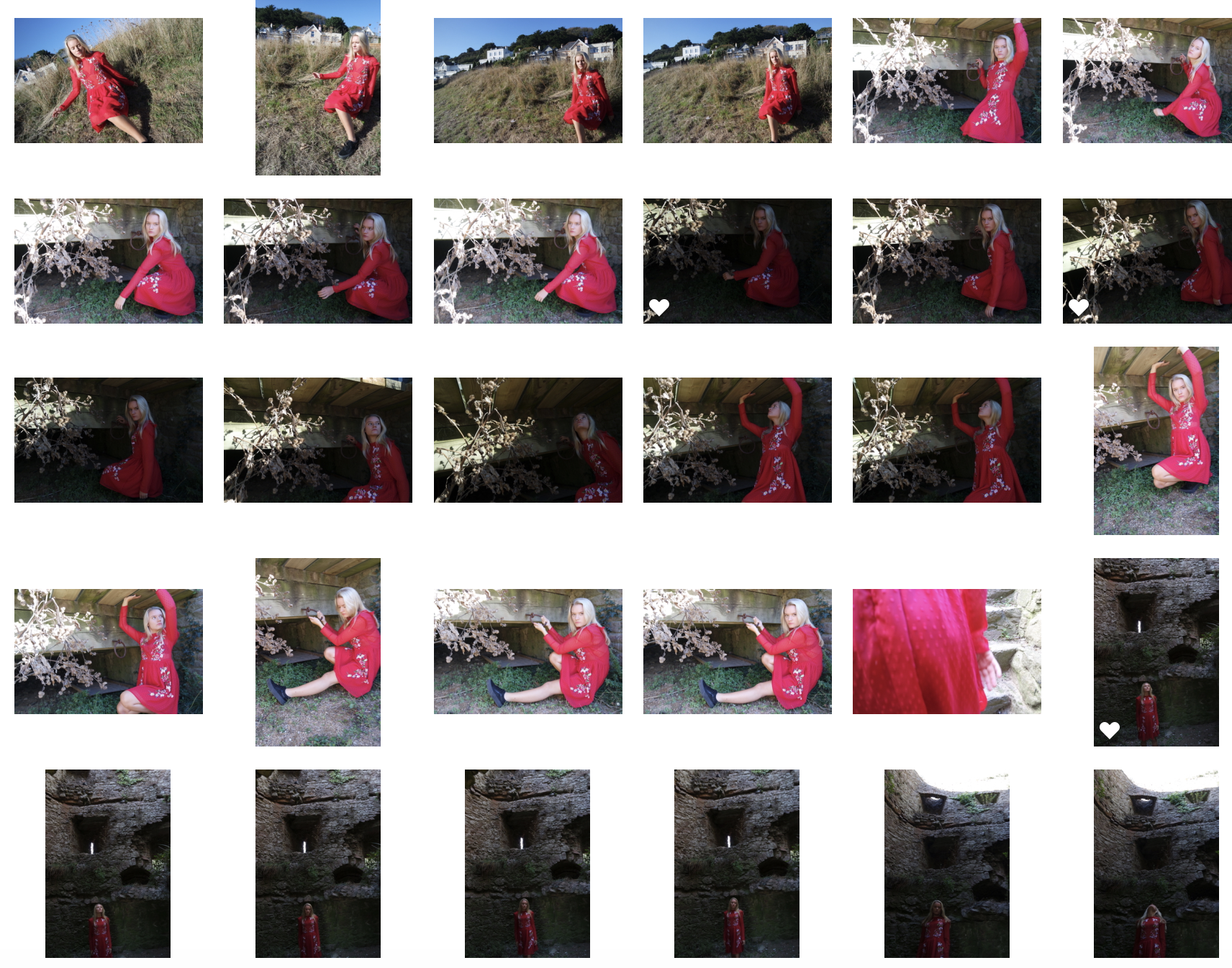
For my second location I will go to Gorey castle, I have chosen this as it is a hugely influential Archival area and shows a huge political impact of war and issues effecting how jersey is currently represented. For this shoot I want to show an emotion of sadness and anger, this will be mimicked by the colour of red and the action in which the subject moves and where she is placed. I want to incorporate many interest angles and find many little areas within Gorey castle that are dark and represent the suffering of war that this symbolises for many years. To this person it shows the past and present to how politics is now formed and how she is now deemed as a less important citizen because of the events that occurred here. I will use many camera effects in order to experiment within emotion and also using mirrors to show a reflection of time and such.

The last location is a little community within a small town, full of colour and a strong community. This will also show a reflection of love and also highlight the scenario fo living for more urbanised areas. I want to try and capture more people in the community within this scenario and also just the landscape itself. and could possible incorporate a narrative and documentary section of this shoot from following the people who live in the area itself.

First shoot: image count:251


Photographers Research

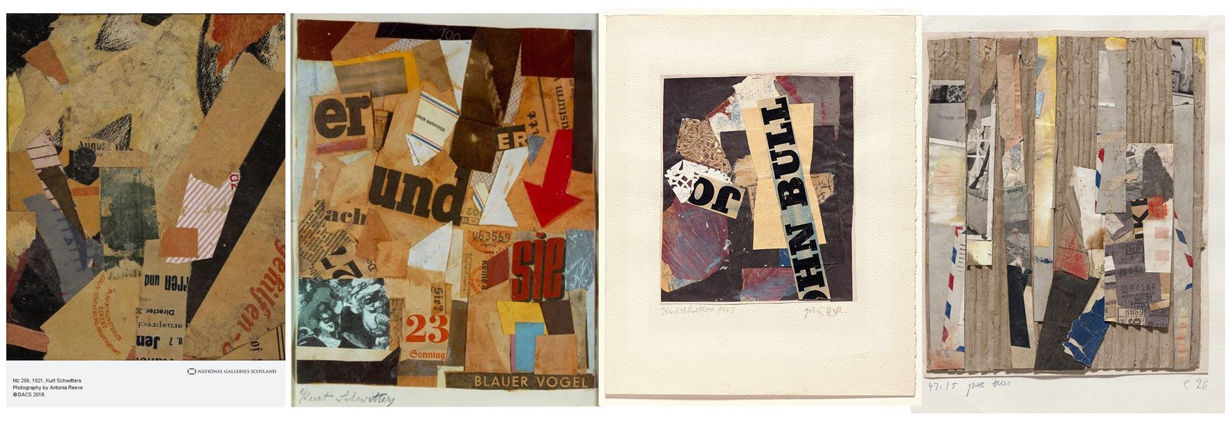
Kurt Schwitters collages

Directly affected by the depressed state of Germany following World War I, and the modernist ethos of the Dada movement, Kurt Schwitters began to collect garbage from the streets and incorporate it directly into his art work. The resulting collages were characterized by their especially harmonious, sentimental arrangements and their incorporation of printed media. He actively produced artistic journals, illustrated works, and advertisements, as well as founding his own Merz journal.

Schwitters used actual trash, such as broken items and scraps of paper, in his collages. Although the use of found objects aligns him with other branches of Dada, his bold dependence on society’s throw-aways provoked additional associations on the part of the viewer and differentiated his expression. Ultimately, he investigated links between seemingly unconnected objects and ideas.

Andreas Gursky

In the late 1980s, Andreas Gursky was pivotal in creating a new standard in contemporary photography, a pioneer who furthered the possibilities of scale and ambition. His massive, clinical, and distanced surveys of public spaces, landscapes, and structures contributed to a new art of picture taking in contrast to the Minimalism and Conceptualism of the 1970s

Gursky is known for his mural-sized, precisely detailed photographs that capture all aspects of globalization. His subjects range from landscapes, to architecture, to individuals at work, and everything in between. Gursky has taken photos on almost every continent, never repeating the same image twice. Martin Henschel of the Kunstmuseen Krefeld has stated, “Gursky manages to capture itinerant  35 parts of the world that at first sight seem to have no cohesion, but which from his perspective are ‘pieces of the puzzle’ that interact when faced with the totality of the world.” While at first glance his photos may appear to have no relation to one another, when examined as a  whole, his body of work sheds light on all facets of globalization, from the New York Stock Exchange, to the buildings of Shanghai, to the desert of Bahrain. Writing in Artjournal, Alix Ohlin summarizes the relationship between Gursky’s photographs : “In their determined, oblivious way, the photographs make clear that there is no longer any nature unchartered by man. In place of nature we find the invasive landmarks of a global economy. Taken as a whole, Gursky’s work constitutes a map of the postmodern civilized world.”86 For our purposes, a comparison between Untitled XIIIand Gursky’s 1999 image 99 Cent , allows for a richer understanding of the globalization.

Yao Lu

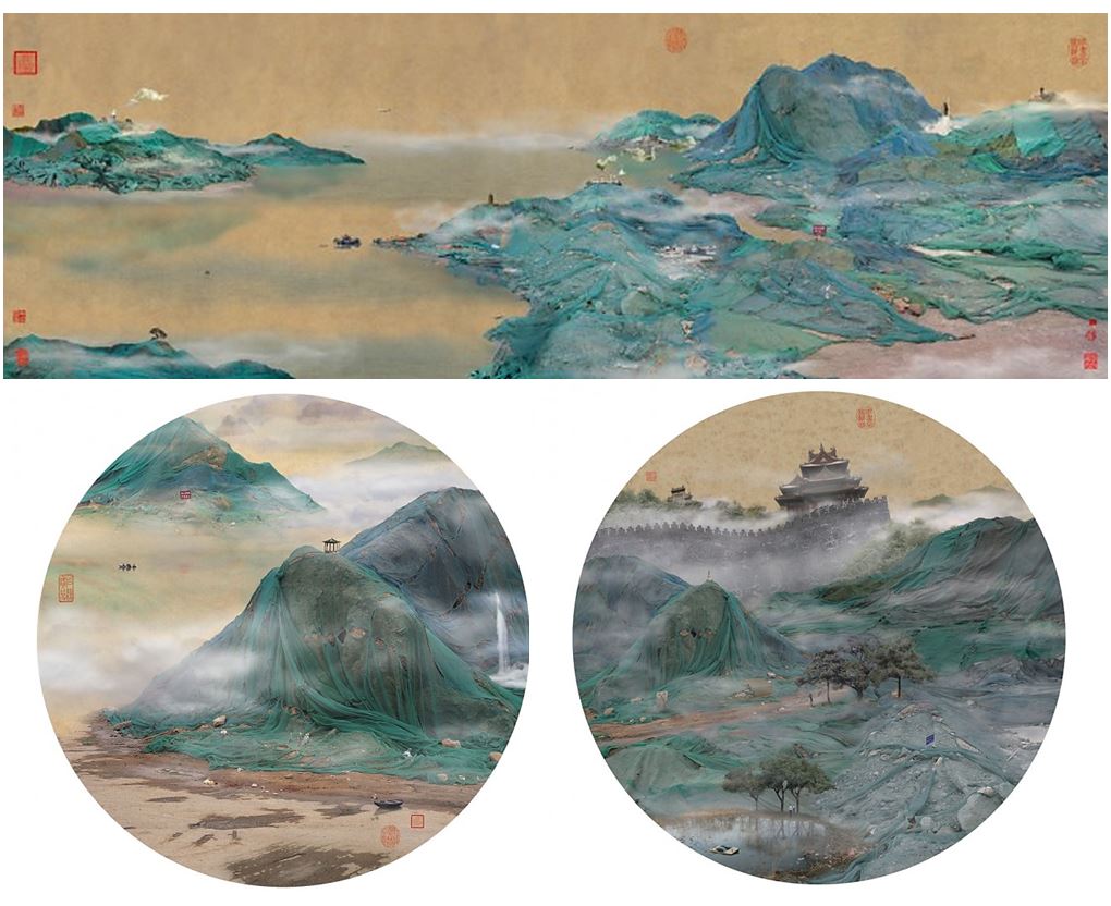
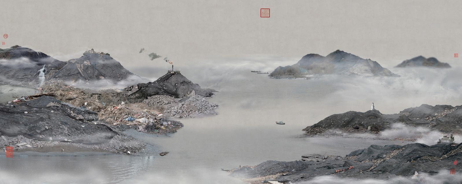
Yao Lu’s concern about the impact of China’s rampant path towards urbanization is portrayed in photomontaged manipulations that borrow from the classical Chinese aesthetic style of painting. Mostly circular, fan-shaped, or scroll-like, Lu’s harmonious landscapes are populated by tiny figures walking through the mist. However, a closer look reveals the chimerical mountain scenes are in fact construction sites scaled out of proportion. Lu’s commentary on the dramatic consequences of China’s rapid industrialization is further reinforced by the artist’s stylistic choices. His recycling of a traditional aesthetic to approach contemporary issues reveals the tension between society’s past and present values. Lu’s environmental message crosses borders and raises pressing questions about the hidden costs of modernization and global sustainability.

According to Lu, “Today China is developing dramatically and many things are under constant construction. Meanwhile many things have disappeared and continue to disappear. The rubbish dumps covered with the ‘shield’, a green netting, are a ubiquitous phenomenon in China.”

Yao Lu has created a thoughtful and timely series inspired by traditional Chinese paintings entitled New Landscapes in which mounds of garbage covered in green protective nets are assembled and reworked by computer to create images of rural mountain landscapes shrouded in the mist.