Category Archives: AO2 Explore Ideas

Filters

Author:
Category:

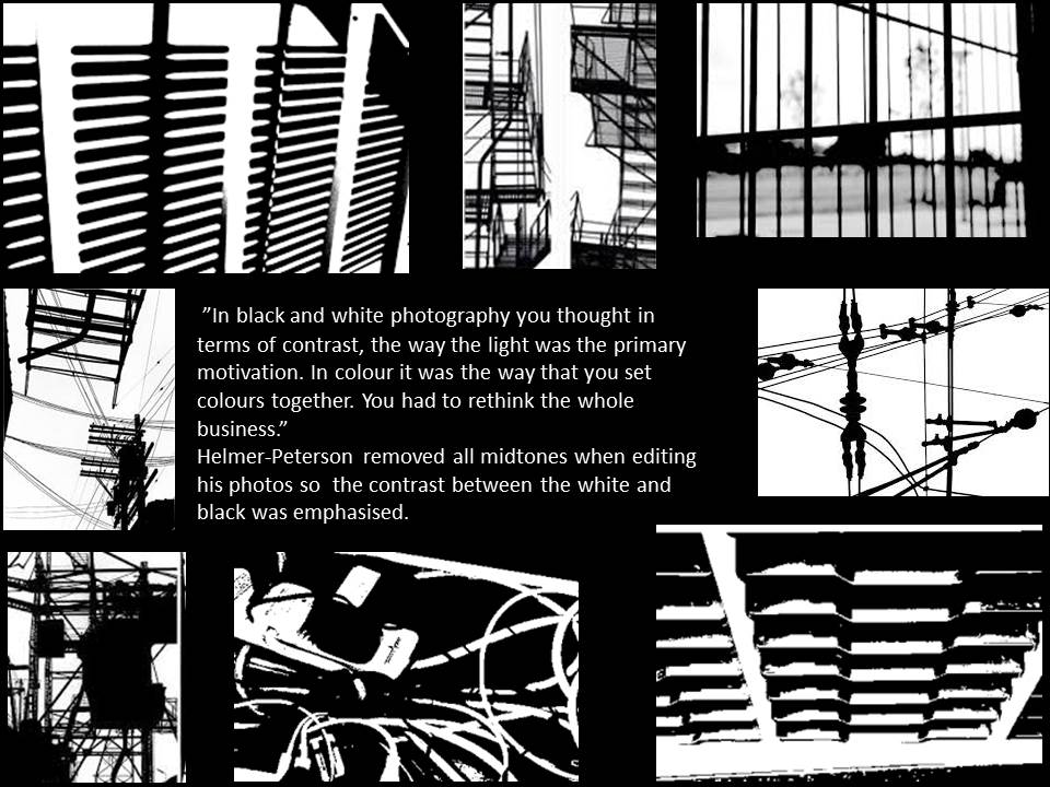
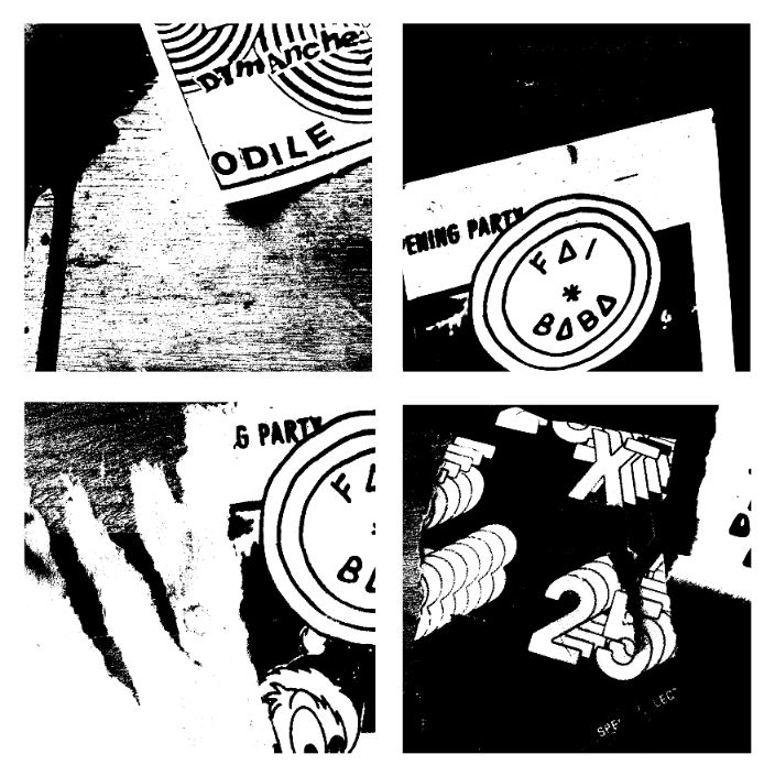
editing with threshold: keld helmer petersen

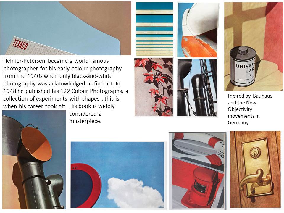
within this image it is edited to show black light within high saturated edits,then also turned into squares for an even overall finish.I was inspired by the artists Keld Helmer Petersen who  wanted to achieve an international collection of experimentation shapes inspired by ranger patsch. He also developed poetic realism  within his work and modernism within photography.

He eventually adapted and developed the intellectual structuralism to art and photography,he liked  to capture leafs and  trees against grey light and patterns created within nature.He started to become more abstract within the enlarging of his images focusing on the microcosm of nature.

I chose these images due to their defined lines and shape within the pieces. I thought the compositions of the pieces where also quite interesting as there are many dimensions and angles to the piece themselves.
 

this is a clear  example of his work and how he different from using more simplistic images to more complex lines but overall still achieved the same tonal range and detailed effect of the image.



Exploring High Contrast Images With Helmer-Peterson

Helmer-Petersen

Image result for helmer petersenHelmer-Petersen was a Danish photographer who looks at shapes similarly to Albert Renger-Patzch. His work, especially his book “122 Colour Photographs” brought modernism to Danish photography and earned him a grant for a years study at the Art Institute of Chicago. He looks at the natural shapes and pattern in the world around us and creates something attention-grabbing out of it. A lot of the work he did was high-contrast and this below I have created some work in his style.
The Process

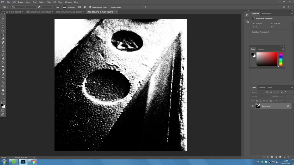
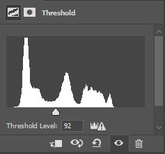
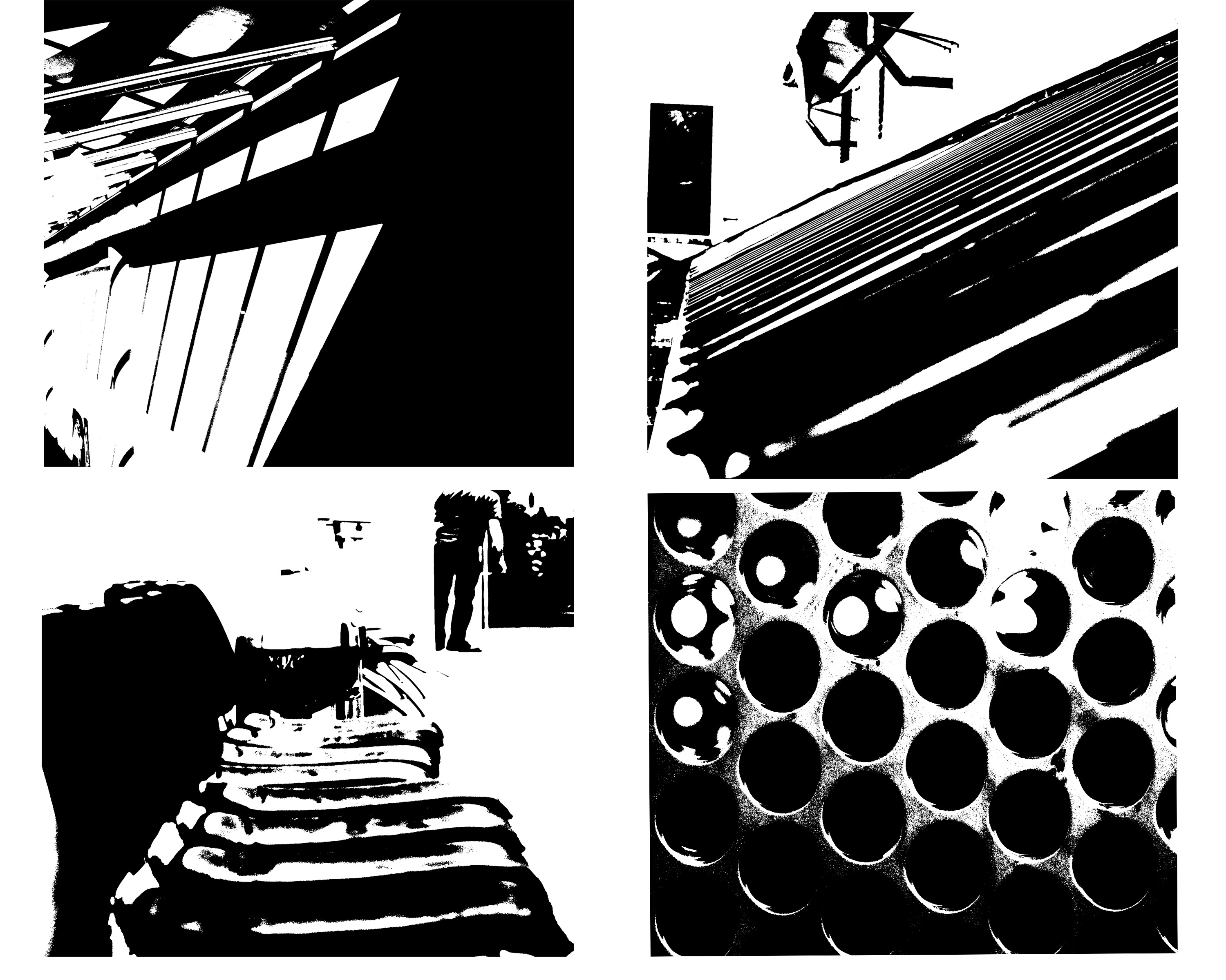
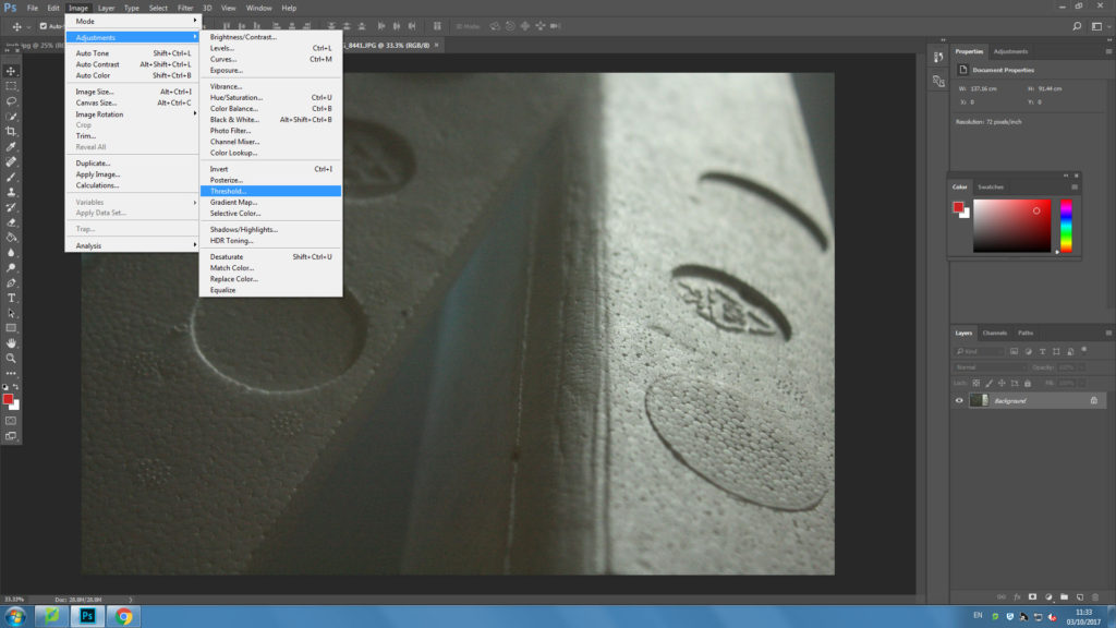
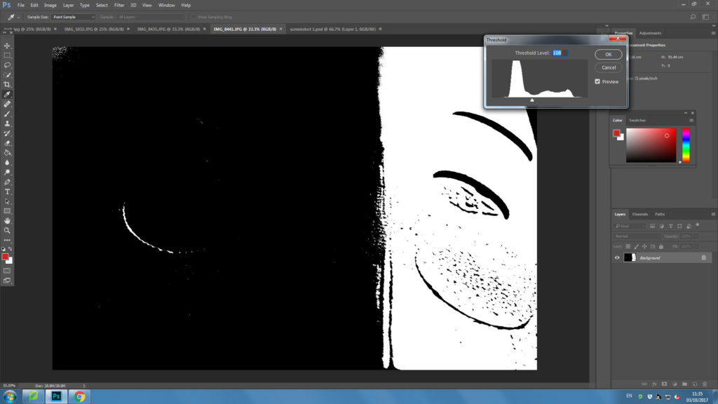
I edited the image in the style of Helmer-Petersen by firstly choosing the threshold option on photoshop.

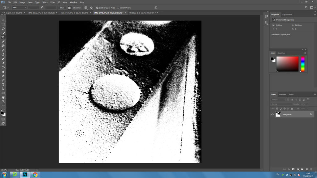
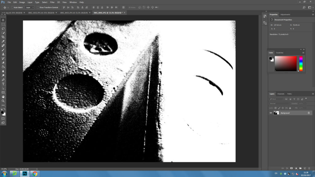
I then edited the white and black balance using the slider to create my ideal image.

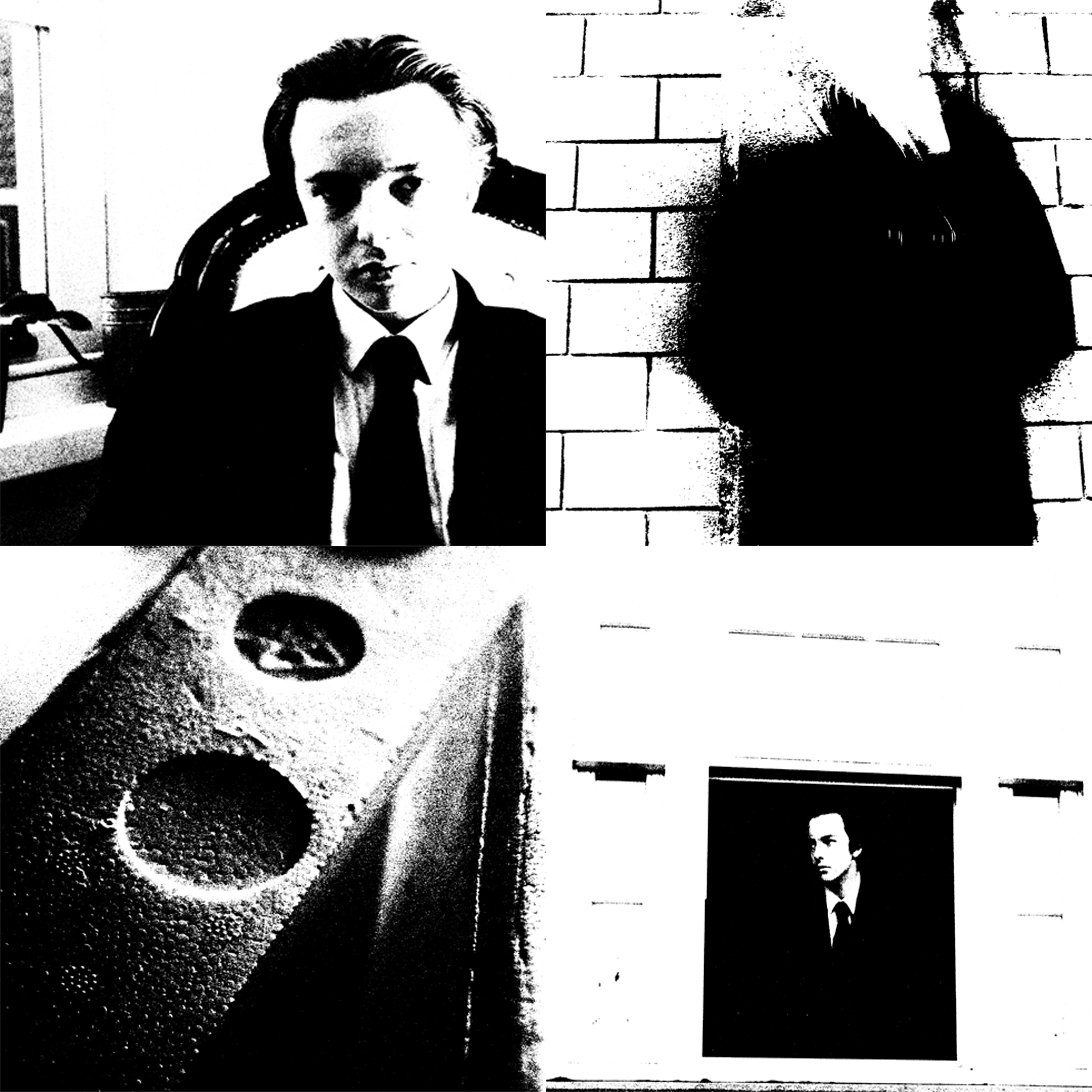
I then cropped the image to produce a square so that I could present my images in one sheet.  

I looked at inverting the image to create something new but i decided not to.

I then put all four images into one page to showcase them.

Frank Hallam-Day and Aaron Siskind

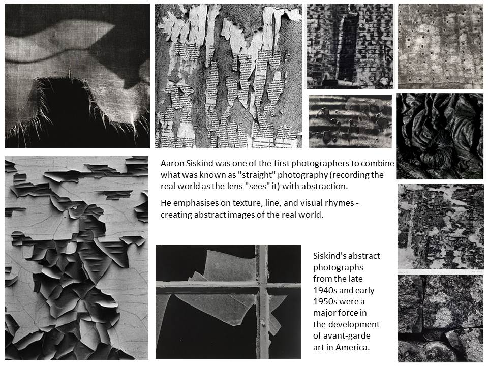
Aaron Siskind

Frank Hallam-Day

 Image Analysis:

I think this photo expresses Frank Hallam-Day’s theme of passage of time on works of man well. He highlights the bright colour yellow and also the brown to emphasise the weathering of the ship hull. He contrasts the work of man (ship hull) with nature (water) to express the affect nature has. The photo is split into the rule of thirds horizontally and one line vertically, creating a grid shape to show the sections within the photo of different patterns like weathering and rusting. The middle section has different levels of rust from where the sea has been, expressing that the ship hulls where once technological achievements but are now just sitting in the harbour. He contrasts the bottom of the photo with the top half, the bottom half having a lot of marks and patterns, and the top being one bold colour. The marks on the ship hull create interesting reflections on the sea and he has increased saturation to emphasise the rust in the reflection.

Keld Helmer-Peterson

Keld Helmer-Peterson Research

Related image


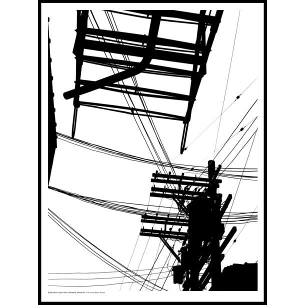
Image Analysis:

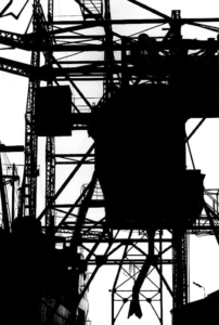
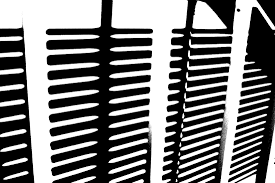
This photo is from Keld Helmer-Peterson’s black and white photography where he looks at threshold. The photo at first glance does not look like a photo of telephone wires and could be mistaken as a drawing because of the bold solid colours displayed. He removed all mid tones so the contrast from white to black emphasises the thin lines as well as the bolder ones and also the different  shapes in the photo. Because the photo only contains two colours, with no varied tones, it create a bold and striking appearance that couldn’t be achieved with mid tones.

Rule of thirds

what is rule of thirds?

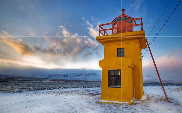
rule of thirds is applied by aligning a subject with the guide lines and their intersection points, placing the horizon on the top or bottom line, or allowing linear features in the image to flow from section to section.This is on order to create a successful and visually pleasing formatted composition. It can allow a direct view of a subject or the type of depth you would like to capture. It can also exaggerate editing within blurring and also subjects such as ISO.

Using the rule of thirds

The rule of thirds is applied by aligning a subject with the guide lines and their intersection points, placing the horizon on the top or bottom line, or allowing linear features in the image to flow from section to section.It can be used by using a visual of tow lines formatted at each angle on the screen or possibly within dots for slight dissidence as to where to place the main subject of the image.

The rule of thirds was written by John Thomas Smith,this was written back in 1797 in order to find the perfect way in how to capture rural scenery,

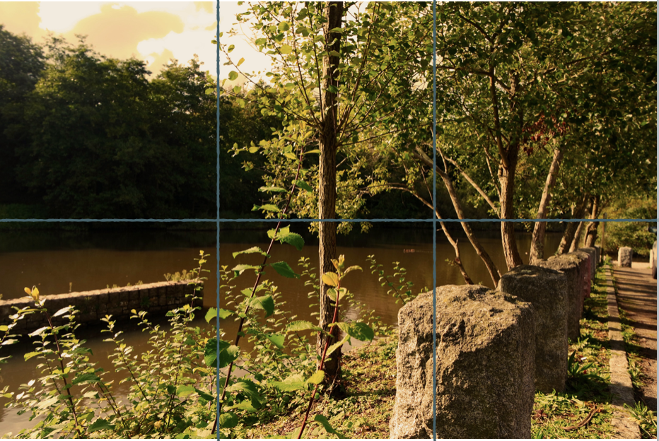
You can clearly see the horizon and how it sits equally in the middle throughout the lines.,this divides the image into thirds of the lower two sections. The tower is the point of interest directly in the middle of the second line.The sky also develops with color over the horizon.

within this image you can see the rule of thirds of how the rock is alined within the first line with the rest entering back to become equal with the second horizontal line.There is also a tree centre and this achieves an even overall effect.

Motion Blur

Motion blur can be adapted in many areas of photography; to create a sense of movement in the image or to blur out the background and bring the viewer’s attention to a certain part/detail of the image.

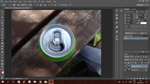
To begin, open your image in Photoshop and duplicate it.
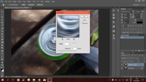
By going to Filter<Blur<Motion Blur you can bring up the motion blur window and adjust the sliders to your liking.
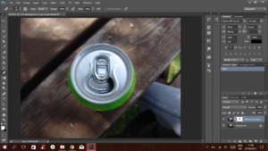
After creating a layer mask, you can use the eraser tool to reveal the bottom image which is sharp and in focus; enabling you to pick what stays in focus and what doesn’t.

Side By Side Before vs After Image 

Although I used Photoshop to create this image and effect, it’s possible to achieve this using the camera. A way to do this would be slowing down the shutter speed,  using a small aperture and decreasing the ISO. These things combined would create a naturally blurred photo with a subject in focus.

Often, in Photography, motion blur adds movement and a lively atmosphere.

Depth Of Field

What is depth of field?

DOF is the zone of acceptable sharpness within a photo that will appear in focus. In every picture there is a certain area of your image in front of, and behind the subject that will appear in focus.

This zone will vary from photo to photo. Some images may have very small zones of focus, which is called shallow depth of field. Others may have a very large zone of focus, which is called 'deep depth' of field. Three main factors that will affect how you control the depth of field of your images are: aperture (f-stop), distance from the subject to the camera, and focal length of the lens on your camera.

Image result for what is depth of field
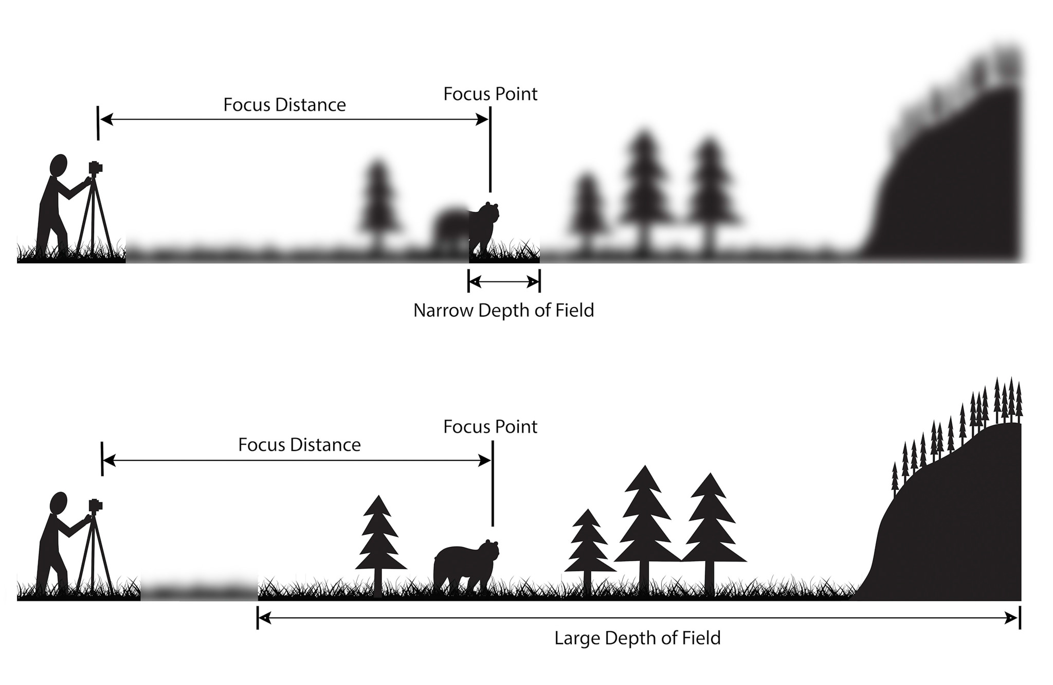
Depth of field diagram

In this picture below to the right there is a gradual focus change within the picture with a very narrow depth of field, allowing the photo to be in focus of one particular object. However to the left there is a much bigger depth of field stretching to infinity, allowing the backdrop to stay focused in detail at the same time.

Image result for what is depth of field
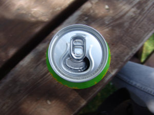
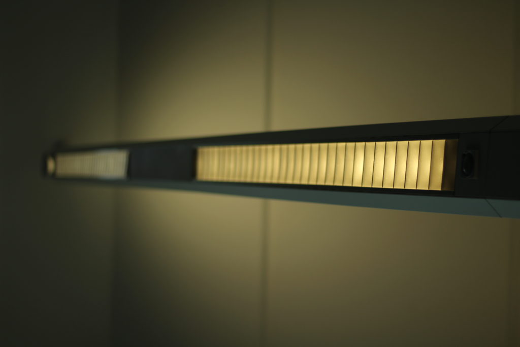
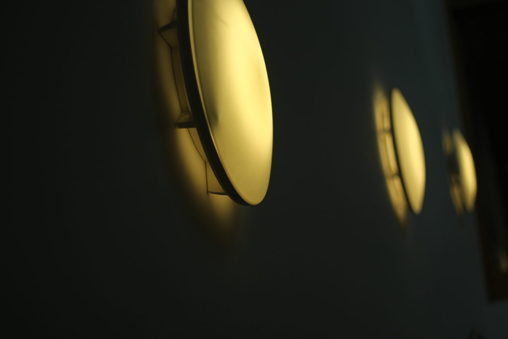
I decided to have a go with the method in a few of my photos, and so walked around school experimenting with it, these were my results:
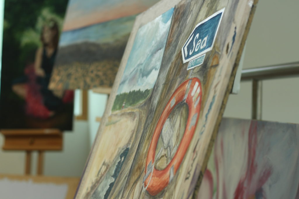
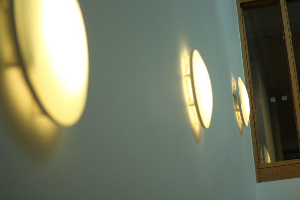
I thought that messing around with the lighting would allow significantly for the viewer to notice what the focal point would be, and to my opinion I think that it worked.

Threshold Editing

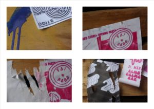
using the same techniques as Keld Helmer Petersen I edited four of the images from my most resent shoot. I opened each image onto Photoshop and cropped them all to squares, and changed the threshold to suit each picture. I then flattened each image and dragged them into a new tab which was a white square. Finally I arranged them into a collage format and saved it as a JPEG.       


Abstract and colour photography

Abstract photography

Sometimes called conceptual or concrete photography, it is meant by depicting a visual image that does not have an immediate association with the object world and that has been created through the use of photographic equipment, processes or materials.

Exploring Colour

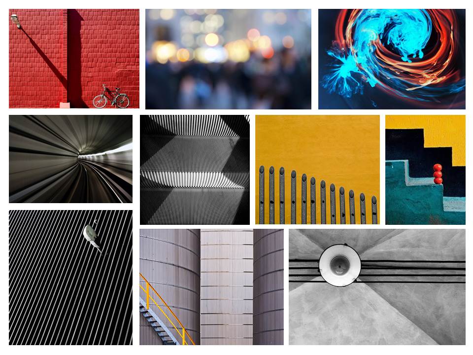
I used colour to create abstract shapes. I adapted and edited the images to make the colours bolder because I thought they look dull and could be adapted more and could be made more interesting and visually pleasing. These are my original edits and then the more interesting edits.

I used Photoshop to create these edits. Firstly, I cut out the circular shape using the ‘elliptical marquee tool’ where I then cut out a circle from one of my chosen images. Once I had cut out a circle I pasted it onto a new document where I made a collage of four. I wasn’t happy with the final outcome so I decided to change the vibrancy of the image to it being very high and then used the paint bucket tool to fill the coloured areas in with a bolder colour. I made a collage of nine in a new document as I wanted to show of more of my edits.