what is minimalism?
Minimalism is a modern idea within the 20th century,it is about specific components such as color,shape,line and texture.It is highly subjective as artwork itself. leaving interpretation and meaning up to the viewers perception of the work.Some photographers use this in order to tell a story of a act of photojournalism but in a easily presented manner to the audience.
the best aspects are surrounding the openness and embracing the freedom of interpretation.There is no real direction to minimalism but photographers can still focus on issues or a specific subject matter. Some other photographers would argue it is about simplicity and the audience creating their own feel or interpretation of the image itself. Some techniques are consistently used to employ and enhance the impact of the work.There should be a consistent notion that is wanting to be captured.


It can be seen within this piece in order to direct attention to a specific point of view,possibly because this kids the most detail or it is aimed to promote a certain aim of development within the image itself. The images are developed through a certain line within the mage,a certain single aspect of the image,or a texture.
My experiment within minimalism:
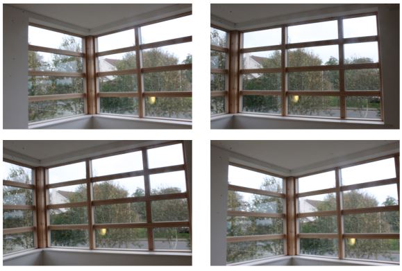
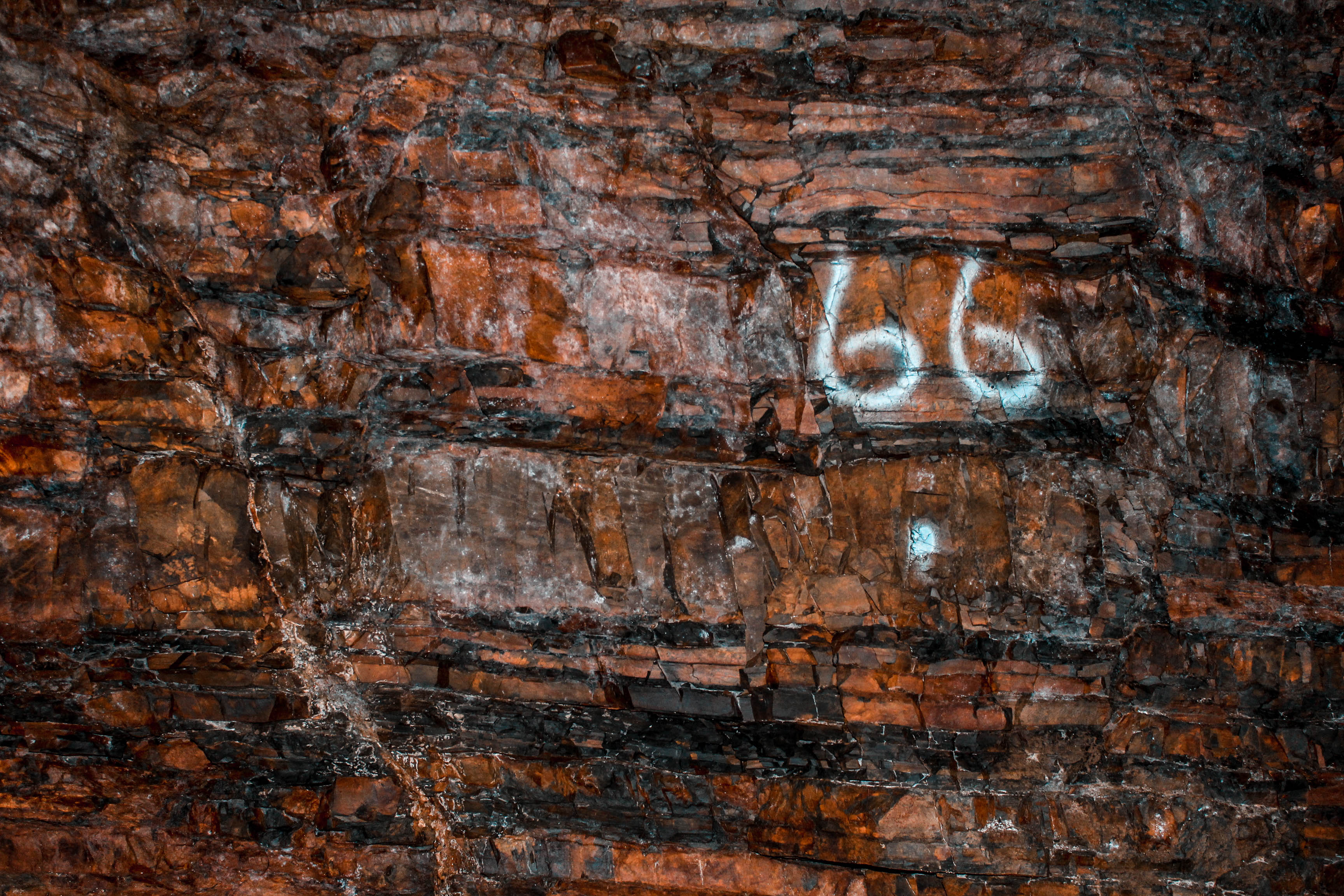
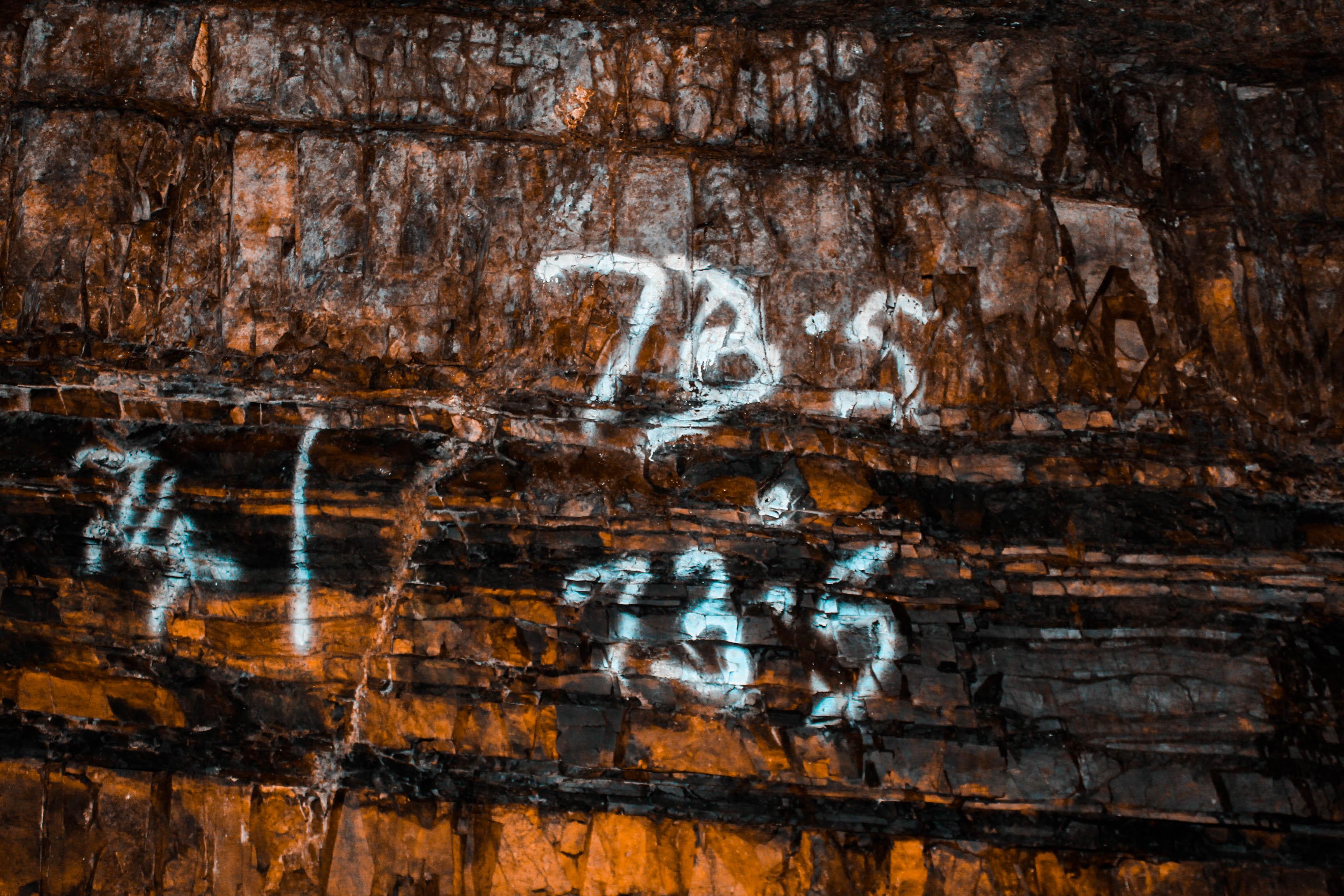
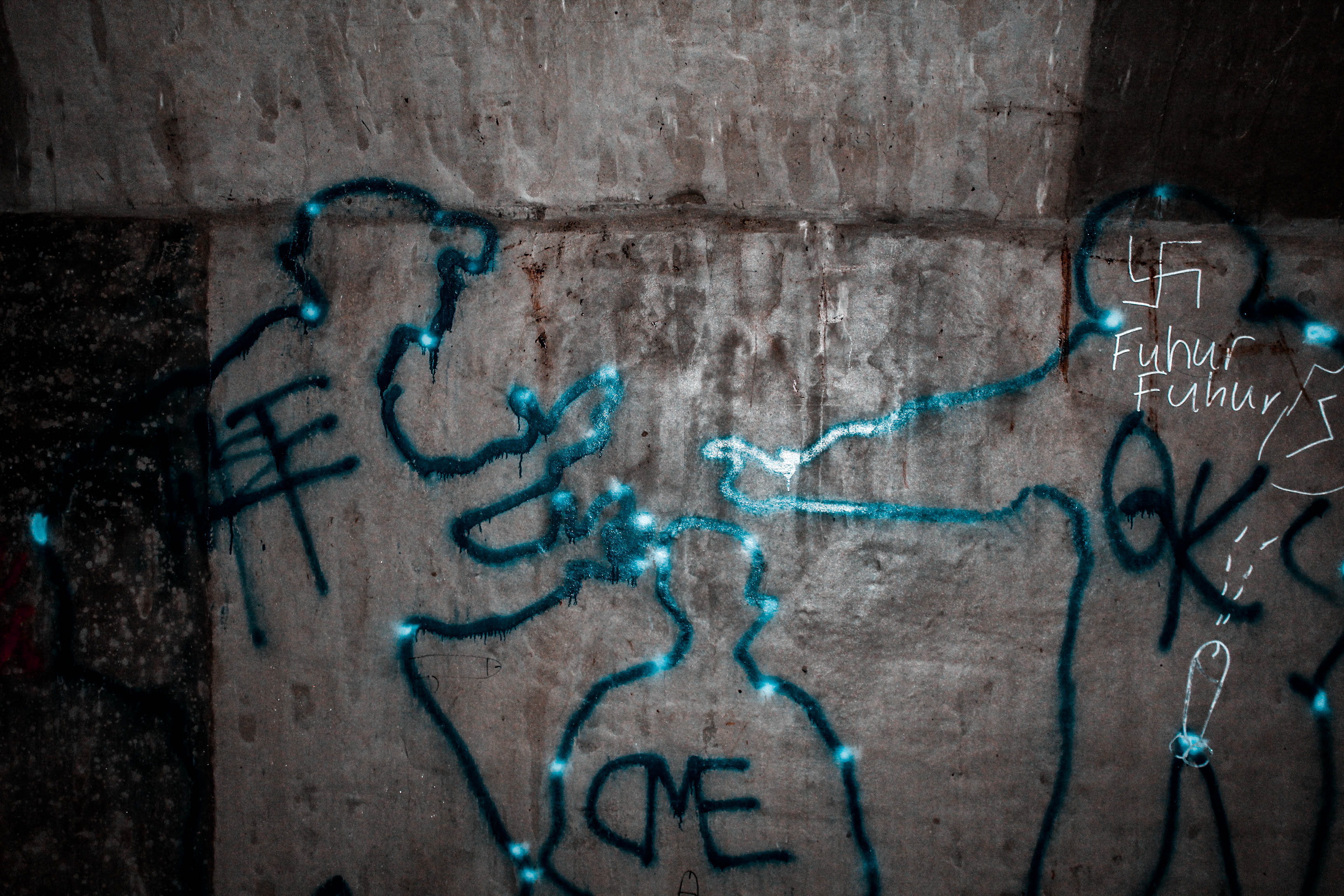
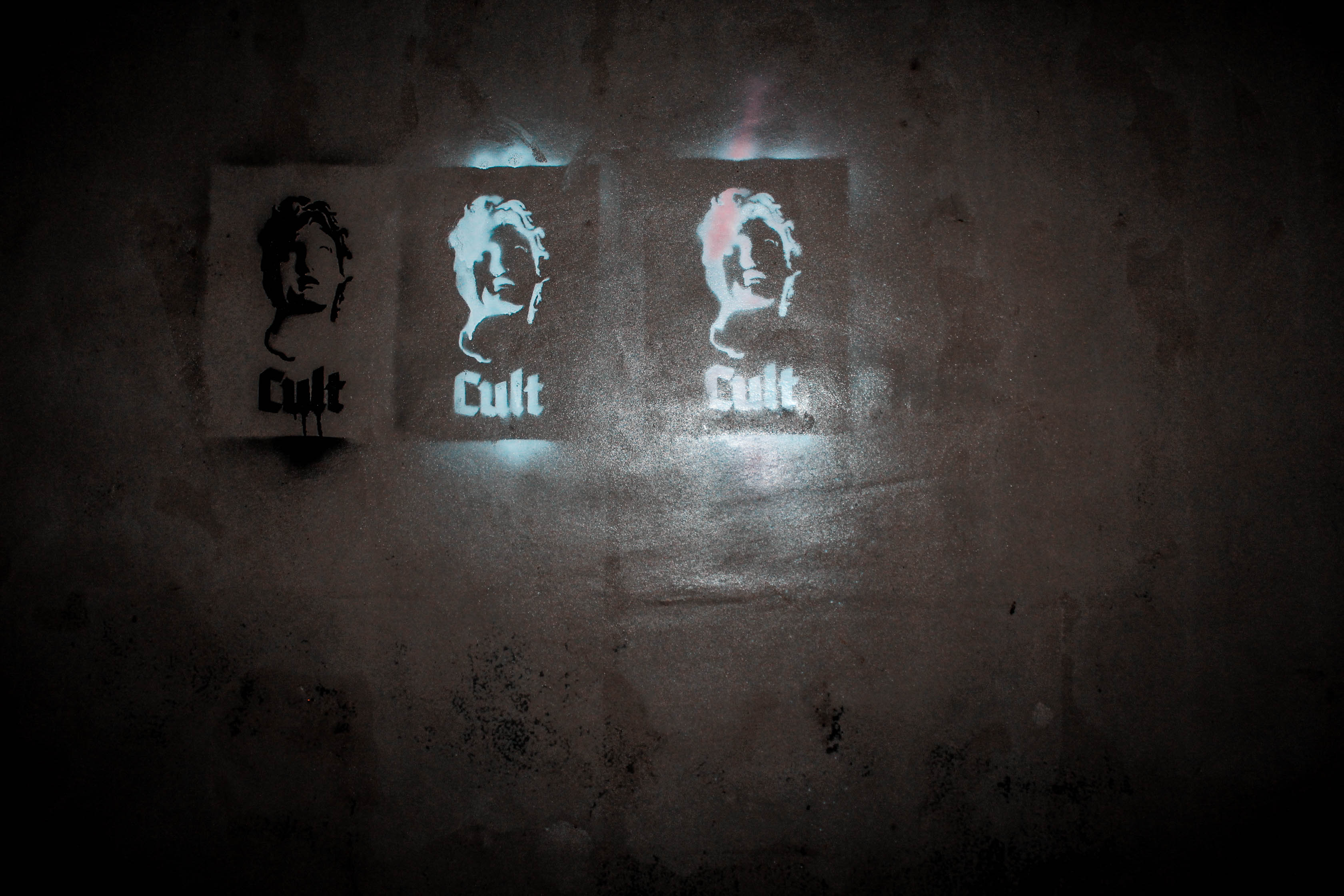
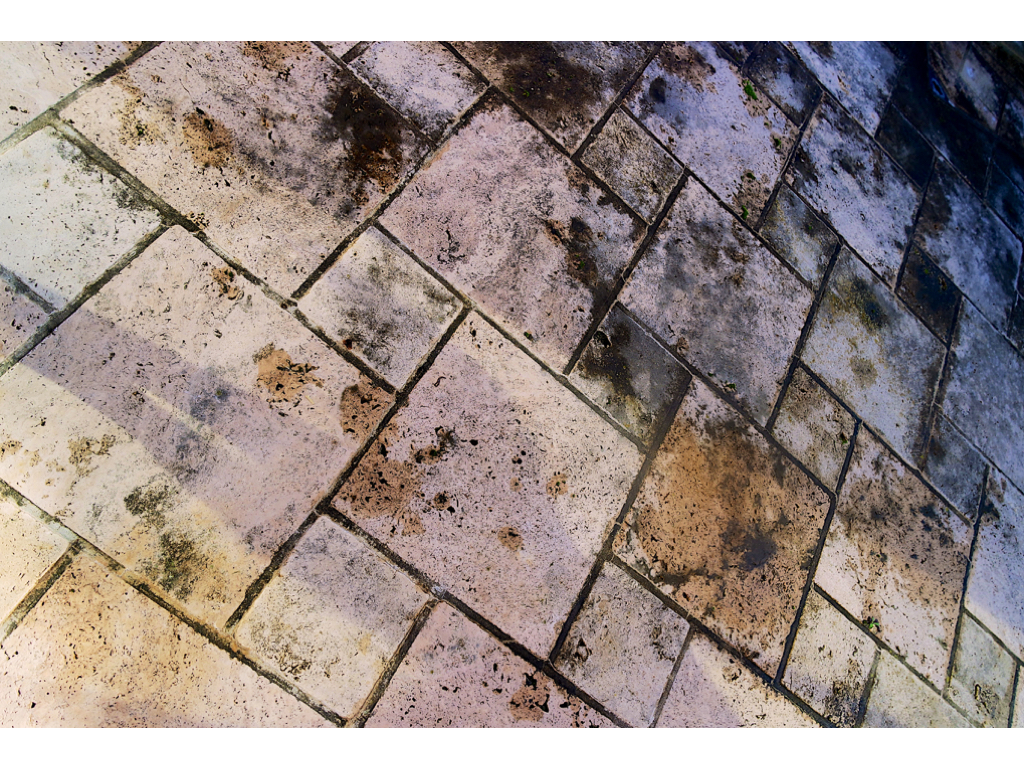
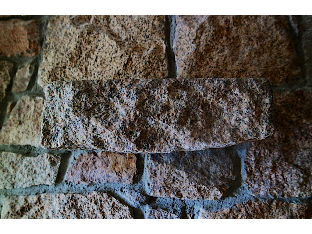
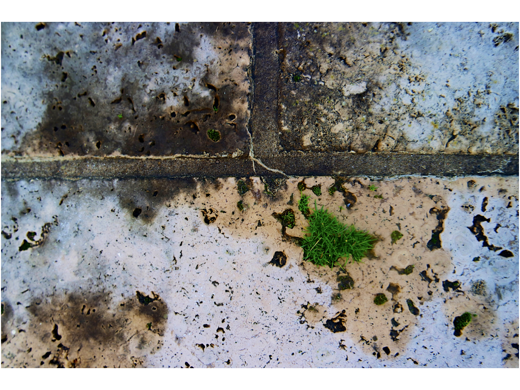
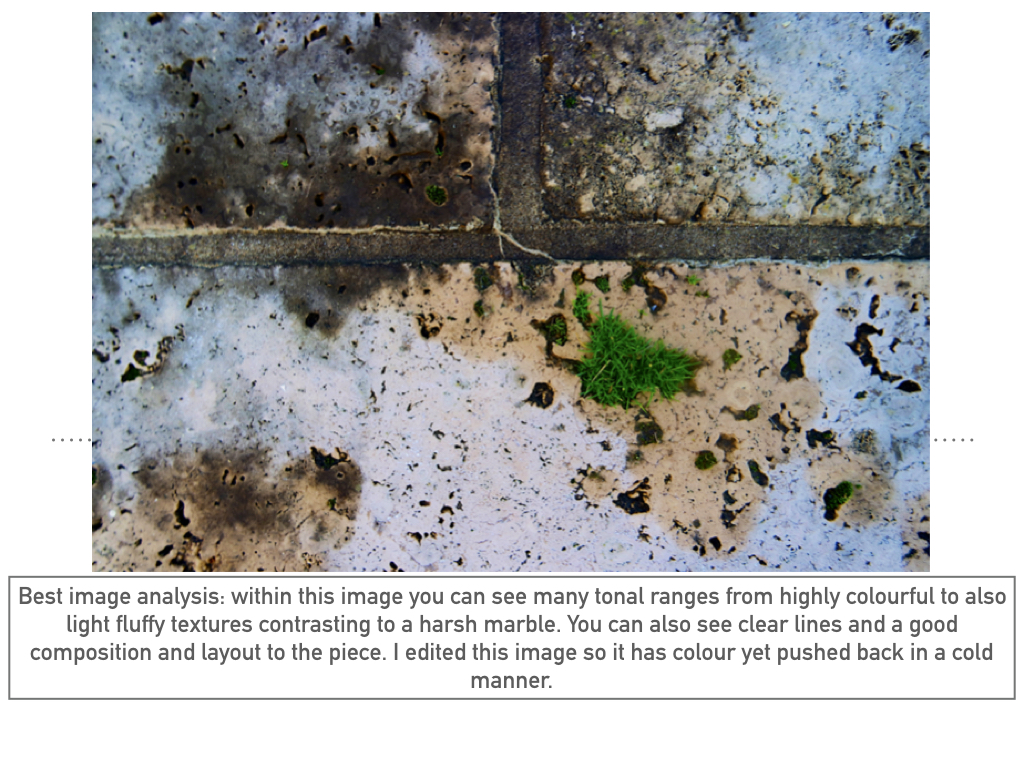
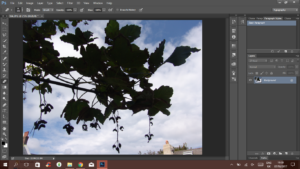
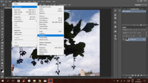
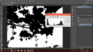
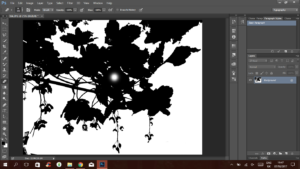
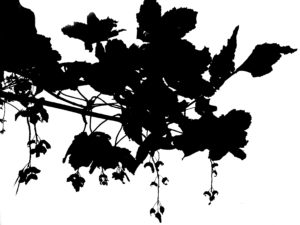
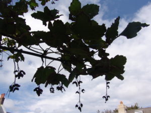
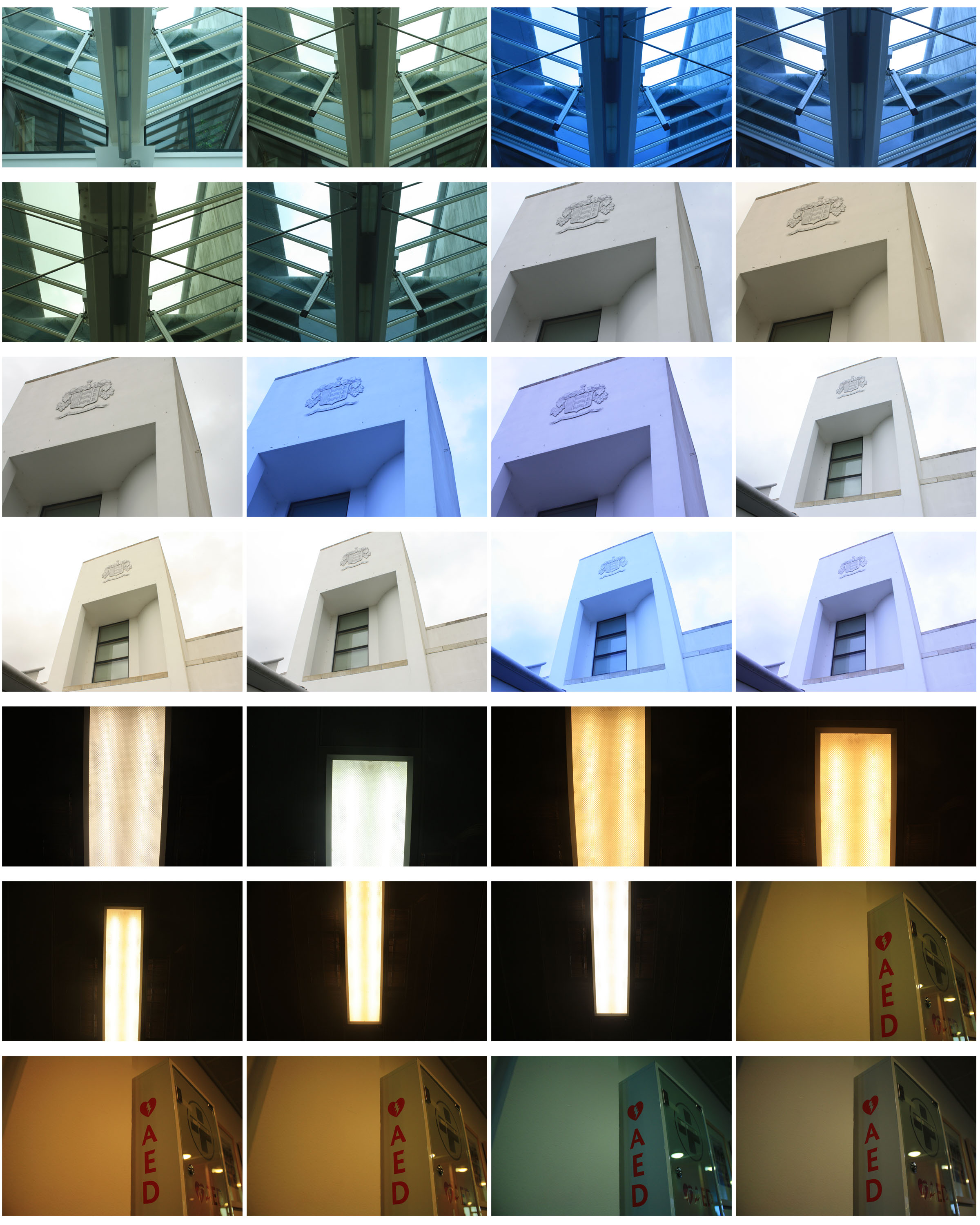
within these photos I simply wanted to capture the lines and highlights within the piece itself. I then decided to further edit these images to create more of a colour impact to the piece itself.
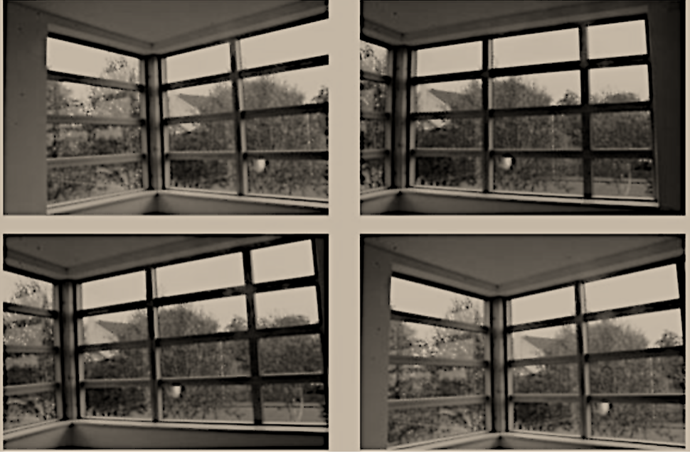
here you can see the final edited image that I have lowered the saturation for and also developed the thickness and how dark the lines are to give a greater focus on the minimalist dimensions of the piece itself.







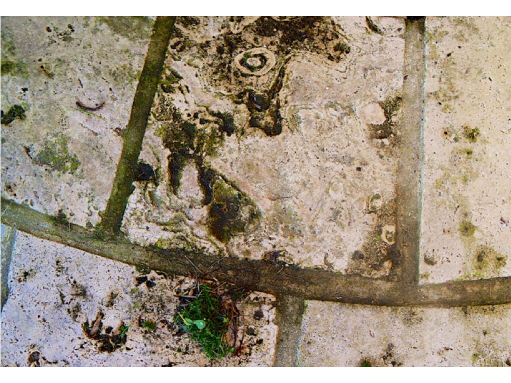
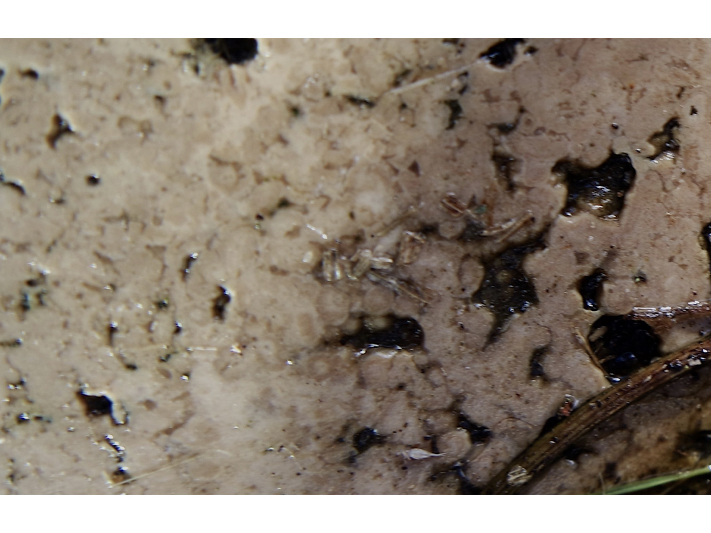
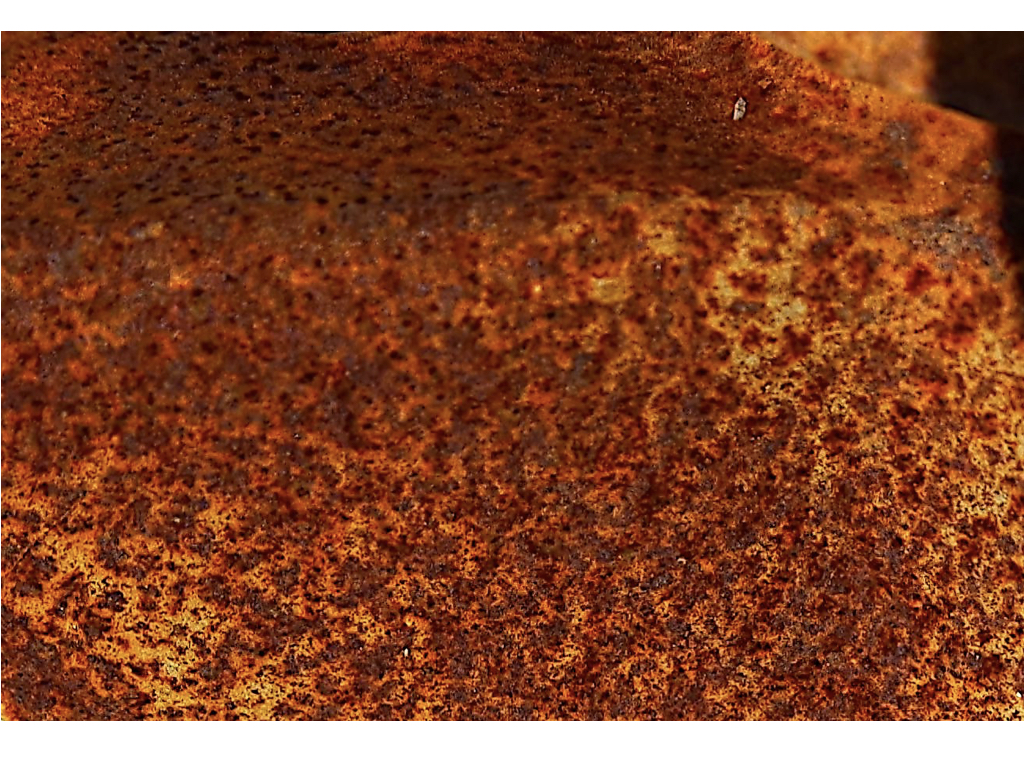
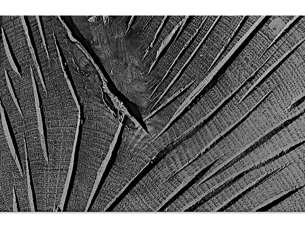

 As you’re taking an image, you would have done this through your viewfinder or in the LCD display, that you use to frame your shot. With this grid in mind the ‘rule of thirds’ now identifies four important parts of the image that you should consider, placing points of interest in as you frame your image. Not only this, but it also gives you four ‘lines’, that are also useful positions for elements in your photo.
 The theory is, that if you place points of interest in the intersections or along the lines, your photo becomes more balanced and will enable a viewer of the image to interact with it more naturally. Studies have shown that when viewing images, people’s eyes usually go to one of the intersection points most naturally, rather than the center of the shot – using the rule of thirds works with this natural way of viewing an image, rather than working against it.

 In addition to the above picture of the bee, where the bee’s eye becomes the point of focus. The next time I went out I decided to try this within my photos, to really get the viewers attention to the object of my choice, these were my results:



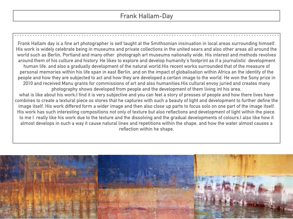
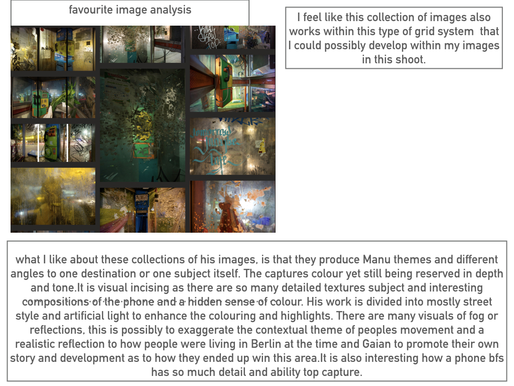
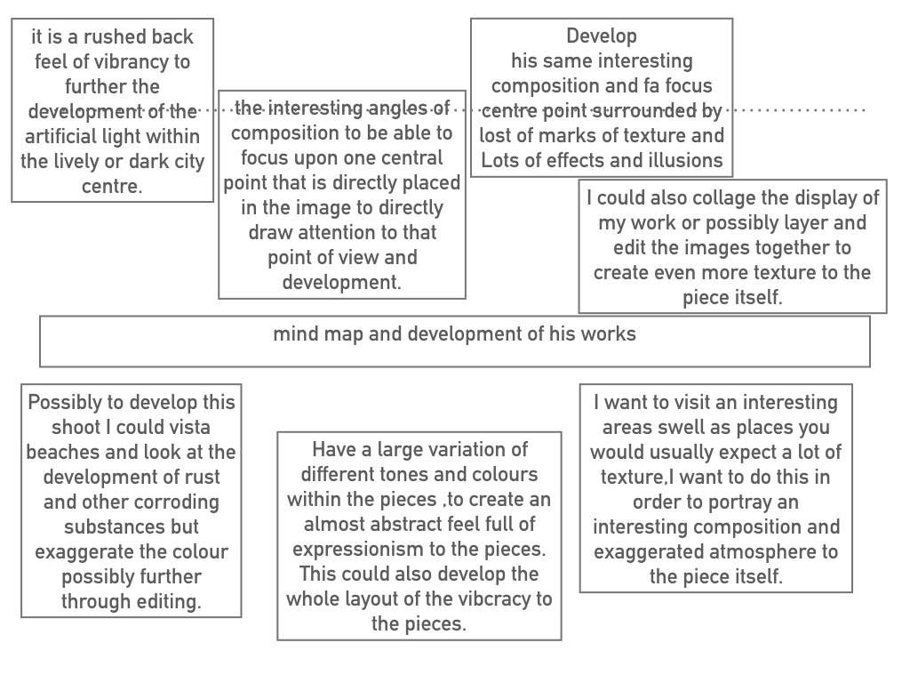
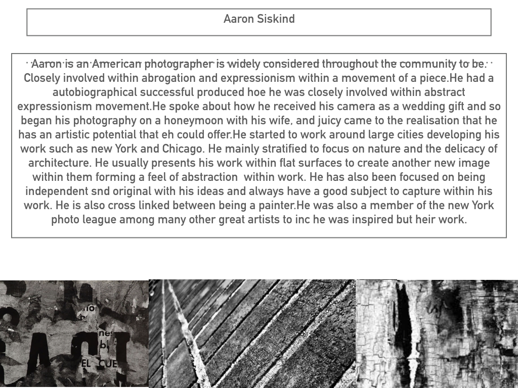
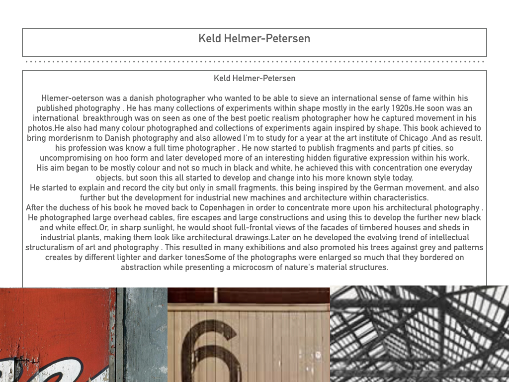
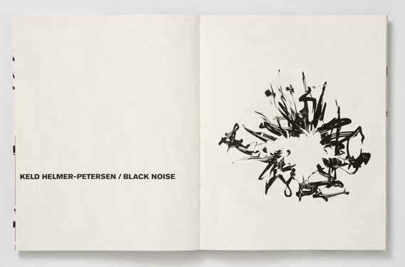
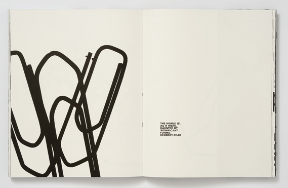
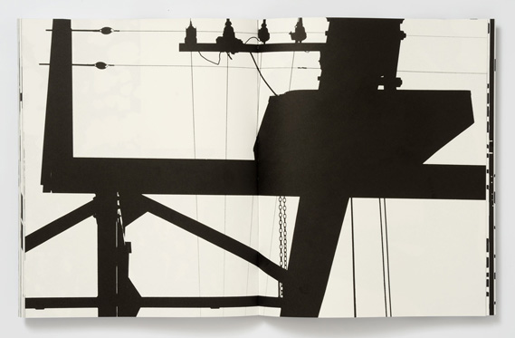
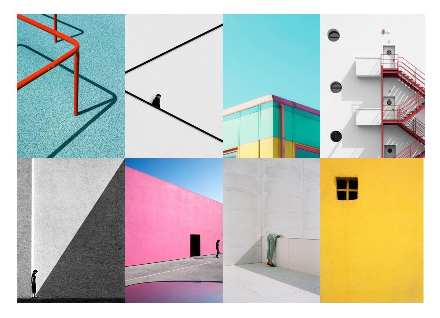 Minimalism is a style used by many 20th century artists and photographers, it focuses on having a minimum amount of concepts in an image such as colour texture and shape. The style became popular within architecture,art and photography in the 20th century and is still considered a modern style. two of the first artist to make minimalist art where Frank Stella and Piet Mondrian who both used colour blocking in their work. Keld Helmer Peterson and Mirko Nahmijas were two influential photographers who took minimalist photographs in the 20th century, they both focused on architecture as their subject.

 Some of his best known work focuses on the style of minimalism as seen in his book ‘122 colour photography’ which he released in 1948. the book was very simple and included many abstract and minimal photographs often incorporating his interest in architecture. The book was innovative at the time because colour photography was no being used for artistic purposes. unlike other photographers in the 1940’s he made art out of mundane and everyday objects.