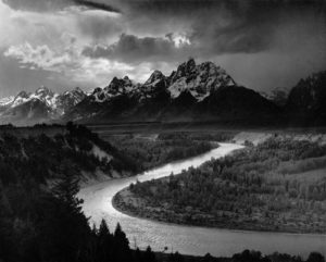
Ansel Adams:
Adams was born February 20th,1902,he was highly influences throughout his surrounding city also being his first memory watching fog moving across the sky and how nature had such a beauty within its movement. Adams himself was a photographer but also an environmentalist,he was born California ,San Francisco. He grew up surrounded by nature happening to be in a sand dune golden gate area,although using these years his once wetly family lost their worth and Adams broke his nose making him distinct for his future life.Due to his older family he has a very historical upbringing which influenced him to be interested himself in a Victorian society both socially and emotionally conservative.
The role of himself as an artist was very much the involvement he had within the environment and movement within it, this including romanticism. He spent many years of his life trying to perfectly articulate and effortless wilderness and have an active involvement in being a ‘mystique:a valid,intangible,and ton-materialistic experience’.His work touched countless people in his effort to show the importance of the environment and saving the remaining lands.
The most impactful place he is said to have pictured evolved his way or working was San Joaquin Valley,he said it was ‘full of caverns, tall pines and stolid oaks, rising to an undreamed heights ad the poignant sounds and smells of ratifier’ This colored landscape modulates his work and earth trademark.when his photography was increasingly important he started excersizing a claim of his energy that was also competing with a beckoning career as a concept pianist.
what I like about his work:
I chose Ansel Adams due to his large significant influence to many and how his work is still praised today for the quality and creating of a landscape to be seen in a light never recognized before.The way in which he uses tones shows a story and a lines of sight to create a flowing and consciousness design of light. his works also never failed to show a power and seen of authority which allows the demonstration of rebellion and what was necessary for a romanticized piece of work. His landscapes are vast pieces of art and never fails to all a story and capture the same presence of a being.
Analysis of favourite piece:
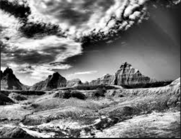
I chose this piece for many reasons,The sky has a clear movement and also power within the strength of tones and also the texture within the sky itself, this shows a strong contrast to the rest of the piece which also shows a clear form and structure in which he intended to portray.There is also a raggedness and solid strength of lines on the mountains, this from a sense of line sand almost a man made aspect to the piece itself. Furthermore the lighter tones and movement of the ground also shows a movement and as if a lane to draw attention to the background and not the foreground.
Technically this image has been divided into three sections,this has been done by the sky,rocks and foreground.It is also technically edited in the way the tones are spread throughout and darker harsher tones to emphasis the main attention aspects overall. Visually there are many interesting aspects which would draw in attention of detail and individual aspects of the landscape.There is almost a manipulation to mirror the ground and sky and the rocks as a divisor and to portray an almost illusion aspect and something you are not able to see naturally,almost a distorted reality aspect.Contextually this has be done in Ansels eyes to shows the beauty of nature and how it needs to be protected,its also done to connote an unseen beauty and how the world could all look like and a preventive to future harm.
Ideas I want to show within my own work:
Throughout my own shoot I also want to show the way in which tones and the strength shows the dominance of an area of an image and how they all need to balance out and also create a sense of line to the main view point . Secondly I want to show a harsh sense of strength within the image wither sing rocks or a design of landscape but then soften this with a contrasting movement formed by wind or a slower time lapse. Lastly I want to show many element of attention within the image,I want it to be interesting and show many interesting concepts in which I have tried to capture and the way in which their own conceptual concepts all intertwined and work throughout each other.
Mind map:


His work clearly all have the same continuation of themes and methods and a precise method in which they are achieved,from observing these You can see clearly how yourself could produce something much similar
My final development of his style:
Finally for my shoot inspired by Adams I too will go to areas that have interesting textured surfaces and also occasional lines of continuation that lead to a dramatic hill area.I will also look at trees and possibly sand dunes and how I can mirror that with the way in which the sky has a drama and texture to.










 I found that the use of nature was particularly effective when it came to the images, as the trees could be used for a variety of different things such as fades etc. Through this I found it great how trees could be used to define a certain aspect of the image itself, and so allowed for the silhouettes of the creatures they wished to be highlight.
I decided to make a response to these ideas by mainly focusing around the human body and nature combined. These were the results:

 To create these I used the opacity tool, this increased the transparency of the top image, allowing for the lower image to be seen more clearly, creating the desired effect. I then used the paint tool to rub out the excess parts of the image to match the shape of the subjects face, making it seem more realistic.
 I also wanted to switch between monochrome and the portrait settings when taking photos to allow for a greater contrast between the lights and darkness of an image. This would allow for a more sinister look when produced due to the emotionless expressions of the subject.
 Before the shoot I wanted to create a mind map of the ideas towards this, so that I would have an idea of what and how to take the photos of both subjects.
 From there I decided to carry out the shoot, these were my results:
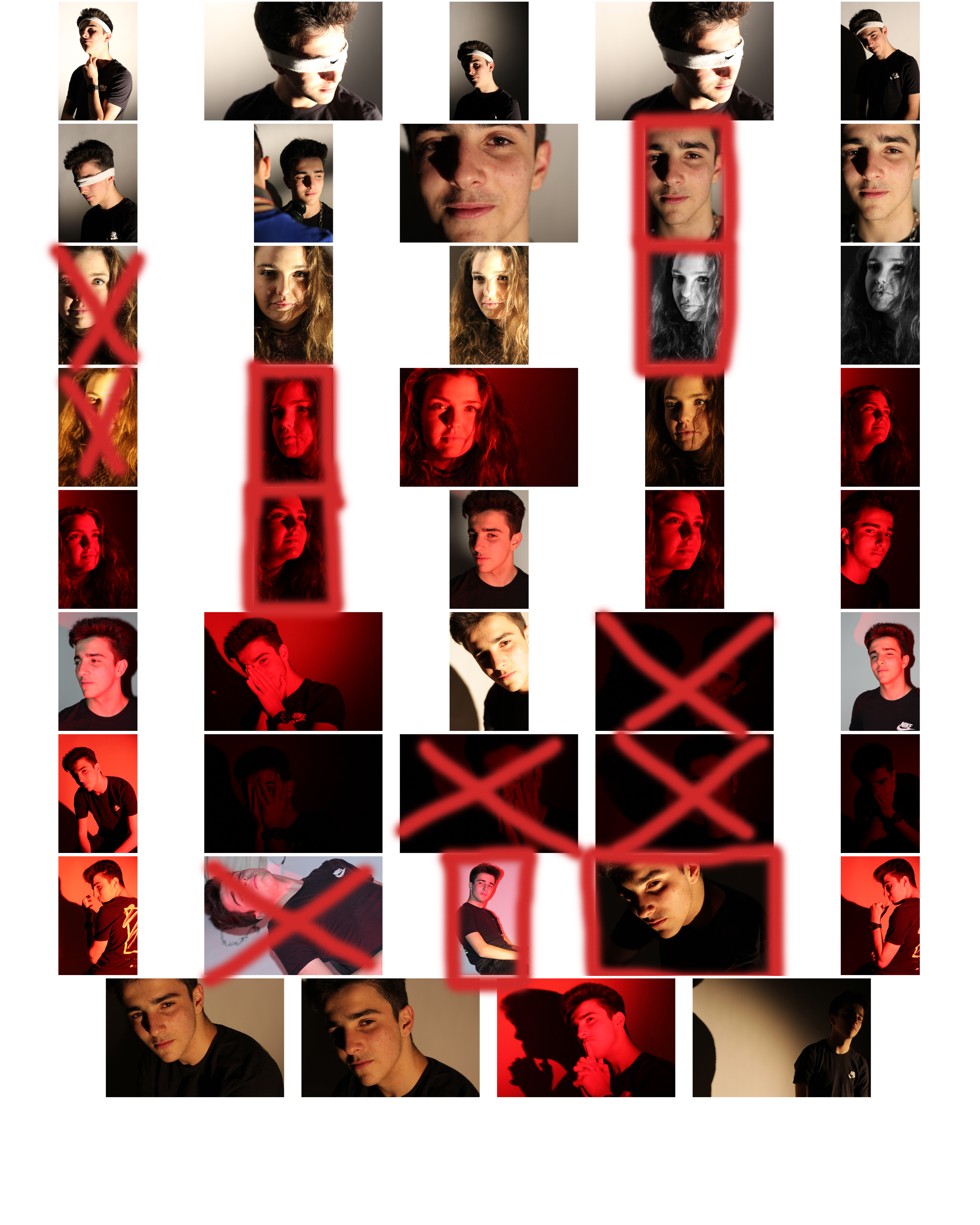
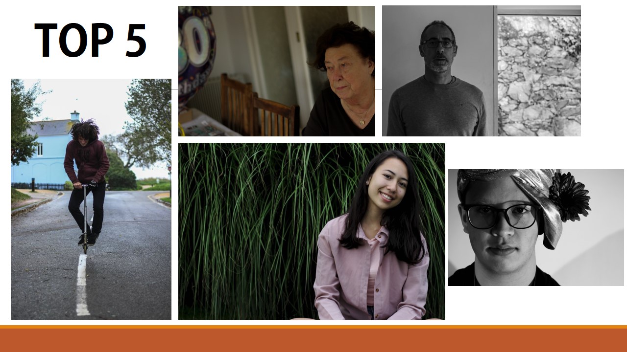
 From here I selected the top ten image from the entire shoot, this would make it easier for me to narrow it down to the final image that I deemed best from the shoot. These were the images I selected:
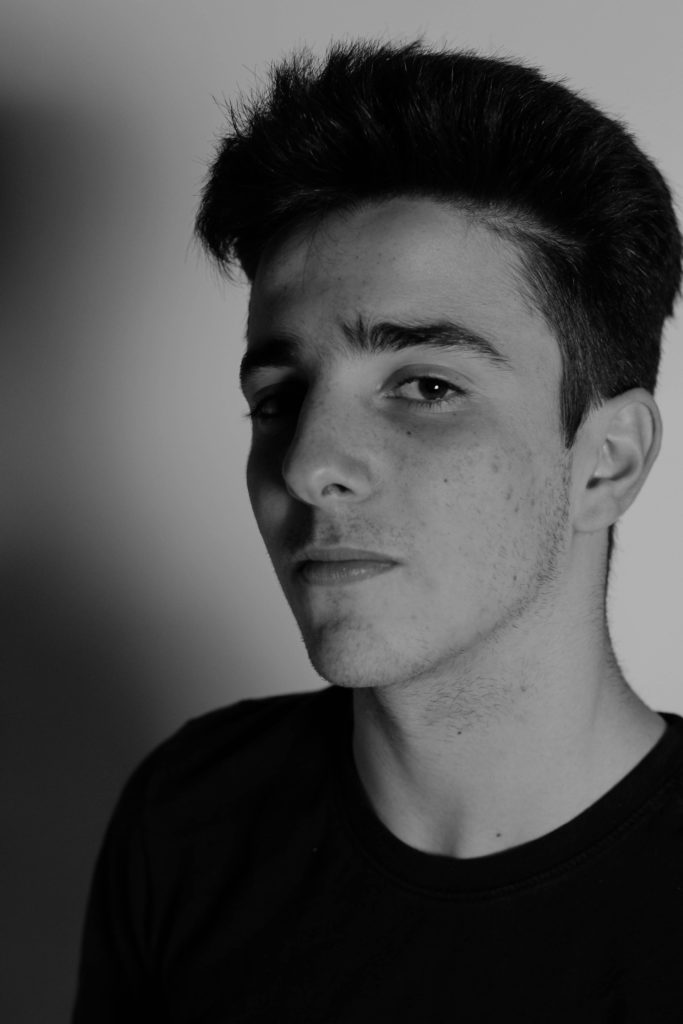

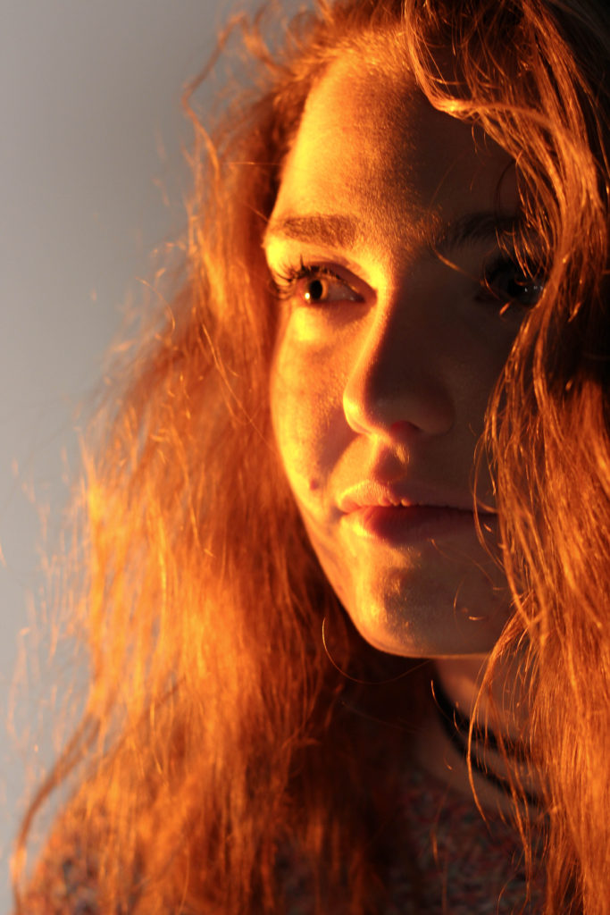


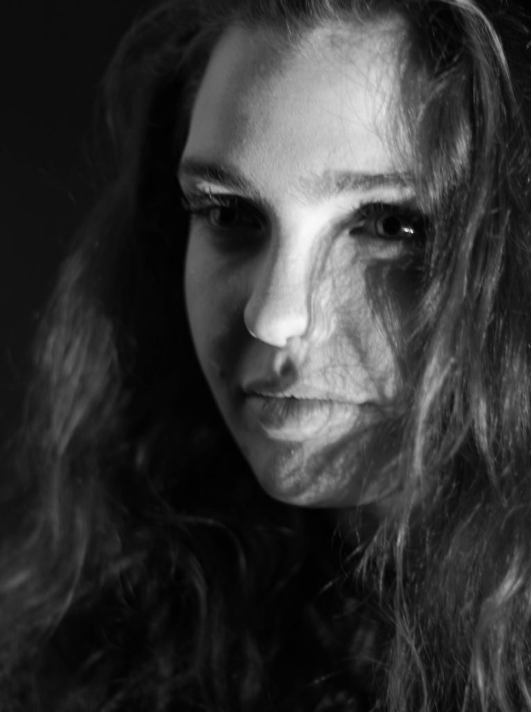


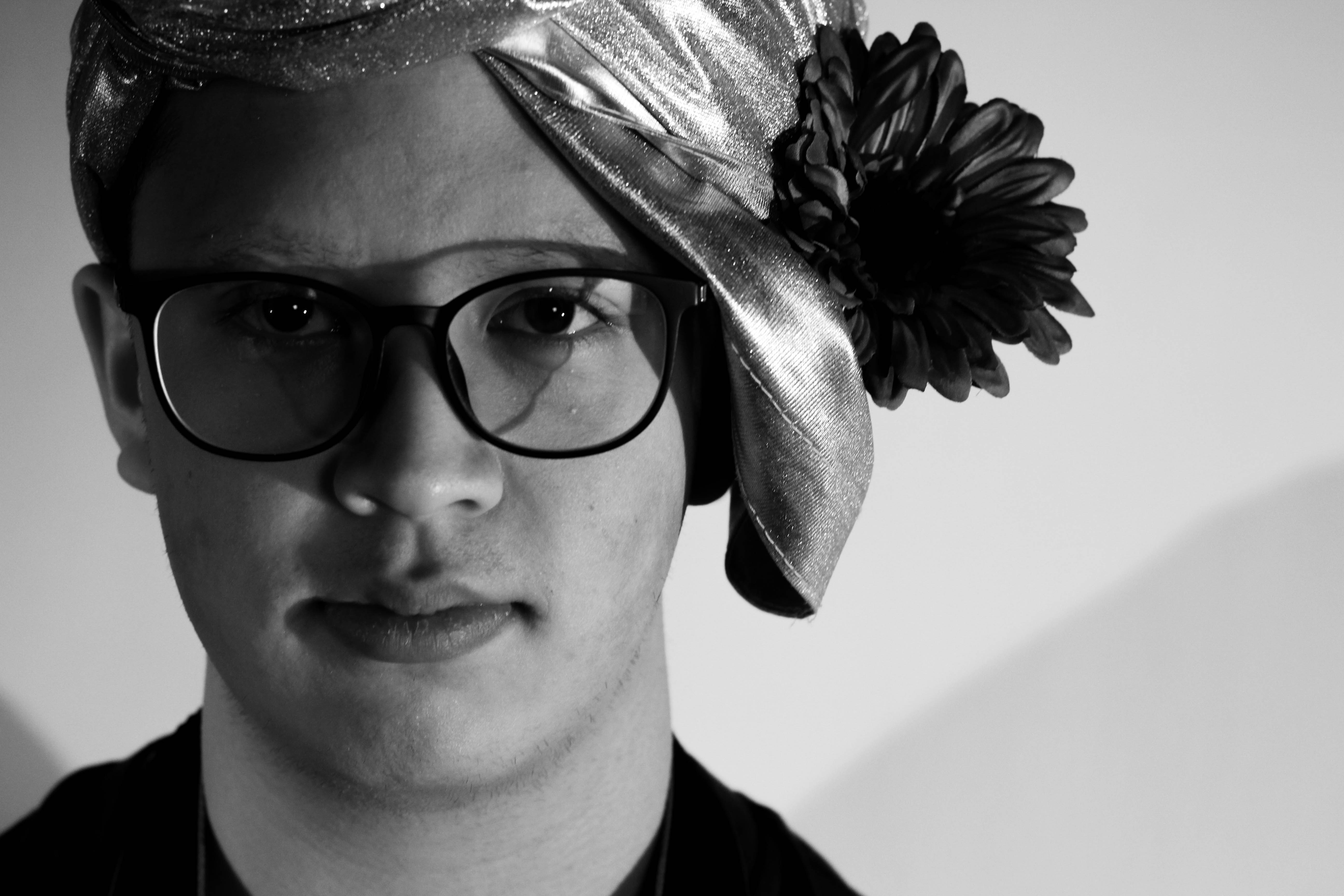 What I loved about this image was the obvious difference between the light and dark on either side of the face. This to me compared with the light backdrop allowed for a clear definition to the face, drawing out certain feature above others.
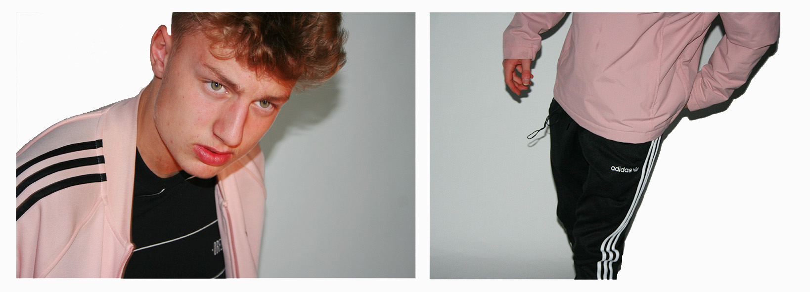

 The images needed slightly enhancing in order to balance the light, contrast, saturation and shadows of the 2 photographs, and cropping in order to make sure that the background of the images look clean and fully white so that the subjects stand out nicely.


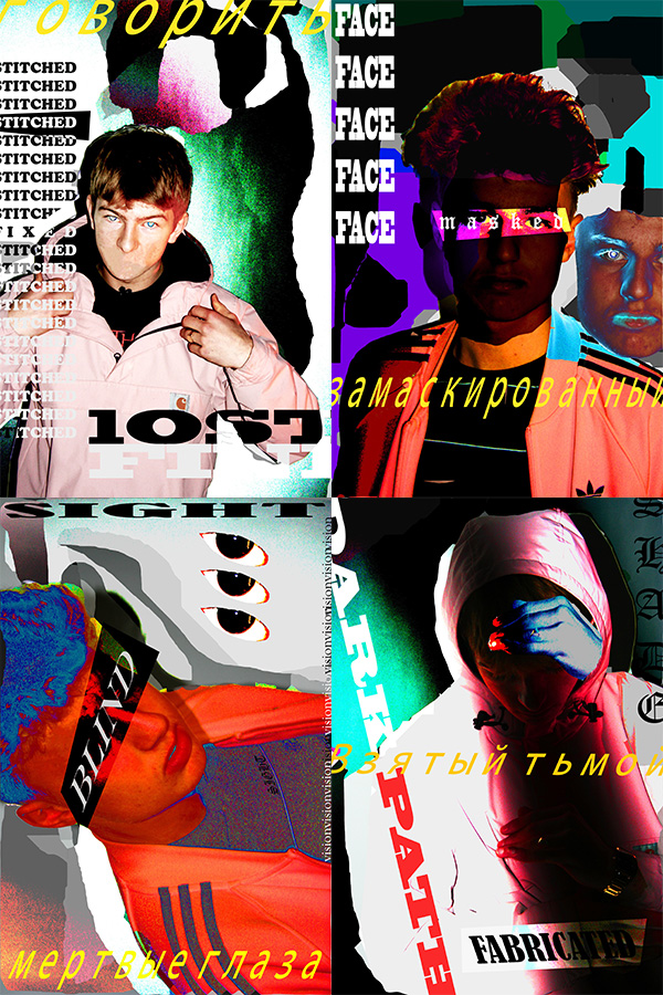



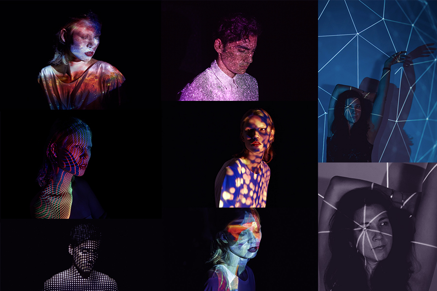
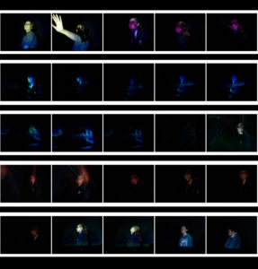

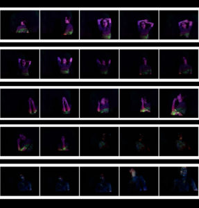
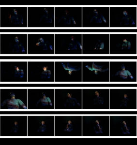
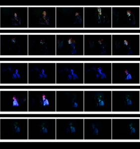
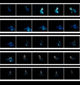

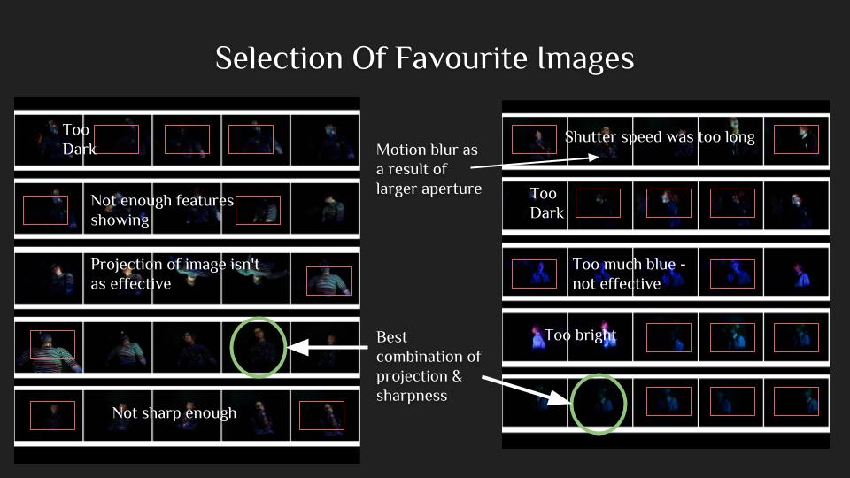
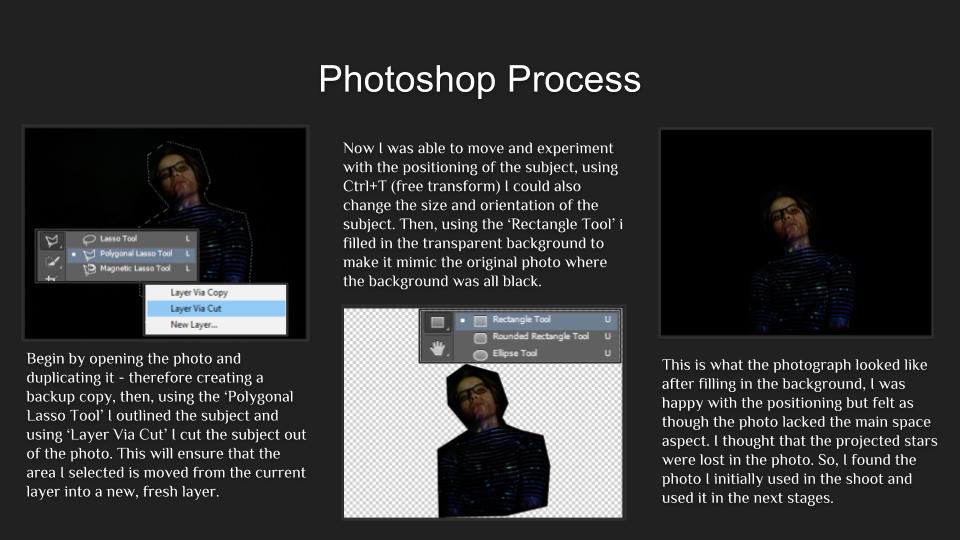
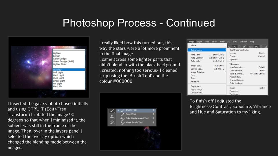

 This was my first and, by far, favourite image. I like the immense focus and the chilling stare of the subject. Adobe Photoshop helped me position the model in the center of the image with a large amount of black filling the frame. I aimed for this effect with all of my images, I wanted the dark to almost swallow my models – I think that this gave my images a more sinister feel and created a more mysterious atmosphere that surrounded my images. Due to this, the photographs also have a more minimalistic feel about them, thanks to the projection aspect the photographs are much more complex and interesting to look at. If I were to do this whole photo shoot again I think I’d try to take some photos with multiple models- with each of them having different projections and experiment with the different effects. I would also try to mix some images together via overlay and such.
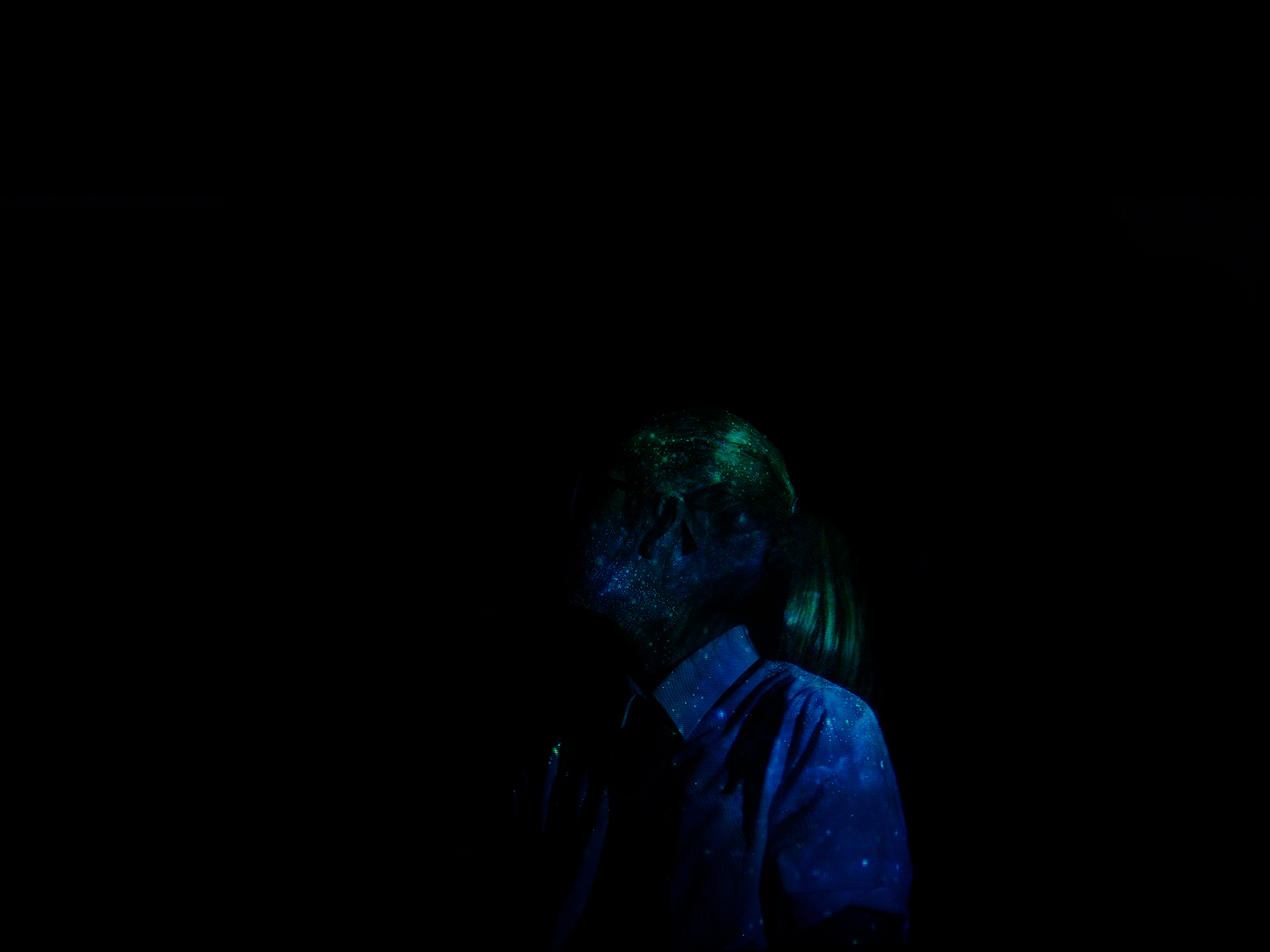 This is my second final image for this subunit, unlike in the other two photographs, this image fully obscures the model’s face and features, This is because she’s looking away from the light source and into the shadow. It follows the general theme and what I was going for, the projection of the stars is very sharp and crisp in this image which makes it more pleasing to look at.
 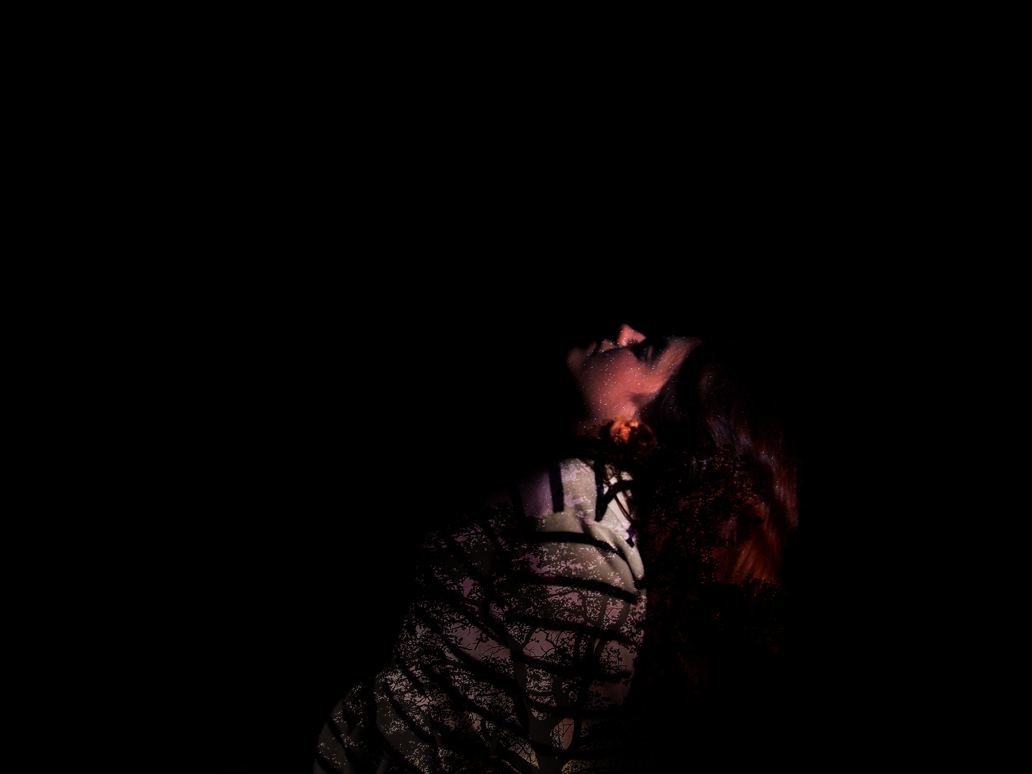 This is the last image, for this image I chose to use an image of a tree with stars behind it. This way I was able to achieve different colours and play around with the placement of the trees in regards to the subject’s posture and such.


