In this shoot I will be focusing on photography surrounding Romanticism. To help me with my shoot I will use Fay Godwin as my influence from a photographer, I chose her because of how her photography uses much of the scenery seen in Jersey and so could use her techniques to provide guidance on what to take as seen below: Before taking the shoot I wanted to pull some ideas together on what to take, allowing for a guideline to my photos, this was my outcome:
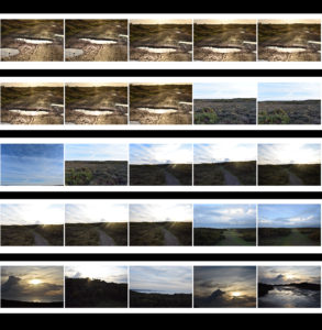
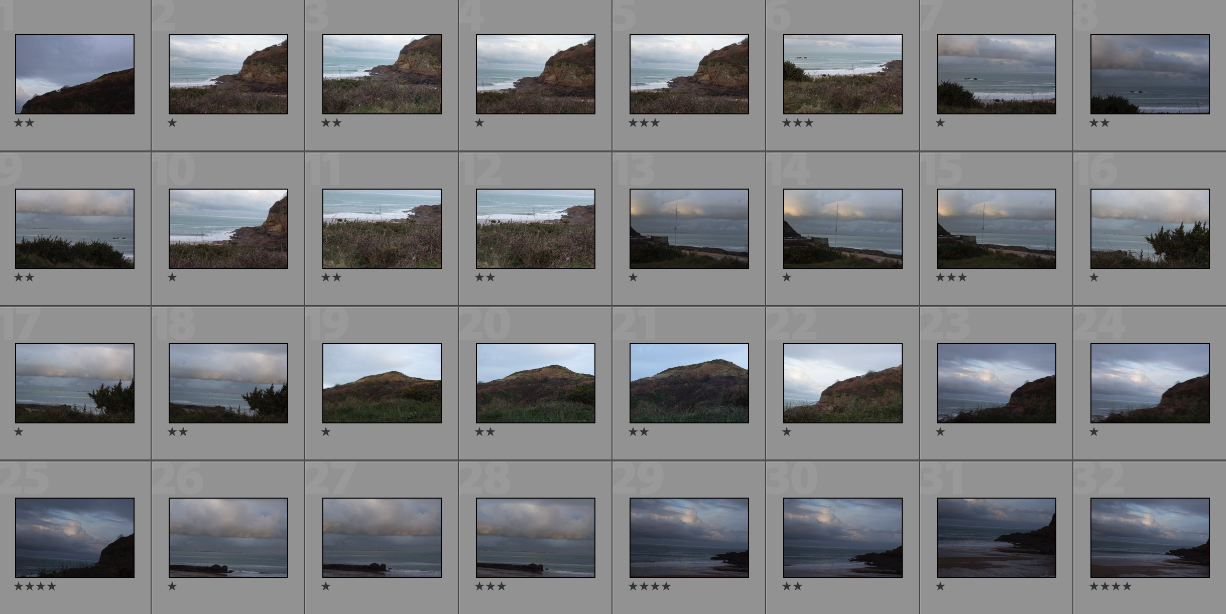
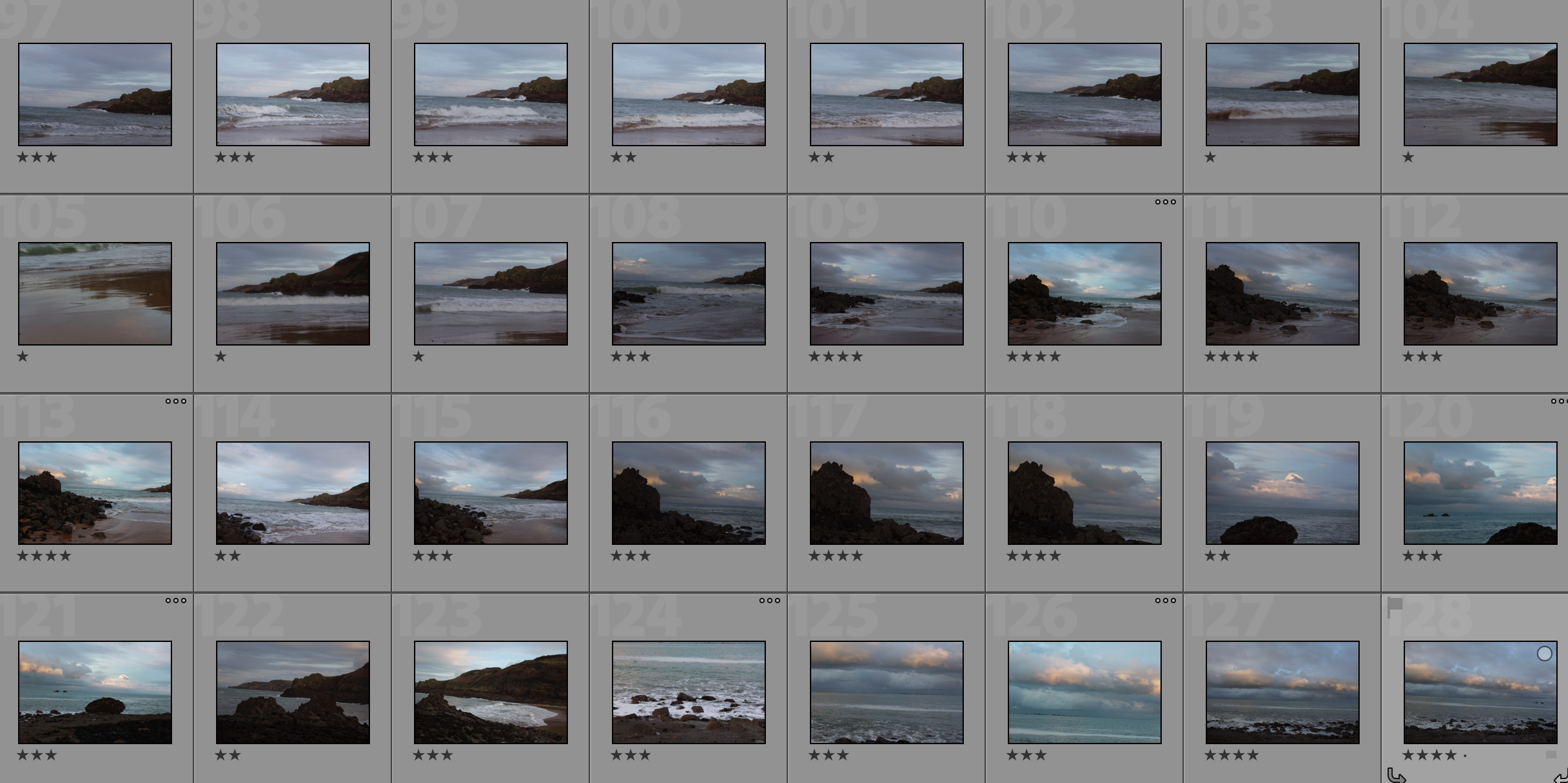
 Once I had a general idea on what I could do for the shoot I finally moved onto the images themselves with these being the outcome:

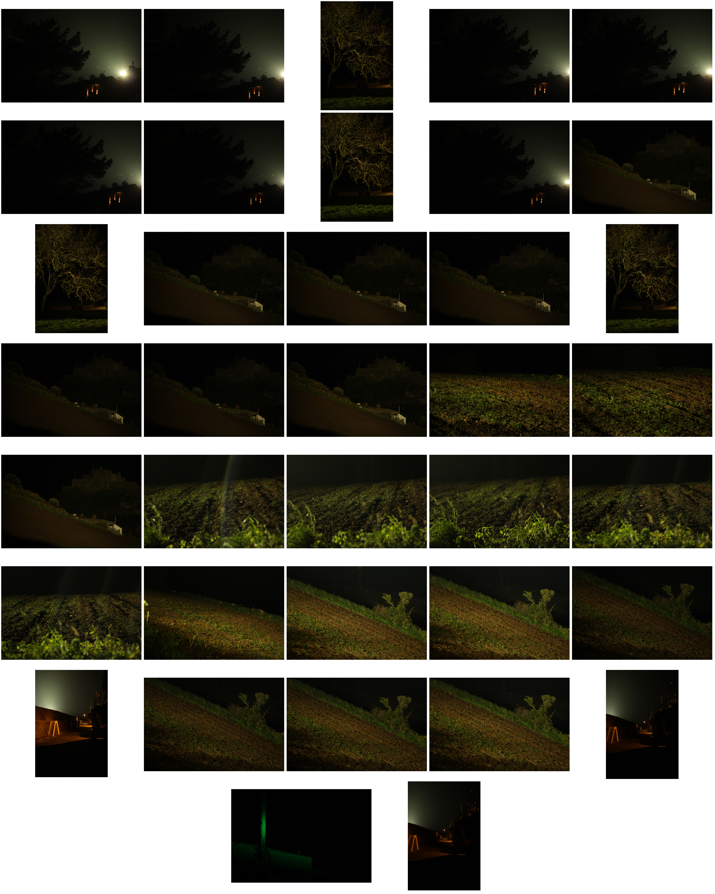
From the photographs I decided on, I made a selection of ten images that I thought presented my best imagery from the overall shoot on the topic of romanticism. These were my choices:


 I chose these images because I thought they popped out from the rest of the shoot, and had a greater understanding of what romanticism in photography was about. I found that their vivid colours and use of depth of field made them particularly effective. From here I wanted to whittle my selection down to just five images to really provide a clearer insight into my final image for the shoot. This is my selection:
 I chose this image due to how I loved the effect created from the back light that was meant to illuminate Gorey Castle at night, that instead silhouetted the housing and trees around it, creating an aesthetically pleasing result as an outcome. And with the slight use of red and oranges from the housing I though it really balanced it out.
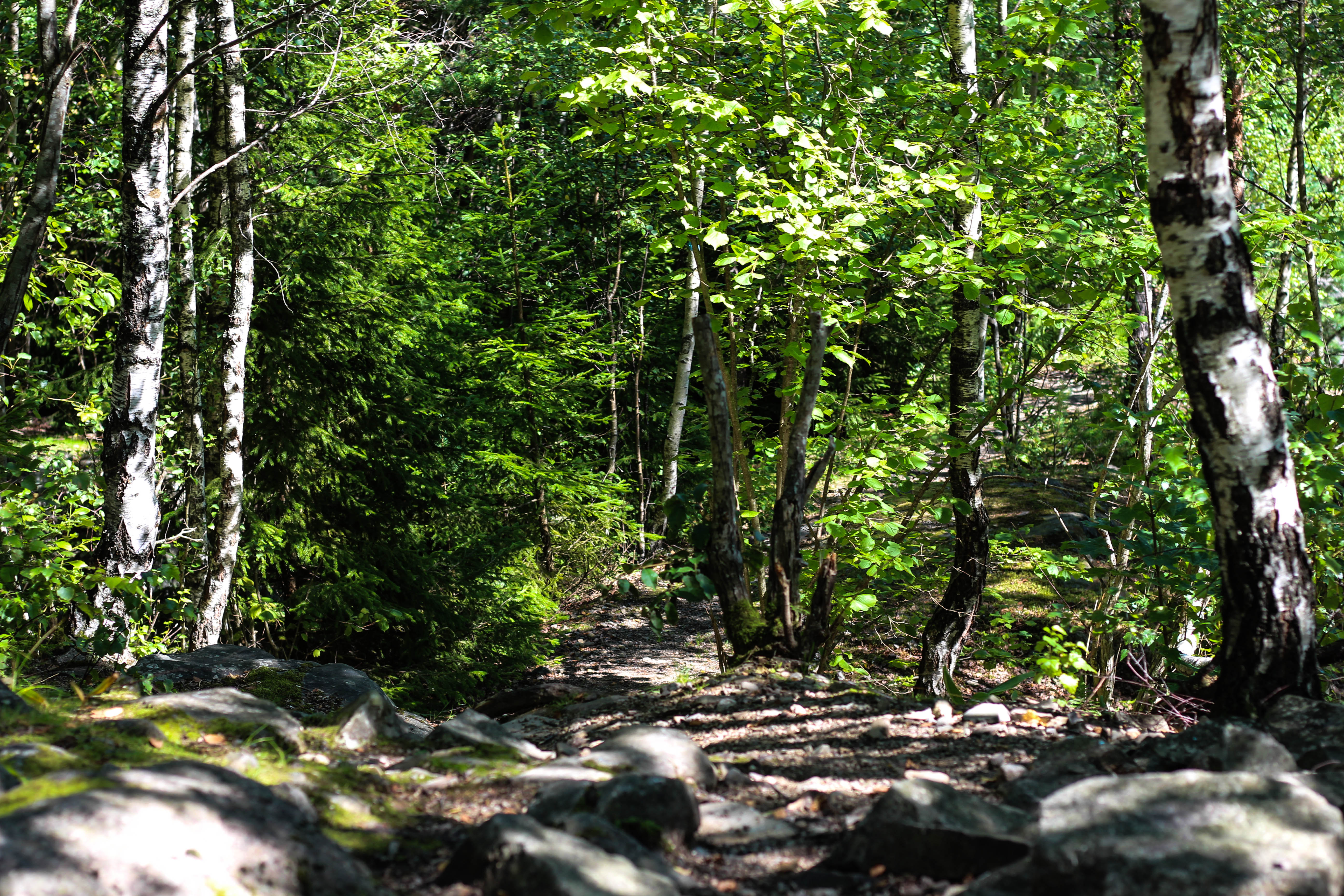 What I loved in this image was the use of the depth of field, this created a focus on a certain section of the woods which instantly drew the eye through the use of its vivid greens. Within the image I used Photoshop to enhance the greens within the image to make it more suited to the theme of Romanticism with the expected outcome as desired.
 I found that this images use of contrast between the light provided by the lamps created an aesthetically pleasing photo. This was because of how by making the oranges within the picture more vivid, it emphasised the shadows created by the surrounding boats, thus drawing the eye instantly to the soft glow of the lamp centred in the middle of the picture.
 The gradient created by the sky I thought particularly allowed for a romanticism theme. This was because of how the majority of the image was made up of the slow but constant changing of shades of blues into yellows, with only a small percentage made up by the landscape. I found that by darkening the ground it created a greater effect onto the sky due to an emphasis to the colours.
 What I loved about this image was the composition and the dark and grim colours. This is because of how the skeletons of the trees create a sinister but beautiful effect on the pathway through the middle of them, with unclear imagery of people in the far distance. I also liked the use of depth of field as well due to how the trees slowly faded and merged into one collective backdrop, whilst maintaining the desired look.
After analysing each of the five images, I decided to come to an overall decision on the final piece from the selection. This is my final choice for the best image out of the shoot:
 I chose this as my final image because of how I loved the contrast created by the floodlights to Gorey Castle. I found that through this it completely emphasised the silhouettes of both the tree and the house in a sinister but fascinating way. I also liked how the floodlight captured by the camera is seen as a circular gradient in which slowly fades into darkness, with the three red lights being there to balance out the image as a whole and not let the black overpower the piece.
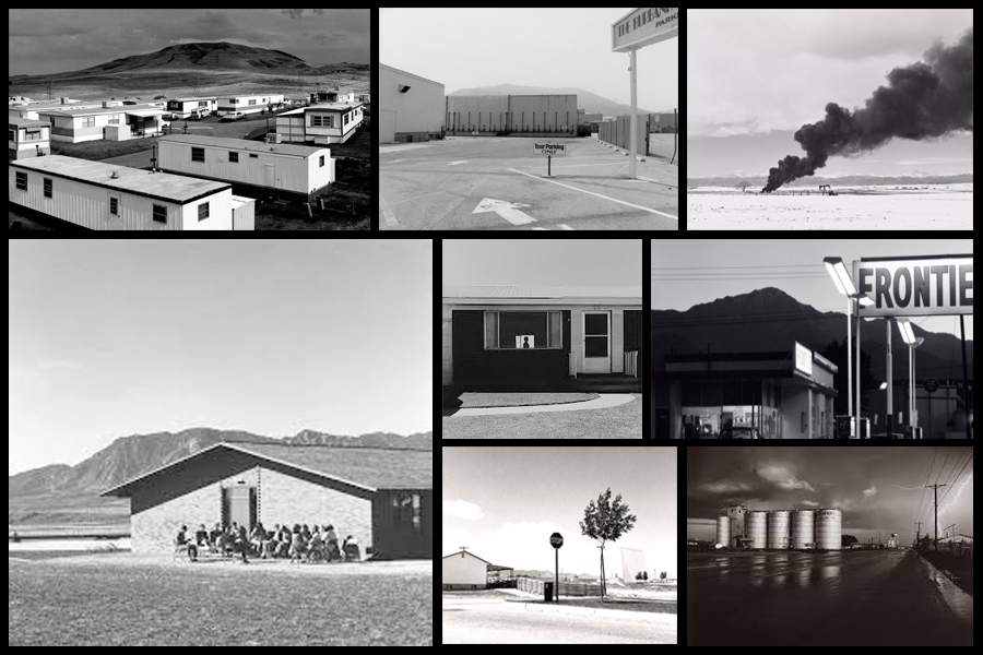

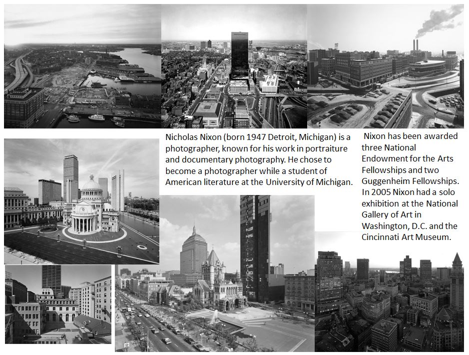
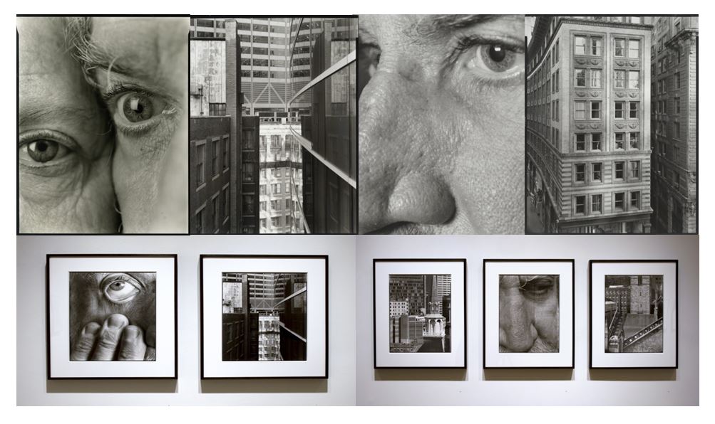
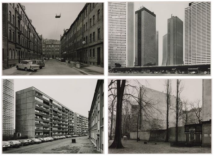
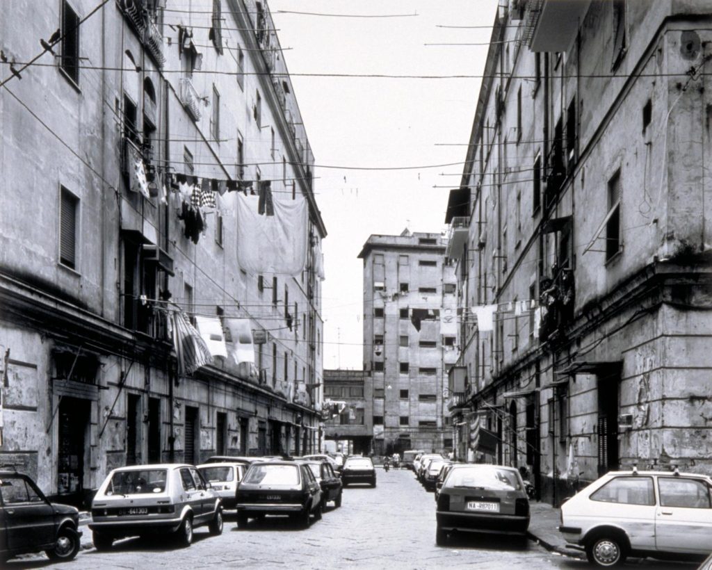
 His very first pictures are mostly architectural views of the city taken from rooftops and part of them were included in the “New Topographics” exhibition in 1975. “My idea at the time was to put my feelings in service to clear description. When I moved to Boston in 1974, I was enthralled with it and was trying to figure it out. Getting on rooftops was a great way to learn…not unlike the way one climbs to the top of a bluff or a mountain: to see more.” He took photos from above, “like a landscape surveyor,” he said. “You could see where the streets go, you could see where everything lines up.”











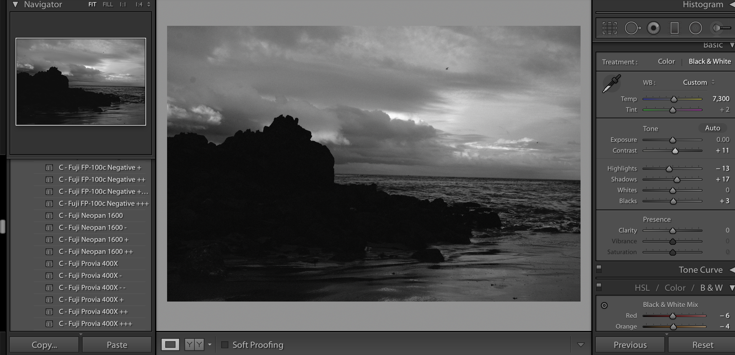
 I then applied the filter Fuji Neopan 1600 to create a strong, contrasting photograph that emphasises the shapes.
 I then adjusted the shadows, highlights, contrast, brightness and whites and blacks in order the fine tune the photograph.

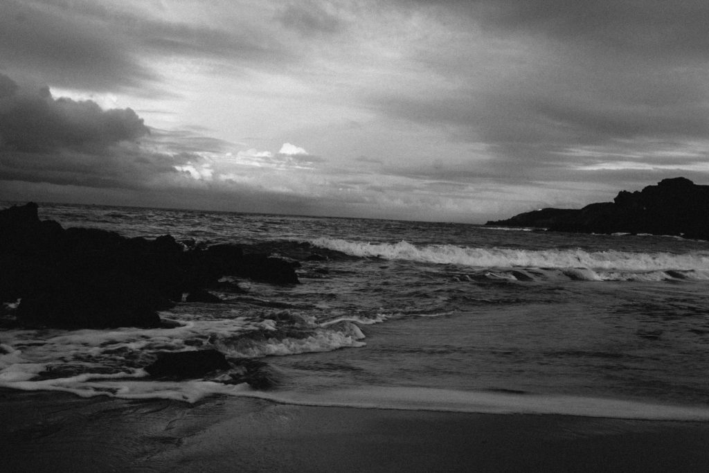


 My Favourite Photograph


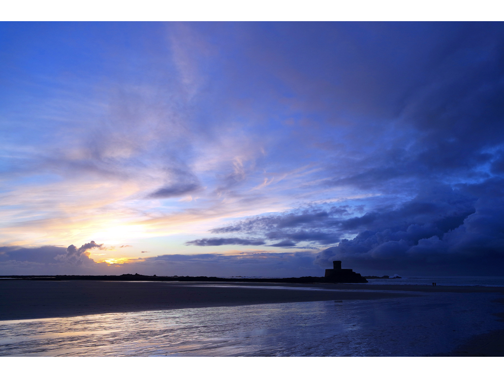

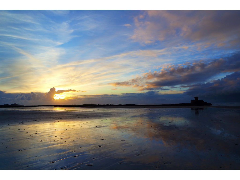


 within the images above I wanted to capture a romanticised landscape in a much more vivid and and poetical extreme of colour caught within the golden hour, although I also wanted to capture a sense of clam that will soon be abounded due to the oncoming stormy strength of the high side and cloud formation.


 Before taking the shoot I wanted to pull some ideas together on what to take, allowing for a guideline to my photos, this was my outcome:
 Once I had a general idea on what I could do for the shoot I finally moved onto the images themselves with these being the outcome:


 I chose these images because I thought they popped out from the rest of the shoot, and had a greater understanding of what romanticism in photography was about. I found that their vivid colours and use of depth of field made them particularly effective. From here I wanted to whittle my selection down to just five images to really provide a clearer insight into my final image for the shoot. This is my selection:
 I chose this image due to how I loved the effect created from the back light that was meant to illuminate Gorey Castle at night, that instead silhouetted the housing and trees around it, creating an aesthetically pleasing result as an outcome. And with the slight use of red and oranges from the housing I though it really balanced it out.
 What I loved in this image was the use of the depth of field, this created a focus on a certain section of the woods which instantly drew the eye through the use of its vivid greens. Within the image I used Photoshop to enhance the greens within the image to make it more suited to the theme of Romanticism with the expected outcome as desired.
 I found that this images use of contrast between the light provided by the lamps created an aesthetically pleasing photo. This was because of how by making the oranges within the picture more vivid, it emphasised the shadows created by the surrounding boats, thus drawing the eye instantly to the soft glow of the lamp centred in the middle of the picture.
 The gradient created by the sky I thought particularly allowed for a romanticism theme. This was because of how the majority of the image was made up of the slow but constant changing of shades of blues into yellows, with only a small percentage made up by the landscape. I found that by darkening the ground it created a greater effect onto the sky due to an emphasis to the colours.
 What I loved about this image was the composition and the dark and grim colours. This is because of how the skeletons of the trees create a sinister but beautiful effect on the pathway through the middle of them, with unclear imagery of people in the far distance. I also liked the use of depth of field as well due to how the trees slowly faded and merged into one collective backdrop, whilst maintaining the desired look.
 I chose this as my final image because of how I loved the contrast created by the floodlights to Gorey Castle. I found that through this it completely emphasised the silhouettes of both the tree and the house in a sinister but fascinating way. I also liked how the floodlight captured by the camera is seen as a circular gradient in which slowly fades into darkness, with the three red lights being there to balance out the image as a whole and not let the black overpower the piece.


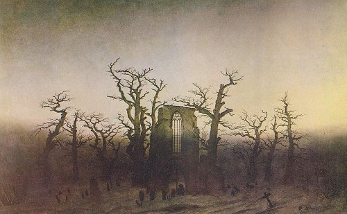

 More about Romanticism can be found