Category Archives: AO2 Explore Ideas

Filters

Author:
Category:

Hannah Hoch and the early pioneers of photo collage/montage

Hannah Hoch (1889 – 1978) was a German Dada artist. She is best known for her work of the Weimar period, in which she was one of the originators of photo-montage (a type of collage in which the pasted items are actual photographs, or photographic reproductions pulled from the press and other widely produced media).  Key themes in Hoch’s work include androgyny, political discourse, and shifting gender roles. These themes all interacted to create a feminist discourse surrounding Hoch’s work. Hoch constantly promoted the idea of women working creatively more generally in society.

Image result for hannah hoch

Image result for hannah hoch

Paul Strand

Paul Strand (1890 – 1976) was an American photographer and filmmaker who helped establish photography as an art form in the 20th century. His work covers numerous genres and subjects throughout America, Europe and Africa. Strand was an early icon of the “straight photography school”. In contrast to Pictorialism, “straight photography” was a move to “pure photography” which was loosely defined as having stylistic traits that were not manipulated heavy to mimic other art forms such as painting.

Image result for paul strand photography

Image result for paul strand photography

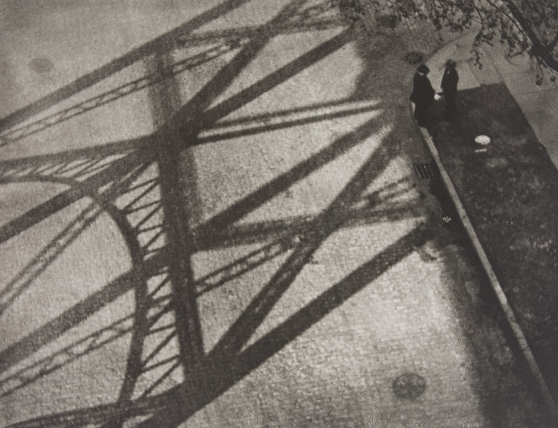
My Favourite Photograph

Image result for paul strand photography

In this photograph it appears that Strand has used and manipulated natural light in order to capture this photographed. He has used the structure of man-made structures against the daylight to create contrast and shapes within the photograph. It appears that a deep depth of field was used as the whole of the photograph is sharp and in focus. A shutter speed of 1/20-1/80 will have been used for this photograph along with an ISO of 100/200/400 to allow enough light to enter the lens whilst keeping the photograph as high-quality as possible. There is a slightly warm and old-fashioned undertone to this photograph.

There is not colour in this photograph – only a warm black and white undertone. This gives an old-fashioned, industrial feeling to the photograph and makes it feel more dramatic. There is lots of contrast between the shadows and the ground which creates a wide range of tones, this adds more drama to the photograph. There is a dirty/dusty texture in this photograph which adds to the industrial feeling of it. It is a flat 2D image mostly due to the focus being the 2D shadows. The shadows create lots of patterns and shapes in the photograph making it more interesting to look at.

Planning the Psycho-Geography Shoot

The aim of psycho-geography is to be familiar with a certain area, and to essentially explore it. To do this I will be focusing on a small urban area within town, to which I will try to become more familial with its surroundings in order to take the photos needed. This is the area I have chosen:To add to my research of the area to be explored, I decided that it would be appropriate to take street view shots in order to have a bit of an insight before hand of the area.Part of the main area I am exploring is the car park, however now has been transformed into the International Finance Centers, with much of it still under construction. Other areas include Liberty Wharf, which was once known as a former abattoir that was restored and converted for the use of a shopping centre.

Some artists that have inspired me in the shoot consist of  Mishka Henner and The Boyle Family. Henner tended to focus on more satellite/birds eye view techniques of the landscape around the world to create vivid and mind-boggling imagery, to which in some cases he would distort them to create more abstract pictures. Some examples of their work can be seen below:As seen above Henner very much focuses on satellite imagery as his main source of art. One technique commonly seen in his work is shaped pixels, this can be done through selecting an area and finding the main color present in that space, to then convert it to just that singular color.

The Boyle Family however take a very different stance on psycho-geography, as seen below:They tend to focus on how the different textures of the floors can create the pattern to make aesthetically pleasing imagery. The images taken are of everyday generic objects that we take for granted and don’t see the patterns within them.

Mishka Henner, Edward Burtynsky, The Boyle Family and Psycho-Geographies

Mishka Henner

Mishka Henner (born 1976) is a Belgian artist working and living in Manchester. His work has featured in several surveys of contemporary artists working with photographers in the internet age. Henner uses technologies such as Google Earth, Google Street View, and YouTube in his work.

Image result for mishka henner

Image result for mishka henner

Edward Burtynsky

Edward Burtynsky (born 1955) is a Canadian photographer and artist known for his large format photographs of industrial landscapes. His work is kept in more than 50 museums including the Guggenheim Museum. Nature transformed through industry is a constant theme in his work.  He uses subjects that are rich in detail and scale but they are open in their meaning. The images produced are meant as metaphors to the dilemma of our existence; they search for a dialogue between attraction and repulsion, seduction and fear.

The Boyle Family

The Boyle family is a group of collaborative artists based in London. It consists of the couple Joan Hills and their children. The Boyle family work across a wide range of media (painting, photography, sculpture, film and more) but they are most known for their Earth studies. They recreate randomly chosen areas of the Earth’s surface using resin and fibreglass.

Typology Homework Assignment

Planning

Task: Take 100+ photos that explore the concept of typologies

Camera settings: I will be using an ISO of 100 with a shutter speed of 1/20 mainly in order to allow the image to be as high quality as possible but this may have to be adapted slightly for darker environments.

Lighting: I will be using daylight for the majority of my photographs but photographs taken inside the car park may be captured with flash or with the car park lights.

Location: Waterfront underground car park and Jacksons car centre.

Context: I will be taking photographs with the work of Typologists in mind.

My Photographs

My Edits

My Favourite Photograph

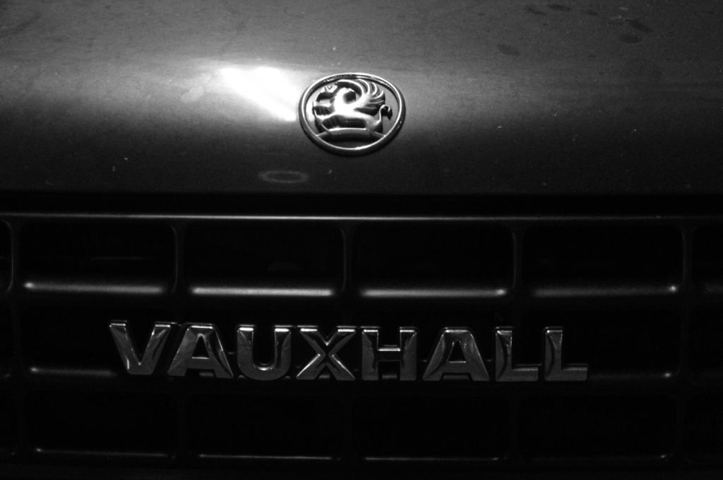
In this photograph I used the artificial lighting the waterfront underground car park. This lighting allowed the photograph to be contrasted with the correct amount of exposure. An aperture of f18 was used for this photograph to ensure that the whole of the photograph was in focus with a deep depth of field. I used a shutter speed of 1/20 along with an ISO of 200 to allow enough light to enter the lens whilst keeping the quality of the photograph as best as possible.

There is no colour in this photograph – only black and white. This creates a rustic/old-fashioned styled photograph. There is not a massively wide tonal range in the photograph but the contrasting tones are right next to eachother so it gives a more dramatic effect. It is quite a 2D photograph as it only has one close-up subject with no foreground or background.

This photograph is part of a collection of typology photographs that I took which include the fronts of cars up close in order to show the differences between similar structures on the Earth. I took inspiration for the style of photograph (rustic) from the Bechers’ but instead of photographing the same subjects as them I decided to choose my own typology whilst taking inspiration from their style.

Week 4 | Altered Landscapes | Cut-N-Paste | Composite Images

This week we will be looking more closely at the concept of altered landscapes.

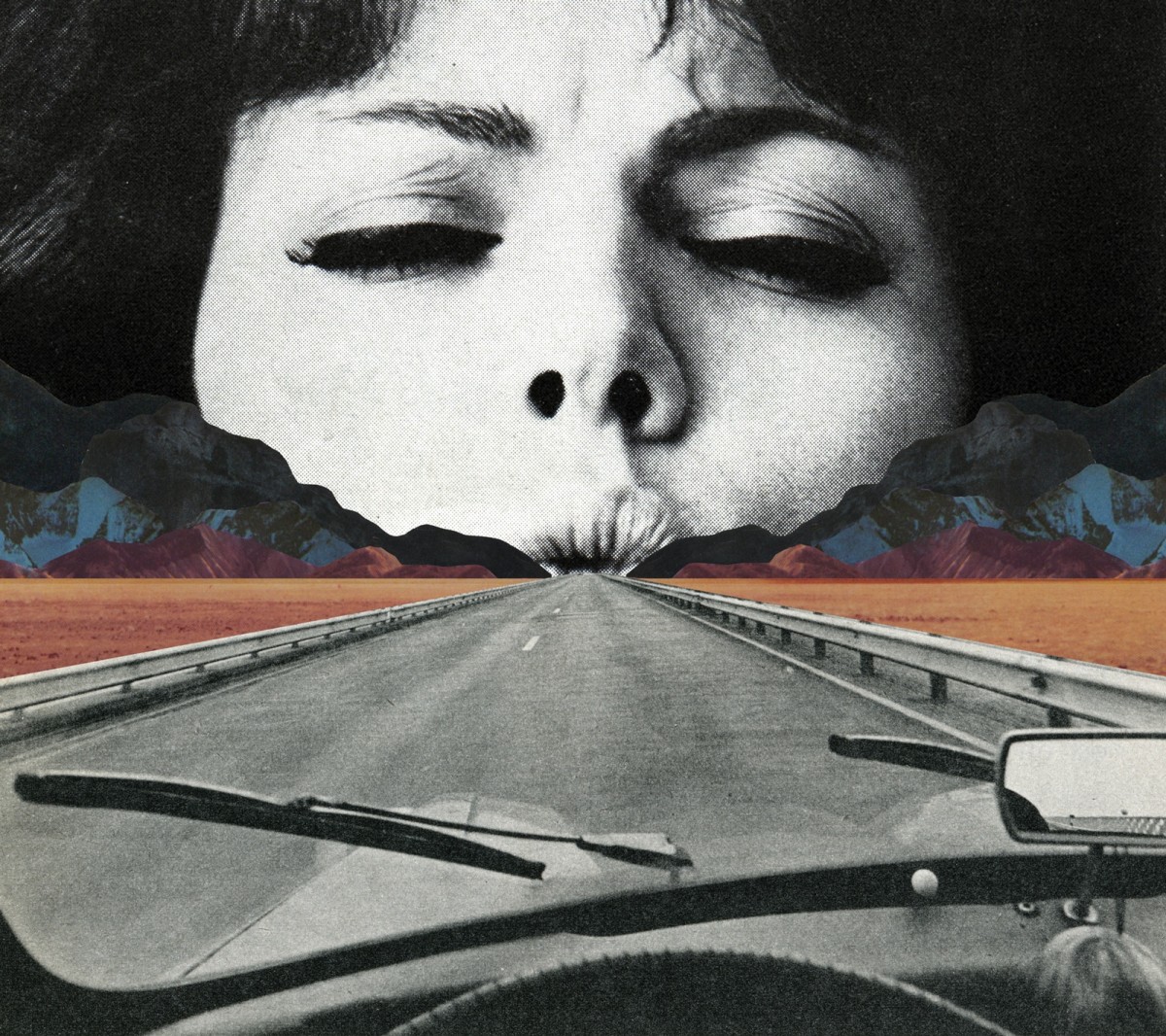
You may choose to employ a range of creative techniques (digital and traditional) to create your environments…

  • Photographing changed, changing or altered landscapes
  • Creating altered landscapes by combining a range of images in Adobe Photoshop
  • Using cut-n-paste techniques and printed matter (from photos, magazines, print-outs, newspapers etc)

You may already have a range of suitable images to start your designs…but will need to conduct a range of photo-shoots to ensure that you have enough high quality images to work from:

Here are some examples to help inspire your ideas…

Tanja Deman

Beomsik Won

Jesse Treece
Sammy Slabink

Krista Svalbonas


CLICK HERE to research Vassilis Konstantinou’s “unintentional sculptures”

CLICK HERE to research “new landscape” photography

CLICK HERE to find more examples of cut-n-paste ideas…

Essential Blog Posts This Week…

  • Research Altered realities,
  • Hannah Hoch and the early pioneers of photo collage  / montage
  • A Case Study on your chosen photographer (plus analysis of a key image)…show how this has inspired your ideas and process
  • Your images, process, editing, selection, final outcomes and evaluation

HANNAH HOCH INTRO CLICK HERE

EXTENSION TASK

Research the work of Joan Fontcuberta…

One of Spain’s most prominent artists, Joan Fontcuberta is best-known for his exploration of the intersection between art, science, and illusion. In Landscapes without Memory, an exhibition of forty large-scale works made between 2002 and 2005, Fontcuberta harnesses a piece of landscape-rendering computer software designed for the military, which creates photo-realistic three-dimensional models based on two-dimensional sources. For his Landscapes of Landscapes series, the focus of the Aperture exhibition, Fontcuberta feeds the software images of famous paintings and photographs by Turner, Cézanne, Rothko, and Carleton E. Watkins, among others, forcing the program to interpret the landscape masterworks as “real.” The contours and tones of the pictures are transformed into three-dimensional mountains, rivers, valleys, and clouds—baroque, fantastical landscapes void of human existence that tap into our desire for unattainable paradise. Thumbnails of the original images are shown next to Fontcuberta’s work.

Through his artistic process, Fontcuberta creates new landscapes that, despite their “postcard perfect” resonance, are purely fictional­ and can never be experienced in nature. The result is “landscapes without memory.”

  • Why do you think Fontcuberta creates “photography” in this way…?
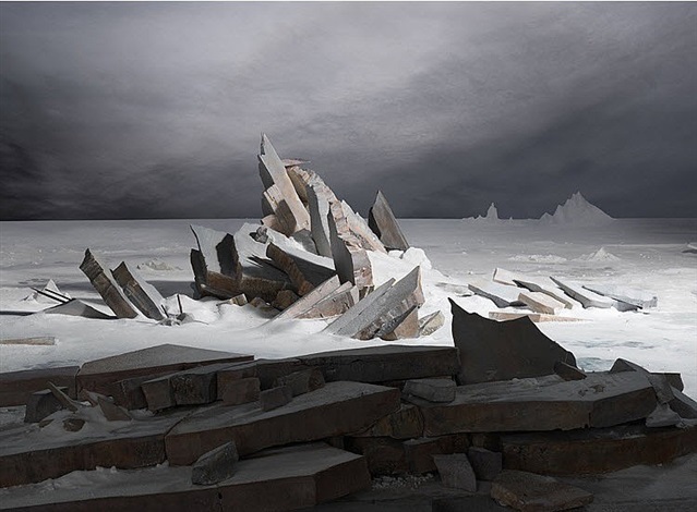
  • How does Fontcuberta’s work compare to the work of James Casabere ??? (below)
  • “The photographs that put artist James Casebere on the map are chilling. Like an architect, he builds a highly detailed model. But instead of turning the model into a life-size construction, Casebere zeroes in on the nano-details of the space and then photographs it to create his “constructed photography.” In the past, he has built and then photographed empty spaces, from miniature prison cells to flooded rooms to suburban homes that recall the housing crisis. To call these sparse, meditative images haunting, with their careful placement of light and shadow, is an understatement.”

    James Casabere (after Friedrich)


Homework 3

Kings Street

King Street forms part of Saint Helier’s main shopping area in Jersey. It is a pedestrianised street which runs from Charing Cross at its west end to Queen Street at its east end.

This map of King Street is believed to date from 1913. It shows clearly how relatively small the properties were on the south side of the street, compared with those on the north, which stretched back over what had previously been wet meadowland.

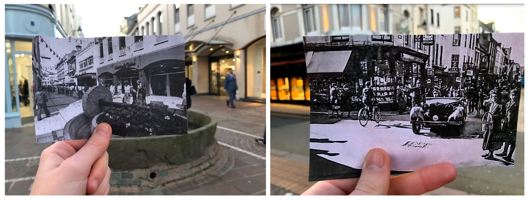
I first planned out where i was going to go to explore psycho geography on google maps and decided to walk along King Street. I printed out old photographs that were taken of buildings from the past, which also capture the environment of that time.  I planned to compare the old images to present day and take a photo of the comparison.I researched what  King Street looked like in the past and displayed a few to show the comparison between the two time periods.

  • I took a few photos of me comparing the present day to old photographs and found that these two worked to best as the buildings line up in both real life and the printed off image.
  • The images also looked better in black and white as it makes them seem more historic.
  • I especially like the one on the right as it shows how different the street was in the past with the car coming from the street which is no longer a road.
  • The one on the left is from King Street in the 1970s. In 1978 the apple crusher was installed at the junction of Rue de Derrière and Ruette Haguais, and La Croix de la Reine at the junction of King Street and Broad Street as part of the pedestrianisation landscaping, a traditional. The left image is from the 1940s showing A German staff car in King Street during the Occupation.

These images also show the change over time on King Street. The first image shows buildings and people in the past and the second image shows what the same buildings look like in the present day. The first image contains quite a few people walking on the pavement dressed in old fashioned clothes, second image contains less people walking in the street and has construction work in the middle of the road.

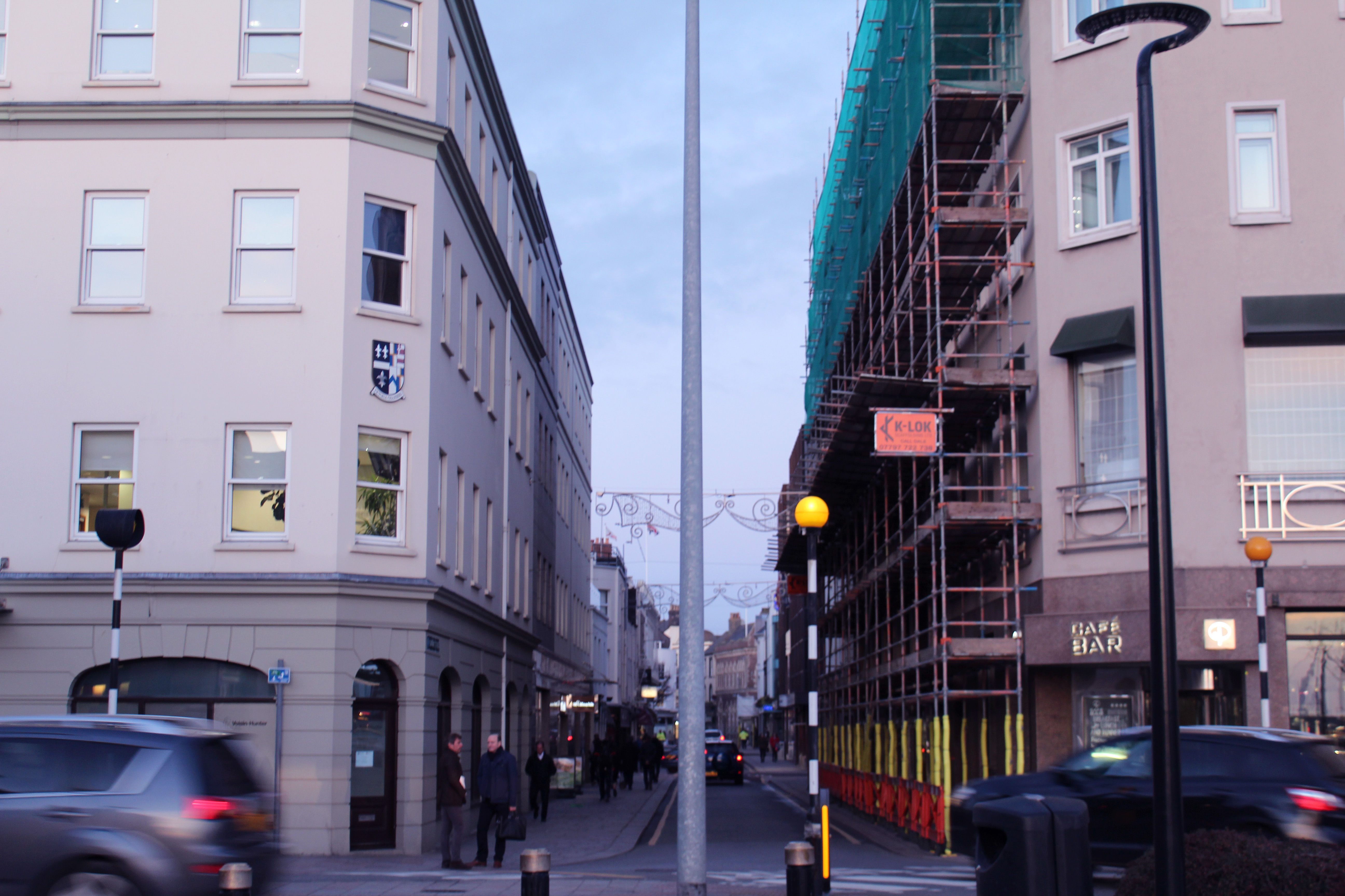
I also took pictures of the urban landscape when comparing the old images and photographed the surrounding environments. When doing this I tried to take the photos taking inspiration from the New Topographic photographers.

  • When taking this photo I tried to capture the movement of the cars and the symmetrical alignment of the buildings to produce an overall aesthetically pleasing image.
  • The lamp post in the middle divides the image in half, either side having similar layouts with the buildings and cars in similar place.
  • I thought the image was powerful enough by itself and didn’t think it needed too much editing so i only gave the photo a pinkish tint and decreased the exposure slightly to create a softer appearance.
  • I chose to take this photo at this angle to show urban activity continuing down the road with the rushing cars, people and construction along it. The blue sky contrasts with the pinkish buildings

Visual:
  • The angle at which this photo is taken makes the surrounding buildings look like they’re taller and towering over the camera, creating a tunnel like street.
  • The buildings have a shadow cast over them but the bright sky creates a contrast between the two, emphasising the pathway.
  • The layout of the image is nearly symmetrical as the photo was taken standing closer to the left side than the right. This makes the buildings on the left seem taller. I took the photo like this as it emphasises the pathway of the street.
  • The photo is taken from a street view like a person would see when looking down the street as the other image showing the history of Kings Street is from the same angle.
Conceptual:
  • The concept of this image was to compare history to present day thought the buildings on Kings Street.
  • And to capture the atmosphere on King Street now compared to then.
Technical:
  • The lighting in this image was natural and had a natural shadow over the buildings which i emphasised when editing.
  • I used a wide angle lens so i was able to show the whole street
  • I used a fast shutter speed to eliminate motion i the image and low exposure which was why the shadows were emphasised
Contextual:
  • I placed both images beside each other to show the comparison from the historic image and the present day image.
  • It shows how buildings and shops have developed and been re-designed over time

New Topographics Research

What Was It?

“What I remember most clearly was that nobody liked it”Frank Gohlke, one of the participating photographers told the LA Times when the exhibition was re staged last year.

‘New Topographics: Photographs of a Man-Altered Landscape’ was an exhibition that showcased a key moment in American Landscape photography. Parking lots, suburban housing and warehouses were all depicted in the same way that early photographers would document the natural landscape- this caused many people to turn their heads on this exhibition. The show consisted of 168 rigorously formal, black-and-white prints and when taken collectively, they seemed to posit an aesthetic of the banal.

source

Robert Adams – Artist Research

Born on the 8th May 1937, Robert Adams is a photographer from America specializing in the landscapes of West America. Adams’s documentation of contemporary western landscapes reveals the environmental damage caused by the suburbanization of such cities as Denver, Portland, Seattle, and Salt Lake City, as well as by the proliferation of nuclear weapons technology in those areas. 

Contact Sheets

j

Analysis Of Photograph

Technical

This is my favourite photograph by Robert Adams, the image portrays a fairground ride illuminated by bright lights. The photo was taken during the evening as the sky was getting darker. Since all of the image is in focus I can assume that Robert Adams used a high aperture of F/22+,  he most likely increased the  exposure to achieve the soft glow from the lights. Due to the black & white feature of the photograph I cannot comment on the white balance or colour composition of the image but due to the vast range of grays it can be implied that the colours created chaos and in that sense, the black and white aspect was able to create a calm and serene atmosphere.

Visual

Referring to Ansel Adam’s tonal system, the image has the brightest white (#ffffff) but lacks the darkest black, despite this, it still  contains a wide range of grays. The composition of the photograph is very successful, the ferris wheel isn’t in the direct center of the image, in fact, the top half of the image is incredibly plain and predominately one colour. This, however, doesn’t in any way serve as a disadvantage to the photograph. Naturally, the eye is drawn to the center of the ferris wheel; then to the bright lights and finally to the looming clouds.

Contexual

The name of the image is ‘Longmont, Colorado’ taken from the series ‘Summer Nights’. The image was taken roughly around 1982 (but printed in 1989).

For about five years, beginning in 1974, Adams embarked on an experiment, he made a series of photographs at night, the opposite of the high-altitude daylight used in most of his previous photographs. The project brought an element of risk he had not experienced before. In this photograph, Adams isolates the ferris wheel lights against a threatening sky to create a scene both delightful and ominous.


Marcus DeSieno Image Analyse

Who is Marcus DeSieno?

DeSieno us a lens-based artist interested in how the advancement of visual technology is changing continually and enhances our view of the world. DeSieno received his first MFA in Studio Art from the University of South Florida and is currently the Assistant Professor of Photography at Central Washington University.

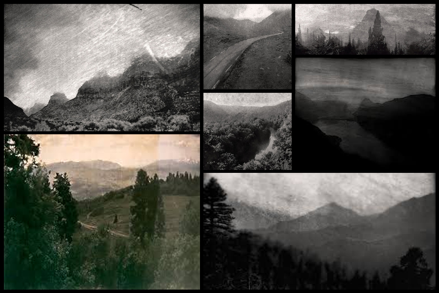
His work has been displayed nationally and internationally at various places such as the Center for Fine Art Photography, Candela Gallery, Aperture Foundation etc. the work has also been used in a variety of publications such as National Geographic, Slate etc. Marcus DeSieno focuses on the idea of surveillance and  macro lens photography as seen below:One image that I particularly liked and decided to analyse was ‘Archival Pigment Print From a Surveillance Camera Feed’ which won the Lens Culture Emerging Talent Award 2016.

62.009730, -6.7716400. Archival Pigment Print of a Still from a Surveillance Camera Feed. © Marcus DeSieno, Winner, LensCulture Emerging Talent Awards 2016.Technical:  Marcus DeSieno’s piece consists of hacking into surveillance feeds to capture interesting imagery, the image itself seems to be taken on a gloomy day, capturing the silhouette of the mountain range in the distance whilst incorporating the Ansel Adams system throughout capturing a range of shades. The picture seems to have been deteriorated creating an old feeling to it whilst maintaining much of the crisp qualities of the original photo. A depth of field can be seen partially used through the use of the graininess and how the road snakes off into the distance removing detail from the image, but at the same time keeping out focus on the road.

Visual: The image consists of a huge range in tone, with a big difference in the contrast between black and white allowing for the photographer to make certain parts of it pop out and draw the viewer in. The snaking road positioned in the center of the image is the focal point of the picture as the light shades of it balances the rest the darkness, seen throughout the rest of the photograph.

Conceptual: His photography consists of the exploration of how surveillance is used in our everyday lives, with the idea that we are constantly watched. Marcus takes advantage of this and uses camera feeds that look upon landscapes to capture the beauty of nature using Archival Pigment Prints to capture the image.


Psycho-geography

What is psycho-geography?

The term psycho geography was made by the Marxist theorist Guy Debord in 1955. It was inspired by the French nineteenth century poet and writer names Charles Baudelaire’s concept of the flâneur, an urban wanderer. Through this new term it suggested a creative and playful way of exploring the urban environment in order to examine its architecture and space. He wanted to create a term that was new to the approach of architecture that was less functional and more exploratory. Some example of psycho-geography in photography consist of:

 As seen above psycho-geography very much focuses around the aspect of architecture, through the recording and creation of visually pleasing imagery of what in most circumstances would look like ruins of debris. Most of the photos are very much based around the exploration of a urban inhabited area, to which what they tend to focus on makes the photos taken look almost desolate and uninhabitable for civilization.

The process of psycho-geography can be simple or complex depending on what you choose to focus on, but the main focus is how we are affected by being in certain places around us due to architecture, weather and who you’re with. Many are taken within a small area to focus on how much you know about the specific area you are in, this is known as practicing dérive, and is a fundamental principle in psycho-geography.

A leading photographic artist in the area consist of Marcus Desieno. Desieno creates almost de-humanised landscapes from hacking into surveillance camera networks, whilst at the same time avoiding privacy problems associated with urban and residential areas. Here are some example of his work:
This form of photography can also be focused around the idea of the constantly being watch as everywhere we go there are cameras, and so can explore this idea by incorporating maybe satellite imagery into the form of photography using creative angles to make the most of the landscape.

Image result for satellite camera imagery of cities