Category Archives: AO2 Explore Ideas

Filters

Author:
Category:

photoshoot 2 and 3:final editing ideas

typology inspiration:
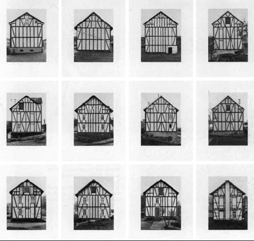
In my last project I have previously looked upon the old more historical buildings and recording them,however I want to find more interesting and landscape inspired images in which I can also develop.I was also going to develop within how I can use the natural landscape to express the way in which colour and the impact that they have but decided against it because it ill not have a specific relation to the ned of my project.
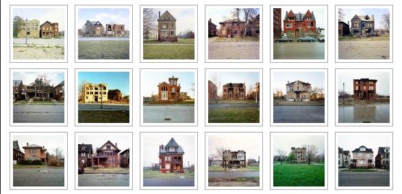
These ideas are much more modern photographers and also fit more into my interest of landscapes within natural and buildings that are purely structural. I think within these images they would allow me to explore more of what I want to develop within my final three weeks.I think this above is a good example of exterminations of the way in which stature and individuals in and areas can e interesting.

I decided to travel around and fine many houses in a similar area that all look very individual but have the same surrounding theme of environment,furthermore for the sunset images I want to capture a strong sense of color within the same beach but different areas and then also expand this to other areas within the island. I think i could show a gradual development of when the sun sets and perhaps even develop panoramic views.

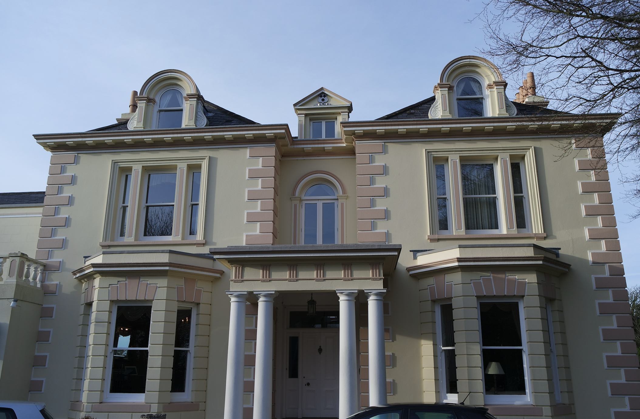
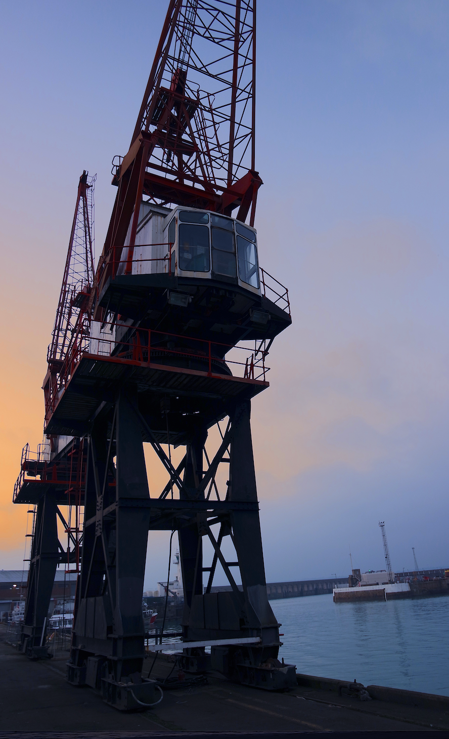
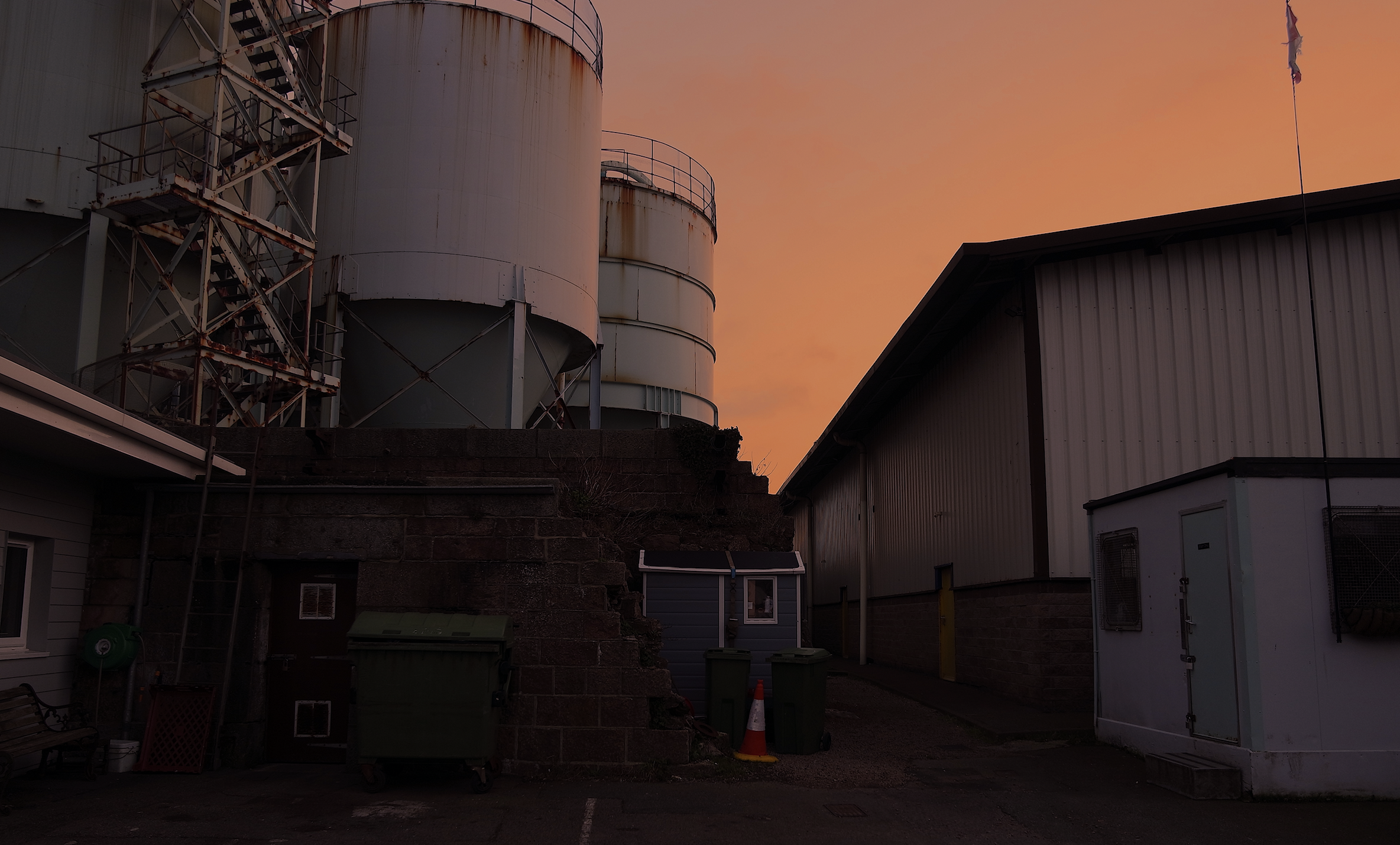
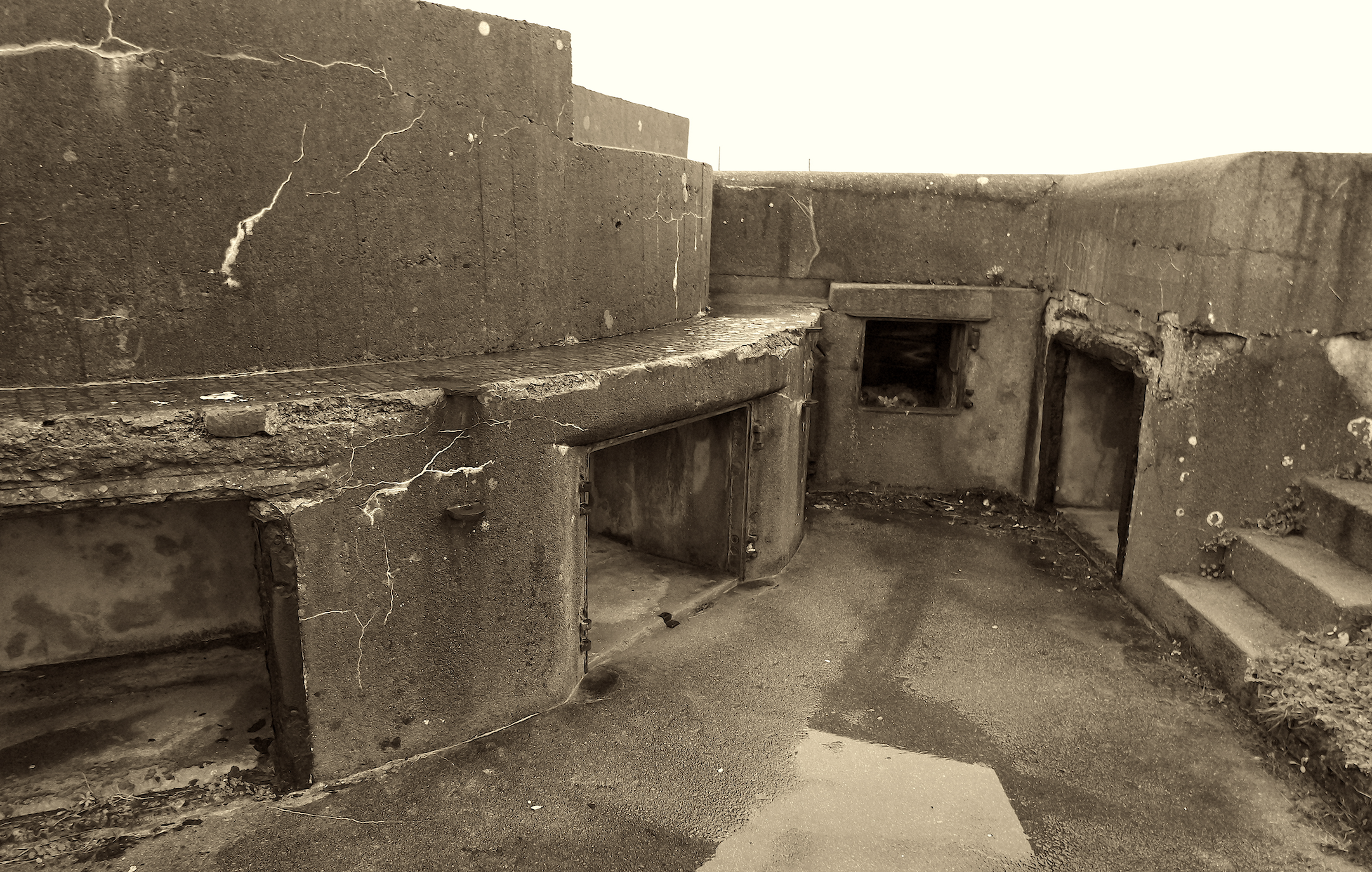
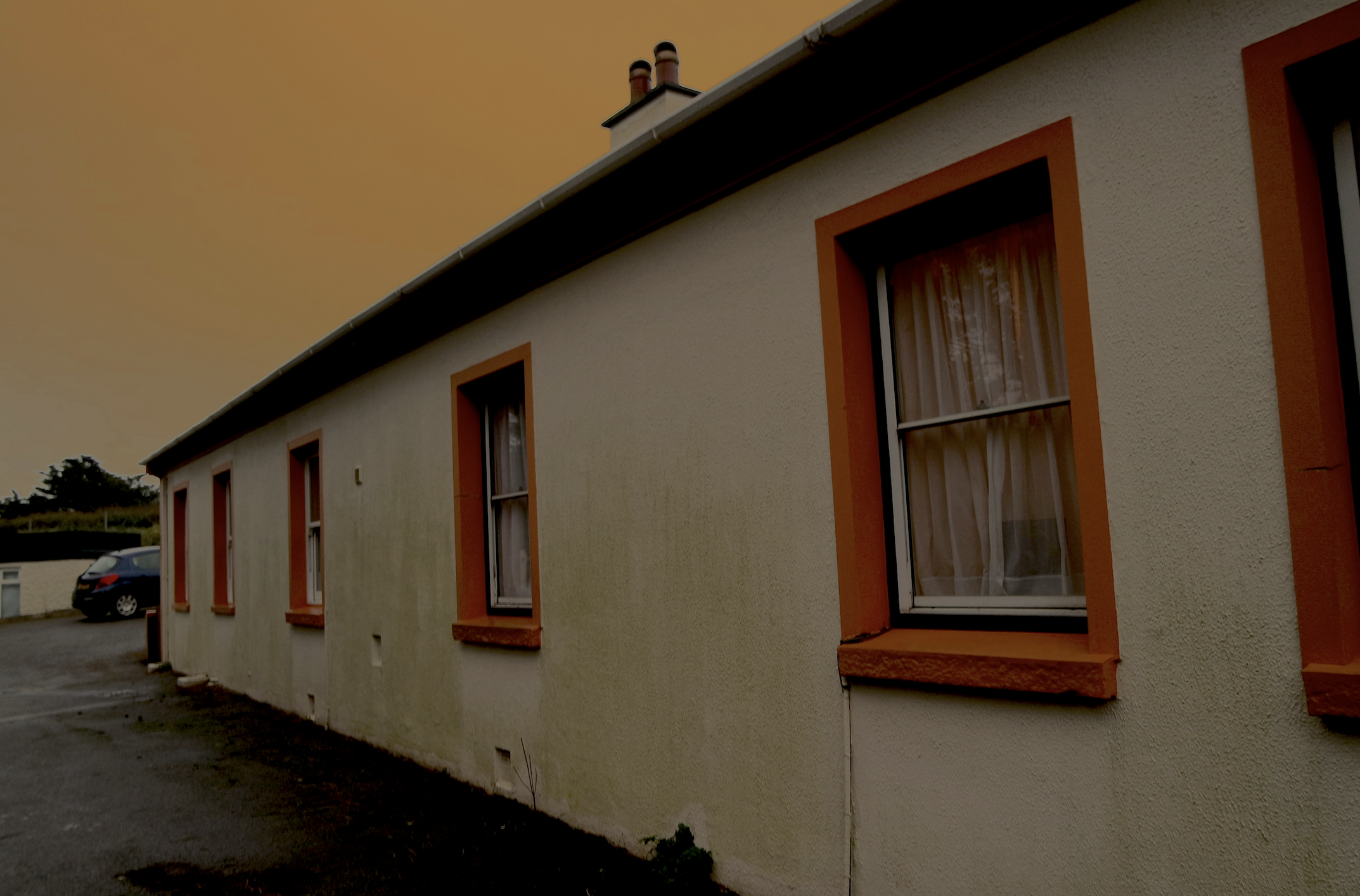
This is my first shoot I discussed previously about my plane for the project,i want to go to many areas in which I can get a strong range of distinctive boiling I want to show no colours so I need to the stutter itself to speak fro all the effectiveness of the building itself.

I have already taken many images of old figures and statues so for this shoot I focused on the aspect of old historic and impressive buildings that have a great impact altogether.


My Images inspired by typology:

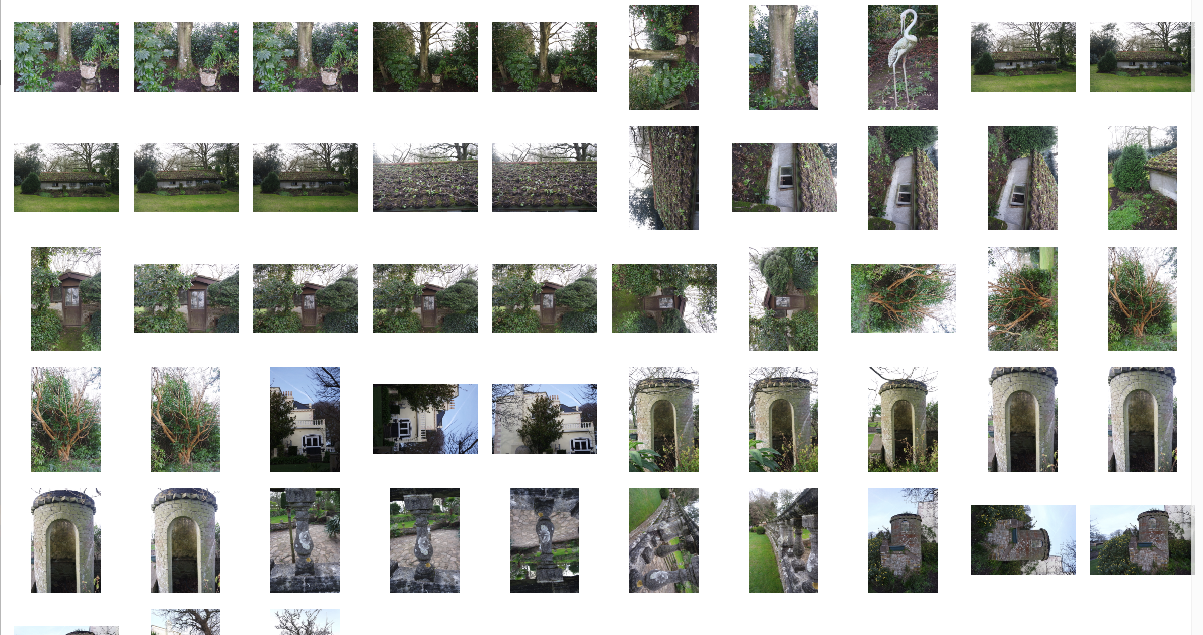
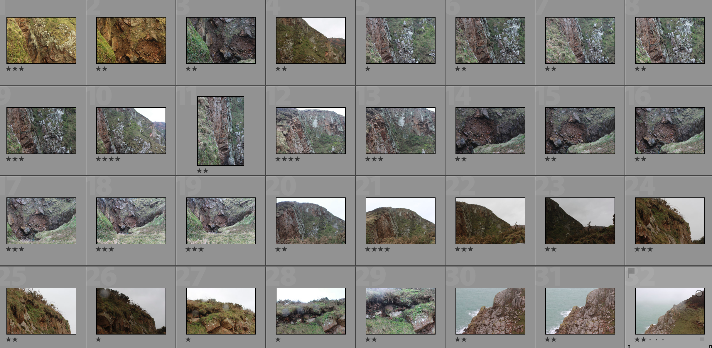
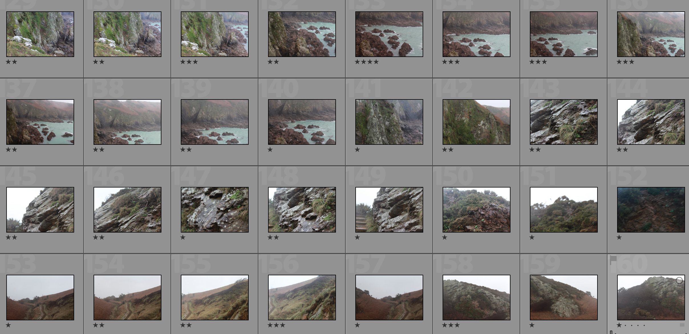
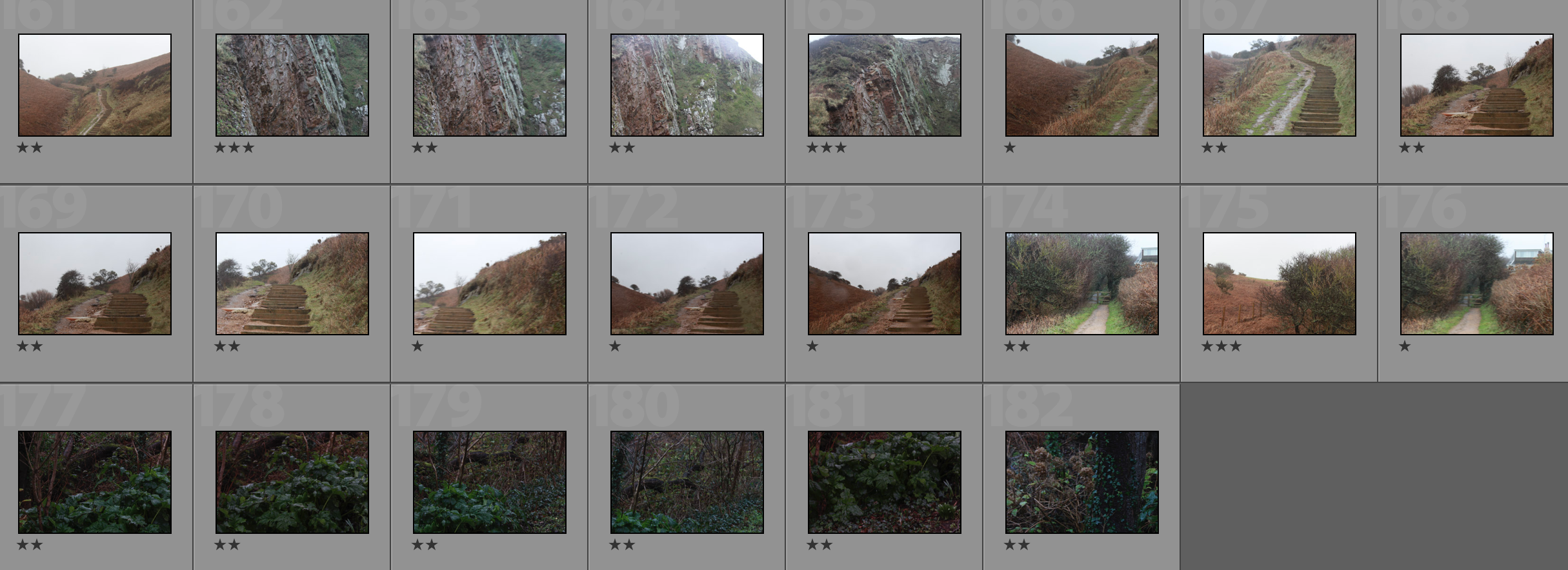
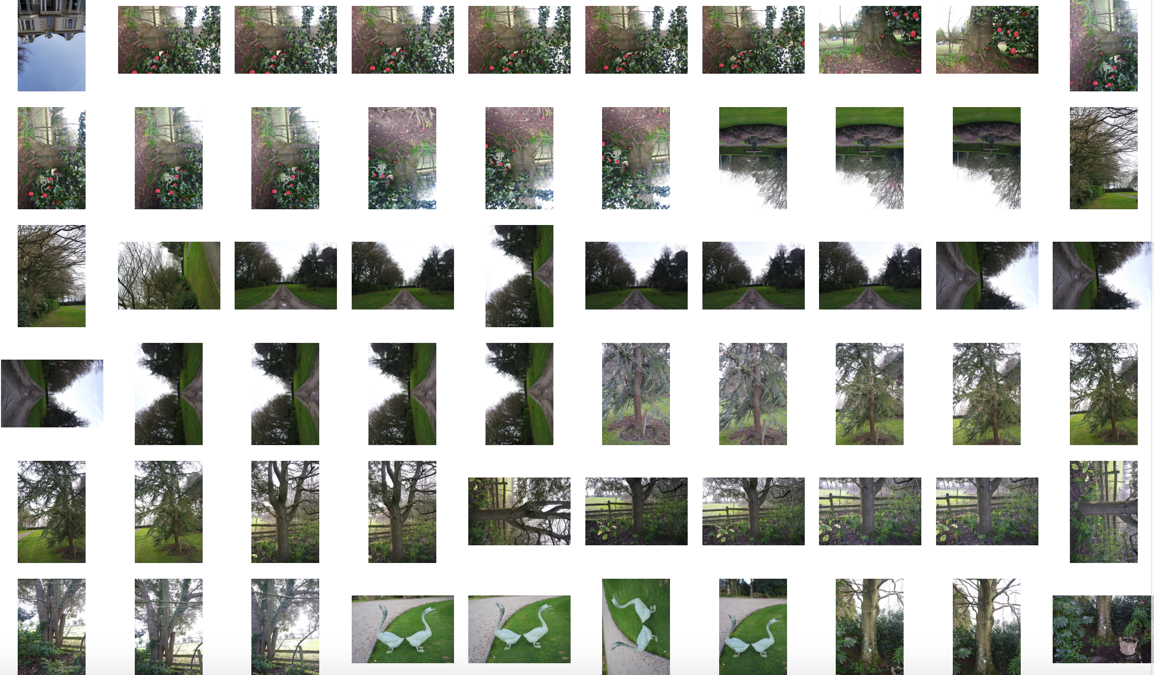
Contact sheet of shoot 2:builings and 3:nature/woods:
Editing:
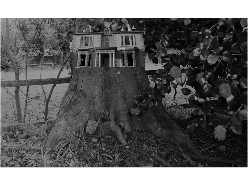
Overall evaluation:

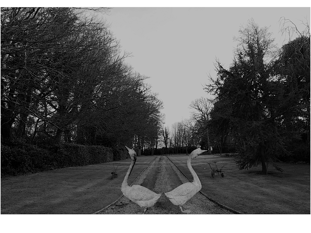
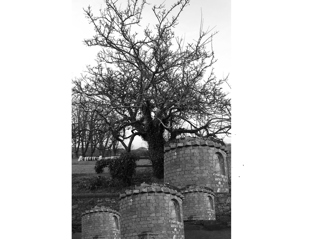
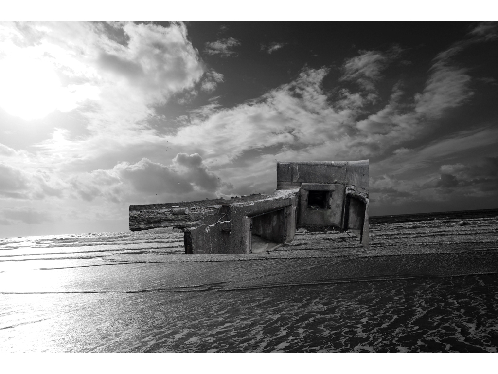
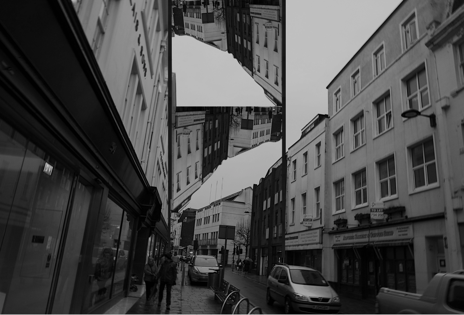
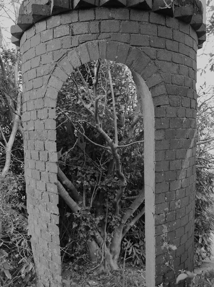
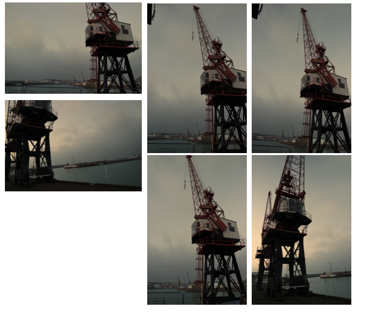
Once again for these images I was inspired by nature being formed with industrial structures and buildings,I  wanted to also edit some additional themes of surrealism,althought these images are not edited to completion and will need some additional work.For the nature aspect I wanted to capture large and impactful structures and also the size of the nature itself and how it can compete with the man made structures.

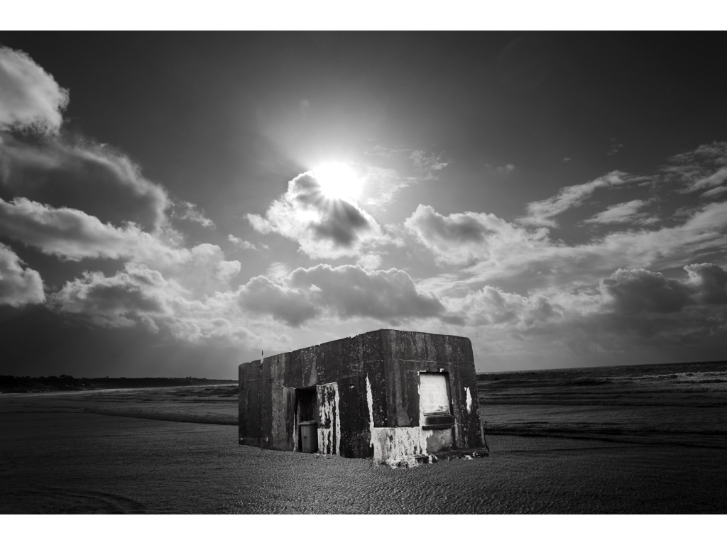
First shoot(out of five):Sea Shoot

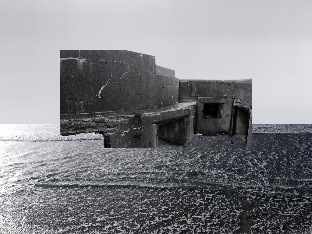
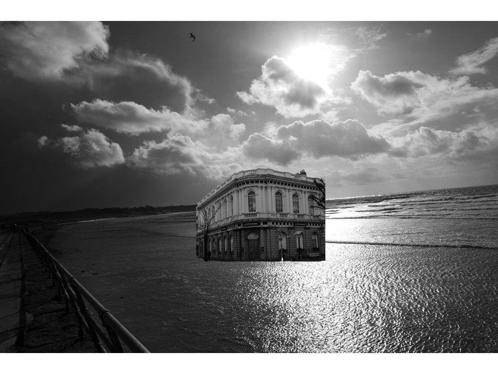
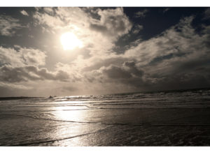
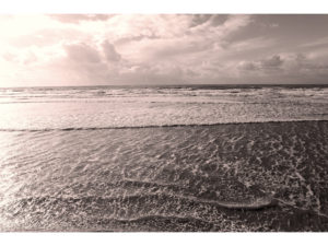
I have taken a sea shoot developing on many different surfaces of water and line which I have further experimented and attached some previous images of buildings  and created an altered aspect of surrealism and tonal editing.

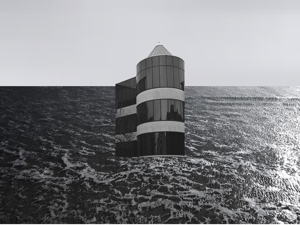
This is my favourite experimental piece so far,I wanted to capture the tones of the sea to be very calm and have a contrasting representation to what water should look like, furthermore the light allowed a direct centre view and also showed a diversity of tones throughout the piece.I then decided to add this building as the tonal range brings about a harmony to the piece and also the buildings angle itself shows a three dimensional angle creating an overall successful affect.

within this piece and one other I took a sample from the sea and sued this for the sky to have a same interconnecting tonal range but also a calmness to the scenario.

Within the rest of these images I again did the same technique of editing the original images to have the same tonal range inspired by my artist and also having an interesting strong juxtaposing industrial piece in the middle of the piece. 

These images above are pulley romanticised sea images and originals from the shoot itself, this portrays the scene previously to how it was altered.

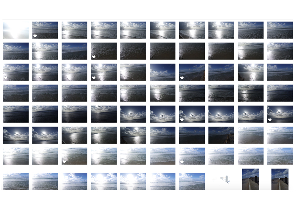
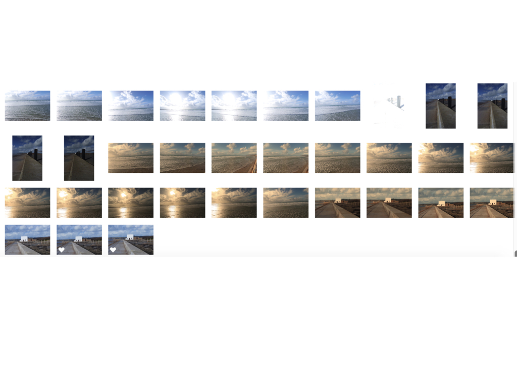
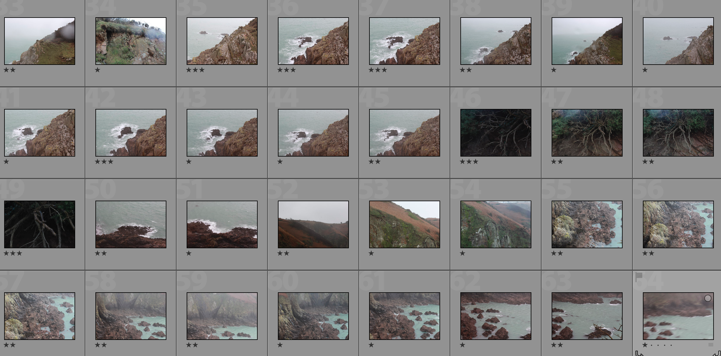
contact sheets

Experimenting For The Mock Exam

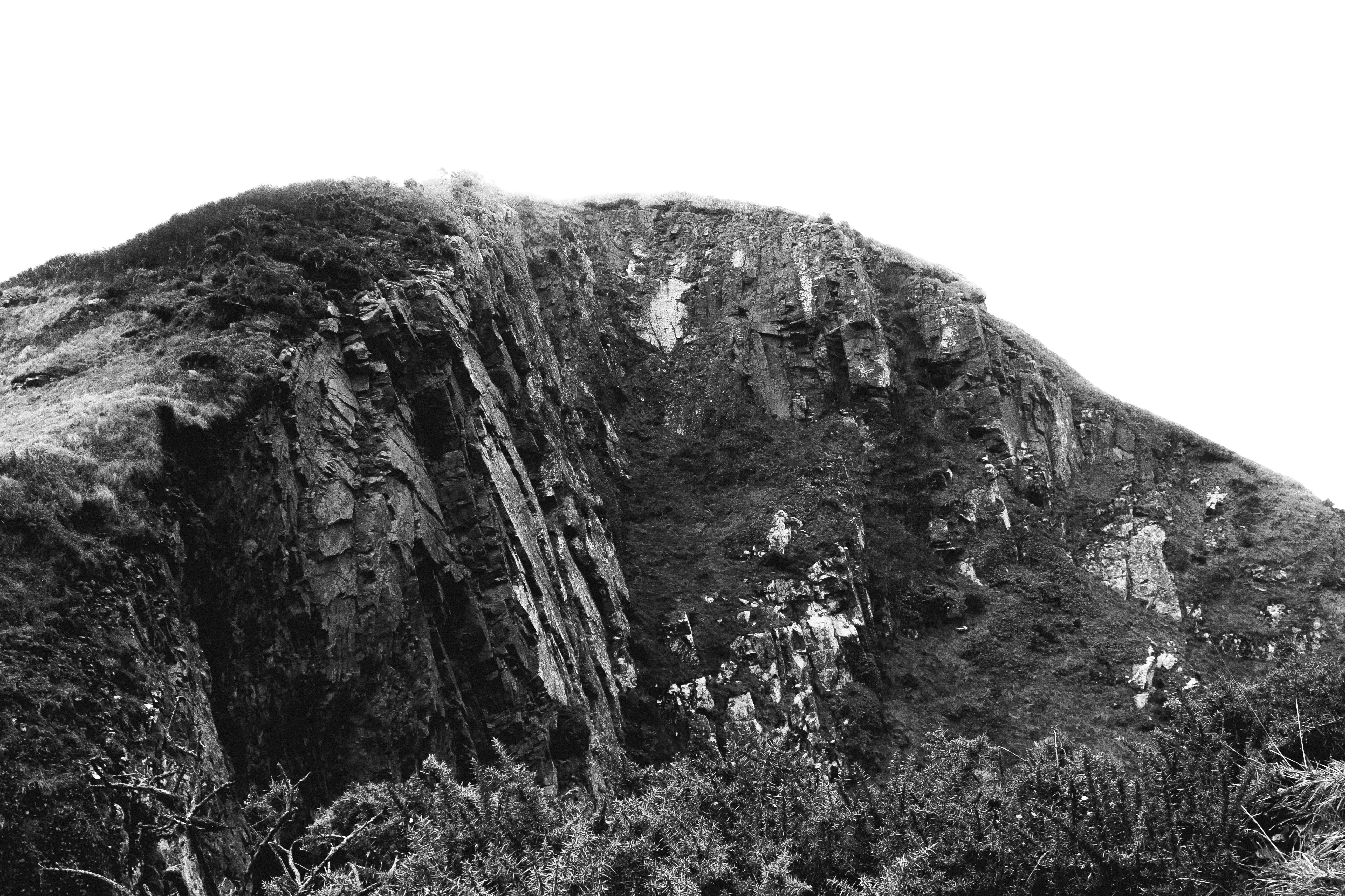
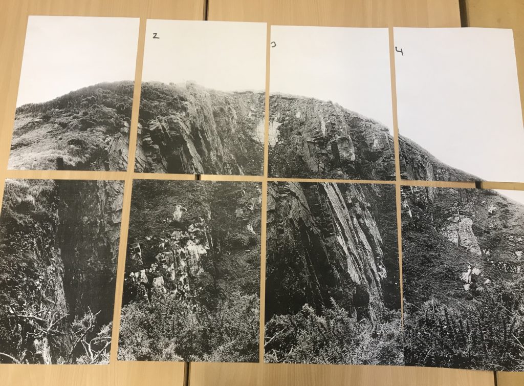
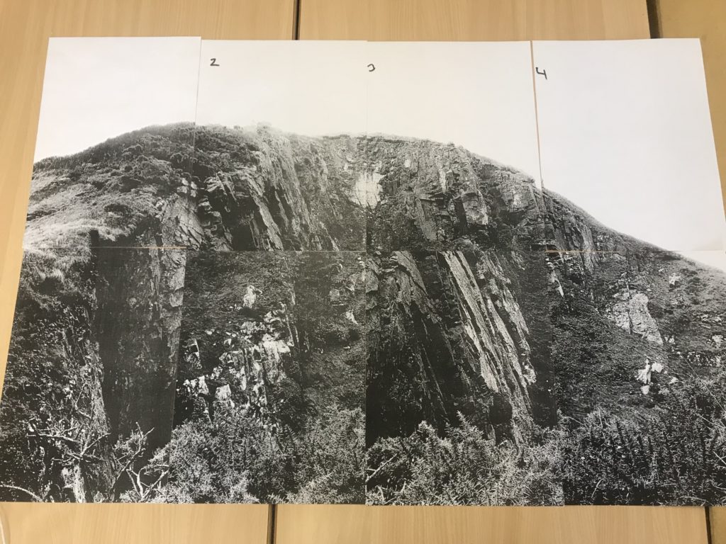
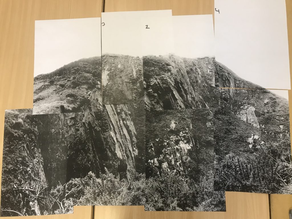
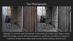
Below is one of my final images that I will be presenting for my final piece in the mock exam. In this post I look at how I could present the photograph in different ways to make it stand out more and be more creative.

Due to the size of the subject in this photograph, I want to present the photograph on a large scale to emphasise the presence and size of it. This creates a more intimidating effect because of the largeness of the subject. I have looked at keeping window-like borders between each section of photograph but decided that I will not follow through with that because I feel that it takes away the fact that it is one large photograph. I have also looked at moving around the panels in order to create a mixed  up image – I decided that this takes away from the nature of the photograph and isn’t in the direction that I want to be going. I came to the conclusion that my best option was to stick all the panels together in the correct order to create one large photograph.

typology analysis

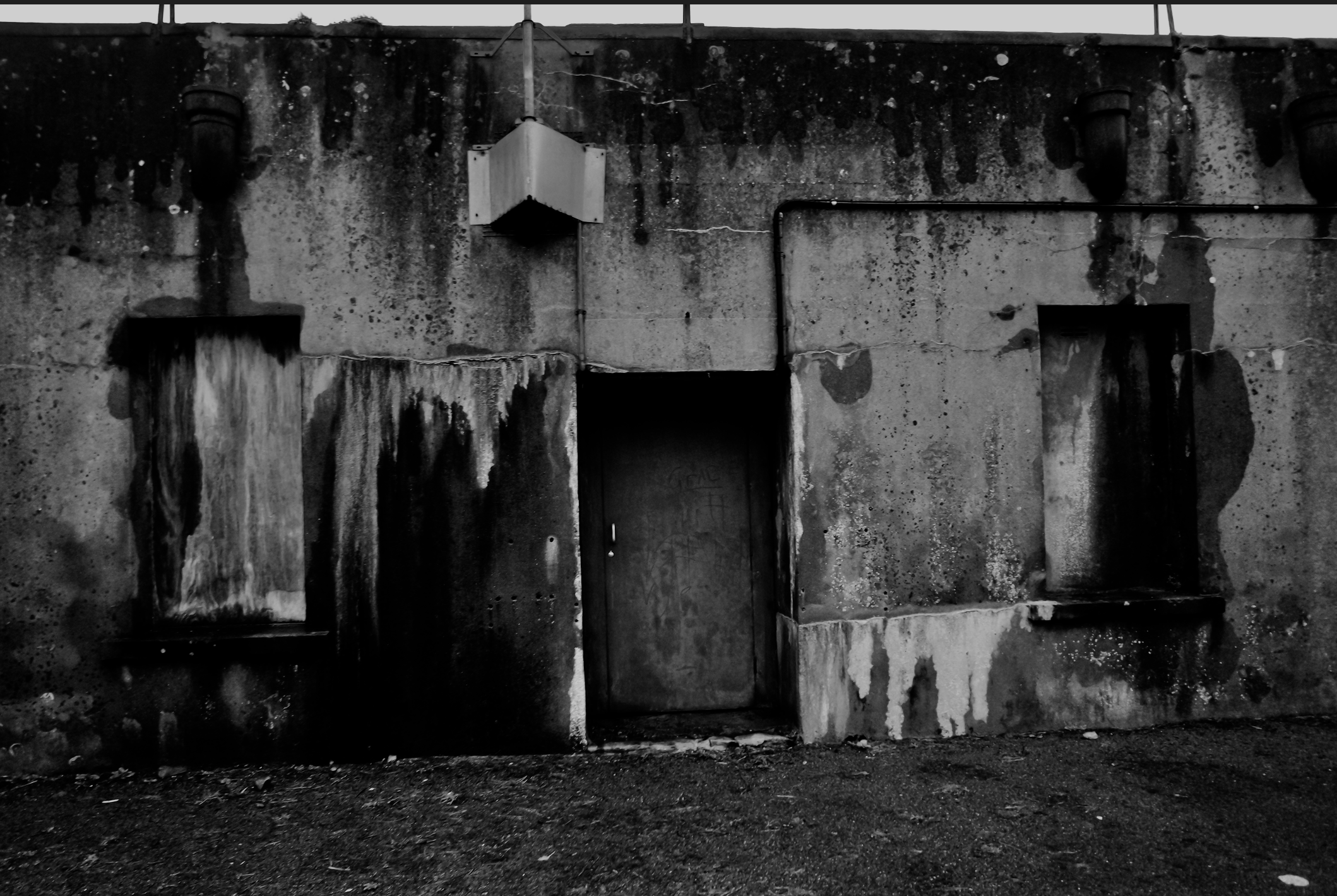
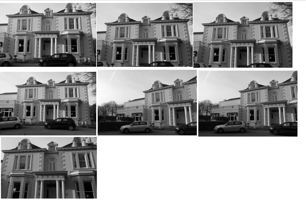
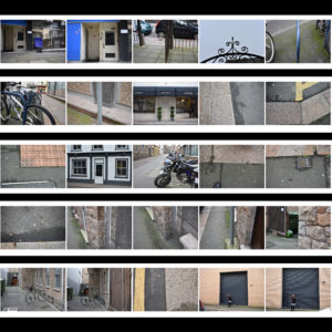
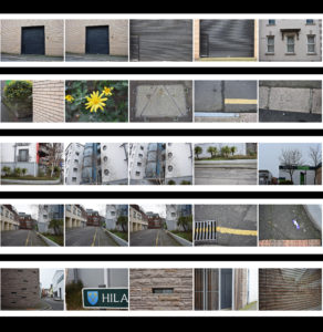
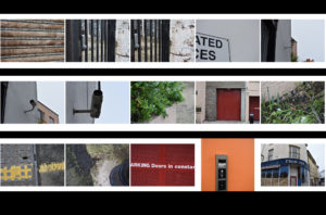
when I thought of typology I wanted to use a wider range of the terms wanted to find a range of buildings from all different spectrums of history and movements,I did this is order to have many possibilities to contribute to my final outcome,becasue of this I took many images and angles of the same building, I wanted to present each building in such close detail and also portray that the image could be seen as three or two dimensional depending not the angle and representation necessary.

As I said before all of these buildings have different occurring qualities weather it was me wanting to couture a texture,a historical aspect of society,an urbanised areas and or a more Morden buildingsI did this as all of these present a different shape and have different occurring  qualities and angles within them.

I have already adjusted these images as seen previously with colouring to a darker tonal back and white ,or enhancing the pigment within the saturation,this is all dependent on the scene and what I am trying to achieve within the piece itself. all of my images are taken from right angles when cycling round too mature every element and angle of the image itself, which can not necessarily be parented from above.

 Grid set development:

I have slightly cropped my images in order to display them clearly alongside some other angles that I have taken,I have done this for all  of the buildings and structures that I have worked within. although many  of these images are mirror images and so near and similar that they portray the same composition and lighting, although they could be edited and both enhanced or even presented  together.

overall I think I have capture enough images to show that I have considered typologies although I did focus more on individual buildings that will hep contribute to my theme of form man made  sutures to enhance nature.


Preparation For Mock Exam

Mood Board

Image result for romanticism photographyImage result for romanticism photographyImage result for romanticism photographyImage result for romanticism photographyImage result for romanticism photographyImage result for romanticism photography

Brainstorming

For my final photographs I want to produce pictures of natural landscapes with a moody, dramatic feeling to them.

  • Sunset
  • Cloudy
  • Storm
  • Beach
    • Devils Hole
    • St Ouens
    • Greve De Lecq
    • Gorey
  • Rocks
  • Trees
  • Cliffs
  • Hills
  • High contrast
  • Dark image

Ansel Adams

Ansel Adams (1902 – 1984) was an American photographer and environmentalist. His photos of the American West are often seen on calendars, photos and books.  Adams founded the photography group ‘Group f/64’. He was part of the romanticism movement and produced lots of striking landscape photographs in black and white, often involving a pathway of some sort and interesting weather.

Image result for ansel adams

Image result for ansel adams

My Favourite Photograph

Image result for ansel adams

This photograph was taken using natural daylight with the clouds blocking the harsh sun from the camera, resulting in dramatic contrast between the mountains and the river being brought into the photograph. It appears that a wide angle lens was used to take this photograph as this is what was typically used by the romantics to capture landscape photographs. It looks like a deep depth of field was used as the whole of the photograph is sharp and in focus. A shutter speed of 1/60 – 1/150 was possibly used for this photograph due to no motion blurs being in the photograph. A low/medium ISO appears to have been used as the photograph is not grainy and is quite dark, which will have been intended. There is lots of texture in the photograph, from the grassy bank to the flowing river. It seems to be quite a cold and isolated photograph as there are no signs of civilization around.

There is no colour in this photograph, which allows the viewer to focus on the range of tones, textures and shapes in the photograph rather than the colour. There is a wide tonal range in the photograph ranging from the dark silhouettes of the mountains to the white reflection of the river. It is quite a 3D photograph due to the trees in the foreground and the river running throughout the photograph, leading the viewers eyes from the trees in the foreground all the way to the mountains in the background. There is no rule of thirds used in this photograph, to me this is because Adams is trying to show that it is natural and nothing is set up.

Adams was a big part of the romantic movement in the late 1700’s, typically the romantics would photograph striking black and white landscapes with the idea that there is a deeper meaning than what appears behind everything. Romanticism was a rejection of the Enlightenment movement which took emotion out of writing and art, Romanticism wanted to challenge this by depicting emotions such as horror and untamed nature.

I think that in this photograph, Adams was trying to emphasise the natural beauty of the environment and to show that no editing was needed on the image, it is as it appears. He is trying to challenge the Enlightenment movement by doing this.

My Photographs

Top 5/Edits
My Favourite Photograph

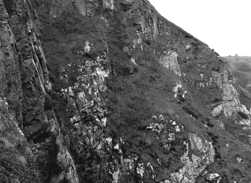
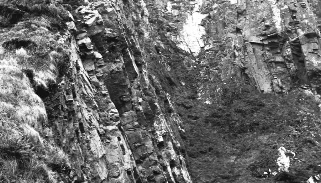
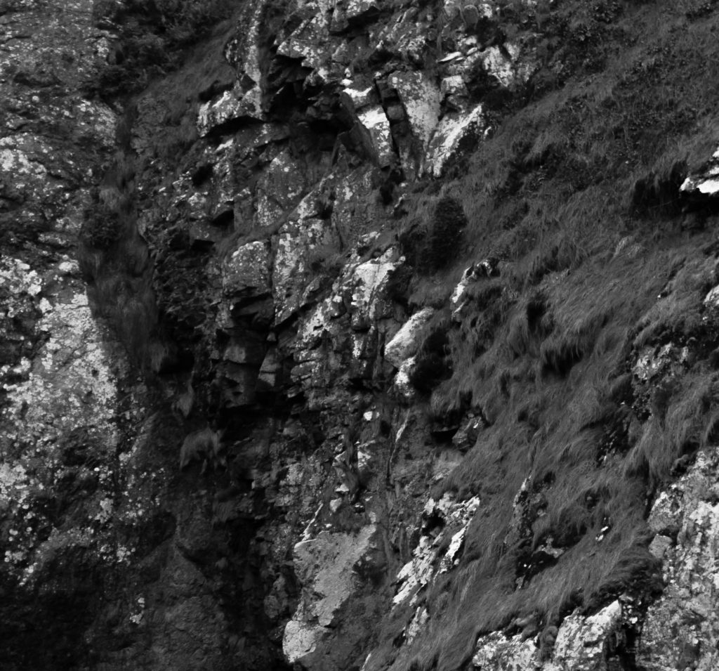
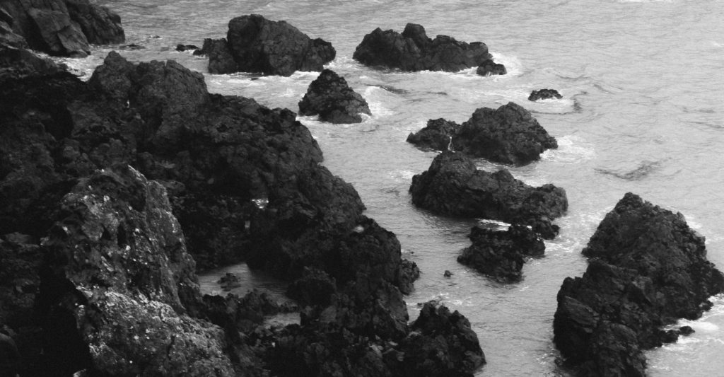
In this photograph I used natural lighting which allowed contrast between the correctly exposed cliff face and the over-exposed sky. This created a very wide tonal range in the photograph. An aperture of 18 was used which allowed the whole of the photograph to be in focus. I used a shutter speed of 1/40 with an ISO of 100 to create a photograph with the highest quality possible. There is a slightly cold undertone in the photograph due to the white balance.

There is no colour in this photograph as it is in the style of the romantics – the lack of colour helps to bring our more contrast and a wider tonal range in the photograph. The texture of the cliff face can be clearly seen which creates a more interesting photograph. There is a slight 3D effect in the photograph due t the shapes and depth within the cliff face.

I took this photograph at Devils Hole. I chose this as the location as it has a rich history and has lots of interest cliff faces surrounding it. I tried to create and edit this photograph in the style of the Romantics in the sense that it is black and white, has dramatic contrast in it and shows only nature. This photograph is similar to the work of Ansel Adams in the sense that it shows the untouched nature in a black and white photograph with lots of shapes and edges within it. My photographs do not have as much contrast and definition in them as Adams’ does but there is clear inspiration from him in my photographs.

Mona Caron

Mona Caron is a San Francisco-based artist, engaging in muralism & street art, illustration, art-ivism, and photography. Her focus is on community-informed and site-specific public art . She has created murals in the US, throughout South America and in Europe, creates stop-motion mural animations, has freelanced as an illustrator, and engages in artivism with social and environmental movements.

The first image is a mural called ‘Outgrowing’ in Taiwan, Mona painted the plants growing, like weeds do, from an inhospitable ground, a disturbed environment. She utilizes a wall’s large size to emphasize this inversion of scale, a micro-to-macro assertion of the power of small things, the power of the grassroots, human or plant.

Public art

Mona has been focusing primarily on murals in public space since the beginning of the millennium. Her goal is to activate public space by simultaneously creating artwork and interactive street happenings, using the painting’s narratives to spark conversations and critical awareness of the space we share.

Several of these murals contain intricate miniature details, invisible from afar. These typically narrate the local history, chronicle the social life of the mural’s immediate surroundings, and visualize future possibility, and are created in a process that incorporates ideas emerging through spontaneous conversations with the artwork’s hosting communities while painting.

Mona’s first period in muralism was defined by very site-specific and community-immersive narrative murals, reflecting the past, present, and future images of their neighborhoods through a uniquely permeable participatory process, considered part of the artwork. Mona’s community process has been the subject, among other publications, of an Emmy-winning documentary film by Paige Bierma.

In recent years, Mona’s stop-motion animation and botanical mural series titled ”WEEDS”,  a metaphor about resilience, has been growing, just like its namesakes, both in numbers and geographic reach, as well as in the scale of her pieces.
  • Currently, Mona likes to combine the poetic with the narrative aspects of her work, as can be seen in her most recent Collaborative work.
  • Mona has also illustrated books, posters for music or political events, news editorials, and more, using various styles of watercolor, block print techniques and more.Mural by Mona Caron
  • This mural, called ‘Taking Root’, features the first wildflower that made it back to a barren piece of land in Union City, California, after its rehabilitation from industrial pollution, and during the construction of a new affordable housing complex.
  • The topsoil had been completely scraped off to remove pollution, killing all vegetation. As the building construction neared completion, the first wildflower she found became the main feature of the mural, a symbol of resilience.
  • https://www.monacaron.com/murals/taking-root-video-documentary- link to video
  • few more videos https://www.monacaron.com/murals/manifestation-station-painted-utility-box
  • https://www.monacaron.com/murals/brush-tenderloin-short-movie-paige-bierma

Dandelion 1 Masjid Darussalam, San Francisco by Mona Caron

http://youtube vid:  https://monacaron.com/weeds -a stop-motion mural animation

“They may be tiny but they break through concrete. They are everywhere and yet unseen. And the more they get stepped on, the stronger they grow back.”

This is a series of paintings of urban weeds, created as a tribute to the resilience of all those beings who no one made room for, were not part of the plan, and yet keep coming back, pushing through and rising up.

weed-1-new

“I look for weeds in the city streets near a wall I’m about to paint. When I find a particularly heroic one growing through the pavement, I paint it big, at a scale inversely proportional to the attention and regard it gets”

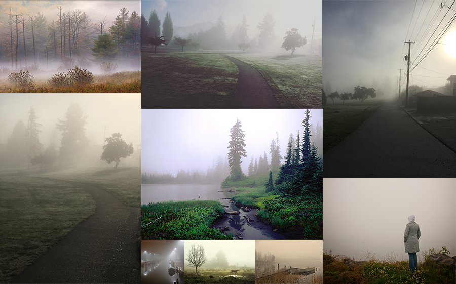
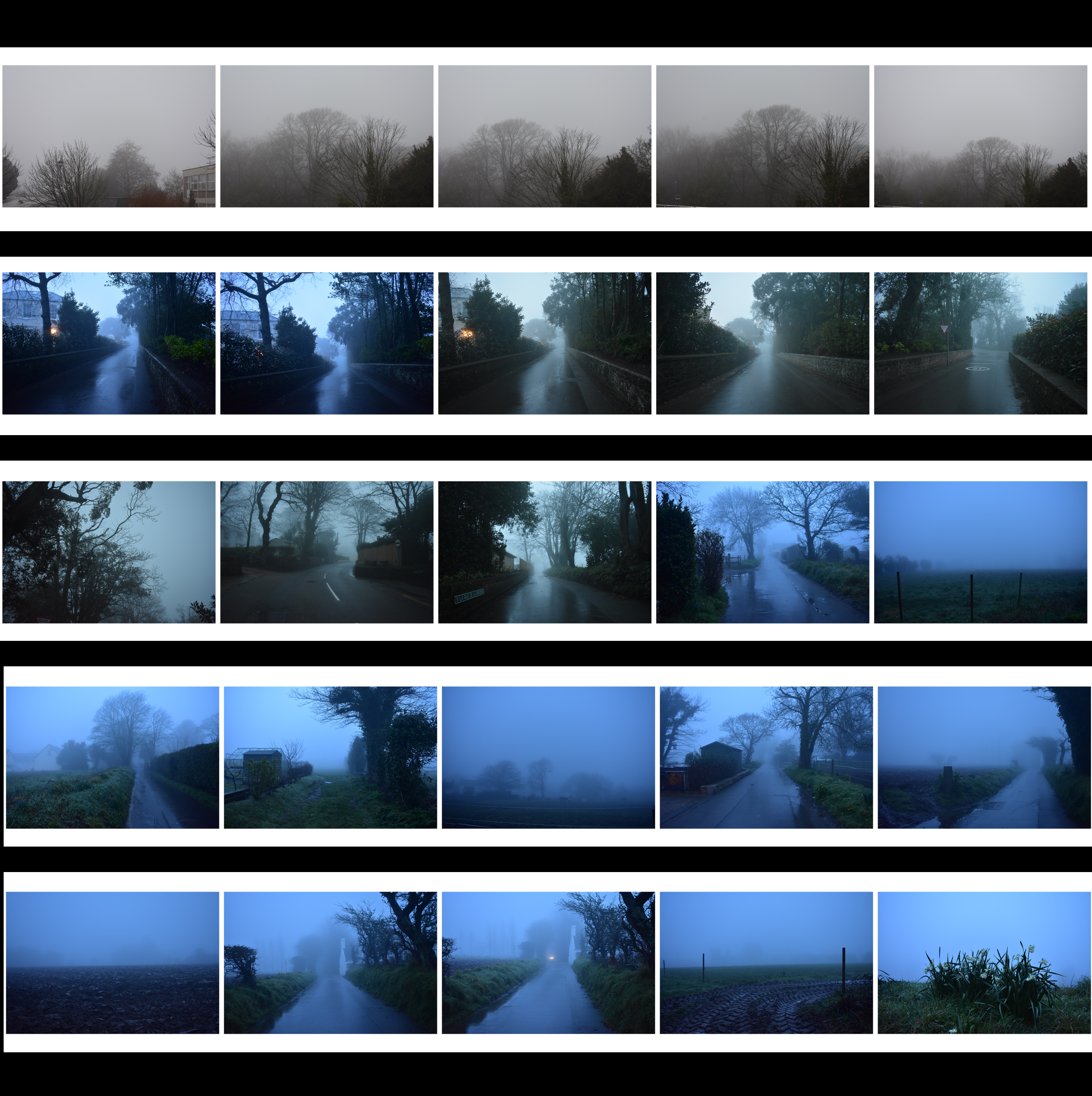
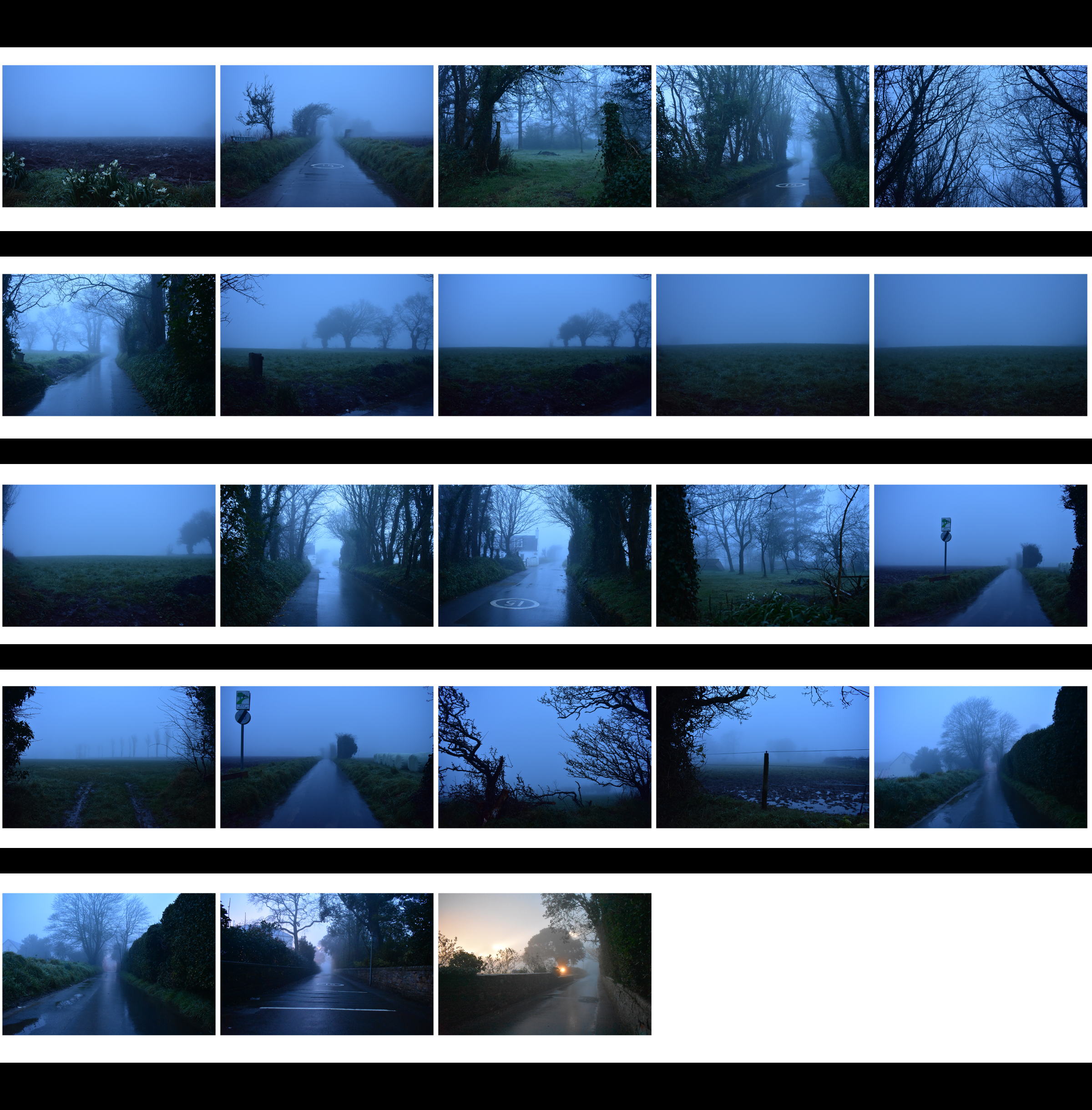
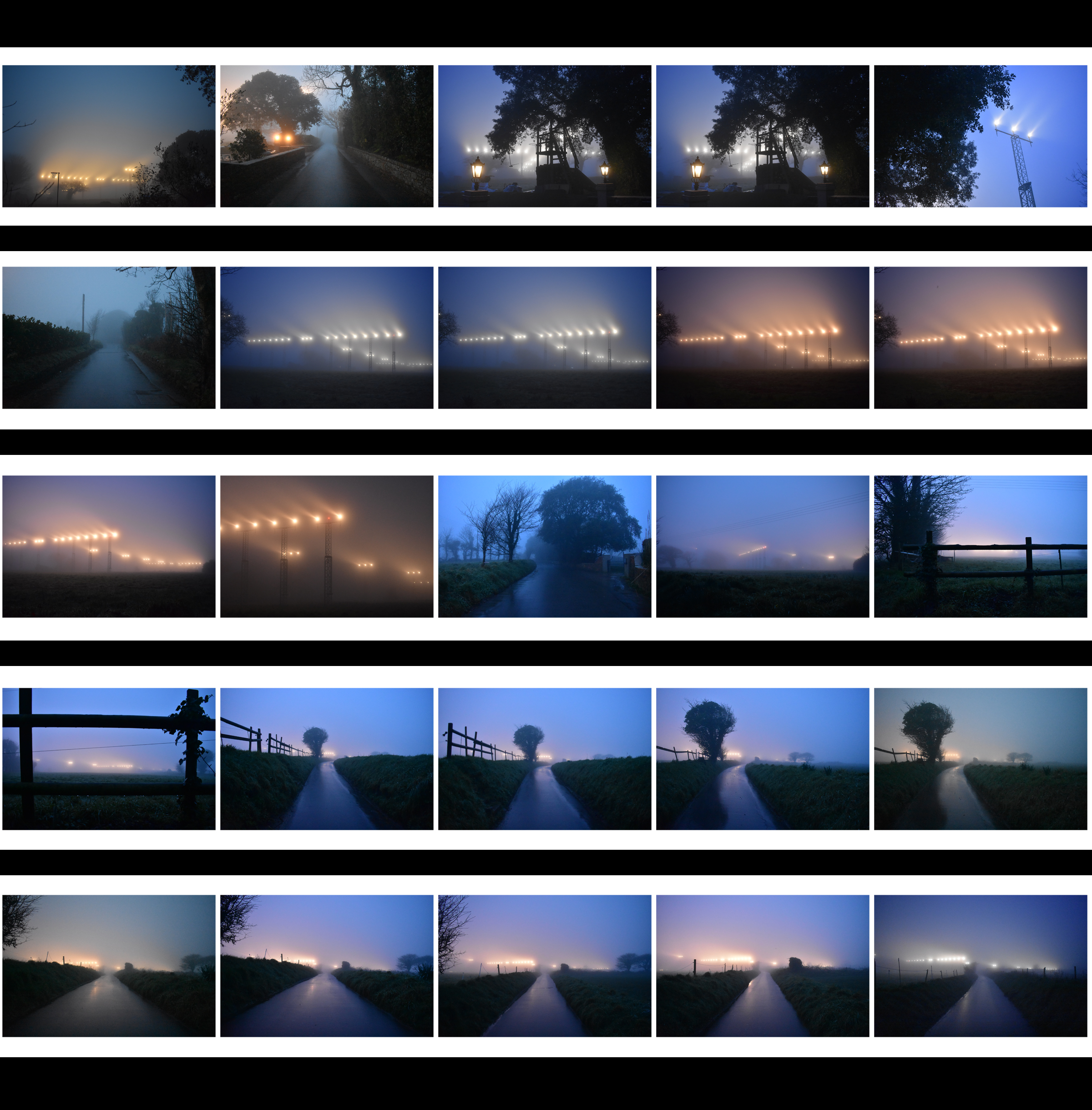
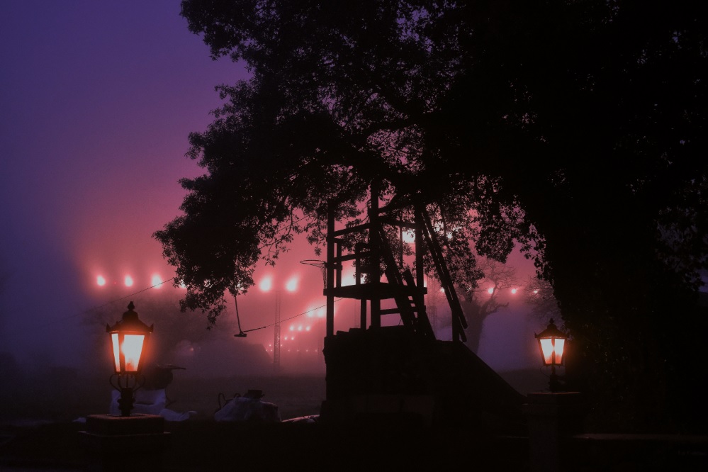
Nature Photoshoot – Fog

Moodboard

In its simplest form, fog is a cloud that sits on the ground. In more scientific terms, it is condensing atmospheric water vapor created by a temperature drop when relative humidity is fairly high.

Artist Research – Fogaholics

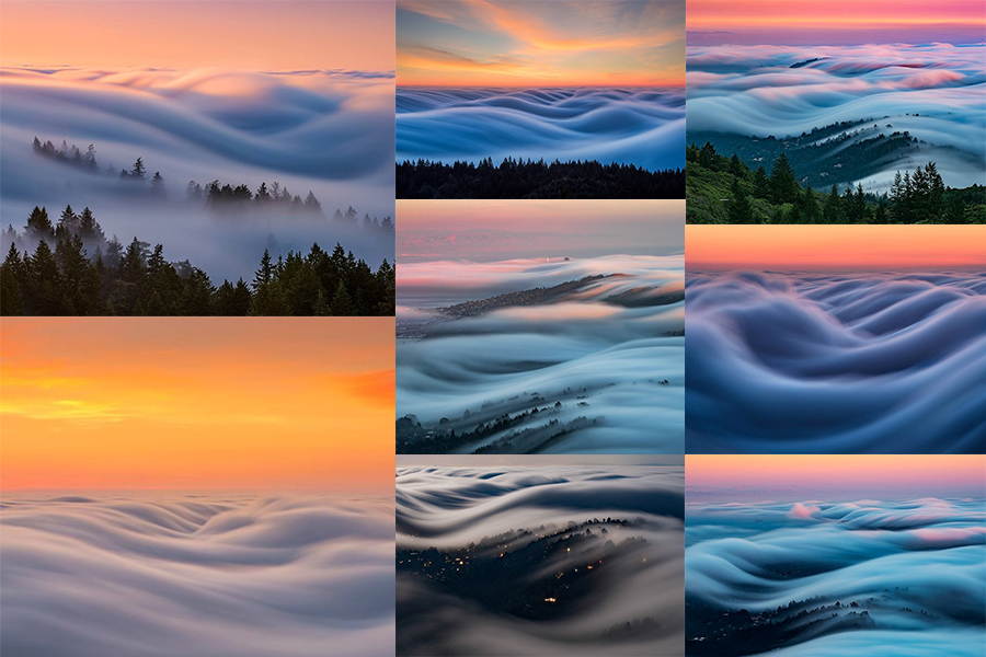
Landscape and cityscape photographers have a love/hate relationship with the fog in the San Francisco Bay area. It can make for some spectacular and moody photos, but it can also leave the area un-shootable – that is unless you seek higher ground. Nick Steinberg and other photographers in the Bay Area have formed a group that they call the “Fogaholics”.

The group consists of around 20 photographers that watch forecasts religiously and seek out the best foggy shooting conditions possible. When the fog rolls in, they make their way to Mt. Tamalpais, which sits at 2,572ft above sea level. This unique vantage point gives them the opportunity to photograph some amazingly beautiful conditions. With the help of an ND filter and exposure times sometimes exceeding two minutes, Nick is able to capture the fog waves as they make their way inland.
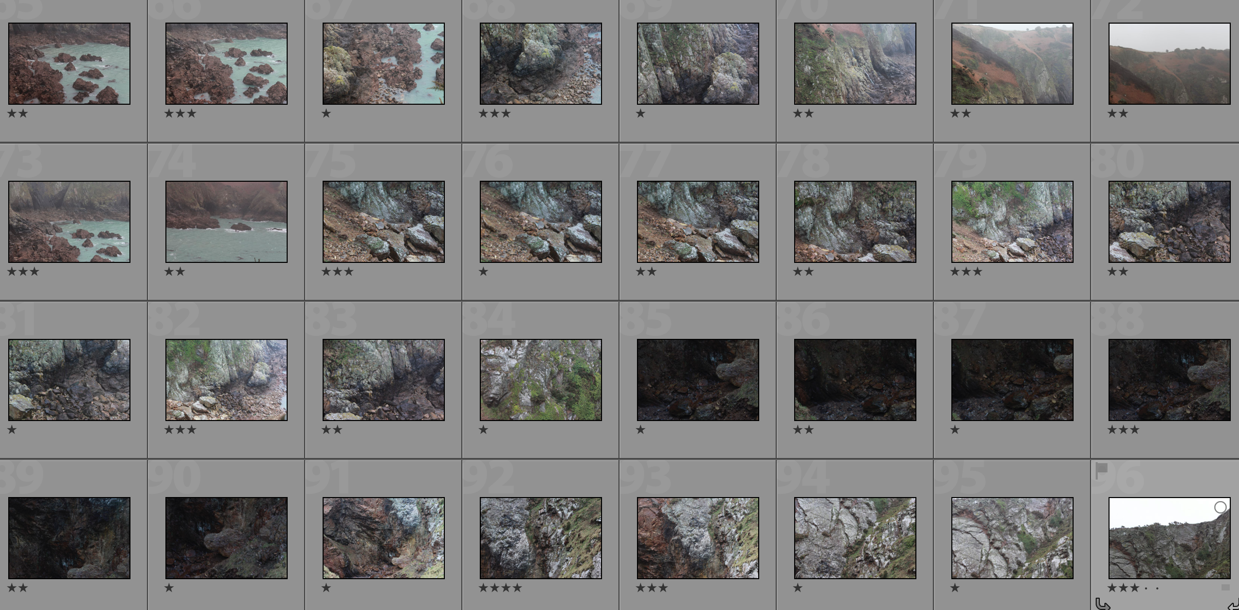
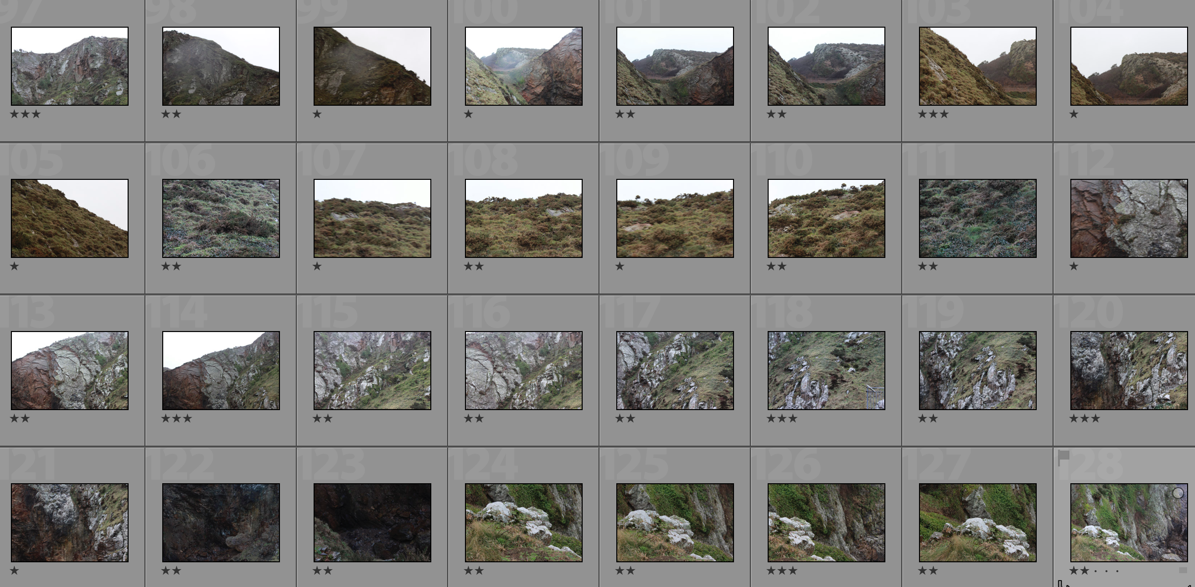
Contact Sheets

Edited Photograph


Joan Fontcuberta and James Casebere

Due to his aim of wanting to portray a truthfulness within his work and examine conceptual aspects of art his approach to art is unique.His propaganda and dictatorship of Spain allowed him to reflect his authority wihtin his are,his advertising had complete relationships between photography and truth but most importantly he believed that his humour is the most important concept throughout his work and called his art ‘postmorden’

How does Fontcuberta’s work compare to the work of James Casabere ?

Since the mid-1970s James Casebere (b. 1953, Lansing, Michigan) has been carefully constructing architectural models and photographing them, yielding images somewhere between realism and obvious fabrication.All of Casebere’s work is filled with highly detailed models of but in a juxtaposing nano-detailed space.he does this in order to create his’ constructed  photography’. He focused much of his work on minimalism and the emptiness of spaces to that of the expansion of prison cells to flooded rooms.He likes to promote hunting images that do not underestimate the use of light and shadow to form a sense of size. Casebere is interested in the memories and feelings that are brought to mind by the architectural spaces he represents. The resulting works are dramatic, surreal, and remarkably true to life, embracing qualities of photography, architecture, and sculpture.

This differs strongly to that of Joan Fontcuberta’s work and how he focuses on the interesting work in which we are surrounded to portrays aspects of surrealism and adventure within his images. the juxtaposition wihtin their photos are enormous yet both highly influential.

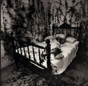
To me Fontcuberta’s work inspires such a depth of beauty and detail of action within his images,everything has a meaning and belonging while still being filled with many visuals. He also has many portrays of people within his work to show how a human ideal to the scenario.I chose this image due to the way in which nature is seen surrounding a basic human necessity, it proposes the state in which he himself lives and how he is tangles and almost retrained to the life of nature and a drawn very humanness aspect of not wanting to leave the bed. It is a minimalist idea but presenting in a more diverse way whereas;

James Casabere’s work prestos a beauty within. basic man made future as he uses the delicacy of light to from and enhance the stutter to become a life and shows a sense of nature though the confinements of human life.

Within my work I too want to show different contrasting elements of more simple and structurally dynamic images enhanced within light but I also ant more interesting and conceptually interesting images.I think both images are just as successful as each other and encompass what they both want to portray every efficiently.I chose to all experiment within His work due to the way in which he is able to show how he captures the landscapes an nature shots which will be the boom of my development shots. Although I think he most effect part of this research is how James Casebere uses light to show tones and stutter within his work which is too what I need to experiment within. He does also have themes of surrealism which will also help me within my project.


Mood-board of relevant images to project idea,And Action plan for shoot

Mood-board and brainstorm

As explained previously I want to expand upon using nature landscapes, urban and historical buildings and putting them into these situation weather it be the sea or the woods,this does create a surreal aspect to the images but overall creates an effective development of original ideas.I chose all the images because they all have a similar theme of moulding architecture  and some urban images to forms of nature, although I will further experiment as this is just inspiration and a theme in which I will too follow. I will edited all my image in a  similar method such as above, and editing the tonal enhancements and creating a black and white effect.

Action plan for final shoot

For the shoot itself  will need to visit around  varies separate locations,althought this will be split into four sections

1)the first of which will be trying to capture a variety of typologies of buildings itself, I want to show urban buildings,strong historical shapes and army grounds,I also want to show large buildings that hold lots of power within my chosen theme,This will also develop the formalism within buildings and capture the shapes and importance of tones also seen within the architecture.

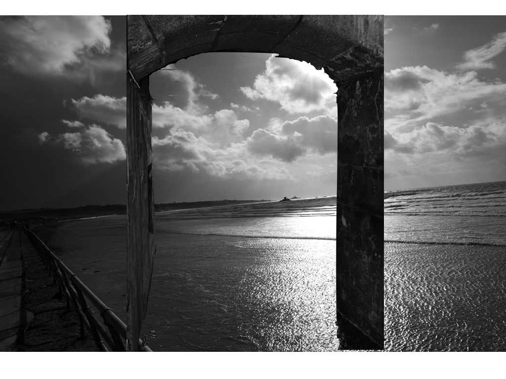
2)The second shoot will be focused  on capturing natural landscapes such as Rocky grounds, woods and as seen above large tree trunks will also take images that are purely for the woodland landscape and  have a power, and  possibly a strong romanticised theme within them.I also want to capture landscapes in which I can edit a more surrealistic images to edit them such as the image above with the door in the rock itself.

3)The Third shoot will be a much more beach and water inspired shoot, this is to show the simplicity of the artists above and how I can show illusions and repetition of shapes and lines and formalism within the piece creating a specific mood

4)finally this shoot is a lot more abstract, it is a lot more based upon capturing light and city scapes with slow exposure shots,I chose to do this incase I can edit them into the image and create a more interesting intriguing landscape image.I have previously experimented within this in my urban shoot and think it was successful so will further look through these images.

After experimenting within all of this I will further edit all the images together this will be around two or three images formed and photoshopped together and then further enhancing the tones. I think I will have to do a lot of extermination within this but overall will develop successfully.