Category Archives: AO2 Explore Ideas

Filters

Author:
Category:

Political Landscape – Fernando Maselli

Fernando Maselli was born in Buenos Aires in 1978. He studied Fine Arts and moved to Madrid where he worked for major advertising agencies, shooting professional assignments for brands such as Coca Cola. This work won Maselli numerous awares at festivals such as Cannes.

In his current project ‘Artificial Infinite‘, Maselli appropriates the concept of the sublime through natures effects on the mind to develop his own investigation using elements like the vastness, the darkness and the hugeness of nature, but especially an attribute called artificial infinite: an element that is repeated many times in a constant and uninterrupted configuration generates in the viewer a sense of infinity. I think that the way that Maselli presents his work is very interesting due to the ways he cuts pictures up and puts them back together to create a collage style photograph but due to the gentle subject that is the nature he photographs I think that it could be more aesthetically pleasing without the photo manipulation.

Maselli spends several days in the mountains, taking pictures and later, in his studio, he rebuilds different parts of the landscape into a new landscape,trying to get, through the repetition of these images, the artificial infinite effect.

Guillaume Bression and Carlos Ayesta and Fernando Maselli have a common link in their approaches throughout their photographs as they intend to capture and document what the world is like in places that ordinary people wouldn’t visit without a strong purpose. Both of their photographs contain elements of staging in them as Guillaume Bression and Carlos Ayesta may place subjects to make photographs more intriguing and Fernando Maselli rearranges photographs in his studio to create the setting that he wants.

A contrasting feature in the works of Guillaume Bression and Carlos Ayesta and Fernando Maselli is that Maselli focuses on settings untouched by humans in order to show the aesthetically pleasing sublime of nature, wheres Bression and Ayesta look at the destruction of a man-made city.

I think that the purpose of this project is to show how aesthetically pleasing nature is when it is left alone – and still can be aesthetically pleasing if humans treat it with care, as Maselli has done through carefully creating a collage of photographs.

Maselli has a statement on his website explaining further his interest in photography and the style in which he enjoys working.

Analysis

The below photograph uses the natural lighting of the mountainous landscape along with a deep depth of field to create a photograph that shows the different layers within the natural landscape. Maselli creates a photograph that demonstrates high contrast in the lower half and low contrast in the upper half due to the fog and weathering of the setting. There is quite a large tonal range within the photograph ranging from the dark shadows within the mountain faces to the white blankets of snow on top of the mountains. A shutter speed of 1/60-1/150 will have been used in this photograph along with a low ISO in order to keep the photograph as high quality as possible whilst allowing plenty of light to enter the camera lens.

There is no colour in this photograph – only black and white. Whilst this black and white helps to create contrast and shadows within this photograph I feel that it makes the photograph slightly bleak with no area of the photograph standing out as a main viewpoint. The difference between the light tone in the upper half and the dark tone in the lower half creates an feeling of how extreme the weather is in the mountains. There is not much of a 3D effect in the photograph due to their not being any subject in the foreground – which it feels like there should be. The eye is led to the bottom of the mountains where it looks like there should be a viewpoint but there is only more snow.

Maselli took this photograph as part of spending several days in the mountains, taking pictures and later, in his studio, rebuilding different parts of the landscape into a new landscape,trying to get, through the repetition of these images, the artificial infinite effect.  The natural sublime has been a part of the arts through literature such as in Frankenstein for a long time and it representative of peace and tranquility.

I think that through these photographs Maselli is trying to convey the fact that there is so much of the world that most humans’ will hardly see or experience and that these hidden parts of the world are better off because of the absence of human intervention. This links to political landscape as Maselli is showing and contrasting how different landscapes really are without humans building on them and altering on them to meet some of their selfish wants.


Political Landscape – Guillaume Bression and Carlos Ayesta

Since the tsunami and the nuclear catastrophe of March 2011, Carlos Ayesta and Guillaume Bression have made regular visits to the region of Fukushima, Japan, and especially to the “no man’s land” around the stricken power station. Their visits mix posed situations along with a documentary approach. The title of this project is ‘Retracing Our Steps‘. I think that the street photography/documentary photography style that has been introduced in these photographs make the photographs more interesting as they appear to come from the view of an average person. An interesting point of view would be to see more dramatic photography approaches as this area is unseen by many so to explore it in multiple ways could be successful.

Guillaume Bression and Carlos Ayesta and Fernando Maselli have a common link in their approaches throughout their photographs as they intend to capture and document what the world is like in places that ordinary people wouldn’t visit without a strong purpose. Both of their photographs contain elements of staging in them as Guillaume Bression and Carlos Ayesta may place subjects to make photographs more intriguing and Fernando Maselli rearranges photographs in his studio to create the setting that he wants.

A contrasting feature in the works of Guillaume Bression and Carlos Ayesta and Fernando Maselli is that Maselli focuses on settings untouched by humans in order to show the aesthetically pleasing sublime of nature, wheres Bression and Ayesta look at the destruction of a man-made city.
I think that the purpose of this project is to document the damage that can be done to a once over-populated city and how environments change without the presence of humans.

Analysis

The below photograph by Guillaume Bression and Carlos Ayesta uses the natural light of the evacuated ‘no-mans land’ to create shadows and contrast within the photograph. The shadows created by the frame of the windows replicate the Japanese text onto the walls creating a feeling of a natural average environment – which contrasts with the fact that this area has been abandoned. There is not a massive tonal range within the photograph but there are enough tones developing throughout the photograph such as the contrast between the light sky and the dark cafe. A short-medium depth of field appears to have been used in the photograph as the subject in the foreground is in focus but the forest in the distance is slightly out of focus. A fairly low shutter speed of 1/40-1/80 will have been used in this photograph along with a low-medium ISO as the cafe gives a dark environment with not much light so the lens needs to be open for more time in order to allow more light to enter.

This photograph is not overly colourful but the touches of colour that it uses is very effective, such as the red flag against the blue sky contrasting with the dark grey/brown of the cafe. The darkness of the cafe creates a contrast against the light outside which further pushes the image of a deserted cafe. There is quite a 3D effect of the photograph as the seats and the subject in the foreground create an immediate viewpoint for the eye as opposed to the deserted area in the background. The cropping of the photograph allows for the subject to be placed on the left vertical line in the rule of thirds which create a more aesthetically pleasing photograph from the viewer and tears the photograph slightly away from the documentary photography genre and more towards contemporary photography.

Carlos Ayesta and Guillaume Bression composed this photograph after making regular visits to the region of Fukushima, Japan, and especially to the “no man’s land” around the ruined power station. Their visits mix posed situations along with a documentary approach, which is clearly seen in this photograph as they document how quiet and deserted the area is whilst setting up as a posed photograph. This links to political landscape as it shows the artefacts that humans have left behind but it also shows how the land has become a quiet place left to nature. It looks at the impact of humans on landscapes and how they change it.

I think that the purpose of this photography is to show how quickly and dramatically urbanised areas around the world can develop in either a negative or positive way and how much land is left to be used/discovered. It primarily looks at how the humans that once populated this area have left everything exactly as they were with no signs of chaos shown.


Zine research and inspiration

What is a zine?

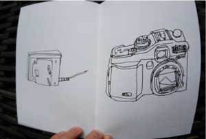
Image result for photography zinesImage result for photography zines

Image result for photography zines

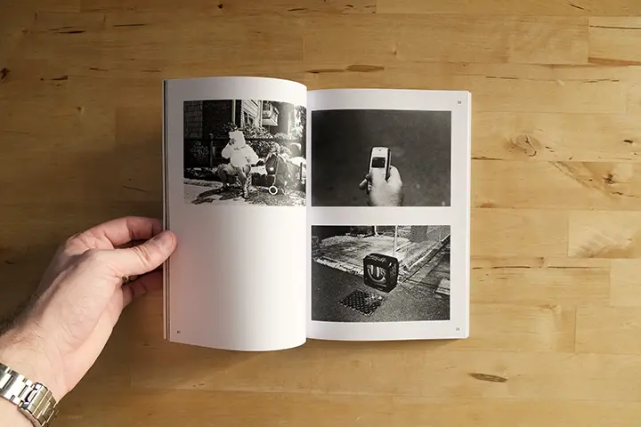
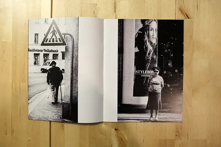
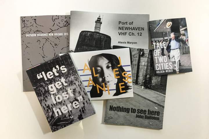
A zine is a small-circulation of self-published work of original or appropriated texts and images, usually reproduced via photocopier Zines are either the product of a single person, or of a very small group. Zines are used as an effective way of marketing and presenting ones work and often will stick to one small topic throughout all the pages. They incorporate a basic design layout with usually one image per double page spread and sometimes one image per page.  Among the various intentions for creation and publication, the idea behind zines are to develop one’s identity, share a niche-skill or art, or developing a story, as opposed to seeking profit.

I am interested in exploring derelict architecture however I also think it could be interesting to contrast this with new building as well as buildings within the development stages. Within my zine I intend to create a narrative which tells the audience how the area of St Helier has been developed and also left and forgotten about.

Inspiration


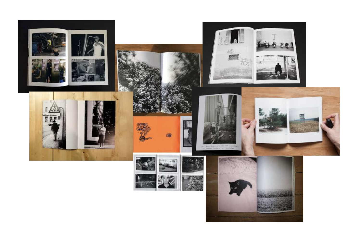
Image result for photo zinesImage result for photo zines

I want the images in my zine to be as big and as bold as possible. By doing this I will make sure they go right to the edge of the paper and cover all the white on each page like seen in the zines above. I think by doing this it will display my images in the strongest and best way for my image too be displayed.

Zine Analysis

The term ‘Zine’ was coined in an October 1940 and stems from the shortening of the word magazine and was developed as a rejection of commercialism and mainstream publications. In stark contrast to the mass media industry, zine artists don’t seek to make a profit. Instead, they are designed to share ideas, stories, and artistic work.

  • It’s a tool that photographers can use to tell a visual story, to inform an audience about a specific topic or issue, to showcase and advertise a new idea.
  • The constant evolution of technology mixed with older, more traditional techniques means that zines continue to intrigue with highly individual and versatile methodology.
Photographer James Moreton Interview://www.thephoblographer.com/2017/05/05/why-photographers-should-create-zines/

‘I believe the photographic book is the best medium for photography. The ability to create impact by pairing, juxtaposing and sorting pictures into a flow in order to tell a story or instill an emotion in the viewer is unsurpassed by any other photographic medium. Having something tactile in your hands that you can keep and look at on your own terms is also very important. A zine is an accessible way for someone to create this object and they can take on many different forms – from a very DIY aesthetic to high end magazine print quality.’

Different Zine designs:

John  Darwell:

The British photographer John Darwell is an independent photographer working on long-term projects that reflect his interest in social and industrial change, concern for the environment and issues around the depiction of mental health.

To date he has had seventeen books of his work published. As a photographer, Darwell “roots himself in neglected landscapes”.[1] His early work, published in Working Lives and The Big Ditch, was in black and white, but he moved to colour soon thereafter and has not used black and white since.

From series ‘Scratching the Surface’ that looked both at the extractive industries of Cumbria and also asking the question as to whether we photographers can ever do more than scratch the surface of our subject matter.

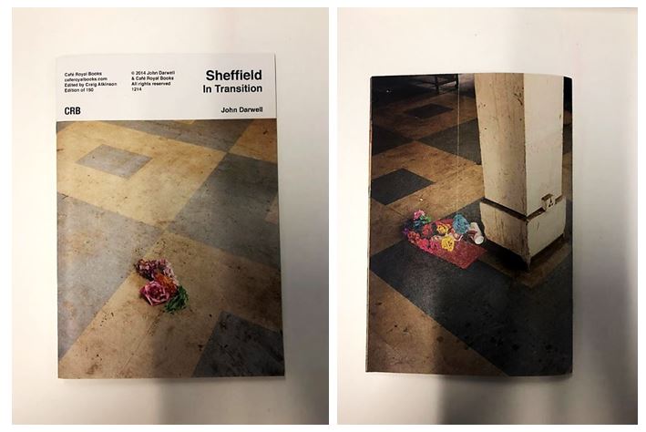
I first discovered the photographer John  Darwell in class where I read his zine called ‘Sheffield in Transition’. He uses a roll of colour negative film which is different from his previous work which is in black and white, and looks at a more contemporary approach looking at contemporary issues, in terms of post industrialisation and often problematic redevelopment schemes. ‘Much of the work I produced in Sheffield had a strong and explicitly political edge that gad only been been hinted at in mt earlier works.

The front and back of his zine contain images taken in the same place but at different times. It clearly states the name of the zine ‘Sheffield in Transition’ on a white background creating a professional appearance.

His work has been exhibited, and published, widely both nationally and internationally, including numerous exhibitions in the UK, the Netherlands, Italy, the USA,  Mexico, South America and the Canary Islands, and is featured in a number of important collections including the National Museum of Media/Sun Life Collection, Bradford; the Victoria & Albert Museum, London and the Metropolitan Museum of Art, New York.

  • This page earlier on in the zine was my favourite as it includes the use of text as well as images to explain his concept. I also liked the used of the yellow background behind the black text to emphasise it and to link the the page on the right which shows an image of rubbish and plastic surrounding one area and hanging on a tree.
  • The yellow plastic bag is highlighted through the use of the same colour yellow background on the left page, linking the two together but still juxtaposing, going from lots of detail on the right to hardly any on the left.

  • As the zine continues it displays landscape images across double page spreads throughout. I like this layout as it forces the reader to compare one image to another and to be surprised by the contrasts between each one when they turn the page.
  • For example, the image above show a more industrial looking image with bold structures and lines juxtaposed containing colours with similar neutral tones. This is juxtaposed with the chaotic image of a pile of paper and plastic rubbish on the next page with different patterns and contrasting colours.
  • Having this image after a more simple and structured image emphasises the chaotic and disordered nature as it’s two extremes one after another.

David Johnston:


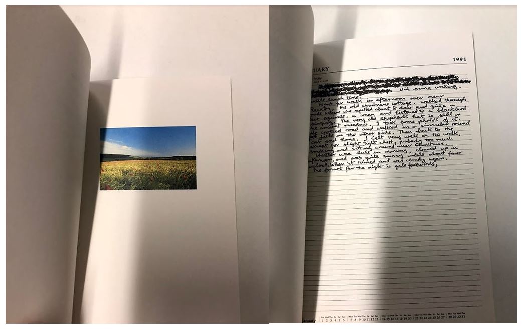
I then looked at another zine by the photographer David Johnston called ‘Long walk’ where he displayed single images of the country side alongside side diary entries of what he experienced on his journey. For example the first diary entry reads: ‘Did some writing until lunch time. went for walk in afternoon over near Rackton, the old woodmans cottage. walked through woods where we spotted about 8 deer and quite a few squirrels, a wren and listened to a blackbird singing.’ The layout of the diary entries are messy like he quickly wrote them after he did or encountered something which gives the whole zine a more authentic feel. He also includes the crossings out and mistakes grammatical mistakes he made like no one would be reading his entries, which makes the zine more personal as he’s sharing his thoughts and feelings with the reader. The front  cover is the only full page image in the zine making the reader expect find more inside but only contains small images in the top half of one page on a double page spread.

David Johnston has for many years made photographs during walks through the West Sussex countryside. His work constitutes a private archive of thousands of images, a personal and highly detailed account of seasonal and social change across a specific rural landscape. The Country Life series, curated by Val Williams, invited artists to respond to the George Garland Collection, archived at the West Sussex County Records Office. Like George Garland, David Johnston is committed to the preservation of the rural landscape, and is assiduous in making photographs in which no traces of the modern world are evident. The publication and exhibition of Long Walks expresses the commitment of the Country Life project not only  to commission new work, but to also explore existing archives and to recognise the value of non professional photography within the community.
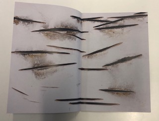
The end of the zine contains ‘Forms of Blossoms’ giving information about the form and parts of flowers expressing David Johnston’s interest and passion for nature. It also contains a glossary listing 55 names of parts of flowers, the contrasts with the start of the zine where David Johnston expresses his experiences to facts about the forms of flowers linking back to the Country Life Project.

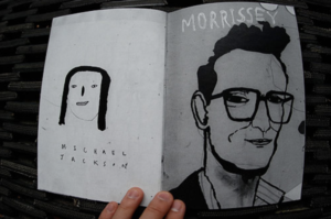
Artistic influence and mood board:Zeroten, and The Shaved Guy by Lin Yi-Hsuan

Zeroten, and The Shaved Guy by Lin Yi-Hsuan

I think this double page zine is effective due to the similarity between the base colours of grey being but the slight different shades to point out an obvious divide between the two pieces themselves.I think the text allow a more interesting composition to the piece and gives more attention to detail and I think this is something I might use within my own project, such as quotes from people within the zine talking about St Helier.  I would interpret this zine as more of a contemporary arts style inspired by the 60’s and 70’s I think the photographer was trying to communicate the way in which drawing and art can be unique and quirky and still have a message wihtin a piece. I think many poeple would judge this piece harshly and say this is not a successful due to the child like influence the artists is seen emphasising throughout his work. My work of course would not be artwork like this but I think the main importance is the synrinarity between the pieces themselves.

I will take inspiration form the covers over these zines due to their vibrancy and interesting drawing and imagery. It will be highly effective,especiall when I will wrap up my booklet in a cover with an interesting mark and then make another card cover with a title and an image of my own onto the top.I am fascinated within the contemporary style of this artist and although my images are not similar I think it will really help me in the long run. The colours of the  pages themselves are always the same within both pages, I think this shows cohesion within the pages and also allows the differences between each page to focus more on the tonal black and white contrasts.
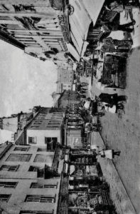
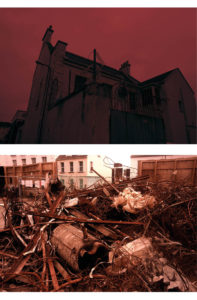
 

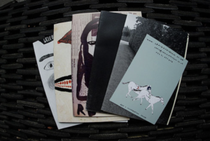
when looking for zines I decided to explore the well known cafe royal and the chosen pieces Craig Atkinson. I chose his work as inspiration due to the way in which it is so unique and art based. There is a strong sense of character and individuality between each of the chosen photos within the book and yet all clearly have a solar pattern and theme and continue as a narrative.I think I need to open my images and also the creativity up when designing my zine,I think the more contemporary and more abstract contrast within the colours and composition and displayed more creative and overall a lot more effective. I want to show juxtapositions of colours, size and also the type of image thsemlves I think this will attain the interest of the reader and present st helier visually and compositionally in a interesting way.

mood board:

I created a mood board in order to look at a quick overview of what many zines layout are like and was I think will be the most effective and also the best composition for each page. I have taken four photoshoots so when creating my zine want to expand more on images that I might not have previosluly experimented with throughougly enough.

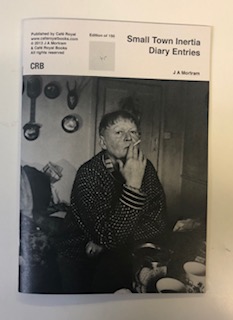
J A Mortram

J A Mortram is a British social documentary photographer and writer. He is the photographer that produced the first zine in my previous post – the zine is from his ongoing project titled ‘Small Town Intertia’. Mortram records the lives of the disadvantaged and marginalised, making repeated visits with a number of people living within three miles of his home. The project tells stories of “isolation, poverty, drug abuse, homelesness, self-harm, mental illness, juvenile crime, and epilepsy”, that Mortram believes are otherwise under-reported.

I chose to study J A Mortram because he looks at individuals in the present tense but he also goes back and visits to see development and change, as we are doing in the ‘Future of St. Helier’ project.  His photographs appeal to me as they are very bold and look at sensitive subjects such as mental illness and drug abuse. The high contrast photographs all blend together well to create a strong collection of photographs.

Mood Board

Image result for J A mortram

Image result for J A mortram

Image result for J A mortram

Image result for J A mortram

Image result for J A mortram

Analysis

Image result for J A mortram

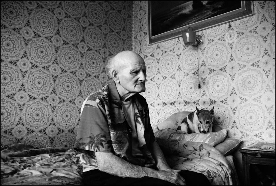
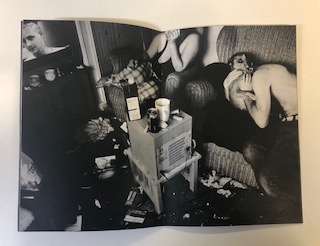
This photograph appears to use the dim natural lighting within the household in order to create a dark and contrasting atmosphere. This contrasting atmosphere creates some areas in the photograph where the subject is over-exposed such as the body of the man hugging the dog – this goes towards creating an even more dramatic feeling to the photograph. A short-medium depth of field seems to have been used as the photograph starts to fade out towards the edges – possibly due to the vignette effect. A quick shutter speed no slower than 1/60 appears to have been used as well due to the dark nature of the photograph, this dark nature may have further been emphasised by the use of a low ISO.

The photograph is also in black and white which creates an idea that there isn’t much happiness or positive energy in the subjects, it makes the setting seem very dark and draining. There is a very wide range of tones within the photograph as in parts it is nearly fully black where as in others it is bright white. There are many subjects in the photograph to lead the eye too but the initial subject that caught my eye was the table in the middle – possibly due to it being at the forefront of the photograph presenting the mess in the photograph. This gives the photograph a slightly 3D effect.

This photograph is from his zine titled ‘Diary Entries’ from his ongoing project ‘Small Town Intertia’ in which Mortram records the lives of the disadvantaged and marginalised, which can clearly be seen in this photograph as there is mess everywhere and it is obviously not a pleasant place to be living in.

I feel that Mortram is trying to shed some light on the disadvantaged and how they live by showing the rest of the world through his photographs and zines. Mortram says that these topics such as drug-abuse and homelessness are under-reported so this is his attempt to show people how privileged they are.

Image result for J A mortram

This photograph using natural lighting in order to convey the fact that this photograph is in the style of documentary street photography. The natural light ties in with the idea that these are just normal people living their lives and the photographs are not staged. It is quite a contrasting photograph in order to create a dark/glum atmosphere – which the setting in the background does itself. A deep depth of field has been used to take this photograph as the whole of the photograph is in focus. A quick shutter speed of around 1/60 will have been used to take this photograph due to the natural daylight. A low ISO has most likely been used here as the photograph is quite dark but not underexposed.

The photograph is also in black and white which shows how bleak and possibly hopeless the life of the subject it. There is a wide range of tones within the photograph due to the high contrast within it. The eye is lead straight away to the tattoos on the subjects back, which seem like a bad decision to most people and so further pushing the idea of what setting this is in. The photograph does not have many layers to it – only the man in the foreground and the walls in the background so there isn’t a major 3D effect within this photograph.

This photograph is another photograph from his ongoing project ‘Small Town Intertia’ in which Mortram records the lives of the disadvantaged and marginalised. Here Mortram shows someone that has made bad decisions and doesn’t seem to be in a pleasant setting to emphasise the idea that they are marginalised.

I feel that with this photograph Mortram is trying to show that everyone has their own unique properties and stories – he is emphasising that the marginalised and disadvantages are no different to the privileged in the sense that they make their own memories but in their own way.

Analysis of a zine picture book

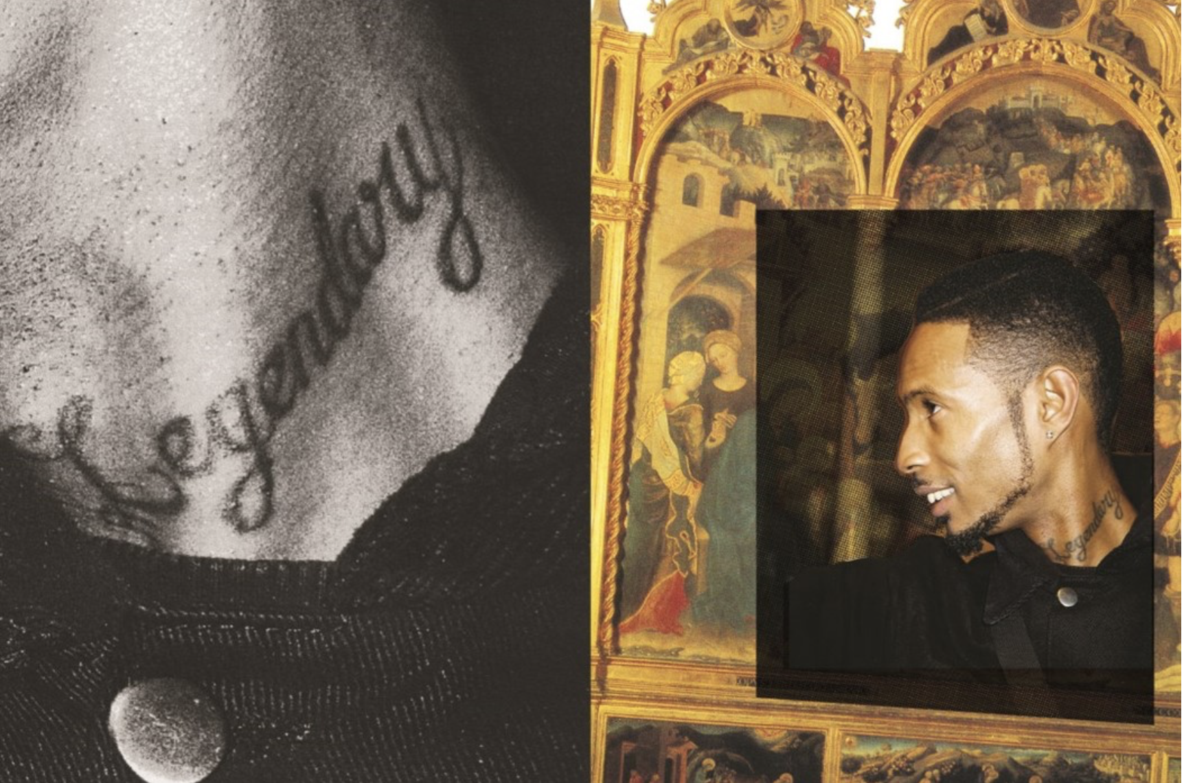
Joseph Patterson created a zine in order represent underground music as a creative renaissance of generations.The grime and hip hop scene was flourishing and he wanted to develop emerging themes and allow them to flourish within his work. The mainstream coverage of this work is typically poor and actively neglecting the scene and portraying a harmful approach to the music by the conservative media. His work shows a space that was ‘actually invested in underground music in youth centre’ they described as wanting their images less formal so a zine would be a unique format to enhance their work.

His images are a mix between a shoot on location and rarely people on stage as they do not want a featured person to be perceived a certain way in which they would not deem themselves. They use a mixture of overlapping imagery within their displays and writing quotes on some pages, usually the images have a strong contrast of time periods and the colours connecting them are overlapped between vibrant and black and whites.

This particular artist and group are typically based online which is why they launched this zine issue as it features a Longform and creates something in which you can look back at in years to come. lots of their work was inspired by DIY culture and stripping back and keeping the core elements of a photo and celebrating a passion and making your work personal by the intricate way In which you put it together and the people you surrounded yourself with. They want to highlight the importance of interconnectivity between the worlds of online creativity and physical when coming to photography.

Analysis;

I think this zine has conceptually a really interesting subject matter and narrative,although their is no chronological order or a method to which the story is being told but a representation of a current state of living for people within the underground crime music industry.It demonstrates a subjectivity of community within passions of people and the importance and influence music can have upon young people. The images itself develops the narrative construct of time and the comparison of having two highly different timeframes being presented as one (renascence and modern day) the images have an interesting composition of overlapping images to be placed upon older original works of art, these allow the placements to look more abstract and be Random in their framing but close up allow a intertwined structure to the narrative. The colours while are light do not reflect any vibrancy and come across as dim, this is to symbolise a similarity when forming to the older more dim and reserved older images. Overall I think this zine is highly effective with its message and is highly unique in comparison to many other zines.

Inspiration for my Zine Design

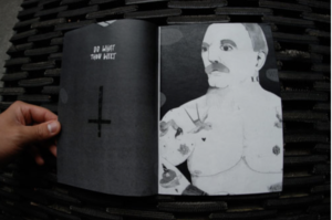
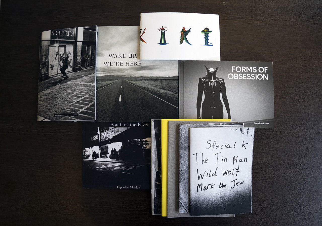
Zine 1

I chose to look at this zine because the dark and contrasting  full-bleed photographs appealed to me as I am using full-bleed photographs in my design. The design of this zine is very dark and simple which fits in with the dark theme very well. The full-bleed photographs help to convey the bold theme as it almost makes the photographs more invasive and in your face.


Zine 2

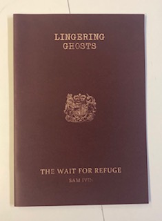
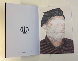
I found this zine very interesting as it has a strong theme as well as a message. Each double page consists of a symbol with a quote from the subject on the left side and then a portrait photograph of the subject with the face scratched out. This theme of identity carries on throughout the zine and is further pushed by the similarities between the cover and a passport. This simplistic design allows the message to be carried further and looks very aesthetically pleasing.


Zine 3

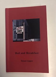
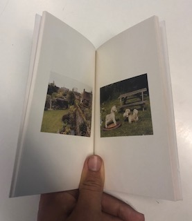
I chose to look at this zine as it has a more professional design to the booklet. It has a spine and is done through binding whereas the other zines are just stapled together. The design and placement of the photographs are very simplistic and minimalistic, there is one photograph per page with a wide border in order to allow the viewer to focus on that one photograph, which I think is very effective.

Zine 4
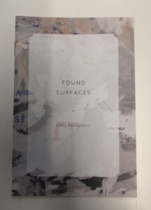
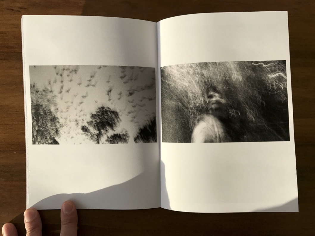
I looked at this zine because it has a busier and more abstract look than the other zines. The cover has a lot going on behind the title unlike the other zines and has an abstract look to it. This theme is carried on throughout the zine with full-bleed double page spreads of abstract photographs. This alternative approach is very eye catching.


Research and analysis of my zine

Zine; A Zine is an effective method of marketing and presenting your photography, they have been created for years there is a creative athletic collaborated wihtin the making of zines. it creates the ability to create a impact of juxtaposing and sorting images into a story in order to enhance emotion.There is an energy and ability to show yourself through the work as you make it yourself. This aesthetic enables a tactile creative freedom. I believe that zines look and feel professional and achieve a high quality when out onto thick paper and good printing, it allows a completed piece and presentation without the harsh formality to take away from the piece itself. its expressive and shows a desire of photography  throughout.

When gathering my visual inspiration I wanted to concentrate on the themes of narrative, subject,design and concept. When choosing the theme of my Zine I want to have a constant theme throughout and so not having a segregated feel to the piece as a whole narrative concept. I wanted the narrative to be the history and time present throughout St Helier, I wanted emotion and periods of time to be expressed through the modernisation and deforestation of St Helier and the people who have inhibited St Helier for long or short periods of time and the cultural impact of the area on them as a whole. This embodiment of time, emotion and urbanisation forms St helier in a unique frame which would be intriguing wihtin the prevention of a zine.

When questioning the theme of the piece I want to show how neglecting  periods of significant historical moments  such as ww2 and the occupation had upon old buildings and families within The red section of St Helier,The deep urbanisation and neglect for buildings shows a historical significance of abandonment and reflection of past times, which some elders say shares community and ethnicity within people and the reflection upon each other. However between my photos you can see a current distinction between the modern building up or architectural developmental impact upon the people  and the money in comparison to the people within this section. When using this theme of history of time to use a comparison of people and community effect and wether work or community is enhanced wihtin the specific section of St Helier.

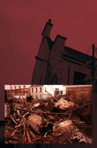
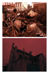
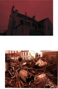
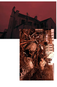
My subject matter at the start of this project was more projected upon the buildings of St helier and the different narratives of building destruction and neglect, this then illuminated the possibilities of reflecting the people who live among these communities. I think my most successful images are of the subjects of construction of buildings such as piles of rubble and construction. The thematic colour of red also connotes a historical reflection of war and how the buildings being taken should be a reflection of a movement or however an ignorance go past history.I believe in this 16 page booklet the buildings would be more conceptually pleasing and also creative a narrative more available to the reader. My whole concept overall for the Zine would be a time frame of chronological demolish rebuilding and relation fo people living in the various areas itself.


Final images and jersey archive inspiration

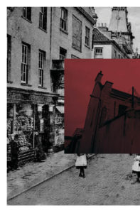
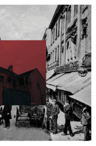
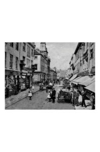
  • For my final presentations I not only wanted to incorporate my themes of the progression and modernisation of st helier but also the way in which I could demonstrate the history and st helier through the archives. I through I could express these themes tonally and show intentions of what the original images would’ve been similar to. I was inspired by themes of documentary photography, this seemingly objectivity should be the ability to convey the impression of an unmitigated image. 
  • The images have  a range of colour overlay experimentations to show a vibrancy and show a senses of life to st helier itself. I was inspired by previous work as colour allowed a free expression and eye catching attentions to the composition nd layout of the images. Howver I think my work has many features of arcjitextual and urban landscapes better complimented wihtin cooler tones, these simplest comparisons present a pre occupation to different sides of st helier and the community and architectural interest wihtin the areas. 

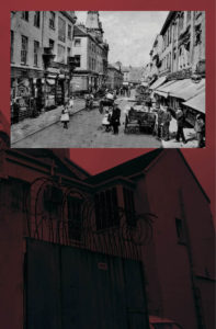
Jersey archive:When thinking about jersey archive I wanted to visit area of great prominence to st helier,i think it is interesting of how time shows the development and also deterioration of an area and allows the community to be subjective upon what they think about it.

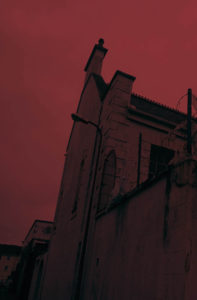
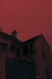
overall:My aim was to achieve a complimentary colour, composition and overall feel I want to convey of st helier.When speaking to teachers and other photogohers they agreed the most successful and complimentary images are those which represent jersey archive through the time difference of old and modern while still representing the area and mostly in an urban way. the colours I have chosen I have edited in such a way to be similar in their tones and have the same red themes throughout. all of these images demonstrate a process of destruction and reconfiguration of a landscape to form a comparison of St Helier itself.It shows a evolution of an area, time and the people living within the area itself. lastly I wanted to concentrate on the composition of he piece and experimentation within how the images can be presented to the audience with the most effective way.


The lower compositions are too segregated and do not have the correct flow to what a double age would need in a magazine. I have further experimented within that could be my final composition.i could incorporate more experimentation within the architectural construction pieces I have as these also further develop a sense of work ethic and a life to st Helier and the property development within St Helier itself.I will definitely grout and develop an additional shoot for my St Helier project in order to grab a different angle or St Helier and the modernisation and constraint changing to St Helier itself