Category Archives: AO2 Explore Ideas

Filters

Author:
Category:

text to put inside my photobook

I belive after much research it would probably be too much text if I were to research stories, because of this I belive I will focus on quotes and short stories about the sublime. I wanted to start off by looking at poems which attempt to describe the sublime, which is a great relation to the subjectivity it has. With this I believe it would be possible to connect these explanation of what someone sees and connect them to my own imagery. The poems are divided into more abstract and contemporary feeling describing what the sublime is, combined with a more of a defiant research by a philosopher or writer describing what he thinks the sublime is, and what it means to people.

A meditation rose on me that night
Upon the lonely mountain when the scene
Had passed away, and it appeared to me
The perfect image of a mighty mind,
Of one that feeds upon infinity,
That is exalted by an under-presence,
The sense of God, or whatso’er is dim
Or vast in its own being (1805 Prelude, lines 66-73)

I chose this short part of a poem written by William Wordsworth as it reflects on his experience. The means by which ‘Nature’ transforms the mist into an ocean. It’s quite comprehensive and subjective as a text in its relation to each person, but this is why it is successful, as it mimics the feeling to that of the sublime.

Is with infinitude, and only there;
With hope it is, hope that can never die,
Effort, and expectation, and desire,
And something evermore about to be. (1805 Prelude, lines 538-42)

The sounding cataract Haunted me like a passion: the tall rock,The mountain, and
the deep and gloomy wood 
,Their colours and their forms, were then to me An appetite
; a feeling and a love (our emphasis 76-81
“Whereas the beautiful is limited, the sublime is limitless, so that the mind in the presence of the sublime, attempting to imagine what it cannot, has pain in the failure but pleasure in contemplating the immensity of the attempt”
― Immanuel Kant, Critique of Pure Reason
“And I find a happiness in the fact of accepting —
In the sublimely scientific and difficult fact of accepting the inevitable natural.”
― Alberto Caeiro, The Collected Poems of Alberto Caeiro

Whatever is fitted in any sort to excite the ideas of pain, and danger, that is to say, whatever is in any sort terrible, or is conversant about terrible objects, or operates in a manner analogous to terror, is a source of the sublime; that is, it is productive of the strongest emotion which the mind is capable of feeling.”


analysis:
After speaking to one of my photography teachers, I know the importance of the size and where the text lies on the page, and to make sure it is not too crowded. Because this I have above experimented with three different forms which I could lay out my book. The first being a short poem, which is quite large over the page. I believe the poem, first off, being next to this image is successful. The image itself is quite ambiguous yet does inflict connotations of loneliness abandonment and mystery. Because of this the poem discuses a lonely girl mimicking a lovely landscape which she believes to be sublime. To my mind this is a perfect example of a text and image helping each other in order to further evoke an emotion and a narrative story for discussion. However an important aspect which I need to change, is the sizing of the text. This on screen does not look large but when it is printed, this will overwhelm the page and make the layout look too messy with the large gapping. Overall I belive this double page spread with this text is successful and I will further develop this to my final cut of the book.
The second composition I experimented with I am less keen on. I  wanted to experiment with this image because it is a mimicked expression as what the sublime stands for. Her being underwater and face divided shows a beauty and inevitability of death yet peacefulness. Because of this the image should be displayed on a much a larger level. However due to the poem I chose being quite long to the extent of the space the text overwhelms and creates the page lookout to be too busy and then takes away from the poem , instead of enhancing the image itself. I believe the poem I have used already is successful on its own but the overall composition with this a layout, even with a smaller text is not very successful, and should not be used for the final edit of the book.
The last layout is a long extended poem discussing the limitlessness of beauty. These go hand in hand with the young girl in a deep tonal colours with a light shining on her, this symbolises her beauty, and  due to its darker tones also creates an aspect of Pictorialism within the photo. The boarder use also frees up space making the text look less crammed for space The smallness of the text itself also works and due to its shortness this once again enhances the image and I should develop this further, and possibly keep this as a final composition.

additional images and editing process

After speaking to both of the photography teachers, their favourite shoot is the water reservoir shoot, where I show both a combination of colour development, and use the light in such a way to evoke a sense she herself is submerged within the water. Both the water shows reflections of not only the Light and sky, but of the woodlands themselves. This illusion of the setting being repeated shows a really interesting aspect to the images themselves. All these are images which I did not choose when I did my first selection process. This just showing the pivotal importance it is to look back on your images as there will be a good variation which are too successful. The top three of my images I edited in such a way where her eyes and the water is the same colour, and both are over exaggerated to create a mystical and perhaps even a Utopia atmosphere altogether. I believe these images are very successful and That I will be using these inside my end product photobook. I belive I will replace these images withe the underwater Go Pro ones. This is because the go pro images, not only are not the best detail, but most of which do not have such a successful composition as these do. I do not want my book to be a reflection of the development of my project, but just a successful finished product. Not only this but due to their quality, it is near impossible to edit the colour of the images clearly and successful, so they do not blend and work with the rest of their images. I will now start experimenting with the way I will be able to use these images, alongside the current layout with my photobook, and hopefully this change will really benefit the quality of my images, and create a deeper interest within the book.       I have edited an array of images, all with the variations of slightly different styles throughout. Some I have edited just in order to change the tonal colours. This is because I want to show a reflection of a certain theme, or perhaps I wanted to emphasis the tonal  colours within the piece.  However, due to the majority of my pieces being complicated to shoot and being largely full of many elements, many of them I do not need to specifically photoshop further. This is seen within many of many water imagery. However some of my images I though to would be interesting to see how far I could take them and possibly change and refine them to appear more sublime.

Another shoot I decided it would be worth while to look at and find more images of was, the pool shoot. Due to me discussing about removing many of the go pro images as they do not fit in with the newly created narrative as much as the images above, I thought it would be interesting to experiment with finding and editing more of the images from this shoot.

With these more colour experimental images left over, I wanted to show a more abstract water life through the sublime. The water and mounting of the bubbles is all over the place, and because of this I thought it would possible to create very interesting imagery to split apart my much more controlled tablo shoots. I edited the images to have an array-of blue tonals but deferring from dark blues to greens and purples e.t.c.I perhaps Will experiment with possible ways which I could apply this in my book, however I belive currently, the rainbow rock image are the main priority for the concept of how I am splitting apart my images. Additionally these images are not as successful as the shoot above, and I only want to show the most successful of my work throughout the book.

Book Specification

I want my book to be finished with a hard cover to show a professional finish and ensure quality throughout it.  I believe that an standard sized landscape photo-book will be the most appropriate size as the photographs will be large enough to be seen in detail and there will be enough space to mess around with the formatting of the photographs.   For the paper I will choose the option of premium lustre paper to offer a hint of gloss as well as greater tonal range and contrast. Throughout the book I will be using a mixture of landscape and portrait orientated photographs including a mixture of family environmental portraits and documentary-style photographs of my house as well as archival photographs as this will create a sense of documentary as well as including a personal touch.  I will be using a mixture of design layouts throughout the photo-book such as full-bleeds, off-centre photographs and centered photographs to create a variety of styles and to keep the viewer interested in the narrative.  I am planning on creating a narrative that shows the development of the house from beginning to the current state whilst including personal portrait photographs throughout as well as a couple photographs which do not seem to fit the narrative – the result of this will be a couple of narratives running throughout the book creating a more interesting and experimental book.  I think that I will be using primarily images in the book with minimal text as I would prefer the photographs to show development rather than explaining through added context.  I will be using a mix of black and white and colour photographs – the documentary photographs of the development of my house will be in black and white whereas photographs depicting family memories will be in colour in order to bring some life into the photographs.  I will be taking inspiration for the layout of my book from some of the layouts in “Retracing Our Steps” by Bression and Ayesta.

Photobook Investigation – Beyond Drifting: Imperfectly Known Animals

Sequencing of images can be based on chronology,  geography, family, resemblance, art history, season, colour, form, tone, flora, expression, dress, climate, mood, symbolism, material, and so on.

“In three words, what is your story is about?” 

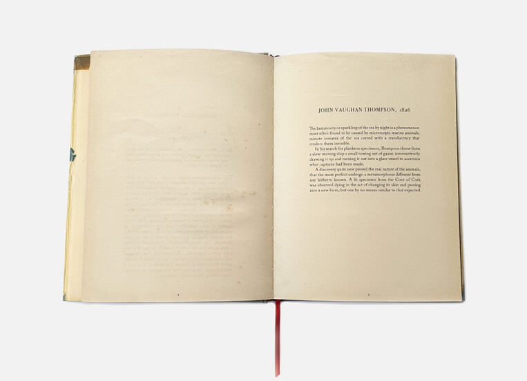
Mandy Barker’s “Beyond Drifting: Imperfectly Known Animals” narrates environmental issues through showcasing specimens of plastic waste under a microscope. The “plankton” specimens in this work are beautifully photographed objects of marine plastic debris, recovered from the same location as naturalist John Vaughan Thompson’s plankton samples from 200 years ago. Each specimen has a new scientific name reflecting early Latin origins and containing the word ‘plastic’ hidden within its title.

The photo book influences an audience of humans in general, using beautifully aesthetic images to shock the viewer by first capturing their attention with beauty before revealing the dark meaning behind it, this being the impact we have on organisms in the environment.

The book features scans of the damaged pages of Brian Keenan’s “An Evil Cradling”, discovered in the ocean by Barker when searching for polluting items.

The book of the series which was shortlisted for the Prix Pictet Award SPACE 2017 was exhibited at the Victoria & Albert Museum London and is touring 12 international venues over the next 2 years.

Deconstruction of the physical and narrative features of the book:

Book in hand: The book comes wrapped in a cardboard piece, alongside a research notes book and a card featuring two images similar to what is featured inside. The book itself is a hardback with a cover of paper over the front and back. The paper cover is smooth but the hardback underneath is textured reflecting water damage. The title of the book is embossed alongside an illustration of a starfish, also embossed. Section-sewn binding with book ribbon; interior tip-in; dust jacket; hand finishes.

Paper and ink: The images feature on black pages mainly, with the occasional white background that stands out. The pages are matte and slightly textured feeling dried out. All images are coloured. The circle in the center of the images takes up the majority of the page to allow for closer analysis by the viewer.

Format, size and orientation: There are 104 pages and 59 colour photographs with illustrations throughout. Dimensions: 23 x 17.5 cm portrait.

Title: In Mandy Barker’s own words, it is called ‘Beyond Drifting’ “because we are not beyond putting an end to the problem – but we are beyond salvaging what is already out there”. Drifting also refers to the state of floating above water, like many of the plastics Barker discovers in the oceans. The series of work is presented as an old science book from 1800’s, that as well as reflecting the current situation regarding organisms intake of plastic, also subtly includes the original writing, descriptions, and figures recorded by Thompson in his research memoirs of 1830, entitled, ‘Imperfectly Known Animals’. The book uniquely captures our changing times along with both past and present research.

Structure: There is no distinct narrative. Instead, Barker places micro images of pollutes found, next to images of the same objects from afar showing a contrast of the aesthetics of the object in a scientific method. Barker repeats the layout throughout encouraging the viewer to imagine what the object is, based on the fictional scientific names given alongside them as well as location they were found in.

Text: The Photobook opens up with a description on plankton made by Dr Richard Kirby, giving an idea for the importance of their presence in the food chain, and how detrimental the effects of micro plastic particles can have on them. An abstract on John Vaughan Thompson’s  search for plankton specimens is also featured.

Quoting Rachel Carson, the first page of writing in the entire book reads “Always, then, in this flotsam and jetsam of the tide lines, we are reminded that a strange and different world lies offshore”.

Photo-book Investigation – Retracing Our Steps by Bression and Ayesta

Image result for bression and ayesta retracing our steps book
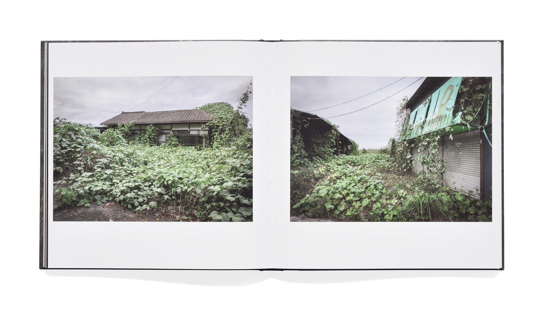
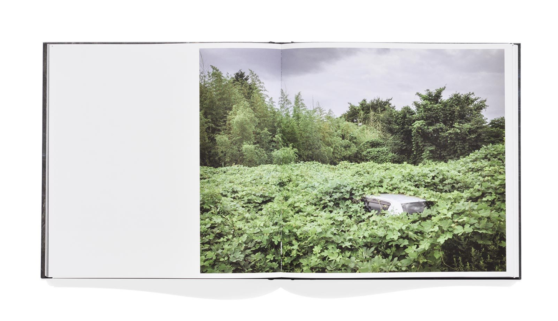
The book ‘Retracing Our Steps’ by Carlos Ayesta and Guillaume Bression looks at the nuclear disaster in Fukushima in 2011.  The photographers have made regular visits to the ‘no-man’s-land’ and have created a book that consists of mix posed situations with a documentary approach.  The photographers asked former residents to come back to their original environment to see how much these formerly ordinary places have changes.  The subjects were asked to act as if nothing had happened, and to behave naturally.  The resulting narrative in this book is a harrowing story of how things can change over time and become so massively impacted from unexpected events which are out of control.  The photographers have made this to “show what the inhabitants have to face when they come back to the place where they used to live”, which shows the the audience of this book is partly the previous inhabitants, and partly the rest of the world to shed some light on how disastrous the impact was on the area.  The book won Bression and Ayesta the New Discovery Award presented by Le 247 Gallery and has been exhibited at festivals such as the Athens Photo Festival.

The book is finished with a half-cloth hardcover and measures 23 x 23 cm.  In total it has 152 pages with 102 colour illustrations.   The photo-book consists of full-bleed double page spreads as well as photographs presented centrally in the page along with text with some off-centre photographs.  There are also smaller photographs included in some pages to create a sense of typology within the narrative.  The photographs in a full-bleed are intended to seem imposing to the viewer and are closer to the front of the book in order to seem bold and to draw in the viewer.  The photographs presented with text are to give the viewer some context about the subjects and their situations as well as to create smaller narratives within the photo-book, it also helps the viewer to see that the destroyed Fukushima area was once the home to thousands.  The title ‘Retracing Our Steps’ reflects the idea behind the book very well as Bression and Ayesta travel back to the no-go-zone to show where the impact started and where the inhabitants are now.


Mark Dion Thames Dig

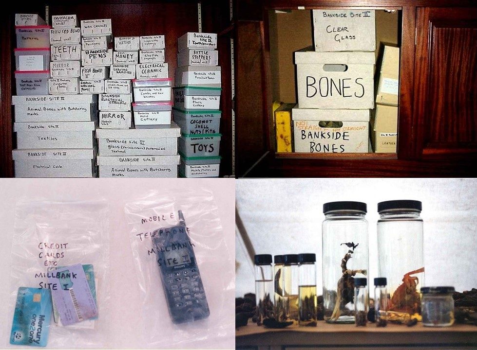
In this series of images, the entire process of collection is captured, from the volunteers cleaning and analysing the banks of the Thames to  the sorting of items by categories – ceramic, glass, bone, leather, shells, organic, plastic and metal. Mark Dion instructed the volunteers to take a ‘scatter-gun’ approach to collecting: to collect anything and everything that caught their attention.

The images reflect a documentary approach, with the scenes within the images not being manipulated. The camera over exposes the images which gives a vintage feel. The details, however, stand out due to a high contrast between lights and shadows.

Before presenting the items as an installation, arranged in a mahogany cabinet, Dion captures the items sorted into plastic bags and boxes.

current Analysis of shoots and how I use these together.

Currently with all the shoots that I have so far, my main objective is to do one more underwater shoot ,and two shoots of landscape images which have the ability to split up the narrative of the book and not have a constantly repetitive water imagery. I have taken more shoots then appear below, However I do not know weather with ,y new objective if they will fit within the new narrative of the book itself. However if I do decided to pursue the angle of the sirens and the development of their forms, such as:  birds and scales, this too could be a small photoshoot I could use with the intention to add some variety to the book itself. I always had the idea that I wanted every single image to be interesting within how it is composed and always have a new interesting surreal aspect of interests within the images themselves. Below is around 25 of the 40 images that I will need for the book. This allows me to keep a perspective of how many more images I need for the content to be to a high standard.

SAMSUNG CAMERA PICTURES

SAMSUNG CAMERA PICTURES

SAMSUNG CAMERA PICTURES

SAMSUNG CAMERA PICTURES


Keith Arnatt

The Tears of Things (Objects from a Rubbish Tip), 1990-91, colour photographs, selection

Howler’s Hill, 1987-88, colour photographs, selection

“it is a nature condemned to death by its own recycling, no longer an original presence to be symbolically opposed to culture.” – Jeremy Miller

Keith Arnatt uses his minimalistic style in ‘The Tears Of Things’ to capture items from a rubbish tip with an aesthetic that forces the viewer to think deeper than the object in the image. It provides questions such as the dangers on the environment as well as who the items belonged to and why they were thrown away.

‘Howlers Hill’ is primarily a study of split plastic bags, in which their decaying products emerge from. The natural lighting shows that these images were taken in an outside environment. As the bags split under pressure from their environment, either by the weight of loads placed upon them or natural decay, the contents fall out & are on display for all to see. The fragility of the bag could be seen as a metaphor or Sign for our own lives & inner burdens which threaten to burst open under the slightest extra load.

Image Analysis

Keith Arnatt, The Tears of Things, 1990-91

In this series, Keith Arnatt captures items found in a rubbish tip, specifically in this image a disposed plastic baby.

The phrase “The Tears of Things” translates from the Latin phrase “Lacrimae rerum” which means the burden human beings have to bear, ever present frailty and suffering, is what defines the essence of human experience. Arnatt uses this phrase to describe the effect we have on our environment.

He places the item in the center of the frame, forming a vignette around the sides by using a tungsten spotlight. This reflects a minimalist style by using a simple black background. He uses a low aperture in order to focus the forefront of the item, the rest disappearing into a dark blur in the background.

The simplicity of images in this series come as part of the conceptual movement, which Arnatt was such a big part of. Conceptual artists recognize that all art is essentially conceptual. In order to emphasize this, many Conceptual artists reduce the material presence of their work to an absolute minimum. Conceptual artists were influenced by the brutal simplicity of Minimalism, but they rejected Minimalism’s embrace of the conventions of sculpture and painting as mainstays of artistic production. For Conceptual artists, art does not need to look traditional or even take any physical form at all.