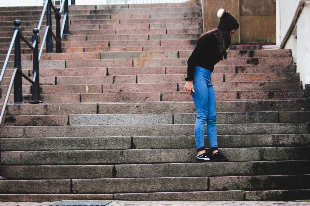
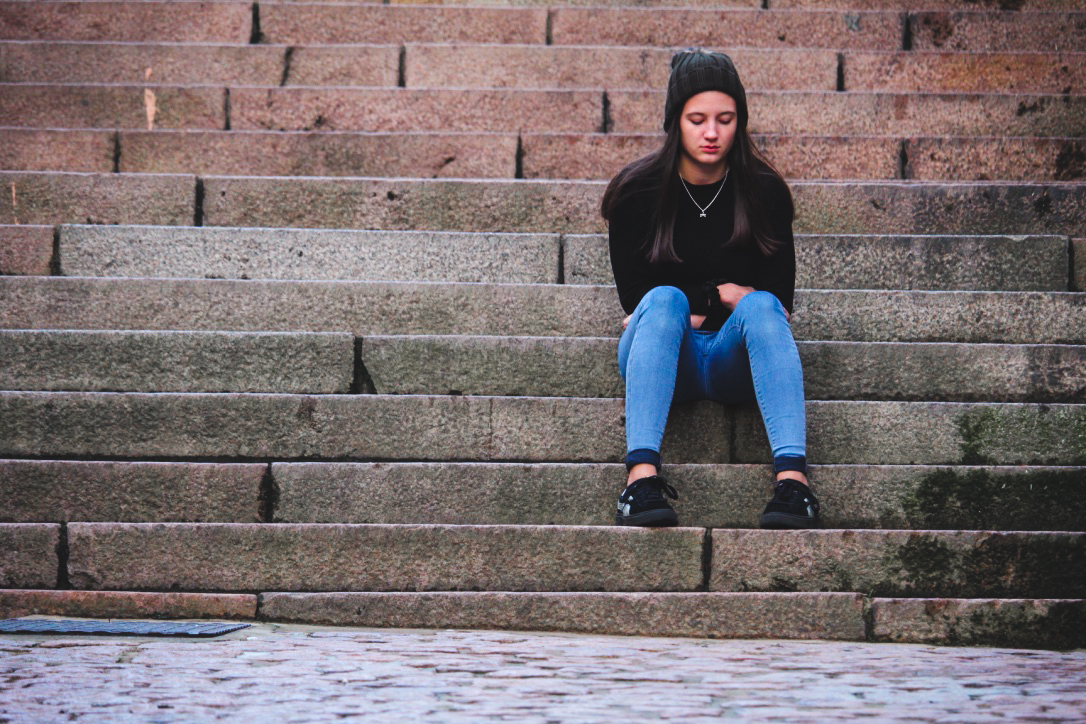
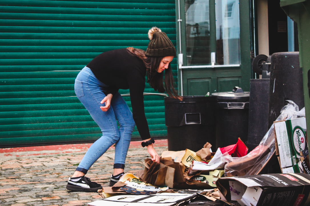
Category Archives: AO1 Develop Ideas

Filters

Author:
Category:

Street Photography – Homework

Planning

Task – Take 100-250 photos in an urbanised environment with people as the main focus.

Models/Props – Friends and strangers

Camera Settings – I will use a quick shutter speed of about 1/100-1/500 depending on how fast the subjects are moving as I plan on photographing them whilst they naturally move around. I will use a low ISO as the area I will take photos in will be well lit with street lighting.

Lighting – Natural lighting will mostly be used however may be necessary to use a flash to highlight key aspects in my models face

Location – In town as this is an urbanised area

Context – Photographing strangers and friends without them aware of the photo being taken in order to capture a realistic view of how they would be behaving.

Concept – To capture street photographs in the style of Vivian Maier and Robert Frank.

Vivian Maier

Vivian Maier (1926-2009) was an American street photographer born in New York City. Her work was unknown and unpublished during her lifetime. In 2007,  collectors found some of her prints and negatives in boxes. Her images were first published on the internet in 2008. Her work has now been exhibited in North America, Europe, Asia and South America. A lot of details about Maier’s life remains unknown.

Image result for Vivian Maier

Image result for Vivian Maier

Image result for Vivian Maier

Robert Frank

Robert Frank (born November 9, 1924) is a Swiss-American photographer and documentary film maker. His most notable work, the 1958 book titled The Americans. His style of work is classed as photo journalism and documentary/street photography.

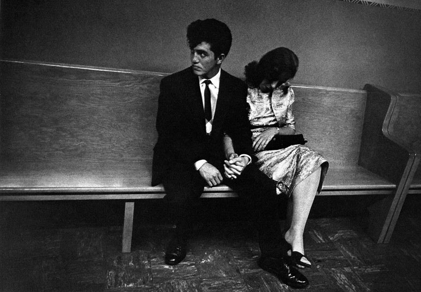
Image result for robert frank

Image result for robert frank

Photo Analysis

Image result for robert frank

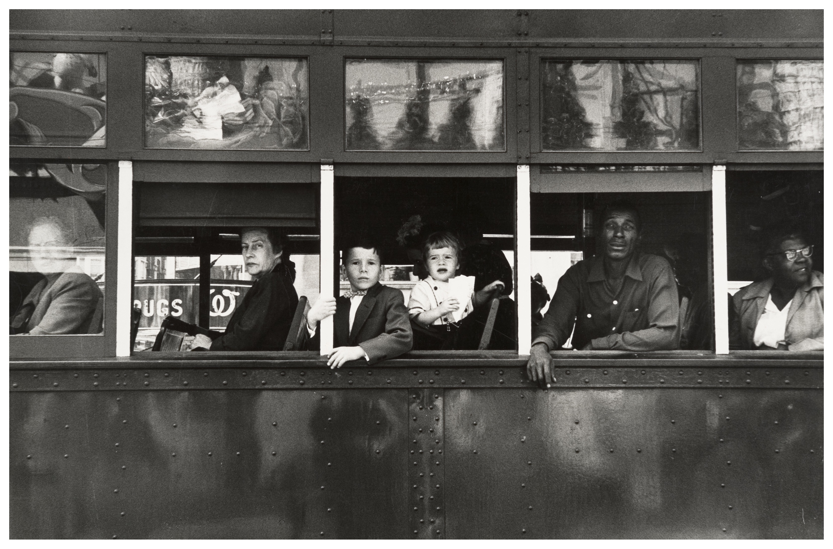
The first thing which caught my eye when observing this picture was the clear use of the rule of thirds. The bus itself create natural lines almost along the horizontal lines when following the rule of thirds. I believe this helps the viewer the see how the picture is made up of several portrait pictures. There is a large tonal range within this picture, with lighter tones towards the top and darker tones towards the bottom. The tonal range can also be seen within the skin tone of the people on the bus, from the left hand side a white man is presented and on the right hand side we are presented with a black person. We can clearly identify that Robert Frank would have used a fast shutter speed in order to take this photograph. This is because the picture is of a moving subject and would require a fast shutter speed to prevent a blur in the image. With a fast shutter speed he was able to capture a sharp photo.There is also multiple textures inside of this image, for example there is the texture of the trolley at the bottom of the image. The blots on the trolley also add another texture to the image.  Moreover, there is the texture of the windows at the top of the image, these look smooth.

This image is split into 3 main sections, the top middle and bottom. The middle part is the main focus which contains the main subjects of the people. Where as the top and bottom contain some interesting textures and reflections but this is not what stands out and catches the viewers eye immediately. There is a definite contrast within this image, with the black and whites exaggerated. There is a clear contrast between the white poles/bars separating the people and the rest of the bus, perhaps influencing us that they are a main factor of the image. This photo has been captured in natural light which is expressed in the reflections at the top of the image. I think that the use of the picture being in black and white emphasizes the different races.

This image taken by Robert Franks was captured in the 1950’s. This image was also taken in America, New Orleans. At this time period,  America experienced marked economic growth – with an increase in manufacturing and home construction among a post–World War II economic expansion. At this time period it was uncommon for photographers to tackle the issue of racism which is a key theme portrayed within this photo. The time period when this photo was taken was a time of racism and prejudice. Although the photo may have been an ‘accident’ as Robert Frank himself said, it may have been a powerful and strongly influential picture to help the problem with racism.

It looks as if the different races are separated from each other. The white man is at the front of the trolley while the rest are sat behind him. This can connote the fact that at this time people like that where protected by society and had more ‘privilege’. The different facial expressions of the different people can say quite a lot about the image. They all have the same serious look about them. This can represent the lives of these people. The layout of the characters in the image also represents the different classes, for example the man at the front could be a higher class than the one at the back however we do not know this it is just interpretation. The white bars can again also show the separation between the different classes.

My Photoshoot
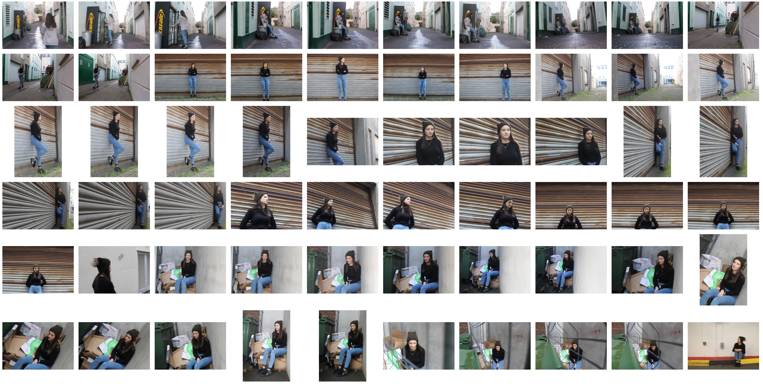


Edited Images
Photojournalism

What Is Photojournalism?

Photojournalism is a form of journalism that uses images rather than words in order to tell a story or report some significant news. It is now usually used to refer to still images but in some cases it also refers to the use of videos in broadcast journalism. Photojournalism is distinguished from other close genres of photography such as street photography by using a strict ethical framework which demands that the work is honest and impartial whilst telling the story in strict journalistic terms. Photojournalists must be well informed and knowledgeable about events happening in the world. They deliver news in a creative and entertaining format.

Photojournalism started off by being inspired by war photography in order to create an accurate representation of war. They would aim to show the suffering and complete devastation of the wars to potentially prevent these wars from occurring. Due to this there was a large expansion of photography which soon inspired the Golden age – This is often considered to be roughly the 1930s through the 1950s. It was made possible by the development of the compact commercial  camera in 1925 and so journalist true flexibility in taking pictures.

Photojournalism goes hand in hand with street photography in the sense that they both aim to present a truthful representation of a situation in which people are unaware of and therefore help to make an impact. They are both hard hitting genres for some people to view and really embrace the viewer to feel as if they are in the scene themselves.

Image result for photojournalism

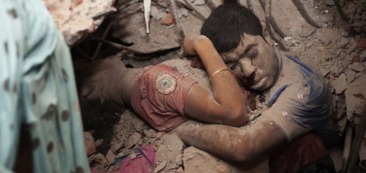
This photograph is an example of photojournalism. It displays an unexpected real life situation which is a devastating event. It is hard for the viewer to intake this kind of image as it is extremely saddening and makes you think how unfortunate some are. The positive thing which comes out of this kind of photography is that it makes us want to help people in these areas and positively impact the world.

Street Photography Shoot

What is street photography?

Street photography, also sometimes known as candid photography, is a type of photography conducted for either art of inquiry, that features many unedited encounters and random incidents within public places of interest.

I found that many images of street photography included capturing the subjects off guard, and so thought that to try this would allow for maximum effect when taking the shoot. 

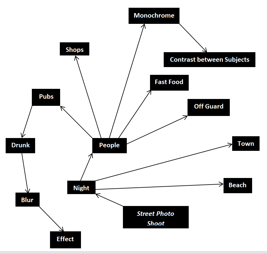
For my shoot I decided it would be either best to go into down for the nightlife, or stay around the street where I lived such as the bars etc. When planning the shoot I wanted it to be clear what I would be taking pictures of, and so made a mind-map to record my ideas, as seen below:
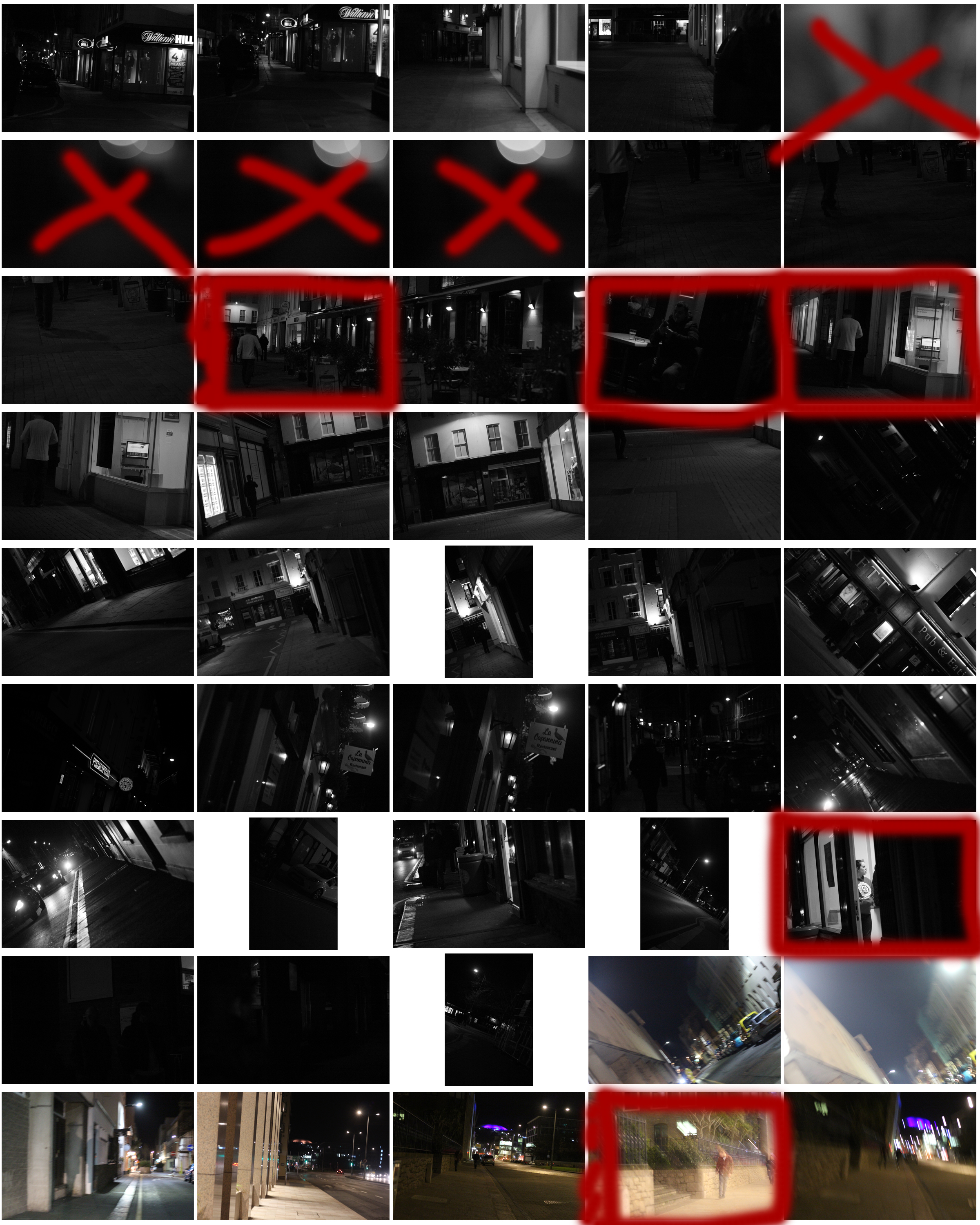
This allowed me to focus on certain aspects of the shoot easier, as I now had a rough idea what I needed to capture. These were the results from my shoot:
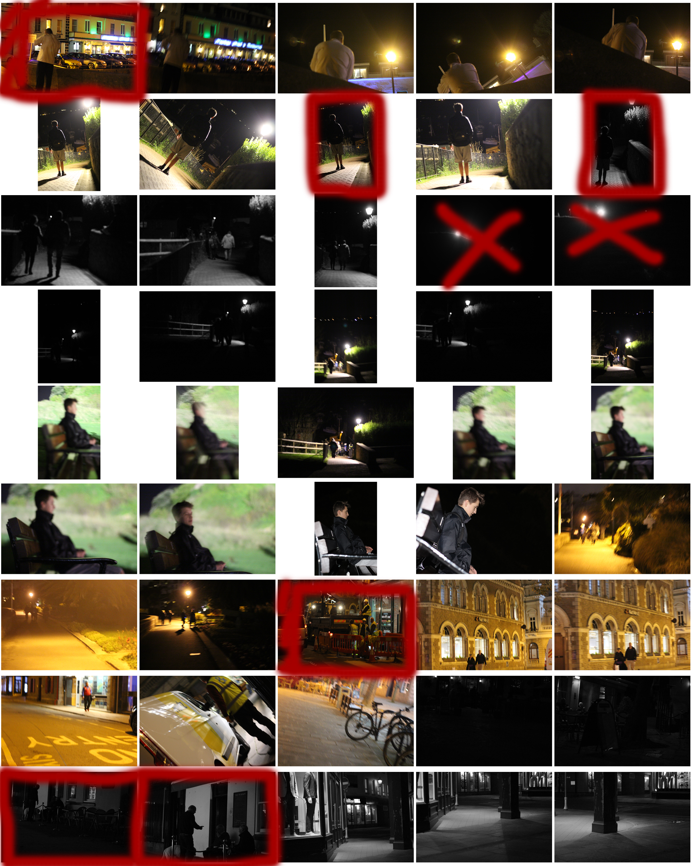
 From the shoot I went on to highlight and crop the images I thought were the best out of all the photographs. This allowed me to limit the shoot down to just ten pictures so that I could choose my final image to display. These were my choices:
Once again from here I went to limit my selection to a top 5 to make it easier for me to find the final piece. This was my result:

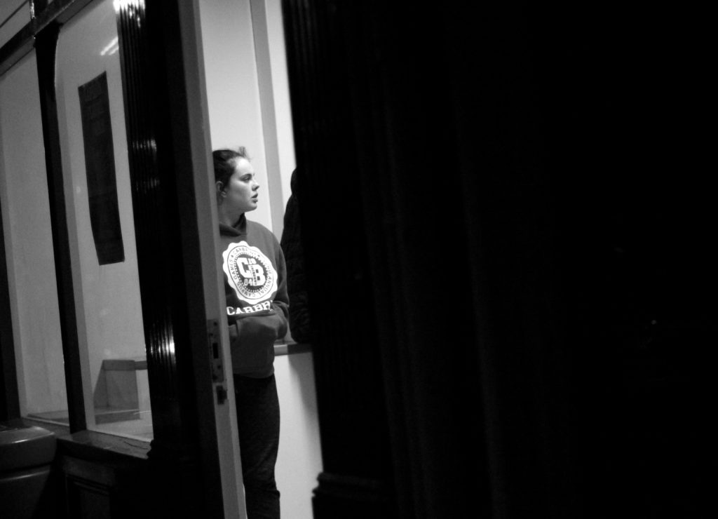
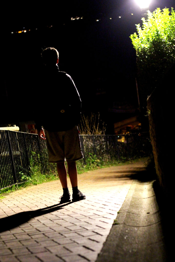
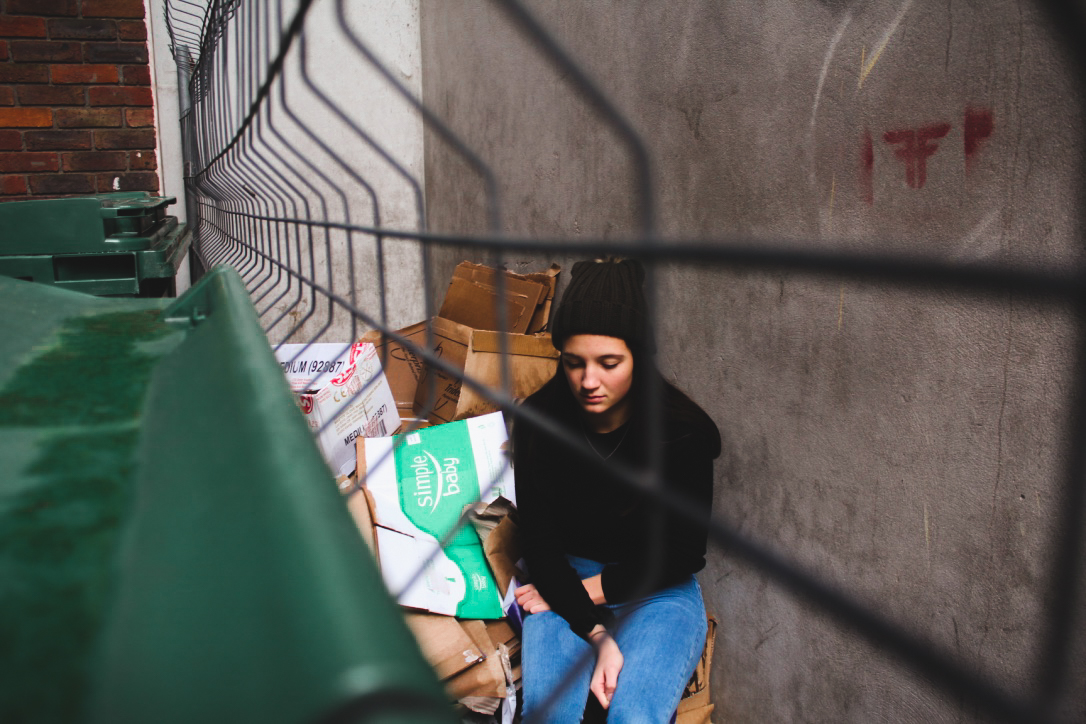
I chose this image because I loved the contrast between the darkness of the wall, and the subject. This is due to the rule of thirds which line up with the character inside, which instantly draws your eye to the face. I found that the pure blackness of the wall covering the picture added for a dramatic effect overall, making it almost seem hidden.
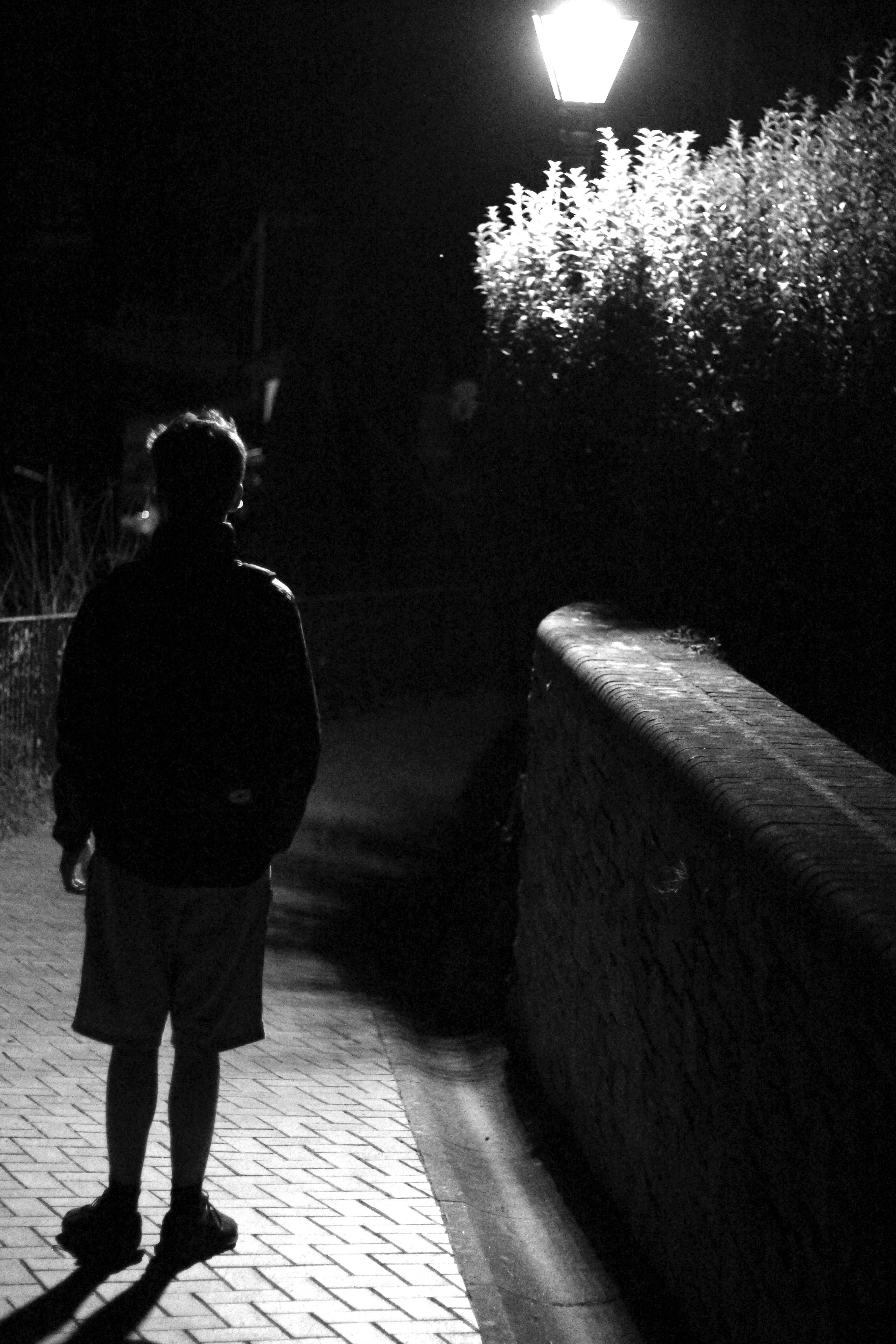
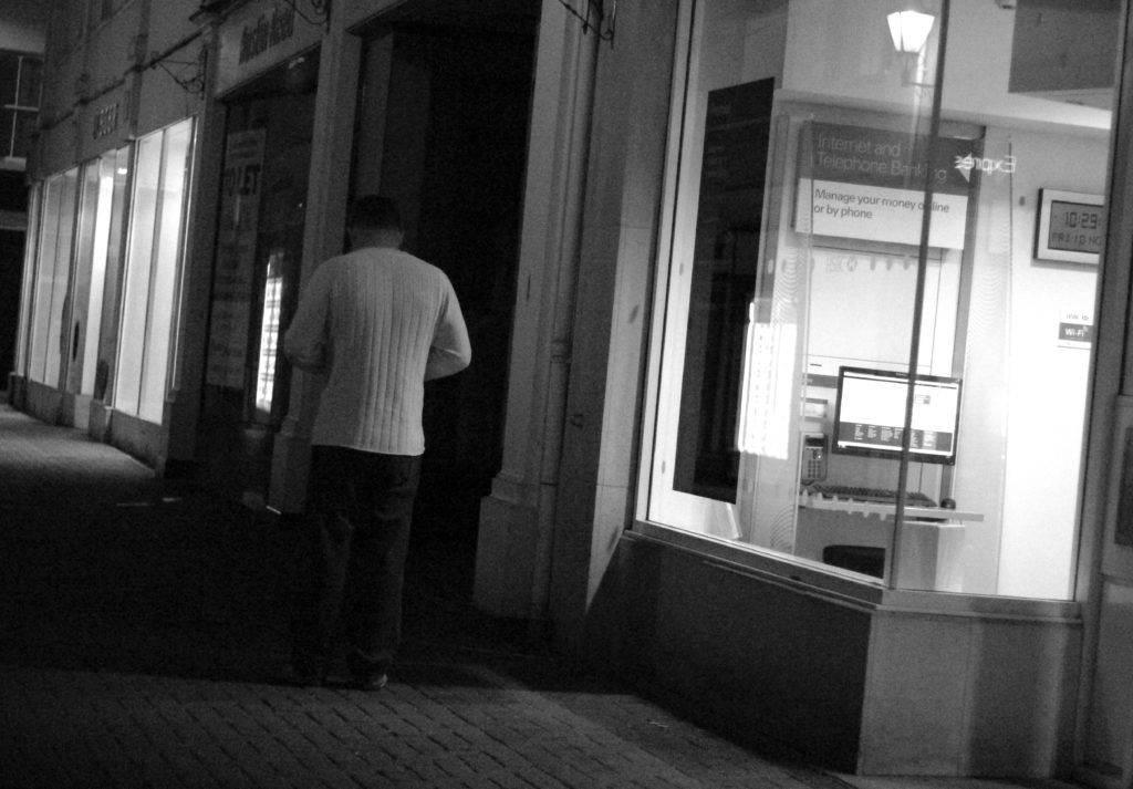
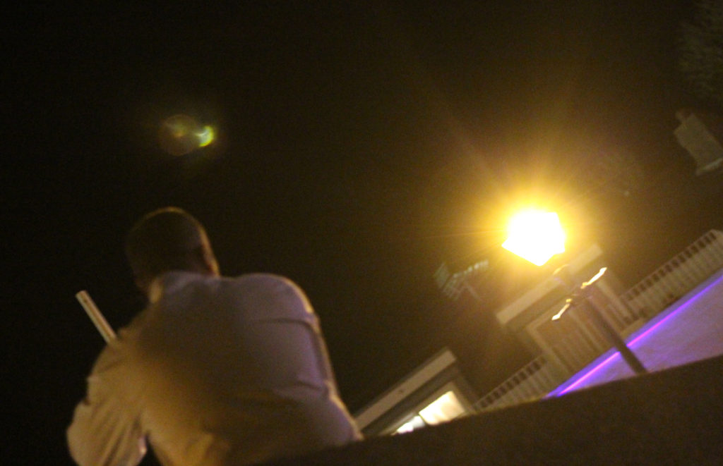
I chose this image once again because of the contrast between the subject and the surrounding area. I found that the silhouette created by the lamp really made the image pop, whilst at the same time balanced it so that the darkness itself was not too overpowering in the picture. 
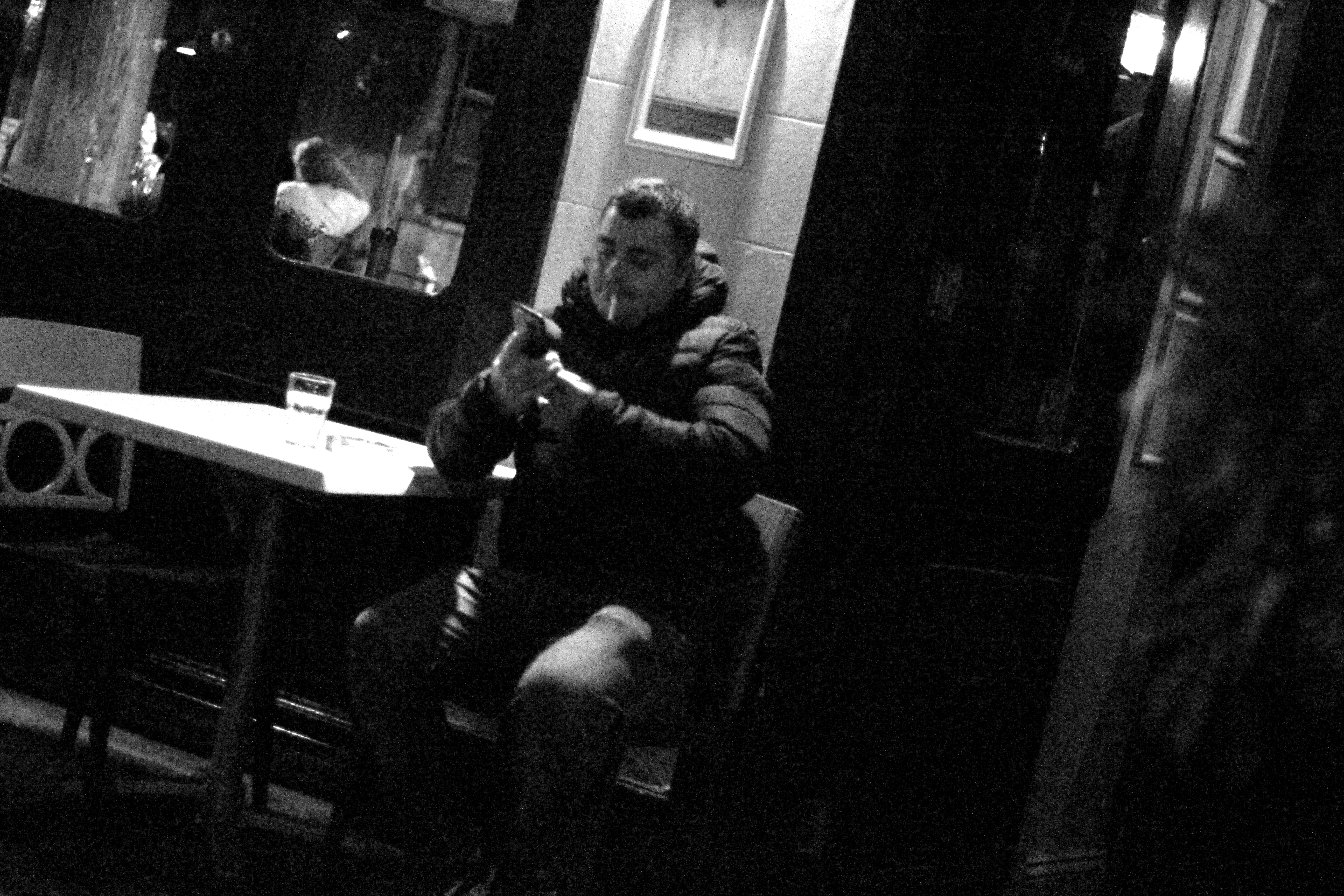
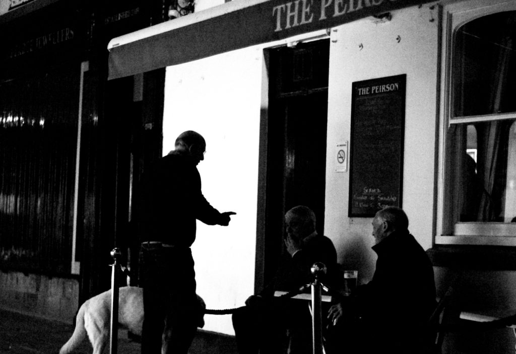
What I liked about this image was how the subjects face lit up against the darkness of the rest of the picture against the white strip of wall. I found that capturing someone off guard in their comfort zone allowed for a greater insight to the subjects life, and really captured them as an individual.

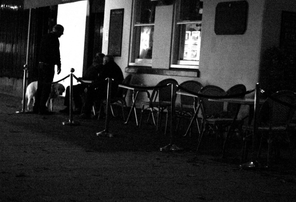
I found that this picture captured a clear contrast between the darkness of the three old figures and the white pub behind. I found that this silhouette that is almost created, makes the overall piece more dramatic than it is, with the blurred black building behind allowing for the whole picture to work. 
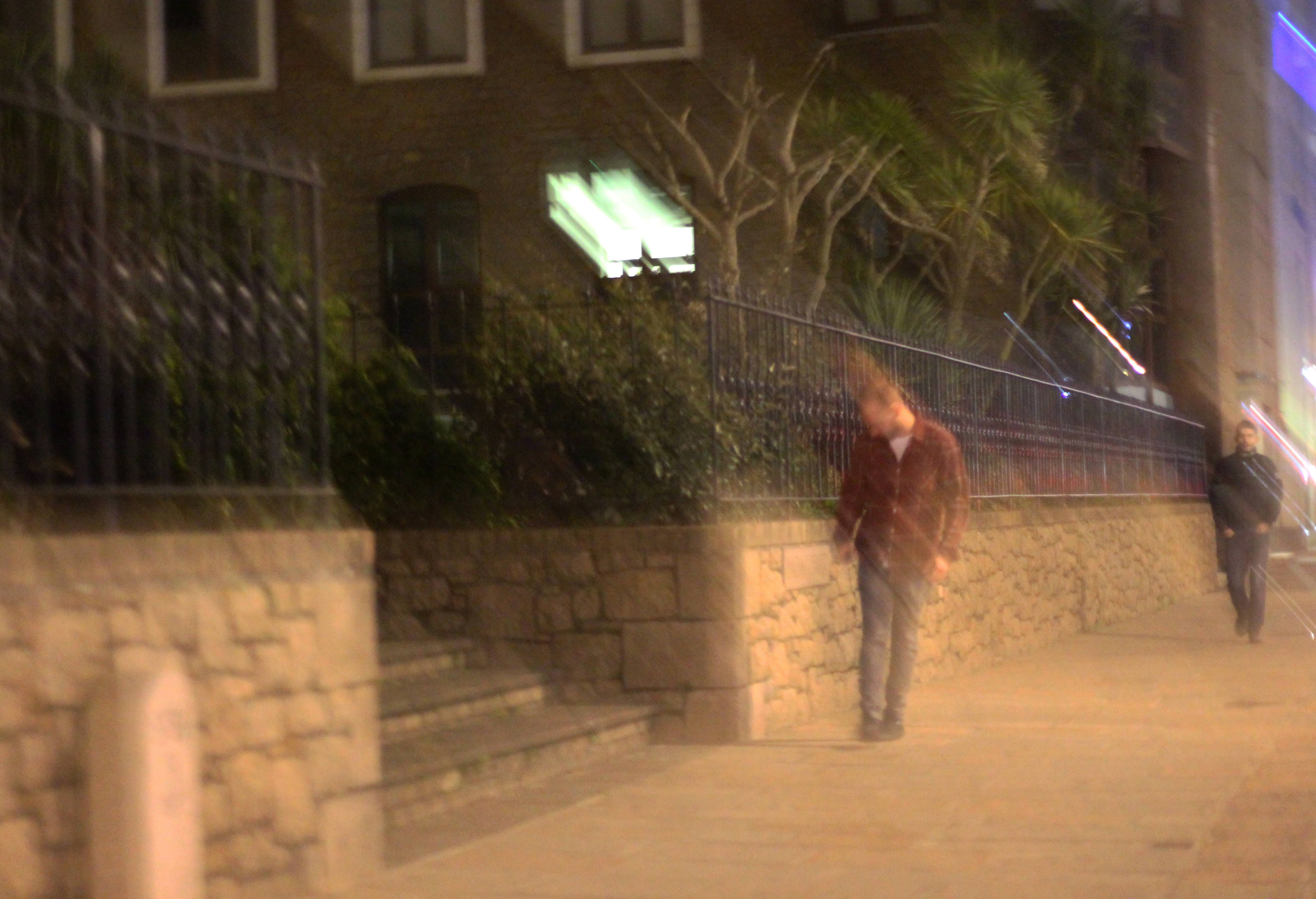

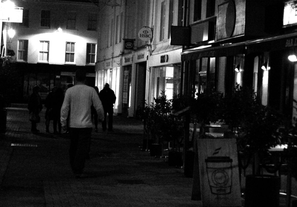
Finally I chose this image because it captured the nightlife of a man drunk stumbling home. What I liked about this was how the picture was blurred itself as well, allowing greater emphasis on the man in the jacket being drunk, and the perspective that he may be seeing.

FINAL IMAGE 
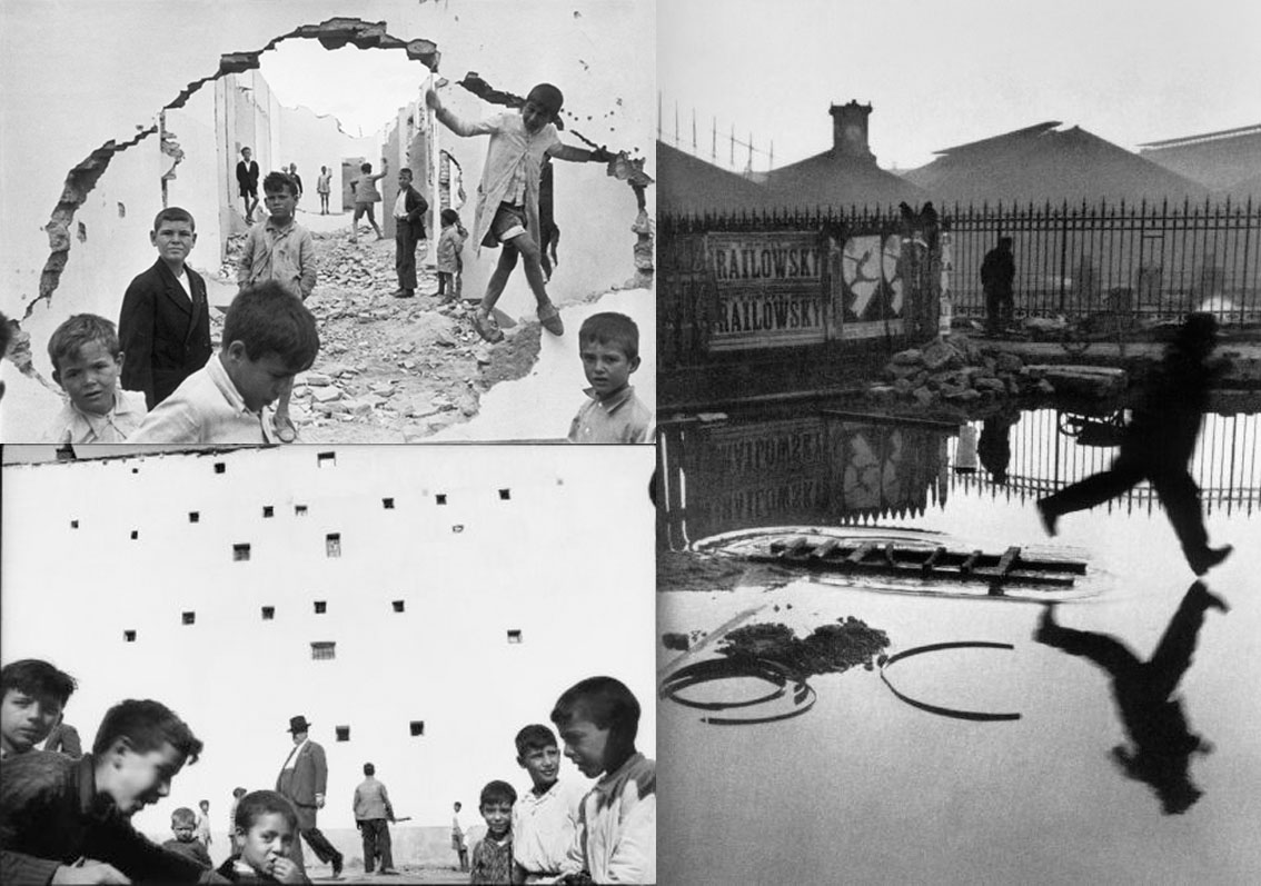
I chose this as my final image because I loved the use of the darkness provided by the wall, to create a backdrop which almost hides the subject behind, with only a glimpse of the subject within the heavily contrasted brightness of the indoors.

Henri Cartier – Bresson and The Decisive Moment

Henri Cartier – Bresson

Henri Cartier-Bresson was born 1908 in France and was the oldest of five children. He died at the age of 95 in 2004 after having contributed immensely to the photography community. Bresson was a French humanist photographer considered a master of truthful and straightforward photography, and an early user of 35 mm film. He developed the genre of street photography, and viewed photography as capturing a decisive moment.

His parents supported him financially so Henri could pursue photography more freely and advance within the passion of his. Henri also sketched and also enjoyed painting as this inspired him for many of his work. While also being highly involved in photojournalism and painting he was inspired as surrealist photographers such as Lhote’s “rule-laden” approach to art. While traveling around the world, he become inspired by different forms of art and artists, people and even the environment that he was surrounded by. He was also captured by German soldiers which further inspired lots of his work within the suffering and journalism of war.

 The Decisive Moment

The decisive moment is a book in which was written by the photographer, originally  titled ‘Images à la Sauvette’ with the English name ‘The decisive moment’.  It was published in France in 1952 and included a collection of 126 of his best photographs. Within the book Henrie Cartier – Bresson quotes ‘To me, photography is the simultaneous recognition, in a fraction of a second, of the significance of an event as well as of a precise organization of forms which give that event its proper expression.’

Analysis

Related image

I am very intrigued by this image due to the fact it portrays a very true sense of realism and truthfulness of war in these desperate and poor countries. It really engages with the audience to achieve a sense of sorriness and sympathy for the young children displayed in the picture. There is a great use of texture within this image to show the sheer state and torn up areas in which these boys call their playground. Especially within the walls and flooring we can see the amount of rubble that has been blown up amongst the buildings creating a pathway of danger. I believe the photographer has really thought out the positioning and composition of this photograph. The blown out wall creates a natural frame which gives the impression that we are looking into a portal of an imaginary world. It may seem imaginary to us in our 1st world countries however the photographer has done this to show how some hopeless and innocent children have to live their lives and it indicates how we are unaware of it as we believe it to be imaginary or seemingly impossible. Further on than the natural frame is positioned a street through the middle of the photograph. This helps to create this portal effect in the way that it guides us down through the scene. This use of leading lines allows the viewer to witness how large the scale of destruction is. This image proposes many ideas which I believe would be an interesting to explore within my work by displaying a series of unexpected areas in which I live that people pretend to be ignorant towards or even do not realise are there.

Contribution To Magnum

Magnum is a website which allows many photographers to upload their images and show a sense of who they are, but mostly used by the photographers that surround photojournalism. Bresson contributed by providing photos inspired by people in his habitat and where he lived at the time. He frequently uploads images of his artwork onto this website which are effective and look very much as an inspiration to his photo work.

To me his work is highly effective in ways of conveying a story within a relevance of the modern and earlier times within history. He  achieves many successful images which emote a sense of change or purely just expose the true elements of some peoples livelihood.


Studio Lighting – Homework Assignment

Planning

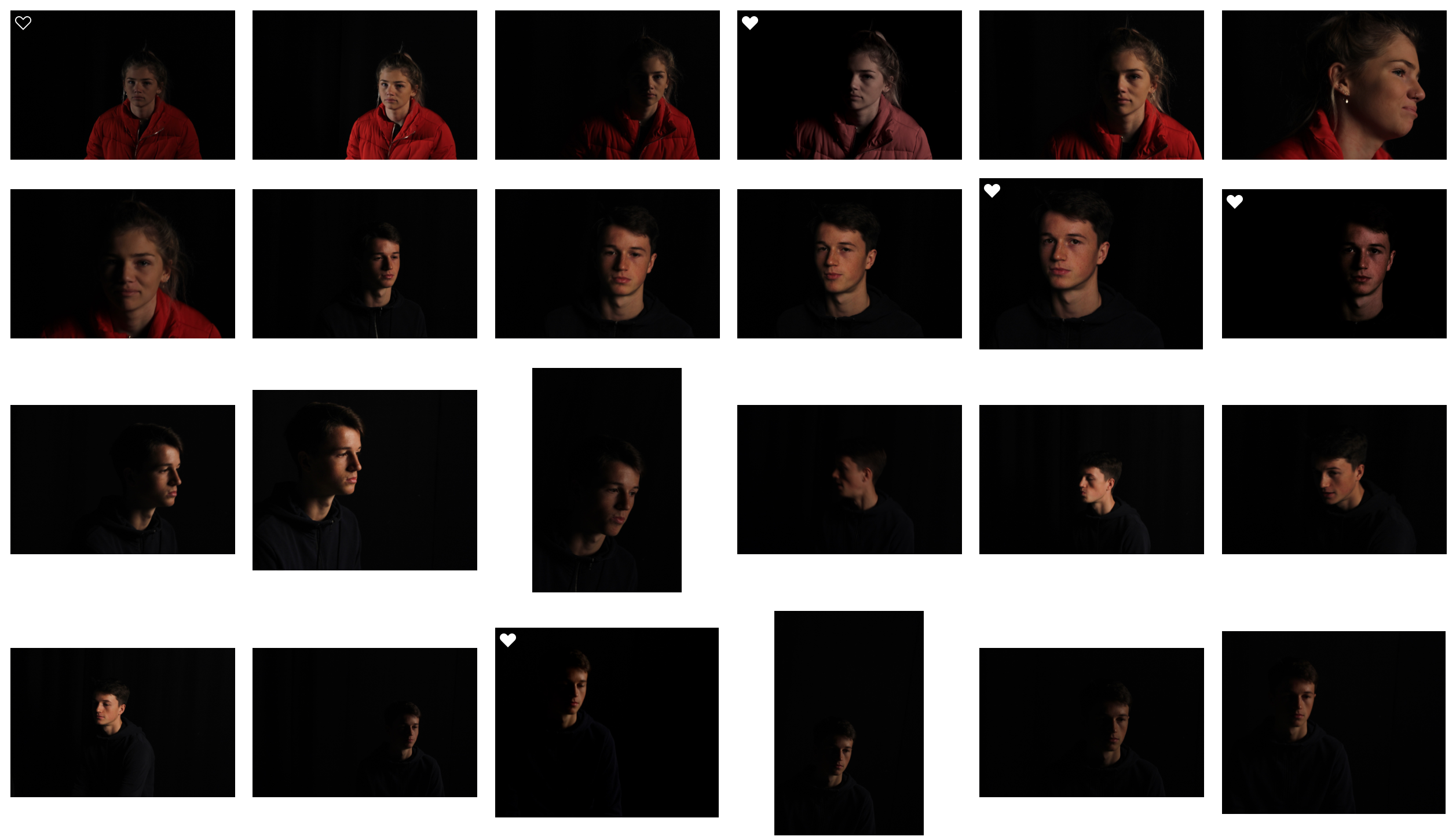
Task – Produce 100-200 images showing your understanding and control of studio lighting.

Models/props – For my model I will use somebody from my class.

Camera settings – I will use a fairly low shutter speed of 1/10 to 1/60 to allow more light to enter the lens from the dark environment when using a black background. I will use a higher shutter speed of 1/60 when using a white background. I will use a low ISO of 100 or 200 to keep the image high quality. I will use a shallow depth of field to create a soft blur in the background.

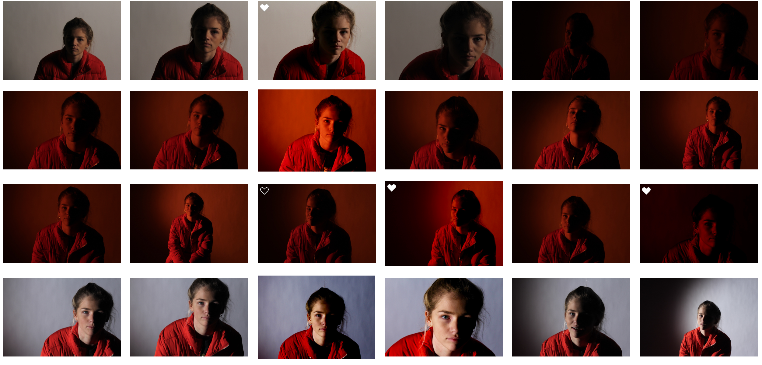
Lighting – I will be using red head lights, spotlights, natural light and flash to capture a wide range of images. I will be using red head light for soft light, white backdrop for some lighter images, a black backdrop for darker images,  a spotlight for harder light, a reflector to reflect light into the model’s face and gel filters to change the colour of the light

Location – School studio

Context – I will be using the school studio to capture a range of images in different styles and different lighting.

Concept – To capture studio photographs in the style of David Bailey and Irving Penn whilst incorporating chiaroscuro.

David Bailey

Image result for bailey photographerImage result for bailey photographer

David Bailey (born 1938) is an English fashion and portrait photographer. Bailey is considered one of the pioneers of contemporary photographer. He is credited with producing some of the most interesting images of recent times. He has captured images of some very iconic people such as The Rolling Stones and Kate Moss.

I like Bailey’s photographs because of the strong contrast in the images. As you can see in the images above, the subject is contrasted against the plain white background and this helps the viewer focus on the small details in the subject.

David Bailey Favourite Photo

Image result for bailey photographer

It appears that flash was used in this photograph as the faces of the subjects are over-exposed. This creates contrast in the image between the white faces and the black details, almost in the style of Andy Warhol’s pop art. It also increases the tonal range in the photograph. A deep depth of field appears to have been used also because all of the photograph is in focus. A quick shutter speed will have also been used because the image is focused and sharp. It appears that a medium/high ISO has been used as the image is quite light but there is some noise in it. The grey background creates a slightly cold undertone to the image.

There is no colour in this image as it has a black and white filter over it. This increases the emphasis on the contrast and boldness of the image. There is a wide tonal range in this image but the tones quickly range from dark black to bright white, there is not too many tones in between. There is a slight 3D effect on this image as one of the subjects are placed behind the other, this makes the photograph more interesting to look at. Both subjects have been placed along the horizontal lines of the rule of thirds, this makes the photograph more appealing to look at.

This image was taken in 1965. It shows Reggie Kray and Ronnie Kray, two London gangsters. It is a widely recognised image and is of historical interest in terms of representing Bailey’s style of artwork and also the Kray twins, who were iconic and infamous.

From doing this shoot with the Kray twins, I think that Bailey is trying to show that he does not only work with high-profile celebrities with good reputations – but he will also work with the gangsters that have bad reputations. This shows the diversity in Bailey’s photography and what he is capable of.

Irving Penn

Image result for irving pennImage result for irving penn

Irving Penn (1917-2009) was an American photographer best known for fashion photography and portraits.  Penn’s work included work at Vogue magazine and independent work for clients including clinique.  Penn was among one of the first photographers to pose subjects against a plain white or grey backdrop. Penn experimented with many printing techniques including prints made on aluminium sheets coated with platinum emulsion rendering the image with a warmth that untoned silver prints lacked. His black and white portraits stood out due to the high contrast he used in them.

I like Penn’s photographs because of the angles and poses of the subjects. This creates an interesting photograph that captures the eye of the viewer because most photographs aren’t taken from so close up and at these creative angles.

Irving Penn Favourite Photo

Related image

In this image, studio lighting was used coming from the right side of the image. This has created a wide tonal range in the image as it has created shadows and contrast. It appears that a deep depth of field has been used as the whole image is in focus, not just the subject. A quick shutter speed of possibly 1/60 – 1/200 will have been used as the image is sharp and in focus. It appears that a low/medium ISO has been used as it is a slightly dark image with low noise levels. The image has an underlying warm tone to it.

There is no colour in this image as a black and white filter has been applied to this, this has allowed more contrast and shadows to be introduced into the image to create a more eye-catching photograph. There is a wide tonal range in the photograph ranging from the white of his sleeve cuff to the black of his suit. There is a slight 3D effect to this image as the lens is so close to the subject so the hands and glasses are obviously closer in the image. The subjects face is at one of the points on the rule of thirds grid, creating a more visually appealing image. The eye is drawn to the subject’s facial expression straight away as it is unusual and eye-catching.

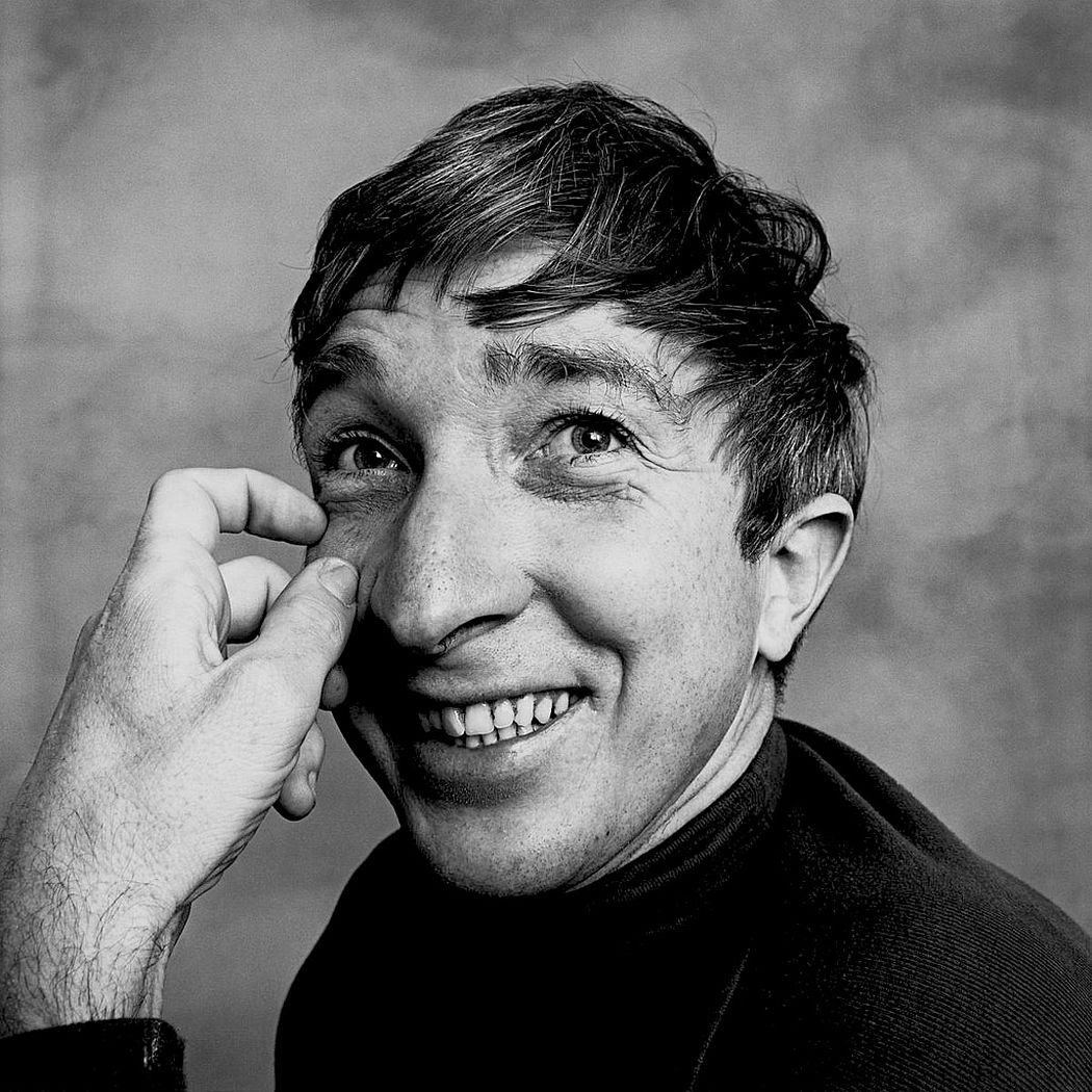
This photograph is of Truman Capote and was printed on a platinum palladium print in 1976. This would have been from a photoshoot that Penn did with Capote as Penn would often photograph celebrities in his studio as he was a very well known photographer.

In this photograph, Penn has gotten Truman to take an unusual pose and an unusual facial expression. This is a common recurrence in Penn’s photographs as Penn tries to catch the viewers eye with his abnormal style of portrait photography – it is what makes him stand out so he tends to play to this strength.


My Response

My Edits

My Favourite Photo

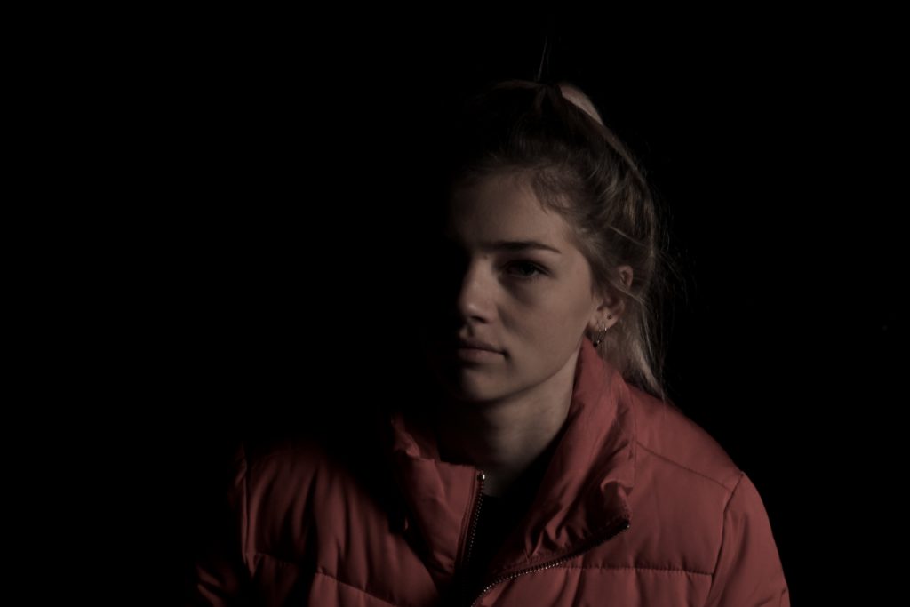
In this photograph, I used the soft light from red head light against a black background so that I could incorporate chiaroscuro into the photograph. I used a deep field of depth so that all of the image was in focus. I used a slow shutter speed (1/20) to allow more light to enter the lens from the dark environment. I also used a low ISO of 200 to keep the quality of the image as best as possible. I decreased the saturation in the image to create a slightly faded and colder effect.

The main colour in this photograph comes from the red coat which fades into the background, I reduced saturation in the image to help it fade into the black more. There are not many light tones in this image as it is mostly dark, this creates a mysterious setting in the photograph. It is quite a 2D photo as the only think that you can see is part of the model – there is nothing else in the image to compare her position to. I have placed the model along the right vertical line of the rule of thirds to create a more appealing image.

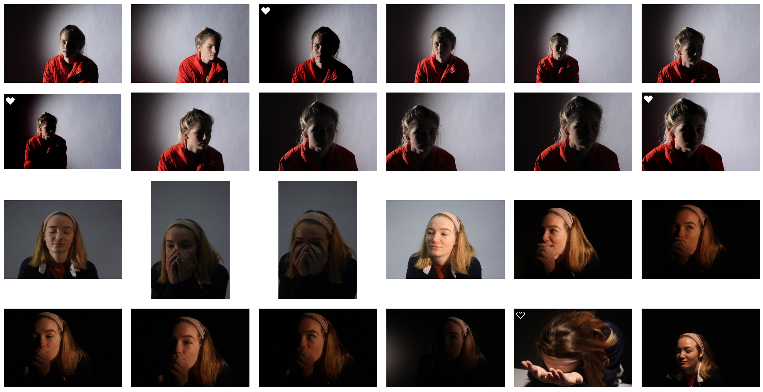
I set up this photograph in the studio, to get this photograph I had experimented with spotlights, red head lights, reflectors and gel filters. I took multiple photographs in this style but this one stands out to me because of the more gradual fade into darkness and the softness of the light.

I took this photo with the intention of experimenting with chiaroscuro and to me it was successful. I took inspiration for the dark tone from Irving Penn’s work. I chose a black background as I thought it would create a more dramatic image.


A comparison of work to William Klein and Diane Arbus

William kelin

William Klein was born in American but a French photographer and filmmaker was less well known for his ironic approach to both mediums, his extensive use of unusual photographic techniques in the context of photojournalism  and fashion photography ranked 25th on Professional Photographer‘s list of 100 most influential photographers.h has many awards and exhibitions surrounding his work, soon after being a painter he started off within his photography journey soon achieving  widespread fame as a fashion photographer  for vogue and for his photo essay  on various cities.

Because of this he was able to make many feature length films, and numerous of short and feature length documentaries advertising his work and allowing the public to see and be influenced by what he has achieved. Again he started off within photojournalism and street photography in new York much like many other famous photographers,His work was soon viewed to be considered revolutionary for its “ambivalent and ironic approach to the world of fashion”, its “uncompromising rejection of the then prevailing rules of photography”and for his extensive use of wide angles  and telephoto lenses, natural lighting and motion blur.

He was said by the New York times to had been considered one among the fathers of the streets and a mixture of compliments that classifies a man who is hardly classy,Or Perhaps this represents him in quite a figurative manner but it still successful shows how people within New York needed his influence and guidance in order to make  an important  for society and that he was able to capture both the humor and the reality within New York at the time.  the world of fashion would become the subject and inspiration for many of His works ad inspire inspirations of clothing evolution and a new meaning of beauty and womanly presentation. Lastly his street would would print a more violent and also exploit different religions and groups within America ta the time which was important to allow news programs to see his work.

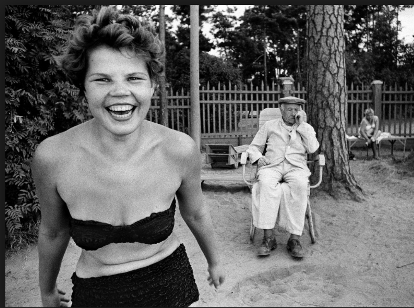
what I like about his works that people were shown in such a ironic and unexpected light, people would be holding a gun with a face that implies that they are joking, or people in uncomfortable scenarios being laid-back and smiling while enraptured in a city more dull than themselves. he was able to capture the people within the city who would otherwise be ignored.

This is my favorite piece of his won work because it allows again a sense of youth and joy with is contradictory compared to that of the elderly people surrounding herself.It shows a women having a. sense of freedom and not wearing much clothing but she is not exploited for her sexuality but shown for reasons of her spirit and how this is what keeps cities alive. Again something more solemn is occurring in the background but the is ignored but to the irony of her celebration.

His work overall is very different to That of the previous artists as it portrays a more light hearted representation  on suffering and troubles within the world and surrounding New York city, his photographers are perhaps less natural but sill capture a well enraptured essence of the people and their lives.

Diane Arbus

Was an American photographer  well known for photographs of marginalized people such as dwarfs,giants,transgender people,nudists and finally circus from former. She again did this in order to represent the minority and portray a sense of  normality by ways in which they look and not general populace who would consider them as  ugly or surreal.Her work has been described as consisting of formal manipulation characterized by blatant sensationalism, this means that her work has most of the interests surrounding the subject of the charter and is taken in a formal manner, this allows a direct eye line and conceptual though go the person and their story and not allowing others to be influenced by herself.

sadly Arbus committed suicide and so presented a fictional version of her life story,within her last areas of photography .This was possibly due to her affair to a married a man who was never going to marry herself and only pushed her harder frequently throughout her work. She was married to another Jewish man such as herself Arbus was insulated from the effects of the great depression while growing up in the 1930s . Her father became a painter after retiring from Russek’s; her younger sister would become a sculptor and designer;so the majority of her family become intrigued in everything surrounding the creative arts and influence.

Diane started her own photography   business and  would come up with the concepts for their shoots and then take care of the models. She grew dissatisfied within this role, a role even her husband thought was “demeaning.”They contributed to  glamour,seventeen,vogue,Harper bazaar, and other magazines even though “they both hated the fashion world”. Despite over 200 pages of their fashion editorial in Glamour, and over 80 pages in Vogue, the Arbuses’ fashion photography has been described as of “middling quality’ due to her gradually  hate and enforcement of photography  she become even less inclined to choose to take a shoot and no longer wanted to develop her work and she grew older and more depressed.

what I like about her work: I like how formally and clearly she captures people. there is no doubt what they are feeling but only why,it allows question which you can answer yourself by looking further into the image itself,and also due to all the interesting people,it allows a more intriguing view of the society in which she was in. Her images also allow an interesting composition to enhance the interesting subject to which she is capturing.

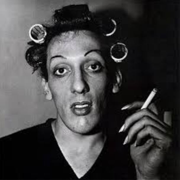
This is my favorite from this artist,this is due to interesting subject of a transgender man which again shows her representing the majority in order to allow a sense of normality to the society in which they are in.The makeup again furthers the image of femininity but that is contradicted within the darker tonal background suggesting more harsh underlining themes.You can also see how they are smoking,which bring a somewhat relevance to the time and possibly creates a sense of relation to the public and they all act the same but have different appearances.

Compared to the previous artist,She is a lot more formal within only concentrating on the face itself and not a lot of movement,this allows a  straight forward proposition of her these also allow a sense  of irony to show a more extravagant type of people within the society.


Cartier-Bresson – Case Study   

Magnum Photos

After the second world war, the world’s most prestigious photographic agency was formed by four photographers : Robert Capa, Henri Cartier-Bresson, George Rodger and David “Chim” Seymour. They had been scarred by the conflict and were motivated both by a sense of relief that the world had somehow survived and the curiosity to see what was still there.

It was important for Magnum’s photographers to have this flexibility to choose many of their own stories. None of them wanted to suffer the dictates of a single publication and its editorial staff.

source – here

Henri Cartier-Bresson

Henri Cartier-Bresson was born on August 22, 1908 in Chanteloup, France. He was a pioneer in photojournalism; he wandered around the world with his camera, becoming totally immersed in his current environment.

To enhance his capacity to take the kind of candid shots he preferred, Cartier-Bresson often wrapped his Leica camera in black tape to make it less obtrusive.

Cartier-Bresson co-founded The Magnum Photo agency (a cooperation owned by its members) that connected the photographers with clients around the world. The agency’s mission was to widely disseminate photographs that were in one way or another exemplary of the modern era and also inherently humanitarian. Examples of his images below.

Source – here

Image Analysis

Technical

The image was taken in natural daylight – this is implied by the fact the photo was shot outside. The photo is black and white so it’s impossible to determine the original white balance, however, what can be determined is the level of contrast; the photo was taken in 1933 (before the invention of Photoshop and such tools) so it’s unlikely that the photographer tampered with the contrast in the post photo shoot stage. When applying Ansel Adam’s zone system to determine the tonal range, this image lacks the darkest black but successfully portrays the rest of the tonal range. The photo has a high exposure due to the large presence of white and since most of the image is in focus, it can be presumed that the photo was taken at a low shutter speed.

Visual

Although the image is black and white it still offers much visual stimulation for the viewers. The hole in the wall acts like a frame and it’s almost as if the children are climbing out of it – this gives the image a 3D element. Many of the subjects are looking directly at the camera, hence looking directly at the audience, their gazes give the viewers an uncomfortable and guilty feeling. The set up is rather ominous to begin with, due to the cropping it’s hard to tell where and what exactly the children are playing in. It could be the remains of a building or factory but it could equally be a street with multiple houses. The image is very bright, and the photographer,  Henri Cartier-Bresson, positioned himself directly in the center – this allows our eyes to follow the path and peak into the everyday lives of these people.

Contextual

Cartier-Bresson captured this image during his three-month journey around Spain in 1933 during that time the first anarchist protest came on 8 December and was easily crushed by force in most of Spain. The Spanish Republican Army employed tanks and stopped multiple uprisings.

Conceptual

*Read Additional Information first* The kids playing amongst the rubble are totally unaware of the war happening around them this shows that they aren’t moved by their situation and can still find ways to enjoy themselves. The image successfully portrays that ignorance is bliss (not knowing something or not acknowledging it is more comfortable than facing it). The fact that they change and hide their play when an adult/outsider arrives showcases not only how adults have tampered (and ultimately destroyed) their world but also how much they fear that it will happen again.

Additional Information

While researching for the contextual part of the analysis, I came across another image from the shoot, taken directly before the image I analyzed (according to  Henri Cartier-Bresson’s published contact sheet from this shoot).

The children in this photo look a lot happier, their faces show pure ecstasy as they enjoy their youthful days. Their expressions change when they notice the presence of  Henri Cartier-Bresson, in the next image they all look bleak, as if caught, this would explain their cold expressions in the next image.

Street Photography

Street Photography

Street photography is about documenting everyday life and society. Street photography doesn’t necessarily need to be shot in the street; you can shoot at the airport, at the mall, at the beach, at the park, in the bus or subway, in the doctor’s office, in the grocery store, or in any other public places.

Street photography is candid photography of life and human nature. It is a way for us to show our surroundings, and how we as photographers relate to them. We are filtering what we see, to find the moments that intrigue us, and to then share them with others. It’s like daydreaming with a camera.

source – here

http://erickimphotography.com/blog/2013/08/07/what-is-street-photography-2/


Homework 2- Street Photography

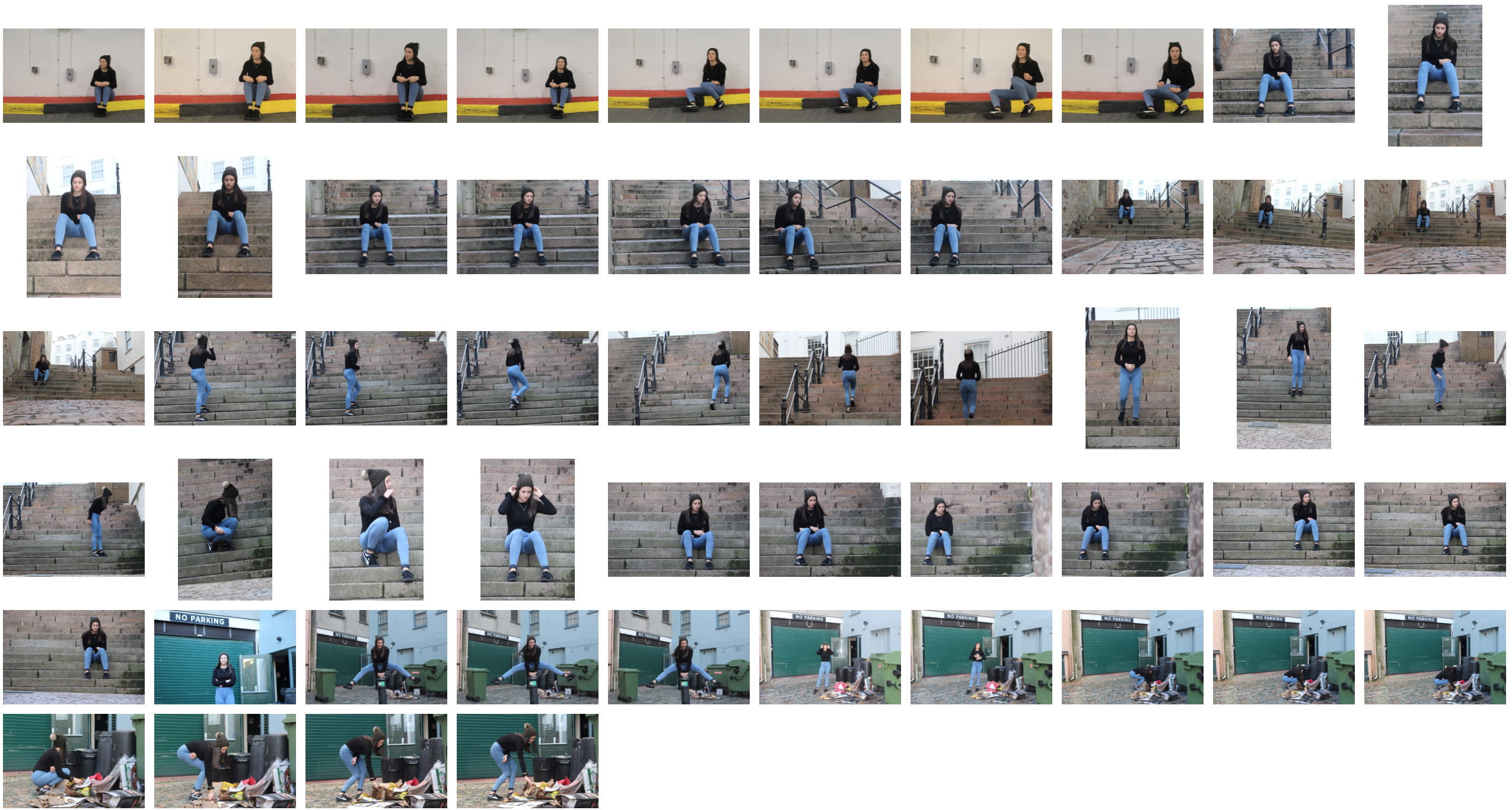
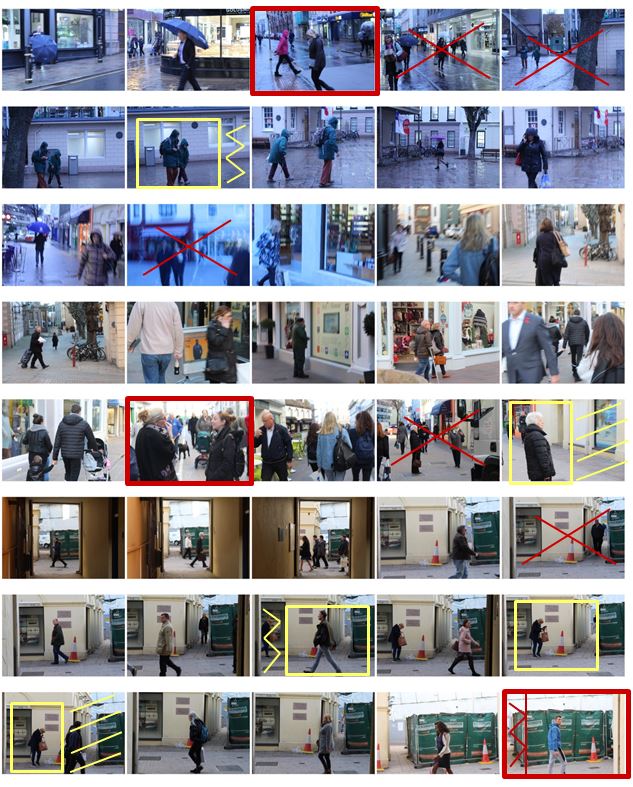
I selected the images from my photo shoot that I thought have a clear subject and a good angle at which the photo was taken and displayed them below. I have highlighted the photos I definitely want to use in red and highlighted them in yellow if they need editing.
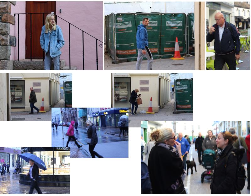
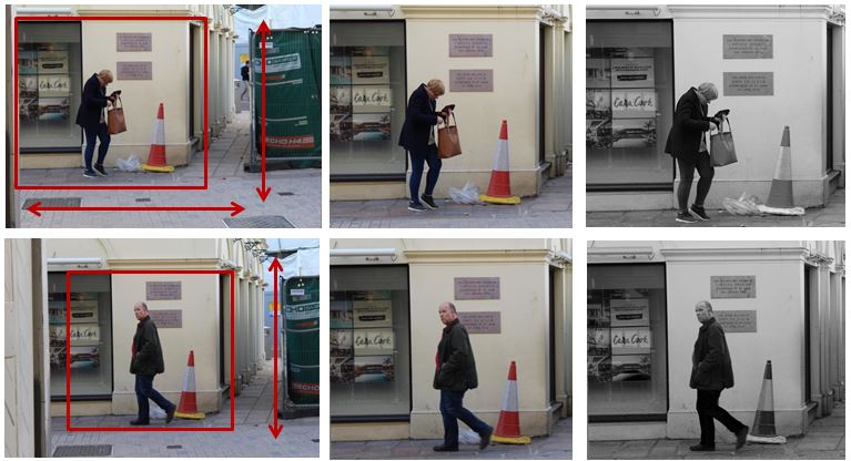
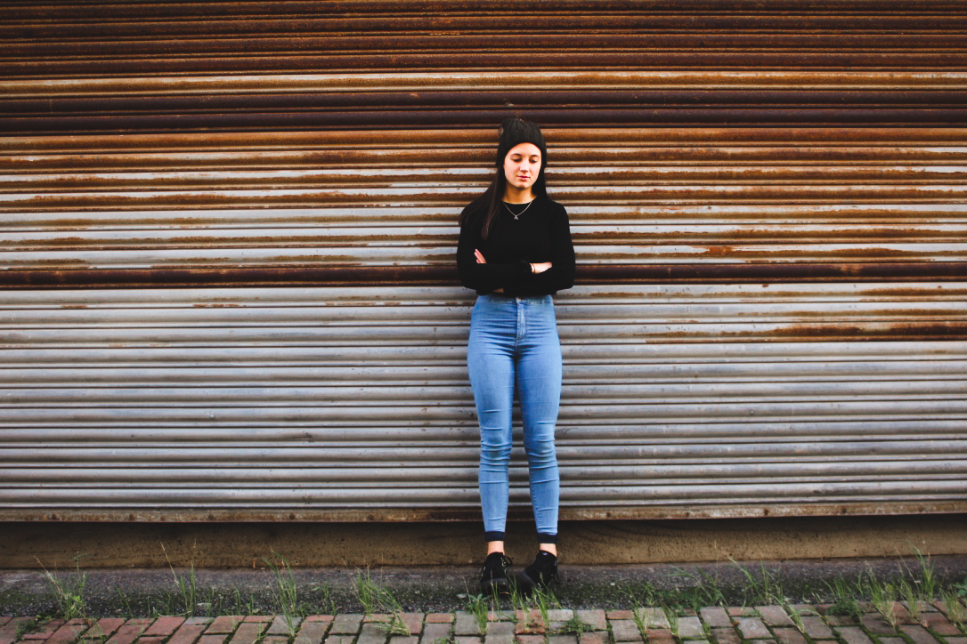
I have chosen these photos and have cropped them to make the overall photo more aesthetically pleasing and so you can see the person more clearly and distinctly. The photograph was candid as i took it at an angle in which the subject did not know they were being photographed, making it more natural. My favourite photo out of the two is the first one as it is more interesting as she is looking for something and is not just walking down the street.

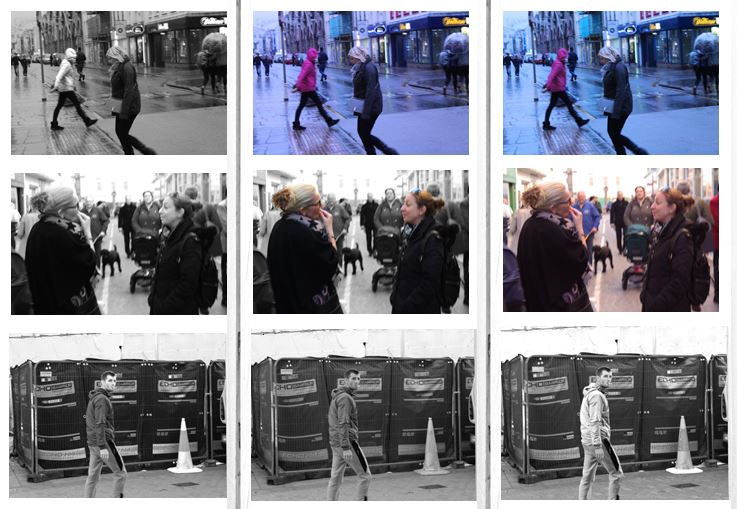
I chose another three images which I liked out of my photo shoot and experimented with the colours and tones. This process allows me to see my photographs next to one another and compare them with each other so i can effectively chose my final images. My favorite image from the first row is the 3rd image as i set the white balance to fluorescent light in order to create a blue tint. This creates the effect that the photo was taken in the evening. I also like the colours in the background as i think it gives the photo more atmosphere.

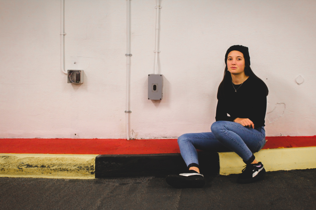
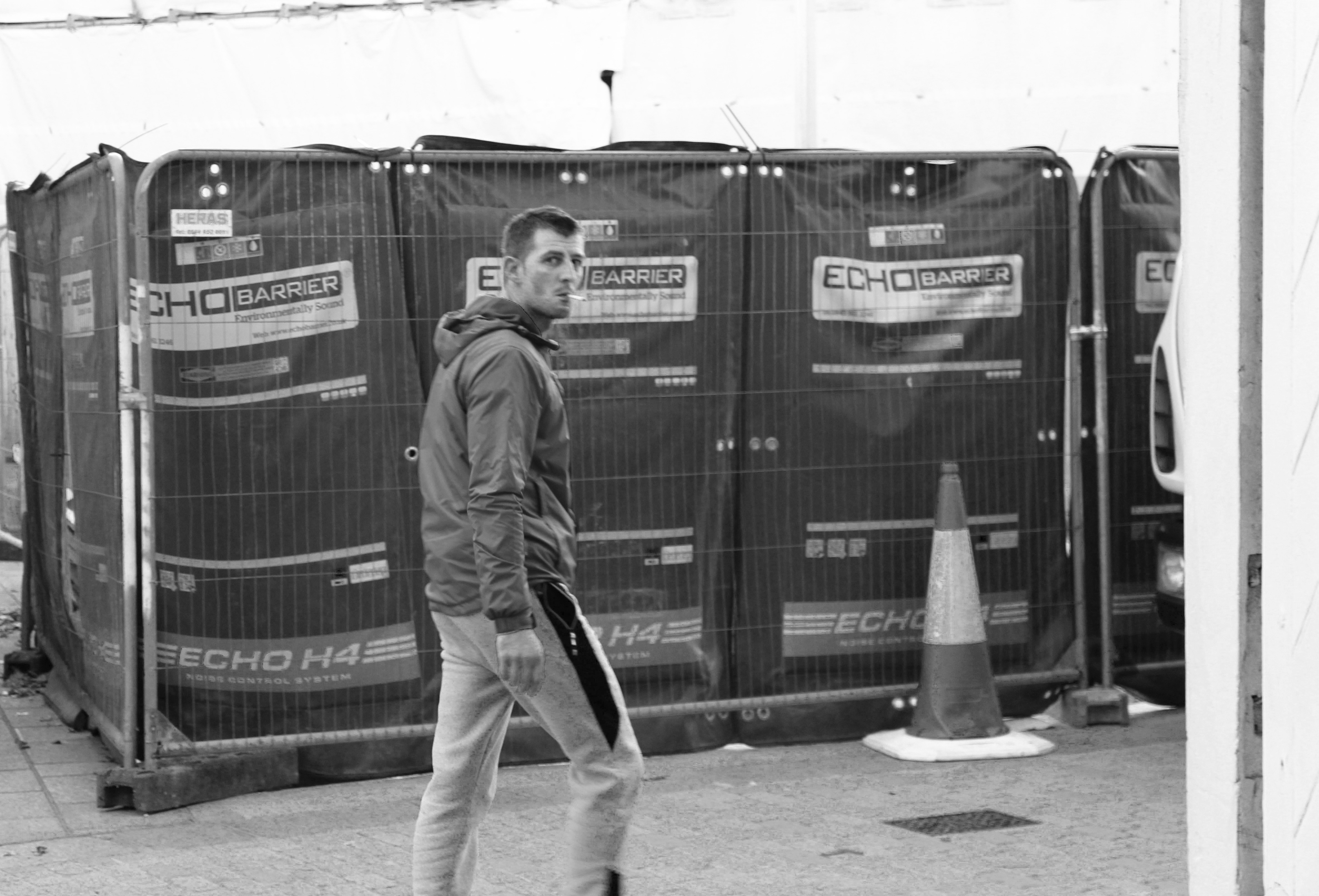
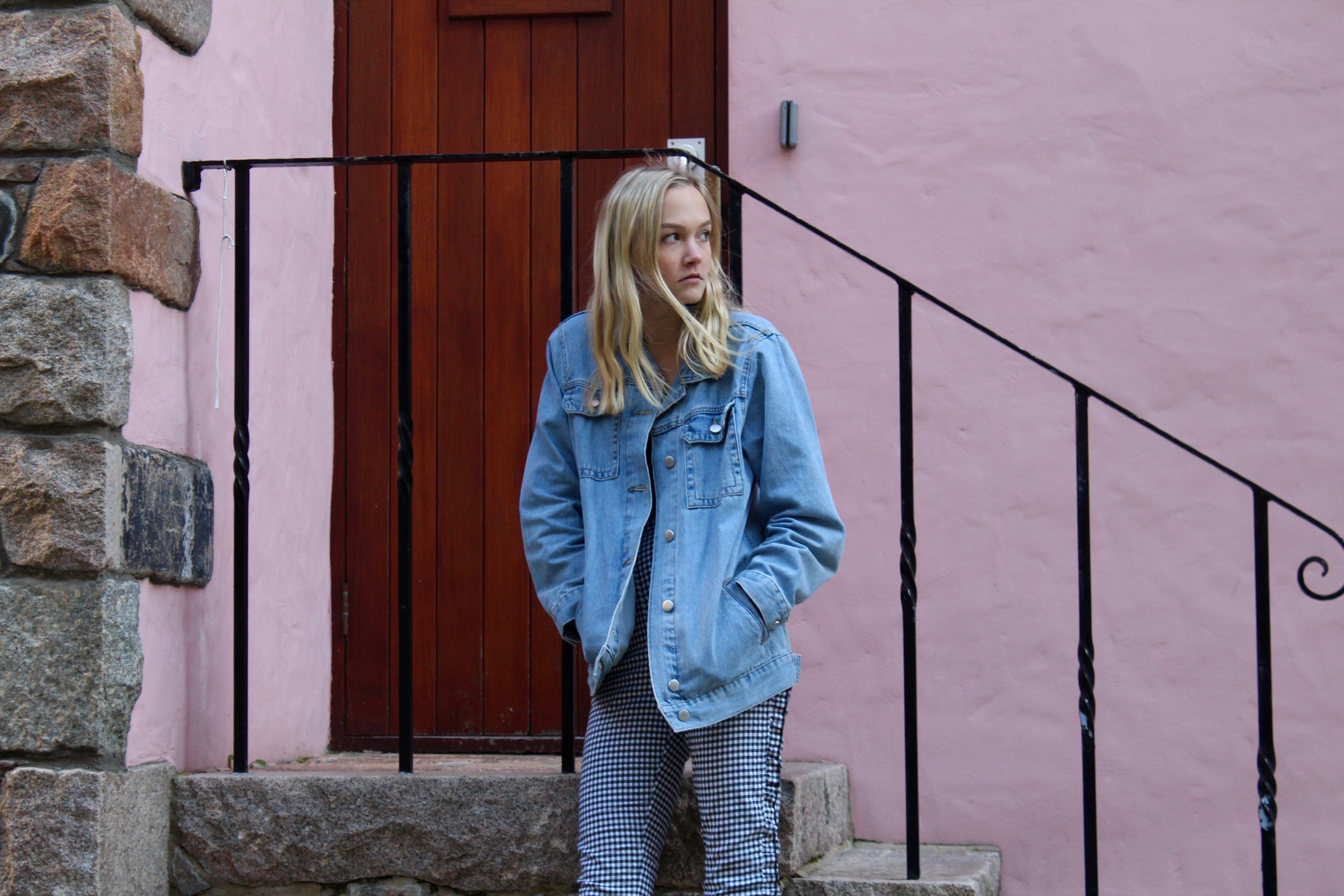
These are my final two images from the photoshoot.

The first image i like as the subject is completely natural which makes the photo candid. I also managed to capture the photo the moment in which he realised he was being photographed which is why his face is confused. I edited the photo in black and white to emphasise the the contrasts in colour and so the subject and the street are in similar tones. I like the background in the photograph and i think it portrays a street well, the fencing and the traffic cone create a sense of the loud atmosphere when the photograph was taken.

I chose this as my second final image as the atmosphere of the photograph contrasts a lot with the first image. The first being loud and busy, and this photo being more calm and relaxed due to the colours in the background of the photo. I edited the photo to emphasise the pastel light pink wall in the background and the railings behind her. The composition of the photograph is good as it is split up my straight lines showing the rule of thirds. The photo is also candid and natural as the subject is unaware that the photo is being taken making it ideal for street photography.