Category Archives: AO1 Develop Ideas

Filters

Author:
Category:

Mirror shoot Ideas development and finished results:

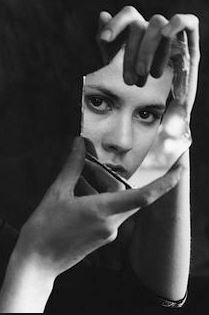
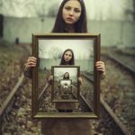
My first idea for the shoot would be using a mirror:

Aim:to emphasis the conceptual concept of no feeling and belonging,having no self worth and an abandonment of skin and bodies reflected. A misjudgment of self image and crack within how they see their own idealistic beauty.

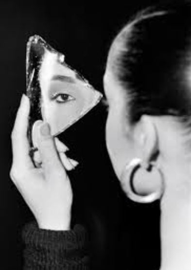
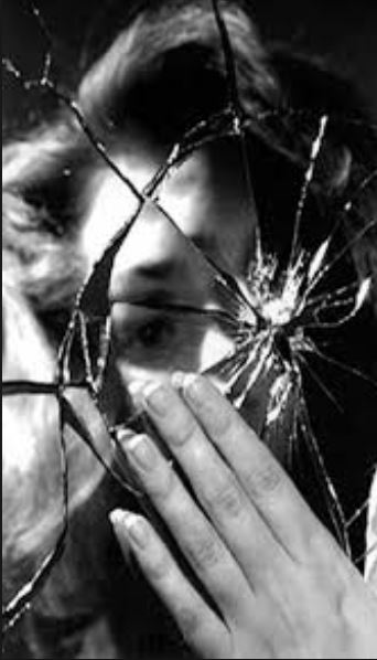
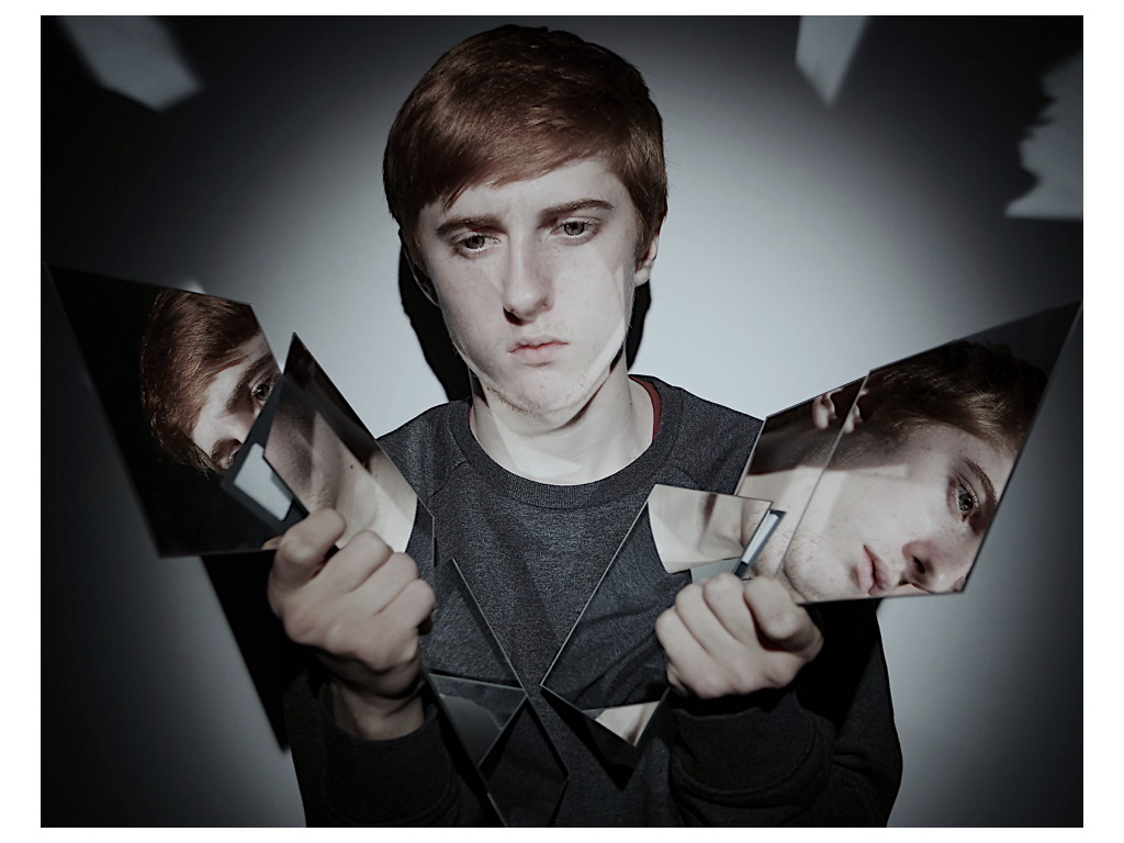
within these images you can see the development of the idea to show a broken aspect of themselves and how they are showing themselves but only in small fragments as they do not have a whole identity. The hands further the interesting  composition and enhance the atmosphere as a whole to make it highly effective and creates an almost lack of body and perhaps being to the body themselves. 
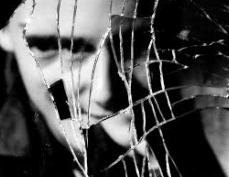
The broken glass idea is very interposing as it shows a repetition of the face and the broken glass creates an interesting pattern of the piece itself.the break also successfully symbolizes  their attitude towards themselves and perhaps the persona in which they carry.


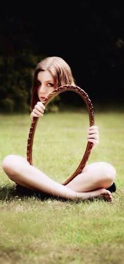
Lastly these images are more to create an interesting illusion to the segment,it shows a lack of body and a sense of perfection to them looking into their identity as a whole.

I was inspired by these images  due to their interposing sense of composition  in interesting illusion when it comes from broken class repletion of the face or an absence of the body.The direct eye contact  and use of the hand shows a sense relish and connection between being broken and then a similar reflection of themselves.I wanted to also further look into artists who’s main theme of experimentation is glass.

Guilliaume Amart is a photographer who uses mirrors in landscapes in order to reflect a person or even a different segregated view of the scene itself. mirrored stand in various landscapes, reflecting the opposing environment back within the image to create a double interpretation of the surrounding scene.concentrate on the double interpretation of the landscape.He has the aim to produce a dream like atmosphere,and enjoys to suggest floating figures within his work. Within the mirror he is known to photograph himself in black so it is purely figurative but connotes a man lost within himself but still the center of the artwork. He is quite mathematical within his work and uses industrial aspects intertwined with more natural areas. The work is highly interesting and intricate and i would would to produce many of his works that contain people within the atmosphere as it demonstrates a sense of suspension and actuation within the illusion of actually being in the forwarded presented scenario.

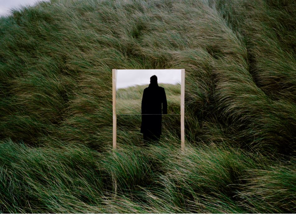
This image is my favorite image from my artist,this is due to the interesting composition to the piece itself,It allows a completely hidden shadowed figure as a face reflected within the glass but then also behind the glass is a figure to add an illusion of someone standing in front and not as an illusion itself. I like the juxtaposing textures of the natural and then quite industrial dark tonal man. The mirror itself blends into the scenario and presents almost a frame of direct attention to the image.
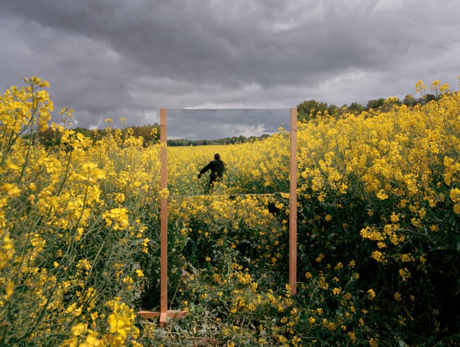
My ideas are very reliant and abstract from the techniques,artists and editing techniques said above,I want a large create diversity to show an experimentation within the techniques and then the outcomes as a whole.

Finally overall throughout my shoot I want to be able to show a clear coherent blend of all these ideas that still successfully present a lack of identity.

possible editing techniques;

1)Make a print and scratch away the face

2)Within the mirror add someone else face or a black hole

3)Pulling apart  their body and a rip

4)Use a crack mirror ad repetition of the face

photos

:This is my best image due to the interesting and dynamic composition to the piece itself, it allows many reflections upon the face and duplication within the mirror that also have a sense of expression of emotion within the face.the lighting does not allow any unnecessary shadows and also allows for high intense light upon the face and the harsh diffusion of darker tones surrounding the image.The scattered mirrors and facial expression allow a sense of self confusion and defeat within the piece itself, so successfully showing many sides to himself and many ideas of identity that he is unsure about. The rigid reflection also allows a harsh highlight on themselves and purposing who their and what they can be.
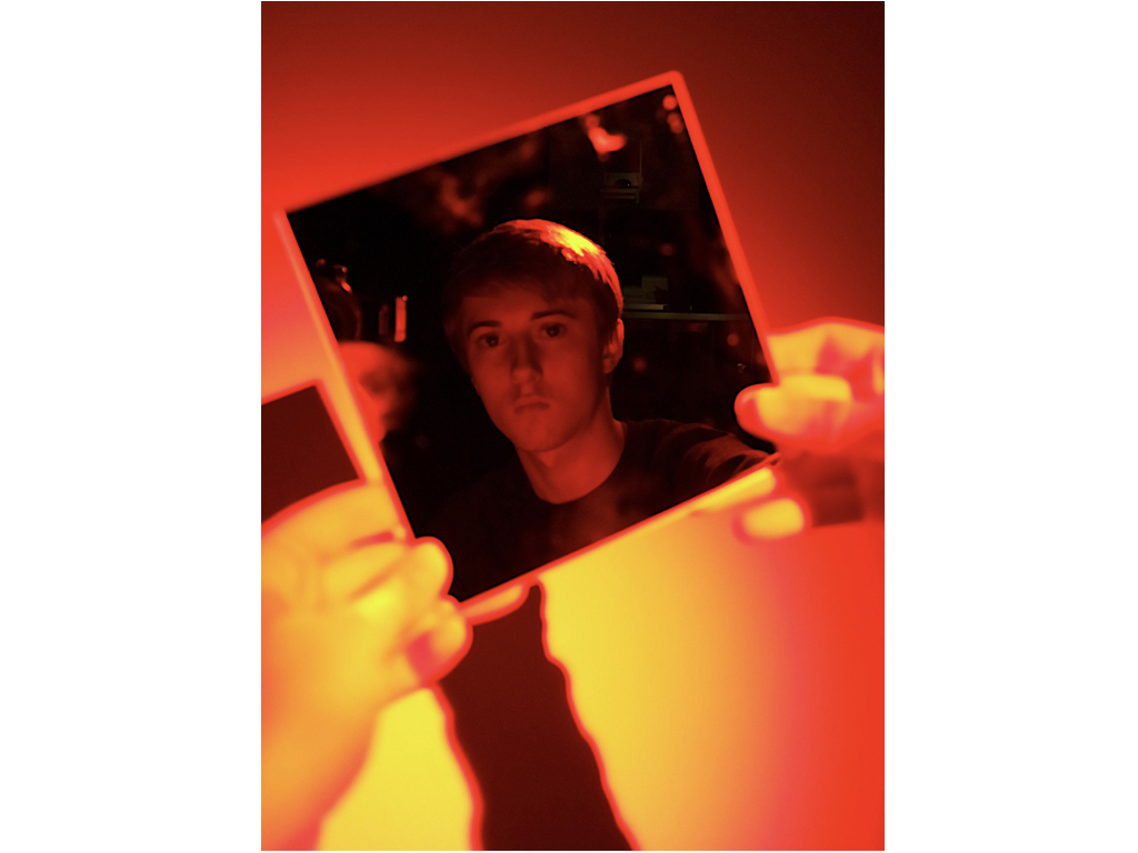
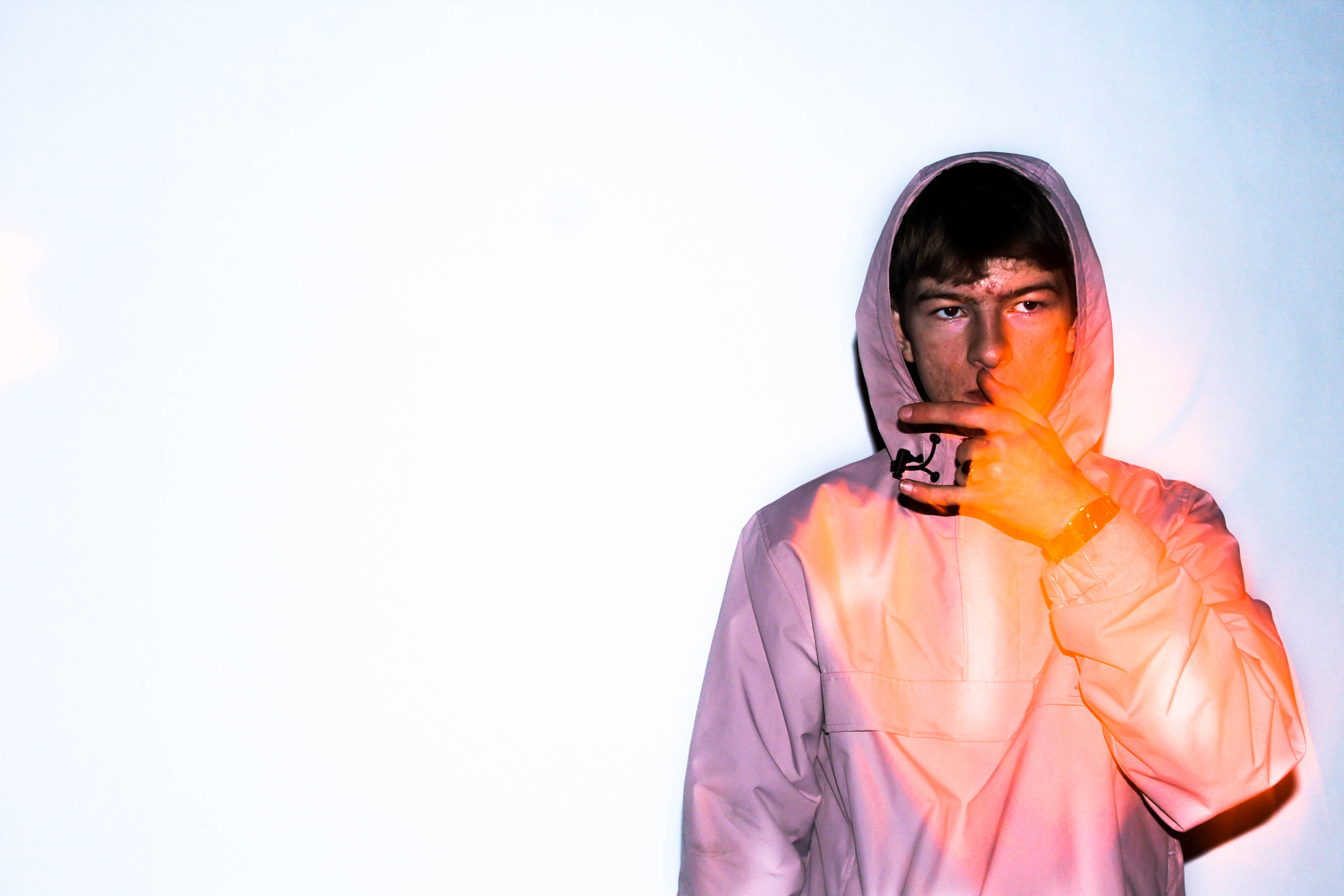
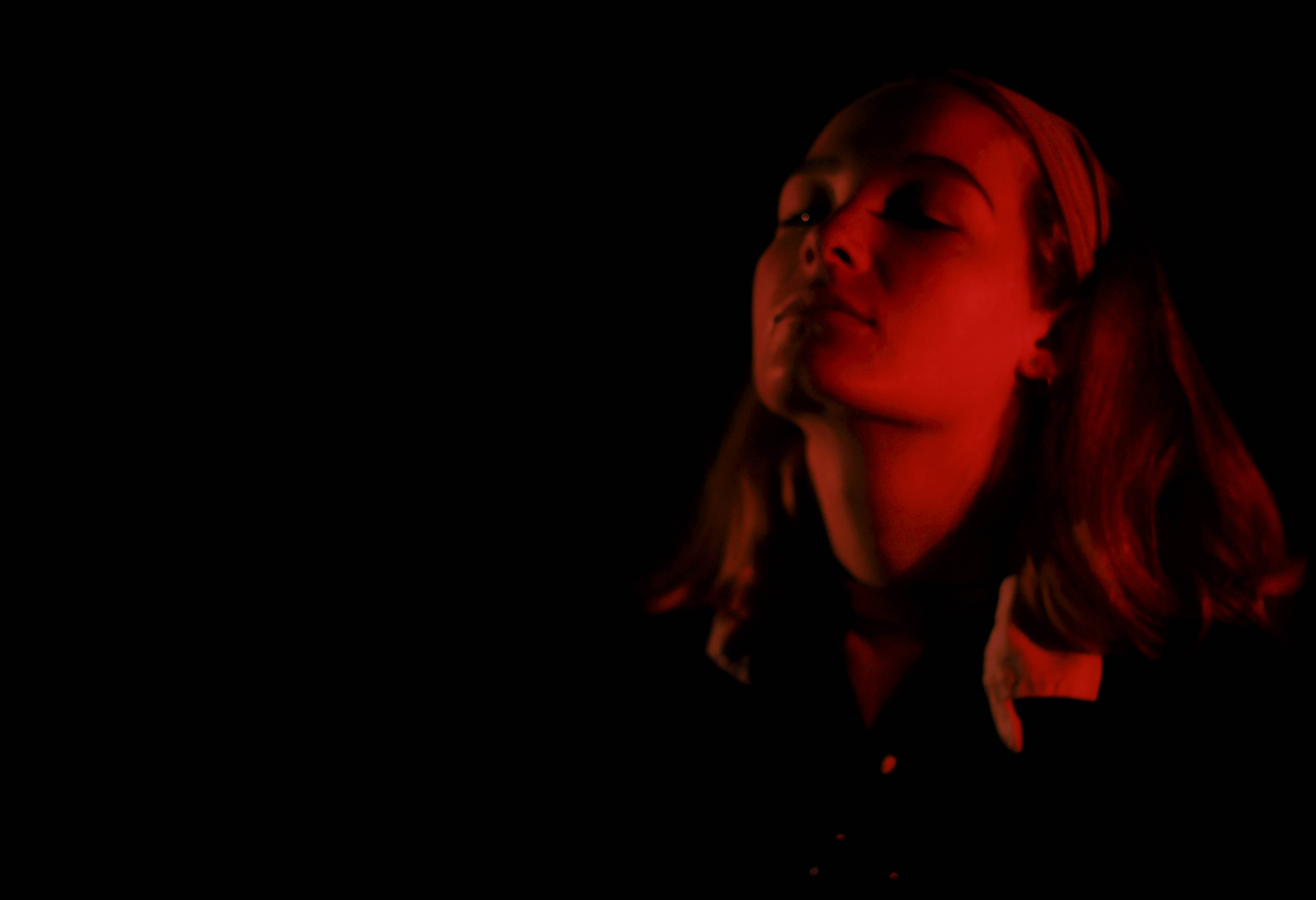
This next image was inspired whiten just a hand and a face seen within the reflection , thought this was quite an impact stance so I wanted to further this idea and use red light to create a more intense and successful image to the piece itself.The deep negative tones allow a highlight on his face and ht illusion that it is only himself seen within he reflection of the glass. It also has strong connotations to that of a negative studio and a sense of history and time to the piece itself.

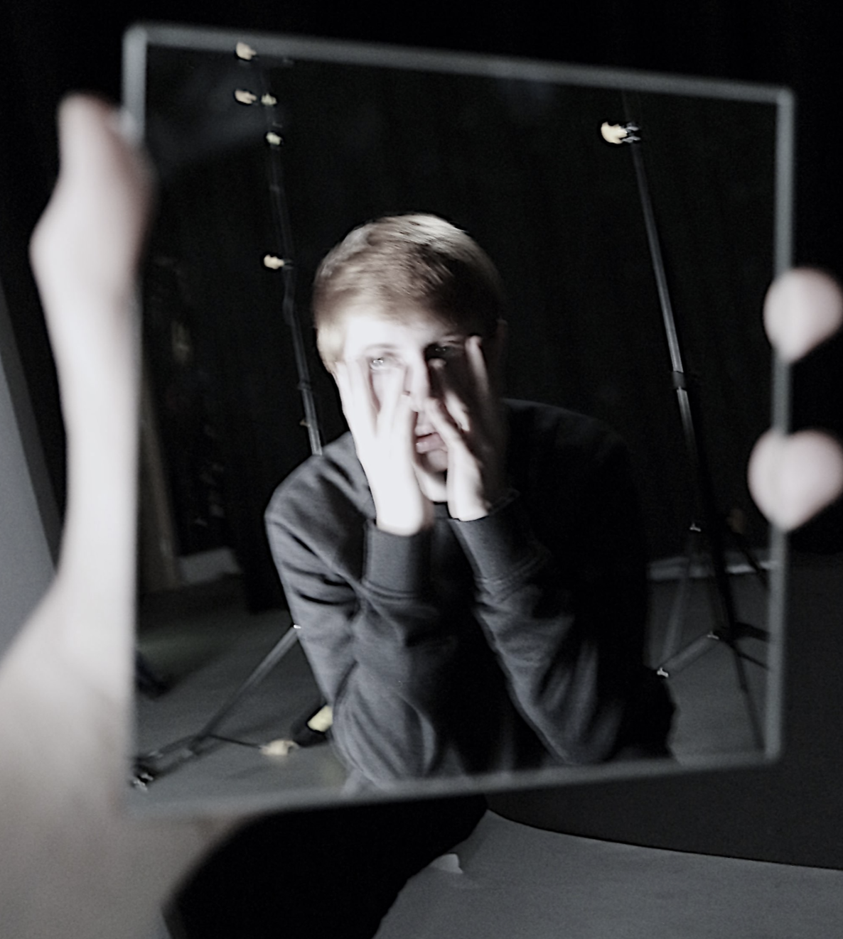
 

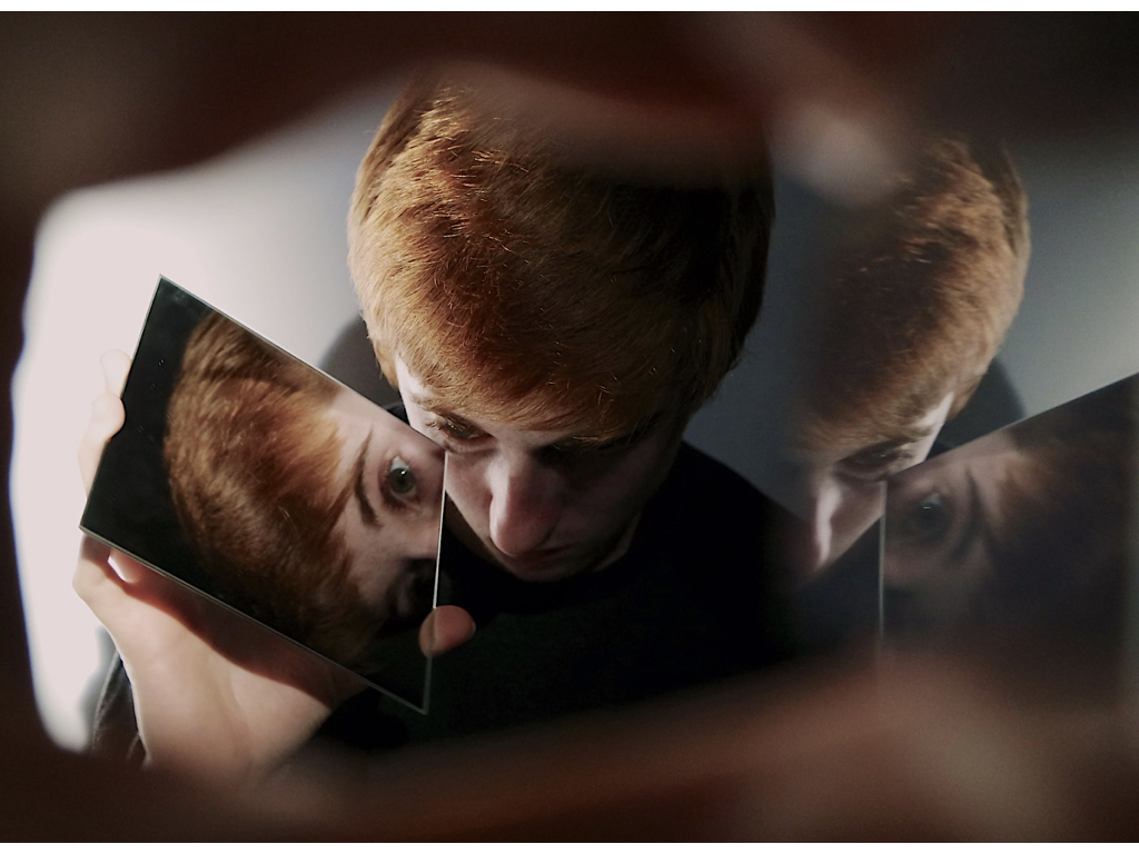
Within these two images I wanted a different version of looking at yourself and a different representation and angle.The first image is glass lined up on a floor in order to show the reflection of the face in interesting forms and angles being moved by how the mirror is paced itself, the section image I wanted to show a sense of  struggle whiten the image and how they too blend in within the background and can be reflected as unseen.
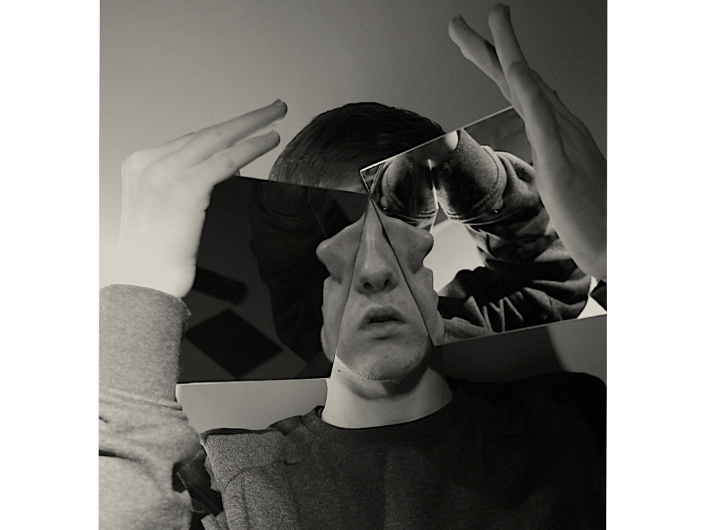
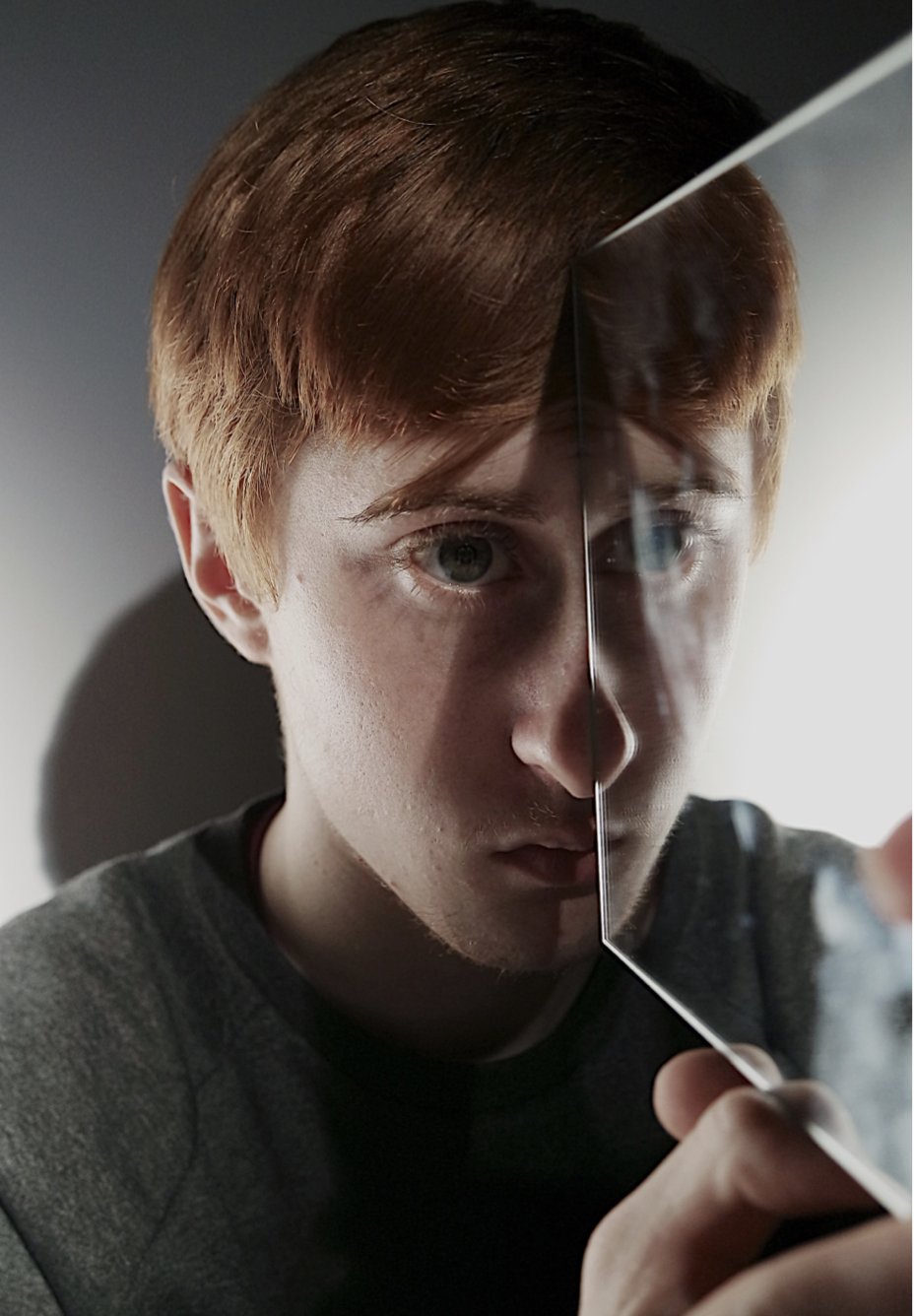
Lastly here I wanted to portray more interesting illusions whiten the face itself and how angling the mirror can cause a different view all dependent on the angle room which you look.I wanted multiple faces and representation of the person and how two sides to a person can all be very different.
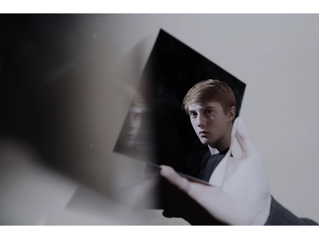
These two images I chose because as seen as before there is a direct interest and question within the image of feeling and attitudes reflected within the deeper tones and self repletion of reflection. The first image within gun looking down allows a sense of unwillingness to know or find who they are or wants to be and surrounded by nothing and no-one. The second image I used a prism to show what looks like blur of slow shutter speed but is really used in order to create a duplication of the face within the scenario.

evaluation:Overall with this shoot i think it is a successful modification of my original ideas and allows more illusions and possibly stronger attachments to my other shoots,I allowed for my   colors to not be completely absent and still be shown throughout but also symbolize the loss of identity occurring throughout.there is not too much editing within the images due to me seeing this as unnecessary and the mirrors already positively create the aspects I was originally trying to achieve.

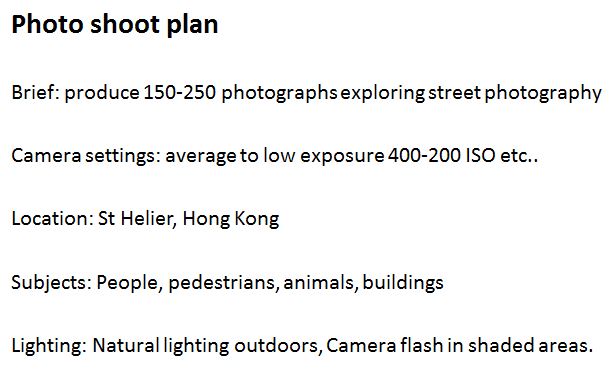
 

Tableau/Creative Portrait – Homework Assignment

Planning

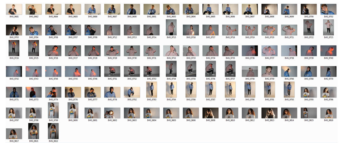
Task – Take 100-200 photos that show your exploration of either tableau or other creative approaches to portraits.

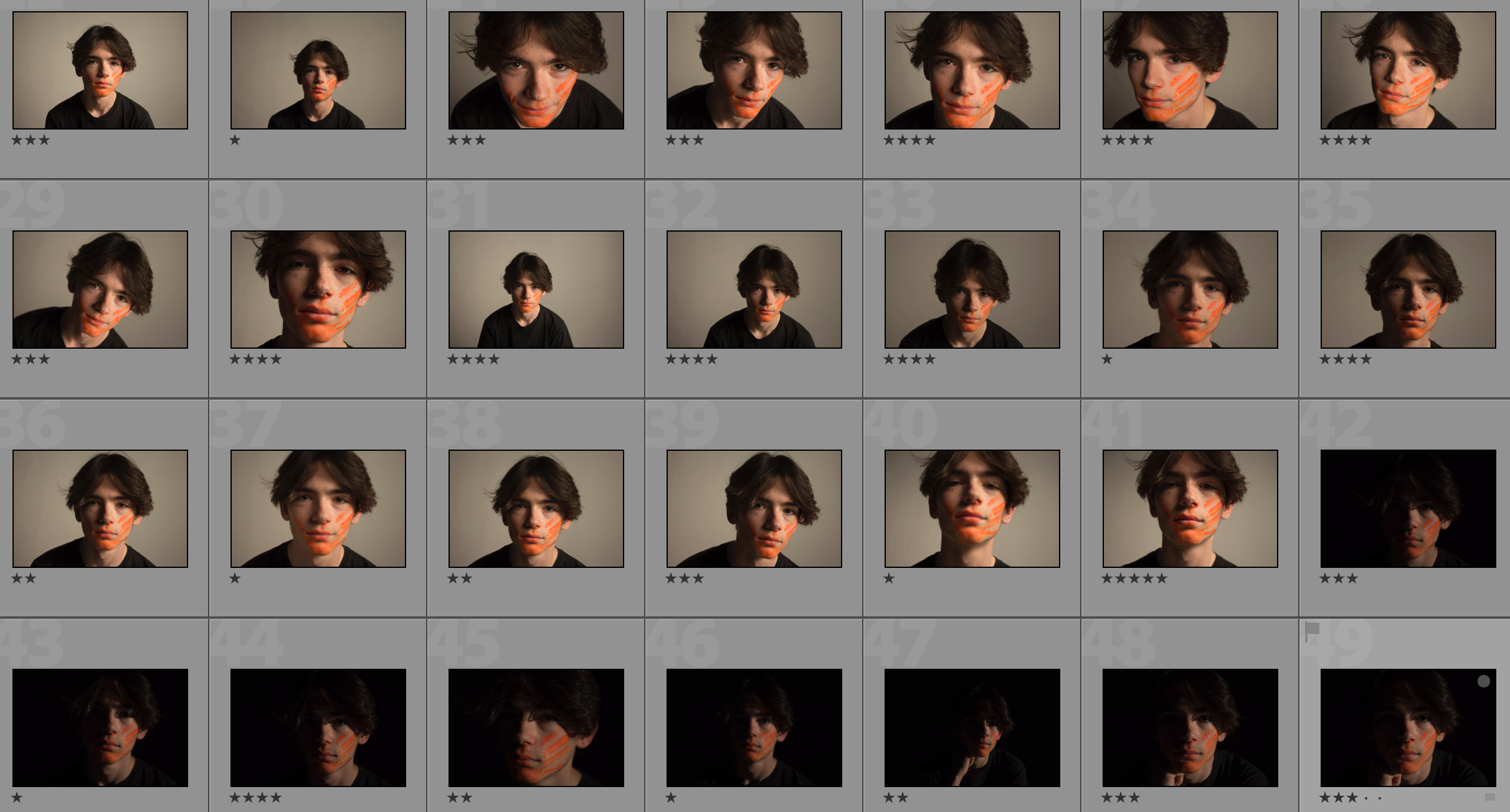
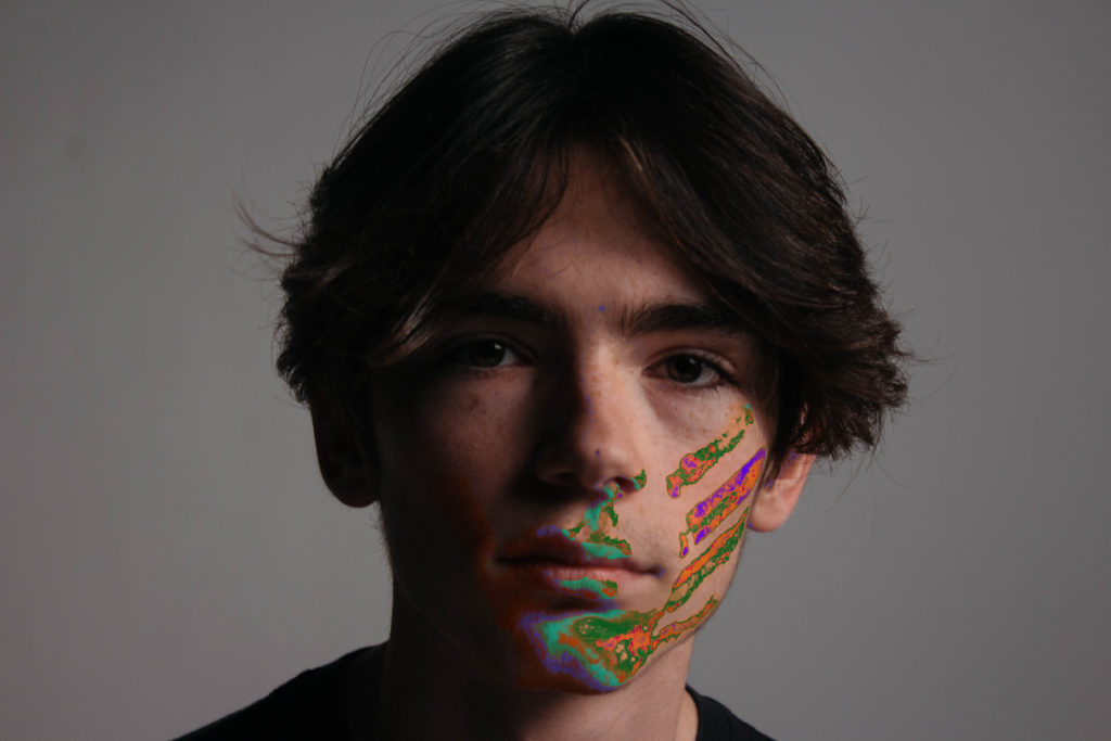
Models/Props – For my model I will use 1-3 people in the lens at a time to create more intense photographs. My only prop will be paint on the models’ face which I will edit to create a more intense colour afterwards.

Camera Settings – I will use a fairly low shutter speed of 1/10 to 1/60 to allow more light to enter the lens from the dark environment when using a black background. I will use a higher shutter speed of 1/60 when using a white background. I will use a low ISO of 100 or 200 to keep the image high quality. I will use a shallow depth of field to create a soft blur in the background.

Lighting – I will be using red head lights, spotlights, natural light and flash to capture a wide range of images. I will be using red head light for soft light, white backdrop for some lighter images, a black backdrop for darker images,  a spotlight for harder light, a reflector to reflect light into the model’s face and gel filters to change the colour of the light

Location – I will do my shoot in the school studio.

Context – I will be using the school studio to capture a range of images in different styles and different lighting to create different amounts of contrast and shadows in the photographs.

Concept – To capture studio portraits looking at both identity and lack of identity.

Johnathan Ducruix

Image result for jonathan ducruixImage result for jonathan ducruix

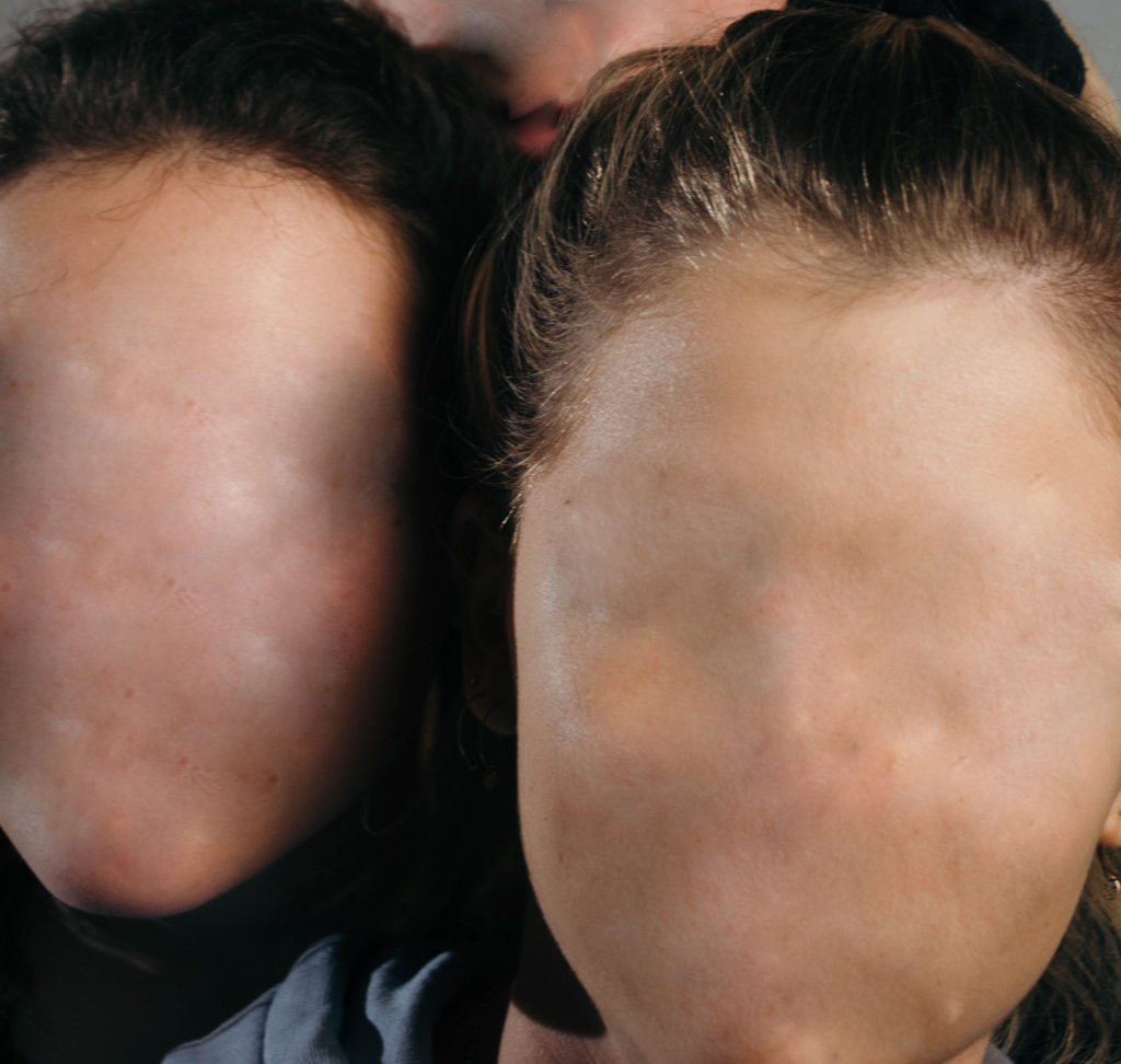
Ducruix is a  Lyon-based digital artist who goes by the pseudonym Me&Edward. He has a diploma in 2D and 3D computer graphics. He says that he has always been attracted to the world of fashion and design which is obvious in his work. Ducruix says that he has a more impulsive style of work – when he has a specific idea in mind he will work on it right away. His spontaneous projects are often the ones that satisfy him the most. The pseudonym ‘Me&Edward’ comes from the fact that he wanted to dissociate the I – as a photographer from the I – as a human being. I hope to take inspiration from Ducruix’s style of editing and photography in my response – especially the removal of facial features.

Johnathan Ducruix Favourite Photo

Image result for jonathan ducruix

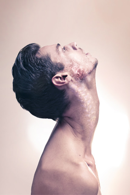
In this photograph, it appears that studio lighting was used to create shadows and highlights in the exact places that Ducruix wanted it to create contrast and to emphasise the shapes within the photograph. It is unclear whether a shallow or deep depth of field was used as it cannot be seen if the background is in focus or not due to it being an infinity screen. It appears that a quick/slow shutter speed (about 1/10)  was used due to the image not being too dark and it being completely in focus and sharp. A low ISO will have been used as it is a photo in a studio, Ducruix will have used a low ISO to balance the overexposure from the shutter speed to keep the image very high quality. It appears that a neutral/warm colour cast has been used on this photograph.

A neutral skin-colour range was used for the colour pallete for this image. This natural colour contrasts with the unnatural subject of the photograph. There is a variety of light and dark in this photograph ranging from the highlight of the forehead to the shadow under the colour bone. This creates contrast in the photograph. They is a smooth texture throughout the photograph except for the face of the subject which has a rough, decaying texture; this adds more drama to the photograph. The shadows and position of the model in relation to the background creates a 3D effect to bring the unrealistic subject to life. The subject appears to be placed in the middle of the photograph to create an uneasy atmosphere in the photograph.

This photograph is from Ducroix’s collection of image from 2012 titled “Metamorphosis”. On Ducroix’s site, he says that Metamorphosis is “a concept about the unlimited transformations of the human body. Just like a chameleon, it’s fitting, just like a virus, it’s mutating, just like a personality, it’s changing. Something new is about to birth, a metamorphosis, an organic complexity.”

The concept of Ducroix’s “Metamorphosis” collection is to show the human body in different forms that are deemed unnatural. Ducroix’s message in this collection is that the human body is capable of many many things and goes through lots of transformations in a lifetime.

Jesse Draxler

Image result for jesse draxlerImage result for jesse draxler

Jesse Draxler, born 1983, is a Wisconsin born photographer/artist who has featured in publications such as ‘Dazed and Popular’ and photographs for the New York Times. Draxler says he struggles to call his art his job, he says “I always hated having a job, now I don’t have one…One of my biggest fears in life is thinking I may have to get a job again some day if this art stuff doesn’t pan out,” Draxler has had her work exhibited all over the world.

Draxler’s work consists of collage-like pictures which merge with surrealism. Draxler will often paint over the photographs he takes or will rearrange it to create something visually confusing but intriguing. I like Draxler’s work because of how dramatic it is and how the he moulds multimedia together to create something that works which shouldn’t.

Jesse Draxler Favourite Photo

Image result for jesse draxler

It appears that artificial lighting was used in this photograph to create the tonal range and contrast that the photographer wanted. A deep depth of field appears to have been used due to the fact that it is all in focus – the corners are not blurred.  A shutter speed of 1/20 to 1/60 was most likely used to allow plenty of light to enter the lens whilst the ISO was also kept low to keep the image quality very high. This helped to create a dramatic image.

There is no colour in this photograph as it is in black and white – this adds to the mystery of the photograph that is initially created by the collage effect. There is wide tonal range in the image but the tones have been placed in unusual places due to the cut and stick style of this photograph. This creates even more drama and contrast in the photograph. The texture of the skin can clearly be seen in the photograph which makes it clear that it is a person but the identity has been scrambled.  There is no clear layout or arrangement in this photograph which links to the idea of mess and confusion in the photograph. There is no clear point that the eye is lead to which further confuses the viewer.

This photograph is from Draxler’s collection of abstract portraiture, it is titled “I wanna be serrated”. It is a collection of photograph like this one in which Draxler takes portrait photographs and then cuts up parts of them then places them in unusual positions to confuse the viewer.

To me, in this collection of photographs, Draxler is challenging the idea of identity and is trying to show how some people feel that they have a lack of it, or struggle to find their identities sometimes and end up stuck in a place without identity.

My Response

My Edits

My Favourite Photos

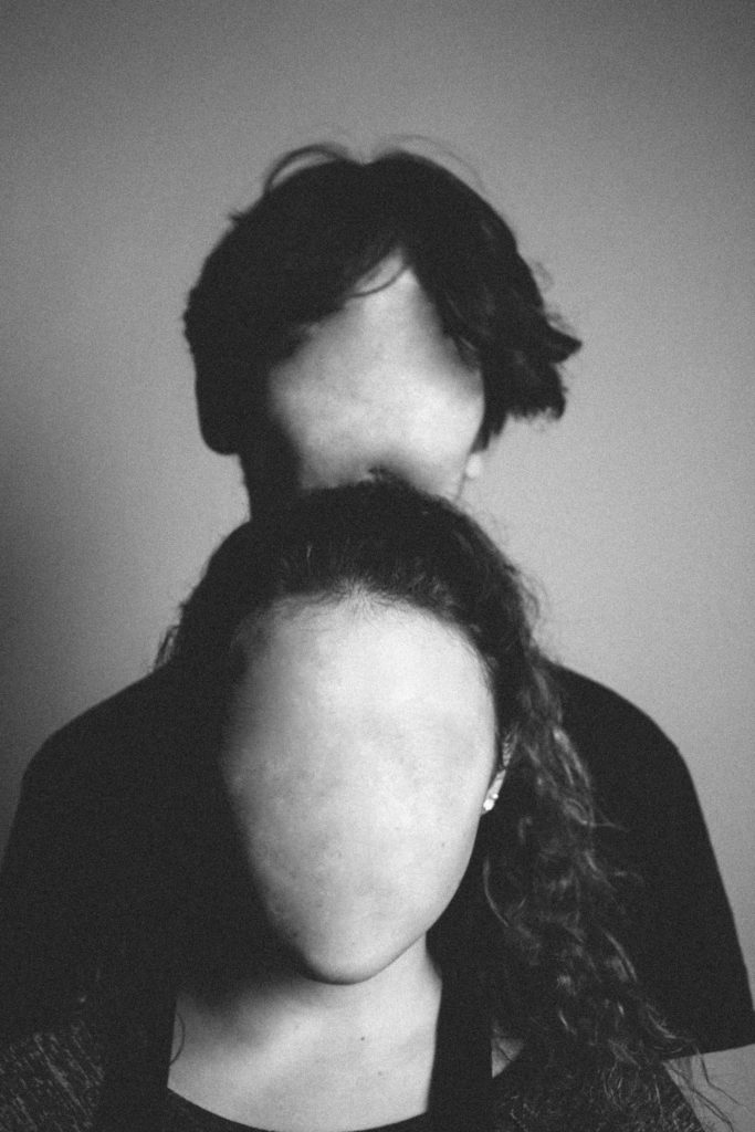
This image was created using artificial light. I used a redhead light to provide some soft light across the models’ faces and I used a spotlight to create a slight chiaroscuro effect to create a more dramatic image with more contrast and shadows. I used a shallow depth  of field (4.0) to create focus on the front model and to mildly blur out the background. I used a slow/medium shutter speed (1/20) to allow more light to enter the lens from the dark environment, I used this along with a low shutter speed of 200 to keep the quality of the image as best as possible.

I used a black and white filter over this photograph to create more contrast and I increased the amount of noise to create an old-fashioned portrait photograph effect.  There is a wide range of tones in this photograph ranging from the darkness of the shadows to the highlight of the face. There is a 3D effect to this image due to the positioning of the models and the slight blurring of the back model, this brings the photograph to life and gives it a more intriguing appearance.  I have placed the models in the centre of the image to create an uneasy effect in the image.

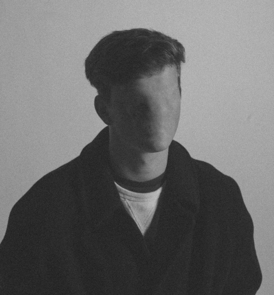
This photograph was taken in the studio with the work of Ducruix in mind. I took the photo then edited it in lightroom to create an old-fashioned effect by using a filter, changing the white balance and increasing the noise. I then used photoshop to remove the features of the face by using the spot repair tool. The aim of this photograph is to show something unnatural and make the viewer uncomfortable.

I took this photograph with the plan of using it for the topic of lack of identity. It shows that there is not much distinguishing each of us other than characteristics and features.  It shows how bland and boring the world would be if we did not have our individual identities as everyone would have the same aspirations and personality traits.


creative photography

what is tableau photography:

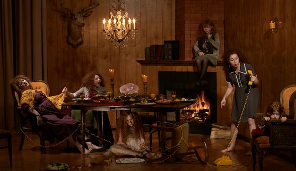
Tableau photograhy comes from Tableau vivant, it is French for ‘living picture’, is a style of artistic presentation, often shortened to simply tableau. It most often describes a group of suitably costumed actors, carefully posed.it is seen to be somewhat romantic and symbolic.It is meant to be short and dramatic.It is all about his the environment reprints a whotle sotry and as to how everything is put in a. place for a reason and everything has a symbolic purpose altogether.it is highly creative and can be used to present a scenario of more surrealistic ideas or even in order to create a historically famous artwork,into a Modern day photographic presents the Modern struggles presented  throughout the work. The key characteristics of the contemporary photographic tableau according to Chevrier are, firstly:

“They are designed and produced for the wall. summoning a confrontational experience on the part of the spectator that sharply contrasts with the habitual processes of appropriation and projection whereby photographic images are normally received and “consumed”

creative photography ideas :

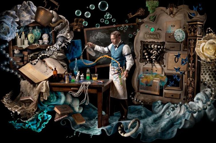
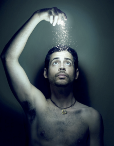
For creative photography I wanted to focus more upon interesting concepts rather than  artists themselves. I want to portray many aspects of illusions that can be achieved through composition and further editing.Lots of ideas that I have seen that inspire me,are images surrounding water,and the development of color and the dripping of lighting and also reflections within the water. This can be seen within the following:The second Idea I have would be surrounding a movement of slow shutter speed,this allows a sense of movement that is create and allows a sense of duplication of faces which is effective.  There is also an additional sense of illusion within the work that allows further experimentation within reelections and editing to the images themselves.furthermore the third creative idea I have is using mirrors,in order to show repetition within the face and also to show illusions of lack of body or interesting angles to capture a hand holing a mirror which clearly shows a face.these were all inspire by my artists seen below.

first artist Aaron Nace:

Aaron Face is a photographer  who uses tableau photography very much in his work.His images resume surrealistic and used in order to show a more imaginative world and more expression shown continually throughout. is a self taught artists,who specializes his work by using Photoshop and using many levels in order to create an almost abstract feel. He said he enjoys using Photoshop in order to act much like a paint brush,this creates a free flowing feel to his images.

lots of the images from below are from an exhibition called ‘visions of whimsy’ This is used  to demonstrate a world in which there standards and expectation  revolved and also highly creative and surreal imagination and also highly creative altogether

I chose this image because of the light and how it enhances all the elements of the photo itself, furthermore it also presents ways in which magic can be repressed in a more realistic circumstance and also masculine standards presented and who he is and his contextual beliefs too.

I think this artists will help in benefiting my work because it has many abilities of imagination creative  aspects too enhance people and how their conceptual thoughts are shown throughout themes like their personality.The attachment within this identity is less to do with a lack of identity but more to be finding their identity in a surrealistic way in how represents them as a whole.I want to continue to show they are diverse  but within a more surrealistic way and perhaps less stereotypical and sad.

Second artist Cristina Otero:

she is a Spanish photographer and  a well known artists best known for her individuality within exhibited portraiture.she is the youngest of three and founder love and passion for photography  at just the age 13,this was due to the fashion photography  show Americas next top model, this was due to her being intrigued within makeup and styling and ways inward which lighting had such a large impact .she further specializes within close up portraits,she was exhibited at just the young age of 15 and this is what started off her very creative  sense of style.all her work varies very much, making no piece quite exactly other,but she does always have a strong continuation of a sense of abstract and creativity within makeup,composition and the coloring used thought out.throughout her work you can Clearly see a more gruesome and perhaps  more vulnerable she to herself throughout her photography. Although these pieces are not my favorite I can see how a sense of hardship has inspired her throughout all of her work.I have chosen work from three of her exhibitions in which I feel I could further use these creative ideas and as to what was inspired by them;

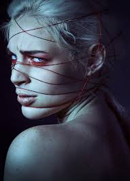
I like this image due t the interposing sense of medium on her face,which creates a sense and molding depth of field and a sense of interest and substance to the piece itself,furthermore the color gradually darkening successfully compliments the background and creates a mysterious and possibly sinister tone to the piece itself.the red under the eyes creates a color contrasting also draws a directness of attention also emphasized with the direction as to where her eyes face, the string itself allows the conceptual concept that she herself is stuck and show the artists cretaive ideas to symbolize a more dark meaningful representation to people.

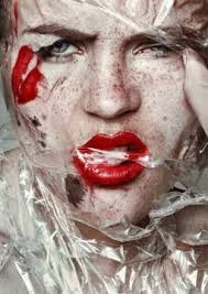
In addition I was also inspired by this piece, due to the juxtaposing sense of textures and create a scorched sense of movement within the case itself, it creates an interesting tone of effect too as it is see throughout so from a way of exaggerating colour. This look was  a inspired by her conceptual concept of beauty standards and was in order to show a sense of everyday clown effect, and how it is a hunoures matter in which people worry about their representation within society today.i think her expression is quite powerful and it furthers the kind of the almost ragged sharp plastic covering hermit shows  strength and I find this intriguing within her work.

I chose this image lastly due to it being unlike any of her previously seen workout shows a sense of natural meaty within her work but while also having really deep tones that create a larger sense of persona to the piece itself. the composition  of a very strong close up on hr hand is changed within how her hand shows a sense of delicacy but also obstruction from within the rest of her face,again creating an interposing composition to the piece.

From her work ideas that I will use: I want to show a large divertsity of color ideas and interesting concepts that she includes in her work, such as power and also a sense of sinister toning.inspiration for shoots: I would like to do a shoot using light and string in order to create an exaggerate persona and connote a struggle while also showing an interposing conceptual concept and visual aspects. ,furthermore I would to focus on direct close ups on portraiture aspects, and also use this to enhance a tone and persona to the image itself.

This work could be further linked to the idea of loss of unity throughout the struggle and hard pressure that  are seen to be under, such as the rope wrapping around the face preeners the idea of struggle and also thatch is contraindicated,this shows how they feel lost and toed up within their emotions not known how they themselves are and almost use the rope as a metaphorical device that they are and unable to continue.

HOMEWORK ASSIGNMENT // STUDIO LIGHTING

Planning

Task – Produce 100-200 images showing your understanding and control of studio lighting.

Models/props – White Backdrop for bright images, Black Backdrop for darker images, spotlight, reflectors, filters, models.

Camera settings – I intend to use an ISO value on 100 to ensure the quality is kept to a high standard and the shutter speed of about 1/125 however i will alter it to fit the lighting used at the time.

Lighting – I will be using red head lights, spotlights, natural light and flash to capture a wide range of images.

Location – School studio

Concept – To capture a range of studio photographs in the style of David Bailey whilst incorporating the style of chiaroscuro.

David Baily

David Bailey was born in Leytonstone East London to Herbert Bailey, a tailor’s cutter, and his wife, Sharon, a machinist. 

Bailey developed a love of natural history, and this led him into photography. Suffering from undiagnosed dyslexia, he experienced problems at school. He attended a private school, Calrk’s College in ilford, where he says they taught him less than the more basic council school. As well as dyslexia he also has the motor skill disorder dyspraxia.

In one school year, he claims he only attended 33 times. He left school on his fifteenth birthday, to become a copy boy at the Fleet Street offices of the Yorkshire post. He raced through a series of dead end jobs, before his call up for National Service in 1956, serving with the Royal Air Force in Singapore in 1957. The appropriation of his trumpet forced him to consider other creative outlets, and he bought a Rolleiflex camera.

He was demobbed in August 1958, and determined to pursue a career in photography, he bought a Canon rangefinder camera. Unable to obtain a place at the London COllage of Prinitng because of his school record, he became a second assistant to David Ollins, in Charlotte Mews. He earned £3.50 a week, and acted as studio dogsbody. He was delighted to be called to an interview with photographer John French.

Image result for david bailey

Image result for david bailey

Photo Analysis

Image result for david bailey

I am inspired by this image due to the sheer simplicity of it, yet effectiveness it has. It has a large tonal range with strong contrast which helps to bring out certain and important elements of the photograph. There is a high contrast between the background which is completely white and the mans coat which he appears to be wearing which is all blackened. I think that a low ISO of about 100 or 200 would have been used due to the fact the image is of such high quality. The bright light upon his face has been implemented through the use of spotlights directed into the right side of his face (his left). This use of lighting has created a strong contrast on the opposing side of his face. This effect may have been deliberately used to create a sense of mystery or secrecy. The composition of this photo is effective in the way that we are drawn to look at the eyes of the model which helps the viewer to engage with the photo.

Contact Sheet

Edits


Rankin

Technical: This image has been taken in a studio using studio lights  to make the image as bright as possible. we can see one light shadow which helps define the model from the background. A very white light for example LED’s would have been used to give the closest possible to true white. The white Balance would have also been adjusted to make sure there were no yellow or blue tones. Despite most of the image being in white it has a high contrast due to the dark areas in the hair. This image was taken on a hight aperture which has made the whole image sharp and in focus.

Visual:

Week 11 | Tableau and Constructed Portraits | Get Creative!

You will now have 2 weeks to explore a range of ideas and techniques that demonstrate a creative understanding of identity and self portrait…

D e a d l i n e   =    F r i d a y    1 st   D e c e m b e r ( your 3 strongest images will be sent off for printing and then we will mount / frame your work)

How to order your prints :

  1. choose your images
  2. copy the jpegs into M:\Departments\Photography\Students\Image Transfer\PRINTING AS Nov 2017
  3. Label the files with your name

Example Of Portrait Blog from last year…

You must provide ample evidence of the following…

  • a mind-map that shows your ideas and influences
  • a mood-board to show your visual influences
  • a definition and examples of tableau, self-portrait and identity in photography
  • a case study that shows your understanding of an influential photographer, including analysis and interpretation of a key image
  • a range of photo-shoots to underpin your mini-project, inspired by your chosen photographer
  • a selection of the most successful photos from your initial photoshoot(s) including SELF PORTRAITS
  • formal analysis of your strongest image
  • a range of editing and presentation techniques
  • a final image ( or group of 2 , 3)
  • an evaluation of your entire process, including screen shots and comparisons to the work of others…

HOMEWORK = 1-3 photo-shoots (50-150 images per shoot)

Themes you could choose from…

  • gender identity
  • cultural identity
  • social identity
  • geographical identity
  • lack of / loss of identity


Make sure you refer to the powerpoint we have used in class to discuss a range of artists and their approaches to identity / self-portrait…

Then…

research and explore ways to present your work and create a blog post that articulates this clearly…

  • A5 / A4 / A3 PRINTS (colour or b/w)
  • in mountcard
  • on foamboard
  • structurally / 3-d
  • other ?…think about composition, groupings and “clusters” of images

Keywords to use for this unit…

  • perception
  • viewpoint (POV)
  • genre
  • context
  • composite image
  • collage
  • montage
  • signs
  • symbols
  • metaphors
  • codes
  • juxtaposition

You may want to explore personal possessions or personal spaces like in this link…

PERSONAL POSSESSIONS


Photoshop Tip of the Week

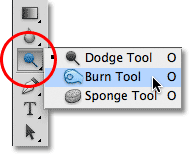
Using the dodge and burn tools to adjust exposure…


photoshop-burn-tool

Burn = darken (check your exposure % and size of brush!)

Dodge = Lighten  (check your exposure % and size of brush!)


Demonstrate a range of editing, manipulating, enhancing and presentation techniques.

You can explore Adobe Photoshop , Adobe Bridge and also Lightroom (extra class on Tuesday 21st LUNCHTIME)

You can explore manual editing techniques….like this

scan objects in photography

You should  experiment with a range of presentation ideas.

You should exploit a range of editing apps and Instagram filters.

W e  w a n t   y o u   to   s h o w   y o u r

                     c r e a t i v i t y…

Photoshop Key Skills | 1 x blog post per skill
  • Double exposures / opacity control / Look at Adam Goldberg)
  • Blending options and overlays, textures, frames
  • Cut and paste (Look at Hannah Hoch) and Free Transform (Ctrl T) to create composite images (Photomontage) inspired by “Dada-ism”
  • Layer Via Copy (Ctrl J)  (see Christopher Relander) and Paste Special commands ( Selection Tools + Layer Mask to reveal)
  • Joiner portraits (see David Hockney)
  • Juxtaposing portraits (see John Stezaker and Joachim Schmid)
  • Blurring techniques (motion, lens, gaussian etc)

Remember >>> Use your own photographs <<<

Soon you should have 3-5  carefully edited responses…clearly displayed as “Personal Responses” (AO4) and these will be printed for you ready to display.

EXTENSION

  1. Choose 1-3 examples from “CREATIVE IDEAS” on the side bar.
  2. Create your own version of the examples using the same technique as described and as used by your choice of artist
  3. Add to a new blog post with comparison and evaluation

Studio Lighting Photo Shoot

Why do we use studio lighting?

We use studio lighting because it gives us more freedom to control the conditions that the subject is in. For example we can adjust the angle, brightness and color of the lights so that we can have the settings we desire to have the picture taken in.

What is 3 point lighting?
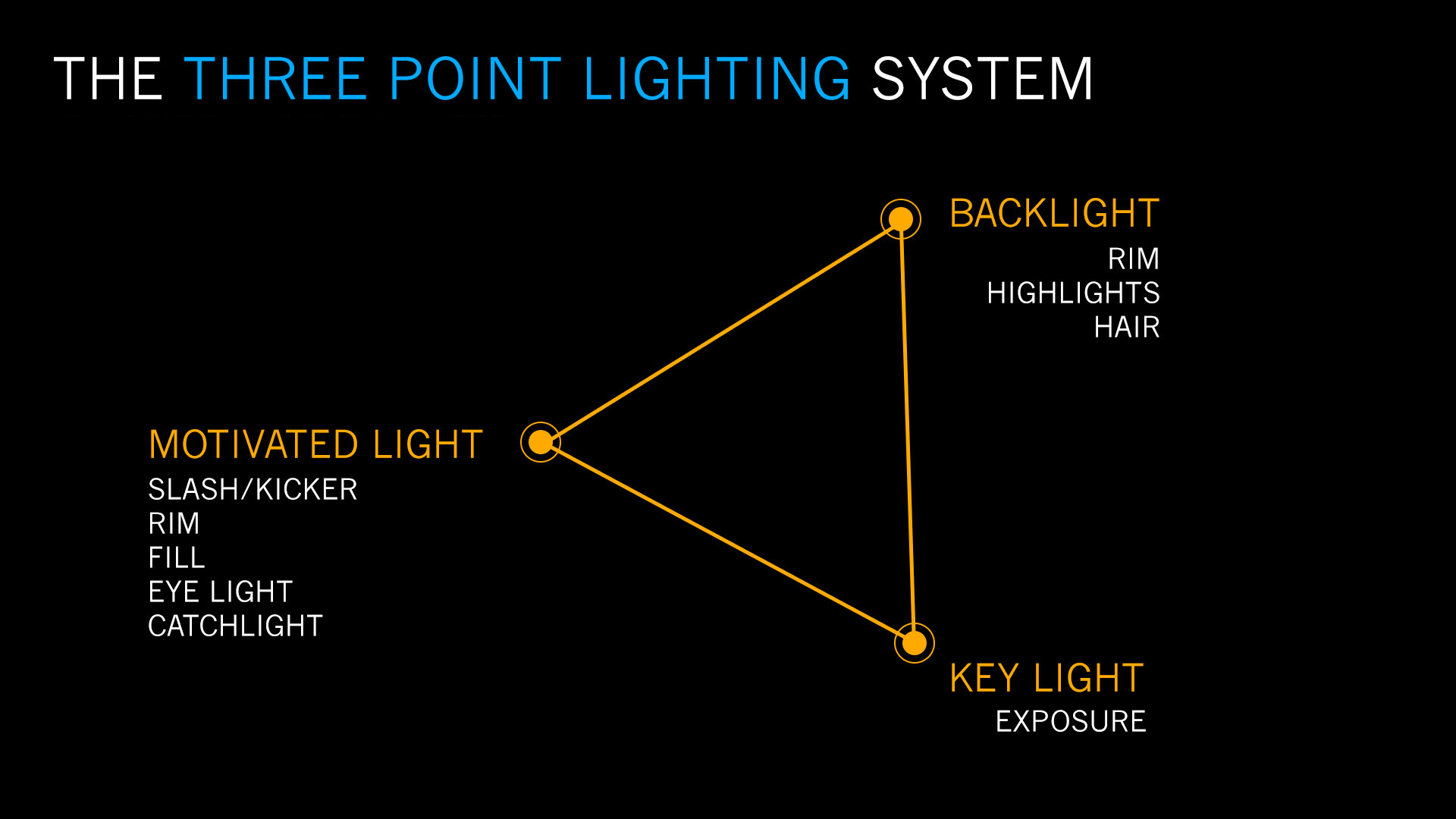
Three point lighting is split into three different points: Key lights, fill lights and back lights.

Key lights: Usually the main and strongest light, with the most influence in the shoot, and is placed on one side of the camera so that the other has some shadow.

Fill lights: The secondary light that is placed on the other side of the camera from the key light, to fill in some of the shadows using softer lighting.

Back lights: This is placed behind the subject to provide some lighting from the back, with its purpose to provide definition and some highlights in the picture, which helps separate the subject from the backdrop.

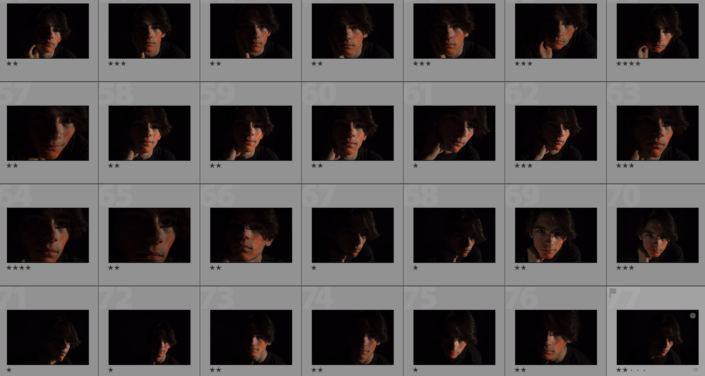
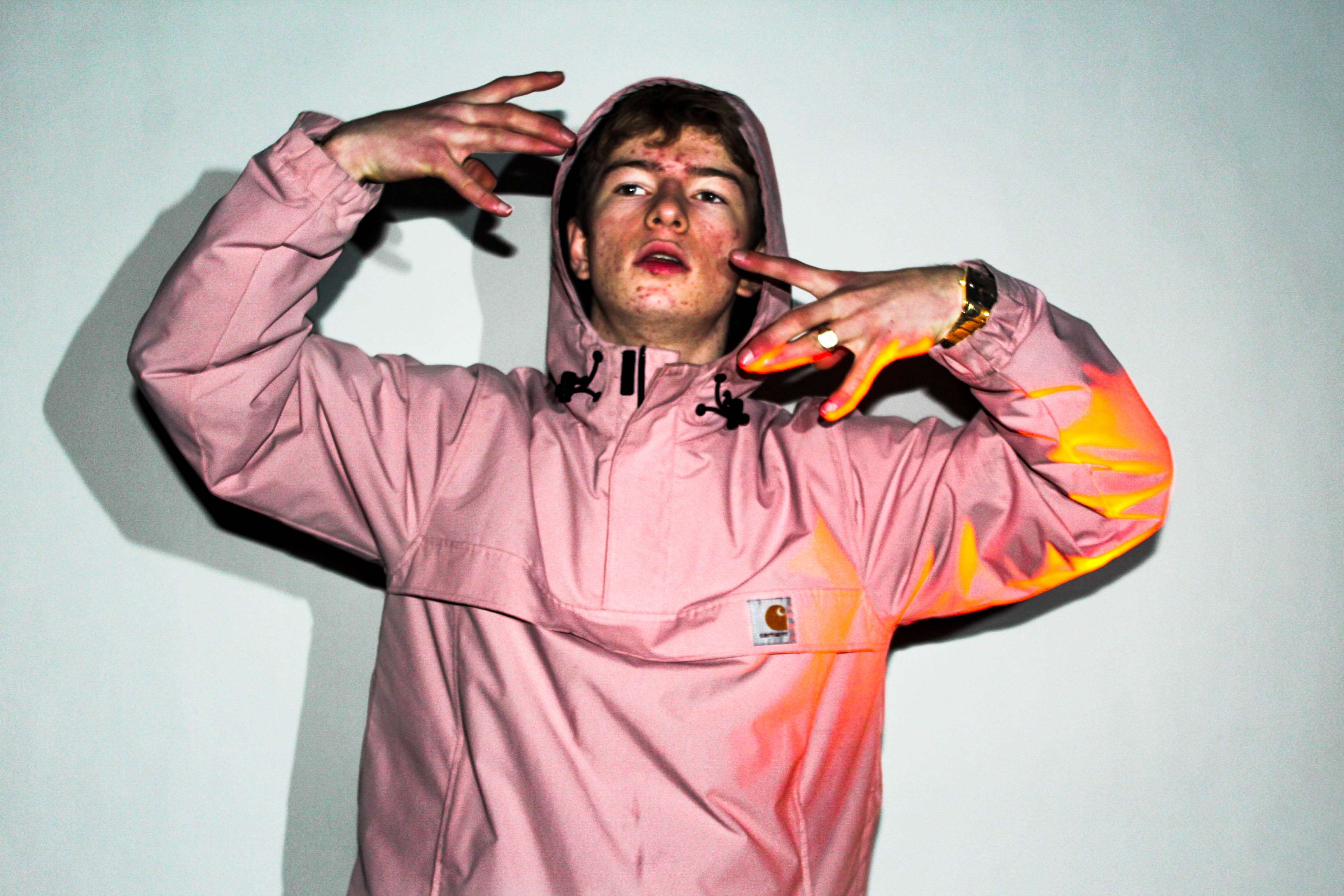
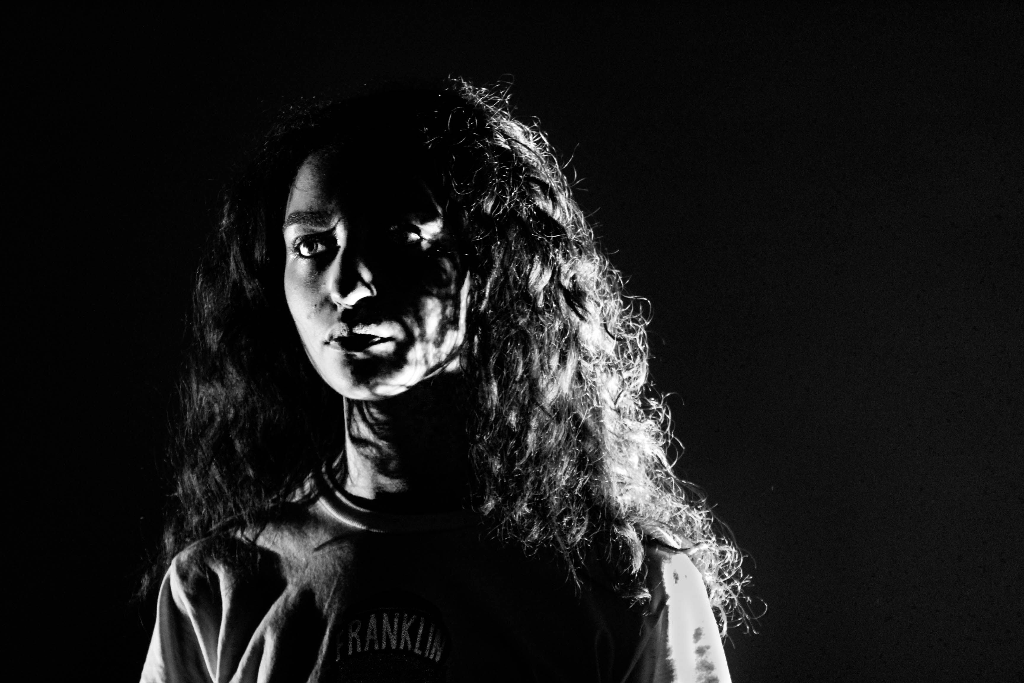
In this shoot I used the artificial lighting provided by the spotlights, to create a dramatic, almost black background, whilst using a red film to cast a reddish shadow onto the subjects face. I tried to position the subject's face using the rule of thirds, so that the eye was drawn to the face almost immediately, whilst blending in some of the subject's clothes into the darkness to create a smooth visually pleasing image.

This was my response:

Final pictures:
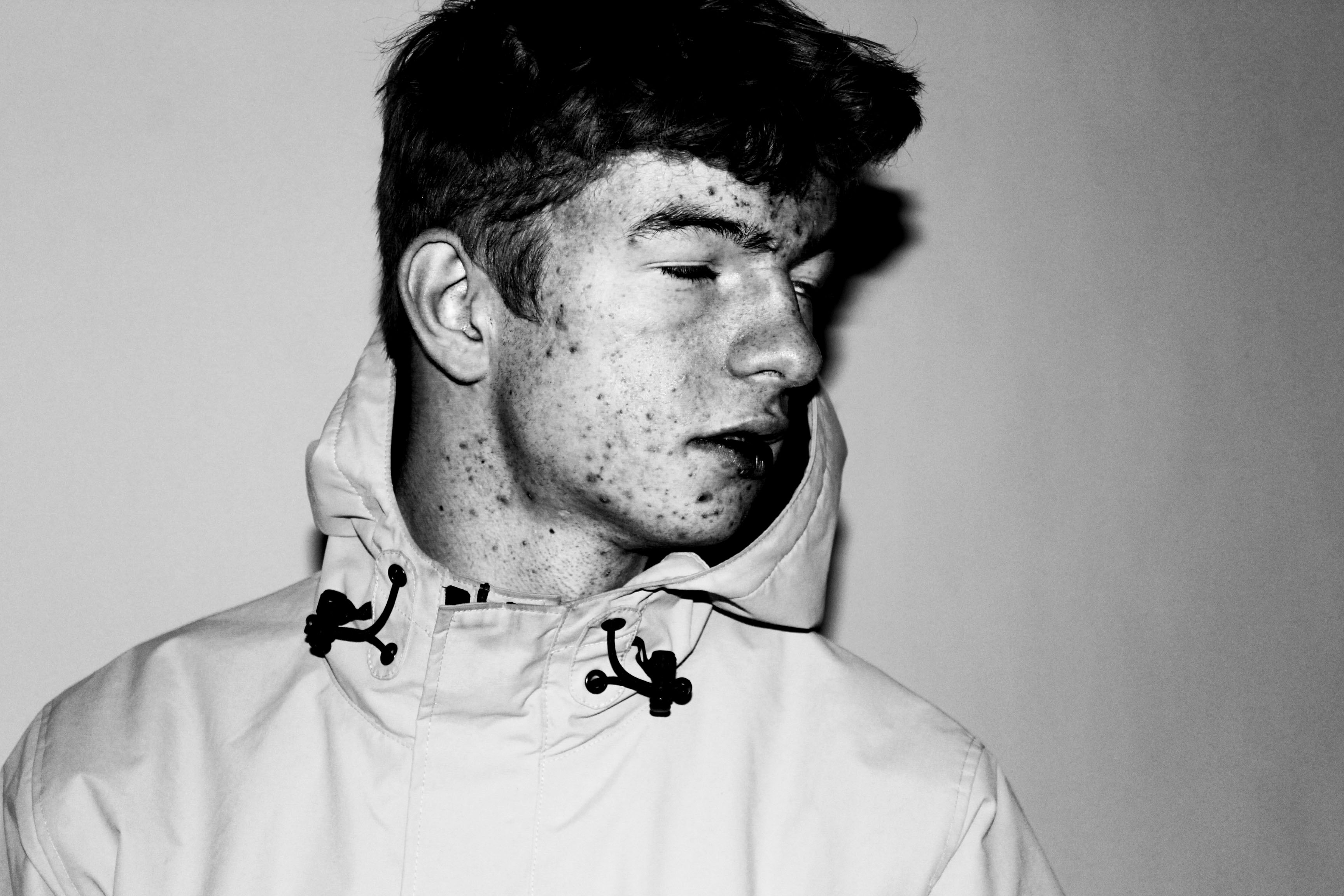
I chose this image because I loved how the subject emerged from the darkness through the slow faint gradient of the red. This I found created a more dramatic effect to the overall image taken.What I liked about this image was how not all of the subjects profile was shown, as there is a clear contrast between the light and dark side of the face. This created a more abstract effect where the body seemingly is materializing from the darkness.I found that the clear definition between certain points of the subjects face, such as the neck and forehead allowed from a most striking and dramatic look from the individual. What I really liked about this image was the use of the main light only being used. By doing so it created a circular spotlight illuminating only the top half of the subject's body, whilst making an imposing and strong contrasted image.The use of the shadow in this image allows for a strong contrast created by the singular spotlight, to which the slight gradient around the edges makes the overall image more sinister.