Category Archives: AO1 Develop Ideas

Filters

Author:
Category:

Creative Portraiture Case Study – John French

Visual Influence – Projector Portraits

Below are some images that I found interesting and wish to work in the style of.
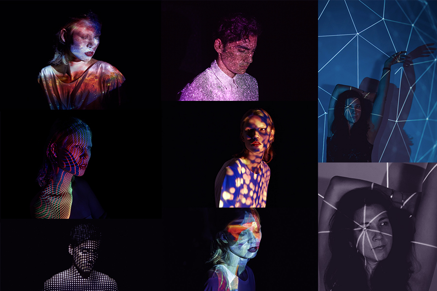
Projection photography has become increasingly more popular over the years as photographers and artists have discovered this fantastically adaptable resource to produce art and photography.

Most famously, photographer John French used projection art photography in the 1960s – he photographed models with floral patterns projected onto their bodies instead of clothes.

John French

Born in Edmonton (London) John French originally trained and worked as a commercial artist, becoming a photographic director in an advertising studio just before World War II.
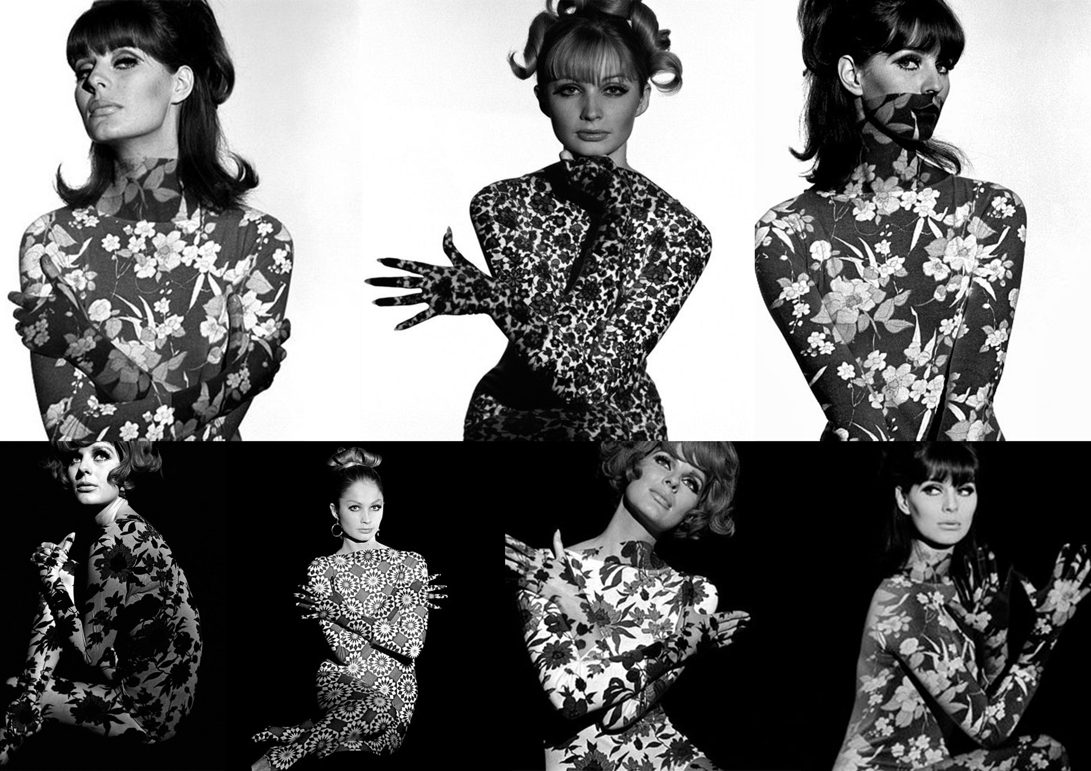
He worked for many editorial magazines and newspapers(like the Daily Express). He worked on a new form of fashion photography (which included bouncing light from reflector boards to create aesthetically pleasing, low-contract images that would reproduce well on newsprint).French is known for his clear, stylish, uncluttered black and white photographs taken against clean backgrounds.  He preferred to work closely with his models, devoting much attention to their posing and his sets.

Source

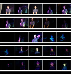
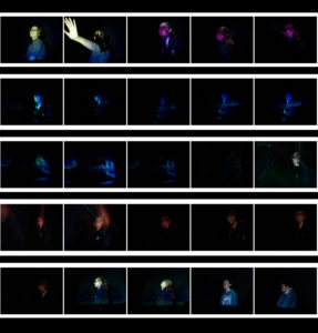
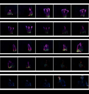
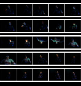
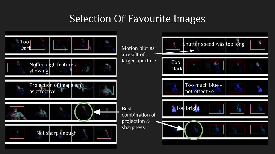
Contact Sheets

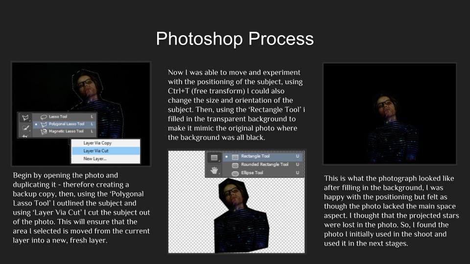
Editing

Evaluation

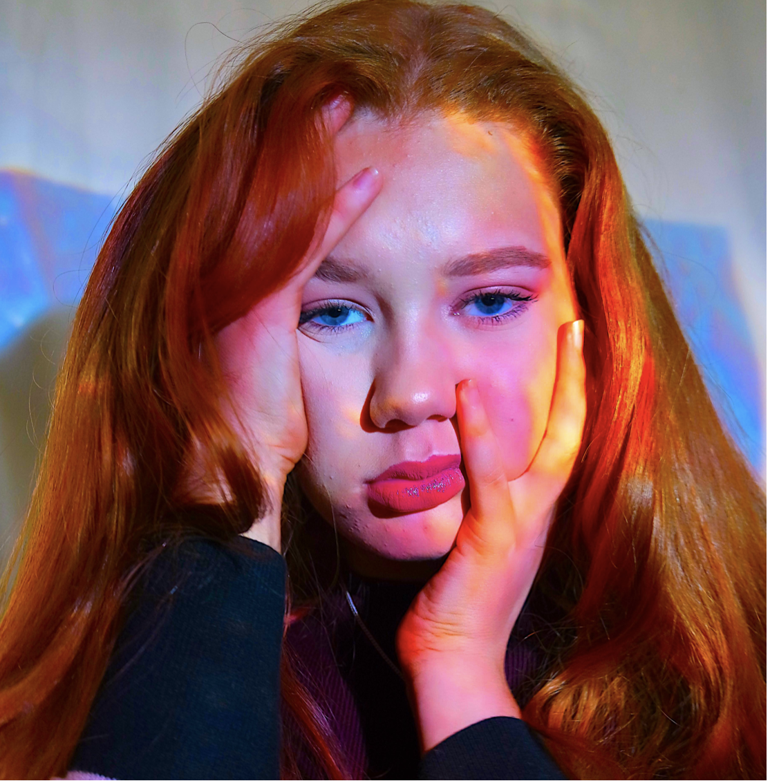
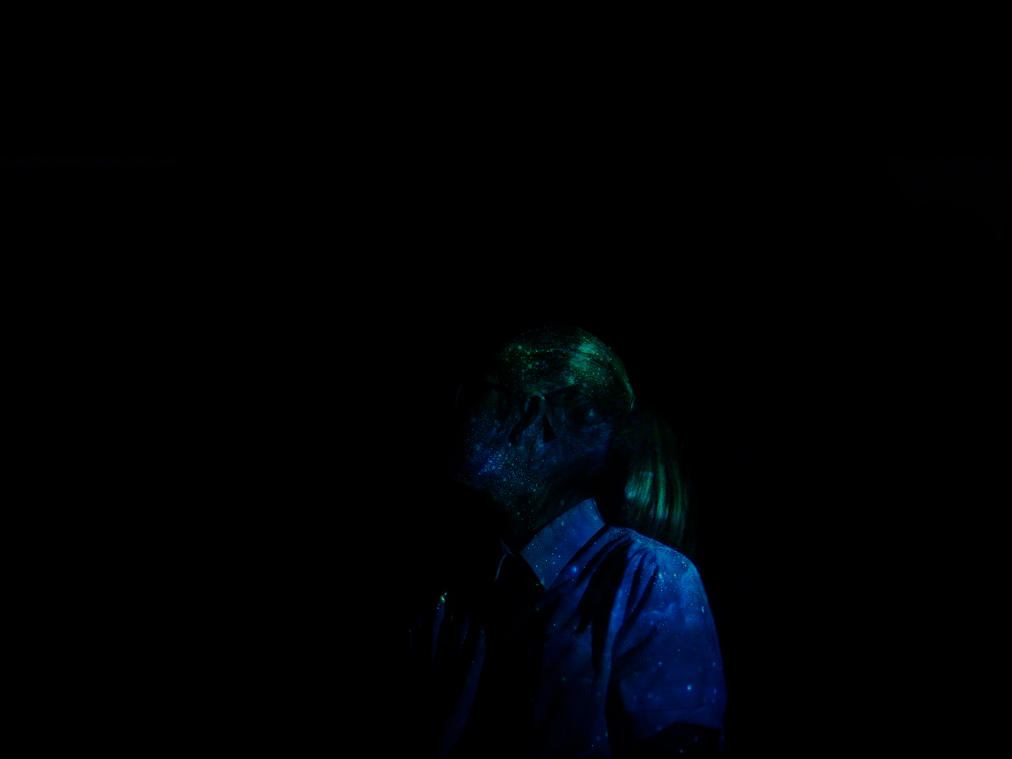
 This was my first and, by far, favourite image. I like the immense focus and the chilling stare of the subject. Adobe Photoshop helped me position the model in the center of the image with a large amount of black filling the frame. I aimed for this effect with all of my images, I wanted the dark to almost swallow my models – I think that this gave my images a more sinister feel and created a more mysterious atmosphere that surrounded my images. Due to this, the photographs also have a more minimalistic feel about them, thanks to the projection aspect the photographs are much more complex and interesting to look at. If I were to do this whole photo shoot again I think I’d try to take some photos with multiple models- with each of them having different projections and experiment with the different effects. I would also try to mix some images together via overlay and such.
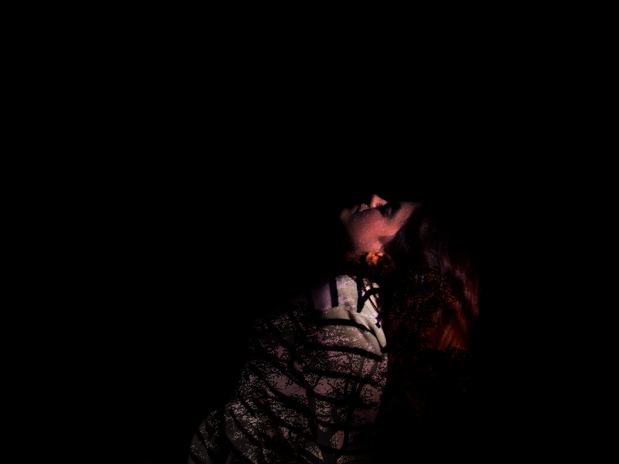
This is my second final image for this subunit, unlike in the other two photographs, this image fully obscures the model’s face and features, This is because she’s looking away from the light source and into the shadow. It follows the general theme and what I was going for, the projection of the stars is very sharp and crisp in this image which makes it more pleasing to look at. This is the last image, for this image I chose to use an image of a tree with stars behind it. This way I was able to achieve different colours and play around with the placement of the trees in regards to the subject’s posture and such.
 

Landscape Photography | Coursework Unit 3 | Getting Started…

YOU WILL HAVE 7 WEEKS JAN 3 -FEB 26 TO COMPLETE AND SUBMIT YOUR FINAL UNIT OF COURSEWORK.

Christmas Break : you should aim to produce a range of landscape inspired images, focusing on natural environments, evocative and atmospheric settings.

Try to get out in the morning / evening light or even at night and capture interesting light effects, colours, mist, fog, and shadows too…

Possible locations include : woods, forests, sand dunes, beaches, fields, valley settings, cliff and coastal areas, sea-scapes (looking out to sea), church-grounds etc

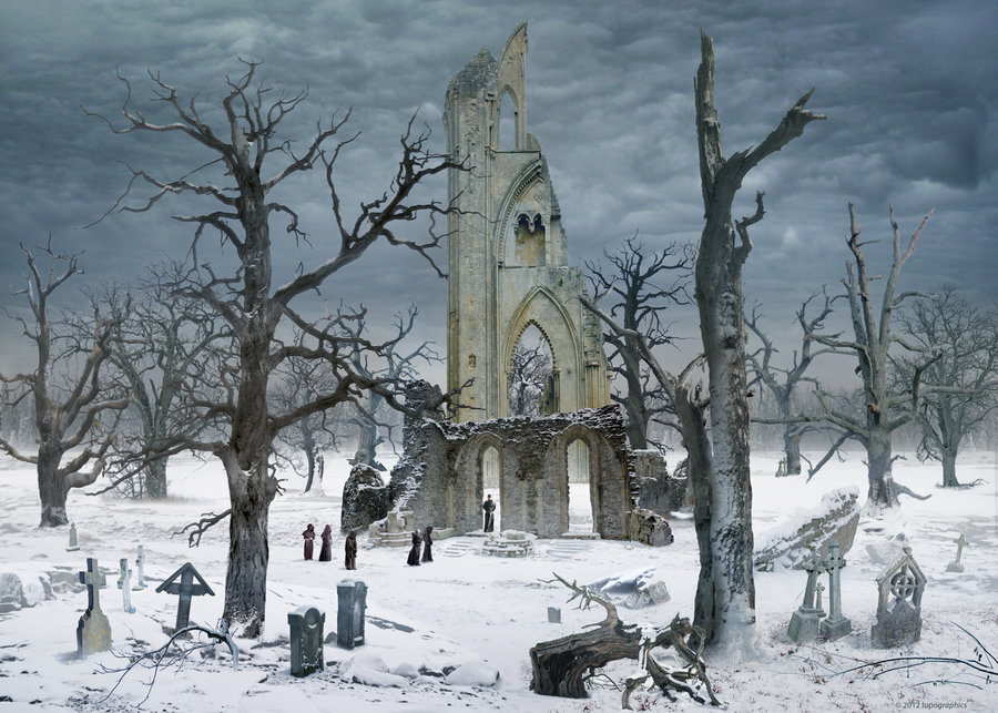
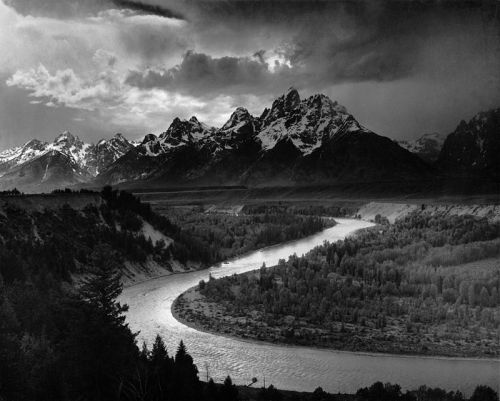
We will be looking at Romanticism as a starting point and if you click here you will have a better understanding of some of the roots of landscape in contemporary photography….

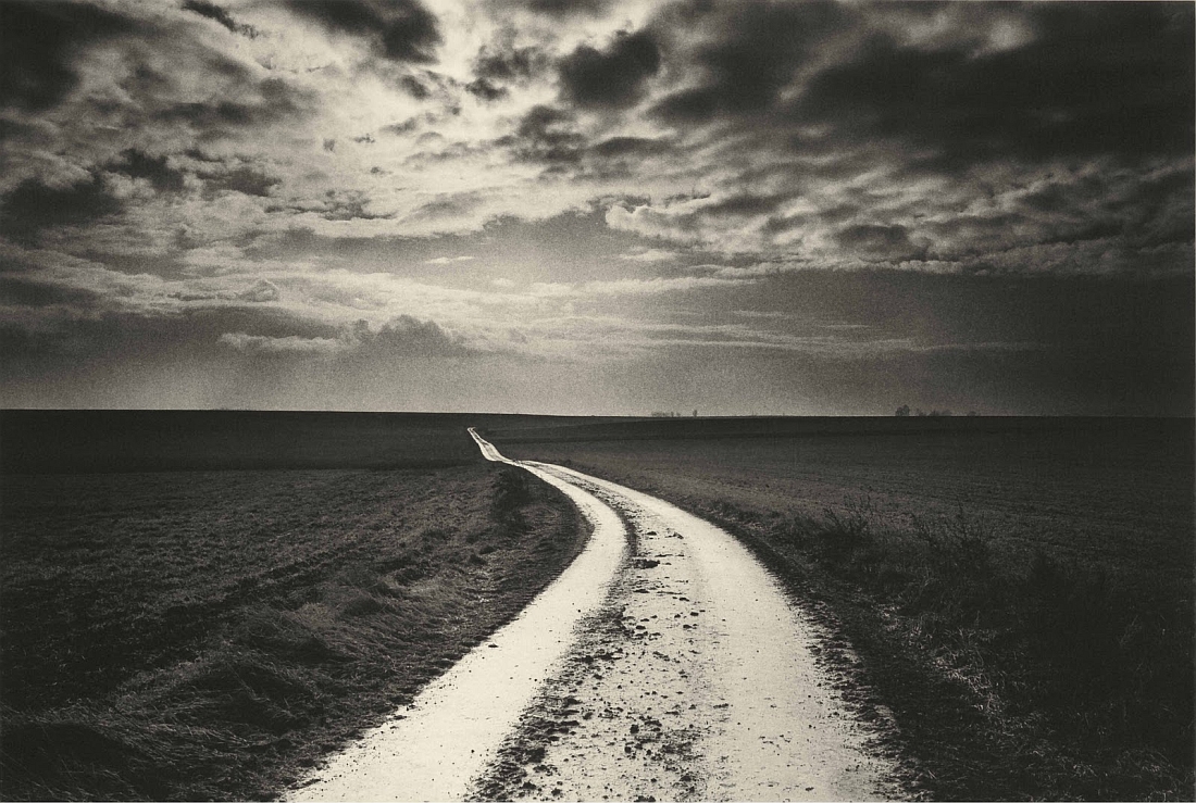
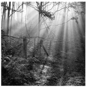
Caspar David Friedrich 1832 Germany
Ansel Adams 1942 USA
Don McCullin 2000 UK
Fay Godwin 1985 UK


AS PHOTOGRAPHY MOCK EXAM

THEME : LANDSCAPE 

DATES…

MONDAY 26TH FEBRUARY 12 A PERIODS 1-5 IN PHOTOGRAPHY ROOM

TUESDAY 27TH FEBRUARY 12 B PERIODS 1-5 IN PHOTOGRAPHY ROOM

WEDNESDAY 28 FEBRUARY 12 C PERIODS 1-5 IN PHOTOGRAPHY ROOM

THURSDAY 1 MARCH 12 D PERIODS 1-5 IN PHOTOGRAPHY ROOM

PRINT DEADLINES

FEBRUARY 19TH 12A, 20TH 12B, 21ST 12 C, 22ND 12 D

(You can add abstract, formalist, portrait and landscape final images to this print run too)

You may have other opportunities to explore architecture, and make links to what you studied in ABSTRACT AND FORMALIST photography…

Link to BBC Website feature on Architectural Photography


Photoshoot 2 // Loss Of Identity

Rosanna Jones

Rosanna Jones is a 19 year old photographer and mixed media artist  who distorts and tampers with her photographs to create unique mixed-media pieces that are both beautiful and disturbing at the same time.  She is based in London and recently graduated in Fashion Photography from Falmouth University. Rosanna explores how body image – whether positive or negative – can unconsciously effect identity. Through Rosanna’s work, she questions and challenges the ideas of beauty in regards to how a person feels internally compared to how a person is perceived by the outside world.

I believe there is a strong link between Rosanna’s work and the theme of loss of identity. This is seen through the use of camera settings which she intentionally uses to capture a sense of lack of identity. For example using slow shutter speeds to create a motion blur on peoples faces or using aperture to focus to foreground and blur the background, thus being the models. She also makes the most of the natural things, like smoke which she seems to have used in many of her projects. She uses this smokey effect to help hide certain features of a persons body and reveal some too.

Examples Of His Work

Image result for Rosanna JonesImage result for Rosanna Jones

Analysis

Related image

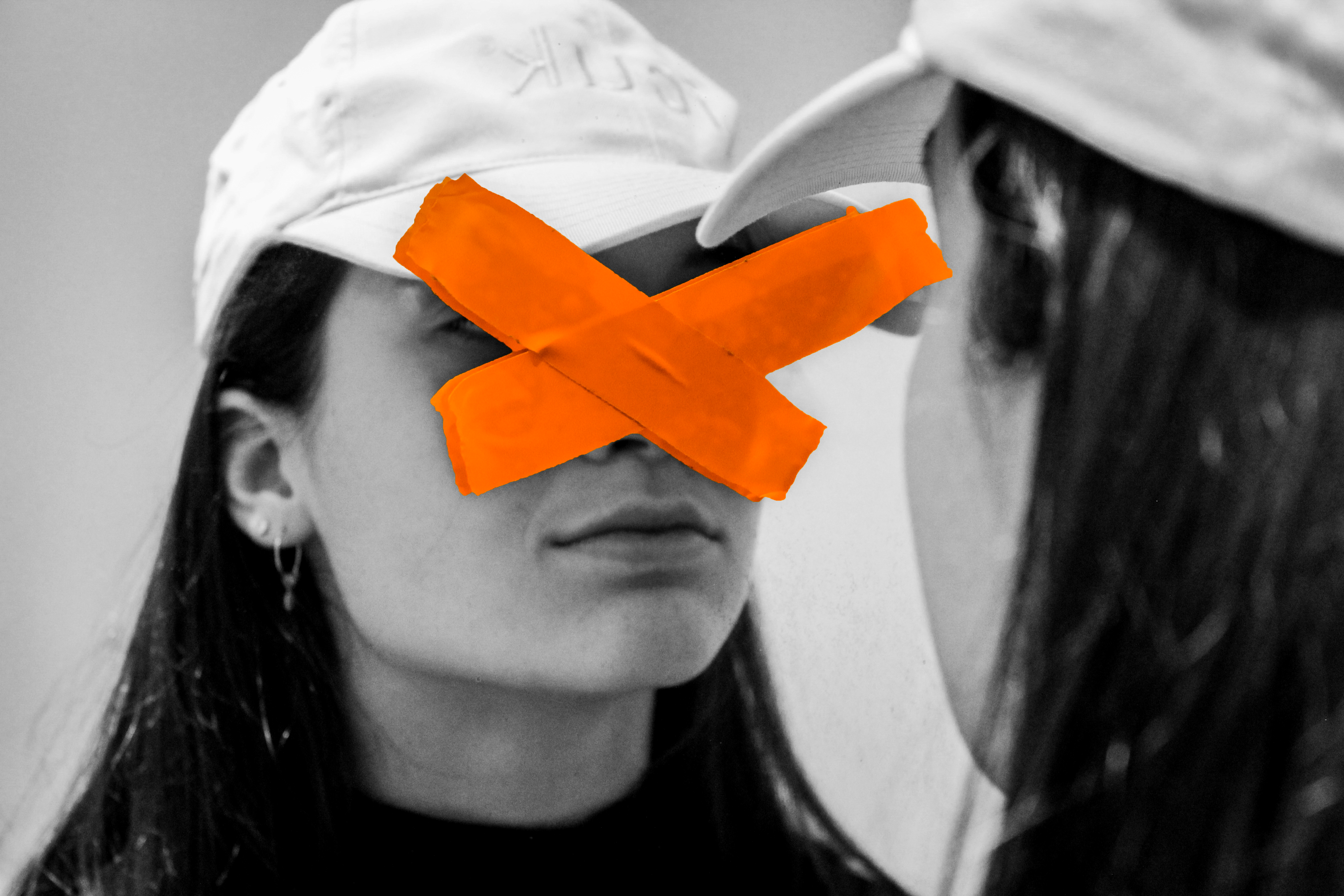
This image happens to be effective purely due to the simplicity yet effectiveness that it has. Although the image appears to be rather simple, it can be interpreted in a variety of ways, having many connotations. I believe this photo was taken through some glass or a window with the tape stuck onto the window. The photographer would have used a low aperture setting to allow a shallow depth of field, ensuring only the tape is in focus. The eyes are the key symbolization of a persons identity which I believe Rosanna covered to give this sense of a loss of identity. The tape, which is vibrant, help to attract the viewer and influence them to intake the messages associated with the picture. One message may being that you shouldn’t judge a person on their identity as we are all equal. I believe the messy positioned tape could reflect the harsh stereotypes that people make based on appearance. The  untidy tape acts as a leading line to help guide us around the face of the model. The eyes have seemed to been tampered, by the way in which they have purposely been covered. This may relate to how the person has been effected with what they have seen wrong in our society or how their personality has been tampered with. Overall this image is influential and a very captivating that helps to reflect a loss of identity through the use of a strong contrast and symbols that represent this.

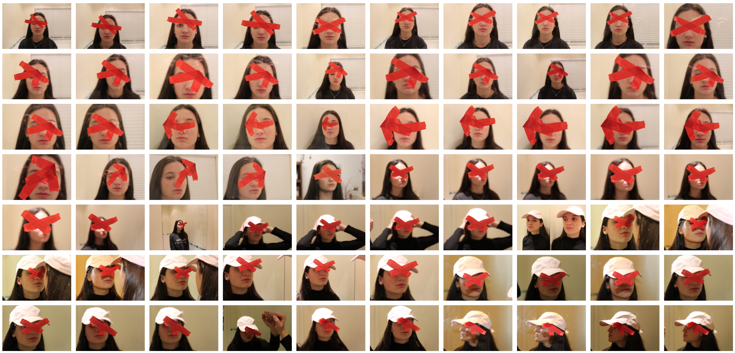
Contact Sheet

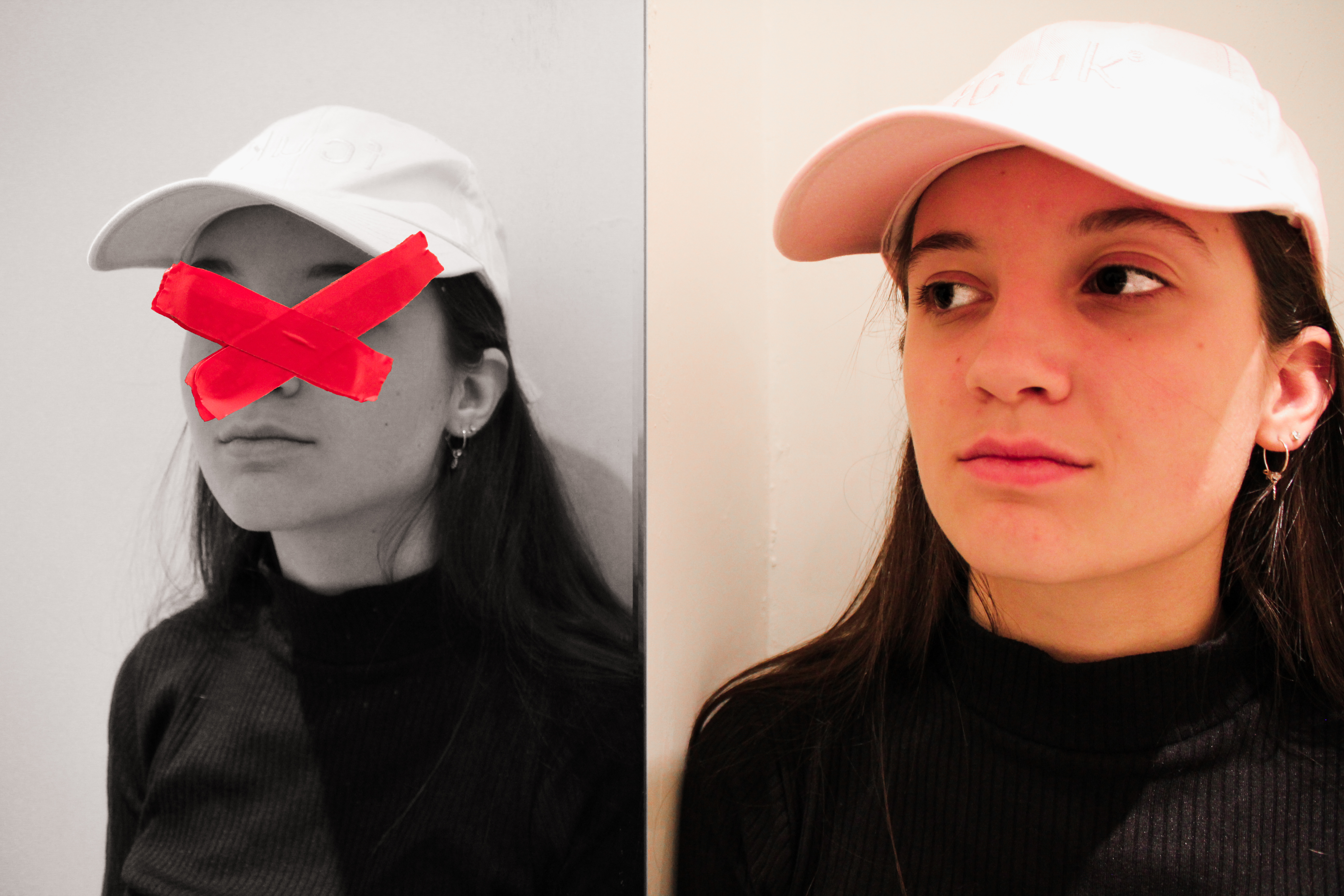
Edits

Identity Photography

In this post I will be exploring photography based around the idea of identity loss. I will be looking at the perspectives that we see people in, including the issues that many have to deal with. 
Here are some example of this type of photography:
In response to this I wanted to have a go at trying to create images based around this theme, using images taken by me which I could manipulate into these designs. These were my outcomes:
I explored a variety of techniques such as liquify, layering and separation. This allowed me to have the effects desired as I was able to manipulate the facial features of the subject, which can be related to the theme of missing or lost identity within yourself.
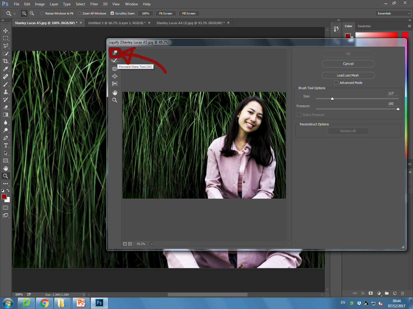
Liquify:
Layering:
Inside:

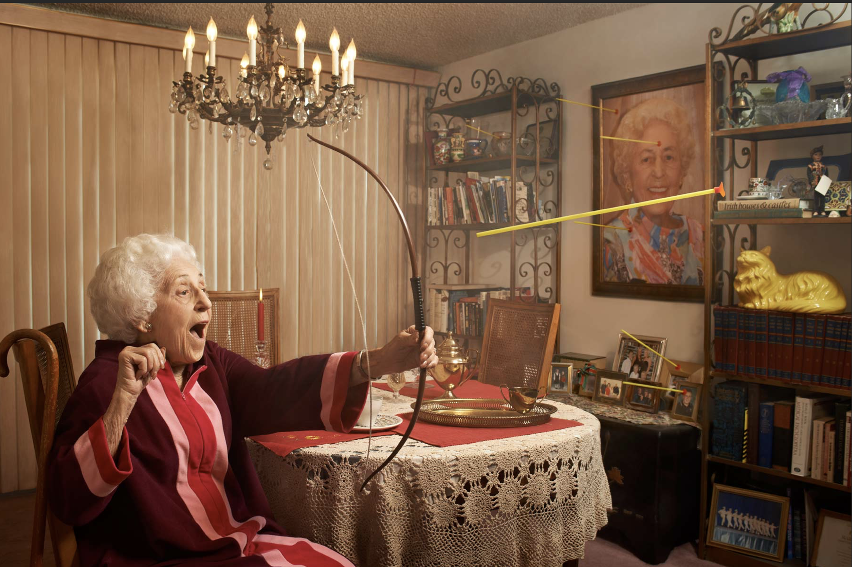
Tableau photography ideas and shoot

For my tableau photography I want to focus upon 7 deadly sins and capturing some, in specific I want to capture  a whole person of the person and in which they can.

I want to show more of a portraiture close up in order to show a close use effect and persona, I do although want to show more of the color of light in order to exaggerate the whole persona and sense top the image itself. 

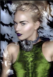
This image was inspired by envy and show the green  and snake around her neck are all placed there in order to successfully I’ve herself a persona. Furthermore the black water shows a deep tonal range  and mysterious and dark connotations of hurt .

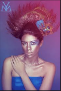
I chose these images because of the vibrancy  in the color which I like and also how this is accomplished but the way in which the color and vibrancy allows a sense of persona.This image is inspired by list but in a more Modern day creative  way, the peacock feather allows a sense of calling or login for someone else.The positioning and composition of her arm also shows her low sense of security without someone with herself.

although in addition I also want to show the way in which the darker image more accurately show the darker side to signings and the whole concept of 7 deadly sins.

tableau artists

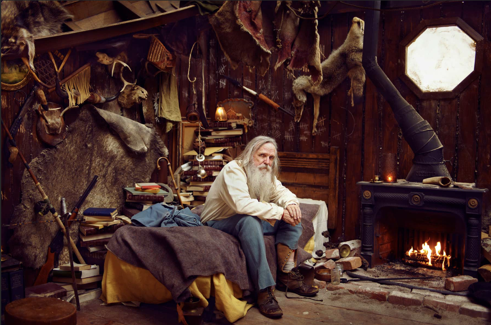
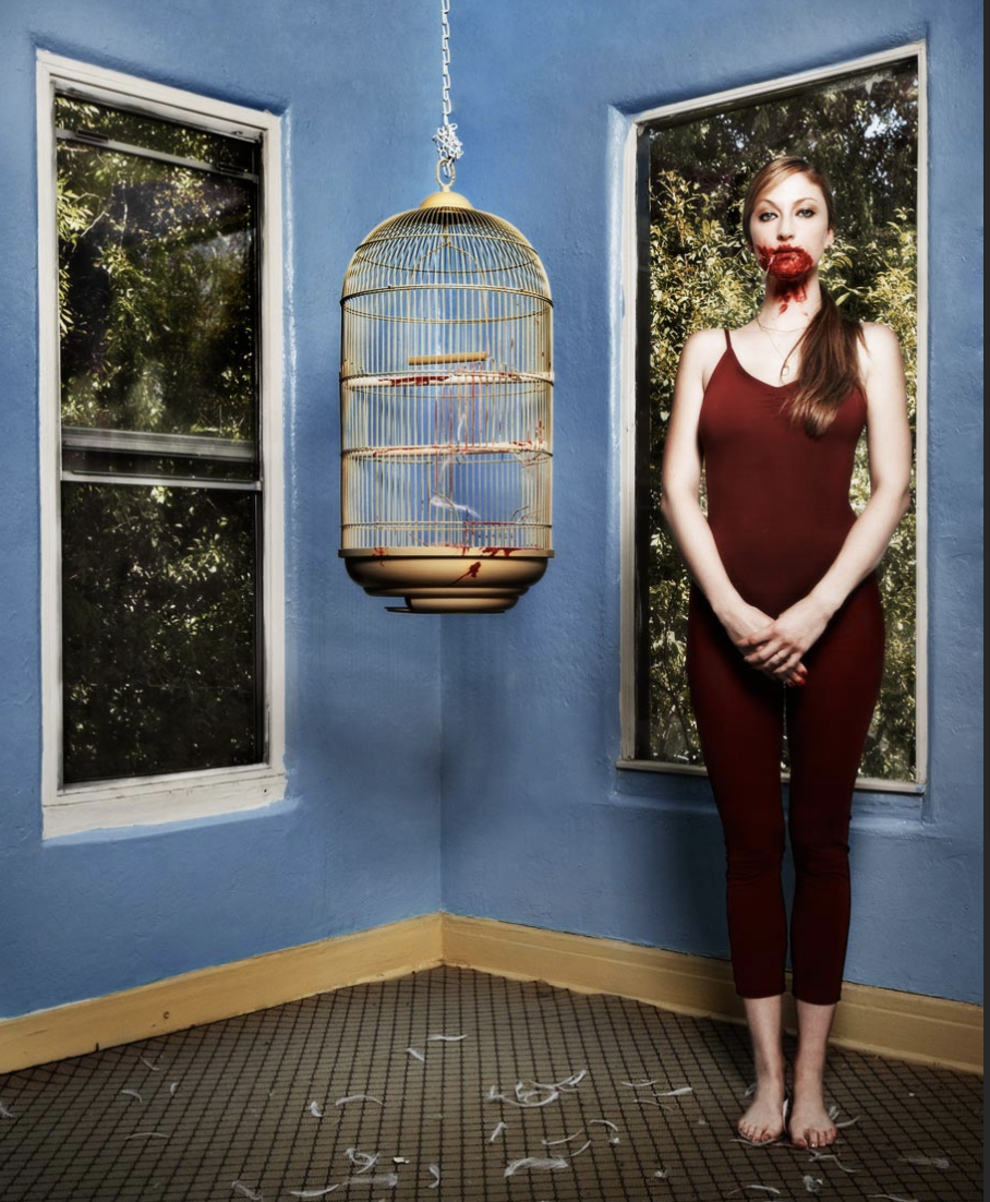
Ryan Scudded :Is a tableau photographer who’s works are highly vibrant and creative but not always in the conventional means of color. Chicagoland – growing, climbing, playing 1997 – 2003 – San Francisco – reading, writing, learning 2003 – 2006 – San Diego – shooting, driving, flying 2006 – Now – Los Angeles – making, lotsa, stuff.I chose his images because ei liked the way in which he captured a specific theme and scenario in a way in which is stereotypical and not heard of.

although the following work is not inspired by the theme in which I will develop I do think it is interesting and lots of good techniques that I too could use throughout my own work ethic.

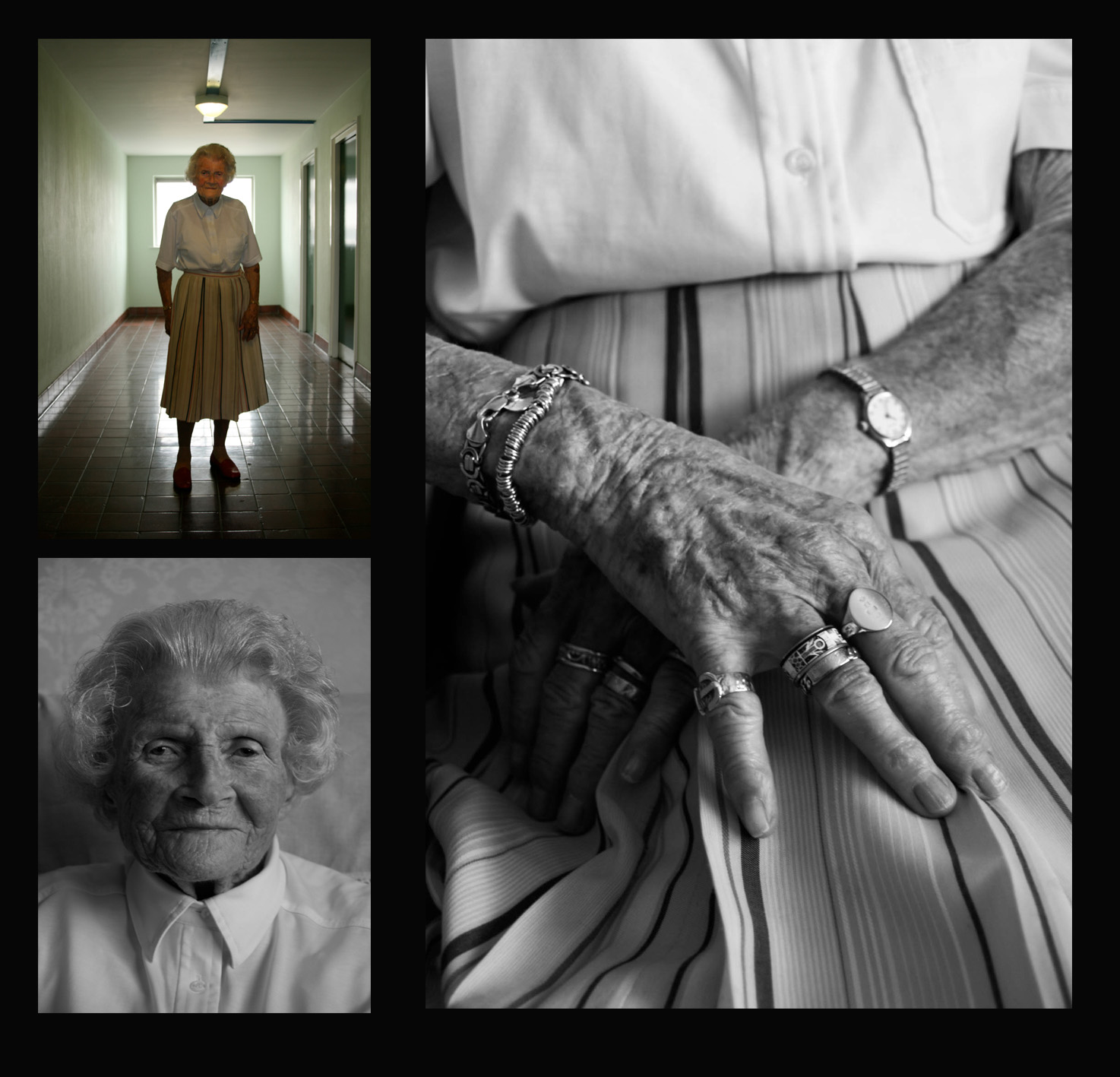
I chose this image because I liked the way in which the photographer captured a persona to the person and a sense of action with the addition of having her self portraiture and furniture that compliment the age and history of herself.It could be perceived as a juxtaposition of adventure for such an older person and how her child like persona has not diminished throughout her aging. The light on this image is quite warm and reserved in order to take away the light that shows connotations to being young and so presents a later presents in her age and also how that compliments the atmosphere  itself.

settings for my shoot:
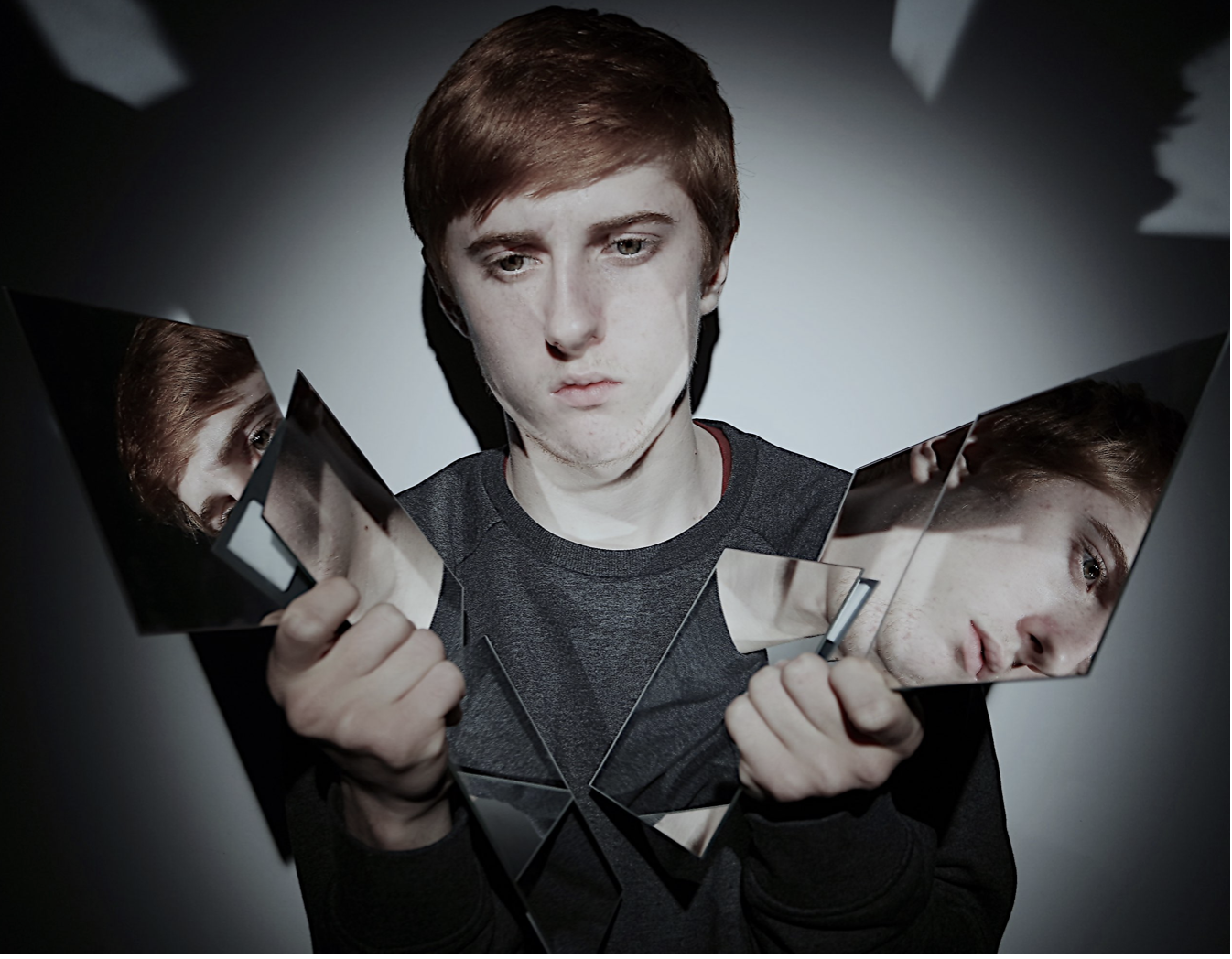
due to me being inspired but he 7 deadly sins I want to choose settings that work well within these words and have clear connotations to the meaning of themselves.

  • Lust.
  •  Gluttony.
  •  Greed.
  •  Sloth.
  •  Wrath.
  •  Envy.
  •  Pride.

for the following I was mostly inspired by the following three, envy,lust,greed. For the setting of lust I would want to capture a sinister feel to the image,having a sense of fair tail and how people are fuled with want and not love.While also having the connotations of revenge and darker themes theirs should also be themes of stereotypical love and lust such as using sheet and other people within the shoot itself.

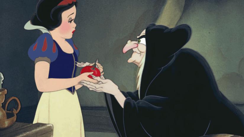
for envy I want to show sins of red and fire and a deep hatred of jealously within the photos, this can also be shown with money and riches that perhaps themselves they are missing. for this image it met be effective if there is one entered person surrounded by many other people who possibly envy her, this would begin a movement and a large central impact to the images themselves.snakes can also be an accessory and also perhaps water with the following accessories surrounds themselves.,also possibly eating an apple again showing the fairy tale connotations.

greed is the final word in which I am own to use, this is due to the impact that I can use many old and silver enrichment and a crown and possess an over exaggerated feel to the image itself. I also want an interesting placement and composition for these images,so I would ;possibly use a bath and many colors in order toe exaggerate the bean of persona of luxury and money.

editing techniques for my shoot:

1)enhance the color that has connotations to the word itself, red for lust,green for greed, black and white for lust.

2)Photoshop more accessories or objects that are again related to what I am trying to create in the atmosphere.

This links to lack of identity in the following,The three sins that I am recording relates to how people become these people and how their whole identity  revolves around how others treat them and so how they decided to interact to others,and if they are envious and or anything else.

Finished results:


Week 12 + 13 Completing The Portrait Unit

You now have 2 weeks to complete…

  • FINAL photo shoots as a direct response to your chosen photographer Re : Case Study (AO1 + AO3)
  • get out “on location” and explore tableau approaches in depth
  • explore a wider range of editing techniques (AO2)
  • blog-based presentation of final outcomes (AO4)

Ensure you have enough evidence of…

  1. moodboards
  2. mindmaps
  3. case studies (artist references)
  4. action plans
  5. photoshoots + contact sheets (annotated)
  6. appropriate selection and editing techniques
  7. presentation of final ideas and personal responses
  8. analysis and evaluation of process
  9. compare and contrast to a key photographer
  10. critique / review / reflection of your work

By Friday 8th December we should have your final prints (x3) ready to mount and frame

  • you will learn how to cut window mounts using a bevel cutter
  • you will learn how to group  / sequence your images
  • you will learn how to present your images using foam-board

Alternative Presentation Techniques

You should explore other possibilities and show on your blog a range of ways that you could present your work

such as…

Tanja Deman…using screens or backdrop to display images and present an alternative context
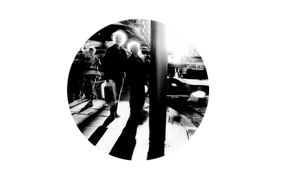
Experiment with alternative-shaped images….try circles


Remember to pay careful attention to…

  • your lighting
  • exposure control
  • composition
  • focus

Add at least one sequence of images to your blog to show the layout / framing of your final images


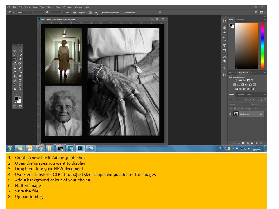
Use Photoshop to place your images within a document and add screen shots to show your process…

Tableau Ideas and Starting points

  • re-create an existing story-based photograph or painting, or scene from a film
  • illustrate a poem, story, song lyrics, dream etc
  • one or more of The Ten Commandments
  • one or more of The Seven Deadly Sins

Tableau Photography is staged. Think of it like theatre. Include props, backgrounds, costume etc that connects to your theme somehow.

Tableau Photography makes use of symbolism and metaphor.

Allegorical paintings / photographs contain metaphor and symbolism

Pictorialist Photography has connections with Tableaux Vivant.

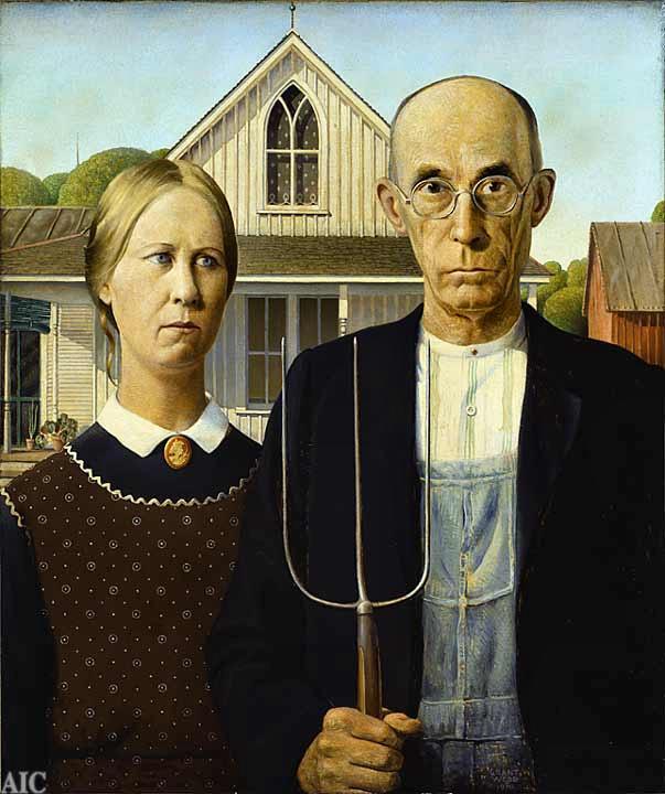
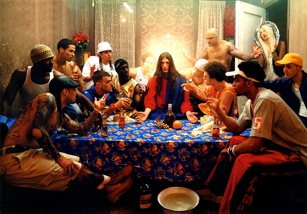
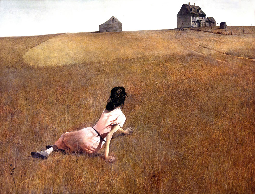
here are some examples that could inspire your own ideas…

American Gothic by Grant Wood
The Last Supper by David LaChapelle
Christina’s World by Andrew Wyeth
Disney’s Snow White

Critical Analysis of the story of Snow White CLICK HERE

Extension Task

  • Visit the Constructed Narratives Exhibition by Hautlieu A2 Photography Students
  • Berni Gallery—Jersey Arts Centre
  • Open 9am-5pm
  • Document your visit with photographs
  • Create a blog post with a review of the exhibition
  • Analyse a key image / set of images that interested you.


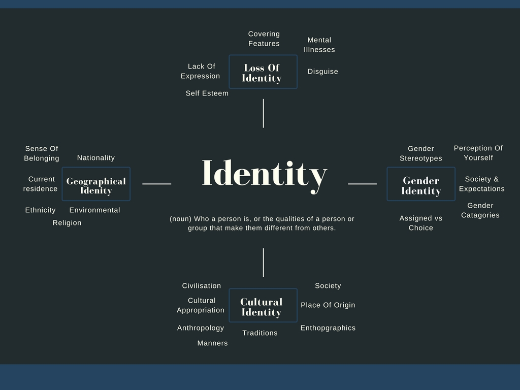
Chosen Theme – Lack Of Identity

My chosen theme for this project is identity/lack of identity so that I can show both topics for contrast and then pick from my photographs to find the most effective photoshoot.. This is primarily due to the wide range of different ways this can be interpreted and shown. I plan to use photoshop to create interested concepts in my photographs and edits. I will be taking inspiration from Johnathan Ducruix in my first photoshoot in which I plan to take ordinary portrait photographs but then I will remove the faces and use shadows to create a sense of lost identity and confusion. In my second photoshoot I plan to utilise paint – I will put paint on the model in the shape of a handprint and then take portrait photographs. After this I will edit the colours in the paint to make them stand out and seem almost surreal.

Johnathan Ducruix’s photograph from his collection ‘Metamorphosis’
Image result for glow in the dark handprint portrait photography
An example that I will take inspiration from for my handprint photoshoot


Final Images from all three shoots

I chose all of themes images because I think in all their independent ways they successfully contribute to portray lack of infinity but have contrasting of both illusions,vibrancy and editing to make them all effective as a whole.I believe that all these images show an array of editing planning and developing techniques to make them all successful and demonstrate successful imagery within them all. I will though explore more ways in which i can edit them to demonstrate a larger range of techniques that i explored within my previous editing brainstorms.

displaying the images:


1st Display

For these three images I will  simply them upon one piece of paper.I have chosen to do this because I believe that the colors and meanings are all equally as relevant and would work successfully in syn within each own.For my display I will present these images all in large squares of equal proportions and then explore many ways in which they look most effective on the paper.

I think it would be quite dynamic and in keeping within the  vibrant tones if I gradually put the images from top left,middle, and then to bottom right,this slow diffusion would be unique and allow a dynamic composition to the piece itself.In addition I think it would be successful to use white paper with thin boarders,this allows a color that will not remove the vibrancy from the images and also not defect attention to a harsh surrounding color.Although these images are not all from the same shoot they all should connote the same successful properties.

It has become clear that all my images will be unable to be in the same proportions so i have experimented within changing my middle image,to an image that still has the same effect but would also work overall successfully.

2nd Display

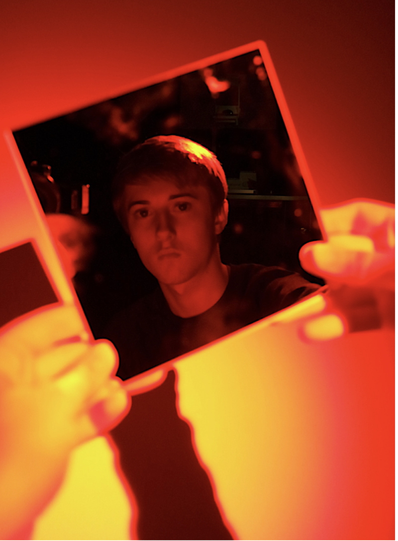
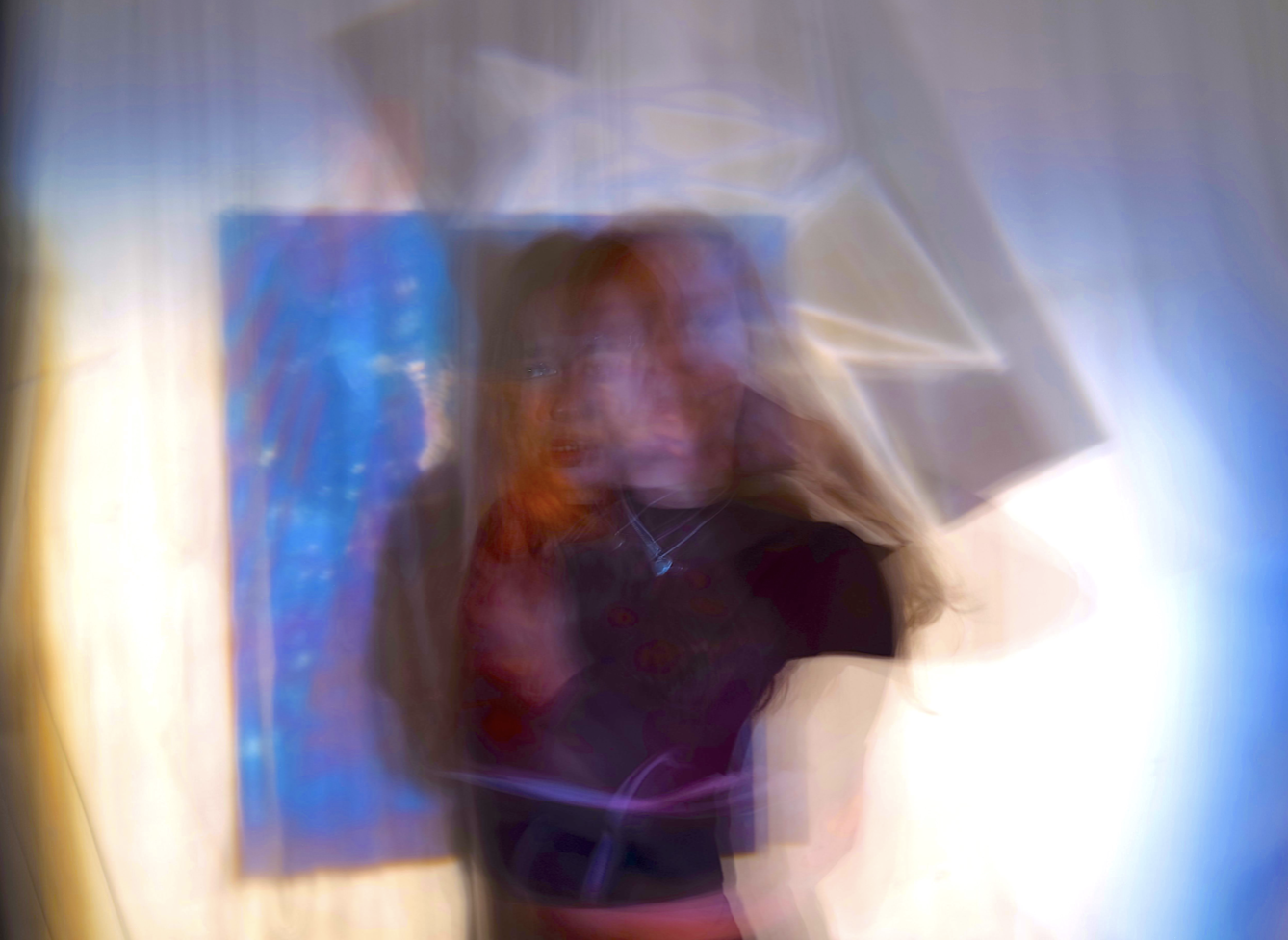
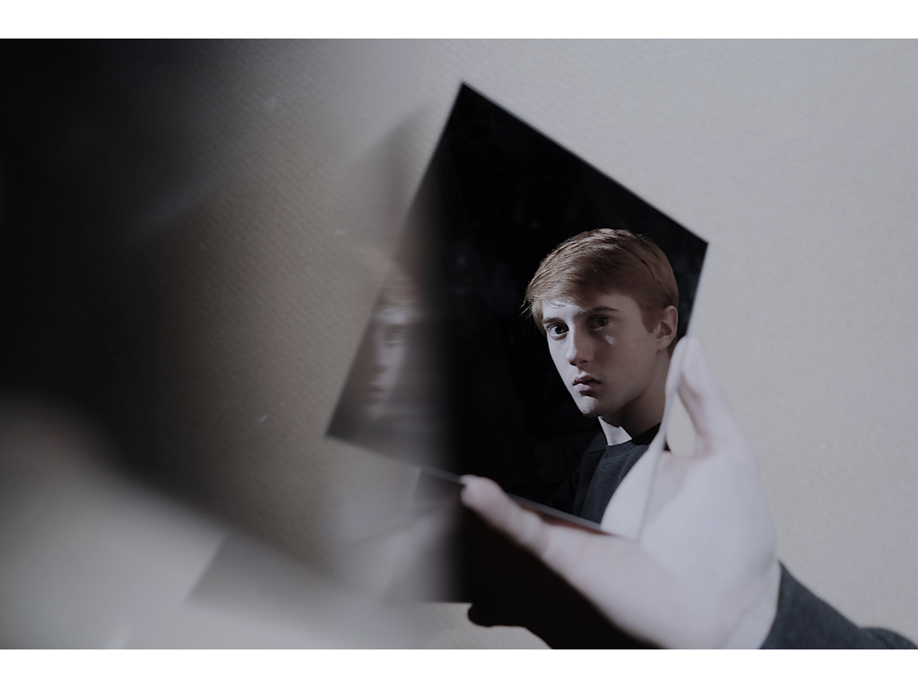
For these two images I will again use a large piece of paper,but I will enlarge these images in order to take up half the space,Due to the same of these images being more rectangular I will but one on top of the other but on a long piece of paper so then reduce the size of the paper so it only has these two images them-self. I chose these images because they both use mirrors in order to reflect a confusion of identity and also have the same tonal range.I would also want to photo shop the first image above and develop a darker tonal range as it is too light in comparison to the second.For these images i would also want a black background as they too are dark but have a lighter surrounding edge so would still have a fine overall cut to the images. I might use a white boarder in order to shoe the in keeping light theme to the pieces,and this too might make a more dynamic composition.

3rd Display

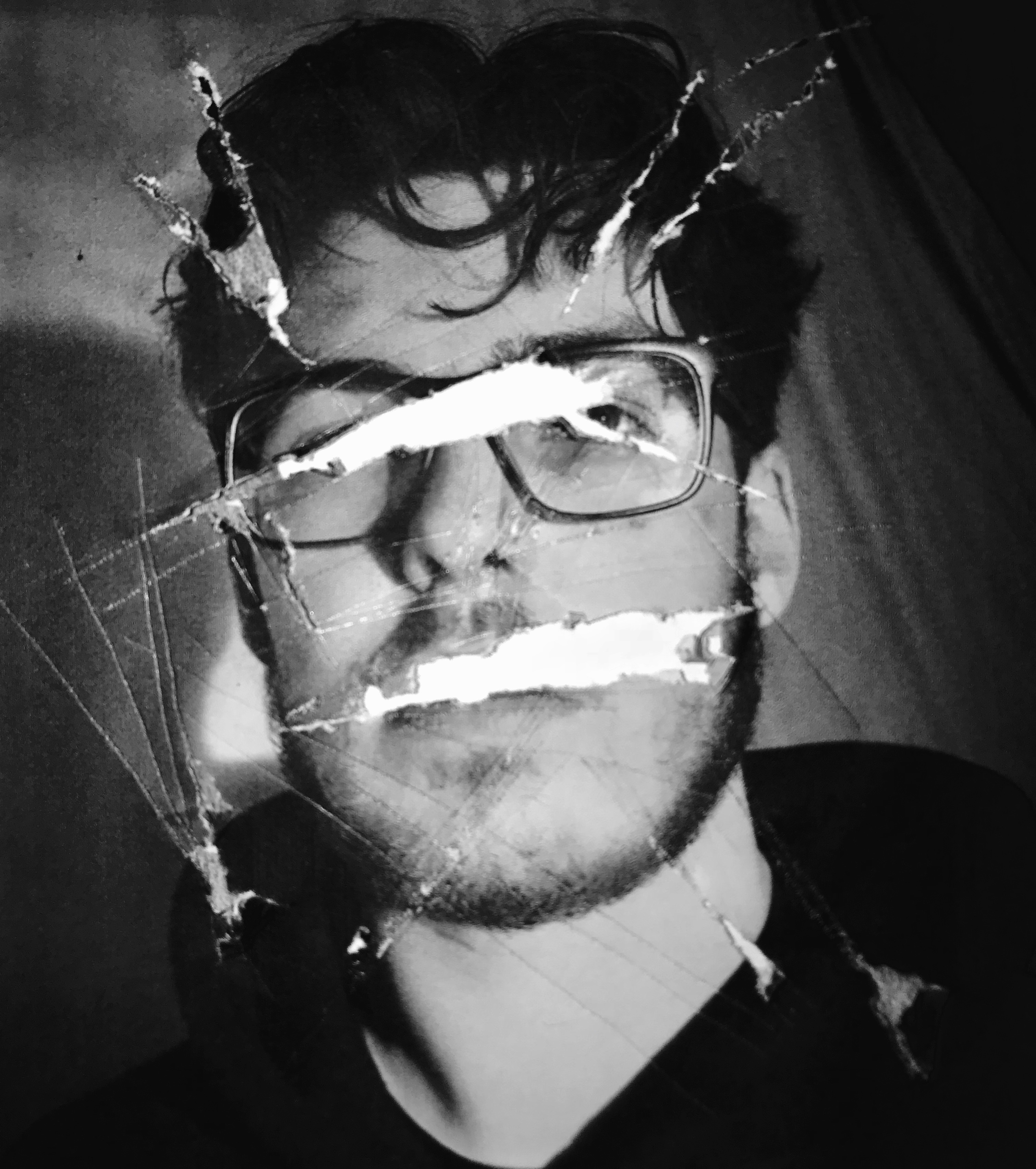
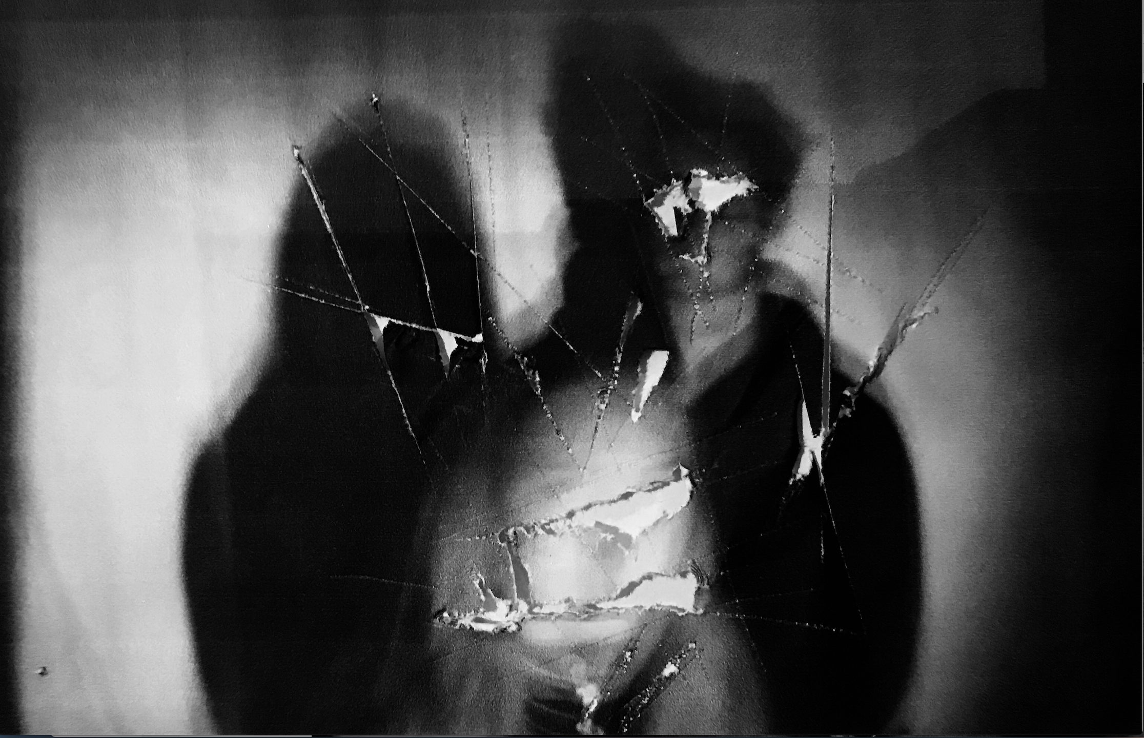
For the final display I wanted to show the darkest tonal range so far.I am unsure whether I should use two or three,but think two images would be more equally effective.I want a more interesting unique way of demonstrating this piece.Due to this being very strong removal of body parts and any subjective demonstration of who they are i think it would be fitting if they were on a structure of hanging as this would well sync within how they are only seen as an object and not a clear demonstration of a person. I could hang them suspended and framed next to each other,or even further the ripped ideas and tear up the piece but still show the piece within a square that is the same size on the same piece of paper,this would be interesting as it is unlike both of the previous and would use the same editing technique.I will experiment within the rips,but if they do not work and do not accomplish an overall successful image then I would use one image and cut this into four parts,this is so it still successfully shows the division and then my presentations develop from three images to two and then one last one just  divided into four which would create an interesting display overall.I would also want to Photoshop these images in order to make sure they are both the same shad of black,over wise the very similarly themed images would have a contrast and separate the overall composition.

I Know have edited all the images so they are all the same size and so an accurate presentation of a composition.


Creative portraits Homework-part 2

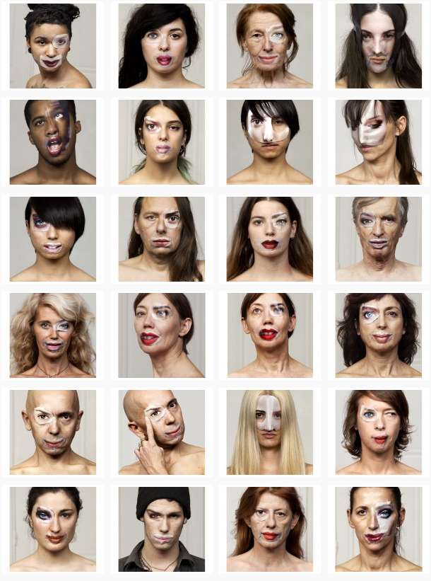
The exploration of both Bruno Del Zou and John Stezaker led to me the idea of experimenting with visual perception, linking to the way we see ourselves.  When researching this idea I came across a series of photographs called ‘The Identity Project’ taken by the French photographers Bruno Metra and Laurence Jeanson. They created a series of portraits that deal with the concepts of identity, beauty and otherness. Experimenting with our visual perception, they apply cut outs of facial features from glossy magazines onto their subjects faces to create a new form of facial expression, like they appear to have cosmetic surgery.

http://www.123inspiration.com/plastic-surgery-with-magazines-by-metra-bruno-and-laurence-jeanson/

“Magazines, cinema, television, keep creating and imposing codes that become social references. What one must look like, how to make up, what clothes to wear, how to behave… We are fascinated by the power of media to influence people’s identities.”

The series provides a compelling visual juxtaposition between everyday humans and the images seen in advertisements, taking a hard look at our identity, as each subject in the photograph de-faces and destroys her or his own image.

To explore this I planned to do an experimentation, taking inspiration from Bruno Metra and Laurence Jeanson , incorporating images from  magazines on peoples faces. First, I would try having printed  images and attaching faces from magazines and re-taking the picture and secondly physically attaching the cut out facial features over their eyes, lips, and noses to my subjects face, like Bruno Metra and Laurence Jeanson did in their series.

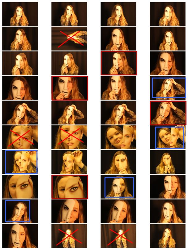
In my photo shoot I used a few different heads cut out of magazines and found that the one I used in the images that I’ve decided to experiment with was the most effective out of them all. This is because the cut of was the closest to the size of the actual model head.I then chose my favourite 6 images and displayed them next to each other so i could compare them. The pictures already had an yellow/orange tint when I took them which is what i wanted but i then decided to edit them to experiment with colours.
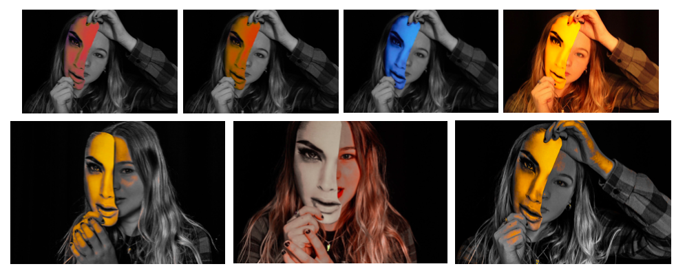
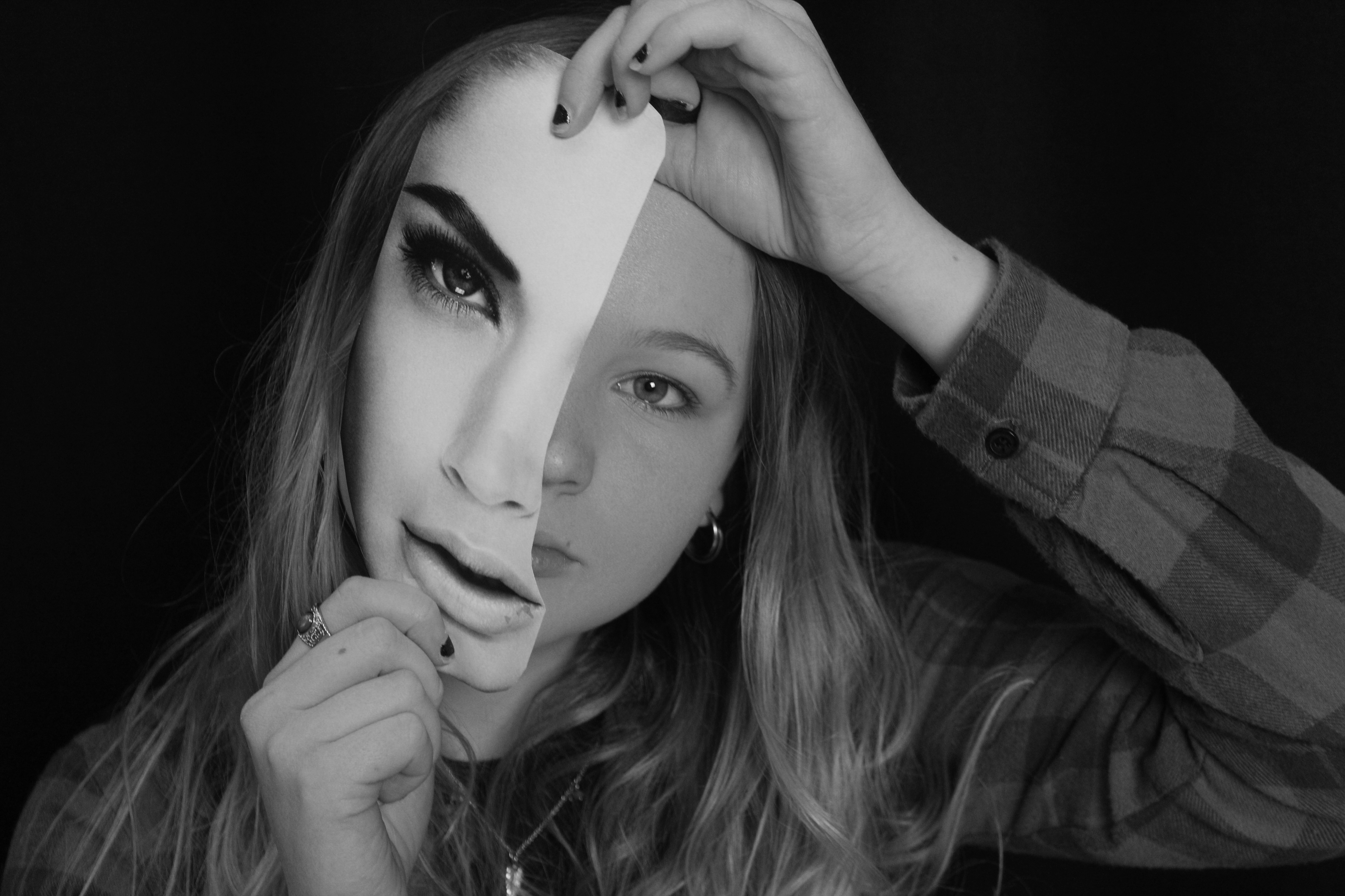
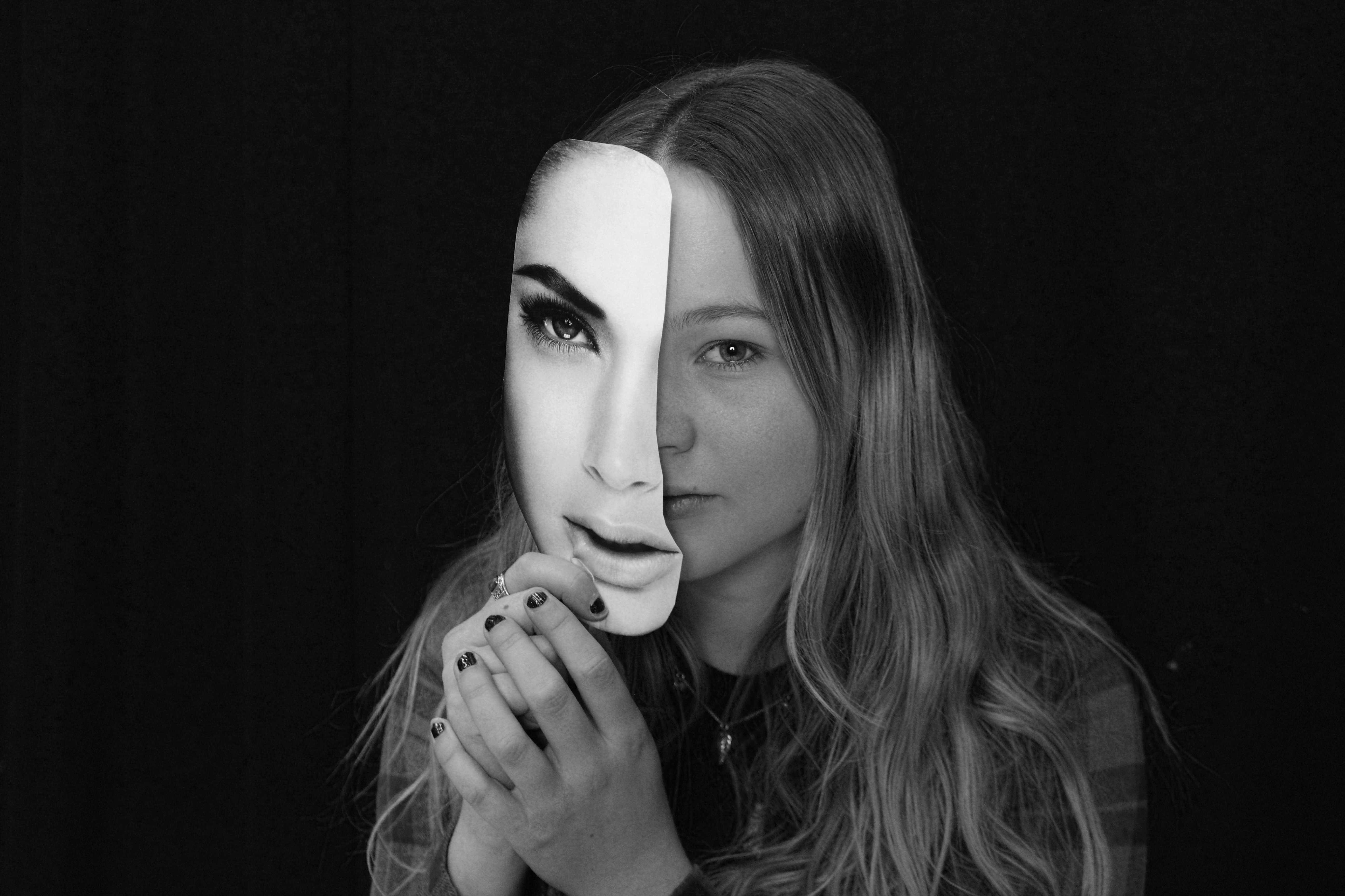
Although i do like the images edited with colour I decided my final 3 images for this shoot be in black and white as it gives them a dramatic effect that is not achieved in colour.

To edit these images i turned them black and white and increased the contrast to make the magazine cut out stand out even more compared to the subjects face. Doing this highlights the cutout and emphasises the shadow between the face and the paper creating a mask-like effect (especially on the 3rd image) and creates a clear division between the two. I decided for my final images to be in black and white as i did not want them to look over edited and too unnatural. I think I did a good interpretation of  Bruno Metra and Laurence Jeanson photography linking to the visual juxtaposition between everyday humans and the images seen in advertisements and their exploration of identity.