Category Archives: AO1 Develop Ideas

Filters

Author:
Category:

romanticism in photography

romanticism was found during the romantic era during a major art movement,this movement originated in the 18th century and was due to social and political enlightenment, this movement also rejected the normal  the idealized harmonies of Neo-classicism and classicism. The movement is used in order to capture a specific purity of imagination of nature and spontaneity.Deep feeling and emotion are the establishment of the movement itself. Throughout the movement their was a large expansion of the exotic and heroic ideas of the art where you could envision and escape, this can be viewed throughout the pioneering artwork.

In the mid 19th century photographers were able to also use this art as a means of their own creation. Many used the landscapes to show vast space and a continuation of mid lines. Although initially inspired by the natural beauty of nature they need to show a clean cut man made almost line to form that symbol of disruption and drama.

Many famous Romantiszed photographers focus upon not an extract truth but a mode of a feeling.The nature having to be captured is nor uncontrollable nor unpredictable.
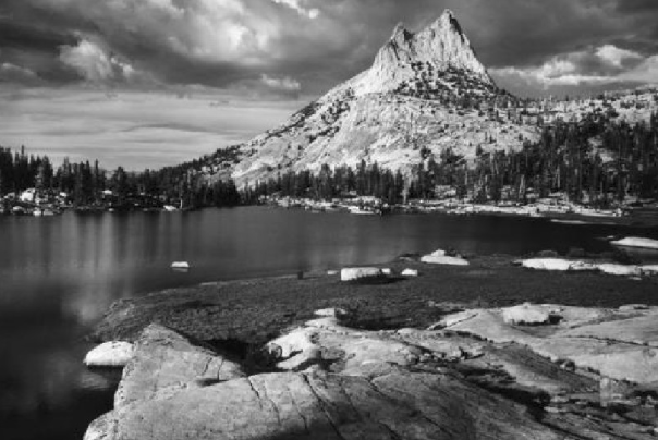
Many romanticised pieces of photography make you question ‘Is this a “beautiful” photo…or a “beautiful” landscape…or both?’This is due to the photo having to tell a story and that should be shown throughout the natural beauty of the landscape but also enhanced by the way in which it captures the key to create a sense of power and the landscape to show many conceptual attributes.Many images are decorative in the sense that people think they are  nice to look at,this is due to the relationship of beauty within nature that many people have a connection with.There is a link above to a website showing the evolution of romanticism and realism.


Romanticism

Romanticism

Romanticism is an artistic movement originating in Europe in the late 1700’s and involves lots of interest in nature and rebellion against social rules and conventions. Romanticism is quite conceptual and aesthetically pleasing to the viewer as is further explained in this video. The main idea behind romanticism is that reason cannot explain everything. The romantics searched deeper and more subconscious than other movements.

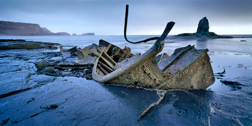
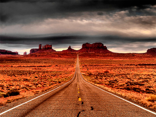
Examples of RomanticismImage result for romanticism photography

Image result for romanticism photographyImage result for romanticism photographyImage result for romanticism photographyImage result for romanticism photography

Landscape Unit | Schedule | Jan / Feb 2018

AS PHOTOGRAPHY MOCK EXAM

THEME : LANDSCAPE 

DATES…

MONDAY 26TH FEBRUARY 12 A PERIODS 1-5 IN PHOTOGRAPHY ROOM

TUESDAY 27TH FEBRUARY 12 B PERIODS 1-5 IN PHOTOGRAPHY ROOM

WEDNESDAY 28 FEBRUARY 12 C PERIODS 1-5 IN PHOTOGRAPHY ROOM

THURSDAY 1 MARCH 12 D PERIODS 1-5 IN PHOTOGRAPHY ROOM

PRINT DEADLINES

FEBRUARY 20TH for ALL GROUPS

(You can add abstract, formalist, portrait and landscape final images to this print run too)

You may have other opportunities to explore architecture, and make links to what you studied in ABSTRACT AND FORMALIST photography…


Formal & Contextual Analysis

Landscape Photography | Week 1 | Natural and Romanticized Landscapes

Week 1

The focus of your study and research this week is natural landscapes and the notion of ROMANTICISM in Landscape  Art and then later, Photography.

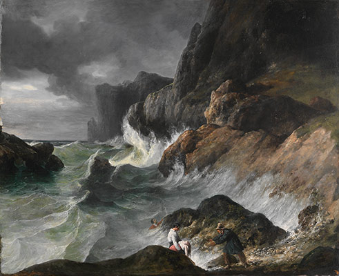
Working Title/Artist: Stormy Coast Scene after a Shipwreck
Department: European Paintings
Working Date: (1830)
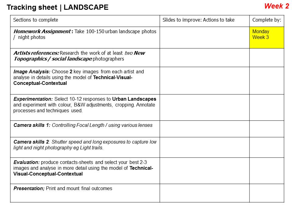
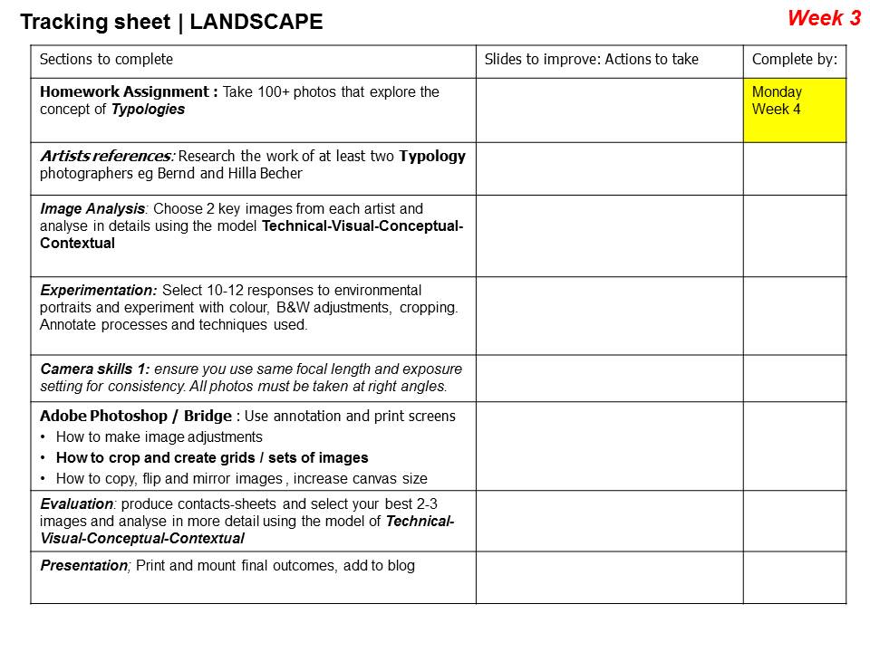
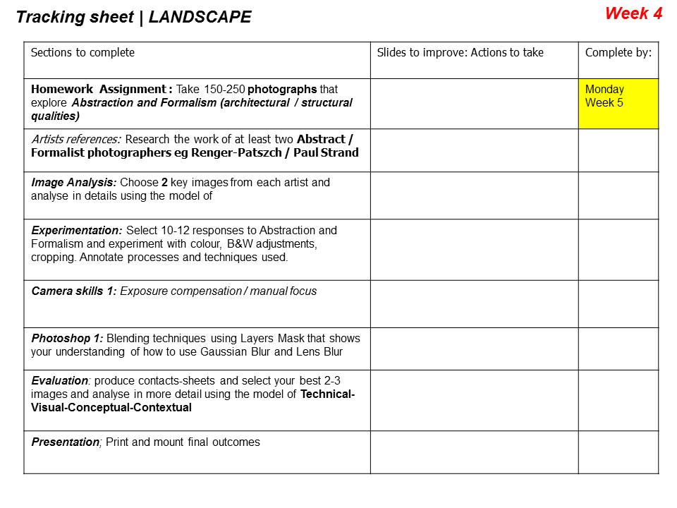
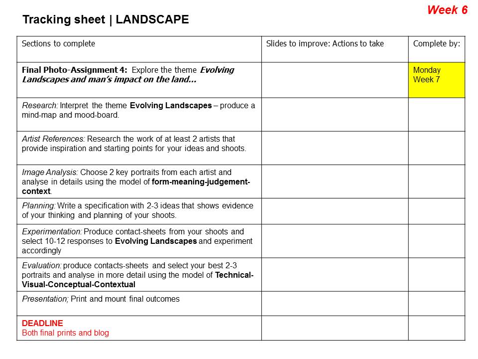
RESEARCH

The Age of The Enlightenment (1700-1800ish)

VS

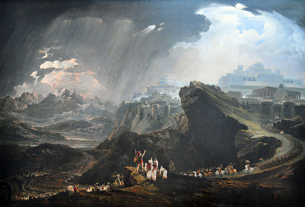
The Age of Romanticism (1800-1900ish)

“Writers and artists rejected rationalism for the same reason that rationalism was rejected by the movement as a whole- it was in rejection of Enlightenment, which had sucked emotion from writing, politics, art, etc. Writers and artists in the Romantic period favored depicting emotions such as trepidation, horror, and wild untamed nature.”

“The ideals of these two intellectual movements were very different from one another. The Enlightenment thinkers believed very strongly in rationality and science. … By contrast, the Romantics rejected the whole idea of reason and science. They felt that a scientific worldview was cold and sterile.”

Blog Post 1: Define, describe and explain Romanticism (in landscape photography). Include a mood-board of appropriate images. Include at least 1 x hyperlink to an appropriate and relevant website. Embed an appropriate and relevant video / podcast.

Blog Post 2: Create an in-depth case study that analyses and interprets the work of a key landscape photographer…

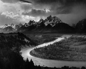
Ansel Adams / f/64 group / Edward Weston / Fay Godwin / Hiroshi Sugimoto / Minor White etc

Remember you MUST use TECHNICAL / VISUAL / CONTEXTUAL / CONCEPTUAL to analyse effectively a key image…

Blog Post 3: add your contact sheet / select your best 5-10 images / 1 x final image / include edits and screen shots to show process

  • analyse and evaluate your images and process
  • show your understanding of composition, exposure, control of light, and effective use  of lenses to create NATURAL landscape images that range from wide angle to telephoto as a response to how your choice of photographer(s) developed the genre…

Use your research to help guide you when taking your own photographs…

  • create a mind-map / mood-board of potential locations around Jersey that you could record and create romanticized landscape photographs of….look for extremes (either calm or wild, derelict, desolate, abandoned or stormy, battered and at the mercy of nature)
  • use the wild and dynamic weather and elements to help create a sense of atmosphere, and evoke an emotional response within your photo assignment
  • aim to photograph the coastline, the sea, the fields, the valleys, the woods, the sand dunes etc
  • photograph in the “golden hour” before dark, at sunset or during sunrise…and include rain, fog, mist, ice, wind etc in your work
  • look for LEADING LINES such as pathways, roads etc to help dissect your images and provide a sense of journey / discovery to them

EXTENSION TASK: EXPOSURE BRACKETING AND HDR IMAGERY


Exposure bracketing means that you take two more pictures: one slightly under-exposed (usually by dialing in a negative exposure compensation, say -1/3EV), and the second one slightly over-exposed (usually by dialing in a positive exposure compensation, say +1/3EV), again according to your camera’s light meter.

High Dynamic Range

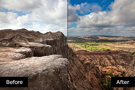
HDR stands for high dynamic range, and it essentially takes a series of images, each shot with a different exposure from darkest to lightest. HDR combines the best parts of the three overexposed, underexposed, and balanced shots to create a dramatic image with beautiful shadowing and highlights

HDR adjustments in Adobe Lightroom click here

HDR adjustments in Adobe Photoshop click here

Task : try a few variation of exposure bracketing and then try using HDR controls to create the exposures that you want…you may already have pre-sets on your phone or camera to help you do this, but experimenting manually will help your understanding!

Ensure that you include the following key terms…

  • Composition (rule of thirds, balance, symmetry)
  • Perspective (linear and atmospheric, vanishing points)
  • Depth (refer to aperture settings and focus points, foreground, mid-ground and back-ground)
  • Scale (refer to proportion, but also detail influenced by medium / large format cameras)
  • Light ( intensity, temperature, direction)
  • Colour (colour harmonies / warm / cold colours and their effects)
  • Shadow (strength, lack of…)
  • Texture and surface quality
  • Tonal values ( contrast created by highlights, low-lights and mid-tones)

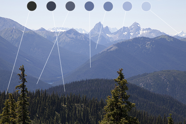
Atmospheric Perspective

VS

Linear Perspective

Good Luck!


Studio Shoot #2

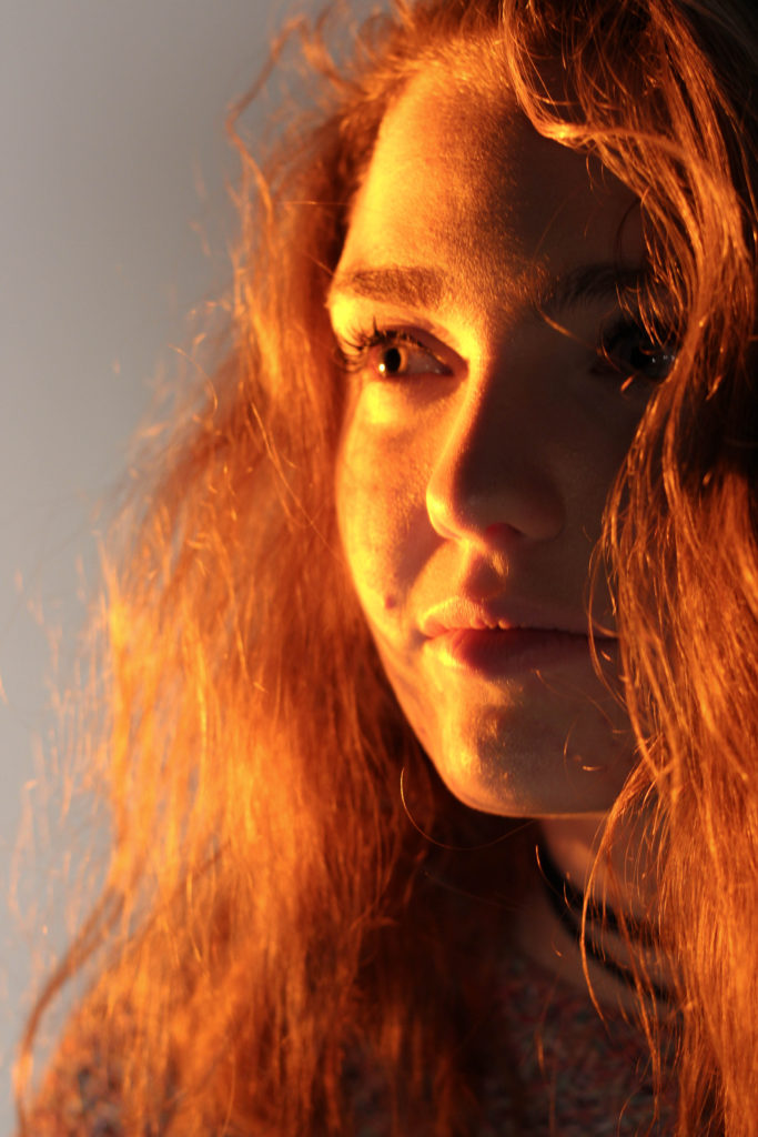
For this shoot I decided to experiment with a broader variety of lighting types and techniques from my previous shoots within the studio. I wanted to use a variety of filters like red and yellow to allow for more dramatic effects on the subjects.
I also wanted to switch between monochrome and the portrait settings when taking photos to allow for a greater contrast between the lights and darkness of an image. This would allow for a more sinister look when produced due to the emotionless expressions of the subject.
Before the shoot I wanted to create a mind map of the ideas towards this, so that I would have an idea of what and how to take the photos of both subjects.
From there I decided to carry out the shoot, these were my results:
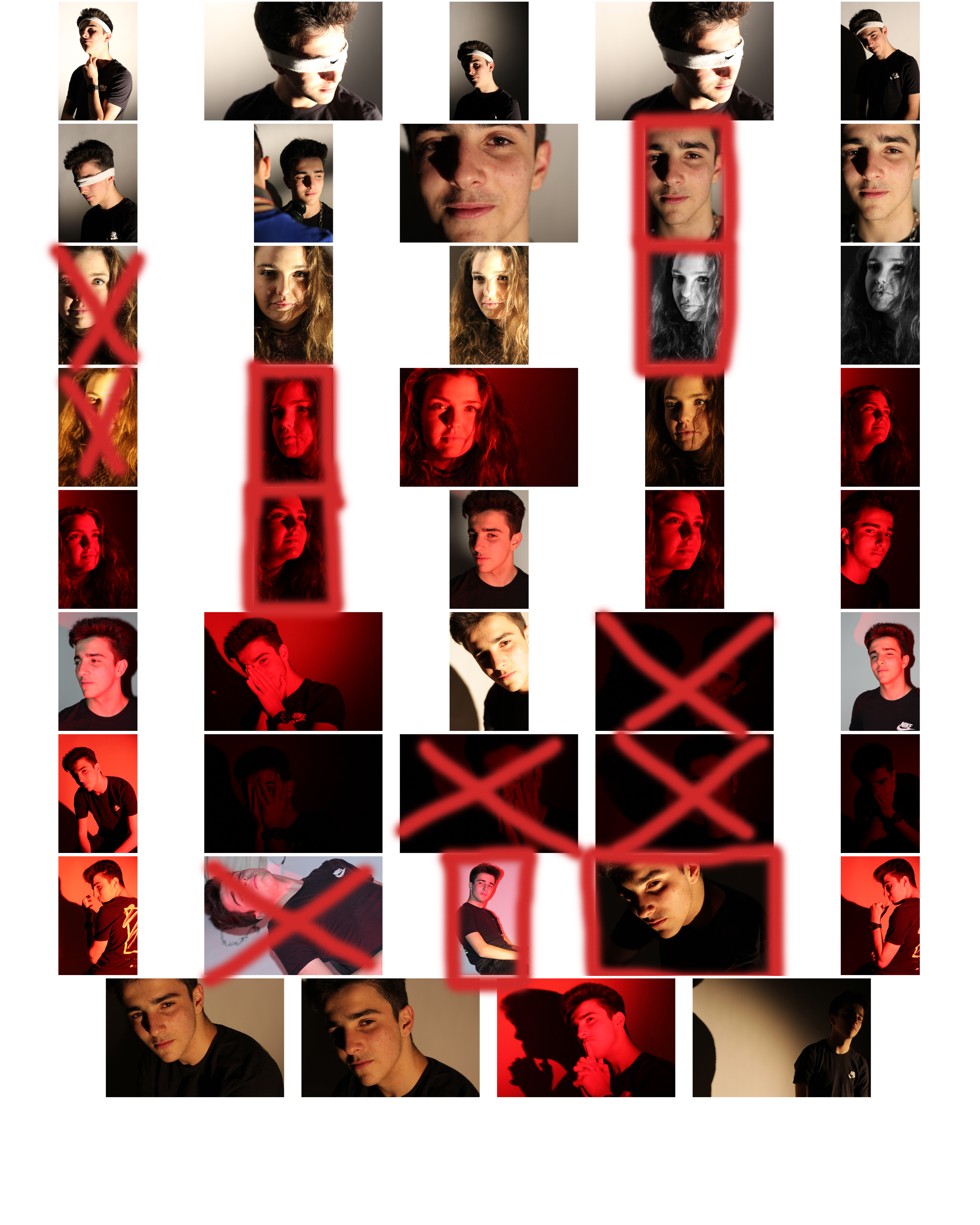
From here I selected the top ten image from the entire shoot, this would make it easier for me to narrow it down to the final image that I deemed best from the shoot. These were the images I selected:
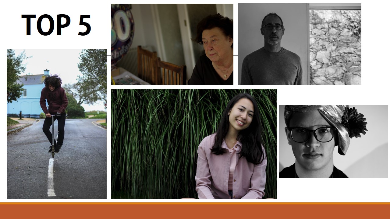
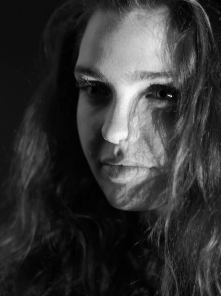
I chose these image because of the composition, lighting and color. I particularly liked the effect created by the shadows behind the subjects, allowing for an emphasis on certain features. What I then wanted to do was narrow the selection down once again to pin point the top five images out of the batch. These were the images I selected:
I chose this image due to how I liked the obviously contrasting shadows from the subjects face, which highlighted particular features. I also found that the huge shadow on the left of the image balanced the photo as the composition of the subject was equally divided onto the other side of the image itself.

What I liked about this image was once again the contrast between the light and dark of either side of the subjects face. Whilst the darkness of the hair added depth into the image, allowing it to be more visually pleasing. The right eye of the person is centered in the top right of the rule of thirds, this allows the viewers gaze to drift almost immediately to the eyes.
I chose this image because of the composition of the subject compared to the rest of the picture. The fact that the person's head lined up once again with the rule of thirds, helped make it aesthetically pleasing.
What I loved about this image was the obvious difference between the light and dark on either side of the face. This to me compared with the light backdrop allowed for a clear definition to the face, drawing out certain feature above others.
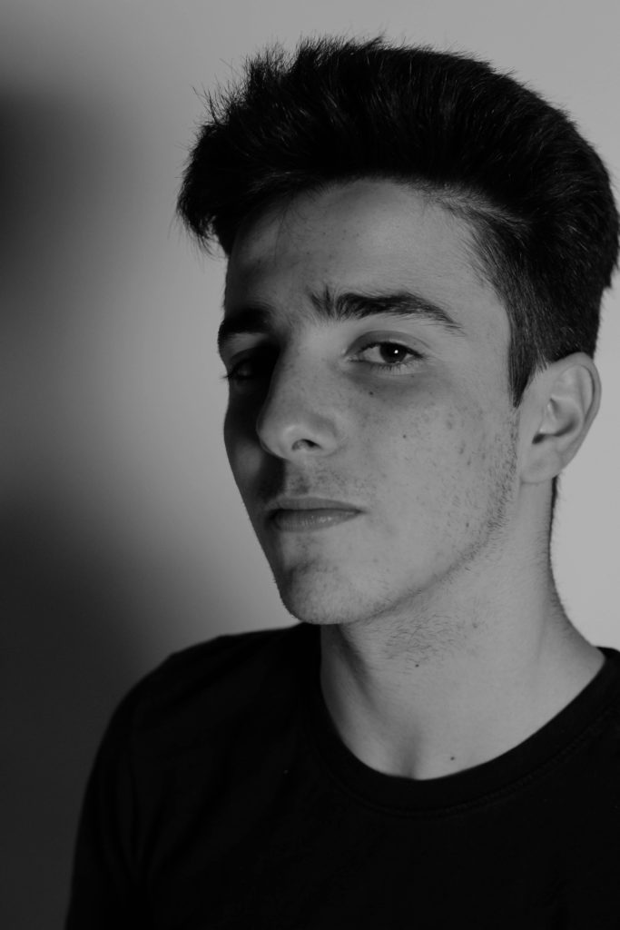
Finally I chose this image due to how I liked the link back to the theme of identity in previous shoot, based around idea of blinded by identity. From this I found the darkness provided on one side of the face allowed emphasis towards this, creating a more mysterious tone.
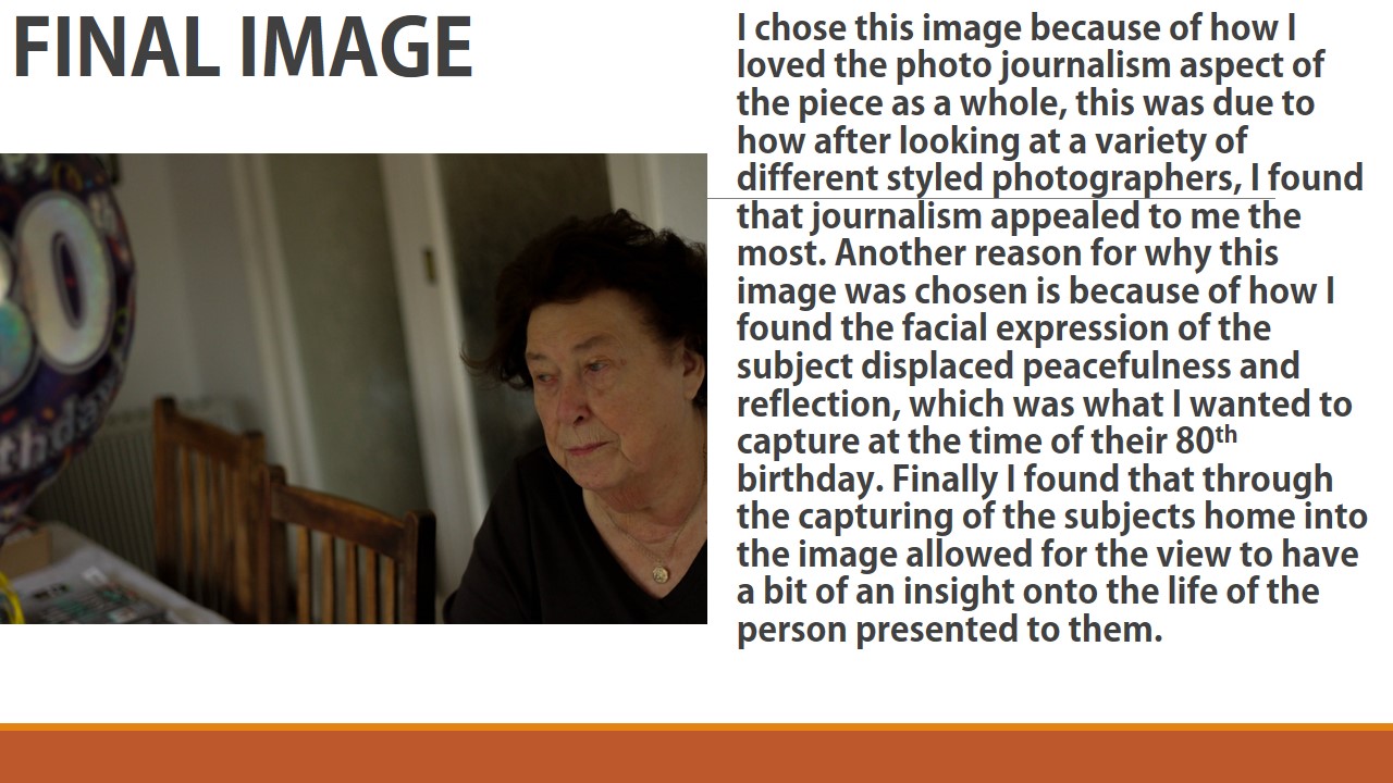
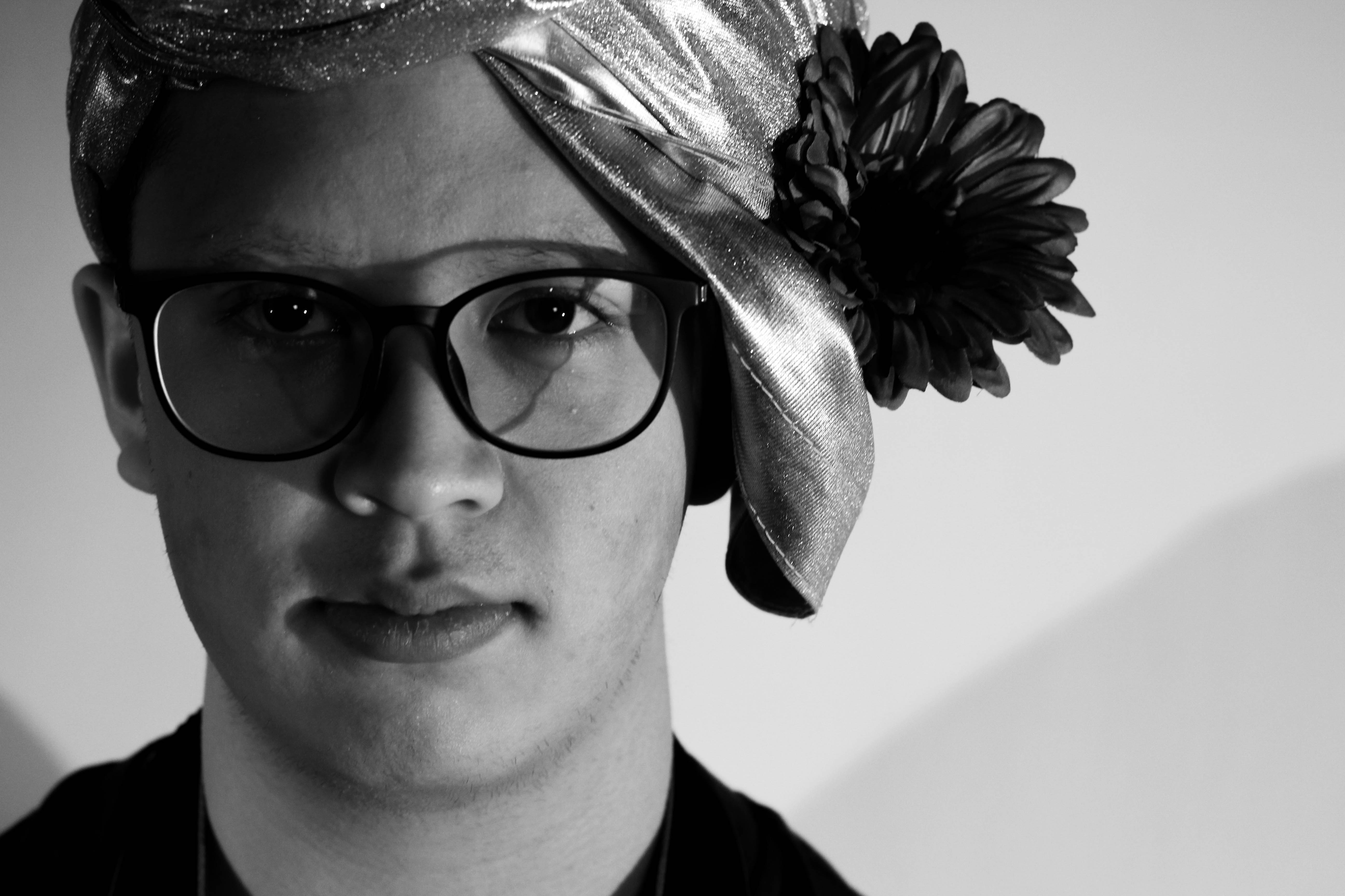
Finally I brought the pictures down to a one photo that I viewed as the most effective out of the selection. This was the image I chose as my final picture:
This was my favourite image because of the composition, lighting and shadowing. I found that the clear contrast between the light and dark of the face and backdrop, allowed for the image to be perfectly balanced, with the dark left side of the face adding definition to the overall piece.

Project Final Outcomes

FINAL OUTCOMES

My favourite chosen outcomes from the project are also those that I have used for my final print compositions, here is a link to the post that went over my final prints…

https://hautlieucreative.co.uk/photo19al/2017/12/18/print-compositions-framing/

Outcome 1

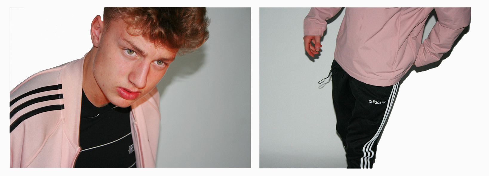
The first of my final pieces is a composition of 2 studio portraits that I believe simply work together rather well and effectively, to create 1 piece.

Outcome 1

The images needed slightly enhancing in order to balance the light, contrast, saturation and shadows of the 2 photographs, and cropping in order to make sure that the background of the images look clean and fully white so that the subjects stand out nicely.
This composition of 2 images is one that I believe shows my raw camera skills. I believe that the 2 images compliment each other perfectly due to the colours, composition and patterns within the images.

Image result for ADIDAS LOGO


The thing other than the balanced colours/shades pink, black and white that stands out to me between the two images is the balance between pattern through the 3 Adidas stripes in both images. These 3 stripes are something that you will see just about everywhere in which people are wearing casual attire. The stripes are the trademark the adidas sport and casual wear brand, causing Adidas to be known as the “The three stripe company” after being called this by its founder Adolf Dassler. In my 2 photographs the dark on light stripes create a good contrast with the light on dark stripes.

Outcome 2

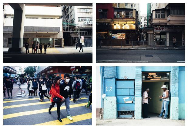
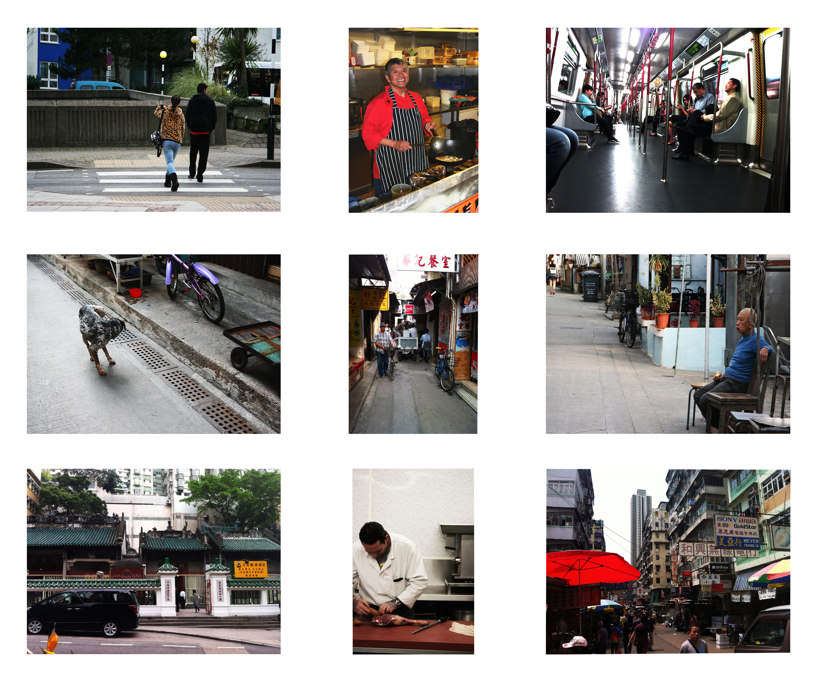
The second of my final pieces is a composition of 9 images (Street photography and Environmental portraiture) in a story board style which explore how the surroundings of a subject visually effects the subject, and how the subject effects its surroundings.

Outcome 2

I have composed the images in this fashion as each image that is opposite to another length-wise or height-wise is related to and balanced with each other.

Here are the 9 original photographs that I have used in this piece…

The environmental portraits were inspired by August Sander who had a mission of photographing every worker in the whole of Germany, here are some examples of his work…


The street photographs were inspired by Genaro Bardy who photographs the streets of metropolitan cities and small towns. Here are some examples of his work…

Genaro Bardy

Outcome 3

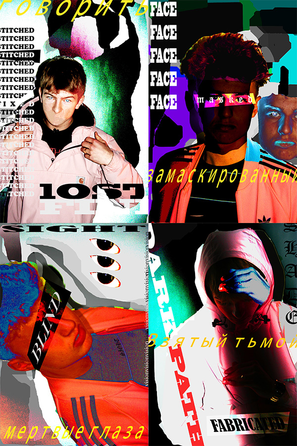
The third of my final pieces is a composition of 4 creative portraits exploring a theme of socially perceived identity.

Outcome 3

I believe that these creative portraits present my creative skills through the use of Photoshop and Typography. The theme of socially perceived is about how people portray themselves within society and how other people portray them, not specifically to the subjects of the images but in general as a society how people seem to see themselves as individuals. The words used in these images explore different social boundaries that some people may come face to face with in society.

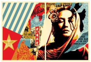
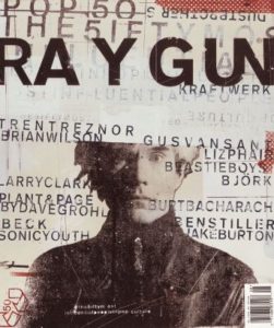
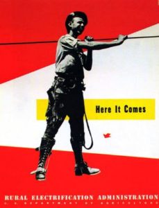
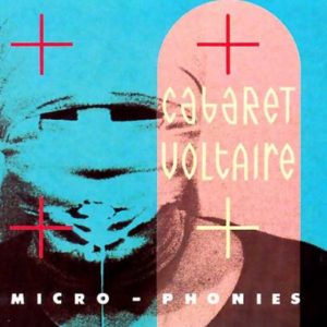
This style of work which I have used in this piece of work is inspired by various photographers and graphic artists including: David Carson, Lester Beall, Neville Brody, Paula Scher, and Shepard Fairey (the creator of the OBEY brand.) Here is some of their work…

Shepard Fairey
Shepard Fairey
Paula Scher
David Carson
Lester Beall
Neville Brody

The work also was influenced by Russian graphic propaganda. This was a way of representing the topic of  social identity as a battle within my work.

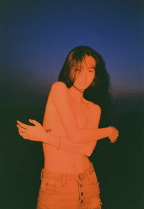
wang wei

Wang Wei is a fashion photographer based in Bejing who specializes in analog photography. Each of his photos are highly expressive and colourful. Wei's photos mainly capture realistic and completely unadulterated scenes of todays youth.Wei's photos are diverse in themes of identity, some of his photos hide it through the use of blur, mirrors, light and shadow. Others express and exhibit someones identity in a photograph through the use colour and tableau. The use of strong colour on certain photographs conveys the strong personalities of youth.