Category Archives: AO1 Develop Ideas

Filters

Author:
Category:

Typology Homework Assignment

Planning

Task: Take 100+ photos that explore the concept of typologies

Camera settings: I will be using an ISO of 100 with a shutter speed of 1/20 mainly in order to allow the image to be as high quality as possible but this may have to be adapted slightly for darker environments.

Lighting: I will be using daylight for the majority of my photographs but photographs taken inside the car park may be captured with flash or with the car park lights.

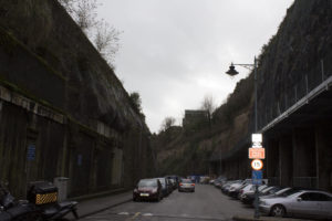
Location: Waterfront underground car park and Jacksons car centre.

Context: I will be taking photographs with the work of Typologists in mind.

My Photographs

My Edits

My Favourite Photograph

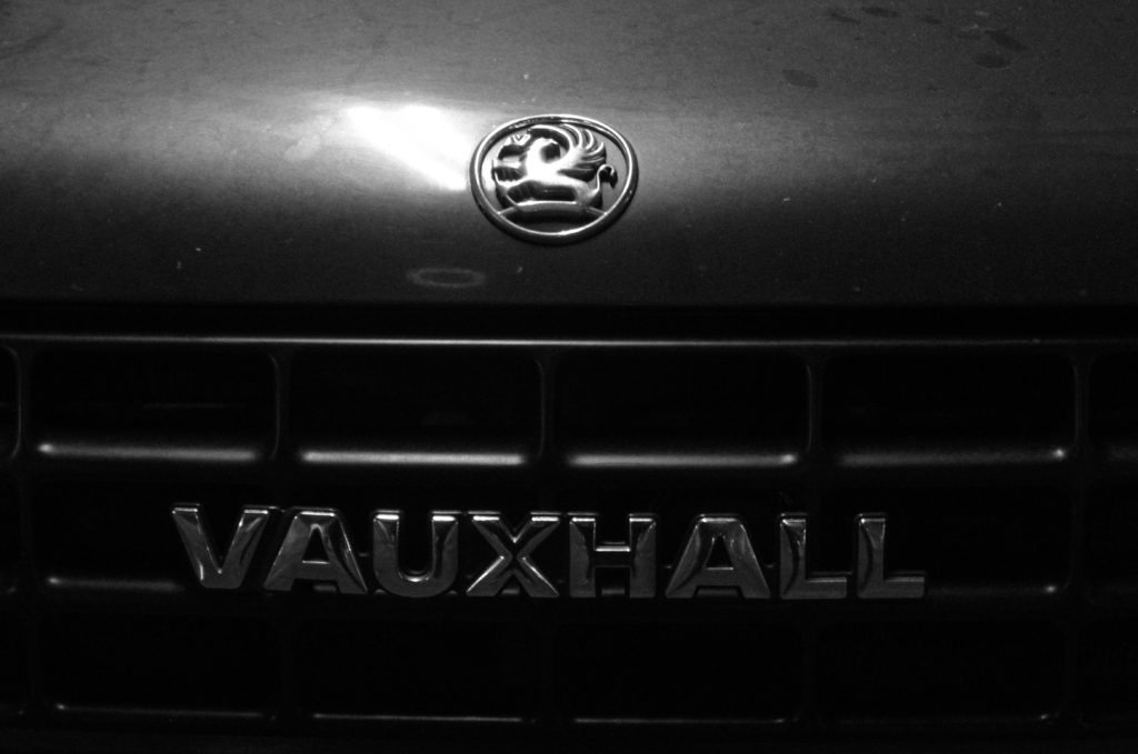
In this photograph I used the artificial lighting the waterfront underground car park. This lighting allowed the photograph to be contrasted with the correct amount of exposure. An aperture of f18 was used for this photograph to ensure that the whole of the photograph was in focus with a deep depth of field. I used a shutter speed of 1/20 along with an ISO of 200 to allow enough light to enter the lens whilst keeping the quality of the photograph as best as possible.

There is no colour in this photograph – only black and white. This creates a rustic/old-fashioned styled photograph. There is not a massively wide tonal range in the photograph but the contrasting tones are right next to eachother so it gives a more dramatic effect. It is quite a 2D photograph as it only has one close-up subject with no foreground or background.

This photograph is part of a collection of typology photographs that I took which include the fronts of cars up close in order to show the differences between similar structures on the Earth. I took inspiration for the style of photograph (rustic) from the Bechers’ but instead of photographing the same subjects as them I decided to choose my own typology whilst taking inspiration from their style.

Week 4 | Altered Landscapes | Cut-N-Paste | Composite Images

This week we will be looking more closely at the concept of altered landscapes.

You may choose to employ a range of creative techniques (digital and traditional) to create your environments…

  • Photographing changed, changing or altered landscapes
  • Creating altered landscapes by combining a range of images in Adobe Photoshop
  • Using cut-n-paste techniques and printed matter (from photos, magazines, print-outs, newspapers etc)

You may already have a range of suitable images to start your designs…but will need to conduct a range of photo-shoots to ensure that you have enough high quality images to work from:

Here are some examples to help inspire your ideas…

Tanja Deman

Beomsik Won

Jesse Treece
Sammy Slabink

Krista Svalbonas


CLICK HERE to research Vassilis Konstantinou’s “unintentional sculptures”

CLICK HERE to research “new landscape” photography

CLICK HERE to find more examples of cut-n-paste ideas…

Essential Blog Posts This Week…

  • Research Altered realities,
  • Hannah Hoch and the early pioneers of photo collage  / montage
  • A Case Study on your chosen photographer (plus analysis of a key image)…show how this has inspired your ideas and process
  • Your images, process, editing, selection, final outcomes and evaluation

HANNAH HOCH INTRO CLICK HERE

EXTENSION TASK

Research the work of Joan Fontcuberta…

One of Spain’s most prominent artists, Joan Fontcuberta is best-known for his exploration of the intersection between art, science, and illusion. In Landscapes without Memory, an exhibition of forty large-scale works made between 2002 and 2005, Fontcuberta harnesses a piece of landscape-rendering computer software designed for the military, which creates photo-realistic three-dimensional models based on two-dimensional sources. For his Landscapes of Landscapes series, the focus of the Aperture exhibition, Fontcuberta feeds the software images of famous paintings and photographs by Turner, Cézanne, Rothko, and Carleton E. Watkins, among others, forcing the program to interpret the landscape masterworks as “real.” The contours and tones of the pictures are transformed into three-dimensional mountains, rivers, valleys, and clouds—baroque, fantastical landscapes void of human existence that tap into our desire for unattainable paradise. Thumbnails of the original images are shown next to Fontcuberta’s work.

Through his artistic process, Fontcuberta creates new landscapes that, despite their “postcard perfect” resonance, are purely fictional­ and can never be experienced in nature. The result is “landscapes without memory.”

  • Why do you think Fontcuberta creates “photography” in this way…?
  • How does Fontcuberta’s work compare to the work of James Casabere ??? (below)
  • “The photographs that put artist James Casebere on the map are chilling. Like an architect, he builds a highly detailed model. But instead of turning the model into a life-size construction, Casebere zeroes in on the nano-details of the space and then photographs it to create his “constructed photography.” In the past, he has built and then photographed empty spaces, from miniature prison cells to flooded rooms to suburban homes that recall the housing crisis. To call these sparse, meditative images haunting, with their careful placement of light and shadow, is an understatement.”

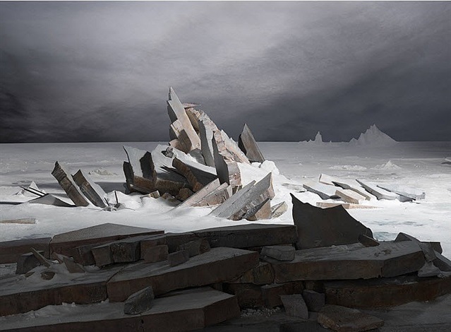
    James Casabere (after Friedrich)


Mishka Henner And Edward Burtynsky


About Henner

Mishka Henner is a Belgian artists who is currently living and working in Manchester,his work is featured within the contemporary arts and working within photography in the internet age,he has been featured in many surveys over time.He studied at Lough borough university and also at goldsmiths college,after he attended school in London he stayed there for a number of years until 2003,he vised Tate modern frequently surveying many documentary photography which to him was described as ‘life changing’.Later on in life he featured on many broadsheet magazines and soon after in 2008 joined panos pictures.He has also been described as a modern day Duchamp,his appropriation of image-rich technologies including ,google earth,street view and also you tube.This is the means of all of his inspiration and where he is seen adopting his print-on-demand bypass to traditional models.This creates a unique sense of works which is inspired by many social medias but also the way in which we love as a group in society through  industrial urban-ism.

Many of his key works are between 2010 and 2015,Henners work is brought to life by the strong engagement of character and nature within his photography. many of his works resulted in print on demand books,films and installations that featured in large scale museum  within France,Canada,and then in the us.He works in the following manner,his new approach of photography is seeing light,photographer without cameras,the need to press the shutter is replaced by a direct interest in images,not necessarily in making images.

Image analysis

title of the pice:OIL FIELDS – Levelland Oil – Gas Field- Texas, Courtesy of Carroll/Fletcher

I chose this image due to the clear though out and interesting composition of the piece itself,all the lines create a strong presence of structure coming from throughout the image,He conceptually wanted to capture the way in which people are continuously walking in a straight created format for themselves and  rarely veering off the path,He took this from a birds eye view angle possibly from google maps and used a strong technological purpose.

ideas I would want to use within my work:

I too would want to take high elevated shots in order too mature lines and a structure within what looks like nature but man made lines’ think it is a clear representation of the path that everyone constantly walks, and how they are in such straight lines and create a parasol form. I think I will use his work more as reference and inspiration and will not do the same technique due to this being very  unrealistic to accomplish without a drone.

Edward Burtynsky

Burtynsky is a Canadian photographer and artists known for his large format photographs of industrial landscapes. His work is now housed in more than 50 museums word wide.He was born in Ontario and his parents then immigrated to Canada in 1951,his childhood is filled of watching ships pass through locks so a very outside oriented childhoood, he also had an interest within many industrial areas and the slow developing urbanism of his life. when he was just 11 his farther purchased a dark room inclusive cameras and manuals from which he practised and become an ammeter photography .he learned how to male black and white prints together with his older sister established small business

I chose this artists because he had a consistent view though all his work and only demonstrated different angles and heI did not change theme throughout. Much like the previous artists he focused very much upon how he can sues suture within all of his work,I again think this is interesting and when possibly will try to find similar scenarios.

Burtynskys most famous work are sweeping views of landscapes altered by industry,mine tailings,quarries,scrap piles, the grand, awe inspiring beauty of his images and is often tension within the compromised environments they depict. He has made several excursions to china and the country toys industrial emergence and the construction of one of the worlds largest engineering project.

To be able to take images like this I will have to get to very high places and then use a wide lens in order to capture accurately the whole ascent of the area itself.I could also do more night time slow shutter speeds and try  to capture  the light traces with all the given road paths because it shows even a more detrimental human inference of technology and building in order for human convenience.

Within this image you can see an architectural  side to the image and also the the structure to the image and the interesting sense of atmosphere that it brings.The green shows the small amount of nature left In the world and how it is now overpowered by the cities and insurable towns that we all live among.
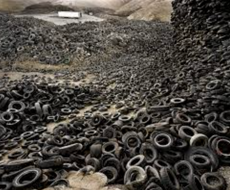
This is my favourite image due to the way in which he uses the interesting and somewhat dystopian feel in order to show a theme of ruins and slow destruction that the human are forming on the earth, his works is done in order to show awareness of global warming and all the negative aspects that we as a society are distilling upon our world.

Ideas for the shoot

I would want to go to many areas such as the dump were there is a large change and a slow deterioration of the green and healthy nature within the environment and how that society and its gradual new buildings evolve so do the effect on the environment and also the people and living and trying to prevent this form occurring.I will only be able to use aspects of this work as I am not able to take images from as high of an angle.


New Topographics Research

What Was It?

“What I remember most clearly was that nobody liked it”Frank Gohlke, one of the participating photographers told the LA Times when the exhibition was re staged last year.

‘New Topographics: Photographs of a Man-Altered Landscape’ was an exhibition that showcased a key moment in American Landscape photography. Parking lots, suburban housing and warehouses were all depicted in the same way that early photographers would document the natural landscape- this caused many people to turn their heads on this exhibition. The show consisted of 168 rigorously formal, black-and-white prints and when taken collectively, they seemed to posit an aesthetic of the banal.

source

Robert Adams – Artist Research

Born on the 8th May 1937, Robert Adams is a photographer from America specializing in the landscapes of West America. Adams’s documentation of contemporary western landscapes reveals the environmental damage caused by the suburbanization of such cities as Denver, Portland, Seattle, and Salt Lake City, as well as by the proliferation of nuclear weapons technology in those areas. 

Contact Sheets

j

Analysis Of Photograph

Technical

This is my favourite photograph by Robert Adams, the image portrays a fairground ride illuminated by bright lights. The photo was taken during the evening as the sky was getting darker. Since all of the image is in focus I can assume that Robert Adams used a high aperture of F/22+,  he most likely increased the  exposure to achieve the soft glow from the lights. Due to the black & white feature of the photograph I cannot comment on the white balance or colour composition of the image but due to the vast range of grays it can be implied that the colours created chaos and in that sense, the black and white aspect was able to create a calm and serene atmosphere.

Visual

Referring to Ansel Adam’s tonal system, the image has the brightest white (#ffffff) but lacks the darkest black, despite this, it still  contains a wide range of grays. The composition of the photograph is very successful, the ferris wheel isn’t in the direct center of the image, in fact, the top half of the image is incredibly plain and predominately one colour. This, however, doesn’t in any way serve as a disadvantage to the photograph. Naturally, the eye is drawn to the center of the ferris wheel; then to the bright lights and finally to the looming clouds.

Contexual

The name of the image is ‘Longmont, Colorado’ taken from the series ‘Summer Nights’. The image was taken roughly around 1982 (but printed in 1989).

For about five years, beginning in 1974, Adams embarked on an experiment, he made a series of photographs at night, the opposite of the high-altitude daylight used in most of his previous photographs. The project brought an element of risk he had not experienced before. In this photograph, Adams isolates the ferris wheel lights against a threatening sky to create a scene both delightful and ominous.


Exploring Exposure Techniques

Exposure Bracketing

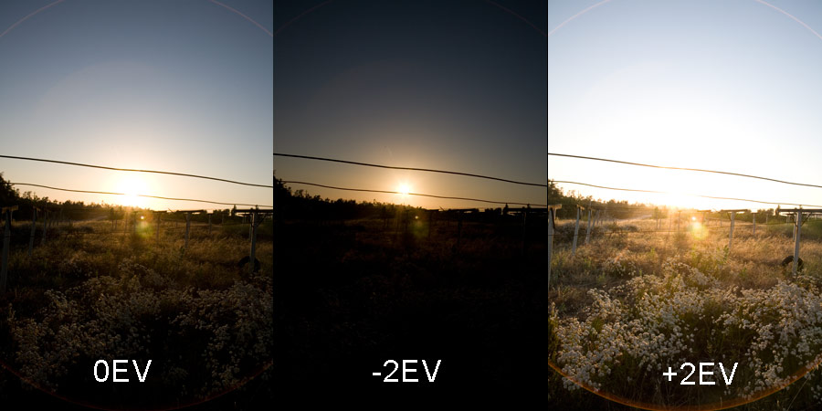
Bracketing in general is a term used to describe a sequence of images taken by a camera with slight differences in the settings.

following on that, Exposure Bracketing involves taking a sequence of pictures of the same scene at a range of exposure settings. The reason you do this is because the camera might have been ‘deceived’ by the light  available(too much or too little) and your main subject may be over or under exposed. By taking multiple shots you are making sure that whatever is the case, then you would have properly compensated for it.

Source And Further Reading 

HDR Imagery

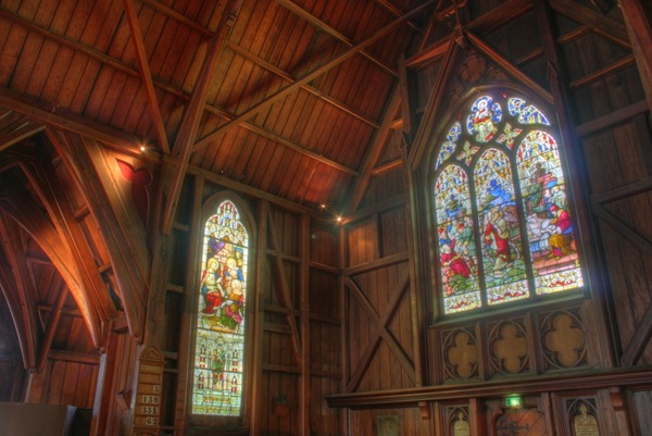
HDR is short for High Dynamic Range. It is a post-processing task of taking either one image or a series of images, combining them, and adjusting the contrast ratios to do things that are virtually impossible with a single aperture and shutter speed.

Cameras are limited to the amount of image detail they can record when the sensor is exposed to light. Whether you’re using the auto settings or are taking pics using skillfully tuned manual settings, your goal is trying to take advantage of the available light to maximize the detail in the result image. The problem is, when you’re shooting heavy shadows and bright lights, you are forced into losing detail in one range or the other.

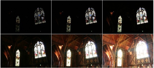
As you can see in the image above, the camera has taken several images at the same time with different exposure levels, the final image is created by layering and combining them in order to get this look.

The basic idea of creating a combination image with multiple exposures is not new to photography. As long as cameras have had the limitation of standard ranges, clever photographers have been hacking ways to create the best possible image. Brilliant photographer Ansel Adams used dodging and burning techniques to selectively expose his prints and create amazing rich detail in images.

Source And Further Reading 

Psycho-Geography | PhotoShoot

Reasons for using this area for the shoot

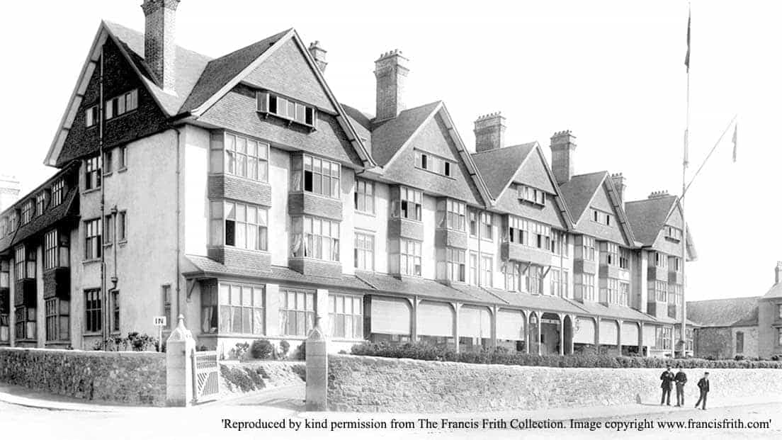
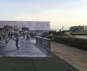
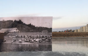
I picked this area for the psycho-geography  shoot as the area has gone through many changes throughout time and has been used for many different purposes through the course of history, so seeing the contrast between then and now will be interestin

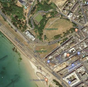
Psycho-Geography West Park 

Image result for jersey ci in 1890File:U16WPPavilion.jpgFile:TP17WestParkSandCastles.jpgFile:WPBeachDunham.jpgFile:Goo14WestParkBeachBall.jpg

Contact Sheet 

Images from the shoot 

Final Images from the shoot

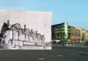
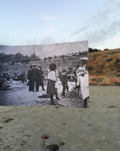
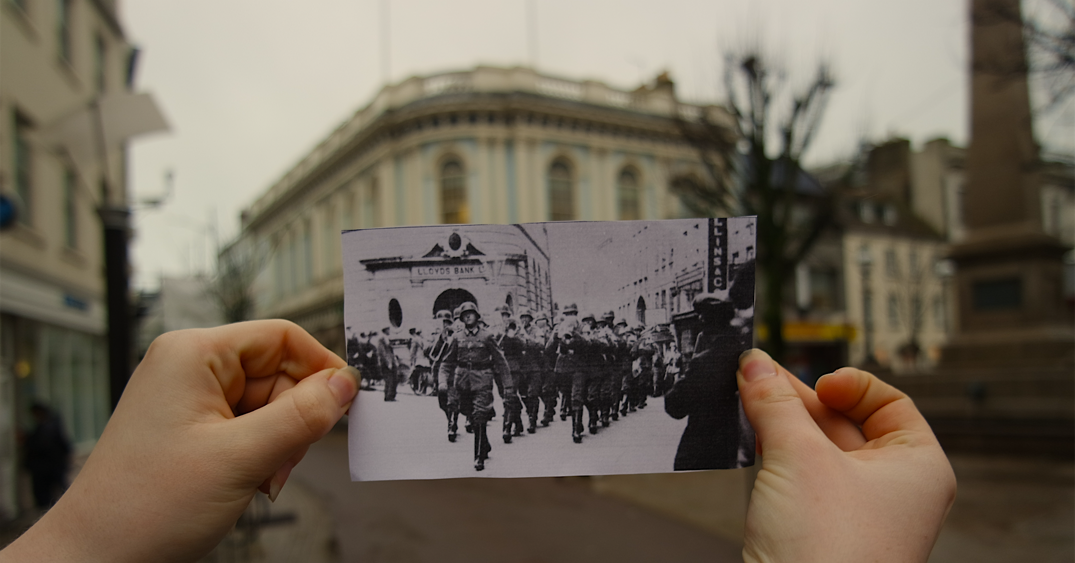
I feel that this image is the best overall out come fro this shoot. I was having trouble lining up the image of jersey from the past with the same location in the modern day as the wind was very strong which kept blowing the picture out of place, but i think that i achieved lining up the two best in this image. I also think that this was the strongest image from the shoot, as because in this image the contrast between the old and the new jersey landscape the contrast between the two can be seen the greatest.

Typology – Jeff Brouws

Jeff Brouws (born 1955) is a self-taught artist and photographer. He took lots of typology photographs of America’s rural, urban and suburban landscapes. He used typology photographs to document the characteristics of the nation. He takes influence from the New Topographic movement and the writings of cultural geographers. He is the author of seven books and his photographs can be found in major private and public collections including the Whitney Museum of Art.

Image result for jeff brouws

Image result for jeff brouws

My Favourite Photograph

Image result for jeff brouws

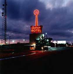
In this photograph Brouws used the fluorescent lighting from the motel to illuminate his photograph. This created contrast between the bright motel sign and the dark and dramatic background. It appears that a deep depth of field was used as the whole of the photograph is in focus. The photograph is generally quite dark so a low ISO of 100 or 200 will have been used along with a slower shutter speed of around 1/25 to let enough light into the lens.

There is lots of use of colour in this photograph – the bright red in the motel sign catches the attention of the viewer and it contrasts with the dark blue of the clouds. There is a wide tonal range in this image which makes it even more dramatic and interesting to look at. The photograph has lots of texture in the clouds which makes the photograph more realistic along with the 3D effect that the motel sign in front of the clouds brings. The central position of the motel makes it clear that it is the main focus of the photograph and it gives somewhere for the eye to be led to.

This photograph is one example of Brouws typology work. He worked to show the differences in the same style objects. He showed the diversity of structures all over America and the different cultures that could be seen. This helped to open the viewer’s eyes to each others differences and respect each other more.

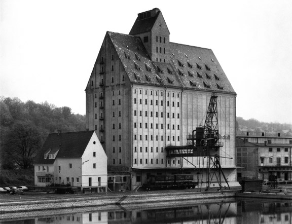
Typology – Bernd and Hilla Becher

Bernd Becher (1931-2007) and Hilla Becher (1934 – 2015) were German conceptual artists and photographers that worked as a collaborative duo. They are best known for their typologies of industrial buildings and structures. They are the founders of the ‘Becher School’ and influenced generations of documentary photographers and artists. They have been awarded the Erasmus Prize and the Hasselblad Award.

Image result for bernd and hilla becher

My Favourite Photograph


Image result for bernd and hilla becher

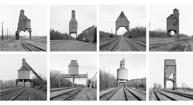
In this photograph natural daylight will have been used to capture it. You can tell because of the soft tones and natural contrast within the photograph. The photograph is slightly over-exposed as can be clearly seen in the background so a slightly higher ISO such as 400 or 800 may have been used along with a potential shutter speed of 1/20-1/80. A deep depth of field has been used at the whole of the photograph is in focus.

There is no colour in the image as it is a black and white photograph. This shows that the viewer should be looking at the details of the subject instead of colours. There is a wide tonal range, ranging from the contrasting shadows of the structure to the over-exposed background. There is clear texture in the structures which makes the photograph more realistic to the viewer and gives it a slight 3D effect.  There is pattern and repetition in the beams of the structures which makes the photograph more aesthetically pleasing for the viewer.

Bernd and Hilla Becher would document architectural structures all over Germany. They took photos of similar typologies and would make compositions of them all together. This is just one example of the work that they would do. They captured the pleasing aesthetics in the buildings deemed ugly and showed the country that there is more to it if they look closely. The Becher couple documented all sorts of structures and worked to open the countries eyes to what was right in front of them.

Psycho-geographies

Psycho-geography

Psycho-geography is defined as the study of the specific effects of the geographical environment, consciously organised or not, on the emotions and behaviour of individuals. The creator of the psycho-geography group, Guy Debord, said that the definition has “pleasing vagueness” meaning that the term can be applied to a wide range of situations.

Snow Hill Psycho-Geography

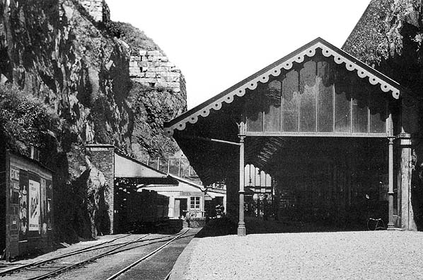
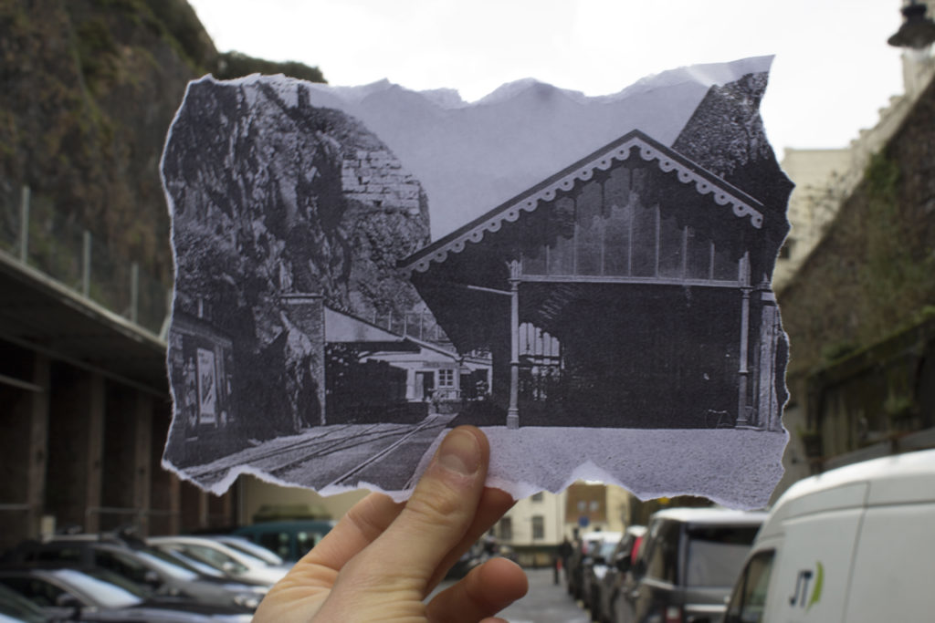
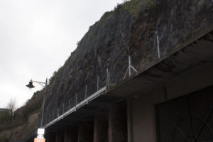
I will be looking at snow hill for my area of interest. Snow hill has some history behind it; in the 17th century it was the eastern limit of St. Helier and was called La Pompe De Haut because of the public pump found there. In the 19th century a theatre was on the site. Between 1873 and 1929 it was the terminus of the Jersey Eastern Railway which ran trains from St Helier to Gorey. The building of the Harbours in the middle of the 19th century used huge quantities of rock for infilling between the outer walls of the harbour and much of this rock was taken from the area now known as Snow Hill car park.

Image result for snow hill car park jersey old

Image result for St helier jersey 20th century

My Archival Image Response

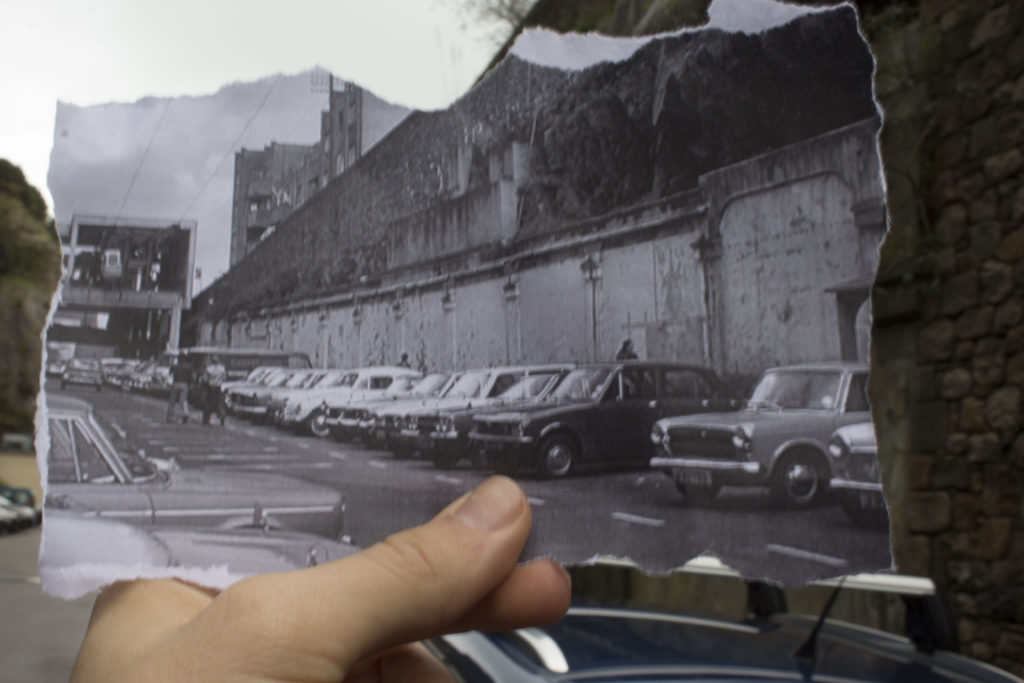
We visited Snow Hill on the 18th January and took archival photographs of the area. There is lots of history behind the area as it has been for used for multiple things such as a railway station and a cable cart station so it was an interesting place to use for comparisons between the new and old. This showed us how much the area has changed and how the past often gets forgotten.

General Photos of the Area

We took some photographs of the area just to show what Snow Hill is like now compared to what it used to be. It is obviously a lot more plain and run-down now as seen in the photographs below.


Location in Jersey

locations

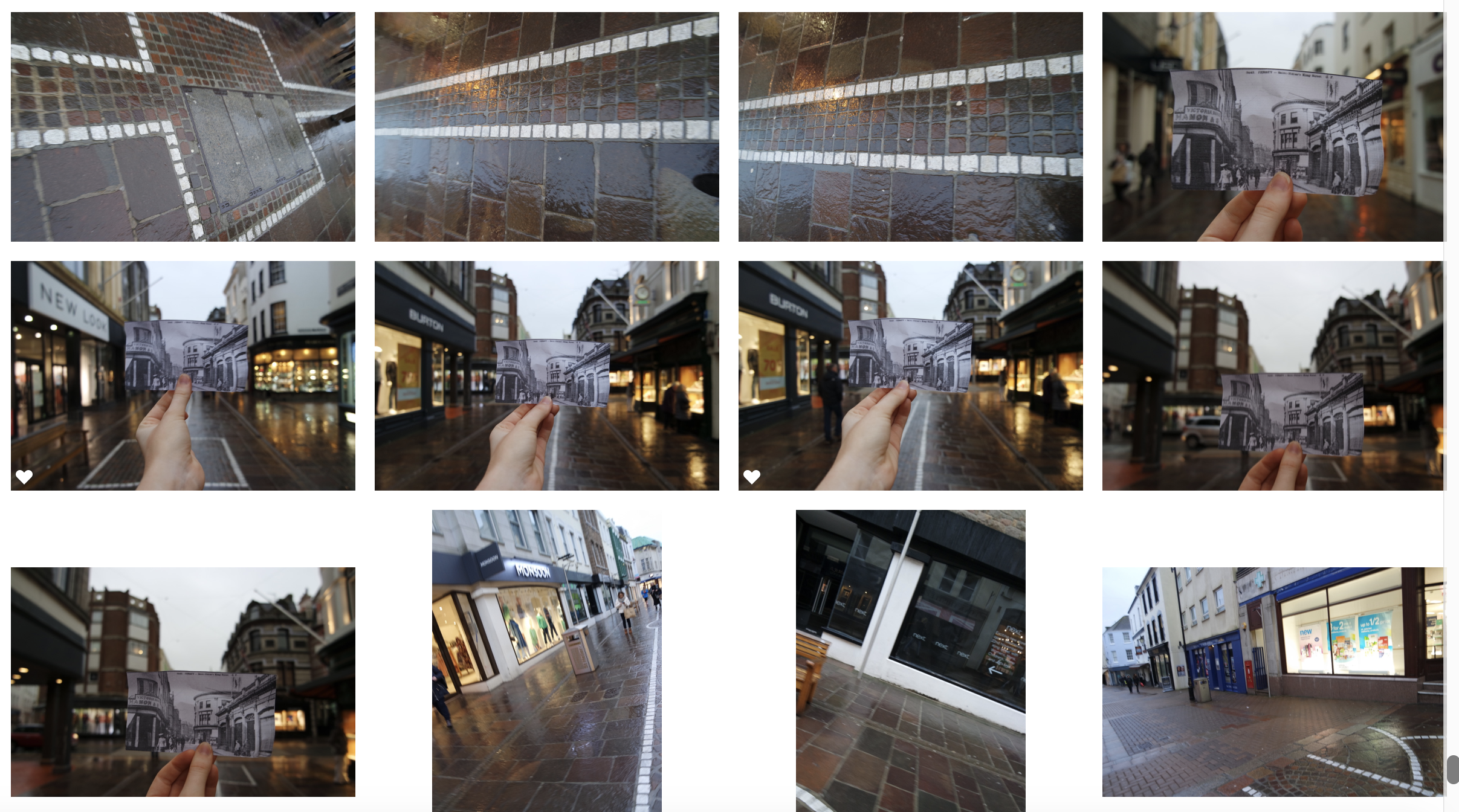
Due to the urban  landscape and the development of humans and man made landscape soon forming the way In which we can travel and the directions in which we are now only capable to go.I want an industrial landscape full of urbanisation,perhpas this would be  done thought out the use of combining old fashioned images of the area in which I am in now and the way in which this contrast  to the current continuation of modernisation and the contrasting enforcement of time and the evoltuion of buildings.

Due to this I will be taking my shoot in the centre of town accompanied with old black and white image and how it has diversified overtime to become the landscape in which we live today.The images I will be using can be seen here:

I will visit all the locations on king street in order to correctly find and  accompany these photos in their official situation to which they were originally taken. I chose black and white photos due to the larger historical impact for the overall image, and also the lines and stutter within the images due to the history of wars in jersey. 

This is the beginning of the street in which I will find suiting image and replace them in the new scenario, this will be accomplished by the direct angles and correct placement, it will be easier due to the common areas and the well known areas as a whole.

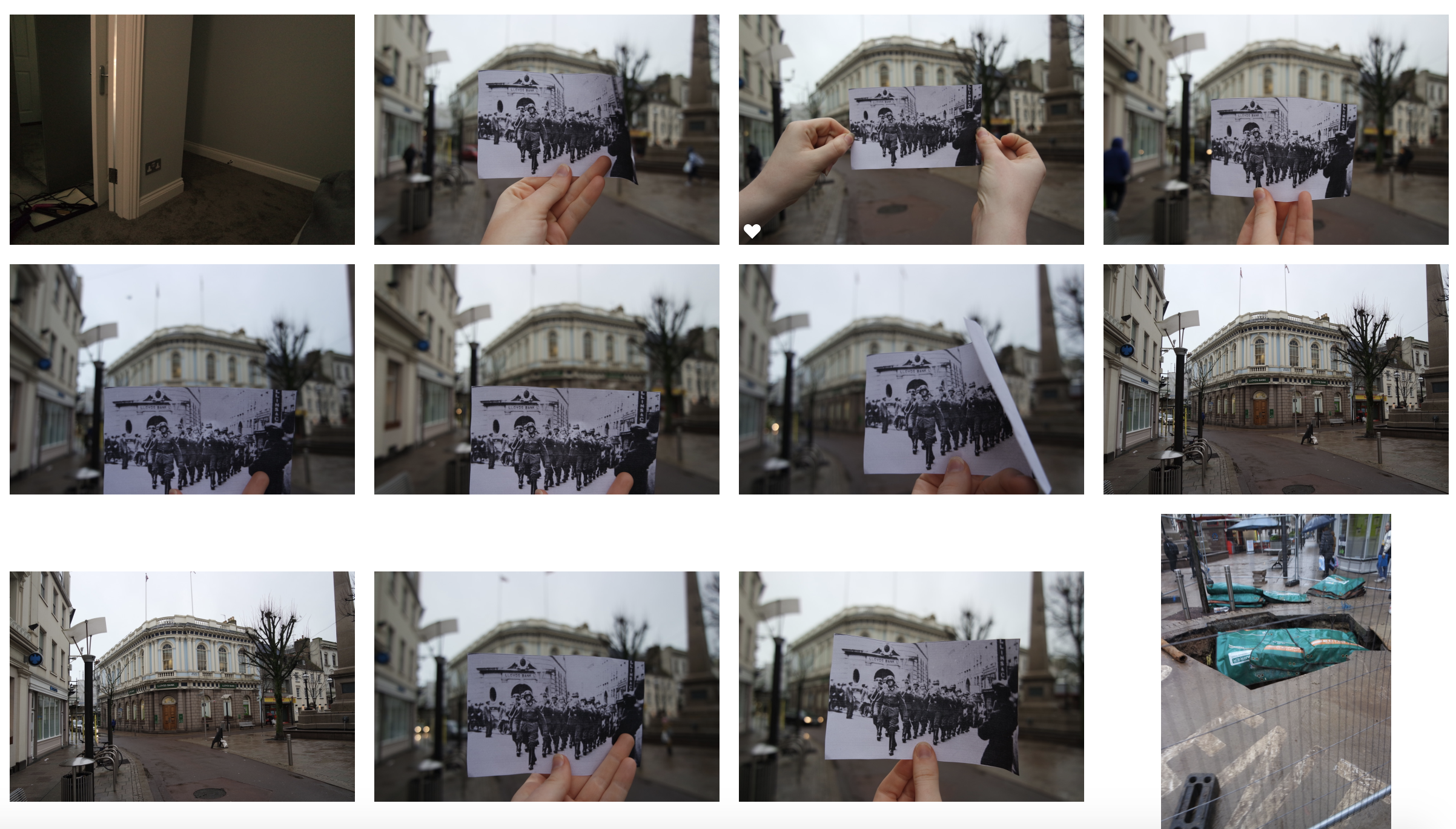
As well as more urban shots around town I also wanted to show edited comparison of jersey as seen as above, although I wasn’t able too capture many as there was a lot of wind to the print image itself wasn’t able to stay straight without support.

Here I wanted to edit the images In both black and white and also colour to show the Morden comparison and then also present the similarities of the town and present the only diversity of time.

wihtin my images I also wanted to demonstrate the focus within the hand and the black and white image and then the attraction of light and colour and a lack of focus to draw attention to the composition and the matching lines that once would occur down that street.

contact sheets