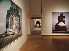
For this post I wanted to explore the use of altered landscapes. To do this I would need to research specific photographers that use this technique to produce the artificial designs and attempt to copy the idea using my own imagery and Photoshop. A photographer I found particularly interesting is Krista Svalbonas, Svalbonas uses images she has taken of buildings to then create part of a structure by stitching together parts of the buildings wanted. Here are some examples of her work: I found that Svalbonas used a calm colored backdrop to her creations to balance the entire piece and really make the design pop out. In response to this I looked through previous photo-shoots picking out images of buildings that I had taken recently. Once found I proceeded onto Photoshop to cut out and stick the parts of these buildings together creating a structure similar to that of Svalbonas, to which I would continue to add a colored matt backdrop that in my opinion balanced the image out. This was my process:
Firstly I created a mood board of the images I wanted to stick together that I thought worked well composition and color wise. From here I cut out the buildings individually and proceeded to join them together experimenting with what fitted well.
 To do this I used the lasso tool to accurately outline the object wanted so that I could then paste onto the design and move it around until satisfied with its placement.
 Once the design had been finished I experimented with a series of colors that I thought were neutral and would not overpower the overall piece. To do this I used the shape tool to cover the backdrop with a large square where I could then change the colors of it.
Once I had put together the images I thought best suited each other I added a backdrop using a singular shape put beneath the layers, this allowed for the effect wanted whilst neatly finishing the piece. These were my results:
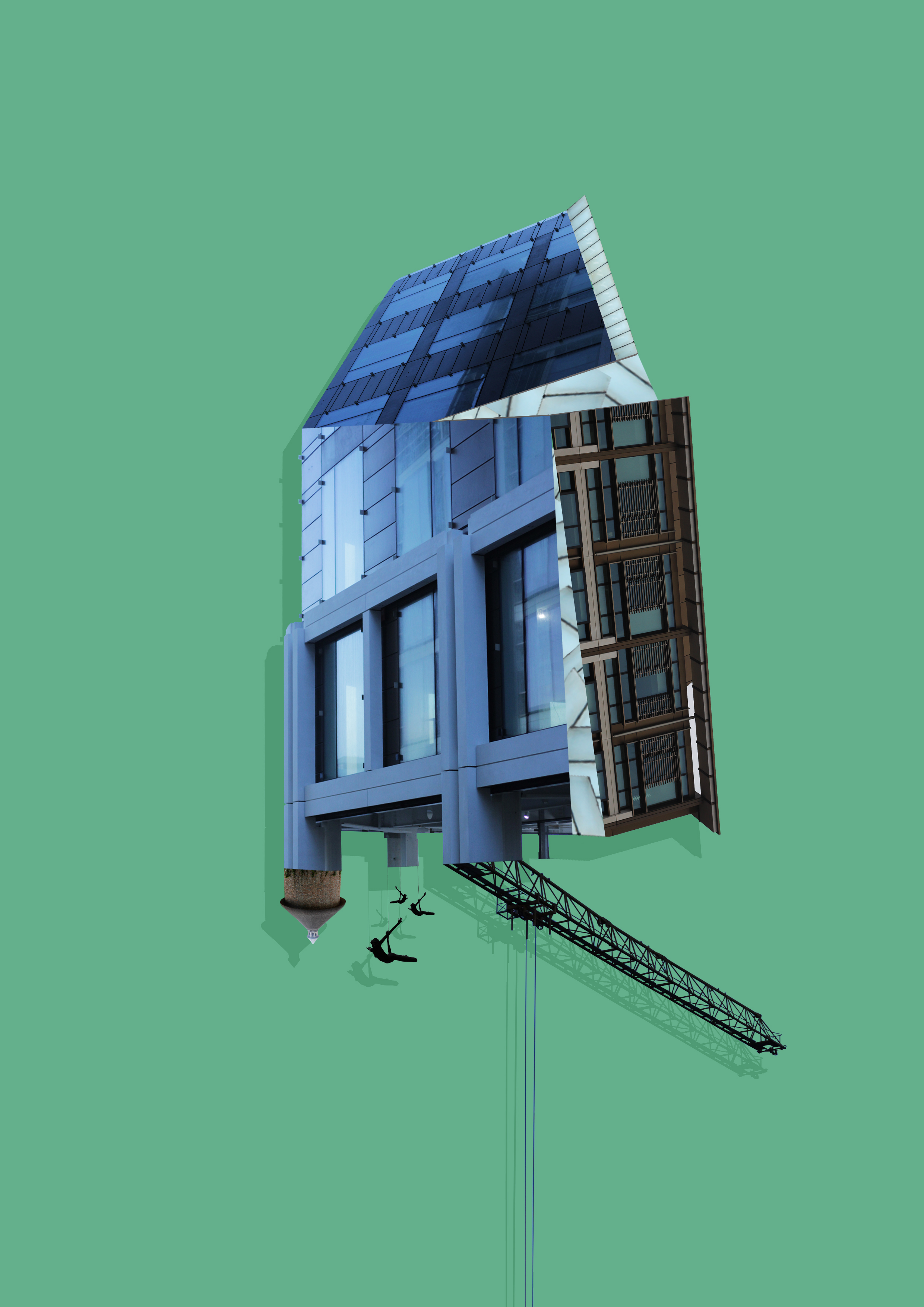
 To create these images I mainly incorporated photos that I had based around the International Finance Center for my psycho-geography shoot and a few images from various other shoots. Whilst doing so I found that by duplicating the image and coloring it black while at the same time reducing the opacity, created a shadow like effect to the piece, this allowed for a 3d like effect that I wanted to put across on the piece and at the same time giving it a more graphic feel. Once done I added a green and a pink backdrop to each piece as I found that these colors drew the gaze to the piece rather than be sore from all the negative space surrounding it.

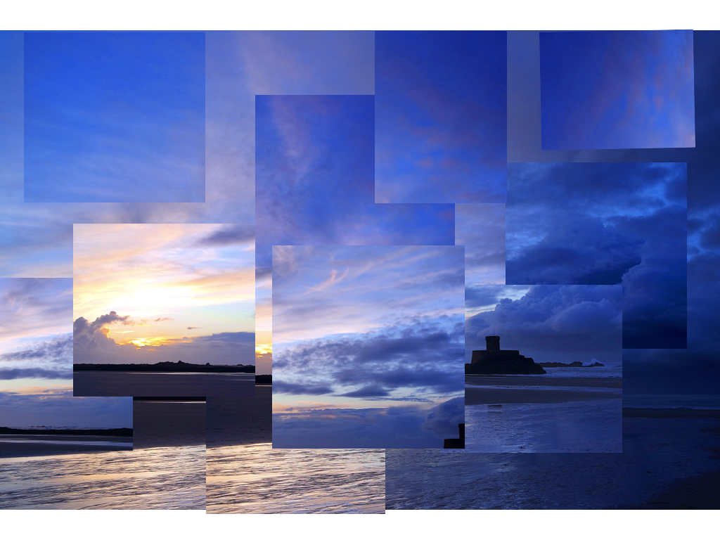
 I decided to attempt at making a panoramic image by stitching together individual images I had taken of a landscape within Photoshop. To do this I overlapped picture upon picture to create a forged landscape of the area taken as seen below:
 Once finished I proceeded to use this method to create a few more panoramas of the landscape in the area where I live, these were the results:
 This image of the bay consisted of twelve individual images that I had to crop and re-shape to allow for the smooth transition effect between each photo that creates the impression of a singular image.
  I took this image of the golf course across the road to me by cropping the overall piece due to how some of the images did not match the shape or size of the others taken. This removed any rough edges to the image allowing for the final result.
 This final image I found to be the most successful due to how the transition between each image looked the most natural with only slight lighting differences.
 From here I thought it would be appropriate to come up with a few ideas in order to help me along the shoot and guide me in what I should be doing. Here are my ideas:


 Once all the pictures of the given area had been taken I decided that I should whittle the selection down to the top ten overall images. This would allow me to come to an easier conclusion on what I thought was the best image taken in the shoot. These were my selected images I thought had the best outcome from the shoot:


 I selected this image because I loved the texture created by the shades of rust on a pole. I found that this allowed heavy but effective contrast between the overall piece as all the colors complemented each other making an almost molten scene.
 In this image I found that I particularly liked the contrast between the silhouette of the statue and the dim-lit sky, with the composition of the pole and string balancing out the image as a whole creating a visually pleasing overall piece.
 Once again I loved the use of the colors created by the rust to make an almost volcanic landscape with shades of red overlapping each other. I found the composition of the piece eye-capturing as the more rusted black areas looked like a mountain range captured from a bird’s eye view.
 In this image I tried to capture the way certain streets were looked after within my given area. What I liked about this one was how it incorporated everyday objects as almost ruining and breaking up the pattern made by the pavement through the composition of the paper and cigarettes.
 Finally I chose this picture because I loved the symmetry created by the textures of the floor surrounding the lights making an aesthetically pleasing image. This use of composition I found was most effective from how it drew the eye to the areas wanted through a clear contrast.
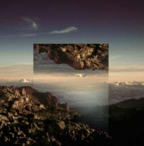


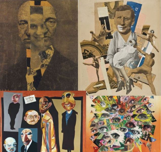
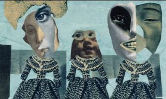
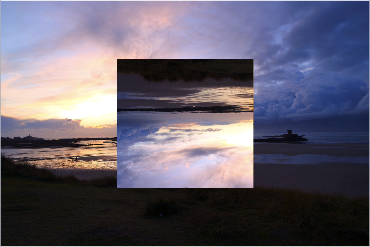
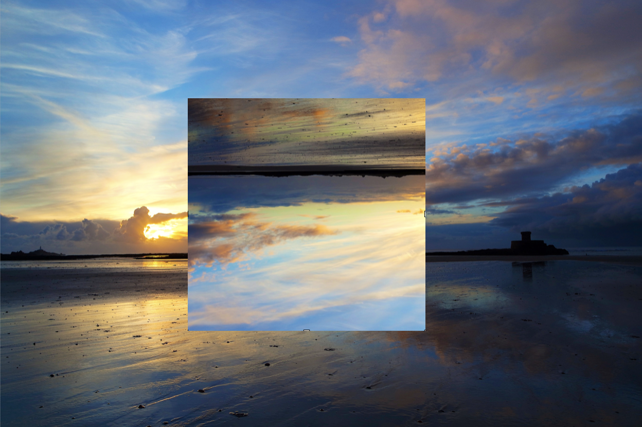
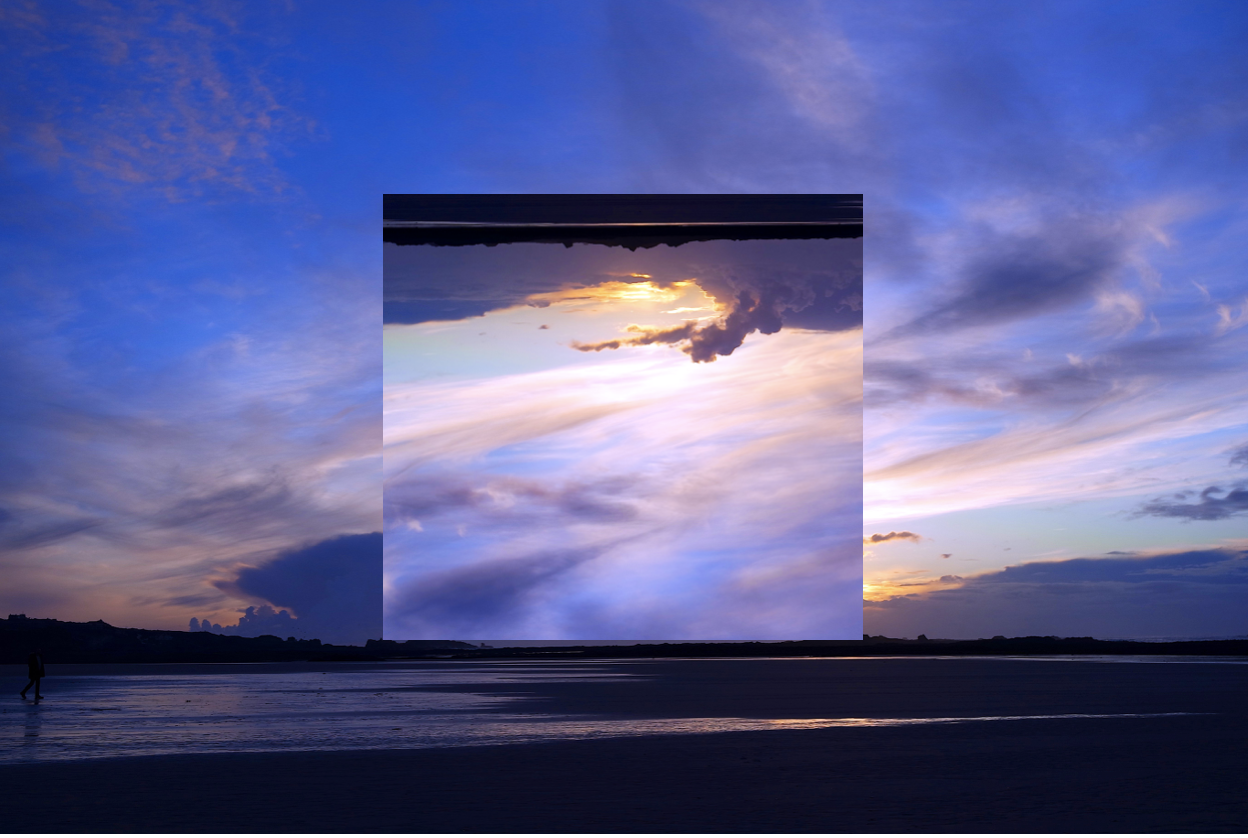
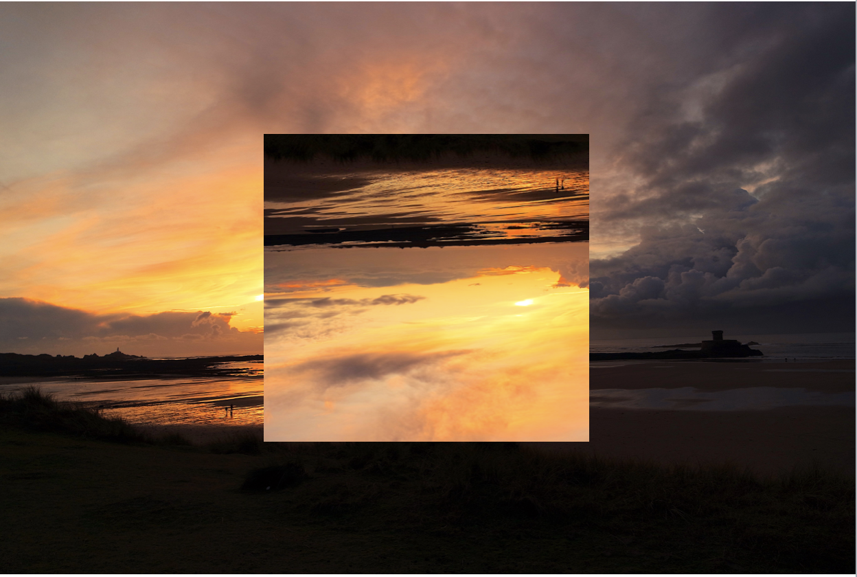




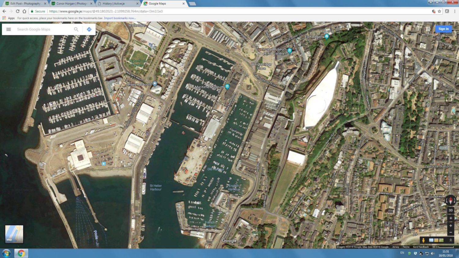
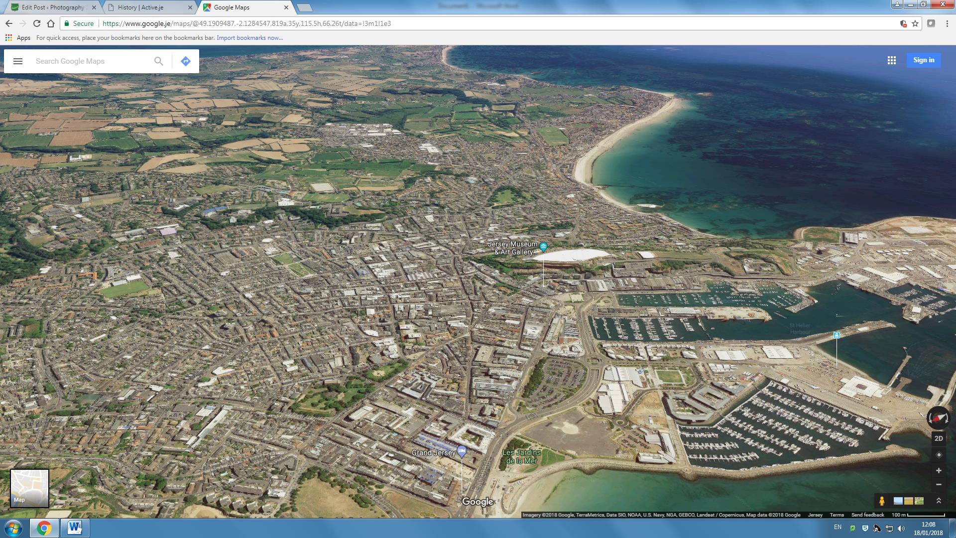


 To add to my research of the area to be explored, I decided that it would be appropriate to take street view shots in order to have a bit of an insight before hand of the area.
 Part of the main area I am exploring is the car park, however now has been transformed into the International Finance Centers, with much of it still under construction. Other areas include Liberty Wharf, which was once known as a former abattoir that was restored and converted for the use of a shopping centre.
 As seen above Henner very much focuses on satellite imagery as his main source of art. One technique commonly seen in his work is shaped pixels, this can be done through selecting an area and finding the main color present in that space, to then convert it to just that singular color.
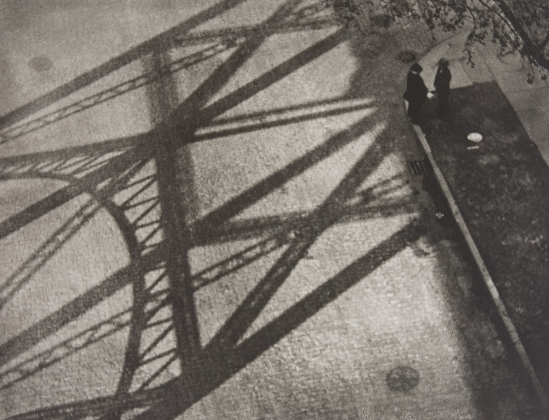
 They tend to focus on how the different textures of the floors can create the pattern to make aesthetically pleasing imagery. The images taken are of everyday generic objects that we take for granted and don’t see the patterns within them.
.jpg)


