Category Archives: AO1 Develop Ideas

Filters

Author:
Category:

Narrative Structures With My Photographs

Narrative structure is about story and plot: the content of a story and the form used to tell the story.  Narrative structures within photography contain a set of photographs which tell a story or explore a theme through either similar photographs or ones that lead onto each other. Below are three narrative structures that I have produced with my own photographs.

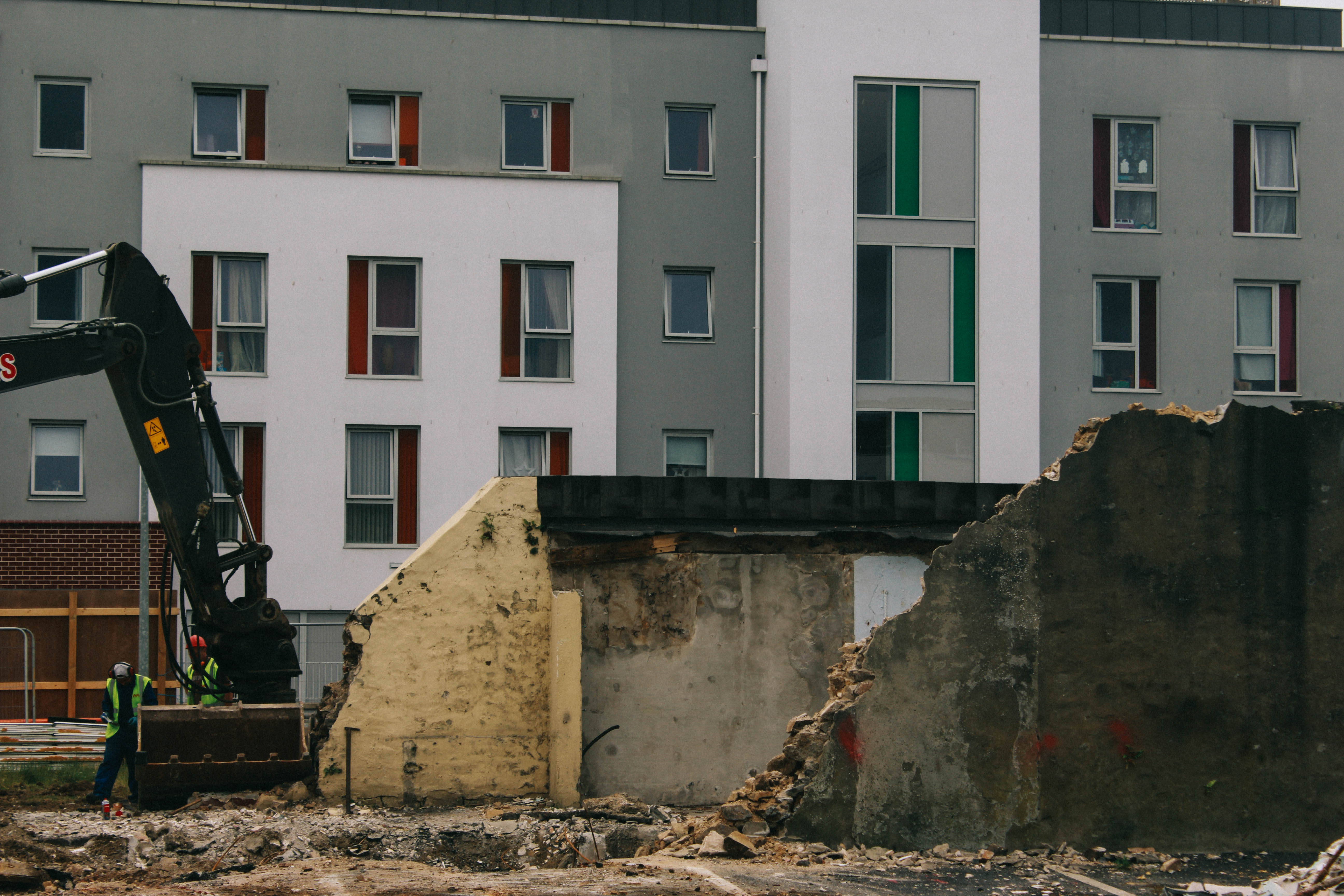
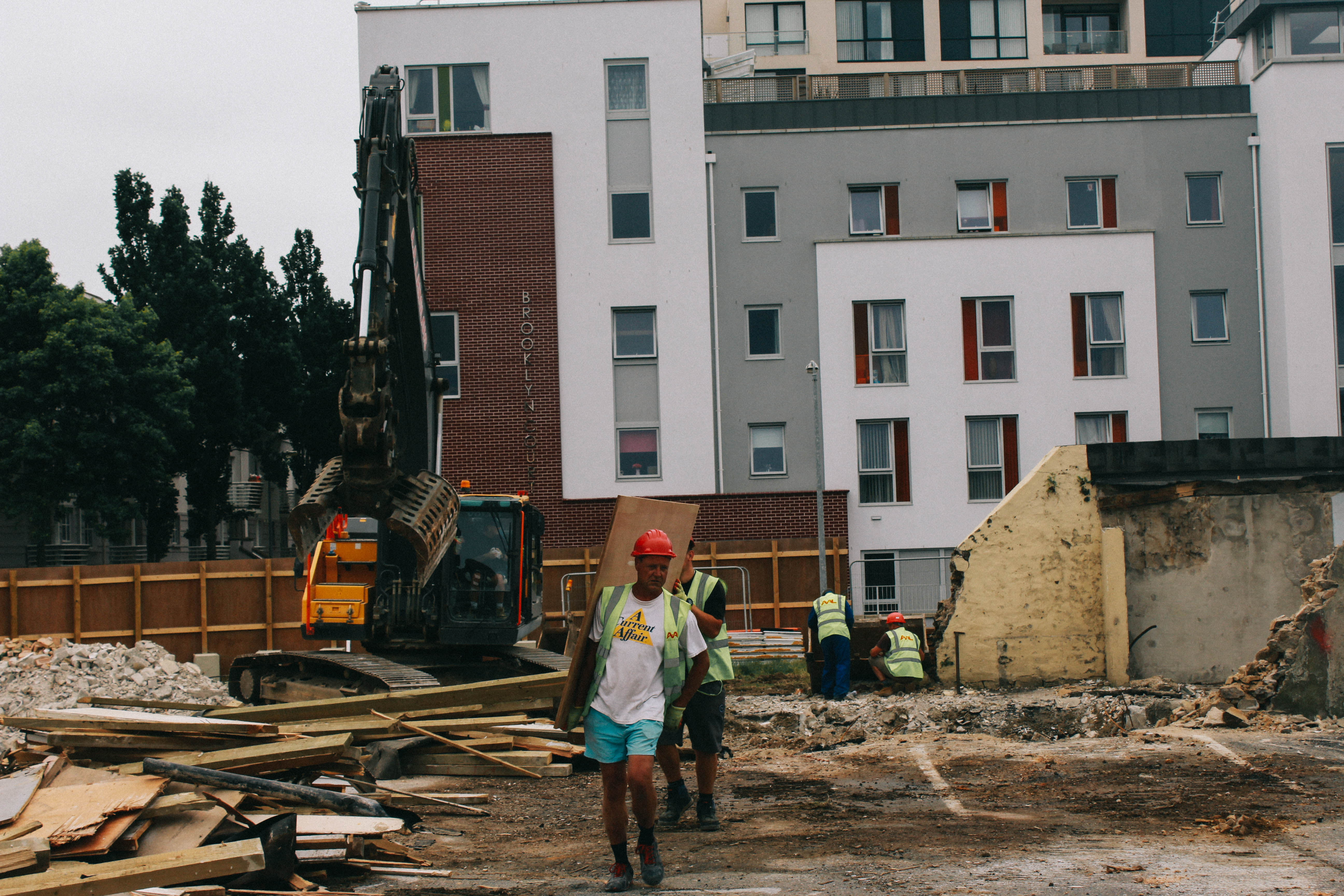
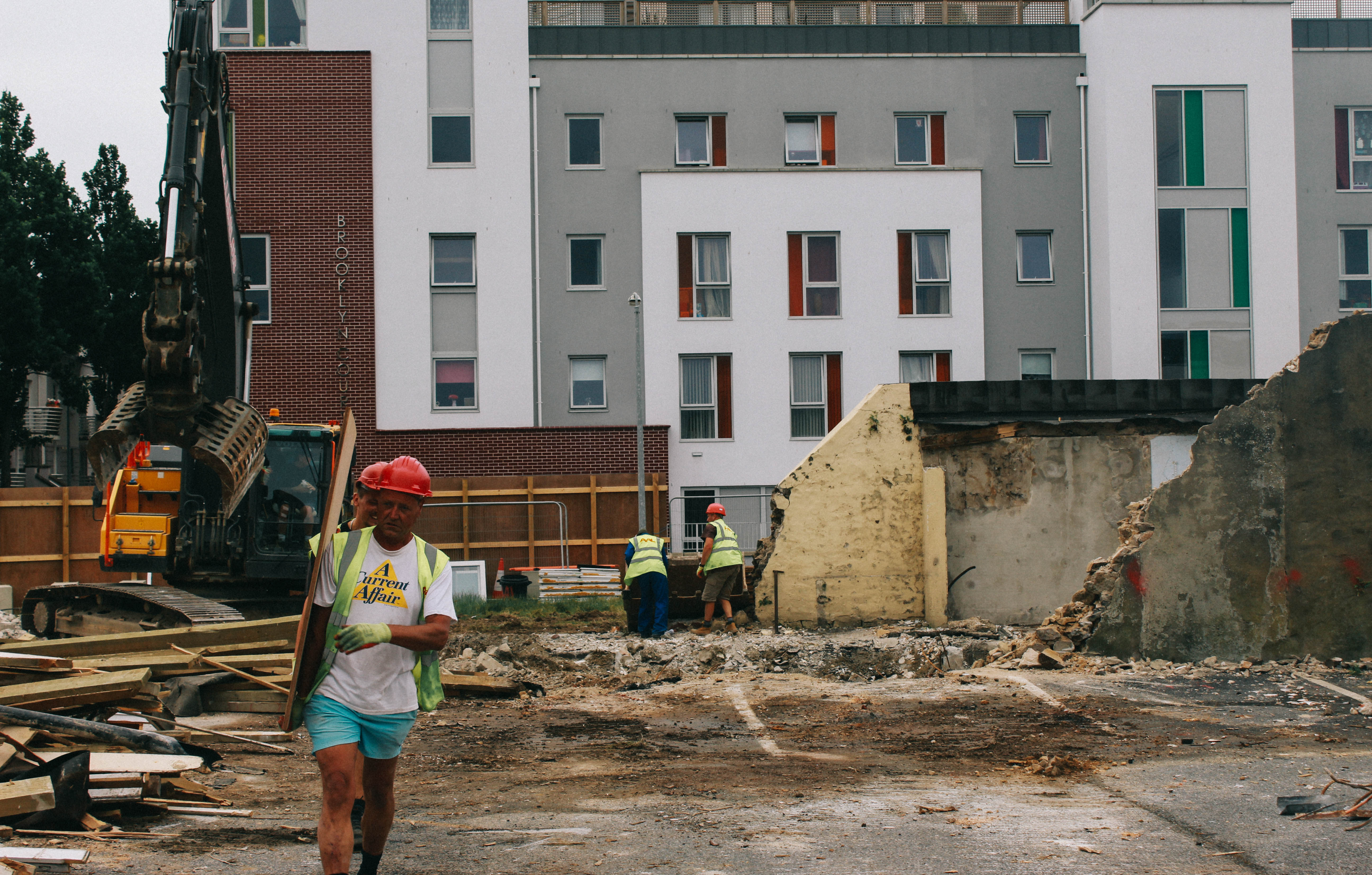
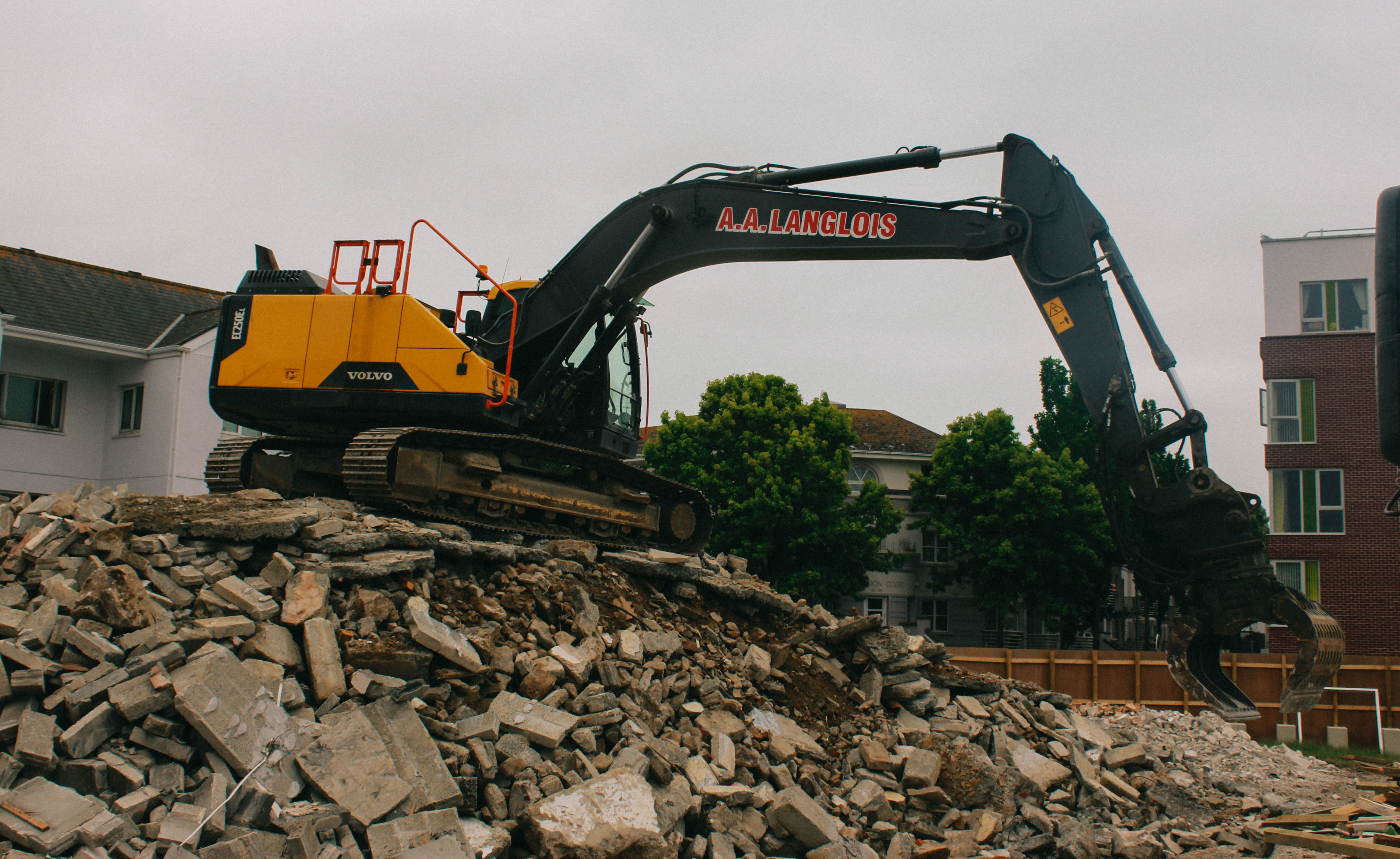
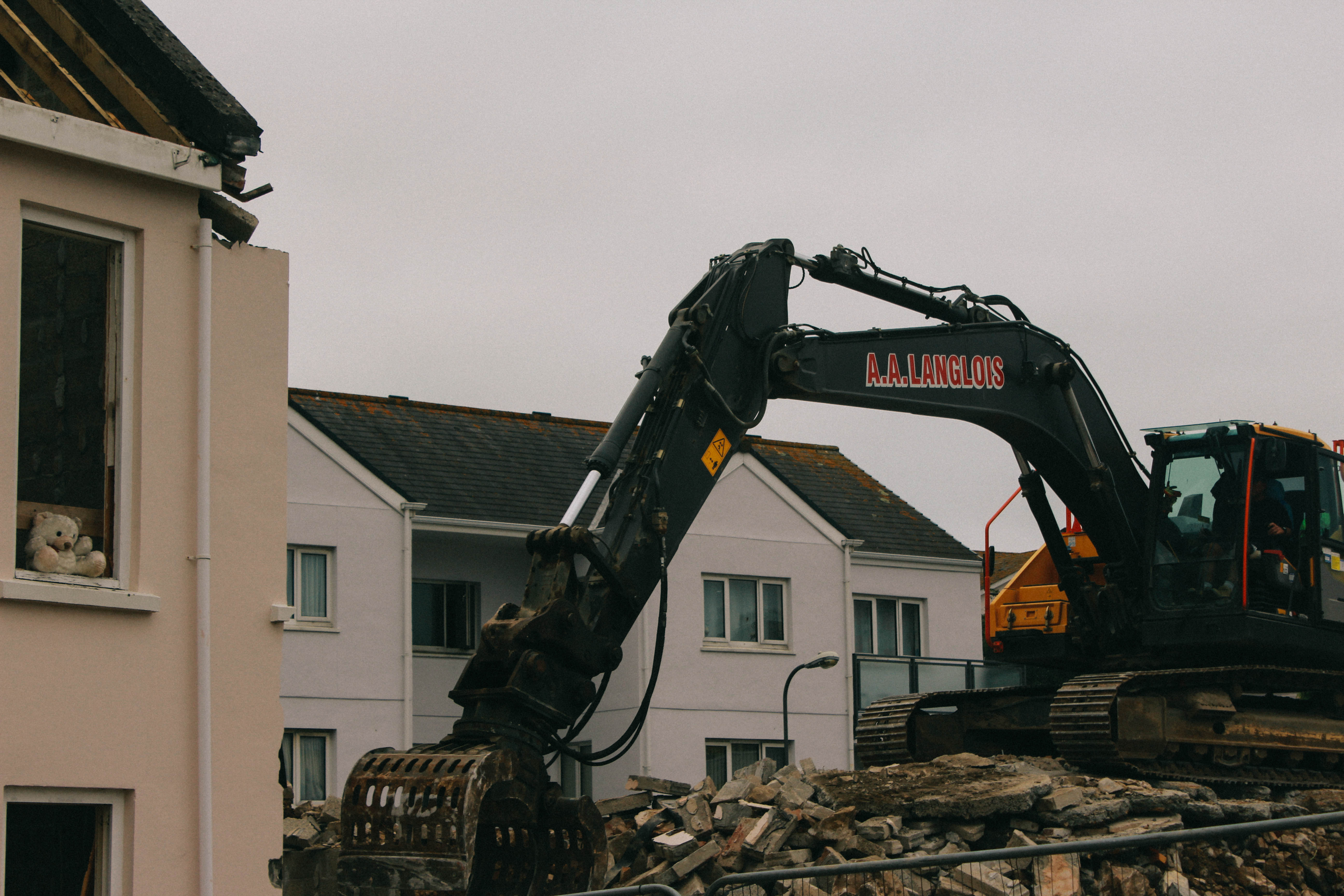
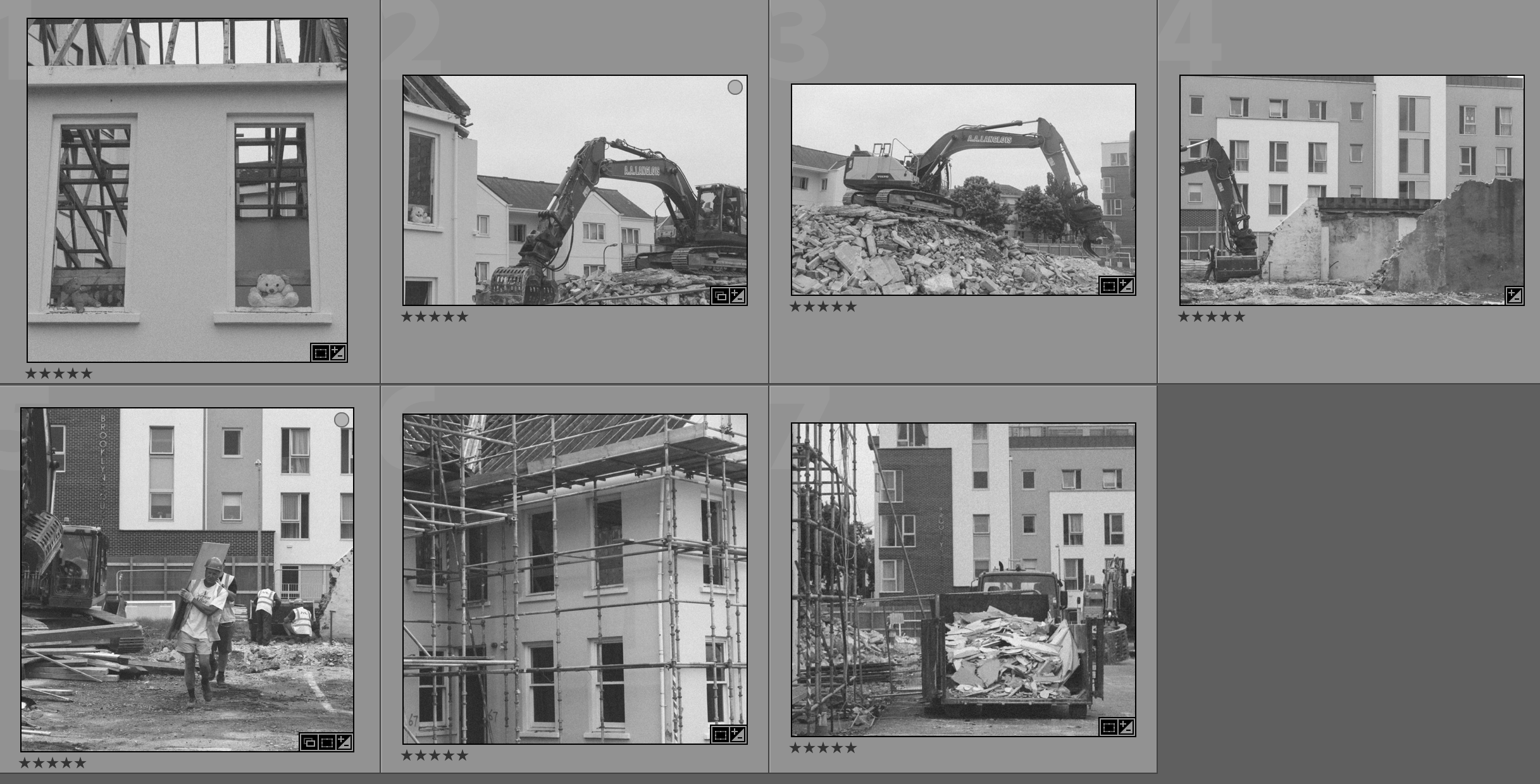
This narrative structure explores the theme of destruction and reconstruction. In the first picture it shows the memories, that are the bears, inside a shell of the house they once inhabited. In the second photograph more context is provided – it is on a building site ready to be demolished. In the fourth photograph you get to look at a past project behind a current project and it foreshadows the outcome for the project. In the fifth photograph it shows the reconstruction beginning to make something new. The sixth photograph then shows the building in progress.

I believe that this is my best sequence as it shows development throughout the sequence and looks at many different subjects to provide a variety of photographs whilst remaining in context.

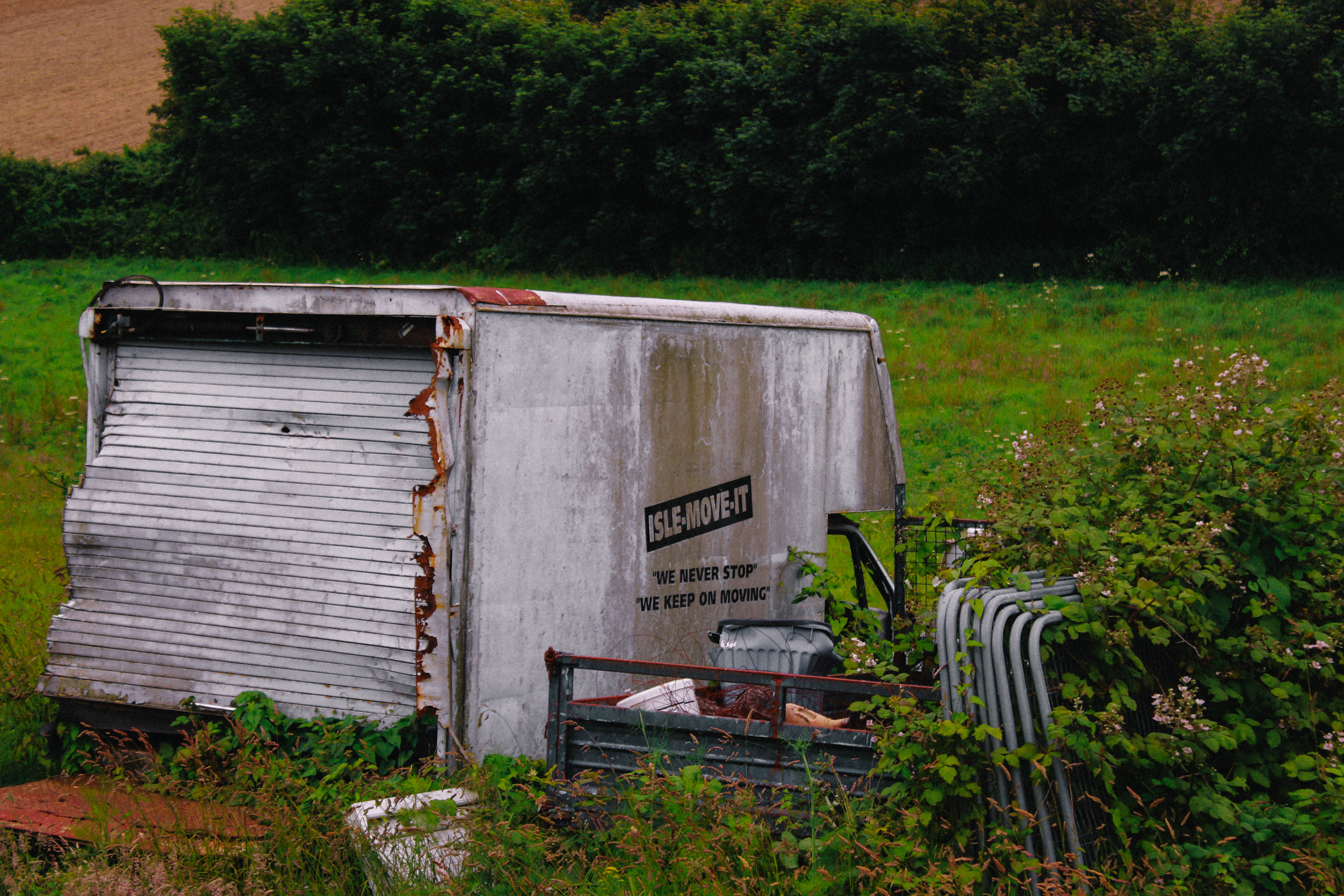
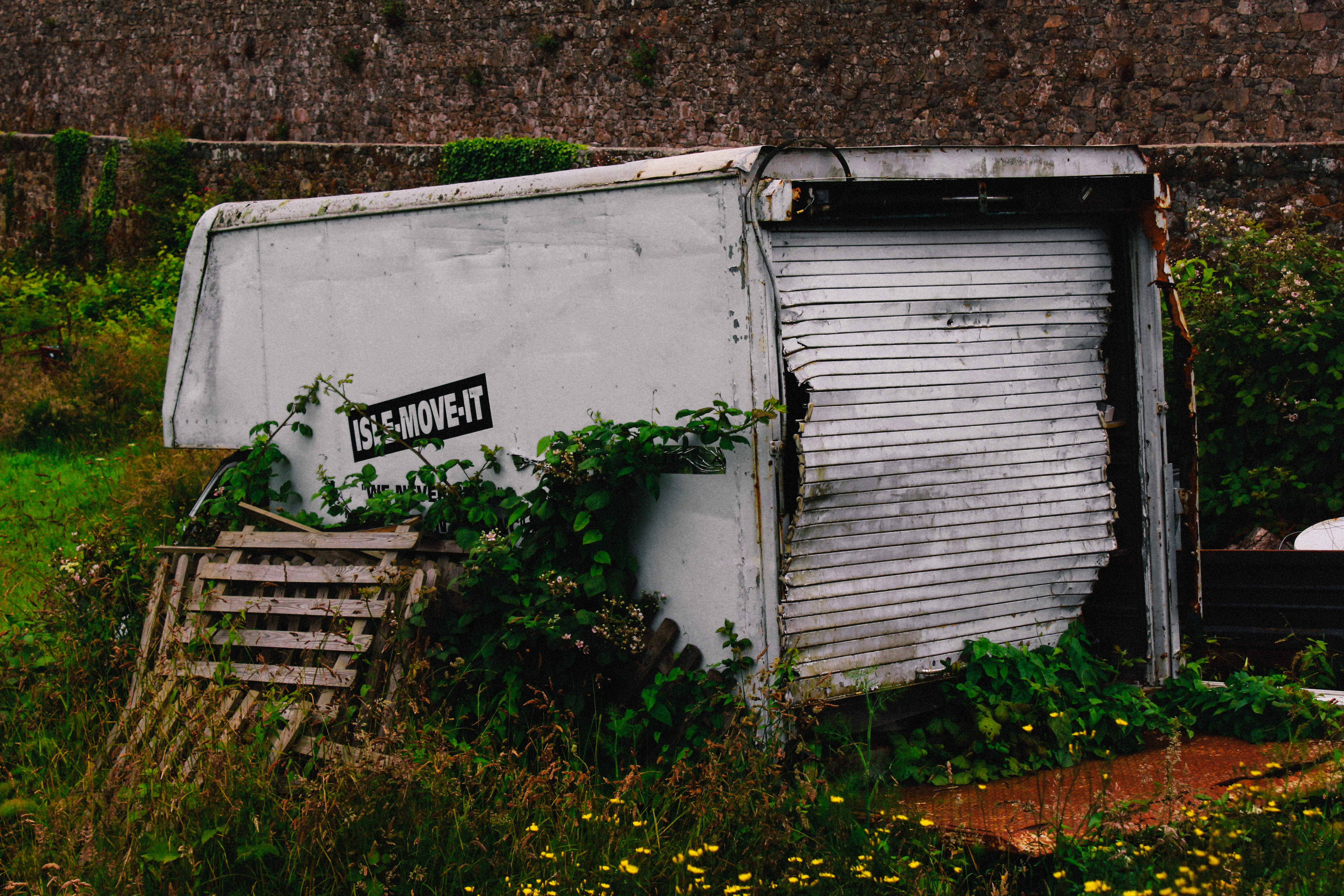
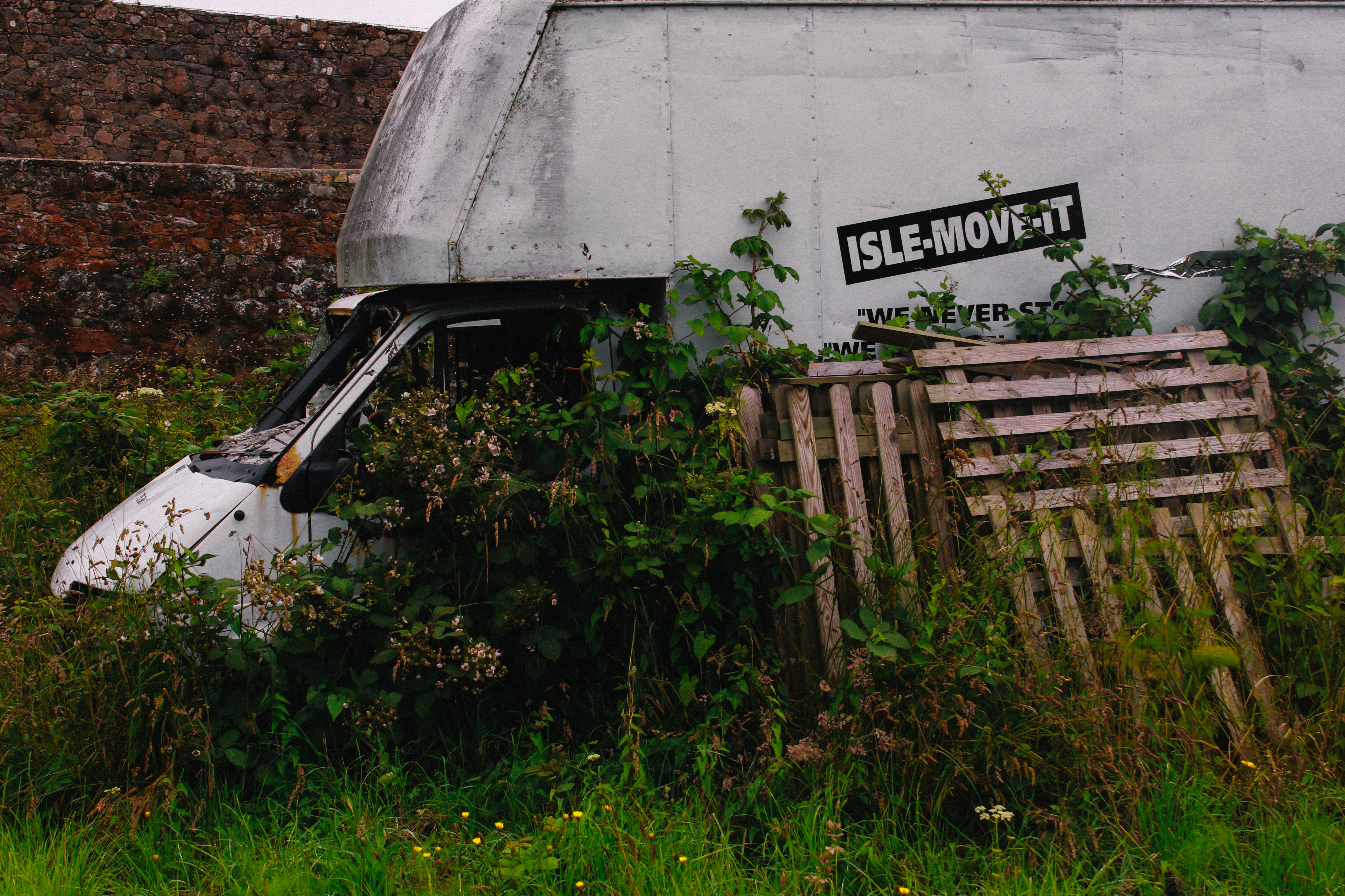
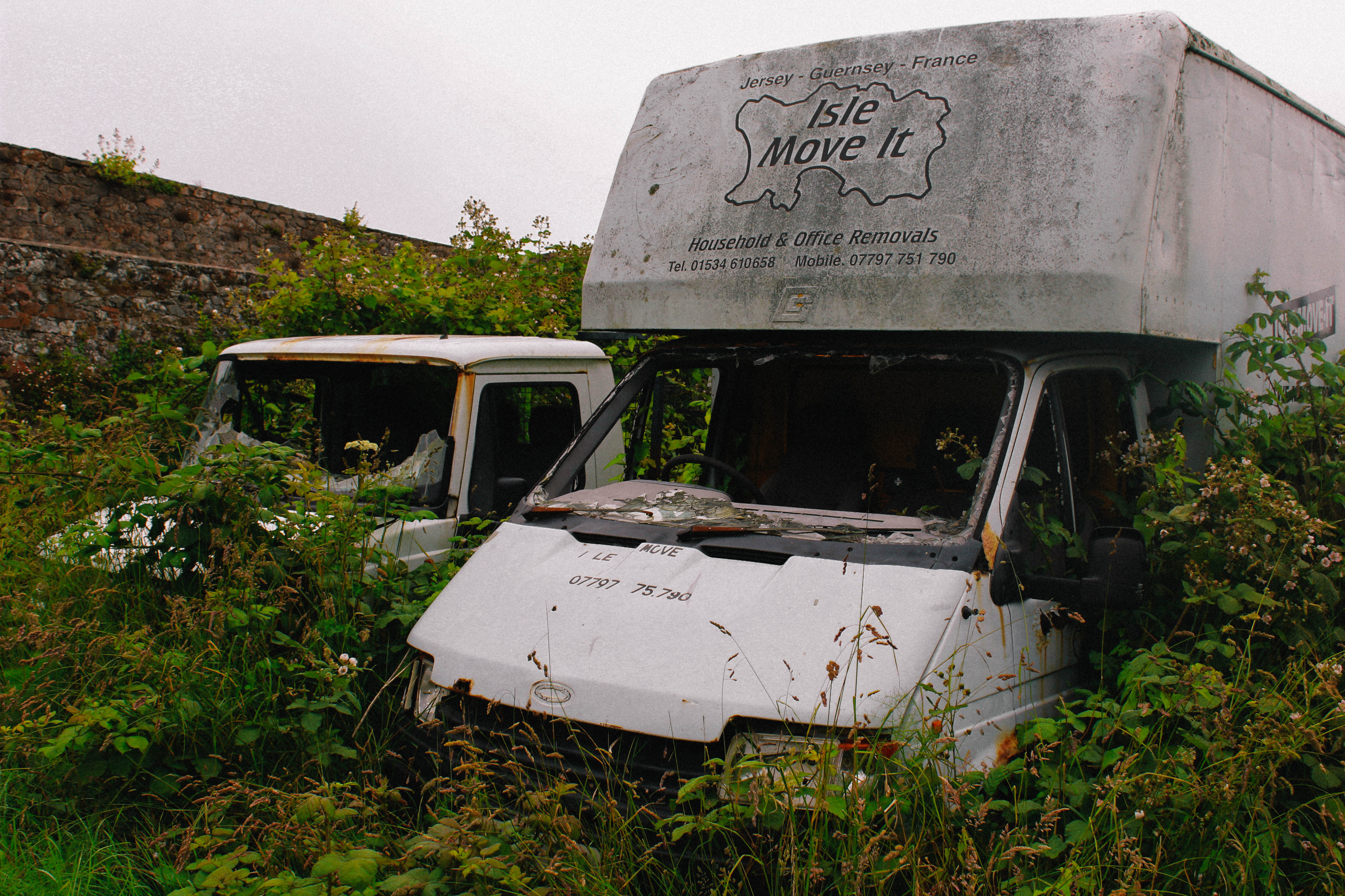
This sequence looks at the theme of nature taking over man. The large van with the ironic phrase ‘isle move it’ upon the side has been left to rot and has slowly been taken over by nature. Throughout the sequence you can see in more and more detail how destroyed and run down the van has become over time.

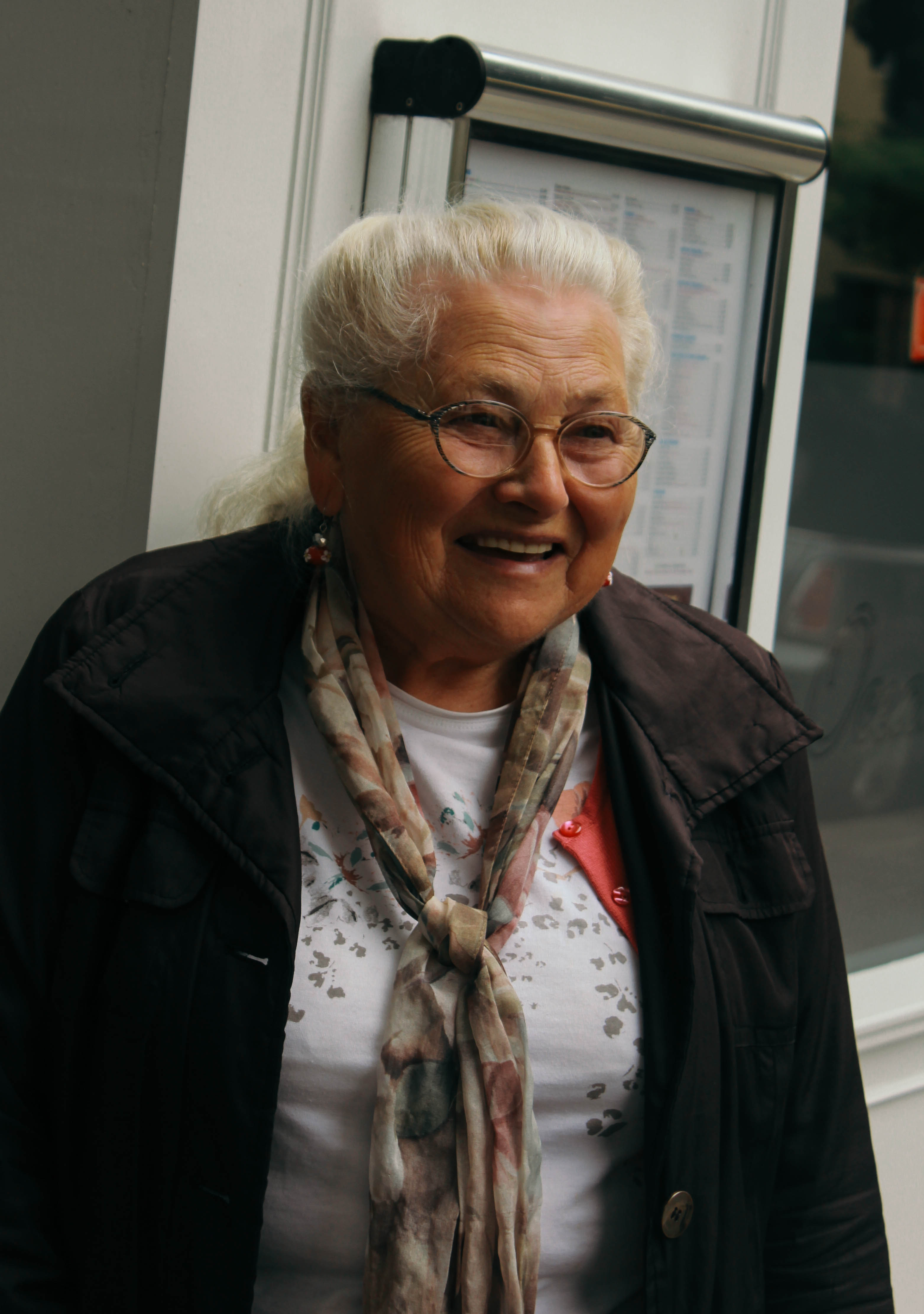
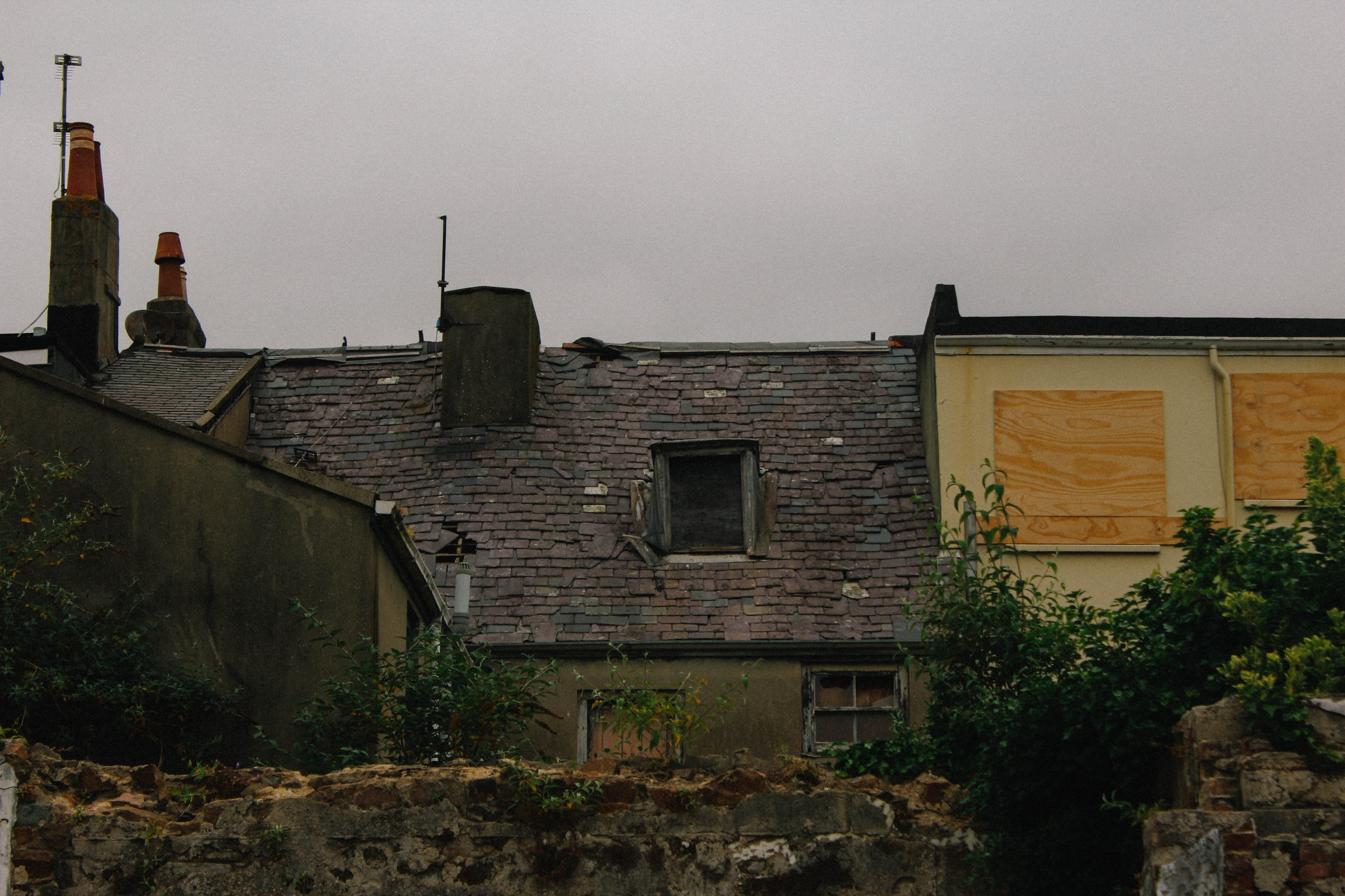
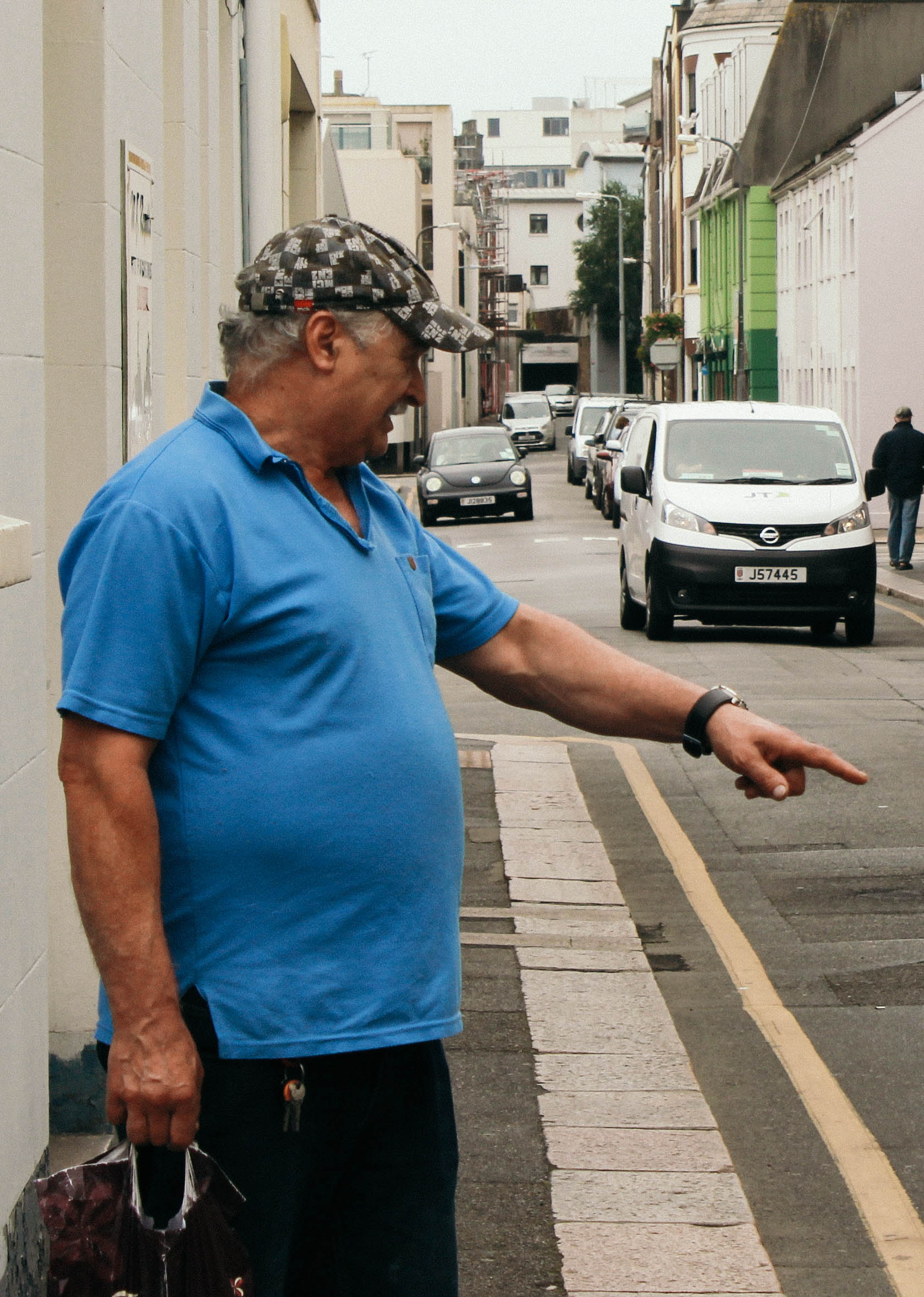
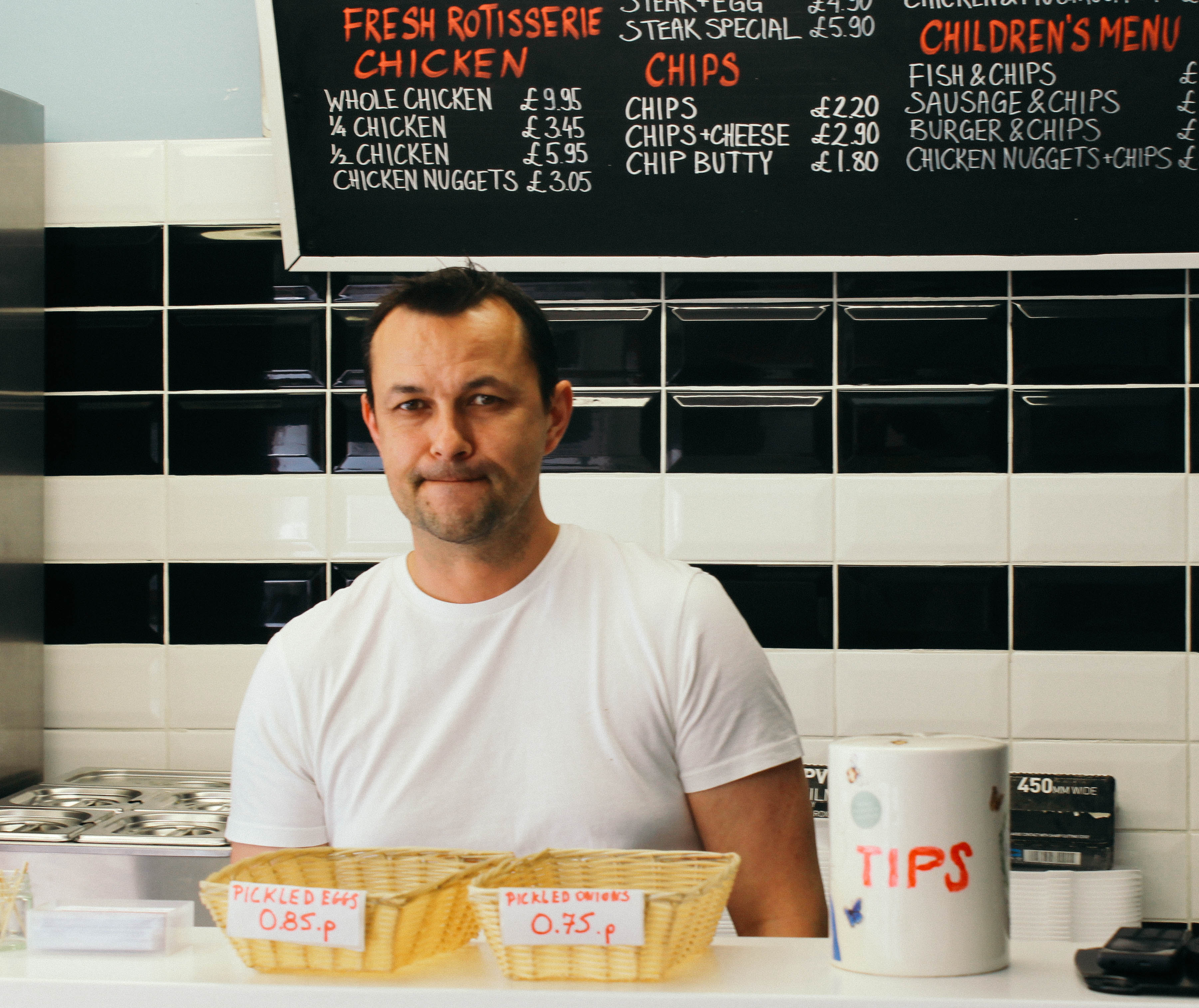
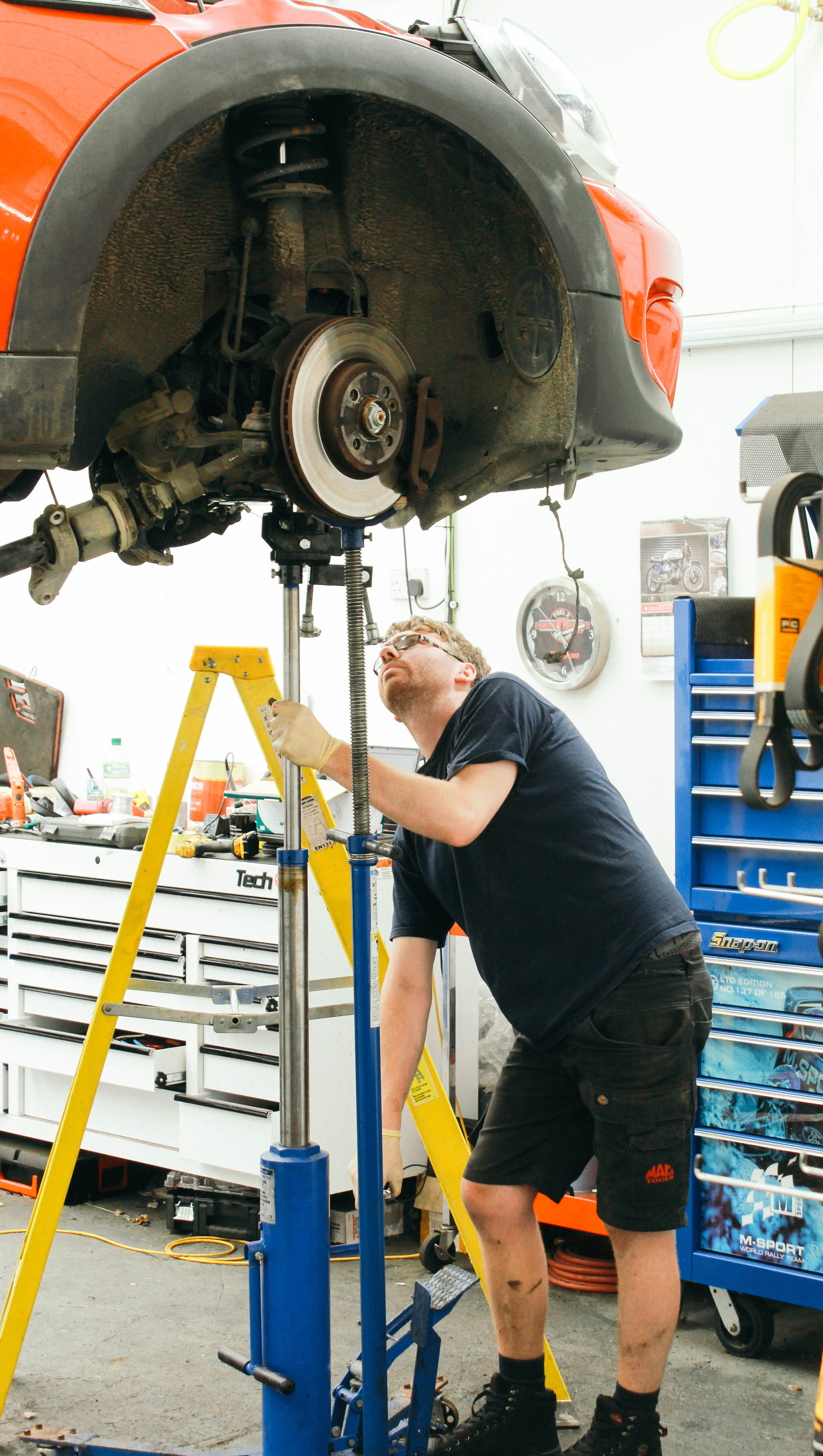
This sequence explores the theme of the people of St. Helier.  It looks at the different occupations and environments that the people of St. Helier thrive in. It shows the current state of St. Helier and the people that we will one day all be successors to.


Experimenting With Colour

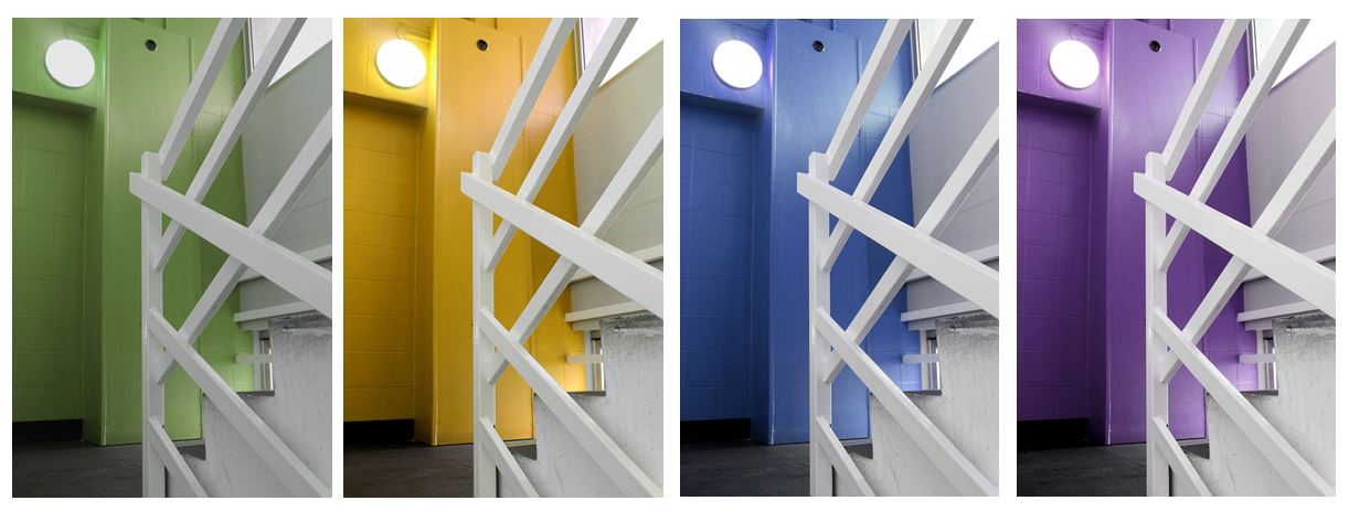
Here I have created colour edits of the photographs in my final shortlist in order to experiment and see different possible outcomes for my photographs. When using colour in these photographs it takes away from the old-fashioned documentary photography feeling that the photographs in black and white convey. For this reason I think that I will leave my photographs in their original edits.

Two-Frame

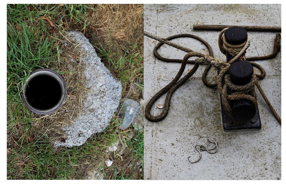
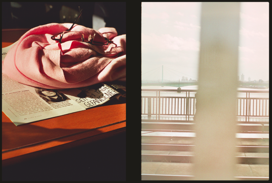
I took inspiration from Luke Fowlers ‘Two-Frame Films’ book. Fowler discusses how the idea of ‘in the blink of an eye’ has a different meaning for us as human beings than it does with the camera. When we blink and close our eyes, we are blind to the world in that instant. By printing two different images alongside one another, he aims to emphasise the momentary nature of a photograph.

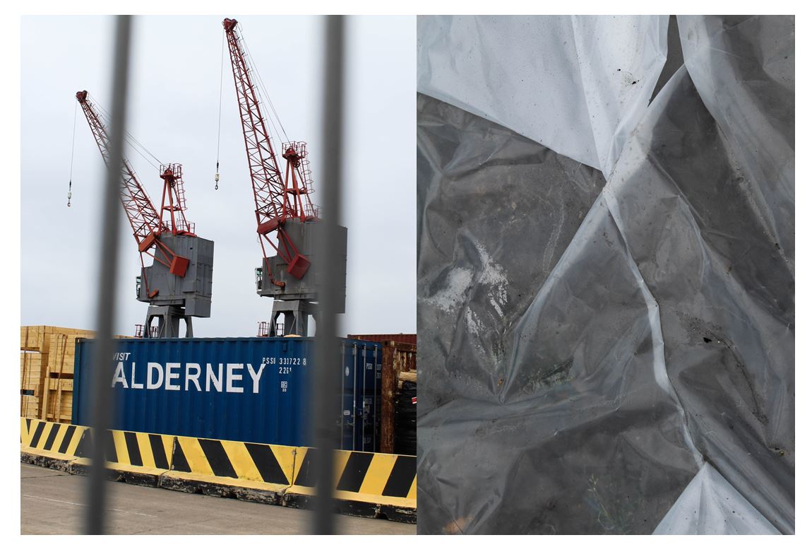
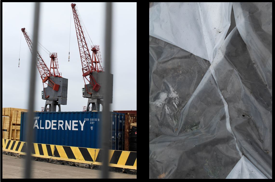
My first two images I took near the old harbour in St Helier. I chose for these two images to be paired together as I like the link of the grey in the cranes and bars to the underneath of the white plastic. I like these two images together as there is a juxtaposition between the close up detailed angle of the plastic on the right and the further away angle of the cranes and construction on the left, but still having the blurred close up of the bars in the foreground.

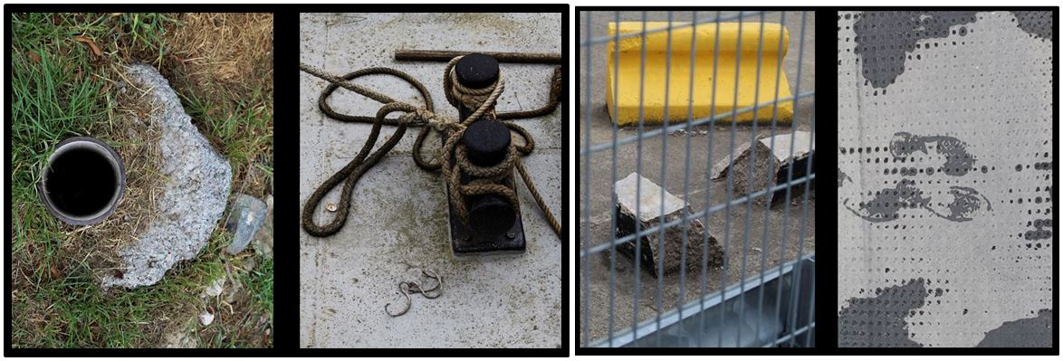
I paired these two images together as i found they have similar shapes a lines within them. Firstly, the pipe hole in the left image links to the two circular shapes on the right both of these sections being black making the connection more obvious. I also like the contrast between the textured  grass and the concrete grey ground. The brown colour of the rope in the left images is balanced out by the brown dirt on the left making both these images completely different but connected.

To improve this image i would take a bird eye view of the image on the right so in both the images the angle would be the same but the subject and place wouldn’t.

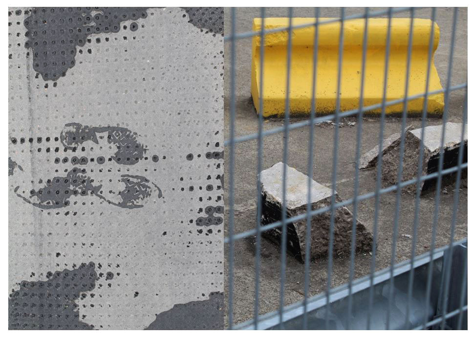
I paired these two images together as i like the juxtaposing patterns and shapes within the two. The fence in the right image has vertical and horizontal lines crossing over one another in the foreground which is contrasted with the left image containing more circular shapes like dots. Both images are quite chaotic but the similar tones of grey link the two together. The image on the right stands out more because of the bright yellow and more chaotic composition. I chose this image as it focuses more on what other do not stop and look at in everyday life similar to Luke Fowler’s style of work. I chose the image on the left as i liked the footprint in the center of the image showing the only trace of life across the two images and represents people leaving behind their mark on the world.

The paired images reveal an event unfolding – a meaningful narrative posed by photographic sets, sometimes close in temporal proximity (the blink of time passing, perhaps), while at other times, the intervals are more expansive, challenging the viewer to connect visible terminal points in a satisfying way.

Fowler experimented with different film stocks, subjects and framing, and the images are inextricably linked to his filmmaking as evidenced by the elements of montage, colour and reflectivity that permeate the series. In both still and moving image, Fowler considers how an event might be abstracted by the camera apparatus in a subjective ordering of reality that is emphasised by the dialectic between paired images. The photographs are a means of personally testing the ability of the camera to authentically bear witness to an event, and its fallibility as a medium of representation.

Edits


Experimentation

Colour Edits:

For the colour experimentation of this shoot i wanted to emphasise the colour green as that was the area of St Helier I was given to explore. First I selected the image that contained green in them and highlighted that, then I found images that I liked and edited green into them so that they could still be included.
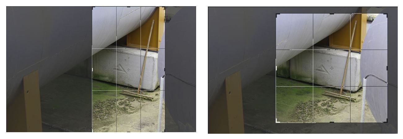
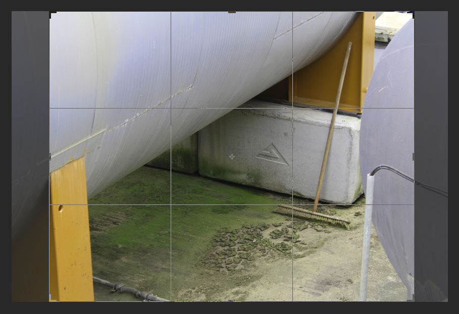
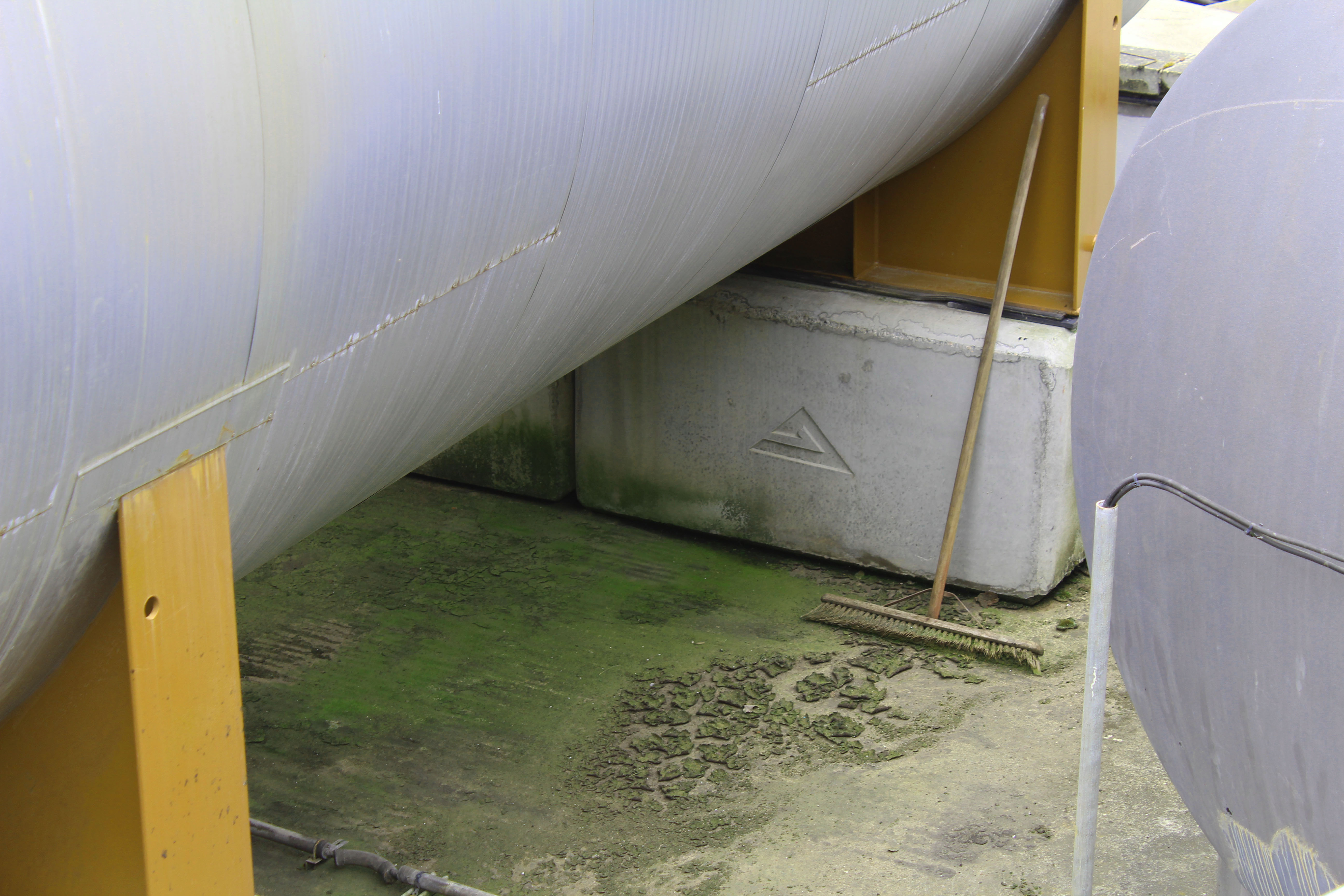
I chose this image to edit as i wanted to highlight the green and I liked the combination of colours i could edit in if I increased the hue of the green, changing the orange colour from the structure to yellow, creating a complementary combination of colours (yellow, green and white/silver). I like this image as the subject of the broom stick, which doesn’t look like its been used in a while from the mould around it, isn’t something that people passing by would notice. I interpret this image as the broomstick being the only signal of life in the image which is surrounded by industrial structures. Similar to how St Helier is being redeveloped into an a more industrial place with new office and buildings being built and abandoning its heritage, similar to how the broomstick has been abandoned and forgotten about.  I also like the composition of this image with the industrial structures surrounding all the edges except for the bottom one and the contrast from the round silver structures to the vertical solid yellow blocks creating a juxtaposition in in the shapes and lines.  These shapes emphasise the texture of the mould and dirt at the bottom as the other parts of the image don’t have much texture, so the audiences eyes are automatically drawn the the detailed texture in the center of the image.

I particularly liked this image where I changed the hue of the red wall behind the stair case to green so I decided I would experiment with different colours others than green in this image to see which one worked the best.
Black and White edits:
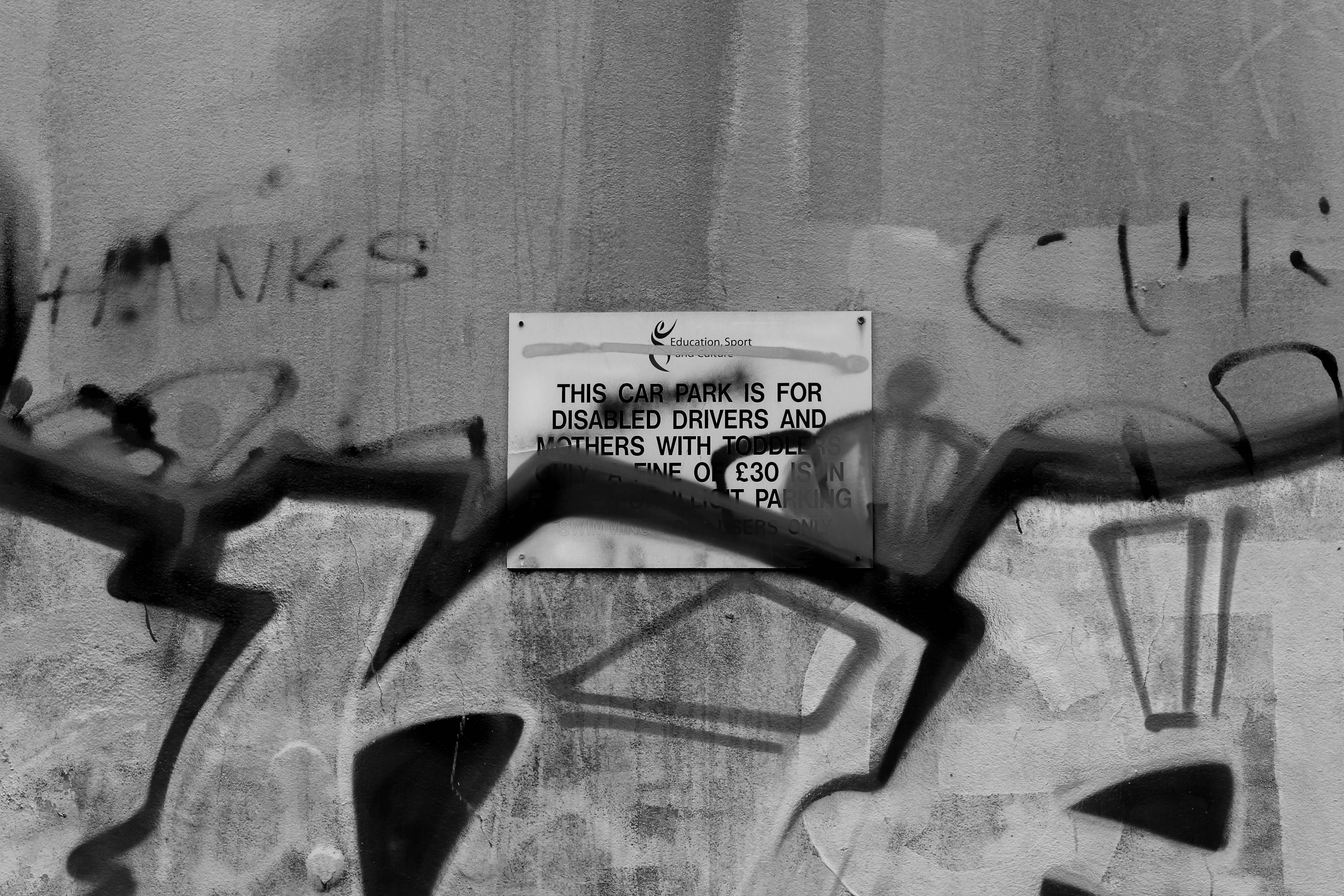
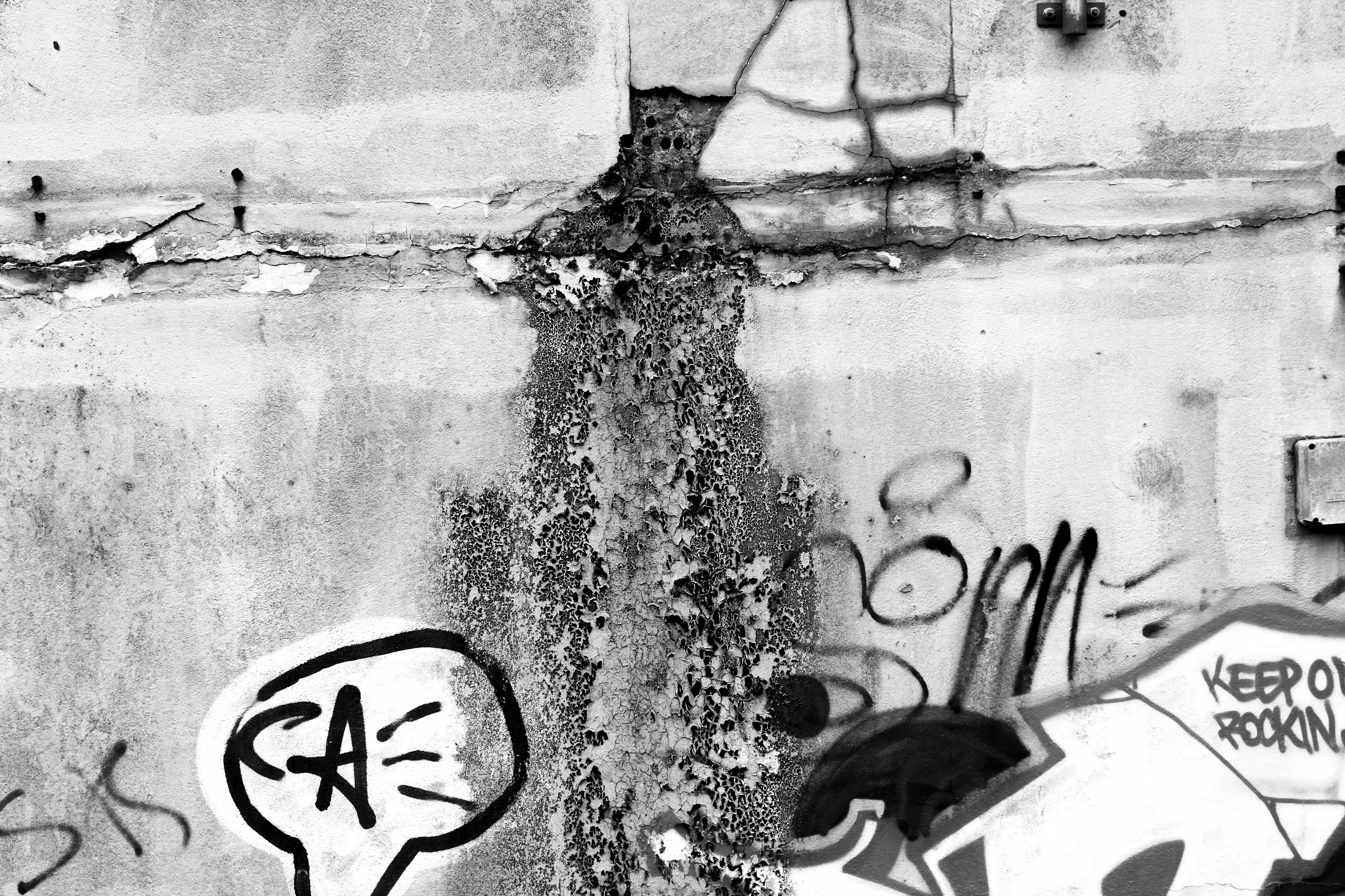
I thought these images would be more effective if i edited them black and white as i wanted to emphasise the dereliction and decay. By turning the image black and white i wanted to darken the shadows where the texture is and emphasise the decomposing  of the wall. I like the bottom image as the mould shown looks like its pouring out of the cracks in the wall and the graffiti adds to the derelict look. The top image is also effective as it shows a sign officially put on the wall informing people about parking, and someone has spray painted over it, possibly reflecting how young people care about art and expressing their opinions about the future of St Helier.
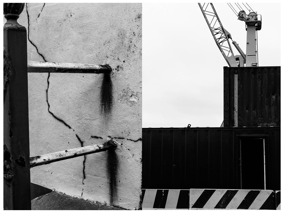
I also like these two images in black and white as they both show structural shapes, the left image portraying more dereliction on the side of a building, shown through the rusting and cracks in the wall, the right image showing objects and machines that are still being used, both images creating a juxtaposition. The image on the left is more effective in black and white as it further emphases the rusting from the metal bars when contrasted the the wall behind and the cracks in the walls are also highlighted. The bold vertical bar along the left of the image creates a division, adding to the differing of lines and angles in the photo. I like the image on the right as it shows two creates stacked onto of one another with a crane behind it, creating a shape that looks like they’ve been conjoined. The striped wall along the bottom of the image is effective as it shows a contrasting pattern compared to the other objects in the image and the colour links together with the crane creating a more balanced and aesthetically pleasing image. I particularly like the composition of this photo as everything is based on the right side on the image with the negative with space on the left.

I next experimented with the threshold in the images making them more bold and structural with only white and black being used in the photos.
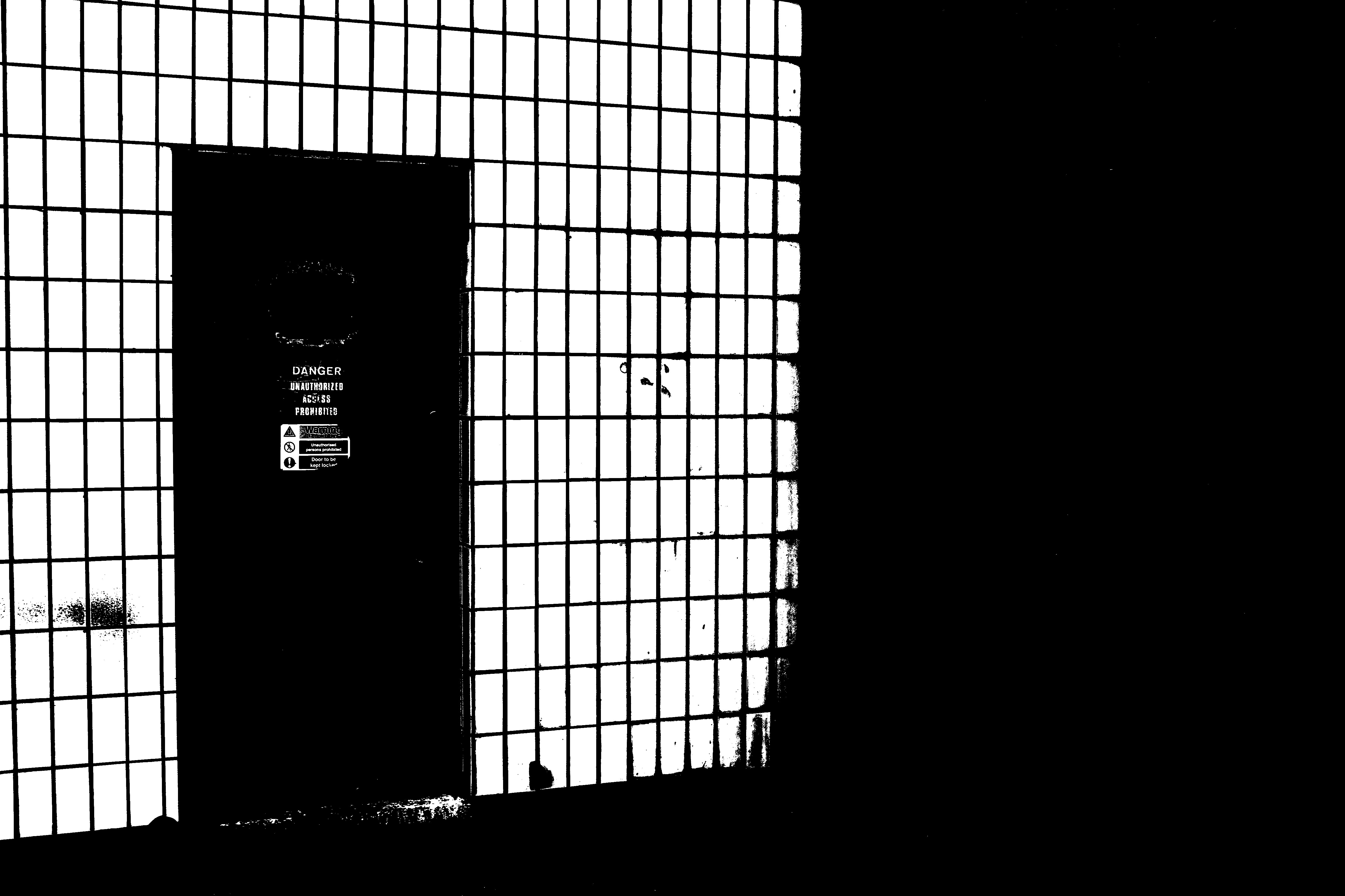
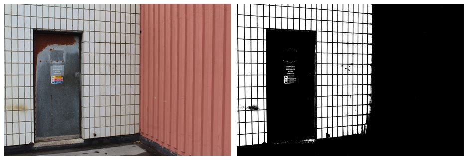
I think that the edited image where i changed the threshold is much more effective than the original image as it emphasises the industrial theme that i want my project to follow. The contrasting black and white lines are a lot more noticeable on the right image as the black in darken and the white it brightened. On the left image there are a lot more neutral tones in colour like the pink wall on the right and the brown rust on the silver door which is completely invisible on the right image, giving it more of a minimalistic but impactful look. The right hand side of the image is completely black out, making nearly half of the image one solid colour, directly the audiences attention the the left. I prefer the right image as the edit gives it a more…. feel, the signs on the door still being visible and the white wall on the left looking more like a fence and the door leading out to nothing.
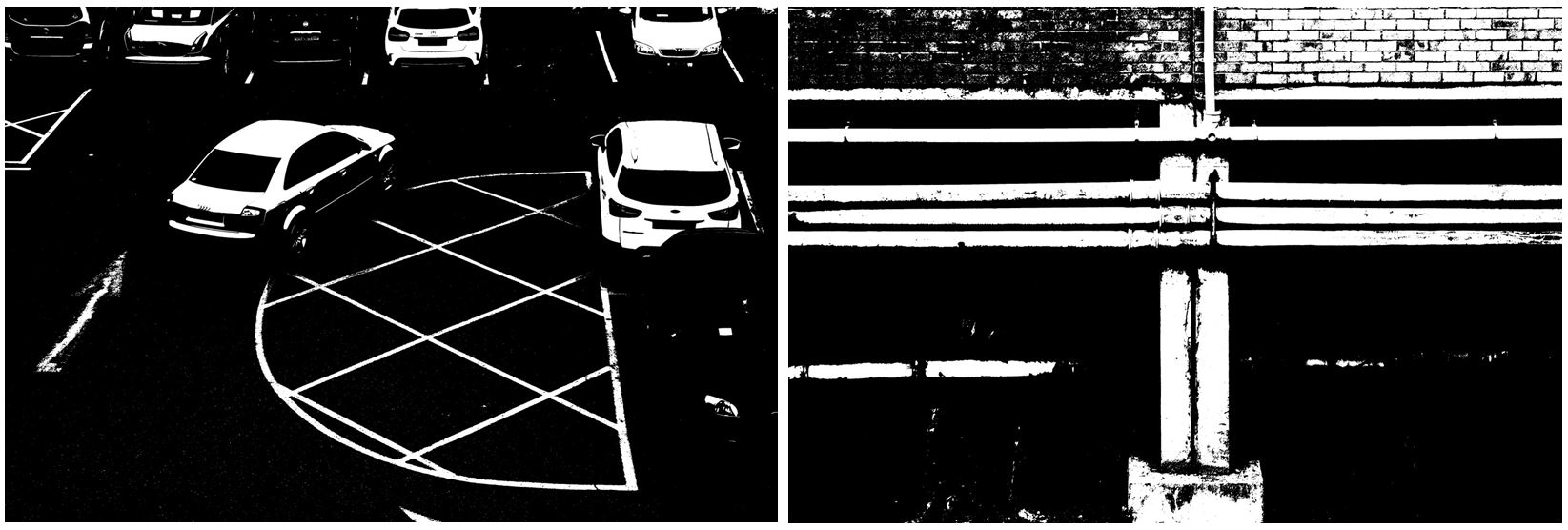
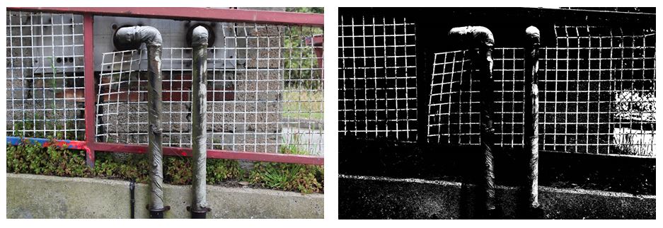
Changing the threshold in these images makes harder to figure out what the image is portraying and makes the lighter points in the image standout more than in the colour image, creating  more of an overall impact . With the bottom to images i prefer the colour edit as it makes the images more interesting to look at with the bold red/pink lines and contrasting white bars creating a checkered effect. Also the two pipes in the center of the image are much more noticeable as they don’t blend into the black background, which is why only having 2 colours (black and white) in the right image isn’t as effective. The image on the right also shows more texture in the green leaves on the plants and the rusting on the silver pipes, compared to the left image where not much of this is seen. Although in the left image the bold, structural lines are emphasised more. The horizontal slope that the fencing is on is emphasised more by the solid black shapes ( where the plants are) which is then contrasted more with the vertical piping.
Future of st helier

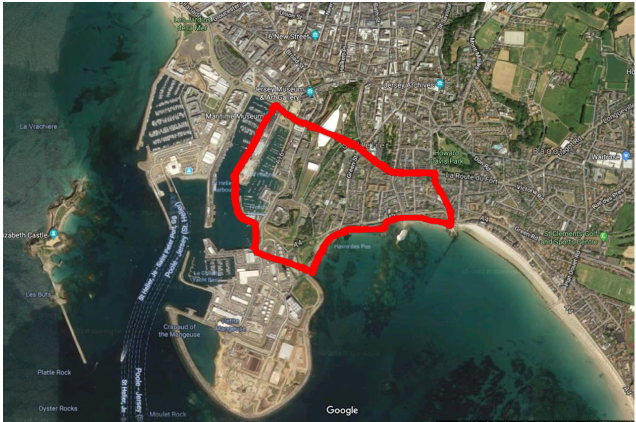
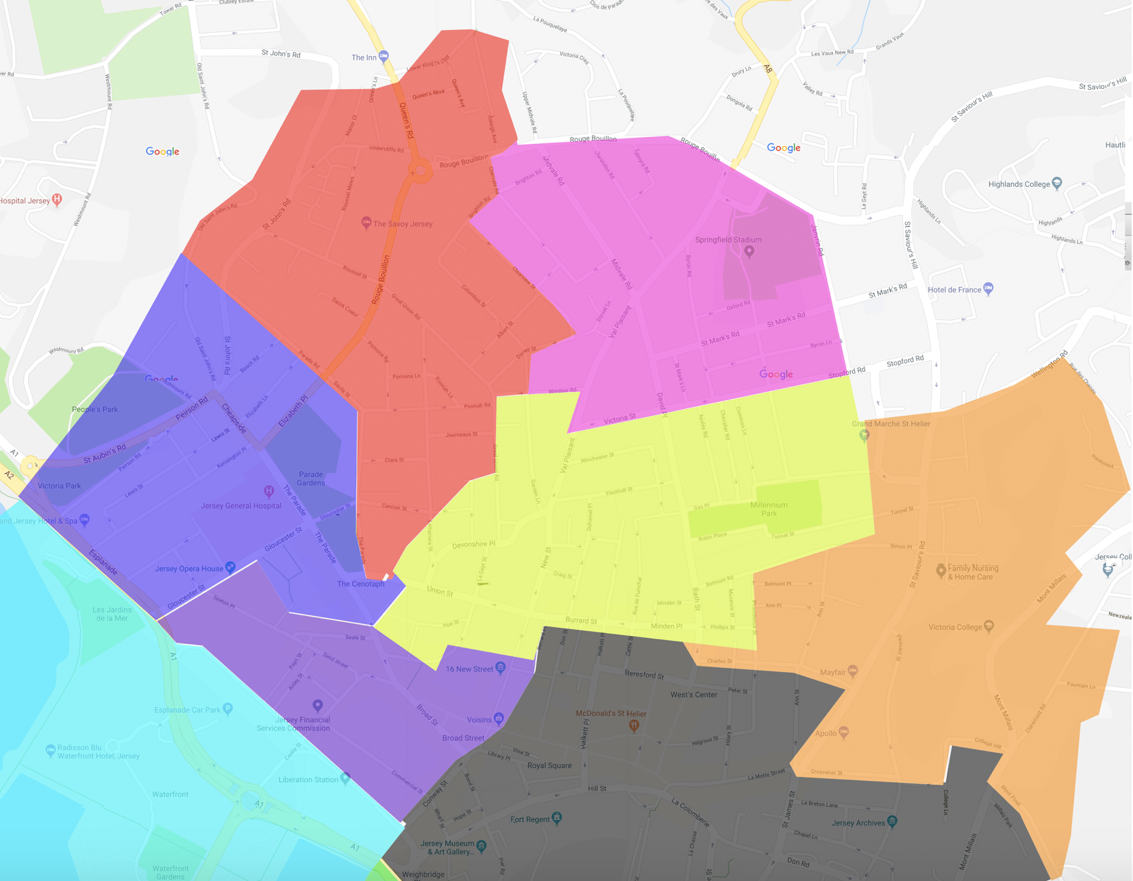
The red section is the section that I have been given, to me, this divides into two main areas; This being the old police station that has now been left empty with some interesting architecture, and the Savoy jersey which could be considered the most upscale part of this particular area and then up towards St Thomas church. The area throughout is focused mostly on old buildings and more urban and deteriorating areas typically ignored by government property developers as they do not hold a public interest within the main section of town or the finance sector, and therefor the area has been left to slowly deteriorate and slowly being abandoned by example the police station which has now moved to a more central and up to date part of town. I do believe there are many small communities within these areas to which I could take images of the people as a representative of the area itself. I also intend to explore the the architecture of the area, such as the churches and deteriorating buildings that form this area, there are also quite a few independent shops and areas of flats in this area that I intend to photograph to create a full perspective of the area with my images. 

Plan for shoot of St Helier

Future of St Helier,as previously said my shoot is around the red section, from the old police station to around St Thomas church area.I have Previously shown and experimented within ideas and concepts I too want to capture within my work,but additional my inspiration I have had from the jersey archives and Tom pope and to not its four on my themes of old and new and modernization in buildings but also taking images of the poeple and how their lives have changed and expanded due to futuristic development.My main title for the whole of this project is : Modernization reunite with past,futistic revamp of St Helier.i also wnat to photgrphy old builings that have so much potential to build and become morden and create a new st helier.Old route,archive :The areas in which I am going to all used to be hotels,I could show comparisons of the finace areas and the old main attrcation of tourism and the contratsing digffference through justaposition of architecture and the new different audience of who come to jersey beacuse of these new main attrcations.

buildings and people: I originally expressed my main interest within concentrating on architecture of old and modern nuilindg to stress the change and further futuristic advances we need in St Helier in order to benefit everyone. However know i also want to cpature poeple living within the area,and try and tell stories through portrite images and the areas in which theyare aurrounded. although when it does comes to foucousing upin the builings i want to urban esc photography within this area,ads modern builings are not current wihtin this section of town.One of my artists is Tom Pope,he is an artists I have previously spoken about and tucks the jersey archive.i was inspired by his work because he had so many interesting conceptual ideas of presenting a location through the people living within it, and also the movement and light and overall composition of how you bring an environment o life.Additionally I am going back to focusing on modernization,this comes under the comparison and juxtaposition of fiance sector of st Helier and then my given red section and how i can edit and compare these areas and stress the need for a change.

Photoshoot Plan

For my first photoshoot I want to focus on urban structures and infrastructure around the Green area I’ve been assigned to explore.  Focusing on this will allow me to show how new buildings and constructions are becoming central theme of St Helier’s future and it becoming less and less about the history and atmosphere of Jersey itself.

Whilst on my shoot I will also focus on photographing smaller details that may not be noticed by people passing to represent how people in St Helier are forgetting Jersey’s heritage. This is taking inspiration from the photographer Luke Fowler where he uses two-frame juxtapositions of two images.  I also want to incorporate the idea of juxtaposing two extremes next to each other e.g. the chaotic urban structures compared to the more natural and calm. I think this will be effective as it will show people how the heritage of Jersey is juxtaposed with the future of St Helier and how they are opposites.

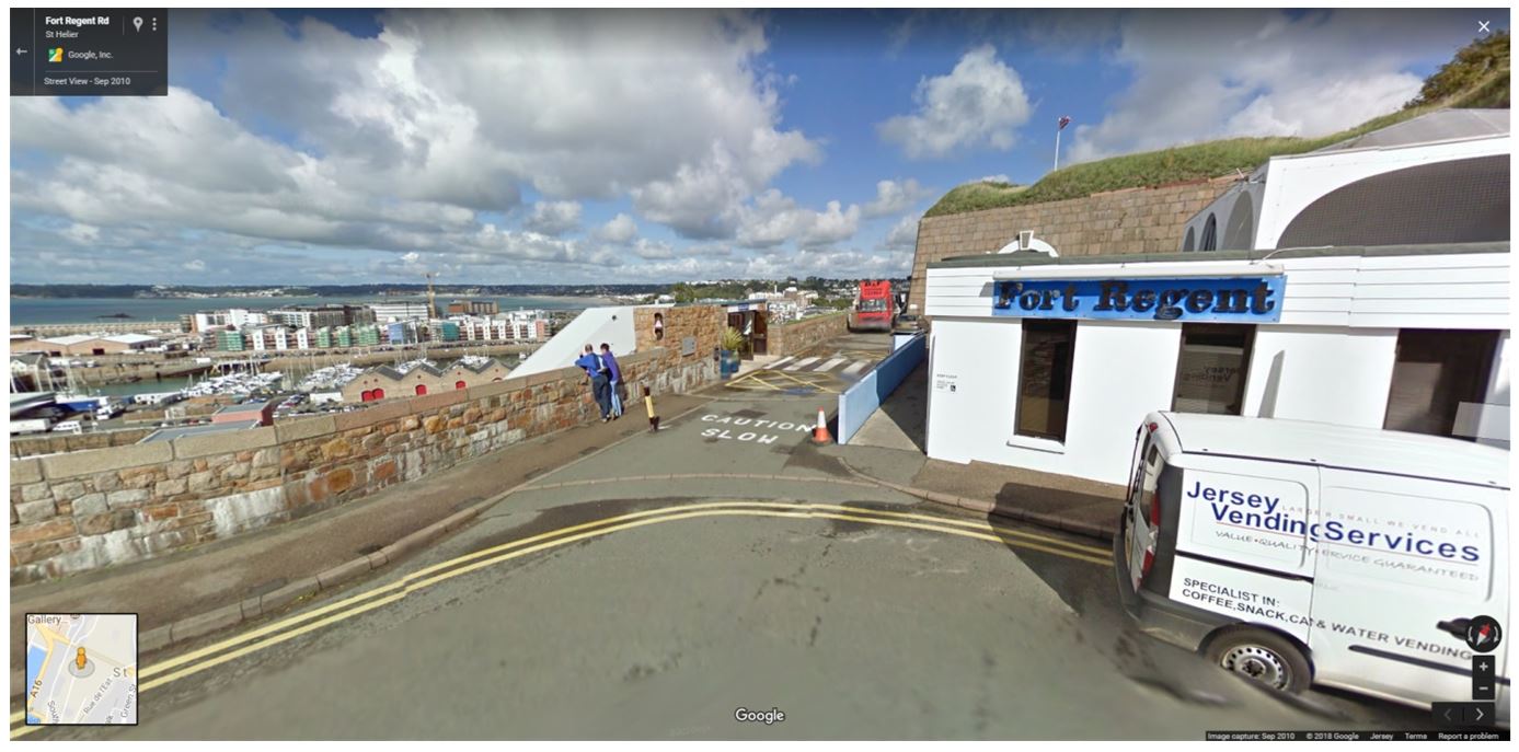
The first place i want to visit on my shoot is Fort Regent.

Fort Regent is a 19th-century fortification, and leisure centre, on Mont de la Ville (Town Hill), in St. Helier.

  • The construction of the fortress we see today on Town Hill began on 7 November 1806, during the Napoleonic Wars The fort was built using local workers and men from the Royal Engineers, with an average of 800 men working at any given time.
  • This enabled the substantial amount of work to be completed 8 years later, in 1814.
  • It was given the name Fort Regent in honour of Prince Regent, who was King of the United Kingdom of Great Britain and Ireland at this time.
  • During the German occupation of the Channel Islands, the German forces made some additions to the fort, including flak cannons. Some of these concrete structures remain today.
  •  In December 1967, the States of Jersey made a decision to adapt the site into a leisure centre. The swimming pool located on the glacis field, which opened in 1971 and closed in 2009,was the first modern addition to the fort.

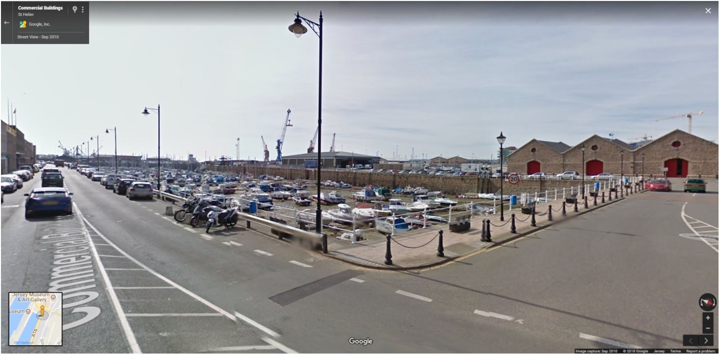
The second place I want to visit is the old harbor as their is a lot of history and jersey heritage associated it.

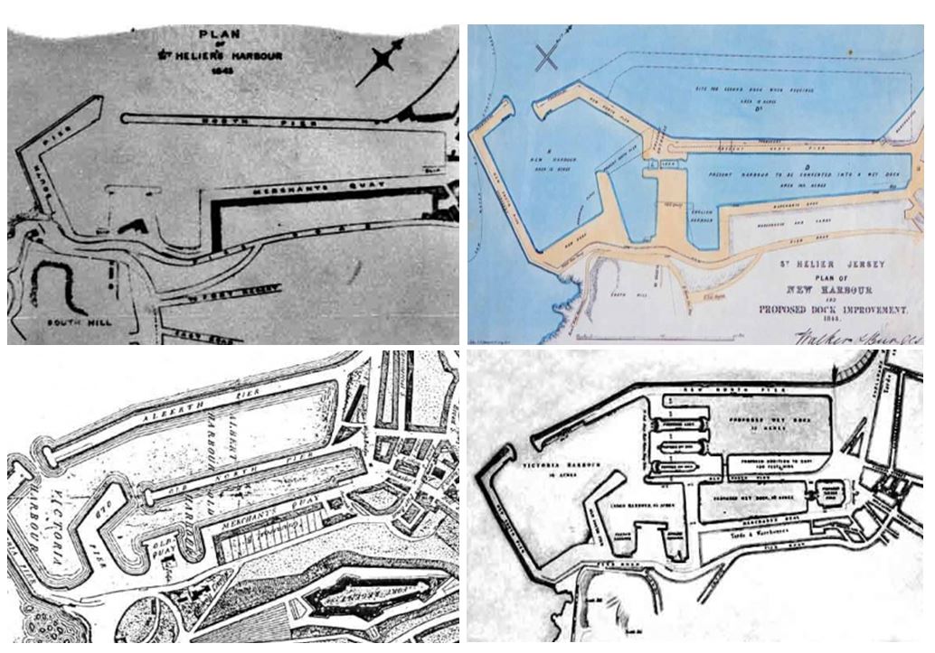
  • The harbour development which was completed by 1850. A few years earler the South and North pier had been built by the States, creating a harbour significantly bigger than the previous English and French Harbours. But all of this dried out for several hours around low tide, and thoughts were already turning towards further expansion.
  • Work on a new pier to the south of the existing harbour was already under way in 1843 when the eminent English engineers James Walker and Alfred Burges were commissioned to produce plans for a further enlarged harbour, and they proposed removing the outer arm of the old South Pier, and widening and extending the narrow North Pier towards it to create a new harbourmouth.

The development of St Helier Harbour

More areas to focus on:

Themes to consider:

  • Old vs New vs Development
  • Make use of your senses : see , hear ,taste, smell, touch
  • Typography and graphics
  • Art and culture
  • Two-Frame Film | Juxtapostions

Jersey achieve history of red section and Tom Pope

The red section I have been given, to me, this divides into two main areas;This being the old police station and the Savoy jersey and then up towards St Thomas church.The area throughout is focused upon old buildings and more urban and deteriorating areas typically ignored by governmental property developers as they do not hold a public interest within the main section of town or the finance sector.As previously spoken about all these areas have jersey ‘masterplans’ since 2011 That have not been accomplished,I will use comparisons between these images and try to enhance the need for mordenisation. Although i do believe there are many small communities within these areas to which I could take images of the people as a representative of the area itself. My main three intentions wihtin this shoot will be, old vs new,abstract urban visions and finally gentification and derelication.

This is a map of the area that I will concentrate my work around. Most of the developments architecturally around this area are old and not fitting with a style, most of the buildings were built in the 80’2-90’s and do not hold a historical value or price.Although this would be good to conceptualise my ideas of capturing urban landscapes.

Jersey Archieve:The jersey archive is an area in which historical photos over decades have been kept and tracked in order to preserve our history the lives of the people. Many of the images track specific days in time such as liberation day,however many are purely to tell stories of the people and places at the time. The area  in which I am looking into has also been a pivotal area of jersey as this is where many large hotels and churches were begun to be made and allowed citizens to come together as a society and grow as a community.The Savoy hotel is the centre of my area and one of the largest buildings of jersey history being around for many decades through jerseys history. Tom Pope is a photographer for Société Jersiaise, Jersey.His aim through his work is to show the world and people around him and he does not see himself as the artists but everything surrounding himself as the art and inspiration. Although his word is not concentrated so much on a location but the people living there, this has inspired me to be less concentrate whtin the buildings and growth of architecture but the way in which the minds of people have expanded due to the futuristic advances.The Archive is the Island’s national repository holding archival material from public institutions as well as private businesses and individuals.I think a main focus for jersey archive is to track jerseys progression of architecture and the way we can keep and expand on jerseys history.

Tom Pope

Tom Pope,has an interesting conceptual view of when presenting a location he does so through the people living their in interesting conceptual methods. I think he will help me develop from just architecture to a feeling of an area itself, showing off urban landscapes in more creative methods.

Original ideas and artist 1:Tanja Deman Fernweh

Shoot inspiration:

First idea:This is the conceptual idea of architecture within new and old buildings.This symbolises movement and clutter,and how the secrets within St Helier and the hidden past lives,this is a basement of a building and you cannot tell weather it is older or modern,I’m concentrated  to find movement and areas to which creates an interesting composition in an area we generally would not view or something we would not typically want to see within a building.

Idea 2:forming old and new buildings collaged into one image,for this I will connect my second photoshoot of modern buildings not in my given section and combine with older more historically  significant architecture. This old and new vs development can present the beauty on both sides but also the inner most need for a revamp and mordenistaion on the insides of buildings. I can use collage,reflection or editing techniques in order to successfully accomplish this.
Idea three: capturing modern or iconic buildings in a futuristic light.These alternative abstract visions could be perceived as wrong and dynamic,It shows a movement and a light of the people living wihtin that area that is important for the buildings themselves. To me this is like cpaturing a texture of a place by the radiance it gives.

urban landscapes;Although so far I have been focused on showing how St helier’s need to be more modern,in the area I have been given it is very desolet and does not have any futuristic aims surrounding it,because of this is will highlight this decay as an urge for change and also present the theme urban as a type of gentrification and derelication,and how there is a strong juxtapostion and contrast between different areas of st helier itself. I will also try and cpature living situations and poeple and their personalities  and persona they have from living wihtin that area.

Artist:Tanja Deman Fernweh

Fernweh has said that “anja Deman’s art is inspired by her interest in the perception of space and her relationship to nature.
Tanja’s works, incorporating photography, collage, video and public art, are evocative meditations on urban space and landscape. Observing recently built legacy or natural sites her work investigates the sociology of space and reflects dynamics hidden under the surface of both the built and natural environment.’
I have a keen interest within her physical and emotional perspectives of a specific location and her own personal perceptions applied to an area,And her views of ,spaces, architectures, geological formations and sites. she also incorporates photography with collage which is an idea that as said previsouly I am highly interested within. Deman’s works spends not just from the camera but also sociological research and human observations wihtin a specific location. Her images are said to ‘reflect upon the dynamics hidden beneath the surface of built and natural environments

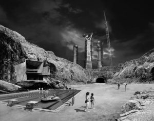
Analysis of one of her images:

I was inspired by this image due to the way she captured the atmosphere of the location and also the emotion and persona of the people living among the area itself. The colours of the piece are very dark and concentrated on tonal shades, it presents a juxtaposition of dereliction and how the pool is a form of modernisation but does not accomplish a sense of community and the large architectural conceptual states still hold all the attention from the people itself. The more urban nature concentrated area is too unique as this is conceptually done to prensts the human influence people have and ability to change an area that once had nothing there.I want to use all her different themes and aims within my work, of collage, tonal work and the presentations of different circumstances of nature and humans all in one photo.

Shooting Plan for the 19th June

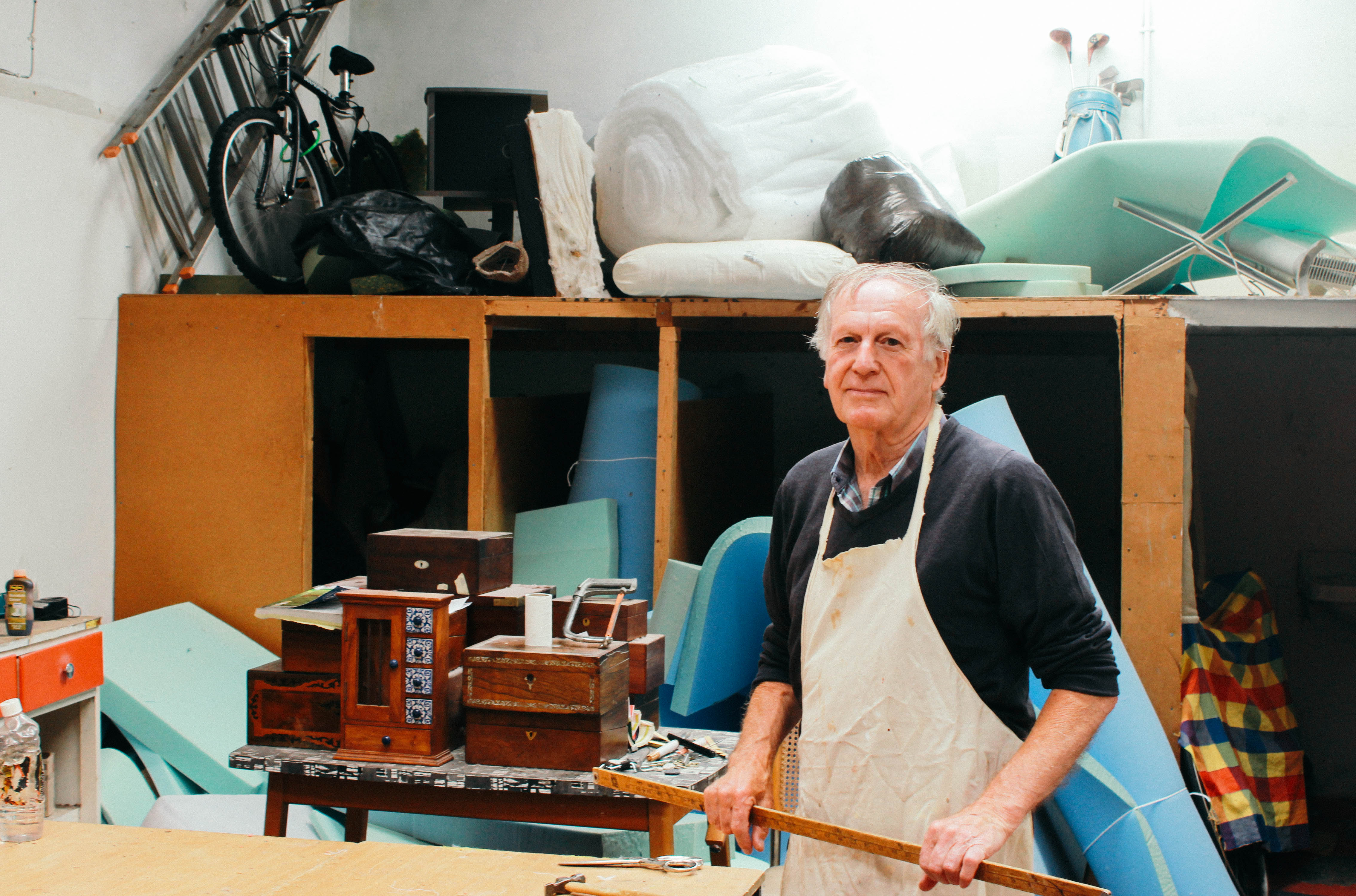
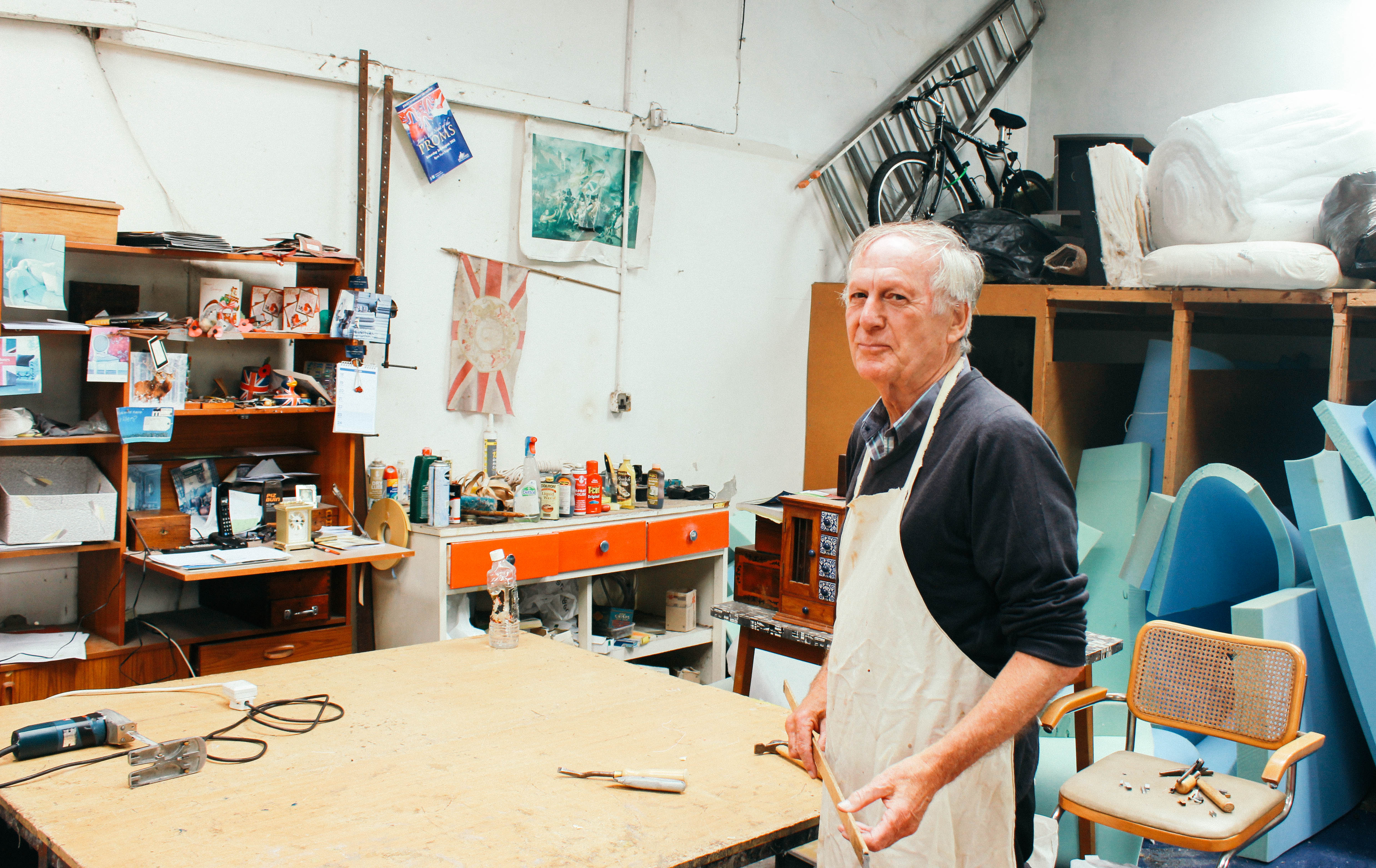
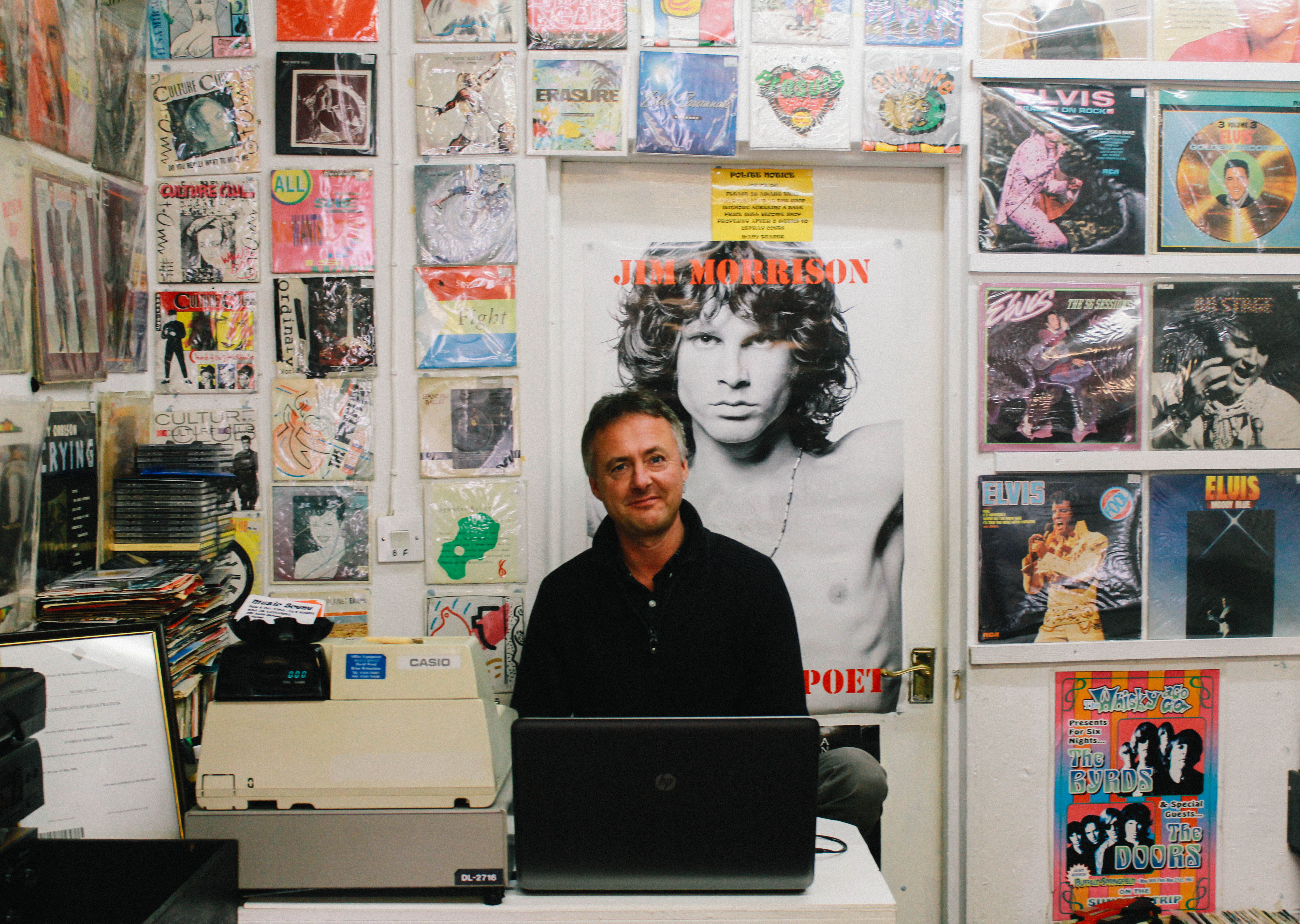
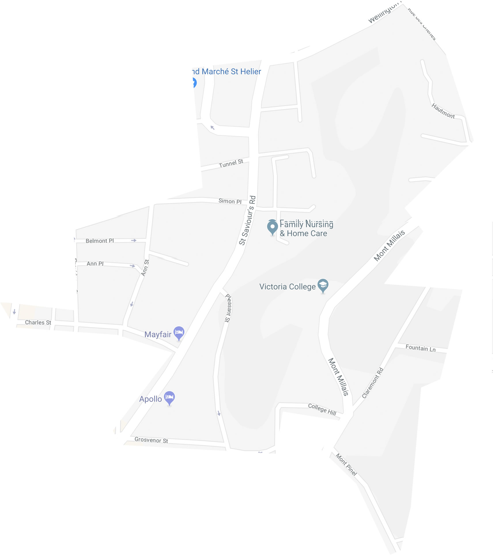
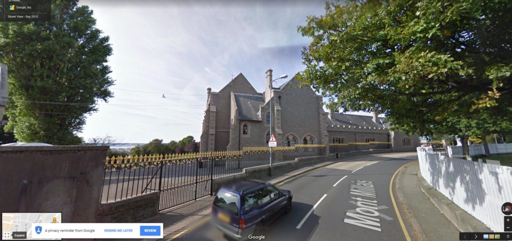
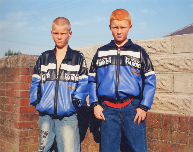
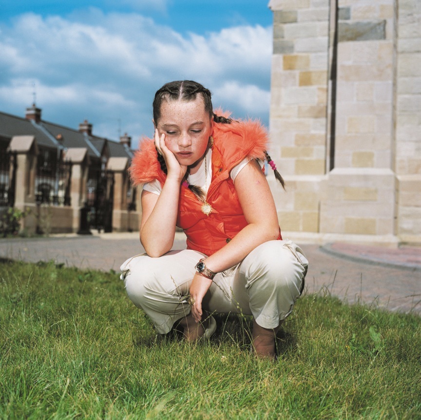
On the 19th of June I will be going into town to photograph the orange area of the above map of St. Helier.  This area contains sites such as Victoria College and the Mayfair hotel. I will be taking inspiration from Michelle Sank and Albert Smith in my shoot in the sense that I will be asking residents and workers of this area to pose in their natural environment. I will also be looking at capturing photographs of architecture of places similar to Victoria College as this is something that Albert Smith did. I hope to catch people in their natural environment whilst creating an old-fashioned feel to the photographs through editing and subjects within the photographs. I plan to go into different shops and businesses to photograph subjects as they are without any preparation and hopefully the inspiration from Smith and Sank will come through in my final outcomes.

Points of Interest

Influences on My Shoot

GoreyPierAlbertSmith.jpg

CarriageSmith2.jpg

RJAOfficersSmith2.jpg

Image result for michelle sank

Image result for michelle sank