Category Archives: AO1 Develop Ideas

Filters

Author:
Category:

Research and analysis of my zine

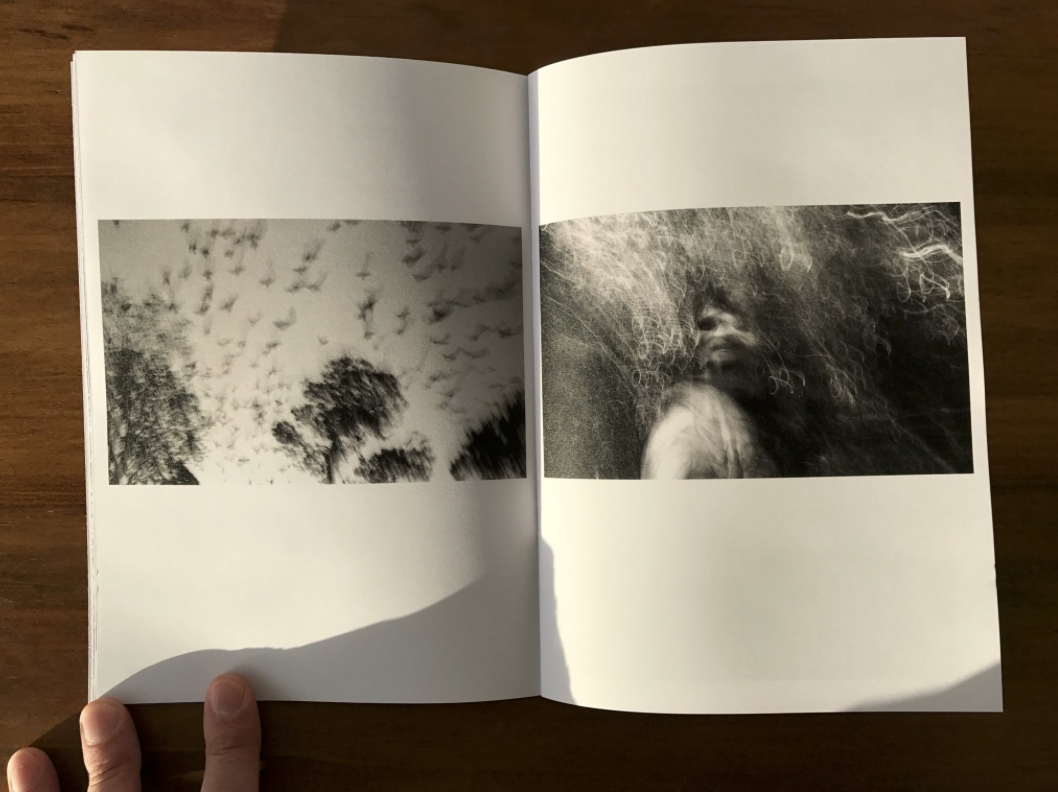
Zine; A Zine is an effective method of marketing and presenting your photography, they have been created for years there is a creative athletic collaborated wihtin the making of zines. it creates the ability to create a impact of juxtaposing and sorting images into a story in order to enhance emotion.There is an energy and ability to show yourself through the work as you make it yourself. This aesthetic enables a tactile creative freedom. I believe that zines look and feel professional and achieve a high quality when out onto thick paper and good printing, it allows a completed piece and presentation without the harsh formality to take away from the piece itself. its expressive and shows a desire of photography  throughout.

When gathering my visual inspiration I wanted to concentrate on the themes of narrative, subject,design and concept. When choosing the theme of my Zine I want to have a constant theme throughout and so not having a segregated feel to the piece as a whole narrative concept. I wanted the narrative to be the history and time present throughout St Helier, I wanted emotion and periods of time to be expressed through the modernisation and deforestation of St Helier and the people who have inhibited St Helier for long or short periods of time and the cultural impact of the area on them as a whole. This embodiment of time, emotion and urbanisation forms St helier in a unique frame which would be intriguing wihtin the prevention of a zine.

When questioning the theme of the piece I want to show how neglecting  periods of significant historical moments  such as ww2 and the occupation had upon old buildings and families within The red section of St Helier,The deep urbanisation and neglect for buildings shows a historical significance of abandonment and reflection of past times, which some elders say shares community and ethnicity within people and the reflection upon each other. However between my photos you can see a current distinction between the modern building up or architectural developmental impact upon the people  and the money in comparison to the people within this section. When using this theme of history of time to use a comparison of people and community effect and wether work or community is enhanced wihtin the specific section of St Helier.

My subject matter at the start of this project was more projected upon the buildings of St helier and the different narratives of building destruction and neglect, this then illuminated the possibilities of reflecting the people who live among these communities. I think my most successful images are of the subjects of construction of buildings such as piles of rubble and construction. The thematic colour of red also connotes a historical reflection of war and how the buildings being taken should be a reflection of a movement or however an ignorance go past history.I believe in this 16 page booklet the buildings would be more conceptually pleasing and also creative a narrative more available to the reader. My whole concept overall for the Zine would be a time frame of chronological demolish rebuilding and relation fo people living in the various areas itself.


Independent Study 2

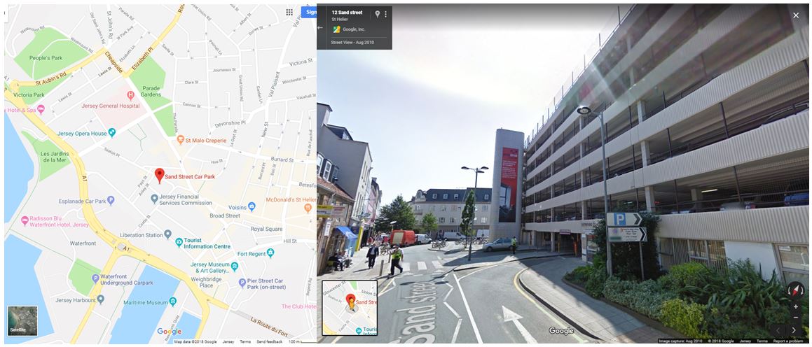
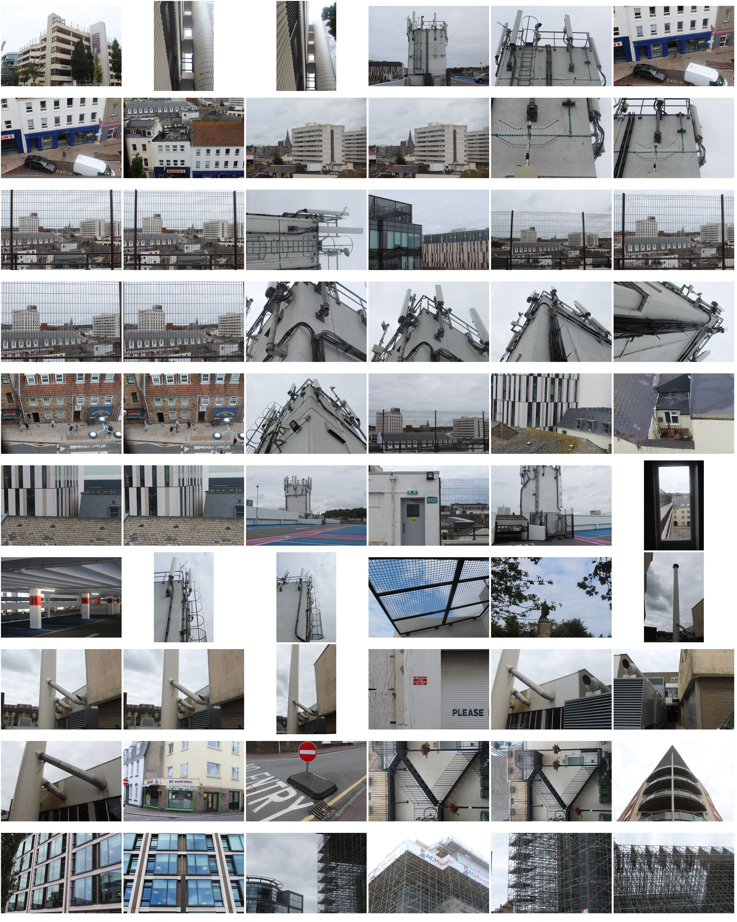
For my third photoshoot I wanted to focus on the more of the industrial aspects of buildings in this shoot. I first visited Sand Street car park which is surrounded by houses and buildings being near the centre of town. I also wanted to walk around and explore the roads in that area to fins more industrial buildings and structures. I narrowed my images down to 60 and displayed them below in a contact sheet.

For this photoshoot i went to an location outside of the area i was assigned to find different buildings and structures in St helier that link to my previous ones.

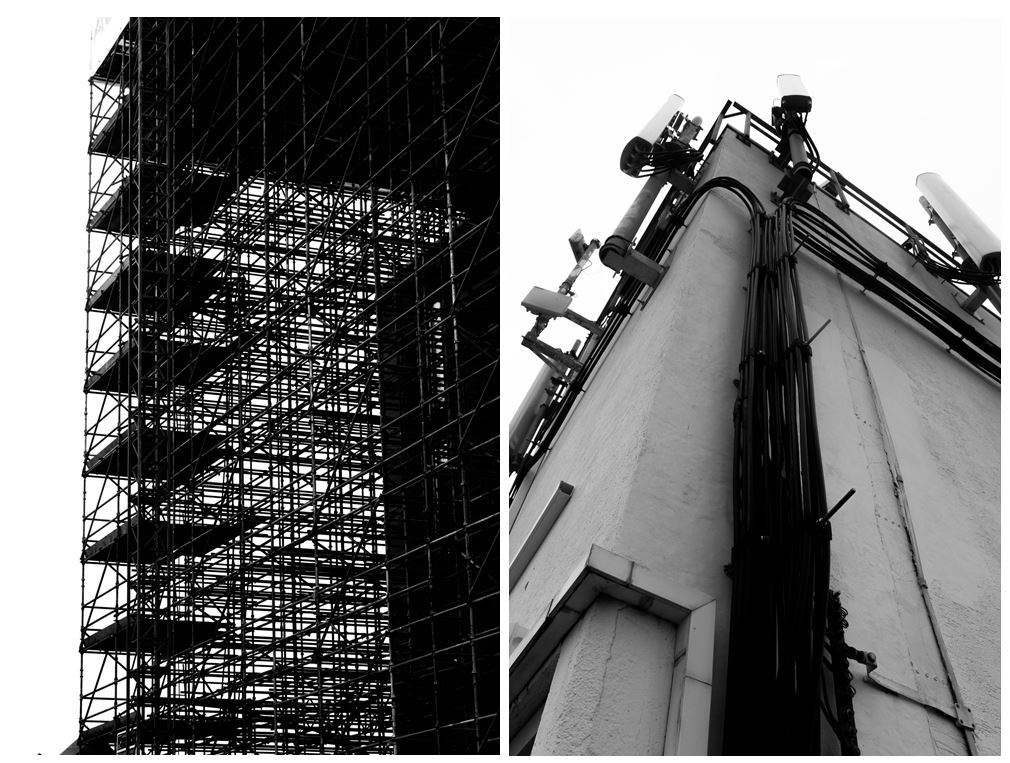
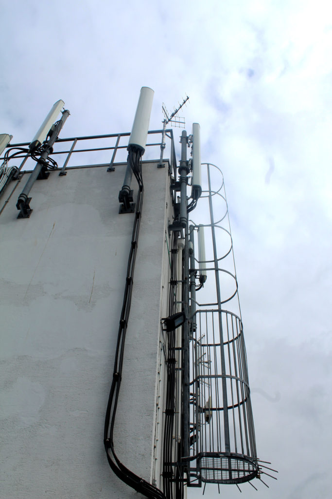
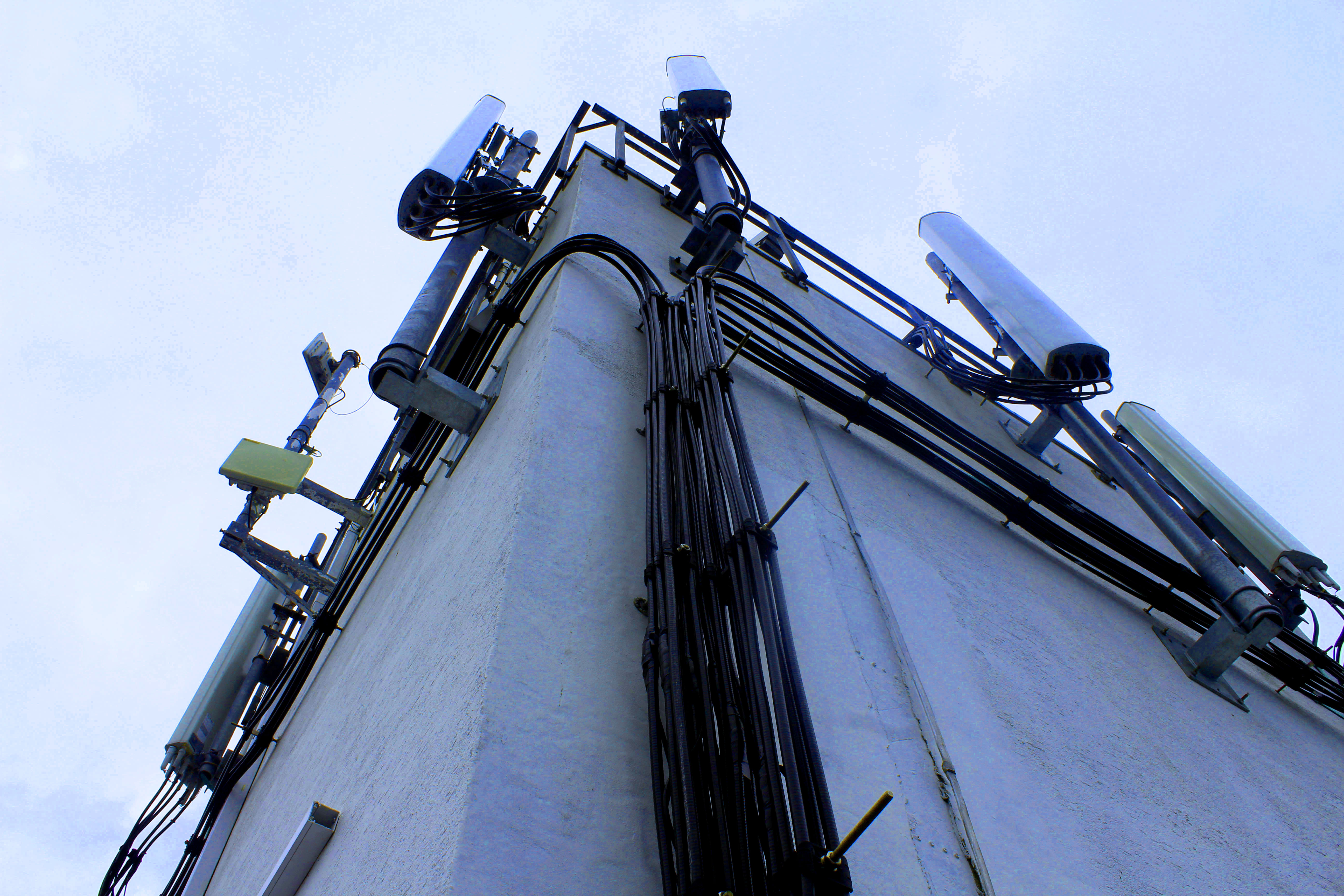
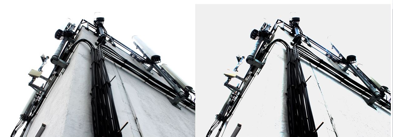
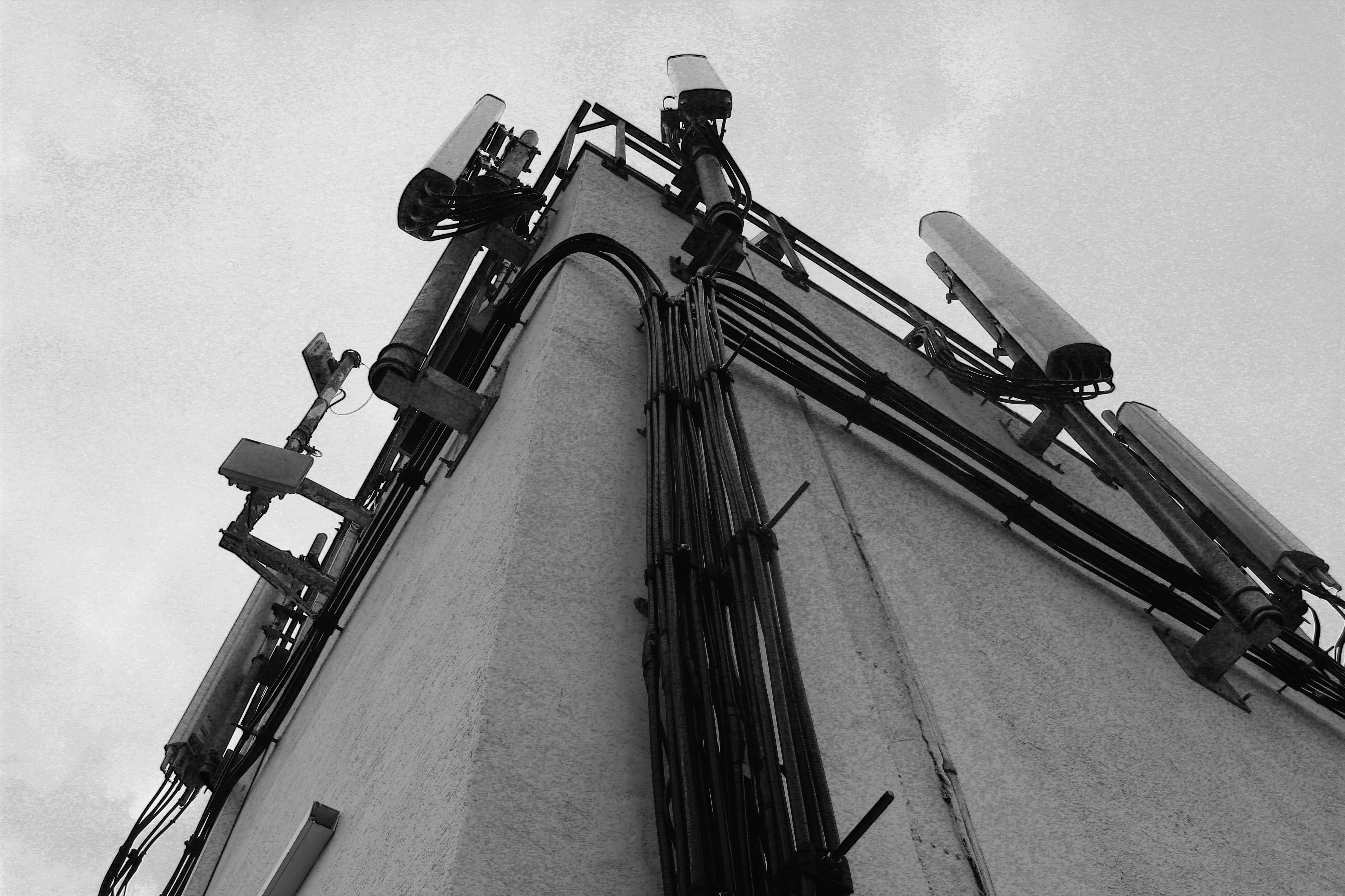
When walking around Sand Street car park I found this building structure that had wire and lamps on it giving a very industrialised appearance. I particularly liked this image as tones and colours in it are many black, grey and white even though i haven’t edited it this way. This means that building looks like its been edited in black and white in real life, representing how the industrialisation in Jersey is taking away the colour and culture. The cloudy sky gives a white background to the grey and black building in the foreground creating a hostile appearance. The angle this image is taken at emphasises the bold black wire running up the side of the building. I chose this photo as one of my final images as you cannot tell that it was taken in Jersey and could be anywhere industrial in the world, representing how Jersey is losing its heritage and culture by new constructions and starting to look like other towns and cities.

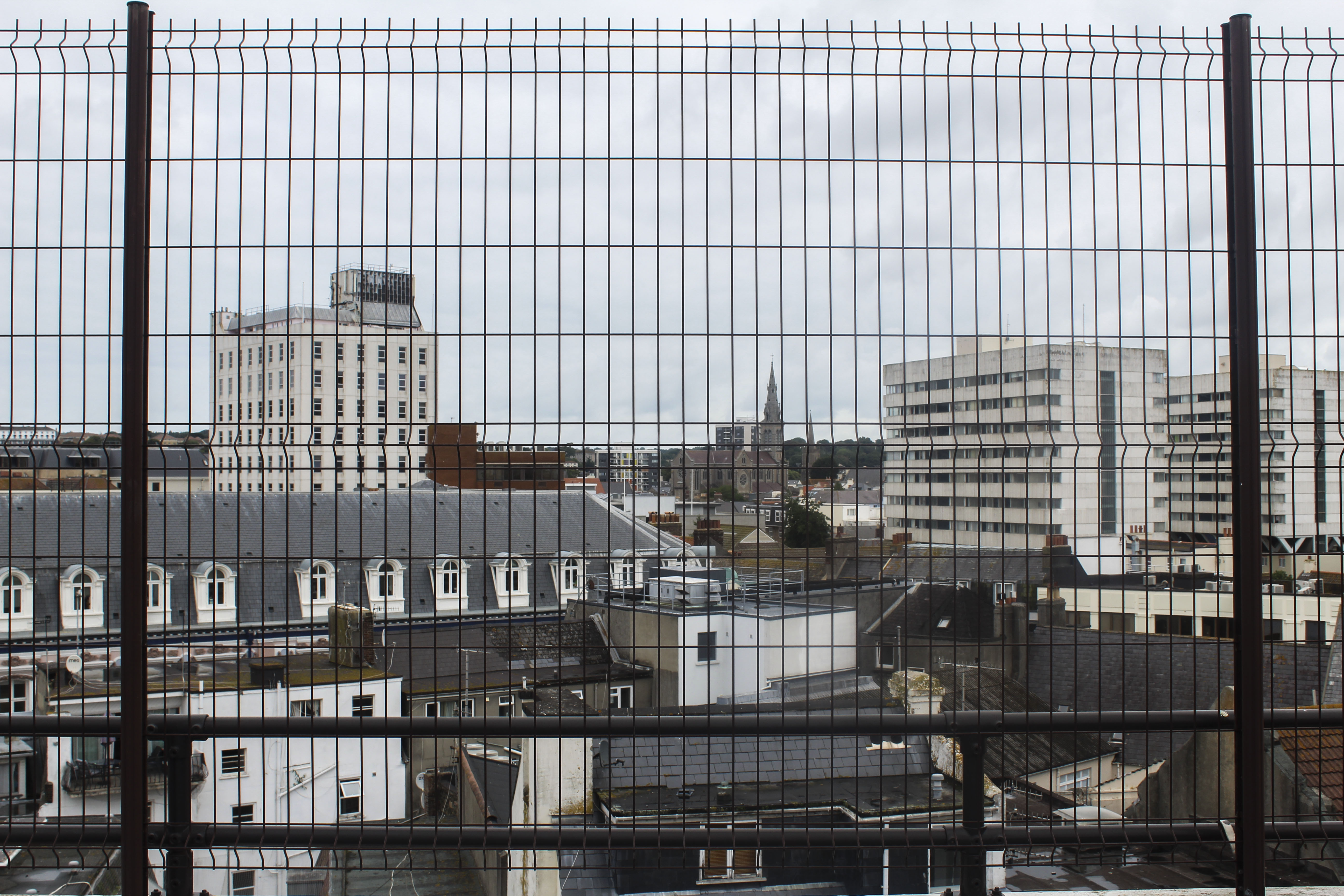
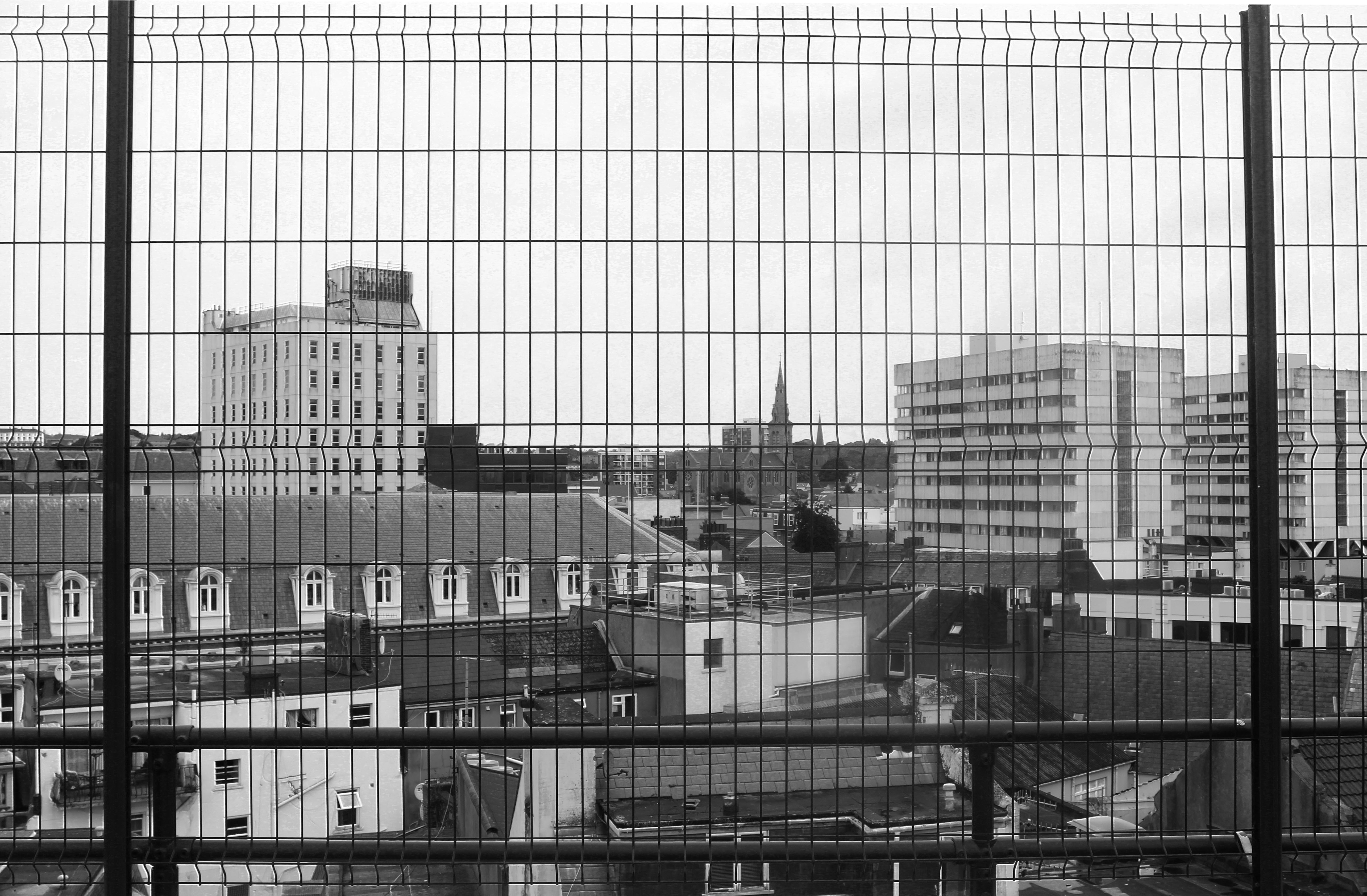
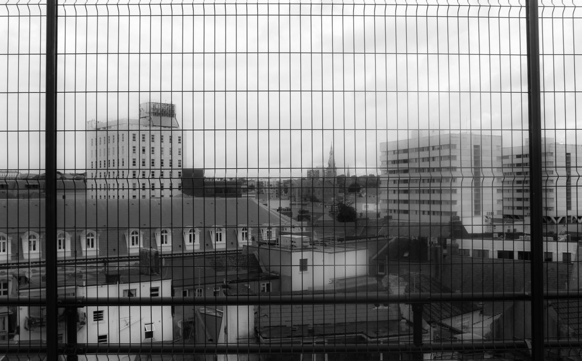
I like this image as it gives an overview of an area in the center of St Helier, showing the different and mismatched styles of building like tower blocks and smaller town houses. The angle which the photo was taken in a car park gives people a different perspective of St Helier than they might normally see. The way the buildings are arranged in this image to me looks like the buildings are being stacked and layered on top of one another. The smaller groups of older looking houses looks like how St Helier wanted housing to look like when they were first being built. Other buildings, like the flats, look like they’ve been stacked on top of the previous buildings, representing how St Helier keeps adding more buildings to the land when there isn’t much room, resulting in the overcrowding of buildings and a mismatched style of old and new.  The black, structured  fencing in the foreground adds another more interesting aspect to the image  which looks like the buildings and town have been caged, giving the image a more industrial and hostile appearance. This makes the front of the  image very symmetrical and ordered, which is juxtaposed with the mismatched buildings in the middle ground and background. The land only goes up half the image and is contrasted with the white/grey sky emphasising the whiter parts of the rest of the image and contrasting with the black fence in the foreground. Cool colours like grey, white and black with blue tints gives the overall image a dull and spiritless appearance. I did this on purpose so the idea to bring more vibrancy and culture into St Helier is emphasised.


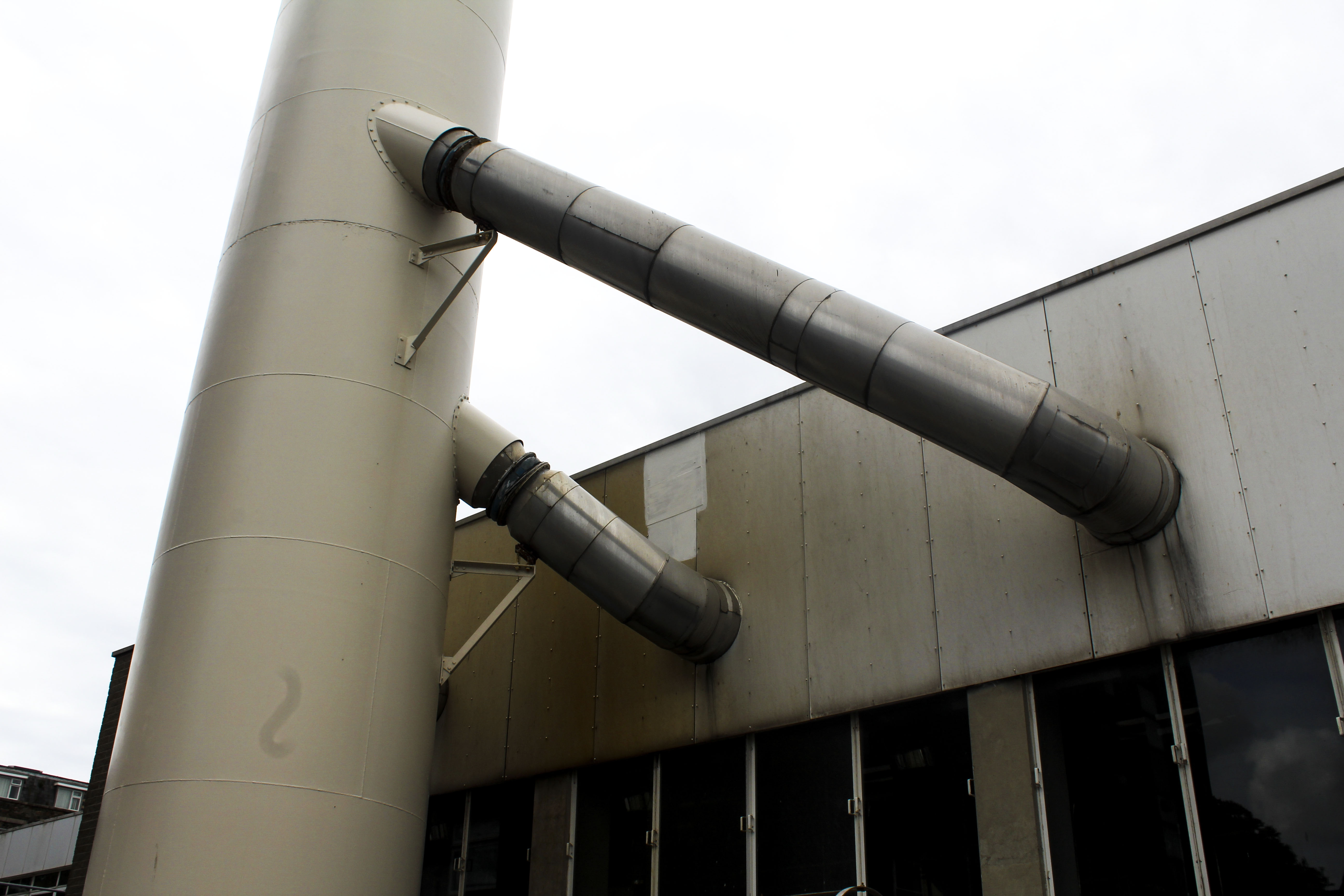
I also chose this photo as one of my final images as I like how it’s only showing an industrial metal structure with no signs of life. The yellow/brown tint on the metal gives the impression that it is rusting. What makes this an interesting image is that its simplistic but contains many different tones of metal from white to black to yellow. I think this image would work best as a part of a series rather than by itself as I think it could be apart of telling a story as now it doesn’t have any obvious meaning behind it when looked at.


Edits

When editing this image I wanted to see if I could change overall appearance. So i experimented by increasing the exposure and increasing the brightness in one of the images so all the colour was taken out of it and was left with a stripped down version. This changes the appearance of the image making it look decolourised and bleached.


For these two image I edited them in black and white as well as increased the gradient in them so they give off a more historical and archival appearance. I like this as it makes them look more authentic like they’ve been cut out of a newspaper. The black and white edit takes out any remaining colour giving them a lifeless and desolate appearance emphasising just on the buildings and not on the lives of people who live in St Helier.


I also experimented by editing different colours to see if one was more aesthetically pleasing or had more of an effect. Although the coloured versions may be more interesting as an image, I prefer the images edited in black and white as it makes them look more authentic, which the colour doesn’t.

I edited this image in black and white and experimented with the exposure and contrast. In the first image I focused on emphasising the harsh black lines of the fencing in the foreground of the image and tried to show the different in the buildings by highlighting the lighter and darker tones. Whereas in the second image I focused on creating a blurred effect so the distinction between the buildings wasn’t as clear and the harsh fencing in the foreground was softened.  The blurriness creates a mist-like appearance like something has been put on the lens when the image was taken. I prefer the blurred image out of the two black and white edits as it gives the image another aspect that makes it more interesting to look at and makes it seem as like there is a meaning behind it. This could be that the blurriness is a representation of how the perception of St Helier is confusing as people don’t know what it will look like in the future with the increasing number of constructions being built.

Shoot Conclusion

I think this shoot was successful at capturing the increasing industrialisation of St Helier, focusing on metal structures and buildings with cooler tones to create a lifeless appearance. The editing also emphasising this by taking the colour out of the images and presenting the buildings and structure simplistically.  For my next shoot I could perhaps focus on how St Helier could bring back some of Jersey’s culture and liveliness and portray a solution to distract from the continuous industrialisation.


Newspaper design and layout : Tasks 1-3

Over the next week we would like you to…

Create 5 x examples of alternative layouts for your newspaper using Adobe InDesign and complete a visual blog post that clearly shows your decision making and design process.

XXL zine for Travel Portand. Photography by Danielle Delph.

CLICK HERE…

ATLANTUS PROJECT | MARTIN TOFT AND GARETH SYVRET

https://www.martintoft.com/atlantus/

Be careful with your choices…aim for impact and originality. Use your crops and edits from your Adobe Photoshop experiments.

You will need to show…

  1. inspiration from a selection of newspaper designs

for this…you should 

  • photograph at least 5 x examples from the middle table and add to blog / describe and explain what is interesting / successful about them
  • Design your layout by showing an understanding of conventions, but also subvert conventions to allow a more dynamic, or fluid approach.
  • Remember to discuss your findings using subject specific vocabulary.

Think carefully about how your images compliment each other, contrast against each other or flow as a sequence in a specific order.

2. Design pages / spreads that have a combination of

  • single image
  • double page (full bleed) spread
  • 2 /3 or multi image
  • overlapping images : conceal + reveal / obsure / transparent
  • images that can be scaled up across 4 x pages
  • include some archival / nostalgic images

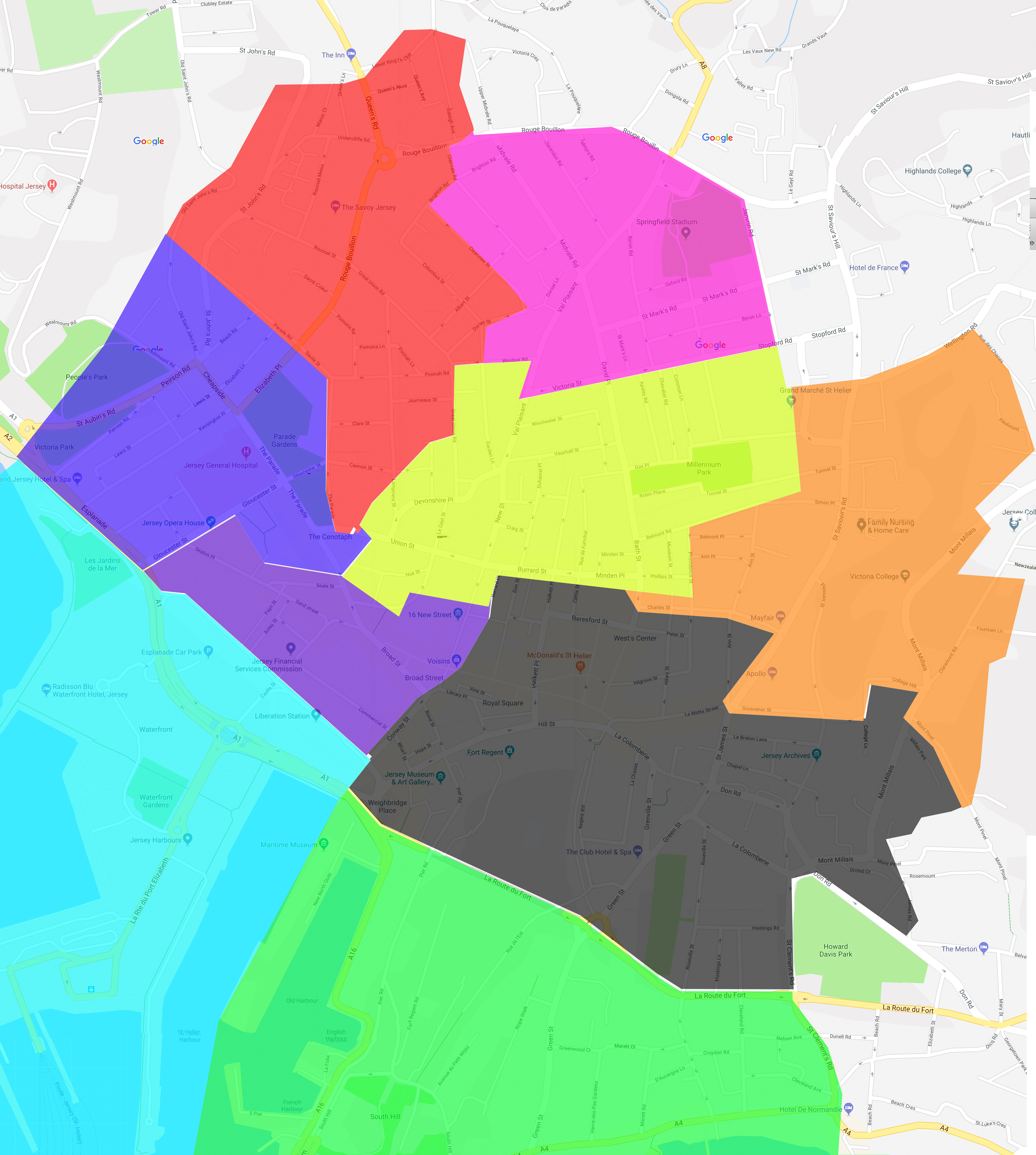
3. Finally…you must add a colour -coded motif (numbered by page) that indicates your team / zone somewhere in your design.

Use the map from our photo-shoot day in St Helier to help you with this…

Your idea could be a small dot in the corner, or incorporated within your image or page in another way. You can be inventive with this idea, but aim for consistency throughout your pages.

You can export Indesign pages as a PDF or JPEG…but also using screenshots is a great way to illustrate your design process and gives you opportunities to add annotations too…

Deadline for completion : Tuesday 17th July

Be brave…be bold…get creative and have fun!


Artist who inspired display outcomes

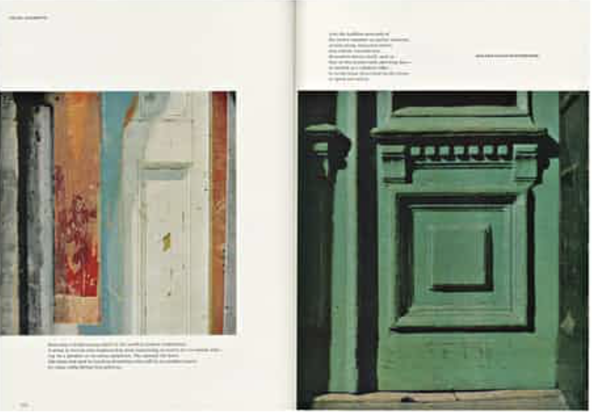
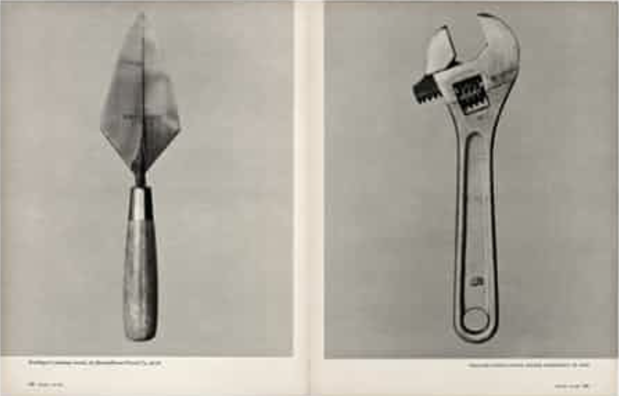
Walker Evans 

Is a photographer who mastered his work throughout magazines and the composition to which he displayed his images. He had a risk taking persona and is best known for photoessays on everything from Chicago street life.He would foucous on ‘American heritage’ and the displaying of beautiful historically important images and buildings either about to be demolished and the new urban regeneration across his state. 

Much like my own themes of modernisation and urban architecture he wanted to project the faceless construction without it being complete yet. He wanted to make a mark withn his photos and so ended up being wihtin nation Wide magazines.He started to work more alongside tech and graphic design further inspiring his interesting and dynamic presentations of his images. He is now a towering figure of photography. His unique artistic authority created a ‘small avant grade publications and mainstream titles’ his innovative and independent journalism is due to the editing and careful design layout of his images which has inspired me to experiment heavily with how I should display my own images. Evans enjoyed to caption his images which I think I could do with quotes from th epoeple surrounding the area and so creating a sense fo community for st helier itself. Evans chose magazine stories that often has elegiac qualities; the American warehouse, and these vast buildings that were prolific to the native area. 

I chose this for inspirations as the muted tones of colour ass to the sense fo transience and feelings of lost and demolished in order to rebuild the colour and life to the image. The simple composition allows the viewer to create a personalised story of what the image means to them. The images echo each other and create a modernist and poetic type feel to the overall composition. His work has an understanding of the world and the people who live among it. His tenacity and visions create an artist control and show his commitment to and intelligent reflect on the modern progressive world and pop culture which is what he was fighting to demonstrate. 

Future Of St. Helier – History Research

History Of My Area

Working closely in collaboration with Societe Jersaise, I will produce a detailed shoot in my assigned area of St. Helier.

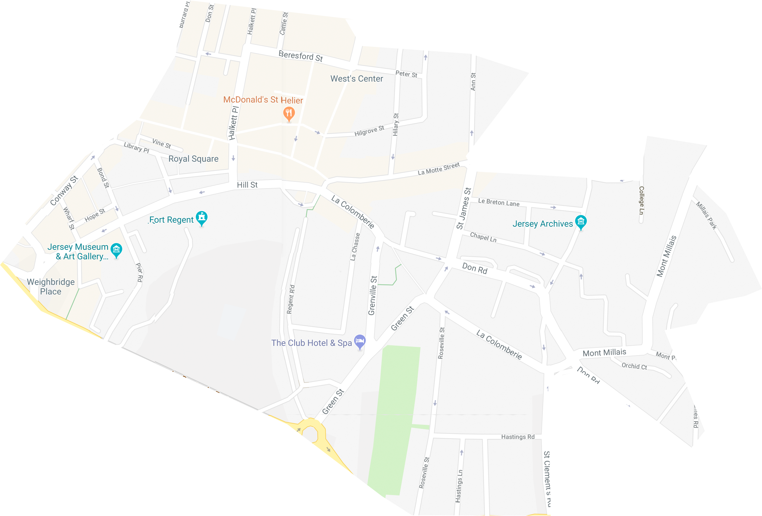
The area I was assigned to was Grey. It included areas such as Weighbridge Place, Royal Square and Fort Regent.

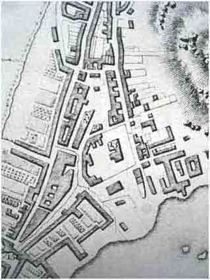
An early map of St Helier before the land on which the Weighbridge stood had been reclaimed The Weighbridge is one of the most important locations in St Helier. The name has been taken by the whole area to the north of the Old Harbour and New North Quay, where the original public weighbridge formerly stood

Weighbridge Place is all reclaimed land, the shoreline of St Helier was previously over 200 metres to the north on the south wall of the town churchyard. Gradually, from the 18th century onwards, the sea was pushed back, as first warehouses, and then hotels and other properties, were built to the south of the church.

Then construction of St Helier Harbour began in the 19th century, and gradually more and more land was reclaimed – a process which is continuing to this day. The weighbridge itself was ordered to be constructed in 1825, and, as the island’s potato industry developed, for several weeks of every year it was the centre of island life, as farmers brought their crop to St Helier for weighing, packing and then shipping out of the island

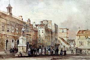
The Royal Square has been the center of Jersey life for centuries. Indeed, there are no records of anywhere else having the same level of importance.

 The Royal Square in the early-19th Century, with the Courthouse on the left, the statue of George II, the Corn Market on the right, and the Town Church in the background. The buildings in the centre adjoining the Courthouse had yet to be demolished to make way for the library building. The early 20th century photograph below shows the frontage of the library tower.

Fort Regent was built as the island’s main barracks and fortification from 1806 to 1814, just as the Napoleonic Wars were coming to an end. A decision to develop Fort Regent as a leisure complex was taken in December 1967. In 1970 the cable car facility was opened which gave access to Fort Regent from snow hill, this was closed to public use in 1991. In 1974 the Fort was roofed over.

The swimming pool was built on the Glacis Field and opened in 1971, the Gloucester Hall opened in 1978; this is part of Fort Regent’s multi-use facilities. The Queens Hall opened in 1988

Narrative and Sequencing Workshop

During this workshop, we learned the importance of the sequencing of images in order the tell a story.  Some of the images I will take may be simplistic on their own but make more sense when partnered with another image.

Above are two examples of a sequence of images by Duane Michals. Changing the order of the images would change the narrative which is why it is important to get the sequence right.

In my project, I want to capture the signs of living such as things people leave behind on the streets or everyday tasks that they complete. For example, clothes hanging out on a washing line is a sign of life as it shows that someone is living there but you don’t know anything about this person.

The theme will not be clear if I choose to partner the wrong images, therefore I want to sequence my images on their pages based on the different aspects of life.

Classic and Contemporary Photographer Inspirations

Albert Smith


Albert Smith is the best known and probably the most prolific of Jersey’s early photographers, although a significant number of pictures attributed to him, and particularly those used for his postcards, were taken not by him, but by employees or by Ernest Baudoux, whose business he acquired when he arrived in Jersey from London.

Not all of Albert’s photographs were taken by him personally, however they are all attributed to his business. Many are overtly commercial, but others constitute a fascinating documentary of life in Jersey in the late 19th and early 20th century. Although an early advertisement promoted portrait photography in clients’ homes, Smith, unlike many of his contemporaries in Jersey was not predominantly a portraitist. He preferred to work out of doors, photographing groups on carriage and charabanc outings.

Image Analysis

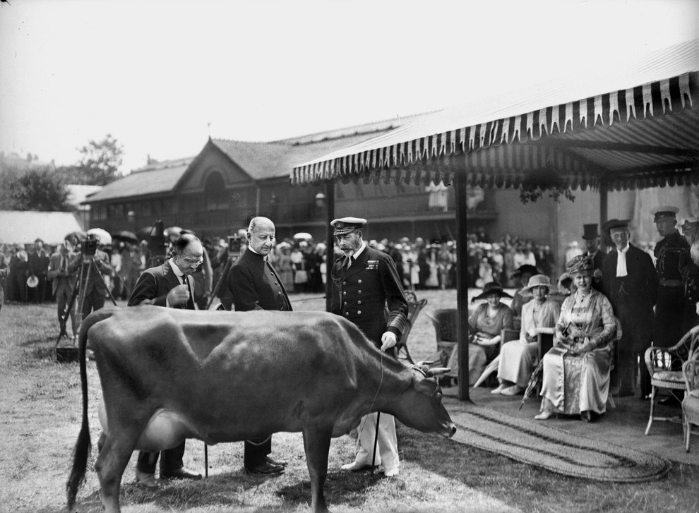
This image shows the Royal Visit of King George V and Queen Mary in 1921 where they were presented with the Jersey cow at a cattle show at Springfield. The Jersey Cattle Breed is famous for its high butterfat content of milk and lower maintenance costs attending its lower body weight, as well as its genial disposition. The image appears to be over exposed, allowing the dark tones to become more contrasted. The focus is maintained on the cow as it is in the forefront and is shown to be observed by the other subjects in the image. The image is in black and white as it wasn’t until 1935 when Kodak brought out Kodachrome, a 16mm color film, that colour photography became more common.

Tom Pope


Tom Pope is an award winning photographer born in Bristol, UK in 1986. Acting as the 2015 Archisle International Photographer in Residence for Jersey, he produced the work “I Am Not Tom Pope, You Are All Tom Pope”.

“The work I intend to carry out in Jersey will explore notions of play and how we conduct ourselves in public. Gathering inspiration from the Société Jersiaise Photo Archive and collaborating with the Jersey community, performances and situations will be initiated where the act of taking and making photographs becomes a social event.”

Image Analysis

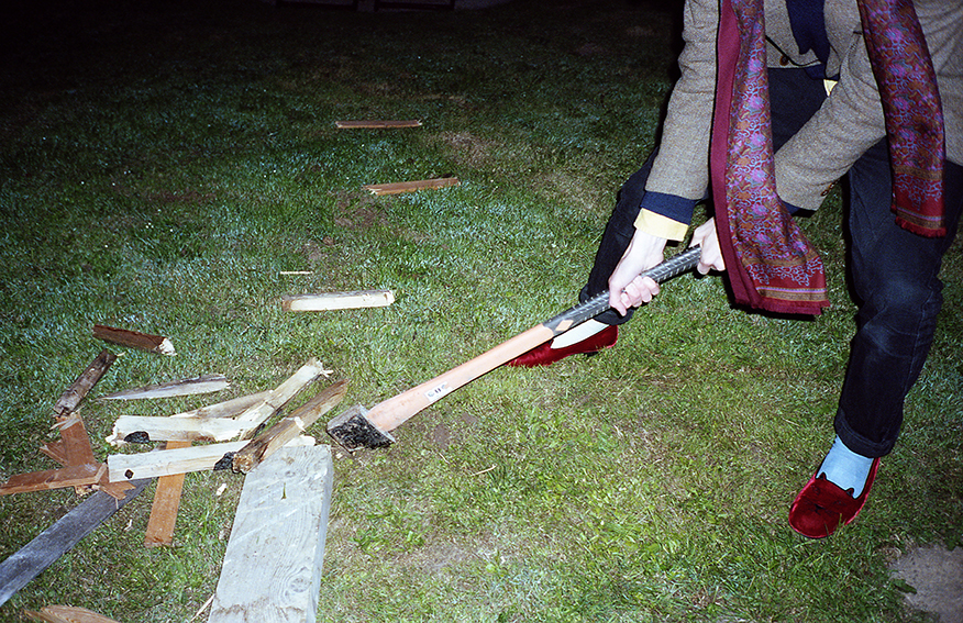
The image features a figure chopping wood with an axe. This is mysterious and intriguing to the viewer as the image is cropped to not reveal who the person in the image is. This similar technique is used in many of Tom Pope’s other works. A vignette appears across the top left side of the image due to the use of a flash which places the focus on the subject. The image feels almost dynamic due to the scarf hanging down before the swinging axe.

Pope’s use of flash brings out the contrast of colour in all of his images, allowing for the subject to become more important in the foreground.

When producing my work to represent the future of St Helier, I want to use the flash in the same way Pope used to bring out the same vibrance and contrast of colour.

Experimenting With Montages

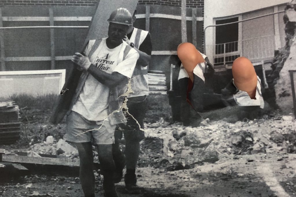
In the below montage I have edited in the two construction workers from another photograph. This creates another subject within the photograph.


In the below montages I have edited in the bear from another photograph in order to add to my story telling narrative within the sequence of photographs.

Cut and Paste Montages

In the below photographs I have manipulated the photograph with my hands and then taped the photograph back together then repeating the process in order to create a weathered look in the later on compositions. I think that this is a good experiment to explore as there is lots of shapes and creations that you can come up with but for this project I am enjoying photographing and editing to create documentary style sequences.


Photo Archives – Artist Research

Percy Dunham

  Dunham was Jersey’s first photojournalist and for a very short period of time in1913 and 1914, he worked for Jersey Illustrated Weekly and then the Morning News, the main competitor for many years for the Evening Post (now known as the Jersey Evening Post and the island’s top daily newspaper).

In the years leading up to the First World War the Evening Post had not embraced the new processes for including photographs in their newspapers, therefore, the illustrated Weekly and the Morning News were the pioneers of photojournalism in Jersey, along with other short-lived publications such as The Jerseyman.

The early photographs were largely portraits or promotional images to keep advertisers happy, but then, in 1913, along came Percy Robert Dunham who worked simultaneously for the Illustrated Weekly and the Morning News.

Photojournalism at the time didn’t have many set rules or definitions, Percy Dunham would document anything and everything he felt was significant at the time.

Photojournalism at the time didn’t have many set rules or definitions, Percy Dunham would document anything and everything he felt was significant at the time.

Percy Dunham’s documentation photography is very natural, other than in group portraits, he photographs everything exactly how he saw it.  Working for two newspapers meant he spent a lot of his time tied to his camera, and his skill is very evident in the photographs. The photos capture jersey in its purest and most natural form- when I’m taking photographs I want to do the same. Much like Percy Robert Dunham, I want to photograph people on their natural environment; this could be environmental portraits or just street photography.

Experimenting With Cropping

Photograph 1

This cropping involves perspective cropping in order to create straight lines within the photograph for aesthetic effects. This cropping shows both of the bears in the photograph along with the two natural framings which are the windows. It also shows some context in the way that you can see the house is falling apart/being taken apart.
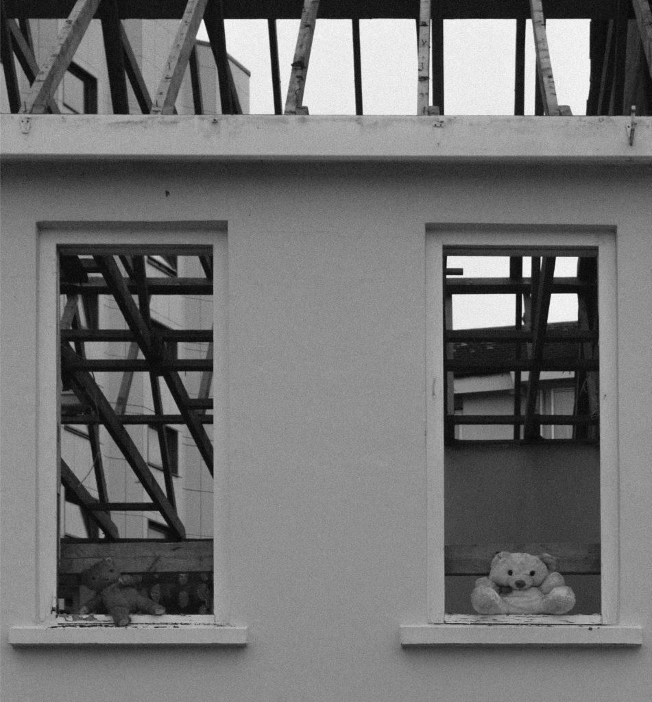
 

This cropping makes the white bear the focus of the photograph as it crops out everything else. I prefer the first cropping as it provided for context and interesting subjects for the photograph.
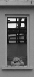
 

This cropping removes the skeleton of the house to allow the photograph to focus more on the two bears in the windows. I like the idea of focusing on the bears but I feel that the skeleton of the house is a vital part of the photograph in order to provide contrast between structures
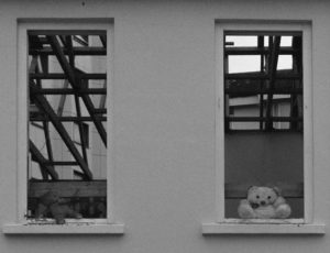
 

This cropping is similar to the third cropping as it focuses on a similar bear. I feel that it does not have as much affect as the third cropping as this bear does not provide contrast through brighter tones.
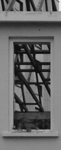
 

The first cropping is the cropping that I will use for this photograph as I feel that it shows everything needed in the photograph including contrast, tonal ranges and interesting subjects – to the extent that cropping it anymore would mean taking away from the photograph.


Photograph 2

This cropping shows more context leading on from the first photograph – it shows where the bear is and what is going to happen to it. The contrast between the hard digger and the soft teddy bear creates an interesting photograph as it makes the viewer wonder about the bear’s story.
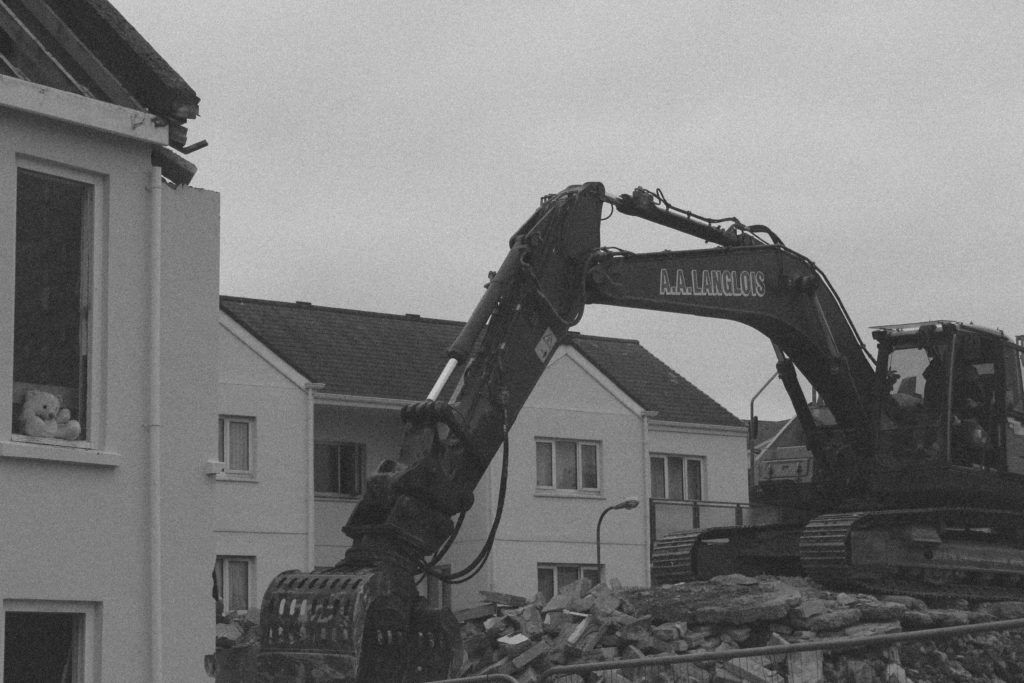
 

This cropping takes away the focus from the bear as it focuses on the digger on the mound of rubble. This creates a harsher image and it only shows destruction. I prefer the first cropping over this one as it provides a bit more context.
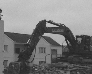
 

This cropping is the opposite of crop two – it focuses on the bear rather than the digger. This makes the viewer think a bit more about who the bear belonged to and why it has been left behind. I feel that this composition does not show enough of the harsh reality that is the digger.
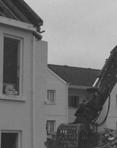
 

This cropping focuses on the main body of the digger and the man controlling it. This helps to convey the message that it is the machine that does the destroying but it is only acting as a disguise for man.
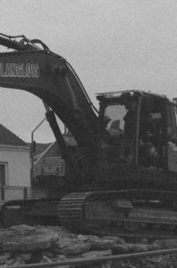
 

I will be using the first cropping as I feel that it shows all the context within the photograph in order to make the viewer think about what has happened here and what is going to happen in the near future. It provides plenty of contrast and tonal ranges compared to the other compositions.


Photograph 3

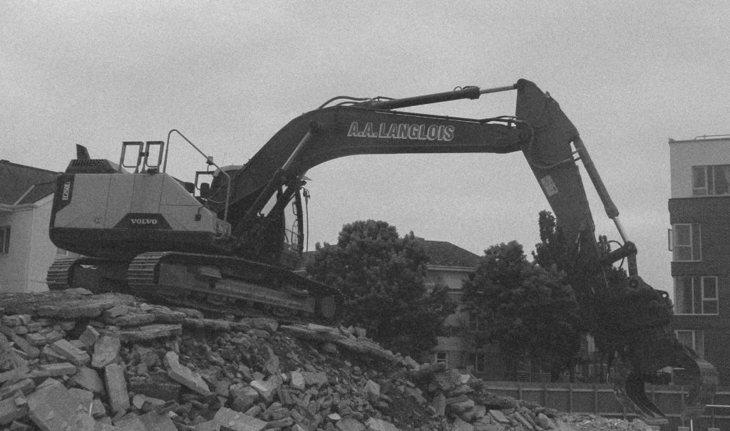
This cropping shows the digger from a different angle on top of the rubble, at an angle that makes the digger seem to have even more power. The trees and buildings in the background help to contrast with the destruction.
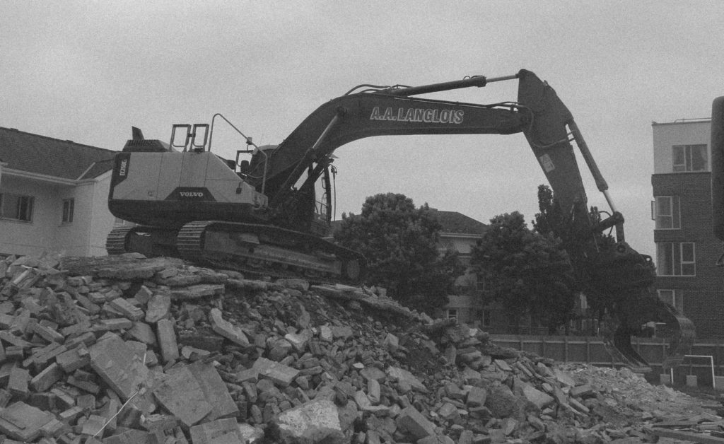
 

This crop takes away some of the rubble from composition one. This creates a composition more focused on the digger but I feel that it takes away from the superior feel given to the digger by the angle.
 

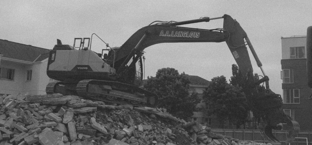
This cropping is similar to crop two but takes more height off of the image whilst keeping width. This keeps all of the context within the photograph as well as the wide photograph emphasising the length of the digger.
 

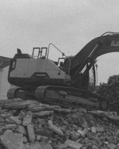
This cropping focuses on the main body of the digger and the man controlling it. This helps to convey the message that it is the machine that does the destroying but it is only acting as a disguise for man. I think that this crop takes out too much of the context and interesting subjects.
 

I will be using the third cropping as I feel that the wide composition emphasising the length of the digger is very effective and helps to convey the extent to which the digger can destroy.


Photograph 4

This cropping shows a building destroyed by the digger with a fully constructed building in the background. This creates contrast between the view of the destroyed and the view of the built.
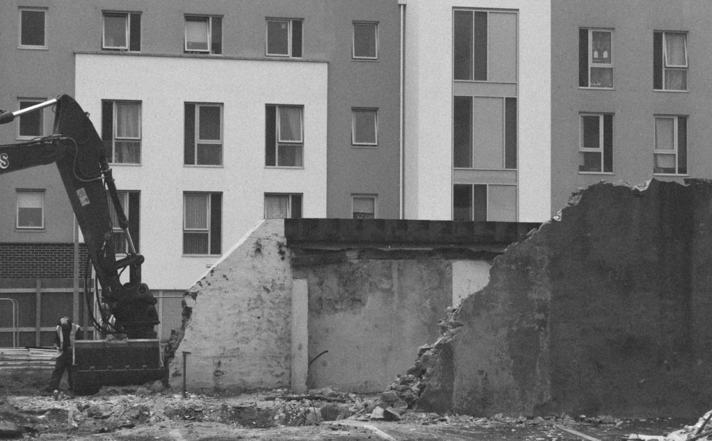
 

This photograph focuses on the digger but takes away from the context and scale of the building, creating a less satisfying photograph.
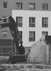
 

This cropping is the opposite of crop two – if focuses on the destroyed building rather than what did it, meaning context has been taken away.
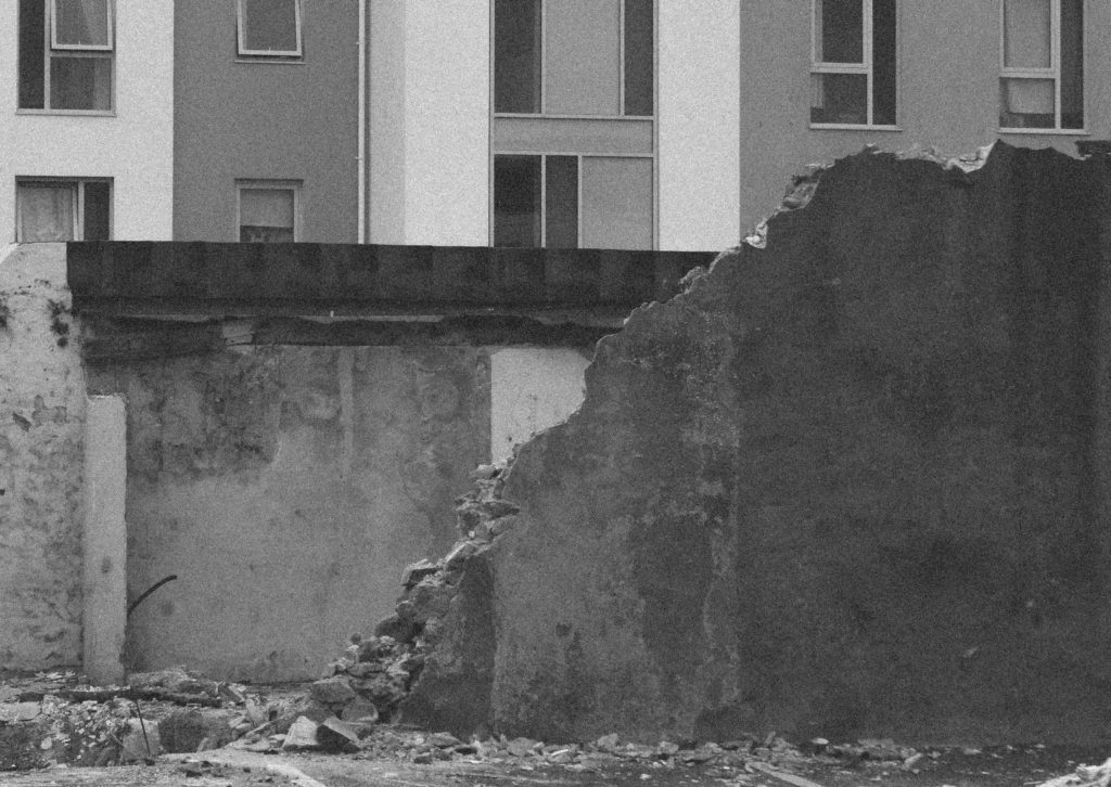
 

This cropping is similar to crop two in the sense that it takes away from the scale of the building, although it keeps some context by including the digger.
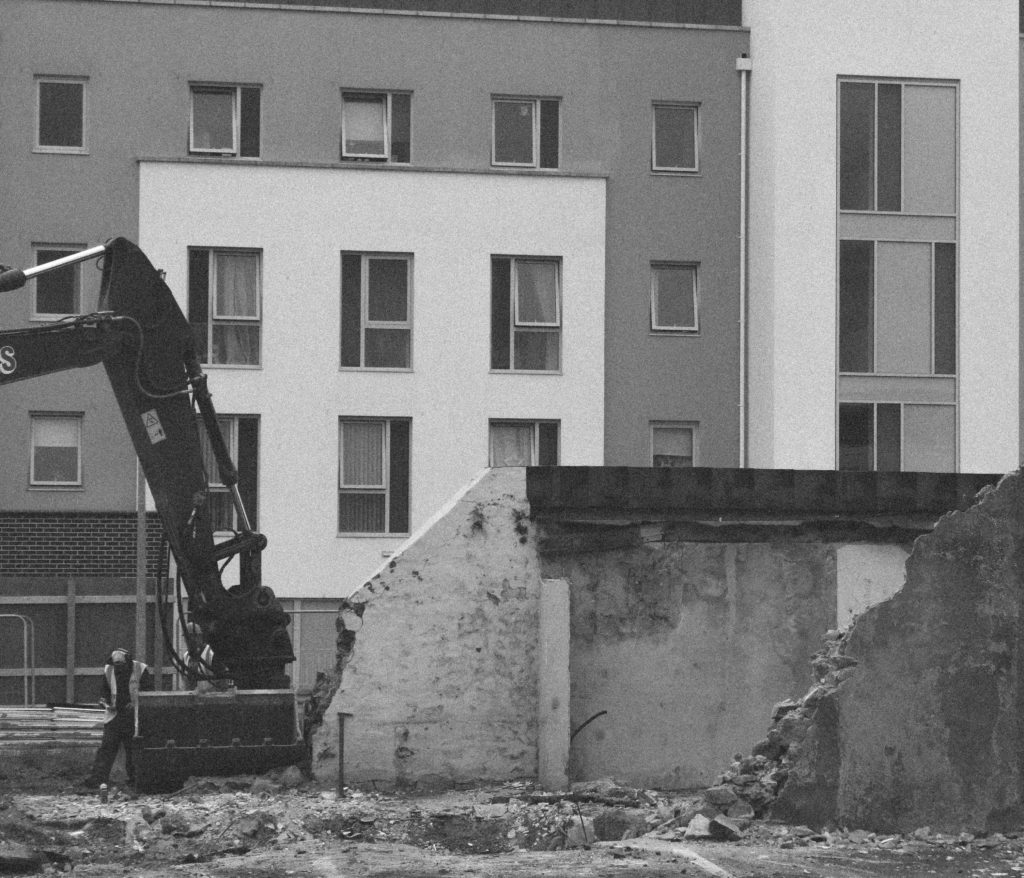
 

I will be using the first crop as I feel that it has well-placed subjects to create an aesthetically pleasing photograph whilst conveying the idea of destruction and rebuilding.


Photograph 5

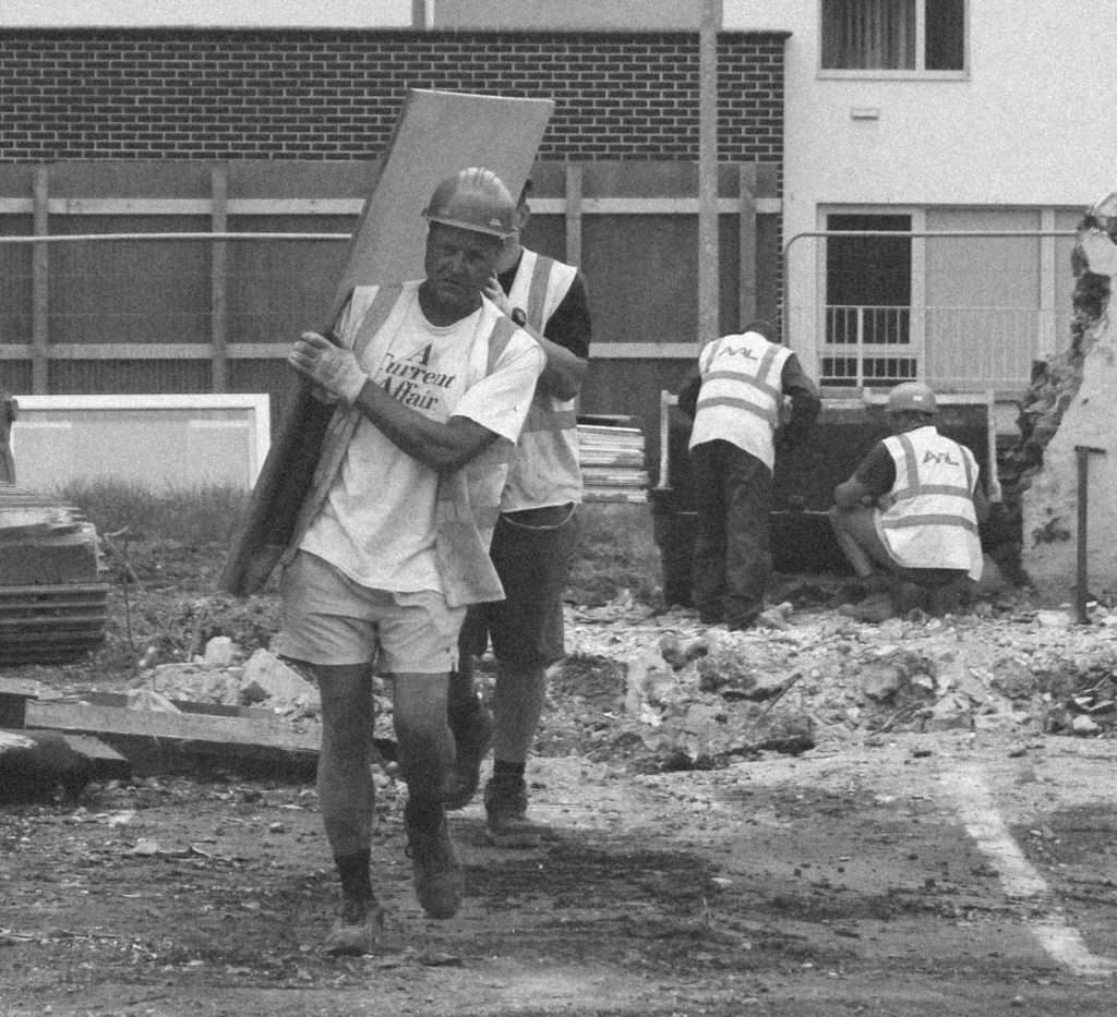
This cropping of the photograph sets the main subject in the centre in order to lead the eye to it straight away. This is effective as the people, machinery and building in the background are not instantly noticeable.
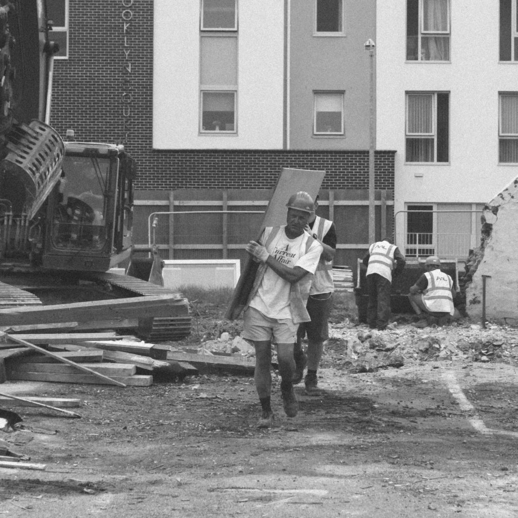
 

This crop focuses even more on the builders, it takes out any of the unnecessary subjects in the background to create a more effective composition.
 

This crop is similar to crop two but I think that too much of the background has been cropped out, which takes some of the interest out of the photograph
 

This crop is similar to crop two as it removes some of the background but I feel that this composition is not as strong as the background in this composition is slightly distracting.
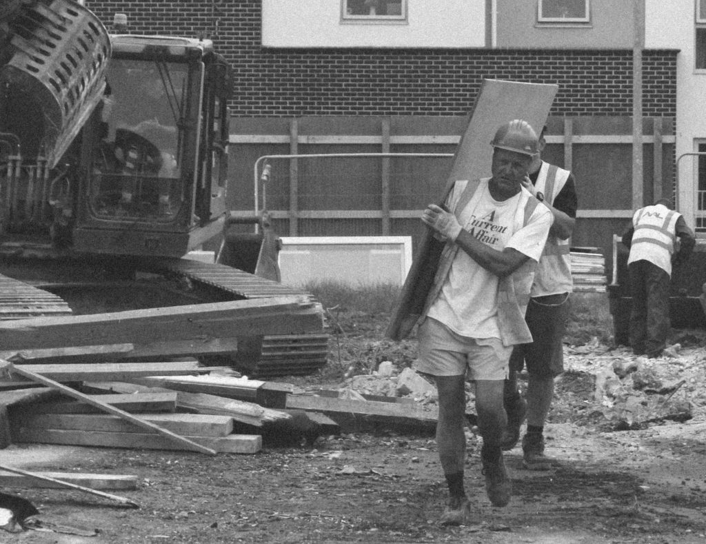
 

I will be using the second composition as it shows all the context needed whilst keeping the photograph simple and effective to convey the message of rebuilding.


Photograph 6

This cropping shows a house shell with just the scaffolding on it – it is effective as it shows the subject for what it is but could possibly be cropped more dramatically to create a more aesthetically pleasing photograph.
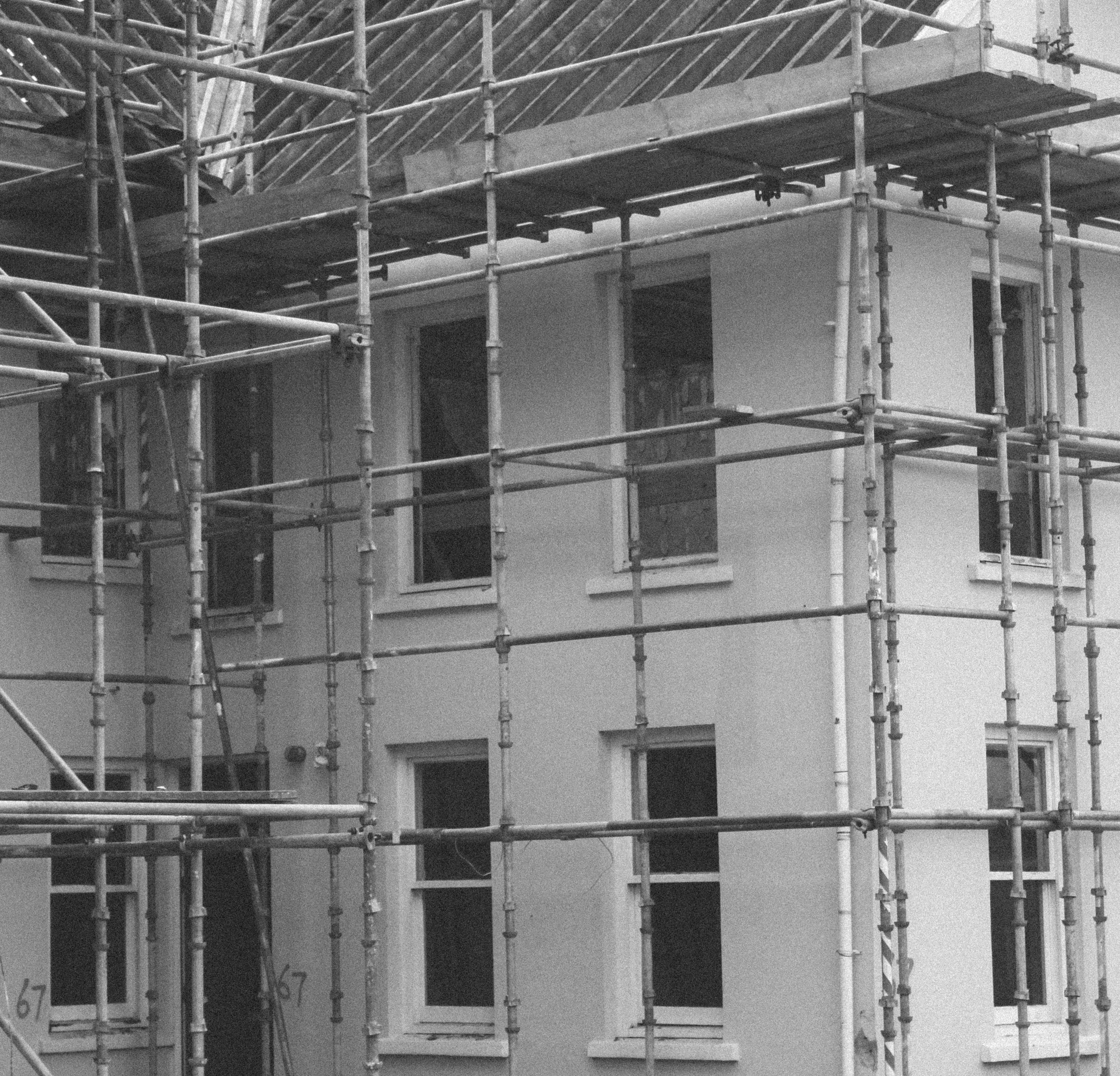
 

This crop takes all of the unnecessary parts of composition 1 out to create a more focuses and slightly abstract composition. It focuses more on the shapes within the photograph and the contrast between light and dark.
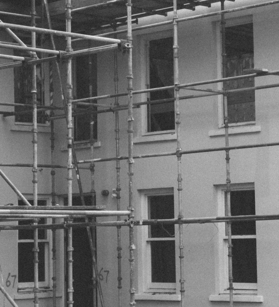
 

This photograph focuses on the top half of the house – to me there is too much unnecessary parts in this composition so is not as effective as crop two.
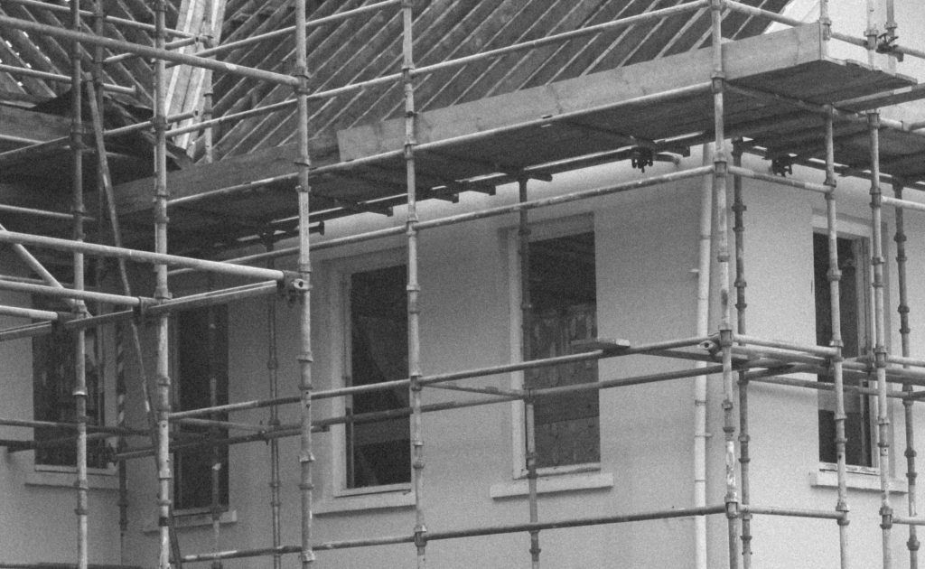
 

This composition crops out a lot of the photograph to create a focus on the linear scaffolding. I think that too much context has been taken out of the photograph in this composition.
 

I will use the second composition as it has an effective focus on shapes and contrast whilst removing any unneeded context.


Photograph 7

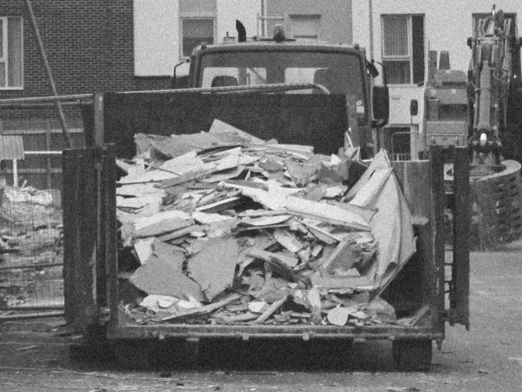
This composition shows contrast between the destruction on the building site and the clean architecture of the building in the background.
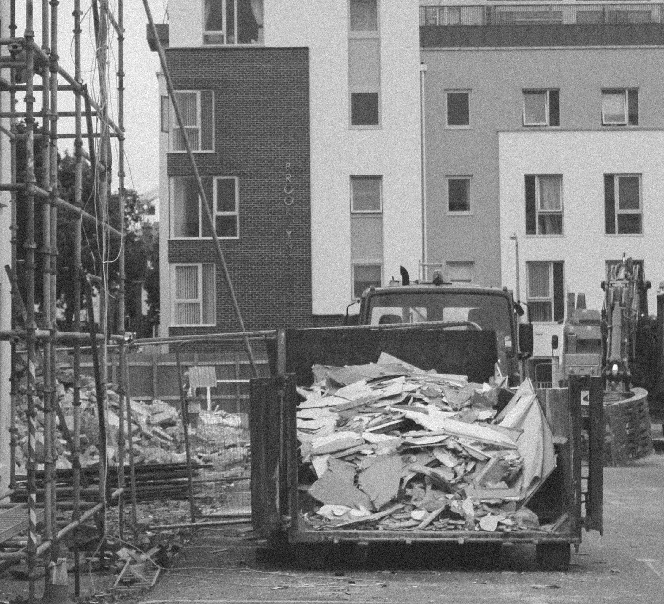
 

I feel that this composition takes away too much context by removing the view of the building in the background along with the scaffolding.
 

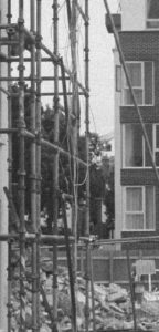
This composition focuses purely on the scaffolding of the building. I like the idea of focusing entirely on one area of the photograph but it doesn’t show enough to make the photograph interesting.
 

This crop focuses on the skip whilst keeping the context of the buildings in the background. It contains a lot of context but I feel that the scaffolding is a vital part of the photograph.
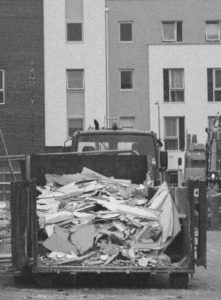
 

I will be using the first composition as I feel that there is plenty going on in the photograph, making it a very interesting photograph to look at.