Category Archives: AO1 Develop Ideas

Filters

Author:
Category:

text to put inside my photobook

I belive after much research it would probably be too much text if I were to research stories, because of this I belive I will focus on quotes and short stories about the sublime. I wanted to start off by looking at poems which attempt to describe the sublime, which is a great relation to the subjectivity it has. With this I believe it would be possible to connect these explanation of what someone sees and connect them to my own imagery. The poems are divided into more abstract and contemporary feeling describing what the sublime is, combined with a more of a defiant research by a philosopher or writer describing what he thinks the sublime is, and what it means to people.

A meditation rose on me that night
Upon the lonely mountain when the scene
Had passed away, and it appeared to me
The perfect image of a mighty mind,
Of one that feeds upon infinity,
That is exalted by an under-presence,
The sense of God, or whatso’er is dim
Or vast in its own being (1805 Prelude, lines 66-73)

I chose this short part of a poem written by William Wordsworth as it reflects on his experience. The means by which ‘Nature’ transforms the mist into an ocean. It’s quite comprehensive and subjective as a text in its relation to each person, but this is why it is successful, as it mimics the feeling to that of the sublime.

Is with infinitude, and only there;
With hope it is, hope that can never die,
Effort, and expectation, and desire,
And something evermore about to be. (1805 Prelude, lines 538-42)

The sounding cataract Haunted me like a passion: the tall rock,The mountain, and
the deep and gloomy wood 
,Their colours and their forms, were then to me An appetite
; a feeling and a love (our emphasis 76-81
“Whereas the beautiful is limited, the sublime is limitless, so that the mind in the presence of the sublime, attempting to imagine what it cannot, has pain in the failure but pleasure in contemplating the immensity of the attempt”
― Immanuel Kant, Critique of Pure Reason
“And I find a happiness in the fact of accepting —
In the sublimely scientific and difficult fact of accepting the inevitable natural.”
― Alberto Caeiro, The Collected Poems of Alberto Caeiro

Whatever is fitted in any sort to excite the ideas of pain, and danger, that is to say, whatever is in any sort terrible, or is conversant about terrible objects, or operates in a manner analogous to terror, is a source of the sublime; that is, it is productive of the strongest emotion which the mind is capable of feeling.”


analysis:
After speaking to one of my photography teachers, I know the importance of the size and where the text lies on the page, and to make sure it is not too crowded. Because this I have above experimented with three different forms which I could lay out my book. The first being a short poem, which is quite large over the page. I believe the poem, first off, being next to this image is successful. The image itself is quite ambiguous yet does inflict connotations of loneliness abandonment and mystery. Because of this the poem discuses a lonely girl mimicking a lovely landscape which she believes to be sublime. To my mind this is a perfect example of a text and image helping each other in order to further evoke an emotion and a narrative story for discussion. However an important aspect which I need to change, is the sizing of the text. This on screen does not look large but when it is printed, this will overwhelm the page and make the layout look too messy with the large gapping. Overall I belive this double page spread with this text is successful and I will further develop this to my final cut of the book.
The second composition I experimented with I am less keen on. I  wanted to experiment with this image because it is a mimicked expression as what the sublime stands for. Her being underwater and face divided shows a beauty and inevitability of death yet peacefulness. Because of this the image should be displayed on a much a larger level. However due to the poem I chose being quite long to the extent of the space the text overwhelms and creates the page lookout to be too busy and then takes away from the poem , instead of enhancing the image itself. I believe the poem I have used already is successful on its own but the overall composition with this a layout, even with a smaller text is not very successful, and should not be used for the final edit of the book.
The last layout is a long extended poem discussing the limitlessness of beauty. These go hand in hand with the young girl in a deep tonal colours with a light shining on her, this symbolises her beauty, and  due to its darker tones also creates an aspect of Pictorialism within the photo. The boarder use also frees up space making the text look less crammed for space The smallness of the text itself also works and due to its shortness this once again enhances the image and I should develop this further, and possibly keep this as a final composition.

additional images and editing process

After speaking to both of the photography teachers, their favourite shoot is the water reservoir shoot, where I show both a combination of colour development, and use the light in such a way to evoke a sense she herself is submerged within the water. Both the water shows reflections of not only the Light and sky, but of the woodlands themselves. This illusion of the setting being repeated shows a really interesting aspect to the images themselves. All these are images which I did not choose when I did my first selection process. This just showing the pivotal importance it is to look back on your images as there will be a good variation which are too successful. The top three of my images I edited in such a way where her eyes and the water is the same colour, and both are over exaggerated to create a mystical and perhaps even a Utopia atmosphere altogether. I believe these images are very successful and That I will be using these inside my end product photobook. I belive I will replace these images withe the underwater Go Pro ones. This is because the go pro images, not only are not the best detail, but most of which do not have such a successful composition as these do. I do not want my book to be a reflection of the development of my project, but just a successful finished product. Not only this but due to their quality, it is near impossible to edit the colour of the images clearly and successful, so they do not blend and work with the rest of their images. I will now start experimenting with the way I will be able to use these images, alongside the current layout with my photobook, and hopefully this change will really benefit the quality of my images, and create a deeper interest within the book.       I have edited an array of images, all with the variations of slightly different styles throughout. Some I have edited just in order to change the tonal colours. This is because I want to show a reflection of a certain theme, or perhaps I wanted to emphasis the tonal  colours within the piece.  However, due to the majority of my pieces being complicated to shoot and being largely full of many elements, many of them I do not need to specifically photoshop further. This is seen within many of many water imagery. However some of my images I though to would be interesting to see how far I could take them and possibly change and refine them to appear more sublime.

Another shoot I decided it would be worth while to look at and find more images of was, the pool shoot. Due to me discussing about removing many of the go pro images as they do not fit in with the newly created narrative as much as the images above, I thought it would be interesting to experiment with finding and editing more of the images from this shoot.

With these more colour experimental images left over, I wanted to show a more abstract water life through the sublime. The water and mounting of the bubbles is all over the place, and because of this I thought it would possible to create very interesting imagery to split apart my much more controlled tablo shoots. I edited the images to have an array-of blue tonals but deferring from dark blues to greens and purples e.t.c.I perhaps Will experiment with possible ways which I could apply this in my book, however I belive currently, the rainbow rock image are the main priority for the concept of how I am splitting apart my images. Additionally these images are not as successful as the shoot above, and I only want to show the most successful of my work throughout the book.

Photobook Design Experimentation

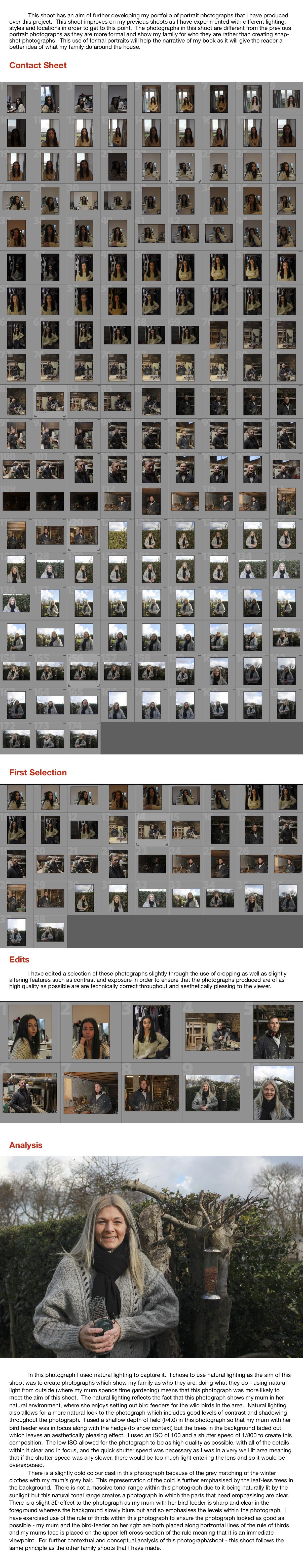
I first started selecting the images I wanted in my photo book by in lightroom by colour rating them into different colours if i wanted to use them. I had an idea of the images I definitely wanted to use in my photobook so rated them green. I then selected other images which I liked and rated them yellow and purple so I could experiment when designing my photobook in lightroom to see which made the best sequence and portrayed a message. This means that I won’t use all the images I’ve rated, but just the ones that combine to make the best photo series.

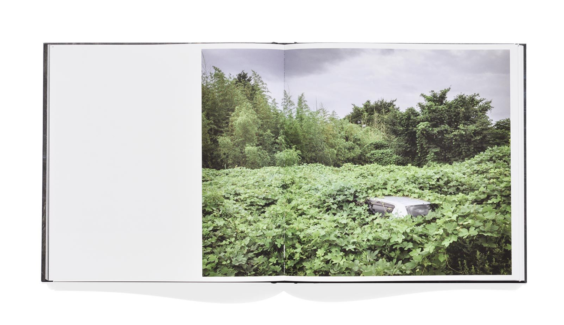
I then put all the images into a book format and started rearranging them from there instead of before making the book, so I could visually see what the image look like displayed together and which one complement each other. I want the sequence of my book to nt be too overwhelming because within the landscape images there is a lot of detail. To try and stop this i plan to  add in double page spreads of single images between more detailed pages to create a break for the reader. This will also make the double paged images stand out more so I will chose images that I want to be emphasised.

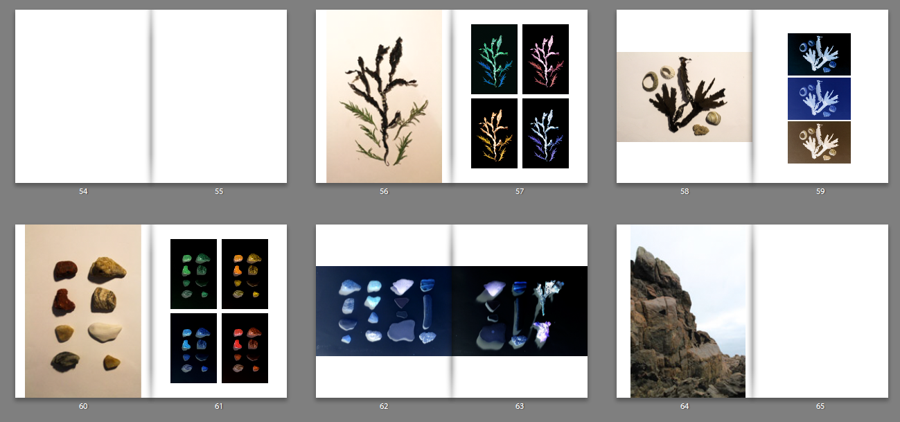
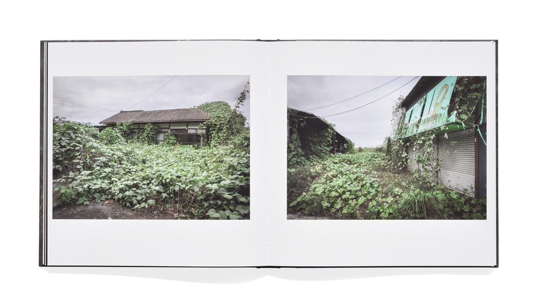
I started my photo book layout by arranging my photos of objects i found on the beach that i formally photographed. I started with theses I knew definitely that i wanted to include these image in my photobook so didn’t have to make decisions about which ones to keep. I decided i wanted a similar layout to Chrystel Lebas in er ‘Field Studies’ book so displayed the original images on the left of the double page spread, with the four edited versions on the right page. I think this layout is effective as it shows the contrast between the originals and the edited versions. One aspect i could improve with these double page spreads are the original images as i don’t like how their is a noticeable border around there the colour of the paper contrasts with the white of the photo book paper. To fix this I made the images full page so that there wasn’t noticeable white borders around the edges.

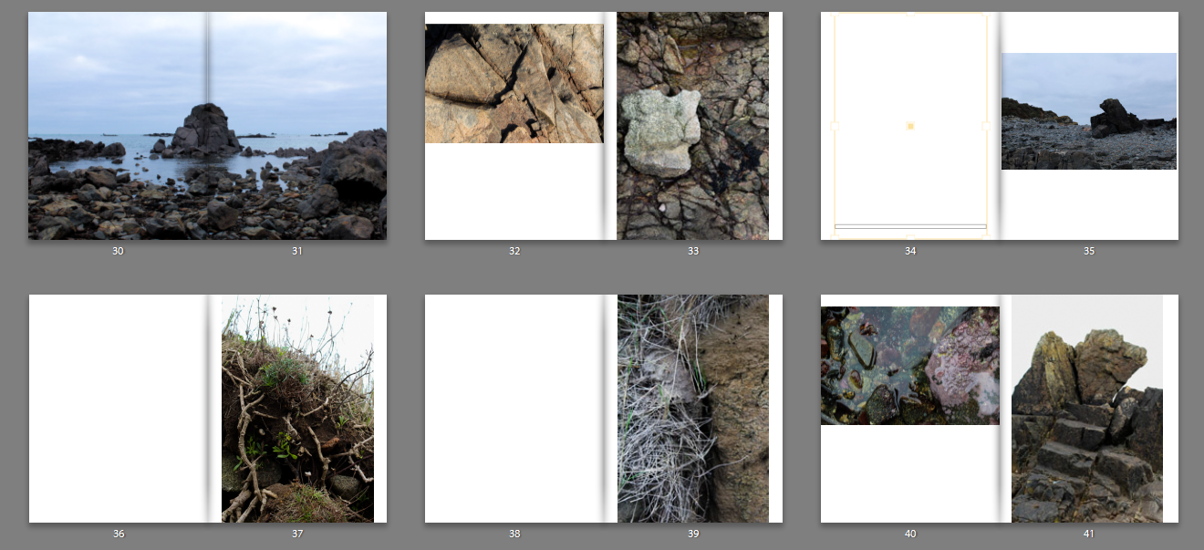
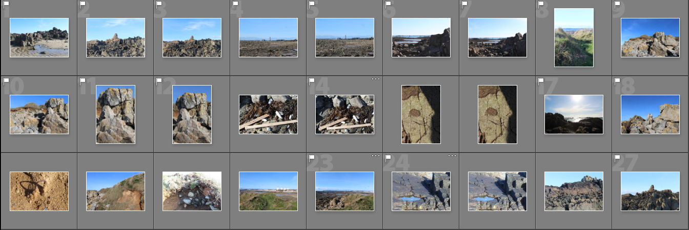
I also started arranging my landscape photography, starting off by trying to find good combinations of images to go on double page spreads. I decided that i would chose a number of set templates for my photobook so it doesn’t look too unordered so it creates an order that’s easy to look through that has a continuous theme. I decided which images looked good as a double page spread and which looked better as single images. For example, the image taken in my ‘Landscapes at dusk’ shoot looks best as a double page because of its composition as well as the cool tones, the double page adding to the vastness.

Also, because i found myself taking images where the main subject  is centered , I couldn’t include these as double page spreads as in my book some of the image in the middle will be cut because of how the book was made, unless the subject was big enough to not get cut off like in the image above. So for these image i had to find combinations with other portrait images to stick to the templates in chose to use which was one landscape and one portrait image on a double page.

When experimenting with layouts i found i like this combination of the archival image and my modern image as together they connect at the same points, creating the appearance of one image across the double page spread. I think that the contrast between the rounded shape of the image in the right in comparison the the image on the left where theres more detailed in the earth creates an interesting image. Although the image were not taken at the same location at La  Motte (the archival image is of the island whereas mine is a close up of the rock nearby), I think that it creates a juxtaposition of different textures, the archival image is where the earth has fallen apart from the excavation which juxtaposes with the more smooth texture of the rock with the seaweed attached.

I also like how the difference between the archival and modern is emphases by the archival being in black and white compared to the coloured modern one. This makes the brown tones and the pale blue sky in the modern image stand out more. Although, i decided that i didn’t want to use the layout of these tow images together in my photobook as the layout in my book has a full page  image together with another image with a white border, which this layout doesn’t follow so may look out of place. To fix this i could create more double pages like this, but i don’y have enough archival images that connect at the same points to my modern images to make enough page. I will use these images in my photobook, but separately with with different images complementing them.

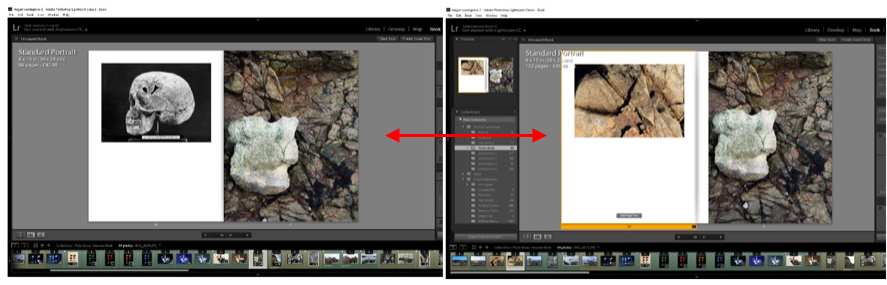
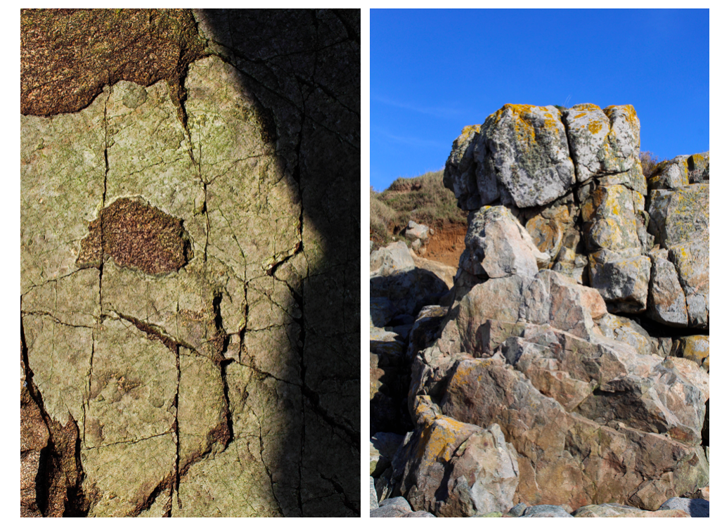
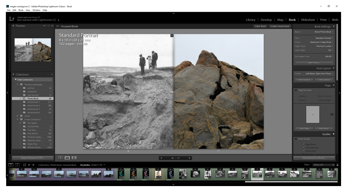
For this layout, I narrowed the images down to two layouts  that worked best with my image on the right side. The layout on the left has my image displayed full page, with an archival image of a skull on the left page. I think this this combination of images works well as the shape of the bright rock in my image resembles the shape of a skull and is a similar colour. This creates a link between the two image which I think makes a good layout, linking the past to the present. When editing I brightened the rock so it was more noticeable, which i think also makes the link more noticeable. I also like the contrast in the background of the two images. The archival image has a lack background as it’s a formally taken photo, this then contrast to the background of my image which is brown rocks, adding more detail to the image. The dark parts and shadows in my image link to the black background of the archival one, which i think makes them complement each other. There is also a mystery surrounding the archival image about who’s skull is displayed in the image as the skull belonged to somebody over 90 years ago, the rock also belonged to the land along time ago.

The second layout is another landscape image i took from a different shoot. In this shoot the lighting was different so the appearance of this rock different as it has warmer tones where the brown is emphasised with more yellow tones. This contrasts worth the image on the right where the warm tones are less noticeable, the town more darker. Another reason i think these images complement each other is they both have noticeable dark lines highlighting the shape and texture of the rock, linking them. The lines in each image are detailed, but have similar shapes to each other and the combination the two makes the layout seem more modern through he warm colours and the shapes resembling that of abstract, especially in the left image where i took a close up angle. Using this image also emphasises the highlights in the right image as it’s brighter.

Comparing the two layouts I decided that I will chose the layout comparing the skull to my image as i think it represent the concept of my project more. he archival image contrasting to the modern image addresses how the natural landscape changes an evolves over time.

Text in Book

La Motte is a tidal island, and listed archaeological site, also known as Green Island, located in the Vingtaine de Samarès in the parish of St Clement on the south-east coast of Jersey, Channel Islands.

Archaeological excavations carried out between 1911 and 1914 showed that the islet had been occupied over a long period of time. Despite being quite small the site is unusual because it had several both ritual and domestic elements, as well as providing important environmental evidence relating to changes in sea level. The remains of a series of prehistoric rubbish heaps, dating between 1,500-300 BC, containing fragments of pottery, animal bones, stone tools and shells were found.

Some archaeological evidence has been found here. Remains of a cemetery on La Motte are believed to be from later settlers. There are Neolithic elements including a cairn and a number of middens, dating from 1500 BC to 300 BC, on La Motte.

I think including text about La Motte gives the reader insight into the images their looking at as they might not know where ‘La Motte’ is as it’s more commonly known as Green Island. I also think that it reflect the work of Chrystel Lebas in her photobook ‘Field Studies’ as she also includes text about the places she visits. In her book she also includes 3 essays from others about the environment to back up her images. I decided not to include long passages in my photobook I didn’t want to take the attention of the readers away from the images, so included a few short passages to help inform them about the project, but not completely distract them away from the main concept.

Photoshoot 6- Landscapes

For this photo shoot i went back to La Motte to gather more objects that I thought represented what was there now to compare with archival images. I narrowed these images down and displayed them in a contact sheet above.  Whilst i was there I also took additional landscape photos as the weather was different to what my other landscape images had been take in. From the photos I took, I displayed the final landscape images and studio images separately in two parts below.

Part 1- Landscapes

I particularly like these two images from this shoot as they have a different atmosphere to the other images in my project. The bright blue sky that’s behind the rocks and horizon, contrasts with the tones in the foreground in both images. When editing these images I will emphasise the contrast between the two colours. In the first image I was drawn to the  unusual shape that the rock made along the top and the detailed sharp edges within it. I wanted to emphases the chaotic nature of the pattern, so contrasted it with the plain blue sky on the top half of the image, splitting the image in two. In the second image I wanted to emphases the developments that have been built along the horizon to contrast with the archival images from over 90 years ago when they were there. This is why I centered the image so that the incinerator was were the eyes are drawn to. I found I also created the same composition in this image as the first image, where the patterned bottom half of the image is contrasted to the blue sky.

I found that when I am taking photos I takes ones where the main subject is in the center of the image, creating a symmetrical composition.  In my photo book I plan to space out the images where I centered an aspect of the photo, so that they create more impact by themselves.

Other images from the shoot:

In these portrait images I tried to emphasise the shadows the that were made by the rocks. I particularly like the third image where i take a close up image of the pattern on a rock, highlighting the light and dark. I think that this image contrasts well with the other landscape images as it shows a close up angles contrasts with a wide one. In all the images, I wanted to focus on one section or a rock or the earth and emphasise it, which is why the objects all continue out of the sides of the photos.

Editing:

When editing these landscape images in photoshop I found that they were most effective when they were black and white. I experimented by editing a couple of them this way and compared them to the originals.

As well as turning the images black and white, I also adjusted the contrast and the white and black to find what made the image look the most aesthetically pleasing.

I think these two images in particular are the most effective in black and white as the detailed patterns that were originally there stand out even more. The different tones in the sky are more noticeable and are emphasised by the contrast to the rocks. Whilst editing I also used the grauduated filter to make the sky have more of a range of tones so that the final image was more vast and dramatic.

Although I like my black and white edits where I’ve emphasised the light and dark, I think that my final images for this project should be in colour as the archival images I have chosen to include in my photo book are in black and white. If my images were also in black and white the reader might get confused as to which ones are the modern ones that I took.

Part 2- Objects Experimentation

For the images photographed in a studio I edited them on photoshop. I first inverted the image to create the appearance of a photogram, simialr to Chrystel Lebas and Edward James Salisbury. I like this editing style as in my previous experiments from different shoots I found that the final images reflect the work of the early botanists where they used light sensitive paper which gives my images a scientific appearance. Instead of using natural objects i.e plants and seaweed, in this shoot I photographed  man made objects to represent the changed environment in my work. Comparing these photos to that of early botanists show how what is found has changed over the period of 100 years and reflects the ideas of anthropocene. Secondly, I adjusted the levcels in my image so that the background was darker to contrast against the objects. I then adjusted the hue of the images so that that I could create different variations of the same image to see which one was the most effective. I displayed these variations below in a grid format. I also adjusted the levels in each image to brighten the obejcts and make the background darker.

From these variations of the same images, I think that the most effective image edited in the bottom row as I like the use of negative space within the circle shape the rope is making. I also like how the background in these images is completely black, taking the attention and focusing on the objects. The other edited images do this but have grey tones within this so distract the audience form the main subjects. Although I do like how the top rown images have a different appearance to the other. The bottom row shows exactly whats the object is, the appearance being more scientific, whereas in the top row it is harder to distinguish what the object is, perhaps making the overall image more interesting. This is through the lighter shapes surrounding the rope, which is the shadows inverted that were created when I photographed the images. I created shadows purposefully when photographing these objects as I wanted to see the effect it created when I inverted the images. Compared to the bottom row images, I think that they have a more delicate appearance as the shapes created are more rounded and go in multiple directions.  In conclusion, I think that all the images are effective as they show different aspects of the same objects at different sections of it. In my photo book I will include a few variations of these images to interpret the work of Chrystel Lebas in her photo book ‘Field Studies’ where she include photograms.

For another object experimentation I decided to use all of the objects I had collected over the shoots I have previously done ans combine them with the objects I found in this shoot. I think that this is a good way of showing the changed environment and I thought that it could be a good image to end my photo book with.  When arranging the objects, I first put the rope in a circle shape as this is the biggest object and the one that stands out the most. I then started placing the other objects around the shape of the rope, going in the same directions. I think that the combination of the natural obejcts e.g rocks, plants, flowers, seaweed in comparison to the main subjects the rope, creates an interesting image as it separates them as there is a divide in the center of the image, created by the rope.

I then went on to experiment with this image by editing the colour and tones within it. I tried to use warm and cold colours to see which was the most effective. Out of these edits I think that the black and white image is the most effective. This is because the shapes and shadows are emphasised as well as the negative space. Although in this image it is harder to see what objects are being photographed as they are all arranged so close together. In the orange/yellow toned image it is easier to tell what the objects are as the edit brightens the objects and the colours within them. In conclusion, I’ve decided that I won’t use this image in my photo book as I think it is too different from my other formally taken images and won’t create an easy sequence to look at. Also I like how in my other images I have displayed the objects by themselves to create a scientific appearance, like what botanists do when they are analysising species. In this image you cannot tell what each o f the objects are clearly and doesn’t follow the scientific approach I have been following throughout my project.

Book Specification

1. Write a book specification and describe in detail what your book will be about in terms of narrative, concept and design.  Produce a mood-board of design ideas and consider the following:

Narrative: What is your story?
Describe in:

  • 3 words

Re-visiting changed environment

  • A sentence

Looking at archival imagery, I re-visited La Motte to document the effect of time on the environment.

  • A paragraphs

90 years after the archaeological excavations at La Motte of 18 cists dated from the Bronze Age to the Iron Age, I re-visited this area comparing the archival imagery with what is there today. I focused on documenting the environment e.g rocks, plants and landscape, as well as gathering objects i found there and photographing them formally. The underlying theme to my photobook is the effect of mankind on the environment over a period of time, taking inspriation from ‘Field Studies’ by Crystel Lebas.

Design: Consider the following

  • How you want your book to look and feel
  • Paper and ink
  • Format, size and orientation
  • Binding and cover
  • Title options:

La Motte: Walking through Landscapes and Archives

La Motte: The Changing Environment

The Changing Island

The Island: Walking through Landscapes and Archives

  • Structure and architecture
  • Design and layout
  • Editing and sequencing
  • Images and text

I want my photo book to have a scientific appearance to it, linking to the formal imagery at the end of the book of objects I gathered taking inspiration from early botanists . I also want to try and emphasise the comparisons between the archival imagery and my photography by having my images in colour which contrasts with the black and white archival images. Similar to Crystel Lebas I want my photobook to have writing in it giving information and history about the area. Some of the landscape imagery will be across two pages, similar to Lebas panoramic photography. The photo book will be portrait and smaller than A4. Inside the photobook I will stick in additional images after it has been printed to emphasise the appearance of a scientific notebook, giving a more authentic, handmade look. The first half of my book will focus on my landscape photography documenting the area. On some of these pages I will juxtapose them with archival imagery from 1911-1914 to show the history of the area and to show how the environment has changed over 90 years due to climate change. Towards the end of the photobook I will display the edits of the objects alongside the original image formally. This is a contrast to the first part of the book, the last part focusing on a more scientific exploration. In ‘Field Studies’ Le bas calls the second half of her photobook ‘Weeds & Aliens Studies’ taking inpiration from Salsibury’s book. I also want to include some of the natural objects and archival imagery at the start of my book as the reader opens it so they have an idea of what the photobook is about and can understand the underlying story more.

One quote i want to use in my photobook is ‘We can in fact only define a weed, mutatis mutandis, in terms of the well-known definition of dirt as matter out of place.  What we call a weed is in fact merely a plant growing where we do not want it.’  Edward James Salisbury (1935). This is because I think it links to my imagery of objects i gathered in the area (specifically the plants) as they have been taken out of their natural environment.

Book Specification

I want my book to be finished with a hard cover to show a professional finish and ensure quality throughout it.  I believe that an standard sized landscape photo-book will be the most appropriate size as the photographs will be large enough to be seen in detail and there will be enough space to mess around with the formatting of the photographs.   For the paper I will choose the option of premium lustre paper to offer a hint of gloss as well as greater tonal range and contrast. Throughout the book I will be using a mixture of landscape and portrait orientated photographs including a mixture of family environmental portraits and documentary-style photographs of my house as well as archival photographs as this will create a sense of documentary as well as including a personal touch.  I will be using a mixture of design layouts throughout the photo-book such as full-bleeds, off-centre photographs and centered photographs to create a variety of styles and to keep the viewer interested in the narrative.  I am planning on creating a narrative that shows the development of the house from beginning to the current state whilst including personal portrait photographs throughout as well as a couple photographs which do not seem to fit the narrative – the result of this will be a couple of narratives running throughout the book creating a more interesting and experimental book.  I think that I will be using primarily images in the book with minimal text as I would prefer the photographs to show development rather than explaining through added context.  I will be using a mix of black and white and colour photographs – the documentary photographs of the development of my house will be in black and white whereas photographs depicting family memories will be in colour in order to bring some life into the photographs.  I will be taking inspiration for the layout of my book from some of the layouts in “Retracing Our Steps” by Bression and Ayesta.

Botanical Experimentation

I started experimenting with my images from photoshoot 5 in photoshop, taking inspiration again from the photograms in Chrystel Leas series ‘field studies’ with new material. I want to continue developing my interpretations of her work so i can include some in my final photobook. In this photoshoot i collected natural objects like plants and rocks and displayed them formally. In Photoshop I inverted the images so that the white background i photographed the objects on turned black. I then adjusted the hue of the images to create different variations of the same image. I also adjusted the levels in the image to produce the most aesthetically pleasing image with the most detail. After this process i edit the image in Lightroom and edit around the objects so that the background is the same colour, eliminating any lighting and marks that weren’t supposed to be there.

I particularly liked this image when i experimented with different colours as i think the multiple objects displayed makes the image more interesting to look at and creates more of an impactful image. I also chose to display these images together as i think they work best as multiple images together, rather than singles images by themselves, as it shows the contrast between the 4 images and the variations. It also shows how the colour of the main subject of the image can can the whole feeling of the image. For example, the red image makes me think the there is a negative concept and message behind the plants, whereas this effect is not created in the yellow edited image.

Displaying them together shows how there can be many variations of the same image, that portray different meaning through colour. In these images i think that the black background works well as it emphasises the repetition of the leaves and shapes going down in size and the different shape that each plant has. I also chose to photograph this image landscape, unlike my other images in this photoshoot as i wanted to display the different sizes of plant. I think this can then show plants at different stages of their life representing how the landscape is constantly changing and growing .

Anna Atkins’s cyanotype of the eagle fern (1843)

I like the effect created when I inverted this image and adjusted the levels without changing the hue in this image as I think it reflects the early photograms that botanists made with light. One example is Anna Atkins’ photograms of algae in 1843. I think it creates an image reflecting the ideologies of romanticism that isn’t shown as much in the images where i edited them have a black background. This is because the main subject is made to seem brighter because of the brighter blue background, creating a more delicate and fragile appearance the objects. I also like this effect as it makes the appearance of the image seem more scientific, like an X-ray analysing every aspect of what’s portrayed.

The flowers in the inverted image look as though they are slightly blurred. This is because the shadows i created when taking the photographs have turned whiter, blending with the actual objects, making it seem as it it’s slightly moving. This reflects Mandy Barkers images in her series ‘Beyond Drifting: Imperfectly Known Animals’ where she moves the the plastic debris she’s photographing so it’s blurred and looks as though it floating in the sea. 

I continued experimenting with this image to see if i liked them in colour edits. I found that i do like them, but for a different reason to the first edit. These images have a more powerful, impactful appearance in comparison to the first edit. This is is because of the contrast between the dark black background with the bright colours of the plants and rocks. I also like these images as i think they grab the audiences attention quicker, and the repetition of the same image horizontally shows how variations of the same image can look very different.

I think i prefer the first two images other than the forth and fifth images as i think the last two look to edited and artificial. Although that was the intention of editing the in bright colours, the last two might be too edited. The first two are yellow and red and work as a juxtaposition to one another, whereas the last two don’t work as well as a contrast as they are both tones of blue. Overall I think these images work well as a series showing different colour edits. If i were to use them in my photobook i would arrange them in a different order so that the two tones of blue weren’t next to each other in the series.

Finally, i created different edits of images displaying just plants in them, also including some small flowers i found on La Motte. I think these are my favourite two images that i edited as i think they created a more delicate appearance that wasn’t there when rocks were displayed in the image. This is because rocks are bold and structured in comparison to the plants I’ve displayed. I first started editing these images by inverting them and not changing the hue to see if this image work as well as the previous image. I found that i liked this edit, creating a similar appearance to the the previous ones, reflecting the work of botanist Anna Atkins that some would consider the first female photographer. I developed them further and found that i preferred these images when i adjusted them in colour.

These three images are my favourite variations of colour edits. The first two are the same image edited in yellow and blue. I like the first image as it simplistic yet detailed at the same time. The detailed patterns created by the stem and flowers on the plant make the image more interesting, but it is still simplistic through the dark black background. This focuses all the attention to the object in the image.

I arranged the plants this way, with one placed vertically with the other coming out of it side, as it creates the appearance that it’s just one plant and i also wanted the stems and flowers to be pointing in different directions to create a more interesting shape. Having the plants in different directions makes them more emphasised against the black background as you are able to see all parts of the plant, rather than them being on top of one another.

The second image is edited in blue tones. I made the plant brighter in this image in comparison to the others as i thought it worked well with the blue background. Also in this image i decided that  instead of a black background i would experiment by having a more navy colour to complement the blue tones of the plant, which i think worked well. In this images the blurred lines are emphasised more which is an effect i like.


The third image is my favourite from the shoot. In addition to the plant, i also added small flowers that i found on La Motte on the left side of the image to give it another interesting aspect. I think this image worked well as a yellow edit, as the flowers i found were originally yellow, so the edit emphasises there natural colour making them stand out more. I also think that they complement the plant well as they are different tones of yellow, the plant being a more darker yellow with hints of brown. The same delicate effect is created taking inspiration from the ideologies of romanticism, similar to the first two images but i think this effect is emphasised with further with the flowers added. This is because of how the flowers all create different shapes against the black background, not one being the same. When photographing this image i tried to make it seem a though they were originally apart of the plant, but had fallen of due to the changing environment.

Photoshoot 4- Landscapes at Dusk

I went back to La Motte at dusk and took 100 images. I then narrowed them to 36 images and displayed them below. I decided to go to La Motte at this time so my images have different lighting and tones in them. In Chrystel Lebas photos she often goes out to photograph at dusk (what the French call l’heure bleu ) when the world becomes more mysterious.  “I was fascinated by night itself, by the absence of light and the impossibility of photographing” Lebas told Nanda van den Berg, the director of the Huis Marseille in Amsterdam. This inspired me to go out at this time the day to see how this would differ from the previous landscape image I’ve taken in this project.

I like this image I tried to emphasise the cool tones to heighten the elementalism relating to the ideologies of sublime. I think this particular image of mine definitely reflects that of the sublime, through the bold, structured shapes of the rocks with dark tones ranging rom brown to black. This combined with the sky which is a blue tone due to being taken at dusk, creates a mysterious and other-worldly appearance.

I wanted to show how the environment was changing by how the rocks had been warn down in comparison to archival images from one-hundred years ago. This is similar to how Lebas wanted to express how the environment was changing though how trees are growing, dying and re-generating themselves. I also like how the horizon is in the middle of the image creating a good composition, with detailed patterns and structures on the bottom half of the image which is juxtaposed with a simple sky with faint clouds. This is then connected with the rock in the centre of the image, being in both half of the image. The center rock is isolated from everything else in the image by sea and is shown by itself which contrasts to the other rocks in the image which are in groups together making the audiences eye going to the entered rock first. When editing this image i will see why it look like when i darken the clouds creating a more vast image.

I particularly like this image from my photoshoot as it has more context and meaning behind it than some of my other images. To me the cross in the center of the image could represent the peoples lives that have been lost on the beach, or the people that were buried in the island. This makes the image more mysterious and allows for the audience to interpret it however they want.

I also like the composition in this image as it is split into three sections , with the cross in the centre of them. The bottom part is th darker pat of the image, the dark brown tones contrasting to the light blue ones in the sea. The tones in the  bottom part of the image link to that on the horizon which creates a more aesthetically pleasing image. This is also because the blue tones in the sea complement the colour of the sky. The cross in the centre of the image is the point that the audience first looks at as it dark brown colour is contrasted against the sea behind it. I think image also links to the first final image in this shoot as they both have a subject in the sender of the image which draws the audience in, which is then surrounded by detailed rocks and blue tones. I think these two image would work well in a  photobook as they complement each and have simile aspects but aren’t too similar that your looking at the same image twice.

I tried to emphasise the blue tones in this image when photographing it at dusk and think I successfully did this. When editing this image i will try to further emphasises these blue tones and maybe even create more contrast between the tones in the sea compared to the sky.

Edits

When editing my final images for this shoot i decided that i wanted to emphasise the colours in the sky and darken the colours of the clouds to create image the reflected the ideologies of the sublime more. I use the Graduated filter when editing all my images and adjusted the exposure, contrast and temperature to create more stand out images.

To experiment with this image I darken the blue sky towards the bottom but kept some of the white clouds around the top of the image noticeable so there was more contrasting colours. I think that the edited blue sky against the white clouds emphasises them more than the original and makes the landscape seem more vast. I also darkened the rocks around the bottom of the image to make it seem later in the day than to when he image was actually taken to make the overall appearance more other-worldly and mysterious.

I also experienced my adjusted the colours and temperature in the photos to see if any of the other variation would make a better image. I changed the image so that there were more warm colours int he sky the cooler colours. Doig this created completely different atmosphere in each image compared to the original. These edits make the image look more other-worldly as the colours in the sky aren’t something you would see everyday, which perhaps makes the image more interesting to look at.

Overall, I think i prefer when the first edit where i emphassed the colour tones as it creates a more sublime image and reflects the work Crystal Lebas more, which is something that i wanted to do in this shoot.

In this image i edited in a similar way to my previous image to see how editing the same way would make the images different. I darkened sky in this image using the graduated filter so there was more of a separation between the sky and the sea. I think this makes the sections in the image more noticeable as their are all different colours. Also the darkened sky makes the landscape look more vast and dangerous like there’s a storm, looking more sublime than the original.

I also tried editing this image with a warmer tone for the sky adding more yellow into the landscape, which creates a different atmosphere in the image. It doesn’t look as natural as the original, taking away the natural blue colours and adding a more other-worldly appearance. I also tried brightening the sea in the right image to create more of a contrast between the dark sky but found that it looks too edited as the dark sky would reflect the sea in real life, which isn’t happening in this image.

As a final image I prefer the first image as I think the darkened sky and clouds fits well with the aesthetic and concept of the image as the cross in the centre is representing people who have passed away, addressing a sensitive and sad topic. To me it shows how even though there’s a storm in the picture and waves the sea, the cross still stands as it always has, perhaps saying something about the people who have died in the area.

I also chose this edit as one of my final images as I like the reflects that the rocks create on the sea and also how it’s showing a different atmosphere to my other dusk landscape. The sea is flat with little waves in it, which contrasts to the other images I took which have more of a dramatic appearance. To me, this image is more calm and peaceful through the flat sea and the soft colours in the sky going from light blue and showing a little of the sun thats just set. In my opinion this image reflects more picturesque ideologies, compared my other images that look more sublime as its not as dramatic and vast and emphasises the beauty in the landscape more. When editing this image i used the graduated filter and brightened the sky a little and emphases the softer colours like the pale blue and orange.