Photographer Research – Hiroshi Sugimoto
Sugimoto Hiroshi, born on February 23, 1948, is a Japanese photographer and architect. He leads the Tokyo-based architectural firm New Material Research Laboratory.
He came to be known for his strictly black-and-white, highly stylized photography series. These series show views of the sea, extremely long exposed theatres, photos of scientific display cabinets, wax figures or Buddhist sculptures. Hiroshi Sugimoto sometimes works for several years on these work series. In recent years he has occupied himself increasingly with architecture, furniture design, objects and fashion.
“It was my goal to visualize the ancient layer of human memory with the means of photography”
“It is about returning to the past and remembering where we come from and how we came into existence.”
Photo Analysis

Technical
Although this photo may look plain and simple at first glance; there are many technical elements embedded in the image. Firstly, the smooth ripples in the water mean long exposure was used, Hiroshi Sugimoto most likely paired that with a slower shutter speed and bigger exposure to achieve this smooth and serene effect. Since the sky is rather dark, it’s natural to assume that the photo was taken at night – due to this, Sugimoto didn’t have to worry about overexposing the image as it would have been too dark to begin with. If the photo was taken in the dark, there would be no natural light for Sugimoto to work with meaning he had to rely on his camera and settings. Referring to Ansel Adam’s tonal range; the image seems to be missing the darkest black and brightest white but captures most of the tones in between.
Visual
Visually, I find this photo very pleasing and soothing. The lack of colour doesn’t feel like a disadvantage in this image; in fact, the lack of colour contributes to the simplicity and straightforward nature of Hiroshi Sugimoto’s photographs. By looking at the other photos in this set, it is safe to assume that Sugimoto used a black and white effect on this photo like all others. The photo has two parts to it: the sky and the sea, divided only by the line of the horizon that creates a soft contrast between the dark grey sky and lighter waves. Sugimoto purposely arranged the position of the sea like this in countless photographs to play and experiment with the concept of minimalism.
Contextual
The photograph was taken in 1997, during a time where most people had access to coloured photographs- Sugimoto purposely chose to not include colour in this image. Hiroshi Sugimoto studied art in Los Angeles in 1971, at the time of Minimalism and Conceptual Art – this is clearly evident in his work.
Conceptual
To me, the concept behind the image is to challenge the audience’s perspective and views on what makes a successful photograph. The image, at first glance, lacks the most conventional aspects of a successful photograph. The image is incredibly plain due to the lack of subjects but still able to capture the attention of the viewer and provoke an emotional response. The whole set has a similar calm and harmonious atmosphere it radiates, allowing the viewer to feel safe and at peace – which may not be a feeling we expierence much in our chaotic everyday life.
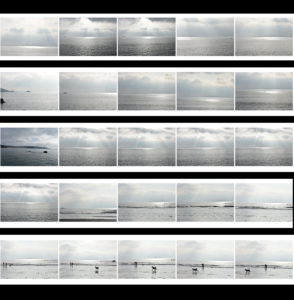
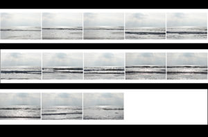
Contact Sheets
Final Edited Image In The Style Of Hiroshi Sugimoto
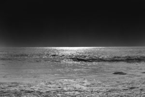
For this image, I first used the lasso tool to separate the sky and the ocean into two different layers and then I simply used the ‘burn’ tool to darken both the sky and the ocean until I was satisfied with the results. It was an easy process but it allowed me to quickly obtain the results I wanted.

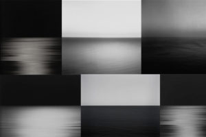


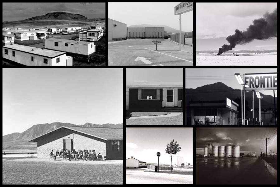
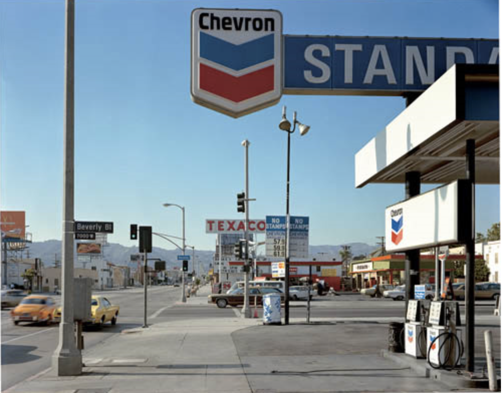

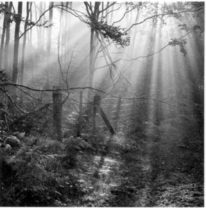


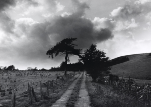
 Before taking the shoot I wanted to pull some ideas together on what to take, allowing for a guideline to my photos, this was my outcome:
 Once I had a general idea on what I could do for the shoot I finally moved onto the images themselves with these being the outcome:
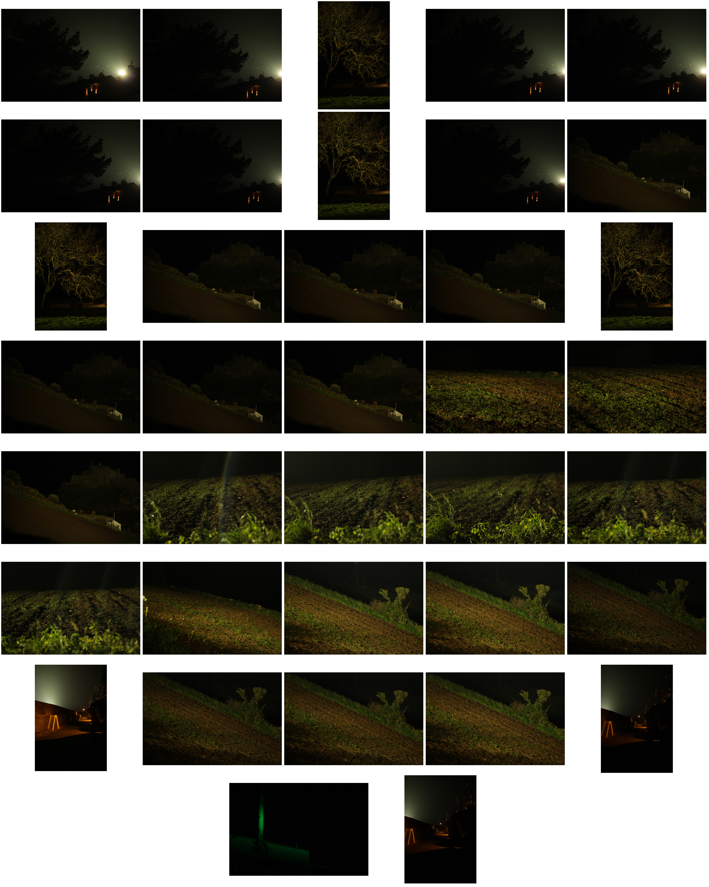


 I chose these images because I thought they popped out from the rest of the shoot, and had a greater understanding of what romanticism in photography was about. I found that their vivid colours and use of depth of field made them particularly effective. From here I wanted to whittle my selection down to just five images to really provide a clearer insight into my final image for the shoot. This is my selection:
 I chose this image due to how I loved the effect created from the back light that was meant to illuminate Gorey Castle at night, that instead silhouetted the housing and trees around it, creating an aesthetically pleasing result as an outcome. And with the slight use of red and oranges from the housing I though it really balanced it out.
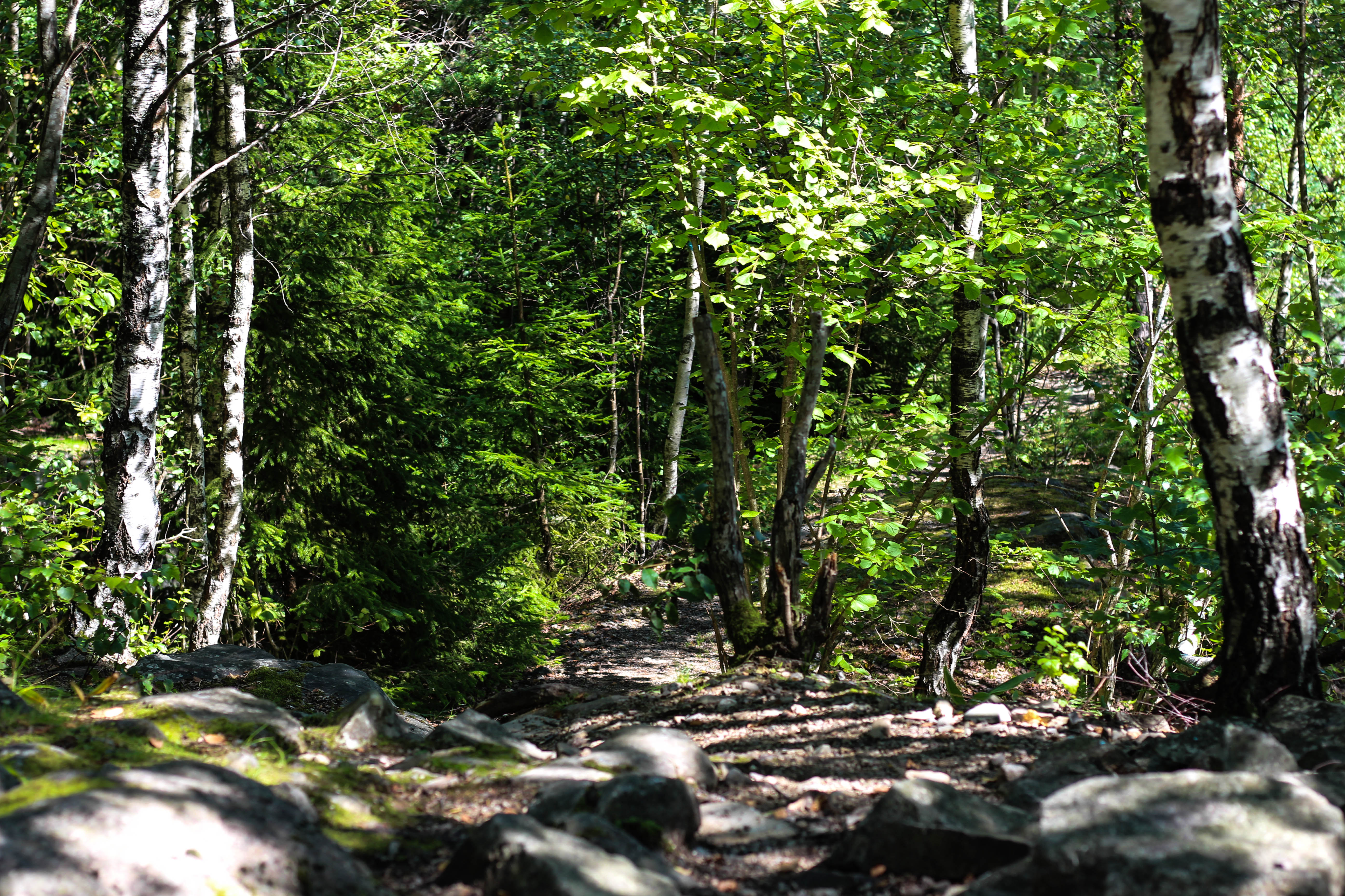 What I loved in this image was the use of the depth of field, this created a focus on a certain section of the woods which instantly drew the eye through the use of its vivid greens. Within the image I used Photoshop to enhance the greens within the image to make it more suited to the theme of Romanticism with the expected outcome as desired.
 I found that this images use of contrast between the light provided by the lamps created an aesthetically pleasing photo. This was because of how by making the oranges within the picture more vivid, it emphasised the shadows created by the surrounding boats, thus drawing the eye instantly to the soft glow of the lamp centred in the middle of the picture.
 The gradient created by the sky I thought particularly allowed for a romanticism theme. This was because of how the majority of the image was made up of the slow but constant changing of shades of blues into yellows, with only a small percentage made up by the landscape. I found that by darkening the ground it created a greater effect onto the sky due to an emphasis to the colours.
 What I loved about this image was the composition and the dark and grim colours. This is because of how the skeletons of the trees create a sinister but beautiful effect on the pathway through the middle of them, with unclear imagery of people in the far distance. I also liked the use of depth of field as well due to how the trees slowly faded and merged into one collective backdrop, whilst maintaining the desired look.
 I chose this as my final image because of how I loved the contrast created by the floodlights to Gorey Castle. I found that through this it completely emphasised the silhouettes of both the tree and the house in a sinister but fascinating way. I also liked how the floodlight captured by the camera is seen as a circular gradient in which slowly fades into darkness, with the three red lights being there to balance out the image as a whole and not let the black overpower the piece.
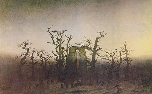

 More about Romanticism can be found
  Adams himself was a photographer but also an environmentalist,he was born California ,San Francisco. He grew up surrounded by nature happening to be in a sand dune golden gate area,although using these years his once wetly family lost their worth and Adams broke his nose making him distinct for his future life.Due to his older family he has a very historical upbringing which influenced him to be interested himself in a Victorian society both socially and emotionally conservative.