About Henner

Mishka Henner is a Belgian artists who is currently living and working in Manchester,his work is featured within the contemporary arts and working within photography in the internet age,he has been featured in many surveys over time.He studied at Lough borough university and also at goldsmiths college,after he attended school in London he stayed there for a number of years until 2003,he vised Tate modern frequently surveying many documentary photography which to him was described as ‘life changing’.Later on in life he featured on many broadsheet magazines and soon after in 2008 joined panos pictures.He has also been described as a modern day Duchamp,his appropriation of image-rich technologies including ,google earth,street view and also you tube.This is the means of all of his inspiration and where he is seen adopting his print-on-demand bypass to traditional models.This creates a unique sense of works which is inspired by many social medias but also the way in which we love as a group in society through industrial urban-ism.

Many of his key works are between 2010 and 2015,Henners work is brought to life by the strong engagement of character and nature within his photography. many of his works resulted in print on demand books,films and installations that featured in large scale museum within France,Canada,and then in the us.He works in the following manner,his new approach of photography is seeing light,photographer without cameras,the need to press the shutter is replaced by a direct interest in images,not necessarily in making images.
Image analysis

title of the pice:OIL FIELDS – Levelland Oil – Gas Field- Texas, Courtesy of Carroll/Fletcher
I chose this image due to the clear though out and interesting composition of the piece itself,all the lines create a strong presence of structure coming from throughout the image,He conceptually wanted to capture the way in which people are continuously walking in a straight created format for themselves and rarely veering off the path,He took this from a birds eye view angle possibly from google maps and used a strong technological purpose.
ideas I would want to use within my work:
I too would want to take high elevated shots in order too mature lines and a structure within what looks like nature but man made lines’ think it is a clear representation of the path that everyone constantly walks, and how they are in such straight lines and create a parasol form. I think I will use his work more as reference and inspiration and will not do the same technique due to this being very unrealistic to accomplish without a drone.
Edward Burtynsky
Burtynsky is a Canadian photographer and artists known for his large format photographs of industrial landscapes. His work is now housed in more than 50 museums word wide.He was born in Ontario and his parents then immigrated to Canada in 1951,his childhood is filled of watching ships pass through locks so a very outside oriented childhoood, he also had an interest within many industrial areas and the slow developing urbanism of his life. when he was just 11 his farther purchased a dark room inclusive cameras and manuals from which he practised and become an ammeter photography .he learned how to male black and white prints together with his older sister established small business
I chose this artists because he had a consistent view though all his work and only demonstrated different angles and heI did not change theme throughout. Much like the previous artists he focused very much upon how he can sues suture within all of his work,I again think this is interesting and when possibly will try to find similar scenarios.

Burtynskys most famous work are sweeping views of landscapes altered by industry,mine tailings,quarries,scrap piles, the grand, awe inspiring beauty of his images and is often tension within the compromised environments they depict. He has made several excursions to china and the country toys industrial emergence and the construction of one of the worlds largest engineering project.
To be able to take images like this I will have to get to very high places and then use a wide lens in order to capture accurately the whole ascent of the area itself.I could also do more night time slow shutter speeds and try to capture the light traces with all the given road paths because it shows even a more detrimental human inference of technology and building in order for human convenience.

Within this image you can see an architectural side to the image and also the the structure to the image and the interesting sense of atmosphere that it brings.The green shows the small amount of nature left In the world and how it is now overpowered by the cities and insurable towns that we all live among.
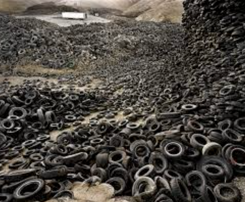
This is my favourite image due to the way in which he uses the interesting and somewhat dystopian feel in order to show a theme of ruins and slow destruction that the human are forming on the earth, his works is done in order to show awareness of global warming and all the negative aspects that we as a society are distilling upon our world.
Ideas for the shoot
I would want to go to many areas such as the dump were there is a large change and a slow deterioration of the green and healthy nature within the environment and how that society and its gradual new buildings evolve so do the effect on the environment and also the people and living and trying to prevent this form occurring.I will only be able to use aspects of this work as I am not able to take images from as high of an angle.

 From here I thought it would be appropriate to come up with a few ideas in order to help me along the shoot and guide me in what I should be doing. Here are my ideas:


 Once all the pictures of the given area had been taken I decided that I should whittle the selection down to the top ten overall images. This would allow me to come to an easier conclusion on what I thought was the best image taken in the shoot. These were my selected images I thought had the best outcome from the shoot:


 I selected this image because I loved the texture created by the shades of rust on a pole. I found that this allowed heavy but effective contrast between the overall piece as all the colors complemented each other making an almost molten scene.
 In this image I found that I particularly liked the contrast between the silhouette of the statue and the dim-lit sky, with the composition of the pole and string balancing out the image as a whole creating a visually pleasing overall piece.
 Once again I loved the use of the colors created by the rust to make an almost volcanic landscape with shades of red overlapping each other. I found the composition of the piece eye-capturing as the more rusted black areas looked like a mountain range captured from a bird’s eye view.
 In this image I tried to capture the way certain streets were looked after within my given area. What I liked about this one was how it incorporated everyday objects as almost ruining and breaking up the pattern made by the pavement through the composition of the paper and cigarettes.
 Finally I chose this picture because I loved the symmetry created by the textures of the floor surrounding the lights making an aesthetically pleasing image. This use of composition I found was most effective from how it drew the eye to the areas wanted through a clear contrast.


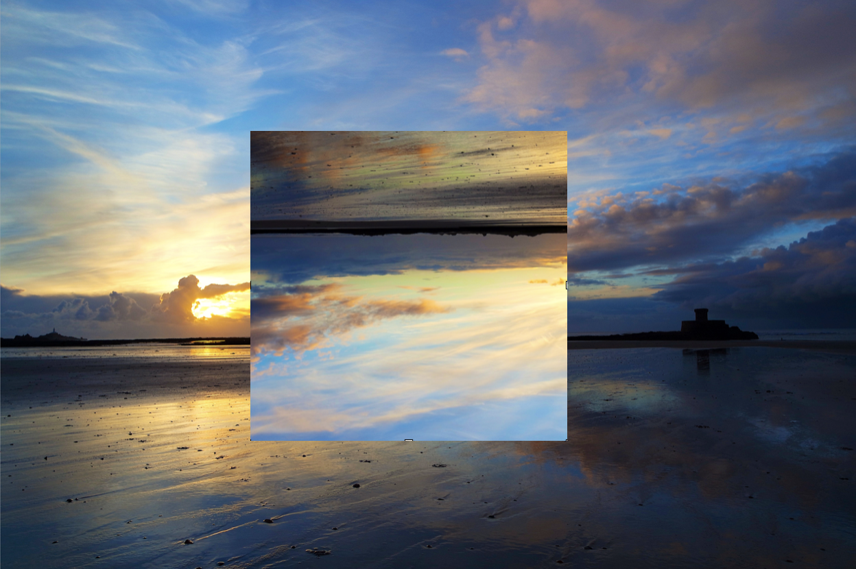
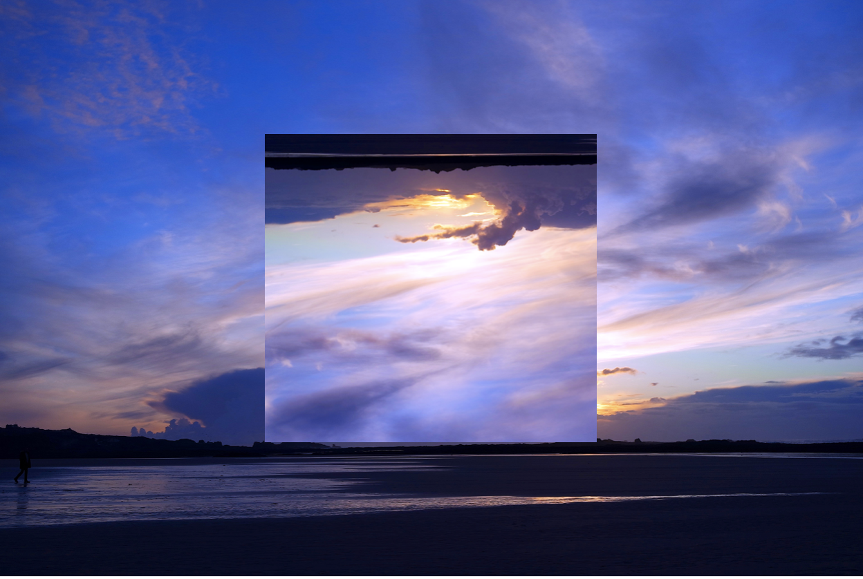
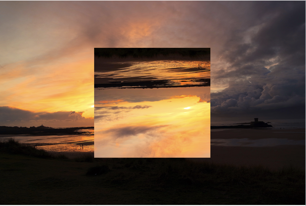
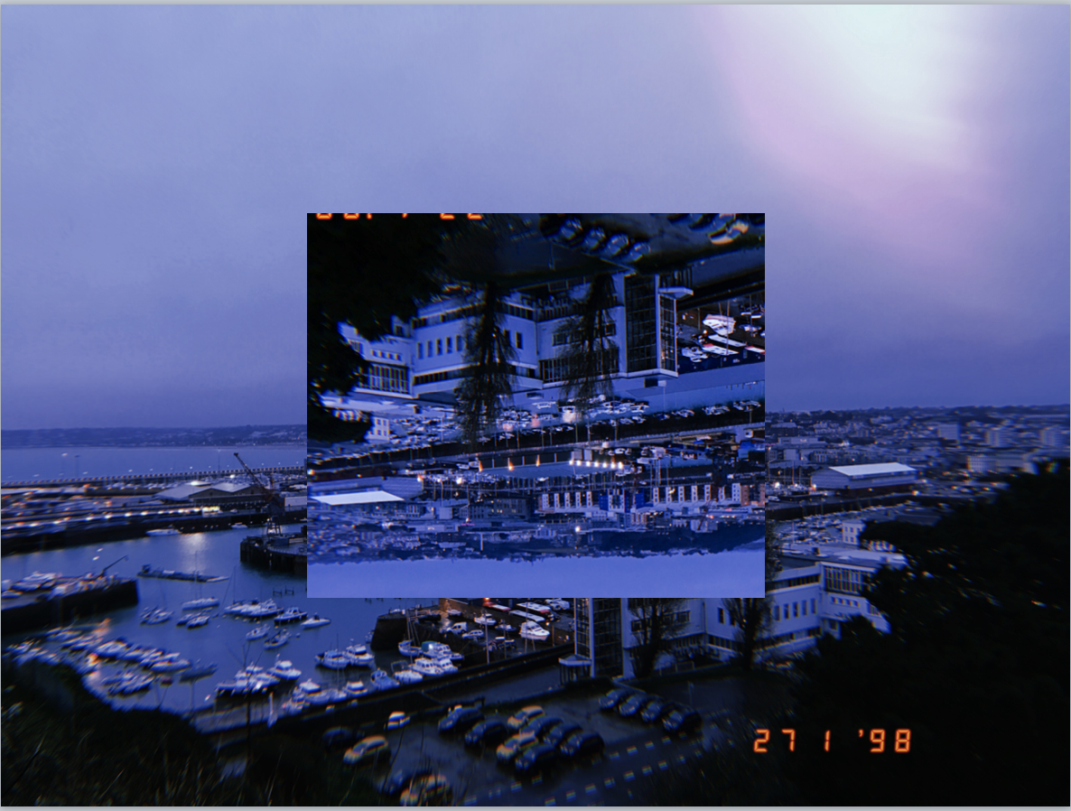

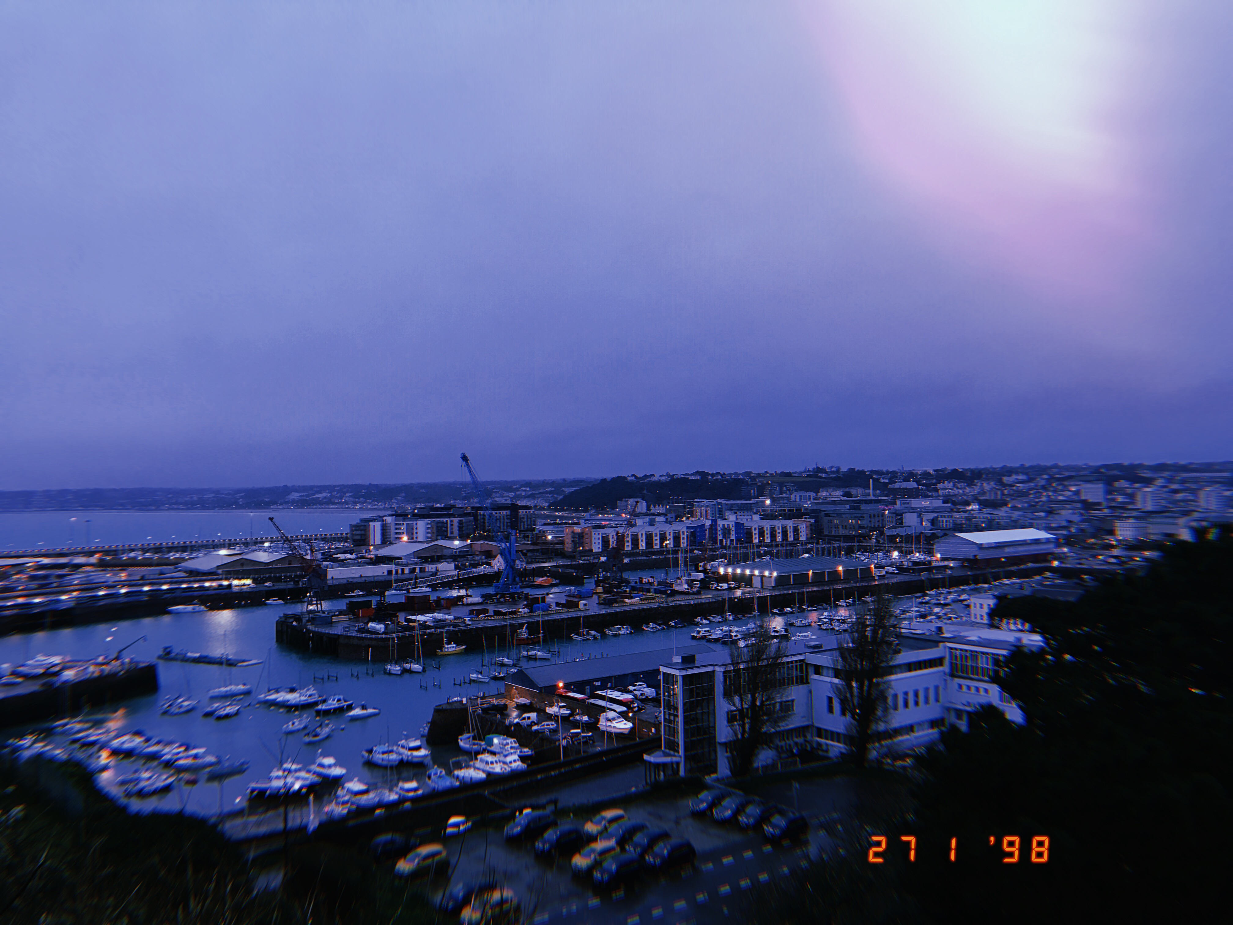
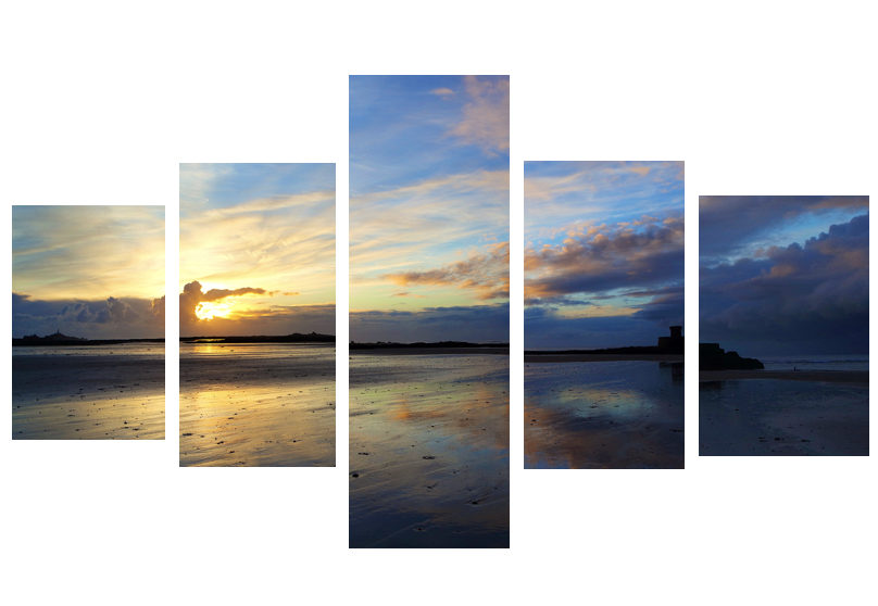

 To add to my research of the area to be explored, I decided that it would be appropriate to take street view shots in order to have a bit of an insight before hand of the area.
 Part of the main area I am exploring is the car park, however now has been transformed into the International Finance Centers, with much of it still under construction. Other areas include Liberty Wharf, which was once known as a former abattoir that was restored and converted for the use of a shopping centre.
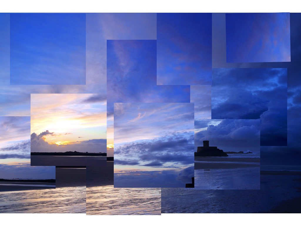
 As seen above Henner very much focuses on satellite imagery as his main source of art. One technique commonly seen in his work is shaped pixels, this can be done through selecting an area and finding the main color present in that space, to then convert it to just that singular color.
 They tend to focus on how the different textures of the floors can create the pattern to make aesthetically pleasing imagery. The images taken are of everyday generic objects that we take for granted and don’t see the patterns within them.


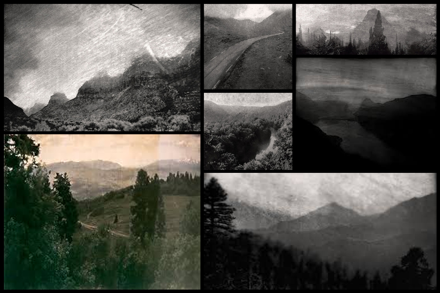


 Lewis Baltz was a visual artist and photographer who was a significant figure in the new topographics movement. His work has appeared in museums, exhibitions and has been published in books.
Technical - The choice of black and white is repeated throughout this movement, it creates depth in the photograph as it has reduced the colours to shades which changes the direction of focus onto the tones in the photograph. The high resolution and natural daylight captures every detail in a bland scene and exaggerates the dullness and precise form of man made structures.
Visual - The photographs serves an aesthetic quality through the minimal shapes and lack of subjects which allows the viewer to concentrate on the straight and rigid lines that contrast with broken and curved wires. Black and white adds to the minimal theme with basic shades.
Conceptual - The photo reflects the movement away from natural landscapes with its banal and ugly qualities yet it finds satisfaction through its minimal style. It also highlights the reality of the progress of man, and the destruction of natural landscapes that have been replaced with flat concrete streets and rectangular buildings infested with wires, pipes, plastic and metal. It could be argued that the concept of the photograph is accepting this development of order and convenience.
Photo shoot - When I went out for this photo shoot I stuck to old run down buildings with interesting characteristics, colours and objects within them with rigid lines and edges.
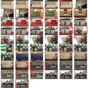 final images -
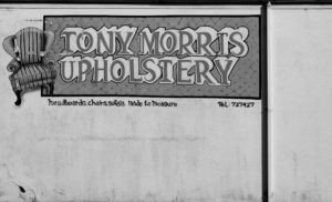
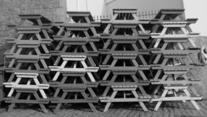
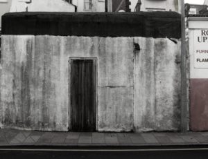
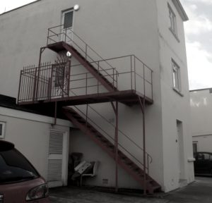

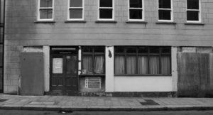 I've chosen pictures that have a lot of simple basic shapes in them, some more than others. Each photo has ugly and banal features, especially in the buildings as they have been stripped and worn down to what this society perceive as ugly. This statement is reinforced in the last image where it has hazard and construction signs, signalling that it has no uses and only dangerous qualities to it. I reduced the colours in each picture, most to just black and white to reinforce the simplicity that the structure of each picture reflects.


