Image 1:
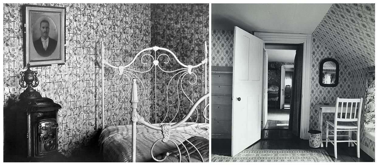
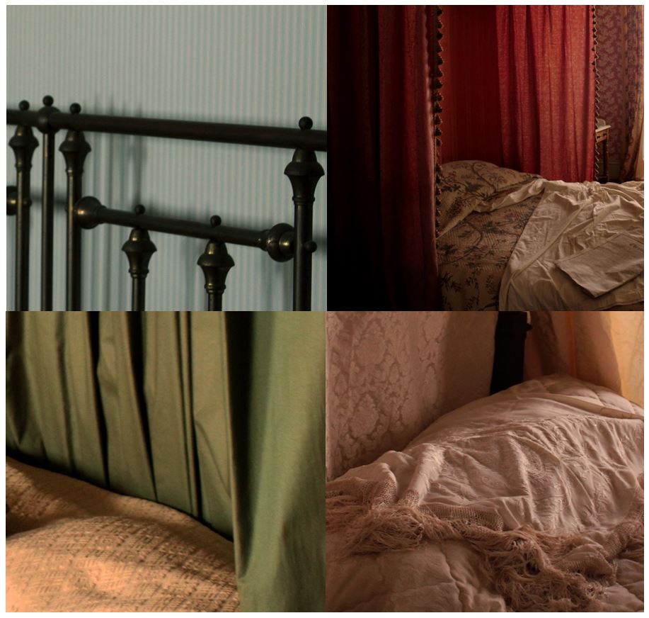 My first image is an edit from my 4th photo shoot. I cropped the original images to focus in on certain section of the original images. I did this to focus on the different textures created by the different materials on the beds in the Merchants house set in 1860’s at the Jersey Museum. I think the way this is displayed is more interesting than the images by themselves as it compares the different colours, tones, textures and patterns. I tried to emphasise the contrasting colours by using the different images containing different colours in each e.g the top left has cold blue colours, the top right has red curtains with pink tones in the bed sheets, the bottom left has green curtains with yellow undertones, and the bottom right has brown and yellow undertones. These colours would have been noticeable if the images were displayed by themselves separately, but are emphasised when displayed together. The concept of this image is to show how conventional objects and furniture have history and stories connected to them. The objects and furniture shown in these images create the impression that someone still uses them based of the casual appearance the settings give. This links to Walker Evan’s images where he pays particular attention to the inanimate objects that are present, almost representing them as characters themselves, also representing absence and the passage of time. My images show furniture and rooms like someone is living and using the furniture, but there aren’t any people, also representing, like Walker Evan, absence and the passage of time
Experimentation:
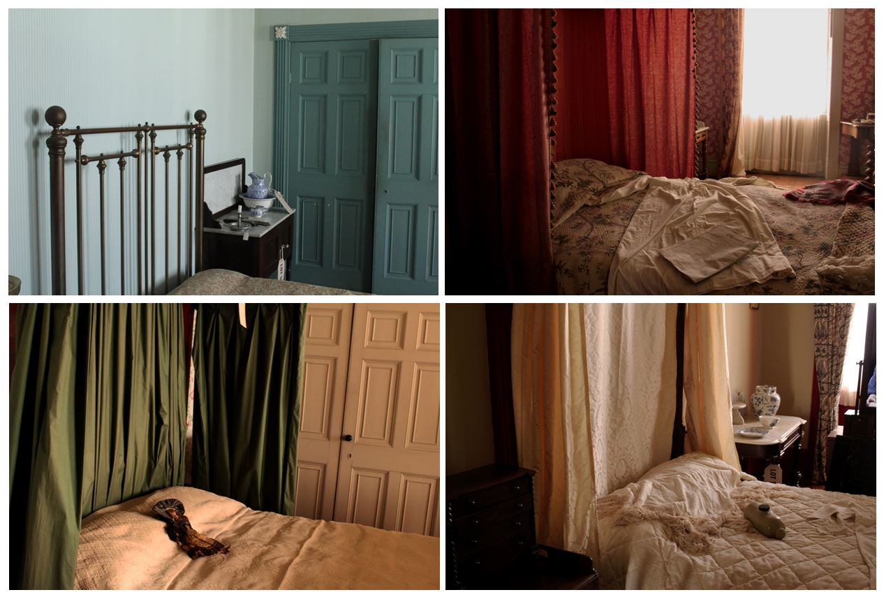
Displayed above is the original images that were cropped. Below i have displayed how i experimented with the cropping on each image.
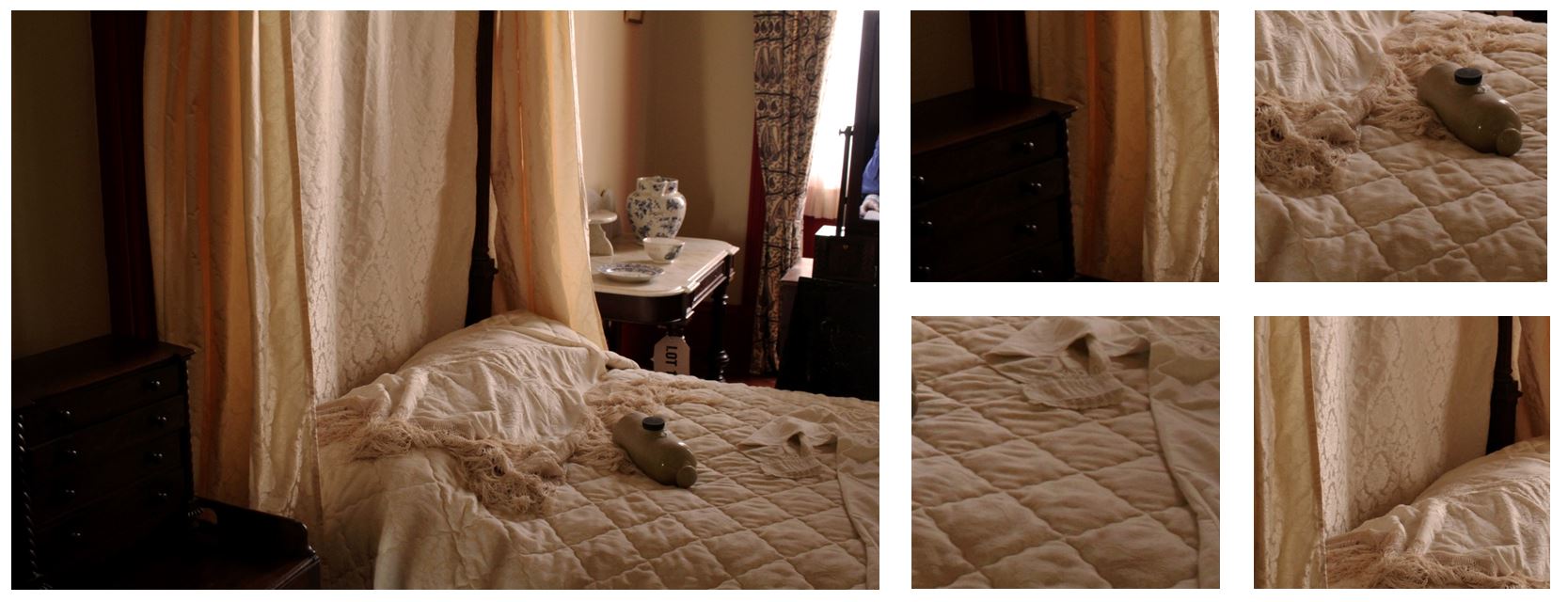
This image has natural lighting which emphasises the yellow and brown undertones within the image. I specifically tried to make the images in this shoot look natural so the setting would not look manipulated and staged like it was in real life. I used a fast shutter speed when taking this image as i wanted it to be clear and detailed with no blur. This photo has a range of light and dark tones within it, the bottom left corner is dark brown and contrasts with the lighter colours of the bed sheets and the light shining through the window. When experimenting with cropping i decided to focus on the textures created through the materials of the bed sheets and draping around the bed.
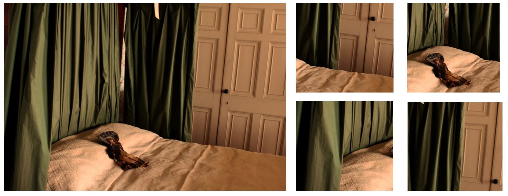
This image contains warm and cool colours, the bedding having yellow tones contrasting with the cooler green colour of the draping from the four post bed. There are vaeriety of patterns created in this image, from the squares on the wardrobe door contrasting with the vertical lines created by the material of the green drapings. When cropping this image i wanted to incorporate the pattern created by the green draping but also she the texture of the bedding.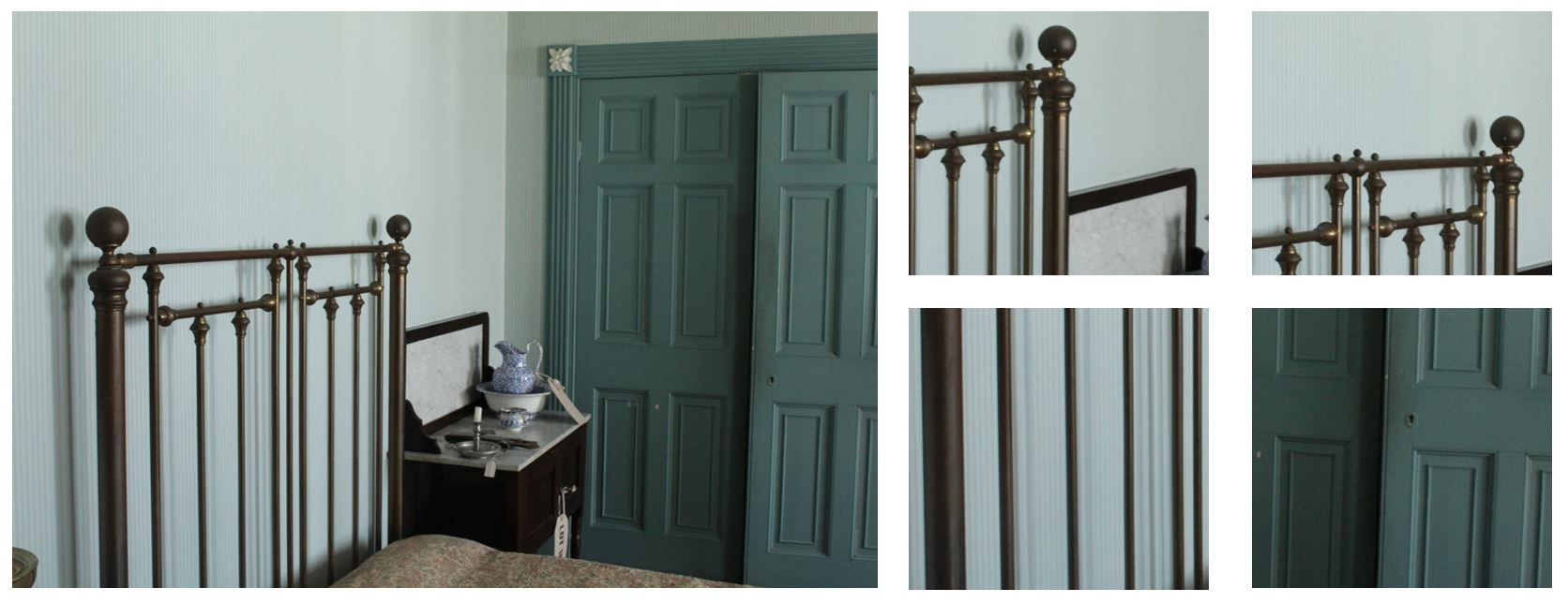 The image on the top left has cold tones from the wallpaper behind which contrast with the dark metal bars in front. The bars from the bed create bold geometric shapes within the image and shadows behind, adding more depth to the image. When cropping this image i wanted this image to contrast from the other cropped images so looked at the geometric shapes and lines compared to the texture and patterns of the material in the other images. I also wanted to show the shadows created.
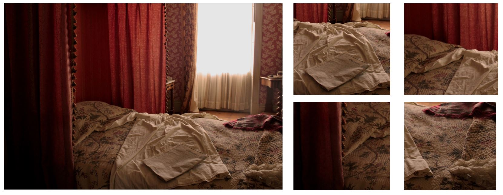
This image contains pink tones and shows the red draping from the four post bed. I cropped this image, focusing on the bed sheets on the left side rather than the window and light on the right side as I think the lighting is too bright and intense. By cropping the audience doesn’t get distracted by a bright light, but the bed it still lit up naturally from it. I like the contrast on the red draping to the bed sheet that has yellow tones and also the pattern of vertical lines created by the draping and the pattern printed on the bed sheet. I wanted to incorporate all these features when i cropped the original image
Compare and Contrast
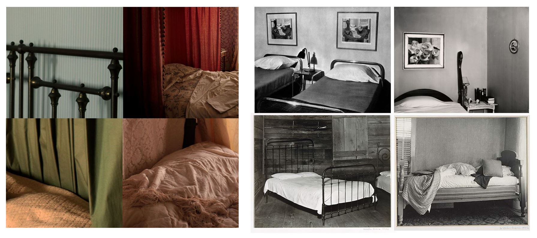
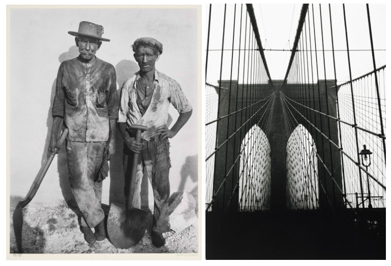
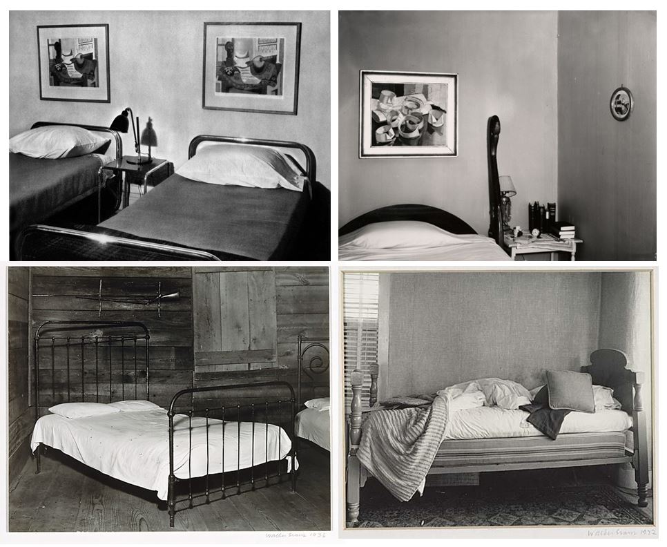
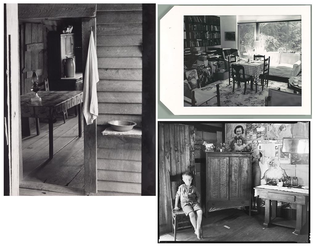
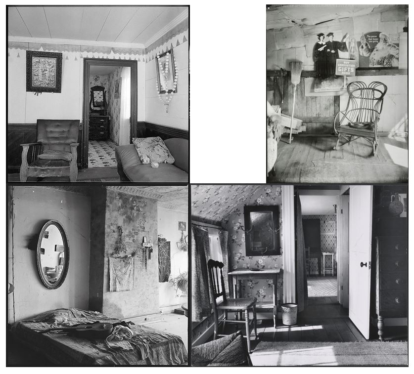
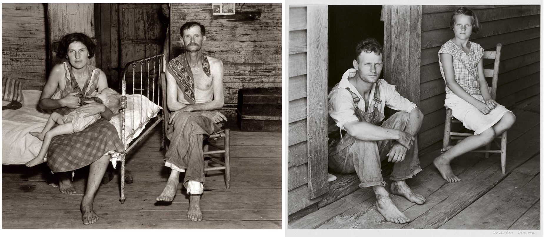
One similarity between mine and Walker Evans photography from his book ‘Message from the Interiors’ as we both pay particular attention to the inanimate objects that are present, almost representing them as characters themselves. I think the images I took represent the passage of time and absence, showing furniture and beds of people in the 1860’s, but the absence of people in the images show the history and how a conventional objects within a house can have more meaning than the purpose of what it was built for. One difference between mine and Walker Evan’s images are that my images are of settings recreated of the 1860’s, whereas his images are actually depicting the 1960’s, the time he was living in. He uses black and white photography presenting the bed as they are in that time in single photographs, whereas I display my images as a collection of coloured images. I decided not to edit my images black and white as when i was editing i focused on the contrast between the warm and cold colours between each picture and the contrast in textures. If i had edited the images in black and white it wouldn’t show the contrast in colours and therefore the textures wouldn’t be significantly different.
Image 2:
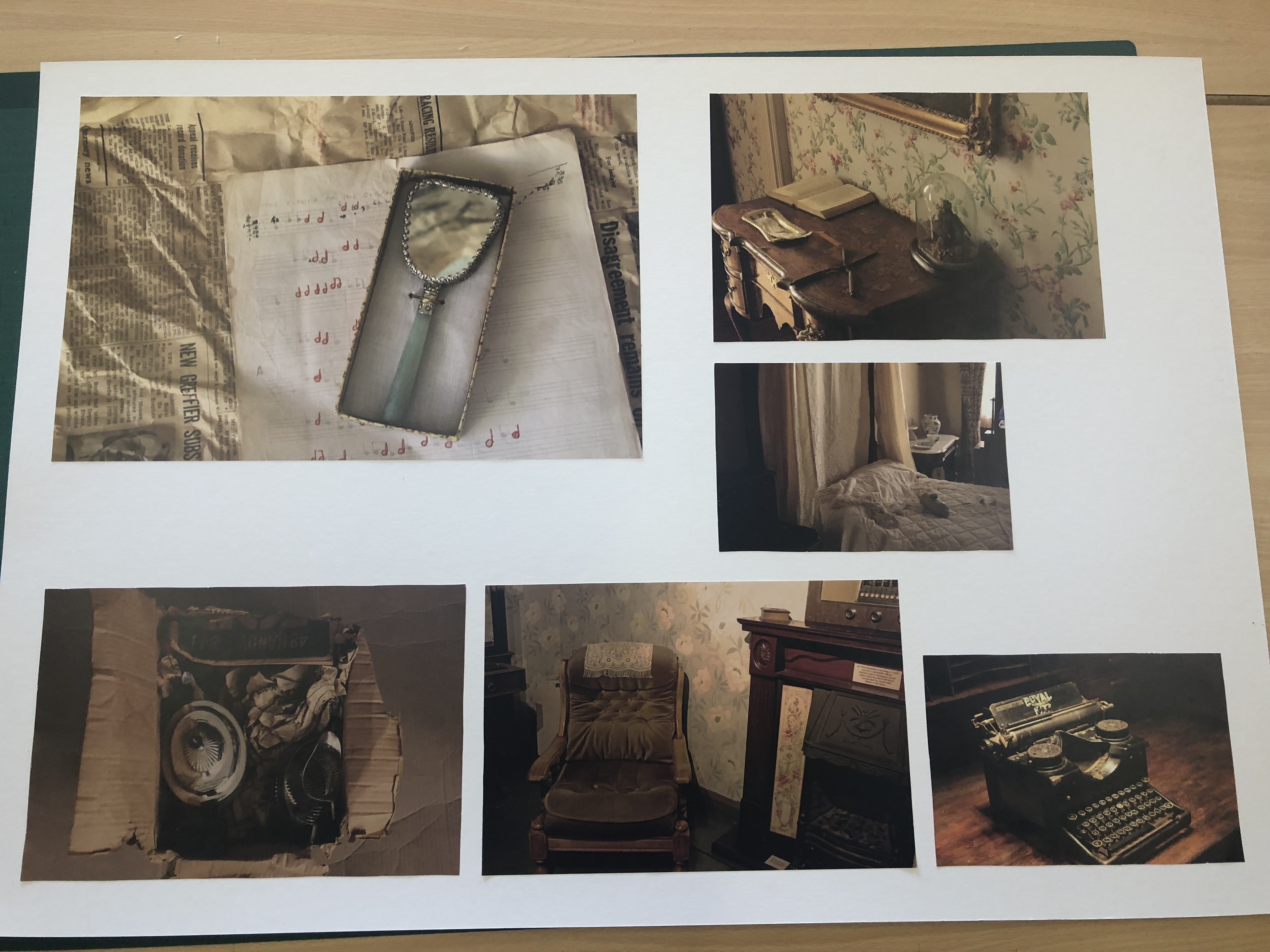
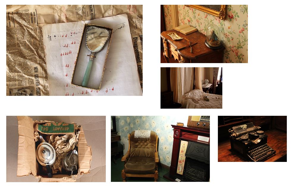
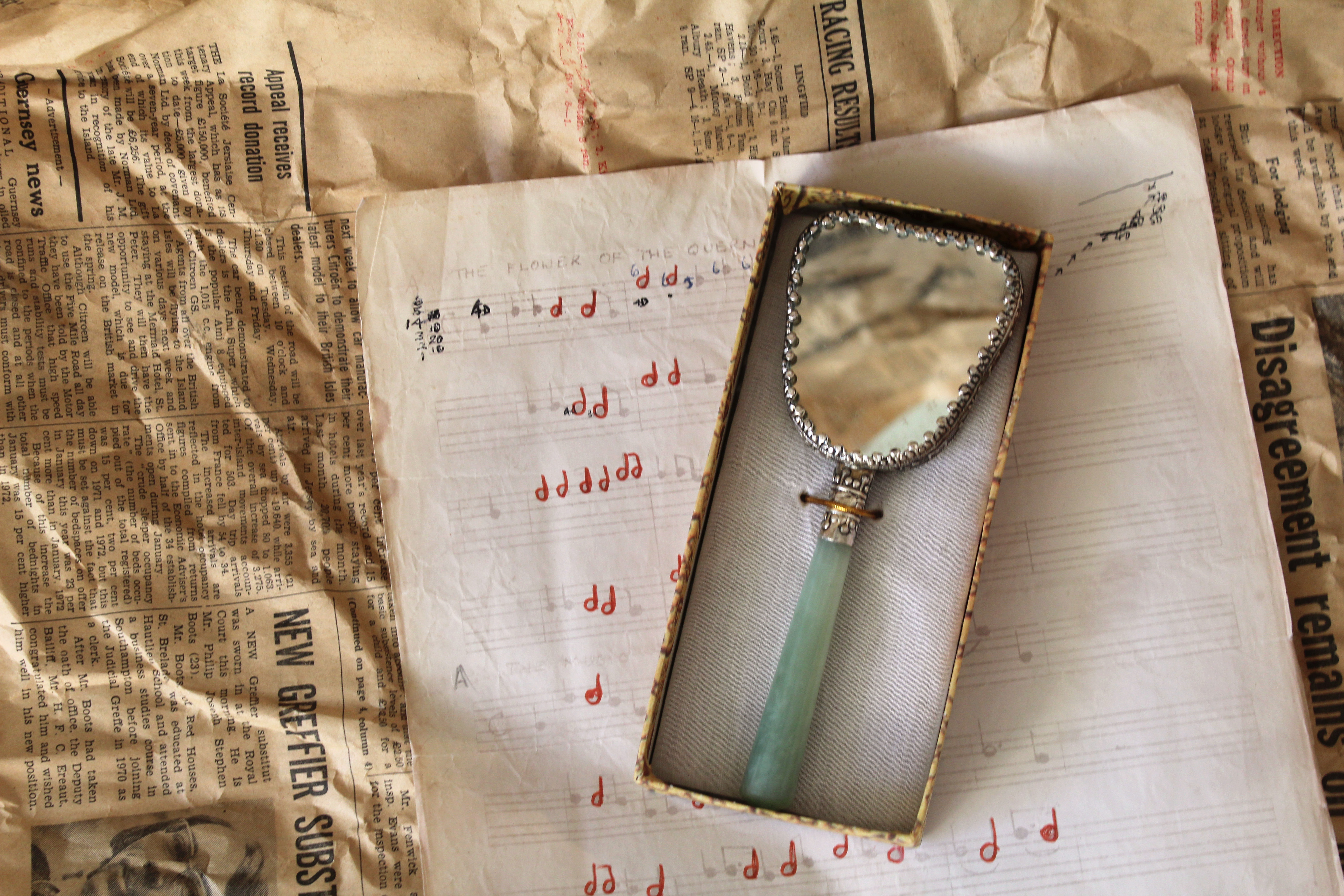 This second image is from my 3rd photoshoot. The mirror in this photo was owned by my grandma, the piano music is something which my grandad sent me in a letter when i was younger, and the newspaper background, which is seen in most of my images from this shoot, is newspaper dated back to Feburary 16th 1973 which i found in a box where my great great grandma’s silver tea set was kept. This is my favourite image from the 3rd shoot as it includes different aspects of my family that are important to me, combined together and shown in one image. It also links closely into Mari Mahr’s work using deeply personal objects and resoning behind her images. I chose to take this image to show how an photo containing conventional objects can have historic links and also personal ones and that there is more to an object the what meets the eye as there’s probably a story or personal connection to it. For example, in this image I used objects from past family members displayed together in one picture showing how what might just look like objects arranged in a certain way actually have personal and autobiographical meaning with stories behind them,
I experimented with both artificial lighting and natural lighting and found that natural created a more authentic, personal look, compared to the artificial that made the objects look staged, manipulated and in the spotlight. The natural lighting coming from the left side lights up all aspects of the photo but focuses more on the left side of the image, emphasing the folds and creases in the newspaper and creating a small shadow on the right side from underneath the piano music.This allows for a range of tones to be presented. For many of my images in this photoshoot i used a tripod, but for this image i didn’t as it’s taken from an above angle, so i used fast shutter speed.
The newspaper, used as one of the background layers in this image, creates an interesting texture as it dates back to 1973, showing how the condition over the past 45 years has deteriorated. The colour of the newspaper links to the other images as they all contain brown and yellow undertones, emphasisng the fact that what is being photographed is old. This contrasts with the off-white colour of the piano music, which also shows signs of ageing around the corners. The tones of the newspaper link into the colour of the outsides of the box containing the mirror. This makes the overall image more aesthetically pleasing as the colours and tones all complement each other and make for a more balanced image. I also reflected newspaper in the mirror so it wasn’t completely white and so it complements the newspaper background. I arranged the objects in a way so that the angles each object were placed at balanced each other out, e.g. the piano sheet music angled to the left, complemented the box with the mirror angled to right, together creating horizontal lines and different layers and aspects in the photo
Experimentation
I edited the image in different ways, one way to interpret Mari Mahr’s work more, one to emphasis the shadows in the image and others to experiment with the tone of the image.

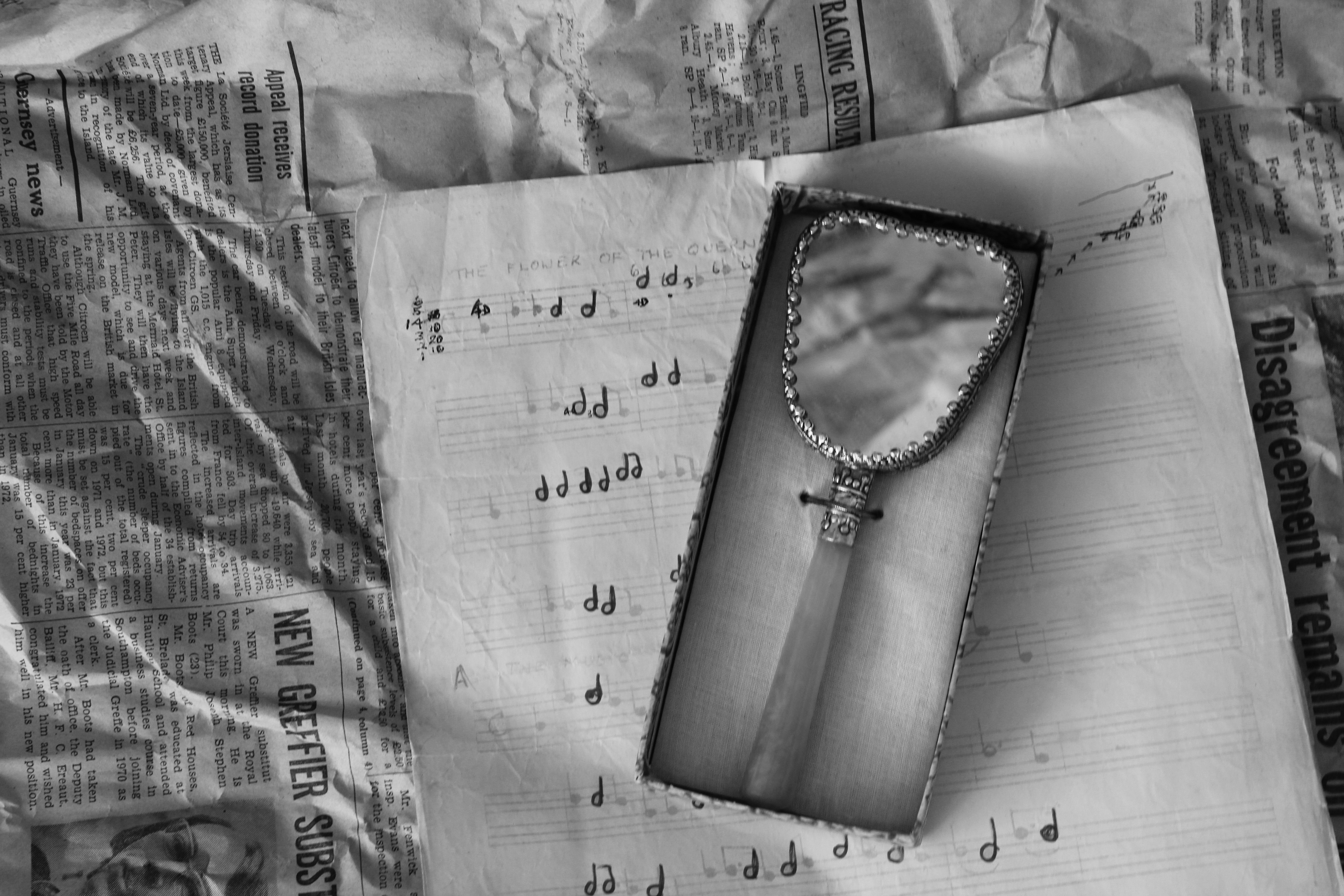
I decided to choose the black and white image as my final piece as it interprets Mari Mahr’s work, but also emphasises the mall details within the image, like the shadows created by the creases in the old newspapers and shadows that have been created on the right side of the box by the light shining in the left.
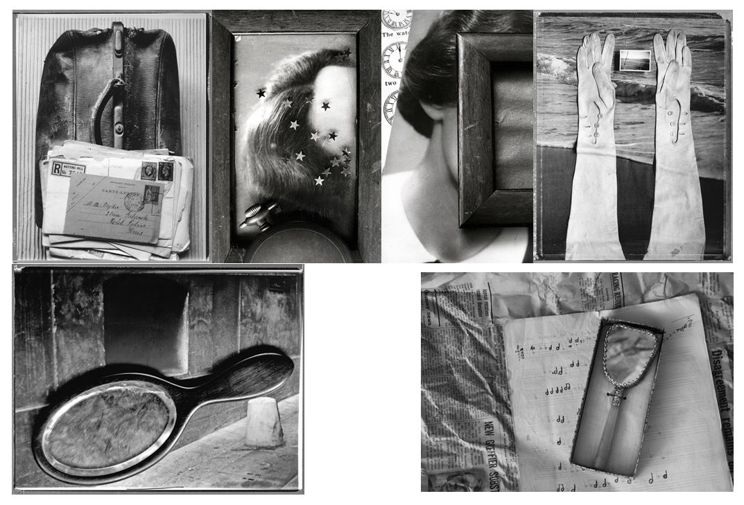
Compare and Contrast
I think it is hard to compare photos to the style of Mari Mahr as each of her photographs is so different, unique and represents a different part of herself and her life within it, being deeply personal. So i’ve displayed a selection of her photography above in comparison to mine. One similarity between our images is that we both used personal objects that have meaning in our lives. She uses objects from her family, photos and objects that remind her of her mother, and objects that remind her of her childhood in Geneva. In my photos i used objects that were owned by me and my family members. For example, a tea set owned by my great great grandma in 1896, piano music my grandfather sent to me in a letter when I was younger, a camera owned by my great uncle, and my grandmas mirror, all linking to me my family history. Both me and Mari Mahr’s photos are autobiographical and have connections to out families and childhoods wishing the images. On difference between mine and Mari Mahr;s work is that her work addresses universal human concerns regarding where it is that each of us come from, and where it is that we each belong. My work does not do this as much as i focused on linking my images to my family history, although does address how where each of us comes from in terms of my family.
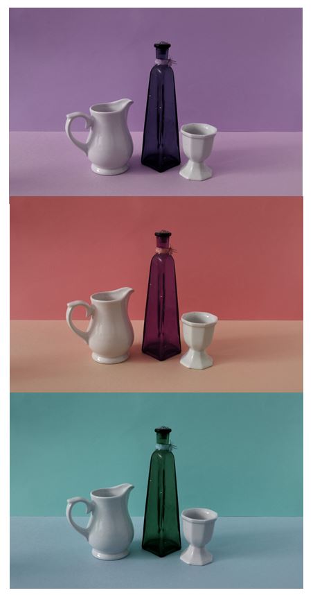
Image 3: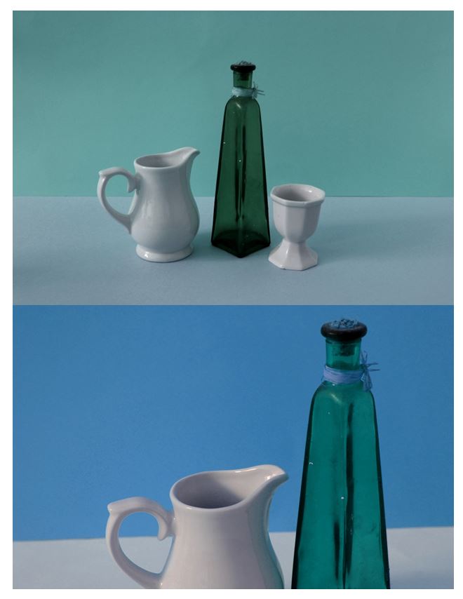 This 3rd image is from my second photoshoot, taking inspriation from the artist Giorgio Morandi where his painting have contain simple domestic objects with solid colour background creating a simplistic yet detailed image. I decided to use these images as one of my final outcomes as it significantly contrasts with my other images from this project and shows the variety within my work. The others taking a more authentic, eclectic style looking at the history of objects and the personal connections and stories behind them. This image however still links in to the idea of objects having a story and personal connections, but look at it in a much more modern way, using bold colours and geometric patterns within the image.
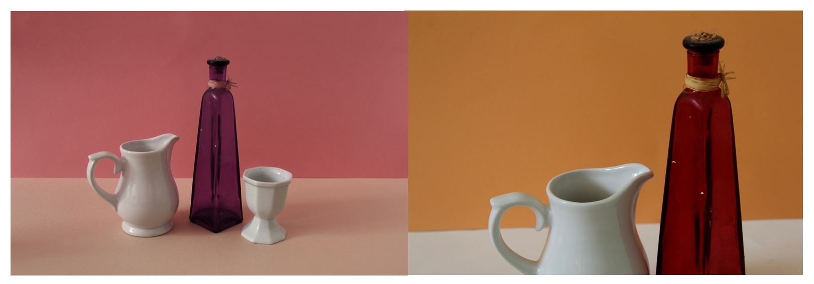
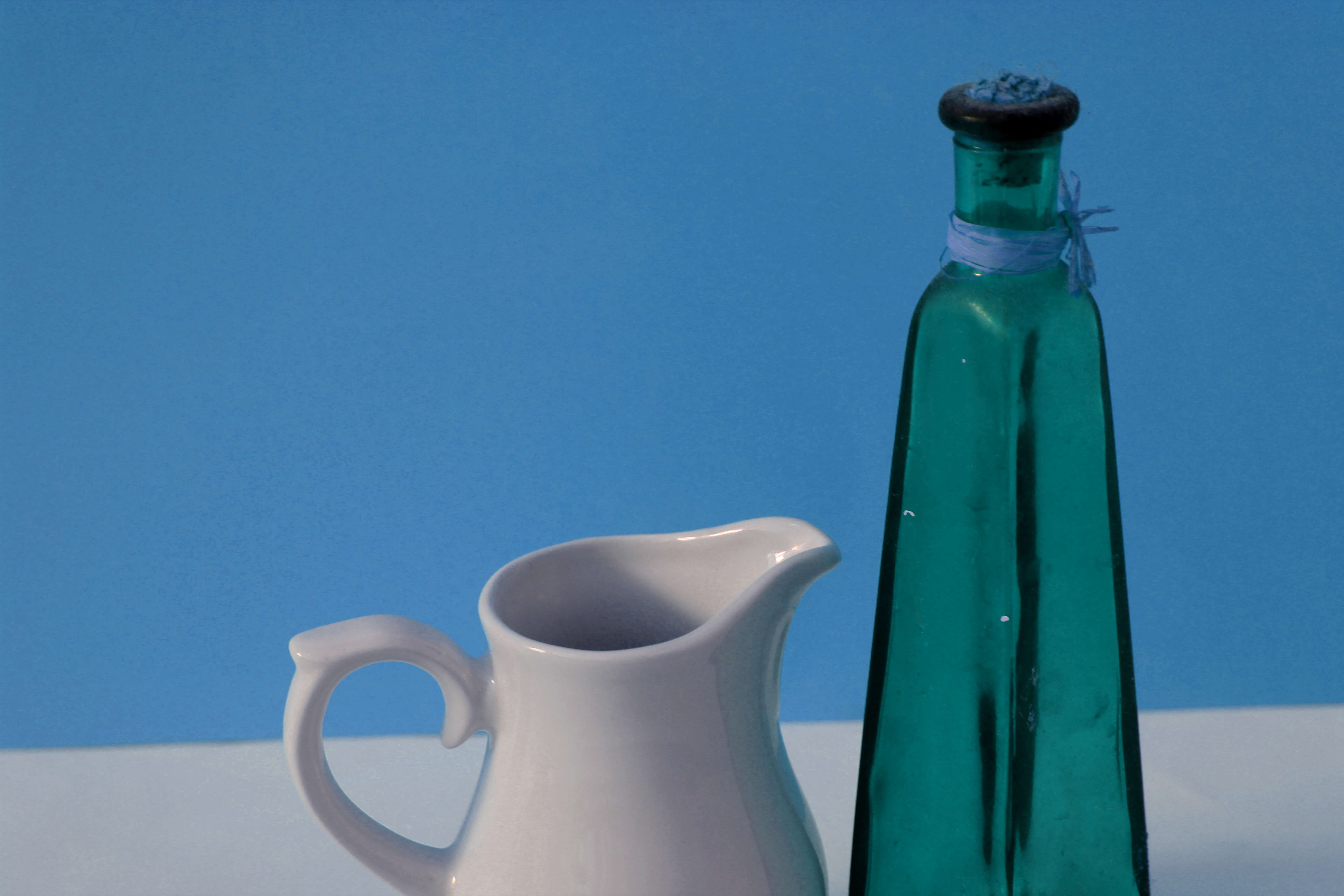
The lighting used in this image is artificial, i used this so the whole image was lit up rather than a certain section. This emphasises the bright colours and the objects in the foreground of the photo. The second image of this collection is closer up than the first, gaining a different perspective on the same scene. Most of the colour used in these images are cold, which is another aspect that contrasts form my other images form this project where they mostly use brown and yellow tones creating an authentic look. The cold colour used make the images seem more modern, although the objects in these images are not. This demonstrates how a certain backgrounds can change the concept of the image, and even make the audience think the photos are taken in a different time. These images create geometrical shapes and focus on the straight lines eg. the horizontal line across the background contrasting with the vertical lines on the vase showing how it’s 3D. When arranging these domestic objects I looked at the levels each objects where at, placing the vase in the center as it’s the tallest and the main object because of it’s colour. I placed the smaller white objects either side of the vase to complement it , putting them at different angles to gain different perspectives of each image. In the second image I took the photo with sides of the two objects coming of the photo, creating a different composition than the first image so I could display them together. The concept behind this image is linked into the theme coneventions like all my other photoshoots in this project, looking at domestic household objects and looking at how an object may only be seen as the purpose it was made for, but can have personal stories and connections behind. This reasoning is the same as my other still life photographs, except this photo shoot was more staged and planned.
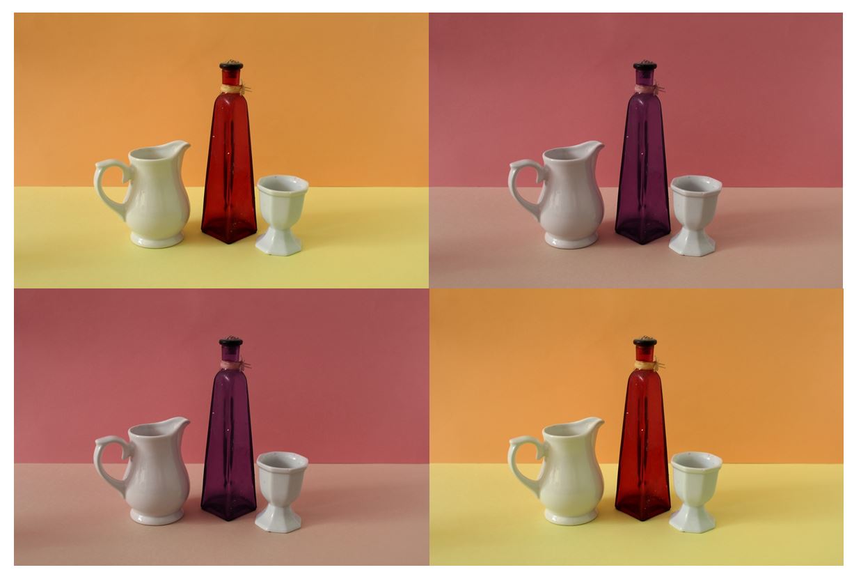
Experimentation: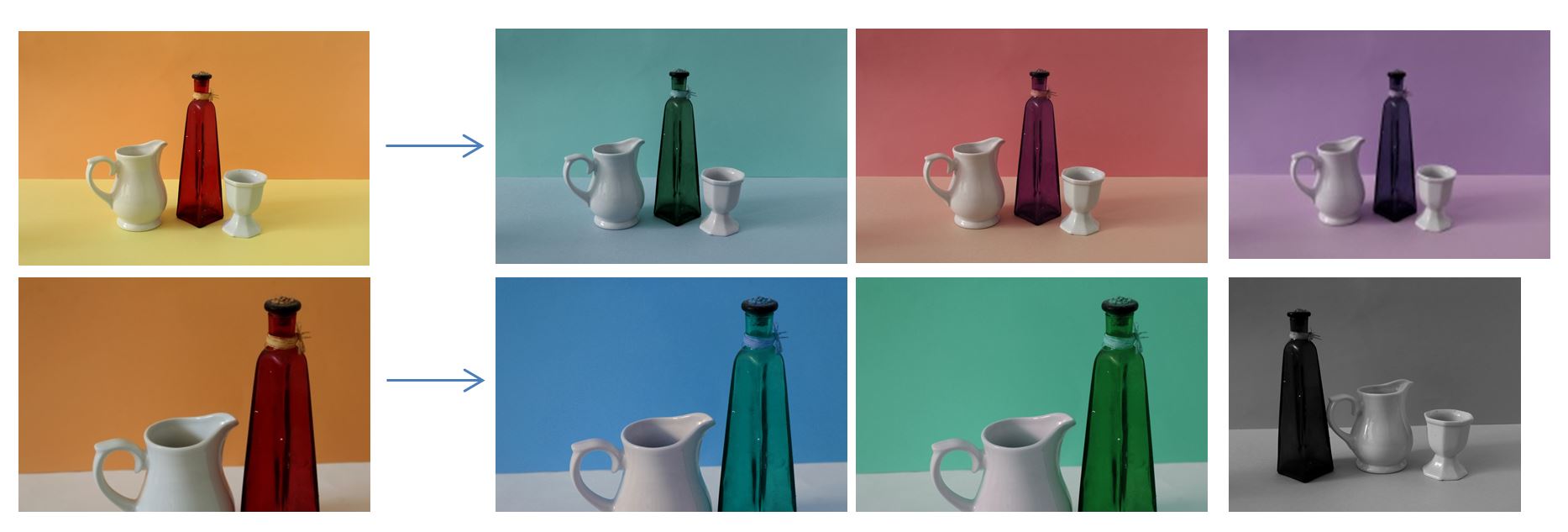 To edit and experiment with the original images i decided that the solid colors in the images could be easily change so i could see if warm or cool colours would look better. I adjusted the hue in photo shoot and change the colours on each of the images. The original images contained the warm colour orange, yellow , and red, wheres the best edited versions had blue and green changing the overall tone of the images from warm to cool.
Compare and Contrast
One similarity between mine and the artist Giorgio Morandi’s work is that we both looked at domestic household objects, presenting them simplistically with plain background and solid colours. Although his painting’s were simplistic they were detailed at the same time looking at the tone and textures of the objects he was painting. I also think i have achieved this in my photographs, for example I emaphasised the dark vertical lines going the the vase in the center of the image to create depth and show how the object is 3D. One difference between mine and Giorgio Morandi’s work is that where he uses neutral tones like cream, brown, oranges for his background and objects, I used bright bold colours. My original image had a bright yellow and orange background, but i edited so it’s blue in one image and green in the other. I did this as i think the bright colours emphasise the objects in the foreground. Another similarirty between mine and Giorgio Morand’s work is that in nearly every still life painting, he has a horizontal line creating a division through the center of the image, splitting it in half. I also tried to achieve this in my images, showing the contrast from the darker tones behind the objects and the lighter tone underneath. Creating this horizontal line adds more depth to the image as it make the set the objects are placed look 3D. If the background was only one colour than the image would look 2D.




 your ability to select and edit images effectively:
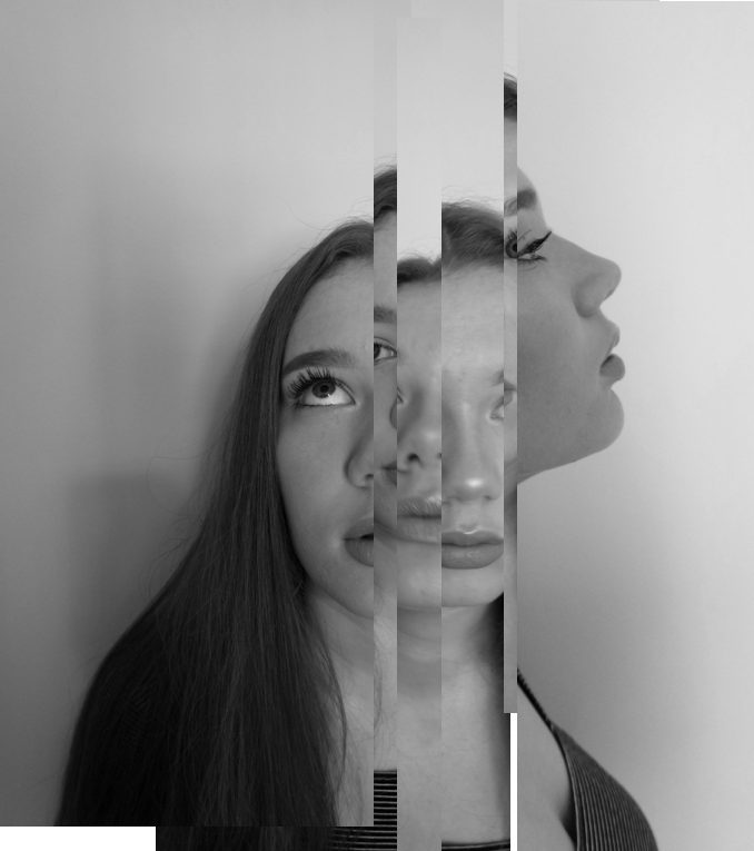
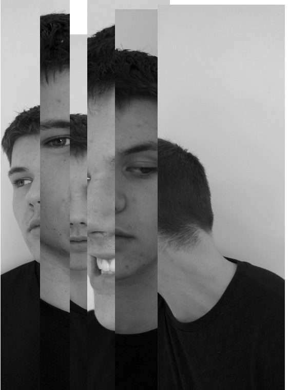
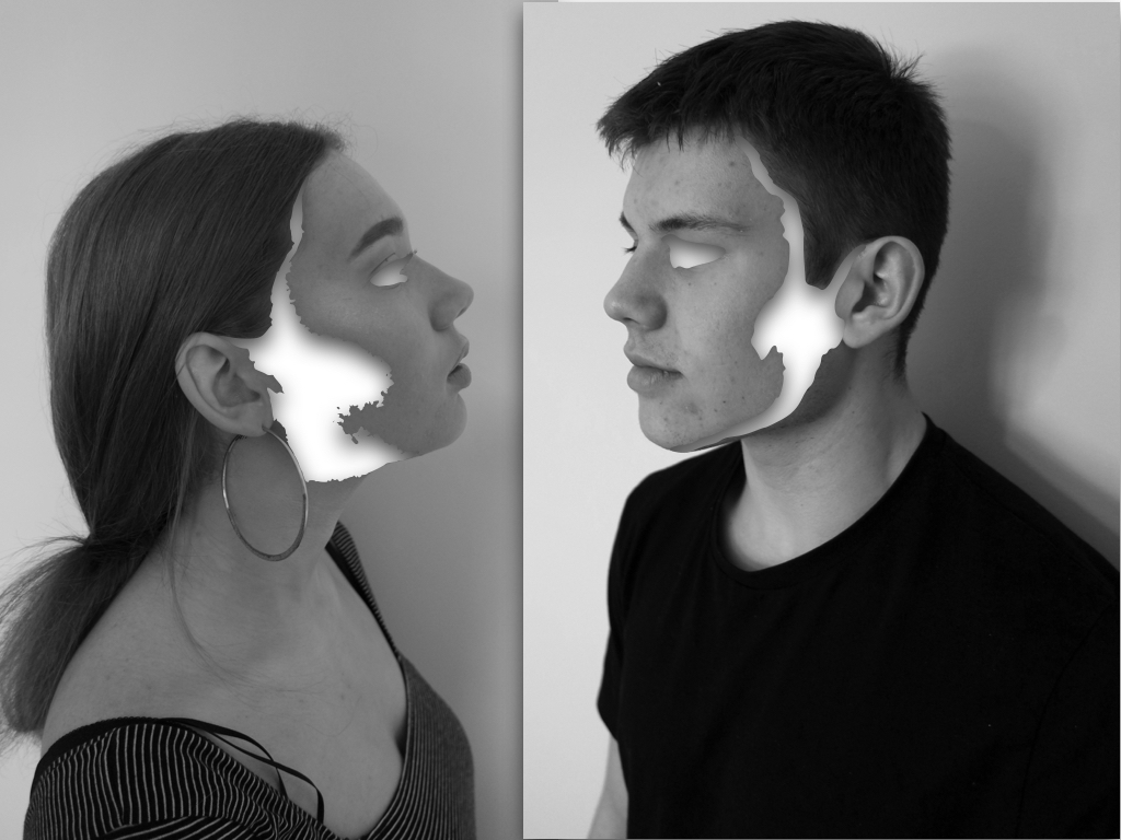
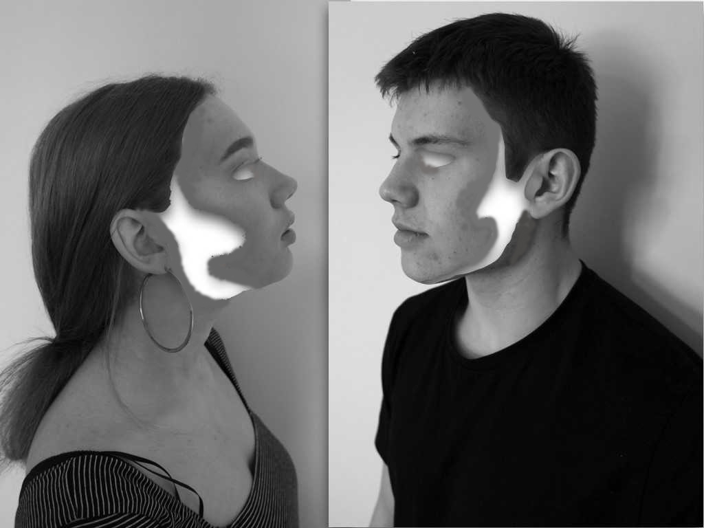
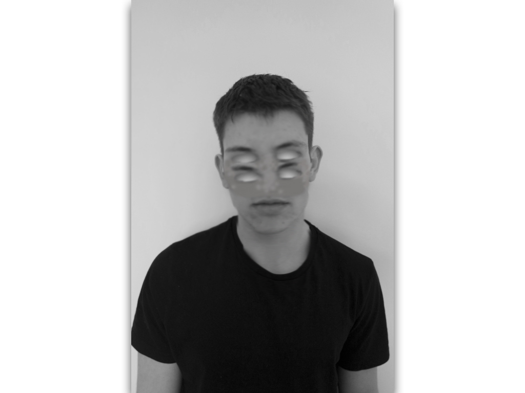
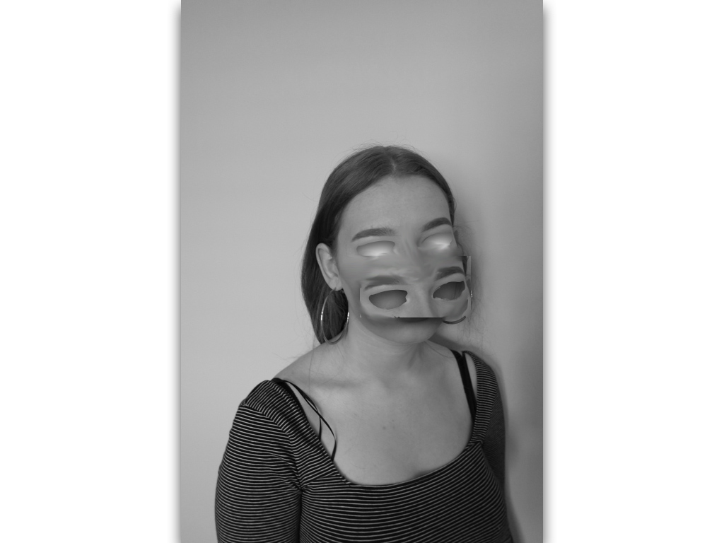
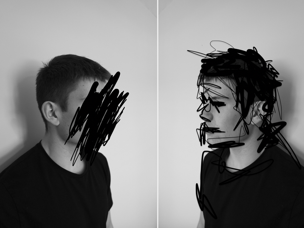
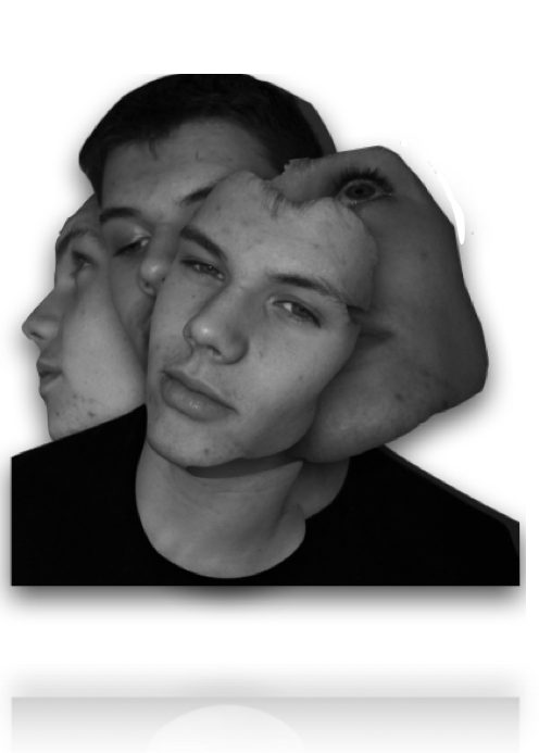
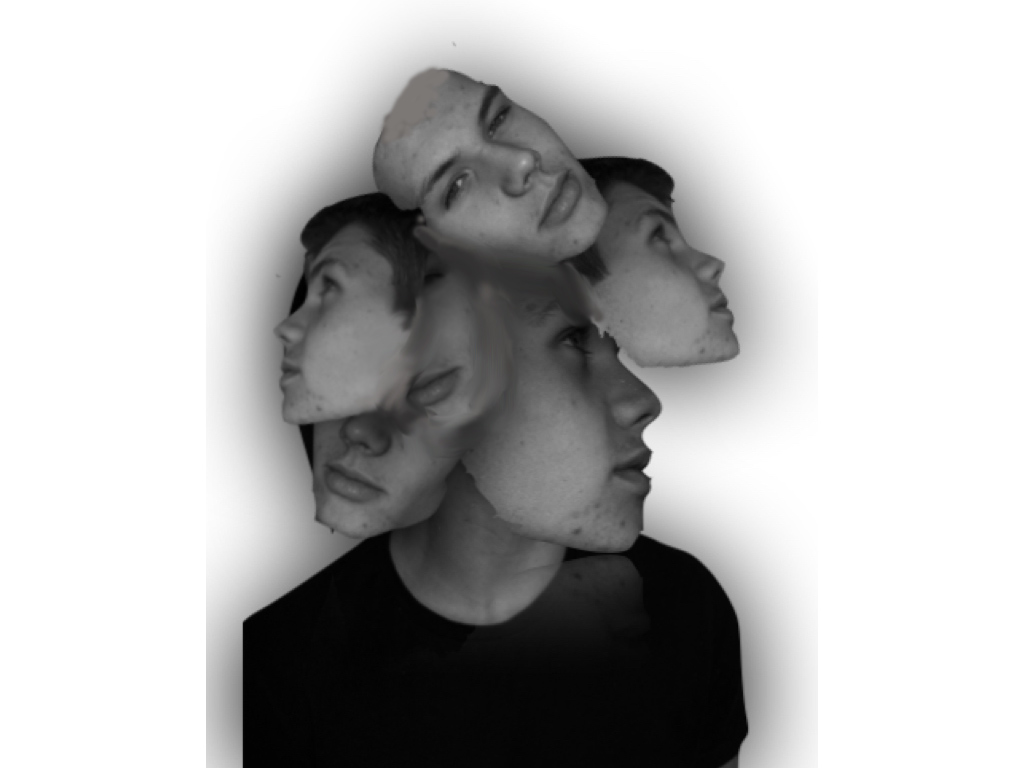
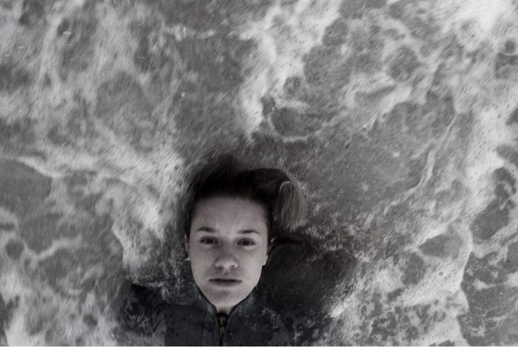
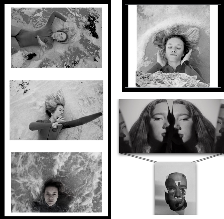
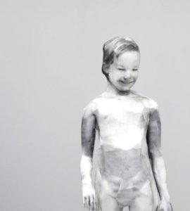
when selecting my images I wanted to give a variety of techniques and presentations of human behavior,I have done this by choosing three separate shoots. I chose my primary shoot to be focused on the combination of human and nature behavior and how when formed together present the convention of loss of identity and isolation within the water itself.I chose this shoot as it it the most creative shoot with the combination of editing and real captured shots,I think overall all the images are very dynamic and able to work as individuals too.
 your ability to respond to a key artist:
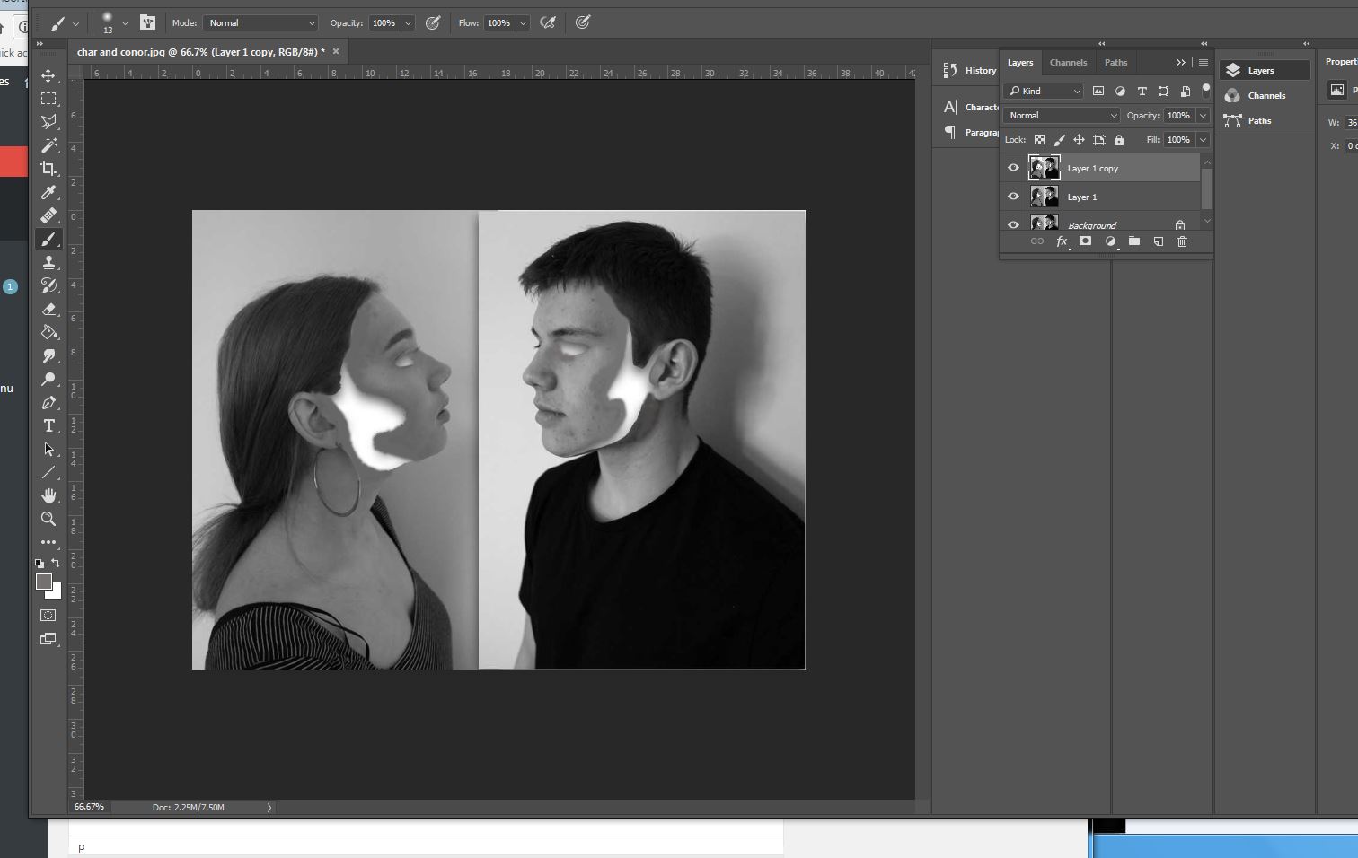
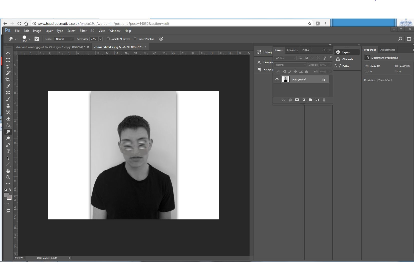
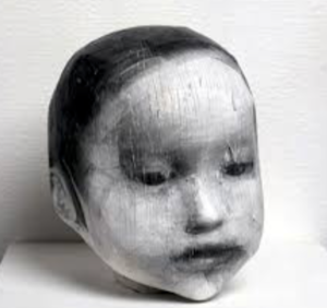
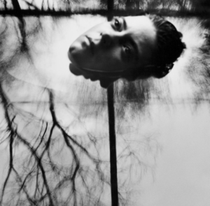
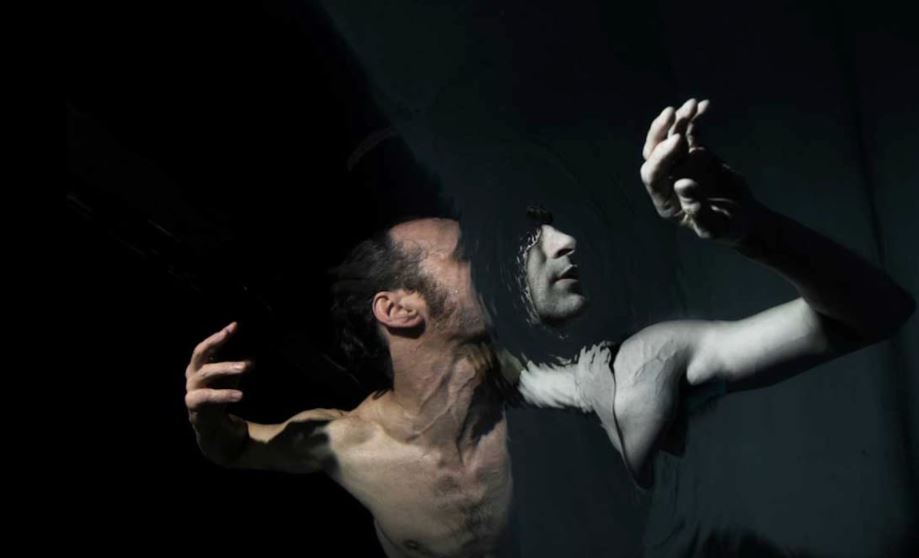
as previously shown my main aim for every shoot was the same theme of human behavior but my inspiration for each shoot was inspired by a different artists,although the main two artist for my final images was Midori Harima and conni imboden,both of their work is used presenting people in different mannerism and showing a more gruesome side to their personalities,I have shown their techniques using collage and additional editing techniques of removing eyes and finally submerging people within water.
