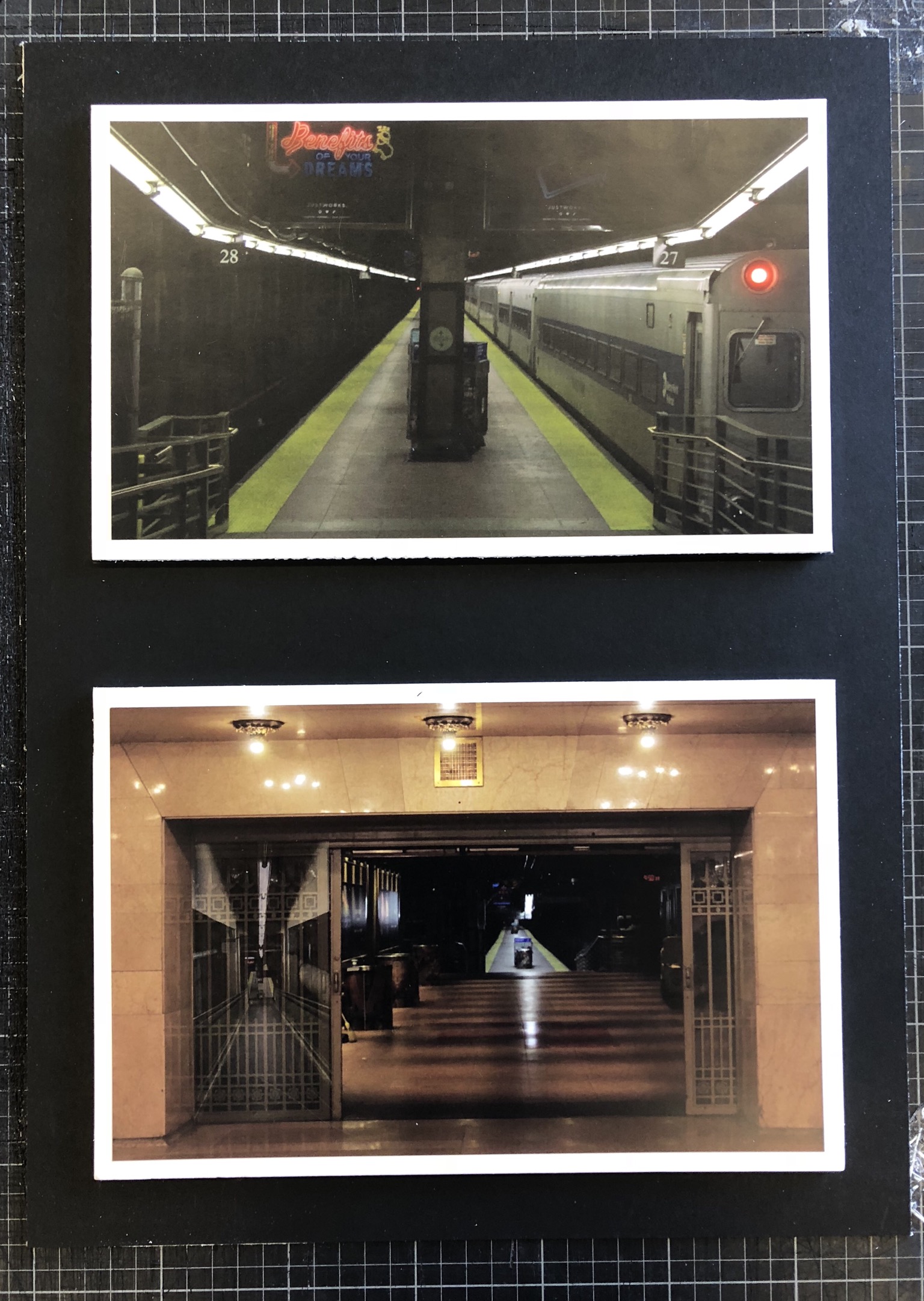
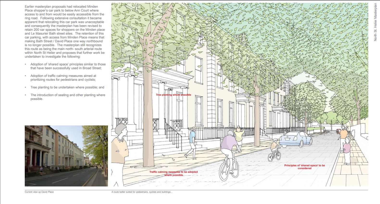
The red section I have been given, to me, this divides into two main areas;This being the old police station and the Savoy jersey and then up towards St Thomas church.The area throughout is focused upon old buildings and more urban and deteriorating areas typically ignored by governmental property developers as they do not hold a public interest within the main section of town or the finance sector.As previously spoken about all these areas have jersey ‘masterplans’ since 2011 That have not been accomplished,I will use comparisons between these images and try to enhance the need for mordenisation. Although i do believe there are many small communities within these areas to which I could take images of the people as a representative of the area itself. My main three intentions wihtin this shoot will be, old vs new,abstract urban visions and finally gentification and derelication.
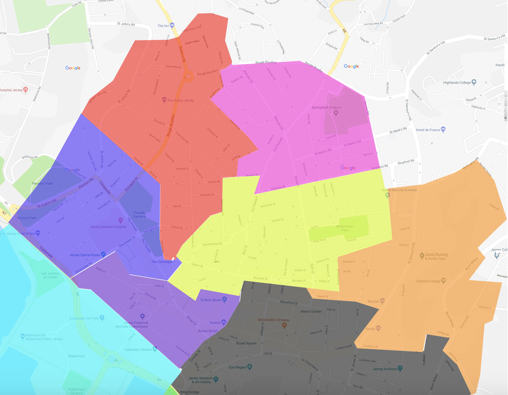
This is a map of the area that I will concentrate my work around. Most of the developments architecturally around this area are old and not fitting with a style, most of the buildings were built in the 80’2-90’s and do not hold a historical value or price.Although this would be good to conceptualise my ideas of capturing urban landscapes.
Jersey Archieve:The jersey archive is an area in which historical photos over decades have been kept and tracked in order to preserve our history the lives of the people. Many of the images track specific days in time such as liberation day,however many are purely to tell stories of the people and places at the time. The area in which I am looking into has also been a pivotal area of jersey as this is where many large hotels and churches were begun to be made and allowed citizens to come together as a society and grow as a community.The Savoy hotel is the centre of my area and one of the largest buildings of jersey history being around for many decades through jerseys history. Tom Pope is a photographer for Société Jersiaise, Jersey.His aim through his work is to show the world and people around him and he does not see himself as the artists but everything surrounding himself as the art and inspiration. Although his word is not concentrated so much on a location but the people living there, this has inspired me to be less concentrate whtin the buildings and growth of architecture but the way in which the minds of people have expanded due to the futuristic advances.The Archive is the Island’s national repository holding archival material from public institutions as well as private businesses and individuals.I think a main focus for jersey archive is to track jerseys progression of architecture and the way we can keep and expand on jerseys history.
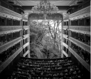
Tom Pope
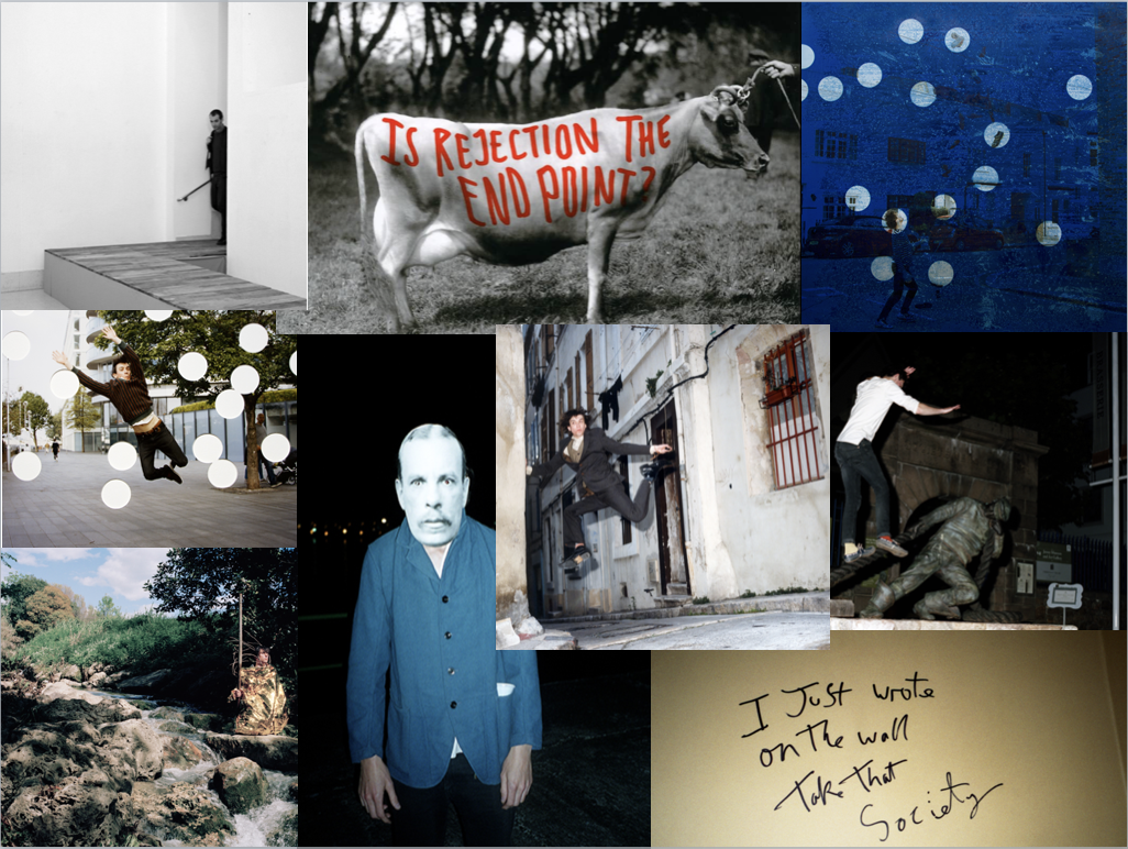
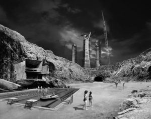
Tom Pope,has an interesting conceptual view of when presenting a location he does so through the people living their in interesting conceptual methods. I think he will help me develop from just architecture to a feeling of an area itself, showing off urban landscapes in more creative methods.

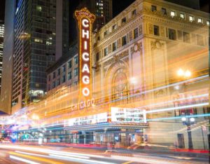
 Idea 2:forming old and new buildings collaged into one image,for this I will connect my second photoshoot of modern buildings not in my given section and combine with older more historically significant architecture. This old and new vs development can present the beauty on both sides but also the inner most need for a revamp and mordenistaion on the insides of buildings. I can use collage,reflection or editing techniques in order to successfully accomplish this.


 This is my favourite image of my project. The content of the image is relevant to me quite literally because of the fact that me and my family produced this plastic waste in two weeks and continue to produce this amount because, it is almost impossible to avoid buying into plastic packaging. It is a conceptual photograph that carries a lot of meaning and relevance to the modern world because it brings forth an issue no one likes to see or do anything about. I think this is down to a common trait that everyone shares - laziness.
Using a camera only had a small significance in the process of making this image. If I left the image alone I would feel no satisfaction in its completion. I have learnt during this first year in photography that generating a final image with just a camera isn't enough. Even though a lot of technical work goes into producing a decent image.
It was difficult to achieve the right lighting because I could only light one side of the pile at a time unless I used the floodlights, yet I couldn't achieve my desired effect with them because of the high level of light intensity. I had to manipulate the lighting with colour and use different angles so I could accomplish an image with enough light to capture the detail but not too much to white wash my image or over expose it. It would of been more successful if I had two spotlights either side of the plastic.
For me, I want to reflect my artistic side in my images with colours and playing with the forms and shapes of the objects in a photograph by cutting out imagery from many of the photographic materials I produce from a photo shoot and piecing it together. Editing my images is the most important stage for me because it allows me to produce something that wouldn't possibly be seen in our daily lives.
In this photograph a lot of the imagery is repeated and seen in many areas of the plastic pile. I didn't want to hide this to make it seem like I produced more plastic than I did just so I could prove my point. I kept the repeated imagery visible because it has the implication that we repeat mistakes and the process of this ongoing problem is down to that fact. The dangers of producing so much plastic is known by everyone yet it is an ongoing cycle of production, because we live in a throw away society.
On the other hand, I also had to repeat the imagery because the majority of the plastic could not be seen in a singular flat image. This is one draw back that makes this image have a lesser impact on an audience. With the context of why I created this image some might ignore my points and reasons behind it because it doesn't impinge on that person. If this perhaps was an image of plastic collected over a year, it might of had a bigger impact. However, putting this image into perspective, this was one family out of billions. In two weeks how much plastic did everyone as a collective produce and where did it go?


 Contextual -
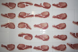
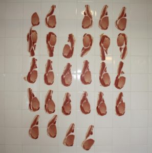
  I had successful outcomes in my material in my photoshoot, finding the correct white balance and ISO was tricky due to the lack of lighting I had because I was in a bathroom, which meant I couldn't bring in any additional lighting other than the main light and relying on the little natural light that came through the window as a result of the lack of plugs. I realised I couldn't take a picture without flash because a shutter speed that was too fast would not capture enough light and a shutter speed too slow made it hard to capture a clear picture when there is no tripod.
The images I captured were not exactly how I imagined in my head in terms of the composition and what the images emulated. This has led me to think of new ideas of presentation. The bathroom wall emanates a sinister and dark tone which I feel takes away my point of mass production and focuses on the unethical issues of slaughter. Everyone feels guilt towards eating meat, yet they abandon the guilt and push it to the back of their mind. That reason alone is not enough for people to think and act on the problem.
I don't want people to look at my images and only think my purpose behind it is to make them feel guilty with the consumption of meat, I want my pieces to trigger some kind of interest in the problem and the audience to realise the process of killing and eating animals is not just unethical but a root cause to problems in the worlds future.
My images do not reflect the issue of mass production and therefore during my editing process I will add to the amount of bacon to have a greater effect.
