Category Archives: Analysis

Filters

Author:
Category:

PAOLA PAREDES

PAOLA PAREDES MELANCHOLIA OF VIRGINS

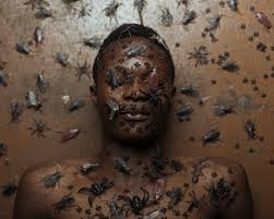
This image is from Paola Paredes body of work ‘Melancholia of Virgins’, a selection of experimental pieces raising awareness of the humiliation of misdiagnosed women in Salpêtrière Hospital Paris for ‘Hysteria’ during the 19th century – a time when medicine subjected women to abhorrent treatment. The term ‘Hysteria’ is now recognized as a diagnosis stemming from pseudo-science, intrinsically linked to misogyny and man’s dominance. These ‘Hysteric’ women were put on display for audiences consisting of medical contemporaries, students and members of the public. One front-runner in Hysteria science was Jean-Martin Charcot he was charged with Hysteria treatment at the Salpêtrière Hospital in Paris, where he would use his camera as a tool for recording patient’s attack symptoms for later analysis.  These pictures were then published and used as ‘evidence’. Paola Paredes then took these images and redeveloped them with the use of modern technology, stitching and handmade collages to produce animations and to magnify the humility and penalization that the institution forced on these women.

Conventionally speaking, the quality of the picture is poor due to the age of the photograph, with no depth in contrast, or wide spectrum of shades and

Image from Paola Paredes’ body of work ‘Melancholia of Virgins’

the noise that the camera has picked up in the darker tones of the image. However if you look at the image conceptually the poor quality of the image carries connotations of poor quality of life, respect and empathy for these women, which gives more depth to the context of the image. The rework of the image  encourages viewers to  to look at the image in a different way and interpret feelings and emotions throughout the whole of the frame, as the subjects face is completely covered making it impossible to read her emotions, so therefore applying an interpreted context to the image. The rework and manipulation of the image grasps the viewers attention on the feeling of being watched and recorded, being subjected to humiliation and being stripped of dignity.

This image is one of her still images which contrasts the effect of one of Paredes’ moving images where there is a sense of input of intensified emotion. However each of her still images convey the feeling of a forced or submissive silence. The use of the string covering the face and hiding the identity of this woman reinforces the idea of that these women were dehumanized, silenced and belittled. This simple technique unveils more about the context of this picture than if it was left untouched or the subject’s face was left on show. However, my interpretation of the reason why Paredes decided to cover her face is the possible referencing of the automatic invalidation of their opinions and dismissal of their freedom of choice and speech because of a ‘higher’ or ‘stronger’ force – in this pictures case the flash of the camera is the force acting against these imprisoned women, which could be interpreted as the misogynistic men that took advantage of them.

Photo Shoot – I want to experiment with Paola  Paredes experimental approach to redevelop old images and give them new meanings and context to provide a thought provoking piece that encourages an audience to interpret an image with my political message. I want to take the idea from Paola Paredes of reworking, experimenting and manipulating existing images, carrying on the theme of my political landscape topic; the agriculture industry and its effect on climate change, being responisble for destruction of land and the mass usage of limited resources that don’t have enough value to raise concern like water and again, land.

My Plan of My Response to My Manifesto

In my shoot responding to my manifesto I will be focusing on rules number 3,4 and 7.

  • Rule #3 – I will take inspiration from Henrik Malmstrom’s ‘A Minor Wrongdoing’ by taking photographs that do not fit within the conventions of photography.
  • Rule #4 – I will question whether the technicalities and conventions of society, photography and day-to-day life are necessary.
  • Rule #7 – I will take inspiration from Lewis Bush’s work on ‘Metropole’ in the sense of use of double exposure.

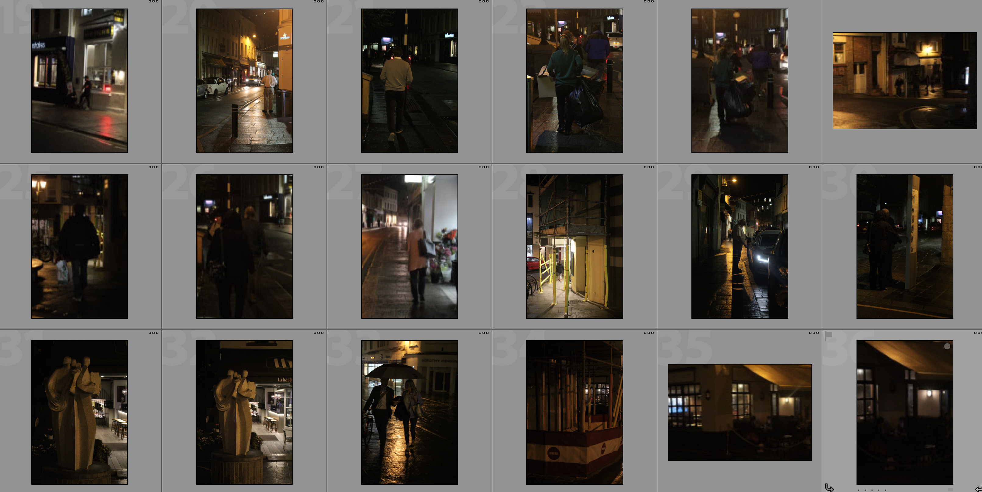
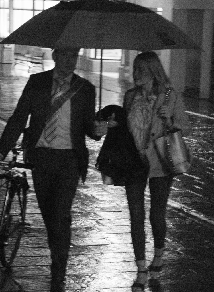
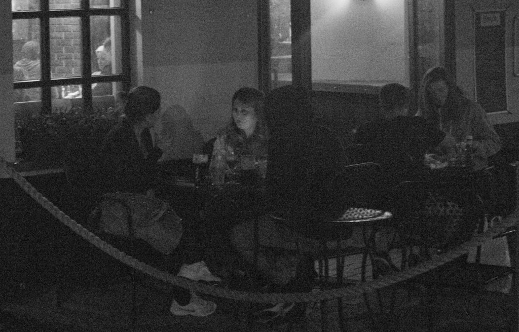
I am focusing on these rules as they allow me to further explore the work I have done on Lewis Bush and Henrik Malmstrom through the use of techniques and styles of photography that both photographers have used in their shoots.  I plan on taking inspiration from Henrik Malmstrom by further developing on my shoot in which I took high-ISO grainy photographs which questioned the technicality rule of photography.  I plan on merging this inspiration with inspiration from Lewis Bush by editing the photographs to create the effect of double exposure that Bush used in his project ‘Metropole’The combination of these two inspirations will allow be to follow rule four and question whether the technicalities and conventions of society and photography are necessary as well as incorporating political landscape further.  As seen in this post, I will be creating double exposure photographs using grainy photographs of individuals minding their own business in order to show and convey the idea that the Islanders are feeling disorientated and lost –  both because of the fast development in their island and because they are getting lost in their own business to the point where they do not realise people are observing and watching them

Future of St. Helier newspaper and instillation

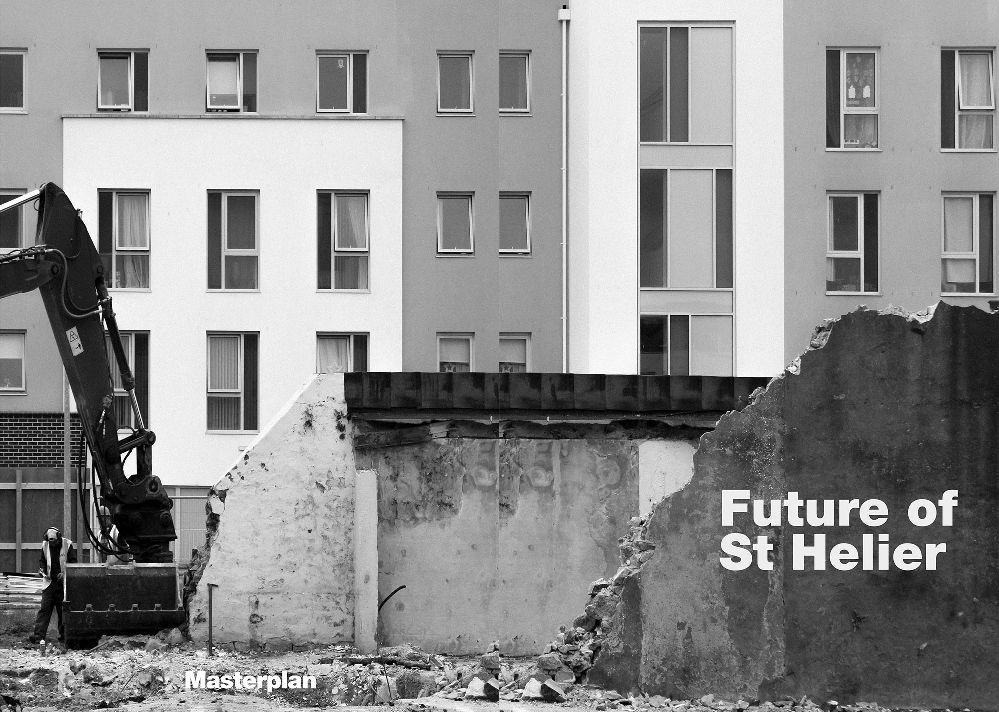
Future of St Helier

Your final images/ design – choose from folders here
Then write your own evaluation / experience of  being part of  the newspaper and hoarding installation etc.

Copy and past all the below and publish as your own blog post

Hoarding Installation

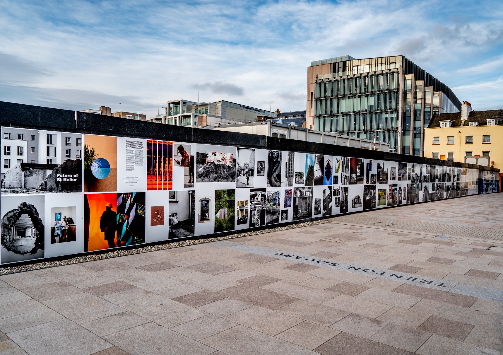
The unveiling of the Future of St Helier Hoarding at the International Finance Centre on the Esplanade in St Helier took place on Thursday 13 Dec 2018.

First published as a 52 page newspaper supplement in September by the Jersey Evening Post the work produced by A-Level Photography students at Hautlieu School have been transformed into a 34m outdoor installation as part of Masterplan Community Arts and Education Project

We were challenged with responding to specific areas, streets and neighbourhoods divided up along the urban vingtaines of St Helier and to explore through research, archives and photography the built-environment, urban living, diverse communities, town planning, land use and re-generation projects.

We thank all sponsors and collaborators for making this a successful contribution to the island’s cultural records and historic archives Jersey Development Company, Camerons Ltd, MJP ArchitectsArchisleLewis BushPhoto-Archive Societe-Jersiaise, Kevin Pilley, States of Jersey and Connétable of St Helier, Simon Crowcroft

Earlier today we unveiled the Masterplan Future of St Helier hoarding display at the International Finance Centre. Lots of local media interest from Jersey Evening PostITV Channel TV and BBC Jersey who broadcasted live on radio talking to photography students at Hautlieu School, Constable of St Helier, Simon Crowcroft and sponsors Jersey Development Company, Camerons Ltd, MJP Architects about the future of the island and its capital. An excellent example of how a community arts and education project can generate a debate that affects all those who either live, work or visit St Helier.

If you are interested in our views of young people tune into BBC Radio here (listen from 3:18:30 onwards or watch the six o’clock news tonight on ITV.

https://www.bbc.co.uk/sounds/play/p06rlpdw

If you missed the news last night at ITV Channel TV you can catch up here with Hautlieu students talking (15m.12s) about their images on display at the Masterplan Future of St Helier hoarding on the International Finance Centre.

See link here

The outdoor installation on the hoarding around the construction site is a great way to engage the public in art and debates concerning the future of the island’s capital but, what we need in Jersey is a new contemporary art space that will provide a new venue to showcase art produced in the island, but equally also bring international art to Jersey for the public enjoyment of its residents and visitors alike.

The recent Culture, Arts and Heritage Strategic Review, commissioned by the Government of Jersey makes 20 new recommendations that will revitalise the island’s cultural infrastructure and achieve a wide range of social and economic objectives from tourism, to health and well being to external relations, to planning and environmental developments – in the hope that in partnership with Government it will enrich and enhance Jersey’s quality of life.

Let’s hope those in power who can make real changes to St Helier’s build environment will include such a new art space in the revised Masterplan of the Waterfront. All we need is political will and re-prioritising public funding for the arts. States of Jersey

Future of St Helier Newspaper

The outcome of students work was first published on Tuesday 18 September 2018 as a 52 page newspaper supplement, Future of St Helier that was printed in 14,000 copies and inserted into a daily edition of the Jersey Evening Post and distributed island wide.

Here is a video browser of our Future of St Helier supplement printed and distributed in today’s edition of the Jersey Evening Post. Hautlieu photography students were challenged with responding to specific areas, streets and neighbourhoods divided up along the urban vingtaines of St Helier and to explore through research, archives and photography the built-environment, urban living, diverse communities, town planning, land use and re-generation projects. Each student designed a page spread which was then split in half producing a fragmented image reflecting on the nature of experience and diversity of St Helier.

Here is a video browser of our Future of St Helier supplement printed and distributed in today’s edition of the Jersey Evening Post. Hautlieu photography students were challenged with responding to specific areas, streets and neighbourhoods divided up along the urban vingtaines of St Helier and to explore through research, archives and photography the built-environment, urban living, diverse communities, town planning, land use and re-generation projects. Each student designed a page spread which was then split in half producing a fragmented image reflecting on the nature of experience and diversity of St Helier. Make sure to get your copy before the shops close!Thanks to everyone involved in the creative process Archisle Lewis Bush, Jamie Cole, Simon Crowcroft, Kevin Pilley – States of Jersey and our sponsors Jersey Development Company and Camerons Limited.

Posted by Martin Toft on Tuesday, 18 September 2018

my image displayed  on the wall:

Analysis of Futurism Artwork

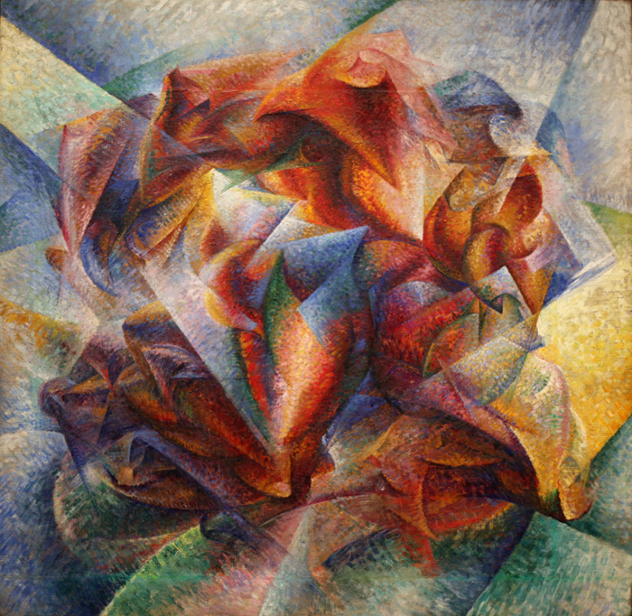
Below are two photographs that have been made in response to the manifesto of Futurism – ‘Dynanism of a Car‘ by Luigi Russolo and ‘Dynanism of a Soccer Player’ by Umberto Boccioni.

Dynanism of a Car

Luigi Russolo, ‘Dynamism of a Car’

The colours within this work are very intense – the yellow colours make the viewer think of the headlights of a car as well as the red. This use of hot colours throughout the work adds to the feeling that the car in the painting is going at a very fast speed – which could reflect how Futurists feel about how the world should be. The use of the hard hot colours creates a contrast with the black of the de-constructed car which creates a more sleek and eye-catching design. The use of the yellows and reds have connotations to fire and the way the colour fades out in places can be seen as patterns that would be seen in a physical flame. There is no 3D effect within this photograph but there is an intense feeling of direction within it. The shape of the aero-dynamic modelled car can be seen even though it has been deconstructed and re-arranged. Russolo added to the affect of the aero-dynamic shape by horizontally stacking red arrows pointing in the direction of the car’s motion in order to give a sense of direction and movement within the photograph. ‘Dynanism of a Car‘ takes a car and de-constructs it into new entities that are then re-arranged into a new interpretation of the same car – this shows Cubist influences which was another artistic movement that de-constructs the subjects.

This piece of art by Luigi Russolo, titled ‘Dynanism of a Car‘ is a great example of the type of work produced during the movement of futurism in Italy.  Futurism is a rejection of the past and a celebration of speed, machinery, violence, youth and industry.  Futurists insist that literature will not be overtaken by progress, rather, it will absorb progress in its evolution.  This art was produced in 1912 and produces an image reminiscent of chronophotography by introducing the time dimension of speed in painting.

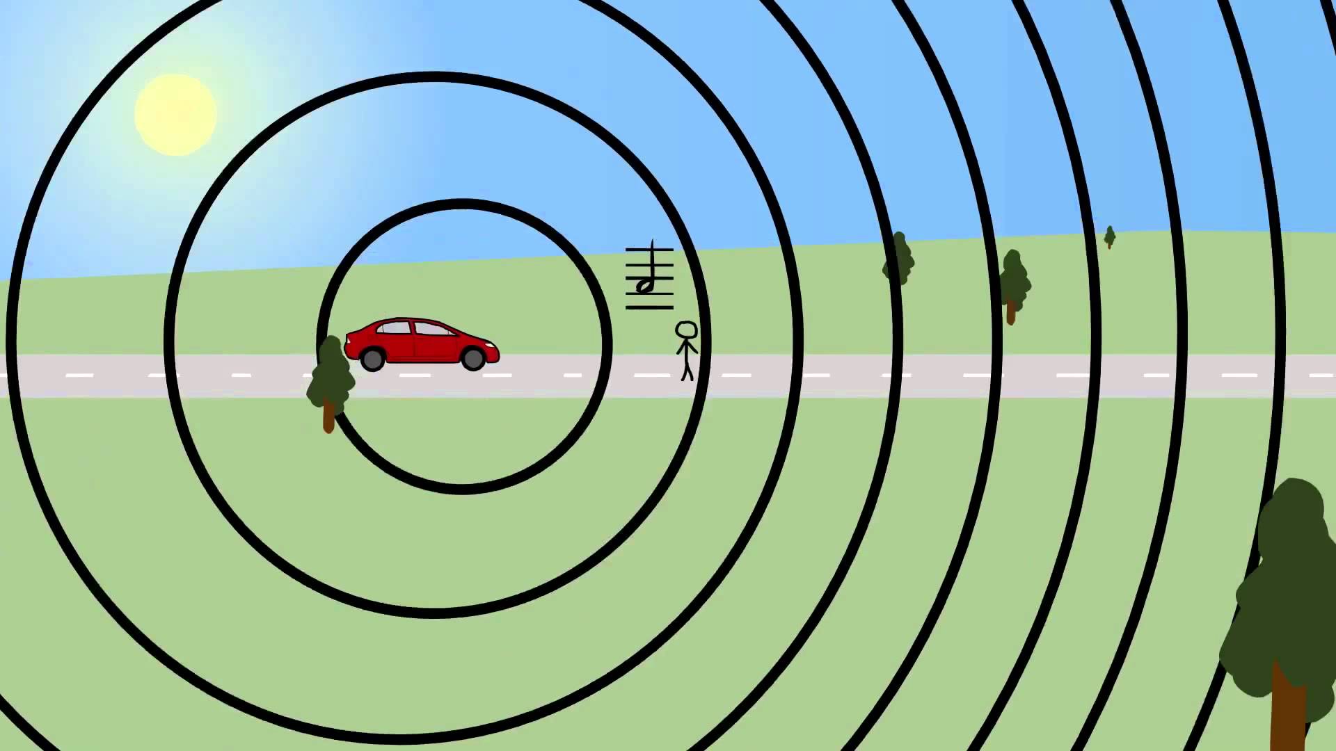
The painting was produced in 1912 but the image seems to display a modern bat-mobile type supercar which shows the forward-thinking attitude within Futurism.  Russolo is trying to convey the idea of motion by creating the impression of soundwaves in the front of the car. Russolo would often focus on the technological innovation and the visual manifestation of motion which can clearly be seen within ‘Dynanism of a Car‘.  The picture is also  similar to physics textbook pictures illustrating the Doppler effect which supports the idea that Russolo was intending to show the compression of soundwaves through this photograph.

An illustration of the Doppler Effect

Dynanism of a Soccer Player

Boccioni uses highly contrasting colours in ‘Dynanism of a Soccer Player‘ along with extremely vibrant hues divided into sections that are reflective of rays of light – possibly coming from around the football stadium. Boccioni is focused on representing these vibrant colours and a sense of dynamics of movement within the painting rather than depicting the player. The dynamic movement feeling spread throughout the painting is done through abstract shapes of different opacity overlapping eachother – which has Cubist influences, similarly to ‘Dynanism of a Car‘.  The work is intended to show a soccer players dynamic movement through an abstract series of shapes and kaleidoscopic colours. The soccer player is dematerialized into a luminous array of colours which could be seen as the colours and lights seen in a typical football stadium in which there are seas of fans in different coloured football kits supporting the soccer players.  The only part of the soccer player that can be made out is the calf at the centre

Dynanism of a Soccer Player‘ was produced in 1913 by Futurist artist Umberto Boccioni who was a member of the Italian Futurists – a group of artists active around World War 1, which is a rejection of the past and a celebration of speed, machinery, violence, youth and industry.  Futurists are firm believers of moving technology and life forward at a fast pace, which can often be seen through their art.  . This piece demonstrates a quote from Boccioni from 1910, he said “To paint a human figure you must not paint it; you must render the whole of its surrounding atmosphere…movement and light destroy the materiality of bodies”.

Through abstraction and sense of dynamic movement Umberto Boccioni has challenged the conventional stillness of paint on canvas in order to create something exciting and different to the viewer. The viewer is forced by Boccioni to rethink aesthetic sensations and their original perception of surrounding objects due to the chaos of abstract shapes within the painting.

breaking the rules of reality:possibilty, dependecy and circumstances

After much research I believe personally that reality is the form of three situations, possibility, dependency and circumstances within action.

Possibility to me is the chance of reality. Reality is not a given or something you are able to predict. Such as being older than someone does not stop the younger person from dying first. These harsh truths show the possibility of we do not know what effects, illness or situations we will come through during our life. Possibility is also a large part of chance, chance is something uncontrollable, and no one can know what the chance of something happening is. Because of this I think it would be interesting to capture some scenarios that capture how everything in life is a risk and matter of timing. this could be a balloon before it burst or perhaps the weather before a storm or even adding my concept of political emotions showing a narrative of something getting evicted or possible literally falling down. When I researched It come up within many fast shutter speed shots in order to cpature the action a apiece has. However I could focus on the side of nature and the beauty nature holds, And the chance something incredible would happen in nature, this could be a sun set or rise, people having twins and many occasions that would not be expected to happen in peoples realities. 

This has forever been an ongoing concept, because of this I believe using achieve pictures and editing them in such a way to demonstrates the circumstance of reality would be incredibly interesting.Dependency is the relationships people have within each other and how their actions cause a dependent reaction which causes the reality. This is a sense of action and reaction. dependency also has strong implementations of a weight. This weight could be the cause of emotional trauma, political instances or a literal weight and harsh imapct. This is a clear demonstration of the balancing of nature and the relationship of trust. I could use this narrative to track people and one person calling and showing clear demonstrations of trust and someone being dependent. however I could enlarge this through a large political instance of who everyone in the world is infact dependent on eeach other. We as a society cannot and will not be able to functions without eachers, as they help with medicine ,housing, money, economy but most importantly we need ot look after other. I think a large ignorance of dependency and a fault at our core is ignorance. How the western world ignorances the cries of those in need in the south and east.

circumstances. This is the godly benefit of being born in a circumstance better than others. Circumstance is also the determinate of where you are when and how this could lead onto the causation of what happens to you. No one has the ability to control who their family is or where stye are born and raised. Because of this many negative an unhappy relationships are formed,this could be caused but he environment people are in or they way in which people treat them.  Circumstances comes into the attitude of nature and fire very well into political landscape as it is an area governmentally controlled differently as you would like. Because of this many people, including some people in my family feel as though this is where they are not meant to be, Is this fate or a disappointing circumstance of action.

plan for shoot:

I want to create a alternate reality. To do so I will create an atmosphere that does not really exists, and capture actions that only happened for a s second and not what people would usually focus upon. tThe editing will be highly conceptual and forms ways in which is unconventional to portray the landscape itself. I will use my idea of circumstances by taking images where I was raised,This is my home, which I did not have a choice over but luckily the circumstances was not negative. However I think dependency goes hand in hand in capturing a reality of a place.  trust and dependency is usually something seen within people, however I think I could relate this t landscape and nature and also further expand this to the power if nature of man itself. lastly I want to capture possibility and capturing rare photos us using fast shutter speed and such. This will be very different from my family shoot, however still based in my family home, but will relate more to political landscapes through these conceptual ideas and editing processes.

The Rule of Technicality – My Response

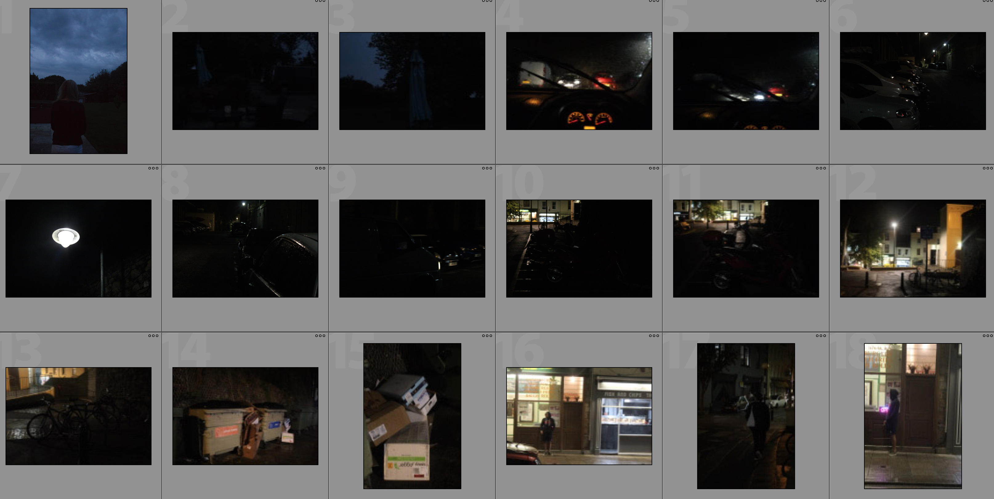
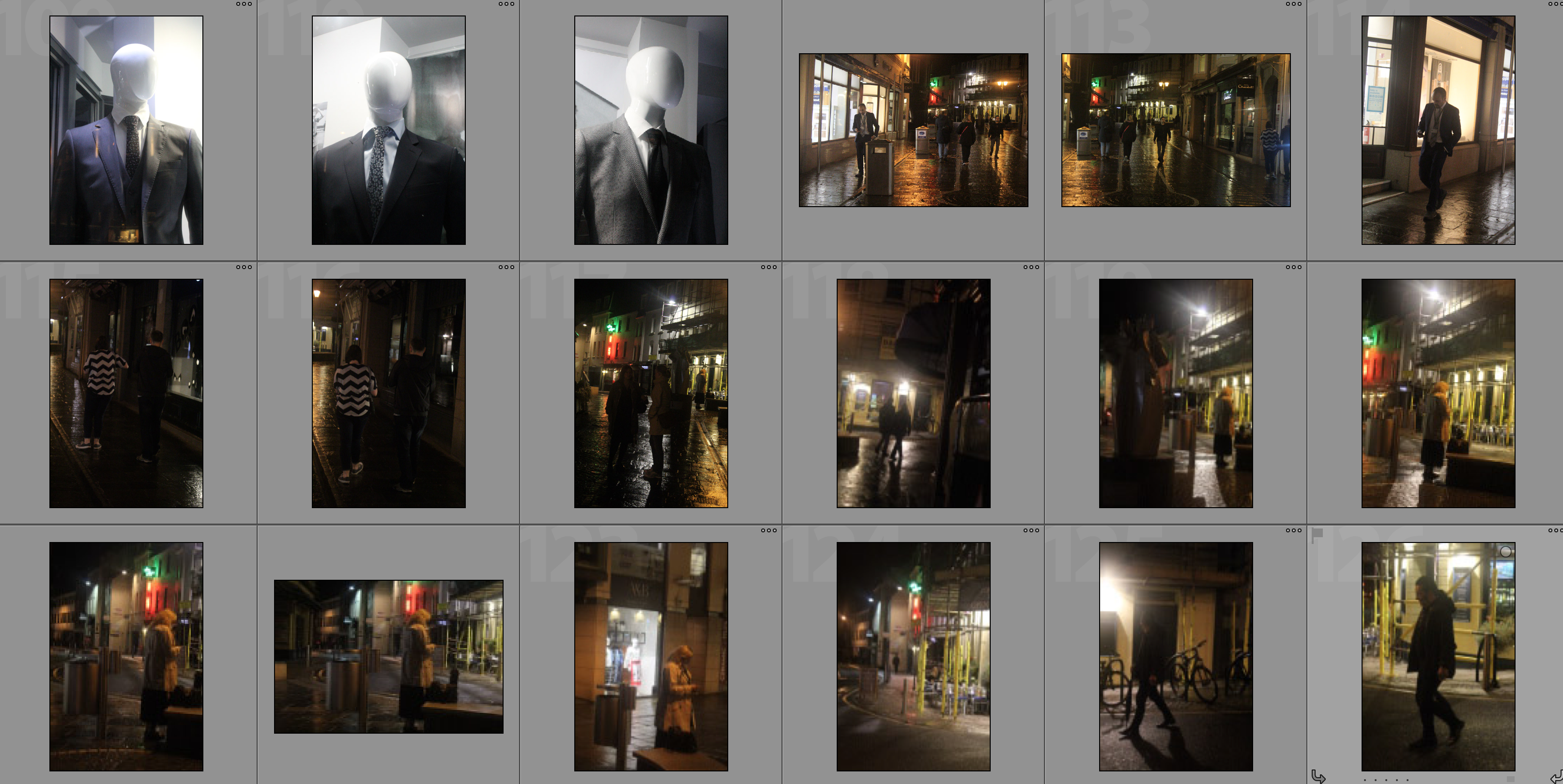
In this shoot I will be responding to the rule of technicality and taking inspiration from the works of Henrik Malmstrom – particularly his work on ‘A Minor Wrongdoing‘ in which he would photograph people that he saw from the window of his living room using a cheap digital camera. The idea of this book was to create grainy surveillance-type photographs that are unconventional and unique. He would do this through using dark environments along with high ISO’s which I will be replicating in my shoot to show the different people within St. Helier and what they get up to when it appears that nobody is watching them. I will be using an ISO of 6400 on all of my photographs in this shoot to achieve a grainy effect and a shutter speed of 1/30-1/80. I will attempt to create a fusion of documentary and street photography within this photoshoot.
Contact Sheets

Edits

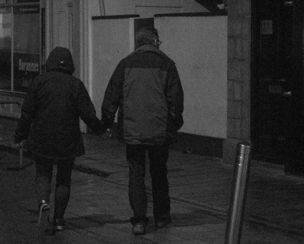
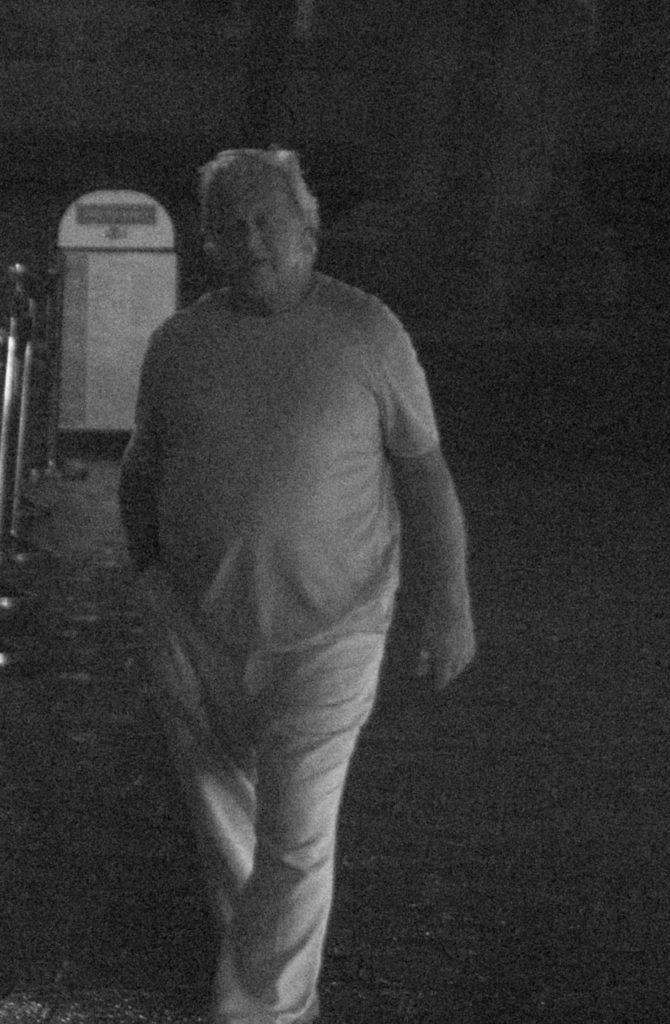
In the below edits I have taken photographs of people within St. Helier with a high zoom and ISO in order to create surveillance style photographs. I have then used lightroom to crop these photographs to close in on the subjects and further improve the effect of surveillance. I also added a black and white filter to these photographs and reduced contrast to create conventionally grey images that contrast with ordinary dramatic contrasting black and white photographs.

Analysis

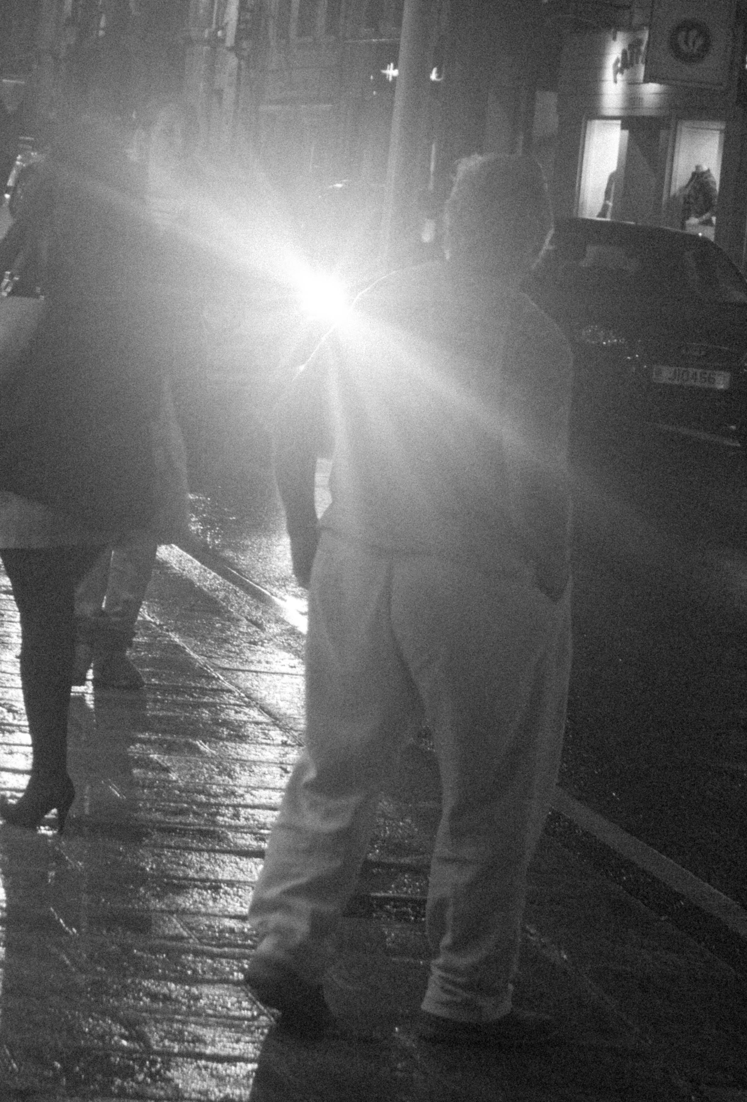
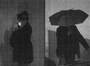
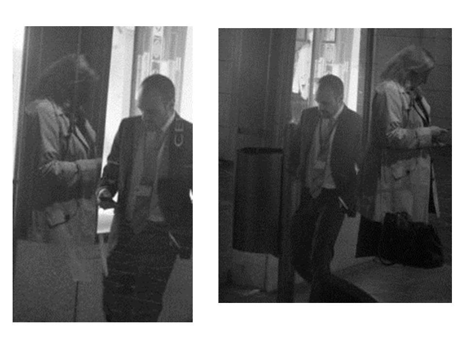
In this photograph I have used the artificial light from town at night to create a dimly lit photograph with little contrast in it.  The lack of light within the setting allowed for a contrasting bright light from a car to illuminate parts of the photograph and create a glare in the camera which creates a mysterious and intriguing subject at which the man in the photograph is looking.  If it was not for the glaring bright light, there would not be a very wide tonal range within the photograph as there would be no major source of light so the photograph is dark grey tones throughout except for this one spark of white.  I think that this white tone within the dark tones of grey add to the photograph by providing another viewpoint and provides a sense of confusion and distortion.  I used a deep depth of field in this photograph to ensure that the entirety of the photograph was in focus but this cannot be seen due to the glare of the car light distracting the viewing eye.  To capture this photograph with a grainy surveillance effect I used a shutter speed of 1/30-1/60 in order to allow some light to enter the lens from the dark environment.  I also used a very high ISO of 6400 to create the grain and conventionally bad quality of the photograph to create a unique composition.

There is no colour in this photograph due to the black and white filter that I have used. I have removed all colour from this photograph in order to convey the theme of surveillance and discretion within the photographs. The use of a high ISO mixed with the black and white effect allows for quite grey and documentary style tones which adds more mystery to the photograph as it is not very clear what the light is or what is going on in the composition. The grainy texture makes the photograph seem as if it was taken poorly, which is the aim of this shoot. The grainy texture creates character and feeling of a dark and disorientating environment to fit in with the surveillance theme. There is a slight 3D effect to the photograph due to the glare of the light separating the man in the foreground from the car in the background – this beam of light surrounding the man further creates a disorientating effect for the viewer, resulting in a slightly abstract composition.  Although I am breaking rules of technicality within this photograph, the man is placed along a vertical line of the rule of thirds but the main viewpoint, being the glaring light, is slightly offset from the centre which adds to the disorientating composition.

This photograph takes lots of inspiration from the work of Henrik Malmstrom’s ‘A Minor Wrongdoing‘ in which he photographs people in the streets using a very high ISO along with a cheap camera to create grainy surveillance-type photographs that are different to the conventional standards of a good photograph.  The photographs that would result from this are similar to mine in the sense that they are dark, grainy and have a sense of mystery and secrecy around them.  Lewis Bush once said that that “the camera technology of today means the real skill and the real statement sometimes lies in taking a wilfully ‘bad’ image”, which is exactly what I am attempting to do with this photograph – create a photograph which is interesting and unique but does not sit within the conventions of photography technicalities.

As with what I think that Malmstrom is trying to convey throughhis photographs, I am questioning whether the technicalities and conventions of society, photography and day-to-day life are necessary and whether people stick to them when it appears that no one is watching them. In this photograph I have photographed a man without revealing his identity, suggesting that he represents society and everyones ongoing ordinary lives.  The photograph observes how society moves and composes itself whilst getting from A to B and also how society presents itself and reacts to certain situations – such as the man staring into the glaring headlights.  This photograph is my attempt of showing people in their own world minding their own business but being watched and recorded without knowing – which can also link to controversy about how closely society is being watched by organisations such as the government.

The Rule of Technicality – Henrik Malmstrom

Henrik Malmstrom is a Finnish photographer currently living and working in Buenos Aires, Argentina.  Malmstrom self-published his first book in 2010, titled On Borrowed Time‘.  He is the co-founder and curator of the Müllkellergalerie which is a premium art gallery located in a garbage room in Hamburg, Germany.  Malmstrom has won over 15 awards since 2008 as well as being shortlisted for the best photobook of the year in 2016.

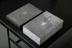
I think that Malmstrom has a very interesting approach in his book ‘A Minor Wrongdoing‘ in which he photographs subjects at night with a very high ISO to create grainy and underexposed photographs.  In this book Malmstrom would photograph people that he saw from the window of his living room using a cheap digital camera. He would create the effect of a surveillance camera by setting the ISO abnormally high.  The book that came from this replicates a messy police report archive with the grainy monochromatic photographs creating a sense of abstraction due to their unconventional appearances. The photographs in this book were taken between 2011-2014, Malmstrom’s synopsis of ‘A Minor Wrongdoing’ says that the project records “the last remains 
of street life in an urban area that is currently undergoing
fierce gentrification after recent official law enforcement
against street-based prostitution”.

I think that Malmstrom’s defiance of the rule of technicality is very interesting and unique as it creates a composition that most photographers would not even attempt to make.  Whilst having an abstract and unconventional aesthetic in this project, Malmstrom has managed to make this work still look good whilst breaking the rules of technicality. I plan on taking inspiration from Malmstrom’s work when exploring breaking the rule of technicality as I think I can successfully combine documentary/street photography along with this style to create something that I would not usually attempt.

Analysis

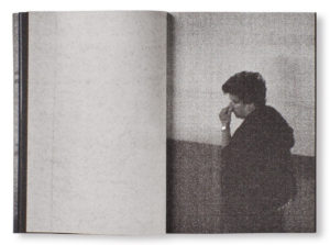
In this photograph, Malmstrom has used natural lighting, or the lack of it, in order to create a very grainy and grey photograph which replicates the effect of a surveillance camera. Within this photograph there is not a wide tonal range due to the grey and surveillance nature of the photograph which creates an almost old-fashioned effect within the photograph. The photograph is not a very high contrast either due to the dark setting that Malmstrom is going for, but the low contrast works for the style of photograph. Malmstrom will have used a shutter speed of around 1/50 – 1/100 with a very high ISO of 1600 or 3200 as the idea of this project was to capture grainy photographs of people in the dark. Technical quality was not a key aim of this photograph, which can be seen, as Malmstrom aimed to create these technically incorrect photographs. The high ISO allows for the grainy texture to be created which adds a lot of character to the photographs and adds to the dark and mysterious setting.

There is no colour in this photograph – only black and white. This black and white theme further conveys the theme of surveillance and discretion within the photographs. The mixture of the high ISO grainy photograph with the black and white effect means that the tones are also very dark and mysterious – these dark tones make the setting have a sinister and secretive vibe meaning there could be more to what meets the eye with this subject. The grainy texture makes the photograph seem as if it was printed poorly – which again breaks the technical rules of photography, but this grainy texture fits in to further push the idea that this is a mysterious photograph. The eye is immediately drawn to the cigarette being lit in the subjects mouth as it sparks to be the whitest part of the photograph, contrasting from the regular grey tones without. This white spark illuminates the side of the subjects face to give a slight sense of the subjects identity without giving too much away, leaving more mystery in the photograph. The subject is also placed along one of the vertical lines of the rule of thirds – this may be intentional but also may not be, either way it makes the photograph more aesthetically pleasing for the viewer. There is not much of a 3D setting to the photograph due to the dark and grey tones with little shadowing.

This photograph was taken from Malmstrom’s book ‘A Minor Wrongdoing‘ in which he photographs subjects at night with a very high ISO to create grainy and underexposed photographs.  All of the subjects within the book were photographs from Malmstrom’s living room window which adds to the sense of mysteriousness and surveillance.  On the final outcome of the book in which this photograph was placed, it replicated a messy police report archive which shows that the surveillance theme conveyed throughout the photographs is intentional.

I think that through this photograph and the other photograph from his book  ‘A Minor Wrongdoing‘, Malmstrom is trying to question whether the technicalities and conventions of photography and society that we are supposed to conform to really matter in the grand scheme of things.  I think this because Malmstrom is photographing unaware subjects whilst they are in their own world, not worrying about conforming to society’s standards or trying to impress people.  Through doing this Malmstrom is showing what people are really like when they are not around and so how we should be all the time.  Malmstrom further presses this idea by not sticking to the normal conventions of photography through grainy, low contrast photographs caught with an abnormally high ISO.


second artist: and Cristina de Midde

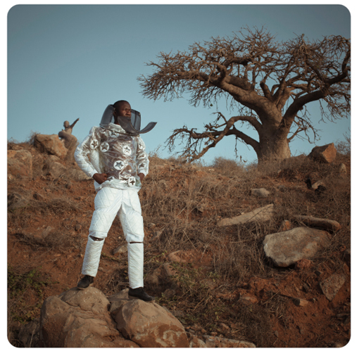
Cristina de Middel  is a Spanish  documentary artist who is currently living and working in Mexico. She has self published many of her works and has focused on many different projects such as the southern Africa space program . Her work is critically acclaimed and she had sold out many of her books ad  works across the world. She has been nominated for many huge photography prizes all around the globe. Her work is an ongoing investigation to focus on the ambiguous relationship of what is the truth. She blends her views od documentary and conceptual phoqogorhic practises, she does this through practising with the reconstruction of archetypes and her found burr of what is reality and what is fiction. Her photojournalistic gaze as an outsider allows her to create views which she can presently see within the landscape she is is innovate with her work creates critically acclaimed series , such as the image above which focuses on a failed program for space. this could come onto terms of predicting the future of presenting a false sense or recreating an occasion that is happening elsewhere in the world. Her stages reenactments and obscure narratives allow a continuously interesting new body of work. Her work is that of fiction but can serve as a subject relative to todays world. Her photography can work just as well as being fact as it highlights our expectations of how reality is flawed. Her exhibitions are international and have won the prize for infinity award and the international centre award. 

To me the image above has a child like sense of a false sense of reality and the hope and childlike ignorance a child has. This is mirrored through the handmade costume and the stance which conveys power and confidence. The angle of the photo being a low shot also attributes power to the man, it shows a confidence and his gaze perhaps highlights a longing for a reality that will probably never happen. The atmosphere to which they are surrounded is relative to the location of Africa and them having a space program in such a poor area. The light tonal colours of the outfit creates such a strong juxtaposition to the atmosphere itself and shows the artists disagreement of political standards and corruption within the government structure of their properties. It shows a false reality to the people of Africa and thinking they have an opportunity to be part of this space program but it is not a possibility.

I believe this piece is very interesting in how to shows a false reality .I believe that the person  look secure, and composed, and how this is not an accurate scenario to someone who too would be faced with many bugs such as this. The image contains a beauty within these horrible bugs that would scare many people. This image symbolises the death and ignorance and suffering people have to live with.Her images purpose a sense of reality throughout he false tablo images which are obviously set up but insure a deep meaning. it interests me the way in which all of her work contains and obscure image with an equally as obscure narrative story within it too.

Midde had a realisation that her work did not have enough impact. because of this she stopped believing in raising awareness by pointing out the problem. She wanted to start a debate within her images and see how many different approaches she could take in order to start the making of a solution. She has said ‘ straight documentary photography is about imposing an opinion (that comes from mass media’s agenda) and the audience has very little to add to it, and the dimension of the problem makes it impossible to react’Because of this imposing a different reality were she promotes a solution and not the problem itself there is a new dynamic and an essence of courage within her work.The language employed when searching the chronicle of the world is outdated, the reaction is no longer the same. People are no longer impressed by the document itself and some contexts needs to be provided. Midde wanted to ‘include my opinion and my vision of things in the way I try to explain the world.’ The inspiration of her work is generating a context from newspapers, magazines and then sharing it she portrays as a selfish process. Midde stays on the surface because she believes this is the most interesting subject to a topic, due to it being a visible concept. It enables people to see a problem and understand it a-lot better . This is how her work presents a new reality to so many because it is not meant to show a problem, but easily present a solution.

My Response To Lewis Bush

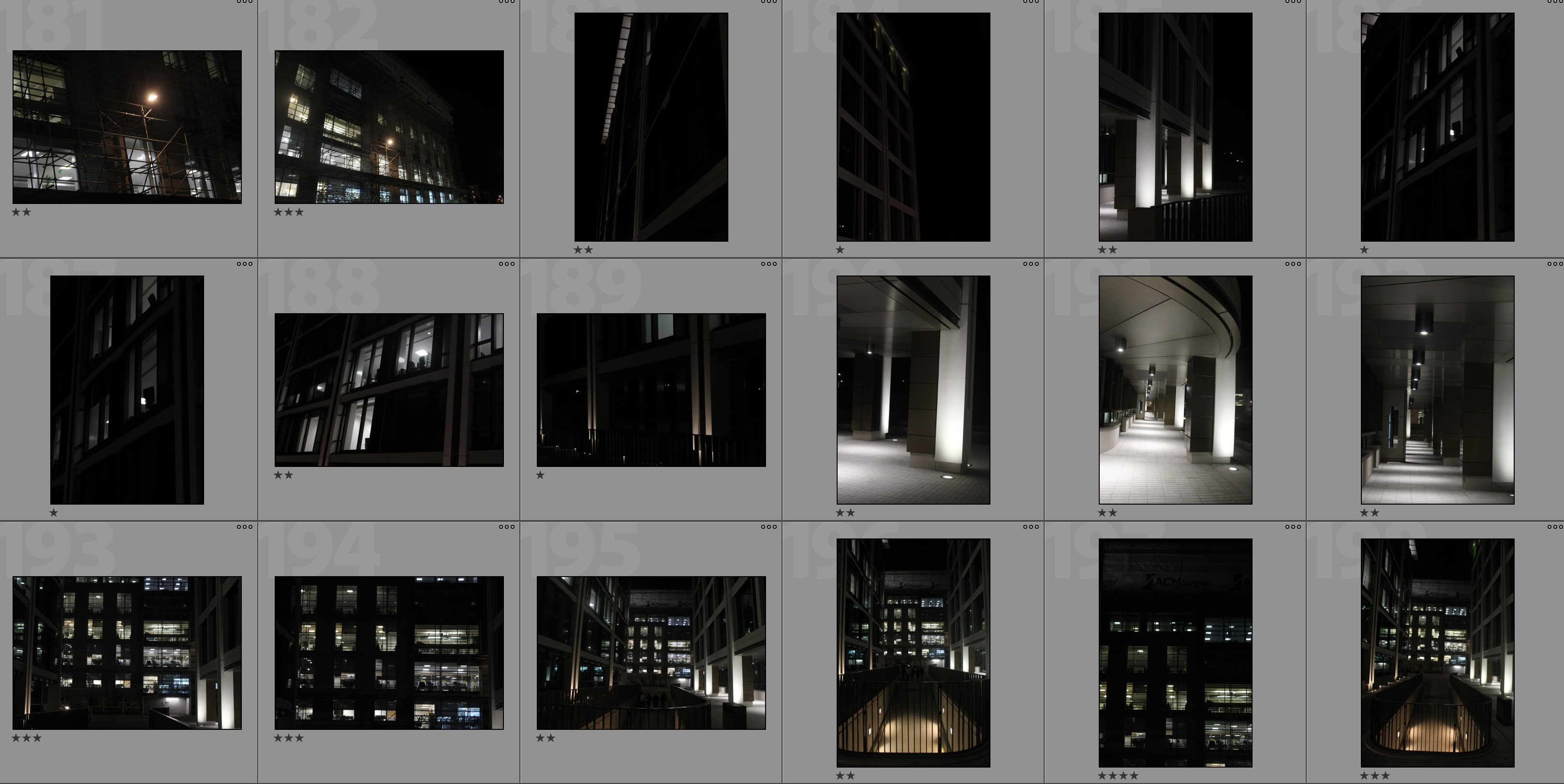
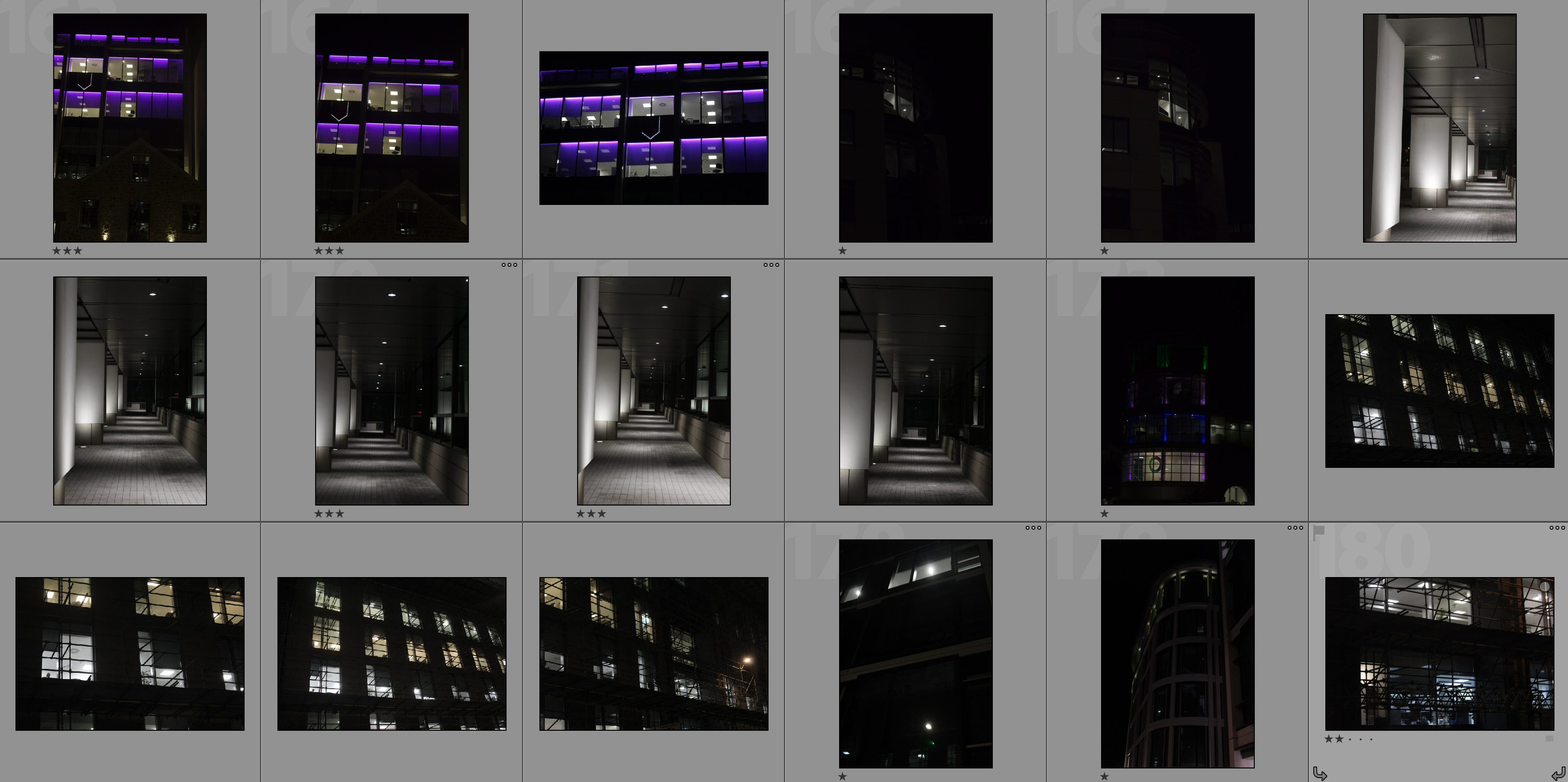
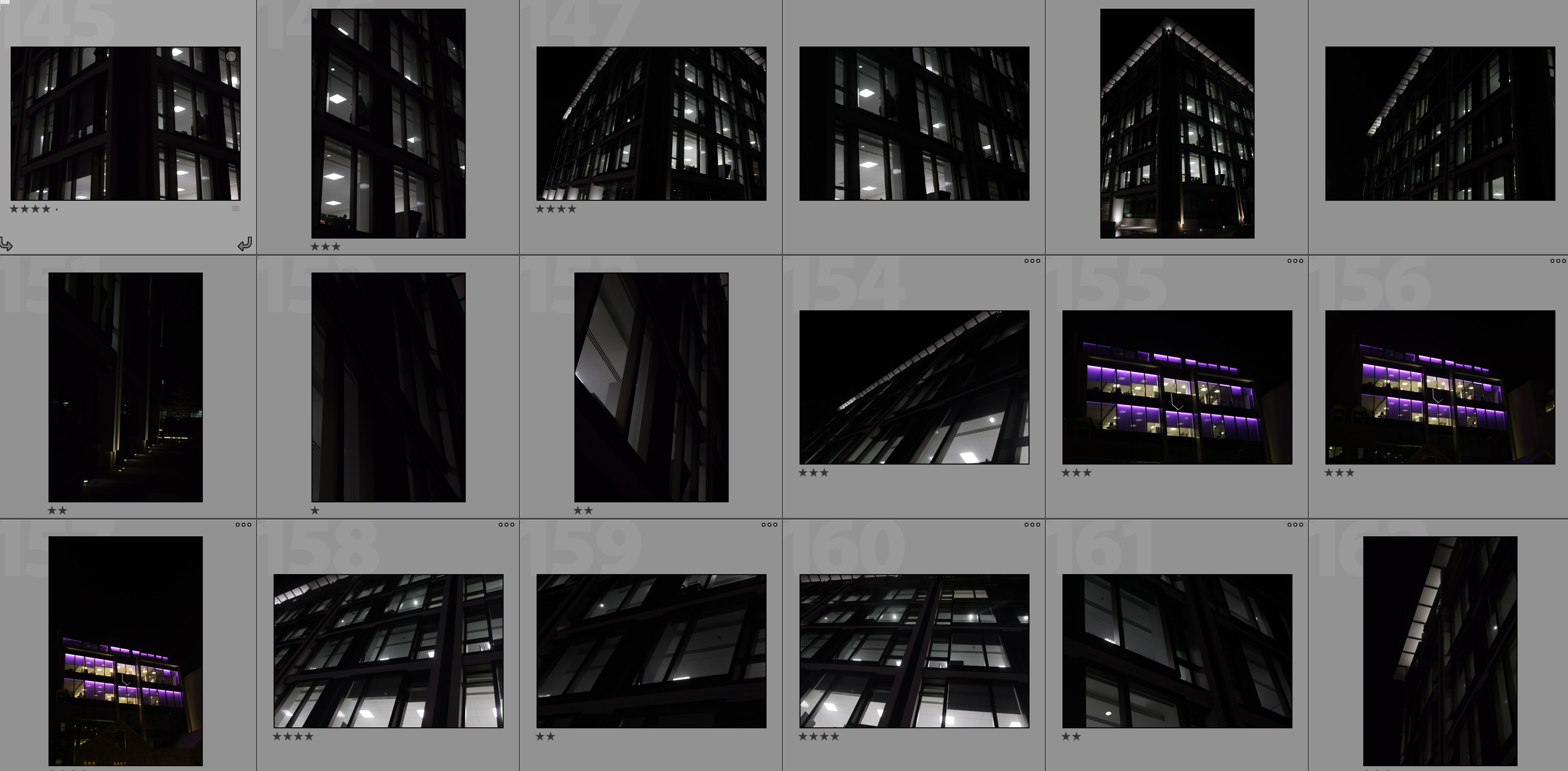
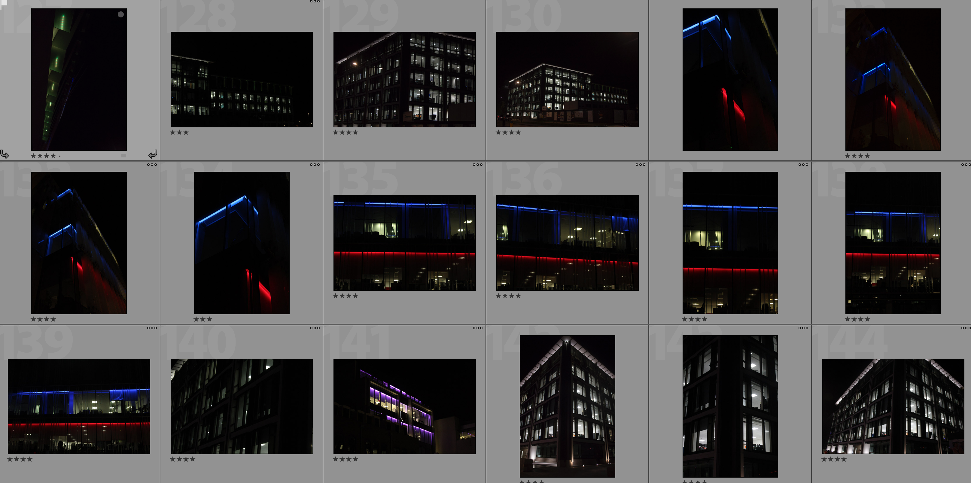
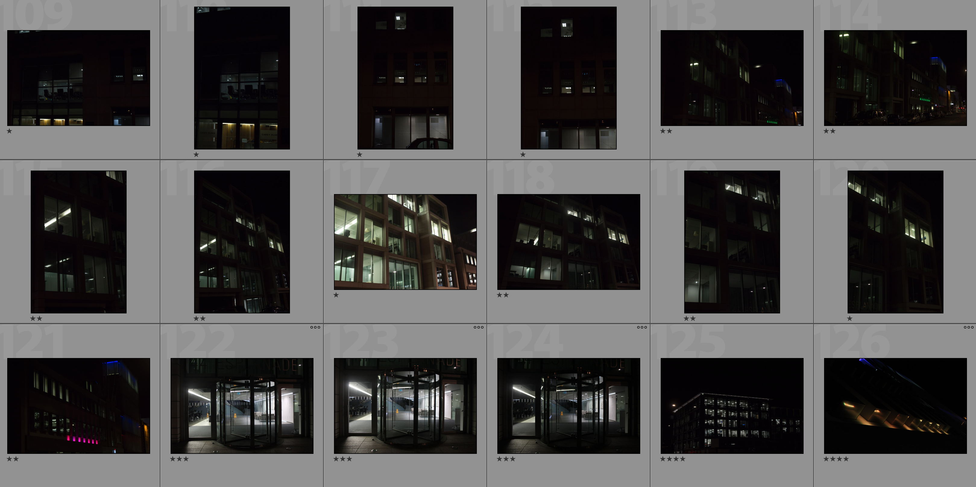
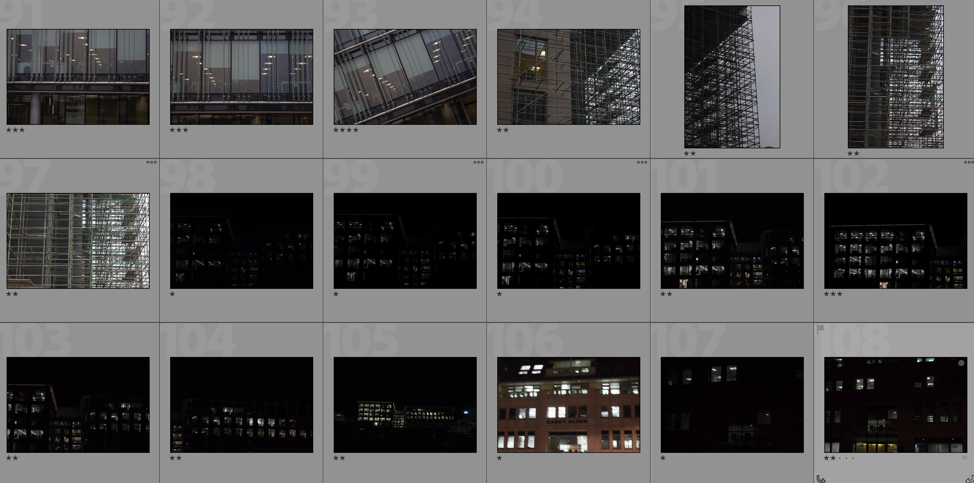
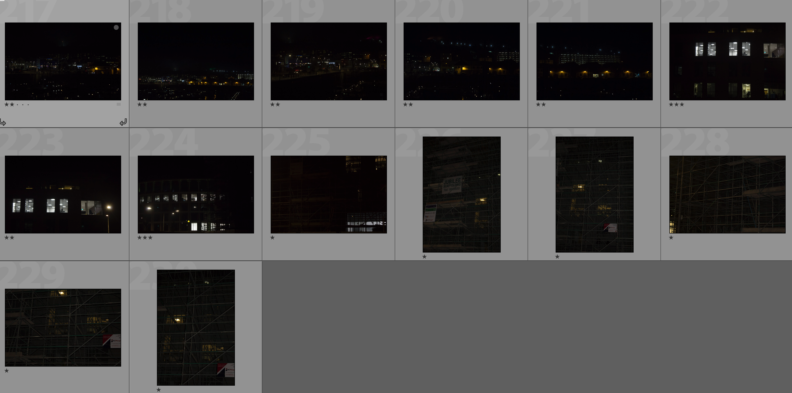
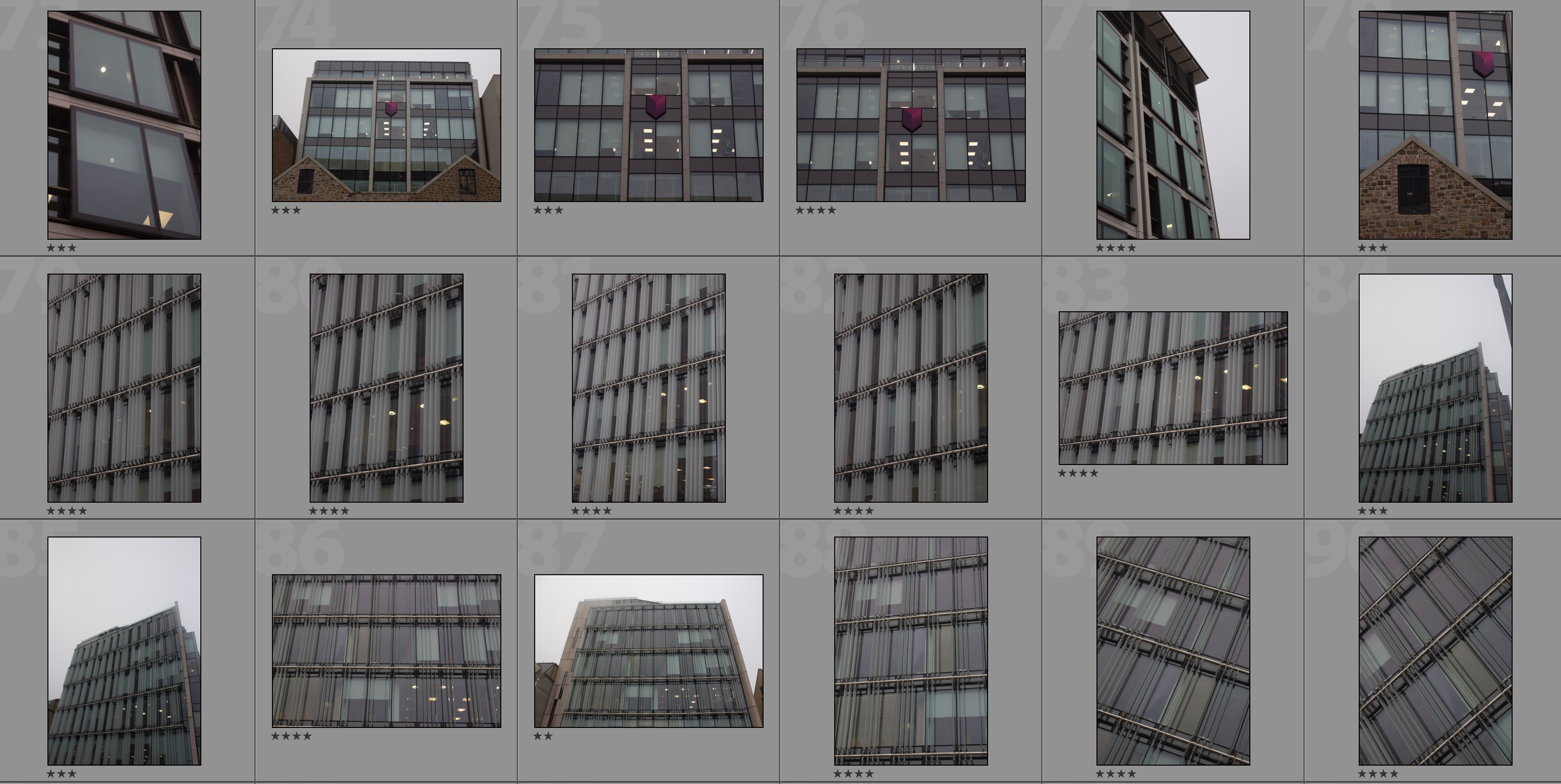
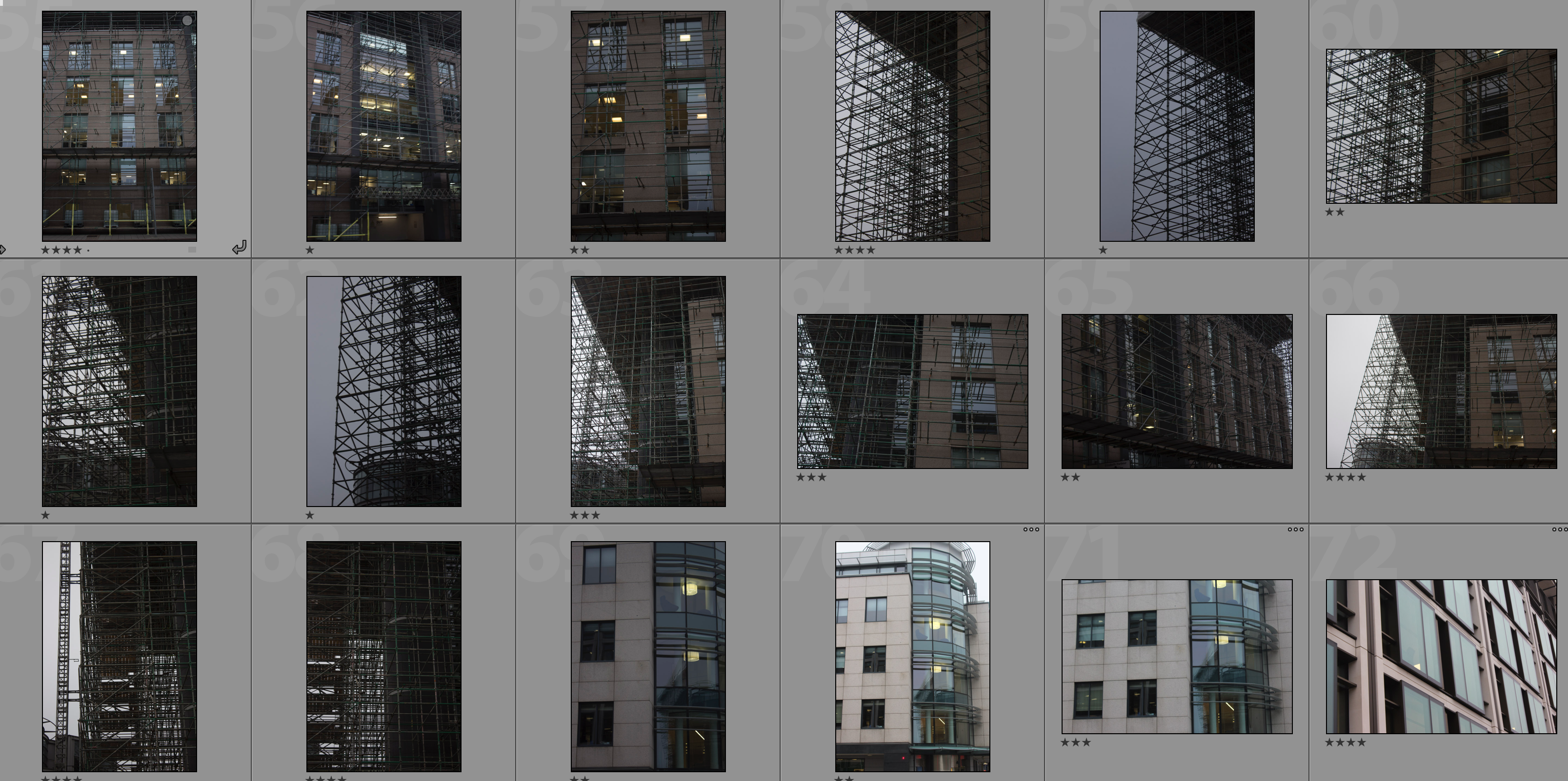
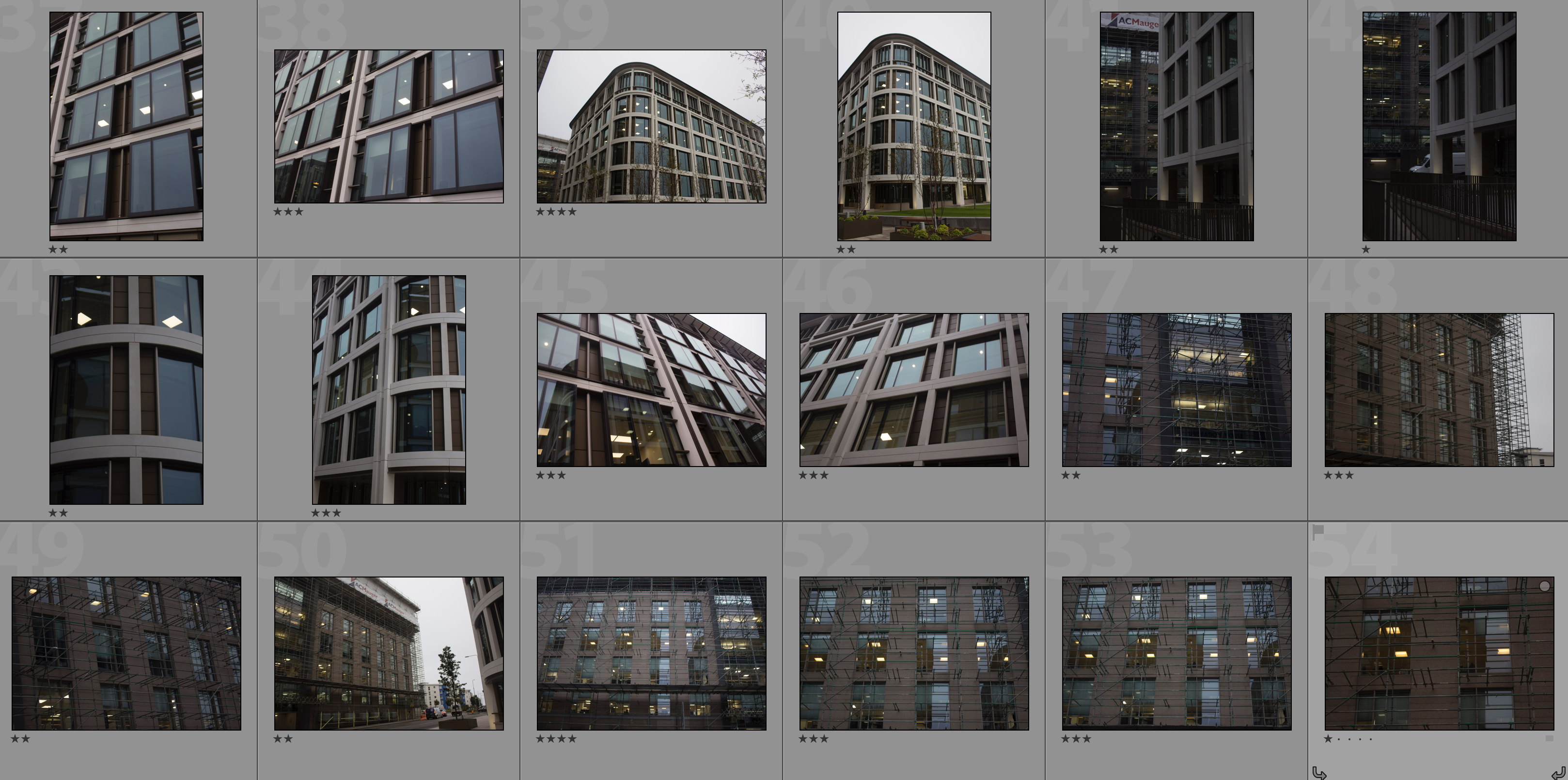
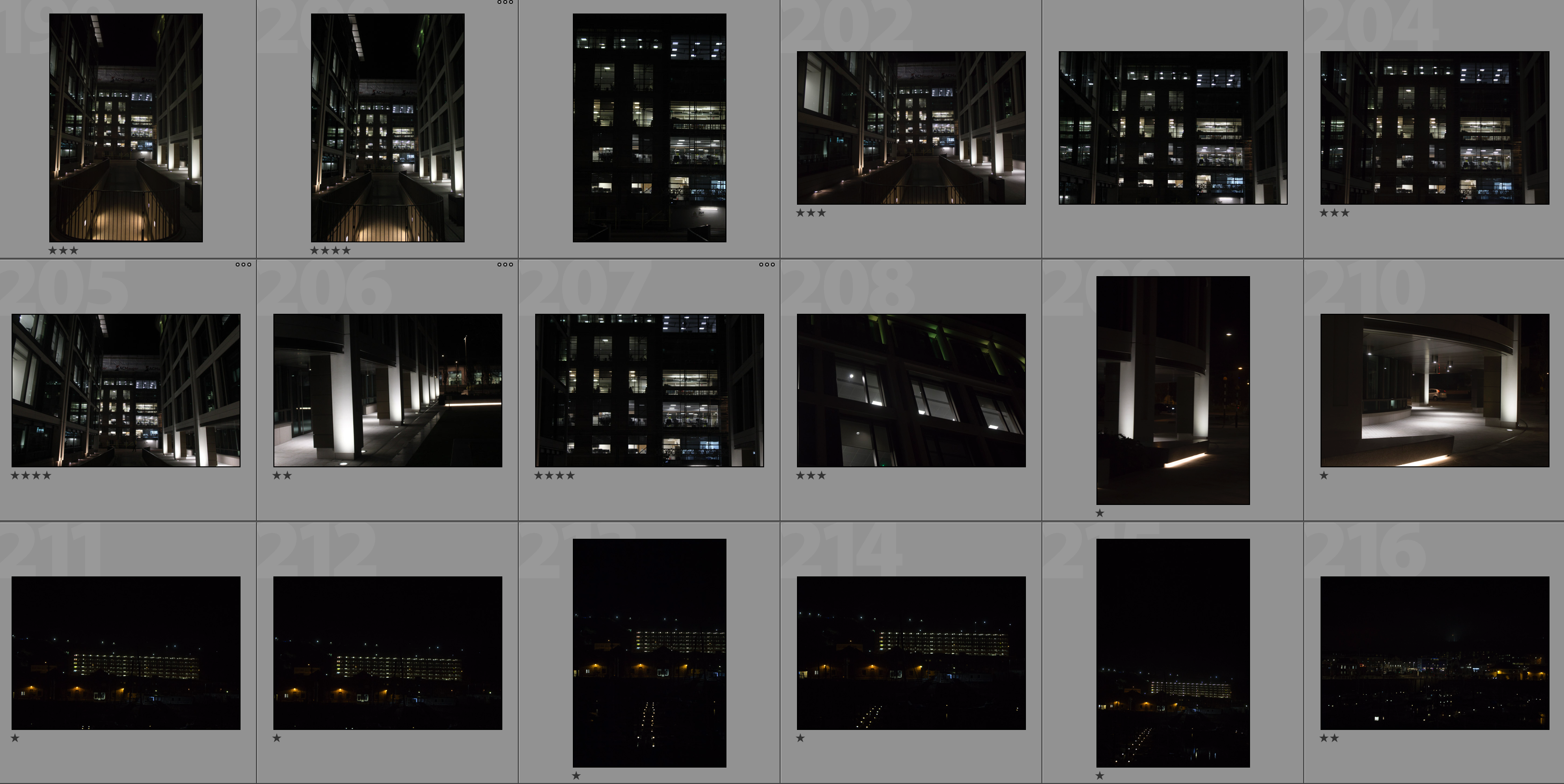
In my response to Lewis Bush I am going to be photographing the financial sector within St. Helier in both day and night and then creating a double exposure effect with these photographs in photoshop. The inspiration for photographing the financial sector comes from Bush’s ‘Trading Zones‘ and the use of double exposure comes from his project ‘Metropole‘ in which he used this technique throughout. I will be carrying out two photoshoots for this response – one in the daytime and one at nighttime. This will allow me to be able to work with a wide variety of photographs in order to create different effects and settings within the edits.
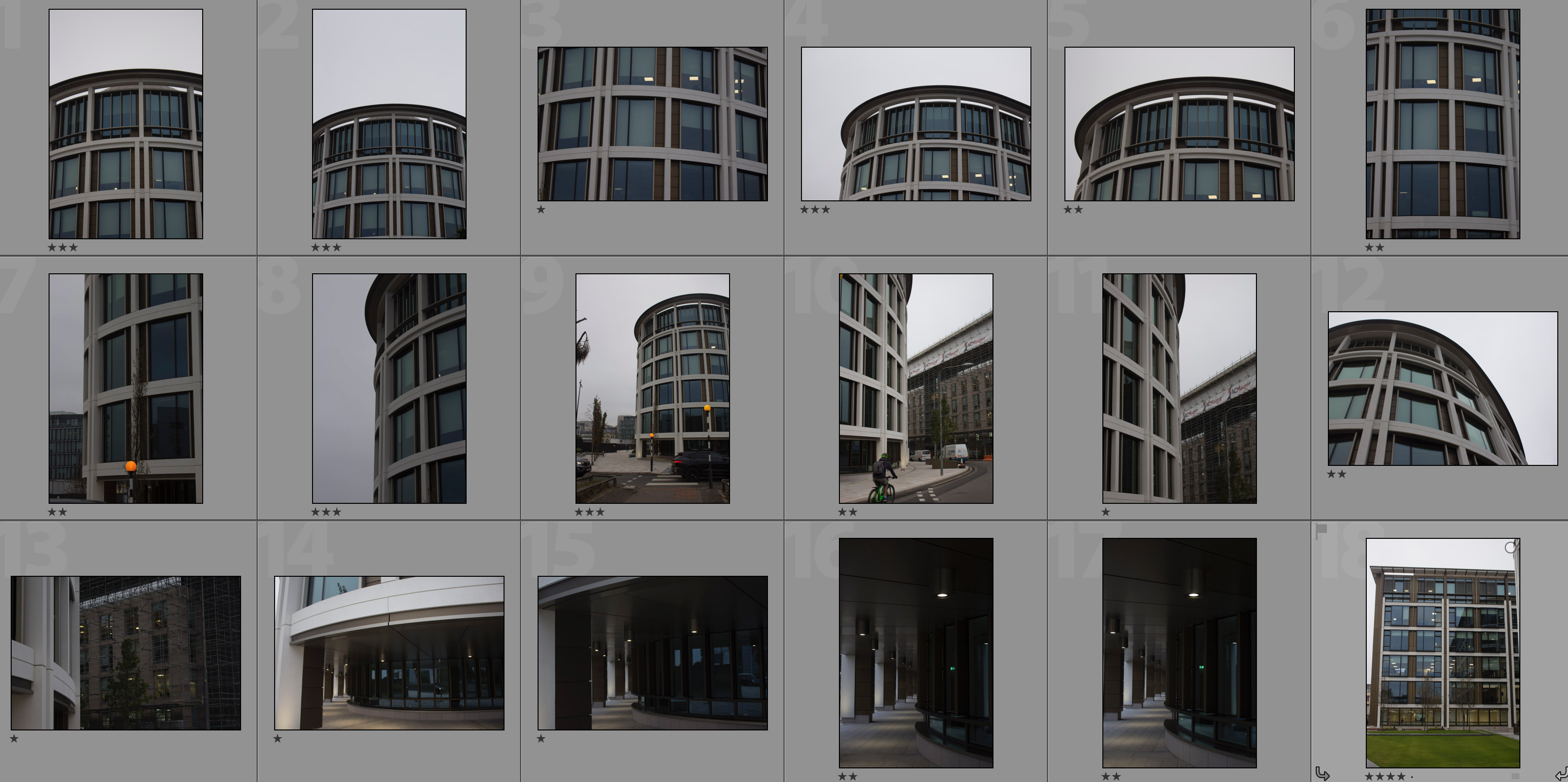
Contact Sheets

Editing Process

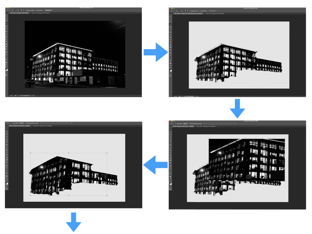
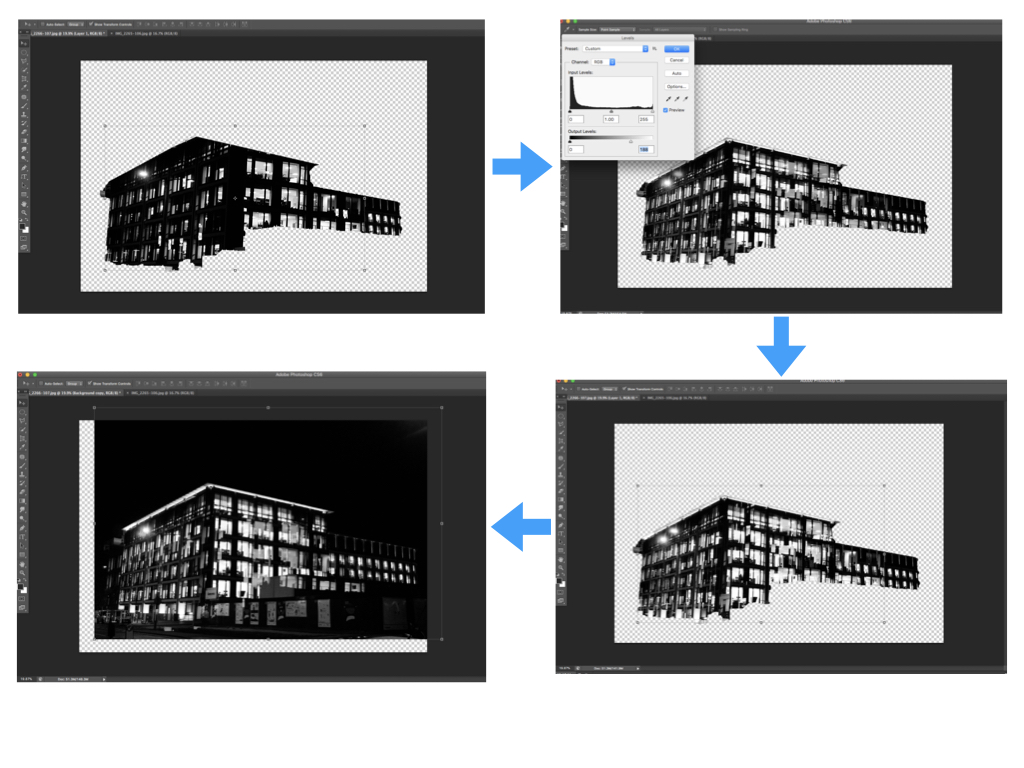
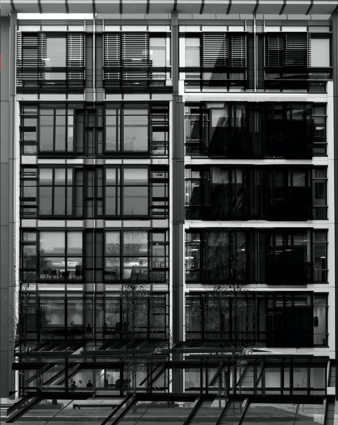
I carried out the double exposure editing on photoshop. I started by using the quick selection tool to separate the building from the rest of the photograph and clicked the ‘refine edge’ button to create a blank background. I then placed the second photograph over the base photograph and added a layer mask in order to shape the second photograph in line with the base photograph. After this I used command-L in order to edit the levels of the second photograph and so changing the black/white/grey properties. Next I selected the blending option as ‘lighten’ to allow the two photographs to merge. I repositioned the second photograph over the base photograph to create a double exposure effect then brought the background forward to reintroduce it to the composition. Finally I repeated this with multiple photographs to create a disorientating composition.

My Edits


Analysis

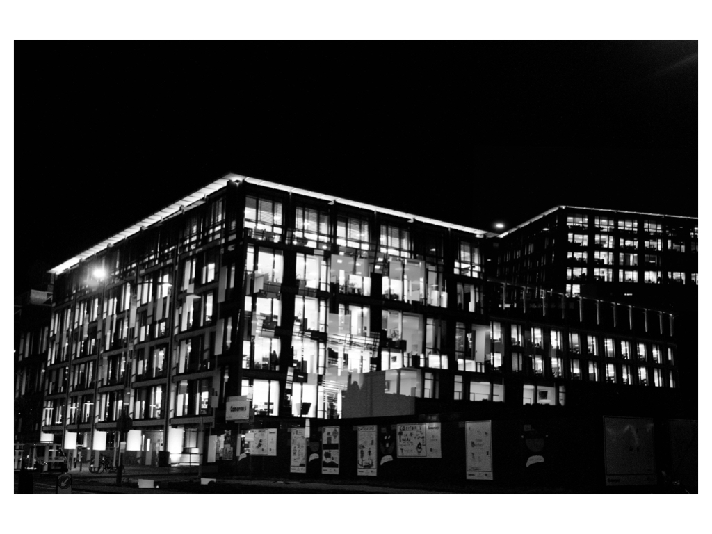
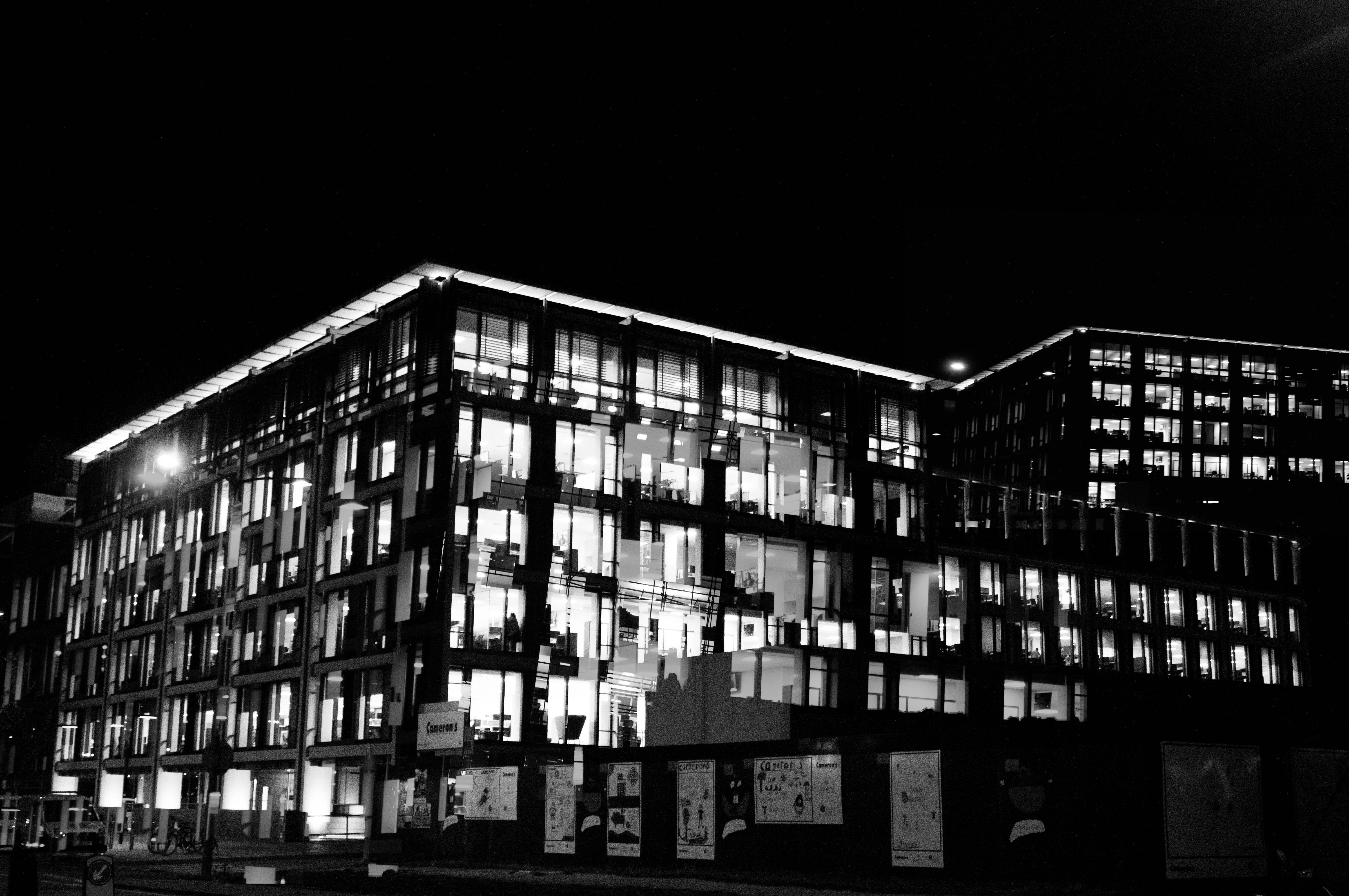
In this photograph I have used natural lighting in order to capture the natural shadows and contrast of the new finance centre in St. Helier.  This natural lighting allowed for reflections in all of the windows which creates a variety of tones throughout the composition. This variety of tones creates contrast between the dark black frames and the grey tones of the windows.  I used a deep depth of field to capture this photograph to ensure that every detail was in focus including the reflections in the windows.  By layering multiple photographs over the top of the original I have been able to create dark frames and dark shadows to contrast with the lighter tones – I think that this create a much more dramatic and slightly abstract photograph. I used a shutter speed of 1/60 to capture the original photograph along with a fairly low ISO of 200 in order to ensure that the photograph is exposed enough but is as high quality as possible. This high quality photograph allowed for the similar photographs overlayed on top to blend in well to provide more contrast and structure to the photograph.

There is no colour in this photograph as I thought that the black and white filter really allowed the black dark tones to come out to provide more contrast and shadows within the photograph. The lack of colour also allows the viewer to focus on the dark lines and paths running throughout the composition and so emphasising the disorientating intent of the photograph. The tones throughout this photograph are mostly gray with streaks of black running throughout it – there are not many bright tones in this photograph which I think works well as the grey and black tones allow the original photograph and the photographs on top to blend well together to create a photograph that is familiar to someone from Jersey but unfamiliar at the same time. From the way that I have cropped this photograph using perspective crop it is a very 2D and flat photograph except for the photograph overlayed in the bottom third of the photograph. This bottom third of the photograph appears to come towards the viewer which sends the rest of the photograph to the back, ultimately creating a sense of confusion within the viewer. The windows and lines throughout the photograph are very aesthetically pleasing as they create a pattern of squares and lines, making the photograph more intriguing. There is no immediate viewpoint that they eye is led to due to the abstractness and pattern throughout the photograph. The line straight down the middle of the photograph creates a sense of division within the composition as well as a sense of satisfaction due to the organisation of the placement.

I took inspiration for this photograph from Lewis Bush’s project ‘Metropole‘ in which he looked at the collapse of the British Empire and how in its place globalised capitalism grew as London has been rebranded as “a city of demolition, cranes, and glittering new high rises”.  ‘Metropole’ aims to record the effect of this on London through the form of documentary photography and I aim to show the effect of how Jersey has changed with the construction of the new financial centre and all the new flats and other offices within the area. St. Helier has changed drastically over the past couple decades and it may seem as if it is moving too fast for some of the residents that have lived through these stages. This photograph was taken as part of a shoot of the new financial centre, I took the original photograph and layered multiple photographs of the same centre over the top to create a disorientating effect.

I have attempted to recreate the double exposure that Bush used in his ‘Metropole‘ project in order to convey the idea that as the financial centre grows and as construction within the area goes on at the rate it is, the people of St. Helier are becoming more lost and disorientated as this is no longer the St. Helier that they’ve lived in for all of these years.  Bush used this effect in order to create the “sense of loss that many Londoners feel” in the big city. This theme of a feeling of loss within the city links to the genre of ‘political landscape’ as it looks at both the present and past in St. Helier showing how it has changed and how the residents of St. Helier are feeling about it all.  I think that the government of Jersey is focusing too much on construction and not what would really benefit and satisfy the people of Jersey.

Political Landscape – Lewis Bush

Lewis Bush (born 1988 in London) is a British photographer, writer, curator and educator.  Bush studied history at the University of Warwick and gained a master’s degree in documentary photography from London College of Communication, where he lectures on photojournalism and documentary photography.  In his work bush seeks to draw attention to forms of invisible power that operate in the world – such as finance.  Bush has the standpoint that ‘power is always problematic because it’s natural resting state is arbitrary and untransparent’.  Bush’s projects tend to incorporate writing and he has written about photography for a range of national and international print and web titles.
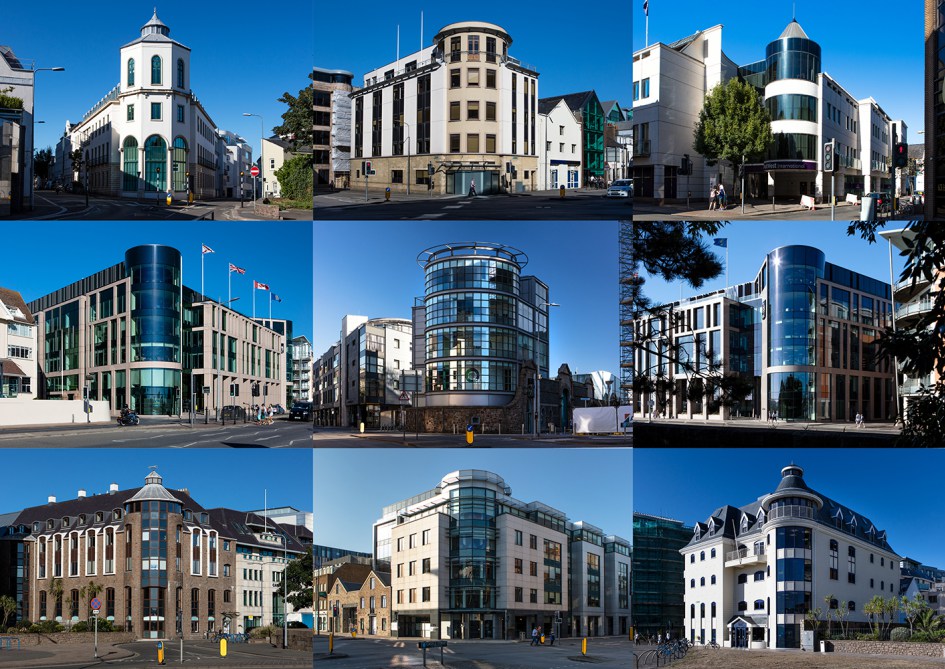
In Bush’s ‘The Memory of History‘ from 2012, he travelling through a range of European countries to document the way in which the past was being politically manipulated in the context of the economic crisis and recession.  This project links to the theme ‘political landscapes’ as it shows how the invisible power of politics is used and abused in different places over time.

Bush is a photographer in residence at the Societe Jersiaise in Jersey where he is working on his project ‘Trading Zones‘ in  which he looks at the international finance industry.  It looks at the global economic crisis that began ten years ago and the resulting financial sector. Finance has been very unrepresented in documentaries due to its complexity and stature meaning that there is plenty of potential for investigation for documentary photographers such as Bush.  The project ‘Trading Zones’ is a result of six months spent as the 2018 Archisle photographer in residence at the Societe Jersiaise in Jersey, which is currently undergoing huge renovations in the financial sector.  Bush says he has used this time to “establish the foundations of what I anticipate will be a long term photographic inquiry into the financial services industry” as the project comes under documentary photography so this project will be ongoing over a long period of time.  Bush says in an interview with ASX “Finance here is the accidental product of events going back almost a thousand years, but is it also the result of very intentional choices made over the last half century” which links back to political landscape in the sense that trends and features change over time but often loop back around.  There are multiple methods of approach taken to this project by Bush – ‘Trading zones’ has inspiration stemming from different areas such as:

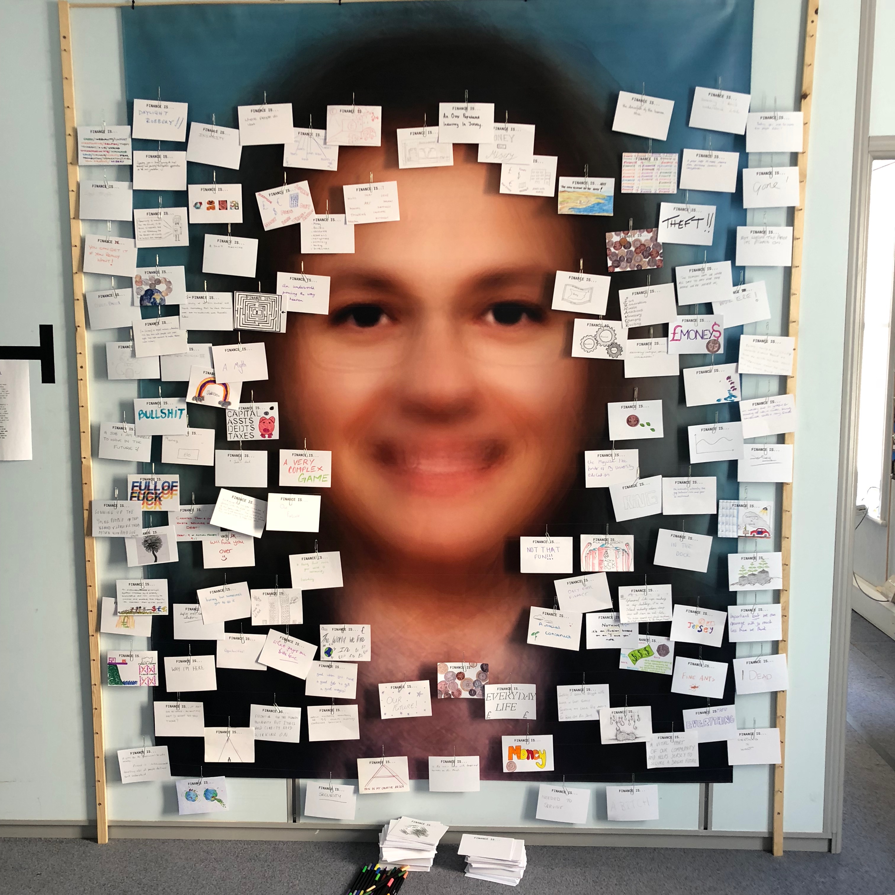
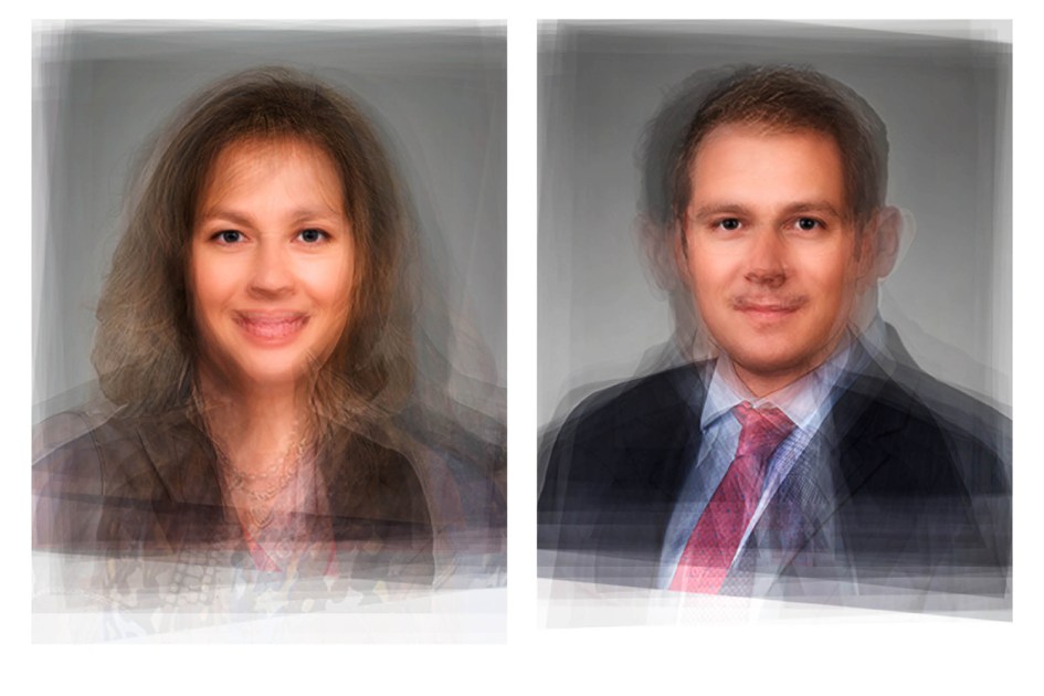
  • Portraits using a technique called ‘composite portraiture‘ developed by cousin of Charles Darwin, Francis Galton, who was an anthropologist.
    • Bush merged hundreds of corporate portraits from a variety of countries specialising in different aspects of finance, resulting it what the average finance worker may look like.
  • Cards asking what the public thought of finance which drew inspiration from a project by EJ Major, who sent out cards asking ‘what love is’, expecting people to respond in whichever way they felt appropriate.

Bush’s residency finishes with an exhibition of ‘Trading Zones’ in the St. Helier Old Police Station where financial investigations unit of Jersey Police was based. This project is currently a work in progress and is continuously looking for future financial collaborators in order to develop this project further.

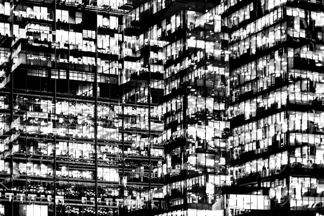
Analysis

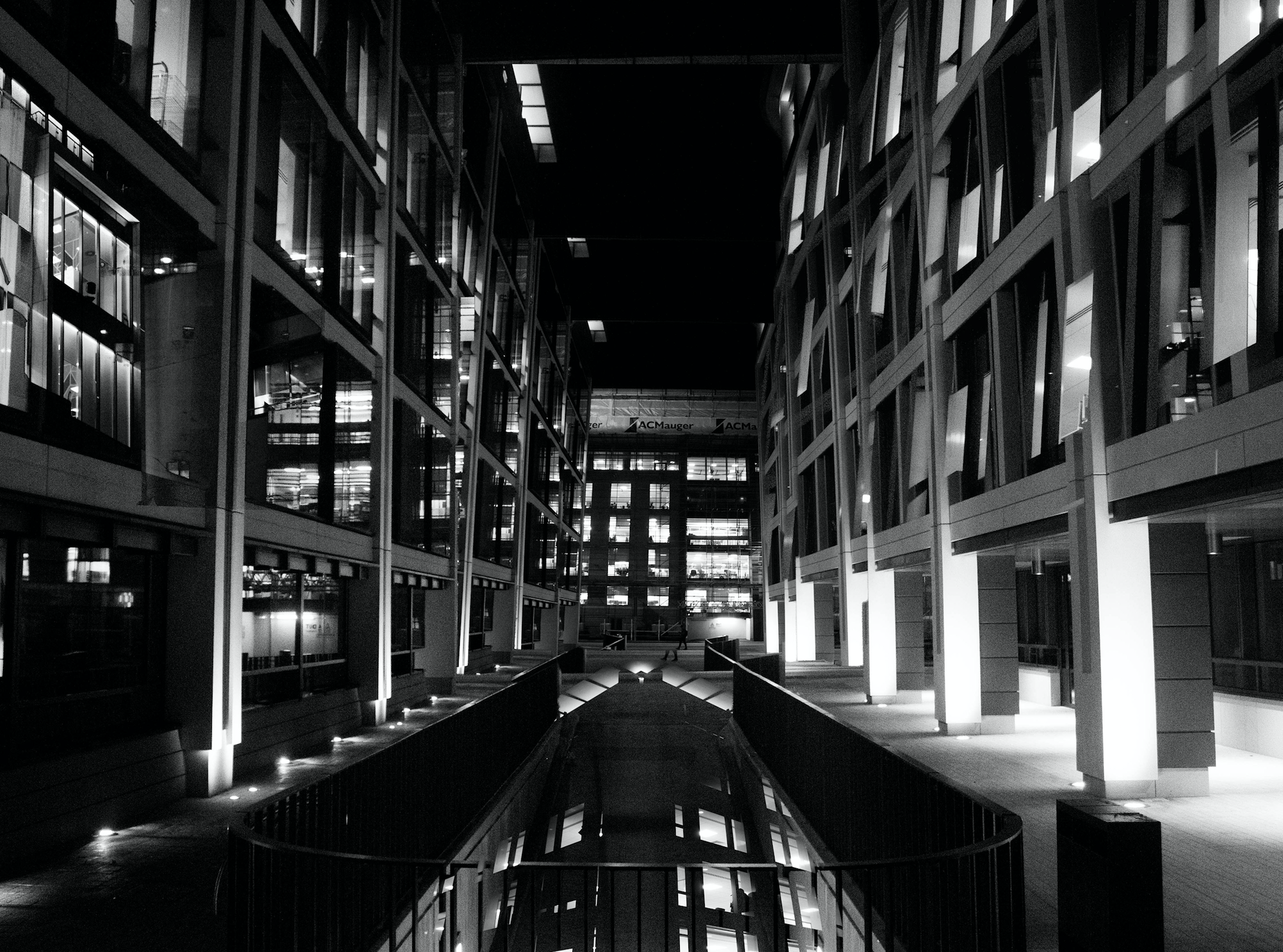
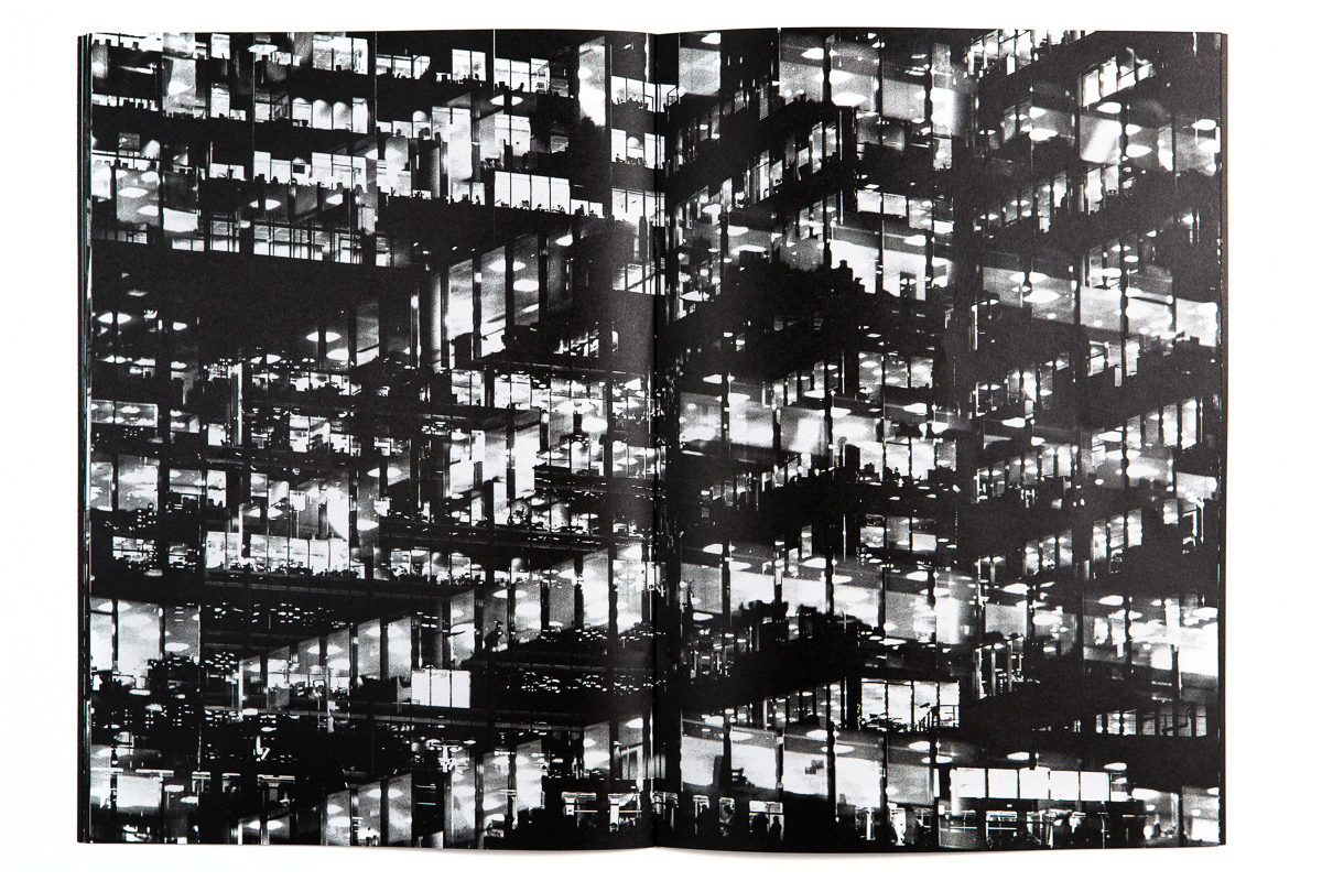
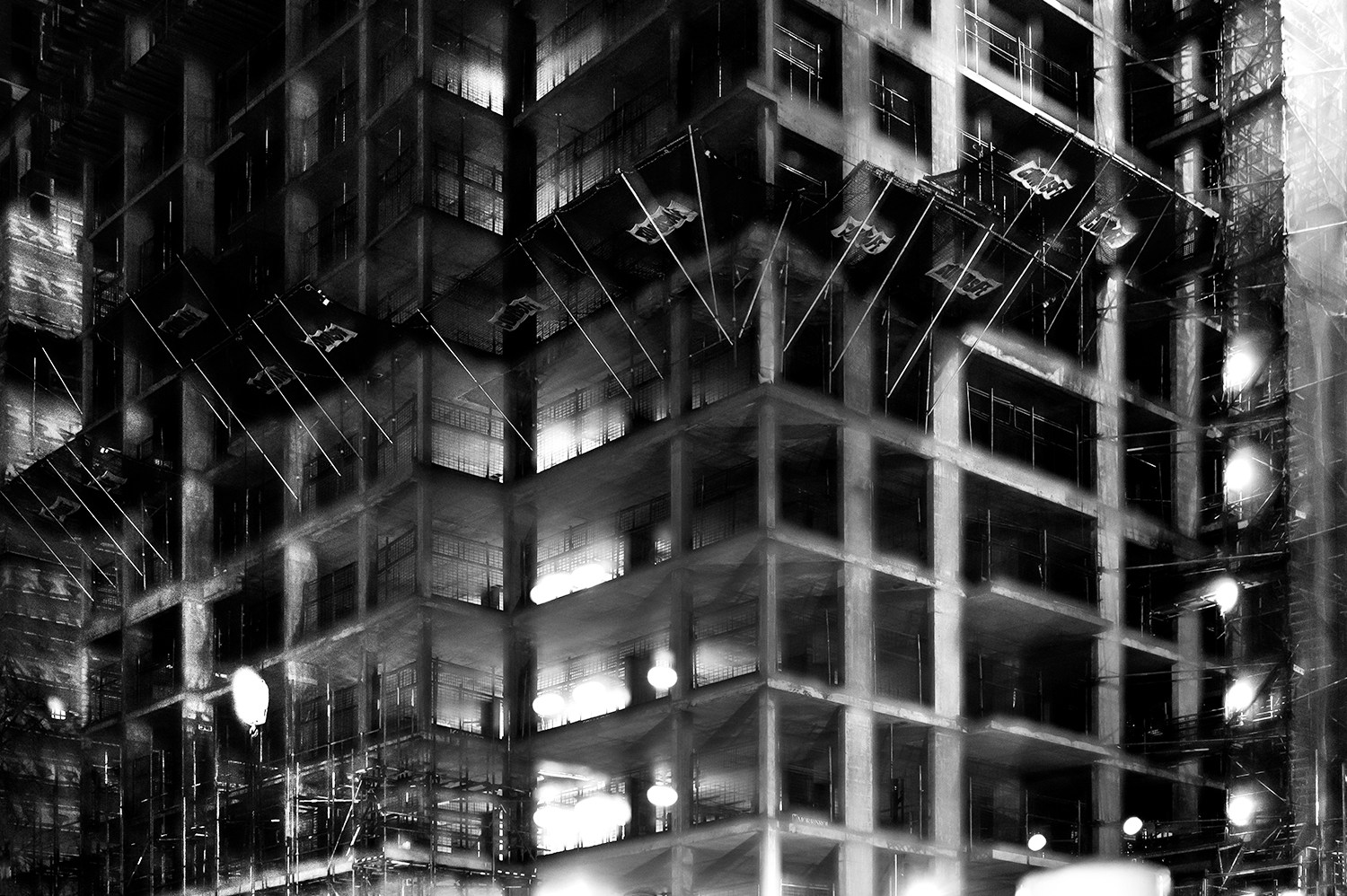
In this photograph it appears that lighting from within the inside of the building was used in what is possible night photograph. The use of this light is used to Bush’s advantage advantage as he uses double exposures to layer building over building creating a disorientating viewing along with contrast between the over-exposed lights and the dark shadows within the building. There is a wide tonal range within the photograph thanks to the range of shadows and lights within the photograph – this wide tonal range makes the photograph interesting in whichever segment the viewer looks as it creates intricate shapes and shadows throughout.  The lights and shapes are very intense as the viewer has to try piece the photograph together in order to understand it. It is unclear whether a short or deep depth of field will have been used in this photograph due to the disorientating nature of it – this adds to the mysterious elements of the photograph. A fairly slow shutter speed will have been used along with a low ISO in order for enough of the light to enter the lens from the dark environment whilst keeping the quality of the photograph as high as possible.

There is no colour in this photograph – only black and white along with the shades in between. This black and white approach to the photograph is very effective as it allows you to focus on the structure of the photograph and the buildings rather than being distracted by colours. The black and white effect also adds to the disorientating effect of the double exposure technique. Another addition that the black and white effect brings to the photograph is more contrast between the tones – especially between the bright white lights and the black shadows. The bright lights may be representative of a light at the end of the tunnel due to their glow in comparison to their environment. The photograph seems to have the texture of a graphite drawing which creates a really interesting viewing as what the viewer is seeing seems almost surreal. There is quite a 3D effect to the photograph due to the blending of photographs in order to create platforms coming out towards the viewer from the building. This 3D effect is complimented by the wide range of tones within the photograph. There are two points in the photograph to which the eye is initially drawn – these are the bright heaven-like lights and the platforms extending from the buildings – this is due to the lights contrasting in tone to the rest of the photograph and the platforms providing different shapes to the rest of the image. The platforms are also placed along the higher horizontal line of the rule of thirds meaning they add aesthetic to the photograph.

This photograph was taken from Bush’s project titled ‘Metropole‘.  This project looked at the collapse of the British Empire and how in its place globalised capitalism grew. London has been rebranded from “an investment opportunity” to “a city of demolition, cranes, and glittering new high rises”.  ‘Metropole’ aims to record the effect of this on London through the form of documentary photography. The project is titled ‘Metropole’ as London was once known as the Metropole meaning it was the mother city at the centre of a vast empire. These photographs were produced “during numerous winter night walks through the city”.

On Bush’s website he says that he used double exposure to create “increasingly disorientating and threatening as the series progresses” in order to create the “sense of loss that many Londoners feel” in the big city. This theme of a feeling of loss within the city links to the genre of ‘political landscape’ as it looks at the past of London and how it has changed – possibly for the worse. Bush continues this theme in his work on ‘Trading Zones’ in which he studies the Jersey financial sector. I think that through this exploration of disorientation and change Bush is trying to show that people often feel that the world is moving too fast for its own good as people get lost in temporary trends and patterns of life.