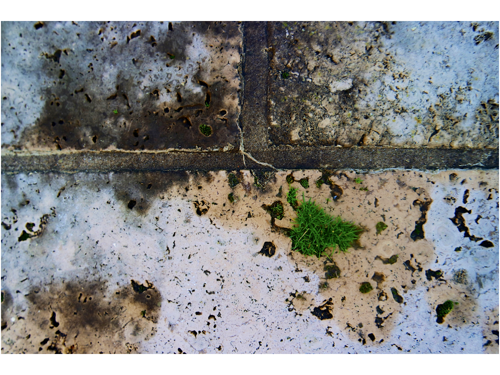
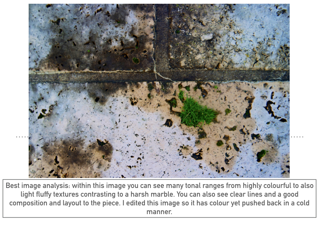
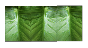
This was my image originally,I chose this image because it has a lines of symmetry throughout the middle and due to the colour being vibrant. I also thought that all the lines of detail would compliment the composition of the piece when experimenting with the layout .
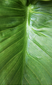
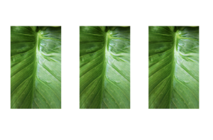
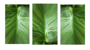
For my first edited I simply repeated these images in lines exactly the same as before,with the the lines throughout it is more obvious and appealing to see and it also portrays the highlights throughout very well.
next I flipped these images to all be different,this creates a more abstract feel and a less fuller sense as to what the leaf really is and also shows the tones in different interesting experimental methods.
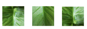
I then proceeded to put my images into a squared again continued these are different angles within th images and again have flipped images within the squares.
The next image is interesting because I wanted to shows a somewhat continuation of the lines through the second image which is also at a different angle so creates a center point and allows the image to become more dynamic and interesting. 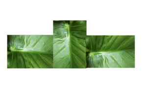
For This image I was again inspired by my previous experiment of the layout of the piece itself is making it so every center point is facing out of the middle. I still have point from the two opposite leaves.
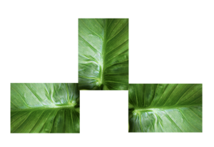
within this last image I want to form a mirror limes and. a sense os symmetry to the pieces also added a boarder so aswell as forming the piece it also breaks the form into specific piece of the text.This piece is also divided into darks and lights within the division.
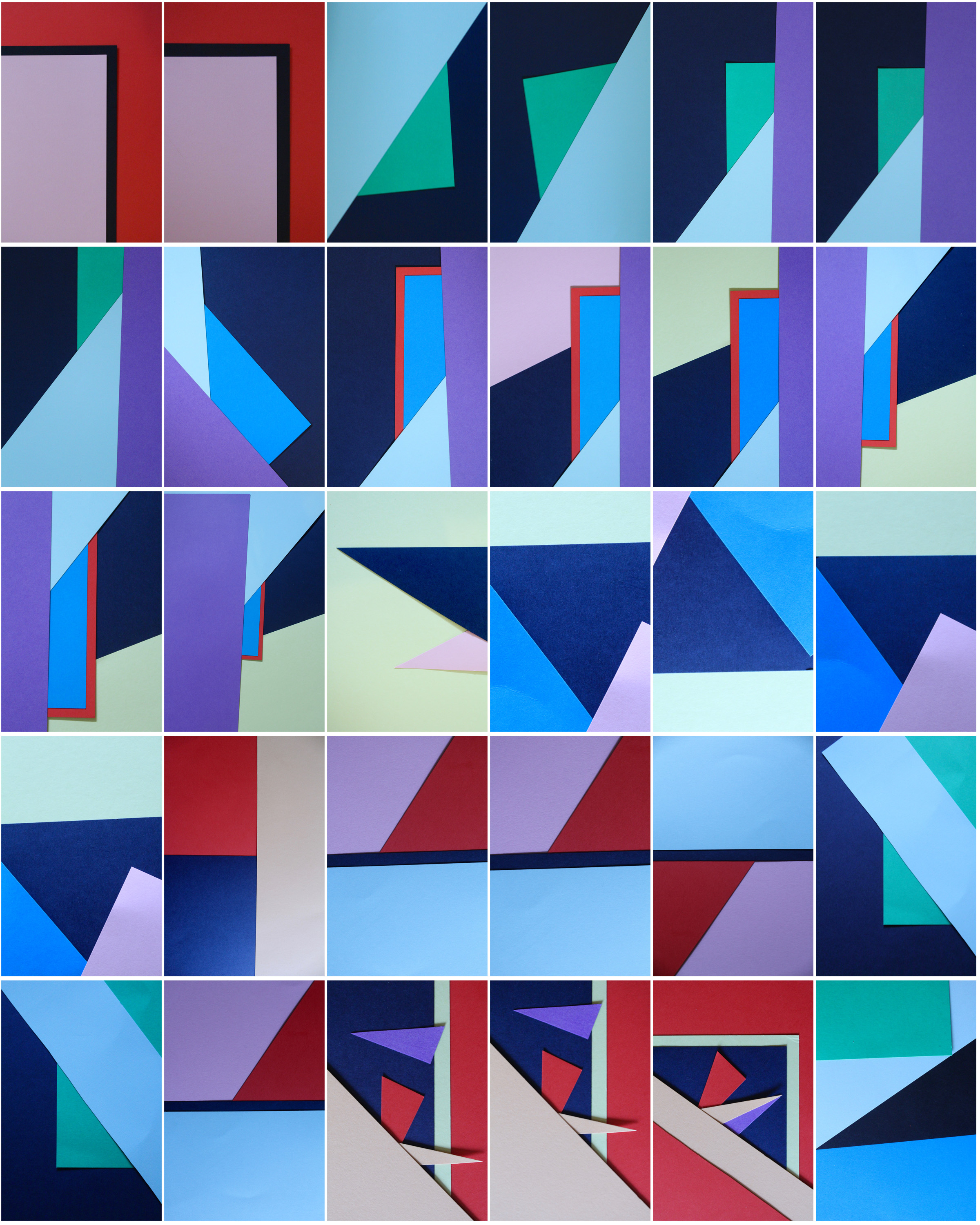
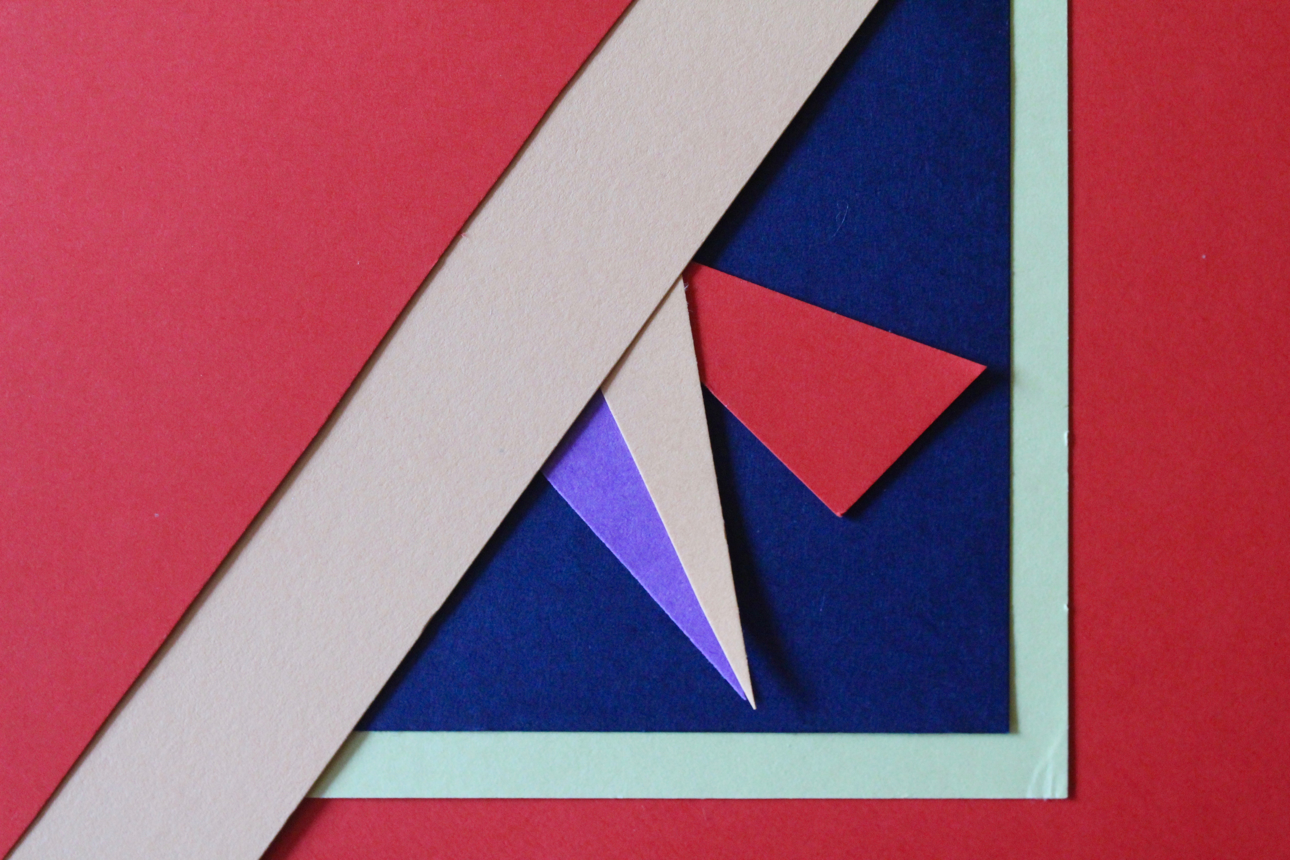
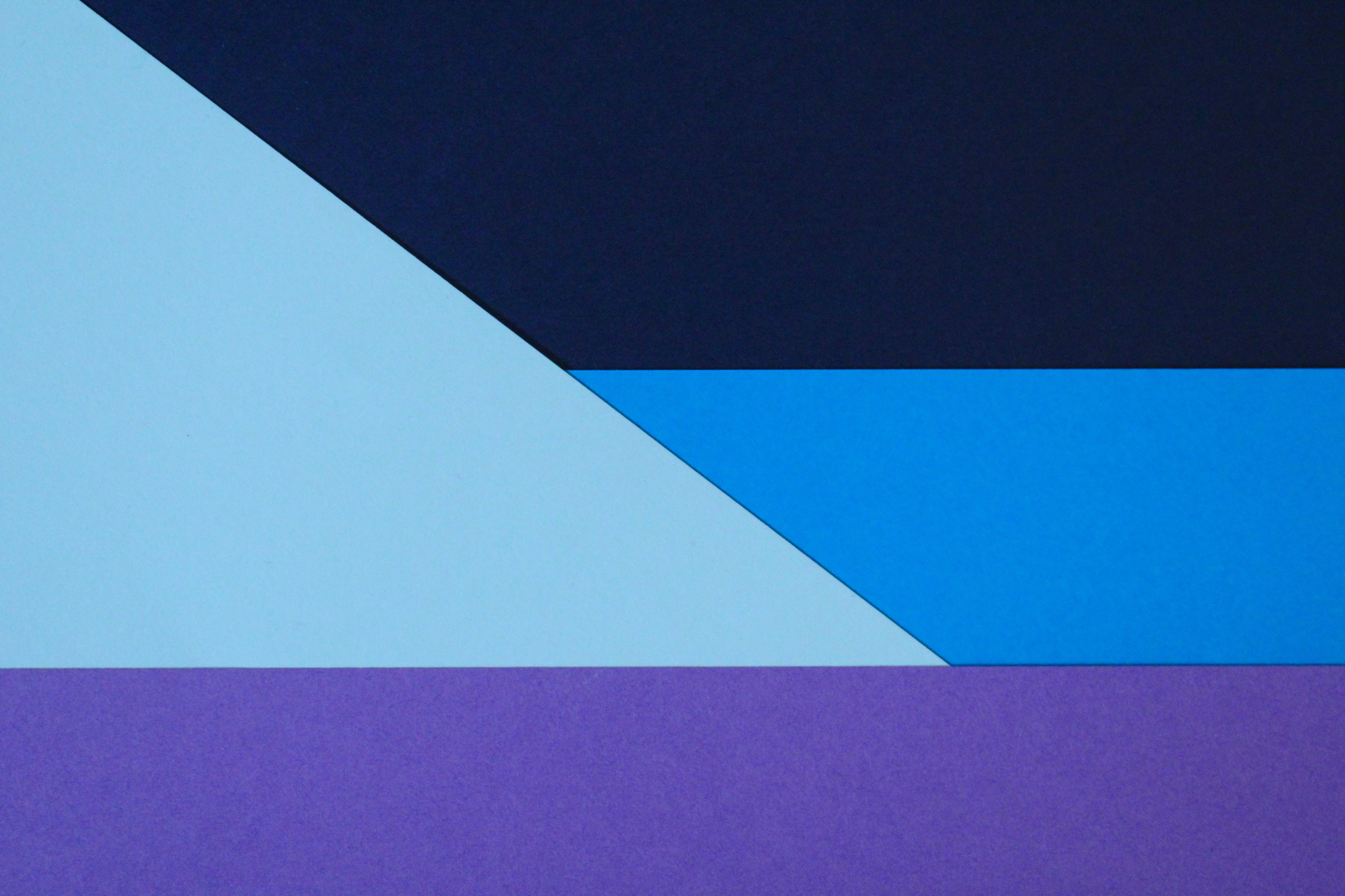
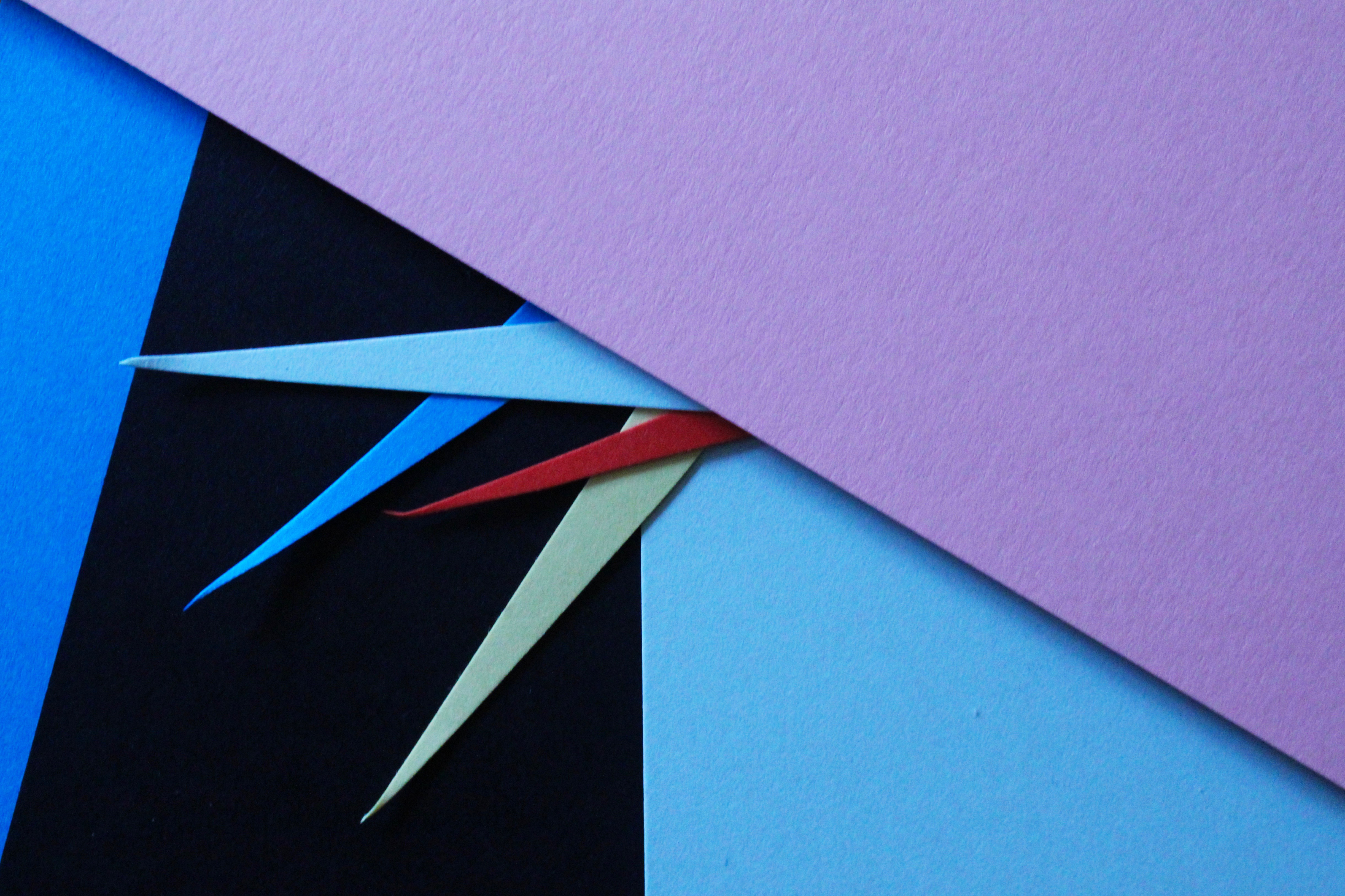
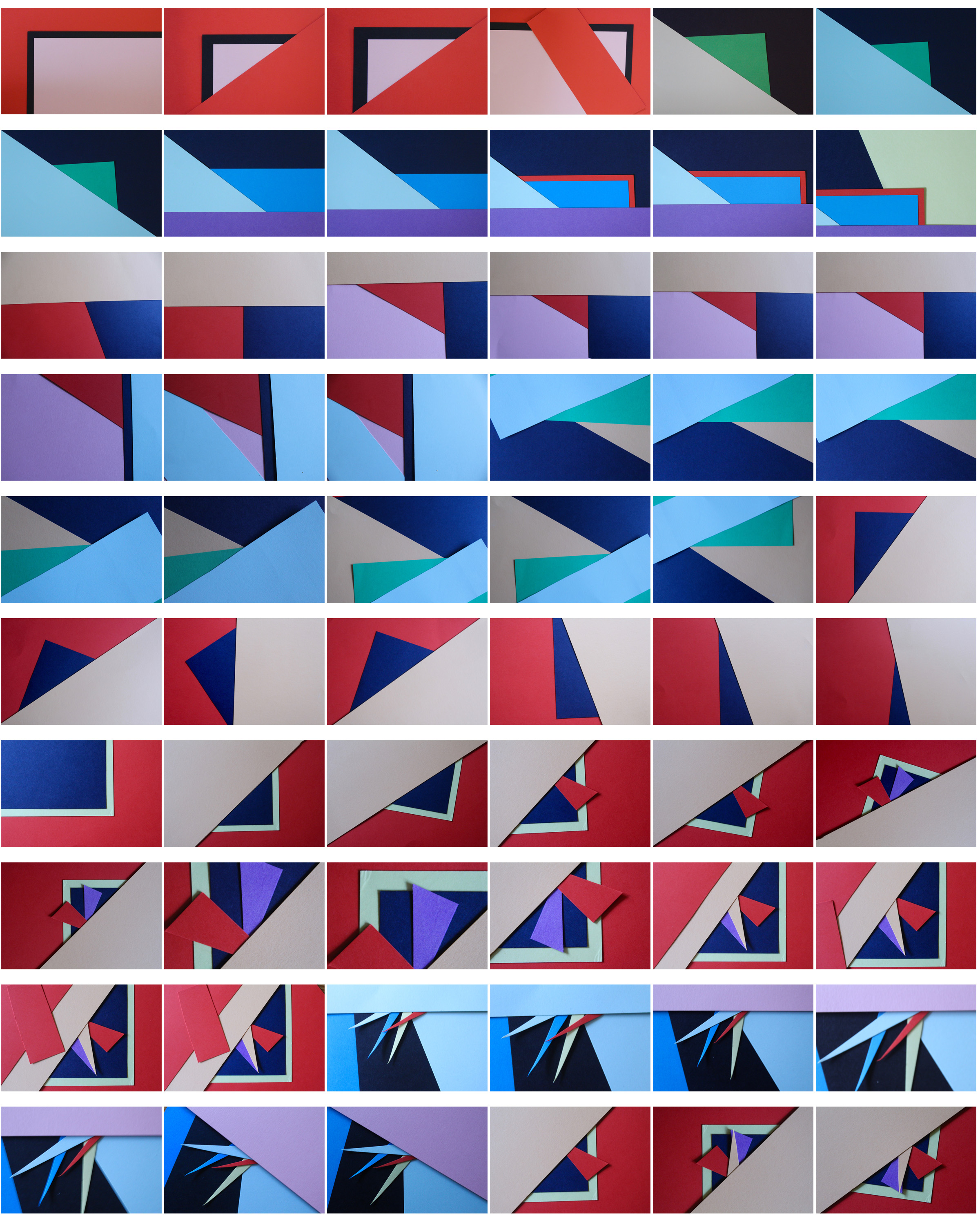
For these next images I wanted to focus more on the actual development of colour, this was in order to again experiment with form and how I can develop the different angles of the paper too.
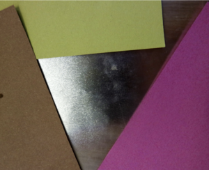
These images are both slightly different angles of the colour itself. but I want to further this image to more of circular and line patterns .
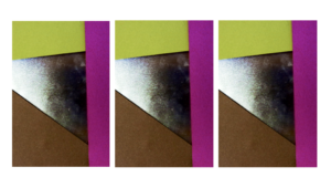
Here I wanted to show a repeated pattern of the lines within the image but still showing the fragments of colour at the same time. I also exaggerated the colour in order to further exaggerate the vibrancy if the piece.
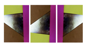
Within the two outside images are facing out in order to show a clear cohesion within the piece and symmetry too.But the middle image is the direct line as it is different to all the other images.
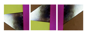
Here I also furthered the image into a squares and again flipped the image itself around too.
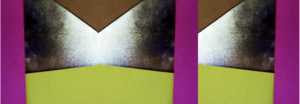
And lastly within this range you can see my lines of symmetry but a continuation of the line too.
Trolley - New Orleans 1955

Named The Trolley, this became one of Robert Frank's most famous photos released from the book The Americans. The picture captures the fleeting moment that conveys the brutal social order of the postwar America. Frank was originally shooting a street parade when he saw a trolley passing, in which he quickly spun round and took a picture before the trolley disappeared from view.

Visual

The picture consists of a small amount of tonal range but a large contrast between black and white throughout. The picture is obviously taken at a slightly angled position, with a balanced symmetry across the entirety of it. This image has been cropped from the original taken with a huge contrast between the white poles and the people next to each one, instantly drawing your eye to them.

Technical

A natural light is used within the image as it was taken on a bright sunny day creating a warm tone to the overall piece, but has been slightly manipulated with evidence of the Ansel Adams zone system used throughout. The whole image seems to be in focus with no blur at all with a big depth of field, whilst telling us that Robert must have used a high shutter speed to capture the moving trolley so clearly without the traces of blur. From the reflection in the glass above the trolley windows, it is clear to say that it was taken head on allowing for the effect to occur.

Contextual

The picture perfectly captures the racial separation between the people at that time period within America in which classes were divided (In one window there is an old white woman, the next are two white children and the last are two black men), whilst also revealing and documenting the truth behind what the Americans saw as 'The American Dream' in which not everyone was equal with similar opportunities in life

 To really create the effect I desired, I drove round jersey to and from destinations, taking pictures of lights that interested me as a photographer, as I thought they would capture the eye of the viewer. Some of the techniques I would incorporate into the images were motion blur and low shutter speed zooming, I specifically made sure not to use a tripod, as I wanted to create a disrupted effect to most of the pictures taken.
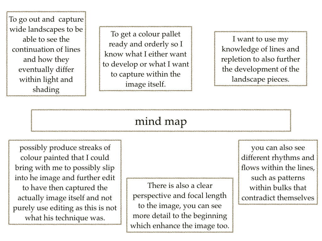
I decided to make a mind map of the objects and ideas behind them, that I could take in the shoot to help me along. From there I would be able to section off individual images from each segment, and choose the best image from each. This is what it looked like:
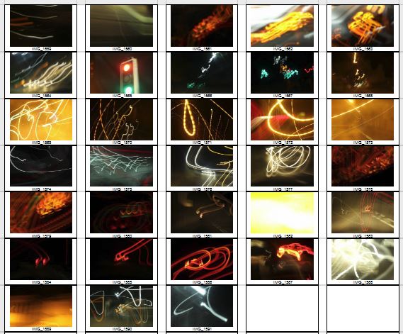
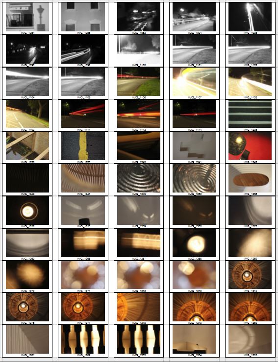
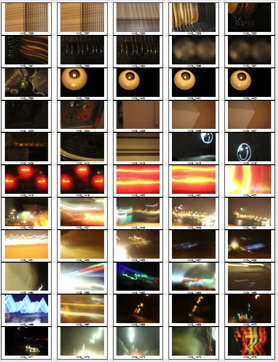
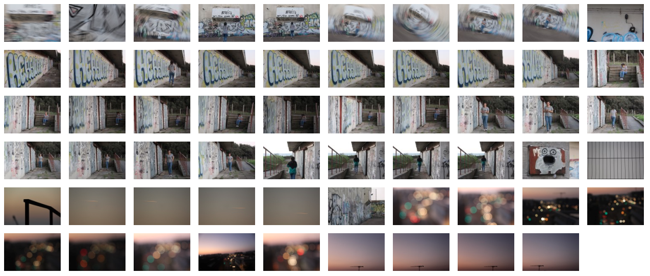
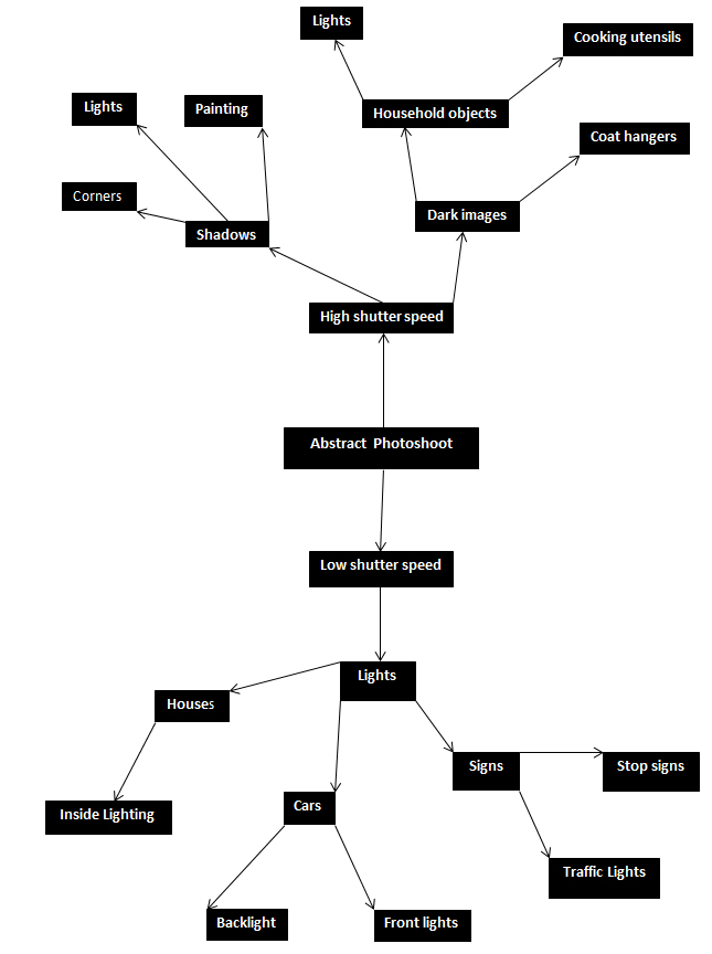 From here I went ahead with the photo shoot, and these were my results from this experiment below:
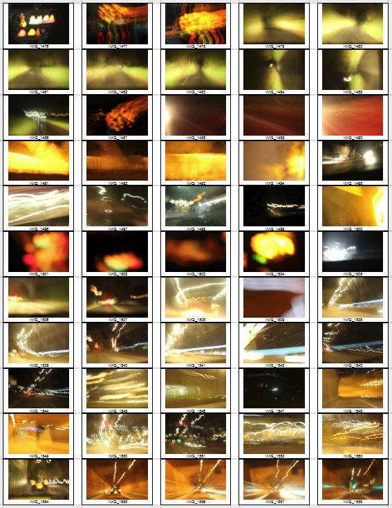
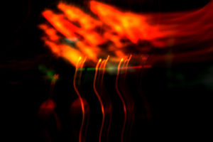
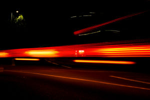
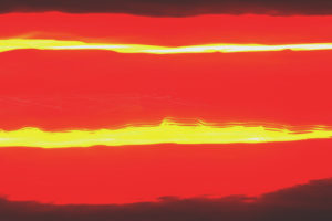
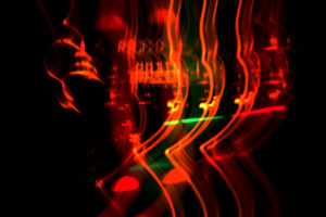
 From this selection of my top ten images, I decided to single them down even more to a top five, to really distinguish the good pictures from the rest. These are my top five:
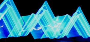
 I chose this image as I loved the triangular effect created by the outskirts of the blue lights at night when driving by, with a long shutter speed (1.8 seconds). I also thought that the contrast between the blue, really stood out from the rest of the image, making it very visually pleasing to the viewer, as seen by all the underlying shades of blue present within. What I really liked, was the fact that the image was an unbroken pattern, creating symmetry throughout the piece allowing for a greater effect.


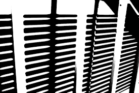 This style of photography inspired me to create my own small contact sheet, in which I would incorporate this threshold idea into some of my picture taken previously, using the software Photoshop. This would really make certain aspects of the image that I desired to stand out from the rest, by reverting the image to a black and white only state. However with certain images, I decided to invert the colors as I believed it made the image more aesthetically pleasing to the eye, and in some circumstances made the object I wanted to pop out.
This is the outcome of my experiment:
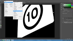
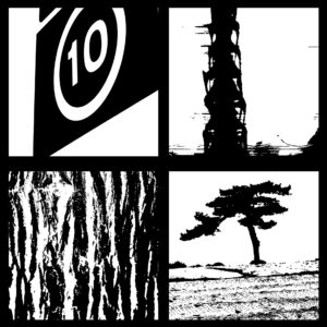 The method in which I created these images on Photoshop are below:
1. Locate the Image tab above, and click the adjustments section, which will reveal the Threshold section.
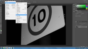 2. For some pictures I then had the idea to invert my image colors, allowing for a completely different picture to be formed.
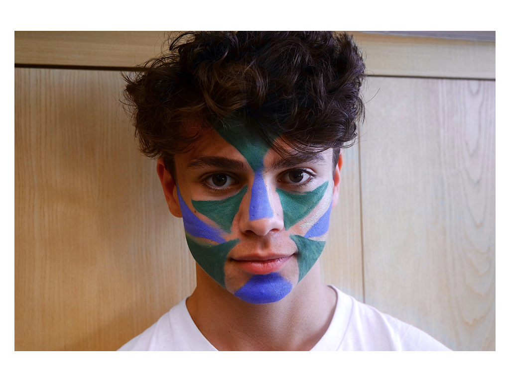
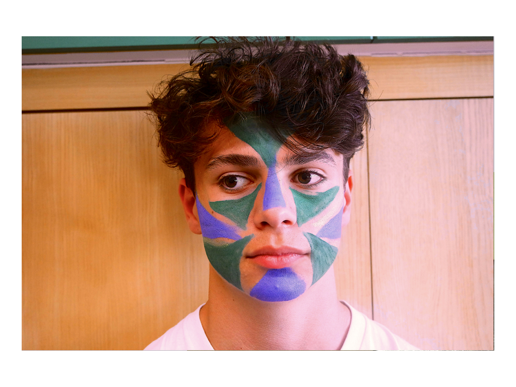
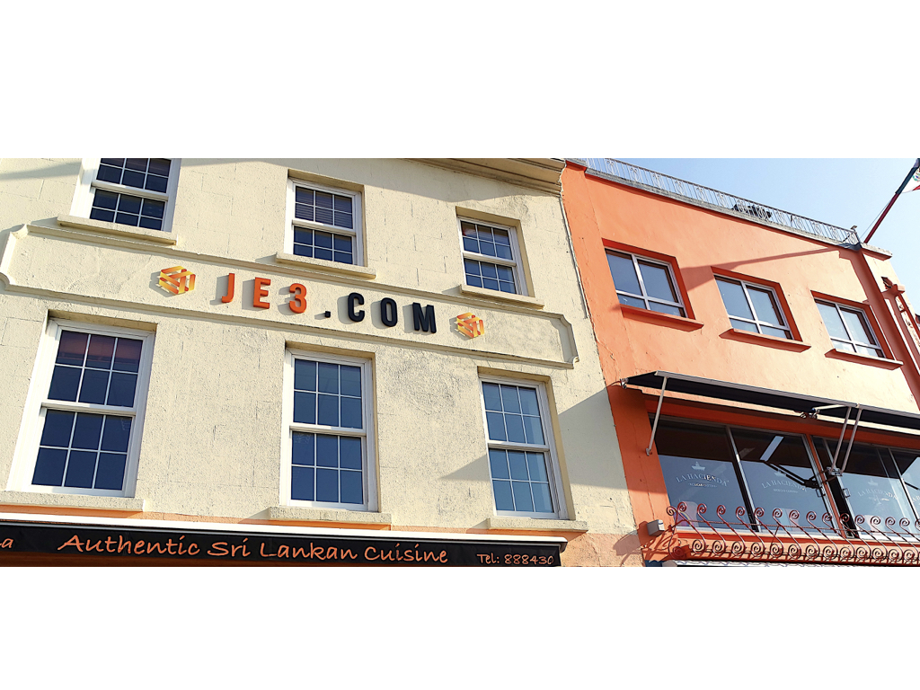
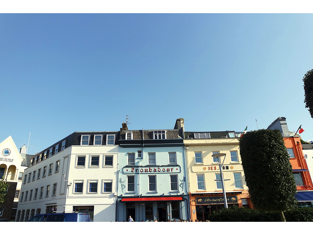
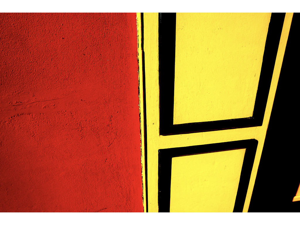
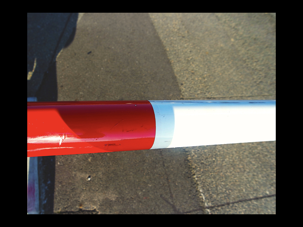
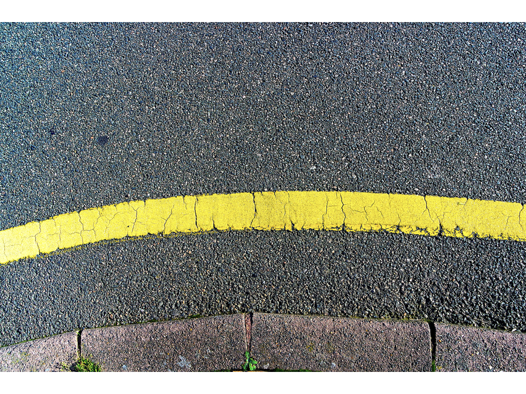
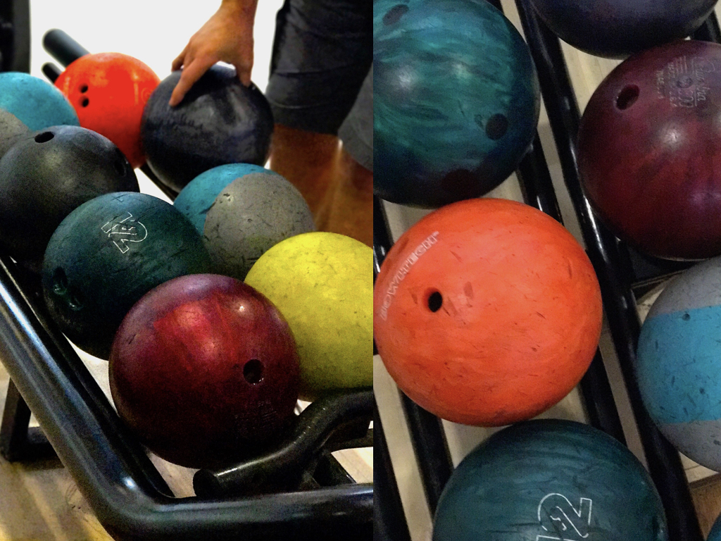

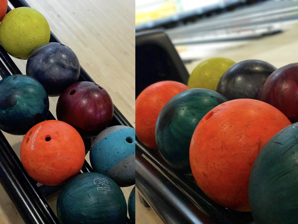
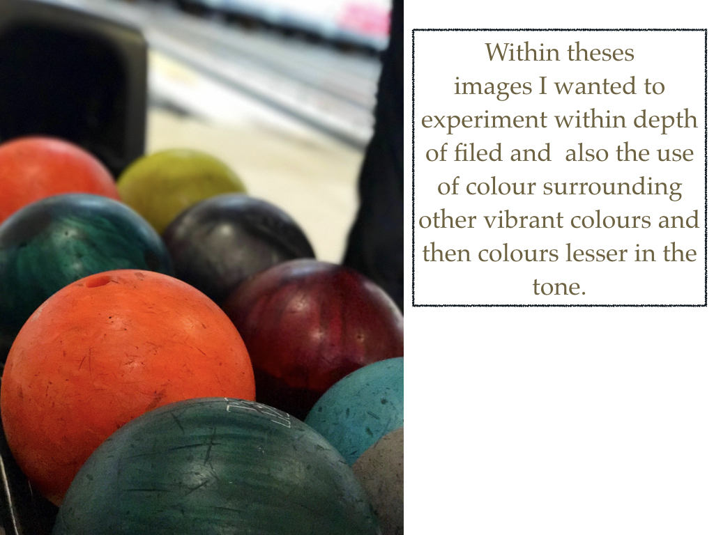





 Basically, bokeh is the quality of out-of-focus or “blurry” parts of the image rendered by a camera lens, – it is NOT the blur itself or the amount of blur in the foreground or the background of a subject. The blur that you are so used to seeing in photography, that separates a subject from the background, is the result of shallow “
 To achieve this effect, you must select a large aperture about f/2.8, 1.8 and 1.4, then get up close to the subject, and focus on what you wish to be 'sharp' whilst making the subject far from the background you want blurred out.
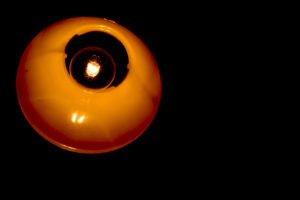
I really liked the way many photographers used the use of making lights into almost circular spheres, and decided to have a go at trying out the effect, by putting a clean glass over my lens to take the pictures it created the desired outcome, these were my results: