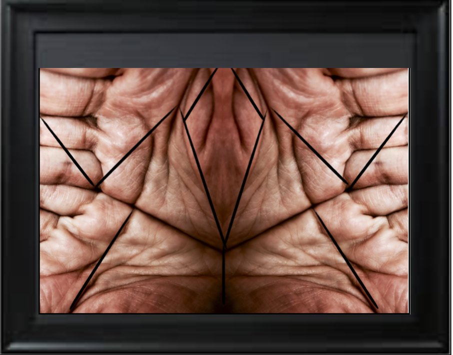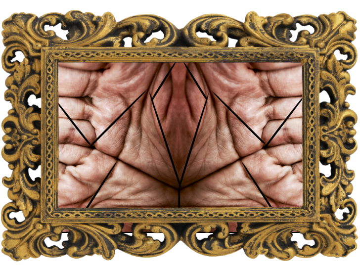
Category Archives: Analysis

Filters

Author:
Category:

Final Image

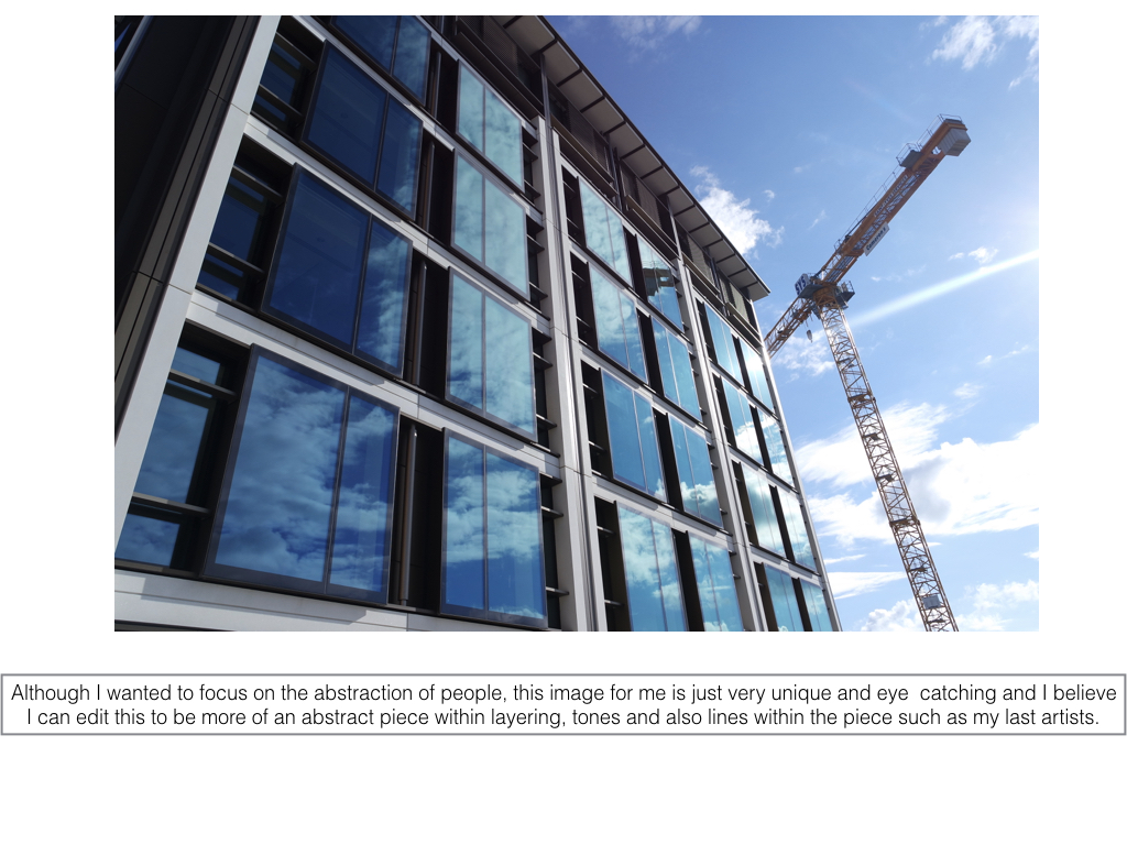
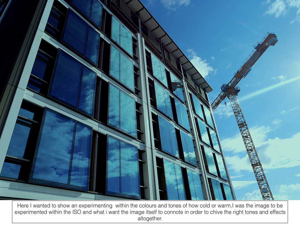
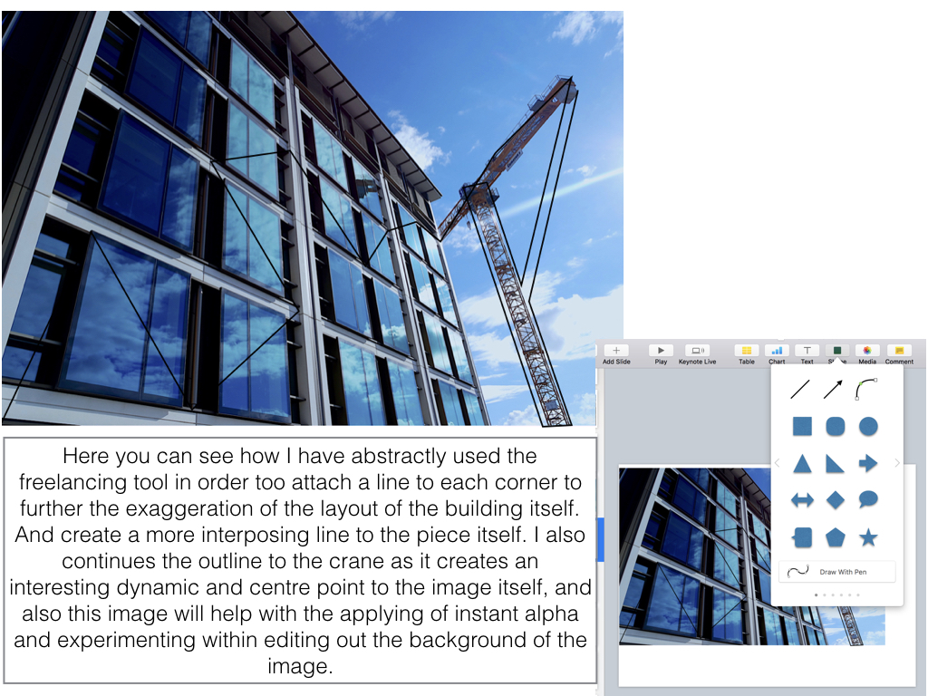
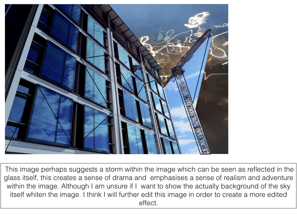
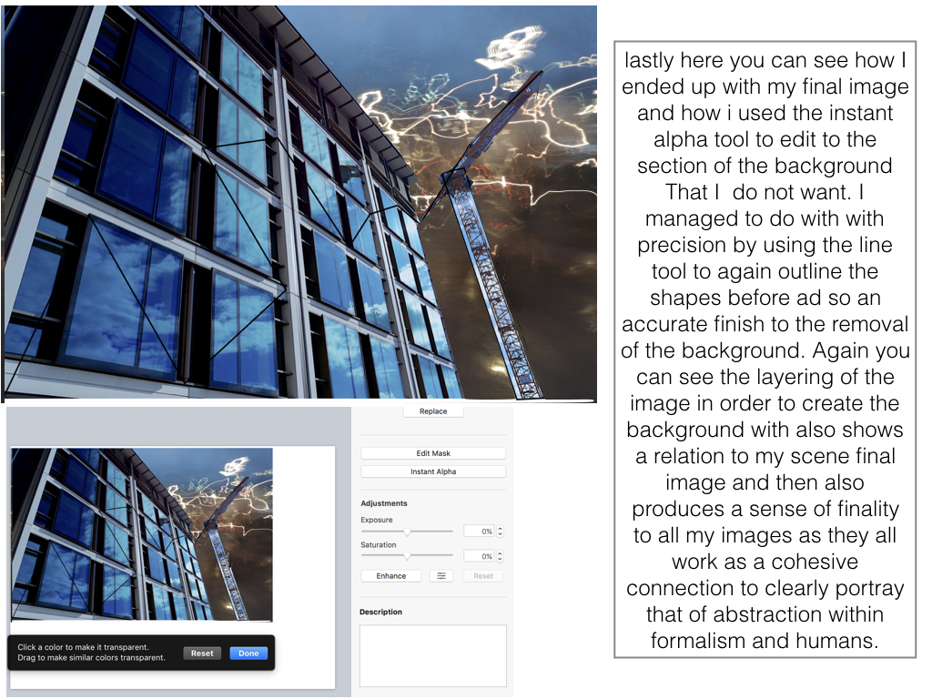
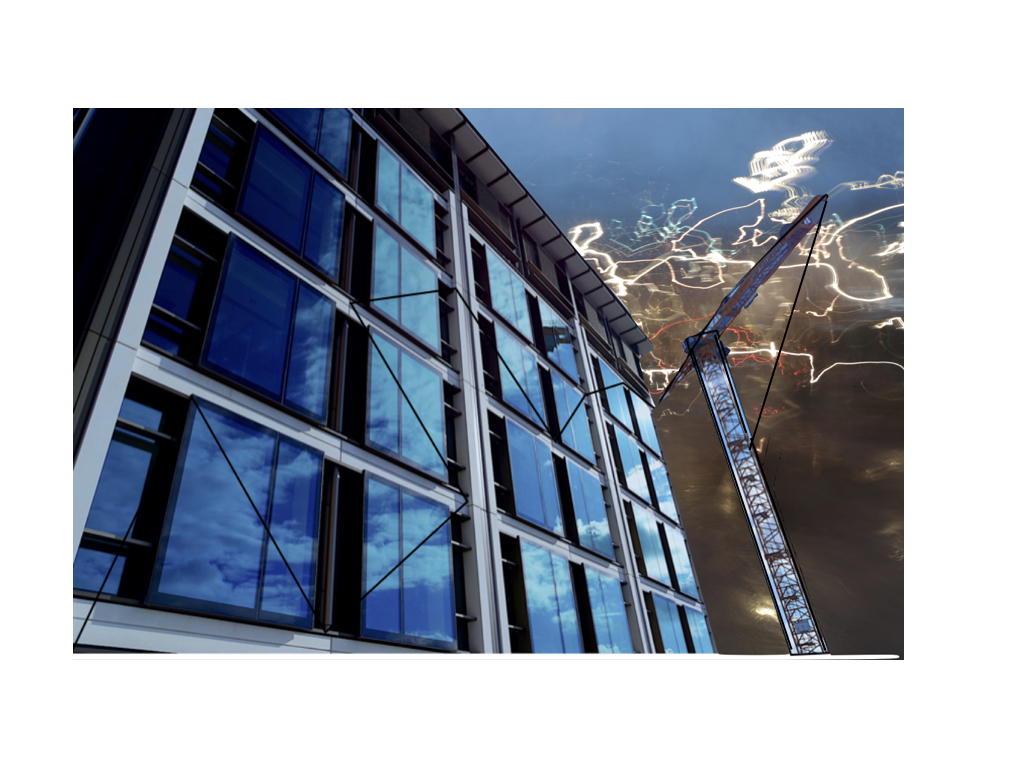
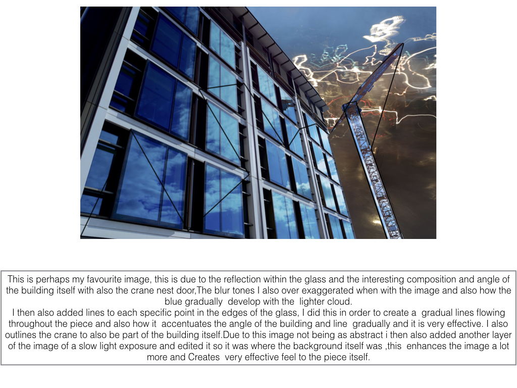
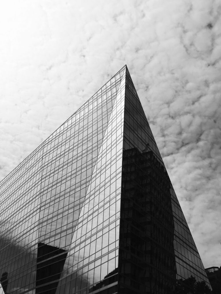
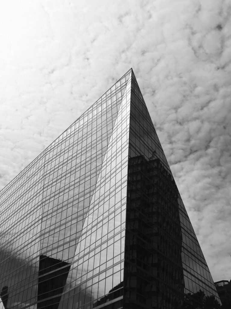
I chose this image as my final piece out of the three as it contains similarities from both the other final images through their geometrical designs and similar triangular shapes that I previously created with the paper. I also chose this photograph as I did not want my project to to turn into an art project and wanted to create variation within my work. This photo was taken with inspiration from Hilla and Bernd Becher’s work in my typologies homework, but I also think it contains elements from other homeworks (such as line, repetition and pattern as well as abstract and texture) which is why i chose it.

This photograph uses Ansel Adams zone system with contrasts from light to dark within the picture creating a photo with varied tones. One reason I like this photo is because of the reflection in which the building has that mirrors the clouds from behind, making the building bright on one side, and dark on the other. This photo also shows repetition through the thin black lines on the building creating a pattern, contrasting with the other side which does not. The building also has a thin black line outlining it, emphasising the structural properties as well as abstract appearance that it has. The fast shutter speed and sharp focus used to take the photo shows the details on the building as well as the clouds behind also showing texture and pattern. The composition of this photograph is aesthetically pleasing through its symetrical appearance.

Overall this project has allowed me to develop my understanding and knowledge of camera skills, and my ability to take better photographs, as well as allowing me to explore artists linking to my work in depth.

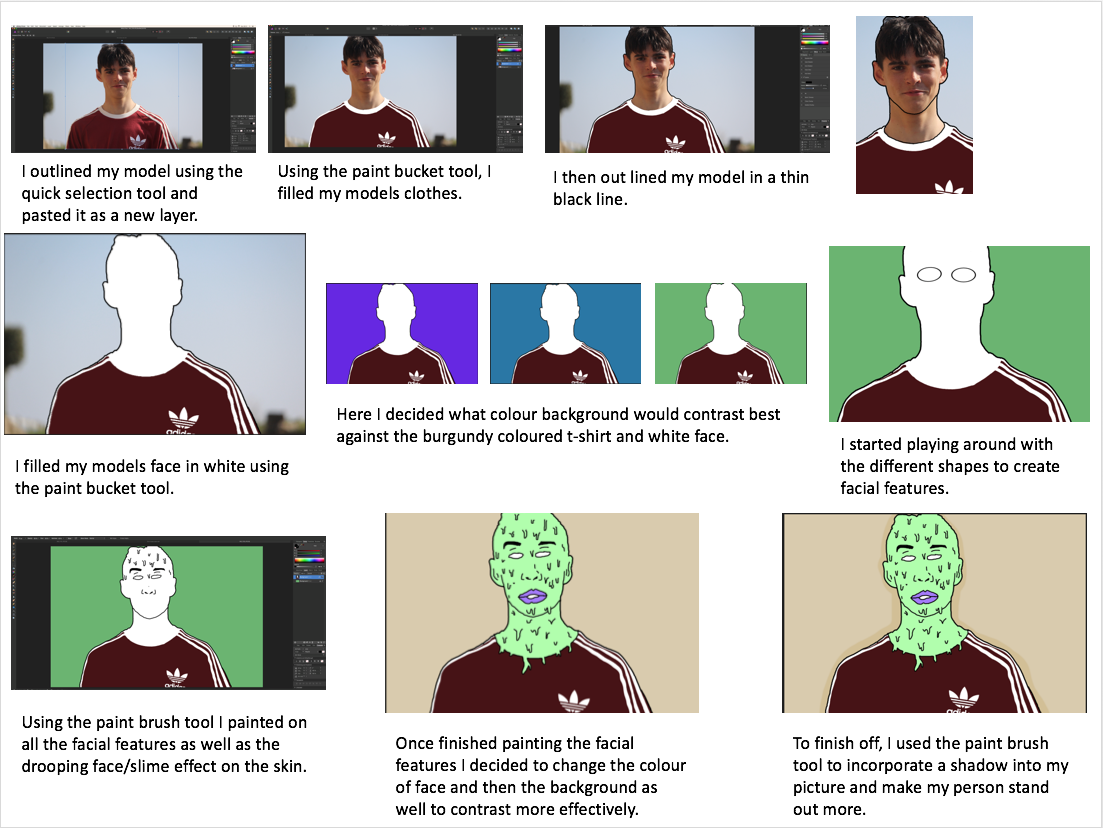
 

Editing My Images For Final Piece

Edit 1 

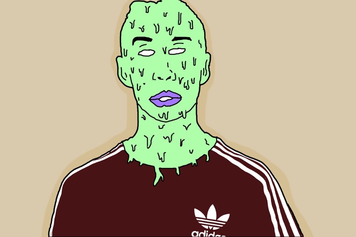
I belive this edit is good and has a strong relationship with my inspirations work. There is a strong contrast emerging between the persons skin colour and clothing with the background. The composition is effective as the main subject is dead in the centre making the viewer view that straight away, and the background is plain therefore it is beneficial to have the main subject in the middle. I believe this edit portrays the idea of hidden identity which I intended to do however I am not pleased with the image as a whole due to the background. I believe if I change the background to have a street or wall it would be more effective in revealing a story and creating a more surreal feeling/look.

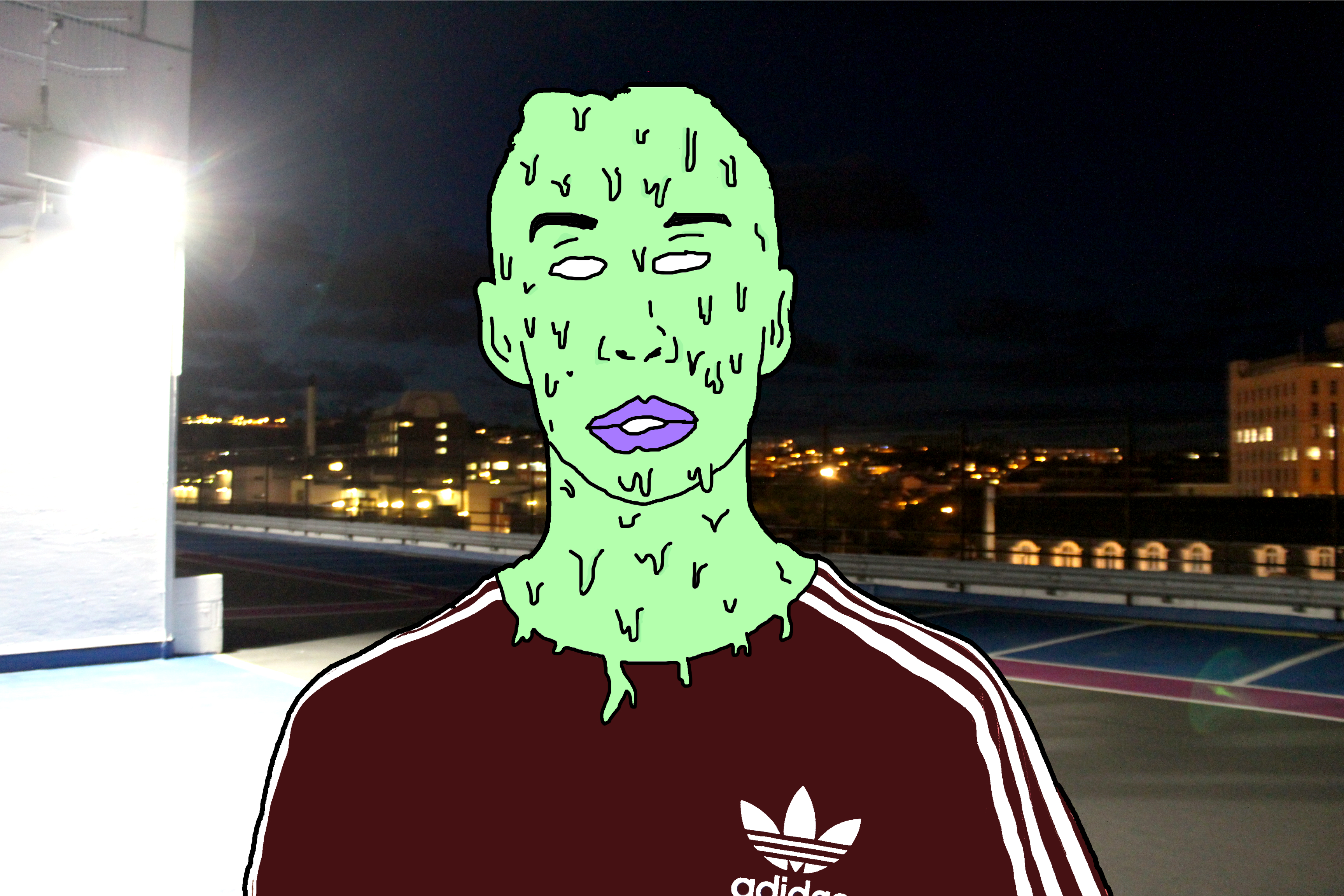
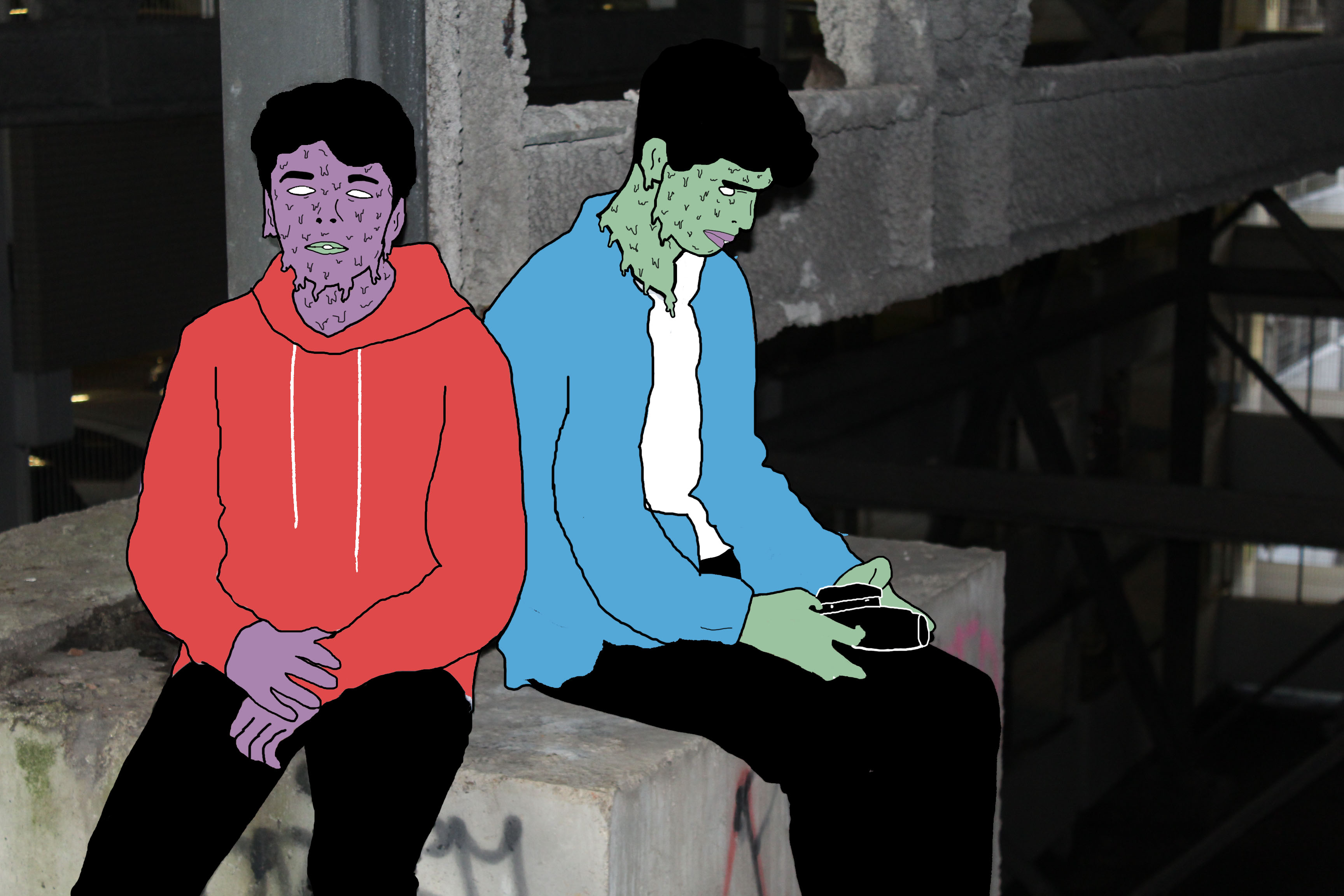
This is the final edit for photo 1. I believe that changing the background from plain to this sinister looking carpark roof image has completely changed how people may  interpret the image. The background has connotations of crime and badness as it is taken at night, which is when most crimes happen and the light on the left appears to hide part of the image relating to a person hiding their identity when causing a crime. However the over exposed light on the left can reflect goodness, contrasting with the darker side on the right relating to badness. This may reflect the person in the centre who has to decide his path to take, the good path or bad path. Due to the fact I have edited the person in such way to distort any facial expression it leaves the viewer to decide what the person’s identity is like and how the background may or may not relate to it.

Edit 2

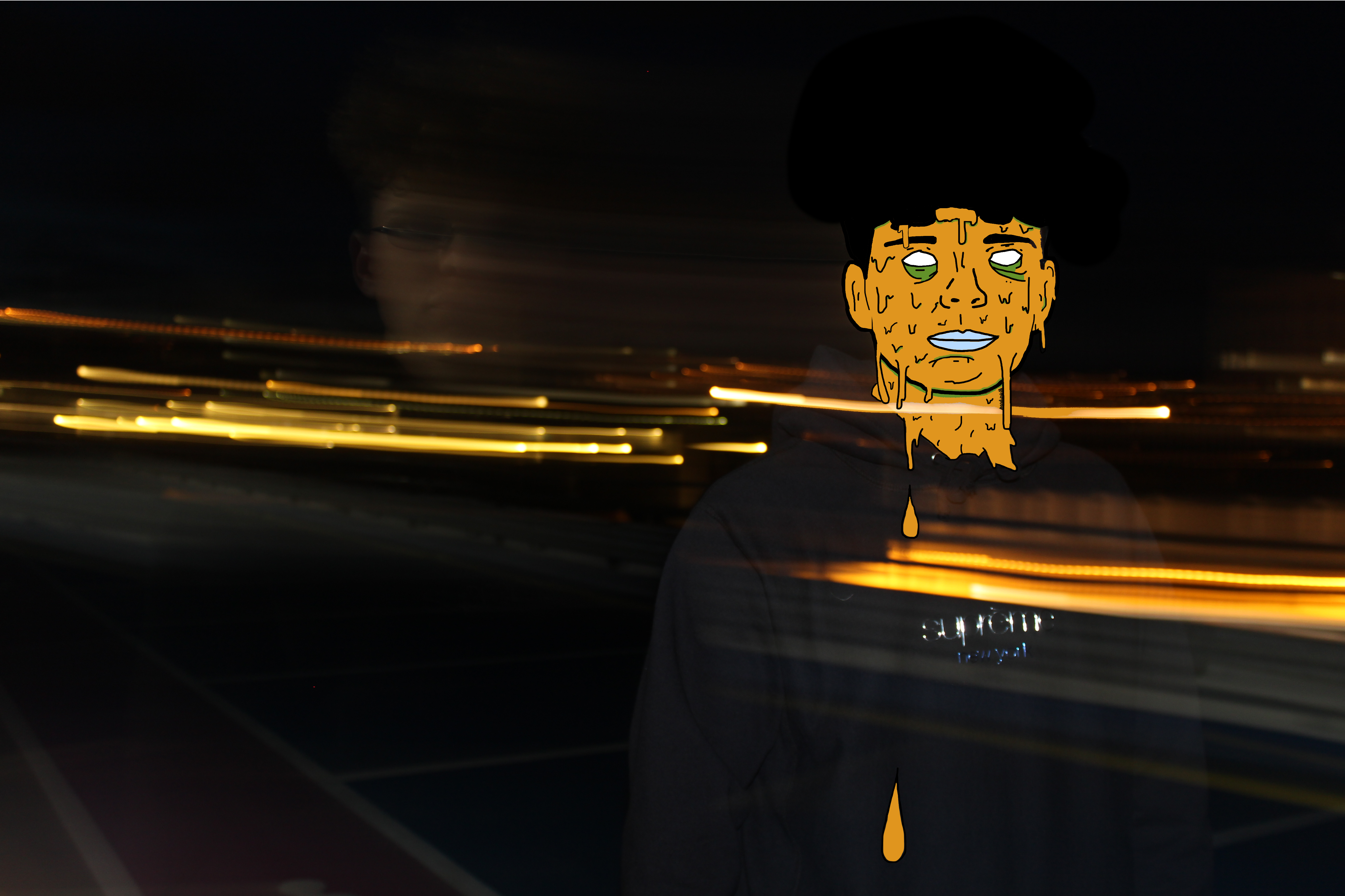
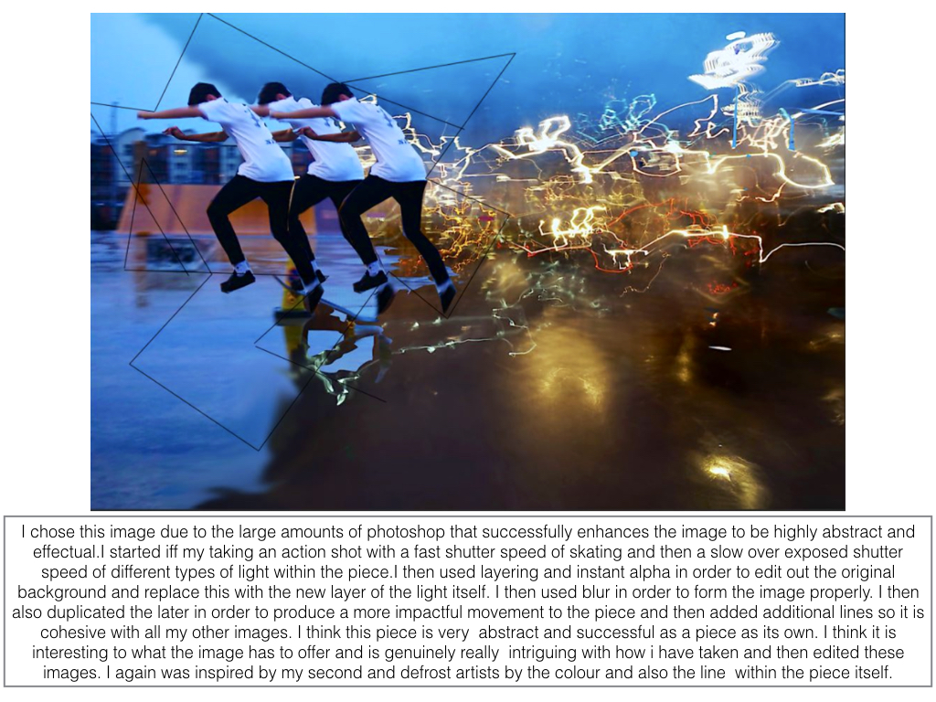
Using the same method as the edit above I was able to achieve another successful surreal image. Firstly I chose to use the colour orange as it fits in with the motion blurs which were created when I originally took the photo. These motion blurs were created by taking a photo with a long shutter speed, around 2 seconds, and panning the camera to the side. I was able to get my model in focus by holding the camera still for the first second facing him and then panning for the other second. In my opinion these motion blurs create a sense of movement which fits in well with my edit as the slime is moving as suggested by the falling droplets.

Edit 3

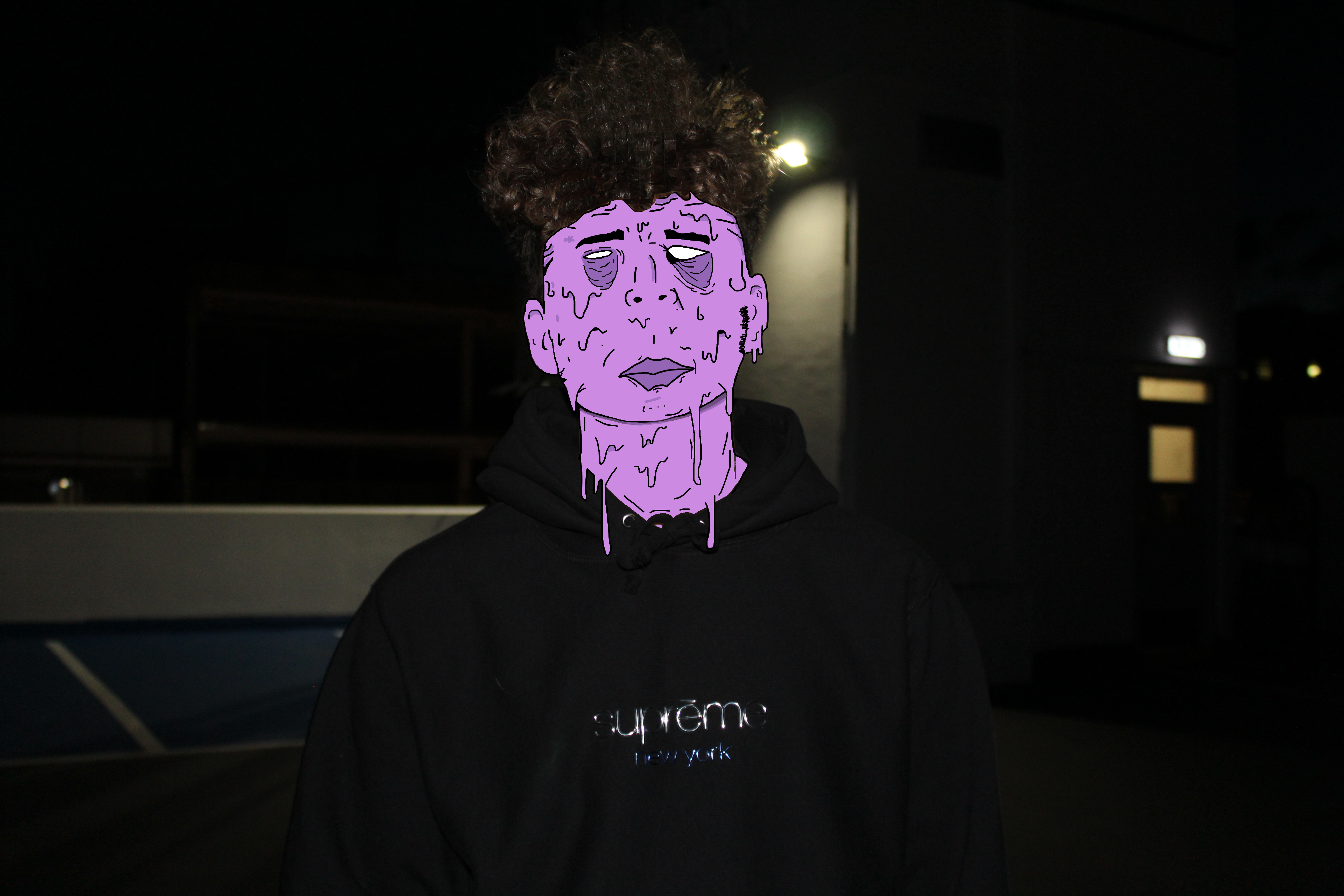
I believe this is my strongest edit. Not only is the digital manipulation at a high standard but the meaning and feelings portrayed are also very strong. Again, to some extent I have incorporated the running theme of blank identity however slightly altered this image to produce some sort of facial expression. In my opinion the facial expression, mainly within the eyes and how they appear to be bruised, reflects upon the theme of child abuse again crime. I believe the underexposed background gives the image a sinister and almost haunting feeling. The dark background is strongly contrasted with the color of slime upon the models face which focuses the attention on the person.

Edit 4 

I like this photo due to the emotion and story it creates and tells us. I believe this photo has a sense of imprisonment as it appears the people are stuck in this enclosed area. The background within this photo is de-saturated to some extent which I think helps to add to the dark and depressing atmosphere. This photo uses the technique of leading lines within the structural features leading us away from the models deeper into the picture to view the rusty and old man made structures. The vibrant colors of the models create a strong contrast with the background relating to the opposition of light vs dark or good/bad.

Presenting My Work

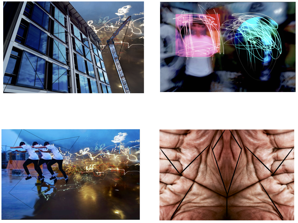
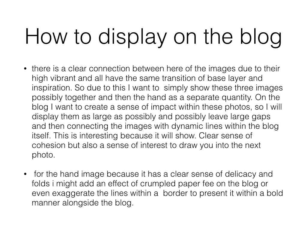
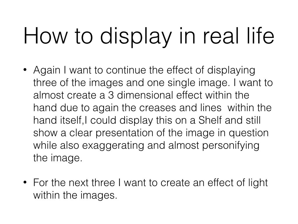
After having reflected my images I have come to the decision that I will use only two of the original 4 images I intended on using. The edits I have selected to use are shown below. I have selected only these images as I think they are my strongest edits in representing abstract photography and telling a story. Also they pair well together as they are of similar colors and tones. These images link to abstract photography in the way it is a piece of art that does not attempt to represent external reality, but rather seeks to achieve its surreal effect by using shapes, colours, and textures. I think that the image with the motion blur lines relates directly to the photographer Ernst haas which was on of the photographers I researched as part of this abstract project. Ernst haas often includes motion blurs within his photographs to indicate a sense of movement and chaos which is what i have incorporated within my final piece. The motion blur lines not only work well with the dripping effect on the persons face but they add to the abstract effect in the way that it is not a usual and commonly seen thing.


The Research and Selected Photos for Final Piece

My Research and Chosen Images For My Final piece 

The Research 

After having researched Pinterest I came across a selection Images under the hashtag ‘desolateputoface’ which really was intriguing in my opinion. I liked how the images portrayed a surreal and unrealistic approach yet still contained an understanding of what the image is. These Images present us with unreal representations of a persons face and they link to the idea of hidden identity. Below are a couple examples of the photos created by the anomonys photographer/graphic designer.

Image result for desolate puto face

Image result for desolate puto face

Analysing This Work

The thing which first inspired me to take a closer and more detailed look into this style of work was the vibrant colours used to create the surrealistic figure. Not only does this image look interesting and creative but it give’s an impression of hidden identity. It appears that the editor/photographer has purposely covered the person in slime to portray a sense of equality and that we are all humans no matter your skin colour, race or religion and therefore meaning we should be treated equally. A lot of the images appear to be males in the streets which may be referring to gang members and in this case the dripping slime relates to the fact that they are ruining and destroying their lives by doing bad. The part of the images that are not slime are fairly basic and unedited, contrasting with the slime.

Choosing my Images

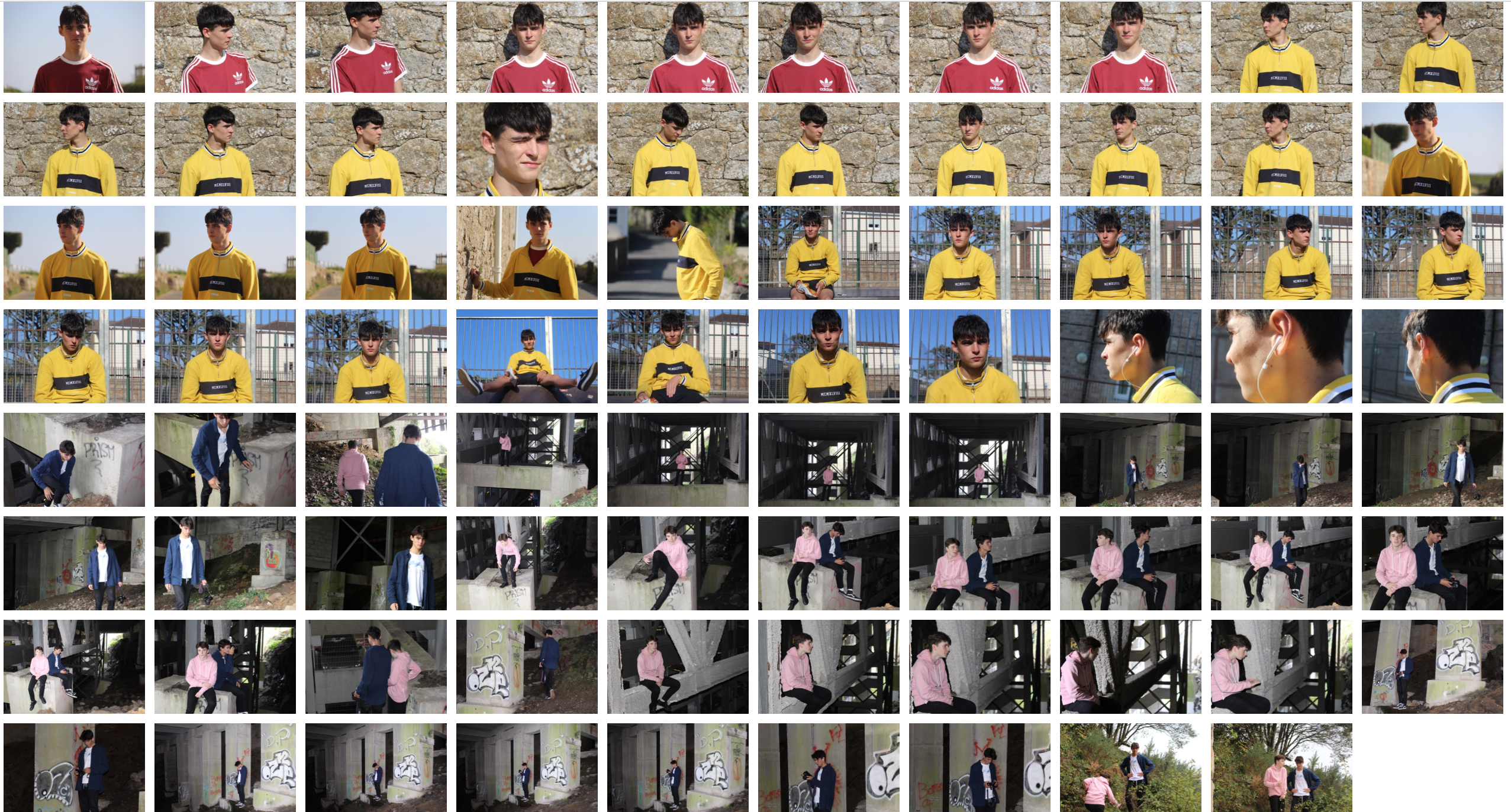
At this point, I didn’t believe that many of my images from the several shoots i have collated were suitable for this theme/genre of photography. I decided it would be best to do a photoshoot to ensure that i could get the best possible images that could relate to this style of work and best portray a sense of surrealism and abstraction. The intention for this shoot was to capture portrait shots with an abstract background to further relate to the theme of the project. Thus in mind, i intend to take photos behind pier road carpark where there is some great structural features which hold the carpark together. Also I will collate images on streets to link to my inspirations images.

Photoshoot 

I believe this photoshoot was highly effective in achieving the aims I set out to do. Thus being getting some quality portraiture shots which could be further adapted to replicate a similar yet personalised image to my inspiration. I believe the natural lighting in the daylight photos was very helpful in allowing me capture the detail in my models face and the background too. The flash which was used in the nighttime and darker locations was effective in creating a focus on the model/models as the flash highlighted the foreground, being the model, and not the background.

Selecting My Images

In the process of selecting my images, I had to carefully go through this last photoshoot and start narrowing down my images to the best 50 then 25, 10 and then finally to arrive at the ones I intended on using. I wanted to select the images that showed a good understanding of using the camera for example using ISO and shutter speed and those that of course had the best lighting composition and were most appropriate to reflect a sense of abstraction whether it be in the editing process or the photo how it is.

Selected Images


Tamara Lorenz Inspired Photoshoot

Within this photo shoot I will be focusing on the effect of layering in an image when taking photographs. I will also explore the use of colors to create a more dramatic effect to these pictures and really pull the photo together as a whole.

One of the photographers that I have been inspired within this shoot are called Tamara Lorenz. German artist Tamara Lorenz creates various constructions which she then photographs to exploit their abstract properties. The addition of strong planes of color provide another source of contrast in addition to those of line, shape, tone and texture.

Rather than photographs of things, each image seems to create its own reality. Consequently, the viewer is unable to recognize a conventional subject and is occupied with the business of looking. As seen below:
Image result for tamara lorenz photography
I wanted to incorporate this effect into many of my photos taken, and do decided to do this through corners of color paintings and instruments to mimic this style.
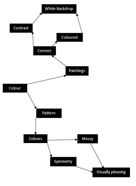
I used this mind map as my basis for the shoot, where I would occasionally use this to find what I needed to focus on most importantly. From this these were my results in the shoot:
 From here I decided it would be best to cut the shoot down into ten images, through this it would make it easier for me to identify the photo I think is best in the shoot. These are my top ten images of the shoot:
From these images taken from corners of paper, I wanted to cut it down once again, to my top five images to single out the best one. These were the photos I selected:
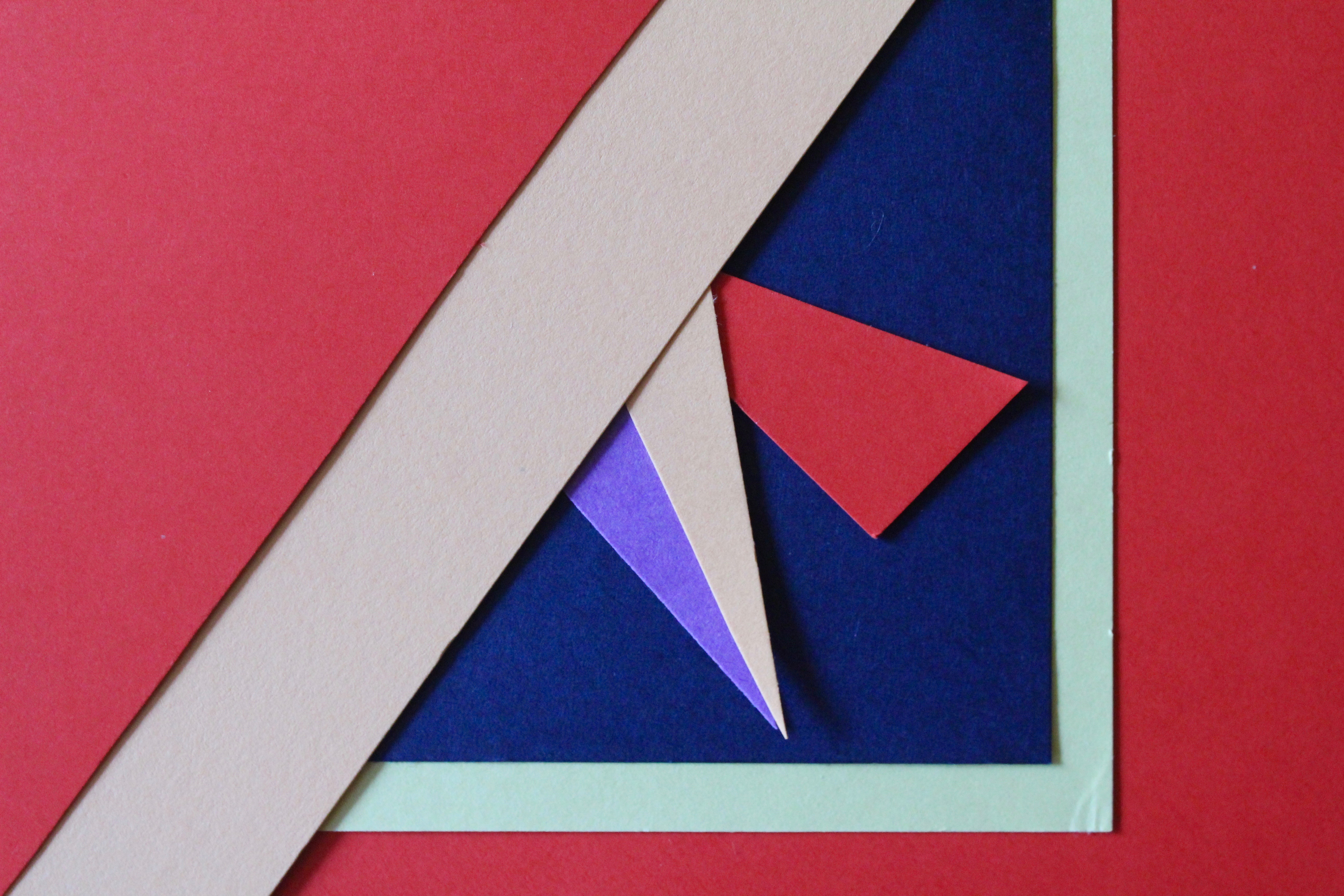
I chose these images because of their composition, color balance and patterns. I thought that these images stood out against the rest and so finally decided to edit these down to my top image of the shoot. This was the image I chose:
I chose this image as my final photo, as I thought it best matched with the style of photography I wanted. Which incorporated an element of graphic design into the imagery, making it simple but visually pleasing to the eye.

Frank Hallam-Day Inspired Photoshoot

Within this photo shoot I will be focusing on surfaces, textures and pattern. To do this I will be focusing on walls, metallic objects etc, from this it will enable me focus on specific details like peeling, cracks, and bumps to allow for maximum effect.

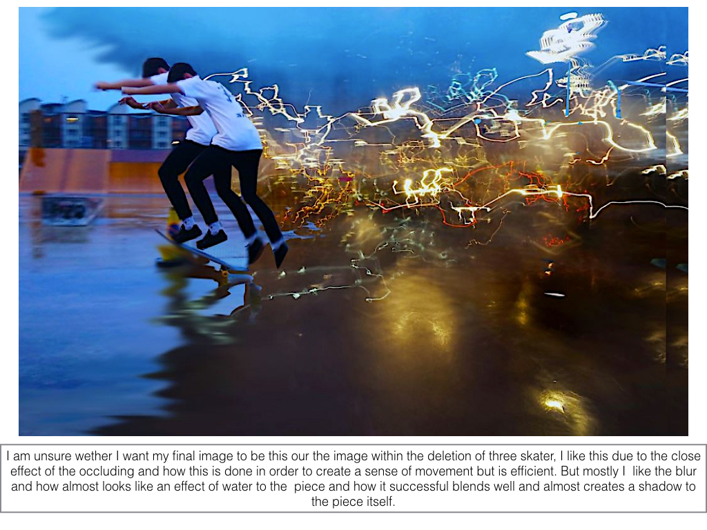
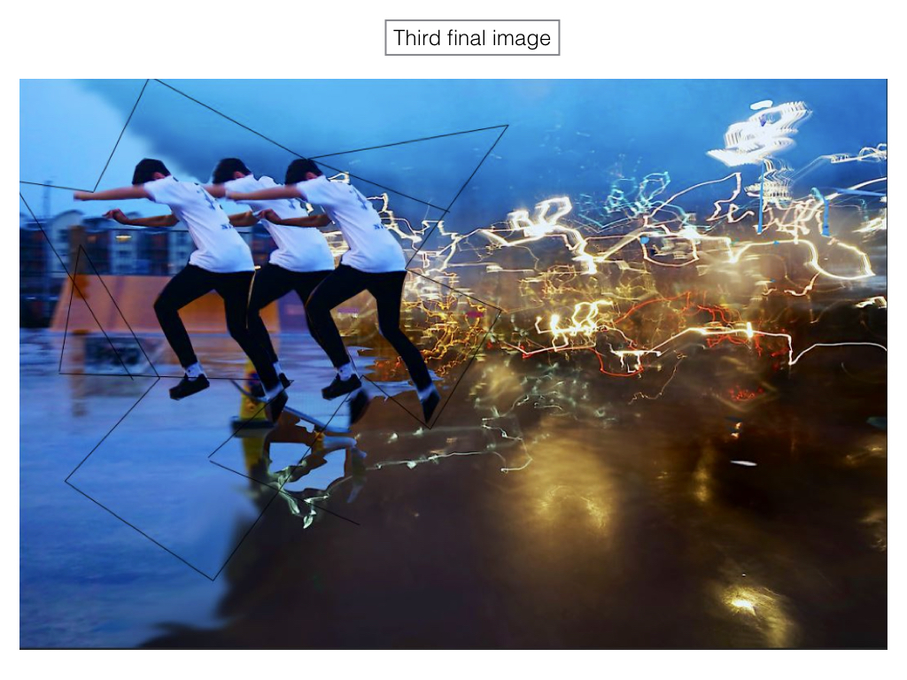
One photographer that has inspired me to do this shoot is Frank Hallam-Day. Washington, DC-based photographer Frank Day is a versatile artist shooting in both black and white and color film. Traveling the world to remote destinations, Day is able to capture the rich beauty of pattern, color and texture of the open-air markets, isolated landscapes, busy harbors and everyday lives of diverse cultures. Day has also mastered the landscapes and cityscapes of the world, shooting the angular architecture of cities such as Berlin, New York, and Baltimore, as well as the beautiful softness of Washington, DC’s cherry blossoms.Image result for Frank Hallam-DayAs much as I liked his work, I decided to mainly focus on reflections made by the water, and since I lived next to the beach I thought this would be an ideal idea to do.

I used this as a basis for my shoot, so when taking the pictures would know what to specify on.
  
From these images taken, I chose the top ten out of the shoot, to narrow down and edit which one overall I think should be my final picture.
From these top 10 photos taken when walking on the beach, I wanted to once again whittle it down to 5 images, so that I would once again have a clear insight on what to have as my final picture.
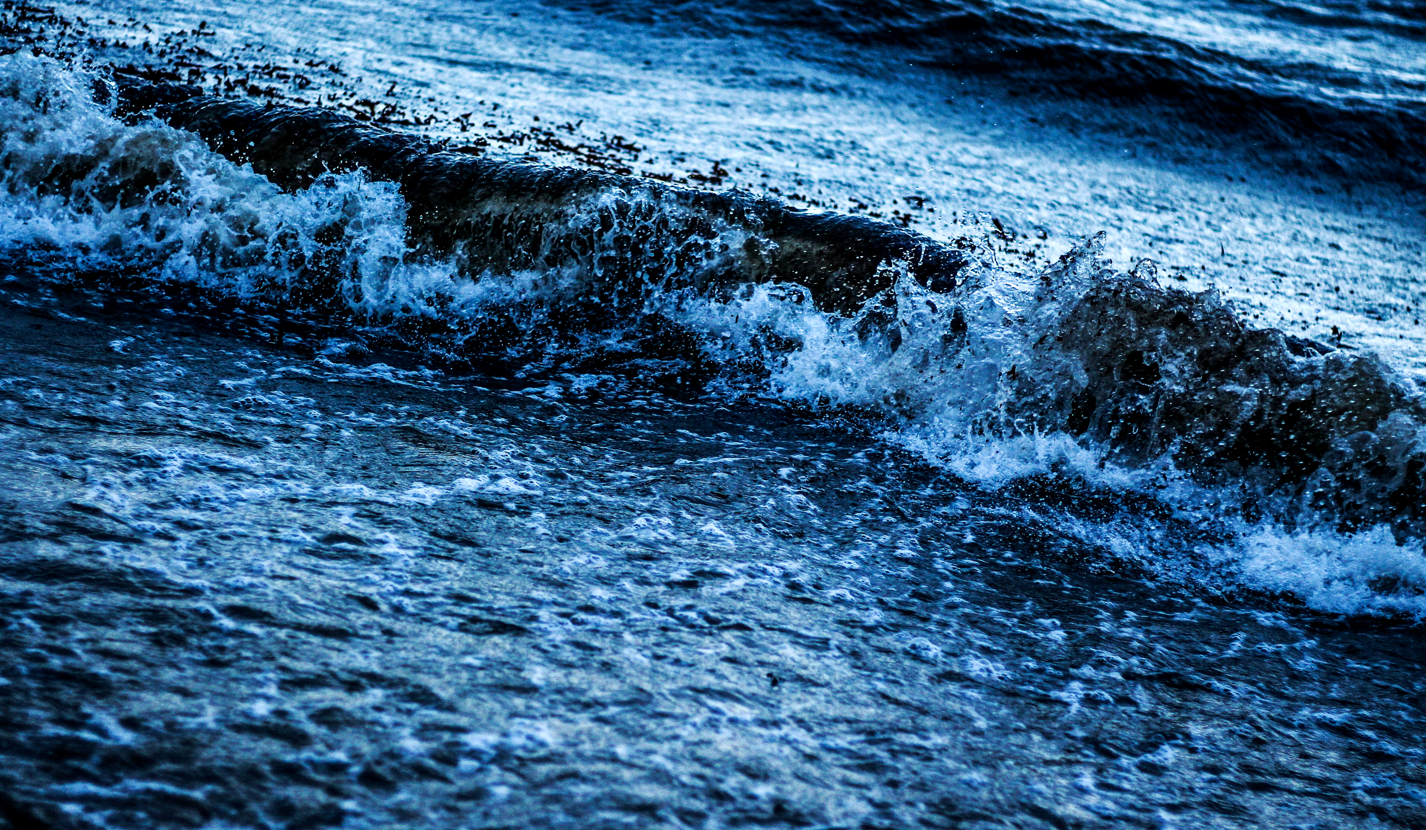
Finally from here I was able to decide on which image would be my final photo. This was my result:

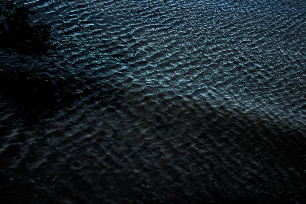
I chose this image because I loved the detail within the crashing wave on the shoreline, whilst the contrast between the darkness of the wave and the foam in my opinion make a dramatic effect. I also loved how the composition of the wave slanted across the frame, creating an almost abstract effect to it all.

Choosing my final images

When choosing my final images I had a lot of images to chose from that I was happy with and wanted to use but as I had so many I wasn’t sure as to which one to use. When I came to my final decision I couldn’t pick the one photo so I ended up picking multiple images from different homework’s. I liked these images the most as they were the images that related to the artist the most and the ones that I personally though came out the best out of any of the others. These photos also show my camera skills and also my Photoshop skills.


Final 3 images

Photo 1

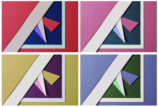
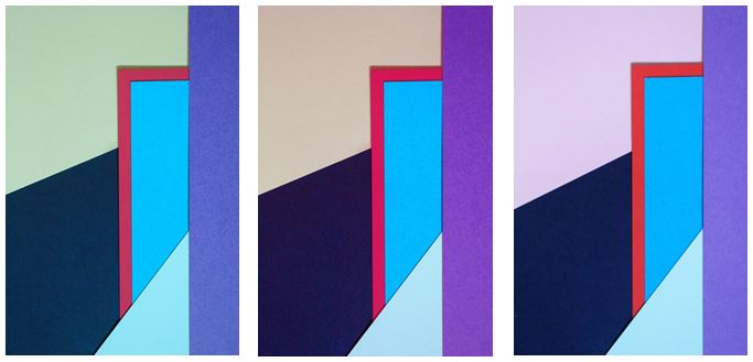
I first experimented with colours and changed the hue of the photos in photoshop and decreased the brightness so the colours weren’t too vibrant. I chose this photo as I think it represents abstract photography well through the solid bold colours and geometrical shapes I created by layering and cutting coloured pieces of paper. I tried to focused on creating contrasts between light and dark pieces of card to emphasise there colour. I personally like the red and pink coloured photos as I think they are the most bold and striking images.

I chose my two favourite photos that I think are the most aesthetically pleasing and experimented by flipping them horizontally and vertically trying to find the best composition and found that I preferred my original composition out of them all.

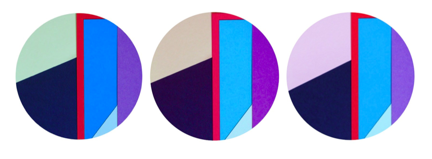
I also experimented by using circular frames which focused more on the middle section of the images, giving them a different appearance

Photo 2

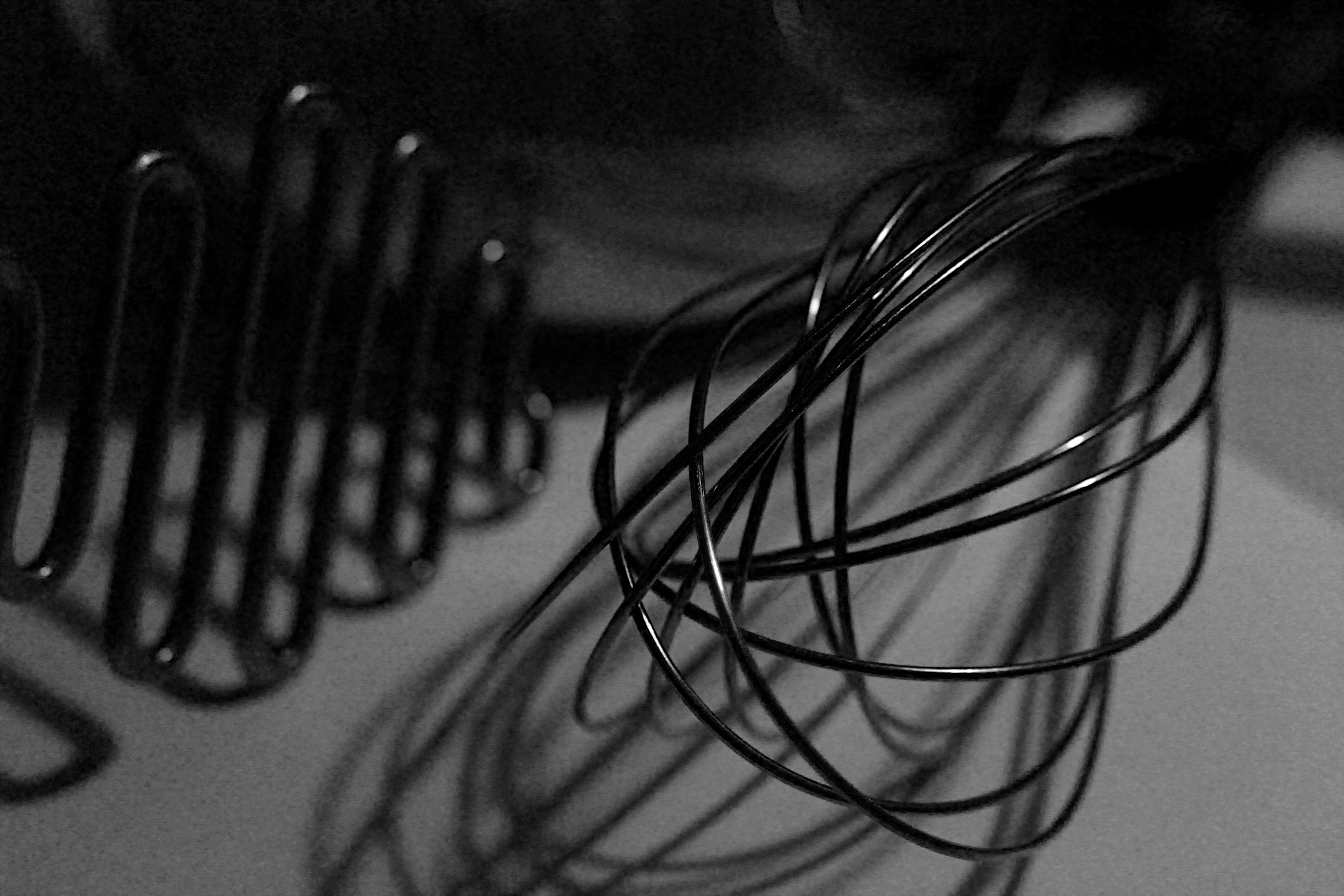
This photo was one of my favourites from my typologies exploration in London, when taking inspiration from Hilla and Bernd Becher. I found that it worked better as a single image, rather than together with others as it contained so much detail. I like the geometrical aspects it has and the repetition and pattern it shows, as well as the tonal variations.

I experimented with the original image, seeing if the photo looked more aesthetically pleasing in colour or in black and white and thought that both worked well as an overall image but decided that black and white was more powerful.

Photo 3

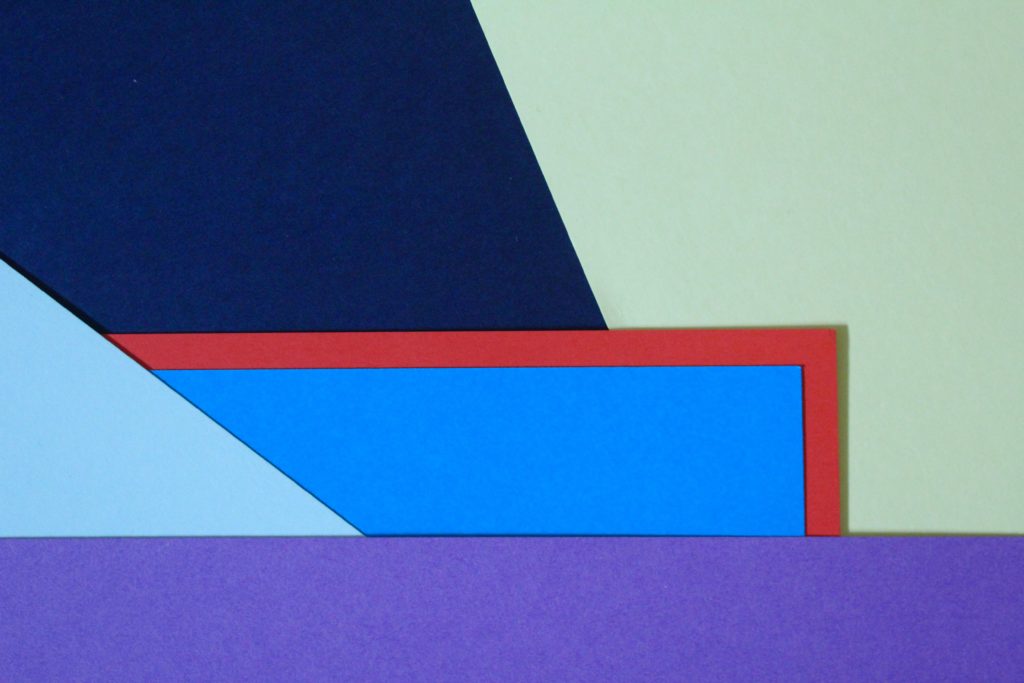
I chose this photo as one of my final images as I think it is a good interpretation of Tamara Lorenz’s work. I like the arrangement of the coloured paper and how I layered them to create distinct shapes with bold colours.

I experimented with the photo, adjusting the hue and I found my 3 favourite edits. The colours I found complemented each other the most were in my original image where the cooler colours (light green, navy and blues) contrasted with the warm colour red, giving a bold outline, which is the point where your eyes are drawn to in the photo.

I experimented with one photo by flipping it to create different layouts and creating symmetrical arrangements. I found that my favourite composition was the photo in landscape:

I like this composition as it contains horizontal lines as well as diagonal lines, with different sized shapes which are emphasised when the picture is landscape.


I also used circular frames to see if the images look more effective and found i preferred my images in a rectangular frame, following the geometrical design of the photo as the contrast of straight edges to circular edges is not aesthetically pleasing.

Textures And Surfaces

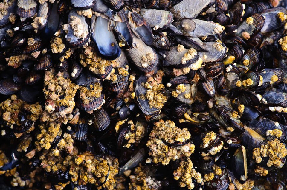
When working on textures and surfaces it is important to take into account the composition, light and depth. This is because texture is all about pattern, colors and depth, where every single detail plays a significant role in the overall perception of the photo taken. To capture this you need to remember intricate details, interesting patterns, vibrant colors and good depth. For example: 
Texture of Mussels
1) Find a texture - Finding textures is easy, you can find them in almost anything around you that catches your eye.
Image result for texture photography
2) Equipment - You will want to keep your aperture at about f/8, as you don't want to introduce shutter shake, which is what you want to avoid the most.
Image result for Bipod
3) Light - You should mainly use natural light like the sun to take pictures like these, as the rays of light will hit the texture at an angle creating an effect. Whereas inside you obviously need a off-camera light, which can imitate sunlight.
Image result for photography natural lights
4) Depth of field - By messing with the depth of field, you are able to create a seemless effect within the image, to perfectly blend a pattern into a backdrop.
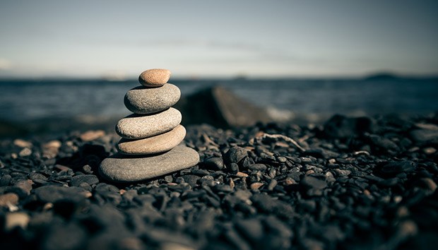
Image result for Depth of field
5) Mix - By mixing contrasting colours together, it is able to create an effect which is visually pleasing to the eye, due to an introduced twist.
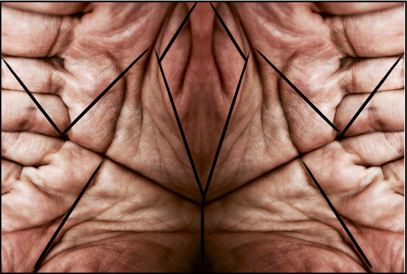
Image result for texture
6) Unity - When taking pictures of textures and surfaces, sometimes it is best to take pictures of smart orderly patterns, as the way they are laid out are visually satisfying to the human eye.
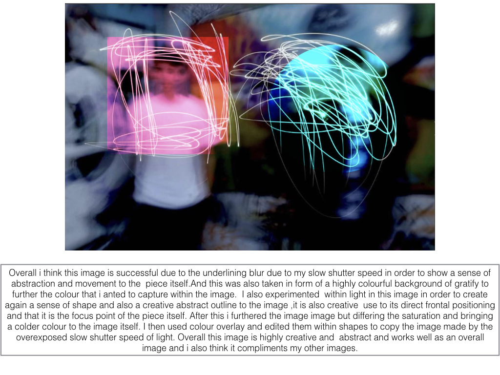
Related image