William kelin
William Klein was born in American but a French photographer and filmmaker was less well known for his ironic approach to both mediums, his extensive use of unusual photographic techniques in the context of photojournalism and fashion photography ranked 25th on Professional Photographer‘s list of 100 most influential photographers.h has many awards and exhibitions surrounding his work, soon after being a painter he started off within his photography journey soon achieving widespread fame as a fashion photographer for vogue and for his photo essay on various cities.
Because of this he was able to make many feature length films, and numerous of short and feature length documentaries advertising his work and allowing the public to see and be influenced by what he has achieved. Again he started off within photojournalism and street photography in new York much like many other famous photographers,His work was soon viewed to be considered revolutionary for its “ambivalent and ironic approach to the world of fashion”, its “uncompromising rejection of the then prevailing rules of photography”and for his extensive use of wide angles and telephoto lenses, natural lighting and motion blur.
He was said by the New York times to had been considered one among the fathers of the streets and a mixture of compliments that classifies a man who is hardly classy,Or Perhaps this represents him in quite a figurative manner but it still successful shows how people within New York needed his influence and guidance in order to make an important for society and that he was able to capture both the humor and the reality within New York at the time. the world of fashion would become the subject and inspiration for many of His works ad inspire inspirations of clothing evolution and a new meaning of beauty and womanly presentation. Lastly his street would would print a more violent and also exploit different religions and groups within America ta the time which was important to allow news programs to see his work.
what I like about his works that people were shown in such a ironic and unexpected light, people would be holding a gun with a face that implies that they are joking, or people in uncomfortable scenarios being laid-back and smiling while enraptured in a city more dull than themselves. he was able to capture the people within the city who would otherwise be ignored.
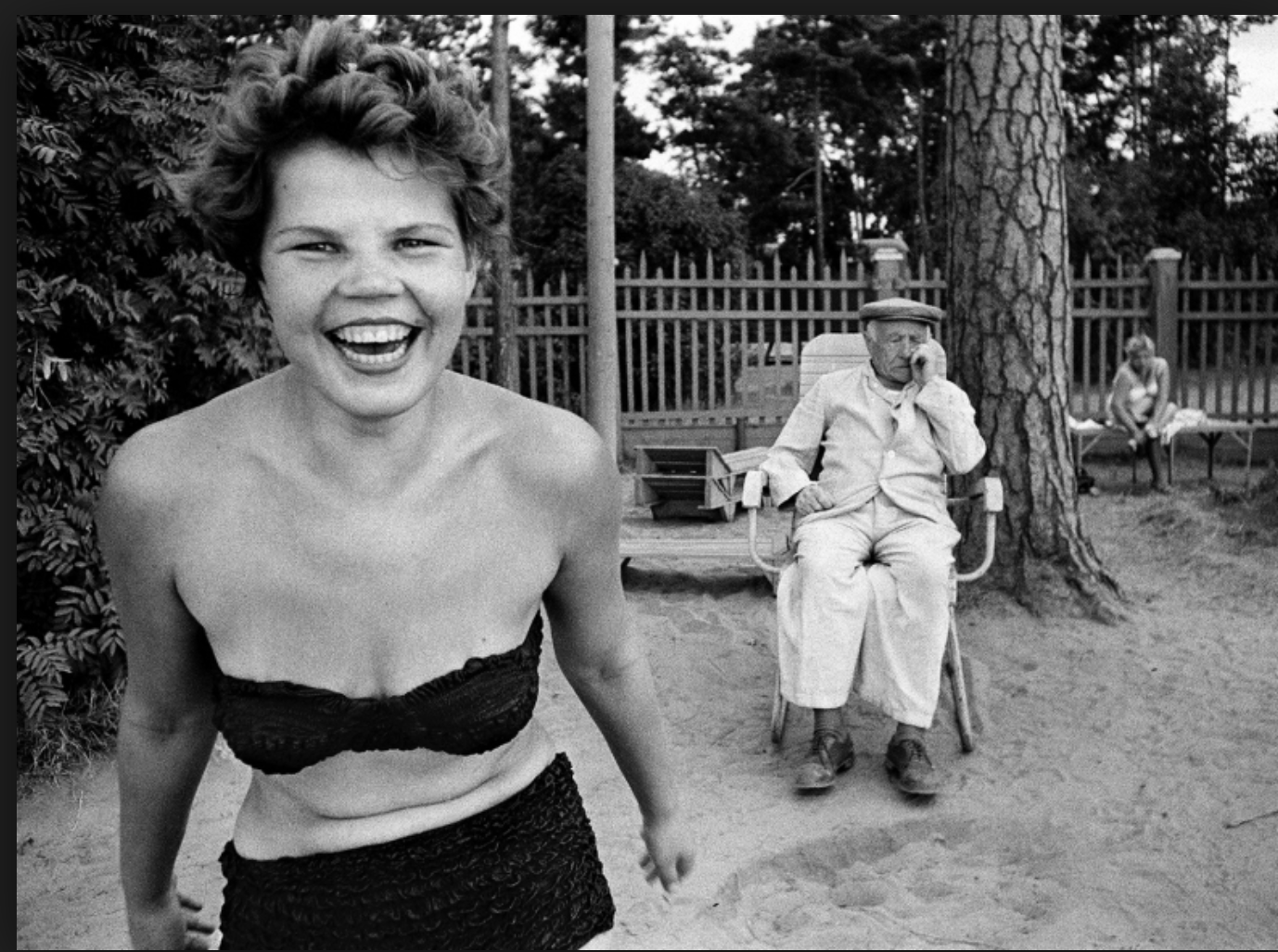
This is my favorite piece of his won work because it allows again a sense of youth and joy with is contradictory compared to that of the elderly people surrounding herself.It shows a women having a. sense of freedom and not wearing much clothing but she is not exploited for her sexuality but shown for reasons of her spirit and how this is what keeps cities alive. Again something more solemn is occurring in the background but the is ignored but to the irony of her celebration.
His work overall is very different to That of the previous artists as it portrays a more light hearted representation on suffering and troubles within the world and surrounding New York city, his photographers are perhaps less natural but sill capture a well enraptured essence of the people and their lives.
Diane Arbus
Was an American photographer well known for photographs of marginalized people such as dwarfs,giants,transgender people,nudists and finally circus from former. She again did this in order to represent the minority and portray a sense of normality by ways in which they look and not general populace who would consider them as ugly or surreal.Her work has been described as consisting of formal manipulation characterized by blatant sensationalism, this means that her work has most of the interests surrounding the subject of the charter and is taken in a formal manner, this allows a direct eye line and conceptual though go the person and their story and not allowing others to be influenced by herself.
sadly Arbus committed suicide and so presented a fictional version of her life story,within her last areas of photography .This was possibly due to her affair to a married a man who was never going to marry herself and only pushed her harder frequently throughout her work. She was married to another Jewish man such as herself Arbus was insulated from the effects of the great depression while growing up in the 1930s . Her father became a painter after retiring from Russek’s; her younger sister would become a sculptor and designer;so the majority of her family become intrigued in everything surrounding the creative arts and influence.
Diane started her own photography business and would come up with the concepts for their shoots and then take care of the models. She grew dissatisfied within this role, a role even her husband thought was “demeaning.”They contributed to glamour,seventeen,vogue,Harper bazaar, and other magazines even though “they both hated the fashion world”. Despite over 200 pages of their fashion editorial in Glamour, and over 80 pages in Vogue, the Arbuses’ fashion photography has been described as of “middling quality’ due to her gradually hate and enforcement of photography she become even less inclined to choose to take a shoot and no longer wanted to develop her work and she grew older and more depressed.
what I like about her work: I like how formally and clearly she captures people. there is no doubt what they are feeling but only why,it allows question which you can answer yourself by looking further into the image itself,and also due to all the interesting people,it allows a more intriguing view of the society in which she was in. Her images also allow an interesting composition to enhance the interesting subject to which she is capturing.
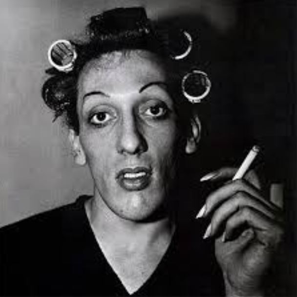
This is my favorite from this artist,this is due to interesting subject of a transgender man which again shows her representing the majority in order to allow a sense of normality to the society in which they are in.The makeup again furthers the image of femininity but that is contradicted within the darker tonal background suggesting more harsh underlining themes.You can also see how they are smoking,which bring a somewhat relevance to the time and possibly creates a sense of relation to the public and they all act the same but have different appearances.
Compared to the previous artist,She is a lot more formal within only concentrating on the face itself and not a lot of movement,this allows a straight forward proposition of her these also allow a sense of irony to show a more extravagant type of people within the society.

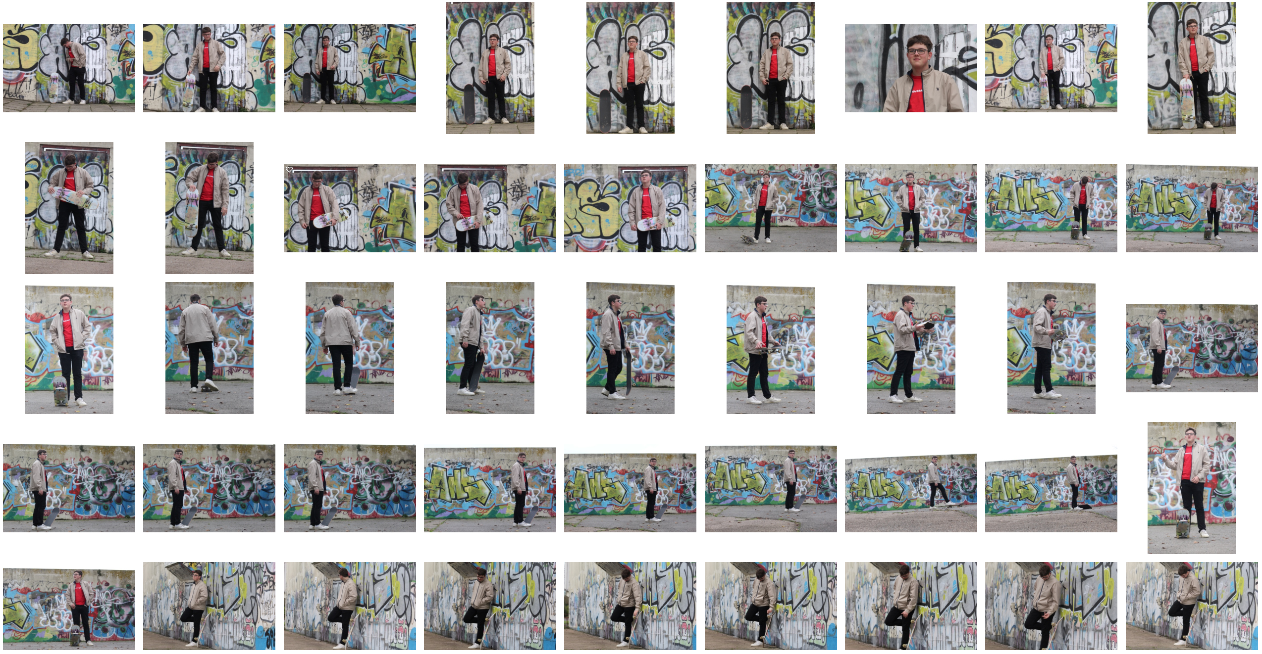
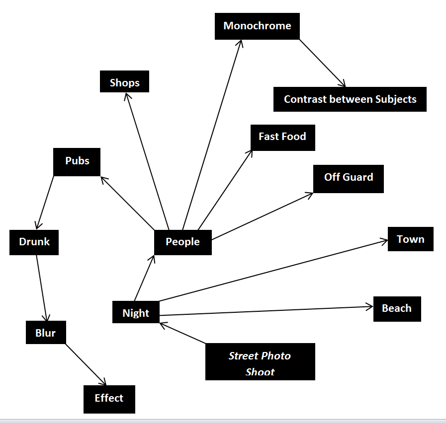 This allowed me to focus on certain aspects of the shoot easier, as I now had a rough idea what I needed to capture. These were the results from my shoot:
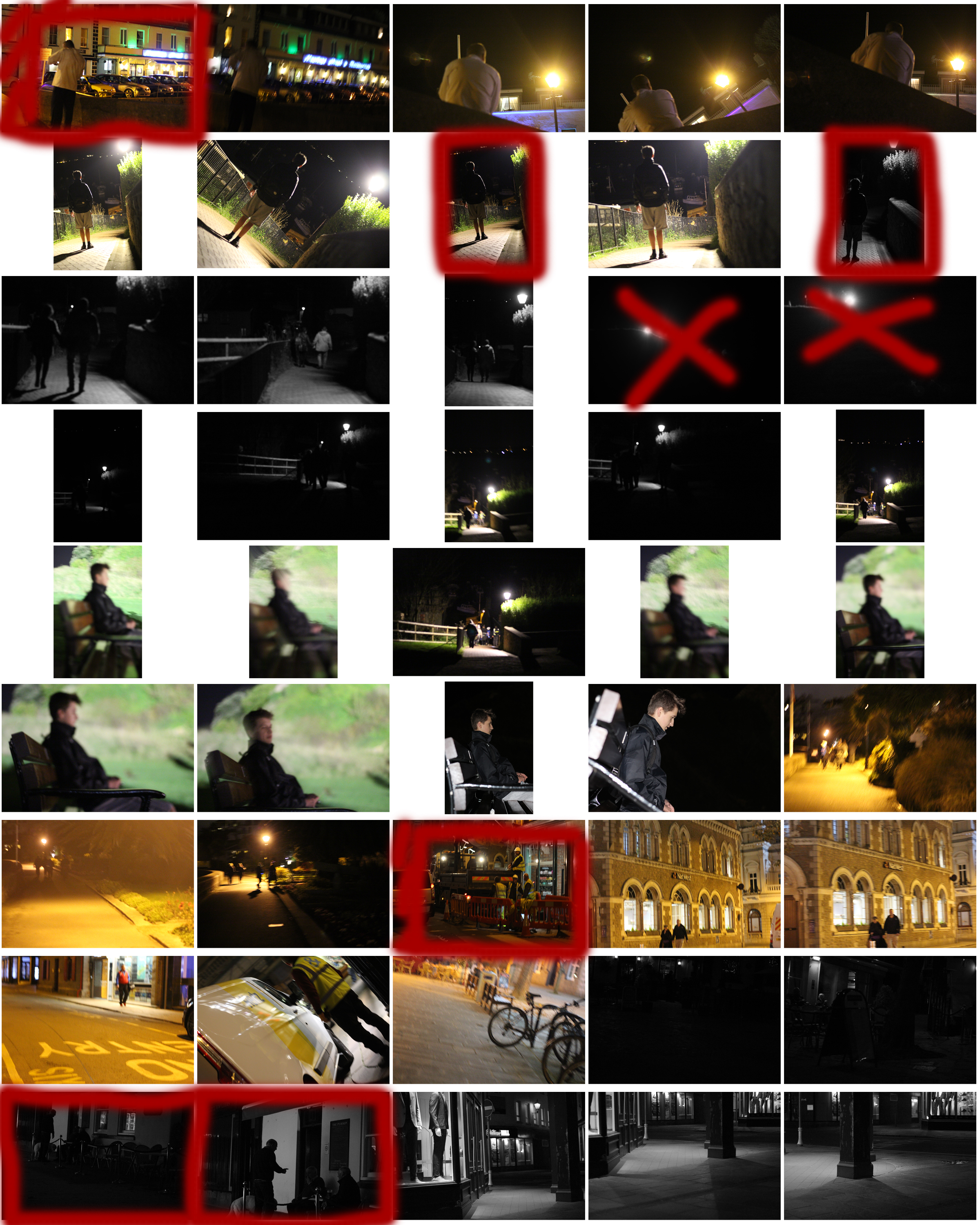
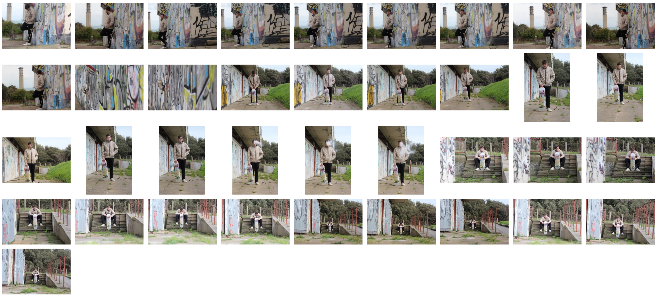
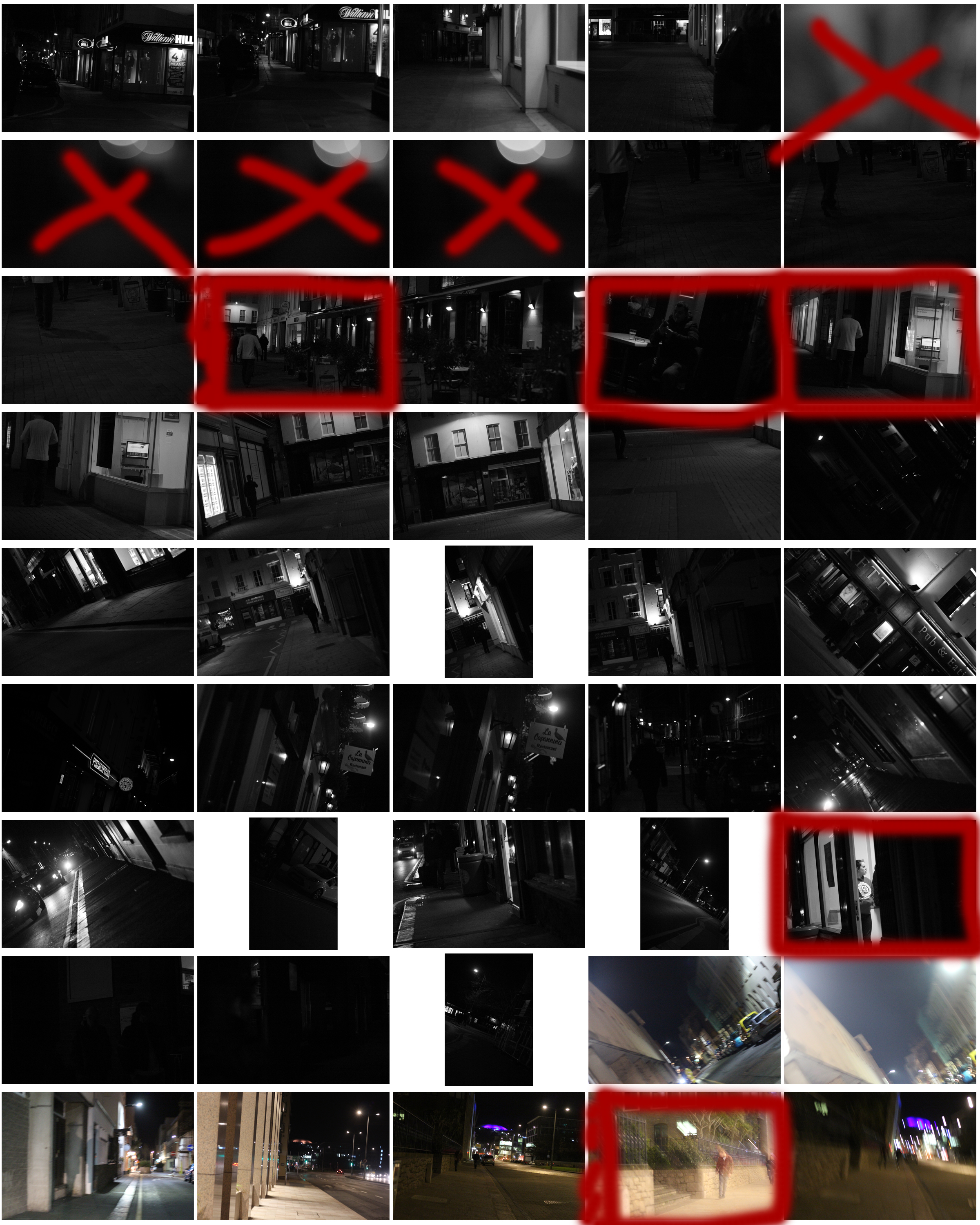 From the shoot I went on to highlight and crop the images I thought were the best out of all the photographs. This allowed me to limit the shoot down to just ten pictures so that I could choose my final image to display. These were my choices:

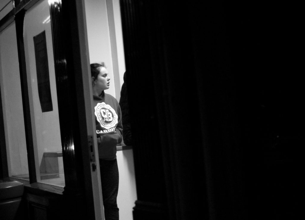
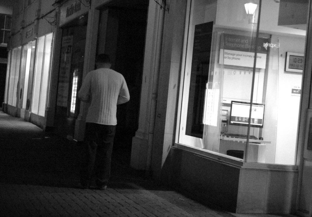
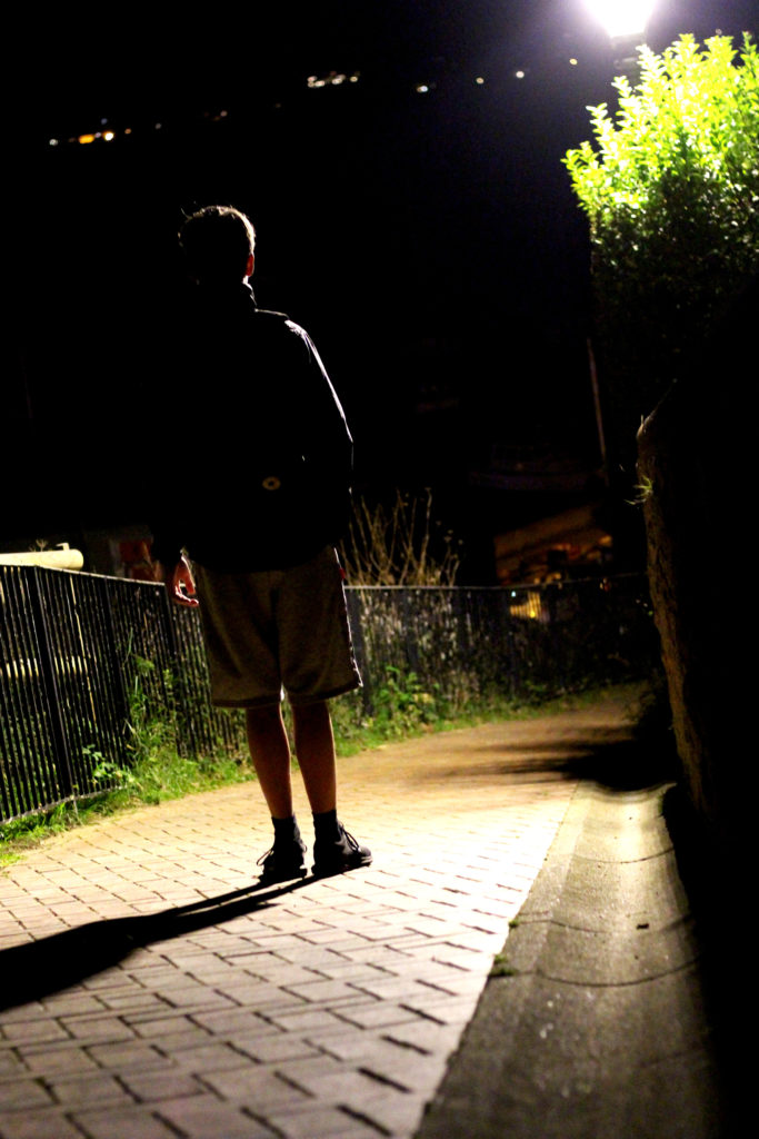
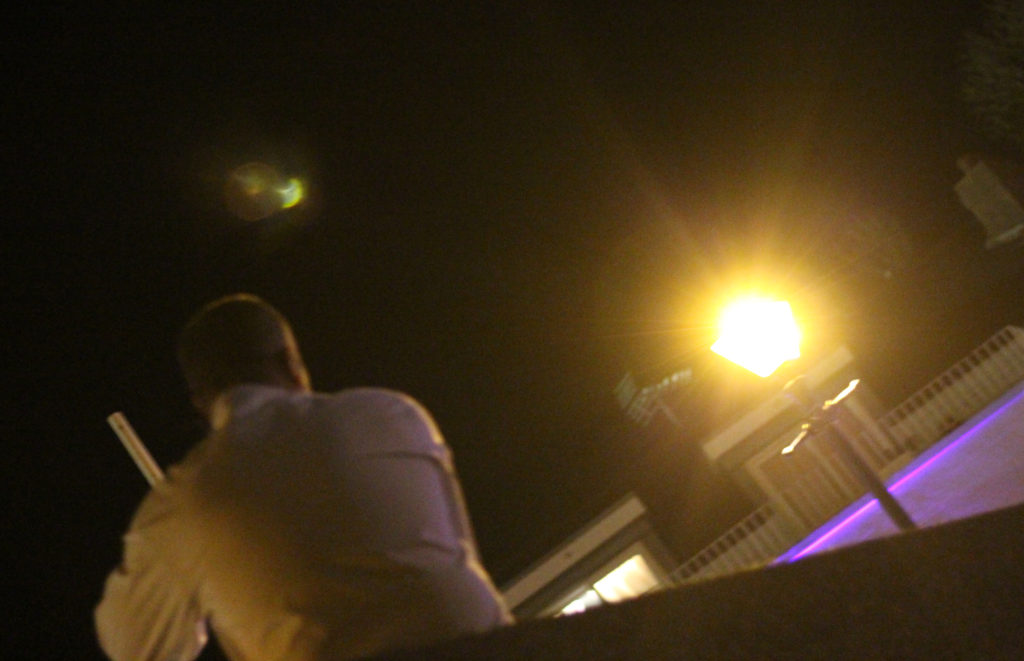

 I chose this image because I loved the contrast between the darkness of the wall, and the subject. This is due to the rule of thirds which line up with the character inside, which instantly draws your eye to the face. I found that the pure blackness of the wall covering the picture added for a dramatic effect overall, making it almost seem hidden.
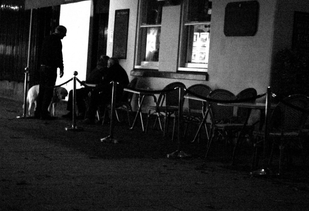
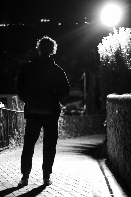
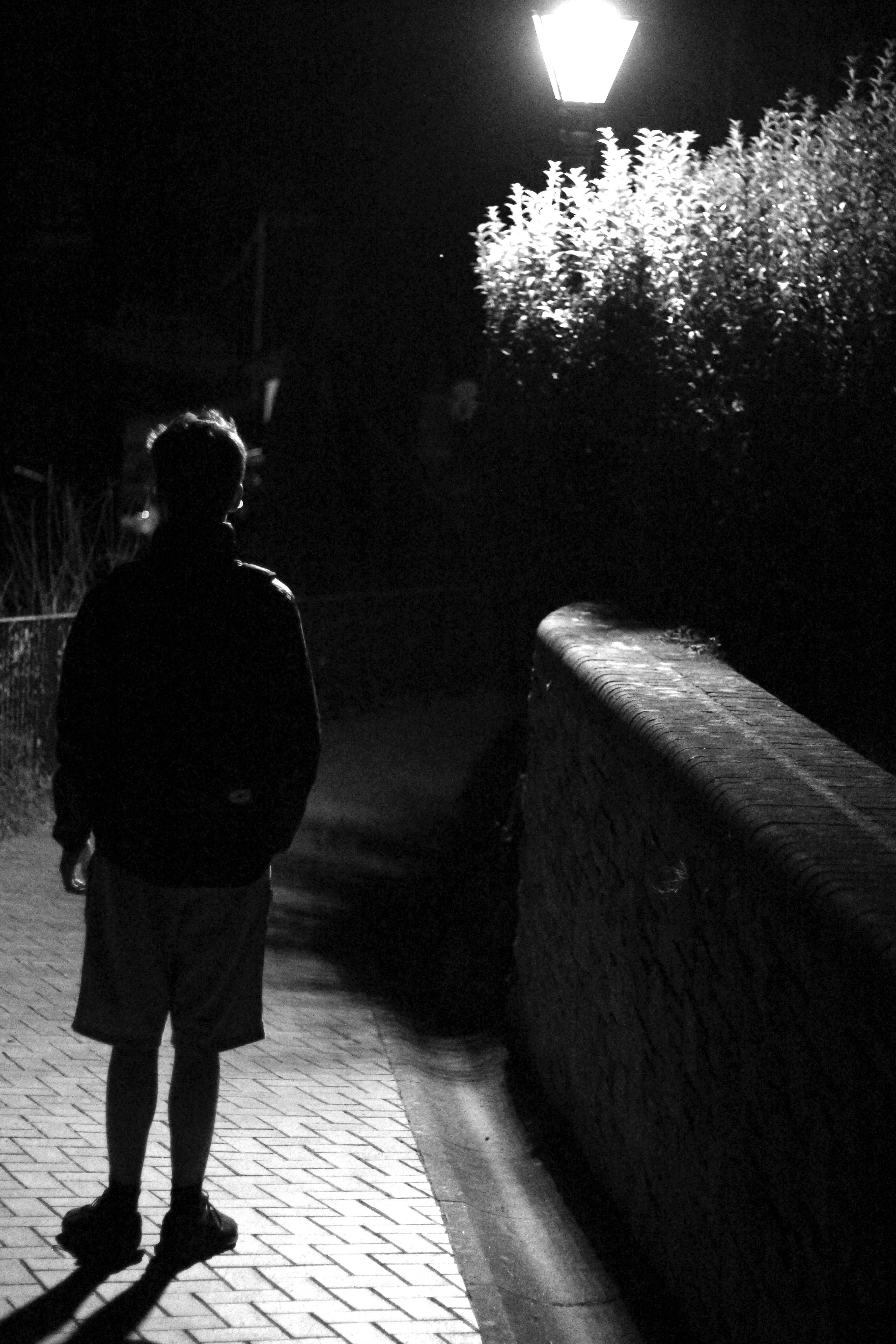 I chose this image once again because of the contrast between the subject and the surrounding area. I found that the silhouette created by the lamp really made the image pop, whilst at the same time balanced it so that the darkness itself was not too overpowering in the picture.
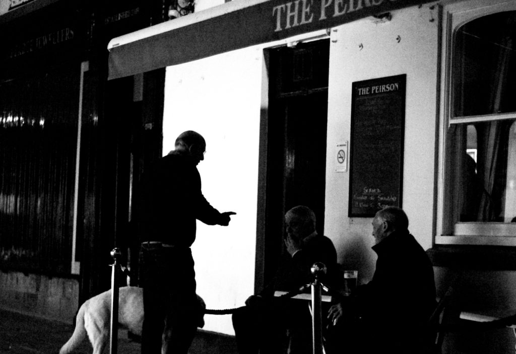
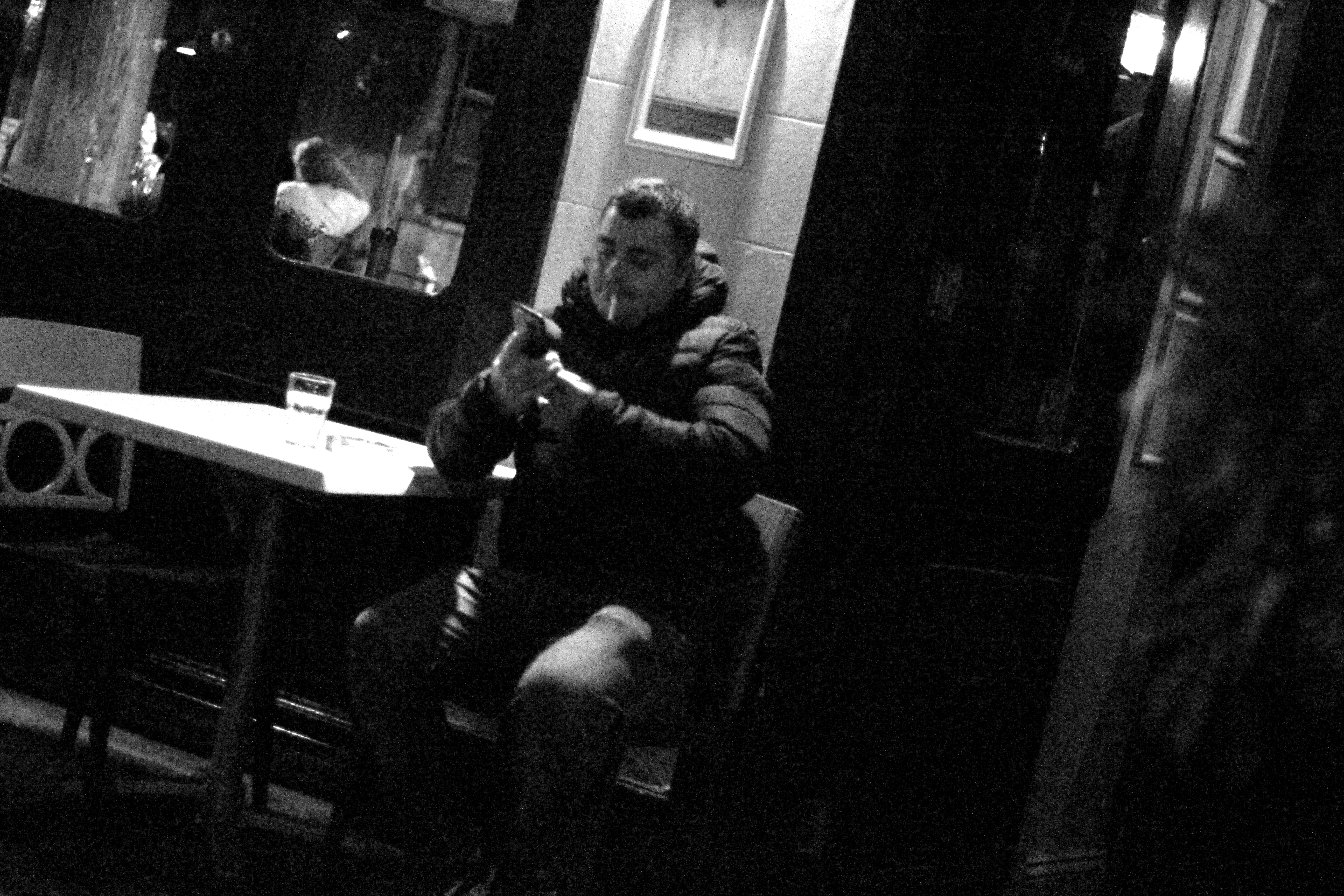 What I liked about this image was how the subjects face lit up against the darkness of the rest of the picture against the white strip of wall. I found that capturing someone off guard in their comfort zone allowed for a greater insight to the subjects life, and really captured them as an individual.
 I found that this picture captured a clear contrast between the darkness of the three old figures and the white pub behind. I found that this silhouette that is almost created, makes the overall piece more dramatic than it is, with the blurred black building behind allowing for the whole picture to work.
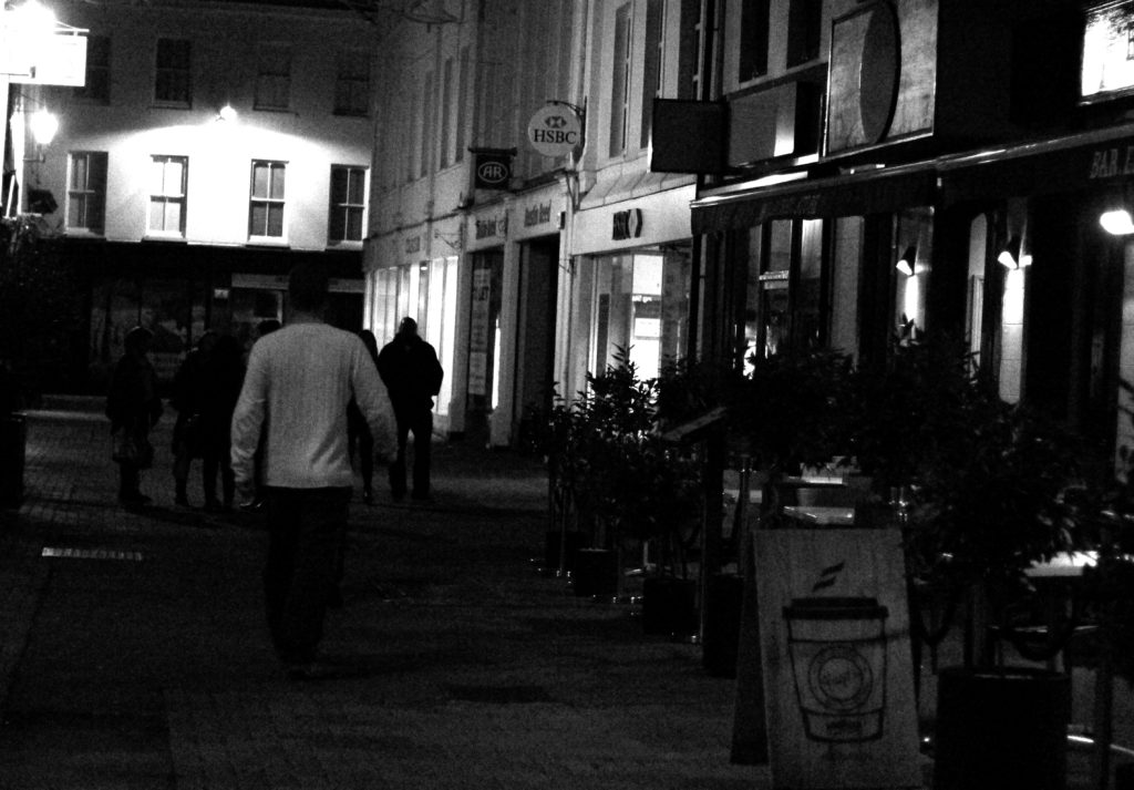
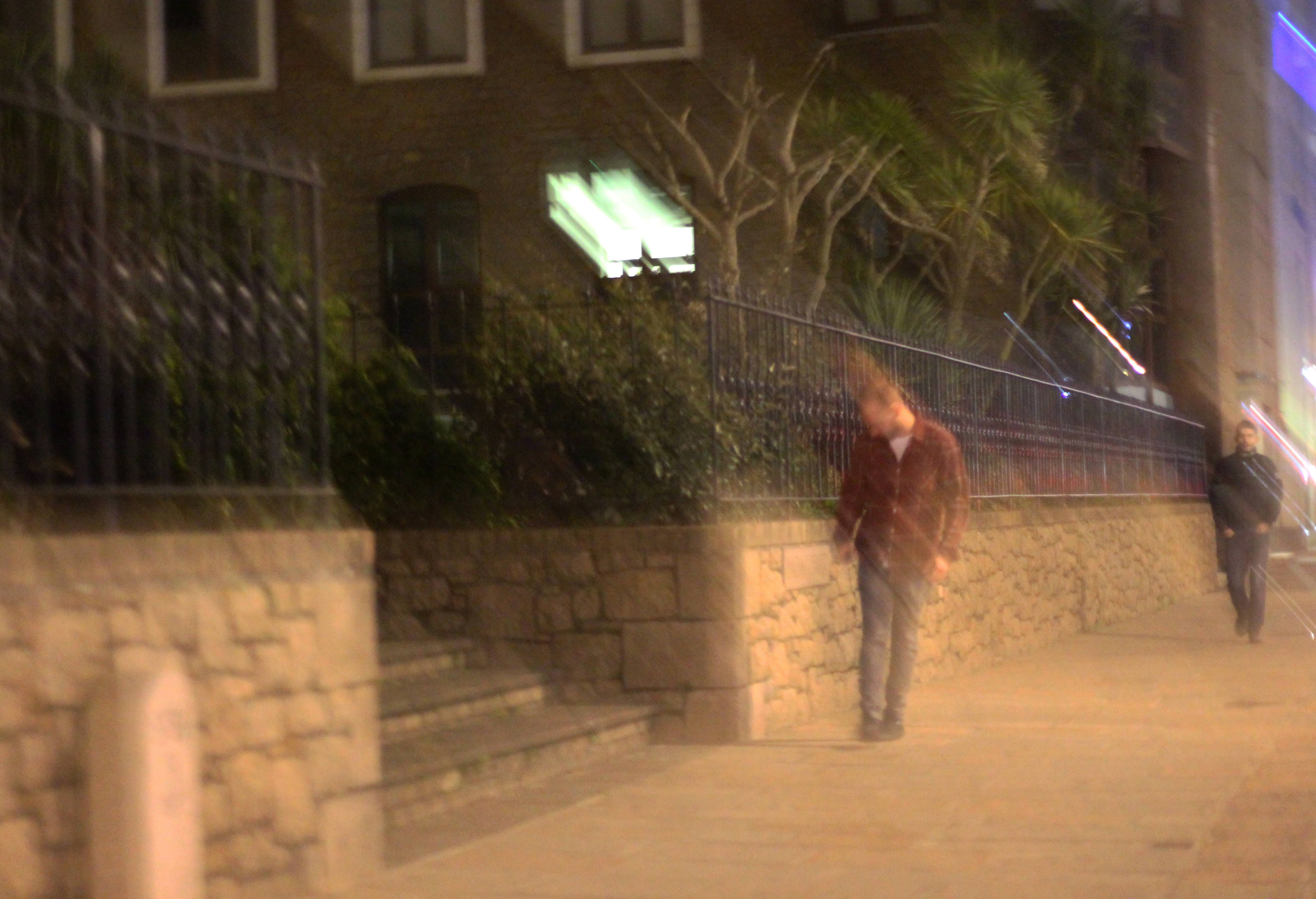 Finally I chose this image because it captured the nightlife of a man drunk stumbling home. What I liked about this was how the picture was blurred itself as well, allowing greater emphasis on the man in the jacket being drunk, and the perspective that he may be seeing.
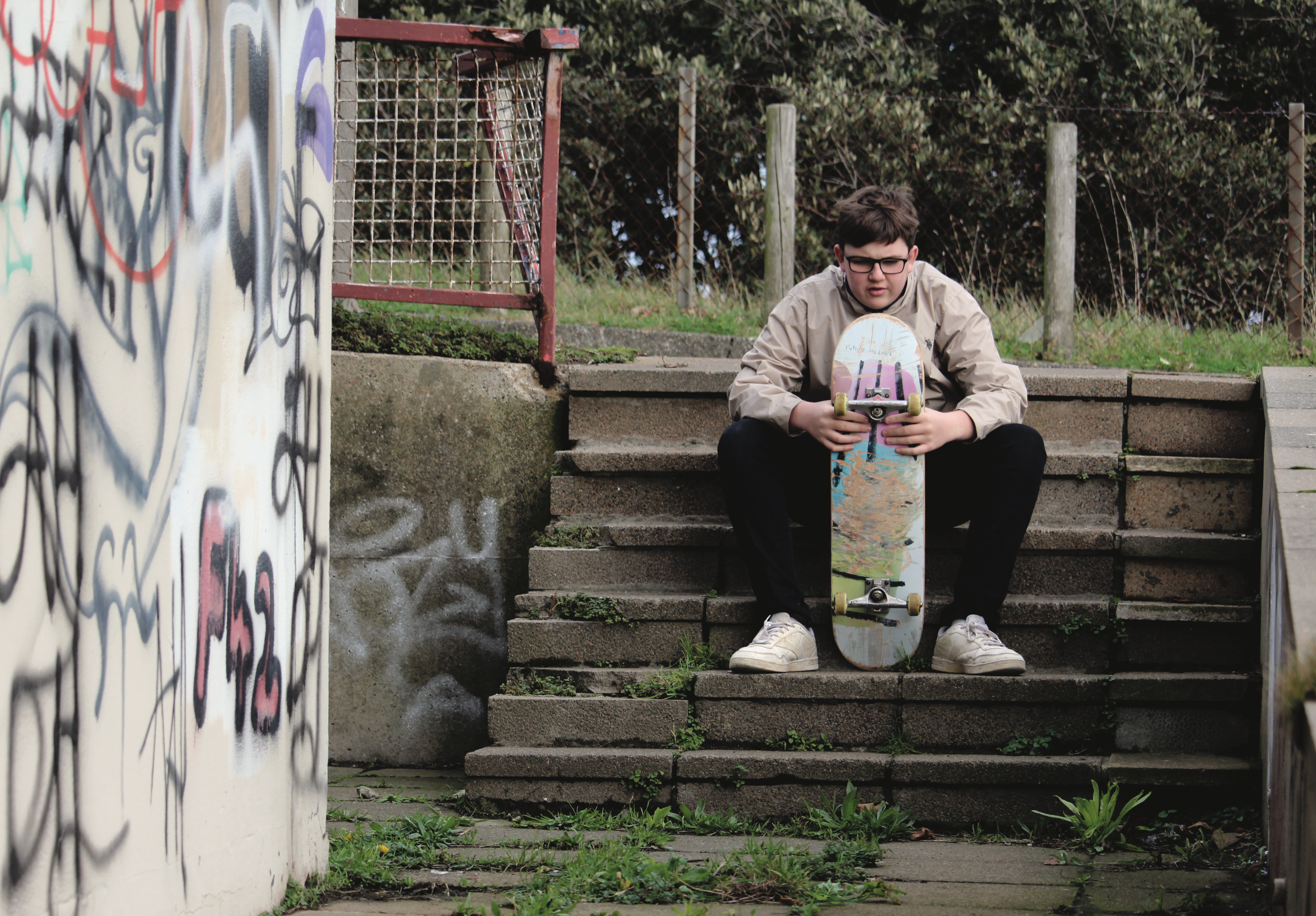
FINAL IMAGE

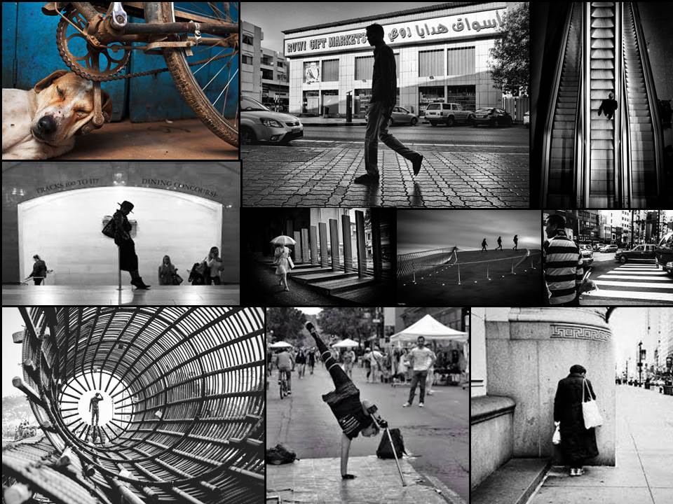 From this mood board I chose the two images I thought were most effective.
 These images highlight everyday life in certain parts of cities and countries. What I think makes them both so effective, is that in the top one taken in a construction site, has a clear pattern which leads to the central figure, where the eye is drawn. This use of using everyday sites to create pattern through contrast etc, allow for a more visually pleasing style of street photography.
However the image beneath that image, focuses on a completely different aspect, as instead it chooses to focus on a poorer place in which sites like that are common. What makes it so effective is that there is a clear contrast between the blue wood, and the white dog, where the photographer uses the bike as a golden ratio to draw the eye to the head of the dog.




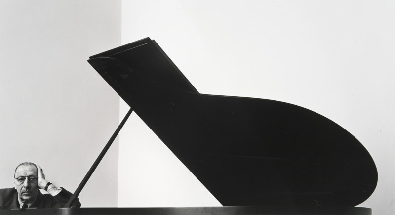


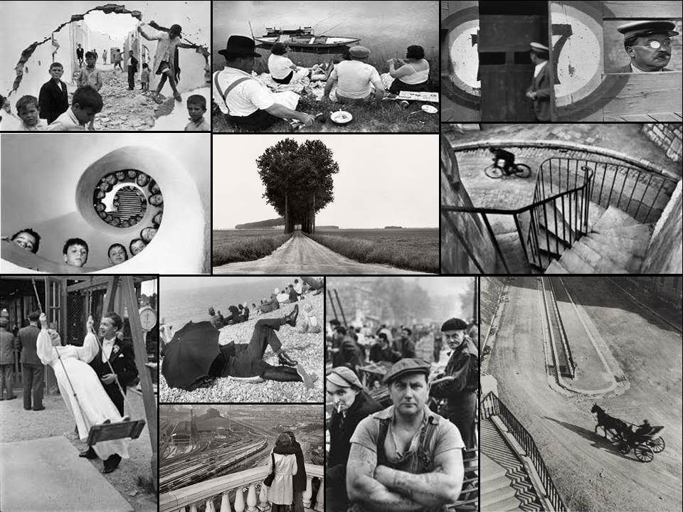
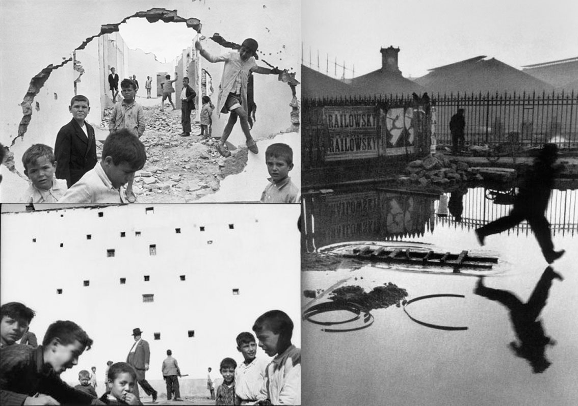
 From this selection of a few of his images, I found that my eye was drawn to the picture of the wall crumbled in.
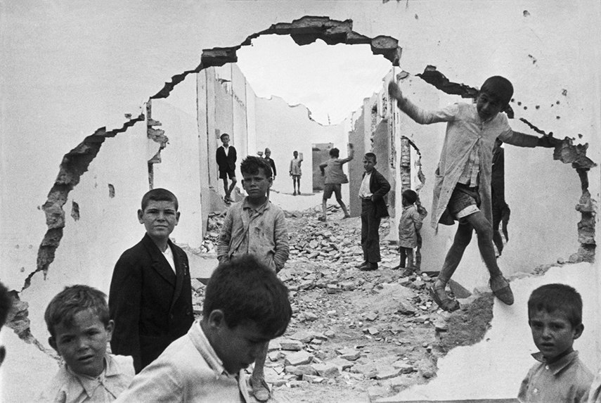 The contrast between the subjects within and the white crumbling wall, which in a way frames the image, allows the photograph to really define the faces of the individual children. From this it allows us to see the different expressions of each child, some seem to be captivated by this photographer taking the picture, whilst others are completely oblivious to it. Allowing the photographer to capture the playfulness but also the curiosity that is seen within each child. The fact that some of the children are playing on rubble, shows how that even in the worst scenarios, kids always make the best out of what they have, showing that innocence within.


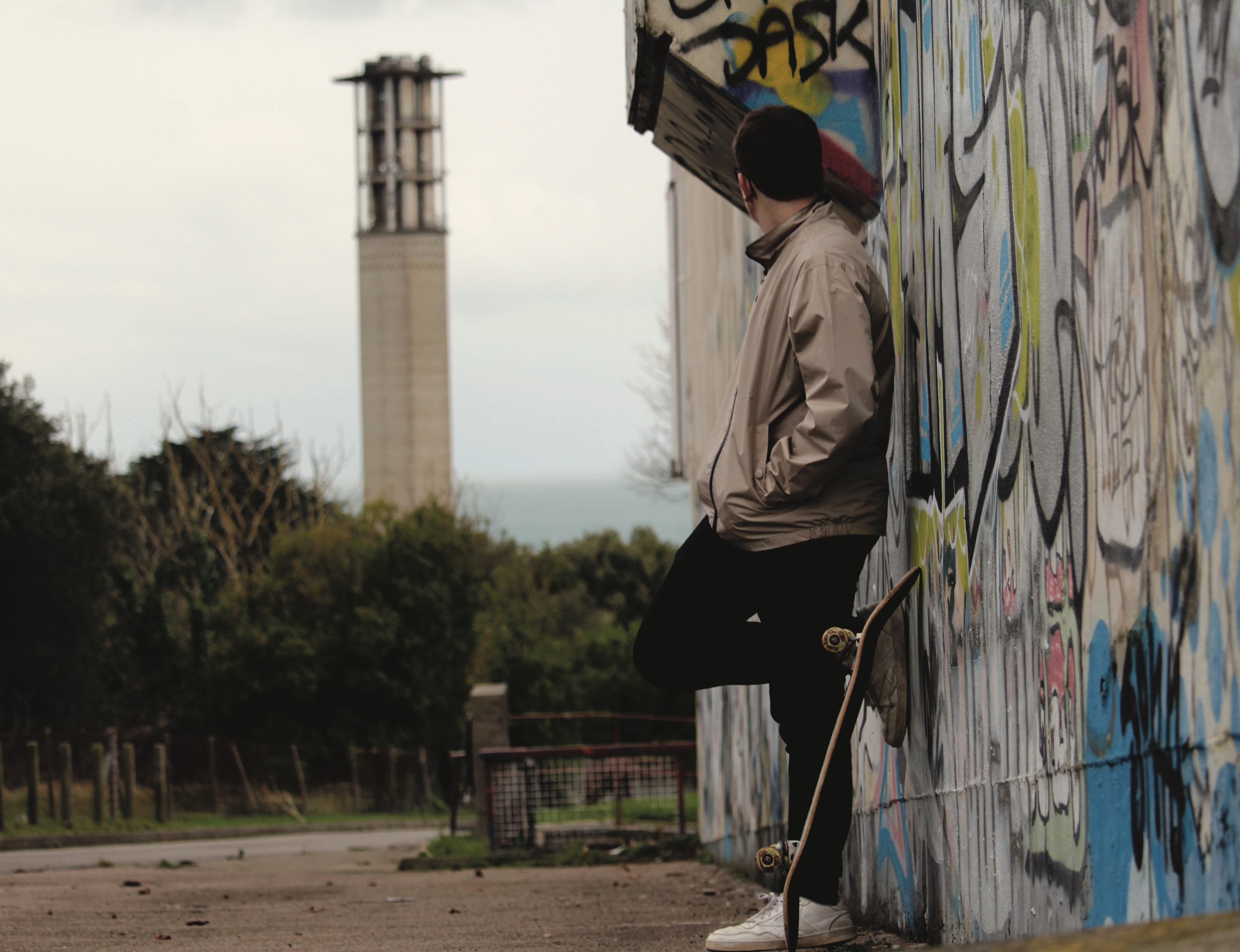
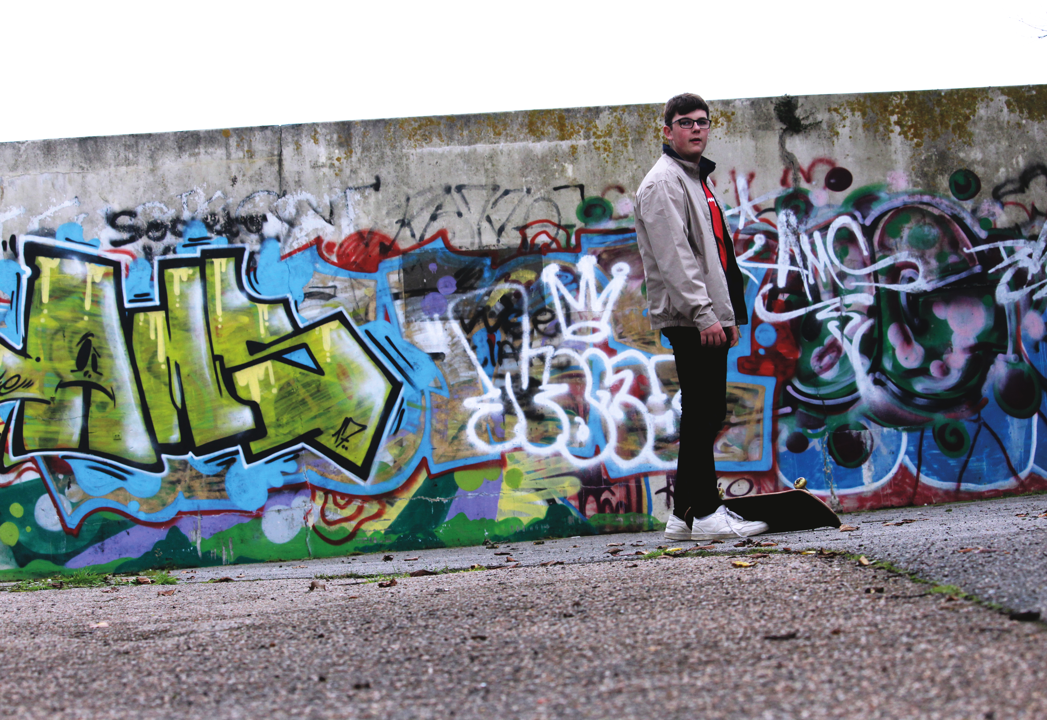
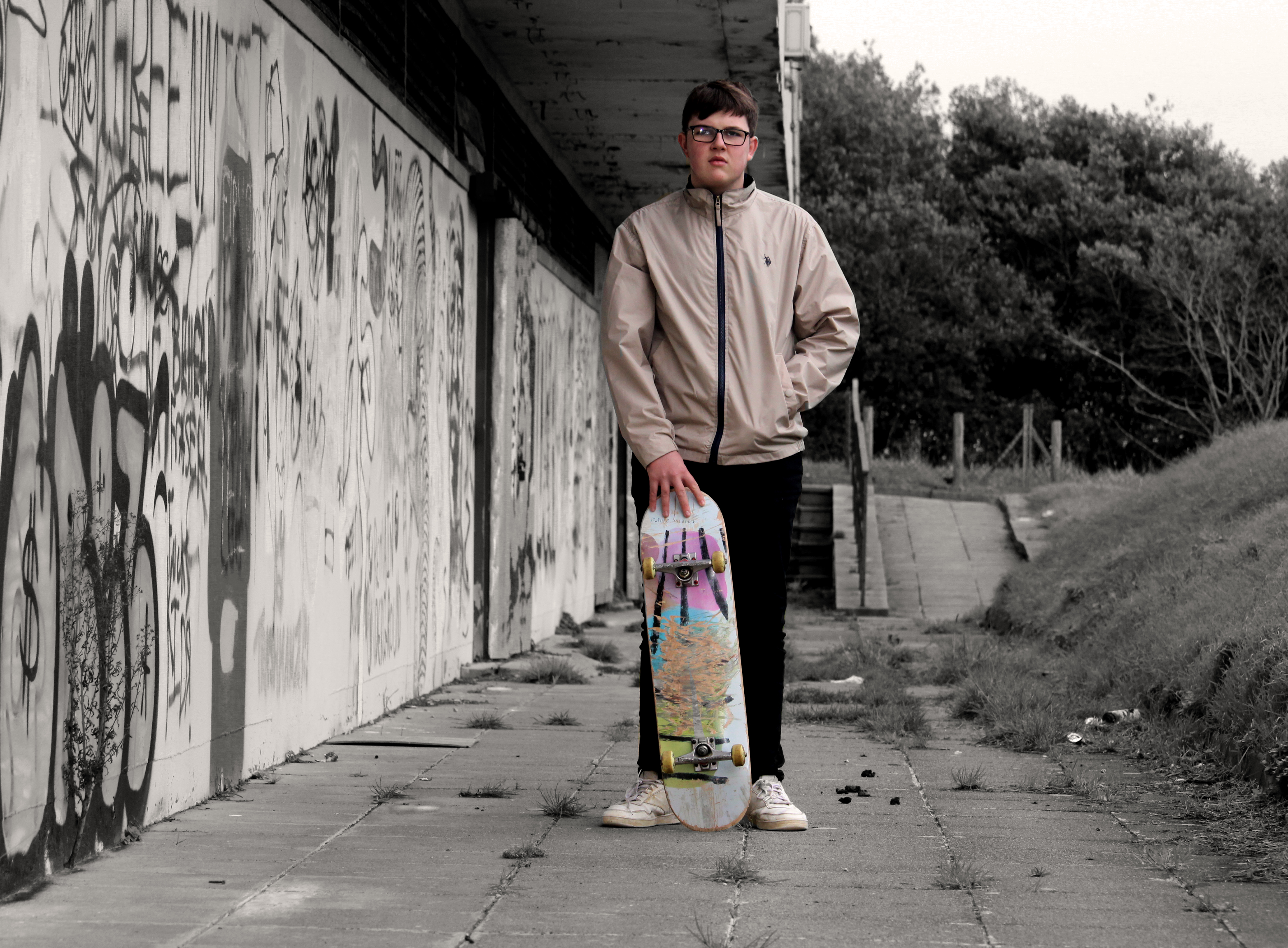
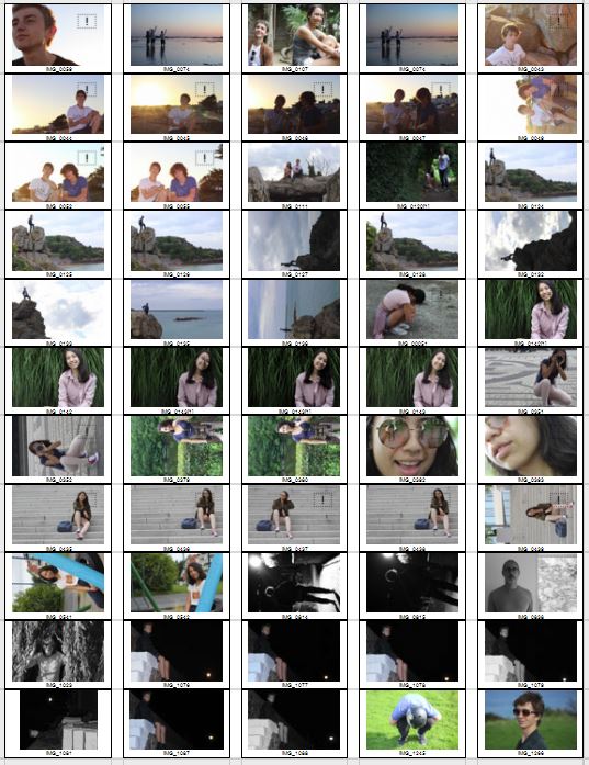
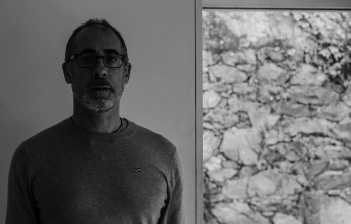
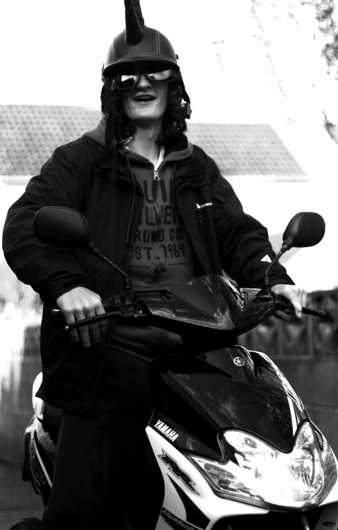
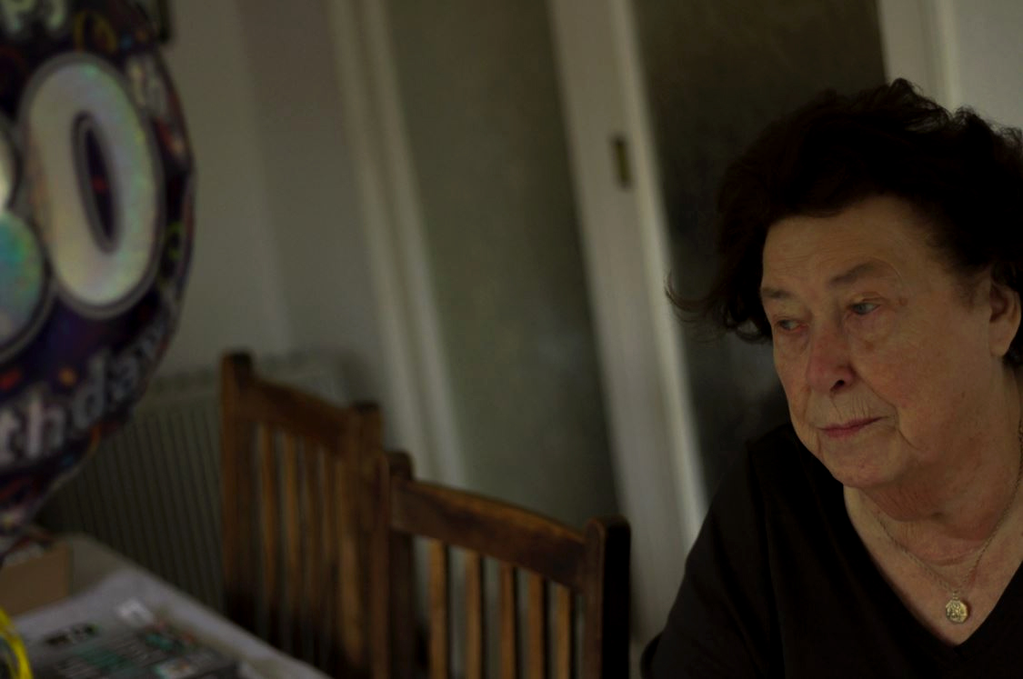
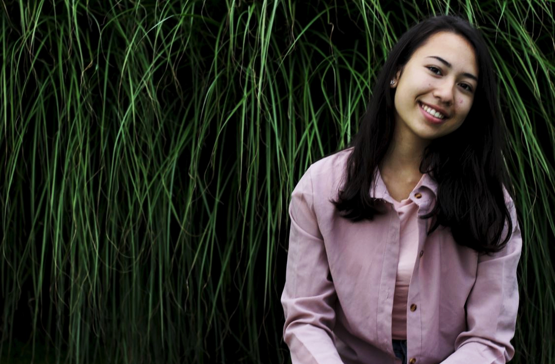
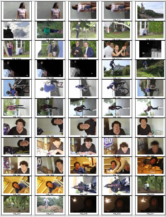 Once I had completed the shoot, I decided to try to limit the images down into my top ten photographs, from there it would allow me to decide which picture I found the most effective from the overall shoot. I chose the image that I thought had the biggest impact of all, so took into account the rule of thirds, symmetry and lighting. These were my results:
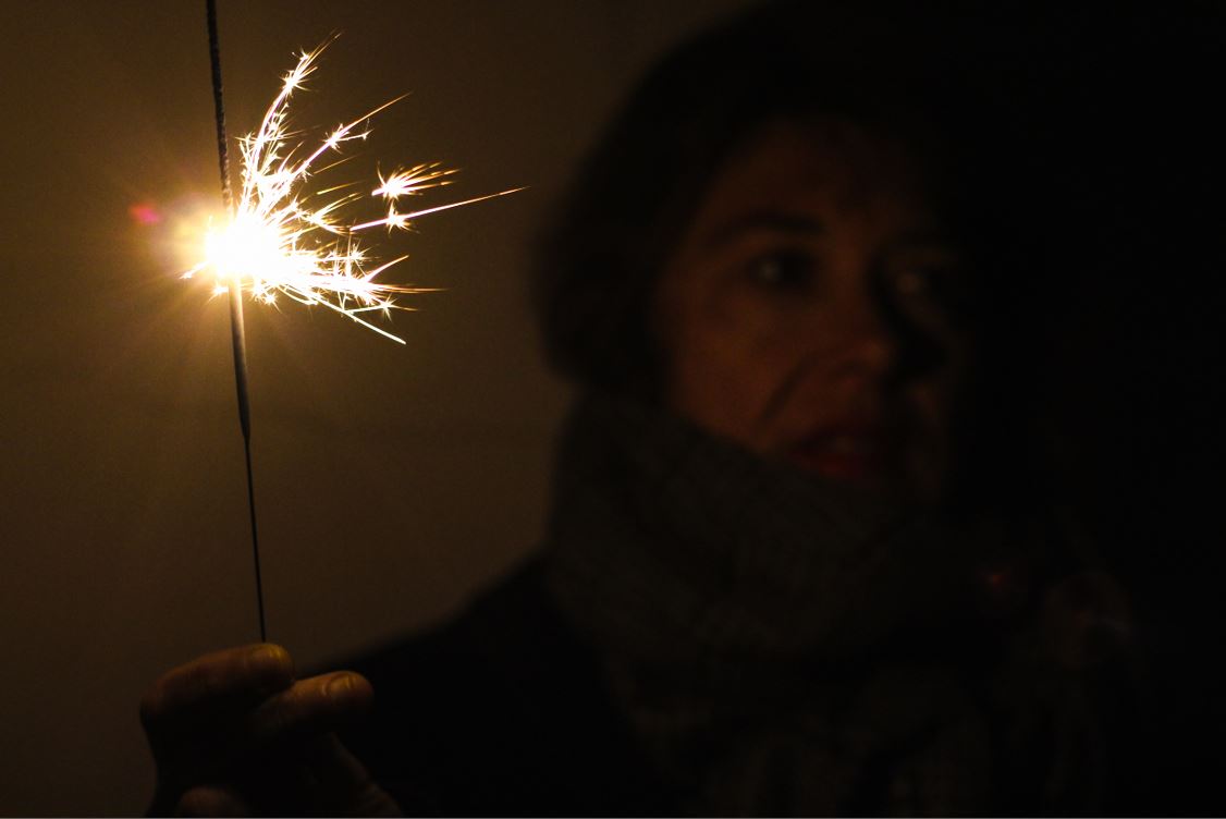
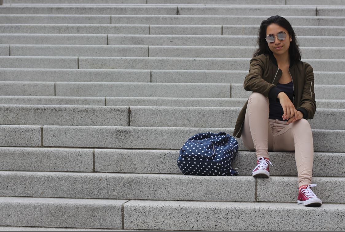
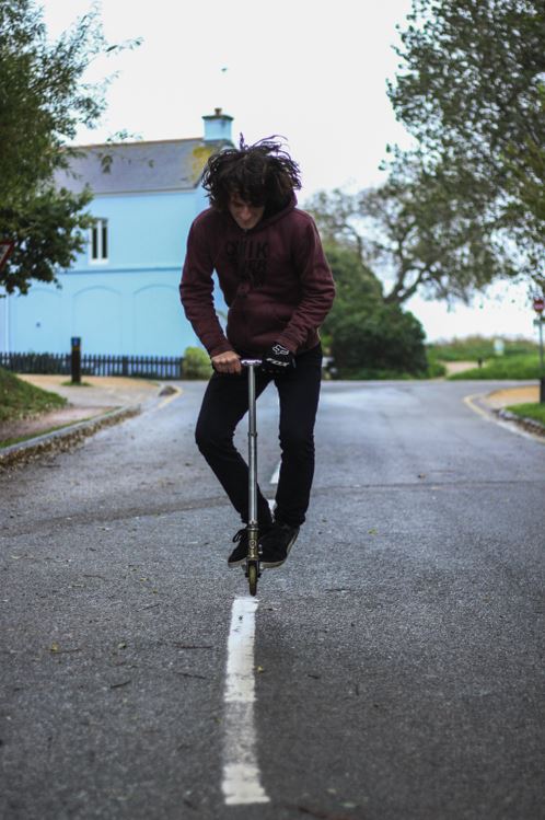
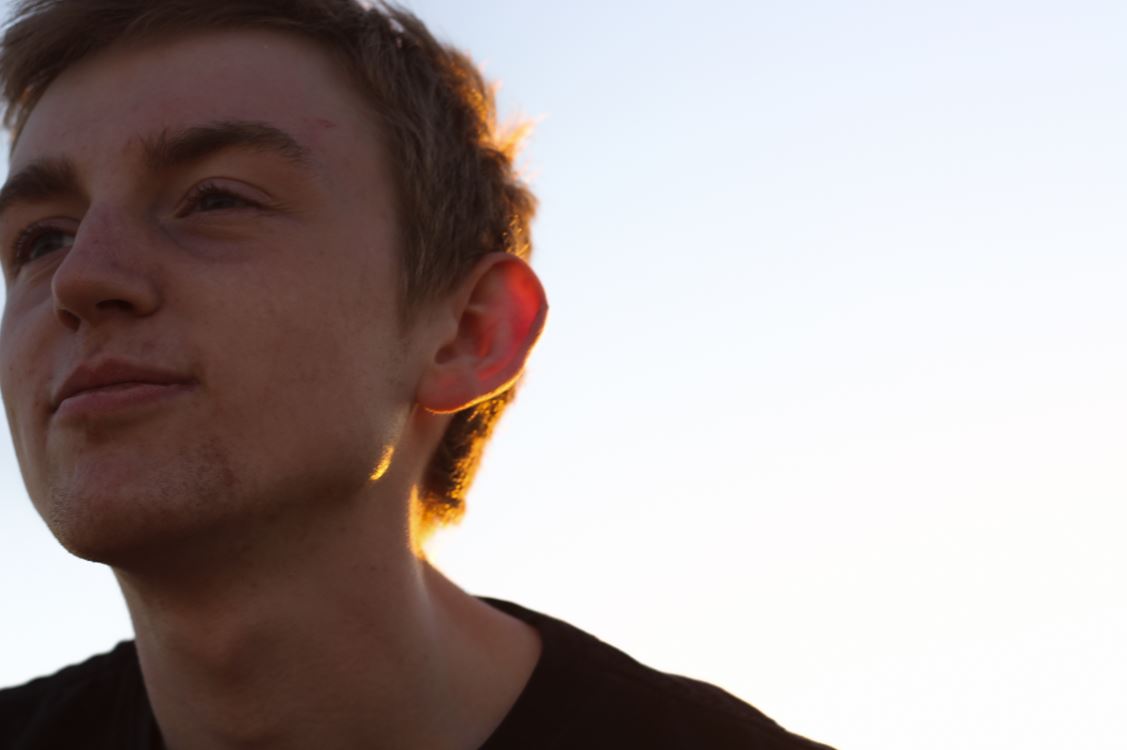
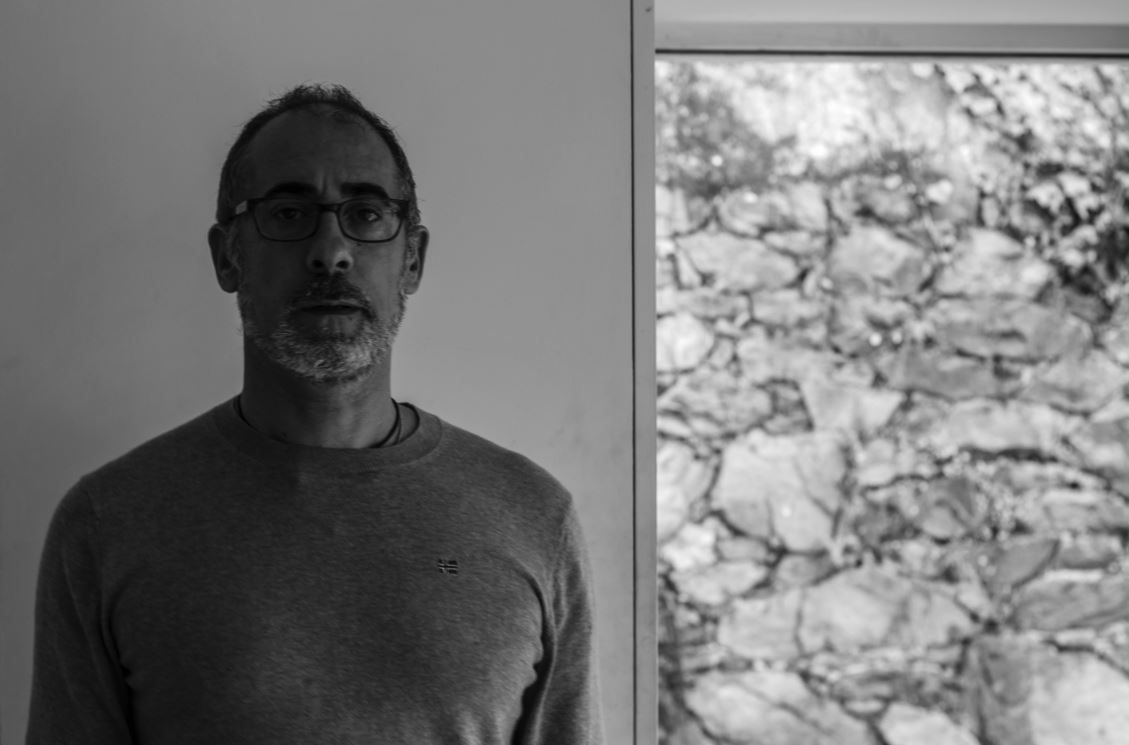
 I chose this picture because I liked the expressionless face of the subject against a white plain backdrop. This to me created effect within, as the backdrop broke up to a messy brick wall on the right hand side, allows for more focus on the subject rather than what is around them, due to how the contrast on their face stands out from the exposed wall.
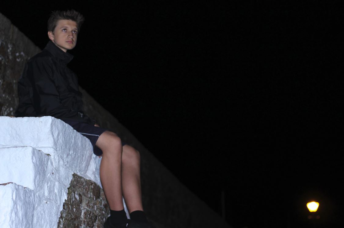
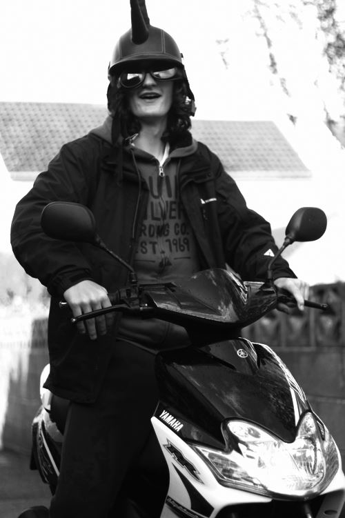
 The reason I chose this image was because I loved the contrast between the overly exposed background and the darkness of the subjects clothes. This creates a dramatic effect, whilst highlighting the points I wished for the viewer to look upon, like the head up. I found that the character being centered slightly to the middle of the picture made it an overall aesthetically pleasing piece.
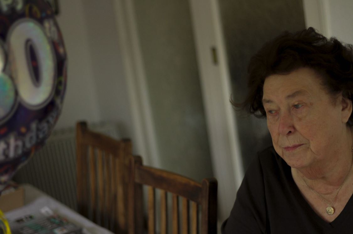
 Finally I chose this image because I found that it captured the calmness and thoughtfulness, of the subjects face at a significant time in their life. This makes the image aesthetically pleasing because of how there is symmetry between the subjects face, and that of the birthday balloon, which cancel each other out making the picture very balanced.
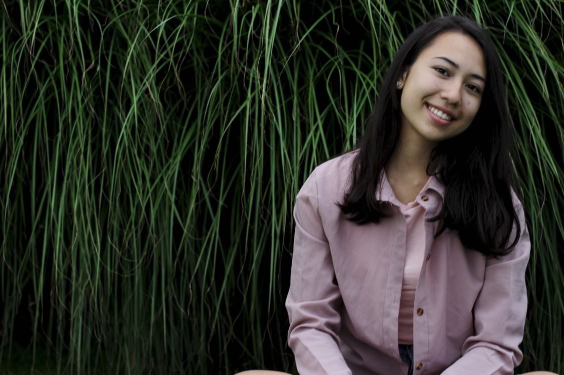
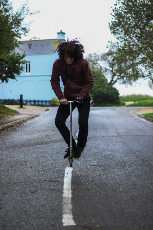
 The reason I chose this image was because I really liked the contrast between the darkness of the backdrop of a bush, and the brightly colored outfit of the subject. This instantly draws the viewer's eye to the subject due to the clear definition between her clothes and the bush, whilst making it visually pleasing to the eye as the pattern of the bush behind is broken up.
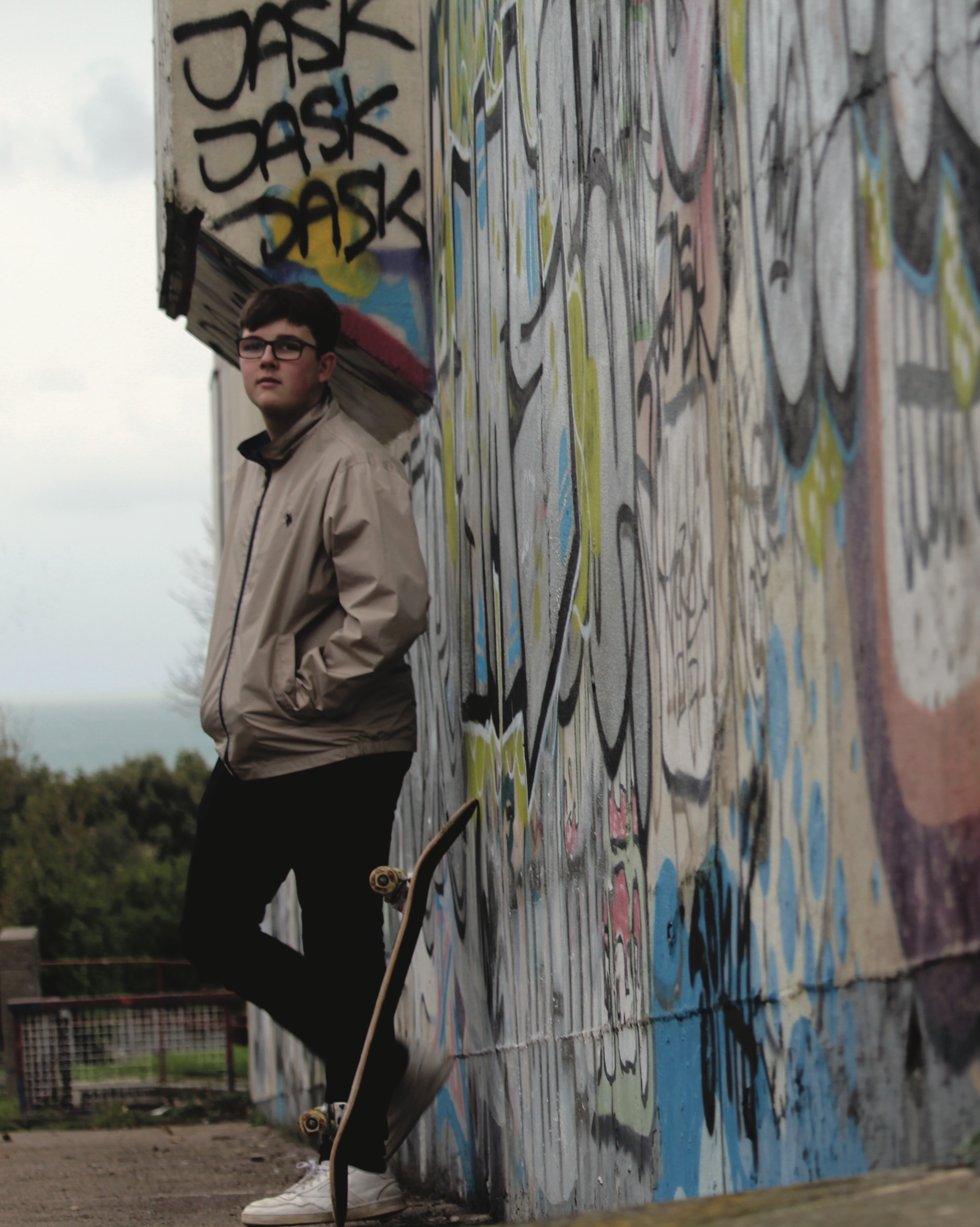
 FINAL IMAGE