What is tableau photography?

Tableau is the French phrase for 'living picture'. Before photography was a thing it was a popular past time to which people would recreate scenes from famous paintings at parties. These people would dress up and use props to make it as accurate as possible. As photography emerged artists such as Julia Margaret Cameron created fantasy scenes like Sir Launcelot and Queen Guinevere, which prompted a huge interest in the art form. However this form of photography fell out of fashion with the introduction to realism.

Some of Julia Cameron's work can be seen below:
As seen in her work, she wanted to focus on how the photos were meant to recreate paintings in an innovative and creative way not seen before.
The 7 deadly sins were a popular topic when doing tableau photography due to each one having an important connection. These were Lust, Gluttony, Greed, Sloth, Wrath, Envy and Pride. I could then link this back to how these all formed their own unique identity and change the individual for the good or worse.
Category Archives: Analysis
Filters
2nd Photoshoot // Studio Photography
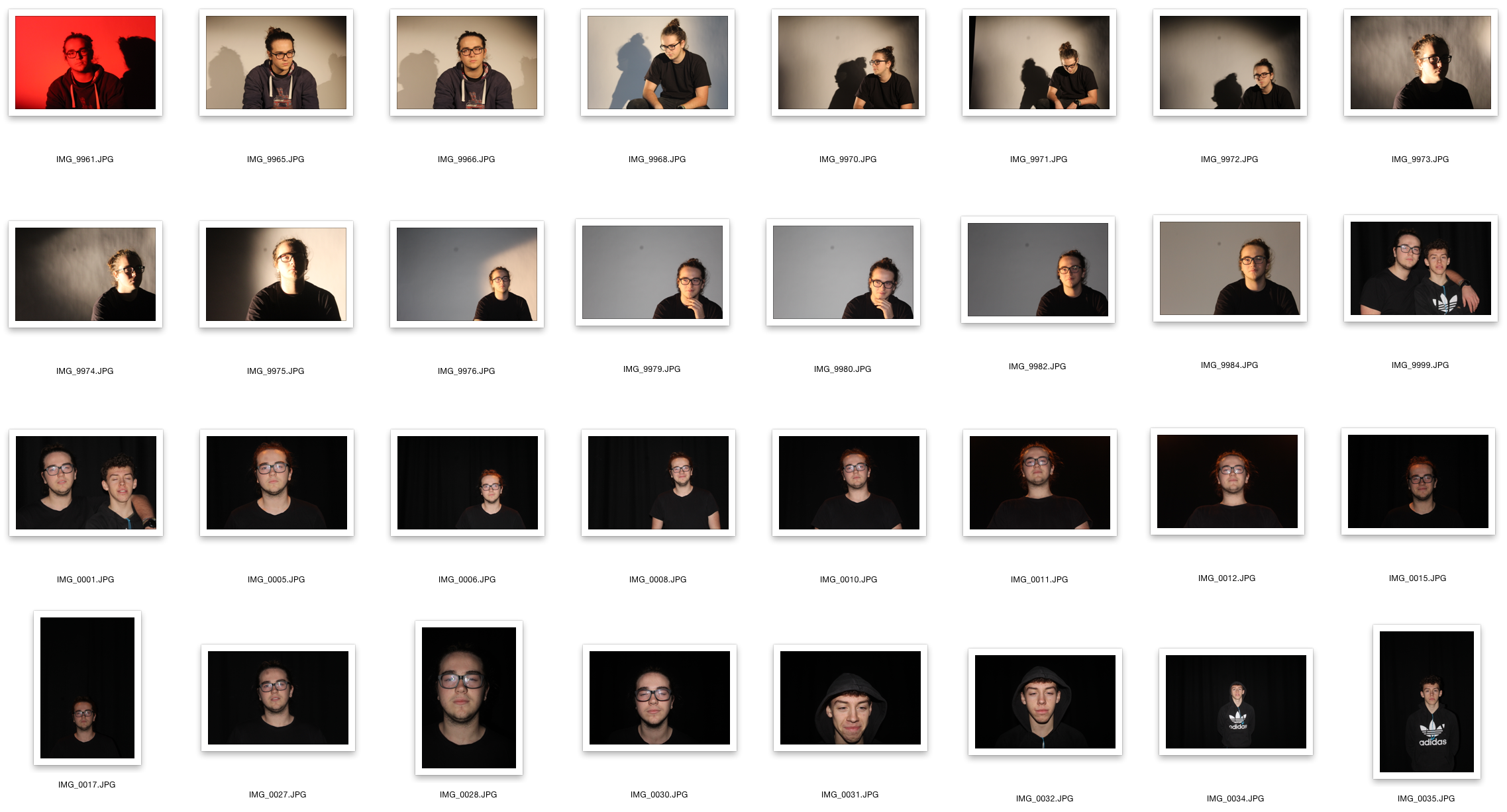
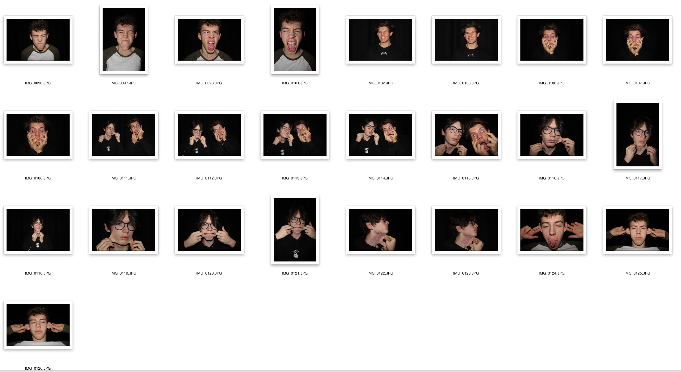
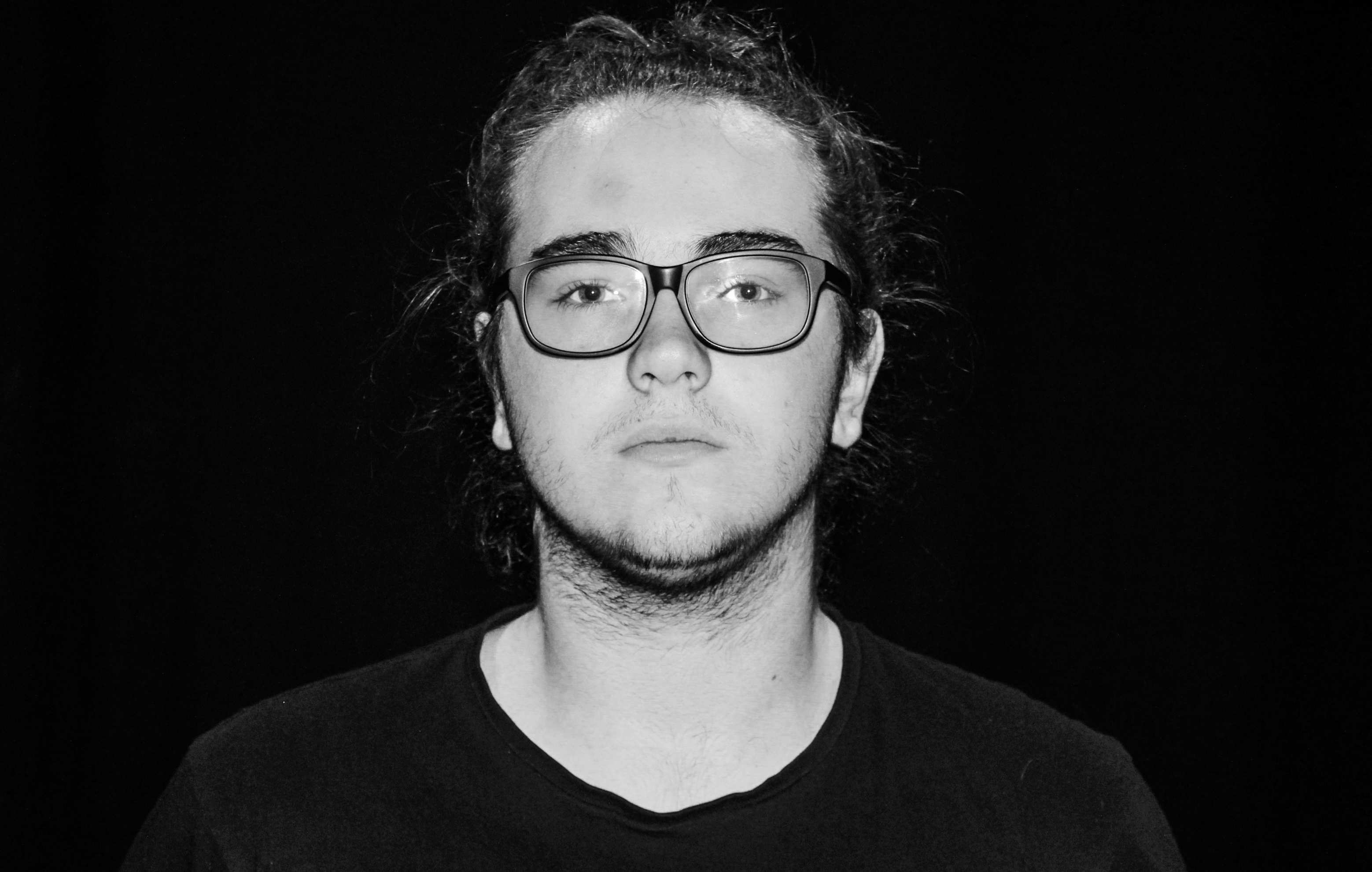
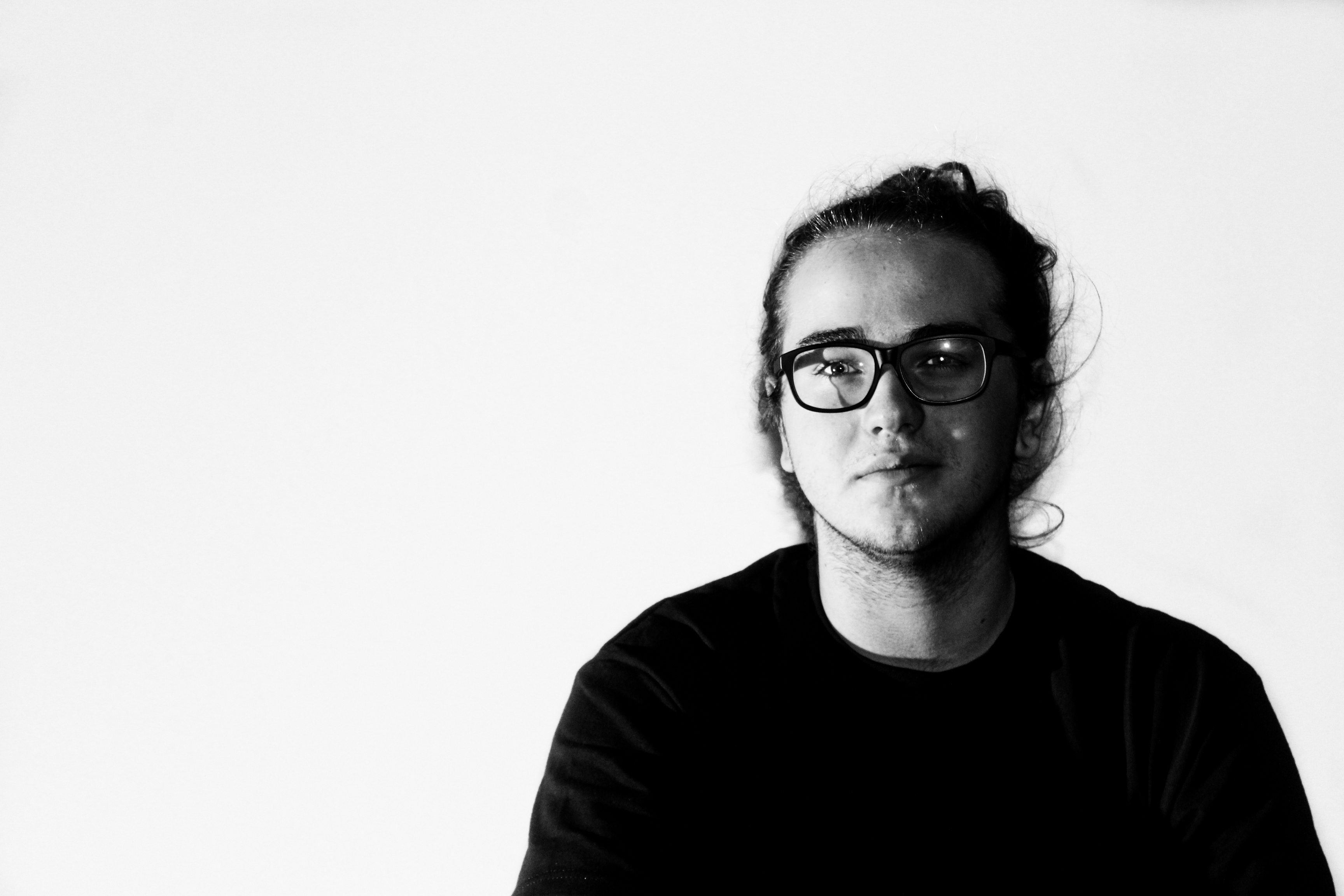
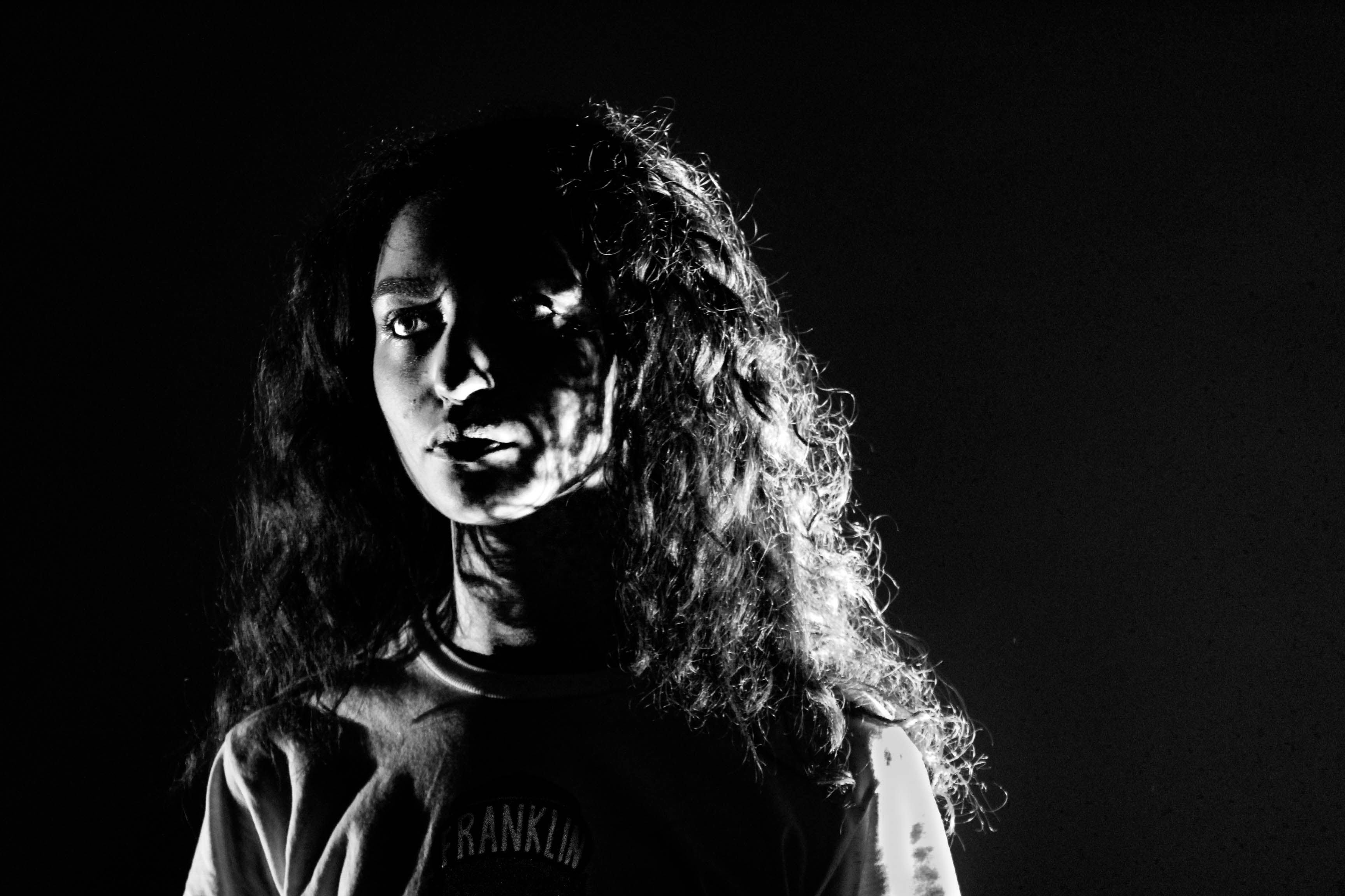
For this photo shoot I intend to explore a larger range of lighting and backdrops to display a wide range of studio photographs. My previous photoshoot consisted of plain facial expressions and didn’t create a story or portray any sense of the models personality. Inspired by work produced by Rankin I decided to take some more images within the school studio to try and capture images which can convey a story or sense of emotion in which the model is feeling. I also wanted to try and incorporate a greater understanding of chiaroscuro by editing the images to be highly contrasted.
Contact Sheet


Edits

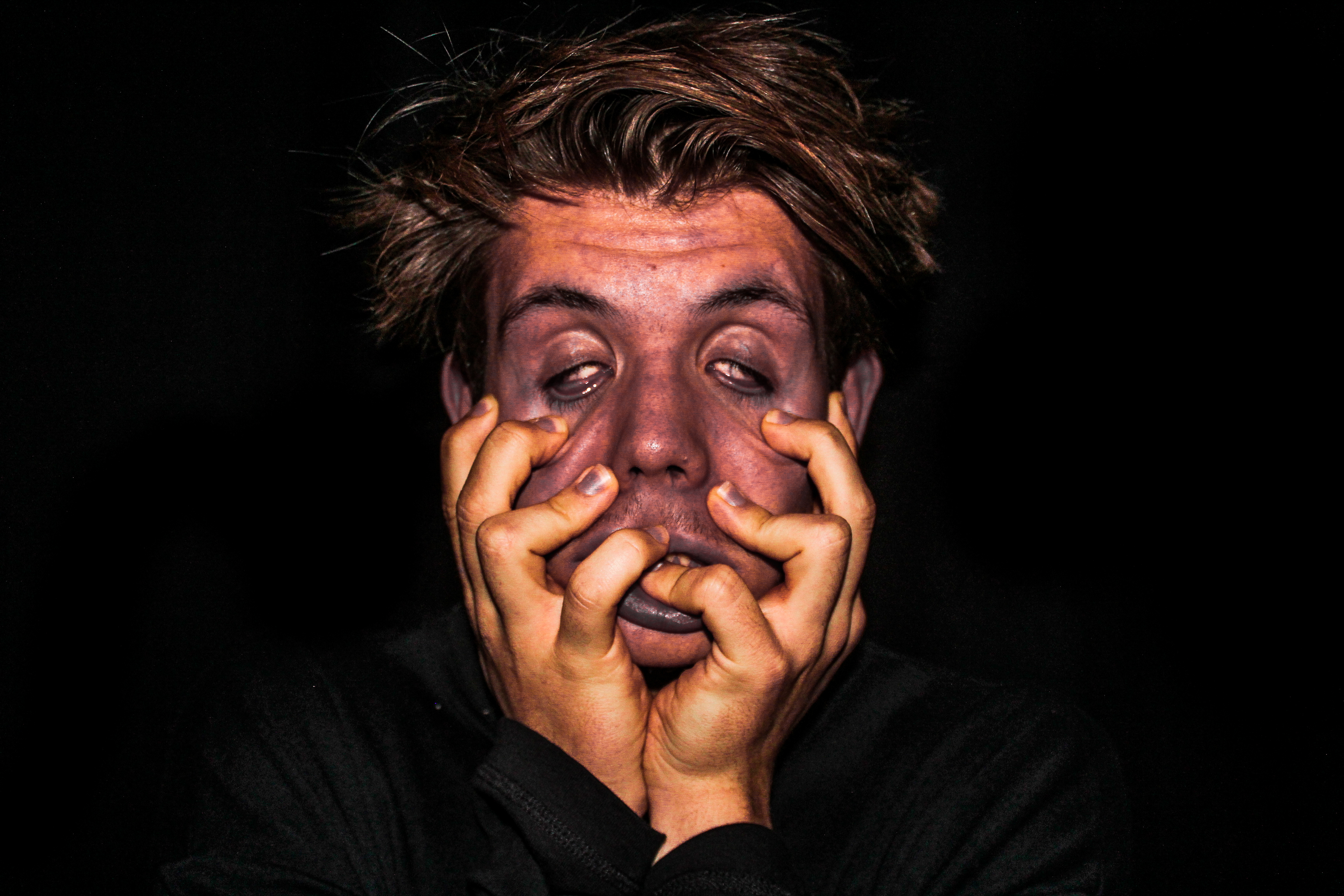

My Favourite Edit 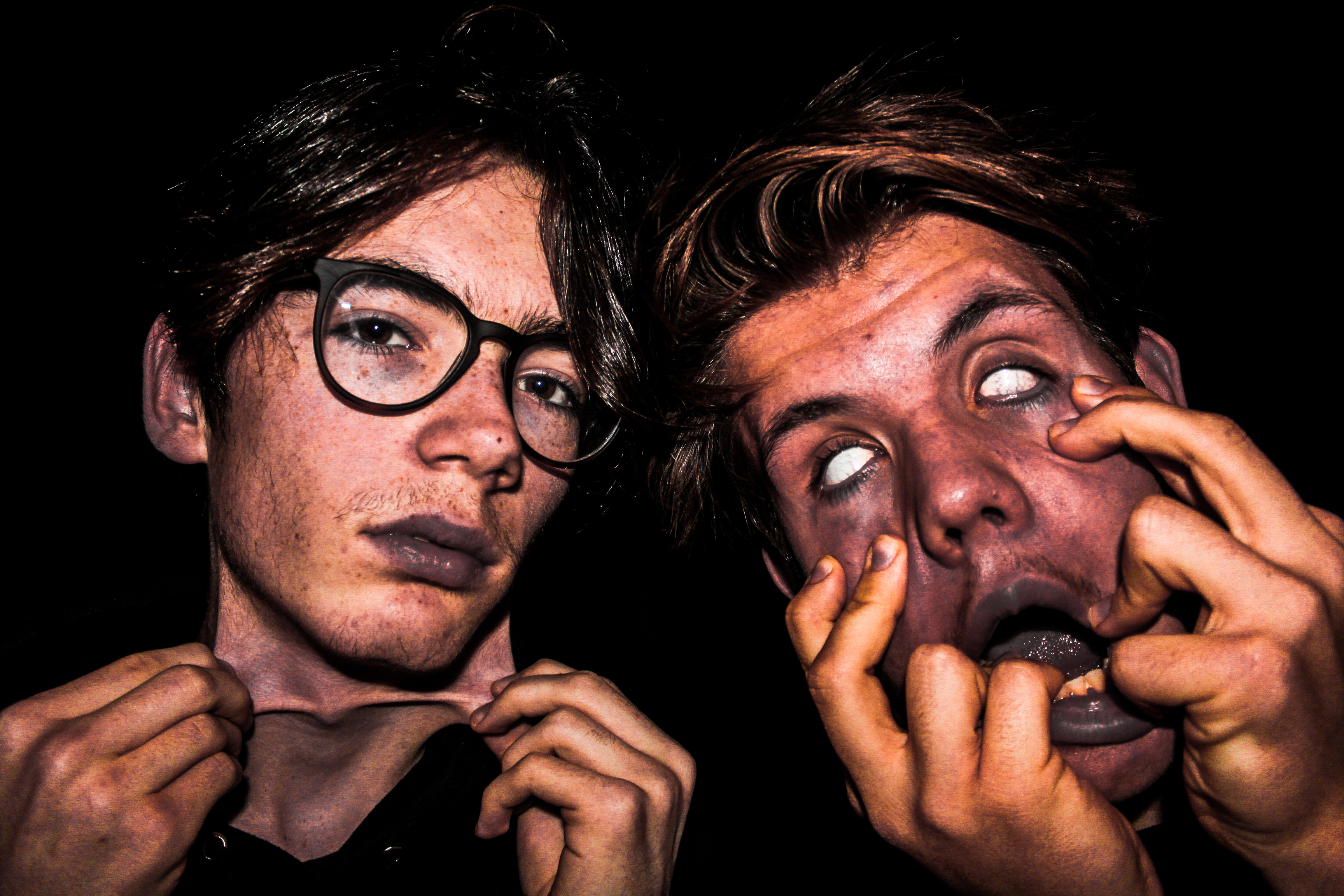
Within the process of taking this photo, I used artificial lighting in the studio with a blackened background. Using artificial lighting, mainly which came from the flash on my camera, helped to illuminate my models faces which is the main focus of the picture. I also used back lighting from above to help bring out the models hair, however it wasn’t too bright that made the hair distracting from the key elements of the photograph like the stretched parts of skin. I directed this photo with the intention to create a strong emotional response on the viewer which i believe has been successfully achieved. The image almost reflects a sense of deformity or could relate to physical abuse which is are very touching and horrifying topics. I like how the high contrast between the background and the facial features really brings out these themes which were intended to portray. To create the distorted effect upon the models faces, I played around with all the colours within Lightroom and increased the clarity by around 80 to really emphasis the detail within the face. Increasing the clarity really helped to bring the image alive to give an extra punch and impact. I think this image was successful, not only because of the detail and the editing as a whole, but due to the story I was able to create, which could vary across several topics leading to the viewer able to unpick and interpret the photo how they like.
creative photography
what is tableau photography:
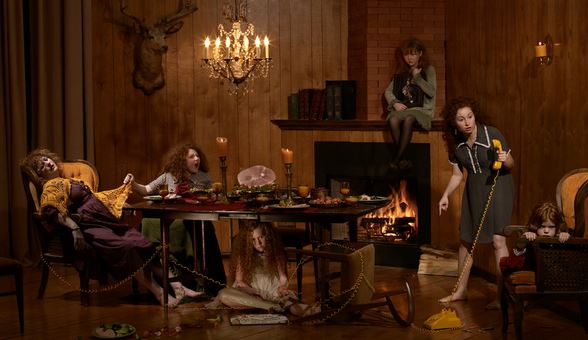
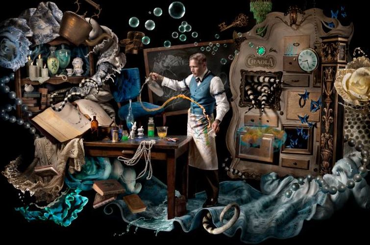
Tableau photograhy comes from Tableau vivant, it is French for ‘living picture’, is a style of artistic presentation, often shortened to simply tableau. It most often describes a group of suitably costumed actors, carefully posed.it is seen to be somewhat romantic and symbolic.It is meant to be short and dramatic.It is all about his the environment reprints a whotle sotry and as to how everything is put in a. place for a reason and everything has a symbolic purpose altogether.it is highly creative and can be used to present a scenario of more surrealistic ideas or even in order to create a historically famous artwork,into a Modern day photographic presents the Modern struggles presented throughout the work. The key characteristics of the contemporary photographic tableau according to Chevrier are, firstly:
“They are designed and produced for the wall. summoning a confrontational experience on the part of the spectator that sharply contrasts with the habitual processes of appropriation and projection whereby photographic images are normally received and “consumed”
creative photography ideas :
For creative photography I wanted to focus more upon interesting concepts rather than artists themselves. I want to portray many aspects of illusions that can be achieved through composition and further editing.Lots of ideas that I have seen that inspire me,are images surrounding water,and the development of color and the dripping of lighting and also reflections within the water. This can be seen within the following:The second Idea I have would be surrounding a movement of slow shutter speed,this allows a sense of movement that is create and allows a sense of duplication of faces which is effective. There is also an additional sense of illusion within the work that allows further experimentation within reelections and editing to the images themselves.furthermore the third creative idea I have is using mirrors,in order to show repetition within the face and also to show illusions of lack of body or interesting angles to capture a hand holing a mirror which clearly shows a face.these were all inspire by my artists seen below.
first artist Aaron Nace:
Aaron Face is a photographer who uses tableau photography very much in his work.His images resume surrealistic and used in order to show a more imaginative world and more expression shown continually throughout. is a self taught artists,who specializes his work by using Photoshop and using many levels in order to create an almost abstract feel. He said he enjoys using Photoshop in order to act much like a paint brush,this creates a free flowing feel to his images.
lots of the images from below are from an exhibition called ‘visions of whimsy’ This is used to demonstrate a world in which there standards and expectation revolved and also highly creative and surreal imagination and also highly creative altogether
. 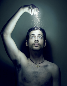
I chose this image because of the light and how it enhances all the elements of the photo itself, furthermore it also presents ways in which magic can be repressed in a more realistic circumstance and also masculine standards presented and who he is and his contextual beliefs too.
I think this artists will help in benefiting my work because it has many abilities of imagination creative aspects too enhance people and how their conceptual thoughts are shown throughout themes like their personality.The attachment within this identity is less to do with a lack of identity but more to be finding their identity in a surrealistic way in how represents them as a whole.I want to continue to show they are diverse but within a more surrealistic way and perhaps less stereotypical and sad.
Second artist Cristina Otero:
she is a Spanish photographer and a well known artists best known for her individuality within exhibited portraiture.she is the youngest of three and founder love and passion for photography at just the age 13,this was due to the fashion photography show Americas next top model, this was due to her being intrigued within makeup and styling and ways inward which lighting had such a large impact .she further specializes within close up portraits,she was exhibited at just the young age of 15 and this is what started off her very creative sense of style.all her work varies very much, making no piece quite exactly other,but she does always have a strong continuation of a sense of abstract and creativity within makeup,composition and the coloring used thought out.throughout her work you can Clearly see a more gruesome and perhaps more vulnerable she to herself throughout her photography. Although these pieces are not my favorite I can see how a sense of hardship has inspired her throughout all of her work.I have chosen work from three of her exhibitions in which I feel I could further use these creative ideas and as to what was inspired by them;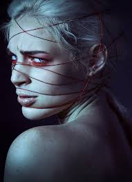
I like this image due t the interposing sense of medium on her face,which creates a sense and molding depth of field and a sense of interest and substance to the piece itself,furthermore the color gradually darkening successfully compliments the background and creates a mysterious and possibly sinister tone to the piece itself.the red under the eyes creates a color contrasting also draws a directness of attention also emphasized with the direction as to where her eyes face, the string itself allows the conceptual concept that she herself is stuck and show the artists cretaive ideas to symbolize a more dark meaningful representation to people.
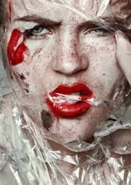
In addition I was also inspired by this piece, due to the juxtaposing sense of textures and create a scorched sense of movement within the case itself, it creates an interesting tone of effect too as it is see throughout so from a way of exaggerating colour. This look was a inspired by her conceptual concept of beauty standards and was in order to show a sense of everyday clown effect, and how it is a hunoures matter in which people worry about their representation within society today.i think her expression is quite powerful and it furthers the kind of the almost ragged sharp plastic covering hermit shows strength and I find this intriguing within her work.
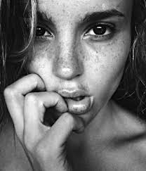
I chose this image lastly due to it being unlike any of her previously seen workout shows a sense of natural meaty within her work but while also having really deep tones that create a larger sense of persona to the piece itself. the composition of a very strong close up on hr hand is changed within how her hand shows a sense of delicacy but also obstruction from within the rest of her face,again creating an interposing composition to the piece.
From her work ideas that I will use: I want to show a large divertsity of color ideas and interesting concepts that she includes in her work, such as power and also a sense of sinister toning.inspiration for shoots: I would like to do a shoot using light and string in order to create an exaggerate persona and connote a struggle while also showing an interposing conceptual concept and visual aspects. ,furthermore I would to focus on direct close ups on portraiture aspects, and also use this to enhance a tone and persona to the image itself.
This work could be further linked to the idea of loss of unity throughout the struggle and hard pressure that are seen to be under, such as the rope wrapping around the face preeners the idea of struggle and also thatch is contraindicated,this shows how they feel lost and toed up within their emotions not known how they themselves are and almost use the rope as a metaphorical device that they are and unable to continue.
HOMEWORK ASSIGNMENT // STUDIO LIGHTING
Planning
Task – Produce 100-200 images showing your understanding and control of studio lighting.
Models/props – White Backdrop for bright images, Black Backdrop for darker images, spotlight, reflectors, filters, models.
Camera settings – I intend to use an ISO value on 100 to ensure the quality is kept to a high standard and the shutter speed of about 1/125 however i will alter it to fit the lighting used at the time.
Lighting – I will be using red head lights, spotlights, natural light and flash to capture a wide range of images.
Location – School studio
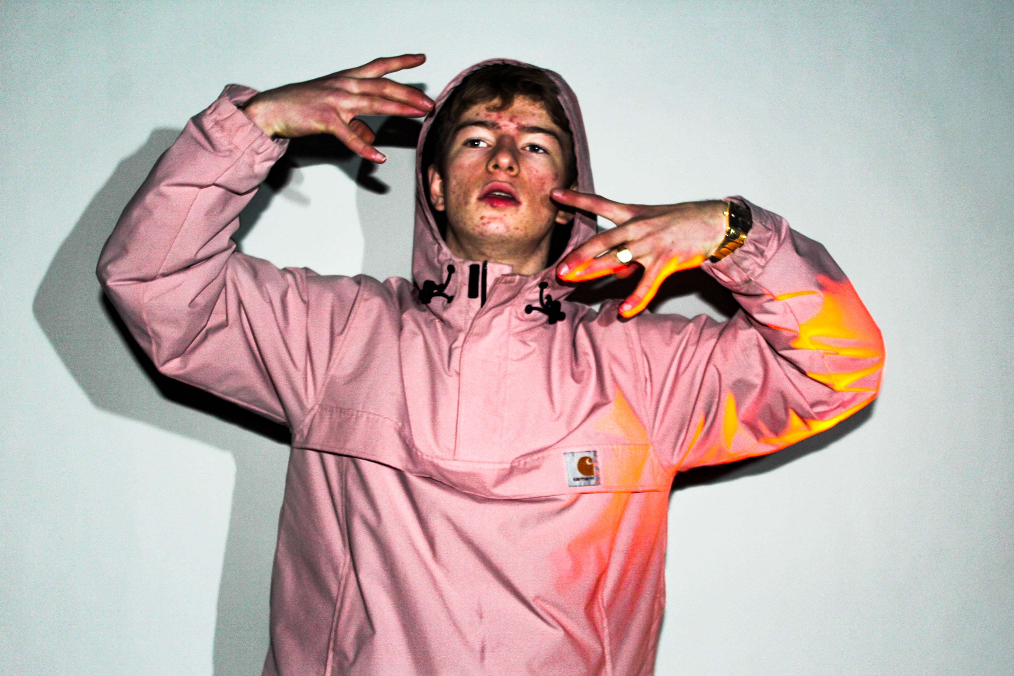
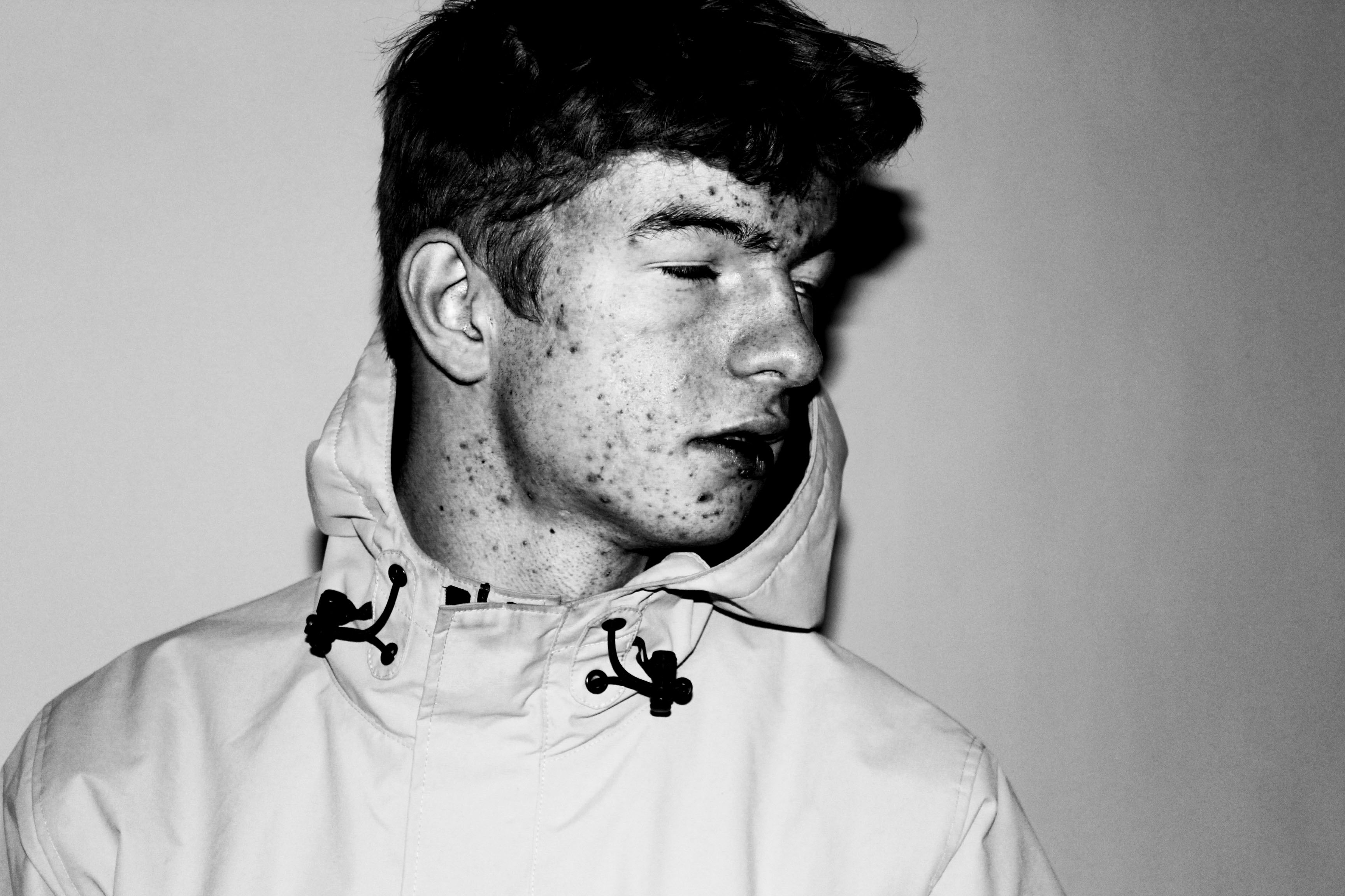
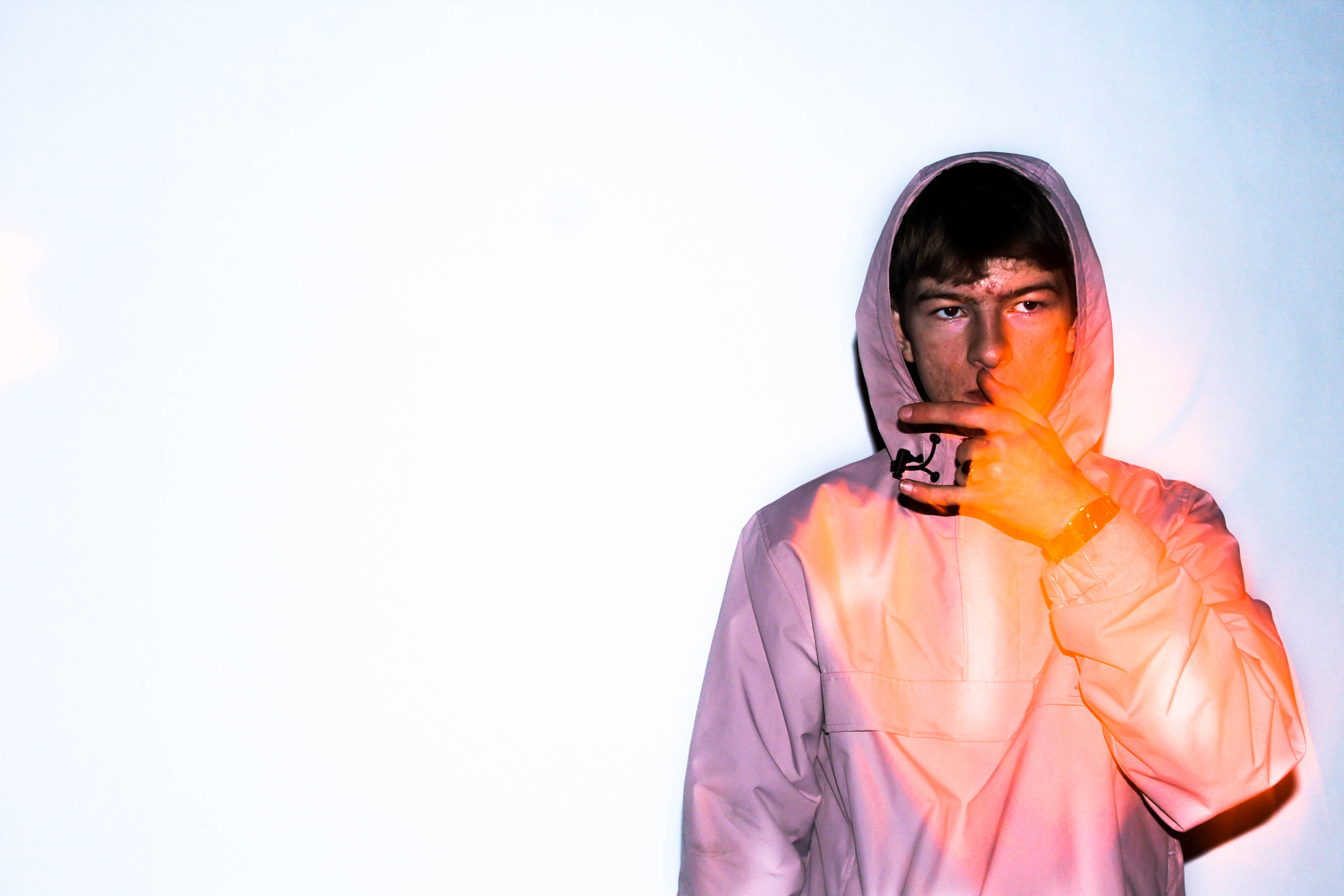
Concept – To capture a range of studio photographs in the style of David Bailey whilst incorporating the style of chiaroscuro.
David Baily
David Bailey was born in Leytonstone East London to Herbert Bailey, a tailor’s cutter, and his wife, Sharon, a machinist.
Bailey developed a love of natural history, and this led him into photography. Suffering from undiagnosed dyslexia, he experienced problems at school. He attended a private school, Calrk’s College in ilford, where he says they taught him less than the more basic council school. As well as dyslexia he also has the motor skill disorder dyspraxia.
In one school year, he claims he only attended 33 times. He left school on his fifteenth birthday, to become a copy boy at the Fleet Street offices of the Yorkshire post. He raced through a series of dead end jobs, before his call up for National Service in 1956, serving with the Royal Air Force in Singapore in 1957. The appropriation of his trumpet forced him to consider other creative outlets, and he bought a Rolleiflex camera.
He was demobbed in August 1958, and determined to pursue a career in photography, he bought a Canon rangefinder camera. Unable to obtain a place at the London COllage of Prinitng because of his school record, he became a second assistant to David Ollins, in Charlotte Mews. He earned £3.50 a week, and acted as studio dogsbody. He was delighted to be called to an interview with photographer John French.


Photo Analysis

I am inspired by this image due to the sheer simplicity of it, yet effectiveness it has. It has a large tonal range with strong contrast which helps to bring out certain and important elements of the photograph. There is a high contrast between the background which is completely white and the mans coat which he appears to be wearing which is all blackened. I think that a low ISO of about 100 or 200 would have been used due to the fact the image is of such high quality. The bright light upon his face has been implemented through the use of spotlights directed into the right side of his face (his left). This use of lighting has created a strong contrast on the opposing side of his face. This effect may have been deliberately used to create a sense of mystery or secrecy. The composition of this photo is effective in the way that we are drawn to look at the eyes of the model which helps the viewer to engage with the photo.
Contact Sheet
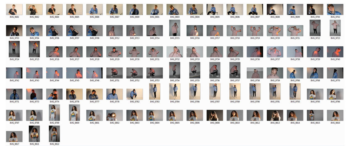
Edits

Photoshop Burn And Dodge Tools
What is the burn and dodge tool? The burn and dodge tool allow you to either darken or lighten an image of your choice. This can be used to create dramatic effect within an image, and so can use it to lighten dark areas or darken parts you want to stand out the most. This is used in portraiture due to how it can be used to make certain features stand out above the rest, such as making one side of the face darker. The image below shows the effects of dodge and burn to a grey surface:I wanted to apply this to an image of mine to see the effects that could be made. These were my steps: 1) Navigate to the selection bar on the left, and pick the burn tool.
2) Select a suitable size for the brush to match the face, and go over the parts of the face I want to darken once.
3) Go back to the bar on the left and select the dodge tool instead, from there I lightened the parts of the image I wanted to have a clear contrast from the darkness.
David Bailey And Rankin
David Bailey
David is considered on of the best pioneers of contemporary photography,he is credited with photoghing such compelling images whit the last 5 decades .he became famous when when making new generation models famous for many impresses roles in order to inspire critics.He is seen continually never failing to impress and captures Manu icon images within famous icons such as the Rolling Stone and Kate moss.although he has a simple style is does not lesson his large impact go tones that generate their own light and personality to the people themselves.
David Bailey was born in East London,to Herbert Bailey, a tailor’s cutter, and his wife, Sharon, a machinist. From the age of three he lived in East Ham. He enjoyed his dads more creative fashion of creating something with power and purpose that also helps define a person in a style in which they want. Although Bailey soon developed a more educational love for history in which led him into photoghy,despite suffering form dslyexia and school being a highly troubling time for himself, he seen attended a prestigious school in which they taught him the basics.His children all later in life have too be surrounding thmslevs in creative works this gene is seen to run whiten the family.
He was soon contracted to be a fashion photogher for vogue magazine, and undertook many freelance work.he later became a swing photogher in order to cpature many celebrities photos due to them having a large self persona in which he could easily show throughout his own work.An unusual and unique commercial release. It reflected the changing status of the photographer that one could sell a collection of prints in this way. Strong objection to the presence of the Krays by fellow photographer, Lord Snowden, was the major reason no American edition of the “Box” was released, and that a second British edition was not issued.for his work he hs know won many awards,bsed upon excellence,and his work is now even seen within the partite gallery.
My favourite image anylsis:
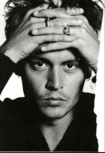
I then chose this image due to the dynamic range id dark and light contrasting tones that further the appearance of the structure upon his face, and also the dynamic and interposing composition of how the hands are placed and then how this forms an almost frame two the piece itself,allowing every tone and shape to work together effectively.
overall I would want to use his work of framing and angles in order to exaggerate lighting and reflect a personal theme to a piece.
Rankin
Rankin is a photogher and has been for around 20 years, he was training to be a lawyer but decided that he wanted to investigate more around the create side of photo journalism and soon moved to a more controlled studio photoshoots.he know has many class renowned books upon the illusion of photoghy and how you are able to also physically change an image with your own self creativity. he attendedLondon collage of painting with to him was his optimal of fine art and found that their fisilities unabated him to achieve great accounts of photoghy and inspire him fornhis future career.
He then met Jefferson Hack, with whom he formed a working relationship. In 1992, the two decided to start a magazine together called Dazed and Confused after they graduated, this magazine was inspired by many studio shoots further developed into such interesting designs full of extraordinary photography . he always donates many of his success from his work to charity such as the woman organisation,furthermore has work is known to have change fashion and how it is seen and also developed throughout his own work. he now has many biographies and sometimes you are able to see him teaching young teens like himself when he started his photography journey.
Within his work he also wants to be able to capture interposing people within a vibrant personality and not be condoned to only working on shoots in which he is paid. rankin has such diversity within each photo, he chooses scenarios and angles with suit the persona of the subject and does not have a specific style inn hich he sticks to
my favourite image analysis:
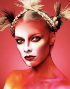
This image is a fashion based image in which he is trying to connote a-sense of unity of life throughout the vibrancy of the colours and ways inward which they are used to represented the darker tones but do not lessen the achievement of highlight within the image itself. the model herself is seen complimented by the colours and not overwhelmed in presents a personality of confidence which is suiting for a fashion magazine. furthermore her hair create a. juxtaposing raggedness that also highlights the darker red tones, this bring s an aspect of unity to the image. his conceptual thought foe this piece was a new intense side of beauty and how it can be shown in a large variety of ways in which I think he haw achieved.
From looking at his work I too would want to bring a sense of individuality and creativity,and not be compressed to a specific style of achievement. I think his work has such a large range of ideas and authenticity I could look at many different angles of colour and compoktionig that I would be inspired by his work.
What Is Street Photography?
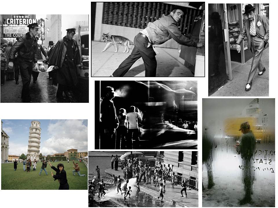
Street photography is a type of photography that features subjects in candid situations within public places. Street photographs are used to display how people behave in society.
A Candid Photograph is one in which the subject has not posed for the camera, they have been naturally caught in the image in whatever situation they are in.
Rankin
Who is Rankin? John Rankin (born 1966) is a British portrait photographer and fashion photographer. He made his name in publishing and founding the seminal monthly magazine Dazed & Confused with Jefferson Hack in 1922. The magazine went on to forge distinctive marks in the arts and publishing spheres, whilst developing a cult status forming and molding trends, bringing some of the brightest lights to fashion. And today is one of the leading online fashion and cultural brands.Rankin creates landmark editorial and advertising campaigns, with his work being some of the most celebrated by the biggest brands, charities etc. Rankin has published thirty books, and has his work exhibited around the world. In 2011, Rankin Film Productions was made to make music videos, commercials, and short films. Some of his work consists of:
I found that when Rankin captured the subjects features, he tended to base them around the head, making a certain aspect pop out (eyes, teeth and mouth). Through this it showed what defined them as an individual rather than what people saw them as.
Chiaroscuro
What is chiaroscuro drawing? chiaroscuro is the effect of light modelling in painting, drawing, or print making where three-dimensional volume is suggested by the value gradation of color and the analytical division of light and shadow shapes (Known as shading). Chiaroscuro has been used since the Renaissance and Baroque period where the artists wanted to engage their viewers. To do this one side of the subject tends to be darker than the other, usually bringing out an aspect of their features, and really drawing your eyes to it.How is it used in modern photography? Chiaroscuro is used within modern photography today to create dramatic portraits by making certain aspects of an image once again stand out as seen below:
Using this technique it allow as seen, it can also be used today to make aspects of objects as well as people stand out. When compared to the art, the chiaroscuro inside photography tends to be more dark and dramatic than the art, which tends to just make one side of the face slightly darker.
Street Photography – Homework
Planning
Task – Take 100-250 photos in an urbanised environment with people as the main focus.
Models/Props – Friends and strangers
Camera Settings – I will use a quick shutter speed of about 1/100-1/500 depending on how fast the subjects are moving as I plan on photographing them whilst they naturally move around. I will use a low ISO as the area I will take photos in will be well lit with street lighting.
Lighting – Natural lighting will mostly be used however may be necessary to use a flash to highlight key aspects in my models face
Location – In town as this is an urbanised area
Context – Photographing strangers and friends without them aware of the photo being taken in order to capture a realistic view of how they would be behaving.
Concept – To capture street photographs in the style of Vivian Maier and Robert Frank.
Vivian Maier
Vivian Maier (1926-2009) was an American street photographer born in New York City. Her work was unknown and unpublished during her lifetime. In 2007, collectors found some of her prints and negatives in boxes. Her images were first published on the internet in 2008. Her work has now been exhibited in North America, Europe, Asia and South America. A lot of details about Maier’s life remains unknown.


Robert Frank
Robert Frank (born November 9, 1924) is a Swiss-American photographer and documentary film maker. His most notable work, the 1958 book titled The Americans. His style of work is classed as photo journalism and documentary/street photography.

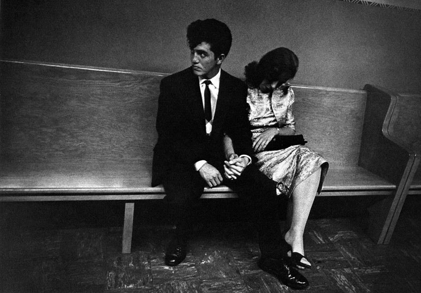
Photo Analysis
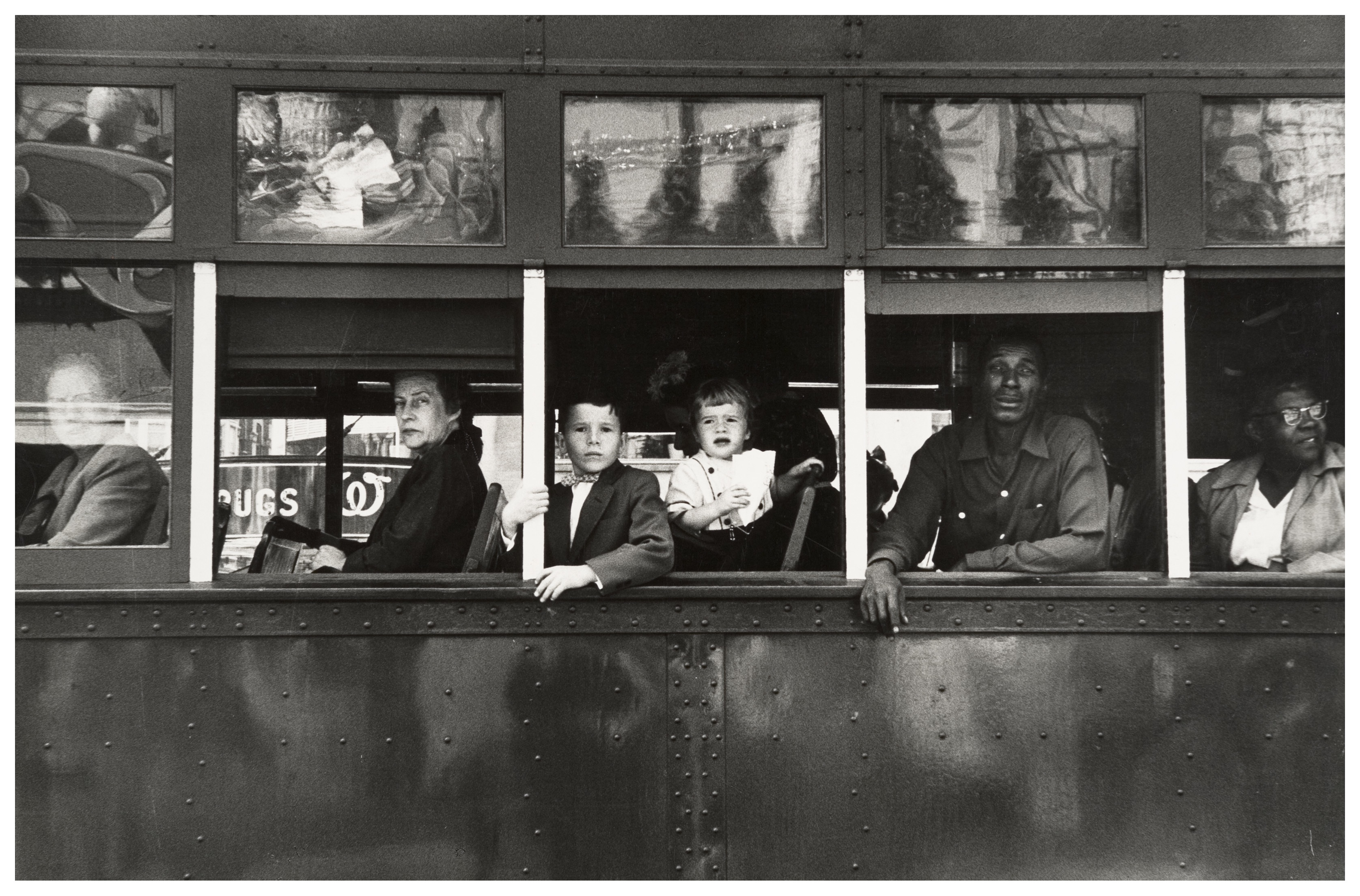
The first thing which caught my eye when observing this picture was the clear use of the rule of thirds. The bus itself create natural lines almost along the horizontal lines when following the rule of thirds. I believe this helps the viewer the see how the picture is made up of several portrait pictures. There is a large tonal range within this picture, with lighter tones towards the top and darker tones towards the bottom. The tonal range can also be seen within the skin tone of the people on the bus, from the left hand side a white man is presented and on the right hand side we are presented with a black person. We can clearly identify that Robert Frank would have used a fast shutter speed in order to take this photograph. This is because the picture is of a moving subject and would require a fast shutter speed to prevent a blur in the image. With a fast shutter speed he was able to capture a sharp photo.There is also multiple textures inside of this image, for example there is the texture of the trolley at the bottom of the image. The blots on the trolley also add another texture to the image. Moreover, there is the texture of the windows at the top of the image, these look smooth.
This image is split into 3 main sections, the top middle and bottom. The middle part is the main focus which contains the main subjects of the people. Where as the top and bottom contain some interesting textures and reflections but this is not what stands out and catches the viewers eye immediately. There is a definite contrast within this image, with the black and whites exaggerated. There is a clear contrast between the white poles/bars separating the people and the rest of the bus, perhaps influencing us that they are a main factor of the image. This photo has been captured in natural light which is expressed in the reflections at the top of the image. I think that the use of the picture being in black and white emphasizes the different races.
This image taken by Robert Franks was captured in the 1950’s. This image was also taken in America, New Orleans. At this time period, America experienced marked economic growth – with an increase in manufacturing and home construction among a post–World War II economic expansion. At this time period it was uncommon for photographers to tackle the issue of racism which is a key theme portrayed within this photo. The time period when this photo was taken was a time of racism and prejudice. Although the photo may have been an ‘accident’ as Robert Frank himself said, it may have been a powerful and strongly influential picture to help the problem with racism.
It looks as if the different races are separated from each other. The white man is at the front of the trolley while the rest are sat behind him. This can connote the fact that at this time people like that where protected by society and had more ‘privilege’. The different facial expressions of the different people can say quite a lot about the image. They all have the same serious look about them. This can represent the lives of these people. The layout of the characters in the image also represents the different classes, for example the man at the front could be a higher class than the one at the back however we do not know this it is just interpretation. The white bars can again also show the separation between the different classes.
My Photoshoot
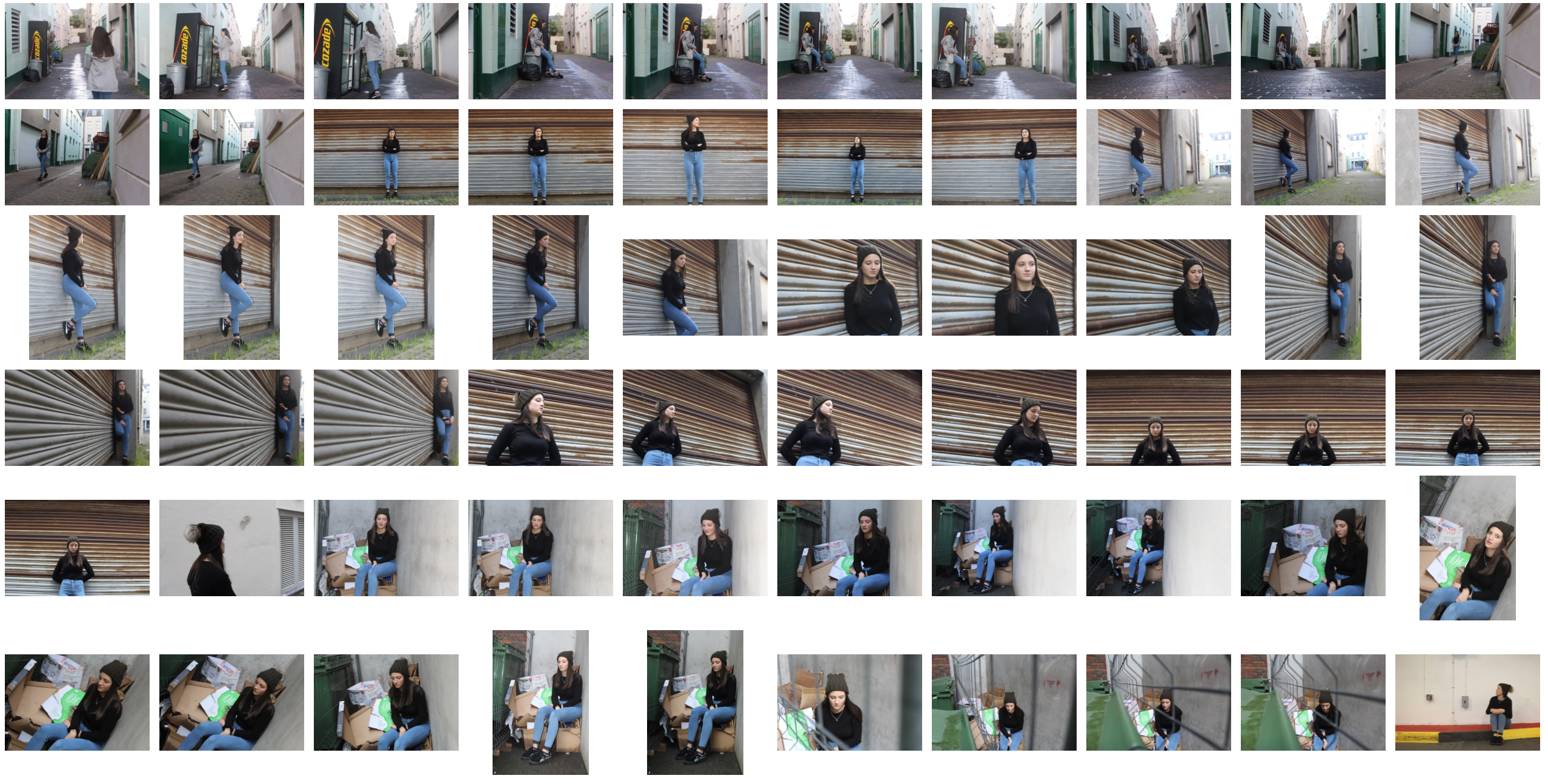
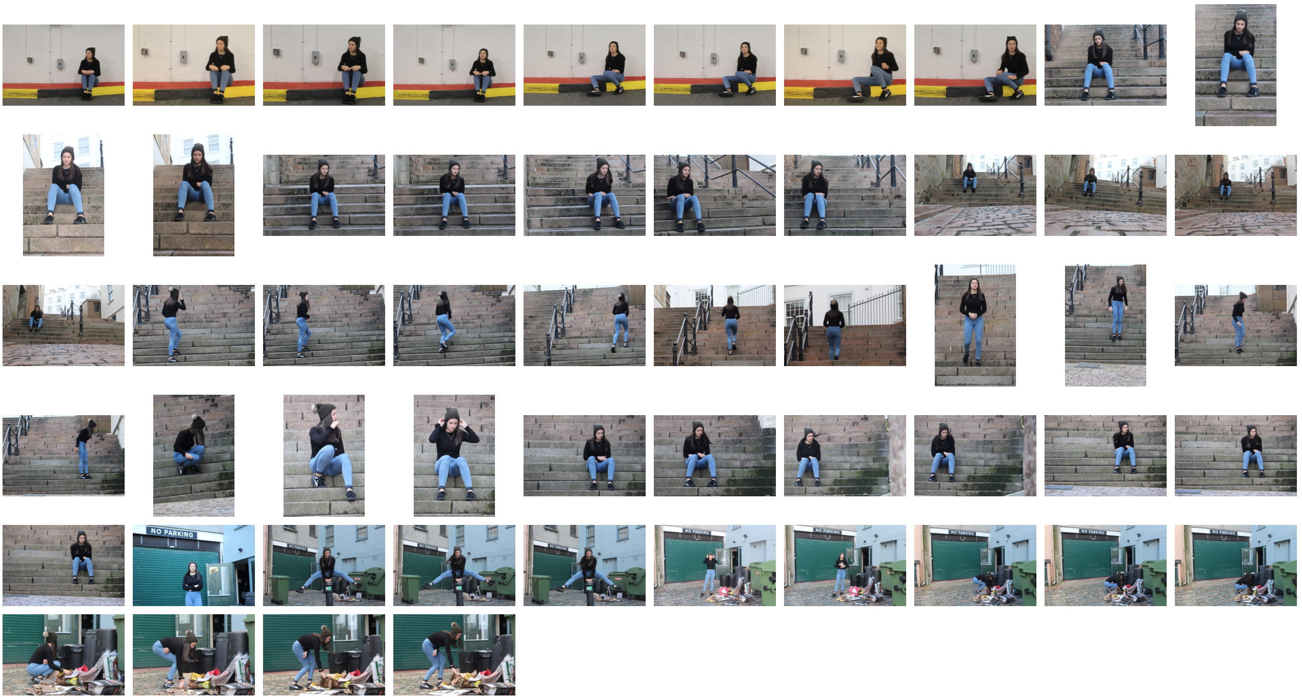
Edited Images
