Category Archives: A2 Personal Investigation

Filters

Author:
Category:

St Helier Grey Area Shoot #1

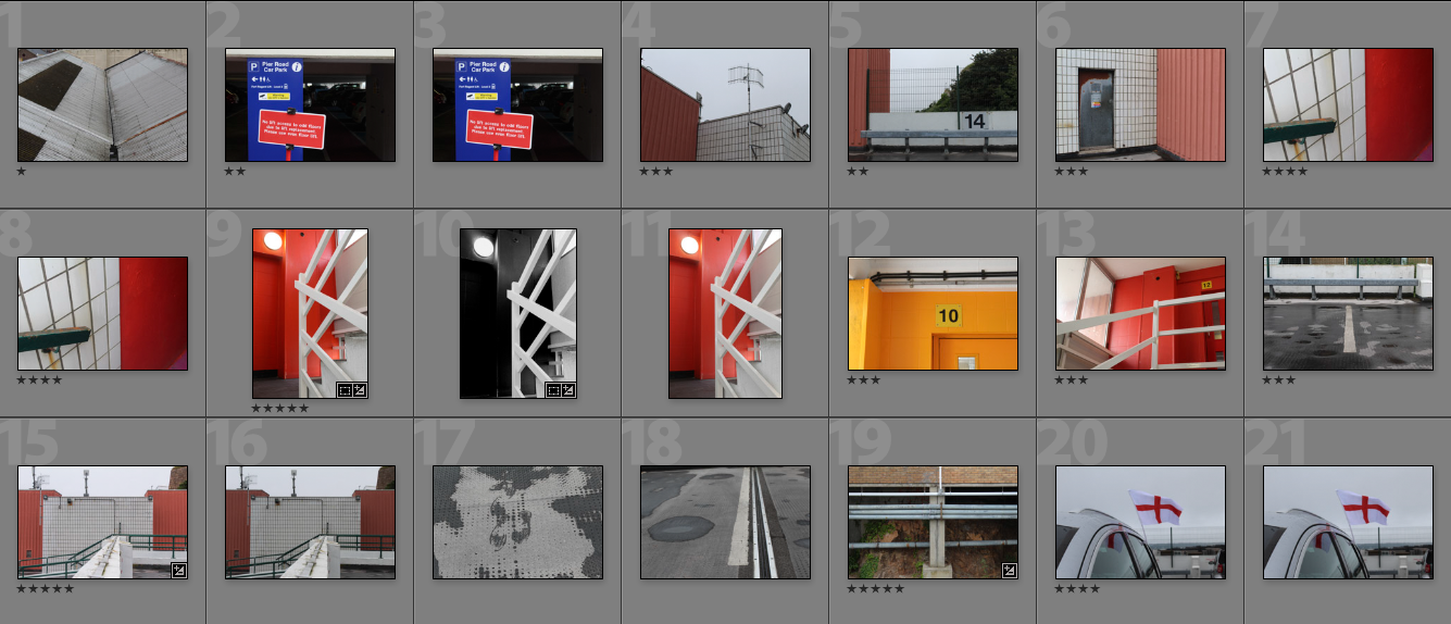
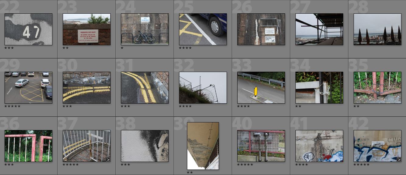
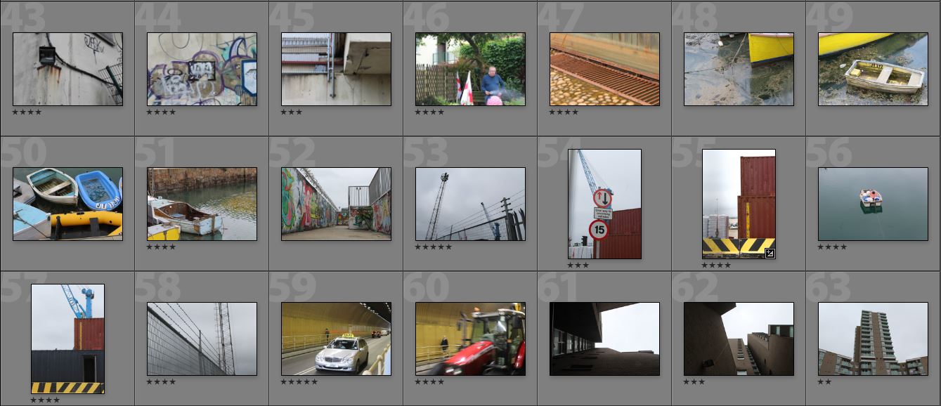
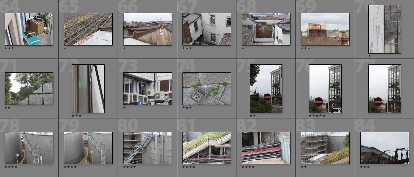
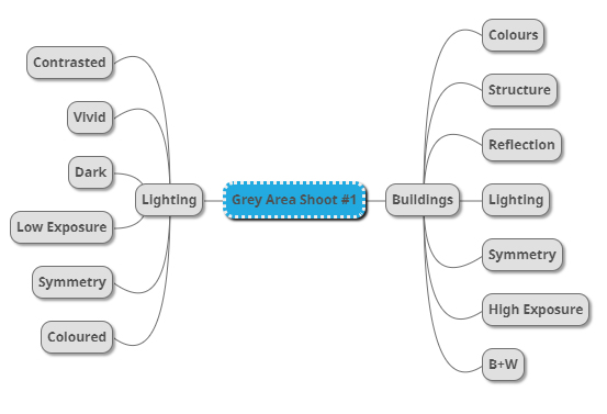
Once I was satisfied with my research regarding the given area to explore, I decided that it was time to move onto the shoot itself. When put into groups for the given area I came to the conclusion I would use a mind-map I made earlier to help direct my interests and intentions quickly towards what I wanted, by doing so it would allow more time for photographing rather than attempting to figure out what I wanted. Here are my ideas:From here I went ahead with the shoot focusing purely on what I wanted to reflect from the assigned area of town, here are my pictures from the first St Helier photography shoot:
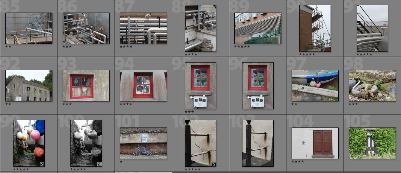
After reviewing my images taken on the shoot I decided to whittle them down to a section of the top ten images that I thought were overall the most successful pieces out of the whole batch. This would allow the process to identify the key images to use for Master plan Jersey easier whilst developing my skills on of being harsh on myself and clearly understanding which pictures are most effective. This was my top ten selection of images I thought best represented the shoot:
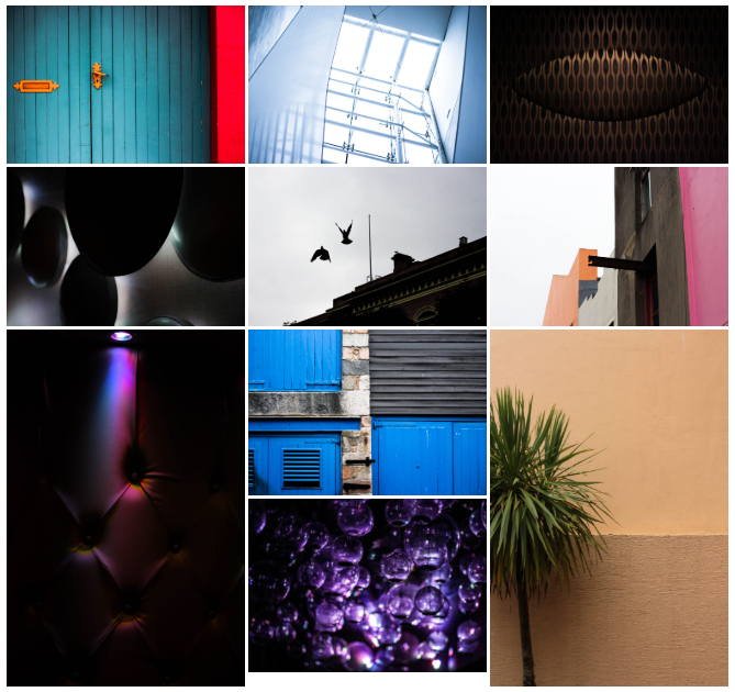
Once done I then proceeded to move onto turning those ten images into five, which I would then go onto analyze the aspects in each one which made them more successful than the others that they were separated from. Here are my decisions:
The reason I selected this image was because of the contrast between the single coloured source of light and the darkness surrounding the rest of the piece. This was made particularly effective from how the indents within the chair highlighted holes which allowed them to become reflective and a key element in the photo. The result is very abstract and so is not definite what it is meant to be, creating a kind of pattern that is carefully put together. I chose this picture because of the broken symmetry present within the left hand side of the picture. I found that the boring backdrop of two contrast oranges is complemented by the green opposing tree which breaks the piece up to become aesthetically pleasing to the viewers. The exposure in the photo highlights the wall, whilst creating a dark shadow to the tree making it stand out consequentially.
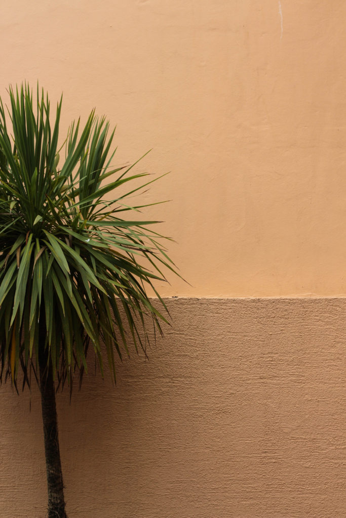
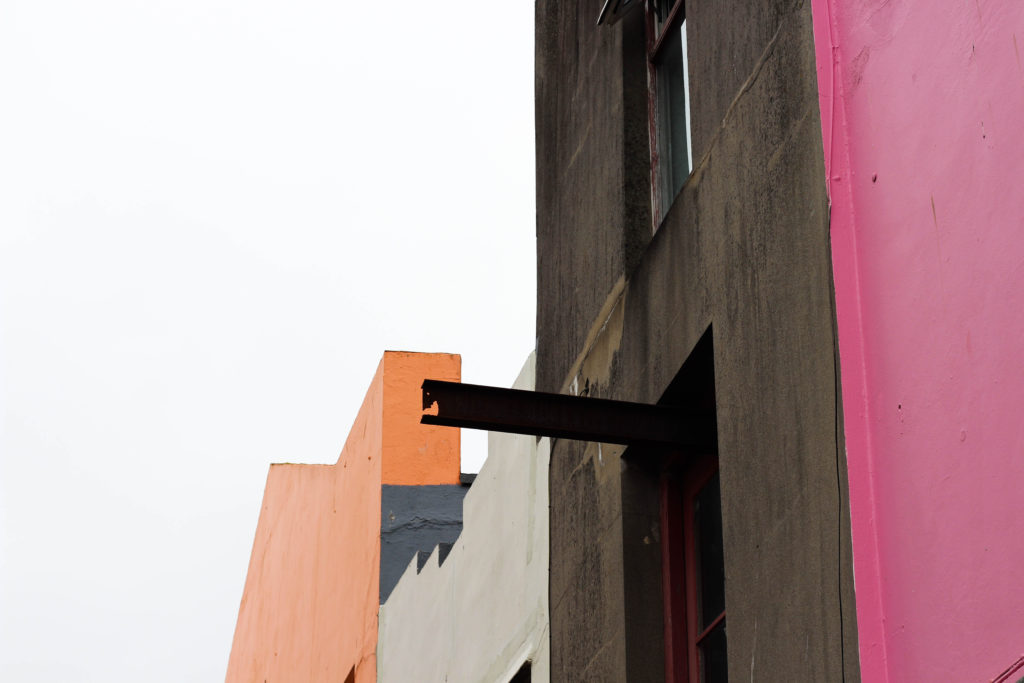
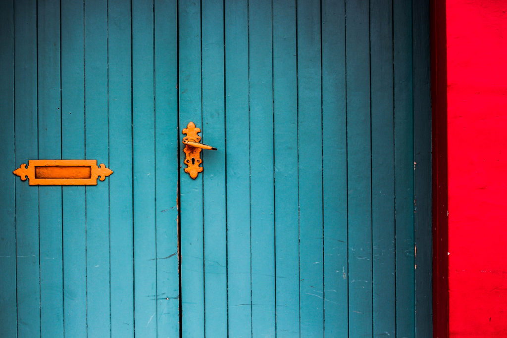
I found that the range of colours in the picture all complemented each other against the bleak sky above. The use of a slanted urban landscape creates an aesthetically pleasing result through the use of blank space which stops the vivid coloured concrete from overpowering the entire picture. There is some use of symmetry which is present through the left and right of the photograph, where half is urban and the rest is natural which can relate to the topic of Masterplan. What I liked about this photo is the use of a depth of field which centers into the middle of the piece. This creates a high form of aestheticism for the viewer as it prevents any eye-sore from occurring through any part of the image, this is also complemented by the use of a dark border which boxes the purples in and centralizes attention to the lights in the middle.  The colours present within do work well with each other as only black, white and purple are present with odd tints of blue which create a sparking abstract result overall. The photograph of the door to me was well composed composition wise, this is became of the continuous use of symmetry present throughout the image. The straight vertical and parallel lines within are complimented by the contrast colours of red, orange and blue, all which and blended together through the use of a black darkened border. I found that the red concrete streak on the right broke up the image from being too bland and overpowered by the blues, and so really balanced it out as a result.
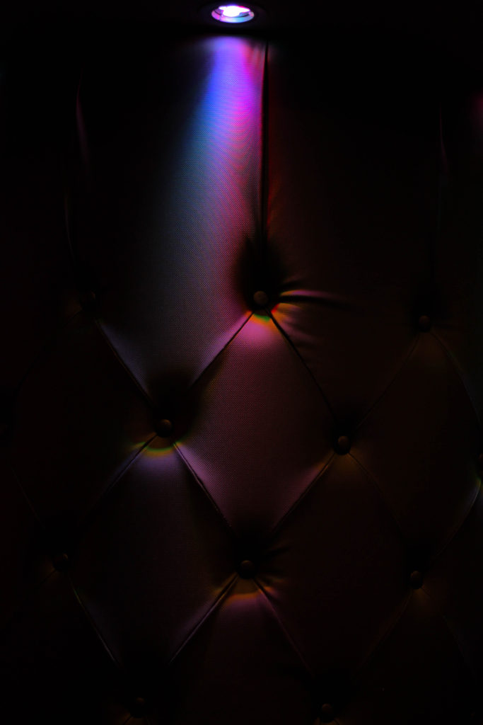
After analyzing each of my top five images, I had decided that I would be able to come to a conclusion of which image I thought was the most effective out of my entire first shoot. I would have to choose this image based on the composition, colours and the overall relevance to the topic of the development within Jersey, this was my final choice:
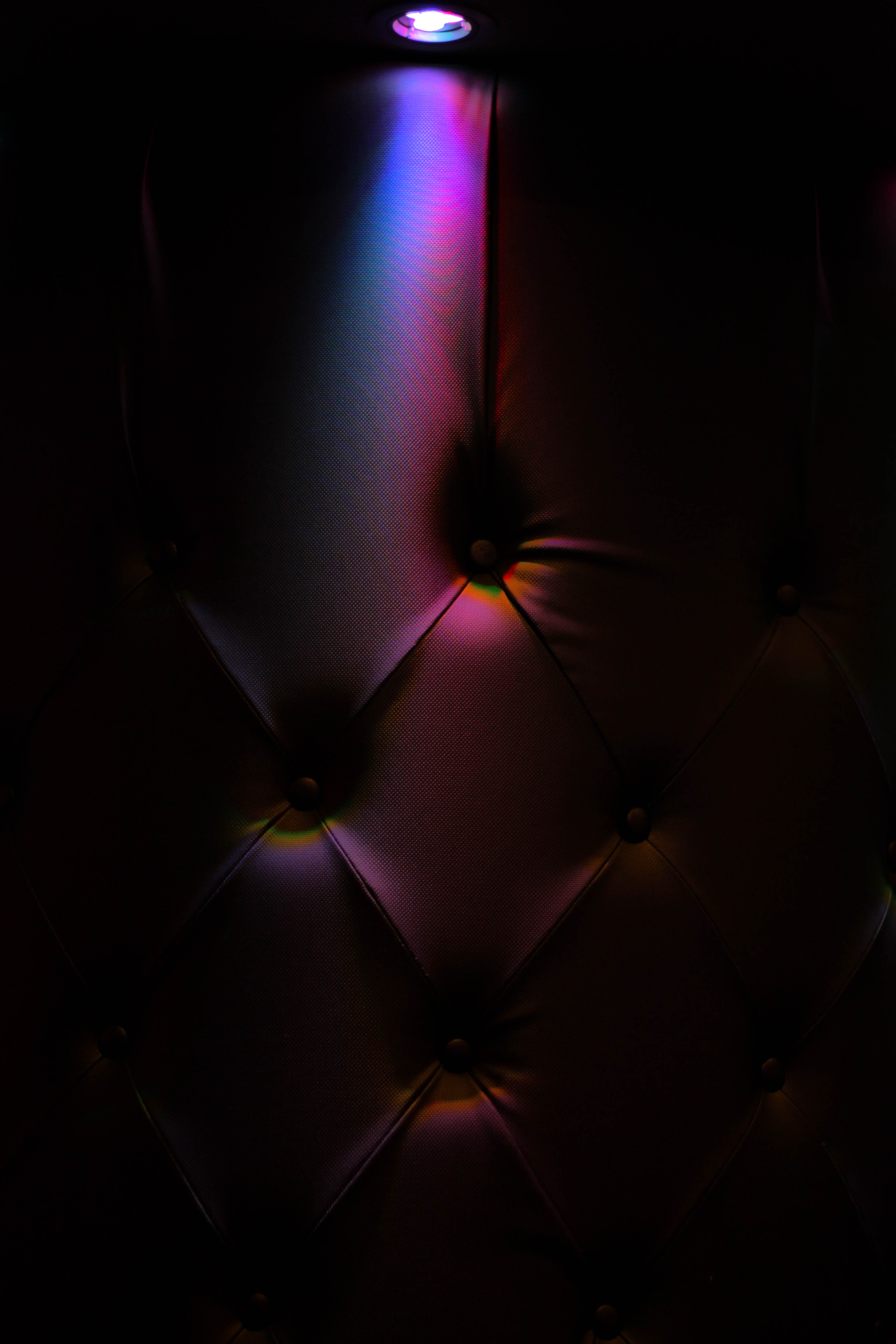
The reason I selected this as the final image for my shoot, which I thought best reflected the overall result from the future of St Helier was this image of a chair. I found that this perfectly reflected how abstract certain parts of the town were, as much of the urban areas were really contrasted against bright unique colours of random buildings. In my opinion this image represented how such vivid colours seemed out-of-place for what it was in the environment, as the chair seemed to be just dotted randomly in the middle of the darkness without any purpose or intention, much like the use of construction within St Helier. The image itself is complemented through the composition, contrasting colours, and use of a dark border to create a sense of mystery and abstract to the design which I found really brought it out as a whole.

St. Helier shoot 3


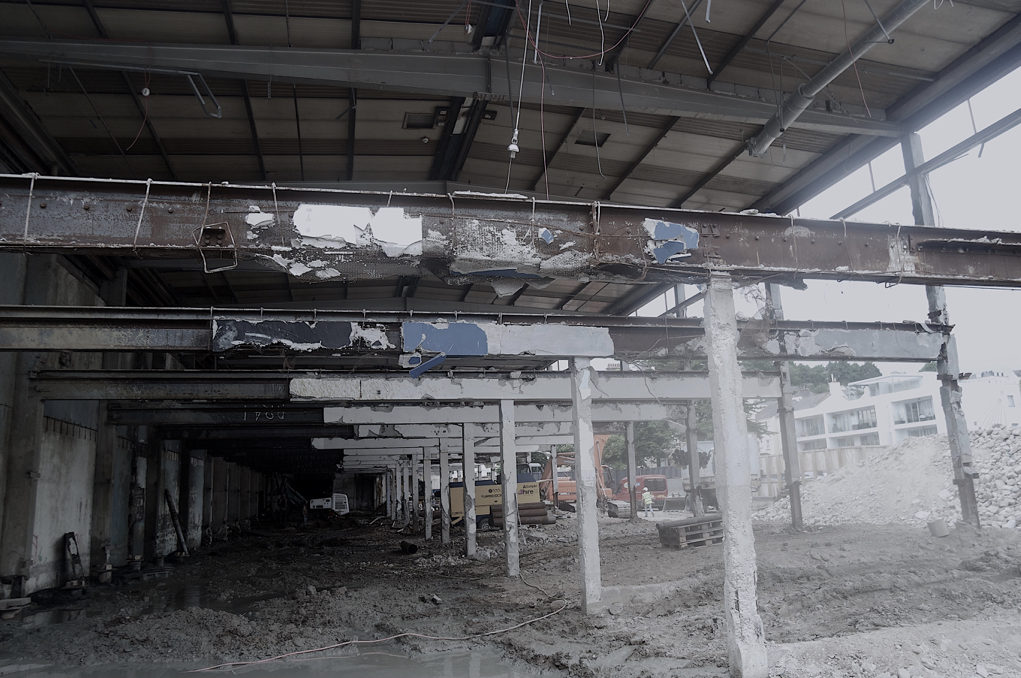
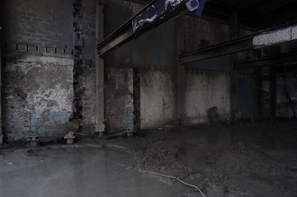
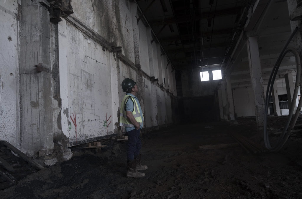
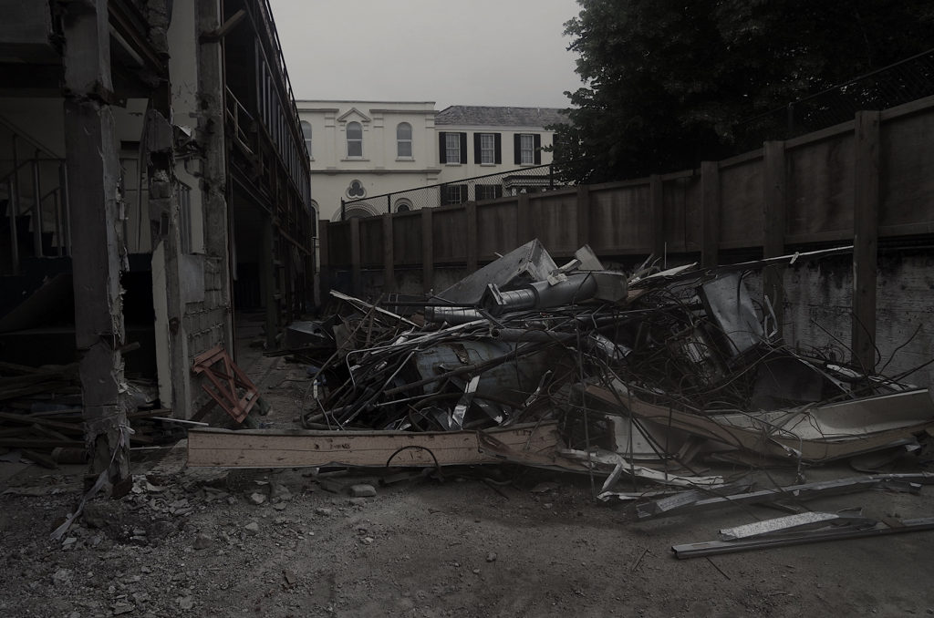
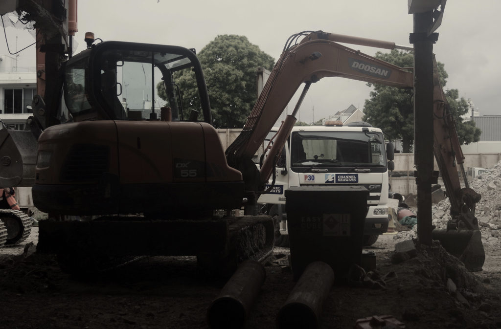
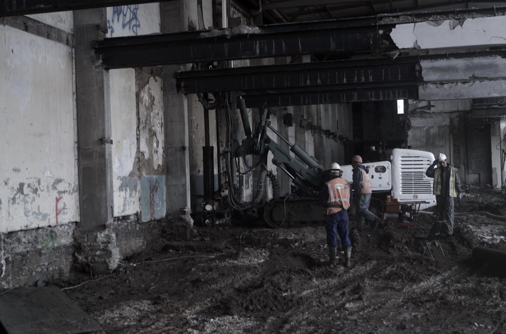
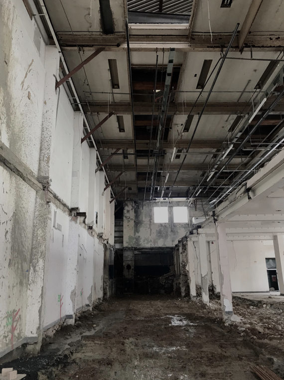
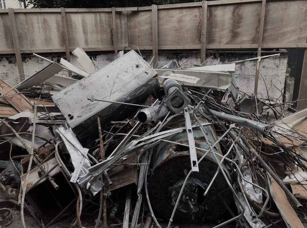
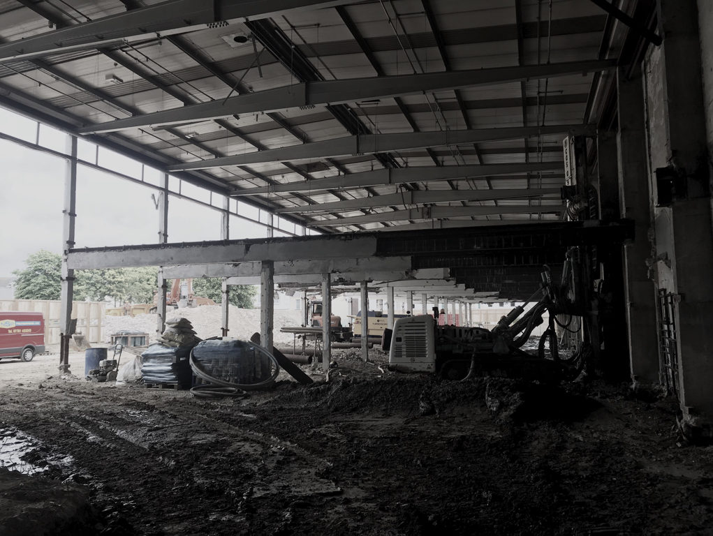
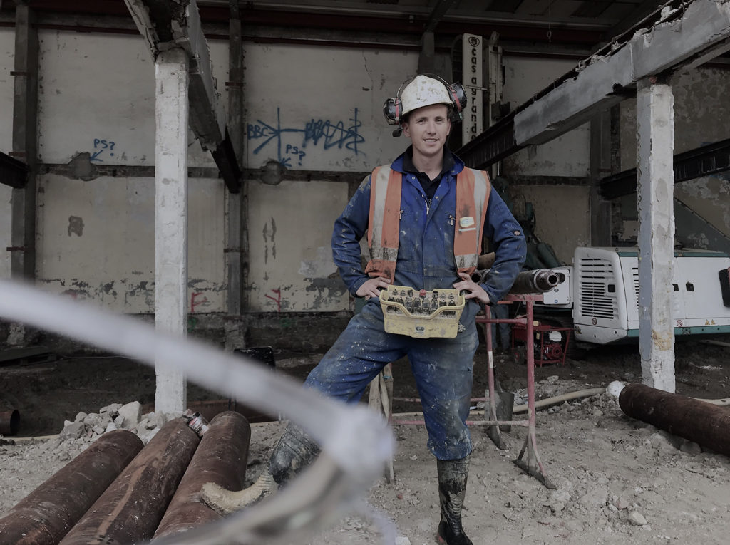
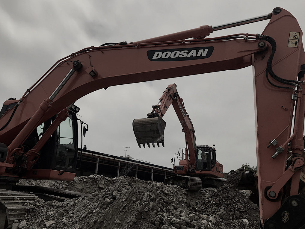
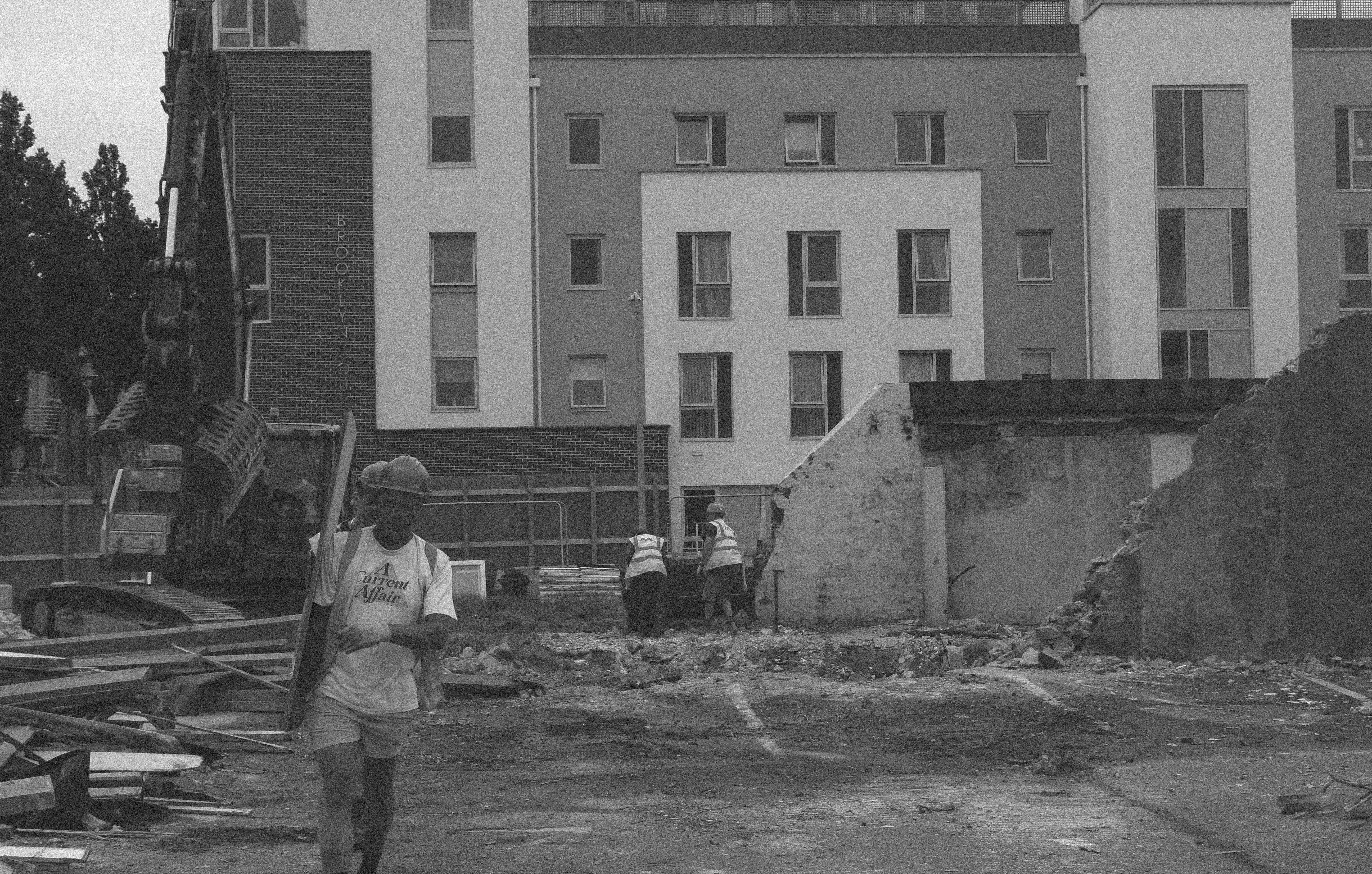
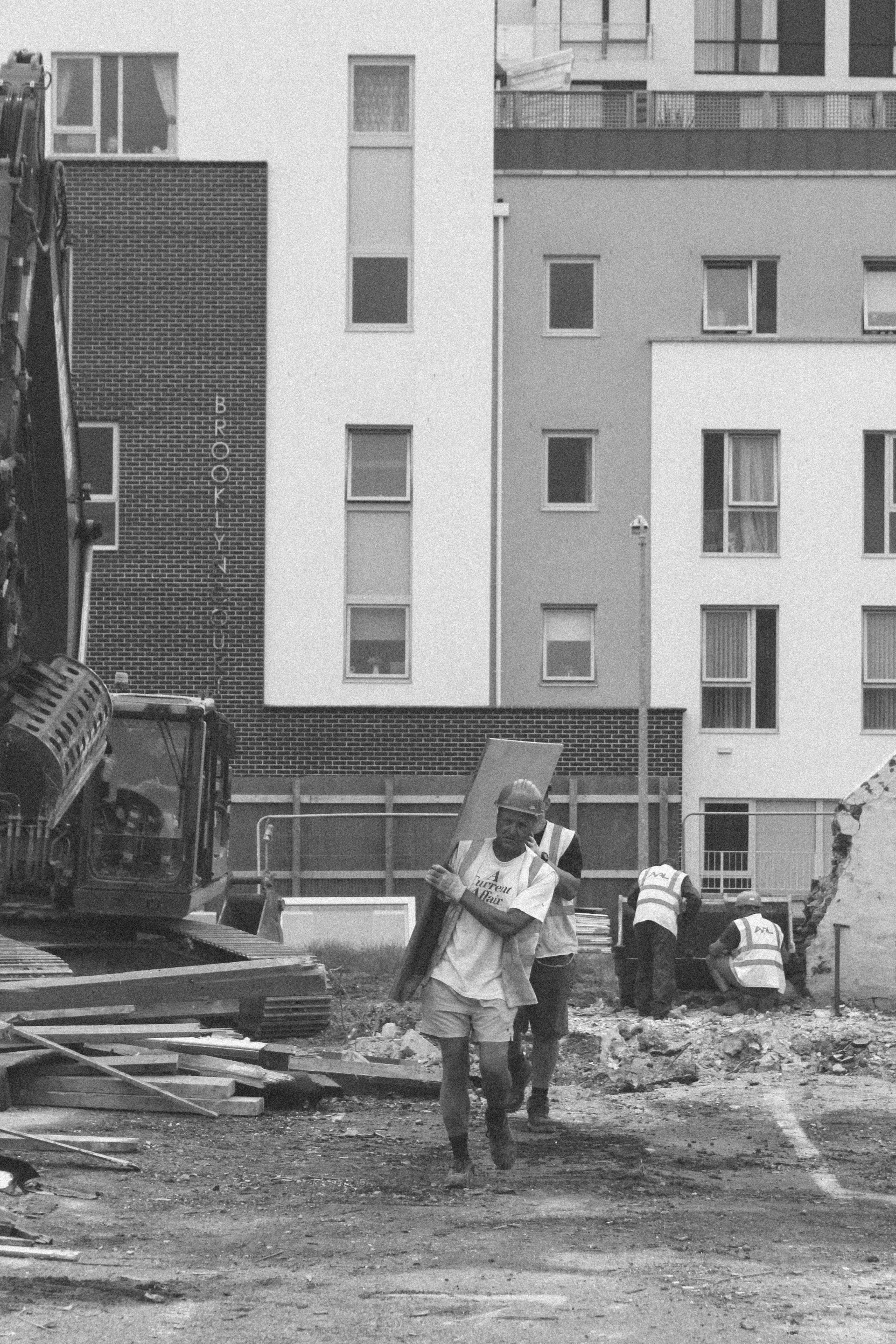
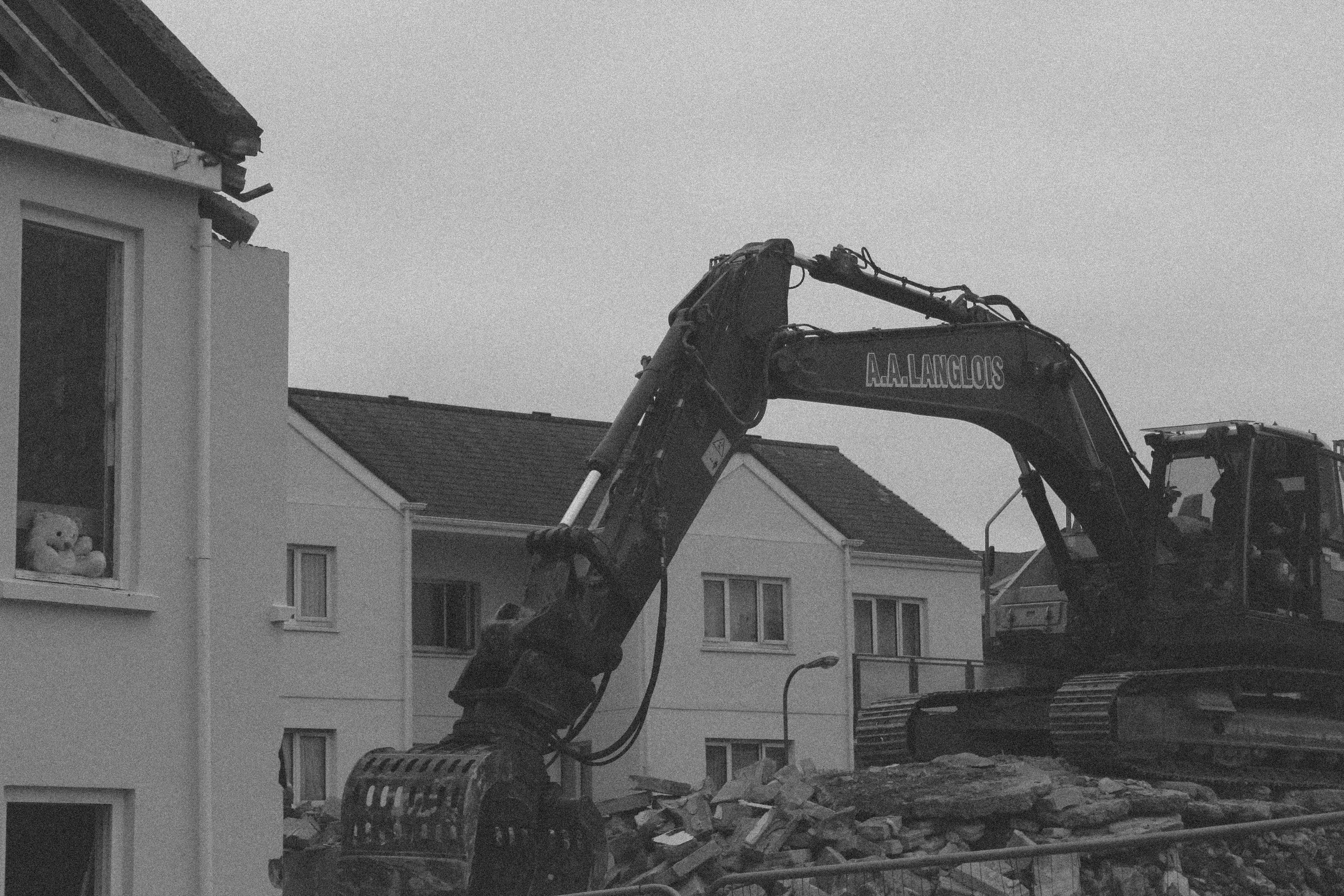
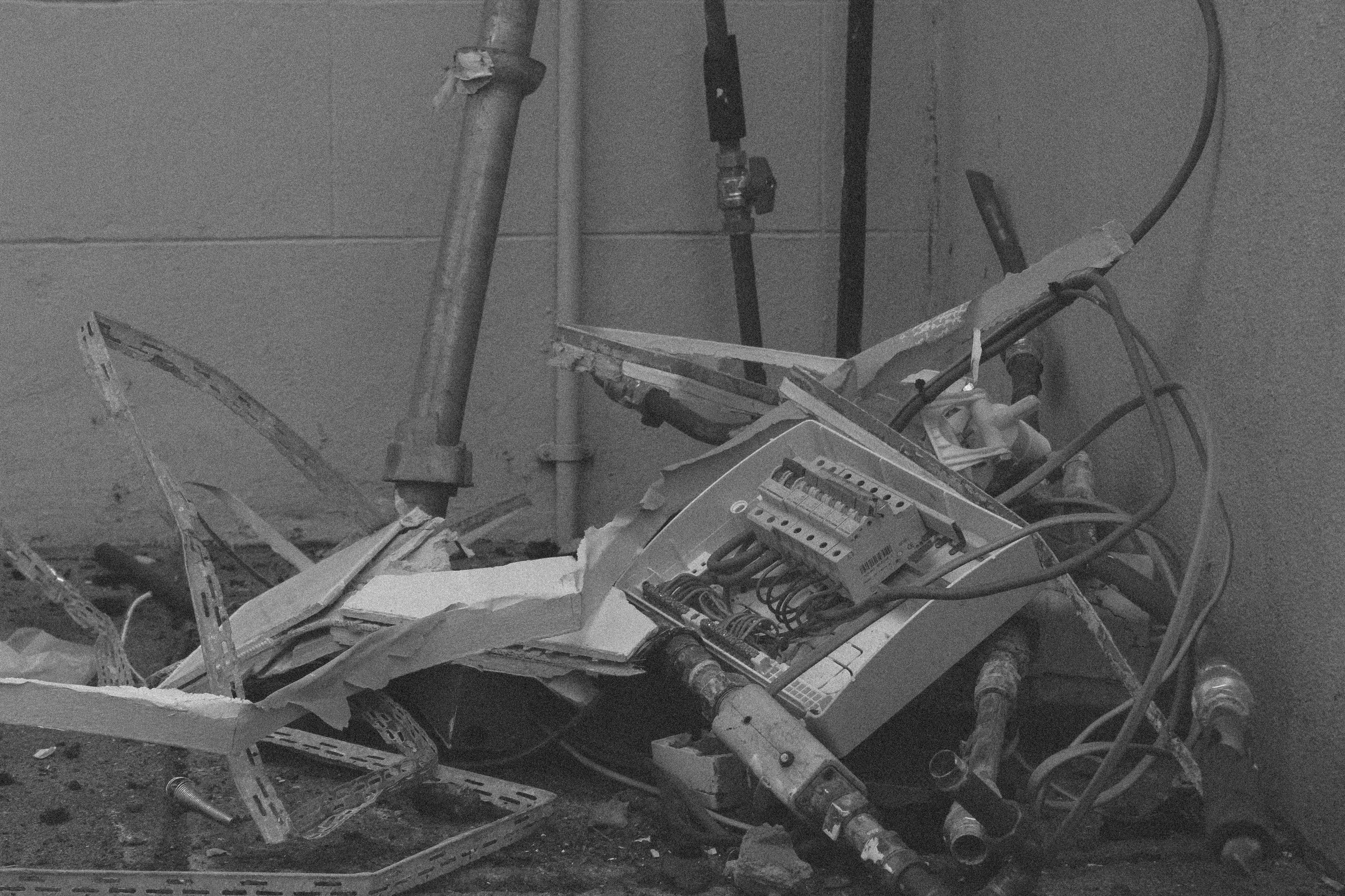
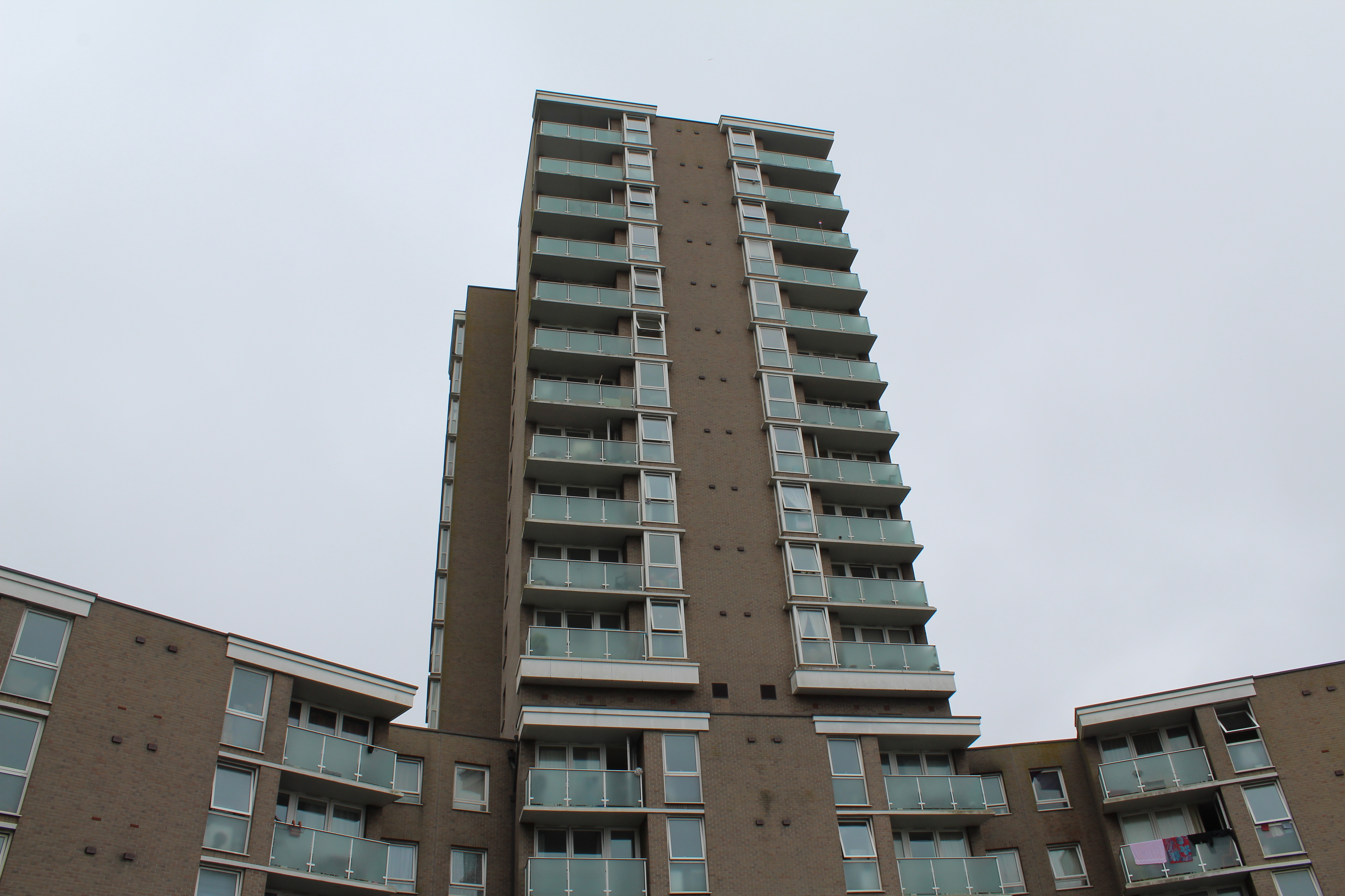
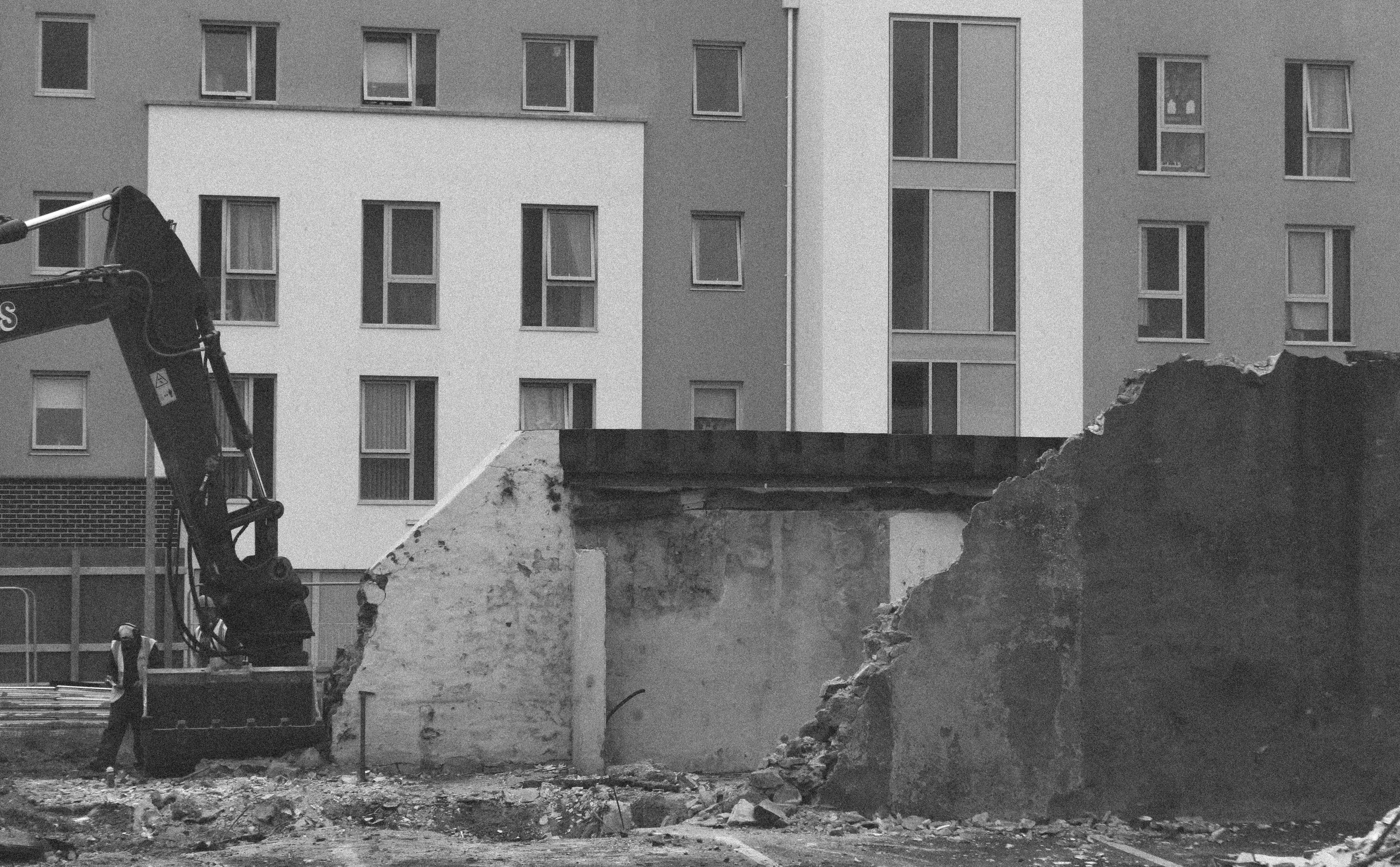
For this last shoot,I went to a buildings site and I wanted to concentrate on the old vs new St Helier and the modernisation and what has to happen to town.

When going to the property development site,there was a different attitude of st helier,which was less centered around community but more around making life better for others with new morden living conditions and to them making an old abandoned area Morer beautiful and becoming more futuristic in st helier. I agree with this.I think development is important because it makes many jobs for people within jersey and foreigners.They all have the same aspiration to make jersey a better place.

St. Helier photoshoot 1


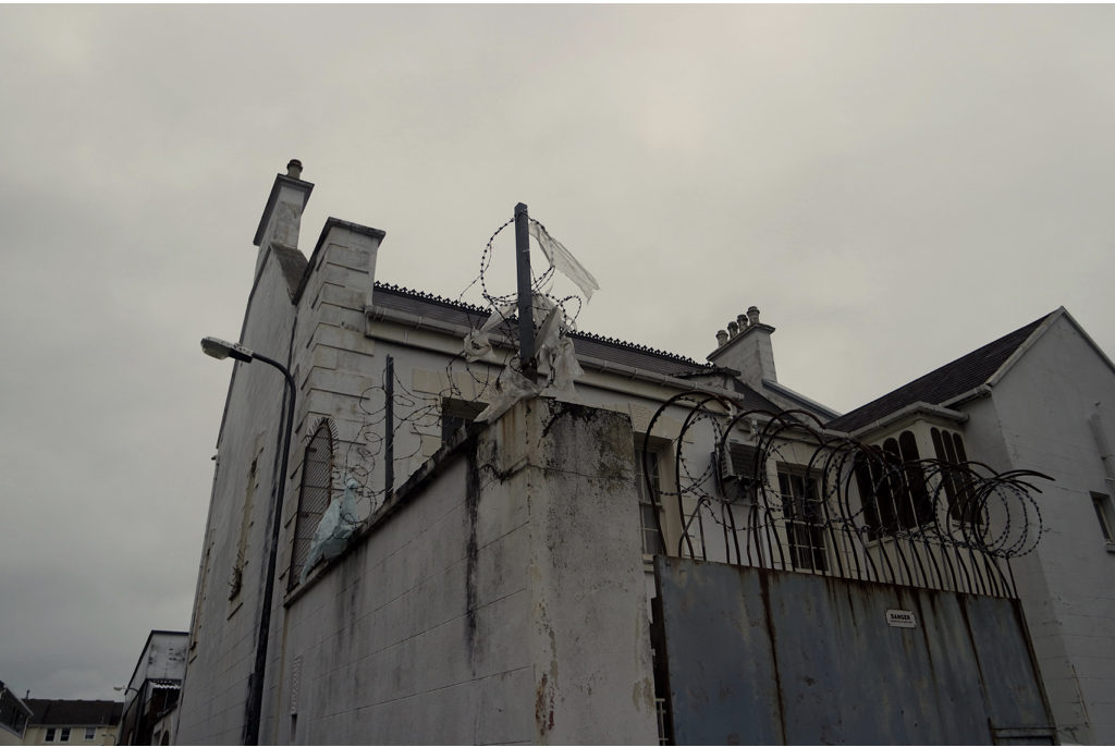
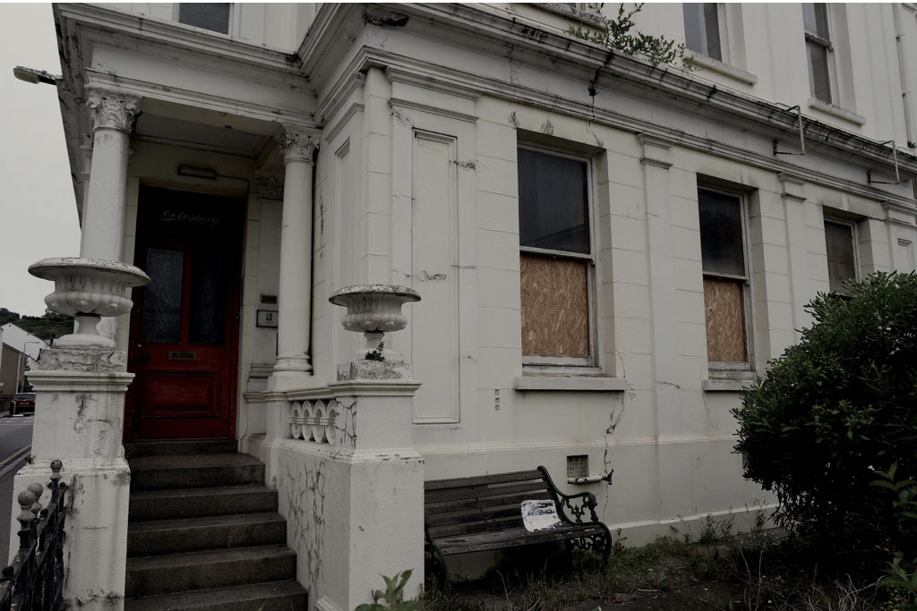
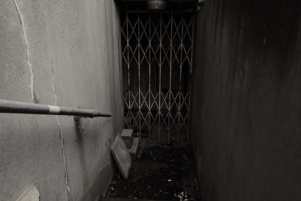
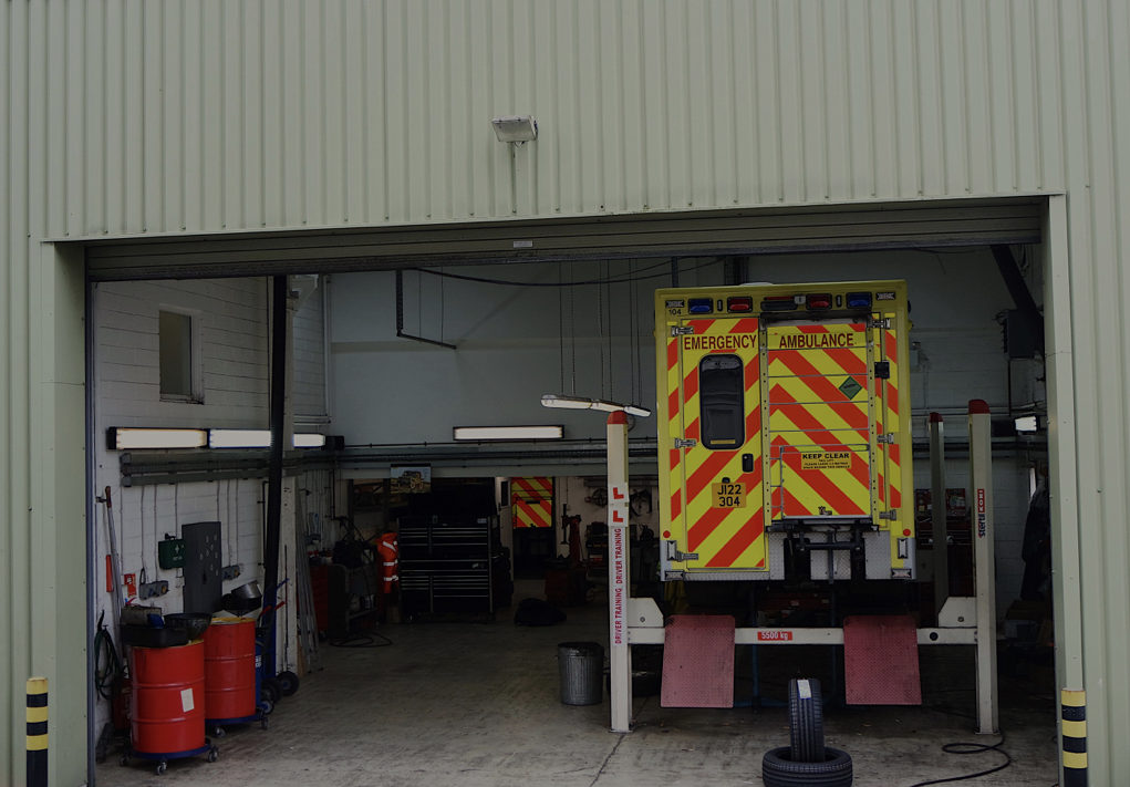
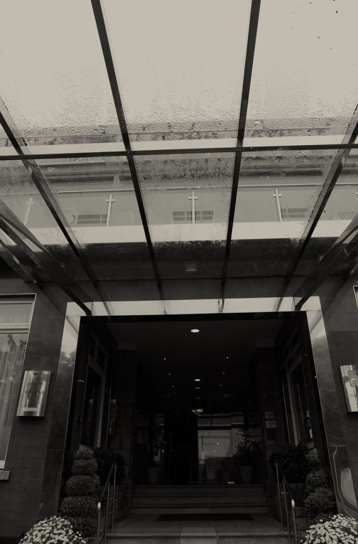
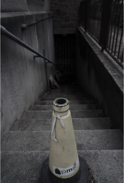
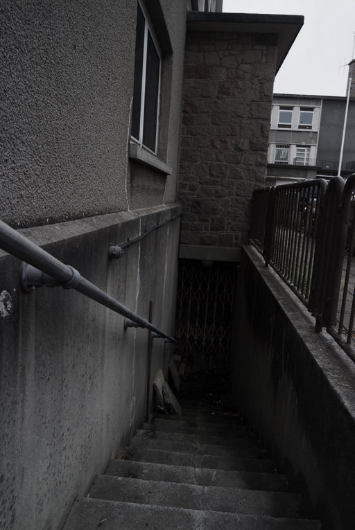
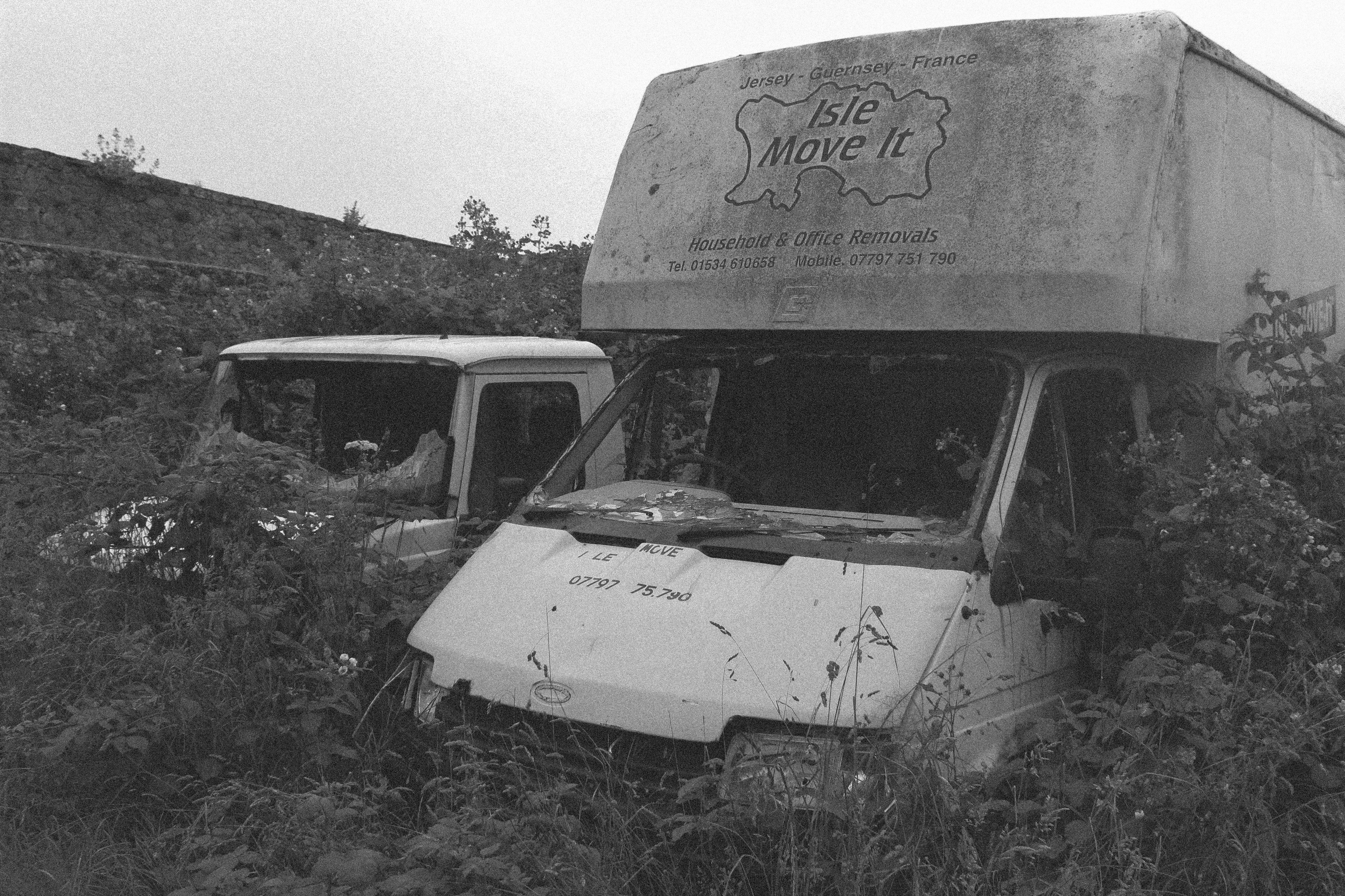
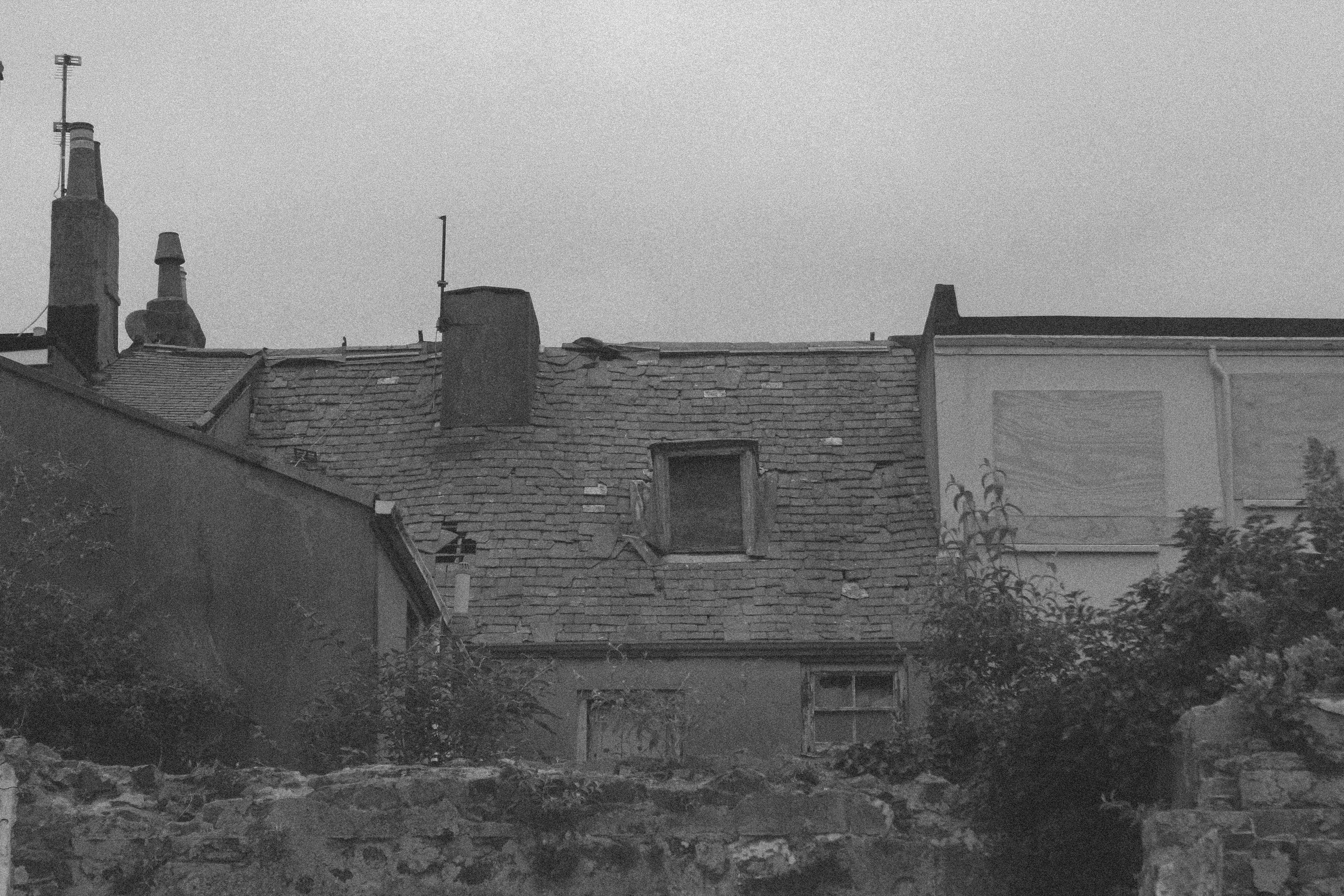
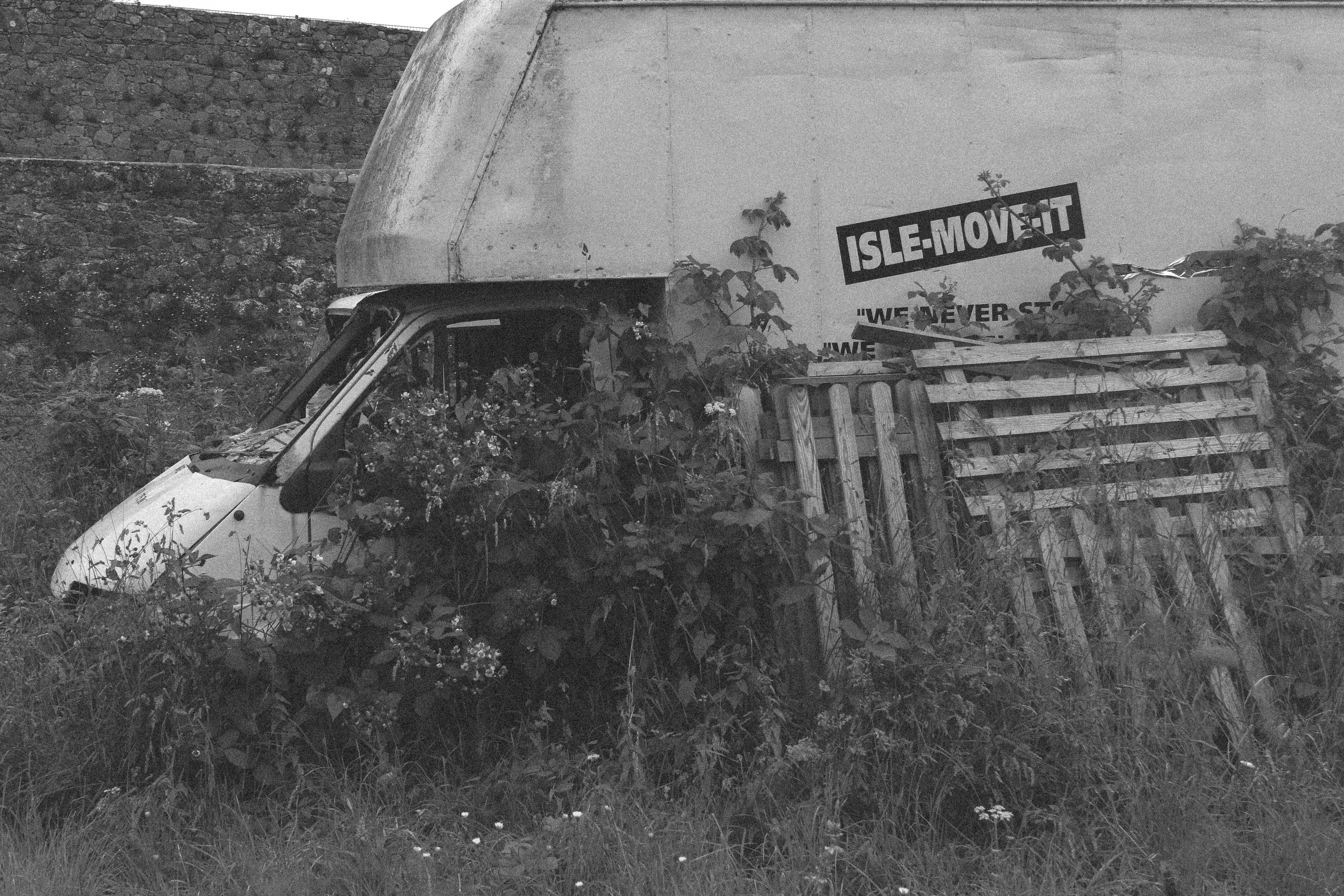
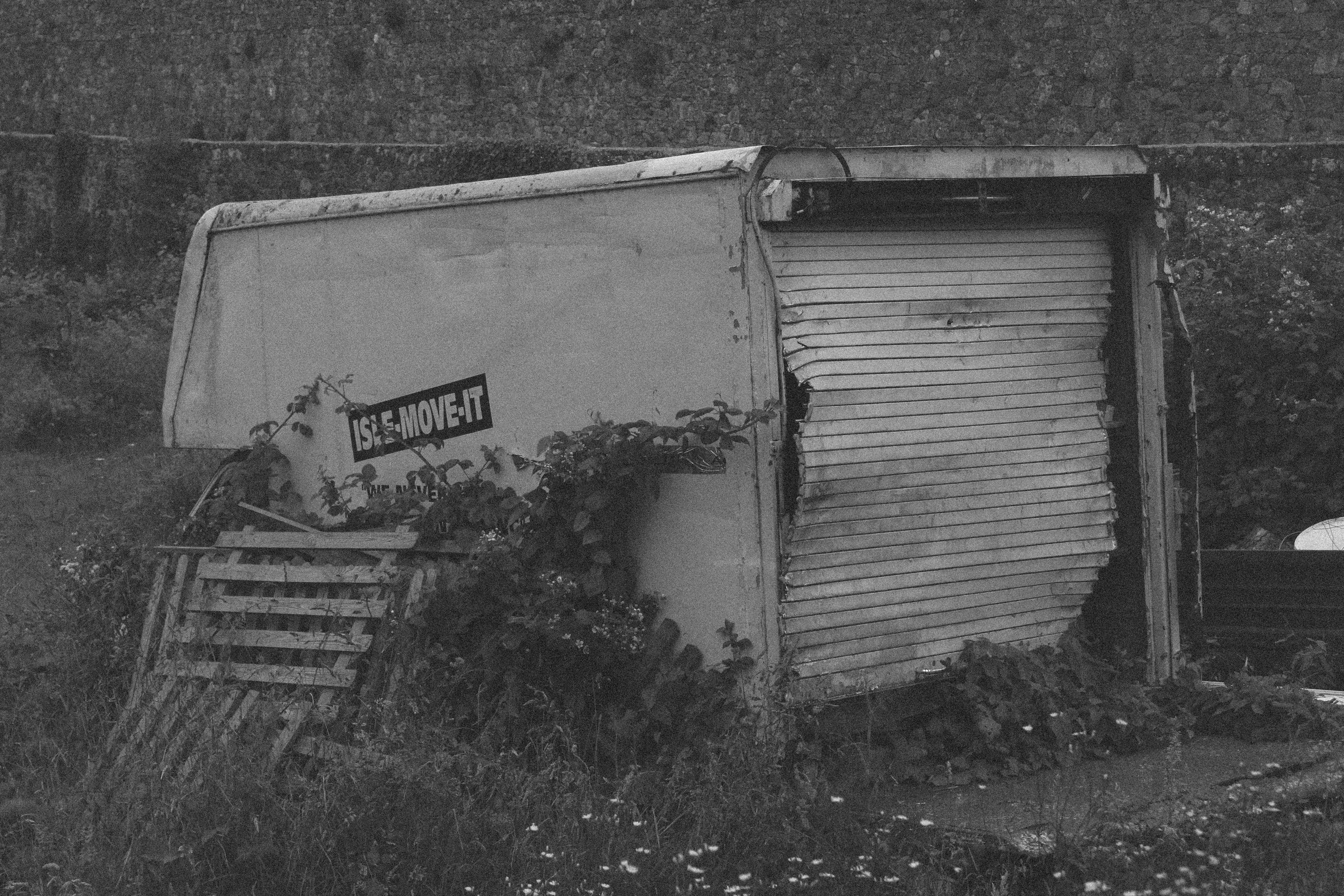
For this shoot I wanted to focus on the more urban landscape around St Helier,using old decaying homes and the old police station back alleys as key points of the investigation. I edited the images to be less exposed and have a darker tonal style.
The first shoot I purley wanted to focus on the primary location of the red sections I was give,I wanted to show a more urban atmosphere as this is what this site successful achieved. I focused on buildings where i could see an interesting texture to the buildings,and colours that have been pushed back. I think it was interesting as i explored many areas that were restricted and paths the normal citizen would not visit and walk down themselves.again I wanted darker images less exposed and so on as this would compliment the images more to the atmosphere given.  


Two-Frame

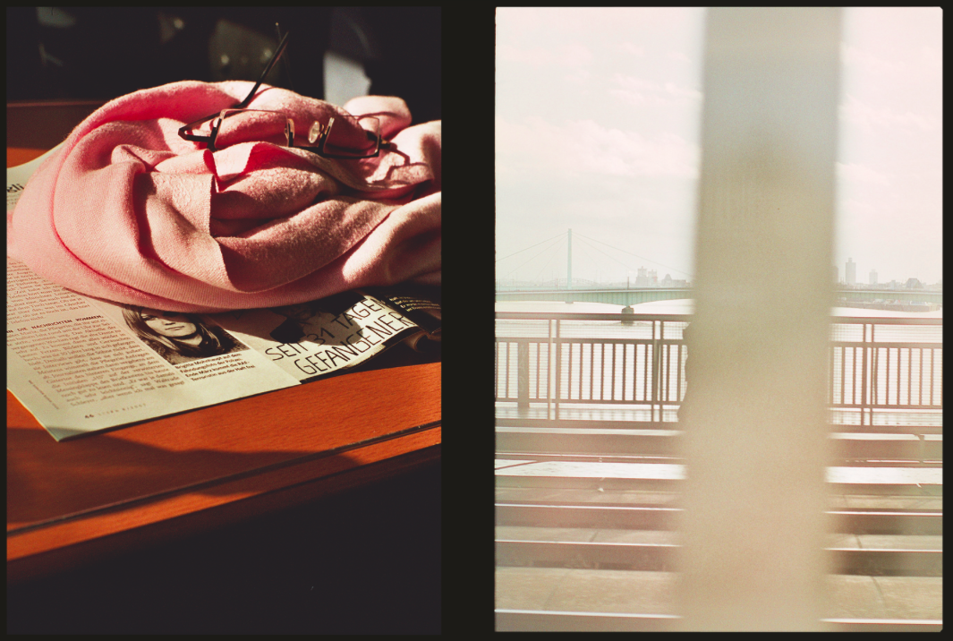
I took inspiration from Luke Fowlers ‘Two-Frame Films’ book. Fowler discusses how the idea of ‘in the blink of an eye’ has a different meaning for us as human beings than it does with the camera. When we blink and close our eyes, we are blind to the world in that instant. By printing two different images alongside one another, he aims to emphasise the momentary nature of a photograph.

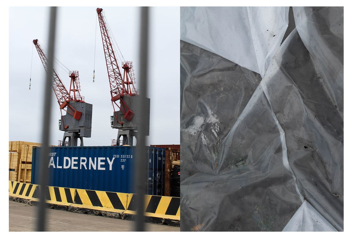
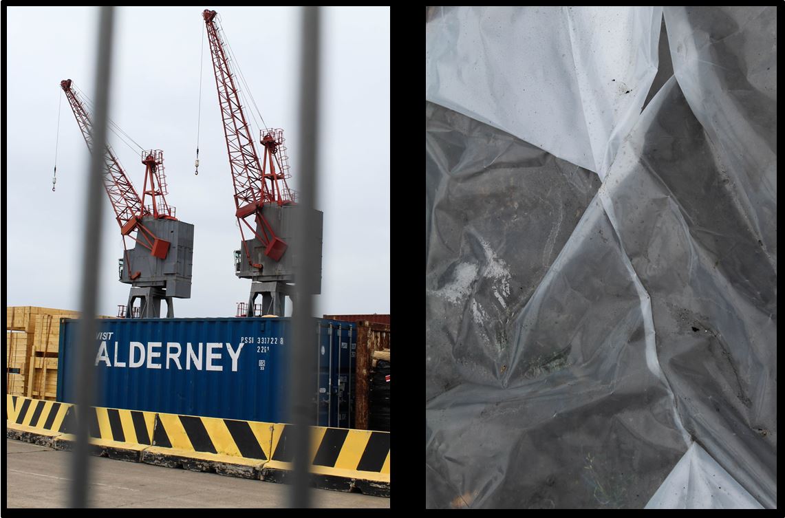
My first two images I took near the old harbour in St Helier. I chose for these two images to be paired together as I like the link of the grey in the cranes and bars to the underneath of the white plastic. I like these two images together as there is a juxtaposition between the close up detailed angle of the plastic on the right and the further away angle of the cranes and construction on the left, but still having the blurred close up of the bars in the foreground.

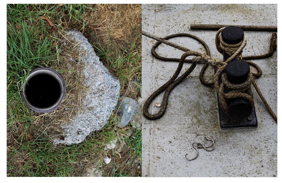
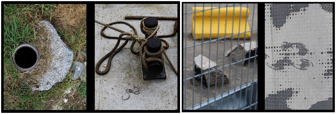
I paired these two images together as i found they have similar shapes a lines within them. Firstly, the pipe hole in the left image links to the two circular shapes on the right both of these sections being black making the connection more obvious. I also like the contrast between the textured  grass and the concrete grey ground. The brown colour of the rope in the left images is balanced out by the brown dirt on the left making both these images completely different but connected.

To improve this image i would take a bird eye view of the image on the right so in both the images the angle would be the same but the subject and place wouldn’t.

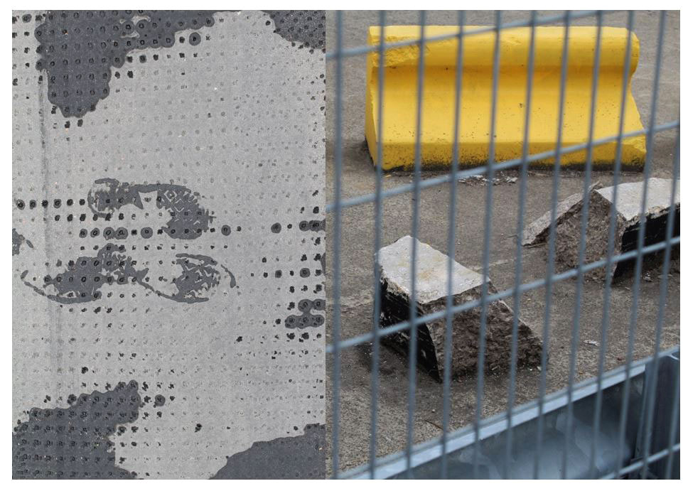
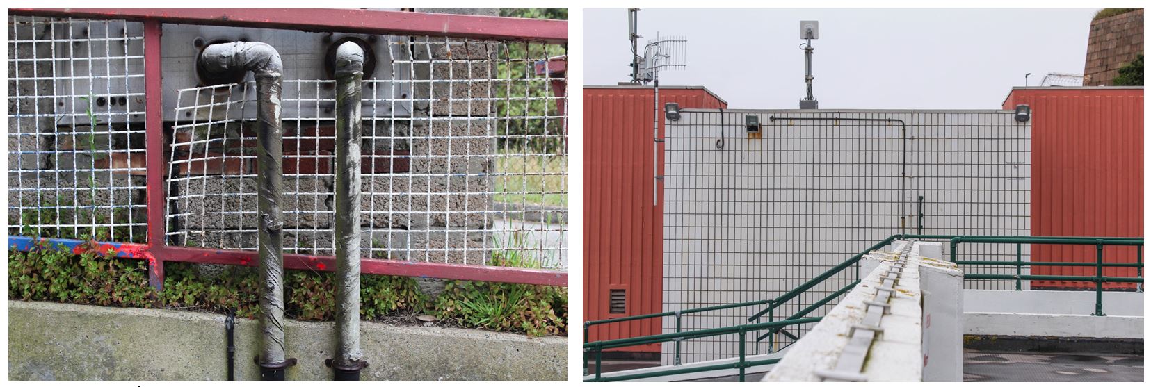
I paired these two images together as i like the juxtaposing patterns and shapes within the two. The fence in the right image has vertical and horizontal lines crossing over one another in the foreground which is contrasted with the left image containing more circular shapes like dots. Both images are quite chaotic but the similar tones of grey link the two together. The image on the right stands out more because of the bright yellow and more chaotic composition. I chose this image as it focuses more on what other do not stop and look at in everyday life similar to Luke Fowler’s style of work. I chose the image on the left as i liked the footprint in the center of the image showing the only trace of life across the two images and represents people leaving behind their mark on the world.

The paired images reveal an event unfolding – a meaningful narrative posed by photographic sets, sometimes close in temporal proximity (the blink of time passing, perhaps), while at other times, the intervals are more expansive, challenging the viewer to connect visible terminal points in a satisfying way.

Fowler experimented with different film stocks, subjects and framing, and the images are inextricably linked to his filmmaking as evidenced by the elements of montage, colour and reflectivity that permeate the series. In both still and moving image, Fowler considers how an event might be abstracted by the camera apparatus in a subjective ordering of reality that is emphasised by the dialectic between paired images. The photographs are a means of personally testing the ability of the camera to authentically bear witness to an event, and its fallibility as a medium of representation.

Edits


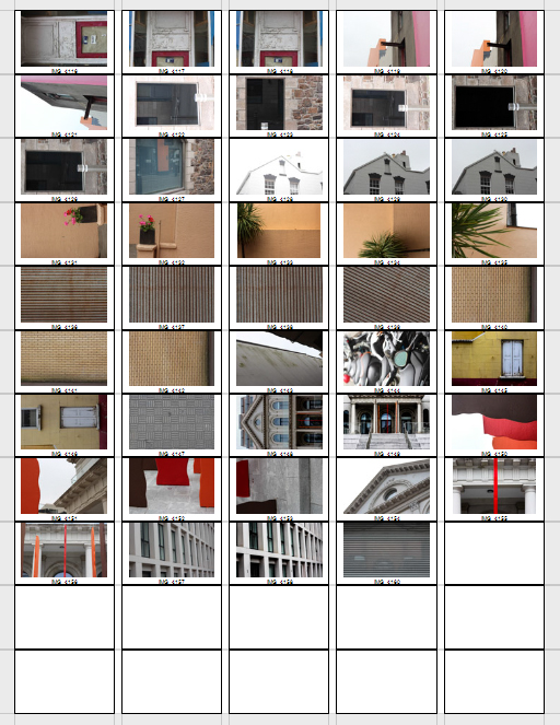
Final Shortlist From St. Helier Photographs

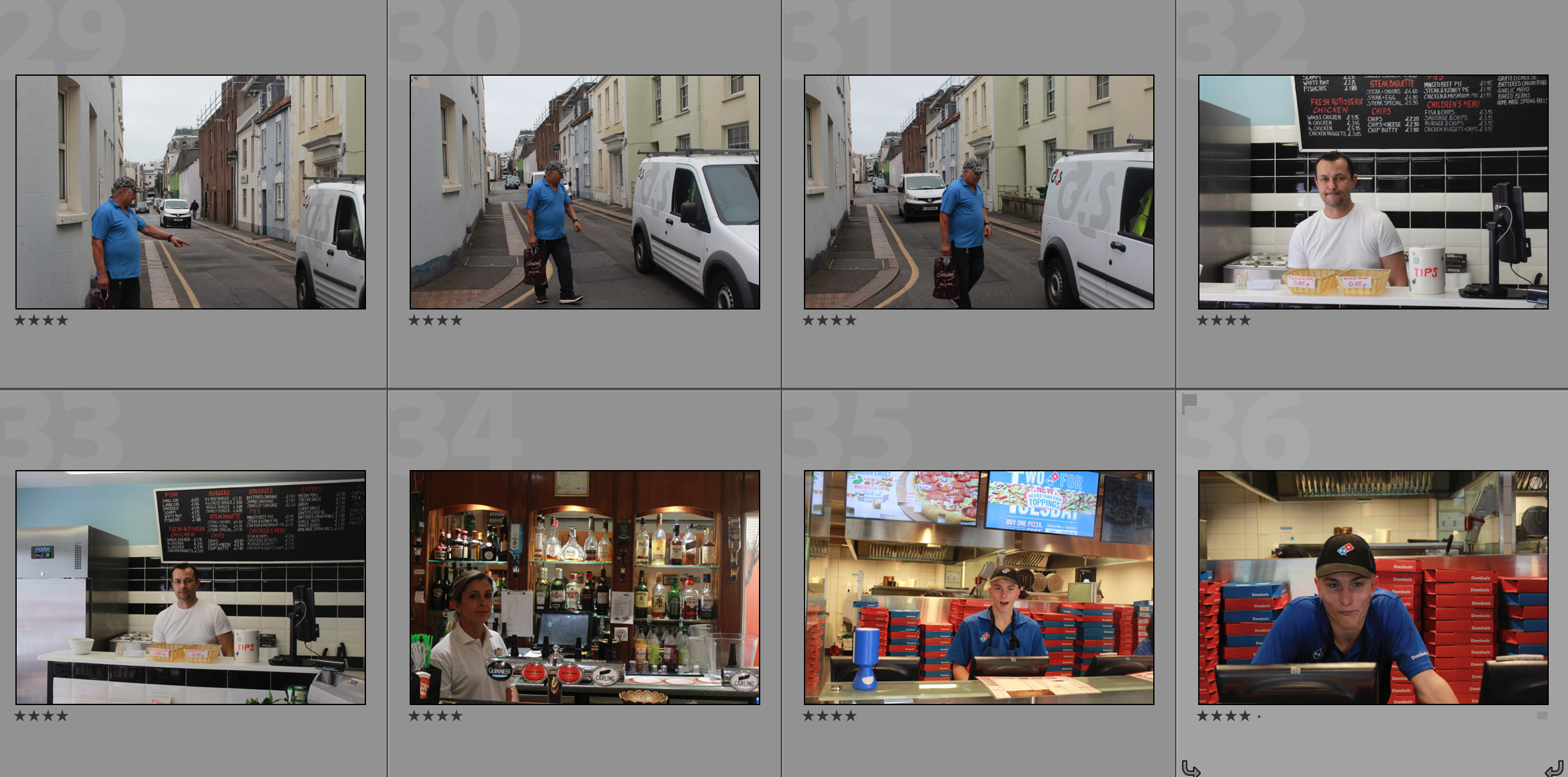
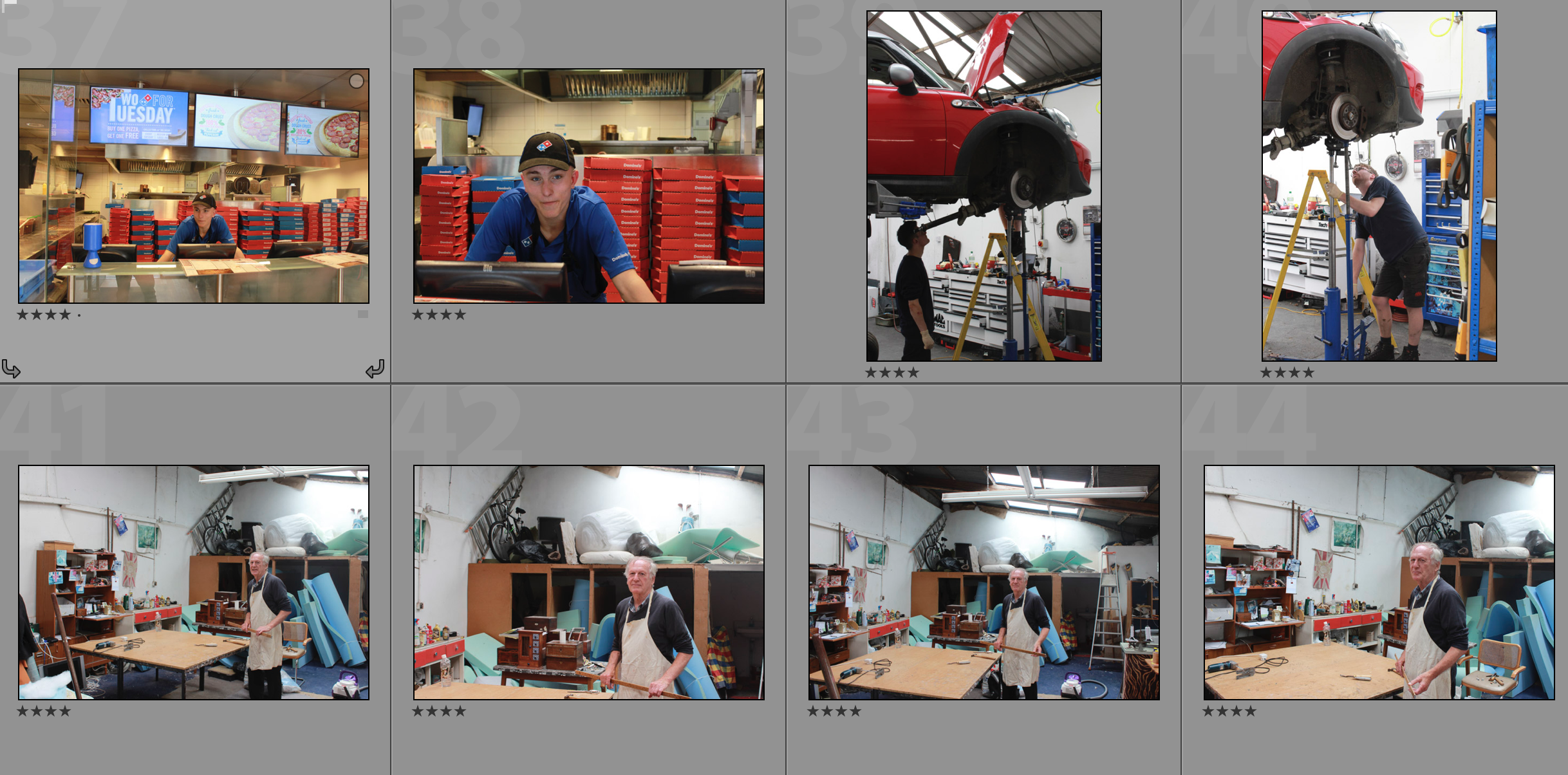
This selection of photographs shows the top 20 images from my shoot in St. Helier. It shows different architectural structures, people, construction and areas that have been abandoned. These photographs take inspiration from Albert Smith and Michelle Sank in the sense that they document the people and their environments along with structures within the environment.

Ernst Haas Research

Who is he? 

Ernst Haas (1921-1986) is one of the most influential photographers of the 20th century considered one of the pioneers of color photography. Born in Vienna 1921 he took up photography after the war leading his early works to be on returning Austrian prisoners of war shown in LIFE magazine, Haas later joined Magnum in 1949 developing close relations with Capa, Henri Cartier-Bresson and Werner Bishof.

Haas moved to the United States in 1951 after experimenting with Kodachrome colour film becoming the premier colour photographer of the 1950s. In 1953 LIFE magazine published a 24 page large colour photo feature in New York City making it the first time such a large colour photo feature was published in LIFE. By 1962 the first coloured photography exhibition was held at New York’s Museum of Modern Art.

Haas traveled hugely, photographing for LIFE, Vogue and Look, being the creator of many influential publications. Four books he made in his lifetime were: The Creation (1971), In America (1975), In Germany (1976), and Himalayan Pilgrimage (1978)

Ernst Haas received the Hasselblad award in 1986 the same year as his death. Haas continued from there to be the center of attention for museum exhibitions and publications in examples such as Ernst Haas, Colour Photography (1989), Ernst Haas in Black and White (1992), and Colour Correction (2011). 

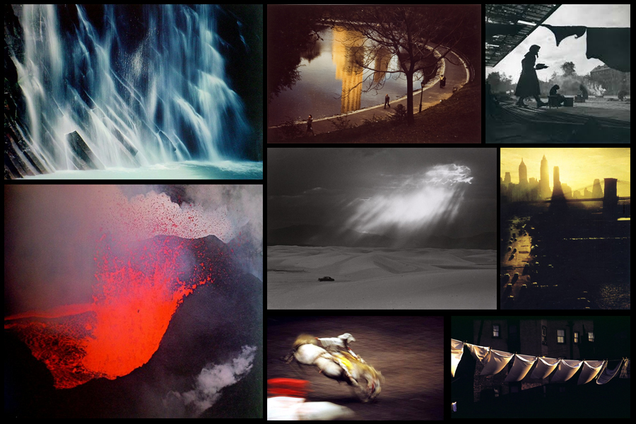
Some examples of his work can be seen below:

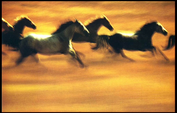
After looking over some of the images from Haas I decided to analyze what made the aspects inside each one so effective, to do this I chose one of his most impressive images; Motion Horses:Technical: The image itself uses a vivid long shutter speed to capture the motion of the horses in action. By doing this it creates a sense of realism into how the photo would have looked to the photographer, making an aesthetically pleasing result from how the horses are contrasted sharply against the yellow backdrop of the piece. The picture seems to use a higher saturation to bring out the colours of the field and emphasize the darkness of the horses to create an almost abstract and surreal result.
Visual: Visually the piece it pleasing to the eye, with our focus drawing straight into the symmetrical line of the dark contrasted horses, this reduces any eye-sore for viewers as it creates a perfect balance of blacks and yellows. Composition wise the piece has been straightened so that the line of horses gracefully cross the field, not taking up too much or too little space within the area, and with more focus and detail being on the horses it draws our eyes away from the floor the first time we look at it.

Conceptual: The image is meant to capture the movement and fluidity of the horses whilst running in the wild. The lack of focus on any part of the picture is used to represent the vision of what it could become like moving at that speed, distorting certain features of the creatures to blurs which melt through into the surrounding landscape.

Experimentation

Colour Edits:

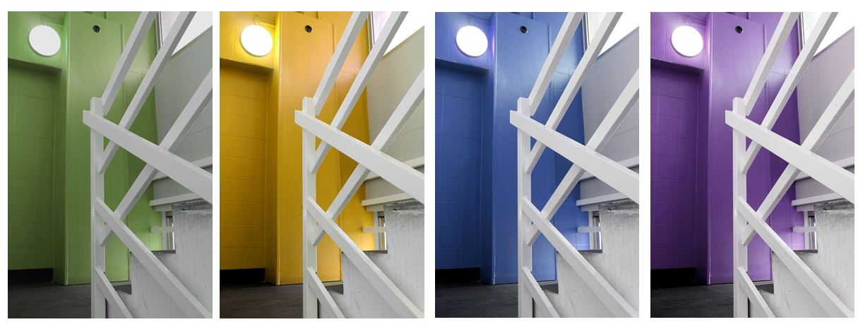
For the colour experimentation of this shoot i wanted to emphasise the colour green as that was the area of St Helier I was given to explore. First I selected the image that contained green in them and highlighted that, then I found images that I liked and edited green into them so that they could still be included.

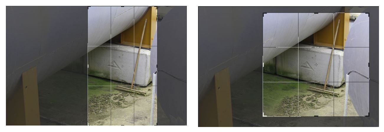
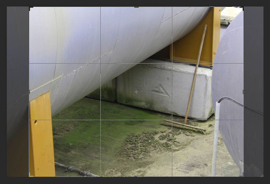
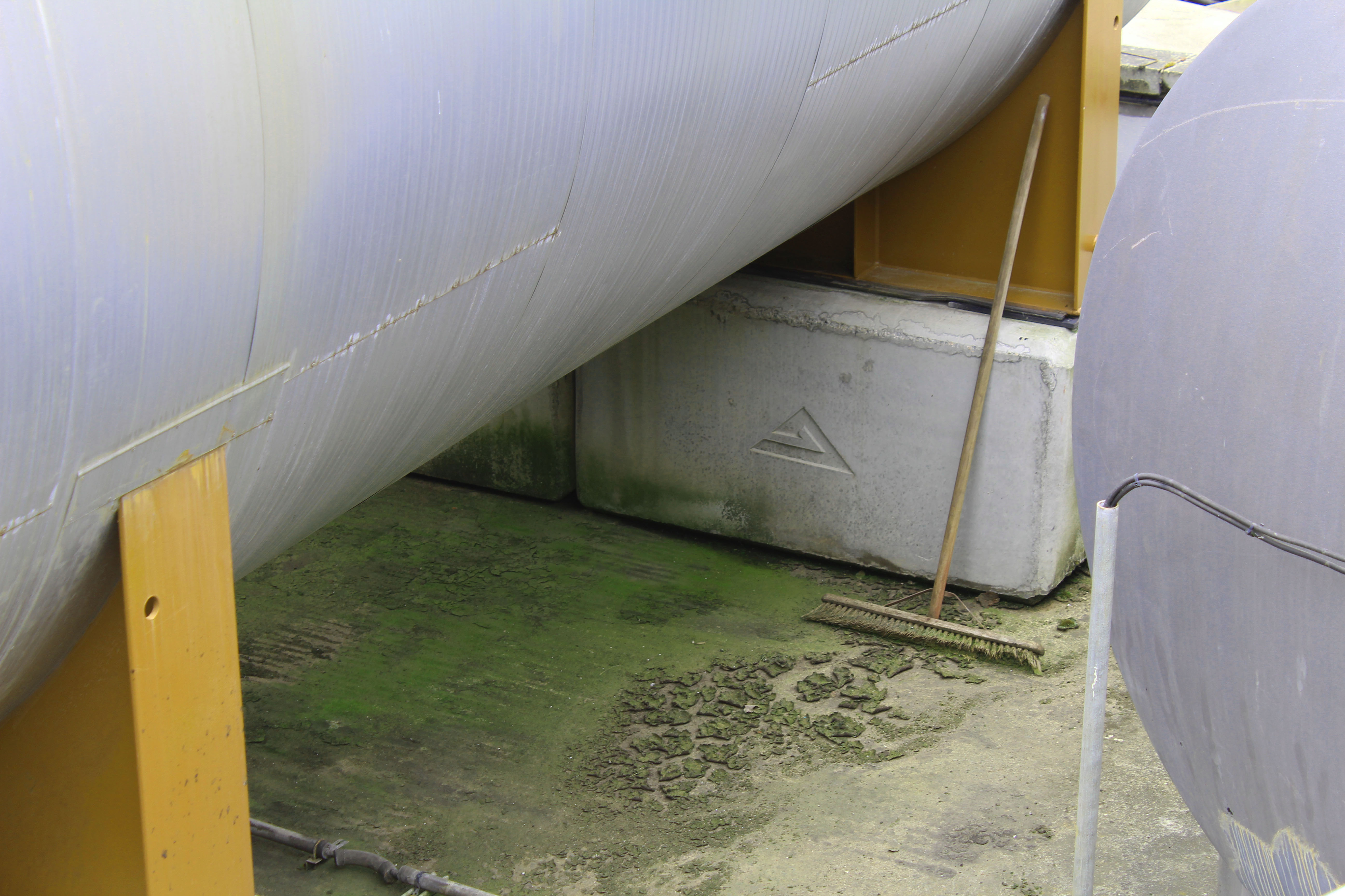
I chose this image to edit as i wanted to highlight the green and I liked the combination of colours i could edit in if I increased the hue of the green, changing the orange colour from the structure to yellow, creating a complementary combination of colours (yellow, green and white/silver). I like this image as the subject of the broom stick, which doesn’t look like its been used in a while from the mould around it, isn’t something that people passing by would notice. I interpret this image as the broomstick being the only signal of life in the image which is surrounded by industrial structures. Similar to how St Helier is being redeveloped into an a more industrial place with new office and buildings being built and abandoning its heritage, similar to how the broomstick has been abandoned and forgotten about.  I also like the composition of this image with the industrial structures surrounding all the edges except for the bottom one and the contrast from the round silver structures to the vertical solid yellow blocks creating a juxtaposition in in the shapes and lines.  These shapes emphasise the texture of the mould and dirt at the bottom as the other parts of the image don’t have much texture, so the audiences eyes are automatically drawn the the detailed texture in the center of the image.

I particularly liked this image where I changed the hue of the red wall behind the stair case to green so I decided I would experiment with different colours others than green in this image to see which one worked the best.

Black and White edits:

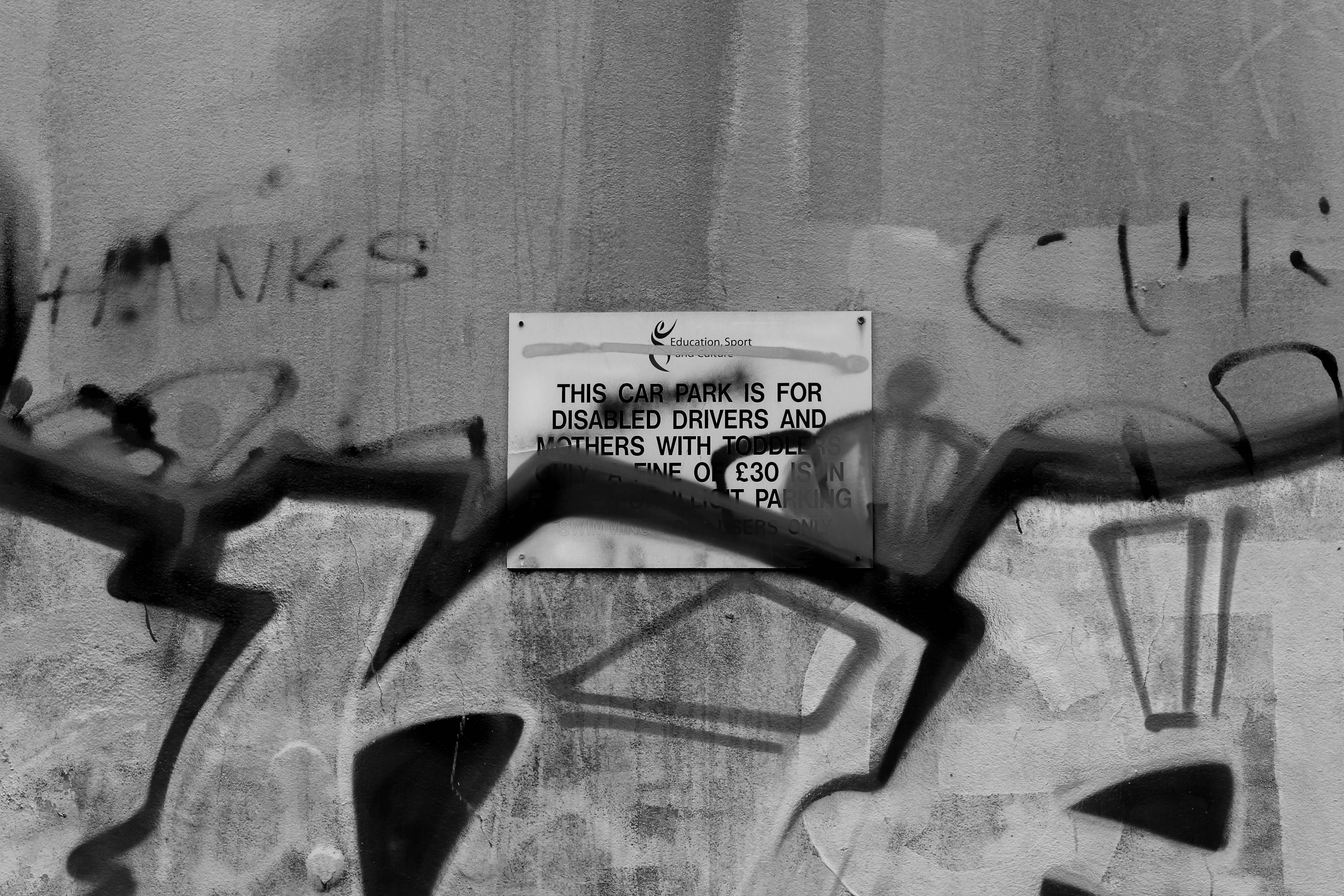
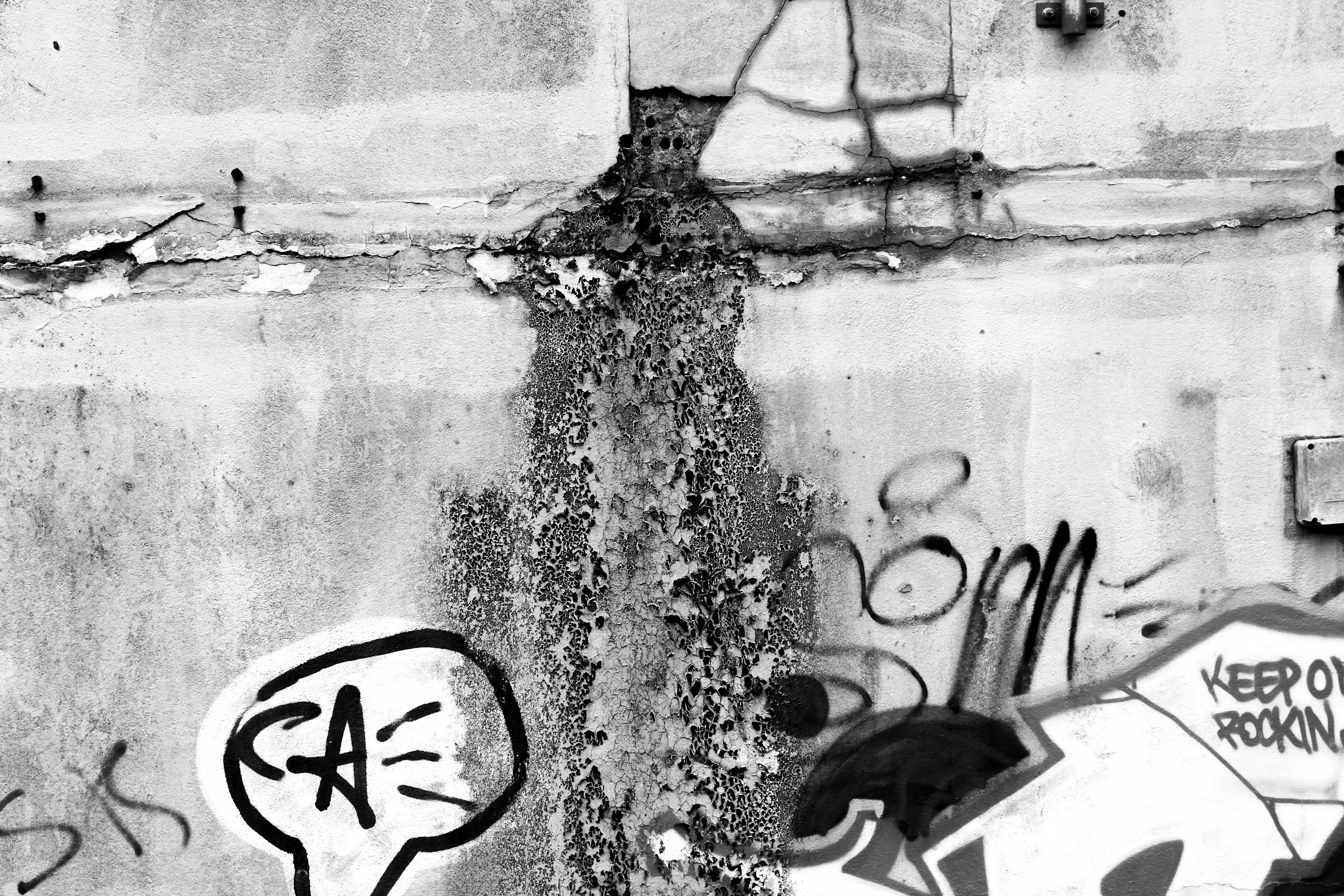
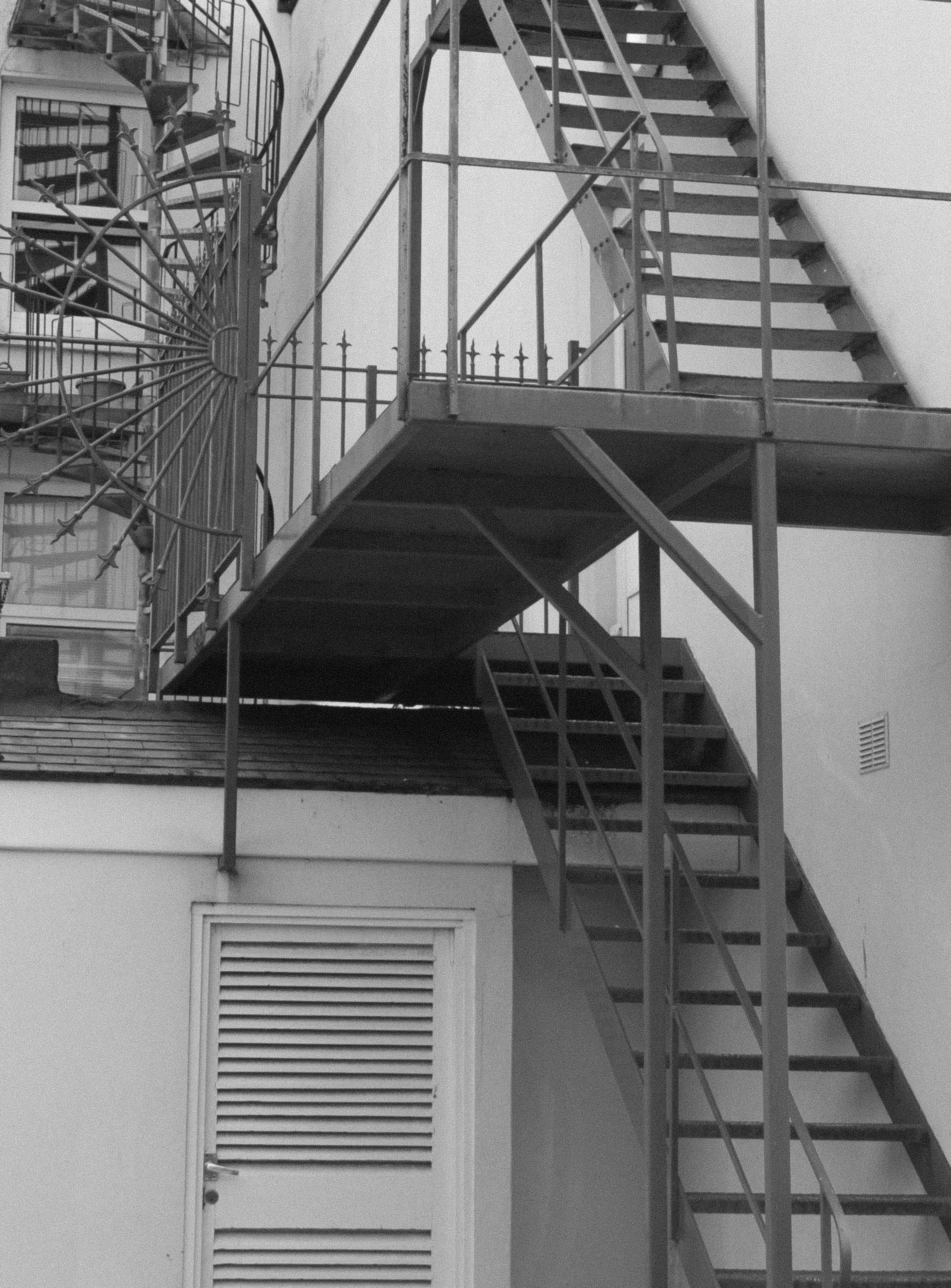
I thought these images would be more effective if i edited them black and white as i wanted to emphasise the dereliction and decay. By turning the image black and white i wanted to darken the shadows where the texture is and emphasise the decomposing  of the wall. I like the bottom image as the mould shown looks like its pouring out of the cracks in the wall and the graffiti adds to the derelict look. The top image is also effective as it shows a sign officially put on the wall informing people about parking, and someone has spray painted over it, possibly reflecting how young people care about art and expressing their opinions about the future of St Helier.

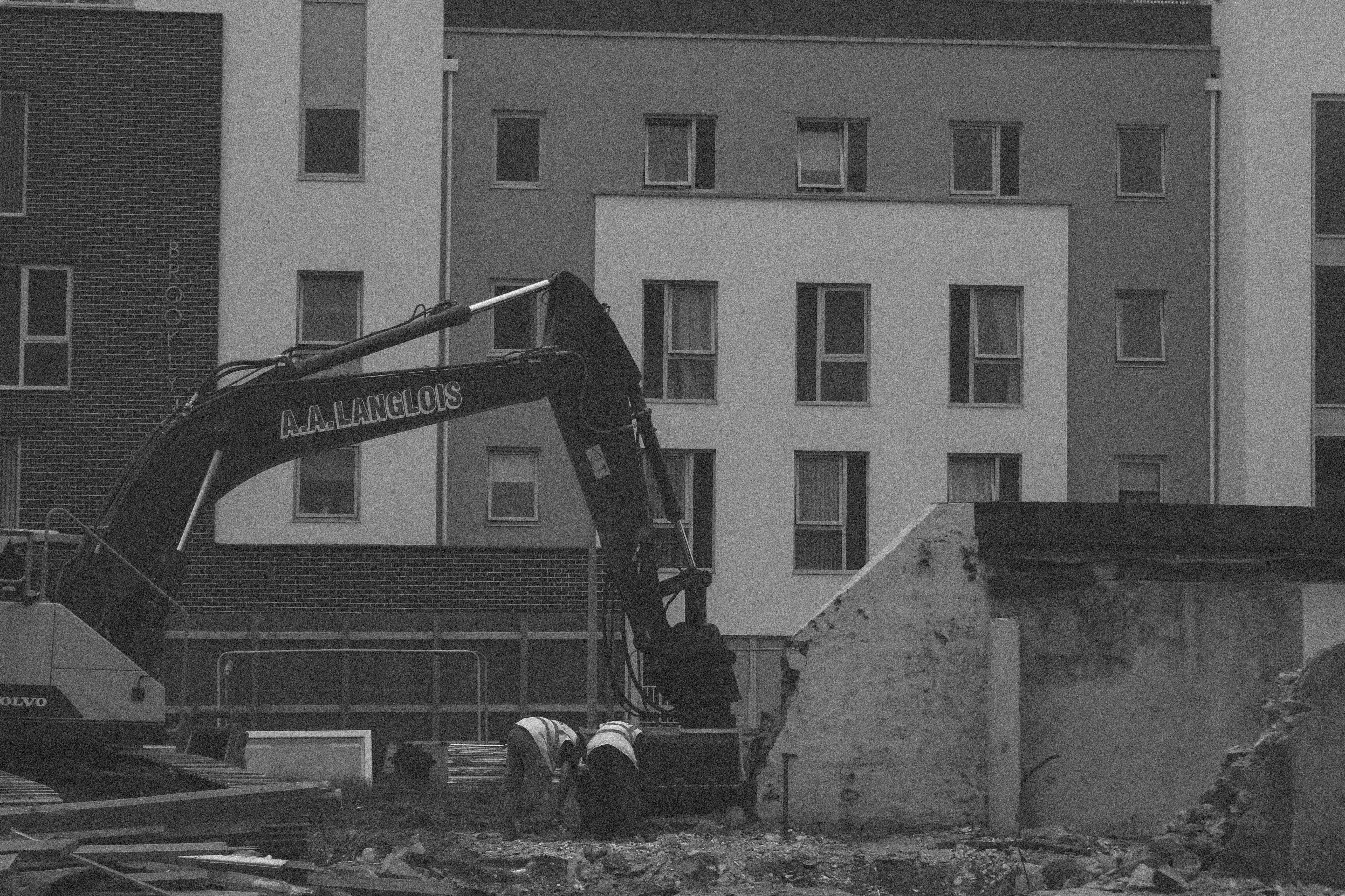
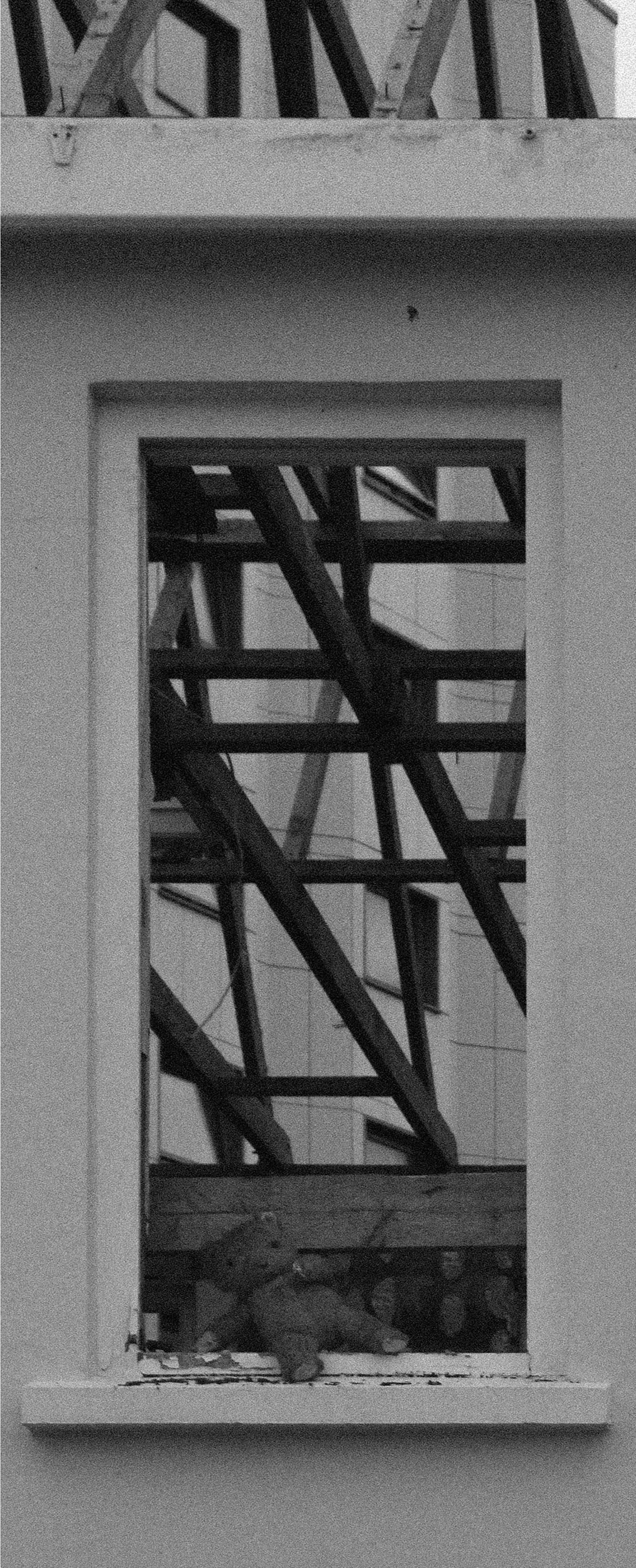
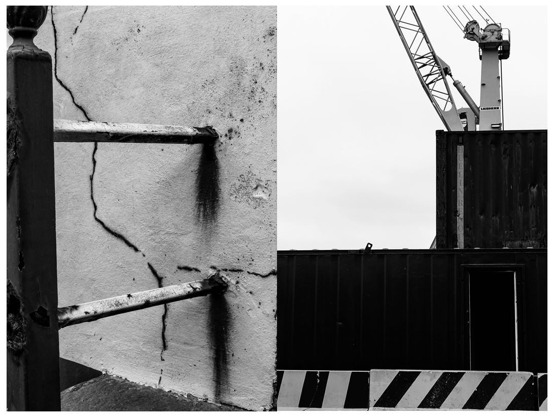
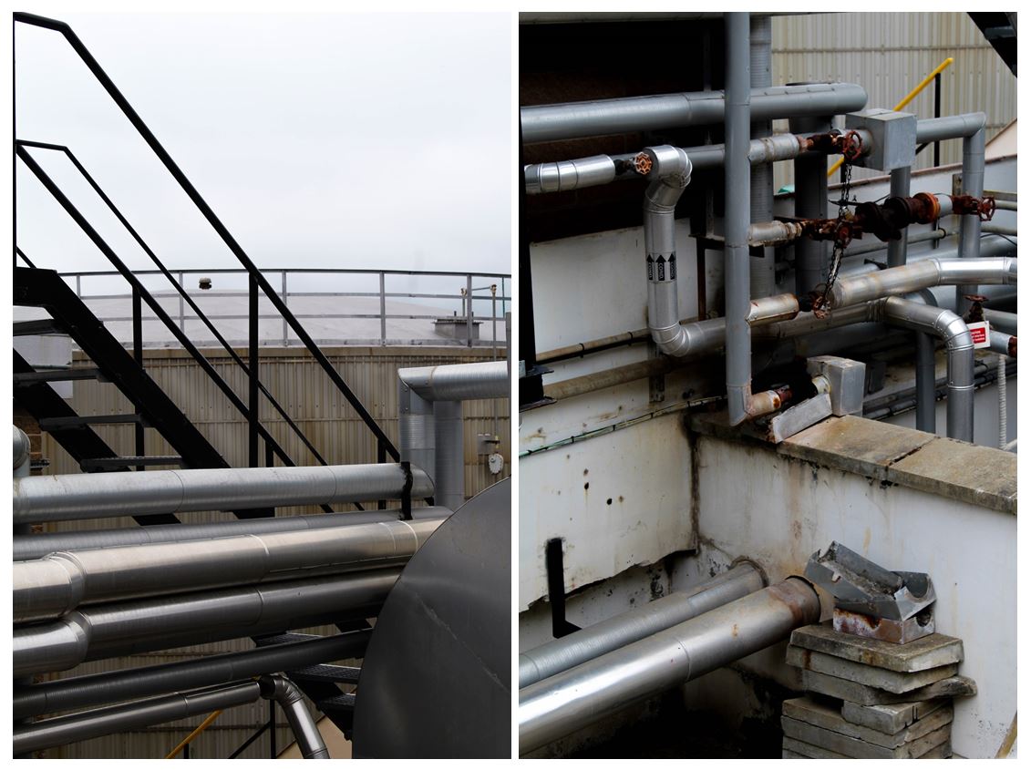
I also like these two images in black and white as they both show structural shapes, the left image portraying more dereliction on the side of a building, shown through the rusting and cracks in the wall, the right image showing objects and machines that are still being used, both images creating a juxtaposition. The image on the left is more effective in black and white as it further emphases the rusting from the metal bars when contrasted the the wall behind and the cracks in the walls are also highlighted. The bold vertical bar along the left of the image creates a division, adding to the differing of lines and angles in the photo. I like the image on the right as it shows two creates stacked onto of one another with a crane behind it, creating a shape that looks like they’ve been conjoined. The striped wall along the bottom of the image is effective as it shows a contrasting pattern compared to the other objects in the image and the colour links together with the crane creating a more balanced and aesthetically pleasing image. I particularly like the composition of this photo as everything is based on the right side on the image with the negative with space on the left.

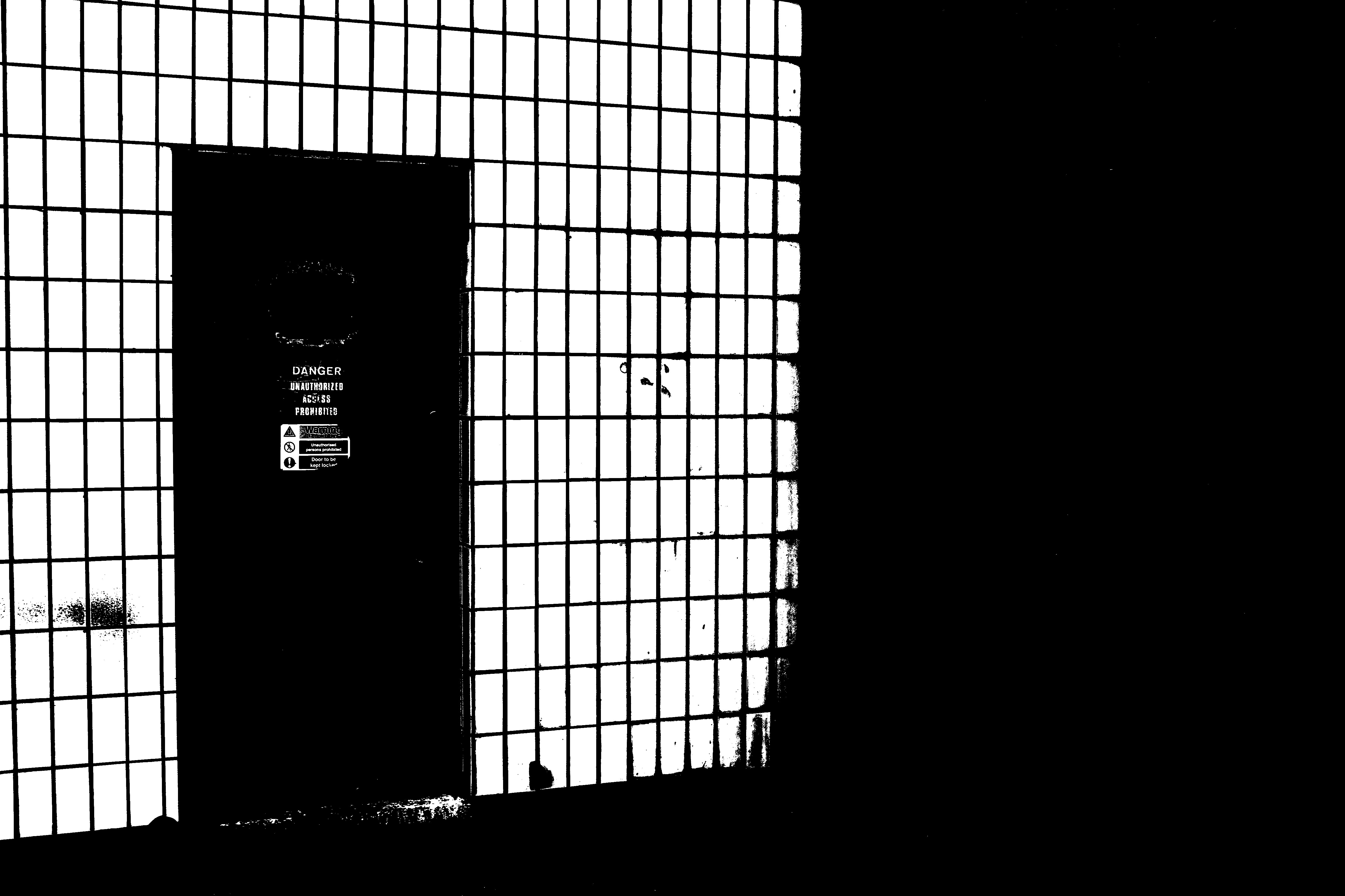
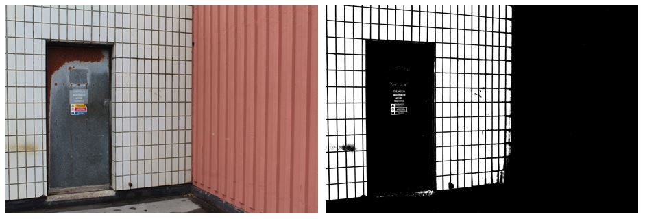
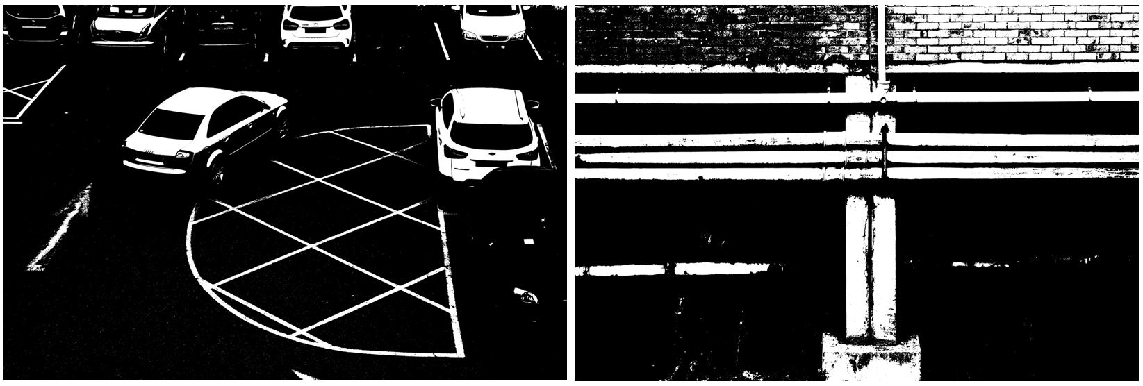
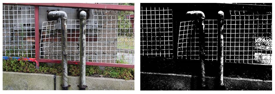
I next experimented with the threshold in the images making them more bold and structural with only white and black being used in the photos.

I think that the edited image where i changed the threshold is much more effective than the original image as it emphasises the industrial theme that i want my project to follow. The contrasting black and white lines are a lot more noticeable on the right image as the black in darken and the white it brightened. On the left image there are a lot more neutral tones in colour like the pink wall on the right and the brown rust on the silver door which is completely invisible on the right image, giving it more of a minimalistic but impactful look. The right hand side of the image is completely black out, making nearly half of the image one solid colour, directly the audiences attention the the left. I prefer the right image as the edit gives it a more…. feel, the signs on the door still being visible and the white wall on the left looking more like a fence and the door leading out to nothing.

Changing the threshold in these images makes harder to figure out what the image is portraying and makes the lighter points in the image standout more than in the colour image, creating  more of an overall impact . With the bottom to images i prefer the colour edit as it makes the images more interesting to look at with the bold red/pink lines and contrasting white bars creating a checkered effect. Also the two pipes in the center of the image are much more noticeable as they don’t blend into the black background, which is why only having 2 colours (black and white) in the right image isn’t as effective. The image on the right also shows more texture in the green leaves on the plants and the rusting on the silver pipes, compared to the left image where not much of this is seen. Although in the left image the bold, structural lines are emphasised more. The horizontal slope that the fencing is on is emphasised more by the solid black shapes ( where the plants are) which is then contrasted more with the vertical piping.

What is Masterplan?

What is it?

Masterplan is a five-year project between the years of 2016 – 2020, and intends to use photography, film and archival research to tell the story of Jersey’s economic growth and development. This would allow a visual record to Jersey’s modernization in the finance industry, and to do this is collaborating with photographers Martin Toft and Gareth Syvret within Archisle – The Jersey Contemporary Photography Program, run by Societe Jersiaise Photographic Archive. The project wishes to emphasize the importance of the finance sector compared to the post-war state, using the Photographic Archive it brings up documentaries of St Helier’s landscape, social and business histories in both the 19th and 20th century, with huge development in landscapes, infrastructure and society during times of post-war, all seen through the visual narrative of photographs.

Masterplan (LINK)

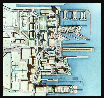
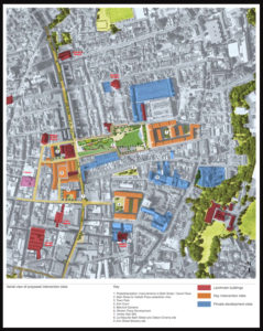
Above is the image of how the finance sector at the waterfront is meant to look after completion, Masterplan wishes to look at this development and the changes that occur throughout the process whilst identifying what makes the area unique to Jersey and its industry.This image represents the potential changes that will occur in certain areas, whilst also showing points of historical interest to the public which may cause debate. By doing so it provides an insight into how St Helier wishes to change over time, this gives us an idea on how we want to go about photographing these areas, as the technique of contrast could be used to identify changed features.


St Helier Photoshoot 1

I reviewed all of my images I took on my St. Helier photoshoot and selected the top 100 images from throughout the day.  When photographing these images I relaised I was drawn to the bold and abstract shapes and colours and how this contrasts with the background of some images.

To develop these images I will pick a smaller selection and arrange them in an order together as I think the images I have collected all link together in a way. I wanted to focus on the parts of St Helier that people may not pay attention to in everyday life, similar to Luke Fowler.

Here are selection of my favourite images from the shoot:

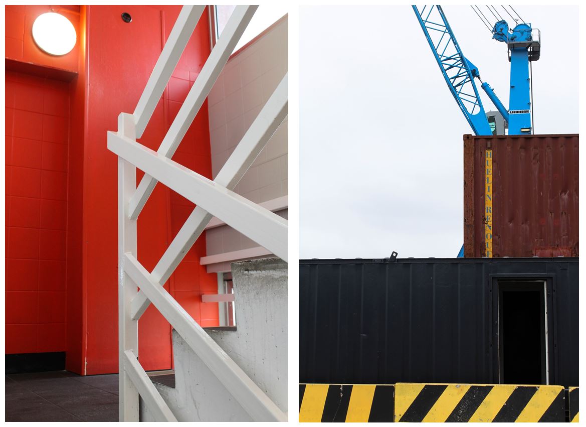
One of my favourite photo from this shoot was the  image on the left.

Visual:

  • I like this image due to its bold and structural lines and shapes that frame the photo. The right hand side has multiple bold white lines creating a crossed pattern to the middle of the image which is juxtaposed with the simple red wall behind and on the right if the image.
  • The contrasts between the red wall behind the white railings gives the image a more abstract feel and only allowing the audience to tell what the shapes are because of the staircase in the bottom right hand side.
  • The use of only three main colours in the image gives it a minimalistic appearance, focusing in the structural side.


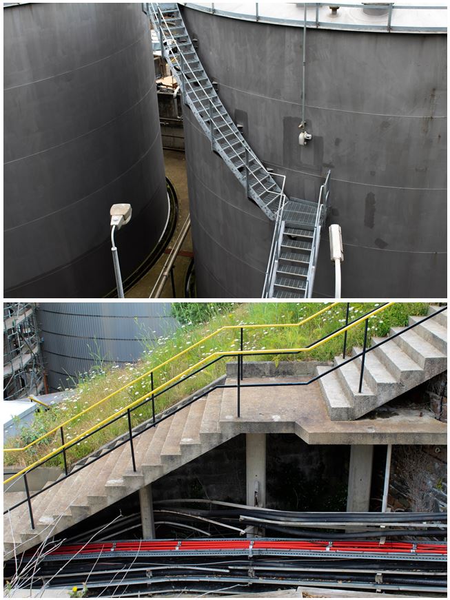
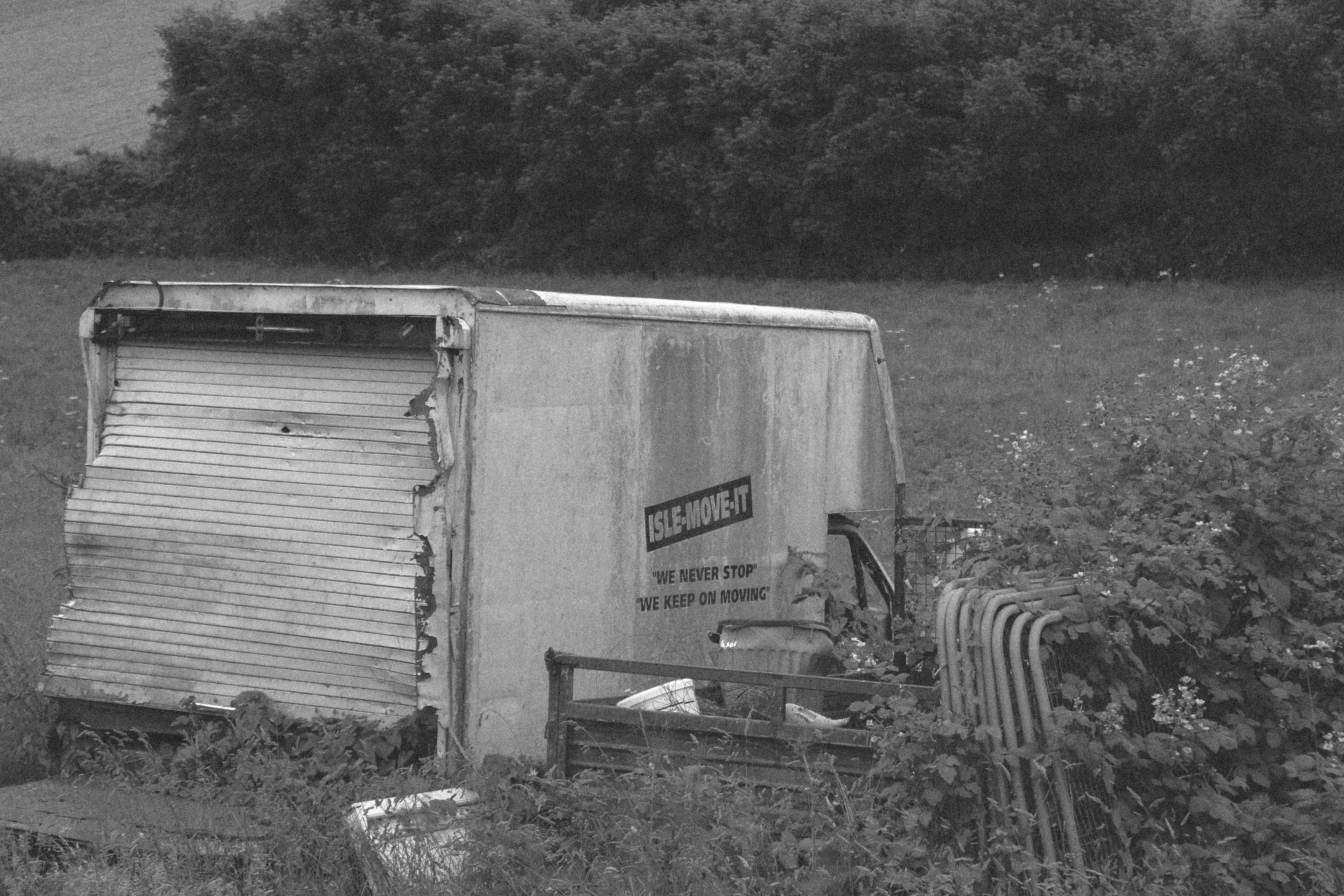
  • I also like the image of the right due to its industrial appearance with the crane and metal crates, focusing entirely on structures.
  • The bold black and yellow wall along the bottom the he image contrasted with the rest of the quite dark colours in the image, making the wall more obviously a warning not to cross over.
  • The composition in this image shows the structures in layers, starting from the yellow and black wall along the bottom, followed above by the entirely black crate going half way up the image. Above that is a smaller brown crate and a blue crate above. The different layers in the image create obvious divisons between each section, but the way all the shapes are together makes them look conjoined


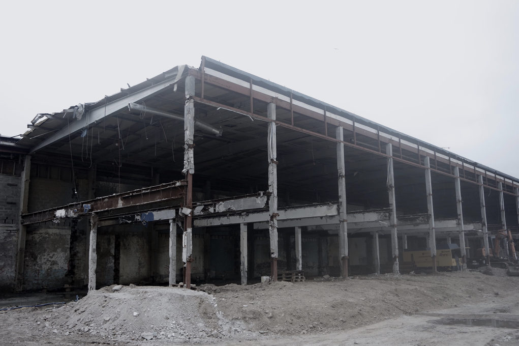
Industrial Images: