Category Archives: A2 Personal Investigation

Filters

Author:
Category:

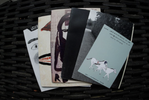
Zine Analysis

The term ‘Zine’ was coined in an October 1940 and stems from the shortening of the word magazine and was developed as a rejection of commercialism and mainstream publications. In stark contrast to the mass media industry, zine artists don’t seek to make a profit. Instead, they are designed to share ideas, stories, and artistic work.
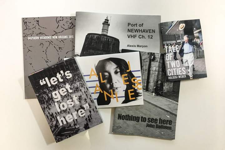
  • It’s a tool that photographers can use to tell a visual story, to inform an audience about a specific topic or issue, to showcase and advertise a new idea.
  • The constant evolution of technology mixed with older, more traditional techniques means that zines continue to intrigue with highly individual and versatile methodology.
Photographer James Moreton Interview://www.thephoblographer.com/2017/05/05/why-photographers-should-create-zines/

‘I believe the photographic book is the best medium for photography. The ability to create impact by pairing, juxtaposing and sorting pictures into a flow in order to tell a story or instill an emotion in the viewer is unsurpassed by any other photographic medium. Having something tactile in your hands that you can keep and look at on your own terms is also very important. A zine is an accessible way for someone to create this object and they can take on many different forms – from a very DIY aesthetic to high end magazine print quality.’

Different Zine designs:

John  Darwell:

The British photographer John Darwell is an independent photographer working on long-term projects that reflect his interest in social and industrial change, concern for the environment and issues around the depiction of mental health.

To date he has had seventeen books of his work published. As a photographer, Darwell “roots himself in neglected landscapes”.[1] His early work, published in Working Lives and The Big Ditch, was in black and white, but he moved to colour soon thereafter and has not used black and white since.

From series ‘Scratching the Surface’ that looked both at the extractive industries of Cumbria and also asking the question as to whether we photographers can ever do more than scratch the surface of our subject matter.

I first discovered the photographer John  Darwell in class where I read his zine called ‘Sheffield in Transition’. He uses a roll of colour negative film which is different from his previous work which is in black and white, and looks at a more contemporary approach looking at contemporary issues, in terms of post industrialisation and often problematic redevelopment schemes. ‘Much of the work I produced in Sheffield had a strong and explicitly political edge that gad only been been hinted at in mt earlier works.
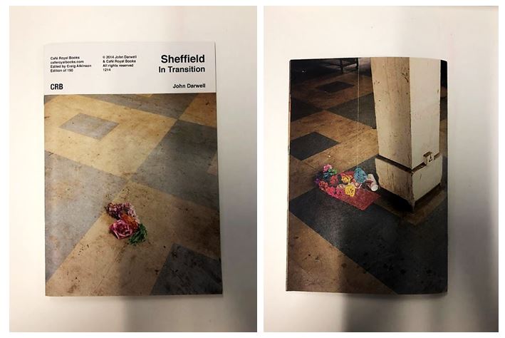
The front and back of his zine contain images taken in the same place but at different times. It clearly states the name of the zine ‘Sheffield in Transition’ on a white background creating a professional appearance.

His work has been exhibited, and published, widely both nationally and internationally, including numerous exhibitions in the UK, the Netherlands, Italy, the USA,  Mexico, South America and the Canary Islands, and is featured in a number of important collections including the National Museum of Media/Sun Life Collection, Bradford; the Victoria & Albert Museum, London and the Metropolitan Museum of Art, New York.

  • This page earlier on in the zine was my favourite as it includes the use of text as well as images to explain his concept. I also liked the used of the yellow background behind the black text to emphasise it and to link the the page on the right which shows an image of rubbish and plastic surrounding one area and hanging on a tree.
  • The yellow plastic bag is highlighted through the use of the same colour yellow background on the left page, linking the two together but still juxtaposing, going from lots of detail on the right to hardly any on the left.

  • As the zine continues it displays landscape images across double page spreads throughout. I like this layout as it forces the reader to compare one image to another and to be surprised by the contrasts between each one when they turn the page.
  • For example, the image above show a more industrial looking image with bold structures and lines juxtaposed containing colours with similar neutral tones. This is juxtaposed with the chaotic image of a pile of paper and plastic rubbish on the next page with different patterns and contrasting colours.
  • Having this image after a more simple and structured image emphasises the chaotic and disordered nature as it’s two extremes one after another.

David Johnston:


I then looked at another zine by the photographer David Johnston called ‘Long walk’ where he displayed single images of the country side alongside side diary entries of what he experienced on his journey. For example the first diary entry reads: ‘Did some writing until lunch time. went for walk in afternoon over near Rackton, the old woodmans cottage. walked through woods where we spotted about 8 deer and quite a few squirrels, a wren and listened to a blackbird singing.’ The layout of the diary entries are messy like he quickly wrote them after he did or encountered something which gives the whole zine a more authentic feel. He also includes the crossings out and mistakes grammatical mistakes he made like no one would be reading his entries, which makes the zine more personal as he’s sharing his thoughts and feelings with the reader. The front  cover is the only full page image in the zine making the reader expect find more inside but only contains small images in the top half of one page on a double page spread.
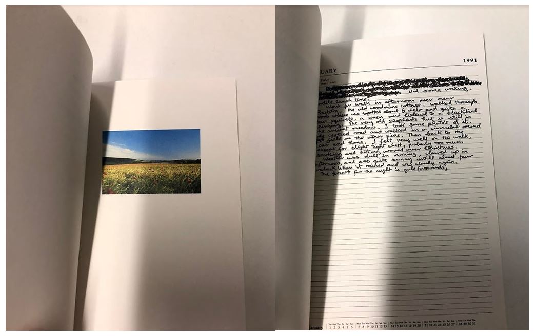
David Johnston has for many years made photographs during walks through the West Sussex countryside. His work constitutes a private archive of thousands of images, a personal and highly detailed account of seasonal and social change across a specific rural landscape. The Country Life series, curated by Val Williams, invited artists to respond to the George Garland Collection, archived at the West Sussex County Records Office. Like George Garland, David Johnston is committed to the preservation of the rural landscape, and is assiduous in making photographs in which no traces of the modern world are evident. The publication and exhibition of Long Walks expresses the commitment of the Country Life project not only  to commission new work, but to also explore existing archives and to recognise the value of non professional photography within the community.

The end of the zine contains ‘Forms of Blossoms’ giving information about the form and parts of flowers expressing David Johnston’s interest and passion for nature. It also contains a glossary listing 55 names of parts of flowers, the contrasts with the start of the zine where David Johnston expresses his experiences to facts about the forms of flowers linking back to the Country Life Project.

Zine final idea

I have decided that I want my zine to be very creative and unique I want the images to be on large paper, differing between glossy and card. I will then cover the front of my zine with a cover of fabric and will make a small piece of card ontop with perhaps a small picture stuck to create a clear visual demonstration of what is inside the zine. This will create a more interesting eye catching  zine and will allow the project to be about contemporary contrasts and comparisons.

inside my zine I want a mixture of double page spreads that change wihtin sizes in order to create the best effects for the picture as possible. I want to exaggerate the size of a building by having the image on large paper,I also want many of the images to contrast each other, some to have a boarder and some to have multiple on one page as I want this zine to be more forwards thinking than the previous traditional zines.

my zine experimentation:

Experimenting with layout, order and text

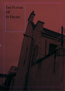
This will be the front page of my zine,I chose this due to the impact of the red and through the interesting composition allowed a clear title to be effective wihtin the top left corner. I chose a bold but yet elegant text, overall I think this is an effective for a cover and the rest of the building to carry onto the back will be effective.  Due to me also wanting to make a hard cardboard cover with a strong colour and clear visual stimulus it shows a clear connection from all the front covers.

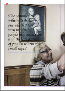
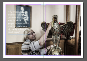
I decided it would be effective to use a quote of a lady to whom I interviewed in St Helier. I think this gives a story to the zine itself and a sense of community and really brings in the aims of presentation wihtin the Morden and older areas of St Helier. The text I chose was more twirly,I chose this as it connotes age of the lady and also demonstrates a fitting composition as this was taken inside a church. This is a double page image but I have given it a boarder as it has a lighter undertone. This at the end will make it smaller than other images but due to the different areas of interest such as the text, face and statue attention will still be drawn to the photo.

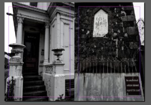
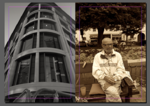
I wanted more harsh black and white pieces to cover all of the page.I chose these two images as I did not use them much previously and think they both demonstrate aspects of deterioration and contain a strong composition to the previous image. The strong white in the left image and the white in the centre right show a synritity to the images and I think the direct divide is successful in a simple display of the images.

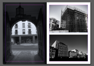
As said in my previous post I want to experiment within different layout. I wanted to choose images which all chose the stature and impact of buildings in slightly different compositions.  Again I have edited all of the images into black and white this then shows a strength to the images and also shows implications to look at the buildings structure and not the images themselves.

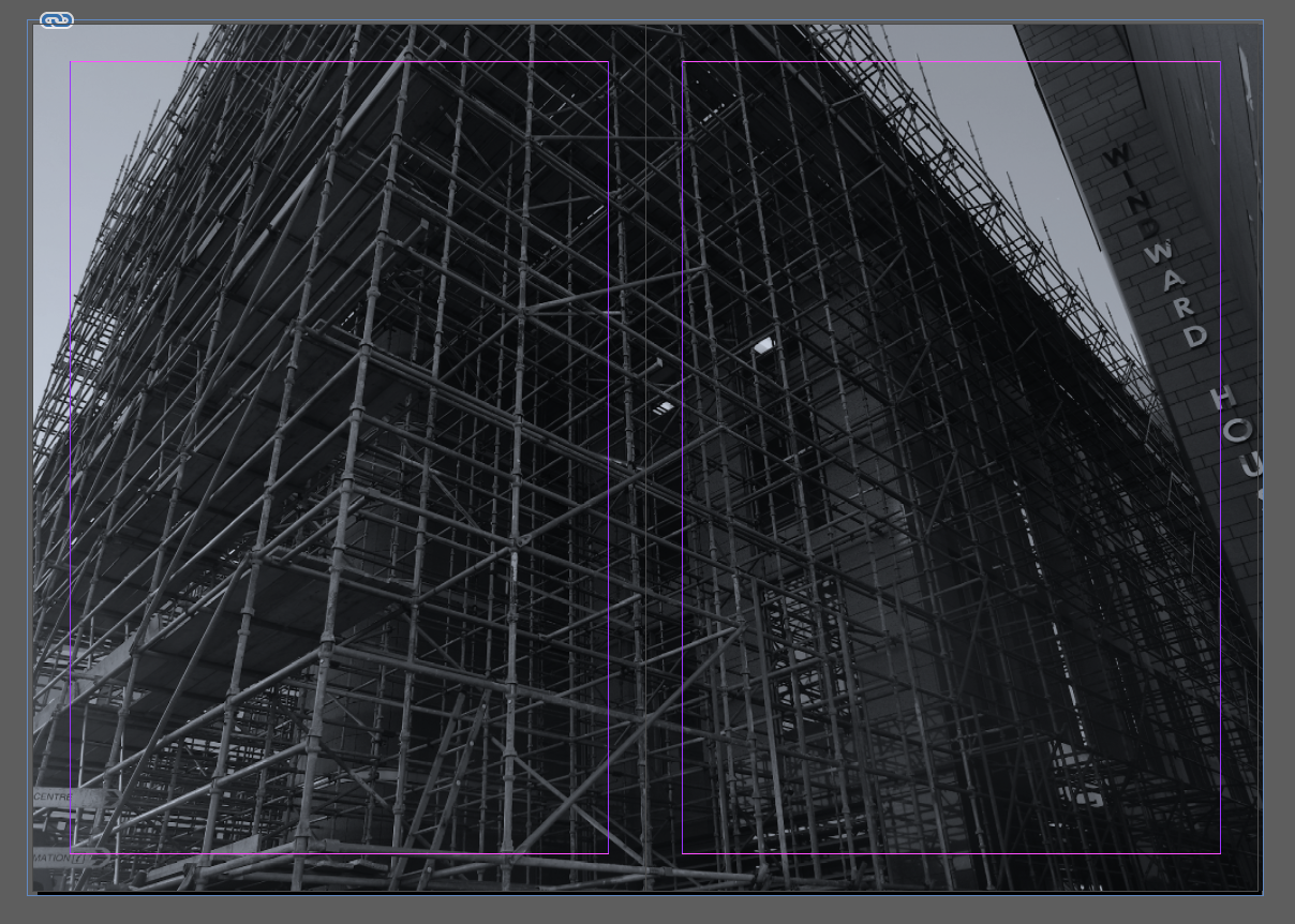
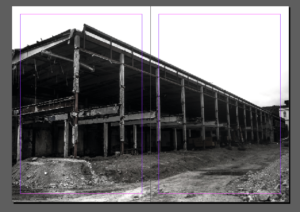
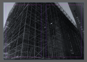
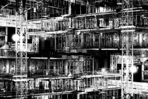
I chose this piece due to the interesting composition and how on a large size of glossy paper the strong impact this would have. It also has a clear convention to being connected to the construction,destrcution and  remodernisation of St Helier. I think the angle and harsh composition really creates a successful piece. Although this piece is very dark tonally It creates a very strong impact  altogether.

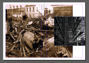
I am not sure however about this double page. In my mind I think the colours or specifically the tonal shading of the black and white does not site each-other. I wanted to show a contrast within the older community and people living within St Helier versus that of the new modern buildings. I think this is an interesting idea when done correctly but I will need to do further experimentation into this piece.

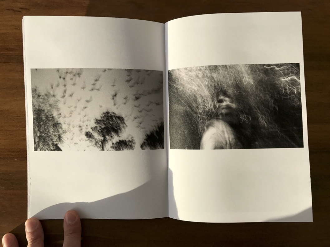
This is now one of my favourite images so I have decided to give it a double page spread. I like the way in which it is cut off as this implies its huge stature,I think the image itself is enhanced though the tone and the way in which the scaffolding creates a three dimensional atmosphere.

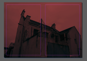
Lastly I wanted to experiment even more so within composition so making a miss matched composition. I think this is interesting as it presents two different types of rebuilding and the different tonal of warmth and coolness contradicting is highly interesting.

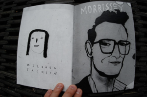
Artistic influence and mood board:Zeroten, and The Shaved Guy by Lin Yi-Hsuan

Zeroten, and The Shaved Guy by Lin Yi-Hsuan

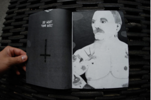
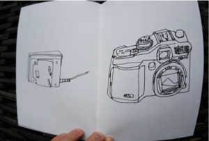
I think this double page zine is effective due to the similarity between the base colours of grey being but the slight different shades to point out an obvious divide between the two pieces themselves.I think the text allow a more interesting composition to the piece and gives more attention to detail and I think this is something I might use within my own project, such as quotes from people within the zine talking about St Helier.  I would interpret this zine as more of a contemporary arts style inspired by the 60’s and 70’s I think the photographer was trying to communicate the way in which drawing and art can be unique and quirky and still have a message wihtin a piece. I think many poeple would judge this piece harshly and say this is not a successful due to the child like influence the artists is seen emphasising throughout his work. My work of course would not be artwork like this but I think the main importance is the synrinarity between the pieces themselves.

I will take inspiration form the covers over these zines due to their vibrancy and interesting drawing and imagery. It will be highly effective,especiall when I will wrap up my booklet in a cover with an interesting mark and then make another card cover with a title and an image of my own onto the top.I am fascinated within the contemporary style of this artist and although my images are not similar I think it will really help me in the long run. The colours of the  pages themselves are always the same within both pages, I think this shows cohesion within the pages and also allows the differences between each page to focus more on the tonal black and white contrasts.


when looking for zines I decided to explore the well known cafe royal and the chosen pieces Craig Atkinson. I chose his work as inspiration due to the way in which it is so unique and art based. There is a strong sense of character and individuality between each of the chosen photos within the book and yet all clearly have a solar pattern and theme and continue as a narrative.I think I need to open my images and also the creativity up when designing my zine,I think the more contemporary and more abstract contrast within the colours and composition and displayed more creative and overall a lot more effective. I want to show juxtapositions of colours, size and also the type of image thsemlves I think this will attain the interest of the reader and present st helier visually and compositionally in a interesting way.

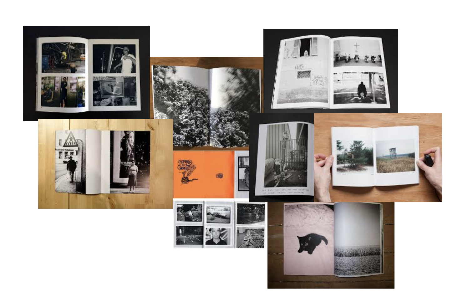
mood board:

I created a mood board in order to look at a quick overview of what many zines layout are like and was I think will be the most effective and also the best composition for each page. I have taken four photoshoots so when creating my zine want to expand more on images that I might not have previosluly experimented with throughougly enough.

Future Of St Helier Newspaper And Installation

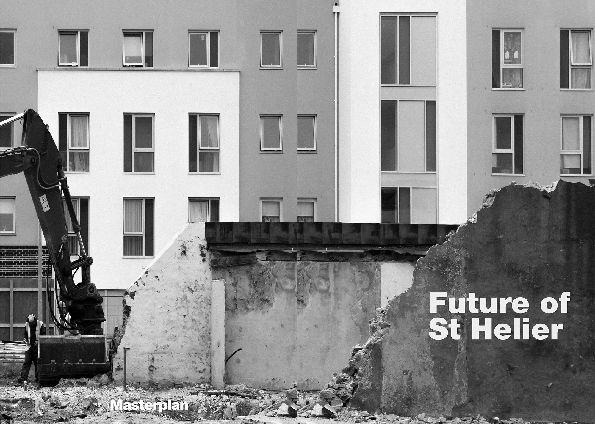
Future of St Helier

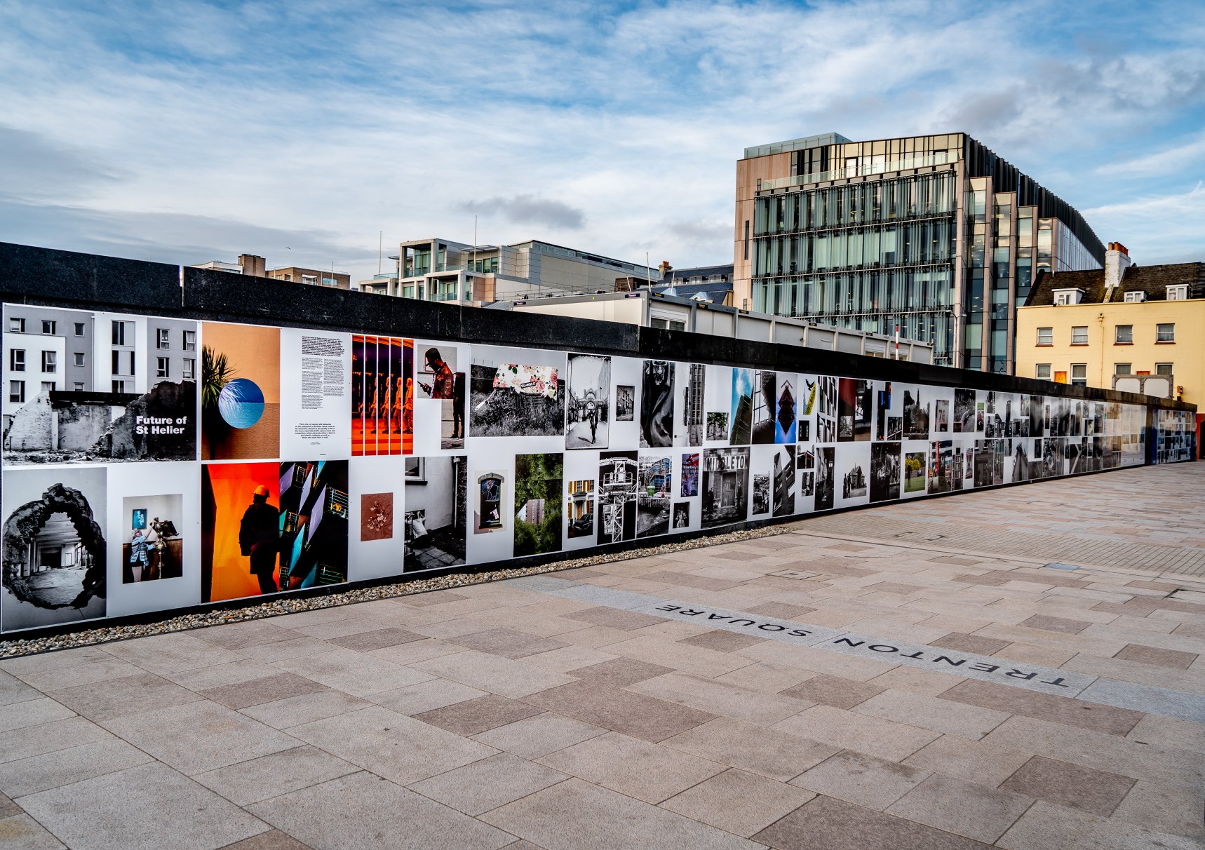
6 of my photos were included in the Future Of St Helier hoarding installation at the IFC in St Helier

Hoarding Installation

The unveiling of the Future of St Helier Hoarding at the International Finance Centre on the Esplanade in St Helier took place on Thursday 13 Dec 2018.

First published as a 52 page newspaper supplement in September by the Jersey Evening Post the work produced by A-Level Photography students at Hautlieu School have been transformed into a 34m outdoor installation as part of Masterplan Community Arts and Education Project

We were challenged with responding to specific areas, streets and neighbourhoods divided up along the urban vingtaines of St Helier and to explore through research, archives and photography the built-environment, urban living, diverse communities, town planning, land use and re-generation projects.

We thank all sponsors and collaborators for making this a successful contribution to the island’s cultural records and historic archives Jersey Development Company, Camerons Ltd, MJP ArchitectsArchisleLewis BushPhoto-Archive Societe-Jersiaise, Kevin Pilley, States of Jersey and Connétable of St Helier, Simon Crowcroft

Earlier today we unveiled the Masterplan Future of St Helier hoarding display at the International Finance Centre. Lots of local media interest from Jersey Evening PostITV Channel TV and BBC Jersey who broadcasted live on radio talking to photography students at Hautlieu School, Constable of St Helier, Simon Crowcroft and sponsors Jersey Development Company, Camerons Ltd, MJP Architects about the future of the island and its capital. An excellent example of how a community arts and education project can generate a debate that affects all those who either live, work or visit St Helier.

If you are interested in our views of young people tune into BBC Radio here (listen from 3:18:30 onwards or watch the six o’clock news tonight on ITV.

https://www.bbc.co.uk/sounds/play/p06rlpdw

If you missed the news last night at ITV Channel TV you can catch up here with Hautlieu students talking (15m.12s) about their images on display at the Masterplan Future of St Helier hoarding on the International Finance Centre.

See link here

The outdoor installation on the hoarding around the construction site is a great way to engage the public in art and debates concerning the future of the island’s capital but, what we need in Jersey is a new contemporary art space that will provide a new venue to showcase art produced in the island, but equally also bring international art to Jersey for the public enjoyment of its residents and visitors alike.

The recent Culture, Arts and Heritage Strategic Review, commissioned by the Government of Jersey makes 20 new recommendations that will revitalise the island’s cultural infrastructure and achieve a wide range of social and economic objectives from tourism, to health and well being to external relations, to planning and environmental developments – in the hope that in partnership with Government it will enrich and enhance Jersey’s quality of life.

Let’s hope those in power who can make real changes to St Helier’s build environment will include such a new art space in the revised Masterplan of the Waterfront. All we need is political will and re-prioritising public funding for the arts. States of Jersey

Future of St Helier Newspaper

The outcome of students work was first published on Tuesday 18 September 2018 as a 52 page newspaper supplement, Future of St Helier that was printed in 14,000 copies and inserted into a daily edition of the Jersey Evening Post and distributed island wide.

Here is a video browser of our Future of St Helier supplement printed and distributed in today’s edition of the Jersey Evening Post. Hautlieu photography students were challenged with responding to specific areas, streets and neighbourhoods divided up along the urban vingtaines of St Helier and to explore through research, archives and photography the built-environment, urban living, diverse communities, town planning, land use and re-generation projects. Each student designed a page spread which was then split in half producing a fragmented image reflecting on the nature of experience and diversity of St Helier.

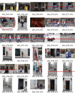
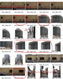
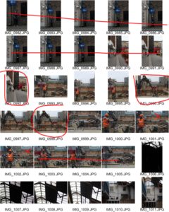
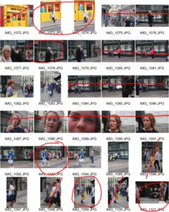
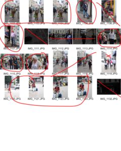
PHOTO SHOOT

For our second shoot we left Societe Jersiaise to explore our allocated areas of St. Helier. First I explored my areas on foot and took pictures of the surrounding buildings and people on a street view, then later went to the top of sand street car park where I managed to capture pictures of town, construction workers and the public from a raised view. The car park was the only public point where we could capture pictures from a higher level so we explored commercial street. We asked the owners of multi story buildings for permission to photograph on top floors for alternative viewpoints of St. Helier. The one building that granted us permission was a mechanics warehouse. We never had the opportunity for an alternative high view point but we managed to capture images of the inside of the building where there were many unusual objects in unusual places. We came across old cars and old kitchen units in the derelict upper floors of the building and explored their storage rooms.


Research and analysis of my zine

Zine; A Zine is an effective method of marketing and presenting your photography, they have been created for years there is a creative athletic collaborated wihtin the making of zines. it creates the ability to create a impact of juxtaposing and sorting images into a story in order to enhance emotion.There is an energy and ability to show yourself through the work as you make it yourself. This aesthetic enables a tactile creative freedom. I believe that zines look and feel professional and achieve a high quality when out onto thick paper and good printing, it allows a completed piece and presentation without the harsh formality to take away from the piece itself. its expressive and shows a desire of photography  throughout.

When gathering my visual inspiration I wanted to concentrate on the themes of narrative, subject,design and concept. When choosing the theme of my Zine I want to have a constant theme throughout and so not having a segregated feel to the piece as a whole narrative concept. I wanted the narrative to be the history and time present throughout St Helier, I wanted emotion and periods of time to be expressed through the modernisation and deforestation of St Helier and the people who have inhibited St Helier for long or short periods of time and the cultural impact of the area on them as a whole. This embodiment of time, emotion and urbanisation forms St helier in a unique frame which would be intriguing wihtin the prevention of a zine.

When questioning the theme of the piece I want to show how neglecting  periods of significant historical moments  such as ww2 and the occupation had upon old buildings and families within The red section of St Helier,The deep urbanisation and neglect for buildings shows a historical significance of abandonment and reflection of past times, which some elders say shares community and ethnicity within people and the reflection upon each other. However between my photos you can see a current distinction between the modern building up or architectural developmental impact upon the people  and the money in comparison to the people within this section. When using this theme of history of time to use a comparison of people and community effect and wether work or community is enhanced wihtin the specific section of St Helier.

My subject matter at the start of this project was more projected upon the buildings of St helier and the different narratives of building destruction and neglect, this then illuminated the possibilities of reflecting the people who live among these communities. I think my most successful images are of the subjects of construction of buildings such as piles of rubble and construction. The thematic colour of red also connotes a historical reflection of war and how the buildings being taken should be a reflection of a movement or however an ignorance go past history.I believe in this 16 page booklet the buildings would be more conceptually pleasing and also creative a narrative more available to the reader. My whole concept overall for the Zine would be a time frame of chronological demolish rebuilding and relation fo people living in the various areas itself.


LEWIS BUSH

Lewis K. Bush is a British photographer, writer, curator and educator. He aims “to draw attention to forms of invisible power that operate in the world”, believing that “power is always problematic” because it is inherently “arbitrary and untransparent”.

Lewis Bush – Metropole

These particular pieces are from his body of work ‘Metropole’. Bush has described it as ‘A composite of dozens of walks through the city of London, using it’s changing architecture as a metaphor for the city’s growing inequalities.’ Bush has used double exposure to layer buildings on buildings, which has created effects of disorientation in terms of scale, perspective and orientation.  ‘Metropole’ has a dark purpose behind resembling London, through its transformation into a ‘new empire’. His work is taken from the perspective of a citizen, comparing the new and progressing buildings and high rises with capitalism. He particularly relates to the idea of Globalized Capitalism, bringing forward concern of the new dominant ideology taking over western societies, thus the progression of threat that increases throughout his book.

At the beginning of this project, all students in the photography department met at The Societe Jersiaise. We listened to presentations about the master plan for the Future of St. Helier and the plans for construction. That was followed up by a presentation from Lewis Bush describing his work of ‘Metropole’ and its relation to the new construction of St. Helier. What I took away from his presentation was new ideas of editing and how I could make my project more interesting for me. I like the idea of cutting up images and layering them, and using double exposure to create something more abstract and unrecognizable. However, my project is based on exploring with people and community in St. Helier. I wold like to explore cutting up images of people and enhancing features of a person that describes more about an individual in a snapshot.

FUTURE ST HELIER

FUTURE ST HELIER 
I think St. Helier has a lot of potential in areas of new construction, community and culture, especially because we are a small island with rich history and opportunity for improvement. Now, it almost gives me the impression as quite preservative with a need for change to improve life in 'town'. 
Personally I think that we need to refine our community more than renew a concrete landscape.

In my view St. Helier is made up of the people who work and live in it. For it to become better, the sense of community and acceptance of all people needs to improve. However, the main focus of is construction, due to rise in population and demand for work spaces from the finance industry. I understand in order for the community of St. Helier to improve these steps must be taken, especially with the struggle to house the increasing population of Jersey. However I feel that Jersey thinks it has no room, time, or money for any creative art which essentially richens the islands culture and sense of community, not to mention boosting the tourism industry which once was one of the biggest industries in earlier years. St.Helier is dull and there is little art. Any time a proposal has risen to improve this, nothing has happened.

I feel that Jersey is trying to become something it has never been and this is essentially destroying the essence of the island. Jersey should improve on what we already have.
When we rebuild St.Helier it should enhance what we have in terms of landscape and history through art, photography and architecture, rather then try to be like an existing city.
Albert Smith
Masterplan: a comprehensive plan of action

The masterplan for St. Helier only solves two problems in Jersey; housing and work space with added restaurants and shops to please the residents of St. Helier and the island. These are important tasks to be completed but, I think we shouldn't forget the importance of enhancing culture and art and we shouldn't lessen its value and its part it has in our society. If five finance buildings are to be built along with apartment buildings along the water front, I want something to be given back to the community like a quality skate park which has been repeatedly promised and delayed, a multi-story art gallery to house all types of creative mediums, public places reserved purely for the display of artwork and what about a new arts center?  

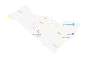
My assigned area of St. Helier; https://www.theislandwiki.org/index.php/Broad_Street
The area I have been assigned includes Broad Street which was St. Heliers first shopping area with many of the retail establishments opened up by English and French immigrants. 
The side of the street that is now consisting largely of financial institutions was originally a row of houses. The opposite side of the street was made up of shop fronts which are now seen as the back entrances of shops on King Street. Overtime this has flipped around with the growth of town, as today the frontage of these shops face King Street. Many of the retail establishments were opened up by English and French immigrants, which leads me to focus on the people that make up St. Helier as inhabitants of Jersey have never been truly Jersey bred.
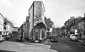
Sand Street

Third Shoot in St. Helier

My Edits

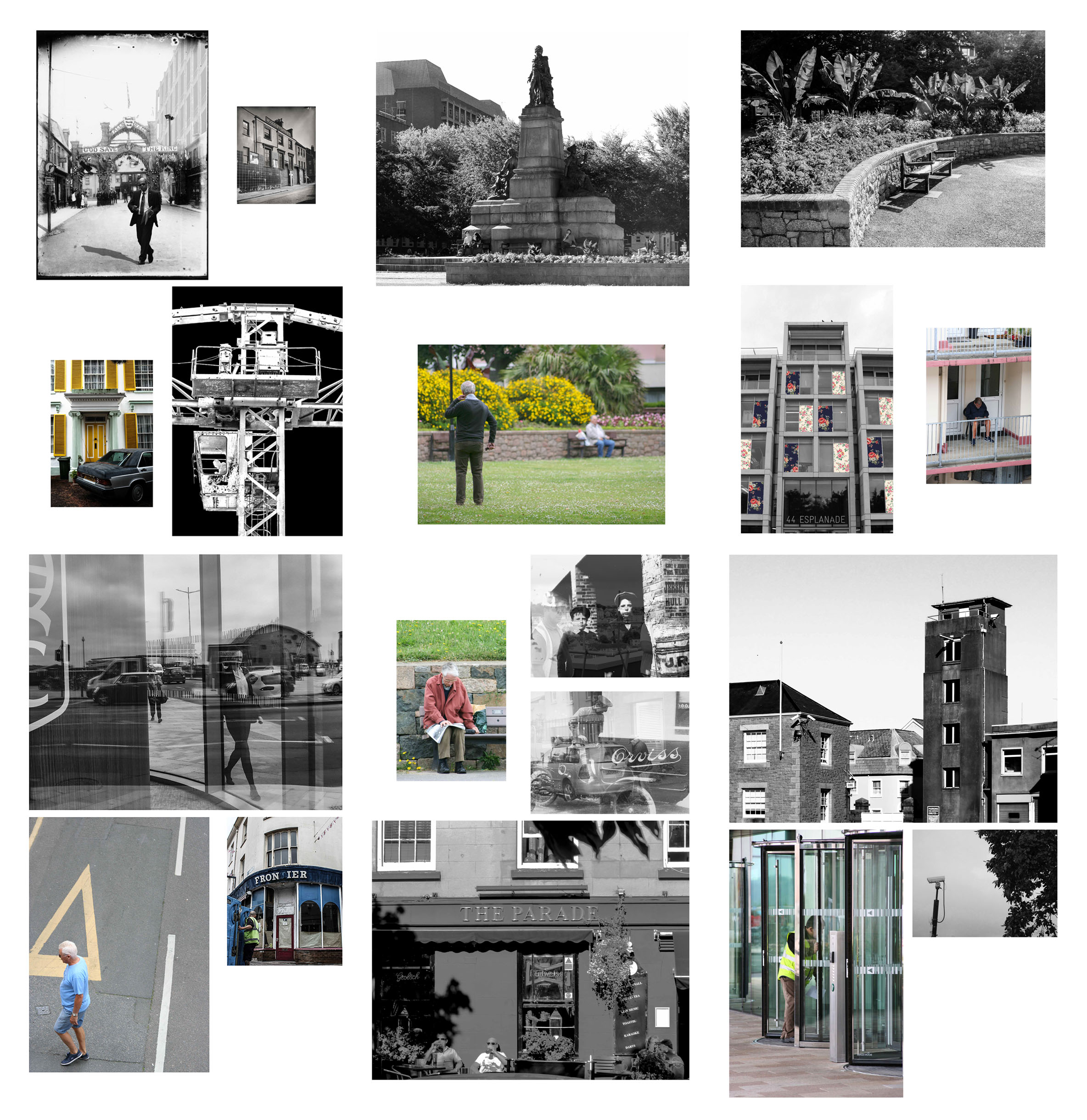
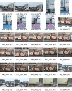
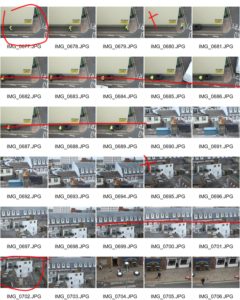
Below are my edits from my third shoot in St. Helier. In this shoot I focused more on the structures and greenery within the area to create a small selection of photographs. I have already selected my layout and my final photographs for this project but I felt that it was necessary to return to the area in order to see if there were any points of interest that I missed. I found upon returning to the area that my main point of interest – the building site – was demolished. The site for this is shown in the last photograph.