In what way have Mandy Barker and Keith Arnatt explored the concept of Anthropocene in their work?
“Have no fear of perfection – you’ll never reach it” – Salvador Dali (Barker 2017:36)
Human’s impact on the environment has been so severe that the earth is in a new age, Anthropocene. Photographers have taken it into their own hands to present the impacts of mankind on the environment in their works, leaving the rest of interpretation and action to the viewer. Mandy Barker often draws an audience in by presenting her work with an aesthetic of beauty which then contradicts and shocks them when they realise the true meaning, whereas Keith Arnatt gets straight to the point demonstrating the disgusting truth behind thrown away plastics, decaying foods and trashed toys. I chose to look at these artists specifically due to their non-conventional approaches, taking a more close perspective of individual aspects such as certain items found in a landfill or the effects of micro plastic pollutes on plankton at the bottom of the food chain, in turn impacting everything that feeds on them and further on. Being able to inspect rubbish items in the same way will allow me to develop insight into where these items come from and the narrative behind them as well as where they may end up (or should be prevented from ending up). Similarly to Mandy Barker, I want to take a scientific approach, figuratively and literally looking at items with the use of a microscope in order to look at the effects of rusting, decay and contamination of waste that I create as well as interesting objects that I find in the natural landscape.
Historical Context:
Photography started out as an important tool for the use of science, an innovation created by those who did not yet call themselves an ‘artist’. One early practitioner, Louis Daguerre, is considered one of the fathers of photography due to his invention of the daguerreotype process. The process involved exposing a sheet of silver plated copper to light then fuming it with mercury vapour, a hazardous element that requires the plate to be conserved under glass to avoid poisoning as well as to prevent tarnishing by prolonged exposure. It went on to become the most commonly used process for nearly 20 years due to its “exquisite minuteness” (Morse, 1839) as said by American Inventor Samuel F B Morse. The detailing in images produced by these new processes made photography a useful application in research into archaeology and botany. Anna Atkins became the first woman to publish a photobook using the cyanotype process, in which she captured British algae species. The cyanotype process, invented by a friend of Anna’s, Sir John Herschel, required the user to mix Potassium ferricyanide and Ferric ammonium citrate with water before coating a chosen material and allowing to dry in the dark. Objects or negatives are then placed on the material to make a print by using UV light. After her mother had died in 1800, Anna became close to her father , John George Children, known as a British chemist, mineralogist and zoologist. These origins caused her to pursue her interests in botany by collecting dried plants. These were probably used as photograms later. She was elected a member of the London Botanical Society in 1839. More recently, artists have chosen to represent environmental issues through staged photography. Although staged photography had emerged as a genre in the 1980s, it has also been around since the invention of the medium. Artists make specific choices when staging their images, choosing to consciously place elements in compositions that reflect the emotions they want to portray. One of the pioneers of staged photography, Duane Michals, acknowledges “I think it’s important to know how to make a portrait of someone that doesn’t tell you what they look like, but what they are about” (Michals, 2012). Keith Arnatt demonstrates Staged photography by choosing which pollutes to showcase in order to reflect the negative impacts on the environment, for example by using decaying items with an underlying meaning of things we throw away. He also chooses to present his images with a minimalistic style which showcases his background as a conceptualist. Minimalism and conceptualism became popular movements in the 1960s. Both movements challenged the existing structures for making, disseminating and viewing art and argued that the importance given to the art object is misplaced. Minimalist art can be seen as extending the abstract idea that art should have its own reality and not be an imitation of some other thing, the artist wants the viewer to respond only to what is in front of them. Conceptual art, however, is art for which the meaning behind the work is more important than the finished art object.
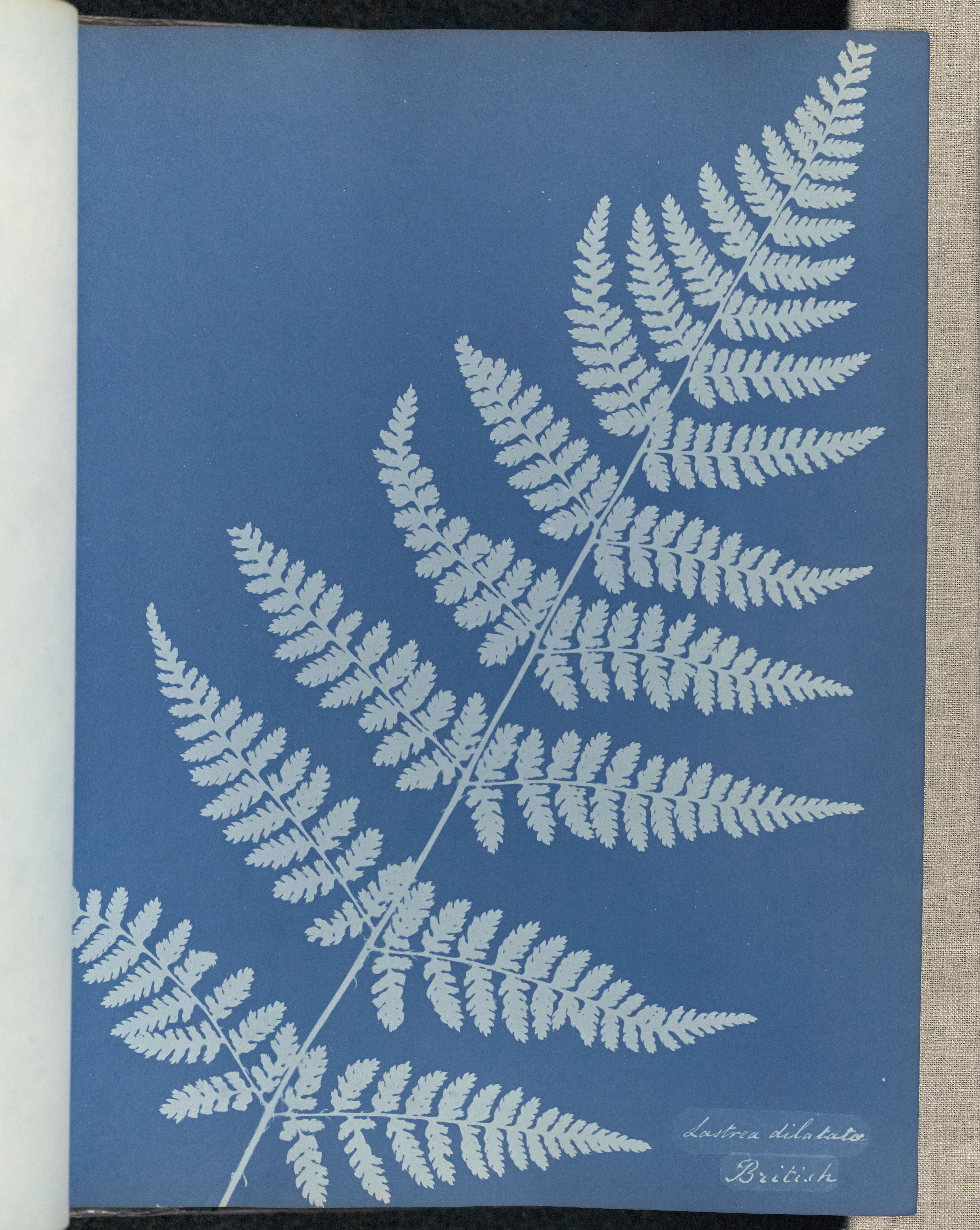
Anna Atkins, Lastrea dilatato, British, 1853, Cyanotype, 25.4 × 19.5 cm
Mandy Barker
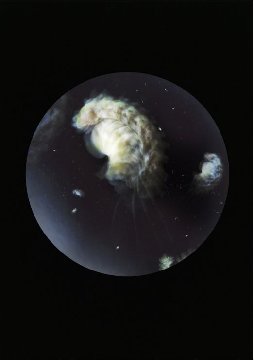 Mandy Barker, Beyond Drifting: Pleurobrachia stileucae, 2017
 Mandy Barker, SOUP: Turtle, 2012
Mandy Barker’s ‘Beyond Drifting’ project served as the main inspiration to my work. Looking at micro-plastic pollutes and their effects on plankton, Barker demonstrates the impacts on an entire food chain with us at the top of it. In one image, titled “Pleurobrachia stileucae”, the remnants of a partially burnt plastic flower are depicted, collected from Carrigaloe estuary, Cove of Cork, Ireland. Items are captured using a slow shutter speed representing the movement of individual plankton in a water column. Captured in a circle on a black background, a re-occurring theme amongst the series, it resembles a planet like construct demonstrating the impacts we have on the earth. In naming images of this series, Mandy uses nomenclature, a method of devising new scientific names, to imitate early Latin origins where plastic items take the place of new organisms. Each name contains the letters that make up the word ‘plastic’ hidden within its title. The entire project serves as a homage to the work of John Vaughan Thompson, a naturalist who collected actual samples of plankton 200 years ago in the same location where the marine plastic debris was collected from. John Vaughan Thompson’s research is evident in inspiring the concept of Barker’s work, even featuring as memoirs in faint print on the reverse page throughout the book, which is deliberately designed to resonate the style of antique science book from the 1800s. In Mandy Barker’s own words, it is called ‘Beyond Drifting’ “because we are not beyond putting an end to the problem – but we are beyond salvaging what is already out there” (Barker, 2017). Drifting also refers to the state of floating above water, like many of the plastics Barker discovers in the oceans. In another series, ‘SOUP’, Barker works closely with scientists to collect trash from our oceans with particular reference to the mass accumulation that exists in an area of The North Pacific Ocean known as the Garbage Patch. ‘SOUP: Turtle’ depicts over 28,000 childrens bath toys that washed overboard from the ship ‘Evergreen Ever Laurel’ on 10 January 1992. The plastic turtles had been circling the North Pacific Gyre for 16 years. Another piece in the series ‘SOUP: 500+’ shows more than 500 pieces of plastic debris found in the digestive tract of an albatross chick. The captions record the plastic ingredients in each image providing the viewer with the realisation and facts of what exists in the sea. Barker notes “I collect this seemingly awful rubbish and I intentionally make it visually beautiful so the viewer is drawn in to see beauty in the image. When they read what it is about, they get the hard-hitting stab in the back of what it represents” (Barker, 2018). In summary, Mandy Barker uses her work as “a powerful form of communication in providing a visual message when sometimes over-complicated statistics or articles are difficult to understand” (Barker, 2017). Her main aim is to encourage people at the very least to think about how their actions lead to this increasing environmental problem. In my response, I placed small, flat items that I had found, such as a melted lollypop plastic wrapper and the bristles of a disposable toothbrush, on the stage of a microscope. In most images, I used the light that came with the microscope however in some I used my phone torch to illuminate the wet looking burnt plastic. A circle shape was naturally created when placing my camera lens against the eyepiece of the microscope. In another response, I captured images with the same concept as ‘SOUP’ being that the rubbish appeared to float in darkness, however I chose to focus on singular items to follow the ‘microscopic’ concept used throughout my project.
 My Response
Keith Arnatt

Keith Arnatt, The Tears of Things (Objects from a Rubbish Tip), 1990-91, colour photographs, selection, 91.5 x91.5 cm
Keith Arnatt’s approach initially began as a means to record what he called ‘situations’ – conceptual works that involved the artist’s interaction with people and objects in space. In his series, ‘The Tears of Things (Objects from a Rubbish Tip)’, close analysis of waste in his images provides the narrative for the deterioration of objects after they are thrown away. Keith Arnatt photographs things that “everyone else thinks aren’t worth photographing” (O’Hagan, 2015) – this is clear proof that people don’t see waste as an issue, believing it should be ignored after it is gone. This is what creates the issue. Keith Arnatt’s minimalistic style is highlighted by the choice of composition amongst the images of the series. He places each item in the centre of the frame, forming a vignette around the sides by using a tungsten spotlight. The objects lay in front of a simple black background to emphasize the textures and colours of the object being photographed, showing the effects of decomposition on the items found. Arnatt allows the viewer to determine their own interpretation of what they are seeing, although there is an underlying bias when demonstrating pollution. One image in the series, depicts a close-up of the body of a baby positioned lengthways. He uses a large aperture in order to focus the forefront of the item so that the foot of the baby is the only area visibly focused. This may be a metaphor for our ecological footprint, the impact of human activities on the environment. The shallow depth of field causes the rest of the object to disappear into a dark blur in the background. The phrase “The Tears of Things” translates from the Latin phrase “Lacrimae rerum” which means the burden human beings have to bear, ever present frailty and suffering, is what defines the essence of human experience. Arnatt uses this phrase to describe the effect we have on our environment. In my response, I tried to follow the same camera techniques that Keith Arnatt had used, I placed my items on a black backdrop and took my images lengthways to create a shallower depth of field. I decided to use items that were larger and 3D rather than flat, in order to achieve the same effect. For example, in one response I positioned a similar baby leg that I had found so that the foot became the centre of the forefront. I cropped the image to a square to share more similarity with the composition of Keith Arnatt’s work. The foot of the baby doll represents our footprint on the environment, being made of plastic, it shows how we are doing more harm than good.
 My Response
In conclusion, Both Mandy Barker and Keith Arnatt provide a micro perspective of the key issue of pollution in relation to Anthropocene. They choose to look at the items causing the destruction rather than the environmental damage itself, presenting images with aesthetics of beauty to contradict the true meaning and shock the viewer. Mandy Barker follows a scientific method with the basis of her work being heavily based off the research she has carried out as well as working alongside a team of scientists to collect the items used in her images. Items are presented as a collection, being classified into groups and given fake names. In contrast, Keith Arnatt is more traditional in his use of the camera. Being a conceptualist, he uses simple imagery that is not supported by great amounts of research and instead leaves interpretation to the viewer. In my work I used both artist’s approaches to show images that are supported by fact whilst also forcing the viewer to think of their actions. I took the scientific approach to a further step by actually incorporating scientific tools such as microscopes into the process of my work. This gave a sense of honesty with my images, showing that I did not need to manipulate them to show the horrible truth.
Bibliography
Barker, M. (2017), Research Notes Beyond Drifting: Imperfectly Known Animals, London: Overlapse
BBC (2018), Hull artist makes pictures from waste washed up on beaches, Location of site: https://www.bbc.co.uk/news/av/uk-england-humber-46222090/hull-artist-makes-pictures-from-waste-washed-up-on-beaches
Fabbri (2010), Cyanotype – the classic process, Location of site: http://www.alternativephotography.com/cyanotype-classic-process/
Locke (2015), How photography evolved from science to art, Location of site: https://theconversation.com/how-photography-evolved-from-science-to-art-37146
Lotzof (2018), Anna Atkins’s cyanotypes: the first book of photographs, Location of site: http://www.nhm.ac.uk/discover/anna-atkins-cyanotypes-the-first-book-of-photographs.html
Martinique (2016), When Staged Photography Becomes Art, Location of site: https://www.widewalls.ch/staged-photography/
Muñoz-Alonso (2013), Showing the things we cannot see, an interview with Duane Michals, Location of site: https://selfselector.co.uk/2013/12/11/showing-the-things-we-cannot-see-an-interview-with-duane-michals/
O’Hagan (2015), Keith Arnatt is proof that the art world doesn’t consider photography ‘real’ art, Location of site: https://www.theguardian.com/artanddesign/2015/aug/27/keith-arnatt-photography-exhibition-spruth-magers-absence-of-the-artist
Osterman, Ten Steps in Making a Daguerreotype, Location of site: http://photohistory-sussex.co.uk/dagprocess.htm
Samuel F. B. Morse, THE DAGUERREOTYPE: AN ARCHIVE OF SOURCE TEXTS, GRAPHICS, AND EPHEMERA, Location of site: http://www.daguerreotypearchive.org/texts/N8390002_MORSE_NY_OBSERVER_1839-04-20.pdf, Originally taken from the New-York Observer 17:16 (20 April 1839): 62.
Staugaitis (2018), Artful Swirls of Plastic Marine Debris Documented in Images by Photographer Mandy Barker, Location of site: https://www.thisiscolossal.com/2018/04/plastic-marine-debrisby-mandy-barker/
Tate, Conceptual Art, Location of site: https://www.tate.org.uk/art/art-terms/c/conceptual-art
Tate, Minimalism, Location of site: https://www.tate.org.uk/art/art-terms/m/minimalism




 Mandy Barker, Beyond Drifting: Pleurobrachia stileucae, 2017
 Mandy Barker, SOUP: Turtle, 2012
 My Response
 My Response

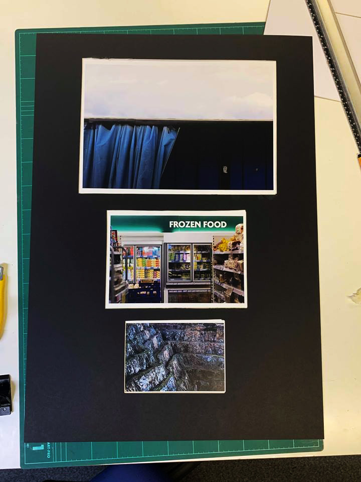
 This is the final layout and design for my book titled ‘Preserved Consumption’. The book includes three different sections including production, product and waste, all of which link into the theme of consumption and its permanent scarring on the landscape (hence the title preserved). Within I have included a variety of different page layouts such as double spreads, boxed in imagery and centred photos, all of which I have experimented with along the way, helping me to conclude which layouts are most effective at accompanying the previous and next photo. Regarding certain images I have included a white border due to it preventing the photo from becoming too overpowering and out-of-place, only really doing so for the larger pieces. For the majority of the pages I have used a white backdrop as I found that it complimented the images the most, stopping any attention being drawn away from the images and to the colours, something I made sure to do from the beginning. Before each category I made sure to add a title page to inform the viewer of the subcategory in the book, giving the layout a narrative as a result which I found is one of the key characteristics of the entire book. Finally I added my essay in the end pages of the book, this was because I wanted to allow the readers to interpret the topic of the book before actually reading about what I had to say about regarding it, with images depicting the studied photographers works and my responses alongside them.
 For the cover I decided to use a rustic effect taken from one of the corroding metal sheets, choosing to use a white New Times Roman font as the main go to for text fonts. I made sure to place this in an area of the page that would make it clear enough to make out and read for the viewer, so by placing it against a blue backdrop seemed to be the logical choice. I selected the title ‘Preserved Consumption’ because of its referencing to how out activities that scar the landscape preserve man actions towards the environment. Along the spine I placed the title and my name in the same font and colour to add the effect of consistency before actually opening the book.
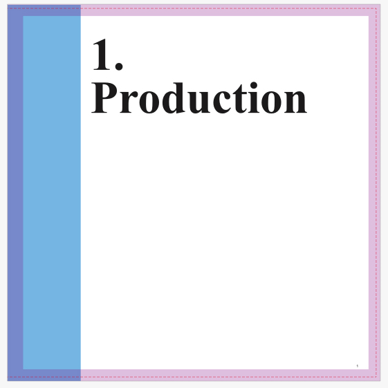

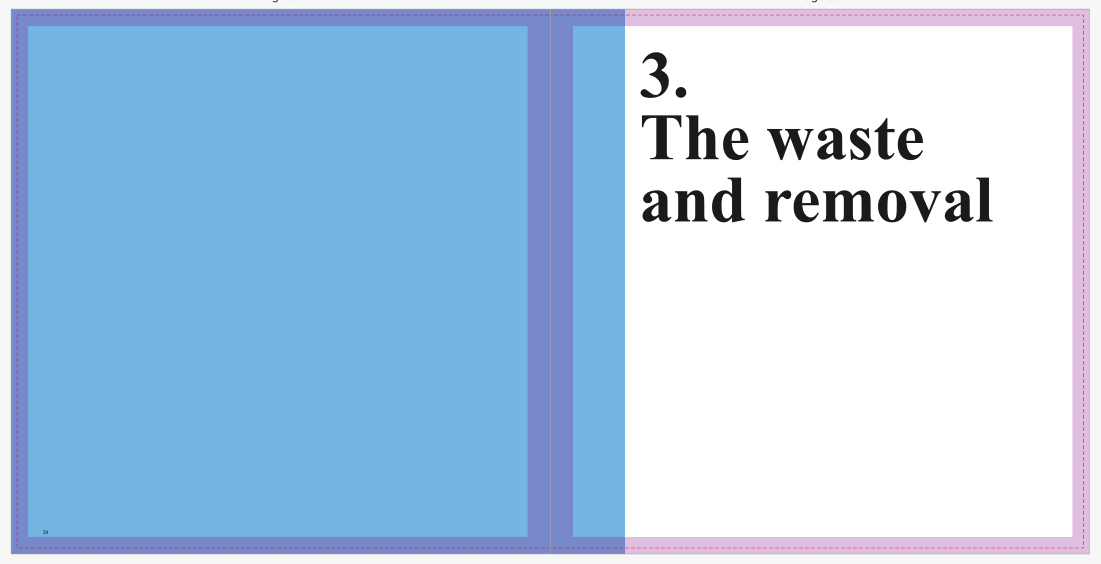 I then proceeded to implement title pages for each of the three topics which would separate the sections of the book out to create a narrative. Once again I used the font New Times Roman to create the impression of consistency, using numbers to represent the intended topic. When laying it out I made sure to include the text underneath the number so that it would fill more space whilst providing the book with an aesthetic result, which by complimenting it with a sky blue really brought out the result. For each of the titles I made sure they had a relevance to the topic they were before, allowing a certain expectation of what will be in it to arise before going through any of the pages.


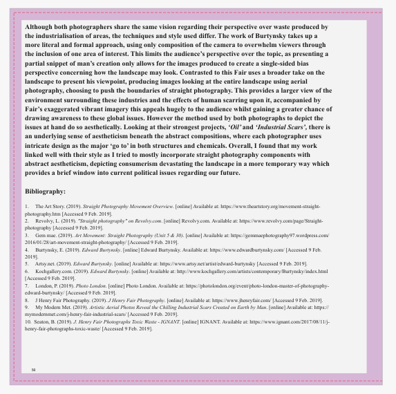 Finally for the essay I made sure to include it at the end of the book, by doing this it would allow for the viewer to interpret the message of the book throughout, with only at the end there being any real answer to what I wanted to explore. Like the rest of the book I made sure to use the font New Times Roman, using varying font sizes throughout the essay on things such as bibliography, title, text and references so that some degree of aestheticism could be put across. Accompanied across the pages of the text I included the photos that the book referenced to and the photographers I studied when making my results, this compliments the essay nicely as the reader can switch between the pages to gain a broader insight into what I wanted to achieve. Composition wise I made sure that the images were placed in an visually appeasing area that did not draw any attention away from the text across the page. When positioning the text for the essay I made sure it started on the left hand side of the page and ended on the right, by doing this it gave the opposite pages more breathing space between them, preventing anything from becoming too eye sore.


