Category Archives: A2 Personal Investigation

Filters

Author:
Category:

Surreal Photography

Surrealism is an art form that became popular in the 1920s as an expression of a revolutionary philosophy. It attempted to free people for their unmovable rationality and the restrictive habits in politics, religion and social behavior. Mostly aligned with radical political movements, it aims at liberating the mind and freeing the imagination. Surrealism in photography is about adding certain imaginary elements to the real physical world, diminishing the fine line between what is possible and impossible, mixing them into a composition. Examples of this consist of headless portraits replacing heads with inanimate objects like umbrellas, and using vivid colours, these photos tend to incorporate two entirely different perspectives and merging them together.

This idea for mixing usually two contrasting things together to form an image I found interesting and wanted to make a basis out of it for future shoots. This would mean using software such as Adobe Photoshop and Adobe Lightroom to create the desired outcomes, whilst using my own photographs from shoots to add objects and people into the picture. Here are some examples of surrealist photography:On artist I found to be particularly influential was photographer Lara Zankoul. Zankoul looks at the idea of underlying representation, and how polar opposites are represented in seven parts as symbol of the fundamentally divine nature of the medium, interrelation and dynamics. Known as Taoist the focus is mainly visual in her work, while the main theme continues to be spiritual and philosophical. When exploring her works I liked the constant use of lighting and perception of the eye to create final outcomes with a surreal twist, the hidden figure of the human body seems to be one of the main focuses of her works, much like Clare Rae’s work Zankoul hides the female face to create an unseen identity.

Some of her works can be seen below exploring these ideas of surrealism and software to produce unusual imagery:Once after creating a mood-board including my favorite images in it, I decided I should analyse one of her most well-known photographs to see and understand what made it so effective as an overall image. To do this I would have to explore three areas: technical aspects, visual aspects and conceptual knowledge of the actual piece itself. By doing this it would allow me to create a response shoot to the artists of my choice in a surrealist style that I could relate to my own personal topic of political landscapes. The picture I chose from Lara Zankoul is called ‘The Unseen’ and is part of a solo exhibition regarding a series of photos. Technical: The image itself uses artificial lighting to create the scene inside the studio made room, because of this the end result makes the impression that the whole thing is subtly staged. A relatively normal shutter speed seems to have been used due to how not too much light has been let and how shadows have not become too overpowering, this as a result allows for a balanced piece where neither of the shades dominate each and instead compliment. The exposure inside the photograph in my opinion is a bit high than usual, but is done effectively to have the green/blue walls pop out against the backdrop of the two characters seated, complimenting them and filling the blank spaces with a more calming and dramatic colour.
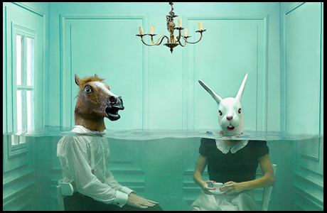
Visual: Visually I think that the piece is extremely aesthetic to the eye due to the composition of the characters in the room and the colours which complement all other aspects. Symmetry seems to be one of the leading aspects within this photo as both the rabbit and horse and positioned equally away from each other with the chandelier placed directly in between them, breaking up the otherwise generic unchanging colours that consist through the image. The water which added as a break, separates the room into a surreal image, as the underwater aspect of the tea party is unusual and so intrigues the viewers to observe the image for longer than they actually had expected.

Conceptual: The concept behind the pieces were to challenge Zankoul to develop images that went beyond regular adjustments. This included creating a completely fabricated environment that her models would have to model in, using fish tanks and specially made rooms to provide them with situations they could adjust too .

PAOLA PAREDES

PAOLA PAREDES MELANCHOLIA OF VIRGINS

This image is from Paola Paredes body of work ‘Melancholia of Virgins’, a selection of experimental pieces raising awareness of the humiliation of misdiagnosed women in Salpêtrière Hospital Paris for ‘Hysteria’ during the 19th century – a time when medicine subjected women to abhorrent treatment. The term ‘Hysteria’ is now recognized as a diagnosis stemming from pseudo-science, intrinsically linked to misogyny and man’s dominance. These ‘Hysteric’ women were put on display for audiences consisting of medical contemporaries, students and members of the public. One front-runner in Hysteria science was Jean-Martin Charcot he was charged with Hysteria treatment at the Salpêtrière Hospital in Paris, where he would use his camera as a tool for recording patient’s attack symptoms for later analysis.  These pictures were then published and used as ‘evidence’. Paola Paredes then took these images and redeveloped them with the use of modern technology, stitching and handmade collages to produce animations and to magnify the humility and penalization that the institution forced on these women.

Conventionally speaking, the quality of the picture is poor due to the age of the photograph, with no depth in contrast, or wide spectrum of shades and

Image from Paola Paredes’ body of work ‘Melancholia of Virgins’

the noise that the camera has picked up in the darker tones of the image. However if you look at the image conceptually the poor quality of the image carries connotations of poor quality of life, respect and empathy for these women, which gives more depth to the context of the image. The rework of the image  encourages viewers to  to look at the image in a different way and interpret feelings and emotions throughout the whole of the frame, as the subjects face is completely covered making it impossible to read her emotions, so therefore applying an interpreted context to the image. The rework and manipulation of the image grasps the viewers attention on the feeling of being watched and recorded, being subjected to humiliation and being stripped of dignity.

This image is one of her still images which contrasts the effect of one of Paredes’ moving images where there is a sense of input of intensified emotion. However each of her still images convey the feeling of a forced or submissive silence. The use of the string covering the face and hiding the identity of this woman reinforces the idea of that these women were dehumanized, silenced and belittled. This simple technique unveils more about the context of this picture than if it was left untouched or the subject’s face was left on show. However, my interpretation of the reason why Paredes decided to cover her face is the possible referencing of the automatic invalidation of their opinions and dismissal of their freedom of choice and speech because of a ‘higher’ or ‘stronger’ force – in this pictures case the flash of the camera is the force acting against these imprisoned women, which could be interpreted as the misogynistic men that took advantage of them.

Photo Shoot – I want to experiment with Paola  Paredes experimental approach to redevelop old images and give them new meanings and context to provide a thought provoking piece that encourages an audience to interpret an image with my political message. I want to take the idea from Paola Paredes of reworking, experimenting and manipulating existing images, carrying on the theme of my political landscape topic; the agriculture industry and its effect on climate change, being responisble for destruction of land and the mass usage of limited resources that don’t have enough value to raise concern like water and again, land.

Clare Ray / Claude Cahun and Lewis Bush essay

In what way can the work of Lewis Bush and Clare Rae both be considered political?

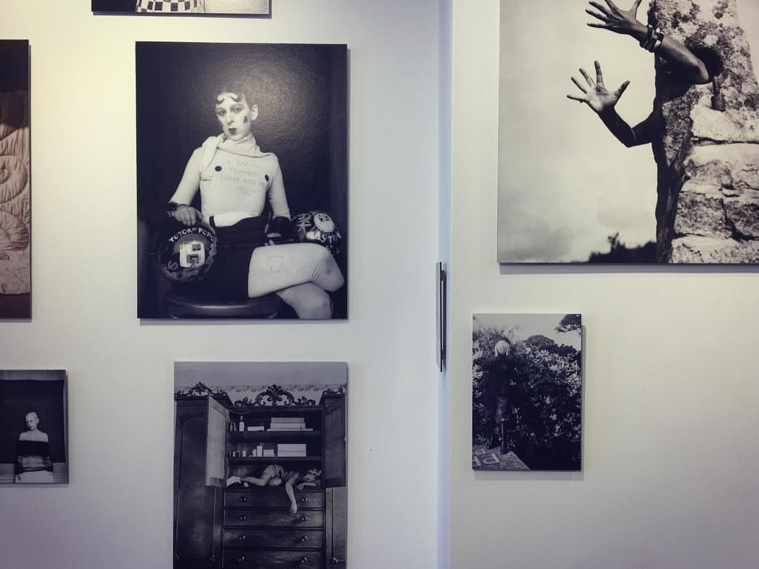
Recently along with fellow photography students I visited Lewis Bush’s ‘Trading Zones’ exhibition and Clare Rae’s ‘Entre Nous’ exhibition in response to the late photographer Claude Cahun. Now the work that makes up both of these exhibitions is definitely something that can strongly be considered as political. How so is what takes some explaining.

Lewis Bush
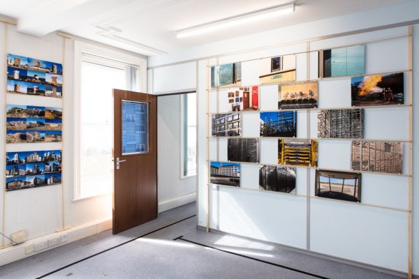
Trading Zones Exhibition
Room 1

My initial thoughts and feelings on the work of these 3 photographers from the exhibitions that we visited was not that the work stood out as particularly political, instead I was just intrigued and taken by how visually interesting and conceptual the images being displayed were. It was immediately clear with the Entre Nous exhibition that both Clare Rae and Claude Cahun’s work had obvious visual links and similarities, a running theme somewhat; however after initially being exposed to Lewis Bush’s Trading Zones exhibition, his works didn’t all share a similar visual theme or aesthetic and instead they were more in sets or projects under one overhead theme of the finance industry. Despite this, after looking into all 3 of these photographers’ work in terms of the exhibitions in much more depth, it was very evident that each of their collated works had a strong political theme / issue running throughout.

Clare Ray & Claude Cahun
Entre Nous Exhibition
CCA Gallery
(Work of Claude Cahun)

In order to get a good enough understanding of where each of the photographers’ work is coming from it would only be right to take a brief look at the background of the three photographers…

Lewis Bush is a photographer, writer and educator, born in London in the year 1988. With a Master’s degree in documentary photography, he is a lecturer of photojournalism and documentary photography at London College of Communication (LCC.) His main beliefs and aims of his photography are “to draw attention to forms of invisible power that operate in the world” believing that “power is always problematic” because it is inherently “arbitrary and untransparent.” This says a lot about how Lewis Bush approaches photography in a documentary fashion, with a strong belief on the topic of power and how that is effective upon society and people individually. Specifically looking at his Trading Zones Exhibition which was located at the old police station in the royal square of St Helier, that took place in September. This was a body of work which was a result of Lewis Bush’s time as a photographer in residence at the Societe Jersaise in Jersey, exploring different aspects and topics surrounding the theme of finance.

Work of Lewis Bush


Clare Rae is a photographer / artist who is based in Melbourne, Australia, who completed a Master of Arts by research in 2014 at Monash University, and received first class Honours in Fine Art in 2009 at RMIT University. Her approach to photography is very unorthodox as she experiments with performance and the use of her own body and figure as a subject of the images which she produces. ” Her work is informed by feminist theory, and presents an alternate and often awkward experience of subjectivity and the female body.” One of Rae’s main interests within her individual practice of performance photography is how ”the camera can act as a collaborator, rather than mute witness, to the performer.” As a self-proclaimed artist as well as being a photographer, this incorporation of performance within her photography is something which could be considered as a more artistic than photographic matter, in terms of lens based imagery. Specifically looking at Clare Rae’s work from the Entre Nous exhibition, this was a response to the work of Jersey based photographer Claude Cahun who explored similar themes and issues, predominantly that of feminism and gender stereotypes, within her work. Although the photographic practices or these two photographers are separated by 70 years they have a lot of similarities. Claude Cahun was an avant-garde artist and writer, who in the 1920s, was associated with a creative movement known as the Parisian surrealist movement. She was not a stereotypical citizen of Jersey, and probably still wouldn’t be classed as one to this day. She was a lesbian who was in a relationship with her half sister, she was also Jewish and she was  activist who protested against the German occupation. To sum up the effects of her work ”Cahun’s subversive self-portrait photographs and texts have become highly influential for artists dealing with questions of gender identity and representation of the female body.”

Work of Clare Rae

In terms of how Lewis Bush and Clare Rae’s work is considered political, it is very evident after looking at their photographic intentions and ideas that they both cover very political matters within society. Although very different matters, they are certainly political, Bush’s being that of the finance industry which is very intertwining with politics, and Rae’s being that of feminism, equality and gender stereotypes which are also very politically discussed topics. These are political matters that all effect society somewhat in positive ways, and on the other hand sometimes not so much.

Bush covered various aspects of what finance actually is, specifically on the island of Jersey. These aspects showed different ways in which finance can be perceived, used and thought about by society. He approached the project in a very modern and experimental manner, with a range of subjects and topics linked to finance, whilst  not going overboard with the experimentation, in order to not create too much abstraction. He used a wide range of archival imagery within the exhibition in his own way in order to help display his findings and interests that he found along the way of completing the project. One of the most interesting parts of the exhibition was the fact that he had made part of it interactive. Allowing visitors of the exhibition (members of the general public) to create there own response to the words ”Finance Is…” On cards that were attached to part of the exhibition. This allowed for people’s views and opinions on the topic of the exhibition to be expressed and viewed by others. Overall I believe that Bush’s exhibition was very successful at portraying the finance industry for what it is in a visual way.

Lewis Bush, Trading Zones

In contrast to Lewis Bush’s work Clare Rae’s approach to her work that made up the Entre Nous exhibition was more contemporary, and has more of a discreet and hidden meaning. Although we are aware that her work covered topics such as feminism and gender stereotypes, the imagery displayed in the exhibition is fairly open for interpretation as it is making the audience/viewer have to think about what each individual image is trying to portray. One of the main and most blatantly obvious visual differences between Bush and Rae’s work is that Rae’s photographs are monochrome, this may be in order to remove any distractions or false meanings that could be caused by the use of colour. Overall I believe that Clare Rae executed a very impressive exhibition which was a great response to the work of the surrealist photographer Claude Cahun and the topics surrounding her work.

Behind The Scenes Of Entre Nous Claude Cahun & Clare Rae

In conclusion it is very evident to me that both Lewis Bush and Clare Rae’s work can be considered as political, as they both cover extremely political matters specifically within the two projects of work which they have recently exhibited.

(The sources that I have used for information are linked throughout this post in blue.)


Political Landscapes Shoot #3

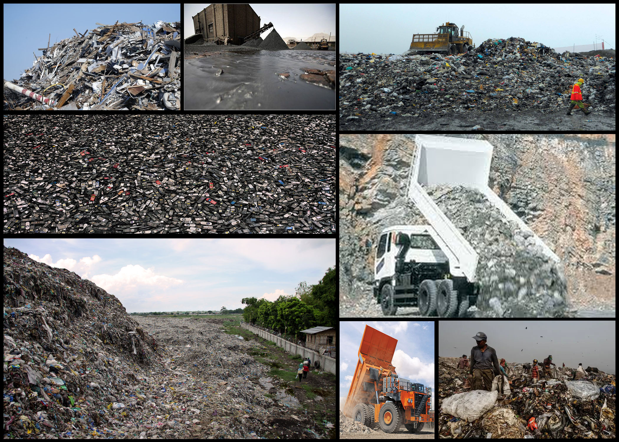
Once I had reviewed the idea of truth within photography, and the camera’s ability to warp perspectives and therefore the influence of opinions regarding what people see, I decided I should head back to the dump and attempt to over-exaggerate the sights present there to influence the viewers. I particularly felt inspired by the idea of exaggerated the truth and warping people’s opinions to support yours, regardless of it being a lie. The photographers I found to be of significant inspiration are Andrea Gursky Robert Capa, by using these photographers style and technique as a way of composing my photos it would allow me to produce imagery that accurately represented my vision regarding consumerism, changing the conventional style of photography I’m used to.

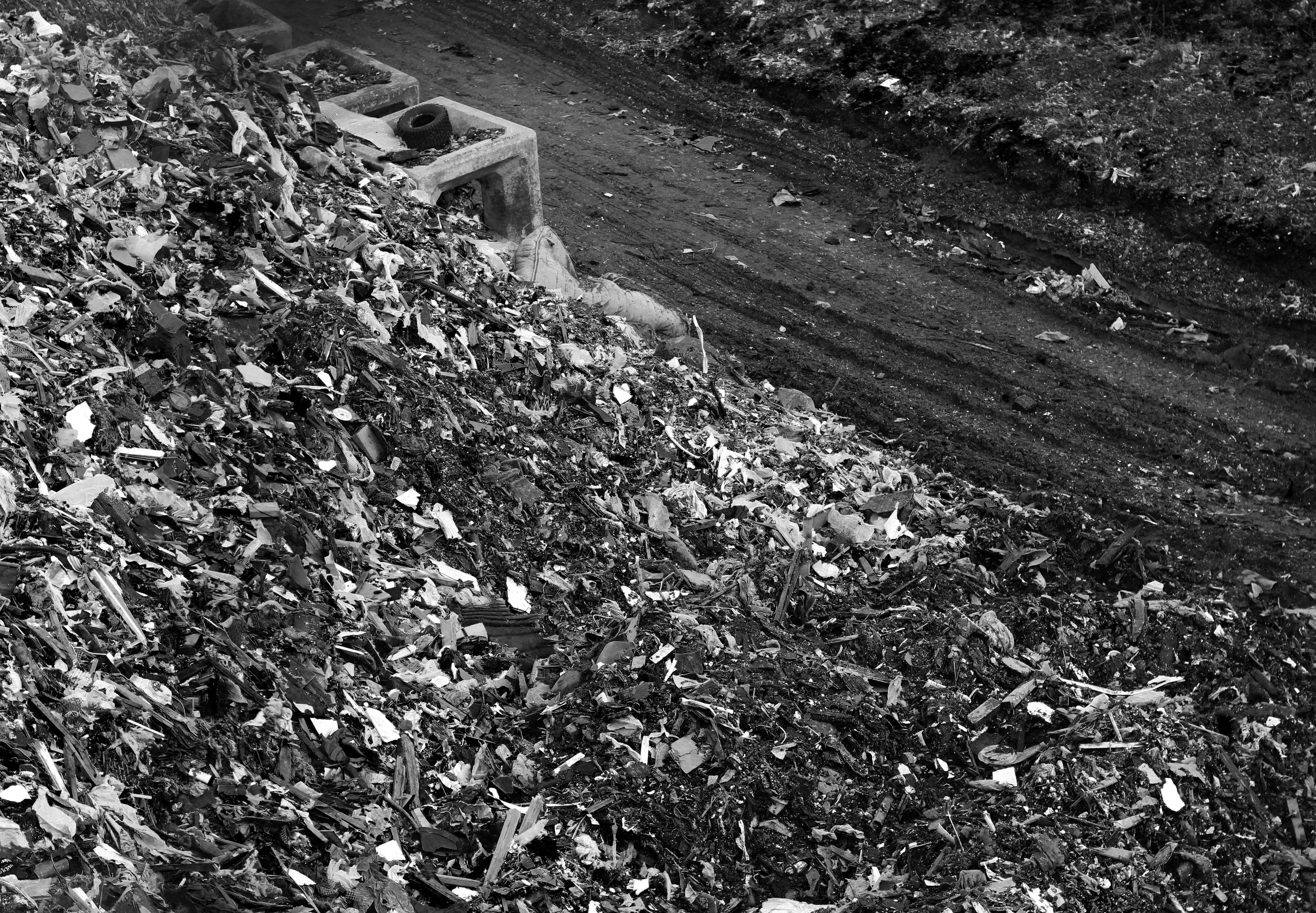
When commencing with the shoot I decided I should look at the objects themselves specifically to provide an insight into the general sighting that can be found in this particular environment. By looking into the materials dumped here I would be able to present how the landscape has been scarred but also this hidden aestheticism hidden beneath all this waste. Here is a mood-board to reflect my various intentions and goals when taking images:

Once I had finished I decided I would create a mind-map to portray and sum up the ideas I have for exploring the area. By doing this it would prevent me from wasting time thinking there and then about what to do, instead allowing me to head into the area with a clear mind focused on what I want to achieve. My ideas can be seen below:

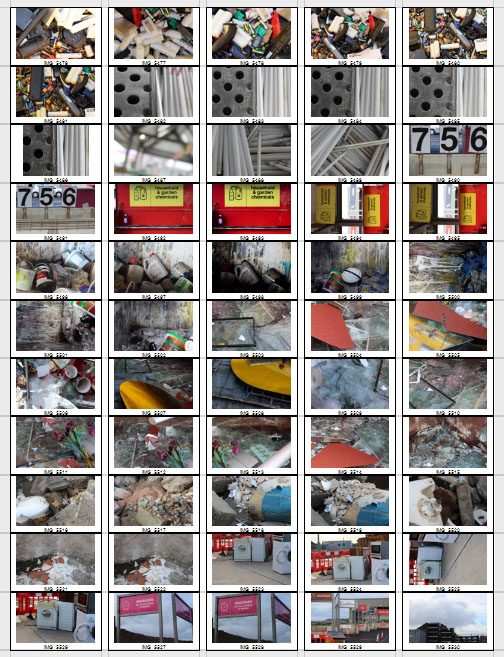
Now that I was satisfied with my ideas I decided it was time to go out and take photographs. The area I wanted particularly to explore was the actual dumping ground of waste material, not the landscape surrounding it like the previous shoot, allowing for a more in-depth look of how out consumerism is handled and sectioned off into varying materials. Here are the results of the shoot: After the shoot was complete I decided to select the ten images I thought best reflected the intentions of the shoot both visually and implicitly. By doing this it would allow me to deduct other images that I thought didn’t portray the aim of the shoot correctly or were poorly taken, here are my choices:
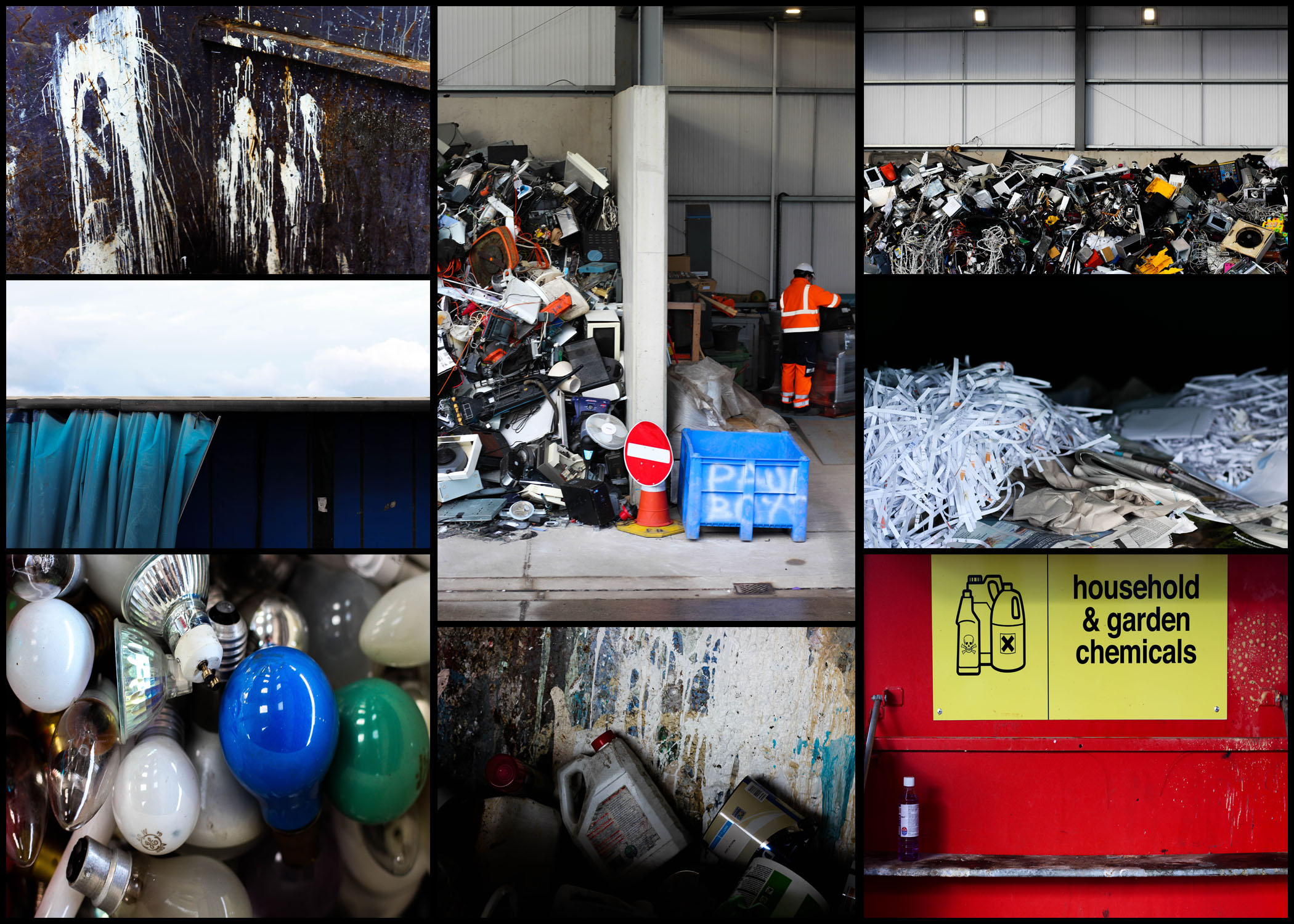
After I had completed organizing and separating all images into a top ten mood-board, I then decided to cut that once again into only five images. By doing this it would allow me to individually analyze each photo, viewing how they related to the topic and their looks as an overall image, here are my selections for the top images for this shoot:  I selected this image because of how I loved the positioning of the paint cans, this look of just the bottles careless thrown into the bin scattering paint everywhere creates an unusual background of random colours. I also really liked how the higher exposure allowed for a dark border across the bottom of the image, creating the impression of the unknown due to there being no evidence for how far these material stretch. The focal point seems to be the center paint can which is clearly defined from the backdrop by the shadows surrounding it producing an abstract effect from the area around it.  What I liked about this image was the clear contrast and separation of rubbish and everyday life working in the area. This contrast seen through the separation of the electronics and a construction worker show evidence of how the area has adapted to suit their life around the product of consumerism. The sheer mass of the electronics almost overflowing out of their section creates the impression of disorganization, where once used they are careless thrown to the side never to be seen again. Looking at this image it is clear how much space is required to hold the waste, especially after seeing how far into the hangar it stretches.  I found that the emptiness of this image was what attracted me to it, alongside the vivid colours which accompany it. The use of a singular chemical bottle on the shelf with the over half of the container sprayed with unknown chemicals provides a messy and unorganized look, where obviously dangerous liquids have been disposed of incorrectly, whilst the bareness of the shelf allowing an insight into how little we attempt to throw away these harmful materials. By the sign being there I feel like it breaks up the otherwise overpowering image which would otherwise be dominated by red.    This image was chosen because of how effective it is at providing evidence towards the sheer mass of things we throw out. Accompanied by the symmetry, the random electronics thrown into a pile can be seen as an almost abstract piece in itself, which various vivid colours breaking through the dull dark grays and blacks. For me this provides a huge insight into how we treat our ever-increasing consumerism, and how once used it’s simply discarded to be lost in the endless heap of other categorized objects. Finally I selected this image because of its contrast between the yellow mirror and the now dirty and broken glass window. I thought that this looked very symbolic, with the new mirror that had just been thrown away providing a clear contrast between that of an old broken window, that had obviously been thrown out a while ago and had deteriorated to an almost unrecognizable image of its former use. This contrast is defined through the use of the shadow which separates each piece of glass, stopping the other into blending with it and becoming eye sore.
Once I had analyzed each image I decided it was time to decide on which photo best represented the entire shoot as a whole. Here is my decision:

Final Image: The reason I selected this image as my overall best photo for the shoot is because of how I think it best represents our consumerism as a whole. By presenting the sheer size of our waste I found it to be particularly impacting due to there being no structure into the actual organization of anything placed into the area. I also really like the clear contrast between the surrounding area and the waste itself, seen through the side of a building which the rubbish is stacked against, whilst revealing the extent of the wastes size. As a result I found this photo reflected my intention well due to it giving awareness around how much we throw out and how our consumerism leads to this build up of random materials clustered into one pile.

Political Landscapes – Andreas Gursky

Who is he?

Andreas Gursky was born January 15th, 1955, Leipzig, East Germany. The son of a commercial photographer, Gursky grew up around photography, starting to photograph things with a black and white Leica camera. He soon started to go against the trend and began working with coloured imagery and tripods. Gursky started to focus more and more on detail in the composition of his photos, the style he is now most celebrated for. By 1980 Gursky was producing photographs so large that they could only be printed on commercial boards, leading him to print of the largest photo paper ever, which he then combined single sheets with to make even larger. From here he became best known for his monumental digitally manipulated photos that examined consumer culture and the busyness of contemporary life, using his unique composition strategies to result in dramatic images that walk the line between representation and abstraction.

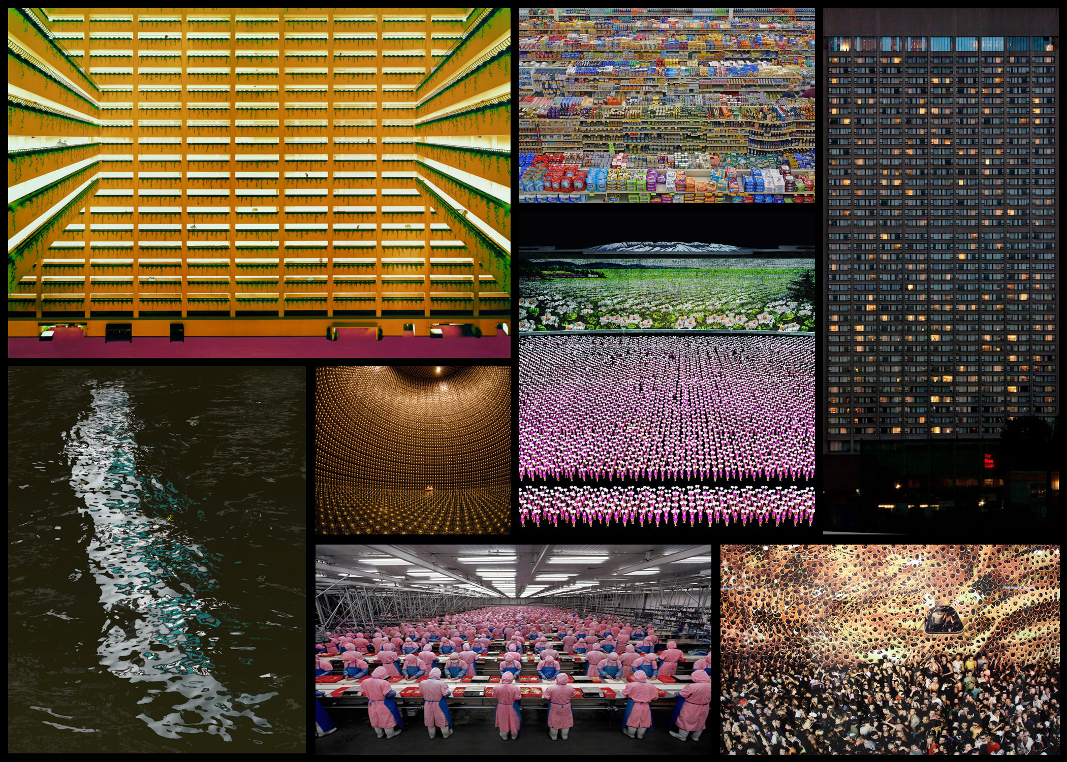
Gursky soon became fundamental in redefining photography for a new generation of photographers. Using digital image manipulation forcing into debate a new version of truth within photography, becoming apparent that the truth manipulating abilities of the camera could distort reality and erode the viewer’s trust. This pushed people to consider the question of truth, with this new digital photography becoming more and more relevant. Some of his work can be seen below:Once I had reviewed a few of his works I decided to go on and analyse one of his photos, by doing this it would allow me to understand what made his photography so effective. Whilst giving me an insight into the techniques and focuses of the style of photography he uses, and the thought process behind it. The image I have chosen is called ‘99 Cent’, taken 1999 of a local convenience store: Visual: Visually this image is extremely aesthetic, with the broad variety of colours present in the shop providing a sea of rainbows to be looked upon by the viewer. This is stopped from being too consistent and overpowering through the use of obvious shelves which stops the packaging from merging with the next, the white poles which pop up occasionally also add to this through their symmetrical layout across the shop, providing clear coordination in the piece and an unseen structure in the shops structure. I love how the packaging of the food is countered by the texture of the ceiling, which seems to almost reflect the colours of the below, fading into the distance as if its never ending.
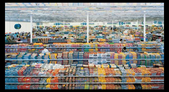
Technical: When looking over the photo, I notice that the image itself uses a relatively higher exposure than usual due to shadows and black areas not being to noticeable and through the faded effect of the variety of colours such as red and blue. However a low saturation could have been used, reducing the colour of the products, stopping them from being too overpowering and instead becoming aesthetic. Gursky has purposely angled the camera so that he picks up the symmetry of the entire shop, with the poles and heads being reference to how he has done so. Finally the inclusion of the wall on the left breaks up the shop from becoming purely focused on products, presenting consumer life in the picture as well.

Conceptual: The image itself is meant to be a spectacle of consumerism appearing as organised, rigorous and formal. However the photo actual is hyper real, where yes its rooted in reality, however there is no physical space like it. By portraying such heightened constructions of our existence from dollar stores to football fields and sprawling cities, Gursky’s photography acts as a symbol of contemporary life. Seen through the mirrored food flattened and the iconic work, over exaggerating the environment of the surrounding environment.

Photography and Truth

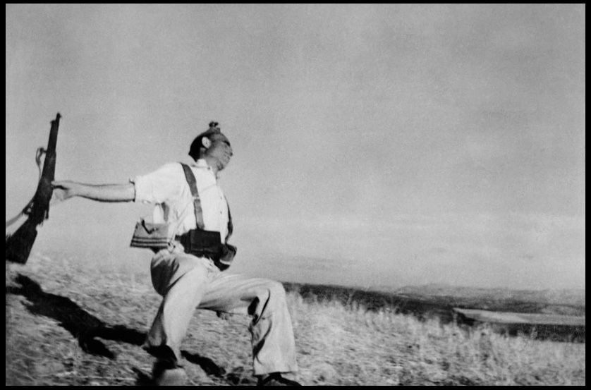
For this post I will be analyzing how a photo of my choice by a photographer can be interpreted and the story behind it that may be carried. The photographer I have chosen is called Robert Capa, a Hungarian war photographer, considered one of the greatest in history, here I have selected his famous ‘Death of a Loyalist Soldier’, 1936, which depicts the instant death that this loyalist has been captured through in mid shot. Here I will be looking at four factors that create such an impact when reviewing the picture; contextual, conceptual, visual and technical.Contextual: Taken during the beginning of the Spanish Civil War, showing the moment of a bullet’s impact on a loyalist soldier, Capa’s photograph has become the emblem for the medium’s unrivaled capacity to depict sudden death. The style of photojournalism became the mark that defined Capa’s work from there on, joining the company Magnum Photos in the late 1940s. The photo itself appear to capture a Republican soldier at the moment of death, the soldier is seen collapsing backward after being picked off from a distance by a sniper. The pictured solider is dressed in civilian clothing but wears a cartridge belt, and following its publication was acclaimed as one of the greatest photos ever taken. However since the 1970s there has been significant doubts about its authenticity due to its location, the identity of its subjects, and the discovery of staged photographs taken at the same time and place.
Conceptual: The idea behind the image was to capture one of the most shocking moments in war, death. Although it was supposedly an accident, the image itself was published because of its insight into the impact of war, and how one moment can lead to another resulting in tragedy. When taken the photographer wanted to capture life on the front line, and life between skirmishes, attempting to depict life in such an isolated region of the country.

Technical: The image itself uses a higher shutter speed to capture the motion of the solider without blurring either the subject and landscape, by doing this the result is crisper without any eye-sores created by faults. Within this image the contrast seems to have been lowered so that only the more dominantly dark objects are defined (such as shadows, gun, hair and dark grass), this leaves the rest of the photo as more bland and faded due to it only consisting of different shades of white, whilst creating a stark outline for the main focus of the picture, the soldier. The black and white result of the camera used produces a more sinister tone surrounding his death due to it being devoid of any other colours, this to me adds context to the image as it reduces your perspective on the story being portrayed, instead giving only the option of two viewpoints.

Visual: Visually the pieces incorporates an executioner, stark backdrop and dramatic nocturnal lighting. By doing so, this for the viewer zeroes on the instantaneous death received by the soldier which will be forever anticipated in the photograph. The image itself seems to resemble an equally famous picture of the civil war in Spain named “The Third of May, 1808” by Francisco Goya in 1814, this provides a narrative element for Capa’s image due to there being a story behind the position and landscape it was taken in. Because of the piece perfectly evokes both discrete moment and an epoch, where one encounters a distillation of the Fascist violence, and the brutally extinguished Republican sense of hope for a new, free egalitarian society, ultimately defining the Spanish Civil War.

The Meadow- Barbara Bosworth and Margot Anne Kelley

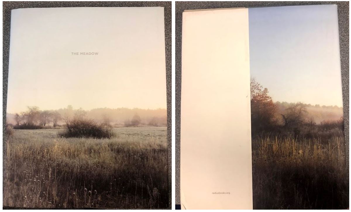
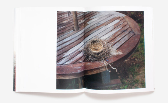
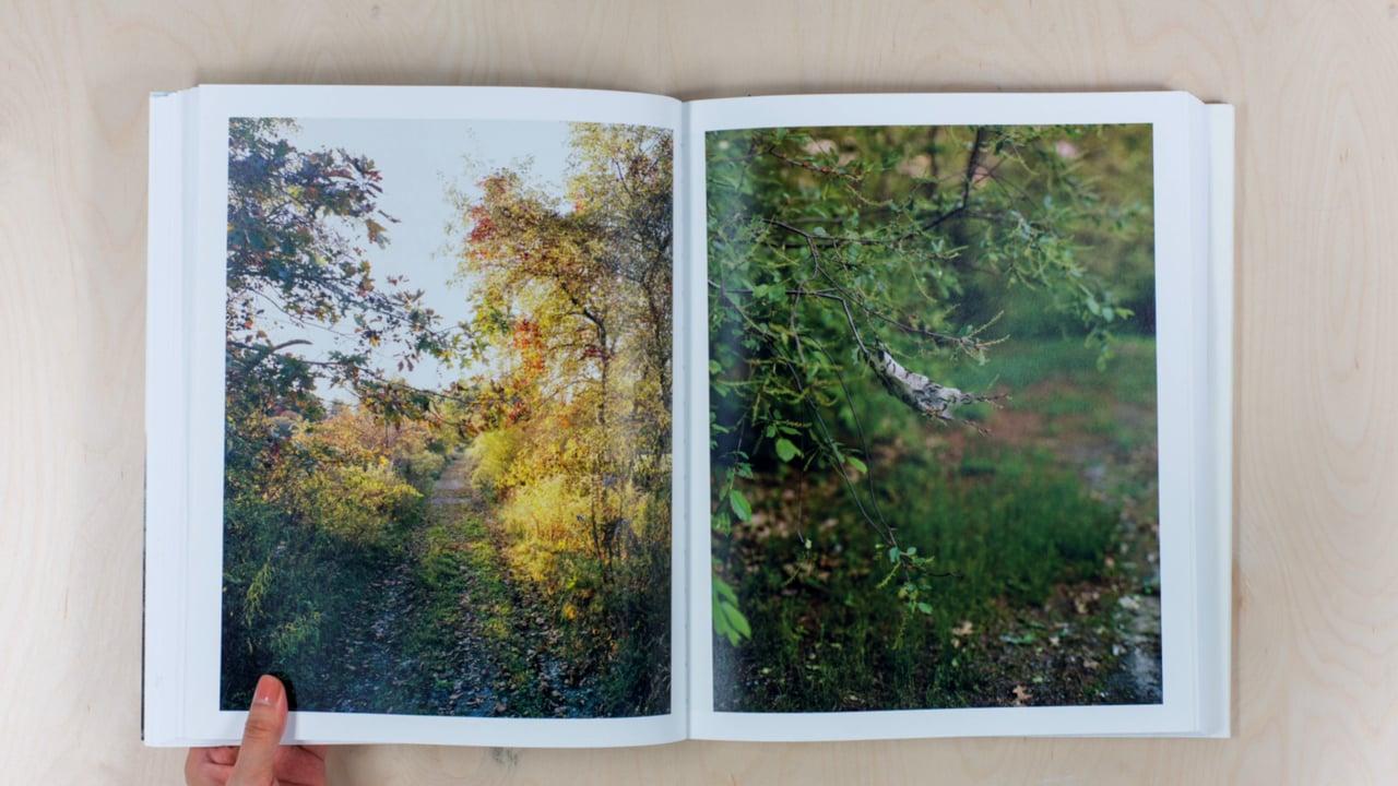
In their most recent collection of work, The Meadow, photographers Barbara Bosworth and Margot Anne Kelley explore the connections and relationships formed between humans and the natural world. Over the course of a decade, the two have taken numerous photographs of an area of land in Carlisle, Massachusetts. Combined with Kelley’s writing, the collaborative project resulted in this uniquely-crafted work. The land they have chosen serves as an ideal subject, composed of paths and abandoned farmland reclaimed by the vibrant foliage.

In addition to their own investigations, they have invited botanists, entomologists, naturalists and historians to consider the meadow with them. Also included are historic maps of the property dating to the 1800s, and a transcription of notes from a former owner whose family has continuously documented plant and bird life in the meadow from 1931 until the 1960s.

Part photo-essay, part journal and part scientific study, this book is a meditation on the shifting perspective that occurs when one repeatedly sees the same place through new eyes

Embodying a diaristic style, the final product has the feeling of a handcrafted scrapbook recollected from someone’s bookshelf. Tucked as if by accident between the pages are small booklets bearing the photographers’ experiences, and the occasional fold-out triptych which embellishes the arts-and-crafts vibe. A detailed appendix documents the numerous foliage, fungi, and pebbles found during the exploration of the meadow.

I particularly like this book as they photographs objects they found in the meadow they were documenting (i.e. rocks) and displayed them on a white background. This gives the book a different way of looking at the area and creates breaks up the images of the meadow itself.

The book concludes with a passage by a friend of Barbara, D’Anne Bodman. She is inspired to write about finality by reflecting on the pets that both she and Barbara have recently lost. In her last paragraph, she writes, “Our remaining dog, Téa, and I walk Santo’s path daily so that it doesn’t disappear.” Through this passage, we are reminded of the importance in retreading paths to mark the changes, which is just what Barbara and Margot have aspired to do with this work.

Video Link

Experimentation With Images – B&W

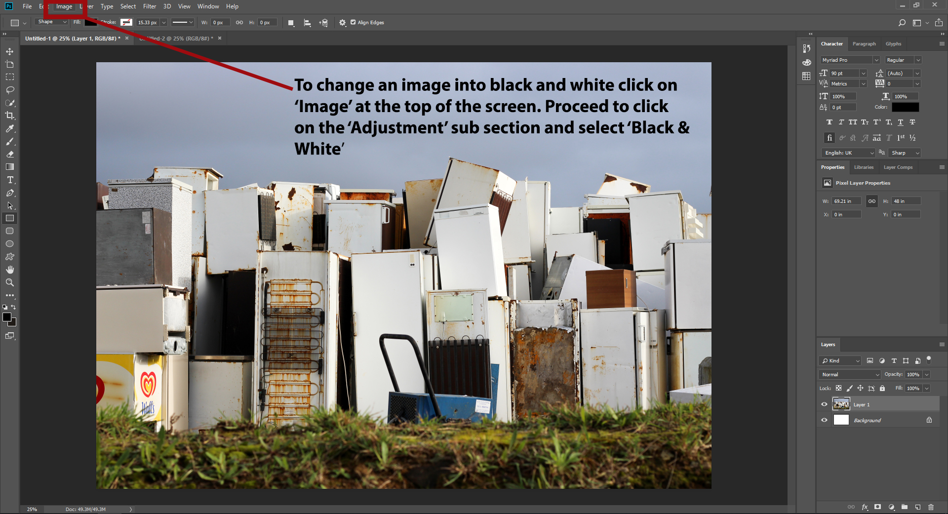
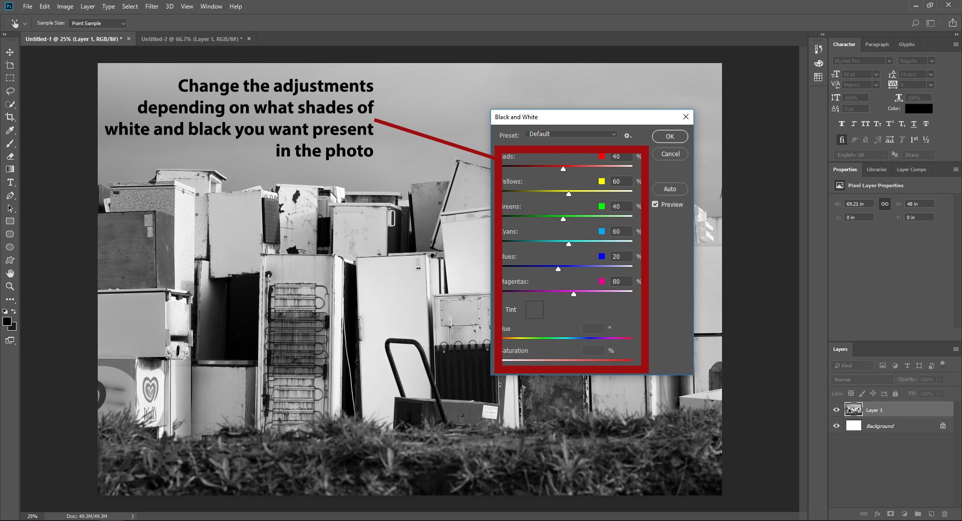
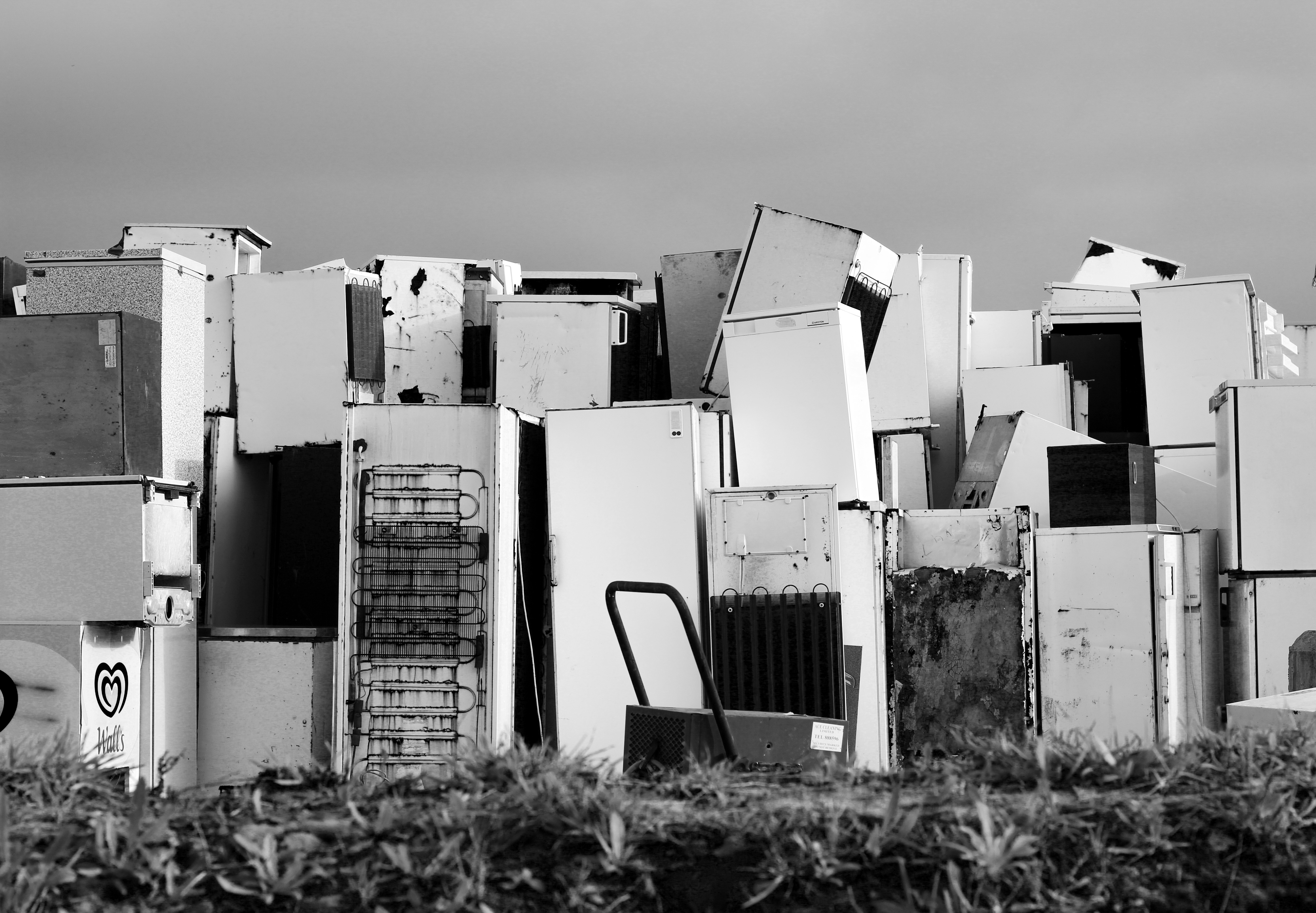
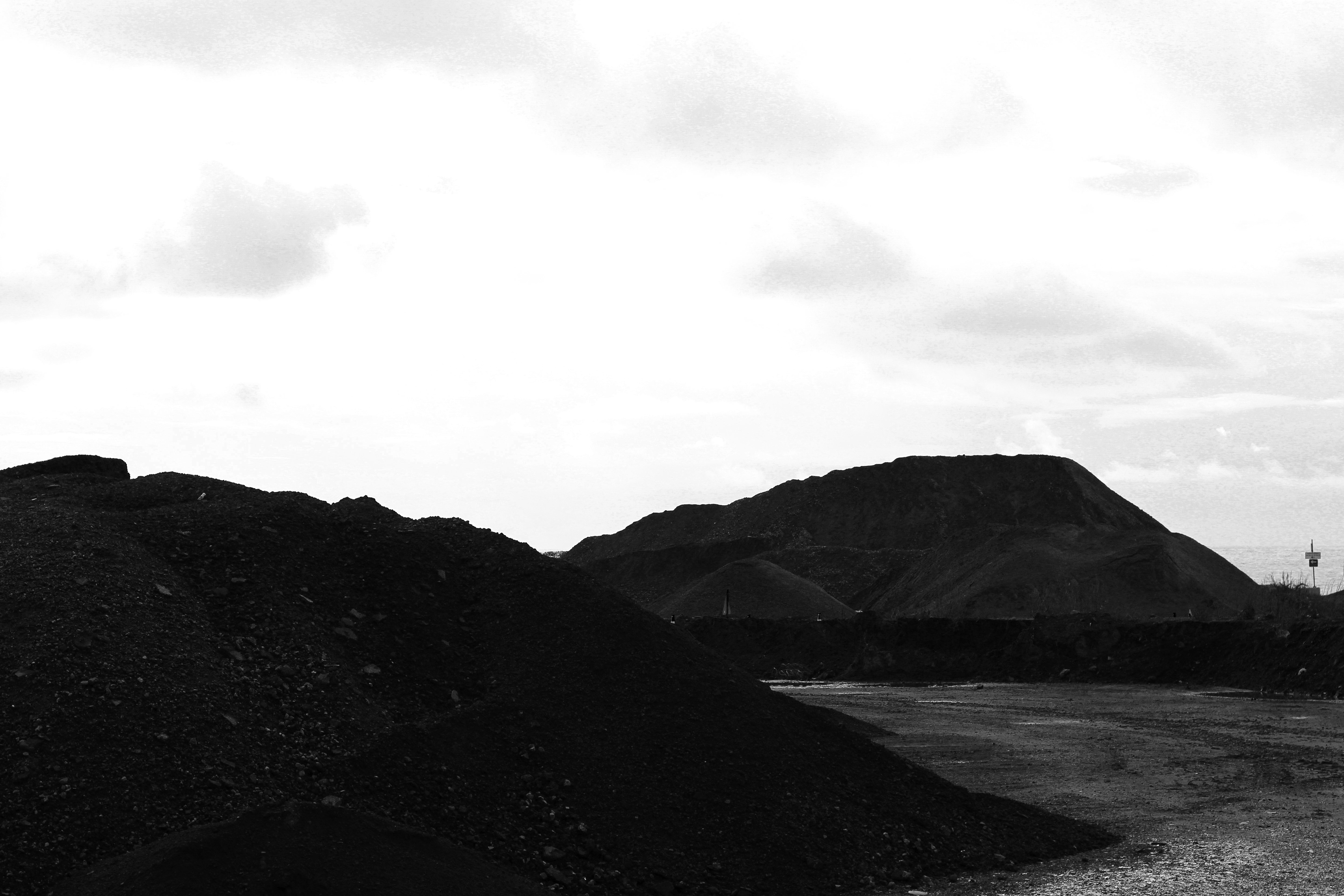
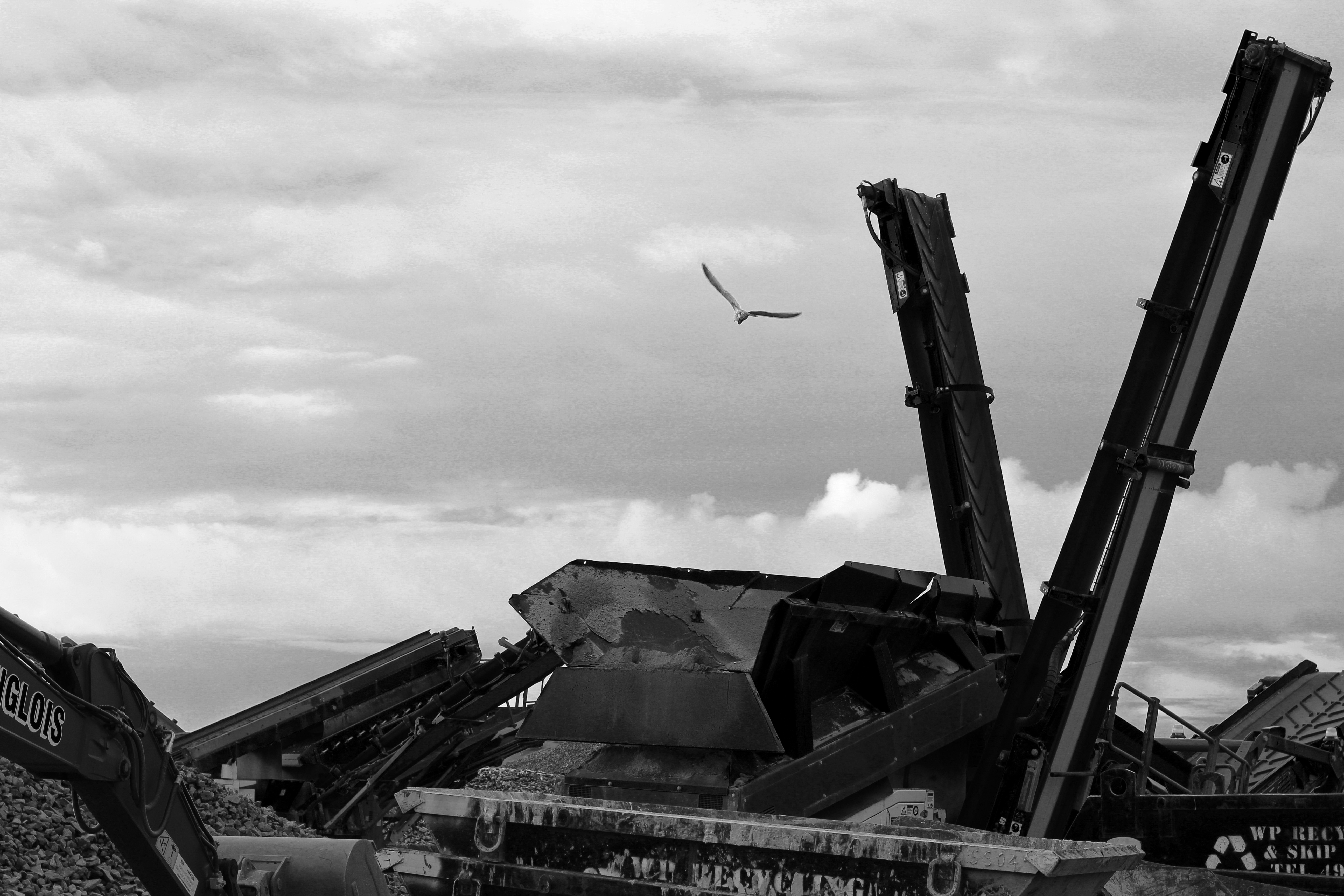
After completing a few shoots I decided that I should explore different ways of presenting my imagery. To do this I thought that by editing the best selection into a black and white format to increase their contrast it would allow me to further look at how I could compose future images regarding the book I will be making. What I wanted to achieve through this was a traditional straight photographic image, due to colour being a rarity at the time leading photographers to produce photographs in monochrome. To create the results I want I will be using the software Adobe Photoshop as it provides a huge variety of tools that will be able to help me adjust each photo to the requirements wanted. Here is the process behind my editing: After I had experimented with a variety of different black and white settings I then proceeded to select the best images that the effect worked on. The results I wanted needed to be high contrasted and produced an impacting technique that defined the landscape through shadows surrounding the subjects within. Here were my choices for the best outcome for the black and white experimental edits: I found that the results of these edits were successful as the monochrome effected added the desired amount of shading for the landscape it surrounded, whilst providing a more straight photography stance that emphasized the destruction of the landscape in more detail due to them being devoid of any colours to distract you. For me this produced an aesthetic result that complimented the topic well as it draws to light the issues at hand in more detail.
Anylsis: Manifesto on surrealism: Artist:Pipilotti Rist

Pipilotti Rist

Is a visual artists. she is best known for creating experimental video art and installations of art often in order to portray self portraits and singing. Her work is described to be surreal and intimate as having preoccupations with the female body and a combined dysmorphia of forged abstract art. Her artwork is often categorized as feminist art. In a 2011 Guardian exhibition review article, Rist describes her feminism: “Politically,” she says, “I am a feminist, but personally, I am not. For me, the image of a woman in my art does not stand just for women: she stands for all humans. I hope a young guy can take just as much from my art as any woman.Rist first gained international attention following her selection for the influential Aperto’93, an exhibition curated by Helena Kontova and Giancarlo Politi for Achille Bonito Oliva’s 1993 Venice Biennale. Her early projection works emerged from her studies in audiovisual design in Basel, which in turn had led to animated cartoons and stage sets for music videos, made in tandem with her career as the drummer with the all-girl band called Les Reines Prochaines (The Next Queens).

In 2009 Risk made a speech about why she think surrealism is so important and this is what she had to say: She believes many people are artists dn cultural people and asks why we repreadtly creates art and ewwhy use so much effort to from a. Cultural piece of art?? She is convinced arts task is to contribute to evolution  art has to ,.. the head…art has to encourage the mind art has to garuntee a detaches view of social changes. Art has to conjure up positive energy art has to create sensuousness, ears eyes and feelings. And it should make us feel better art has to reconcile reason and insctint. We are has human or made we are also animals.To reconcile our ethics with our instincts art has to reasearchnewe possibilities and most importantly art has to destroy cliche and prejudices.I believe Her work links so well into investigating the surrealism manifestos as she uses her art to portray a dream. Her work struck to me with any doubt such creativity and boundless imagination fo the mind.Her work inspired through the light and sense, her work is not defined by limits she sets herself to.She is never concerned with where it will take her but living as she does not know where she will end up through her work. She wants to inspire, and I do believe her work successful conveys this.

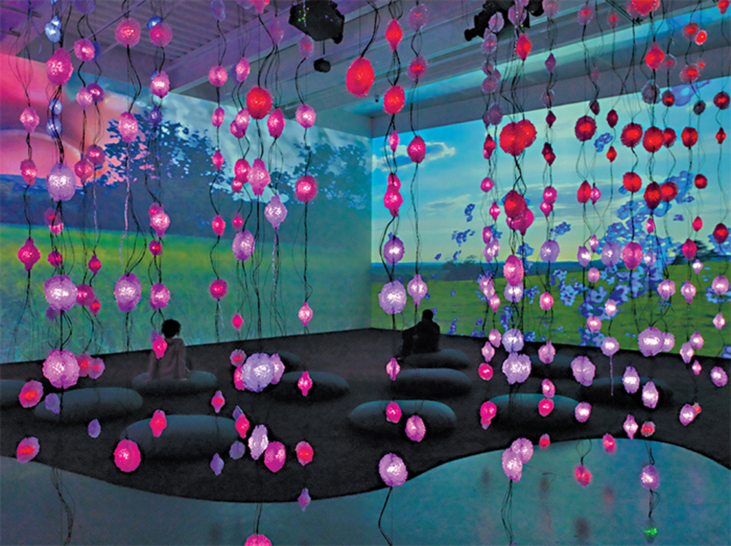
To me this work named ;pixel forest’ is they most comprehensive presentation of lists work to date. Her work includes influence spanning over the artists entire career,using inspirations from her early single channel videos of the 1980’s, exploring the human female body in pop culture to the expansion of video instillations. Her work transoms just a space into a architectural demonstration of masses of dreamlike environments which emphasis a hypnotic musical scores. she has created a new instillation for this exhibition in order to reveal connections between development of her art to the evolution of technology. I believe this such of nature,nuture and new found technology in order o create a surrealism dream life state in unlike anything else and is a huge movement for contemporary arts. it is said to be’ Ranging from the television monitor to the cinema screen, and from the intimacy of the smartphone to the communal experience of immersive images and soundscapes, this survey charts the ways in which Rist’s work fuses the biological with the electronic in the ecstasy of communication.’
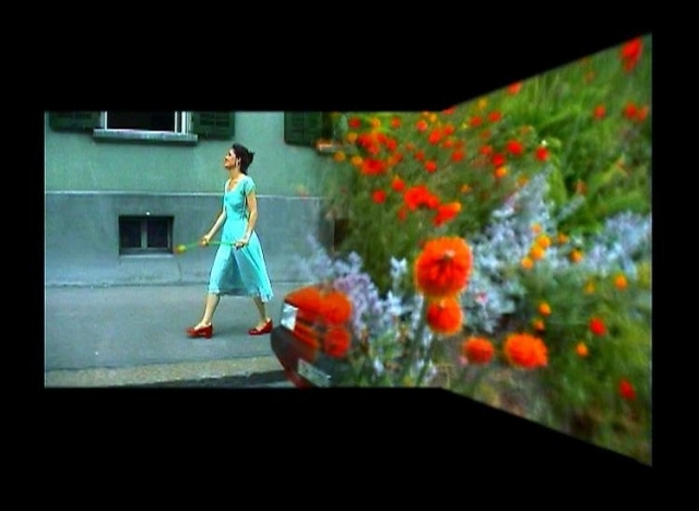
these videos are captured and filmed in such a way to be a piece of art, they evoke such beauty ,passion and colour it combines the life of a daydreamer of surrealism combines with the aspirations of living stye hold to be so true. Her focus being that of video/audio instillations, she does this because there is a room in them for everything  (painting, technology, language, music, movement, flowing pictures, poetry, commotion, premonitions of death, sex and friendliness) to her art is something we have to contribute tot should be seen as a task in order for it to evolve.  Art should encourage the mind to change social perseptions and garunetee a detached view of social changes. Her work should allow yourself to conjure up positive engery in order to create a sensuousness, in order to reconcile a reason of instinct. She wishes to destroy oredujice throughout her work and cliches. This is what I love about her work. This is what I find successful about her style. she uses the surrealism as a sense of escapism through her art form, allowing the manifesto to be freedom through her work. Because of this her art has been widely exhibited at international museums and festivals, all over the world. this lush seductive imagery employs the idiom of commercial advertising and music videos in order to create such abstract art in her own individual artistic language which is informed by her past experiences. Due to her use to being in a music group music has such a strong influence upon her work, the abstract from of sense from shapes of vibrations to which she can make art with. Her work is extended beyond boundaries of the normal monitor incorporated video into an architectural exhibition through th eproejction of space. She uses all her surroundings and space in order influence and help emphasis her work to be more successful. Since her exbitiohns she has become known for producing immersive instillations which she has done with the intentions to create a transformative experience for viewers with fluid and hypnotic imagery. This often uses her inspiration of nature and also a fundamental use of technology. She is unwise in the way to which she views the beauty in nature yet values the progression of technology and uses so to enhance her Art form. Some of her work even goes so far to place the audience wihtin the screen itself, surrounded by thousands of lights.


Mandy Barker

Mandy Barker is an international award-winning photographer whose work involving marine plastic debris has received global recognition. Working with scientists she aims to raise awareness about plastic pollution in the world’s oceans whilst highlighting the harmful affect on marine life and ultimately ourselves. Her work has received global recognition and has been published in over 25 countries.

Beyond Drifting: Imperfectly Known Animals

Enough plastic has been manufactured since the end of the Second World War to coat the entire earth in plastic wrap. No part of the planet is free of plastic waste; the total amount of plastic produced since 1950 is around 5 billion tons (close to the weight of the entire human population at this moment). This amount is very likely to reach 30 billion tons by the end of the century.

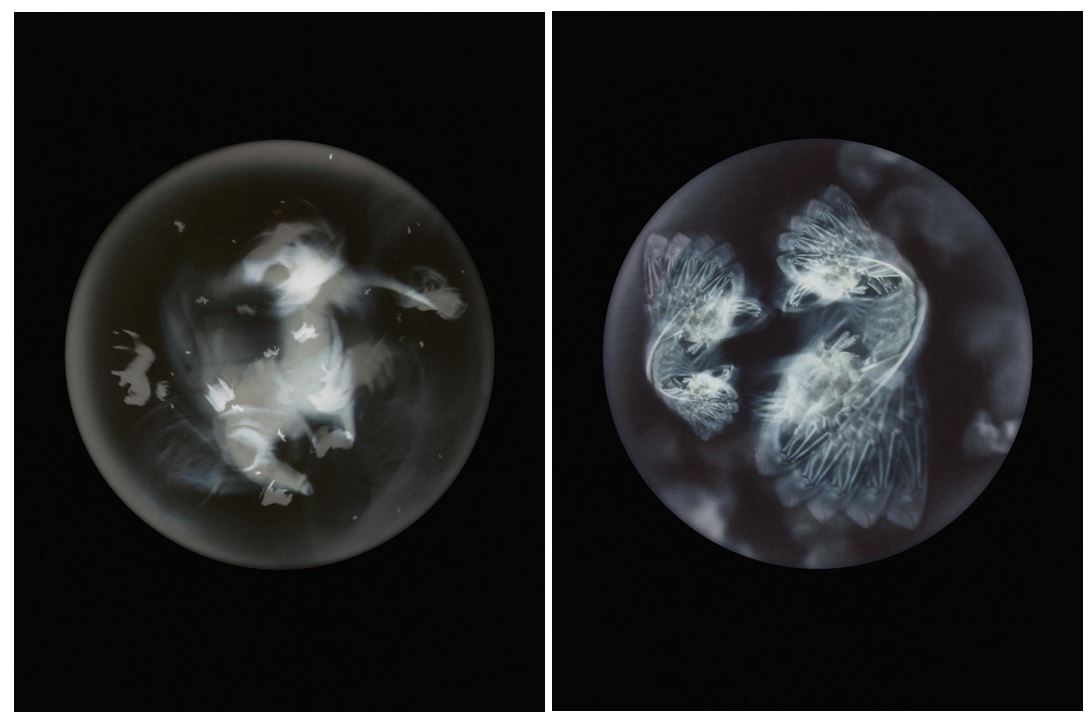
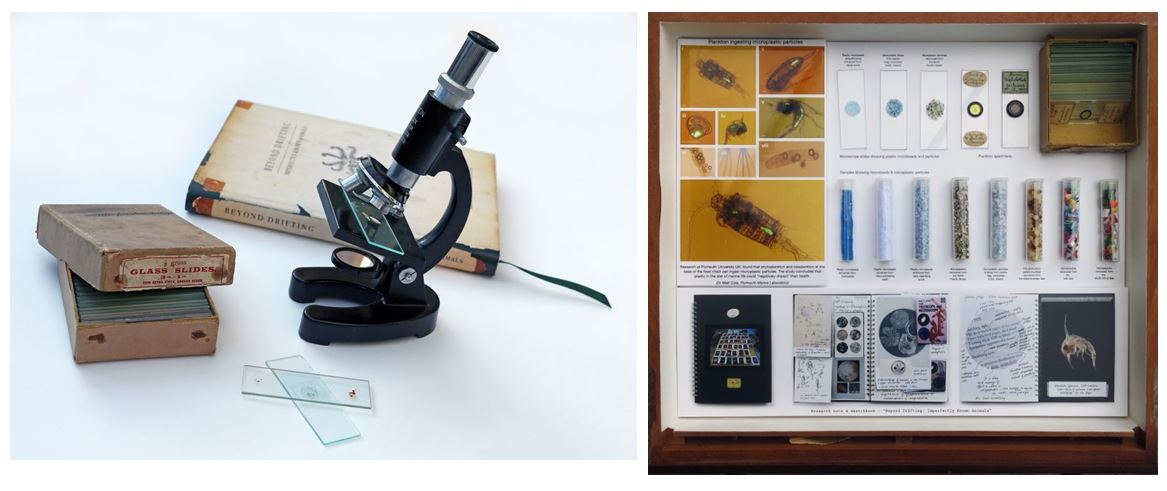
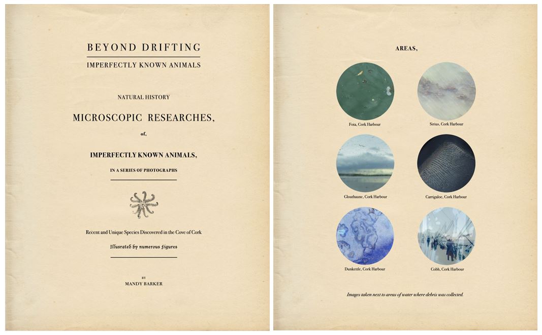
Presented as microscopic samples, objects of marine plastic debris mimic Thompson’s early scientific discoveries of plankton. Barker’s series is conveyed through an antique-like science book—mimicking the past while reflecting on the current situation regarding organisms’ intake of plastic. The book subtly includes the original writing, descriptions, and figures recorded by Thompson in his research memoirs from 1830, entitled Imperfectly Known Animals.

The work examines the degradation and contamination of plastic particles in the natural environment through the lens of scientific discovery, while also looking at the organisms when they were free from plastic (and when we, as humans, were free of plastic as well). The images, shot in an enveloping black space, evoke the deep oceans beneath.

Installation drawer -An original antique specimen drawer highlights the connection with plastic, showing images of plankton ingesting plastic particles with research book spreads. Microscope slides and test tubes show samples of plastic particles recovered from oceans around the world, with micro beads collected from toothpaste and facial scrubs.

https://mandy-barker.com/project.php?gallNo=9

https://www.lensculture.com/mandy-barker?modal=project-314878

Indefinite by Mandy Barker Blurb:

https://www.lensculture.com/mandy-barker?modal_type=project&modal_project_id=47517&modal=project-47517

‘Discarded debris found along the shore and having existed for varying amounts of time in the sea collectively convey a message about the marine environment. The images combine visual beauty with the message of pollution and the time it takes them to biodegrade in the sea. The book shows the series of 10 images representing an intuitive collection of objects as they were presented, on the shore, unwashed and unaltered and aiming to reveal a beauty not otherwise noticed. The form and shape of the objects take on the imaginative appearance of sea creatures, created from the very materials that prove fatal for the creatures themselves. Enveloping black space evokes a deep sea, presenting the emerging objects as creatures from beneath, whilst at the same time serving as a metaphor to the unknown depths of this vast global problem of pollution. The captions state only the number of years it takes each material to decompose, thus revealing a narrative in time, and ending with the indeterminate and Indefinite material polystyrene.’
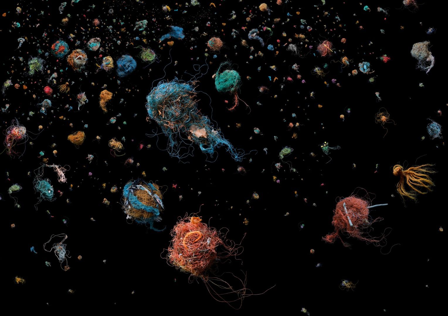
The aim of my work is to create a visually attractive image that initially draws the viewer in, and then shocks them with the caption and facts of what the work represents. It is intended that this contradiction between beauty and information will combine to make people question, for example, how their food packaging, computer, or shoe ended up in the middle of the ocean. If photography has the power to encourage people to act, to move them emotionally, or at the very least make them take notice, then this must surely be a vital element to stimulate debate, and ultimately, change. If I didn’t believe my work did any of these things then I wouldn’t be motivated to continue.

https://www.lensculture.com/articles/mandy-barker-penalty

The series “Penalty” aims to create awareness about the problem of marine plastic pollution accumulating in world oceans. By using a single plastic object (a football), these photos aim to represent the issue on a global scale.

Each football was collected from beaches or oceans around the world and is captioned with the country or area where it was recovered.

The diverse range of 769 collected footballs is represented both by individual countries and overall collections made in particular areas of the world. A collection of 228 by one person shows an individual undertaking, the collaboration of nearly 90 members of the public around the world have helped to represent the project on a global scale.

Soup by Mandy Barker

SOUP is a description given to plastic debris suspended in the sea, and with particular reference to the mass accumulation that exists in an area of The North Pacific Ocean known as the Garbage Patch. This book shows the11 series of images which aim to engage with, and stimulate an emotional response in the viewer by combining a contradiction between initial aesthetic attraction and social awareness. The sequence reveals a narrative concerning oceanic plastics from initial attraction and attempted ingestion, to the ultimate death of sea creatures, representing the disturbing statistics that dispersed plastics have no boundaries. Captions record the plastic ‘ingredients’ in each image providing the viewer with the realisation and facts of what exists in the sea. The book also shows a selection of sketchbook spreads representing the thought process behind selected images. All the plastics photographed have been salvaged from beaches around the world and represent a global collection of debris that has existed for varying amounts of time in the world’s oceans.

“The aim of my work is to engage with and stimulate an emotional response in the viewer by combining a contradiction between initial aesthetic attraction along with the subsequent message of awareness. The research process is a vital part of my development as the images I make are based on scientific fact, essential to the integrity of my work. The impact of marine plastic is an area I have documented for more than 9 years and am committed to pursuing
through visual interpretation, and in collaboration with science I hope it will ultimately lead to positive action in tackling this increasing environmental problem, which is currently of global
concern”.