Looking at the work of Sophie Calle and Thomas Ruff: How does mass surveillance and the ‘big brother theory’ cause a common paranoia and feeling of insecurity within the general public?
”The notion that “Big Brother Is Watching” has been around for decades, it is an often-used catchphrase to describe surveillance or privacy infringements. The evolution of the Internet, cellular networks and the growth of high speed connections worldwide has allowed an endless supply of devices to connect to this global network and produce an infinite supply of very specific, personal data.” [2]
Introduction:
Mass surveillance has become an overruling and unavoidable force of governmental power, which puts the general public in a state of unease and discomfort, sometimes even as far as paranoia. There are many theories and ideas behind the subject of mass surveillance and what exactly it consists of. So what does it directly consist of? The idea of ‘The big brother’ is something that has remained apparent for several years now, becoming very relevant since the publication of the dystopian novel ‘Nineteen Eighty-Four’ by English author, George Orwell, in 1949. In this novel Orwell looked at the way in which he believed in the near future, the population of the world would become victims of boundless mass surveillance by the governments around the world. It seems that since this publication was made that somewhat, if not completely, this has become the harsh truth which we are faced with in this day and age. Being surrounded by different forms of visual surveillance such as CCTV cameras and cameras on our own personal technology is just one of many ways in which we are watched and kept track of by large corporations and the government. Among various other techniques of surveillance such as audio, data and location surveillance. In this personal study I will be looking into the different ways in which two photographers, Sophie Calle and Thomas Ruff, explore these themes of surveillance in their work. I will look at the ways that their work intends to make comments on this subject matter and how visually responsive I have and will be in developing my own work on this controversial topic.
Sophie Calle:
Sophie Calle is a French photographer, writer and artist born in 1953. She explores the concept of what it is to be an observer and to be observed by others. In one of her most notorious works ‘Suite Venitienne’ Calle investigates the theme of surveillance in a physical form as stalking. It began when she met a man at a party who said he was moving to Venice, she then moved to Venice herself, and there began to follow this man named as Henri B. Calle documented her attempts at following the man. She went to great lengths in order to keep on-tail of the man that she was following; going as far as phoning hundreds of hotels and visiting a police station in order to find out where it was that he was staying. She even went as far as persuading a woman who lived opposite to let her photograph the man from her window. A section of text from Calle’s Suite Venitienne book explains how she went about all of this in her own words, she said ‘’For months I followed strangers on the street. For the pleasure of following them, not because they particularly interested me. I photographed them without their know-ledge, took note of their movements, then finally lost sight of them and forgot them. At the end of January 1980, on the streets of Paris, I followed a man whom I lost sight of a few minutes later in the crowd. That very evening, quite by chance, he was introduced to me at an opening. During the course of our conversation, he told me he was planning an imminent trip to Venice. I decided to follow him.’’ [3]

The photographs that she produced as part of this project show the back of the coated man, Henri B, whilst he walks around Venice, the city making for a beautiful aesthetic backdrop to her unusual internalised mission. Looking at her Suite Venitienne project, it is clear that Calle produces her work with the obvious intention of exploring concepts surrounding surveillance, as I said before in a physical from of stalking. This theme of stalking is very relevant in comparison to modern forms of mass surveillance, as Calle intimately follows her subject without him knowing, which closely relates to the ways in which people in the modern world are being followed at all times without even being completely aware of it. Going back to Orwell’s Nineteen Eighty-Four, it is that concept of the ‘Big-Brother’ watching you at all times creating a feeling of restlessness among those in question, which is definitely somewhat portrayed in Calle’s Suite Venitienne, as the photographs definitely have a sense of discomfort and tenseness by the way they are not set up and framed to perfection. However this is not to say that the photographs aren’t perfect for what Calle is trying to portray.
Thomas Ruff:
Thomas Ruff is a German photographer born in 1958 (5 years after Calle), he is a considerably conceptual individual of his craft and has been described as “a master of edited and reimagined images” [4]. In his ‘Nacht’ series which he produced over 4 years from 1992 to 1996, Ruff blatantly explored the subject matter of surveillance, stating himself that these were his intentions of the project. In this series of photographs Ruff used his camera as tool of observation and documentation of night-time scenes of suburban and industrial areas in his home city of Dusseldorf.

But he did not just do this in and ordinary manner; he produced the images with the aesthetic qualities of a long-lens night-vision CCTV surveillance camera. This unusual nocturnal abstraction which Ruff has managed to create in this series is something which I believe does not just make these photographs but also artworks of their own right. Something which Ruff has explained about his work himself, as he states “Photography lies because it purports to represent reality; but a photograph remains a picture, and photography is merely a technique for the creation of pictures, just like painting” [5]. This particular project created by Ruff shows a clear message and link to government surveillance and how what cannot be seen at night by the every-day person’s naked eye can be witnessed by those with authority and higher power. This being part of the reason as to why citizen paranoia caused by the concept of ‘the big brother’ is becoming more and more common. In my personal opinion I believe that Ruff’s work, from this series especially, is amazing at making social comments in a subtle way but which after thinking about become very apparent to the viewer. This is something which I try to, and wish to continue developing in my own photographic work.
Comparing Sophie Calle and Thomas Ruff’s work:
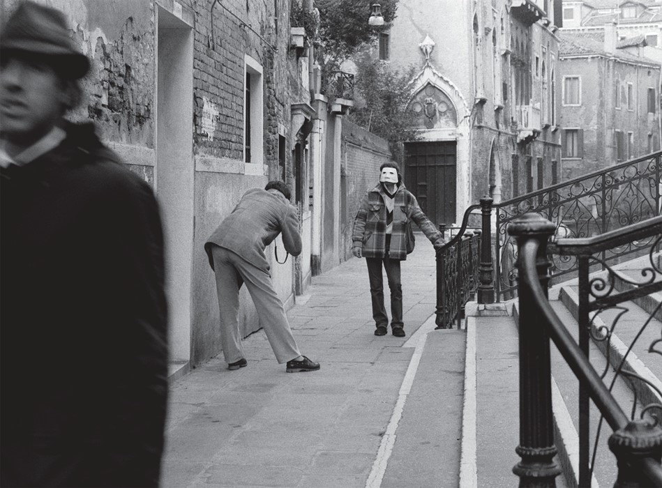
There is one photo in particular from Calle’s ‘Suite Venitienne’ that stands out to me; this photograph unlike the rest of Suite Venitienne has other main subjects which distract from the man she was stalking, supposedly the main focus of the project.

The lighting used for this photograph is natural daylight as the photo does not seem to be staged despite the unusual occurrences within the image. The image was most likely taken either side of it being midday as the light is not overpowering, and the exposure used for the image seems to be fairly balanced as the lighter tones such as the edges of the steps are balanced and contrast with the darker tones in the image such as the door and the coated man by the camera. The photograph has various visual aspects starting with the composition; the viewer is immediately drawn to the dark figure in the forefront of the frame as the figure takes up a considerable bit of space and catches your eye straight away. The eye of the viewer is likely to go from their backwards through the image passing from the stairs to the two other people, to the door and then to the background of the image where the buildings overlook the Venetian canals. As you can see the image is in black and white, most likely due to the traditional and dated aesthetic that Calle wanted to put across, somewhat like that of an old European film. However this may have been done as a means of creating a mysterious or eerie feel to the photographs as the idea of following a stranger around reflects this. The concept behind this photograph, as a part of project consisting of similar images, is that it is a single snapshot of the documenting process of Calle stalking her subject around Venice. This photograph however focuses on multiple human subjects despite the overall body of the project consisting of the man in question being the main subject within. In this photograph Calle is also going against historical stereotypes within art, where men portrayed women rather than women portraying men. So therefore by Calle stalking the man, she is actively creating a role reversal as it is now a female following and producing work based on a male.
There was also one photograph that stood out to me from Ruff’s ‘Nacht.’ This was the first photograph in the series of others similar, titled ‘Nacht 1 I,’ this of all the photographs consisted of certain visual elements that others didn’t, which drew me in as a viewer.

The first part of this photograph which your eyes are drawn to as a viewer is the light shining from a third storey window which appears to be part of a residential building. This is because the bright white tones completely contrast with the dark black and green tones of the rest of the image. This use of light is something that is a repeated visual element within the ‘Nacht’ series, which could be done purposefully by Ruff or could just be due to the fact that at night any source of light becomes aesthetically prominent. The photographs that the series consisted of were ‘’shot at night using a 35mm camera and a Zeiss equipment with the ability to amplify available light’’ [6]. Which has assisted Ruff in replicating CCTV surveillance footage with a night-vision smoky green aesthetic. It is evident that Ruff is not bothered by and infact embraces the low resolution quality of his images. For this project in particular this is very fitting, since genuine footage from surveillance cameras tend to be of a low resolution and use a green tinted night-vision light after they are unable to capture footage using natural daylight. I believe that this photograph as well as the others which make up the series, show how surveillance can be used at all times and in fact in some ways is unavoidable. It is clear the Sophie Calle and Thomas Ruff go about exploring the subject matter of surveillance in two very alternative ways. Their work has obvious visual differences such as Ruff’s use of colour opposing to Calle’s monochromatic style, and also their composition as Ruff uses a square format with a centrally focussed image whereas Calle uses landscape and portrait formats in which her photographs tend to fill the whole frame. Also the other main difference between these two photographers’ approaches is what they are trying to convey and explore with their work as Calle investigates surveillance in a more subtle and less direct manner whereas Ruff clearly makes it blatant from his work that he is directly producing a response to existent means of surveillance used in the modern world. However despite these dissimilarities, I believe that from looking into their work they do share some common intentions. I believe that both photographers produce work that makes people question their personal security as they become aware of how easy it is to be watched at all times; because if it is possible for photographers to replicate these forms of surveillance, then it is certain that it will be made much easier for specialists within the field of surveillance and the government.
Conclusion:
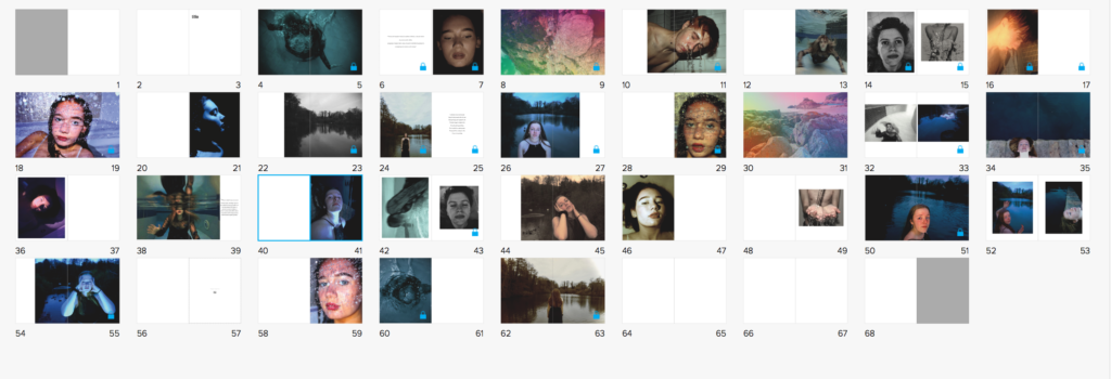
Overall I have come to understand different ways in which the subject matter of mass surveillance can and has been explored in photography. The work of Sophie Calle and Thomas Ruff has backed up my initial ideas and strengthened how I feel about surveillance in general and also how I can put across these thought in my own work. My initial thoughts on the subject matter is that some people are not as aware of the circumstances involving mass surveillance as I believe they should be, however it seems that as time goes on more and more of the public are becoming aware of the problems and consequences of mass surveillance in the modern world. The modern world is a consistently developing place, and therefore surveillance is just becoming more and more common, and also more advanced as well as personal. This ubiquitous increase in surveillance is something which is slowly causing more and more people to become paranoid and feel like they are being controlled and watched at all times; again a concept which is covered within George Orwell’s Nineteen Eighty-Four novel, that is worryingly becoming more realistic by the day. As I said these thoughts are ones which I now feel even stronger about due to investigating the topic in more depth in terms of how it can be photographically interpreted. I believe that this is something which has successfully reflected in my photographs and narrative, as I have taken inspiration and influence from the research which I have executed. In terms of how I have shown similarities in my work to the work of Ruff and Calle, I have used the general visual aesthetics of Ruff’s work in two of my images (pg 24 & 25), and have used the stalking concept of Calle’s work in 4 of my images (pg 36, 37, 40, 41)
Bibliography:
(Opening Page Quote) George Orwell, Nineteen Eighty Four, Part 3, Chapter 4, Pg. 37 [1]
Robert McMahon – Quoted from ‘surveillance and privacy in the digital age: a primer for public relations’ Page 1 [2]
sigliopress.com/book/suite-venitienne [3]
“Thomas Ruff’s manipulative photography”. The Economist. 30 September 2017. [4]
http://lossyculture.altervista.org/thomas-ruff-nacht/ [5] & [6]


 To fit the theme, I also incorporated the use of black in the cover.
