All posts by Thomas Webster

Filters

Author:
Category:

What are Conventions

Definition – A convention is defined as a way in which something is usually done. It also is said to be an agreement between states covering particular matters, especially one less formal than a treaty.

The idea of conventions within photography can be portrayed in many ways. For example, real life conventions can be photographed like shaking someones hand when greeting them. Or the idea of taking the actual photograph in  a certain way could also be a convention of photography.

Synonyms – Practice, norm, tradition, habit, social expectations

Examples – Holding door open, shaking someones hand.

Types Of Conventions – Form, story and genre conventions.

Form conventions are the certain ways we expect types of codes to be arranged. For instance an audience expects to have a title of the film at the beginning and then credits at the end.

Story conventions are common narrative structures and understandings that are common in story telling media products.

Genre conventions point to the common use of tropes, characters, settings or themes in a particular type of medium. Genre conventions are closely linked with audience expectations. Genre conventions can be formal or thematic.

This mood board depicts the standardized conventional photography in the way it shows every day expectations and portrays a sense of normality. I believe that it could be more interesting to focus in on defying the conventions of photography or possibly photographing things which go against the expected conventions.

What are Codes

Definition – A system of words, letters, figures, or symbols used to represent others, especially for the purposes of secrecy.

Synonyms – Identification, classification, secret language, symbols,  hieroglyphics

Examples – Computer coding, Barcode, QR code, Morse code, passwords, symbols, numbers, letters.

In photography, a code can be seen as either a symbol or some form of object which portrays a message or tells a story. Codes within photography can include symbolic codes, technical codes and written codes.

Symbolic Codes – Setting, Mise-en-scene, acting, colour.

Technical Codes – Camerawork, Editing, Audio, Lighting.

Written Codes – Spoken Language, Written language.

What Is Secrecy

Definition – Secrecy is the practice of hiding information from certain individuals or groups who do not have the “need to know”, perhaps while sharing it with other individuals. That which is kept hidden is known as the secret.

“Kept hidden away from the knowledge of others.”

Synonyms : Lies, classified, private, confidential, camouflage, mystery, isolation.

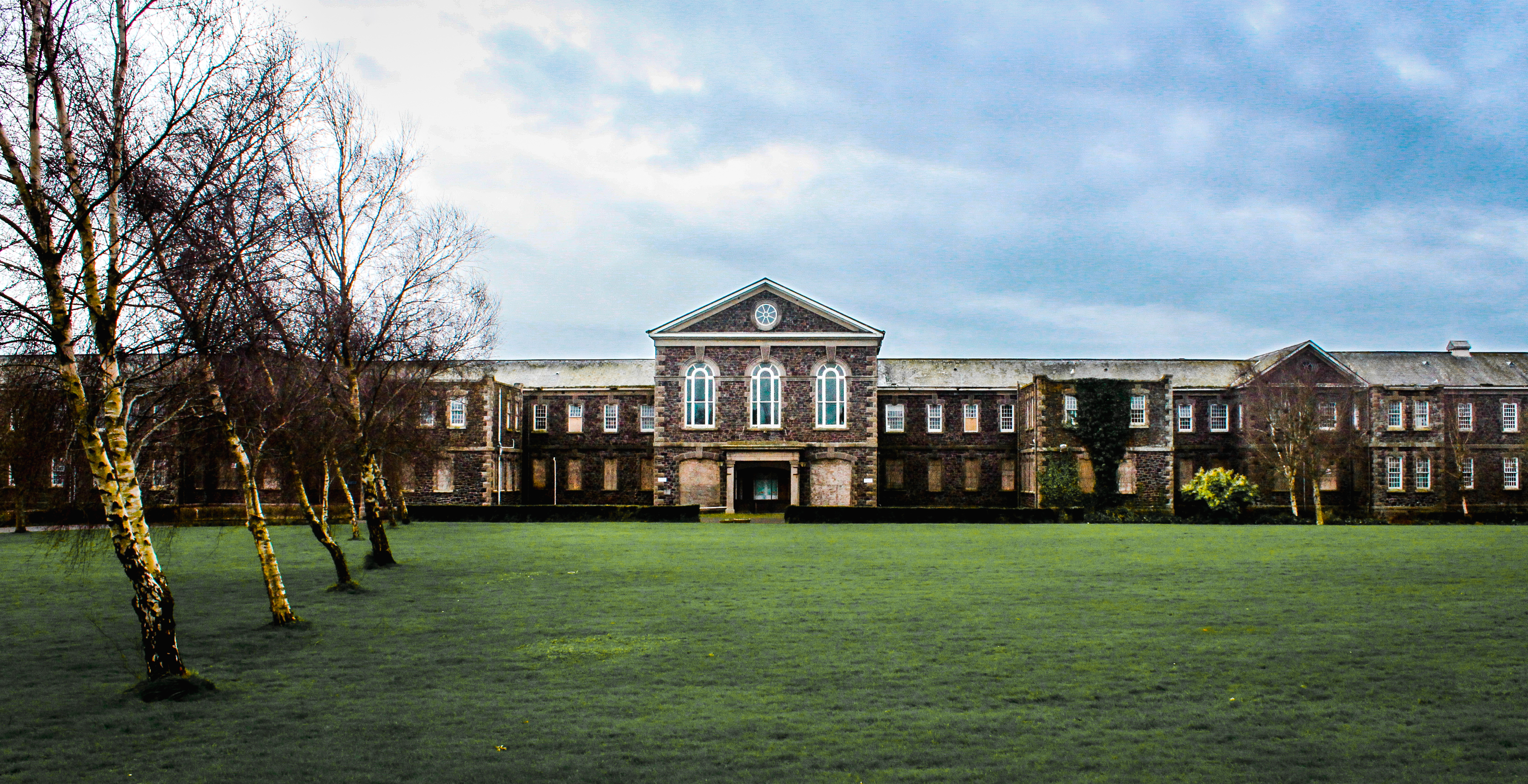
Secrecy links directly with hidden locations such as abandoned or derelict sites that are guarded against discovery. These often become secrets due to the fact that nature takes over these man made structures, hiding them from people.

Image result for abandoned building

Secrecy also has direct connotations with identity and how people will try to keep their personality or identity confidential. This kind of photography often results in surrealistic images which helps to portray this sense of hidden identity.

Related image

Mood Board

Evaluation, critique and analysis of my final response

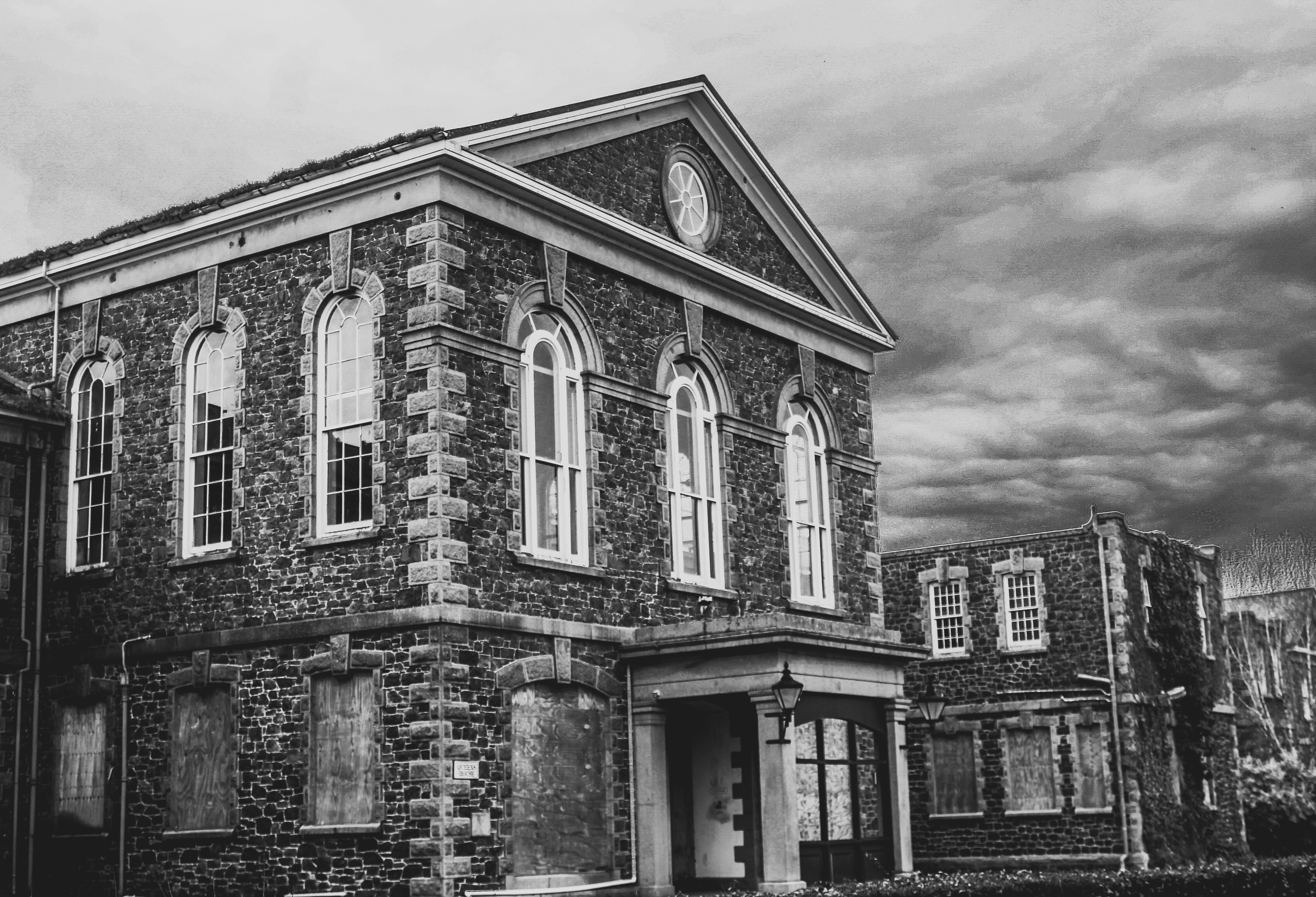
This piece of work is a true representation of the past. It represents a discovery of forgotten things which brings a realization that this place was someones past; the history of lives we never even knew. There is great use of leading lines and depth of field within these photograph which help to direct the viewer around the piece as a whole. The carefully positioned pictures create a strong contrast and juxtaposition to the photos themselves which are completely wrecked and derelict. This use of contrast may be a reference to the atmosphere which once was present to how it appears to be now. This links to the way the hospital used to be run, probably smooth and regulated well, compared to the myths associated with it and how it looks now. Personally, I believe that viewers should appreciate the subjects of this work but keep them in mind as examples of humanity’s wastefulness and the impact society has on nature. I think that to make this piece of work better, I could have explored a variety of derelict sites as appose to only one. I could have also thought about the presentation more to create something more visually pleasing such as a 3D sculpture, incorporating my photos within it.

Presentation Ideas

For the presentation of my images I have printed my selected images out onto three different sizes based on how important each image was in telling the story and messages I intended.

A3

A4

A5

For presentation, I intend to create a story board that gives the audience an insight into the St Saviors Mental Asylum. This will consist of using two foam boards, taped together, and arranging the images into an order that will attract viewers and direct them around the board to the different pictures. The pictures which gives the biggest impact will be in the middle as the main focus of my final piece. I will experiment with different compositions and placing of my photos to ensure i get the best possible arrangement for effect.

The following images show the process I took to get to my final arrangement. In order, it shows how I experimented with the positioning of my photographs to get to my final piece.

I think this composition works the best because it is visually pleasing, allowing the viewer to focus on the middle two pictures, the most important ones, and then be directed around them to get an insight of what the derelict building entails.

Selection Process For Final Images

Initial Images compared to Final Images

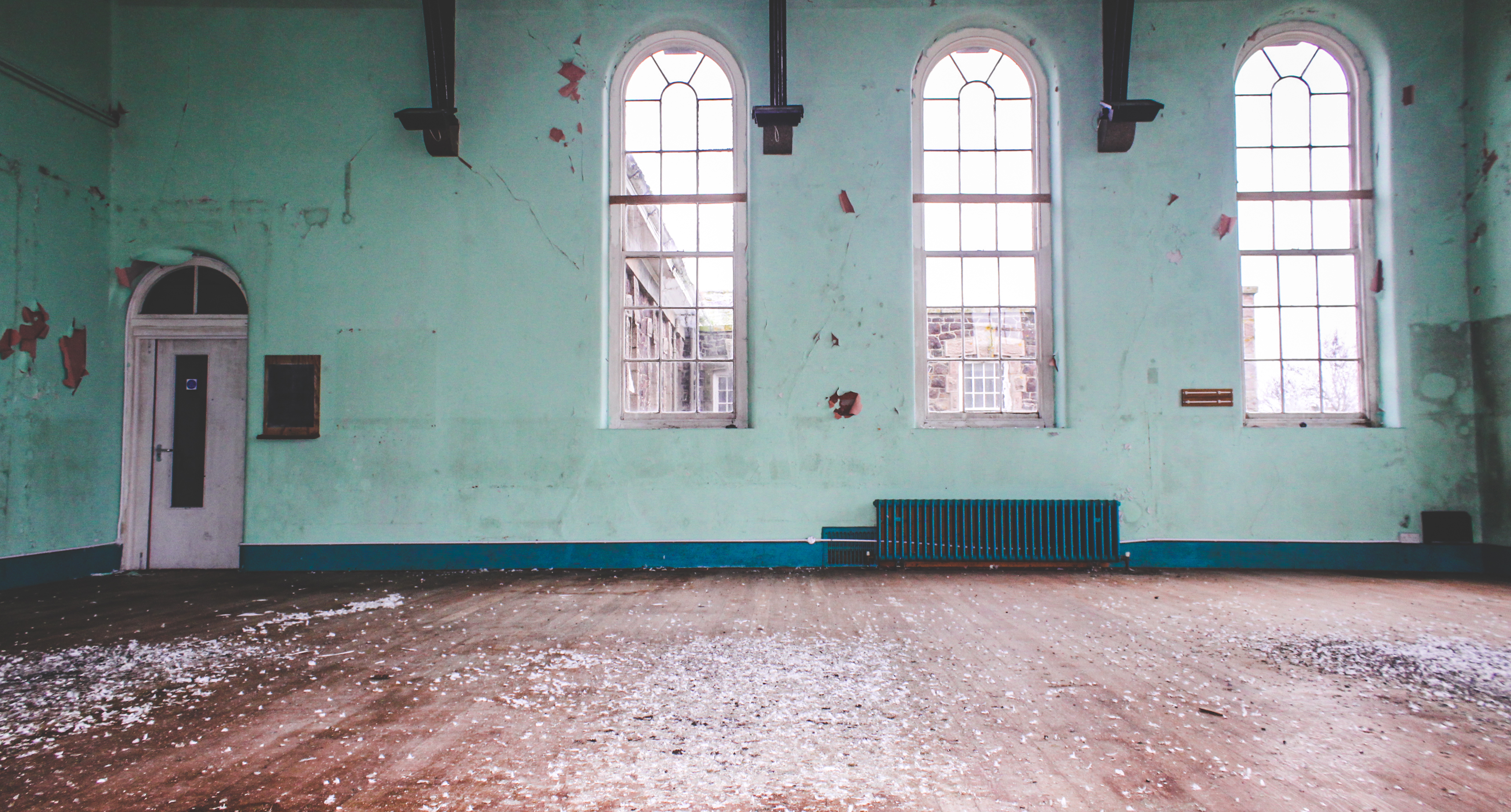
The overall effect of the initial images was completely incorrect for the story and messages I intended to portray. The photos did not ‘pop’ at all and the lighting created some very dull and faded images that were not eye catching. Through the editing process I manipulated all aspects of the photo, focusing on lighting and colors specifically. A main feature in creating these eerie feeling images, was the clarity. With a high clarity I was able to bring out very fine textures within the walls and other subject matter within the photo to give an overall feeling of destruction. I used the brush tool for almost every photo which allowed me to changed lighting and colors within small parts of my photos. Another editing technique i used in creating these images was changing specific colors through  the hue, saturation and luminance. I believe the initial photos were not effective themselves and could have been improved by using a stronger light source within the building and possibly taking photos on a sunnier day which would have allowed for brighter photos inside the building and better lighting outside too.


I believe for my final piece, these images are the effective and the best in portraying a sense of landscape, documentary photography of the derelict mental asylum. The variation of vibrant and black and white photographs will compliment each other when side by side in my final presentation. I believe this set of images creates a true representation of the mental institution at its current state and how it is wastefully sitting there, taking up space that could be used for nature. However it supports the untrue myths associated with how it was once full of psychopaths and was poorly run.

Through this set of images I want the audience to appreciate and acknowledge the wastefulness in which humanity evokes. Also i want them to serve as an eerie reminder that nothing lasts forever.


Altered Landscapes

Witchoria

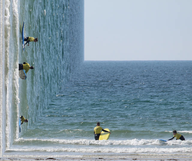
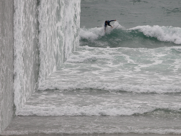
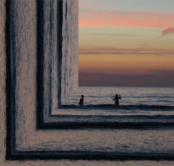
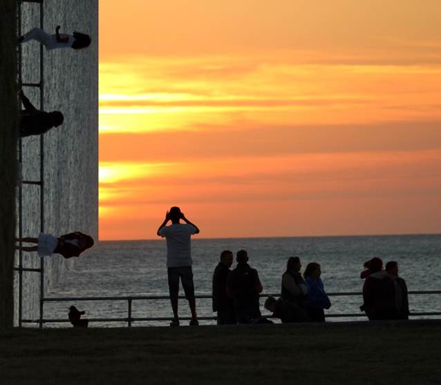
Victoria Siemer is a Brooklyn-based American graphic artist who focuses mainly on photo manipulation using Photoshop.

Her inspirations come from the idea of “emotional fragmentation or ‘fragmentation of the self.’“ Since she had no formal photography training, she paid close attention to others, including artist and former roommate Jeff Brown and street photographer Dave Krugman. It was only more recently that Siemer has begun to call herself an artist, rather than a designer.

Inspiration for this shoot


Photo shoot Plan

Concept Genre /  Artist Location Props Shot type Lighting Settings
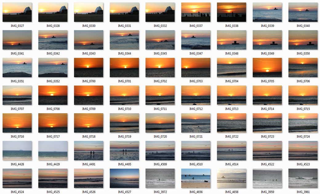
Altered Landscapes Witchoria Beach Tripod Landscape Natural Manual focus,f/2.8-f/4, 1/60 shutter speed ISO-100

For this photo shoot I am going to focus on Witchoria’s photos which she creates a 90 degree angle of half the picture on the side to create an illusion.  Her photos are all at the beach for this style therefore this photo shoot will consist of mainly beach pictures.  For this photo shoot I will use a tripod due to the fact that the sea is constantly moving and I want to try to reduce as much motion blur as possible to create a realistic looking photo to help with the illusion which will be created when editing.


John Divola – Isolated House’s

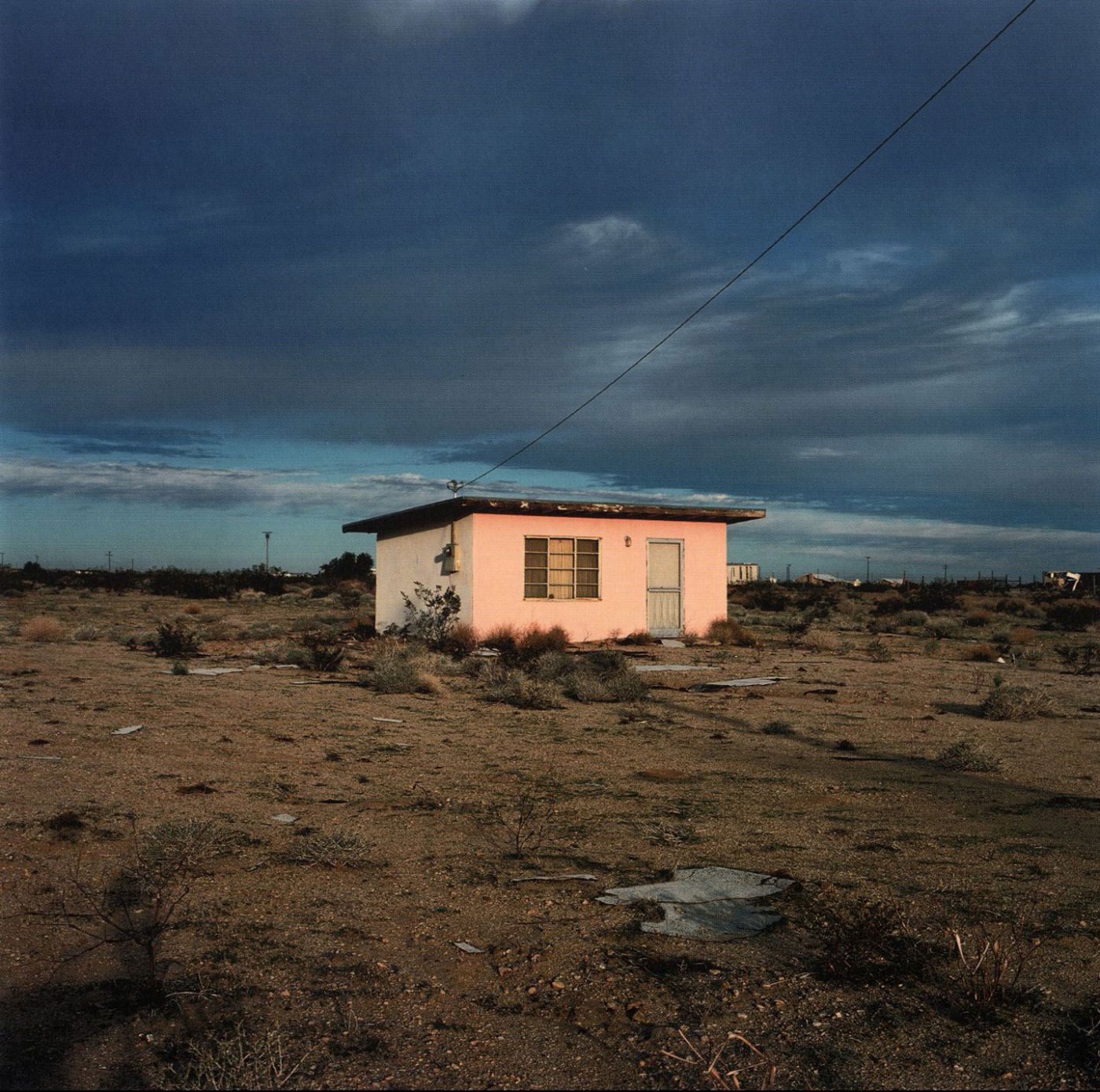
Following on from Johnny Joo, I came across John Divola who is a contemporary visual artist. He currently lives and works in Riverside, CA. Divola works in photography, describing himself as exploring the landscape by looking for the edge between the abstract and the specific. I decided to focus in on the isolated houses book by him, originally released in 2000, as it gives a sense of humanity’s wastefulness which links to Johnny Joo’s work.

I believe this style of work links to the theme of secrecy and hidden identity as it would appear the owners are trying to escape all aspects of civilization and be on their own in their own world.

Image result for john divola isolated housesImage result for john divola isolated housesImage result for john divola isolated houses

Despite the fact these images are rather raw, with little editing, i believe they are effective due to the simplicity of them and the conceptual ideas and meanings behind the images. I think that I can create some interesting images in this style with the use of varying camera settings and editing techniques.

Image result for instagram michael steric

This is an image taken by Micheal Steric, a famous Instagram user. It portrays some very similar connotations to which Divola’s work does however, Micheal Steric has insured to give his audience a more aesthetically pleasing image to visualize by using a series of editing techniques to make it as if the building is on fire and is surrounded by an unusual green glow. This links to both of my views on altered landscapes in the way that the photo has been altered digitally by the photographer but also the way the subject within the photo has been altered by humans and natural disasters. The vibrancy within this image helps to captivate the audience and ensure they appreciate and acknowledge the wastefulness in which humanity evokes.


Johnny Joo Response 2

Photo shoot Plan

Genre /  Artist – Landscape, derelict buildings

Concept –  Capture images to portray humanity’s wastefullness

Location – St Saviors Mental Hospital

Shot type – Landscape, varied angle dependent on subject matter

Lighting – Natural lighting for outside shots, light source to reflect light within the building as it is dark inside.

Settings – 1/30 Second exposures with ISO of 100 to ensure the images are sharp and the varied textures show up.

Contact Sheet


Best Image

I believe that this image is very strong in the way it inflicts the conceptual ideas of nature taking over and dominating us. This can be seen in this photo where the leaves/vines appear to be invading the bathroom through the boarded up window. This is a clear representation of the power of nature and how it can overcome barriers created by humans, in this case the hospital building. It also relates to how this building is taking up space unnecessarily which could be used for nature and wildlife purposes. The use of leading lines within the baths frame helps to draw the viewer up to the window where the vines are taking over.