All posts by Thomas Webster

Filters

Author:
Category:

St Helier Photoshoot 2

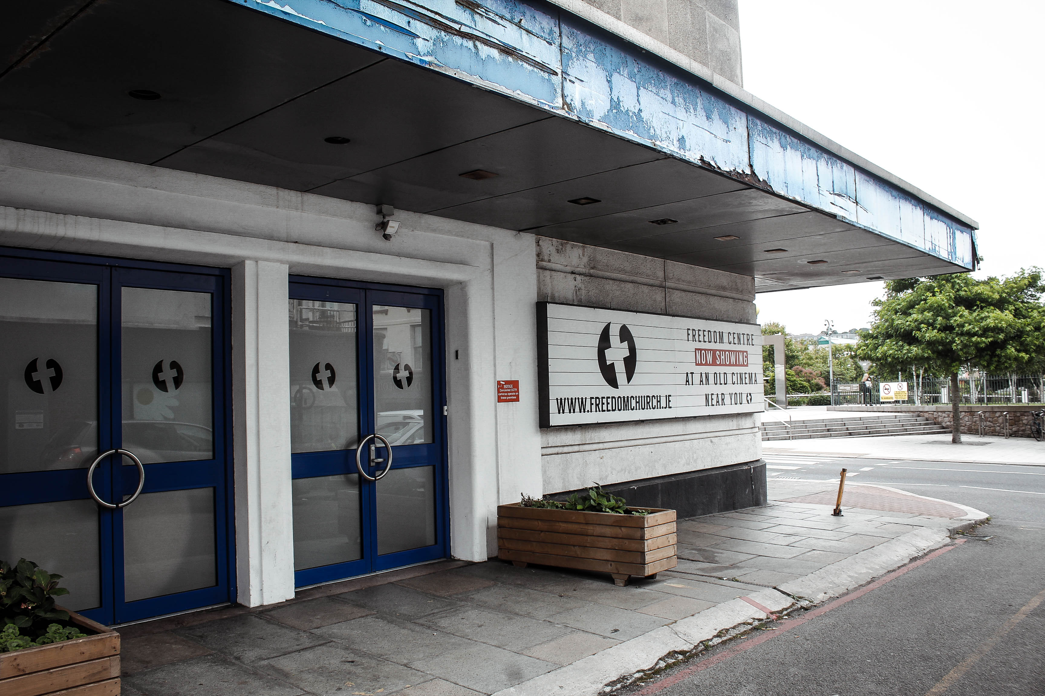
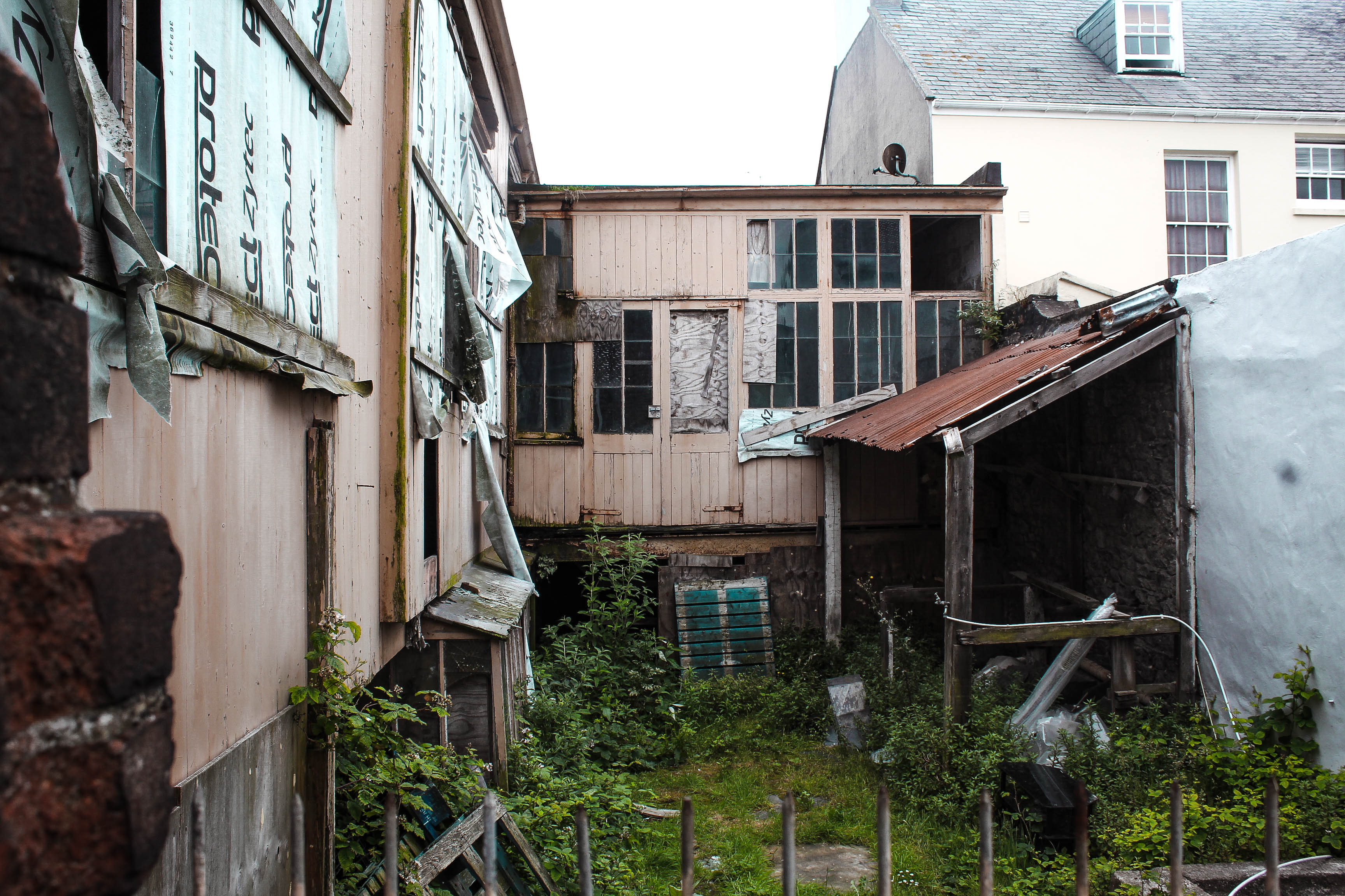
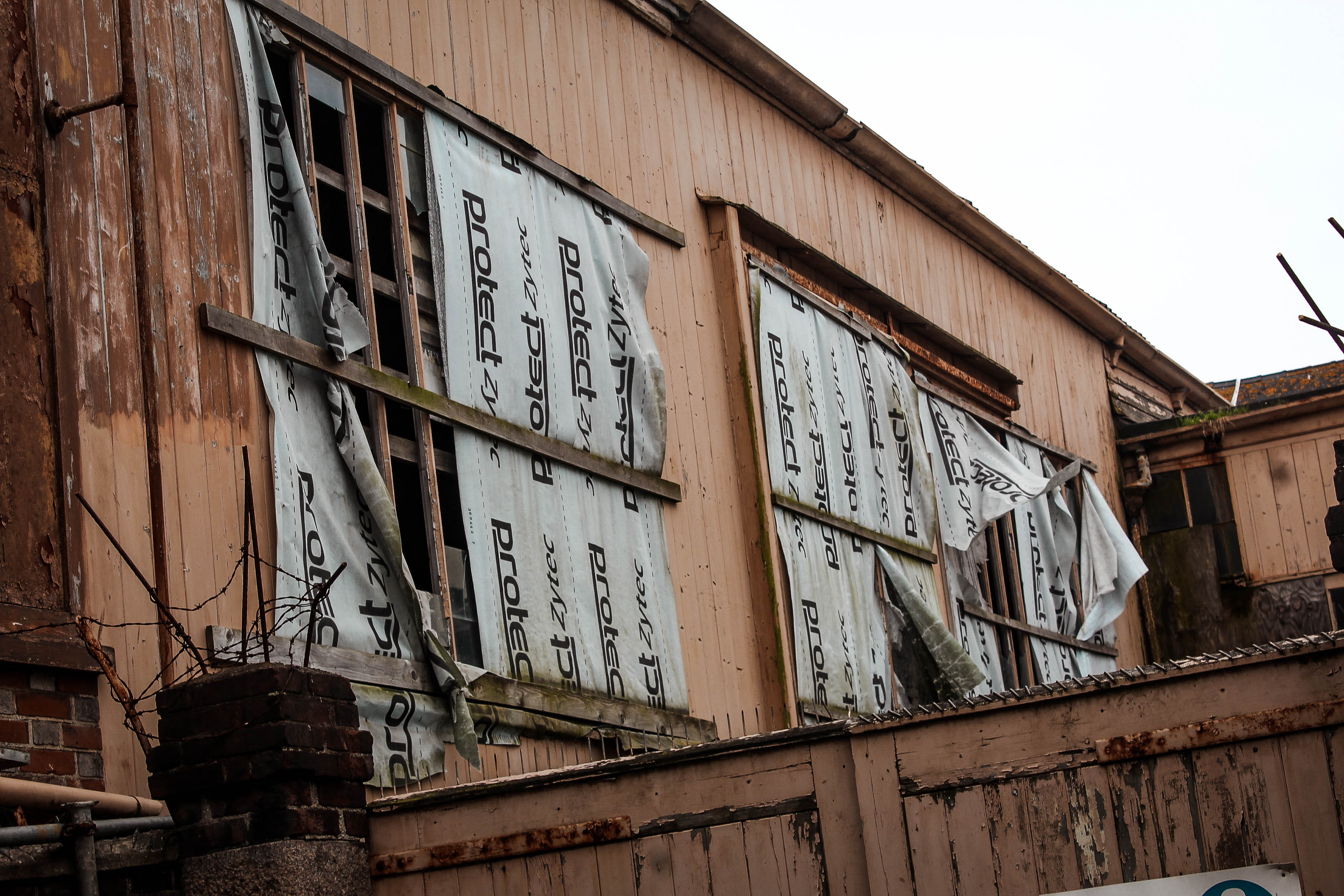
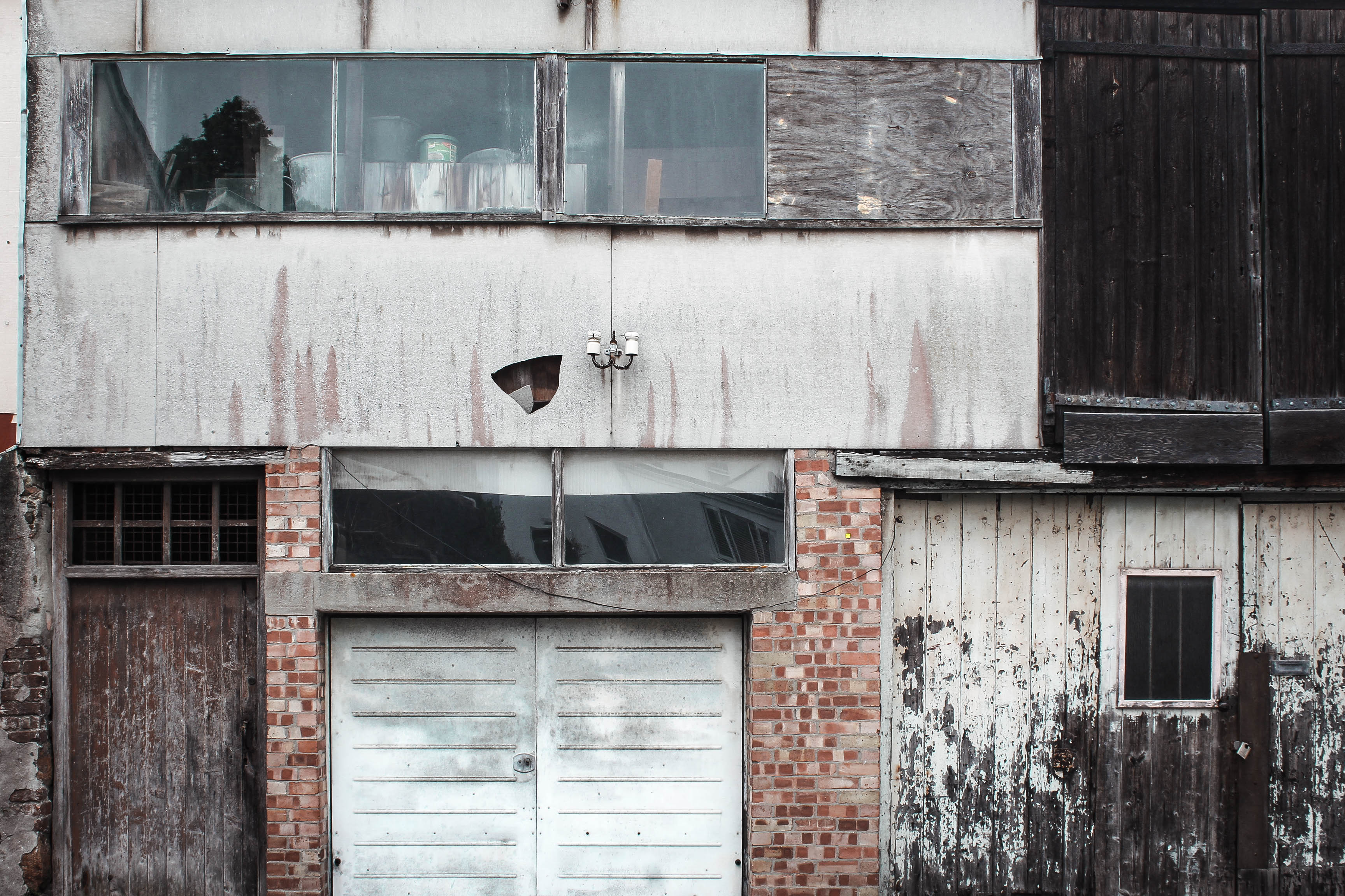
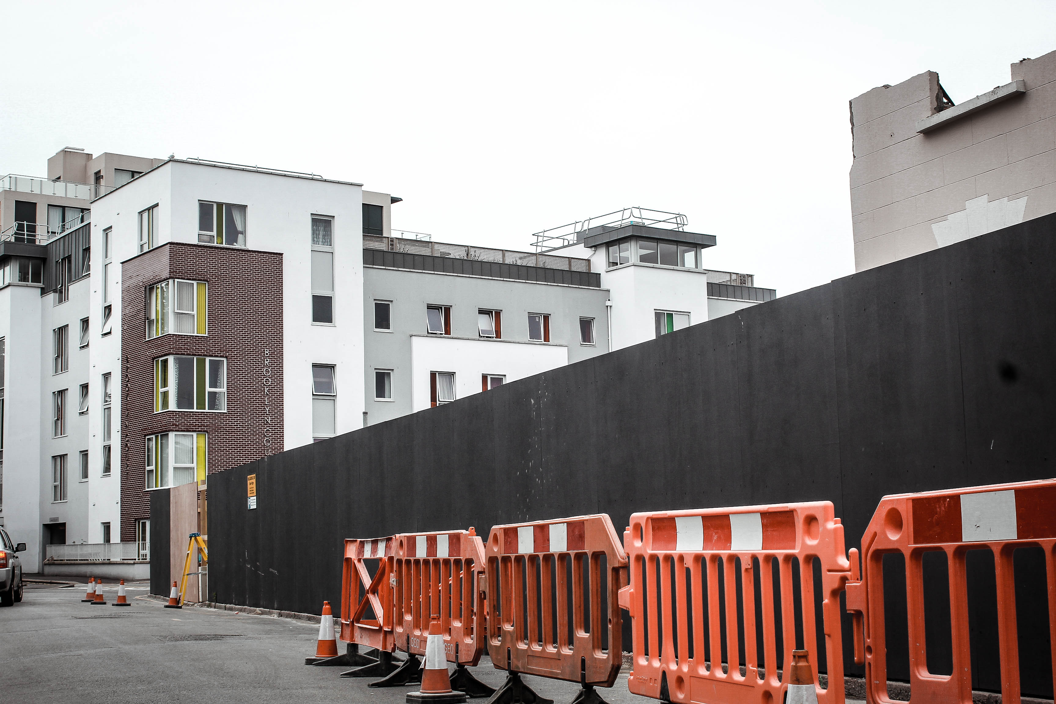
For this photo shoot my intentions were to capture the destruction of the area i was allocated. I did this by shooting derelict buildings which had a sense of usage and were clearly left abandoned. I wanted to bring an awareness to the community of St Helier that these buildings are wasting space and could be used for something that would benefit our island.  I also intended on bringing a strong contrast between the old vs new of St Helier which would truly show how wasteful the abandoned buildings are.
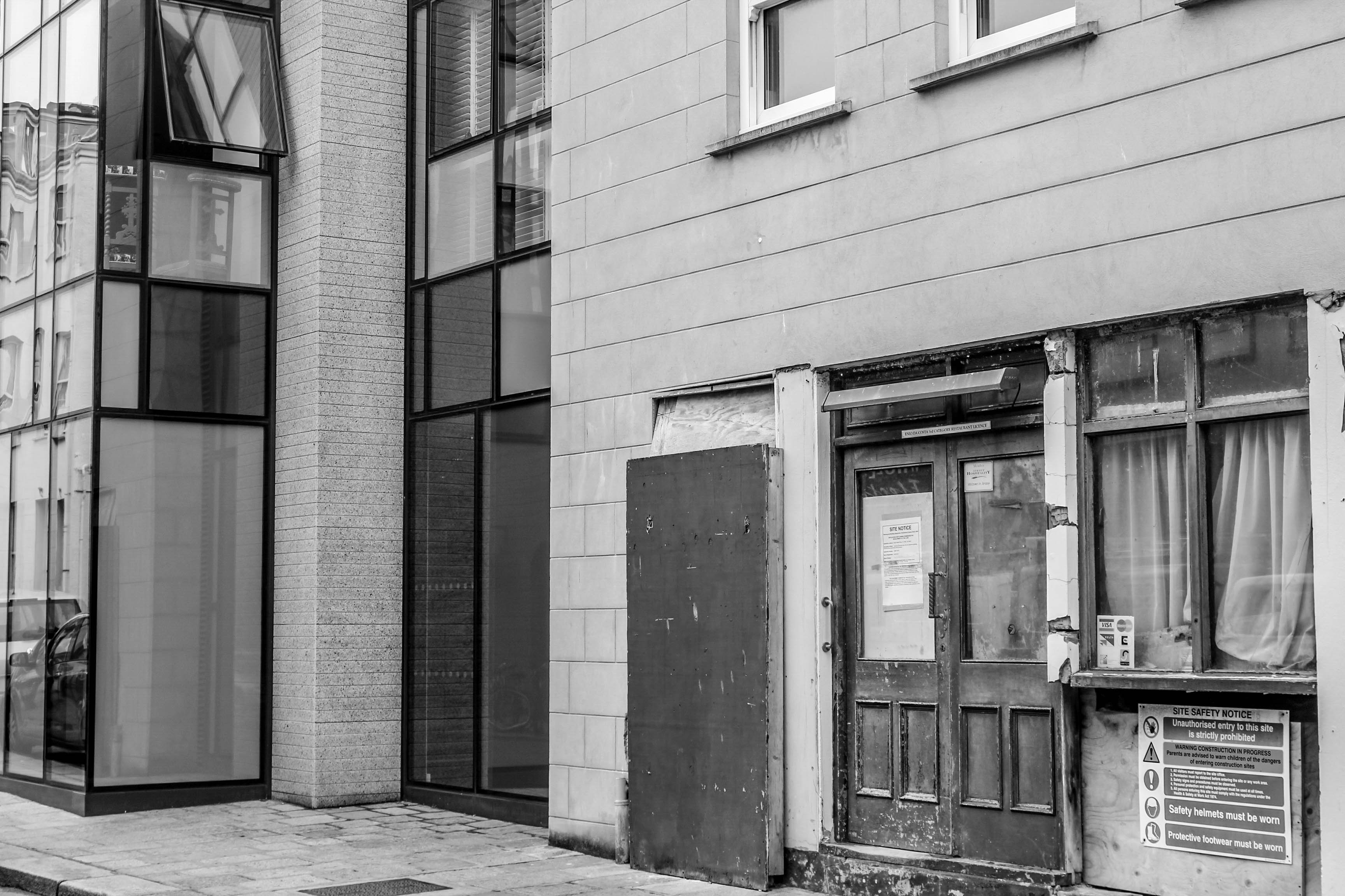
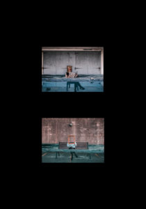
This photo displays a clear contrast between new vs old within St Helier. This strong contrasts helps to alarm the viewer and bring a sense of annoyance as the viewer can see what is capable in the destroyed area however it still remains ruined. The textures are interesting in this photo, with the new building having soft calming textures to reflect a bright future however the derelict building in front conveys very tough and ridged textures. The way i decided to compose this image was to have the derelict building in front to show that this is a key issue standing between us and the bright future for St Helier.

I think this photo is very effective in portraying the idea that Jersey needs development to help the future of St Helier. The photo has the idea that we are looking through a portal into the future of St Helier and if we carry on the way we are going, the future of St Helier is as displayed, destroyed. This is effective in raising awareness of this issue and connecting with the audience in bringing a realization to this issue.

I believe that this shoot was successful in portraying the decline of the area i was allocated however showing the hope for it by including some direct contrasts between the dereliction of buildings and the new structures. This helps to show the viewer that there is large room for development within St Helier which would not only improve the aesthetics of the area but also help to build a community. I have edited most of the images with low saturation and high contrast and clarity, dark shadows and increased blacks to give this sinister feeling to represent my views on this destruction.

St Helier Photoshoot 1

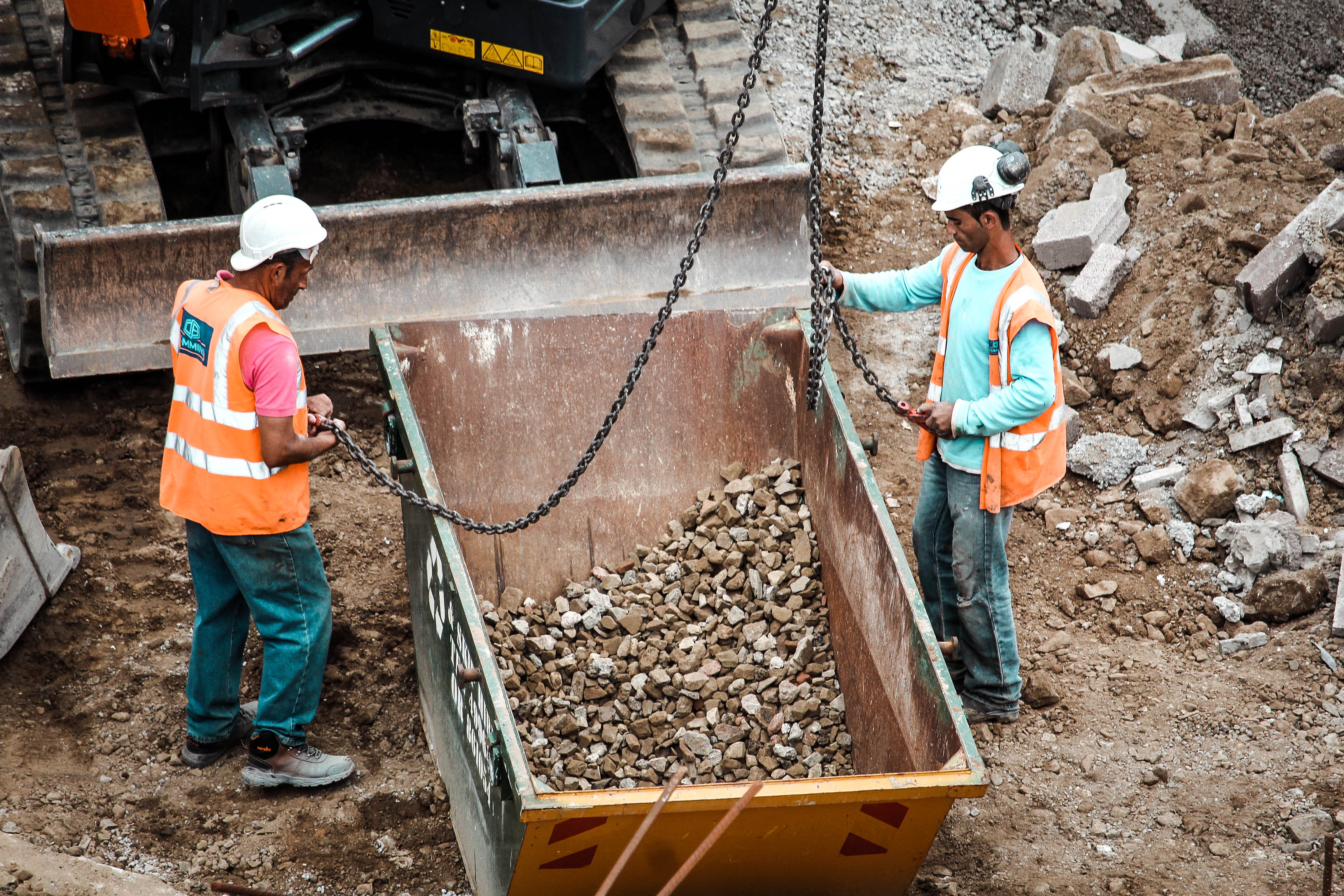
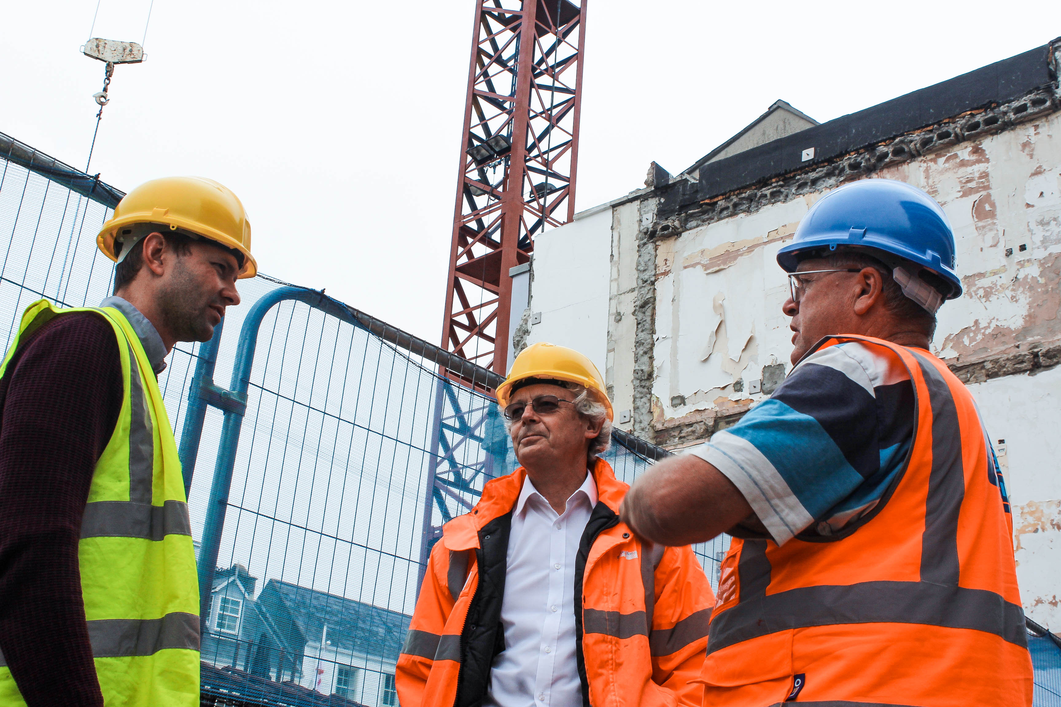
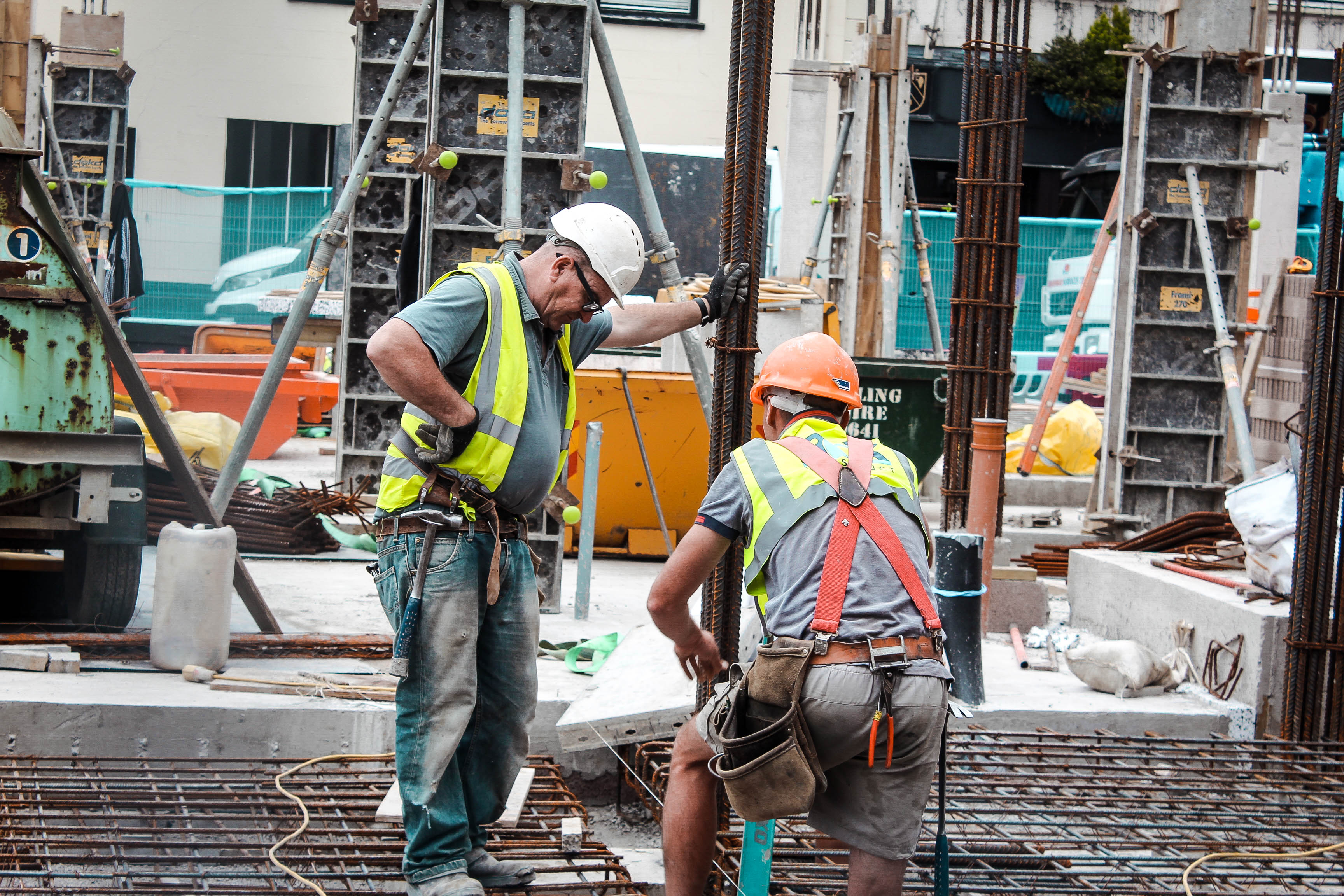
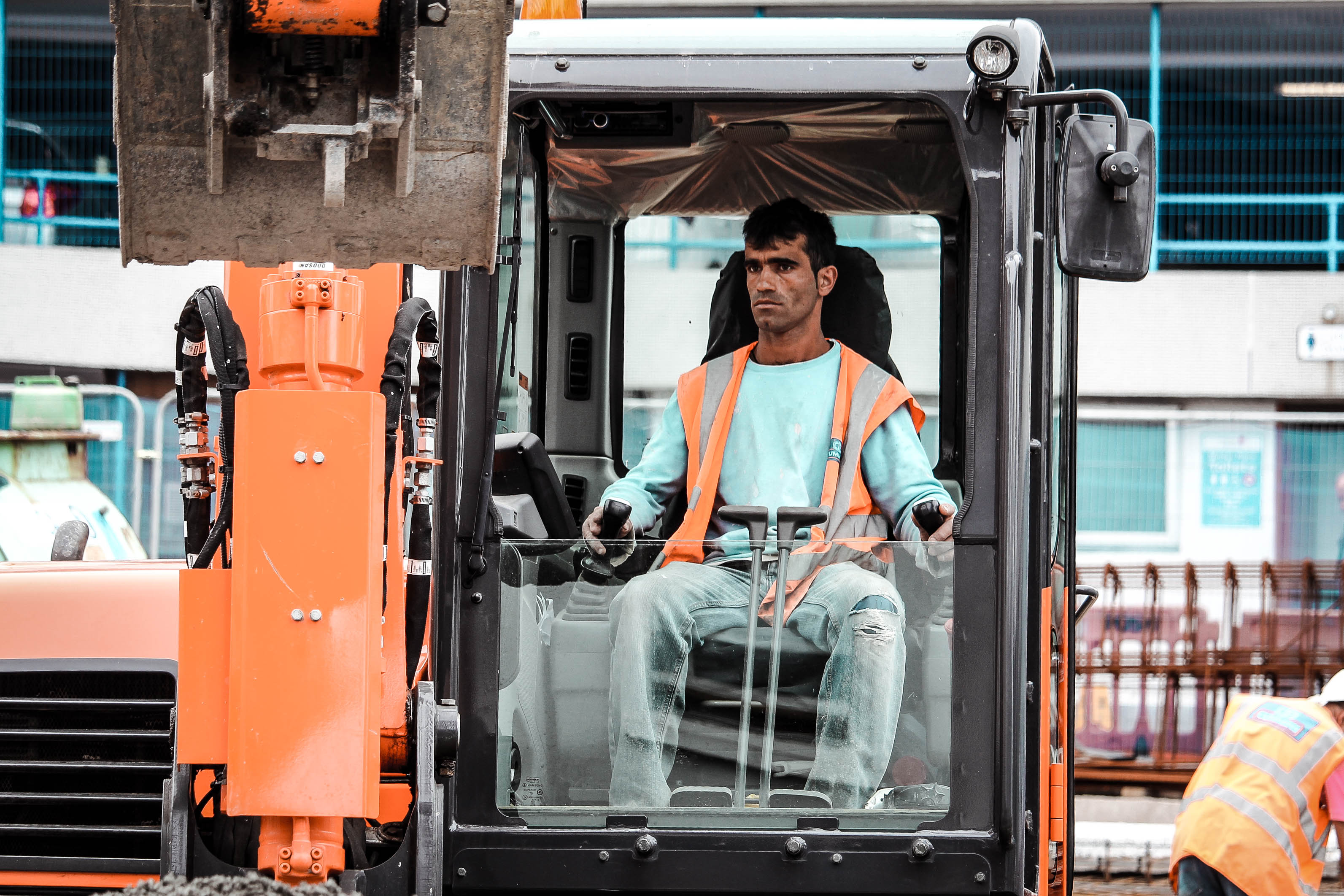
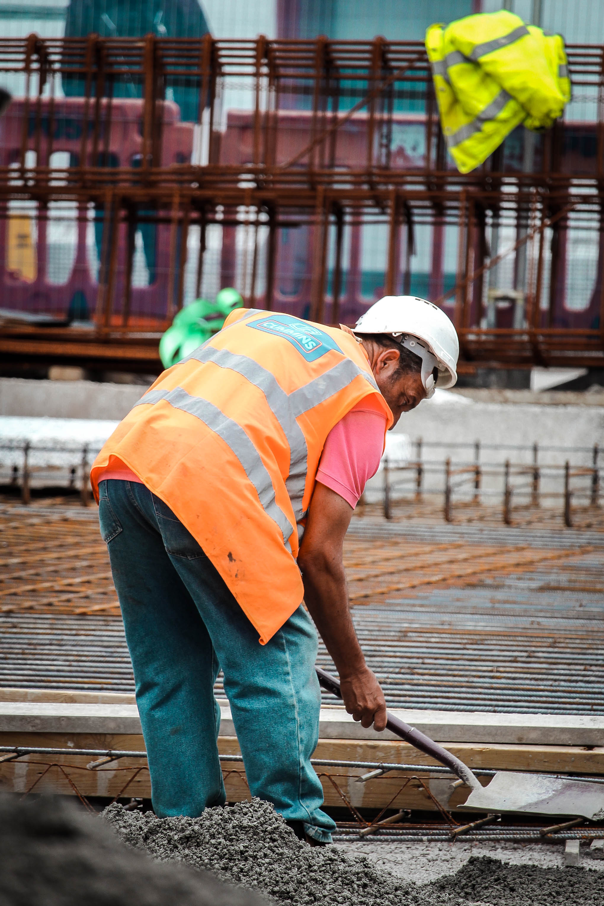
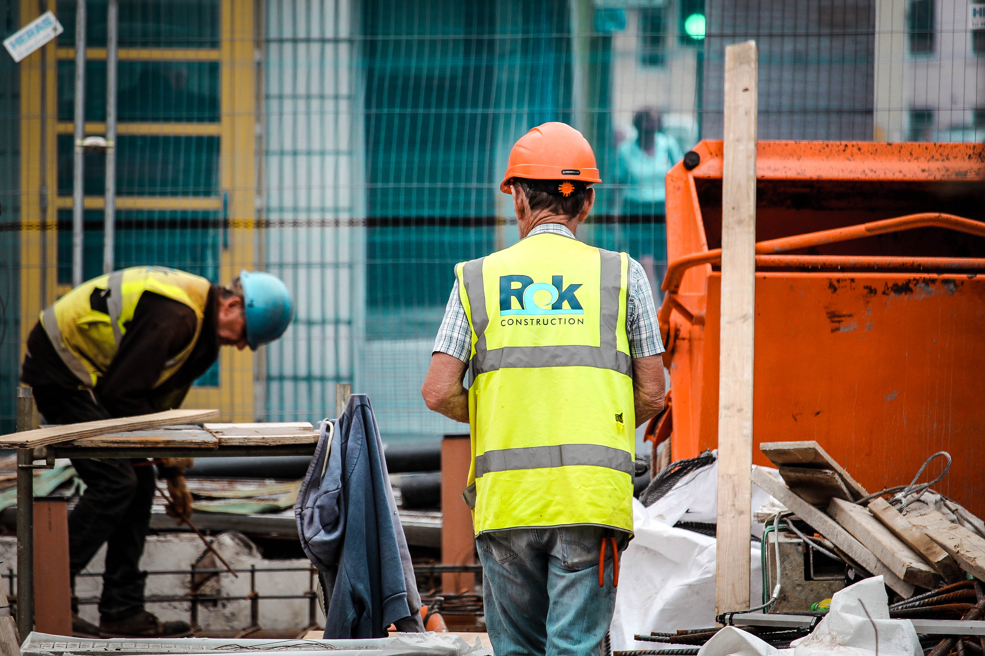
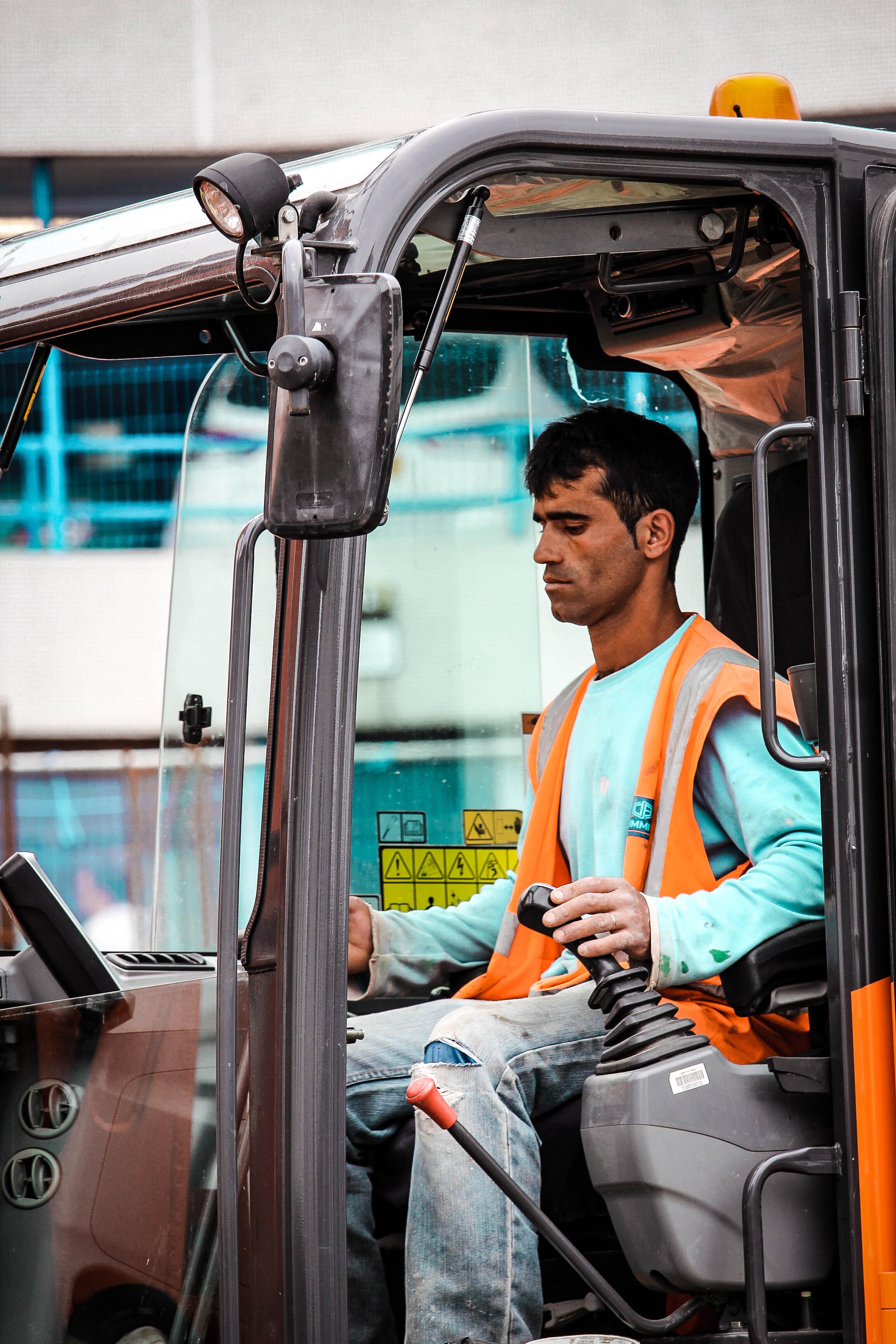
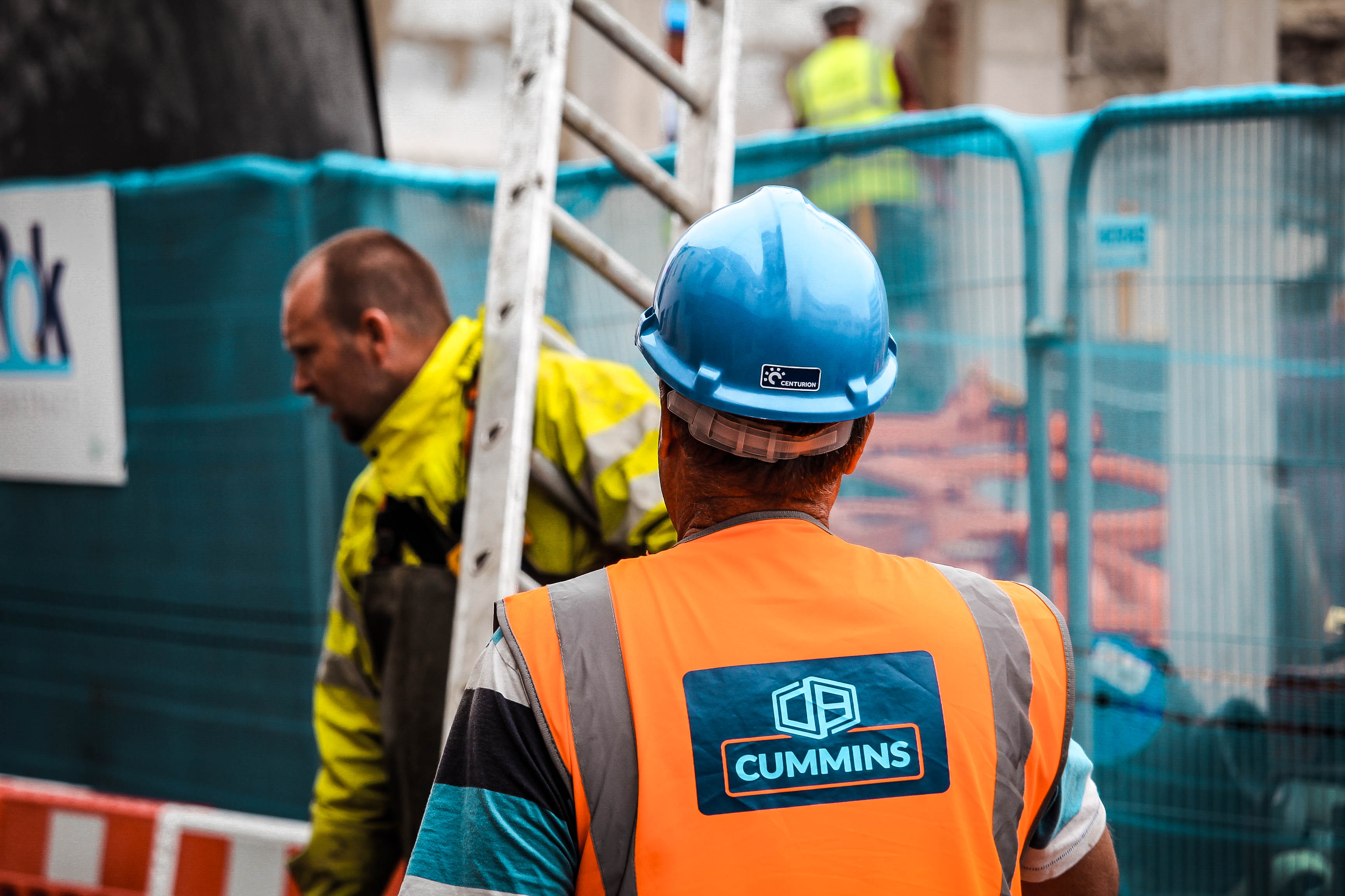
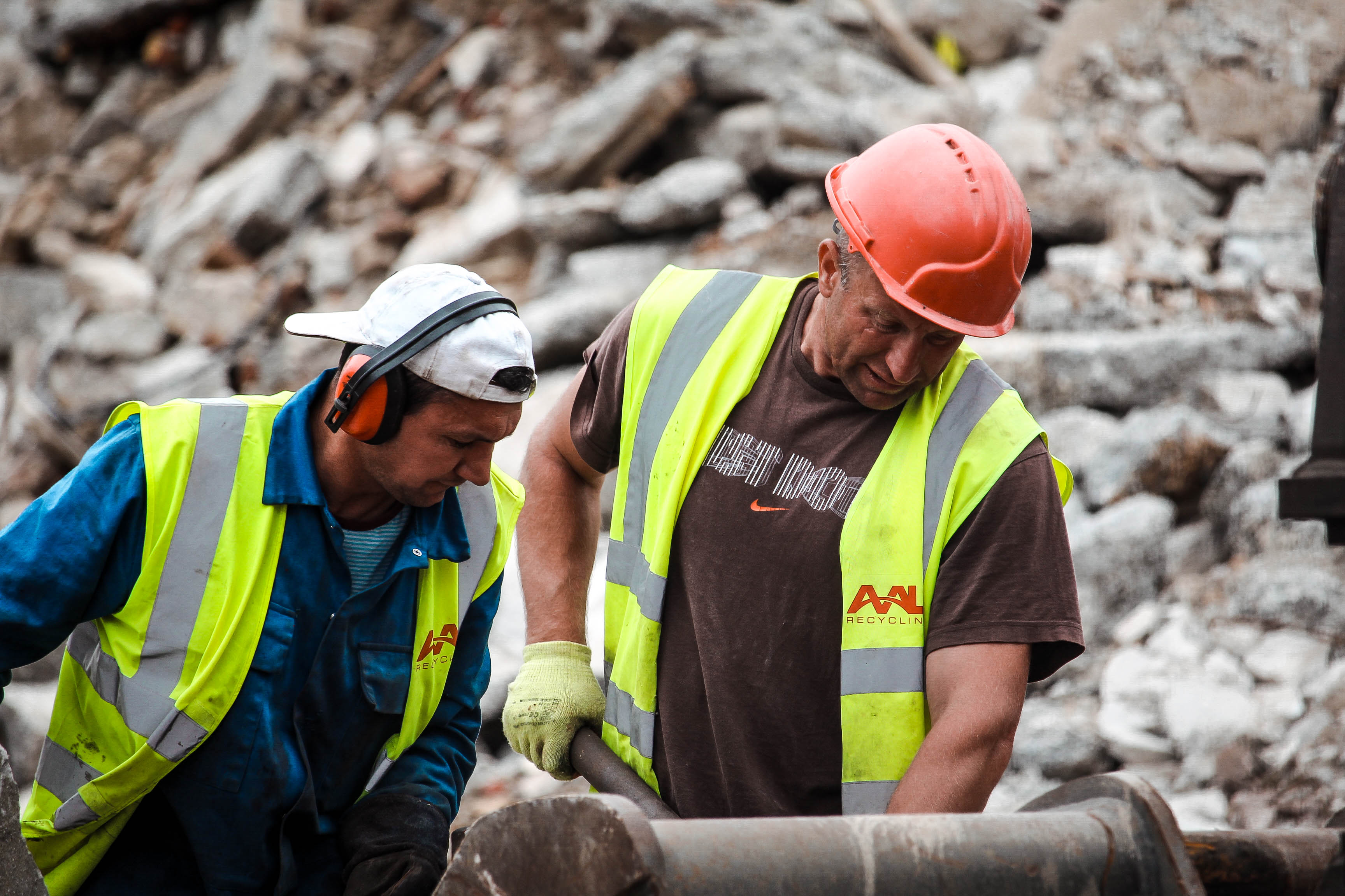
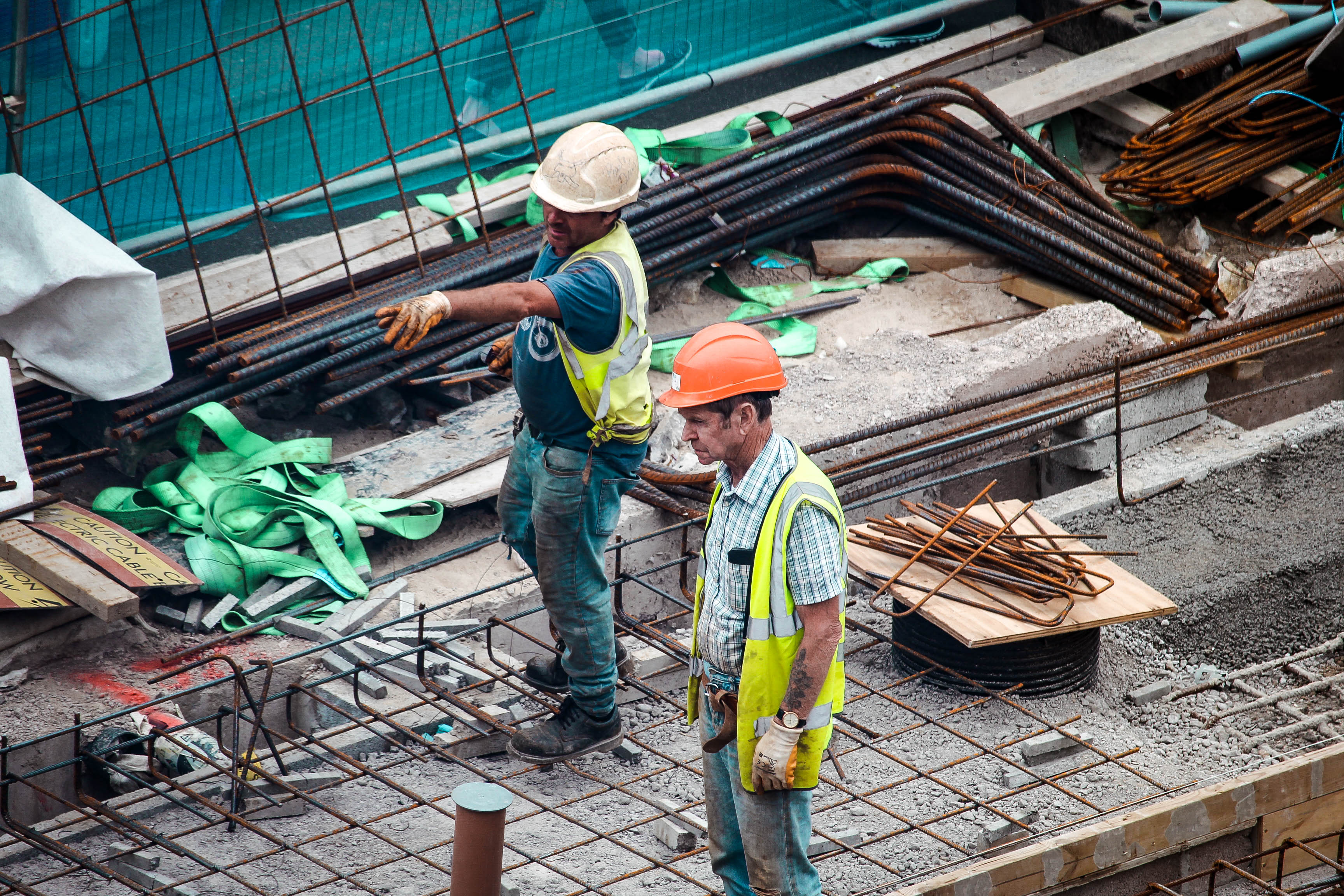
For this photo shoot my main focus was on the construction of the allocated area I was in. This is because it helps to demonstrate the future of St Helier because these building sites will become buildings and businesses that will stand in the future. I found that photographing building sites was less centered around community but more around making life better for the future. The development is important because it  creates jobs for people and living space for the future. Clearly, my photos focus on the job aspect of construction with a clear intent to focus in on the migrants that are taking up these kind of jobs.

Photoshoot Plan

As displayed in my last post, the area of focus for my photo shoot is the top end of town which contains the modern millennium park and some very interesting back alleys which are fairly run down. I plan to show the contrast of the modern vs the old as it will help to show the potential for development and the future of St Helier. I will do this by capturing the dereliction of buildings as well as the construction/modernised buildings. I plan to do three shoots which will all focus on different themes.

My first shoot will focus on the actual development of St Helier and I plan to photograph builders at work. Often the builders in Jersey are migrants that have come over with intent to work so it will be interesting to document this and show these kinds of people helping the future of Jersey. Also a sense of community will be demonstrated through this as often the migrants in Jersey have a close community with strong relationships and so I will try to portray this through my photographs of them at work.

My second photo shoot will involve capturing the destruction of the area i am allocated. I will do this by shooting derelict buildings which have a sense of usage and are clearly left abandoned. I want to bring an awareness to the community of St Helier that there are buildings that are wasting space and could be used for something that would benefit our island.  I also intend on bringing a strong contrast between the old vs new of St Helier which would truly show how wasteful the abandoned buildings are.

For my third photo shoot, I want to capture the modernization of St Helier and show the development which is occurring and has occurred to improve the area and trying to build a stronger community.

My Area To Photograph

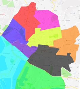
The area assigned for me to research and later photograph is the zone in yellow. This area consists of millennium  park which is a very modern aspect to the area as well as the old jersey brewery which contrasts nicely as this is an old derict building. There are various landmarks and people which will be of interest to photograph. The different landmarks such as the old cinema will help to give a sense of the old vs new within St. Helier and the people will give a sense of the lifestyle and community within the area.

My intentions for the photo shoot is to not only explore and portray the area in the way I percieve it to be but to also capture a sense of what the area once was and could be in the future. I intend to focus on three main elements. This will be the community, the history of the area and the modernization/future of it.

Brief history of St Helier

It is thought that the site of St Helier was settled at the time of the Roman control of Gaul.

The medieval hagiographies of Helier, the patron saint martyred in Jersey and after whom the parish and town are named, suggest a picture of a small fishing village on the dunes between the marshy land behind and the high-water mark

18th Century

Until the end of the 18th century, the town consisted chiefly of a string of houses, shops and warehouses stretching along the coastal dunes either side of the Church of St Heller.

19th Century

Military roads linking coastal defences around the island with St Helier harbour allowed farmers to exploit Jersey’s temperate micro-climate and use new fast sailing ships and then steamships to get their produce to the markets of London and Paris before the competition. This was the start of Jersey’s agricultural prosperity in the 19th century.
20th Century

In the 1960s, income from the Jersey States Lottery was used to excavate a two-lane road Tunnel under Fort Regent, enabling traffic from the harbour to the east coast towns to avoid a torturous route around the fort. About the same time, the Fort was converted into a major leisure facility and was linked to the town centre by a gondola cableway – closed and demolished in the 1990s.

21st Century

Liberation Square is now a focal point in the town – the former terminus of the Jersey railway housed the Jersey Tourism office until 2007.


Masterplan

Master planning is about making the connection between buildings, social settings, and their surrounding environments. A master plan includes analysis, recommendations, and proposals for a site’s population, economy, housing, transportation, community facilities, and land use. It is based on public input, surveys, planning initiatives, existing development, physical characteristics, and social and economic conditions

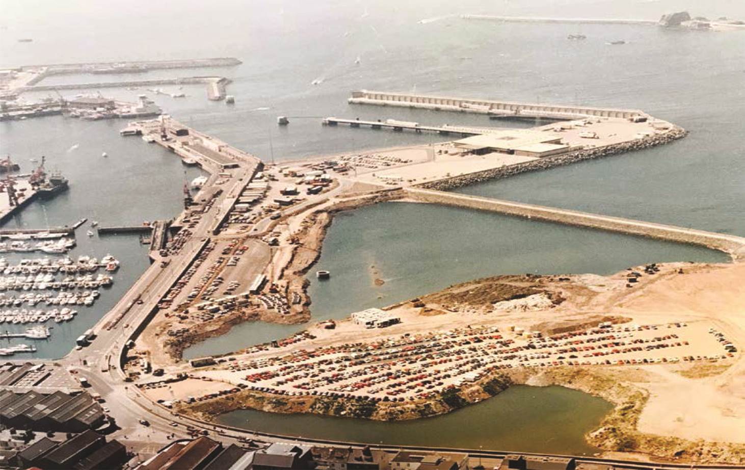
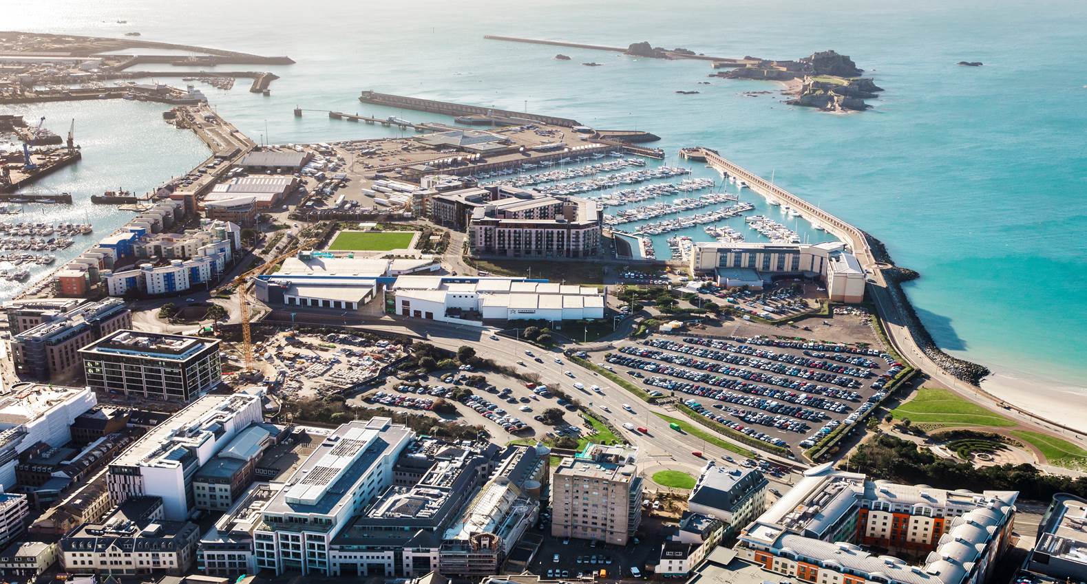
A massive part and the core reason for the success of St Helier is due to the work of master plans. It has played a major role in the development of architecture and economical development and therefore resulted in such projects as the land reclamation. This land reclamation is now one of the Jerseys major attraction areas with multiple leisure facilities, food outlets and accommodation. Masterplans has an important role of determining the shape of an urban environment. If the planning is not done well, it can lead to problems and no success for the future.

Image result for masterplan st helier

My Views, feelings and vision for the future of St Helier

I strongly believe that St Helier is moving forwards with intent to make money with such ongoing projects like the international finance center. Although this is likely to benefit Jersey, these money making investments are orientated towards the finance sector and living complexes which does not positively impact Jersey as a community. Also, the tourism industry is clearly ignored buy the development teams of St Helier with many attractions collapsing and little investment in new leisure facilities.

A clear example of this is how Fort Regent was once considered a hot spot for tourists to the island as well as a great place for locals to spend the day. It provided weather proof activities for all ages but since the 90’s the attraction has been underfunded resulting in the closure of some of its main attractions such as the swimming pool and cable carts. The fact that the fort has continued to go downhill despite the plans to redevelop the whole of St Helier shows that the States of Jersey have lost interest in the islands tourism industry and providing attractions to meet the demands of locals.

Related image

In my opinion the future of St Helier should be surrounding a modernization approach with the belief that new types of buildings will increase the high demanding market for finance. Modern buildings such as high-rises are needed in order to move St Helier from being a town into a city which in my opinion would benefit Jersey as it will gives a chaotic atmosphere to which can and could not be found anywhere else. However this does not mean the demolishing of historical buildings but it will enhance their presence with the contrast between the past and present which shows the movement and development within Jersey.


Final Piece Evaluation


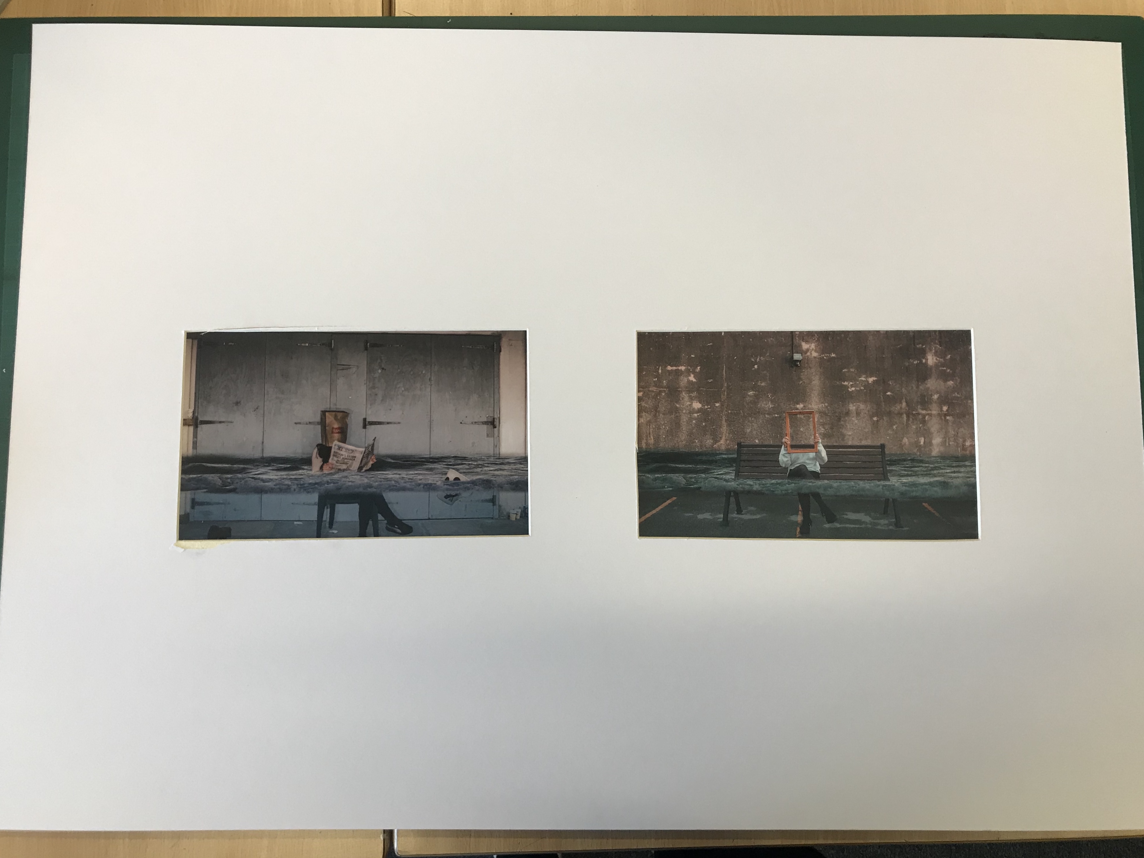
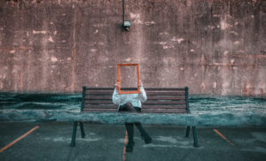
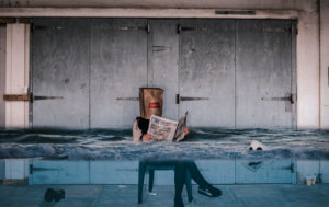
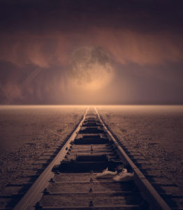
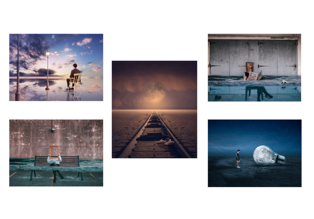
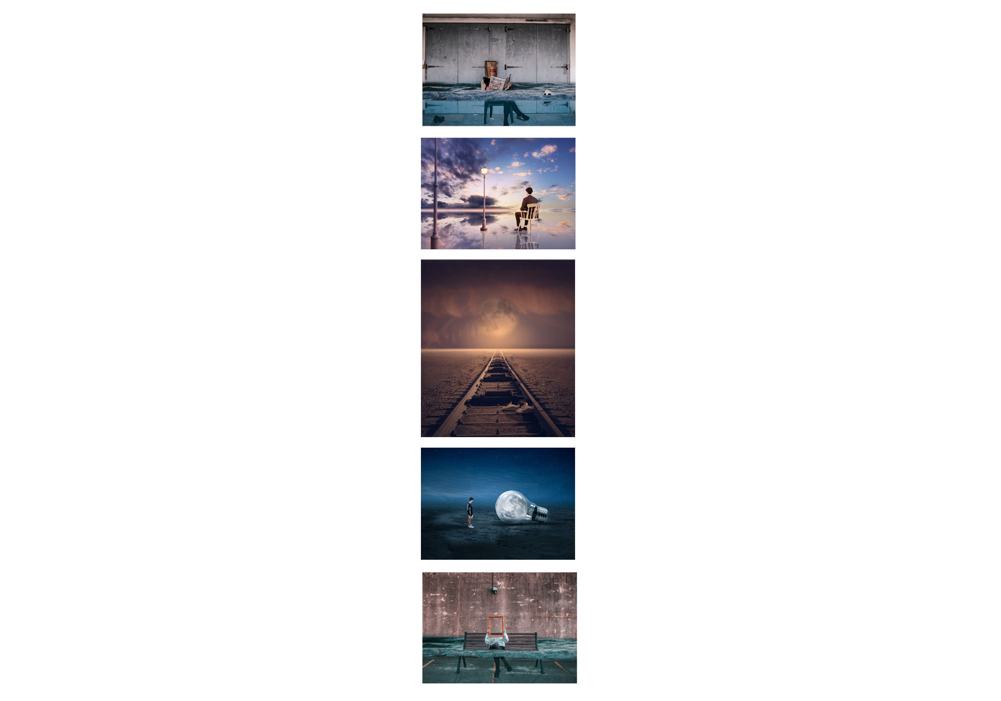
My final piece shows a collection of visual research about humanity’s impact on earth and digital manipulation photography which I have done in order to reach my final piece. I was trying to capture a sense of how our earth is changing by highlighting disasters such as rising sea levels and light pollution. This links to one of my artist studies, Thomas Barbey. He try’s to capture images which show two negatives within society and some which give an indication of our earth being ruined. He mainly uses black and white, which is the same as another artist reference i used, Tommy Ingberg. In contrast, my images display this idea of our earth being ruined with bright colors to attract the viewer. Similar to Tommy Ingbergs photos my final piece relates to how the people in my image could be feeling. For example, the concept of the top final piece is that our sea levels are rising and the person within the image is hiding from the camera suggesting she is ashamed to be part of society which has caused this.

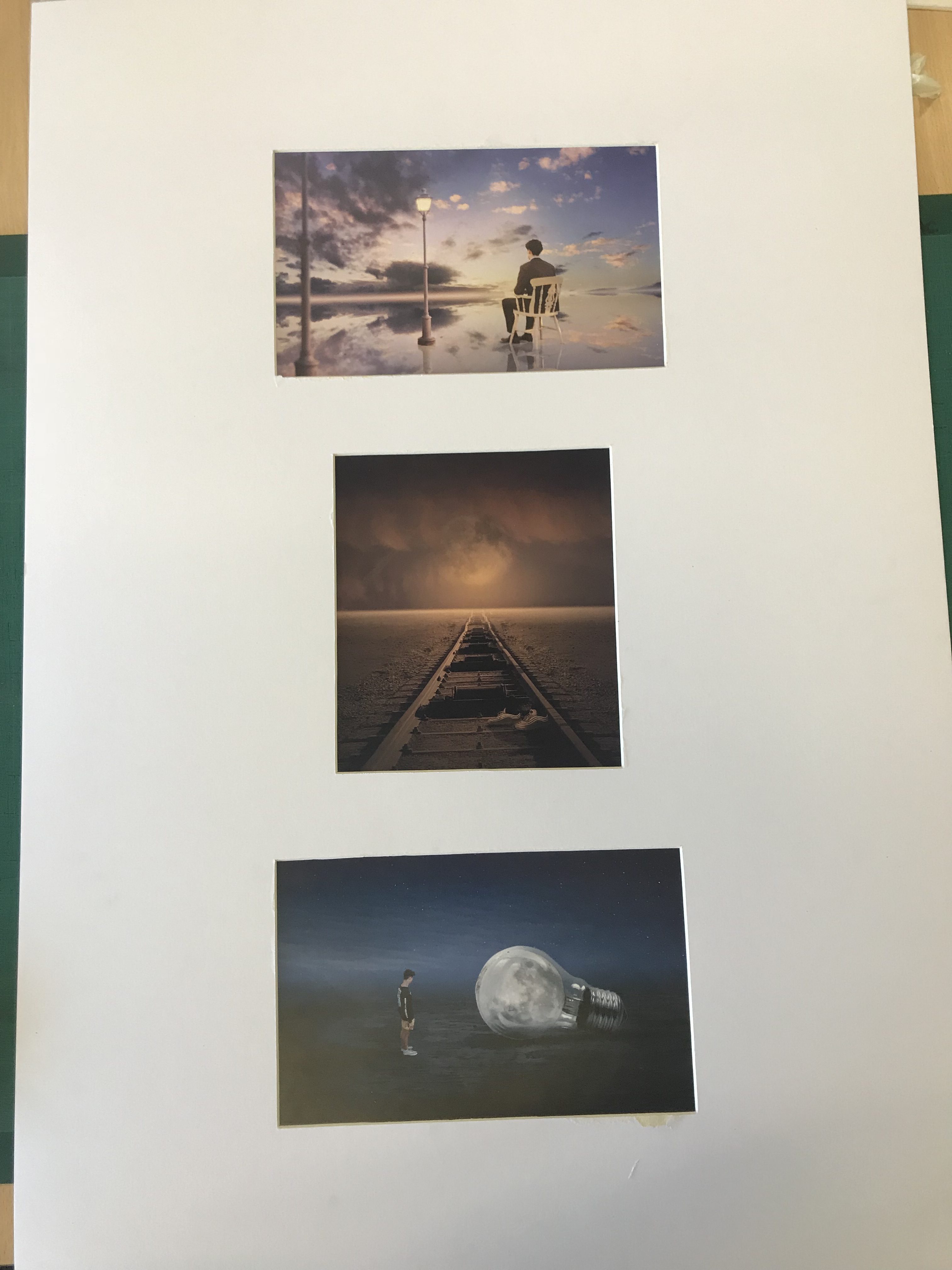
The exploration of secrecy within my final piece is clearly shown by raising awareness of these environmental impacts that some people do not know about therefore they are secret to them. I used codes throughout my images to portray this sense of destruction for example the lampposts in the fantasy landscape image act as a code that we are unnecessarily building onto our land. Also, the idea of conventions has also been captured through my work. Modern day photography conventions are focused on editing and photo manipulation to create stories and make subjects more interesting. This convention is seen in much of the commercial photography that we consume daily, for example a magazine making a holiday destination look more beautiful than it actually is by enhancing the tropical colors.

A successful aspect to my final piece is that the edits are very strong and are shown of well with a simple presentation style. After having made this piece I have a better understanding of how digital manipulation images are created and how serial pictures can be achieved and used to create meaning. I think that if I were to do this piece again I could have explored with my presentation style more to perhaps create something 3D which would captivate the viewer better.

Final Piece Planning

My final idea to present my work is to simply create window mounts and stick my photos down. I think that due to the great deal of editing that has gone into these photos, there is no need for a creative presentation of the photos as the photos are very creative already. I considered mounting my images onto foam board however I think that it wouldn’t have such great impact on allowing my images to stand out.

Resources Needed

                                                                 Size A1 card                                                                                                                             My prints                                                                                                                                   Cutter                                                                                                                                           Masking Tape                                                                                                                           Pencil                                                                                                                                           Ruler

My Chosen Edits for Printing


All these edits which I have chosen, strongly contrast with one another as the dominant colors are all different. I think that this will be effective when presented as a final piece because it will allow each individual photo to stand out. Also, I have tried to ensure each image can tell a slightly different story whilst still focused on the topic of environmental impacts caused by humans.

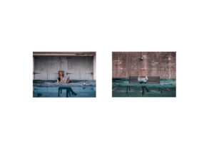
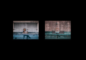
The two images with water involved pair with each other very nicely and would work much more effectively apart from the other images. Initially, I intended on mixing all of the images together into one final piece but after arranging them together, I noticed that there is too much going on and therefore distracting for the viewer. Also, pairing up the two images with flooding involved will allow the viewers to be drawn to the issue of global warming more effectively and make them think about it more.

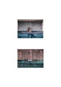
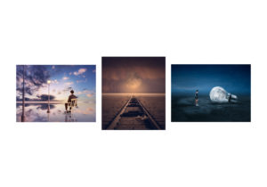
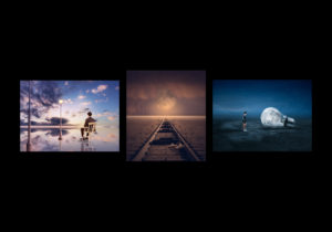
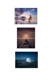
The images bellow shows my experimentation of my original final piece idea and clearly shows how crowded it looks. After having done this mock up I decided against putting all my images together and thought that It would be best to put to the water ones together and the other three together too.

The images below show my experimentation with how my final idea will actually look. I mixed around the photos and backed them onto black and white to come to my final decision.

Piece 1

Final Decision For Piece 1

Piece 2


Final Decision For Piece 2