All posts by Thomas Webster

Filters

Author:
Category:

What is a Political Landscape

The definition of political is relating to the government or public affairs of a country. Politics is about the contempory issues within a country and how these issues impact the country and community.  The word comes from the same Greek word from which the title of Aristole’s book Politics  also derives; polis means “affairs of the cities”. The book title was rendered in Early Modern English in the mid-15th century as “Polettiques”; it became “politics” in Modern English. The singular politic first attested in English 1430 and comes from  Middle French politique, in turn from Latin politicus, which is the Latinisation  of the Greek politikos, meaning amongst others “of, for, or relating to citizens”, “civil”, “civic”, “belonging to the state”, in turn from  polites, “citizen” and that from  polis, “city”

Landscape is defined as all the visible features of an area of land, often considered in terms of their aesthetic appeal. Landscape includes all of the visible features of an area of land as well as the parts that are not seen or the parts that happen behind closed doors, such as the businesses or families that occupy land. The word ‘landscape’ comes from the late 16th century from the Middle Dutch word ‘lantscap’, which comes from the equivalent of ‘land’ and ‘ship’.

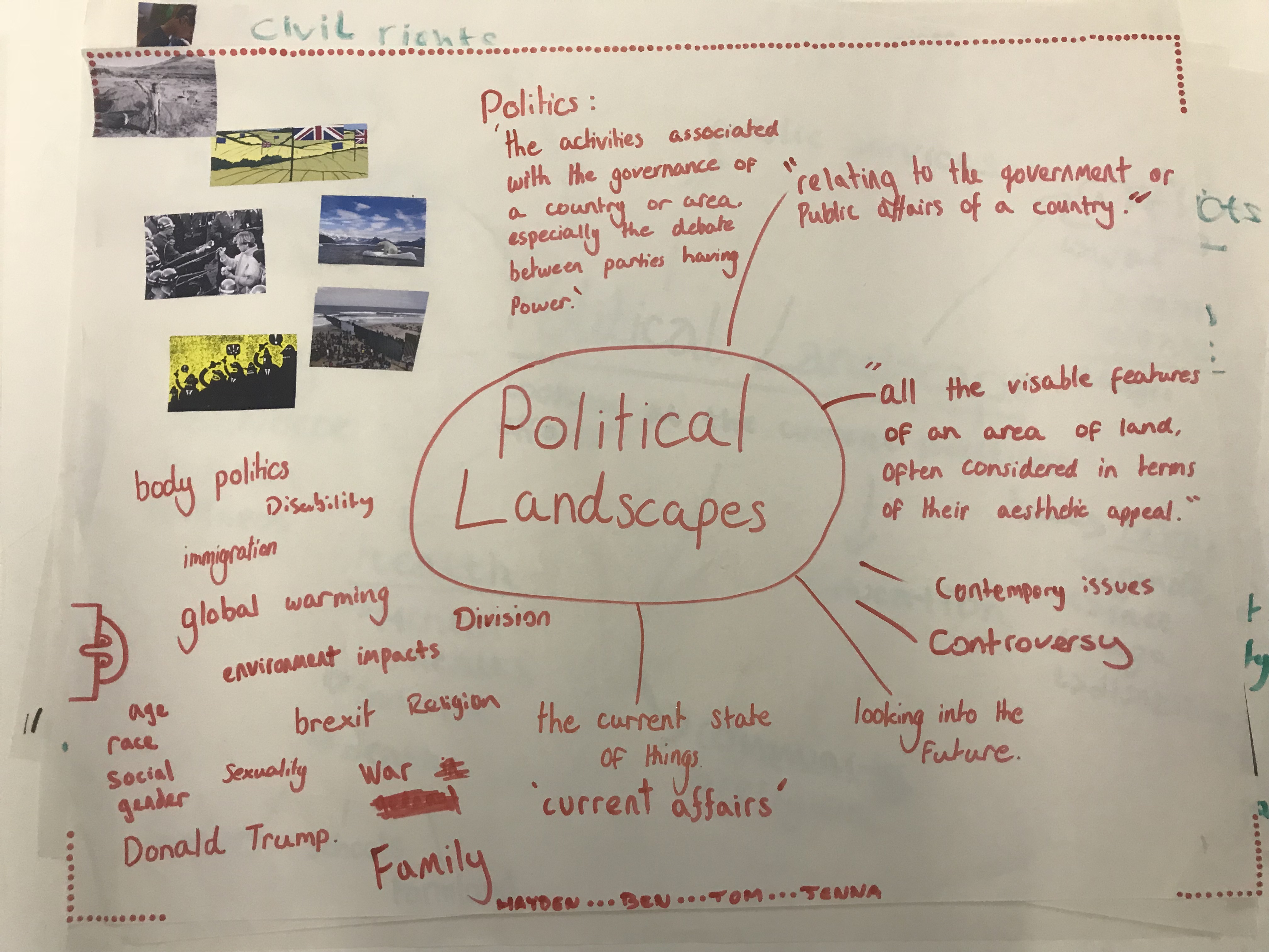
There is no definite definition of a political landscape and many influential photographers have tackled this theme in a variety of ways. To me political landscape is exploring the contemporary issues which are most impacting our society. This is to raise an awareness of issues which people are unaware of yet are so obvious.
 

Final Zine Outcome

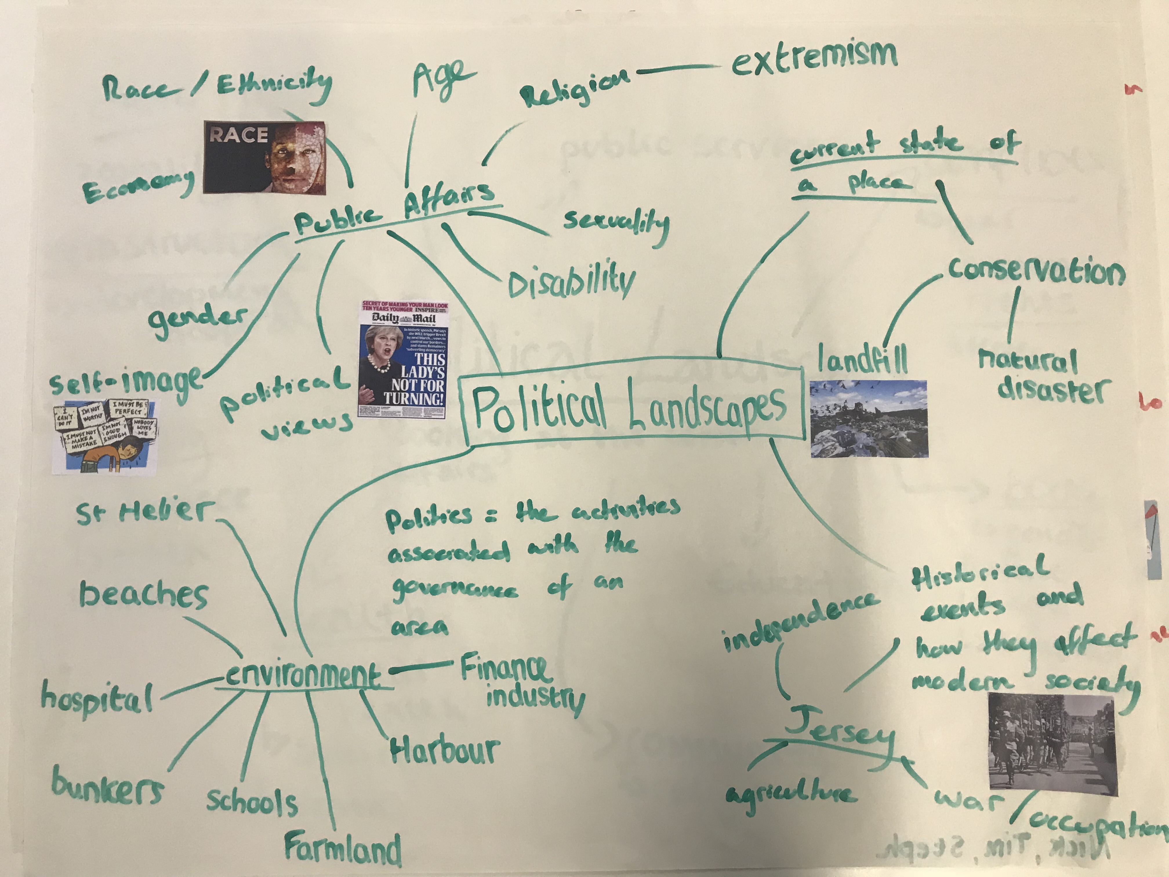
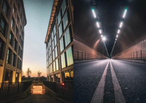
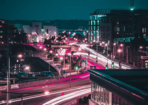
Throughout the Future of St Helier project i have collated a range of information about the past, present and future of the parish which has guided and helped my ideas on how I believe the future of the capital parish should look. When exploring my allocated area for our first photoshoot, I came to the realisation that the parish is in severe need for reconstruction due to the huge amounts of dereliction and old buildings. Some may argue that it is important to keep old buildings as they have certain significance but in my view, I would prefer to see modern architecture that is visually pleasing for the community. Due to this, I went back to St Helier at nighttime to try and capture St Helier as a modern chaotic city that I feel we lack. I used the illuminance of the few lit up areas around St Helier to depict this futuristic vision that i have for the parish. I think that along with my specific location consideration and editing I have really been able to show my views on how the future should look. If i were to do this project again I think I would have a closer focus in on the locals of St Helier and how they use the area on a daily basis. This would give me and the viewers of my project an understanding of how the area can be improved to benefit the majority of the people in St Helier other than just my opinion.

Zine research and inspiration

Zine 1

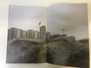
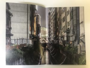
I find the content of this zine visually inspiring due to the narrative and messages it conveys. From my interpretations, I believe the photographer is using the juxtaposition between the rural areas and urbanized area.  This allows the viewer to see what we are destroying and the potential locations to next be lost.

Zine 2

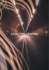
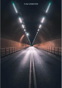
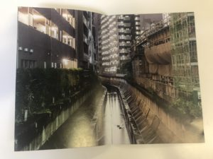
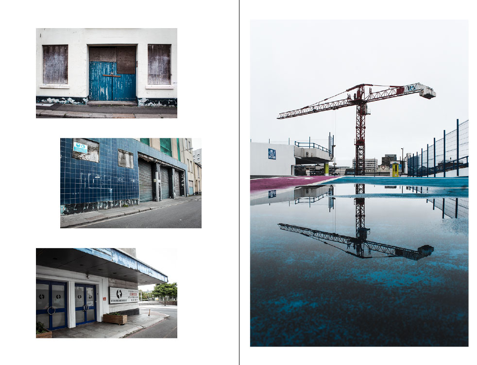
I was intrigued by this zine design due to the continuous theme running through. I like how the images are so similar yet different too and the night photography is pleasing to me. I like the bright colors and and reflections which I think give a futuristic feel to the images.


Zine 3

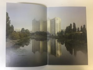
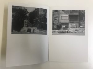
The main focus of me looking at this zine was to explore different ways of presenting my images other than the typical way of one image per page. I like how the zine has white space below the images which could be room for text or even room for the viewer to engage by imagining what could be there if the image was full size. It also gives the viewer a chance to stop and feel relaxed when looking through.

Zine Research and Ideas

A zine is a small-circulation of self-published work of original or appropriated texts and images, usually reproduced via photocopier Zines are either the product of a single person, or of a very small group. Zines are used as an effective way of marketing and presenting ones work and often will stick to one small topic throughout all the pages. They incorporate a basic design layout with usually one image per double page spread and sometimes one image per page.  Among the various intentions for creation and publication, the idea behind zines are to develop one’s identity, share a niche-skill or art, or developing a story, as opposed to seeking profit.

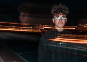
When researching visual inspiration to develop an understanding of a theme, i decided I was most interested in the zines which featured architecture. I am interested in exploiting derelict architecture however i also think it could be interesting to contrast this with new buildings such as the new finance center as well as buildings within the development stages. Within my zine i intend to create a narrative which tells the audience how the area of St Helier has been developed and also left to suffer. I want to capture photos at night time and portray St Helier as a vibrant chaotic place by using techniques such as slow shutter speed.

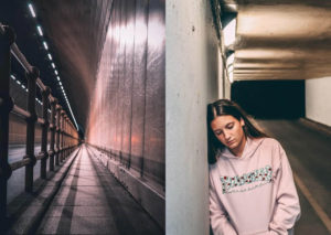
Other than just displaying a sense of the different buildings around St Helier i intend on reflecting on the people that live within these communities and show how they use the area of St Helier. I think that a narrative could easily be created throughout my zine by starting off with some of the buildings located in St Helier and then moving on with the people that live here and how they use the areas.

Final Design Layout – NEWSPAPER

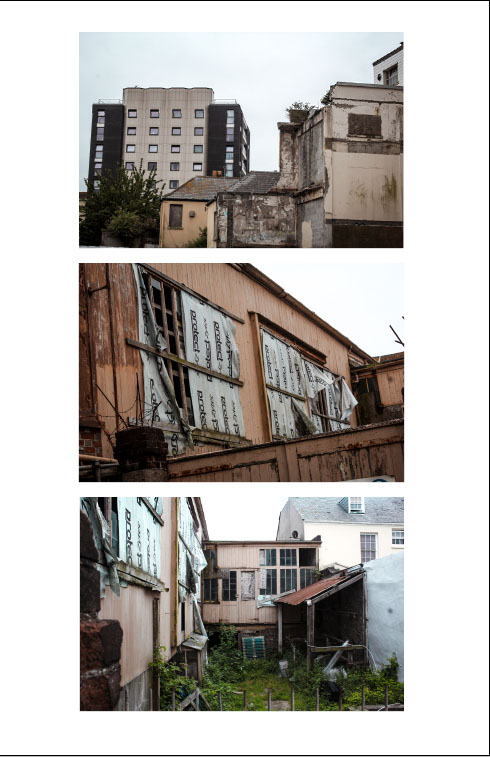
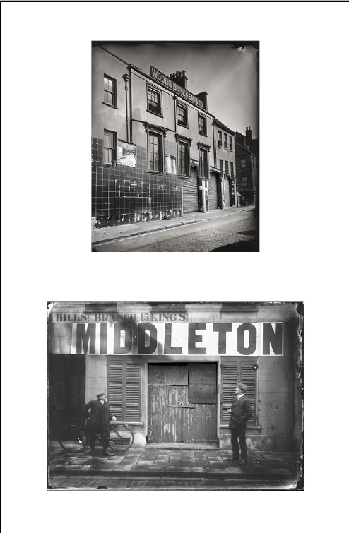
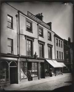
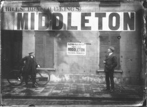
For my final design layout I have primarily focused on the dereliction side of St Helier which is often walked past by members of public without notice. I have incorporated some archival imagery which i believe has great impact through the messages and story they convey. I have merged some of my photography into the archival imagery which creates a strong message that our capital is in decline through the architecture that has been left to rot. The archive images are old images yet the buildings look modern and clean however the images that i have incorporated to the archive images are new however look old and abandoned. I think the composition of each page works well to aesthetically please the audience and i have used similar coloring for each page.

Experimenting with Montage

Within these edits  I have merged some of my photography into the archival imagery. This  creates a strong message that our capital is in decline through the architecture that has been left to become abandoned. The archive images are old images yet the buildings look modern and clean however the images that i have incorporated  are new however look old and abandoned. This gives a strong contrast between how St Helier used to be compared to how it has become in the future/present.

Narrative and Sequence of Photos

Narrative structure is about story and plot: the content of a story and the form used to tell the story.  Narrative structures within photography contain a set of photographs which tell a story or explore a theme through either similar photographs or ones that lead onto each other. Below are some experiments of the narrative structures that I have produced with my own photographs.

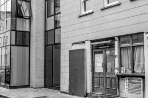
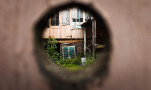
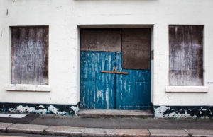
This narrative structure looks at the dereliction and destruction that is present within St Helier. My purpose for this sequence was to bring awareness to the amount of wasted space that there is within St Helier and portray it as a run down town.

This narrative structure follows on from the previous one and could work well along side it. It looks at the development present within St Helier and emphasizes the change that is occurring within St Helier. Viewers may see this as a positive thing as we are modernizing our town however others would see this as a negative thing as it could lead to the removal of historically important buildings.

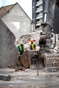
Again, this narrative could follow from the previous one. It conveys the contemporary modernization which is present within St Helier and shows what the construction workers have  accomplished.

Final Shortlist of Photos

These are the top 10 images which i have come to the decision that would work best to create a sequence and narrative with. Not only are these some of my strongest images but i have selected them due to the fact they will best help me convey the messages about St Helier which i am passionate about. These messages include the dereliction that is clearly present in St Helier, which makes the town unpleasant. I have also selected some images that demonstrate the construction present to show how this should be occurring on the sites that have been left abandoned.
   

Experimenting with Cropping

Photograph 1

This is the original photograph with no cropping done as of yet. I believe this photo will be effective to focus in on different aspects to change the ideas portrayed.

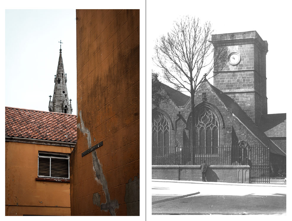
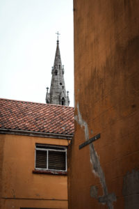
I believe this edit helps to portray the shape and alignment of the church and almost demonstrates how the church is aligned behind the buildings. This is because the narrow crop reflects how narrow and skinny churches are compared to their height. This photo could possibly represent how religion in St Helier is not respected. This is because the building in front of the church appears to be pretty torn up as if the area is pretty rough which contrasts with the ideas of Christianity which is showing respect towards everything and being peaceful. 

For this crop I have focused in on the church and the dominant factor it has compared to all the buildings below it. It appears to be tall and superior which could imply that religion is a key aspect to St Helier. This demonstrates a strong sense of community within St Helier.

This cropping focuses on the dirty, torn up building which shows a sense of poverty and destruction that is present within the area of St Helier. By cropping out the church, the whole concept of the photograph has been altered.

Photograph 2

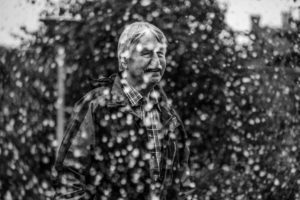
This is the original photograph with no cropping.

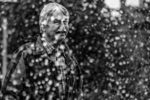
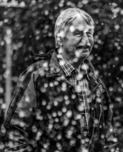
For this photograph I narrowed down the image to ensure that there are no distractions to the focus of the image which is the mans happiness. I cropped it so that the viewer can too look towards the direction the man is positioned and looking.

The cropping of this image focuses directly on the man and his happiness with the modern park that he is in. The main attraction, thus being the water fountain, is what i photographed through and clearly the man is enjoying it. This shows that St Helier’s recent developments are benefiting our community and they’re enjoying it.

St Helier Photoshoot 3

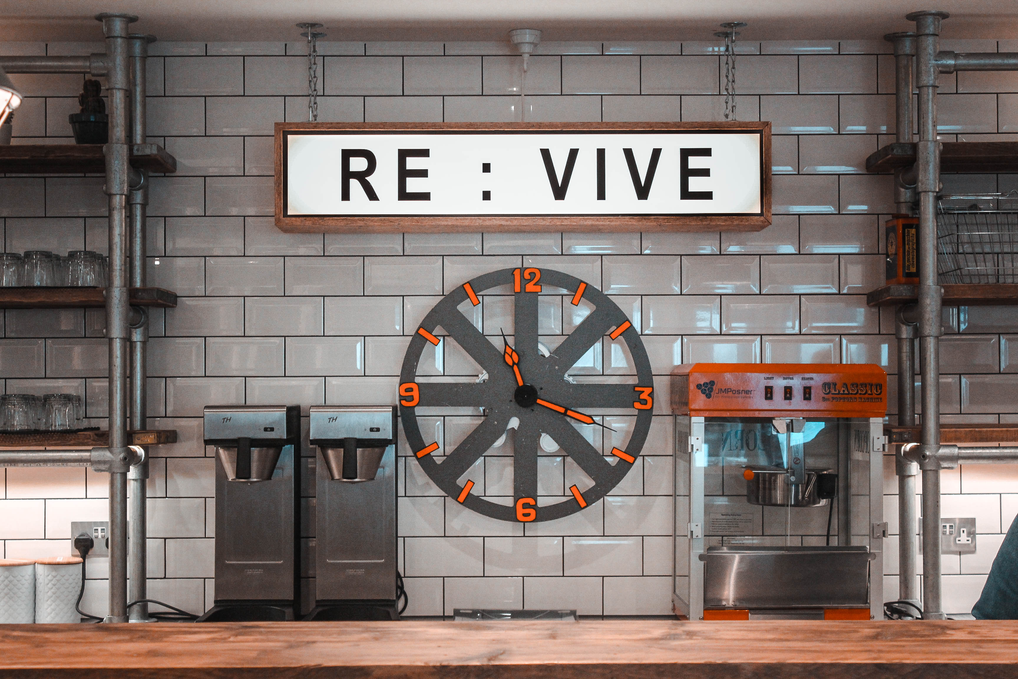
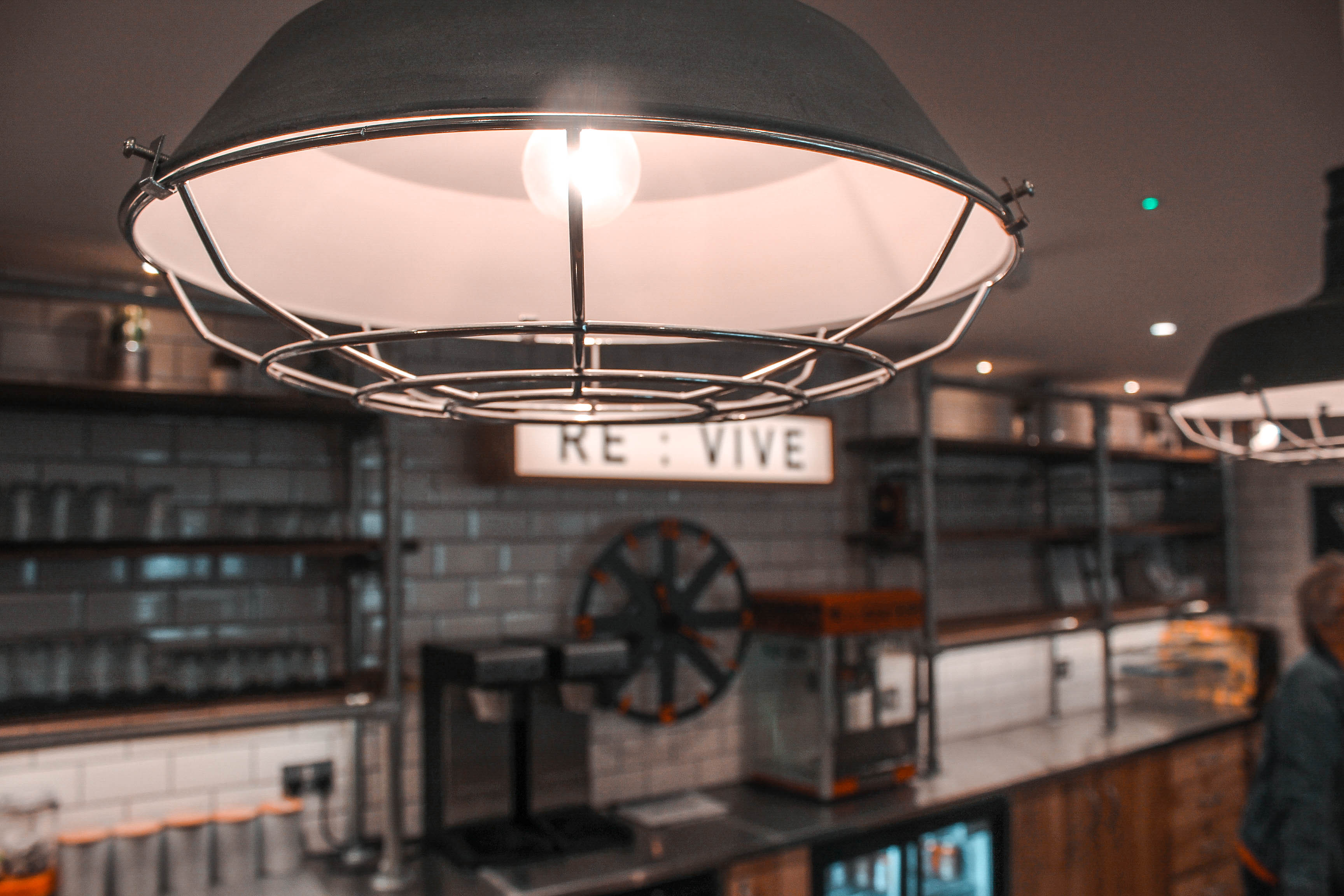
For this photo shoot, I wanted to capture the modernization of St Helier and show the development which is occurring to improve the area and build a stronger community. When wondering around the area i noticed that the development was a lot less centered around community but more around making life better for others with new modern buildings, and what appears to be making St Helier more futuristic.

These few photos above demonstrate a sense of community without actual people being there. This is because of the nature of the place I have photographed and the goals/aspirations of the people that run the building. The building is the freedom church which once was a cinema. Both attractions designed to bring people together and build a sense of community. The freedom church aims to bring youngsters off the streets at night causing trouble and provide a safe place for them to hang out. These photos provide a strong juxtaposition with my second photo shoot that focuses on the destruction of the area which relates to the kids causing trouble on the streets and vandalizing buildings.