All posts by Thomas Webster

Filters

Author:
Category:

Photoshop Skills – Editing Colour into photos

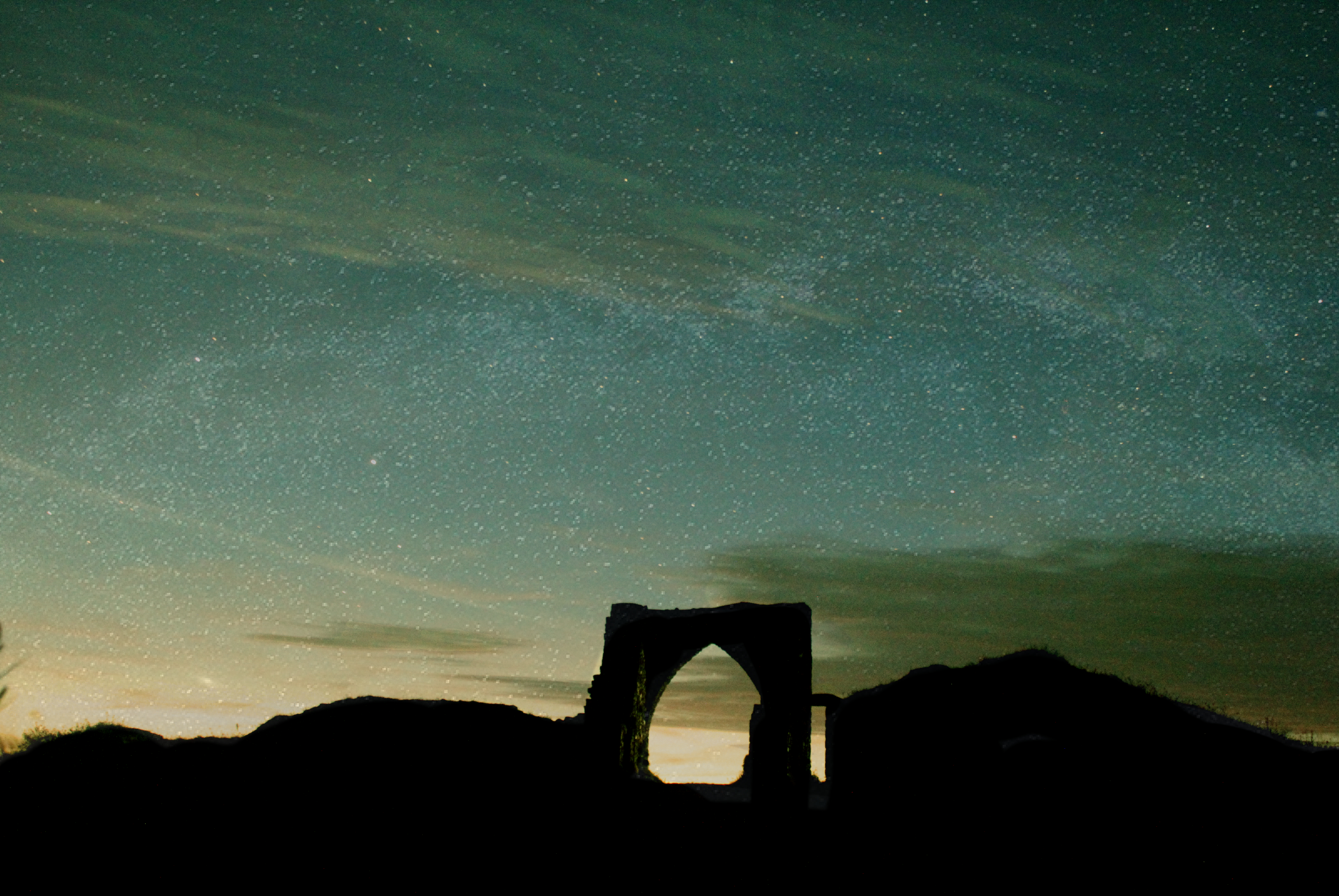
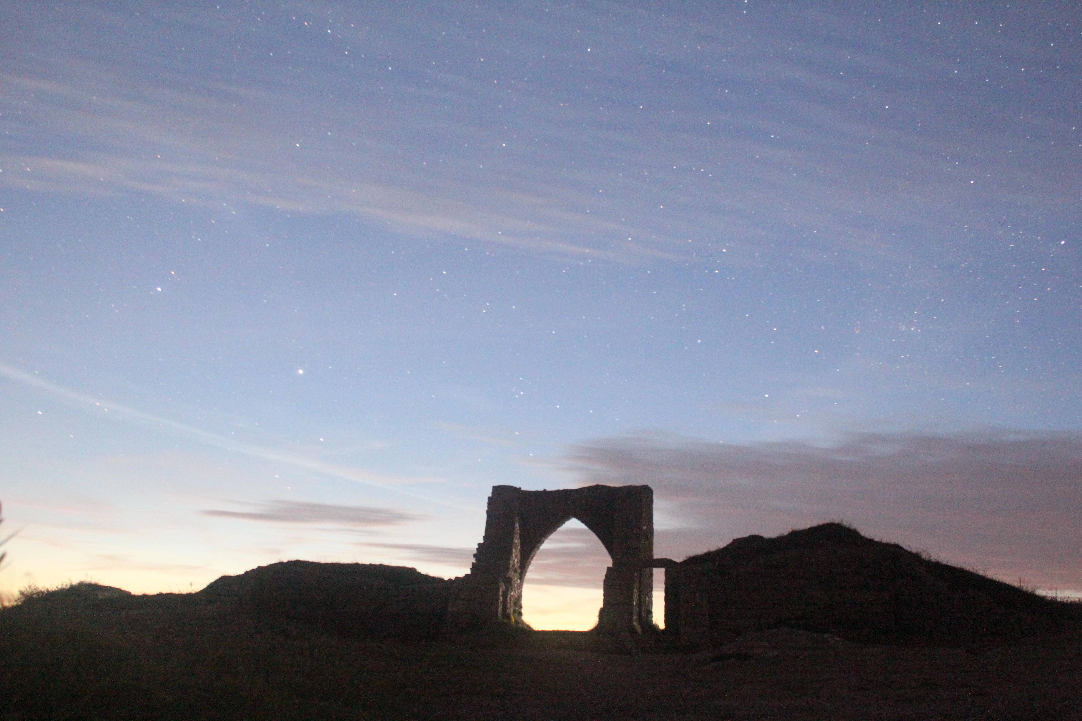
This image of Gronez castle was taking at nighttime, when it was completely dark. The aim was to capture the beauty of nighttime when inflicted with clear skies allowing visibility to see the millions of stars which surround us. Also to capture the colours which are seen through the skies at night time which often can be quite extraordinary. This photo below was taken with a 30 second long shutter speed and an ISO of 6400. I used these settings to allow as much light sensitivity possible into the lens.

This is the original photo
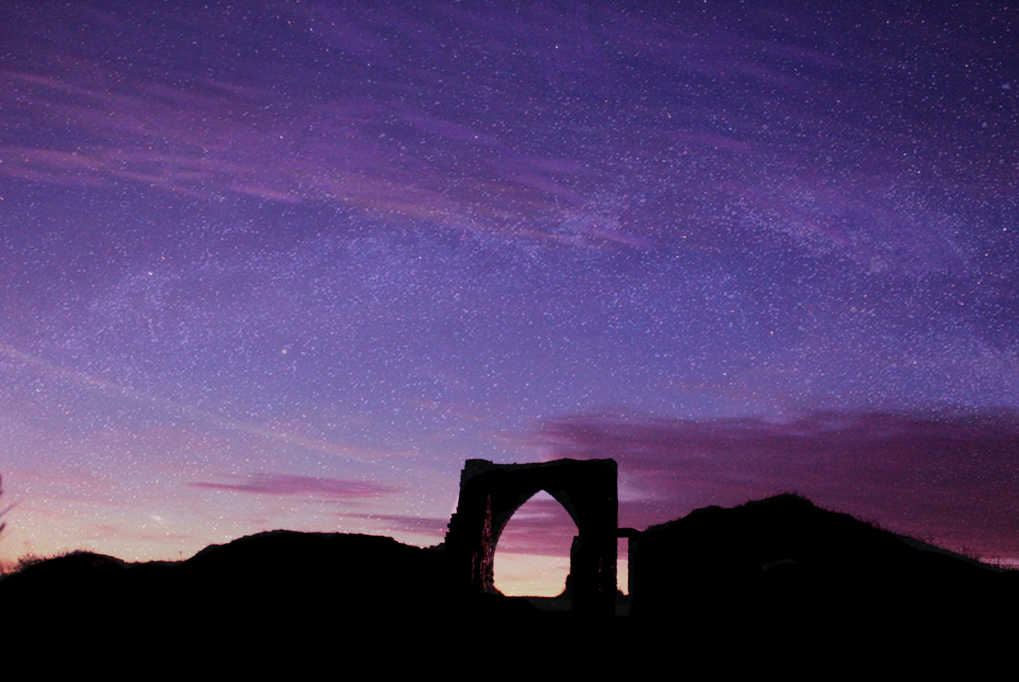
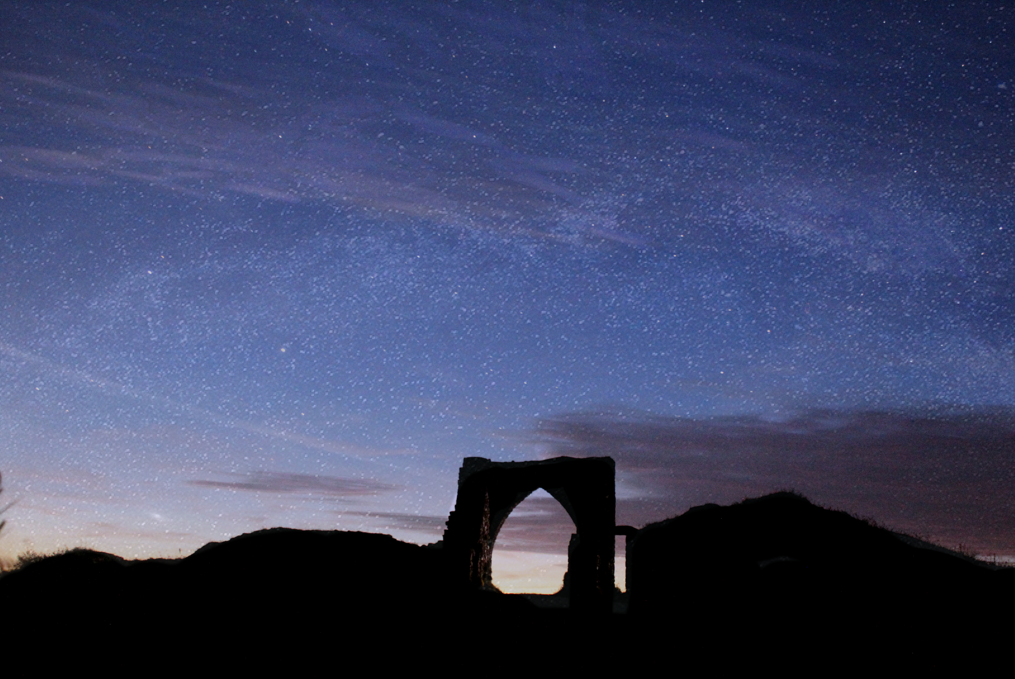
On Affinity photo, by adjusting the white balance and giving the photo a tint of different colours I was able to bring the night sky to life with vibrant and interesting colours. Much of the night time photography I have come across appears to have these unrealistic colours added which I believe is extremely interesting and is very beneficial in creating a photo in which people will take their time to look at. By adding the colour i was able to turn an ordinary picture not something which is eye catching and engages the audience more.
 

Homework Assignment 5 – Color

Julian Schulze

Julian Schulze is a Berlin based photographer which has an abstract and minimalist approach to photography.  He is mainly focusing on the Abstract & Surreal genre of photography and it appears that he loves bold colors as well as color combinations and compositions. “I like the simple things in everyday life”. One of the most important things seen in Schulze approach is to identify freedom.

Analysis Of Photo

This image clearly shows a supposedly isolated man in what looks like an urban area between some interesting and abstract architecture. This image is aesthetically pleasing to view as it has a clear use of the rule of thirds. The image is split into three sections, the patio making up the bottom sector, the first part of the wall creating the second and the different part of the wall creating the third. Located within the bottom right box there is a fence which is used as a natural line to focus and lead us to the main subject of the man. Also the end of the fence is positioned of one of the focus points within the rule of thirds which helps to further guide the viewer deeper down the picture. This image has used natural lighting and appears that the lighting and colors have not been changed too much in the editing process leading to a extremely ‘real’ picture. I believe this image gives a sense of isolation and intimidation. This is due to the man being all alone and surrounded by buildings which appear to look down upon him creating an almost threatening approach. All this image contains is man made structures, no sights of the natural elements in our earth. I believe this shot is an indication of the rapid urbanization around the world and this is leading to humans destroying nature, plants and vegetation. It appears that the man is walking into the light and moving away from the darker place behind him. This is a clear relation to the contrast between good and bad as lightness relates and good and darkness relates to bad/evil. Perhaps this is suggesting the man has changed around his life and is moving on for the better or he is just heading into a much happier place compared to where he was before. It could also be seen that he has a ‘bright future’ as this is literally portrayed in this photo. However, on the floor we can see how the lighting has created different shaded shadows on the floor along where the man is walking. In the picture, he is walking on the darkest part of the shadow which could imply, he is not currently on the path for success but is heading in the right direction.

Photo shoot for Julian Schulze

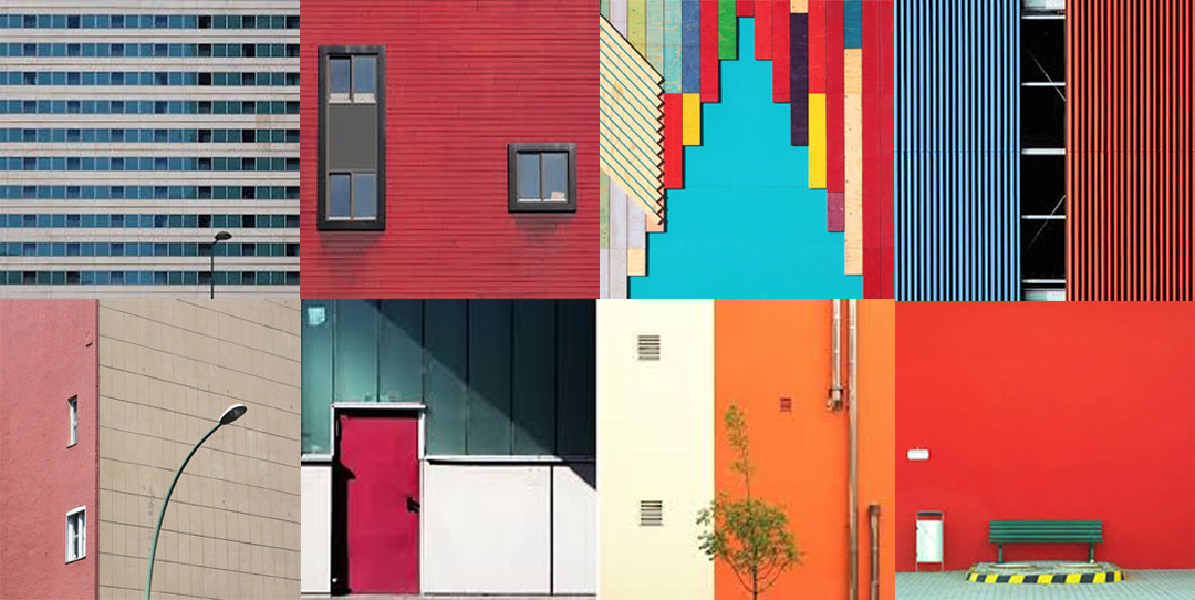
Edits ( Minimalistic ) In the style of Julian Schulze

I believe these images strongly relate to Julian Schulz’s work in the sense that they capture a true response to minimalism with a strong demonstration of contrast. Also they have clearly got a sense of color which was the main focus of this shoot. I think what went well with these images is the composition I was able to achieve to allow a much more aesthetically pleasing image and the simply, yet interesting lines which separate color creating a natural, strong contrast. However I believe i could have improved the surrealism within the images to better portray the abstract theme and create an even more interesting photograph.

Minimalism

Minimalism

Minimalism is a style used by many 20th century artists and photographers. It focuses on having a minimum amount of concepts in an image for example texture, shape and color. In the 20th century the style became popular within art and photography and it is still considered a modern style. Frank Stella and Piet Mondrian are two of the first artists that made minimalist art where both used color blocking in their work. Keld Helmer Peterson and  Mirko Nahmijas were two influential photographers who took minimalist photographs in the 20th century, they both focused on architecture as their subject.

Textures and Surfaces homework 4

Frank Hallam Day

Washington, D.C. based photographer Frank Hallam Day’s work explores the impact of humanity’s footprint on the natural world. Day, who was trained as a painter, says his photographs owe more to the history of painting than photography. Day prefers digital photography to film because it allows him to adjust the image, both on the spot and on the computer. He is a self taught fine art photographer and his interest and methods revolve around culture and history. I am very intrigued by his work as he creates real and moving stories which i believe can impact people upon viewing the images. Not only can he do this threw the use of people and how they are living their lives, which are different to ours in the first world countries, but threw the use of both wide and close up shots of the pure destruction that we are creating to the world. I believe there is a strong contrast within Day’s photos from the portrait pictures in Africa to the landscapes of urban areas in cities which have been destroyed. I believe that this contrast is purposely showing us that despite we have all these luxuries and strongly built buildings we take it for granted and therefore do not look after them, allowing graffiti and tear to occur. I also like the work of Day’s due to the highly saturated and vibrant colours used, bringing a dull telephone box to life for example. Also, the use of great composition and natural lines within his photographs allows him to take a boring boat and turn it into something which makes us appreciate and intake the whole photograph.

Image result for frank hallam day

Image analysis

Image result for frank hallam day

Clearly this photo shows the inside of a telephone box. What usually would have and should’ve been quite a boring image is actually, in my opinion, a very interesting and eye catching photograph. I believe this photograph would have been taken with a relatively slow shutter speed in order to capture the high light which is seen in the photo, possibly a shutter speed of approximately 1/10 of a second. an ISO of about 400/800 seems to of been used due to the brightness yet sharpness of the photo. The rule of thirds has most definitely been used within this photograph, with the telephone itself being placed on the top left focal point and on the left hand vertical line. The use of this draws the human eye to this point and makes the viewer aware that it is the main subject of the photo. Furthermore, this image uses leading lines to draw us into the subject. The metal panels are natural lines which makes us instantly view the phone. This photo is highly saturated using vibrant colours to intrigue the viewer. The use of strong and bright lighting is contrasted with the shadows on the left of the picture and the outside area on the right. This creates a sinister and scary feeling as it gives an impression of isolation as it is only inside the phone box that is overly bright. The use of reflection on the glass of the phone box creates a feeling of confusion, creating a real mood and story to the photograph. At the top of the phone box we can see how it has been destroyed by graffiti which relates to the photographers intentions of capturing human footprints.

Photoshoot

Edits

Keld Helmer Petersen

Keld Helmer-Petersen (20 August 1920 – 6 March 2013) was a Danish  photographer who achieved his international breakthrough in 1948 when he published 122 Farvefotografier/122 Colour Photographs, a collection of experiments with shapes inspired by Albert Renger Patzsch. Keld Helmer-Petersen’s 122 Farvefotografier was published in 1948, it is a photobook of great singularity. The book gained an idea of just how unusual it was to use color for art photographs at that time. However, as well as Helmer-Petersen’s innotive work in colour photogrpahy he also has explored some creative and abstract black and white photography.

Image result for keld helmer petersenImage result for keld helmer petersen

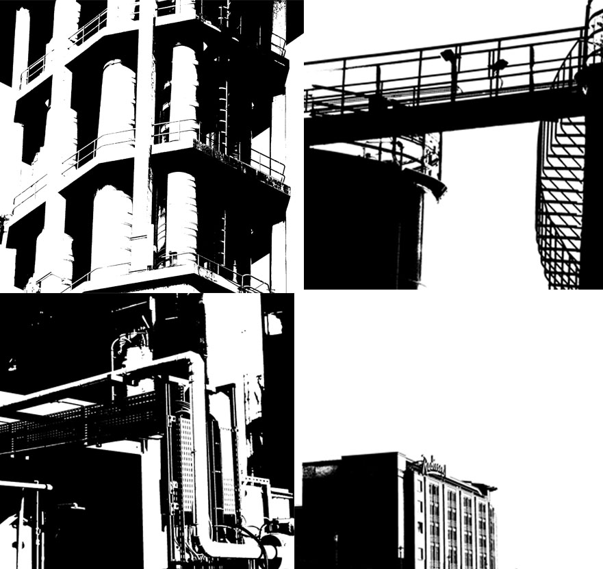
Inspired by his work I used Photoshop to re-create photos similar to his black and white ones. I used the threshold tool to create a similar look and then adjusted the slider to add more or less black and whites.

These are the unedited images I used to create my work influenced by Helmer Petersen.

Homework 3 ( Ernst Haas ) 2nd Shoot

After having done a photo shoot, which contrasts with the ideas portrayed through Ernst Haas photos, i decided to also do one in which has similar connotations within the urban areas and really capture the sense of movement and hurry in these areas.

Edits


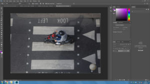
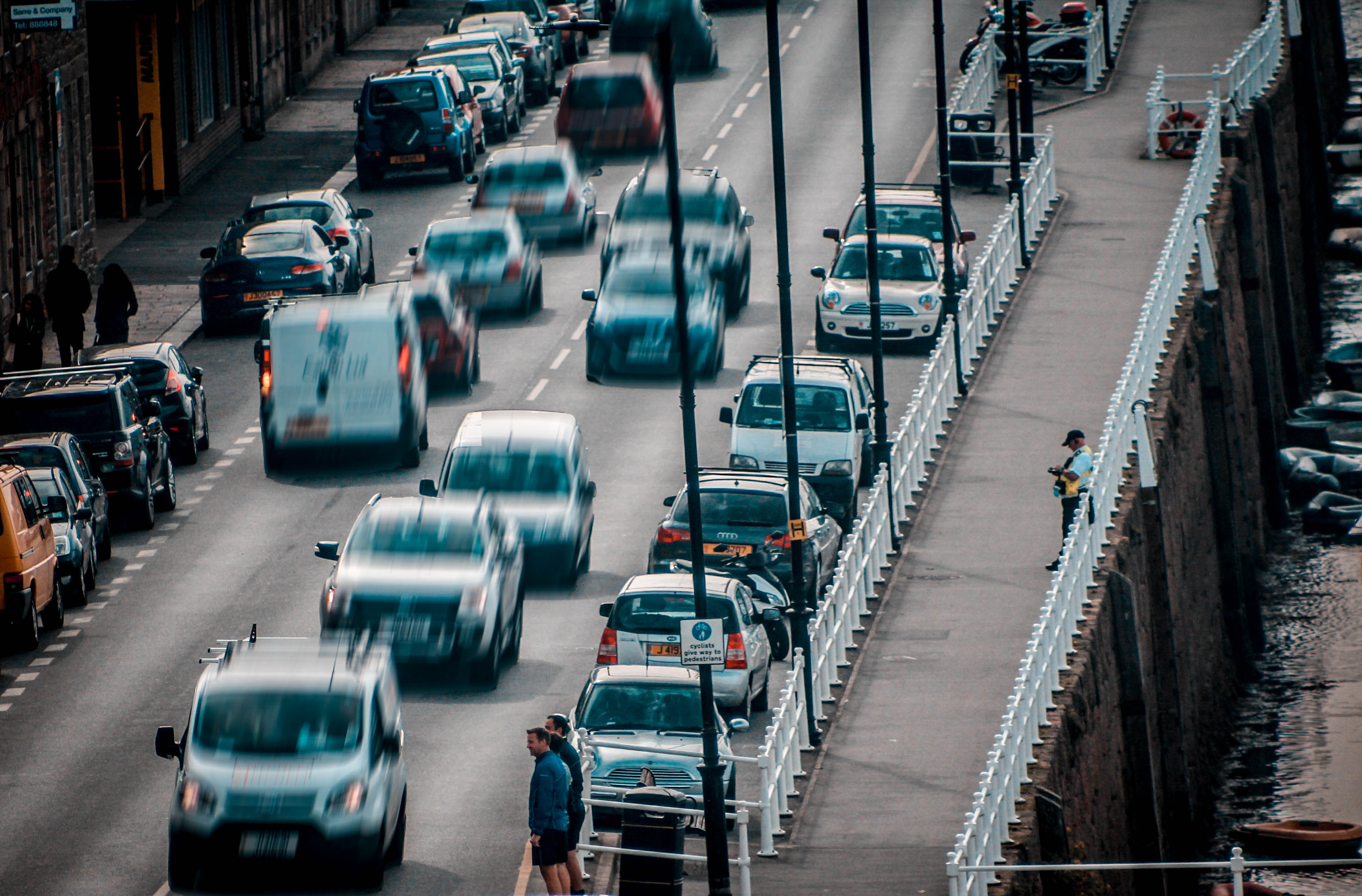
This is the original image which was taken by myself on a rooftop.

I then simply increased the brightness to make it stand out and increased the contrast to create a differentiation between light and dark.

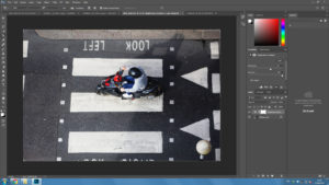
This stage shows the rest of the editing that took place prior to the motion blur which includes an increase in vibrancy and saturation and a slight change in the black and whites.

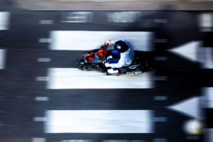
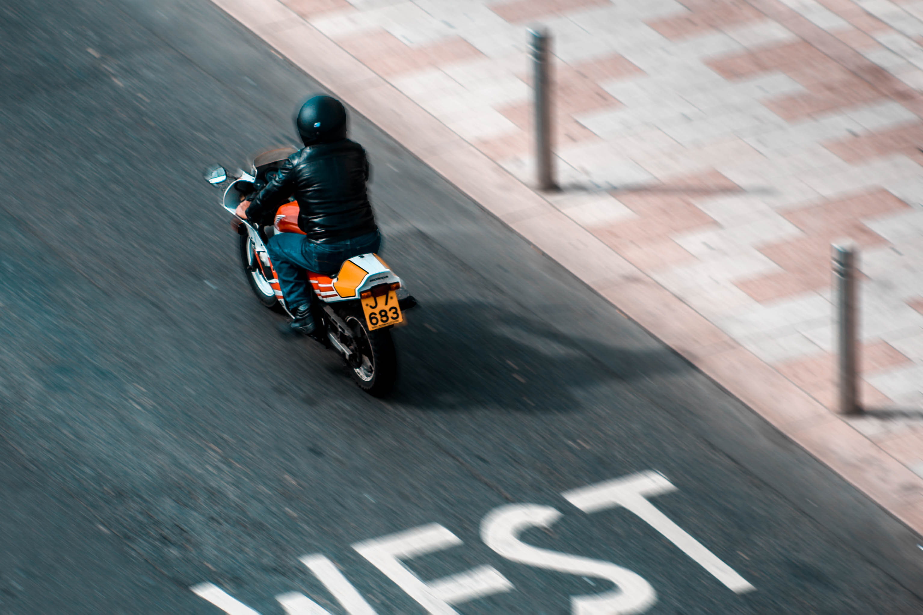
In this edit i used motion blur only on the biker to create a sense of rush within the biker himself to create a sense of rush within the biker himself. It appears that he is in a rush to get somewhere.

In this edit I used motion blur around the biker and kept him in focus to create a sense of chaos. Rather than inflicting a sense of rush within the biker I did it around him to suggest that urban areas are pure mayhem.

Homework 3 ( Ernst Haas )

Ernst Haas

Ernst Haas was a photojournalist and a pioneering color photographer. During his 40-year career, the Austrian-born artist bridged the gap between photojournalism and the use of photography as a medium for expression and creativity. Ernst has a great vision in exploring photography in a more creative and unrealistic way than we actually see things in real life. Using various camera setting like shutter speed Ernst captures great visuals of urban environments, capturing the explosive and rushed vibes within these areas. He does this by producing many images containing motion blurs.

Haas was an early innovator in color photography. His images were widely spread by magazines like Life and Vogue and, in 1962, were the subject of the first single-artist exhibition of color photography at New York’s Modern museum of art. His book The Creation (1971) was one of the most successful photography books ever, selling 350,000 copies.

My Photo shoot Plan

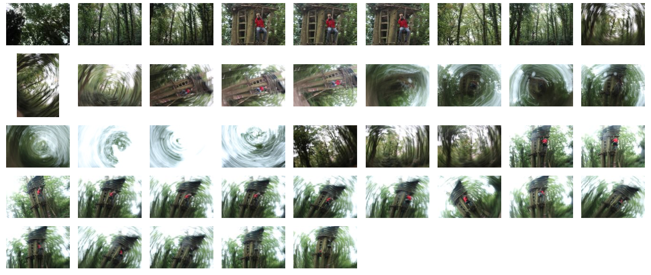
In my photo shoot I intend to use a slow shutter speed in order to capture abstract images which are serial, like Ernst’s are. It appears that he uses mainly natural lighting for his photographs therefore as will I and the location of my shoot will be in a woodland area, where I can capture the feeling within and among the trees. This is similar to Ernst’s photography where he captures the atmosphere in the city, amongst buildings however I am going to take a different approach by expressing the feelings found within a woodland area.

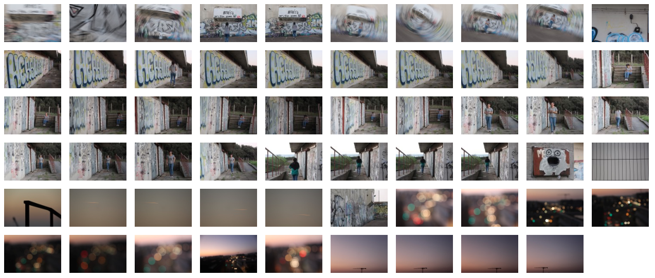
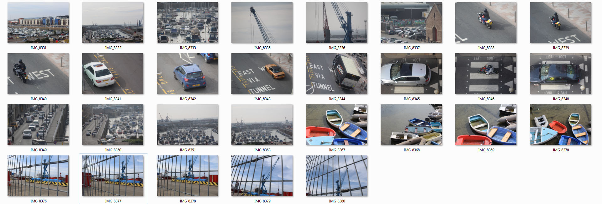
Contact Sheet of Photo shoot

Edits


How To Analyse Photogrpahs

To analyze photographs we use the methods of technical, visual, contextual and conceptual. These factors help to create an in-depth analysis focusing on not only the ways in which the photo was taken but why it was taken and the hidden meanings behind it, or pehaps the story it tells us. These stories and feelings given off can be interpreted in different ways by different people.

Technical

The technical elements within a photograph and what it means when we analyse them is the manual settings and how they have been adjusted. This involves things such as;

Lighting, Aperture, ISO, White Balance, Shutter Speed, focal length. 

Visual

The visual aspect of analysing photos is simply using photographic terms to describe how the picture has been edited or taken. This consists of ;

Colour, Tone, Texture, Shape, Contrast, Pattern, Composition, Leading Lines. 

Contextual

Contextual relates to the period of time the photo was taken and how the time and place affects what the photo portrays. This can link to many factors in society. Contextual is simply;

Ones understanding, Deeper meaning, Additional knowledge Historical context, Personal context, Cultural/Social/Political context.

Conceptual

The conceptual part of analysing photos refers to a persons ideas relating to or based on mental thoughts. Essentially it is the meaning behind a photograph and it is the part in which you give reasons why a photographer may have chosen to take the photo/taken it in a certain way. The key words associated with conceptual are;

Ideas, Meaning, Reasoning.

Typology

What is Typology?

The term typology refers to the study of different types. Typology can be used across all industries and disciplines including theology, anthropology, archaeology, linguistics, psychology, politics, education, medicine, farming and more.
Throughout the modern era, photography has been enlisted to classify the world and its people. Driven by a belief in the scientific objectivity of photographic evidence, the logics utilized to classify photographs-in groups and categories or sequences of identically organized images-also shape our visual consciousness. In the twenty-first-century, new digital technologies and globalization have radically transformed the applications of photography, making the reconsideration of photographic information systems ever more urgent.
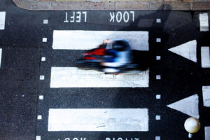
Image result for typology