All posts by Thomas Webster

Filters

Author:
Category:

Robert Adams – The New Topographics

Robert Adams was born in May 1937 and is an American photographer who has focused on the changing landscape of the American West. His first work to become prominence in the mid – 1970s through his book ‘The New West’. His participation in the exhibition The New Topographics was also a dominant feature in helping his career.  He twice recieved a Guggenheim fellowship, a MacArthur Fellowship and he won the Deutsche Borse photography prize as well as the Hasselbald Award.

Image result for robert adams

Image result for robert adams

Image Analysis

Image result for robert adams

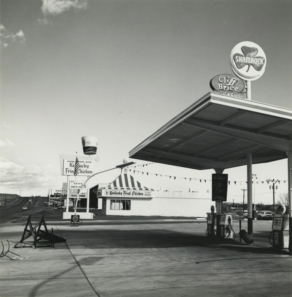
It appears that natural lighting was used to capture this photograph due to the natural tones and contrast in the photograph. This allows the photo to convey a sense of realism and make the audience feel as if they can connect with the photo more. This is contrasted with the way there is no color involved within the photo which makes the photo surreal and creates a sense of mystery and a more dramatic image. The use of black and white helps to focus on the main subjects, thus being the caravans, to allow Adams messages to be portrayed. This photo shows the start of civilization and man-made structures with natural objects appearing towards the back of the photograph. It shows how the New Topographic movement was a reaction to the Romantics by the use of the juxtaposition with the man made features in the foreground and the natural features in the background. In my opinion, this photograph is a message to reflect how man made structures are taking over our society and dominating these natural areas. This is clearly reflected by the way in which the natural features are pushed towards the back of the photo and are not the main feature like they would be in romanticism photography.


The New Topographics

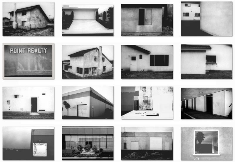
The New topographics was a term used by William Jenkins in 1975 to describe a group of American photographers such as Robert Adams and Lewis Baltz whose pictures had a similar banal aesthetic, in that they were formal, mostly black and white prints of the urban landscape. Bernd Becher and Hilla Becher. Pitheads 1974.

Many of the photographers associated with new topographics were inspired by man-made features, selecting subject matter such as. Parking lots, suburban housing and warehouses.  An exhibition at the International Museum of Photography in Rochester, New York featuring these photographers also revealed the growing unease about how the natural landscape was being eroded by industrial development leaving human footprints.

Romanticism Homework

Photo shoot Plan

Genre /  Artist – Landscape, Romanticism

Concept –  Natural beauty 

Location – Coastlines, sand dunes, fields, forests

Props – Tripod,

Shot type – Landscape, low angle

Lighting – Natural

Settings – Landscape, shutter priority

Contact Sheet

Editing Color into my photographs

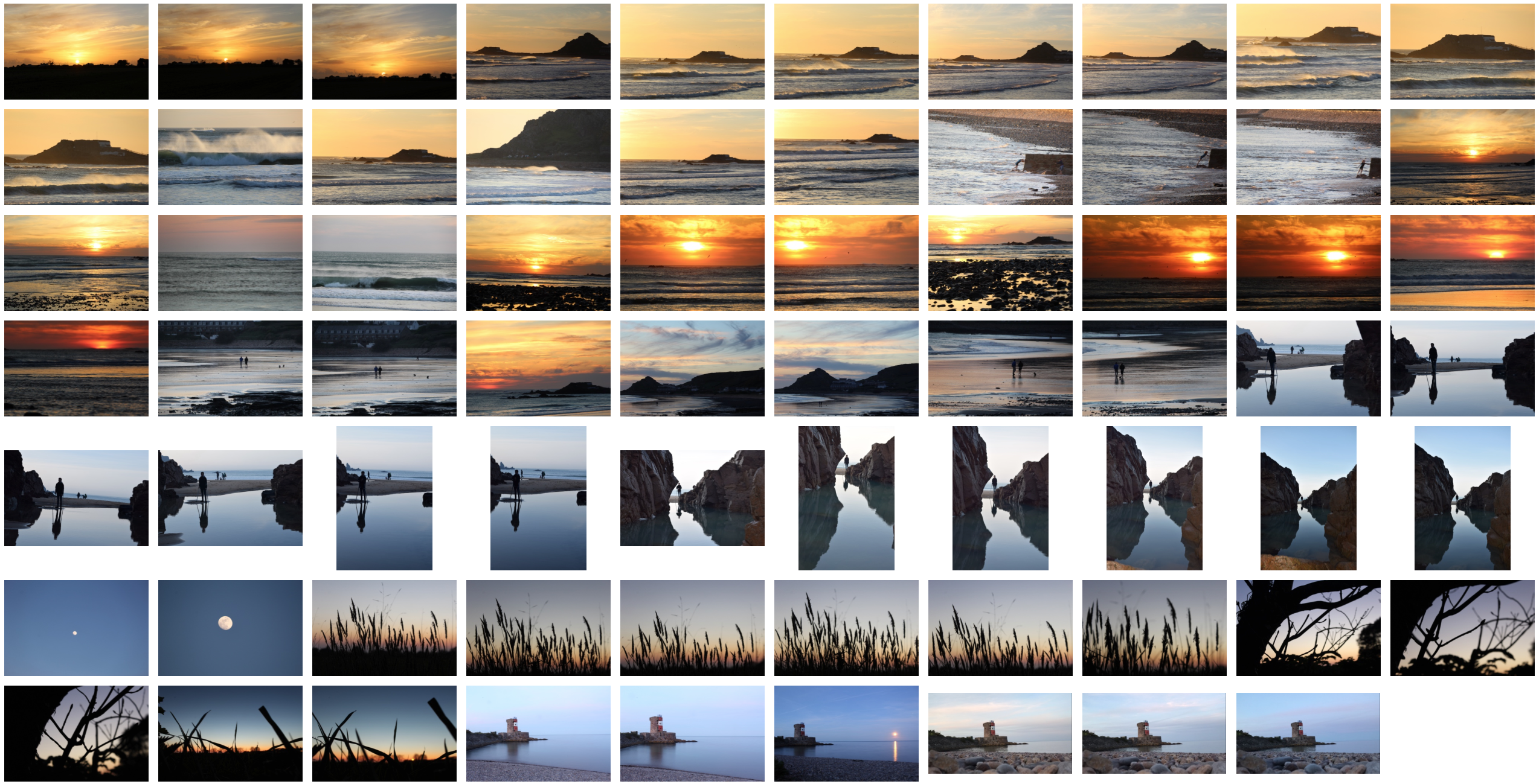
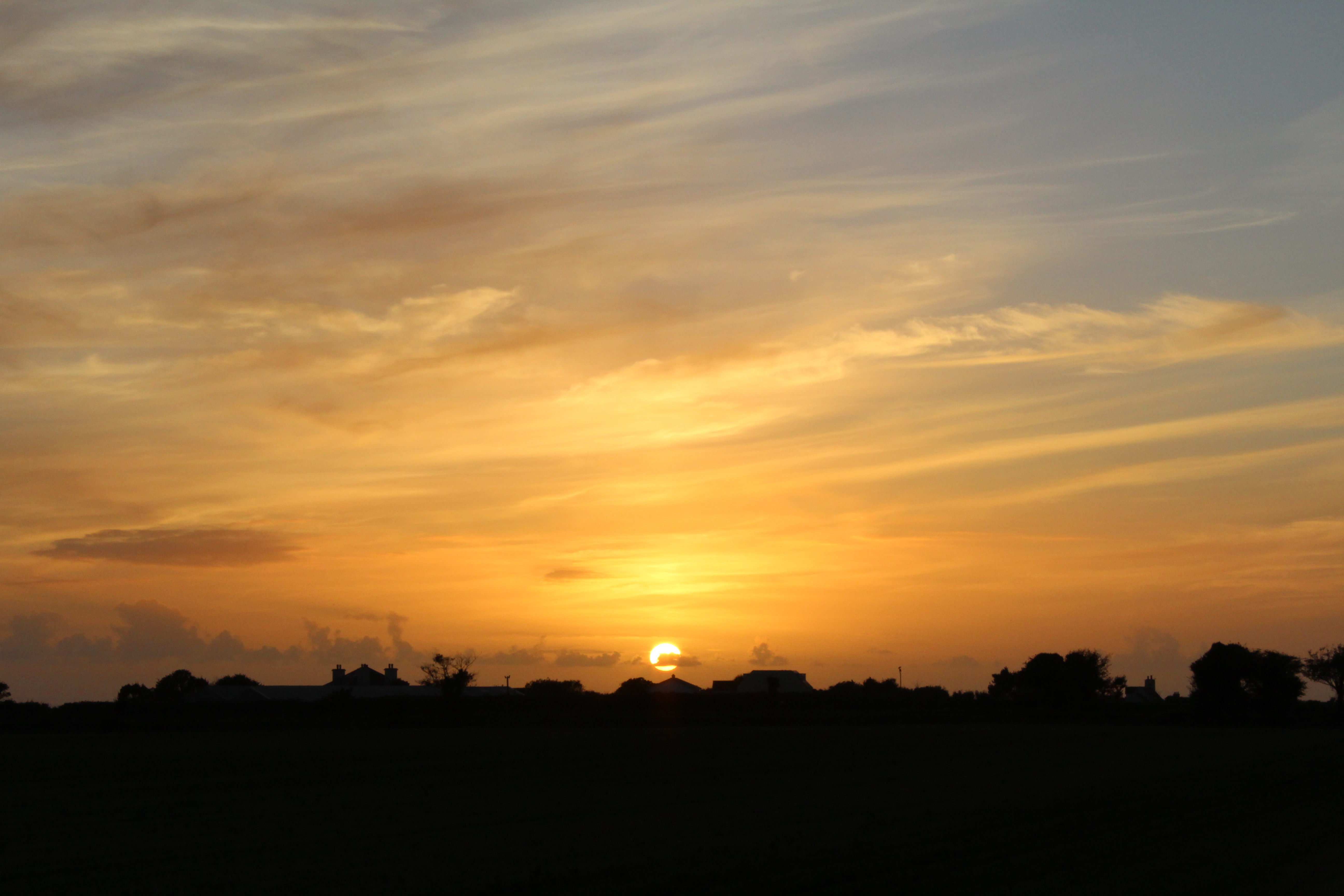
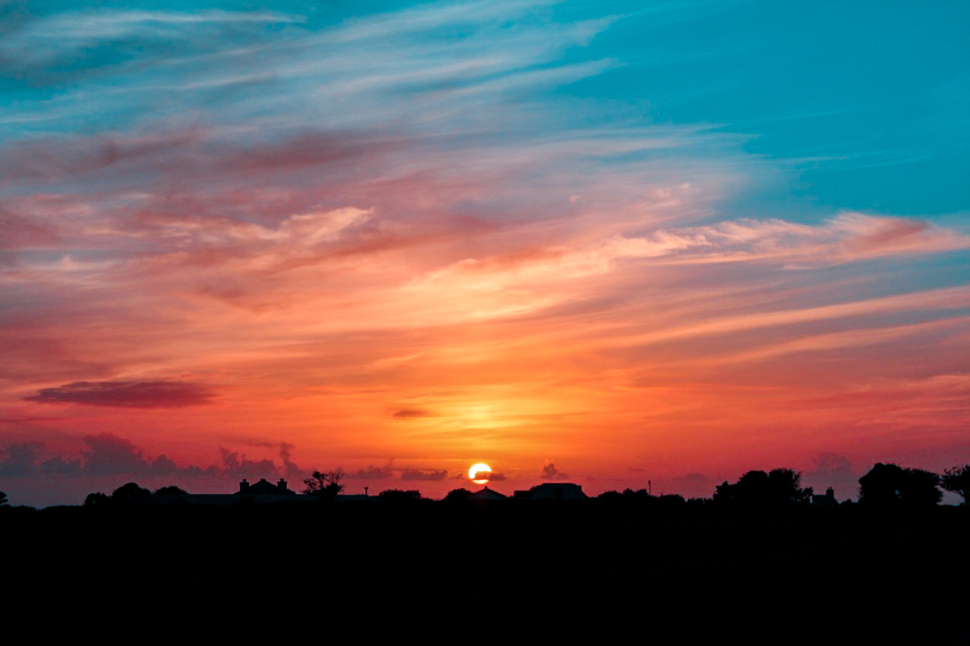
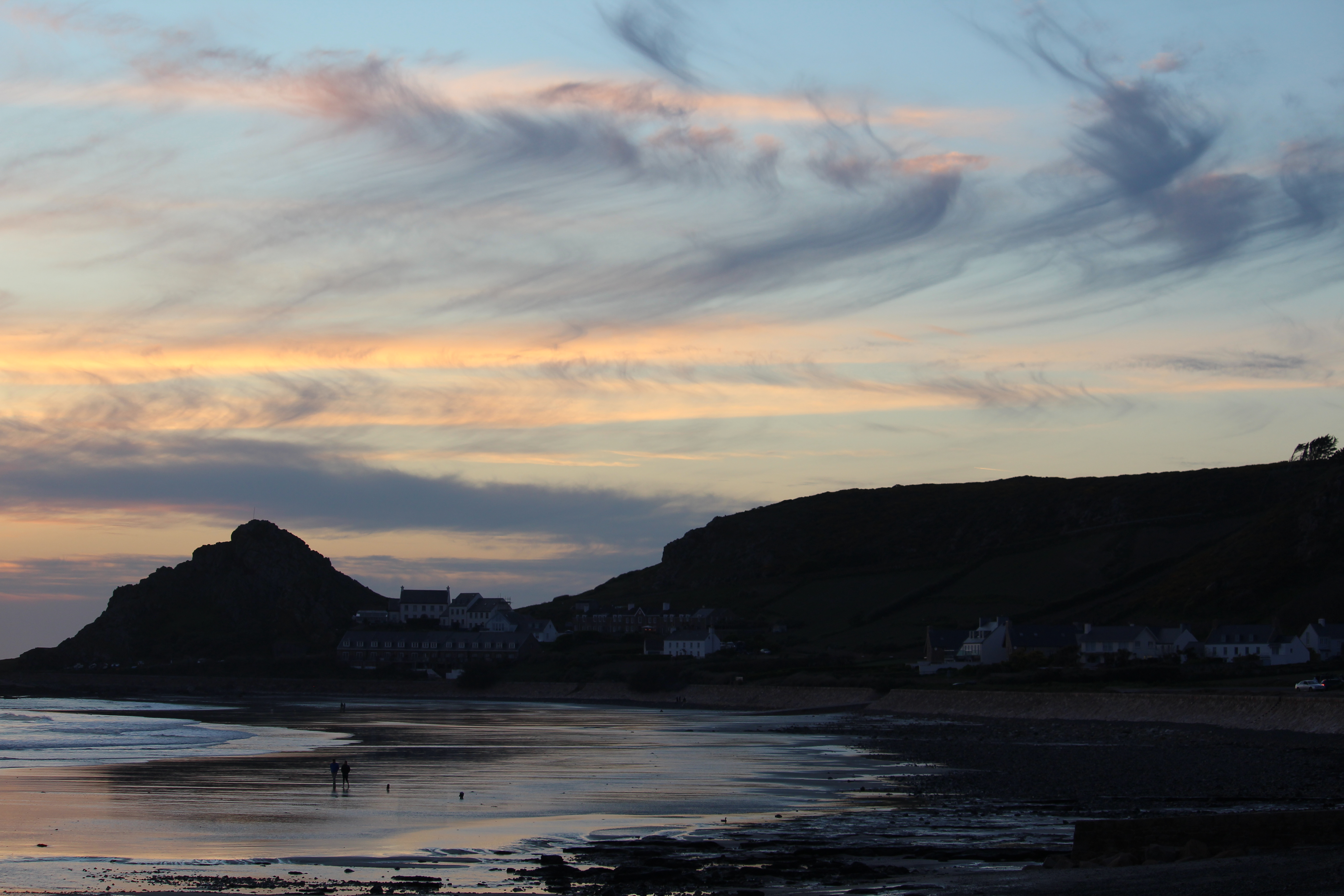
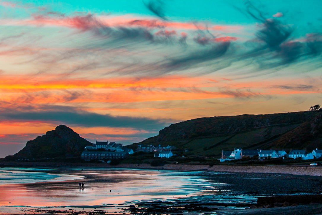
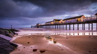
This is the original photograph without any editing having been done to it. I felt as if this photo was effective in portraying the typical colours involved with a sunset which to me, created a boring and uninteresting photo as it can be seen in real life which is much more aesthetically pleasing. To ensure I could entice the viewer with this photograph, i decided to take it to Lightroom and add a variety of vibrant and saturated colours which would influence the audience to appreciate the picture. I believe these colours really bring the sunset to life which has a strong contrasted connotations of how the life (the sun) is dissappearing for the night.


Editing photos into B+W

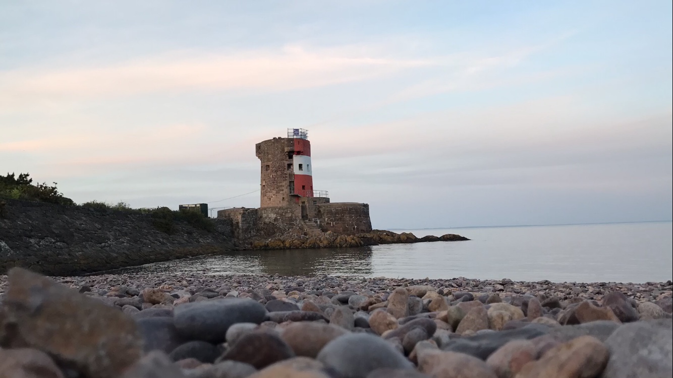
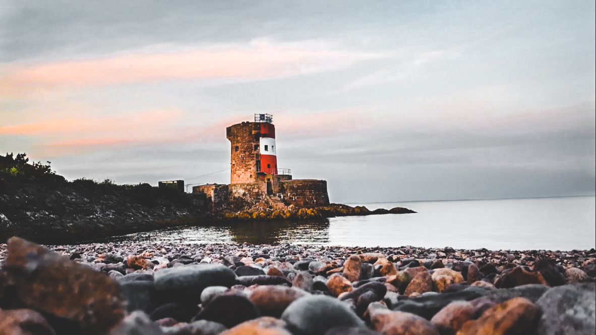
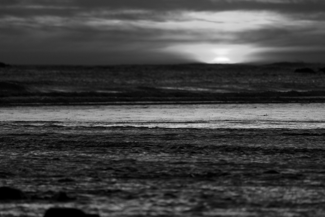
I think that the main success with these black and white photos are the texture which are visible within both. The sand and skies give a great texture with a variety of patterns leading the viewer around the photo. I think that these images could relate to the death of the sun each day as the black and white effect has connotations with death and symbolises this.

Romanticism Case Study – Ansel Adams

Ansel Adams (1902 – 1984) was an American photographer and environmentalist. His photos of the American West are often seen on calendars, photos and books.  Adams founded the photography group ‘Group f/64’. He was part of the romanticism movement and produced lots of striking landscape photographs in black and white, often involving a pathway of some sort and interesting weather.

Image result for ansel adams

Image result for ansel adams

Ansel Adams is a key photographer within the romanticism genre of landscape photography. He was one of the most influential people  that inspired many of the modern day photographers to capture the pure beauty that lays within our earth. He focuses on capturing the untouched areas of our world and exaggerating the pictures to create dramatic and intense photos.

Image analysis

Related image

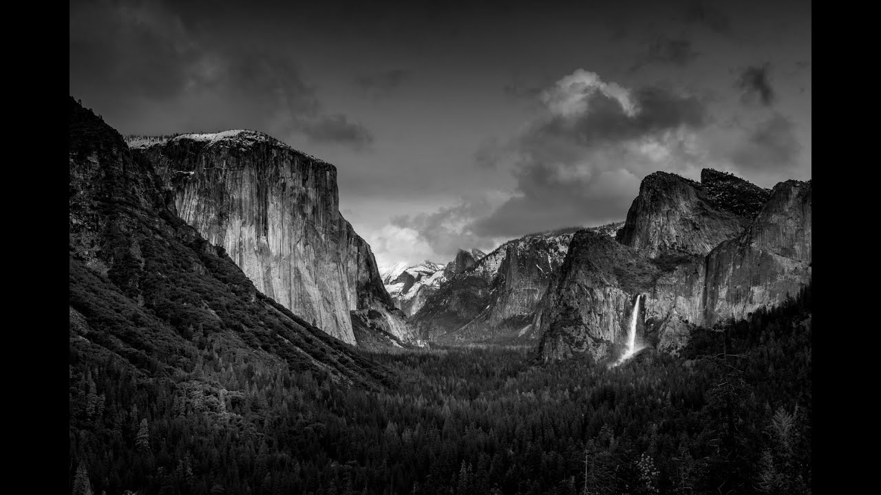
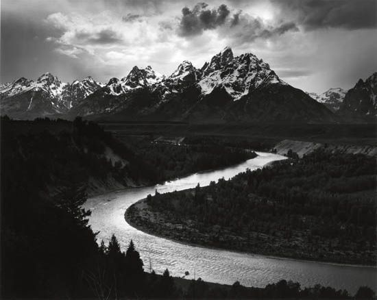
This photograph appears to have been taken with only natural light.  Typically, wide angle lenses were and still are used to capture landscape photos, which is likely what would have been used to create this image. This image has a large tonal range, with the foreground and parts of clouds very dark and sinister to the peaks of the mountains, illuminated in snow. This image entails a large depth of field as the closest parts of the image are sharp and in focus as well as the furthest points such as the clouds. A fast shutter speed would have been used to capture this image because we can see there is no motion blur within the river or the clouds. If a slower shutter speed was used, then the clouds and river would have became silky and smooth with motion blur creating this. There is a great use of leading lines within this photo as the river and trees/banks on either side of it, leads the viewers eyes from the trees in the foreground all the way to the mountains in the background. The composition of this photo is effective yet doesn’t use the rule of thirds to its potential. The only use of rule of thirds int his photo is where the horizon sits on the top horizontal line. There is little use of rule of thirds used because Adams is trying to show that it is natural and it is the subject that is beautiful rather than the actual photograph itself. I think Adams was trying to influence the idea that the environment is beautiful by using little editing.

Romanticism

Romanticism was an artistic and intellectual movement originating out of the late 18th and early 19th century Europe. Its movement was seen to reject the typical ideas of order, calm, harmony, balance, and idealization. As an artistic style, it is strongly emotional, evocative of a vivid imagination. Sometimes, it actually represents the irrational emotions and subjective experiences of the artist.

Romanticism has long since been associated with the landscape. Within photography, the sense of romance of the landscape features its blossoming spirit. It generally involves photographing natural subjects outside such as mountains, waterfalls and valleys.

Image result for romanticism photography

Image result for romanticism photography

Landscapes

Landscape photography shows spaces within the world, sometimes vast and unending, but other times microscopic.

Landscape photographs typically capture the presence of nature but can also focus on man-made features or disturbances of landscapes.

Landscape photographs can vary in the way they are taken throughout different times of the day. Typically, they are taken in daylight however some photographers use long shutter speeds at night to get some interesting  shots.

Landscape photography typically requires relatively simple photographic equipment, though more sophisticated equipment can give a wider range of possibilities to the art. An artist’s eye for the subject can produce attractive and impressive results even with modest equipment.

Many Landscape photographs are used commercially to promote certain destinations or businesses. These are often edited in such way to make the places more appealing then they actually are.

Image result for landscape photography

Image result for landscape photography

Final Piece Evaluation – Portraits

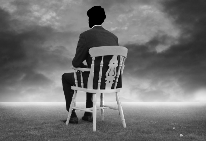
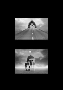
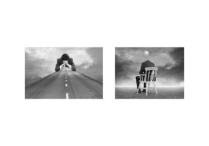
I believe this final piece has turned out very effective and clearly shows an understanding of Tommy Ingbergs photos and the concept of loss of identity. I think the composition and use of leading lines from the bottom picture to draw attention towards the top picture is effective in allowing the viewer to fully appreciate the piece as a whole. The road is used to lead the viewer through the picture as if they are on the journey that the model, at the end of the road, has taken in life. The road is clearly darker towards the start and then lighter as we progress further down it. I have deliberately created this effect to symbolize how the models life has or will improve despite the bad place in which he currently is in. This lighter part of the road is highly contrasted with the model himself as his is giving off a stressed or frustrated feeling. Similarly I have used the same approach within the top edit where the darker parts of the cloud are behind him and the person appears to be looking down the landscape into the ‘bright future’. This use of contrast can be associated with the difference in the persons life from now to then. All the images which were used to construct these final edits consisted of different light intensities and colors. I think I achieved a well balanced lighting across the images to ensure I create what looks like one scene. I think that the black card to board my images onto was the best option because it helps to connote the feeling associated with the images.

Final Images From Portrait Photography

 I have selected these images as I personally believe that they all effectively portray a sense of loss of identity in the most beneficial way by the emotional response it has on the viewer. I think that these images are truly effective as they are engaging due to the high contrasts and tonal range they have. The black and white effect helps to convey the emotions associated with a lack of identity such as anxiety and self confident.

Final Presentation Experimentation

Final Idea

Photoshoot 2 // Loss Of Identity

Rosanna Jones

Rosanna Jones is a 19 year old photographer and mixed media artist  who distorts and tampers with her photographs to create unique mixed-media pieces that are both beautiful and disturbing at the same time.  She is based in London and recently graduated in Fashion Photography from Falmouth University. Rosanna explores how body image – whether positive or negative – can unconsciously effect identity. Through Rosanna’s work, she questions and challenges the ideas of beauty in regards to how a person feels internally compared to how a person is perceived by the outside world.

I believe there is a strong link between Rosanna’s work and the theme of loss of identity. This is seen through the use of camera settings which she intentionally uses to capture a sense of lack of identity. For example using slow shutter speeds to create a motion blur on peoples faces or using aperture to focus to foreground and blur the background, thus being the models. She also makes the most of the natural things, like smoke which she seems to have used in many of her projects. She uses this smokey effect to help hide certain features of a persons body and reveal some too.

Examples Of His Work

Image result for Rosanna JonesImage result for Rosanna Jones

Analysis

Related image

This image happens to be effective purely due to the simplicity yet effectiveness that it has. Although the image appears to be rather simple, it can be interpreted in a variety of ways, having many connotations. I believe this photo was taken through some glass or a window with the tape stuck onto the window. The photographer would have used a low aperture setting to allow a shallow depth of field, ensuring only the tape is in focus. The eyes are the key symbolization of a persons identity which I believe Rosanna covered to give this sense of a loss of identity. The tape, which is vibrant, help to attract the viewer and influence them to intake the messages associated with the picture. One message may being that you shouldn’t judge a person on their identity as we are all equal. I believe the messy positioned tape could reflect the harsh stereotypes that people make based on appearance. The  untidy tape acts as a leading line to help guide us around the face of the model. The eyes have seemed to been tampered, by the way in which they have purposely been covered. This may relate to how the person has been effected with what they have seen wrong in our society or how their personality has been tampered with. Overall this image is influential and a very captivating that helps to reflect a loss of identity through the use of a strong contrast and symbols that represent this.

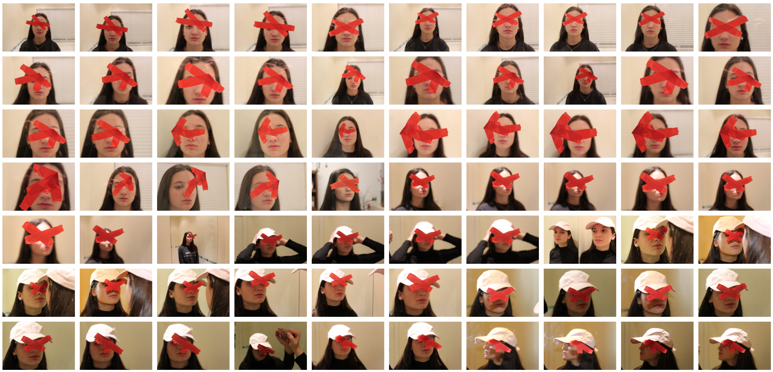
Contact Sheet

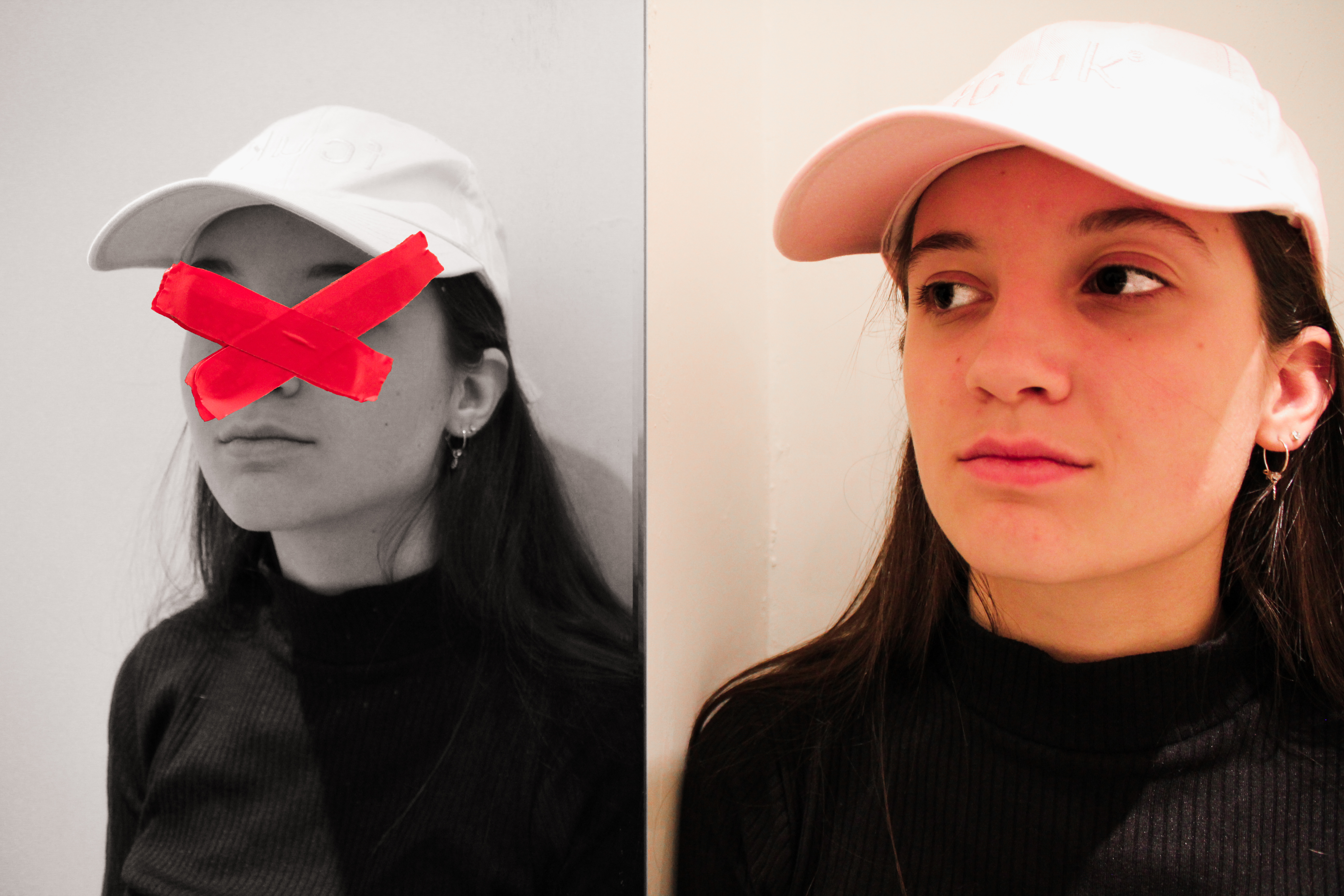
Edits

Lack Of Identity // Photoshoot 1

Tommy Ingberg

Tommy Ingberg is a photographer and visual artist, born 1980 in Sweden. He works with photography and digital image editing, creating minimalistic and self-reflecting surreal photo montages dealing with human nature, feelings and thoughts.

Tommy leaves the interpretation of his work up to the viewer but says, “For me, surrealism is about trying to explain something abstract like a feeling or a thought, expressing the subconscious with a picture. For my work I use my own inner life, thoughts and feelings as seeds to my pictures. In that sense the work is very personal, almost like a visual diary. Despite this subjectiveness in the process I hope that the work can engage the viewer in her or his own terms. I want the viewers to produce their own questions and answers when looking at the pictures, my own interpretations are really irrelevant in this context. “

Tommy Ingbergs main focus are people and the atmosphere/feeling that relates to the them. He portrays these feelings through his work by focusing on mainly on dark, saddening and depressing moods to reflect this idea of loss of identity. The running theme throughout Tommy Ingbergs pictures are that they are all in black and white which to me suggests a sense of depression and sadness. I chose to study Tommy Ingbergs work because not only does he create extraordinary surreal illusions but the deep meanings and stories which are told through his pictures really influenced me.

 The Photographers Photos

Image result for tommy ingberg

Image result for tommy ingberg

Image result for tommy ingberg

Photo Analysis

Image result for tommy ingberg

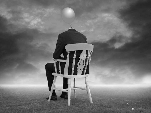
I like this photo due to the emotion and story it creates and tells us. The photo clearly tells us that a person wants to escape the place in which they live in however there is something stopping them. The lighting helps to create this sense of imprisonment. The dark clouds are in front of the man as if he is heading into a darker place and putting himself into a bad situation and the bright clouds which suggest goodness are behind him indicating he is drifting away from what’s good in his life. This photo uses the technique of leading lines within the rope leading us up the body to the balloons which is trying to pull the man away from his life on earth. This photo is in black and white which I think helps to add to the dark and depressing atmosphere.

Photoshoot Plan


Genre /  Artist
 – Surrealism, Tommy Ingberg

Concept –  Loss of identity

Location – Street, beach, cliff paths

Props – Top hat, suit, models

Shot type – Portrait

Lighting – Natural

Settings – Portrait/landscape

Contact Sheet
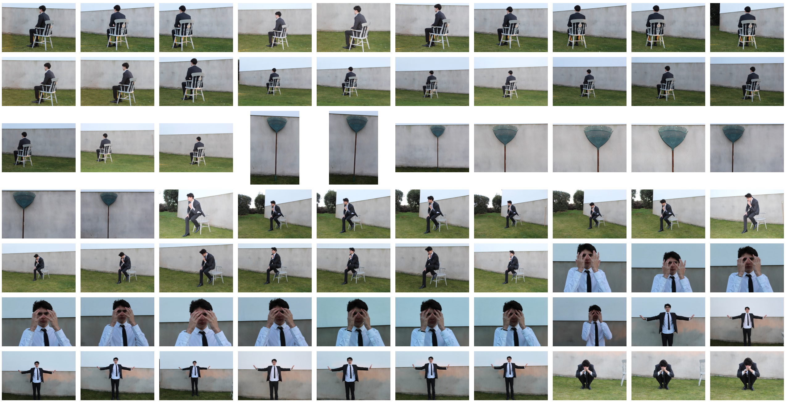
 

My Edits

Favorite Edit

I believe this edit has turned out the most effective out of all my Tommy Ingberg inspired images. I think this is mostly due to the composition and use of leading lines to draw attention to the main subject in the distance. The road is used to lead the viewer through the picture as if they are on the journey that the model, at the end of the road, has taken in life. The road is clearly darker towards the start and then lighter as we progress further down it. I have deliberately created this effect to symbolize how the models life has or will improve despite the bad place in which he currently is in. This lighter part of the road is highly contrasted with the model himself as his is giving off a stressed or frustrated feeling. This use of contrast can be associated with the difference in the persons life from now to then. All the three images which were used to construct this final edit consisted of different light intensities and colors. I think I achieved a well balanced lighting across the three images to ensure all the three elements of the picture look similar. I think an improvement to this image would be to align it to be more symmetrical as i have noticed that the white markings in the road are not  quite in the middle.