
Within this shoot I will be focusing on the use of dark areas to emphasise the idea of abandonment, to do this I will be visiting usually deserted landmarks such as car parks etc. This would allow me to create aesthetically pleasing results whilst creating the impression that human influence has passed by leaving it as a former shell of what it was originally used for. A photographer who inspired this shoot is Rut Blees, Blees focuses on abandoned areas and their urban aesthetics, used lighting to create contrast on specific areas.
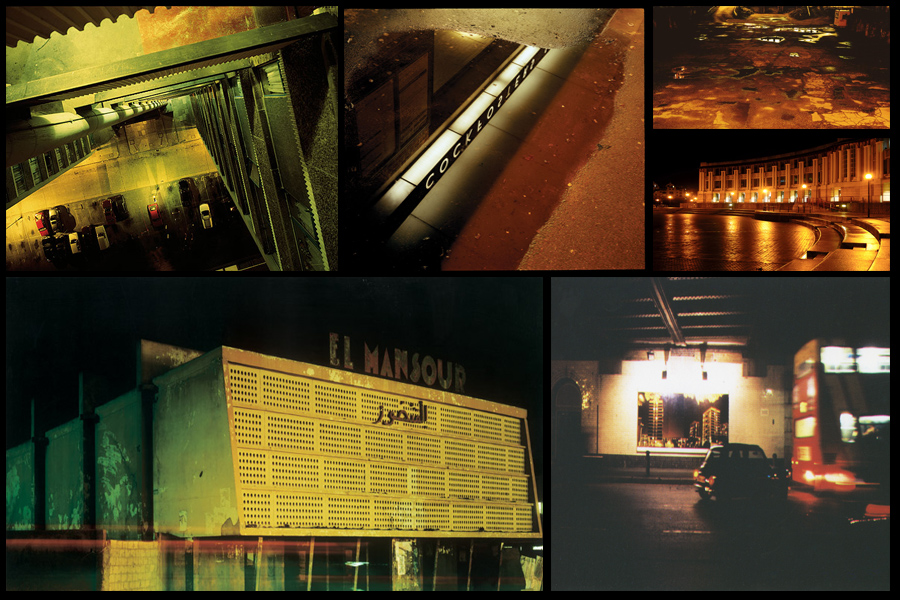
Some of their artwork can be seen below on urban aesthetics: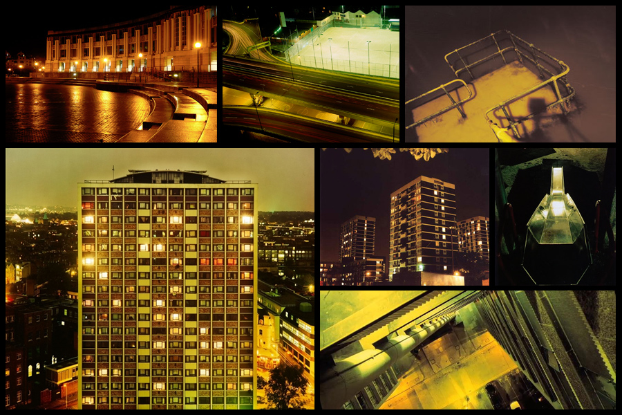 Once completed I decided it was time to move onto my ideas for the shoot, this consisted of creating a mind-map to allow me to focus on specific ideas I think would be most effective when taking imagery. This would make the shoot more efficient to do as I would know exactly what to do. Here are my ideas:
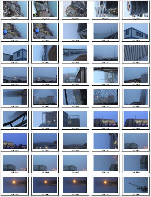
 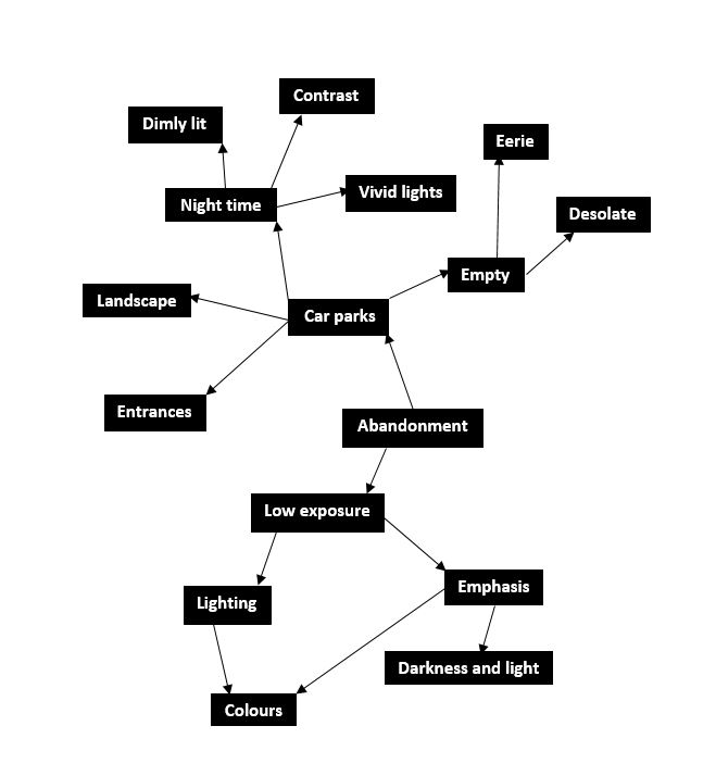 After I finished developing my ideas I decided it was time to focus on the shoot itself now, to do this I drove around Jersey visiting various car parks during the night to capture the images desired. Using a low exposure to produce the outcomes I found that it proved to emphasise the areas of choice like intended. These were my results:
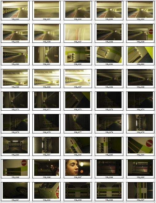
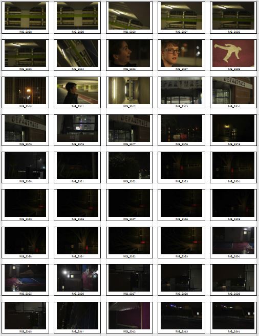
 After I had compiled the images into contact sheets I was able to whittle them down into a top ten images that I thought stood out from the rest of the pictures. This would make it easier to choose the final and most successful image out of the entire shoot. Here are my ten final choices:

Once completing this, I edited them down once again down to five images which I would analyze, this would make it much more easier to decide from which photos I thought were most effective as a development off the inspiration of Rut Blees. Here are my choices:
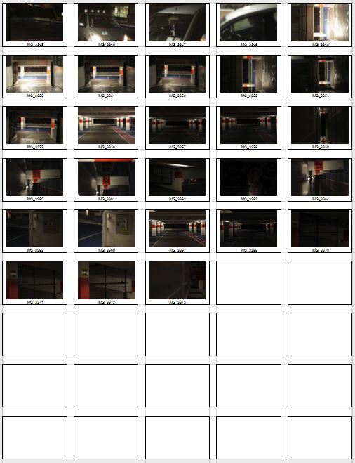
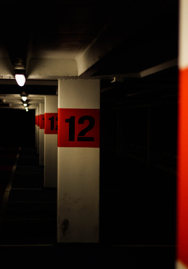
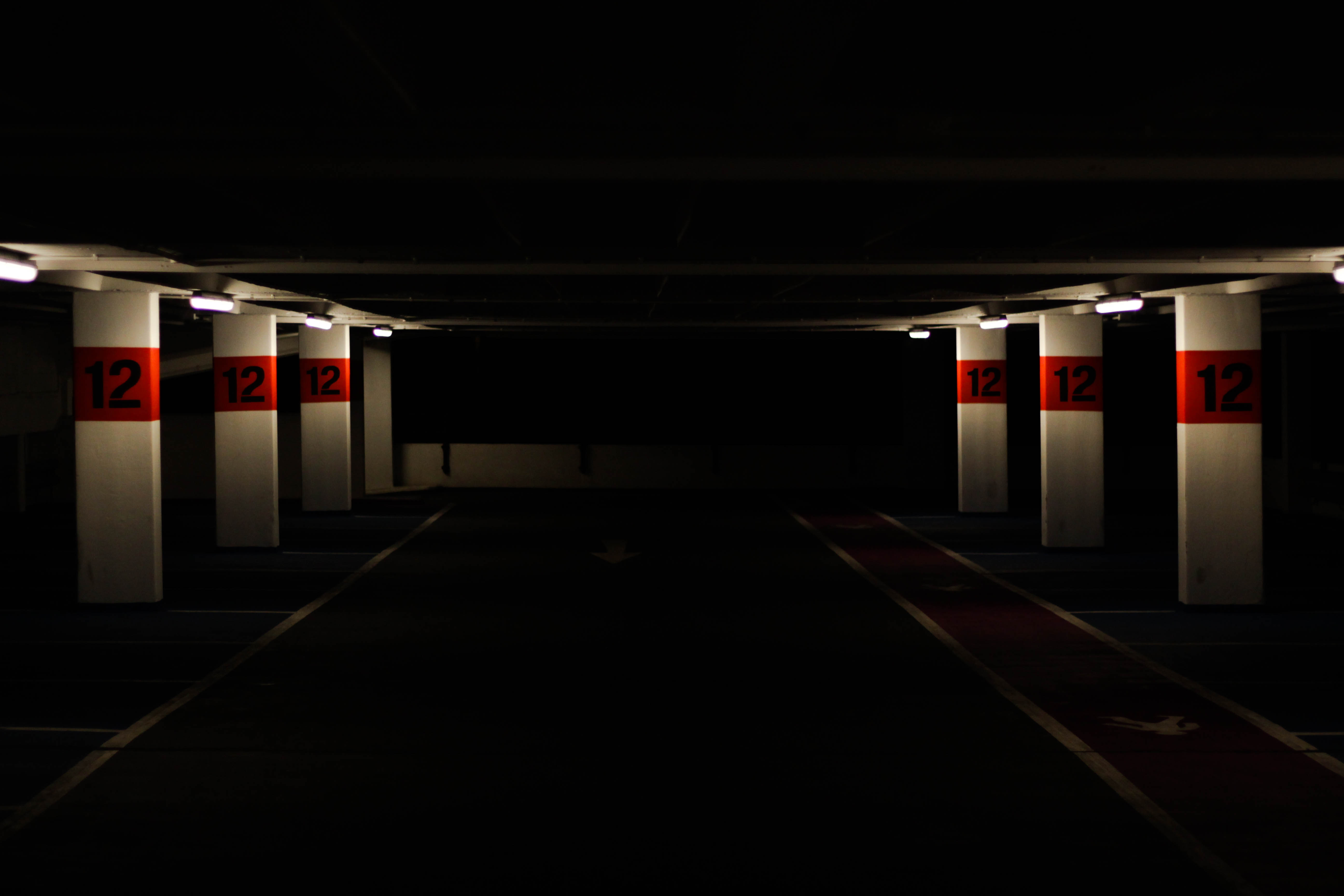 I chose this image as one of my selection of five because I found it contained an effective use of contrast between light and dark, combined with a use of depth of field I thought it gave across an eerie impression of a deserted atmosphere. The red use around the number I found to really balance the image from how the only light sources illuminated those areas whilst emphasizing the depth and darkness of the car park. I found the symmetry used within the image proved effective from how it created a sense of aestheticism with a border made from the use of the slanting ceiling.
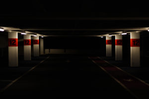
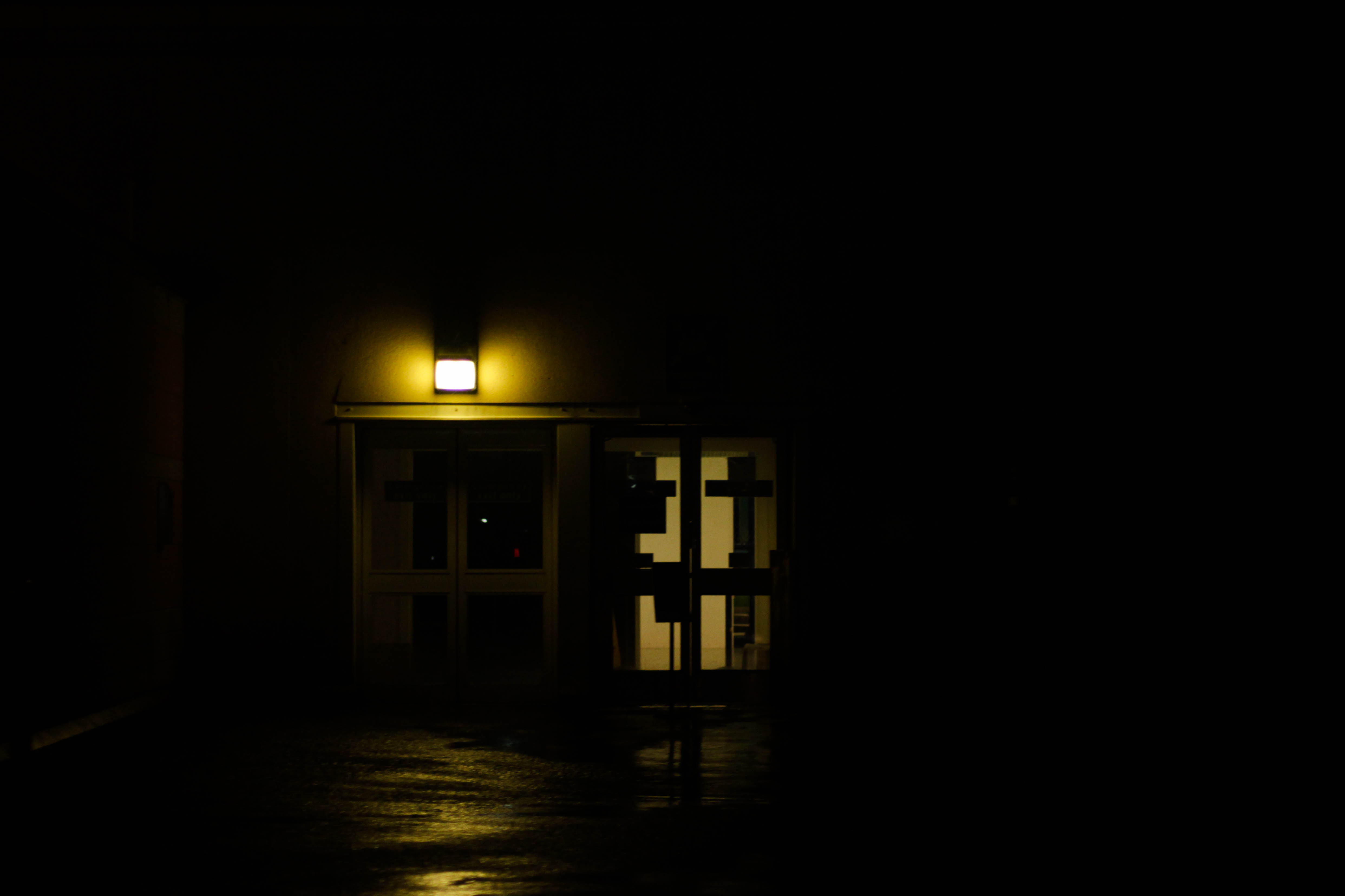 What I particularly liked about this image was the use of a dim yellow light illuminating a small radius around two doors, I found that this combined with the puddles reflecting and emphasizing the colours really gave the impression of an area deserted by human activity. This also produced a contrast between the doors and the rest of the image from how the darkness around it defines it even more the dimly lit imagery exit of the airport. The use of a singular light source present creates a creepy feel from how it creates silhouettes of objects around it allowing your mind to perceive what it wants of it.
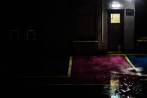
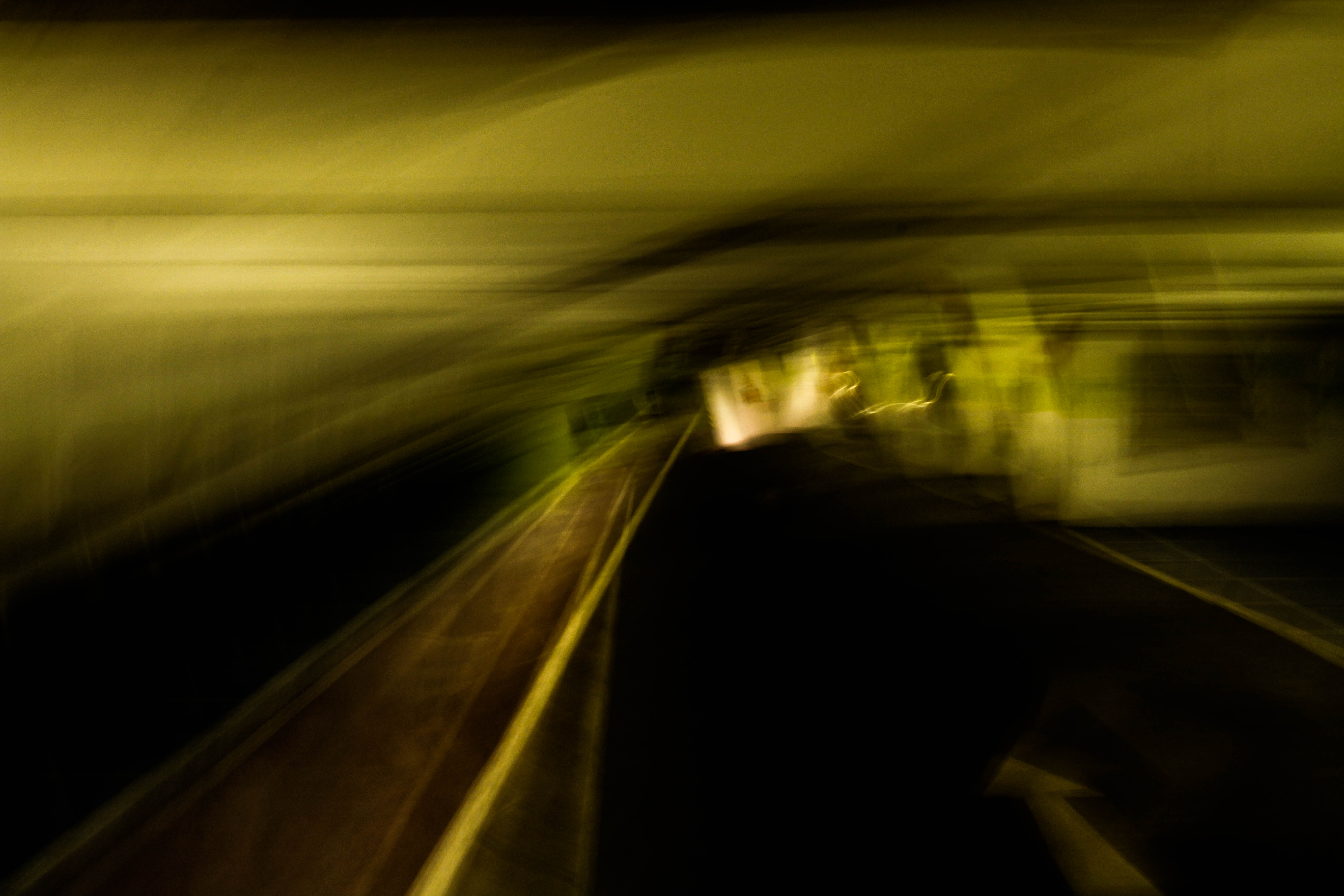 What I loved about this piece was how the blur created by the low shutter speed creates an abstract and almost dreamy landscape of the car park leaving your mind to interpret what it would look like. The combination of yellow and green compliment each other combined with the dark floor allows for and aesthetically pleasing result, however I found that the un-blurred road balances the image as it adds normality to the rest which is essentially is unbalanced.
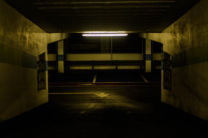
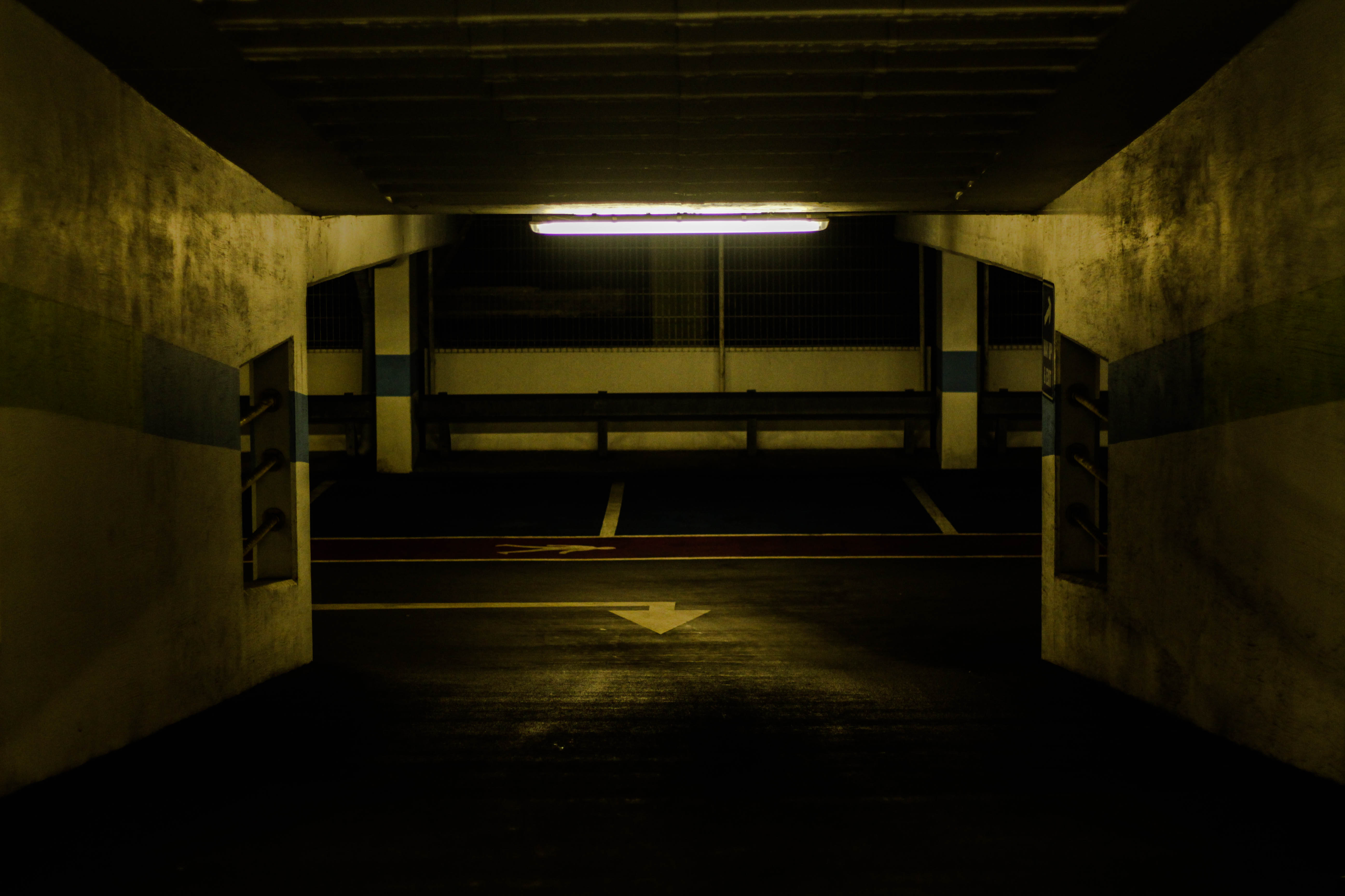 Within this photo I loved the use of a single light source illuminating the dirty walls with yellow lighting, I found that the impression imprinted by this allows a look of derelict and abandonment to the area from how the colours are dimmed with light sources emphasized. I found that the composition was particularly effective from how it was symmetrical throughout allowing for an aesthetically pleasing outcome with the light being the center of the image and the main focus point. The use of depth of field on the far end of the car park wall adds balance to the piece from how the detail is removed from it allowing the viewer to mainly focus on the walls and ceiling without much distraction.
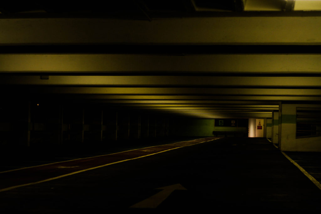
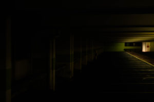
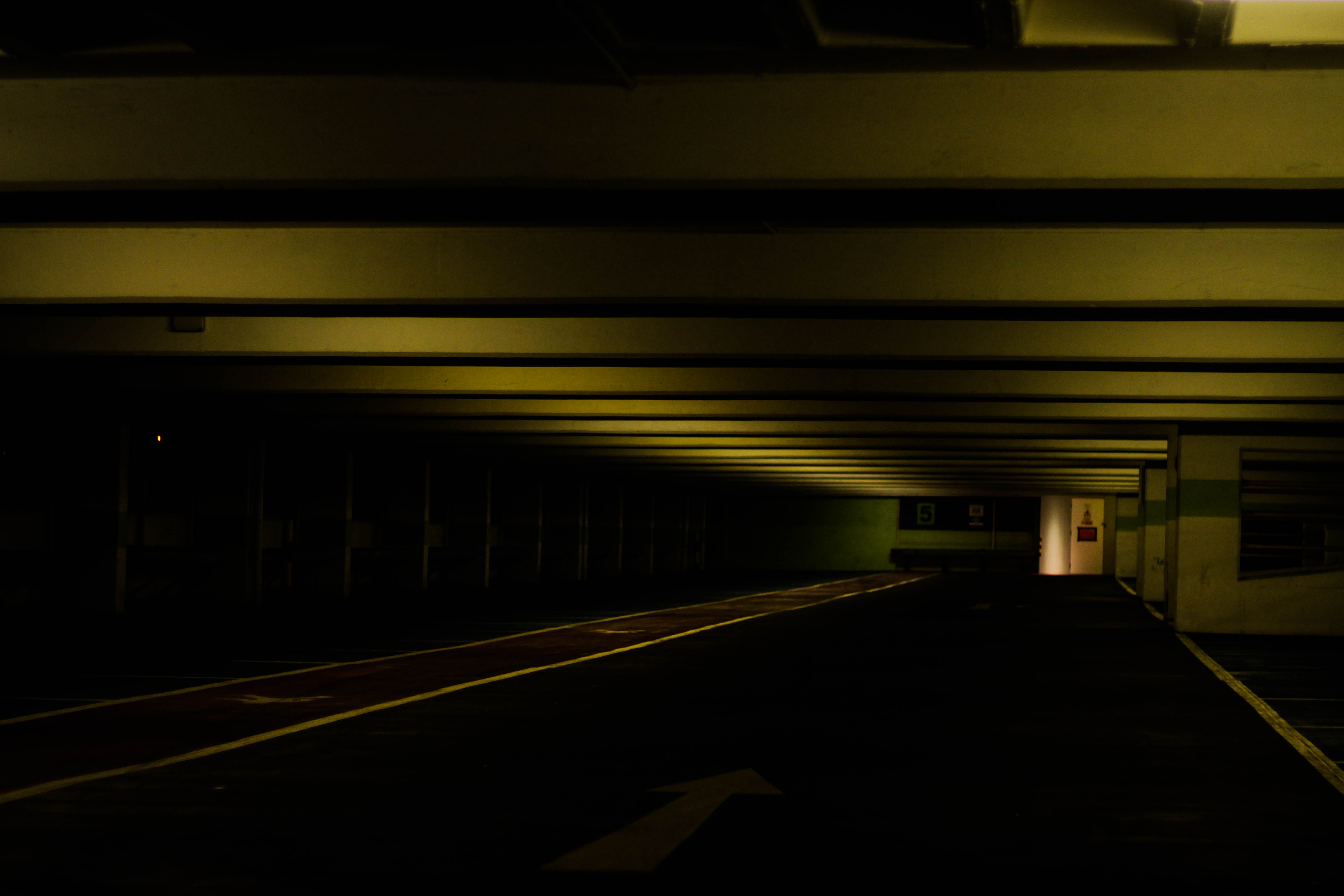 Finally I chose this piece because of how the use of a depth of field and the yellow tinted lights compliment due to how the ceiling is slanted off to the right in the distance. On top of this there is a significant contrast between the floor and ceiling presenting it as a sort of unknown area where the side cannot be seen only the ceiling and exit, with the remaining parts a mystery to what is there. The composition is slanted like most of them, but the patterned ceiling adds interesting features to the piece rather than being head on, presenting it as a large corridor like structure.
After analyzing the images I decided it was time to move onto picking the best image from the five. To do this I need to consider which image related to the idea of abandonment whilst implementing in eerie effect as well, and gives the impression of somewhere deserted by people. This was my end result:
Final Image:
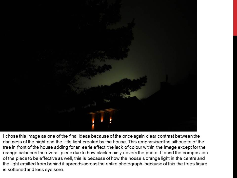
I chose this image as my final picture that I believe is the best outcome from the shoot because of the lighting and composition. The lighting itself presented an eerie and hostile glow illuminating the walls surrounding it, revealing the dirt covering the walls that could suggest the place is hardly every used. The contrast between the light dark emphasizes the idea of abandonment and how nothing is there, this is also complimented by a depth of field which blurs out the parking spaces suggesting that nothing is every there and humans have forgotten it. This is accompanied by symmetry which creates aestheticism throughout the picture with the light being the central point of it and both walls boxing the photo in creating a cramped feel to it.

 Fototagetrier
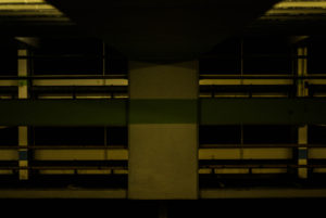
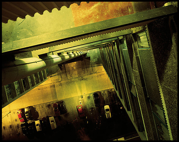 Technical: Within the image the floors of the car park spaces are used as a border to highlight the actual focus of the image, the slightly dim ground floor. This is done through the use of contrast between the sides of the building and the floor itself which uses yellow tinted lights to emphasis certain aspects of the concrete around it, with the grays and blacks in the picture they stop the yellows from overpowering the entire image creating an aesthetically pleasing photograph as a result.
 The plot consists of someone walking back home, to which as soon as she falls asleep experiences dreams in which she repeatedly tries to chase a mysterious figure with a mirrored face. Each time she fails but resumes trying to catch the figure, and each time sees multiple instances of herself which are parts of the dream previously seen. Once woken up by a man she realizes that the events which occurred in her dream actually happened, the man later returns to see a smashed mirror on the wet floor with the woman now dead. The film originally was made by Deren’s and Hammid’s desire to create an avant garde personal film that dealt with the effects of psychological problems such as the French surrealists films of the 1920s like Salvador Dali. All actors in the film were played by Deren and Hammid.


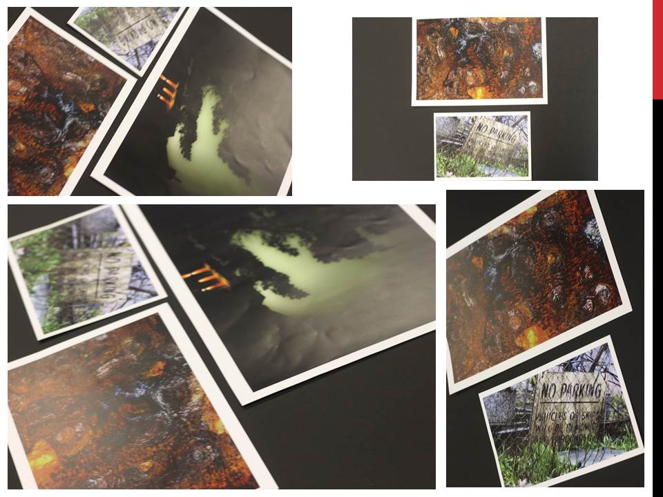

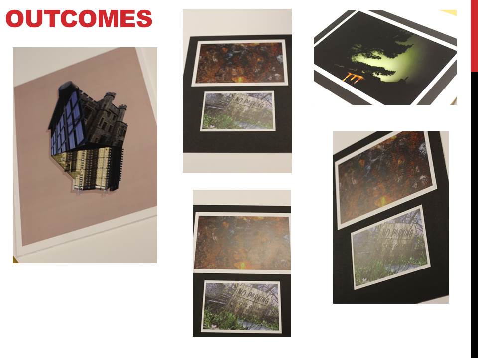
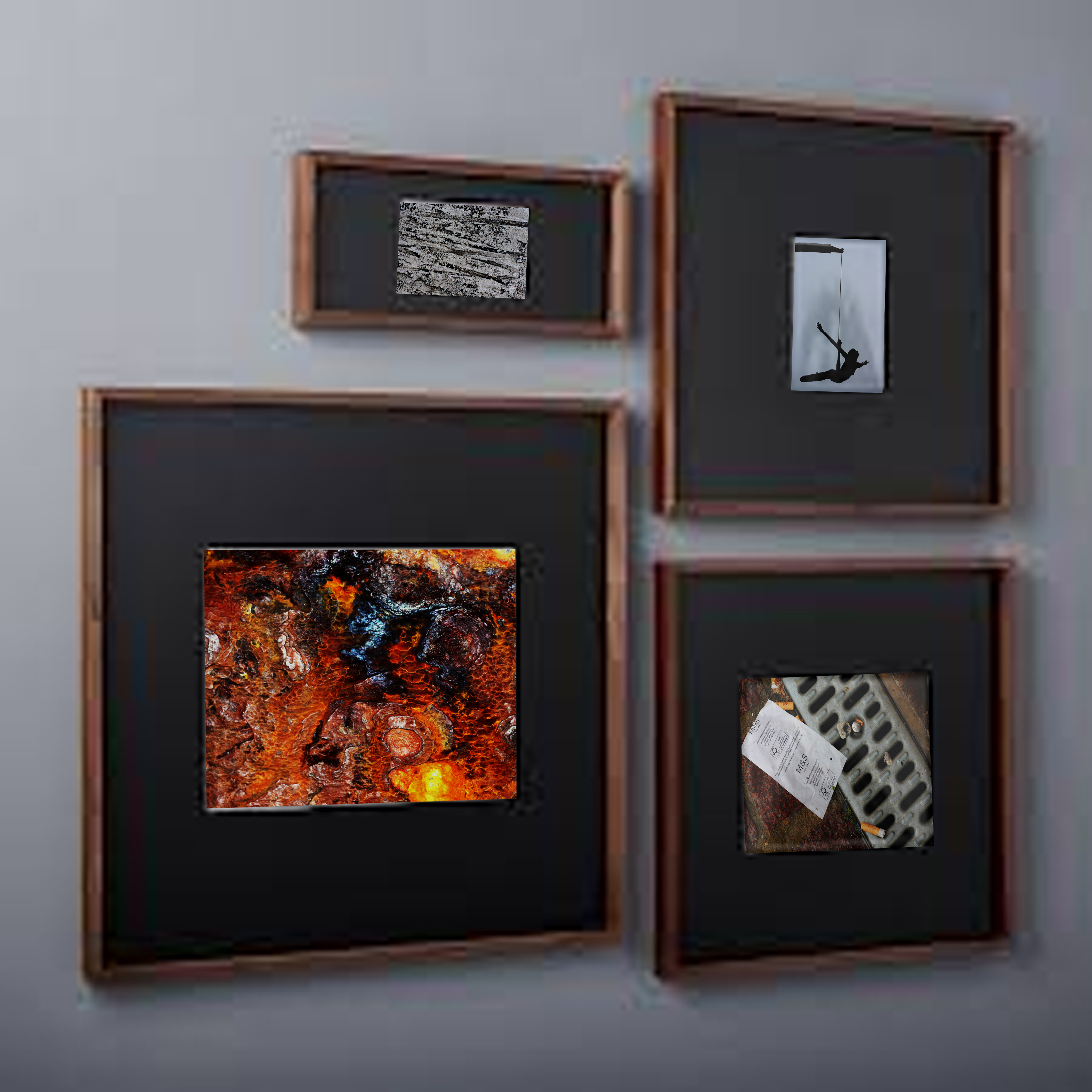
 After looking over these images I decided I should trial run a few of them by manipulating the photos within Photoshop to get the effect needed. I Ideas I settled on were 3D presentation of the landscape and objects due to how through this method it allowed me to choose the focus of interest I wished the view to focus on, whilst creating a more realistic and abstract result. The second idea was the simple image between two black sheet with a white border, I chose this one because I loved the simplicity of the outcome as I thought it emphasized and complimented the entire piece.
 To create this I stitched images of building I had taken together, with me adding edges digitally it made the 3D effect I wanted, this was my outcome:
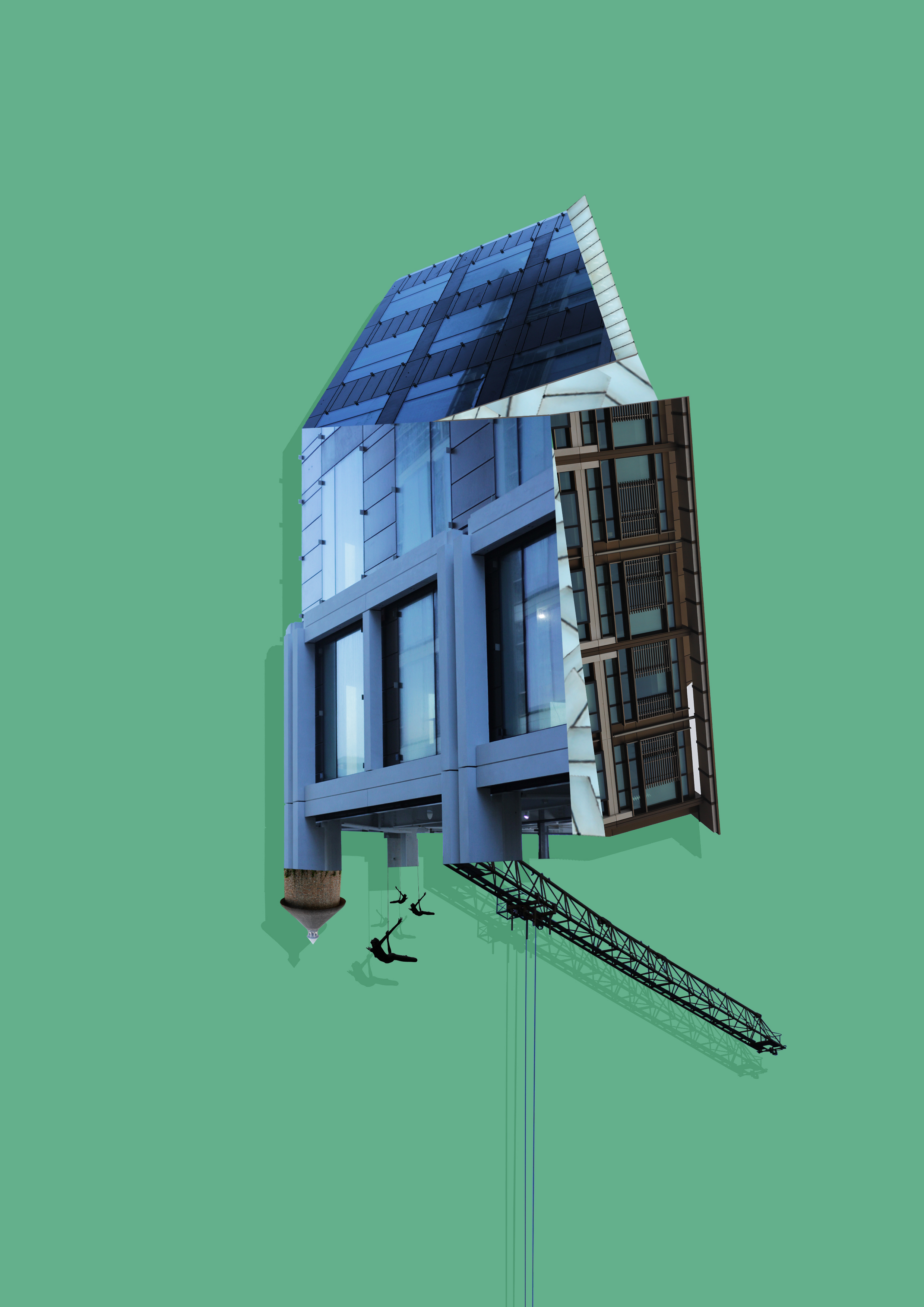 Whilst making this design I found that by adding a shadow to the piece created the effect as if it was mounted upon a wall, emphasizing the 3D aspects even more.
 When editing the images I found that when displayed together the pieces looked more aesthetically pleasing to the eye. This allowed me to come to the conclusion that I would display three of the images together to created this effect.
 I decided however to plan the shoot before I went ahead and did it. This would allow me to have a general idea before hand of what I wanted, and needed to achieve to produce an effective overall image regarding the topic of New Topographics. These are my ideas:
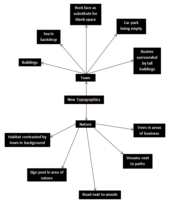 Once this was complete I decided it was time to move on to the shoot itself, and so decided to use the areas regarding the idea sheet of town, Grouville and St Brelades. These were my outcomes:
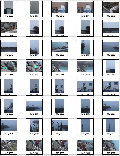

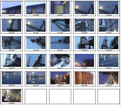 Once the shoot was complete I narrowed the images down to only ten of my favourite pictures. By doing so it would make it easier for me to select the final image that I believe to be the most relevent and successful overall. These were my choices on the ten best images:


 I chose this image because of how I loved the clear contrast between nature and the taking over of it by man, seen by the run down sign surrounded by overgrown grass. I found this to be aesthetically pleasing created by the use of a depth of field, by doing so it blurs our the foreground and the background allowing only really the sign to be noticed properly which is where the eye is drawn. I found the slanted composition to be especially interesting by how it gives the impression of an overgrown and ruined world.
 I selected this image due to once again the use of the depth of field that blurs the backdrop, this along with the use of the composition allowed for maximum effect, giving the impression of a world that eventually succumbs to nature. I found that the way that the fence was composition allowed for a sense of distance to the photo, with the use of neutral space on the right being filled with industrial buildings bringing the viewer into perspective of the area it was taken in.
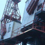
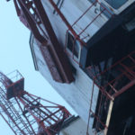
 What I loved about this image was the clear contrast and clear colors used to create an aesthetically pleasing outcome. This is done through contrasting colours blue and white which highlight features of the building, allow for such things as the door and bolts top pop out and draw the viewer’s attention. The composition I found also was aesthetically pleasing due to how the entire image is symmetrical which in consequence created a much cleaner and pleasing look.
 Within this image I found that there was obvious difference between nature and man-made structures. This is once again done through the use of a depth of field to which allows for the appearance of us peering through nature to find the man-made structures that surround everything, whilst showing how where ever nature is human activity is not far behind. I found that the gloomy colours within the image emphasised the destruction caused to the landscape by these structures and how nature and civilisation lives side by side.
  Finally I chose this image as I loved the reflection of cranes created by the aftermath of rain fall. This was partially down to how I thought it highlighted a clear contrast between nature and society, with the looming structures left behind, whilst at the same time creating a deserted and desolate feel to the overall piece. I found that the composition of the piece complimented the photo as it filled most of the negative space made by bricks, with various beams fading out of the image.
 What made me choose this photo as my final image was because how to me it summed up the clear contrast between human activity and nature. This was done by the composition of the grass creating the impression of it growing around the sign as if taking back the land seized by man, to which there is a clear difference in surrounding of the backdrop consisting of machinery and metallic structures that create contrast in not only surroundings but color. The use of depth of field creates a clear definition around the sign allowing for the eye to be drawn to it immediately with both the foreground and background complimenting it due to the drastic difference in colors and blur. To me this was the image that related the most to the topic of ‘New topographic’, which not only created a feel of the contrast between man and nature, but also of the deserted spaces that surround us in our everyday lives.
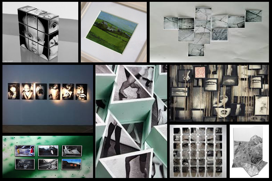
 I found that Svalbonas used a calm colored backdrop to her creations to balance the entire piece and really make the design pop out. In response to this I looked through previous photo-shoots picking out images of buildings that I had taken recently. Once found I proceeded onto Photoshop to cut out and stick the parts of these buildings together creating a structure similar to that of Svalbonas, to which I would continue to add a colored matt backdrop that in my opinion balanced the image out. This was my process:
 From here I cut out the buildings individually and proceeded to join them together experimenting with what fitted well.
 To do this I used the lasso tool to accurately outline the object wanted so that I could then paste onto the design and move it around until satisfied with its placement.
 Once the design had been finished I experimented with a series of colors that I thought were neutral and would not overpower the overall piece. To do this I used the shape tool to cover the backdrop with a large square where I could then change the colors of it.
 To create these images I mainly incorporated photos that I had based around the International Finance Center for my psycho-geography shoot and a few images from various other shoots. Whilst doing so I found that by duplicating the image and coloring it black while at the same time reducing the opacity, created a shadow like effect to the piece, this allowed for a 3d like effect that I wanted to put across on the piece and at the same time giving it a more graphic feel. Once done I added a green and a pink backdrop to each piece as I found that these colors drew the gaze to the piece rather than be sore from all the negative space surrounding it.