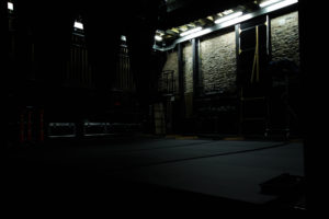
For this shoot I will be looking at the idea of recently abandoned areas where evidence of humans are most evident. I intend to go to abandoned areas to capture the aftermath and the lighting created by untouched places. This hopefully would allow me to capture deterioration of the building which would emphasize aspects associated to the topic. Composition wise I would like to especially focus on the food and drink present within the rows of seats around me as this it what I want to be the main point of the shoot. Inspired by Roman Robroek, an urban photographer who specializes in recent abandonment of buildings, and the presence of humans and memories left behind, I intend to take ideas from him to put into my own workings.
Here are some examples of his work: After researching some of his pictures I wanted to make a mind-map consisting of various ideas I had for the shoot, such as lighting, angles and objects. This would make the shoot more efficient as I would know what to do when there and not waste time trying to figure something out. These are some of my ideas:
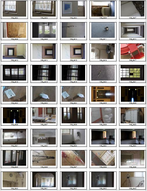
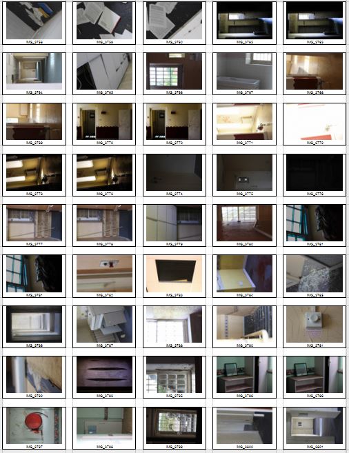
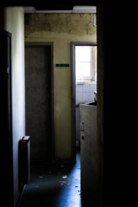
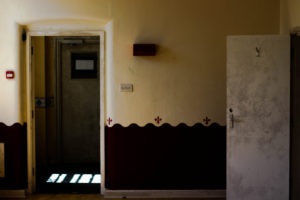
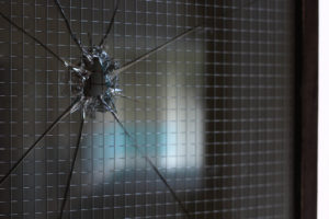
 After finishing my mind-map on ideas that I could use to compose images when taking them I decided it was time to move onto the actual shoot itself. When doing the shoot I would take into account these ideas and use them as inspiration for the results wanted, whilst stopping me wasting anytime trying to think of ways to take each picture. Here are my results:
 After completing this I decided to whittle down the shoot to a top ten images from the shoot. By doing this it would make it easier to figure out which is the best picture from the entire shoot, and why I chose that image. These were my top ten pictures:
 Once I had selected the top ten images of the shoot, I decided to narrow them down again to only five. By doing this it would allow me to analyze each image and what I liked about them individually, whilst making it all the easier to find the best photo of the shoot. Here are the images I have chosen to analyze:
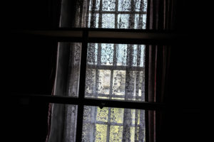
 I chose this image as one of my top five because of the clear contrast between the darkness of the curtains and the light present through the window. Due to this lighting on the curtain it creates a feeling of neglect and emptiness from how the curtain seems almost forgotten, this also contributes to the aestheticism of the picture as the dark and the light half balance each other stopping it being too overpowering. This relates to the topic of conventions from how the curtain has obviously been left for a while and is now forgotten and unused, this is also evident through the dusty window opposite which looks neglected.
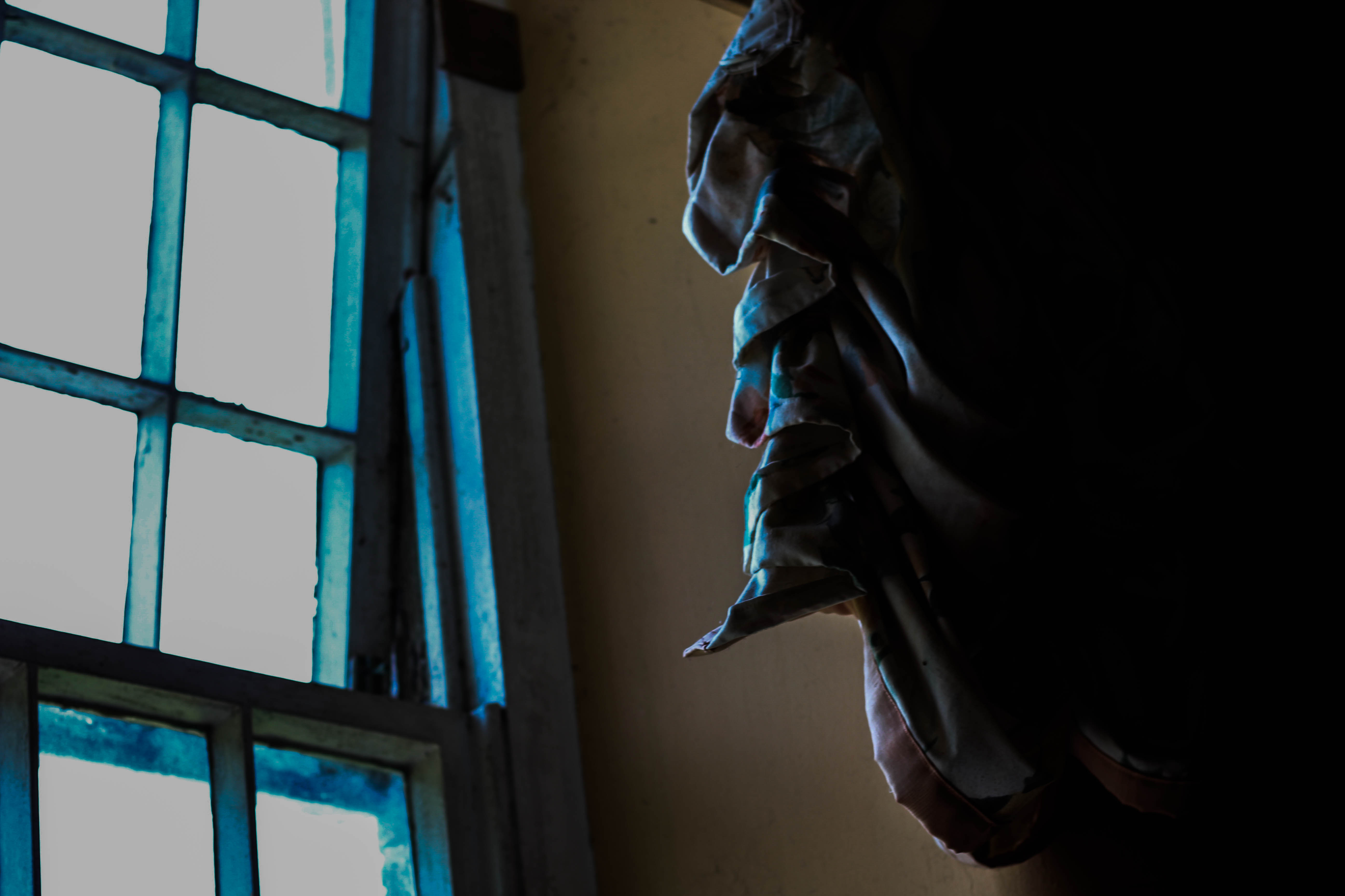
  One of the reasons I chose this image as one of my finals was because of the silhouette creates from the outline of the flower, this instantly become the focal point of the entire image from how it is the most heavily contrasted object against the light. I found that the yellow lighting from the window matched my theme in shoots where abandoned areas are illuminated by eerie lights, casting an uncomfortable feel to them. The picture was taken at a low exposure to emphasise certain features like the flower and floor boards, this really help to home in on the details like dirt and other features found in places like this.
 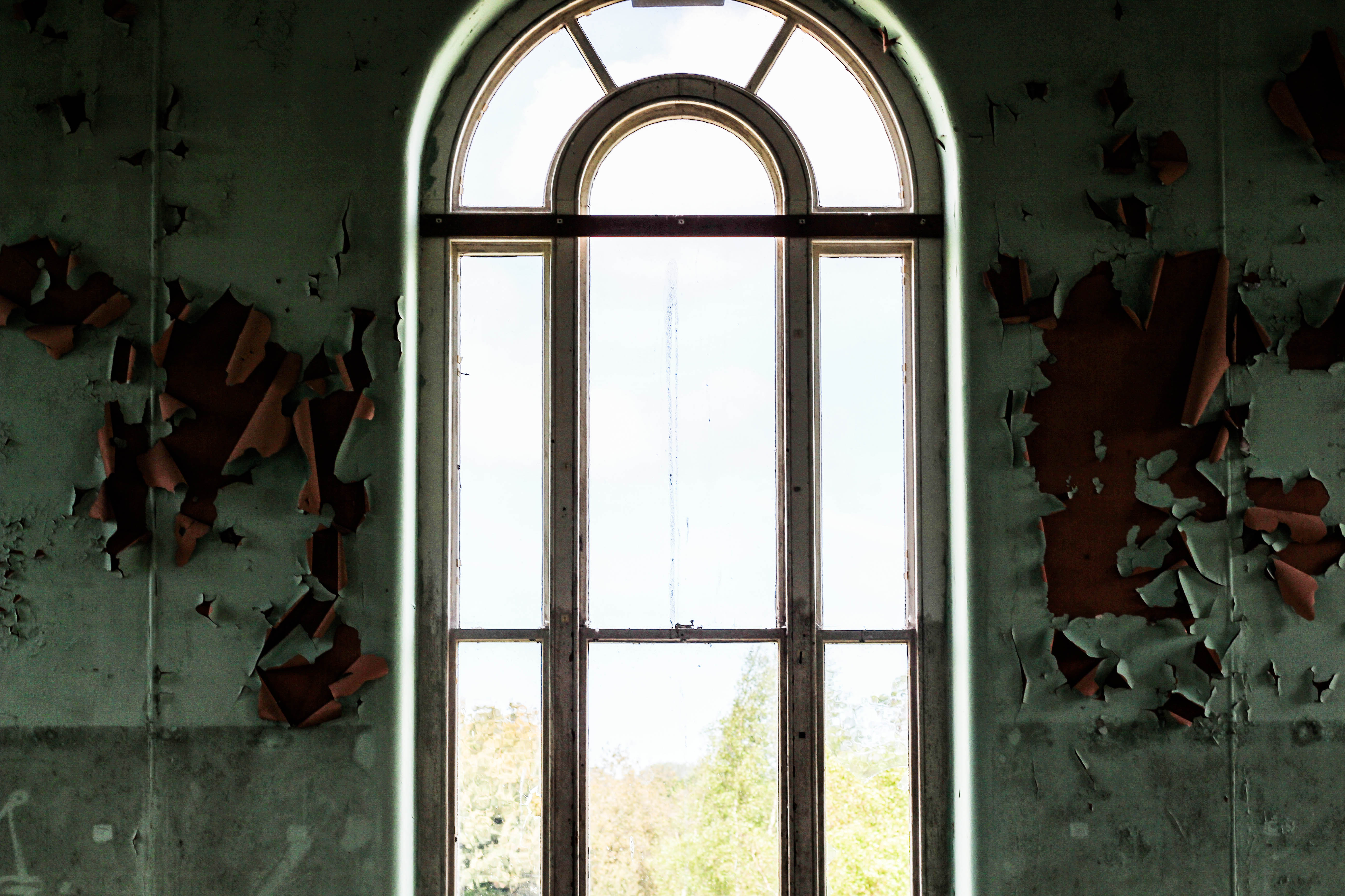 What I liked about this image was the symmetry of the overall piece. This was down to how the green walls contrasted the ripping and tearing of the paint, and alongside with the window casting a bright light in the middle really emphasized this. I found that the clarity in the image really defined the detail of the ripped paint, along with a relatively low exposure really balanced the photo as not to be too overpowered by the window. I used this image as it really related to the idea of conventions and the hidden story of what happened in the room, due to it not being common to see this in homes.
  The reason I chose this as one of my top fives was because it is a typical scene associated with abandoned areas, rubbish on the floor, dirty walls, and a generally creepy light cast onto the objects highlighting this sense of rejection. The contrast in the image creates a great focus point within the center of the piece from how it makes a dark border, boxing what I intend for the viewer to mainly look at in the middle. The cracks and overall dark tones of the picture really emphasize a lack of human activity, as can be seen through dark shadows cast on nearly everything. This relates to conventions from how the bathroom is not being used for its original design and rather has been left to rot.
 What I loved about this image was overall the clarity, this really defined the individual pattern of the curtain, removing your attention from the rest of the picture which is surrounded by darkness. This contrast created by the black border on either side really shrouds the image in mystery from how it makes you wonder where it was taken, what the room is used for etc. The slight highlights of red and orange either side of the light source adds more depth to the picture as it removes certain aspects of the overall really dull colour scheme.
FINAL IMAGE:
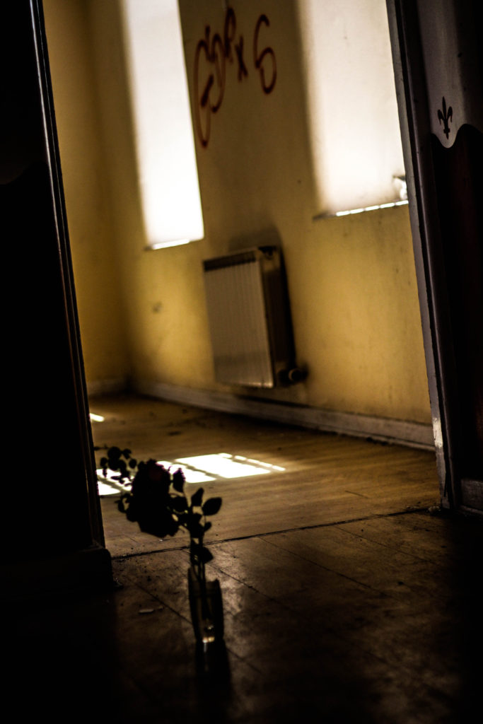 The reason I chose this image as the final piece was due to the depth of field and composition of it overall. I found that the depth of field allowed for the silhouette of the actual flower to pop out more due to any sharp details being removed as a distraction, it also created more emphasis on the dirt in the doorway and how it looks neglected with background graffiti backing this. The dark border that envelops the piece in my opinion ties the image together from how it draws specific attention once again to the flower, doorway and backdrop, and allows a smooth transition for the light to emerge from. It relation to the topic of secrets, codes and conventions I found that the flower adds mystery the image, creating thoughts of why is it there etc. This it also helped through the dirty walls illuminated by the windows creating an unnaturally quiet feeling as a room is not conventionally seen in this state and so removes all elements of comfort that usually would be present at home.

 After looking over these ideas, I decided on presenting all of my shoots in selections of three, each three images would be presented in descending size order on a black or white foam board. The biggest image would be the picture I thought was the most successful from that specific shoot, with the other two being close runners-up. If done on black card I would include a white border to add emphasis and bring out the piece to make it more aesthetically pleasing to the eye. To do this I would need to firstly use Photoshop to gather frames and edit them into this order, whilst imposing my pictures into each one. These are the outcomes:
 This is a diagram of the general layout of how I wish to stack the white and black card on top of each other to create a white border around the image as seen below, I am also going to experiment with a variety of different coloured backgrounds to see which presentation I liked overall:


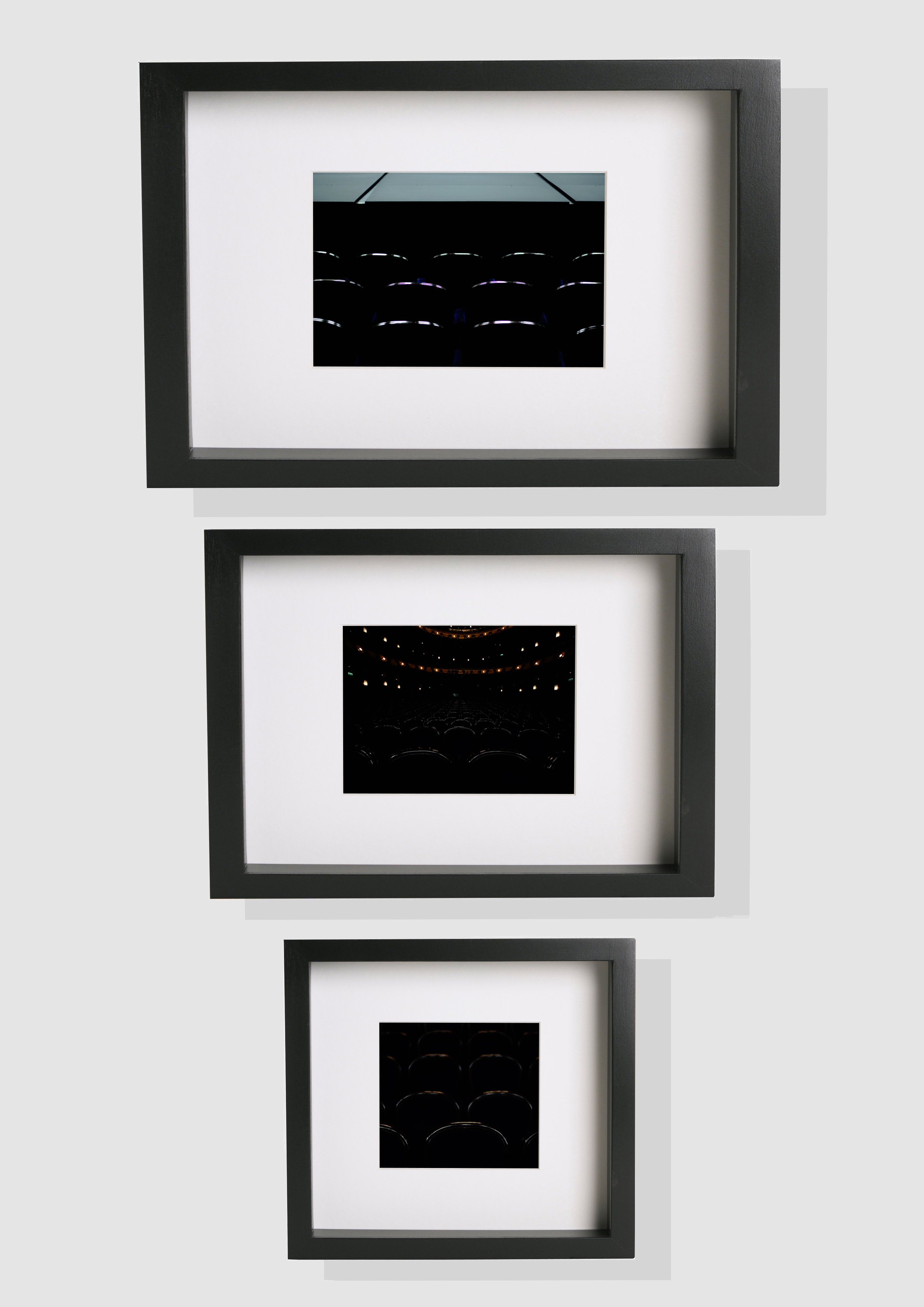 In the end I settled on using a white backdrop because I think it contrasted best with my mainly dark images, allow them to be more the center of focus. When stitching the images to the frames I found that keeping the images in descending order with the worst image as the smallest was the most effective method to use, this enabled the main focus point to be the best image and the worst the least. For the biggest image I will print that in A3 size, with the other two in A4 and A5, these sizes are the best for me to frame them in the desired style.


 One of his images I decided to analyze was ‘Sitting in a church’, I chose this because of its relevance to the topic of chairs that most of my shoots have within them.
  Technical: Within the image Robroek uses a low exposure to capture a contrast between the lights and darks illuminated through the windows of the chapel. The idea of abandonment is portrayed drastically by how Robroek has used people covered in old blankets to bring together the time when the church was and wasn’t used by people, this as a result creates eeriness to the piece as the hidden bodies and faces creates a haunted uneasiness to the overall picture.
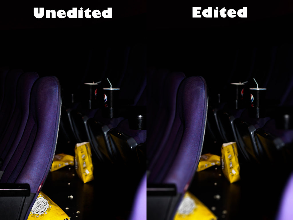
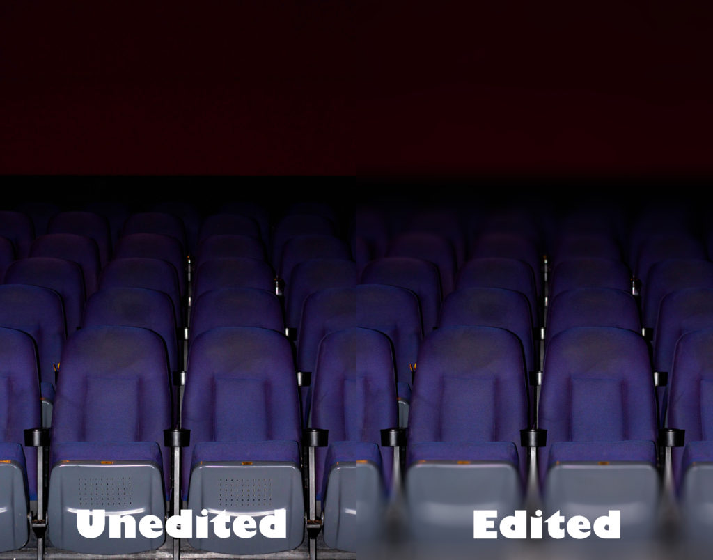
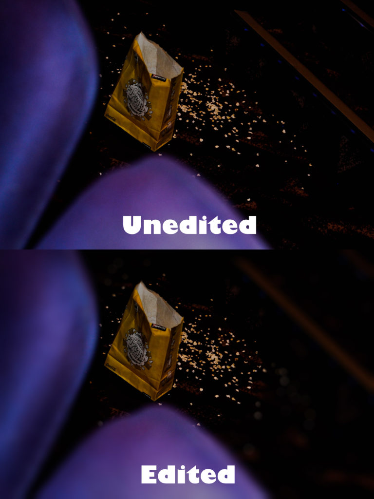
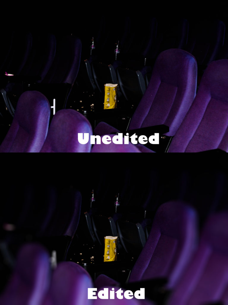 Here is my editing process for how each image was done:
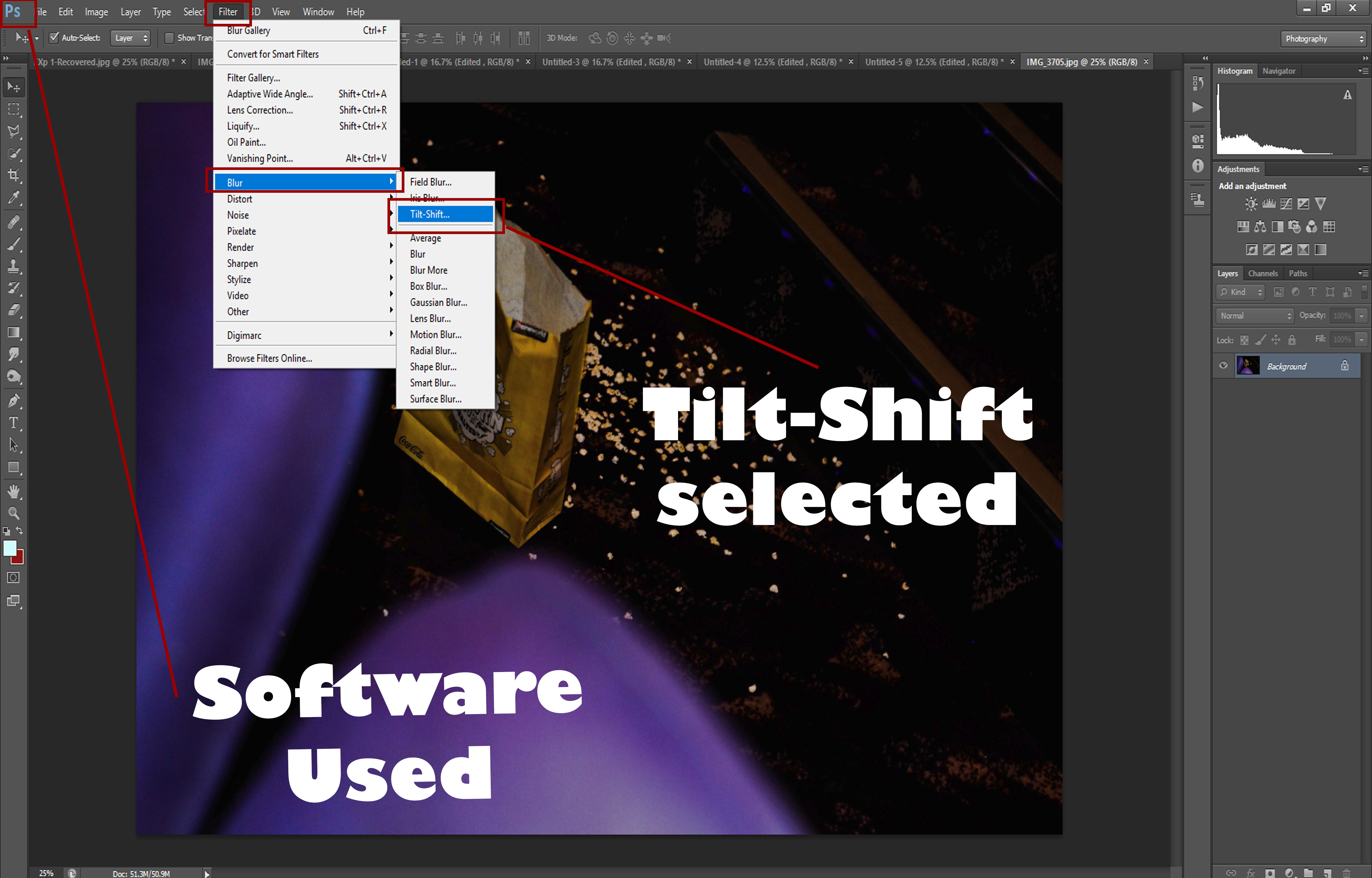
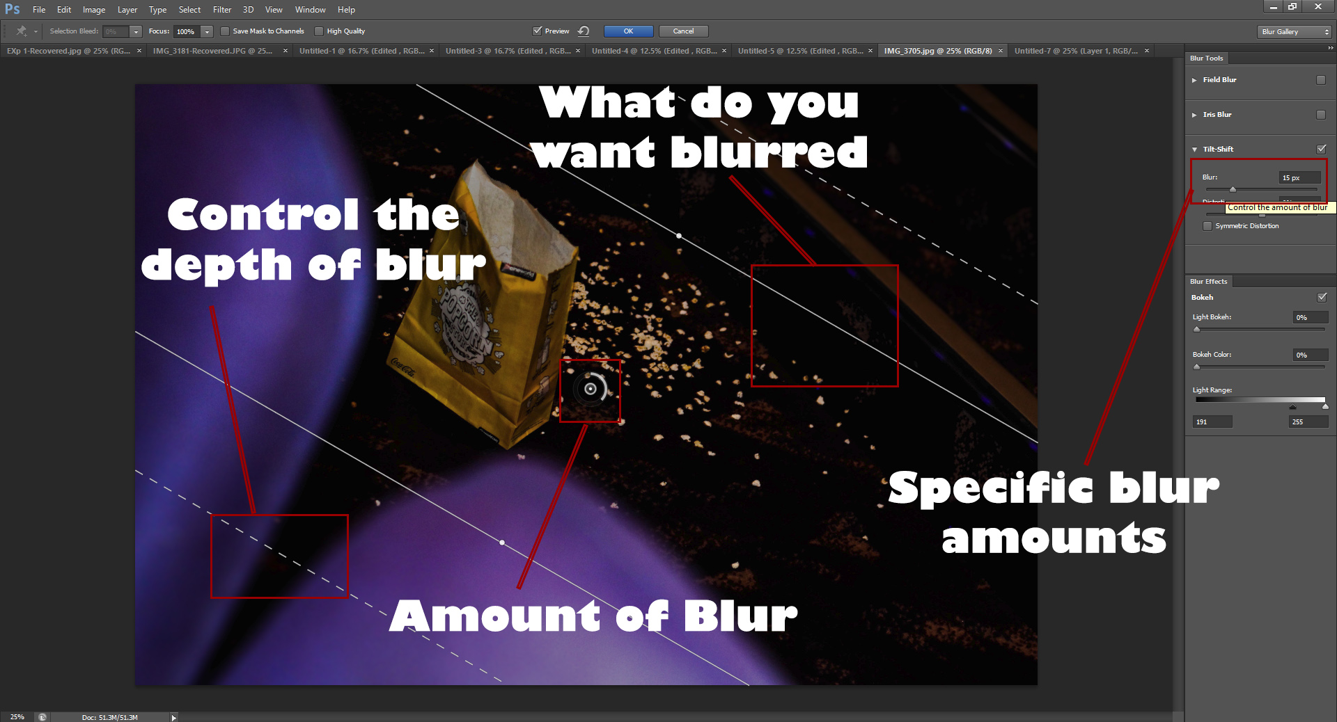 I used Photoshop because it allowed me a variety of different blurs which could be used to change the perspective of how each image would be viewed, by giving me more choice it really allowed me to try with different method to find what I wanted. By controlling the depth of blur and what I wanted blurred, it gave me full control over everything as it made it possible to pin-point certain details in the image I wanted to remove or be unnoticed, whilst giving me the outcome desired.
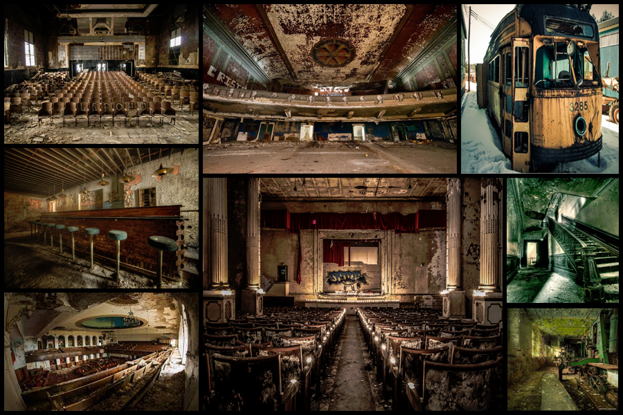 Once researching some of his work to draw inspiration from I decided I would make a mind-map from various ideas I had for the shoot, this would include things like angles, lighting and what to take. By doing this it would reduce the time needed on the shoot as I would know specifically what to do when there and how to take the images needed. Here are my drafted ideas for the shoot:
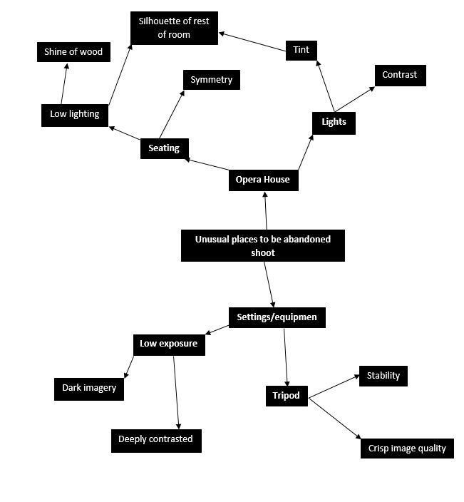 After I had completed my mind-map I thought it would appropriate to go ahead with the actual shoot itself whilst taking into consideration the ideas I had planned in advance. For the shoot I had gotten access to the abandoned opera house in town, these were my results:
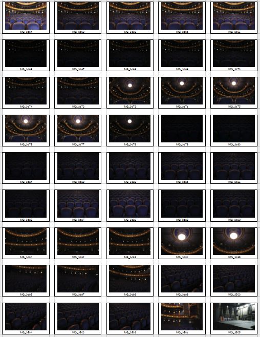
 After this was done I started to whittle down the shoot to a top ten images, by doing this it would enable me to more easily find the overall best image of the shoot with in the process taking into consideration the aspects of each image that made it effective and how it could be related to the theme of secret, codes and conventions. These were my choices for my top ten best images of the shoot:
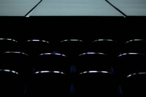
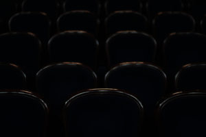
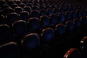
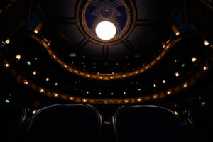
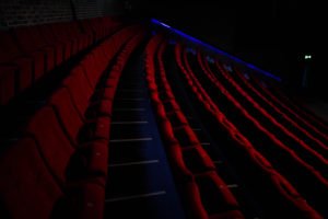
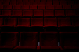
 I chose this image because of how I really think it emphasized the ghostly effect created by the use empty seats. This is because of how the area it not usually seen without human interaction, and to see it devoid of anyone makes it feel unnaturally deserted, this is great for linking it to the topic of conventions as it’s not a place usually seen in this state. I found the composition great from the use of symmetry which I found particularly effective as it makes the picture aesthetically pleasing to view, with the seats having the lighting reflected and a depth of field used, it seems that the seats go on forever as if forgotten and unused. The orange lighting that surrounds the seats creates an even more ghostly effect from how it breaks the otherwise bland selection of colours present in the image.
  What I liked about this image was the use of a depth of field and the contrast of the shine on each seat. The use of a depth of field creates a sort of gradient that fades the lights away into the almost deserted distance, this is linked to conventions from how seats are usually linked to people sitting, and to see them abandoned in such a large-scale seems uncanny due to not usually perceived like this. The use of contrast between the lights of the shine on the chair and the darkness I found effective from how they provide enough light to define the objects but enough to make each chair into a silhouette.
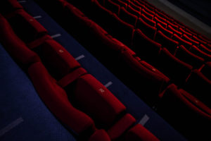
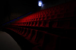
 I loved how in this image there was a really clear contrast between the lightness of the stage and the darkness of the seats only defined by the shine on the wood. By doing this and through the use of symmetry I found it to be very aesthetically pleasing from how it the stage breaks the pattern that otherwise would only consist of dark chairs. The shine created from the chairs brings the image together from how it stops the stage from being too dominant in the picture and overpowering the rest of the image, this is helped by the black space between the stage and the chairs which stop the two different contrasts from colliding and ruining the symmetry and pattern. The image also reflects a ghost audience that is no longer there due everyone being long gone, thus creates an eerie effect of abandonment of the unusual.
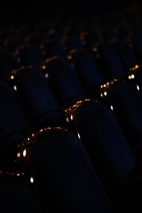
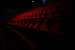
 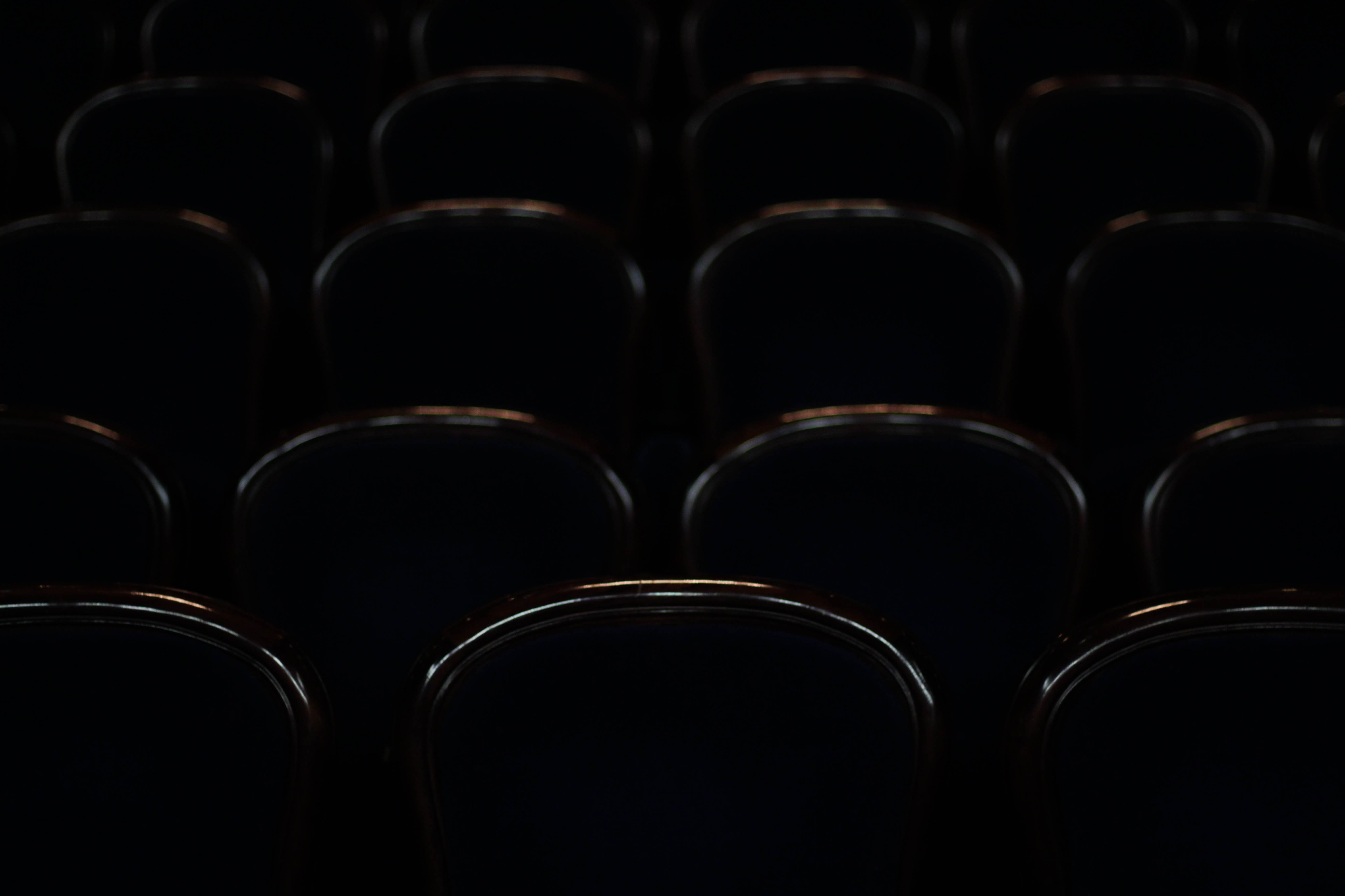 I chose this image purely because of the silhouettes and defined shine created by each of the chairs, this in my opinion combined with symmetry allows for an aesthetically pleasing result that is balances the darks with the top of each chair. This could be linked to conventions by how you could say each chair represents a former shell of what they use to be used for creating an atmosphere of desertion. The sheer darkness between each seat creates a symmetrical pattern with nothing displacing or ruining it to the eye making the piece as a result easy to look at.
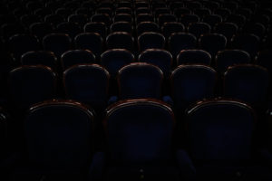
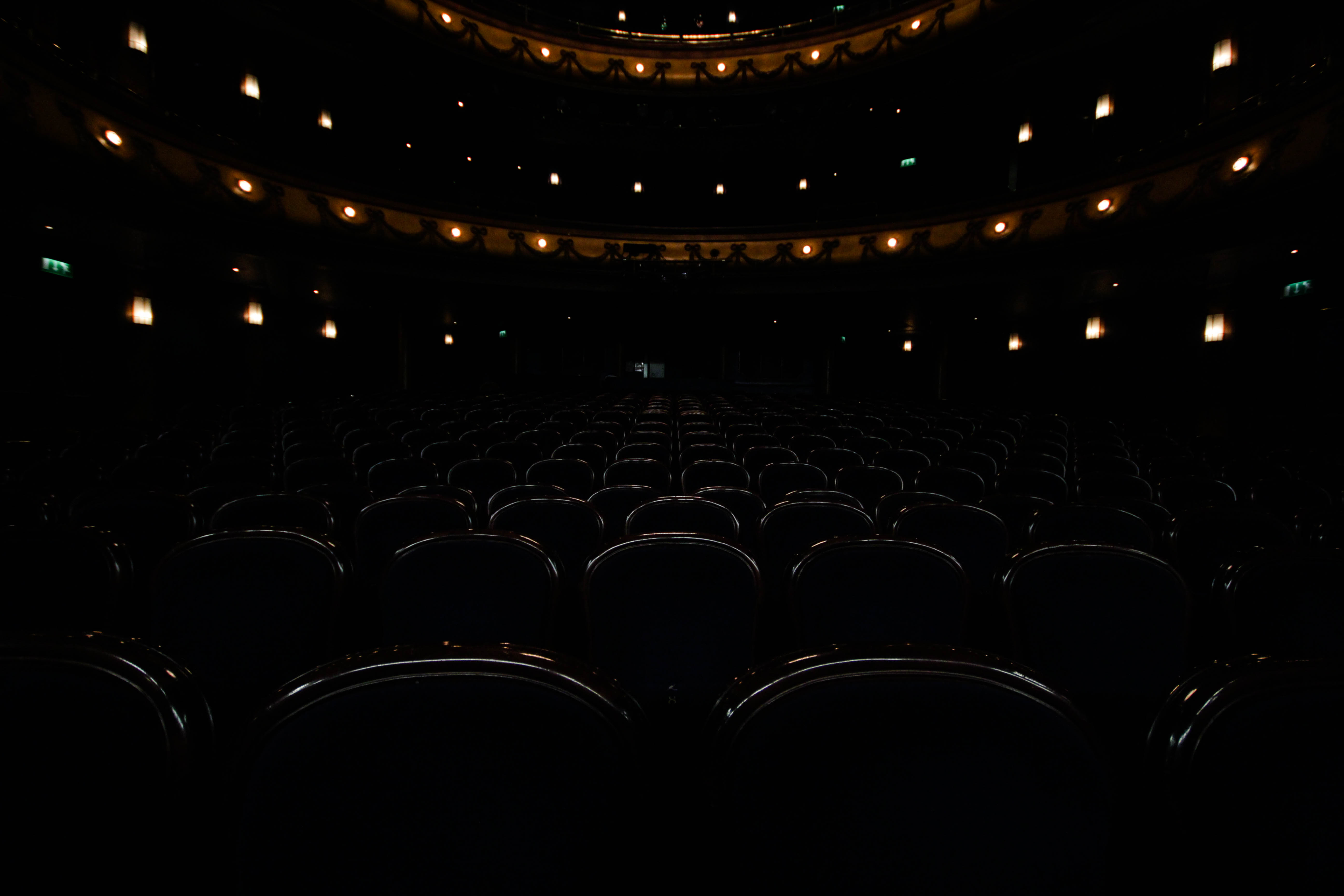
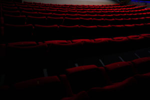
 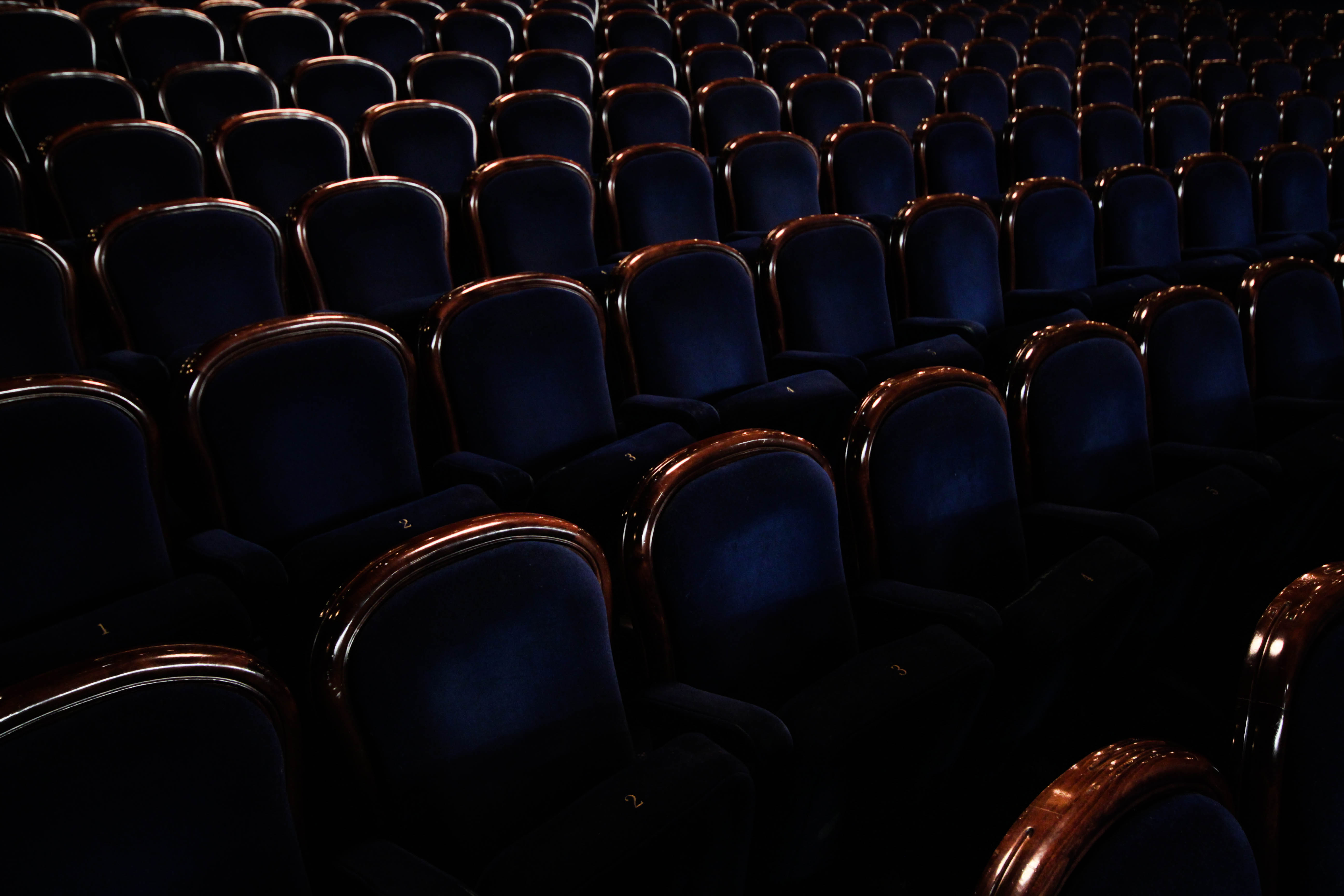 Finally the reason I chose this picture was because of angle and emphasis on abandonment from the amount of chairs present. I found that this image put particular emphasis on desertion from how the rows of chairs create an arc like formation throughout the image, with each one lacking people sitting in them. This conventionally is unusual, as seeing this amount of seats would usually indicate that people are present which is what the photo lacks. There is also a clear contrast present between the blues and browns of the seats which break up block colours to make the piece more visually appealing.
 Once looking over his images I decided I should analyze it to see what made it effective as an image, to do this I would take into consideration the technical, visual and conceptual aspects of the photo. By doing this it would enable me to direct it to my own images and how I could relate this specific style into various shoots. The photo I chose to analyze is called Silent Hill:
 Technical: The piece uses a high shutter speed to create a broad overview of everything in the theatre and capture the whole picture. Joo has used a higher exposure to capture parts of the shadows around the seats and ceiling to emphasize the sense of eeriness around the idea of abandonment, by doing this it removes much of the sense from a light-hearted area. The use of including part of the floor before the seats creates the impression of long-term abandonment due to the rubble present throughout.
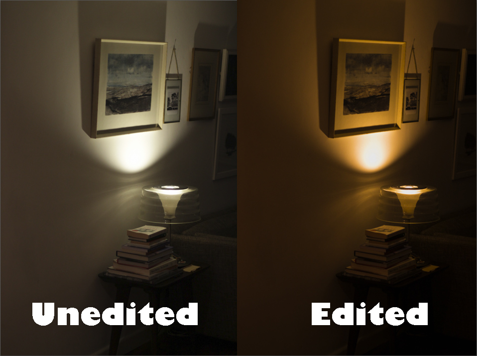

 Here is the process on how I got to the current stage in each image:
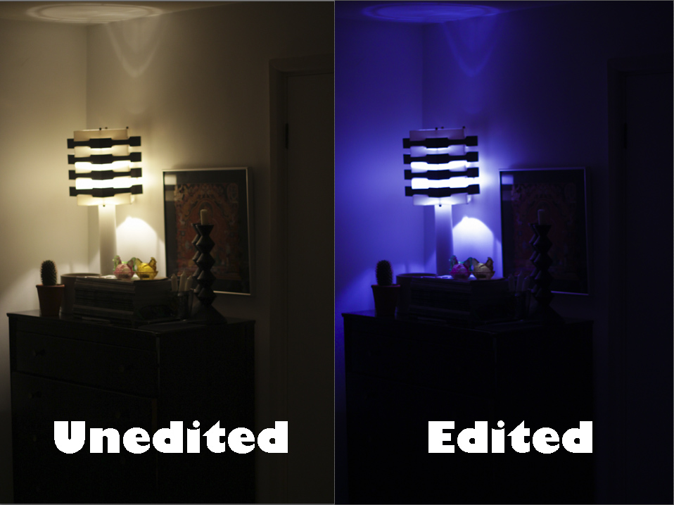
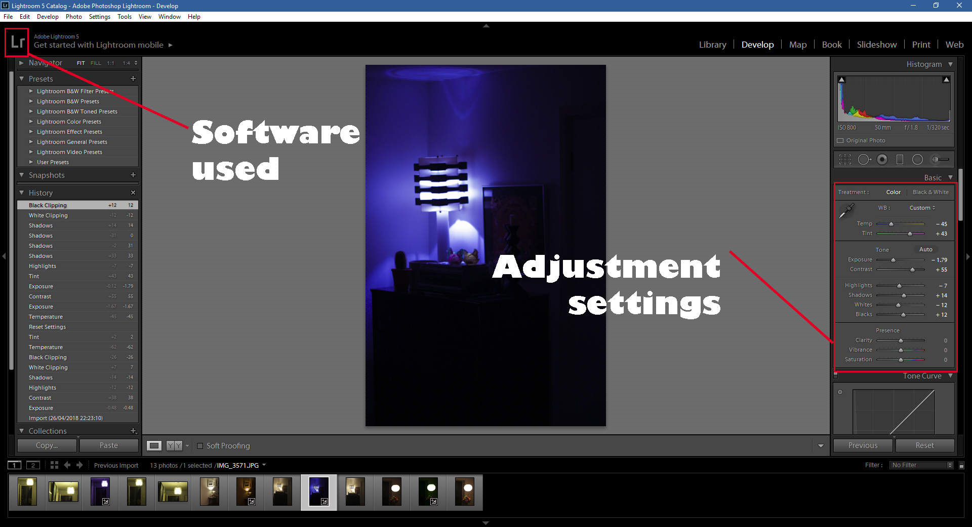 Within Lightroom I used the adjustments tab located on the right to change the saturation and exposure etc. By doing this it enabled me create more dramatic images mixed with coloured lighting to maximize the effect wanted, whilst the highlights, shadows and white effects created and took away any shadows or unnecessary parts of the lighting that ruined the image. By experimenting with this it opening photographing abandoned areas up to new techniques to fully emphasize the message I wanted to get across of conventions related around public areas and the way they are perceived.
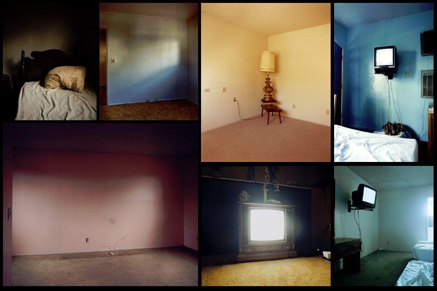 After deciding on what I wanted to focus on I made a mind-map, this would enable me to channel my ideas to specific topics that I should focus on in my shoot. This would remove all unnecessary time-wasting as it would allow me to get straight to what I wanted. Here are my ideas for the shoot:
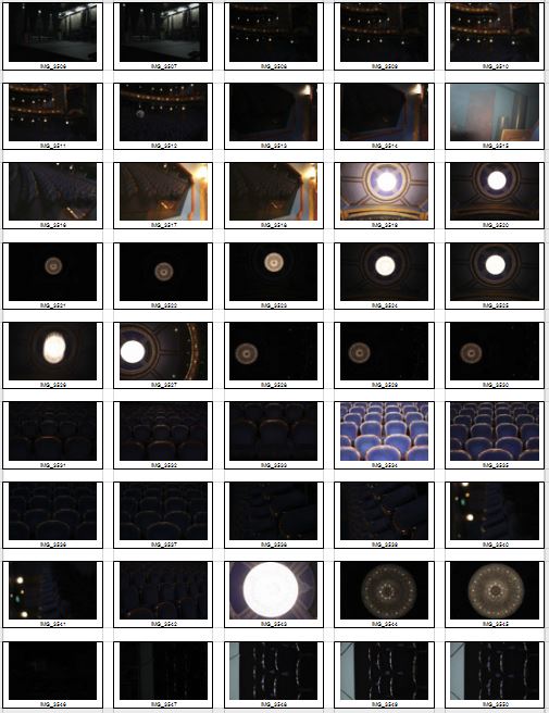
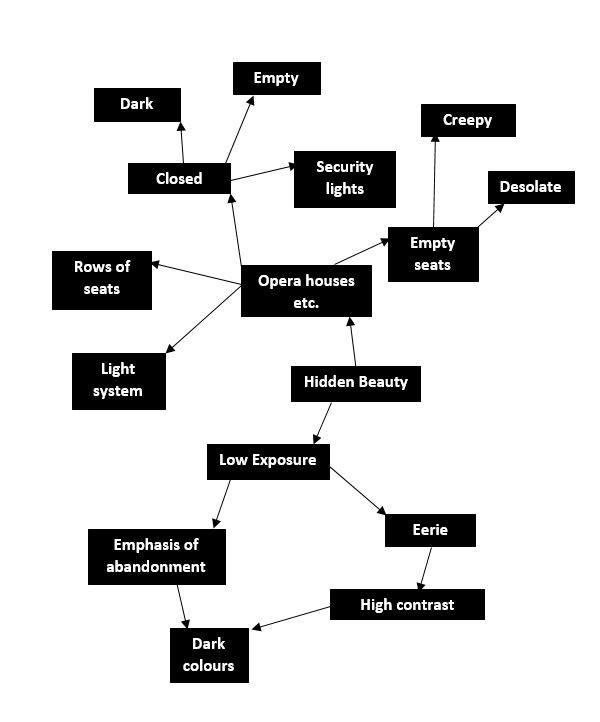 Once done I was ready to move onto the shoot itself, I had gotten access to the local theatre and was now able to know exactly what I wanted to focus on whilst there. After that I would take the image count down to a top ten photographs that I thought stood out from the rest, from there I could then take them down again to the best image of the entire shoot. Here are my results:
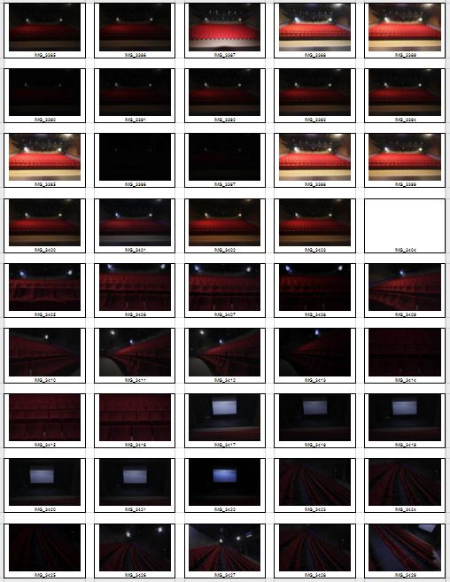
 After previewing my images I decided to pick ten images from the shoot which I could later narrow down to five and then one overall image that I think best reflected the topic of secrets, codes and conventions. By doing this process it would allow me to analyse and really think through each decision I made regarding each of the images. Here were my choices:
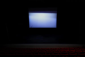
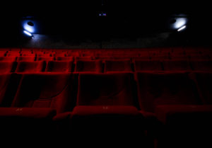

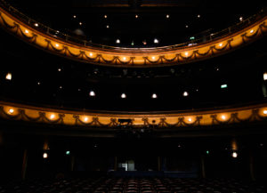
 I chose this image because of the effective use of lighting and the symmetrical composition of the piece. I found that the more dominant light created an orange gradient that transitioned as it went across the seats, this produced an effective balance throughout the picture making it aesthetically pleasing as a result. The blue lighting the trims either side of the seats disrupts the other wise dominant use of red, but at the same time does not overpower or look out-of-place compared to everything else, I really liked this from how it added other elements into the picture creating greater contrast. The symmetrical composition adds to the aesthetics of the image with the two lights being focus point of the piece since they highlight the seats and are the first things the viewer looks at. This allows this idea of abandonment to be emphasized from how the gradient and lighting adds eeriness as it is meant to resemble an area that is currently unused by any human presence.
 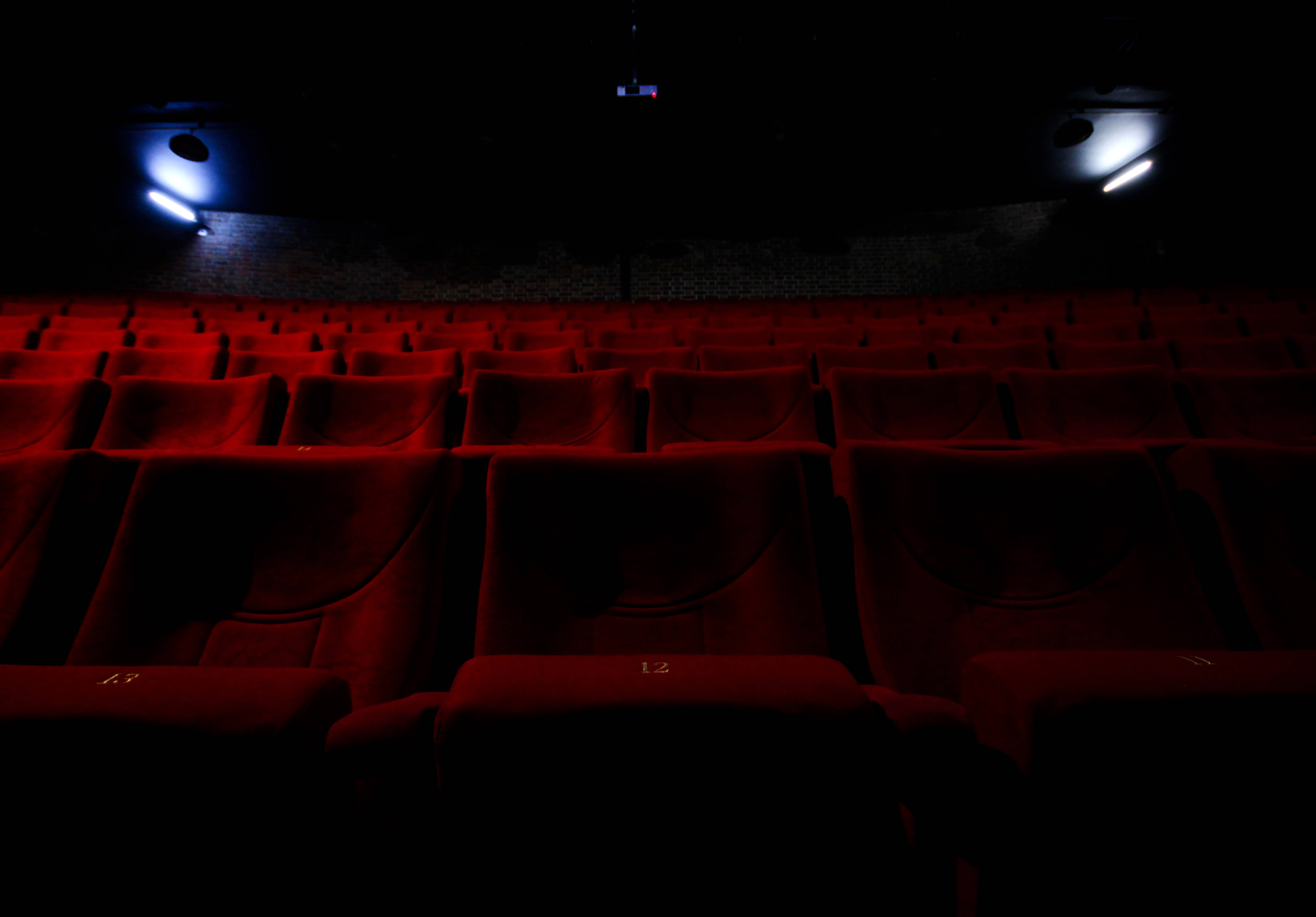 What I loved about this image was the use of a depth of field contrasted by the use of light. Because of this it divides the image into two sections, a light and a dark, with as a result contrasts the darkness of the ceiling and the two lights either side of the picture. The depth of field emphasizes the idea of abandonment through how the seats seems to go endlessly back but contain an absence of people, this fits into the category of conventions as it highlights a should be full area that is now unused and left behind until taken notice of.
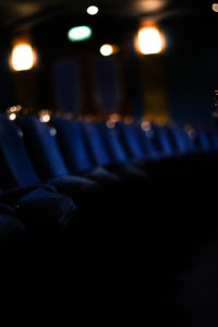
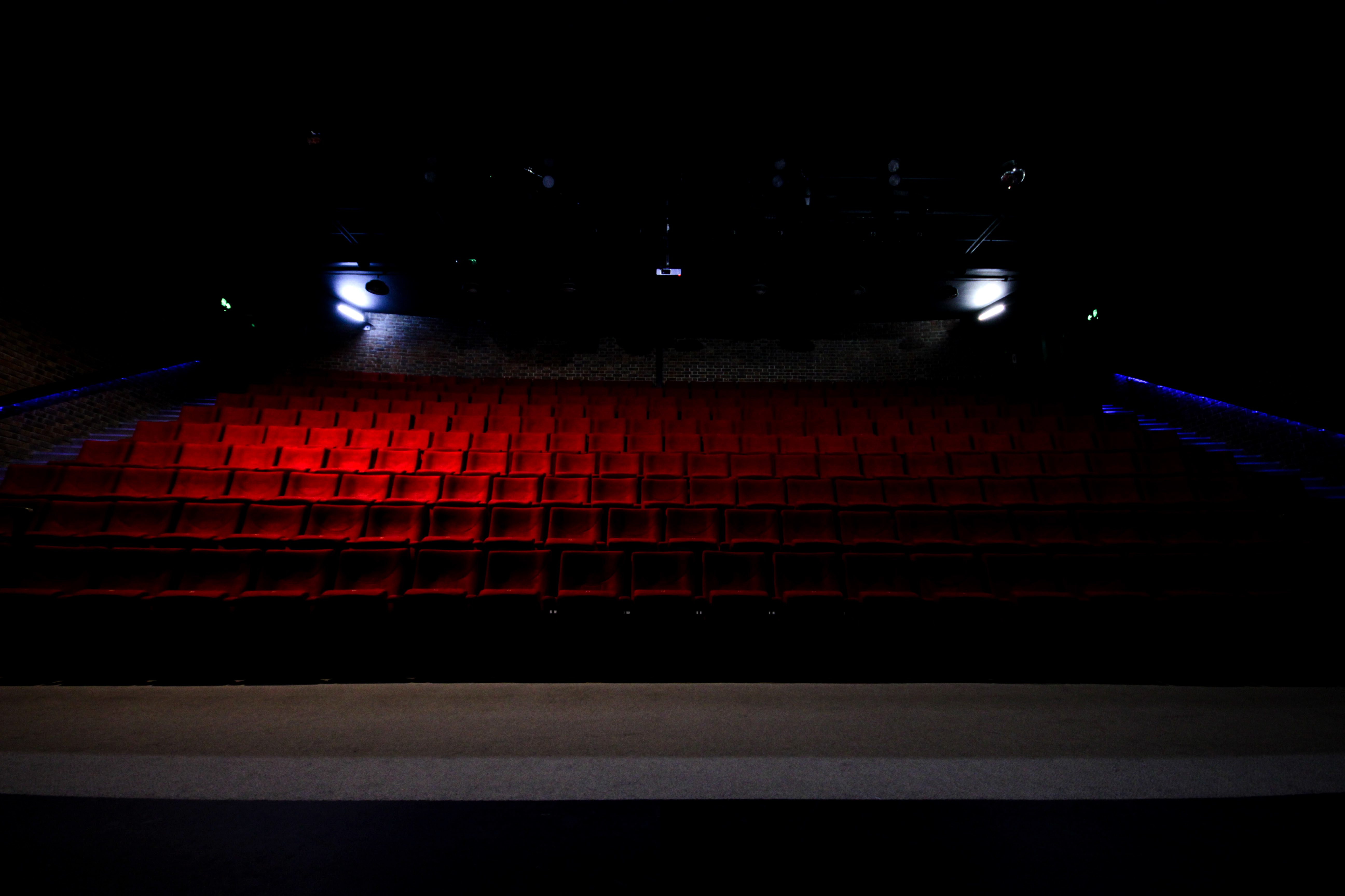
 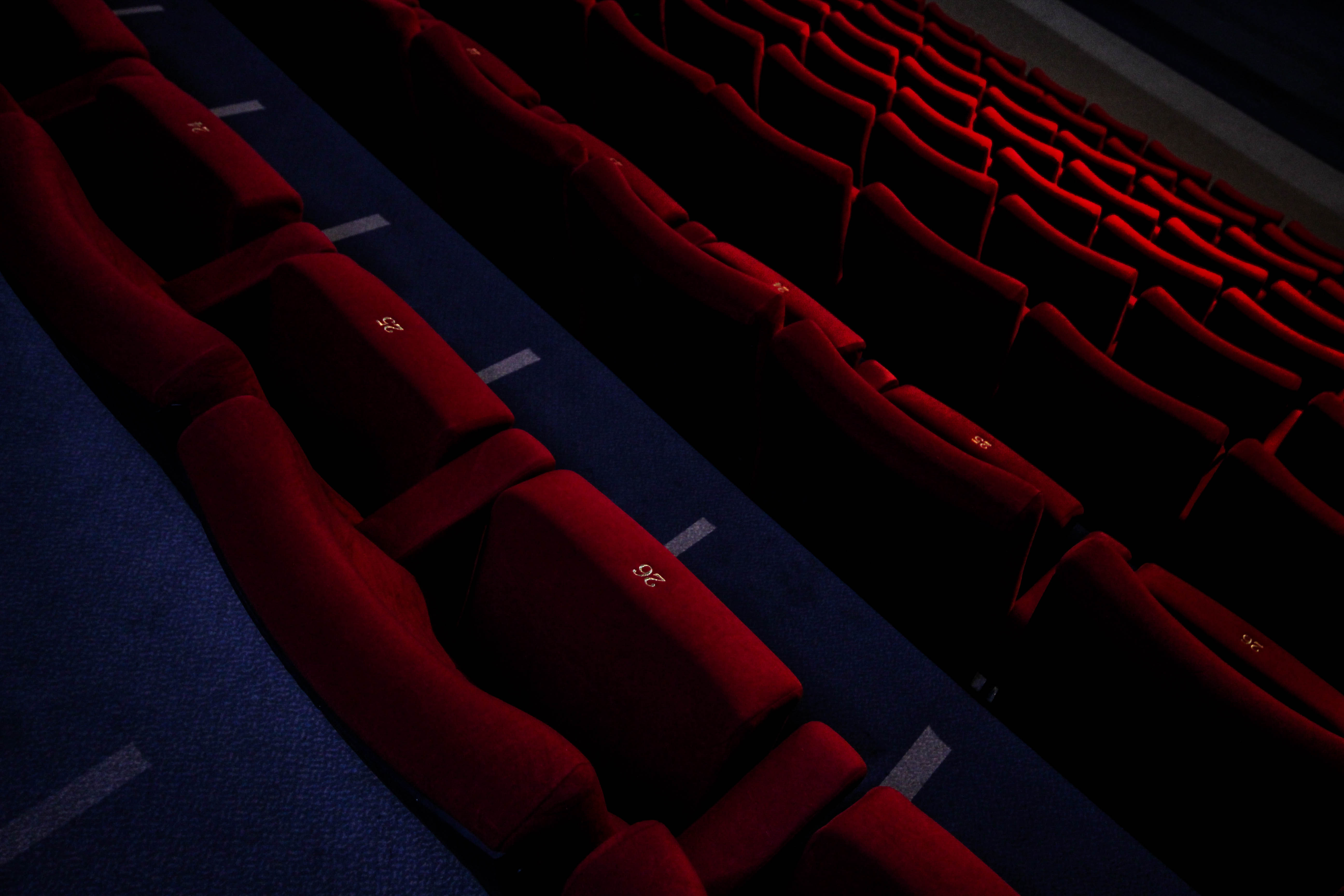 In this picture I found the composition to be most effective due to the angle at which it was taken at. The slant which the image was taken creates a broadened sense of desertion seen through a depth of field that blurs out the bottom rows, this makes the image seemingly unsettling from how the area should contain people, but instead lacks it. However the use of a highlight produced by the overhead lights breaks the dull red colour range of the image adding oranges into the mix by breaking the otherwise purely dark colours.
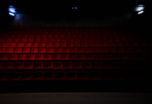
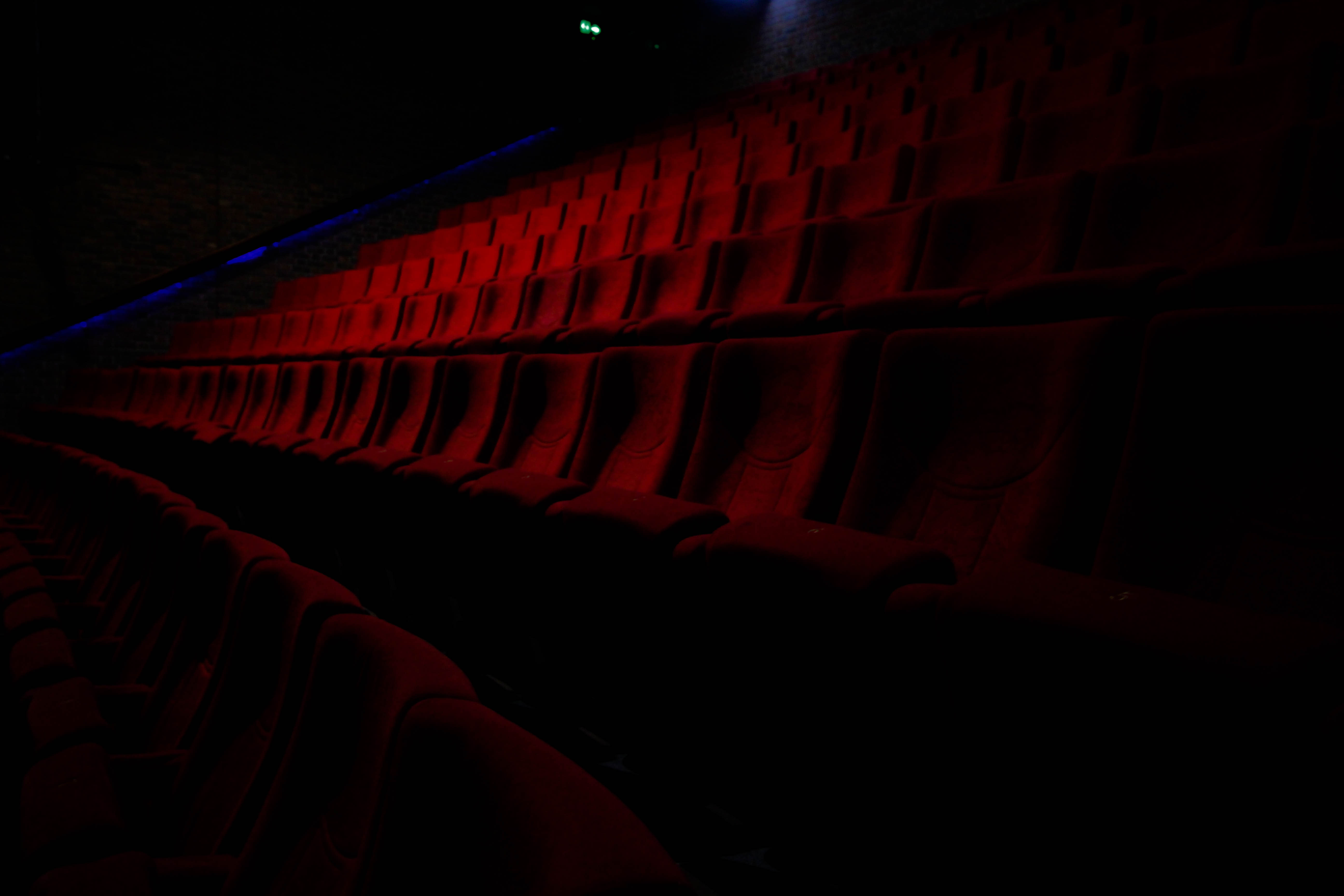 I found that the depth of field in contrast to the dark colours of the rest of the image produced a nice gradient breaking the otherwise bland colour scheme as a result. The faint use of blue streaks used in the far distance of the picture add other elements into the picture when looked at closer, this is also provided the dark border of the image which the chairs seemingly fade into existence from, creating the impression that the place is now deserted and is also forgotten (seen from the hazy darkness).
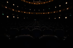
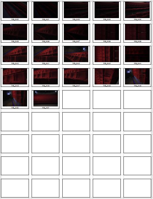
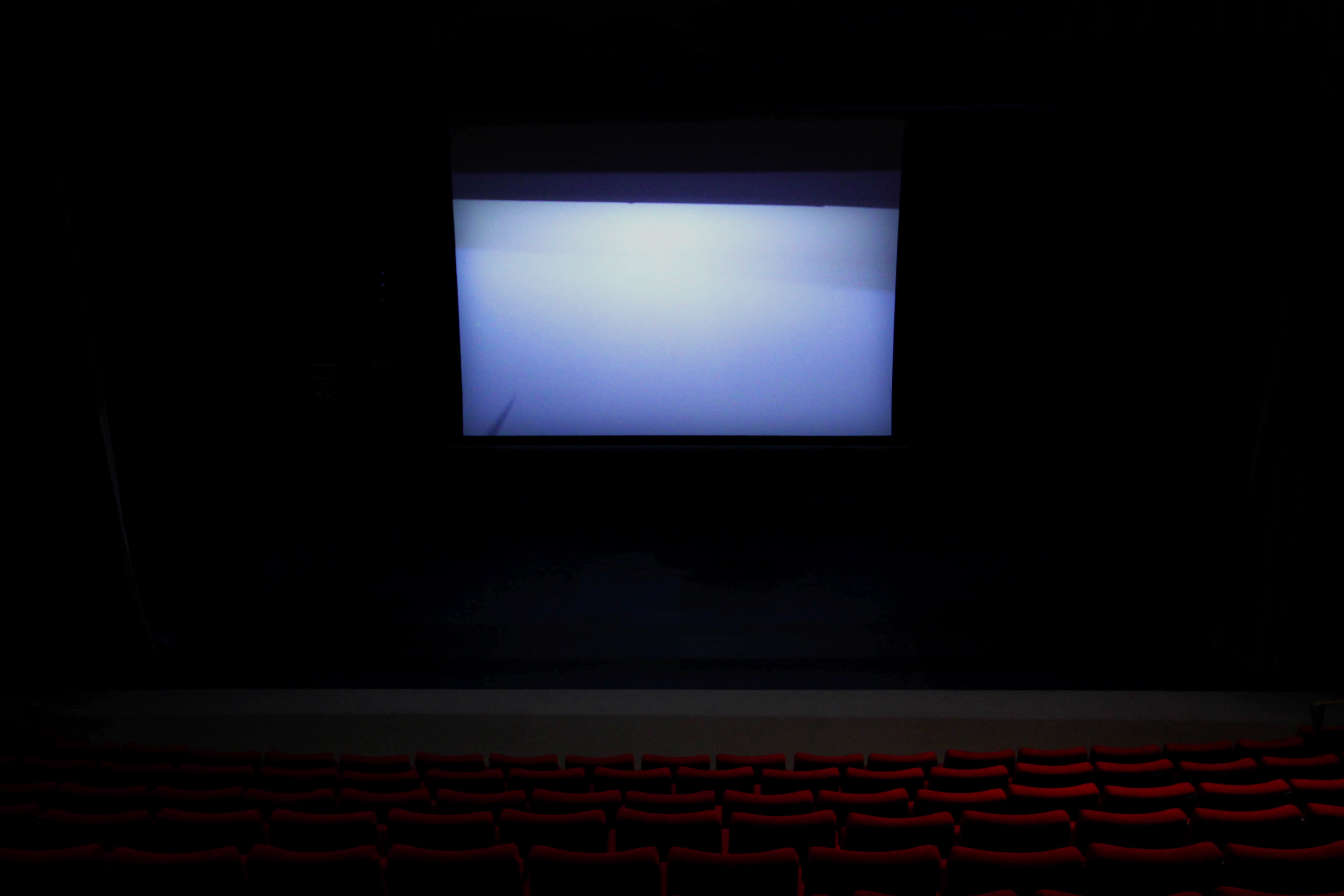 Finally I chose this image due to the overwhelming use of the white screen projecting a ghostly light onto the seats facing it. I found that this produced an almost mesmerizing effect, whilst creating the result of the seats fading into darkness as they went further left to the photo. As a result I found that this created the impression of minimal human influence over the area hence the ghost like product from the contrast.
 After looking over his style and influences I decided I should analyze one of his pictures to find what made it so effective as a piece, to do this I would look at the technical aspects etc to determine what made it the way it was.
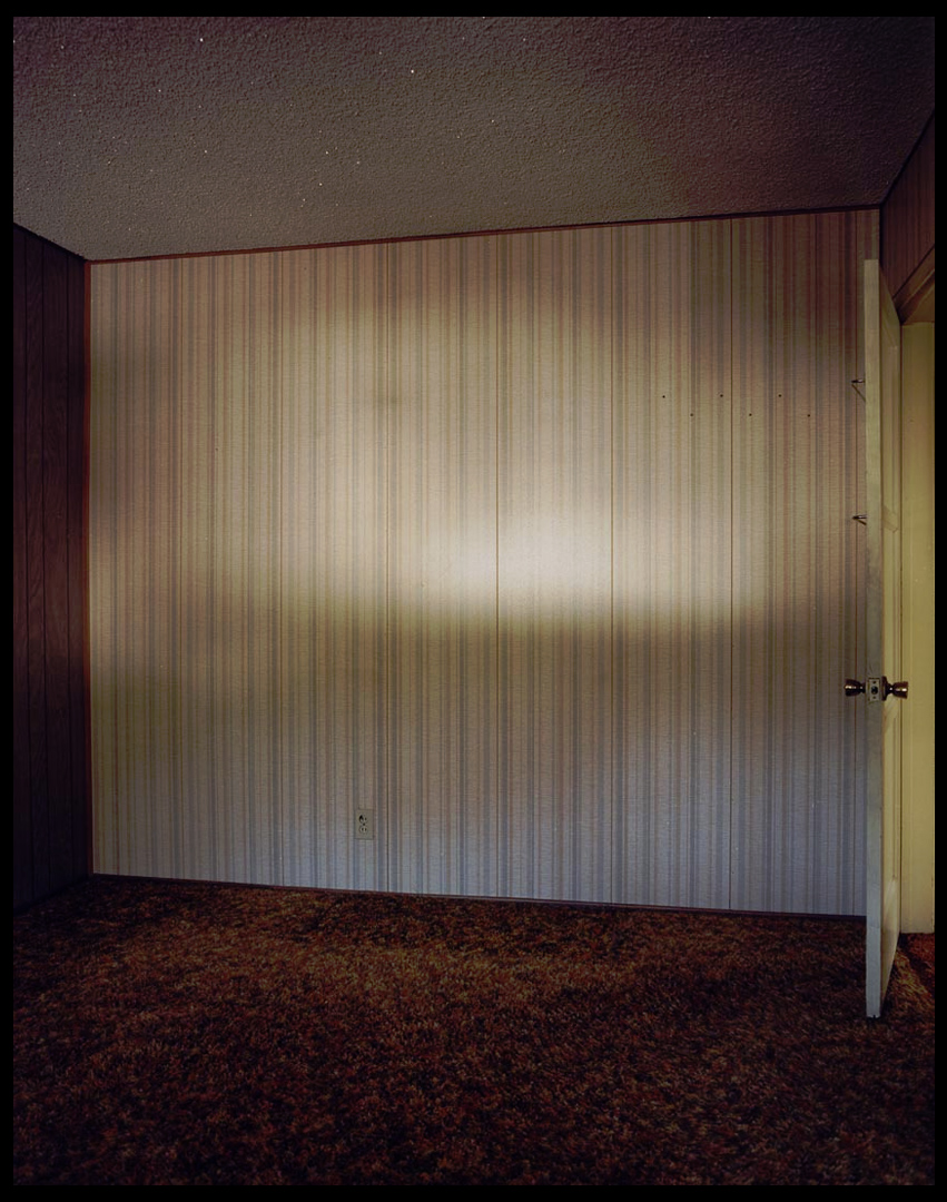 Technical: The images makes use of the little available to the room creating a gradient along the wall, this emphasizes the shadows and dark coloured floor and walls, creating an almost eerie effect to the room itself. The use of a half opened door breaks the otherwise dull looking room by adding some yellows into the picture, to a viewer this creates an aesthetically pleasing result from that disruption of pattern. A low exposure can be seen being used from how the contrast between the lights and darker areas almost pop out at you due to the emphasis of colour.
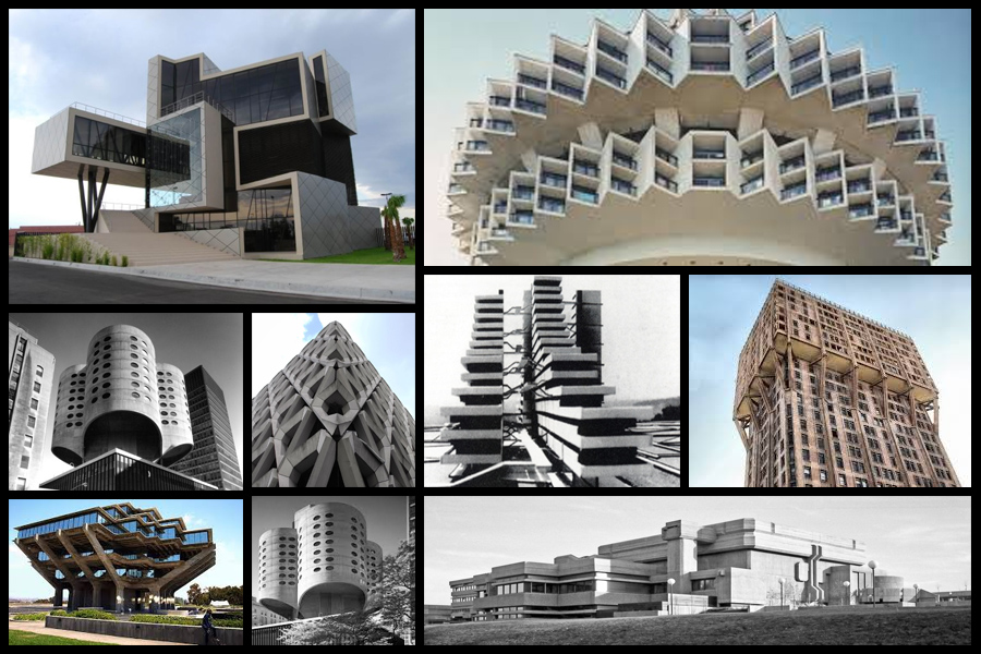 Once looking over the images I decided to analyse one of them to identify common features or styles that each possesses.
 When looking at the style of architecture I found that all the buildings were based on a geometrical structured design, by doing this the outcome would look artificial and almost surreal to images and passers-by due to how these houses and offices would not match the environment surrounding them. Each building was made to look displaced and abstract, whilst many incorporated nature into the designs. Symmetry, pattern and randomness I found was the most common influence over the structures, due to how it gave the place an aesthetically pleasing look. As a result to this many viewed this style of architecture as a form of art.