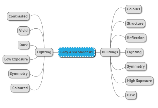
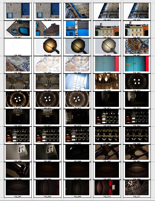
A week after my previous grey area shoot, I decided to revisit the area in order to develop certain areas in my photos whilst exploring varying styles I thought were effective. Once again I would need to create a mind-map as a basis for my ideas and designs, providing an insight into how my ideas and composure should look and present itself: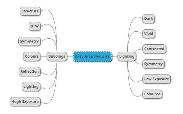 Once this was completed I then went ahead with the actual shoot, keeping in mind the areas of focus I intended to be centered around whilst trying to explore new areas and re-visiting the old ones, these were my outcomes:
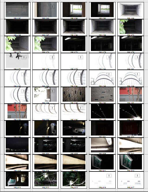
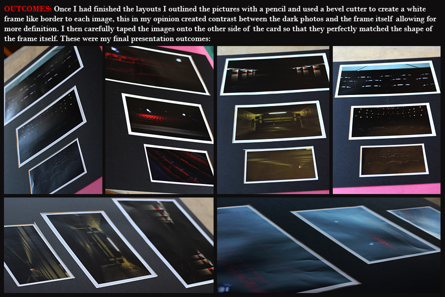
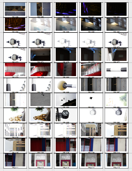
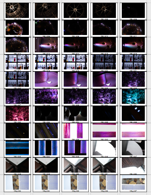
 After the shoot had finished, I went home and developed certain images I believed to be my best out of the entire batch, cutting the selection down to the ten most successful ones. By doing this it would allow me to identify and progress in my analytical response towards the descriptions and methods used in various images. To do this I would have to see how the images selected could relate to the topic of Master Plan ‘Development of Jersey’ , so that a clear message could be sent on my perspective of the direction Jersey is heading. These were the results of the top ten images I thought were the most effective from the shoot:
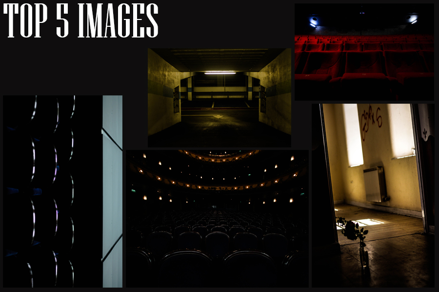
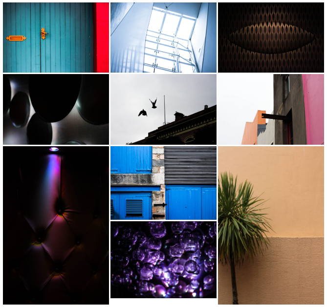
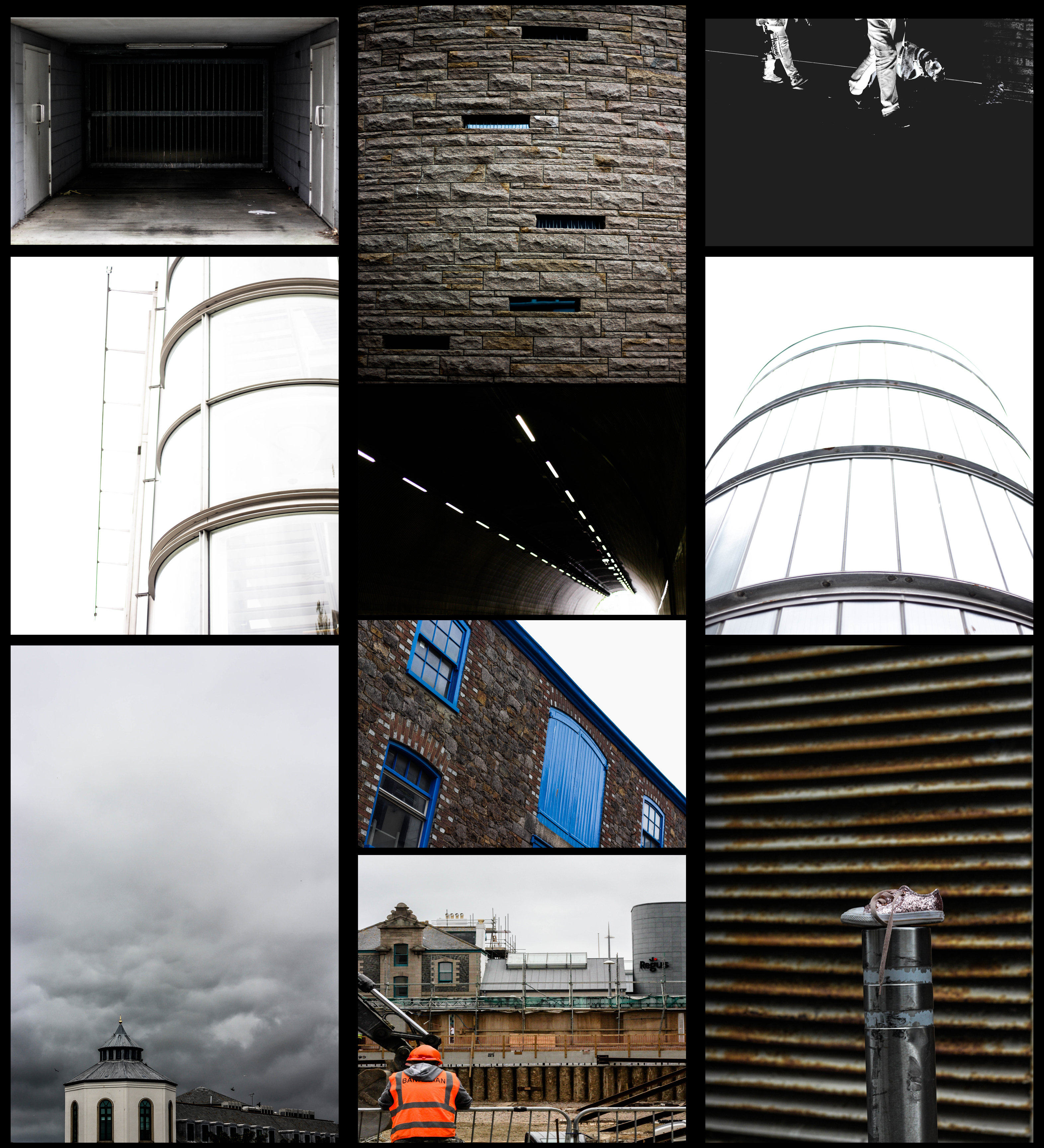 Once done I then moved onto the selection of my five best images from this mood board, when doing this I will proceed to go in-depth and analyze each image to how they could relate to the topic, and the technical and visual aspects which I found to be most effective. These were my choices:
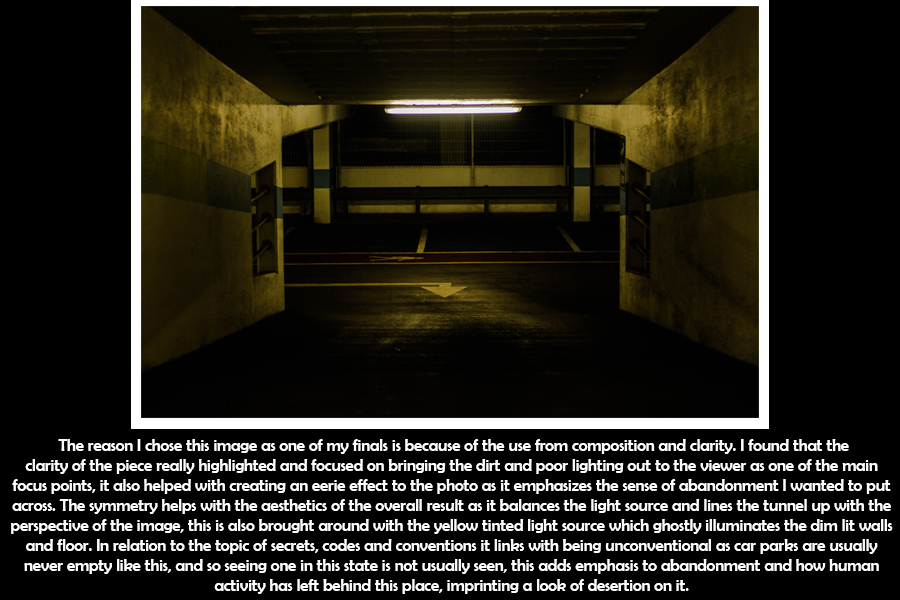
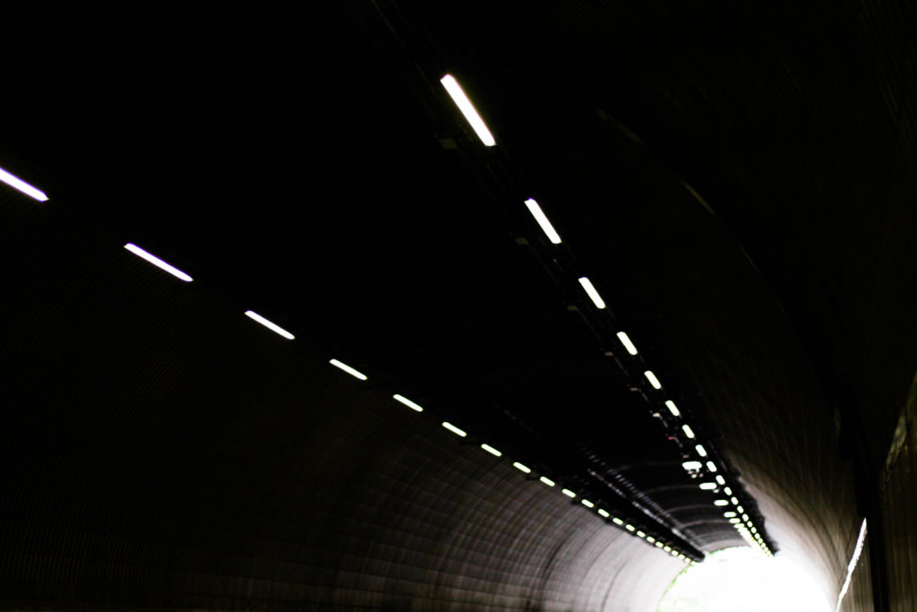 I found that within this image, contrasting shades between the light emerging into the tunnel and the dimly lit symmetrical lights produced an aesthetic result. This is done through the composition of how the lights diagonally slant across the screen filling up what otherwise would be blank space, but by doing so it creates an abstract result as the origin of the lights are hidden from the flash of white at the end of the tunnel. I found that the lack of any other colour in the picture really produced quite a stark and bare image, with the main focus being on this sort of hollow and abandoned tunnel, allowing for a sense of otherworldly representation.
 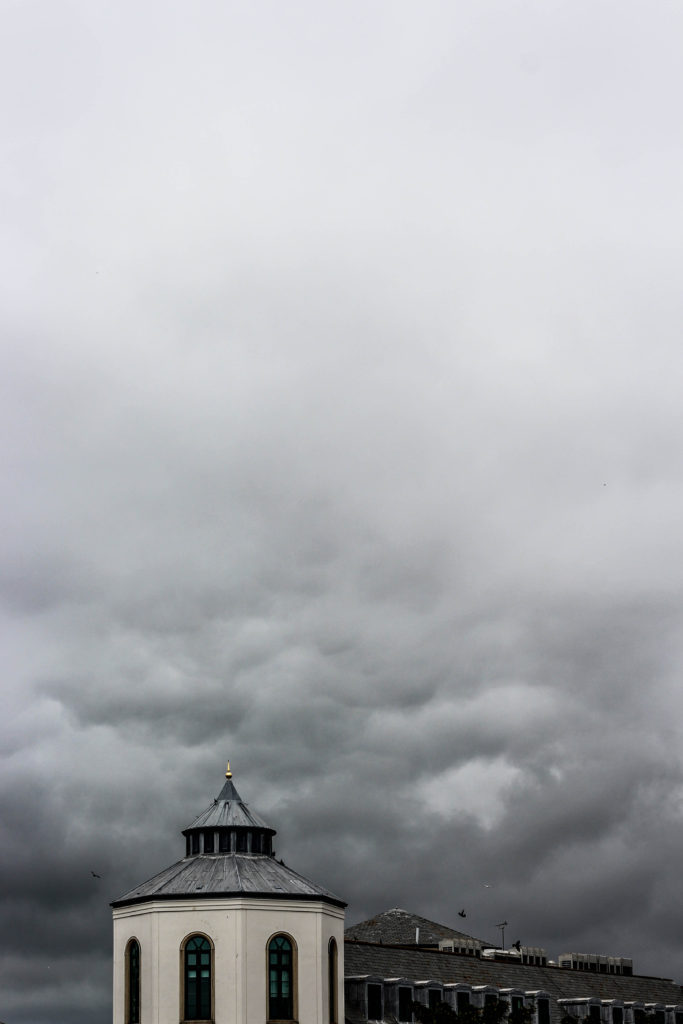 I selected this image into my top five because the clear and contrasted definition between the looming dark sky and the old building. I found this to be particularly effective because of how the gradient from the sky descending onto the building can be interpreted as a reflection regarding the design of town, where structurally, there is no real view that the town planners are heading towards, and are instead blindly fumbling into financial growth. The clarity of the clouds above seen as dark and foreboding, highlighted the sky above and the foundations of the building below, and so reduces the blank space whilst making the building itself the focal point of the picture.
 What I loved about this image was the two point perspective that the image only allowed you to view it as. Done by inverting the colours into only black and white, I found the it presented a rather abstracts but aesthetically pleasing result, with the various lines and smudges created by the white adding definition whilst making use of the black space. By making it hard to find out what is in the image I intended to force the viewer to inspect it more closely, with upon further inspection the shapes of the dog and the people can be made out, opposed to from a distance.
  The stone wall within this image, alongside the high saturation to bring out the colour can be interpreted as a reflection of the historic buildings scattered around the island. With the windows representing peeping holds from bunkers, I found that images abstract look represented well with the randomly diverse designs of buildings located in town. This to me is a criticism on how ill planned much of the development has undergone, with historical themed buildings being placed in out of placed areas. However the use of a black faded border really helped break the up repetitive symmetry that the image presented, making use of the darkness to push the brown and grey colours out.
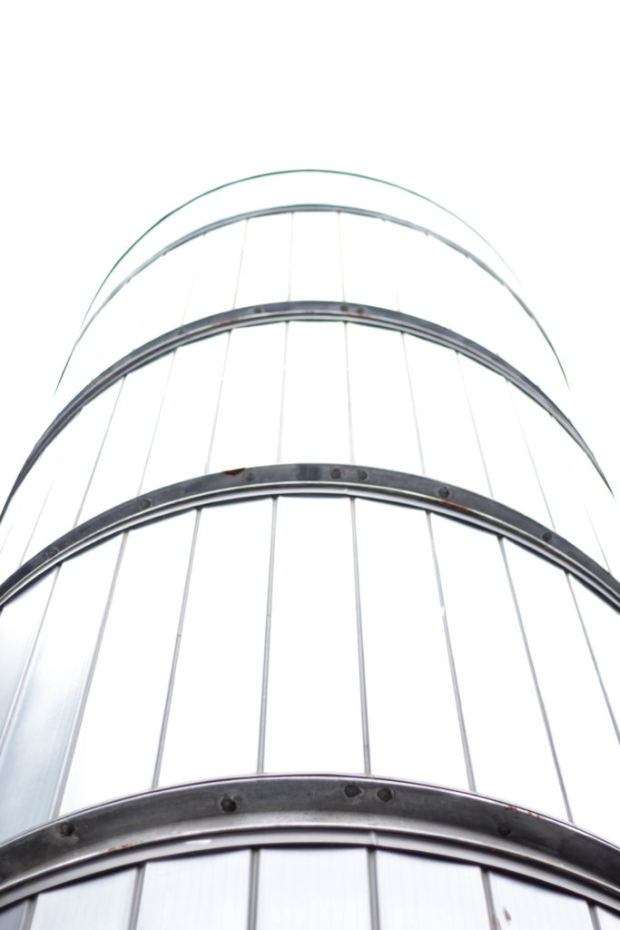 Finally this image was chosen because of the high shutter speed used to fade the design of the metallic structure into the white sky above. But doing this a clear definition has been made between the beams of the building and the glass panes between, making an abstract result in the process. This is accompanied by the symmetry of the building which fills the majority of blank space whilst making the simplicity of it pleasing to the eyes. To me this type of building commonly reflected the designs that the majority of buildings had in town, portraying them as glass castle buttresses.
After analyzing each image I decided I had enough judgement to select the best image out of the shoot that I think reflected and portrayed the aims of the shoot the best. To do this I would take into consideration the techniques within the picture and the elements that could be interpreted as representing the future of St Helier. This was my final decision for the shoot: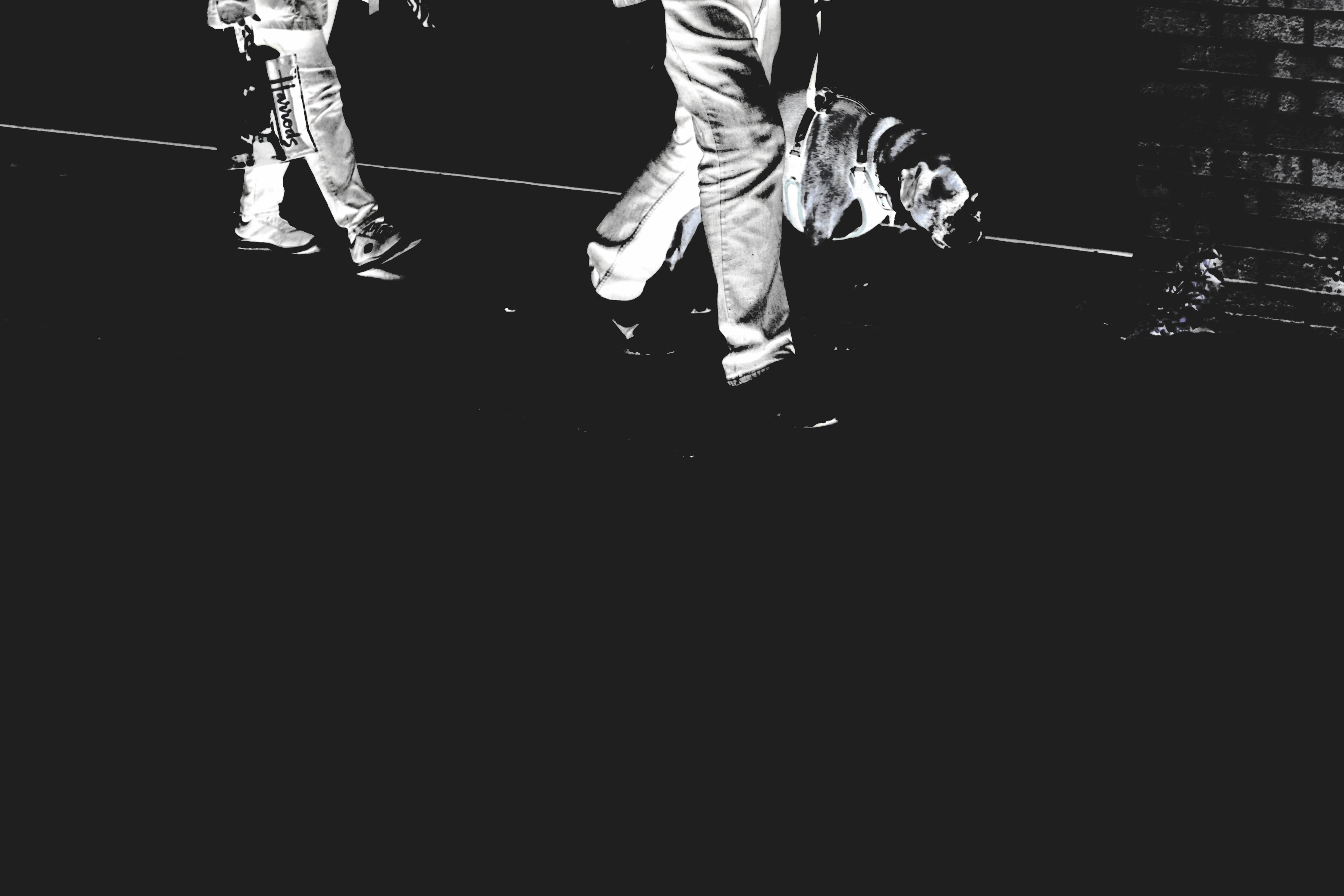 I selected this image as the overall most successful photography from the shoot because of the simplicity but effectiveness that it carried, whilst also putting across the message I wished to use when discussing the future of St Helier. Done through the use of two shades, black and white, it highlighted how the business world could be portrayed to many in Jersey, as from a distance it can be just a mix of random shapes, but upon inspection find whats actually there and how we rely on it for our islands development. The focal point of the picture to me is the dog and the man walking it, accompanied by the line symmetrically defining it, is presents an aesthetically pleasing result, alongside the darkened grey which neutralized the blank space.
 When searching through my images I tried to pick one that had a significant dominance of a specific colour, by doing this it would enable me to change certain aspects of the appearance altering the mood and presentation of it as a result.
 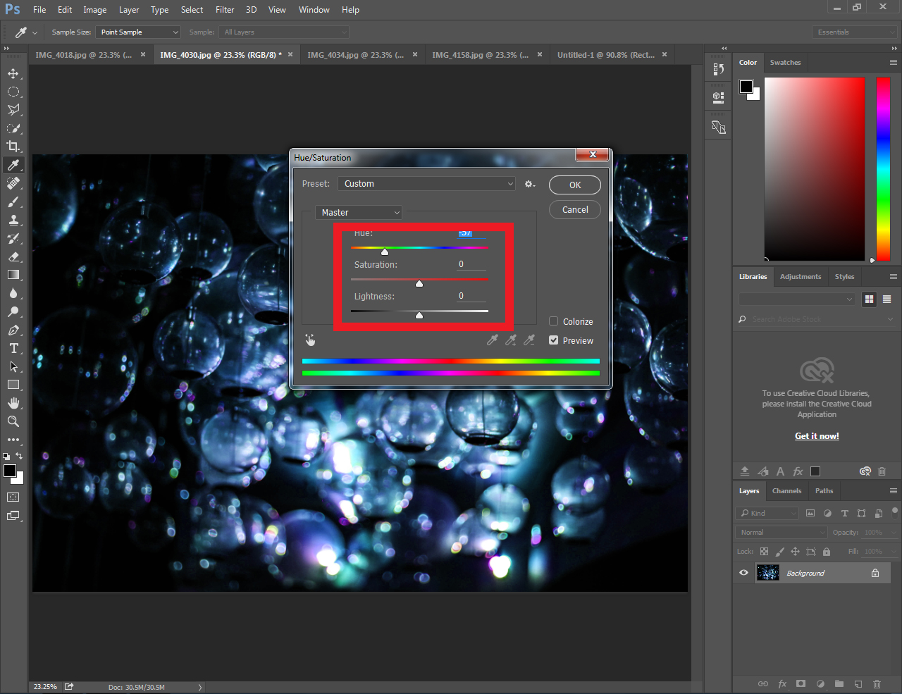 When in the saturation tab I would use the hue bar to determine what colour I wanted to change the image too, when this happened the pictures overall colour (in the case purple) would turn to blue.
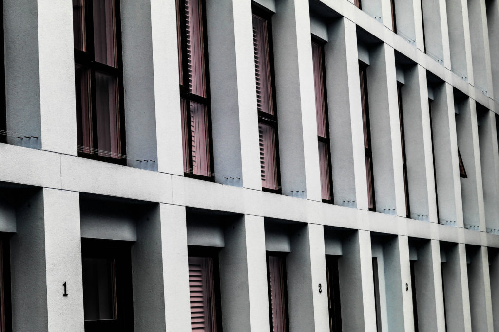
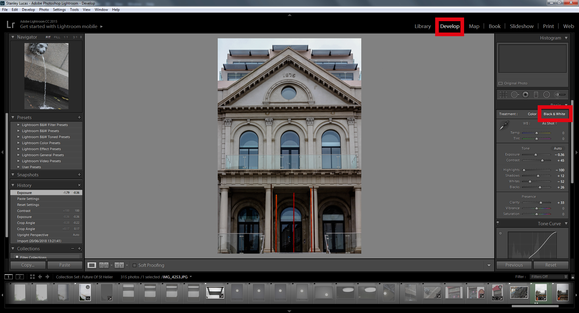 Firstly within Adobe Lightroom I would locate the image I wanted and select the develop tab in the top right. From here it would allow access to the black and white colour filter selection which would enable me to change the photo.
 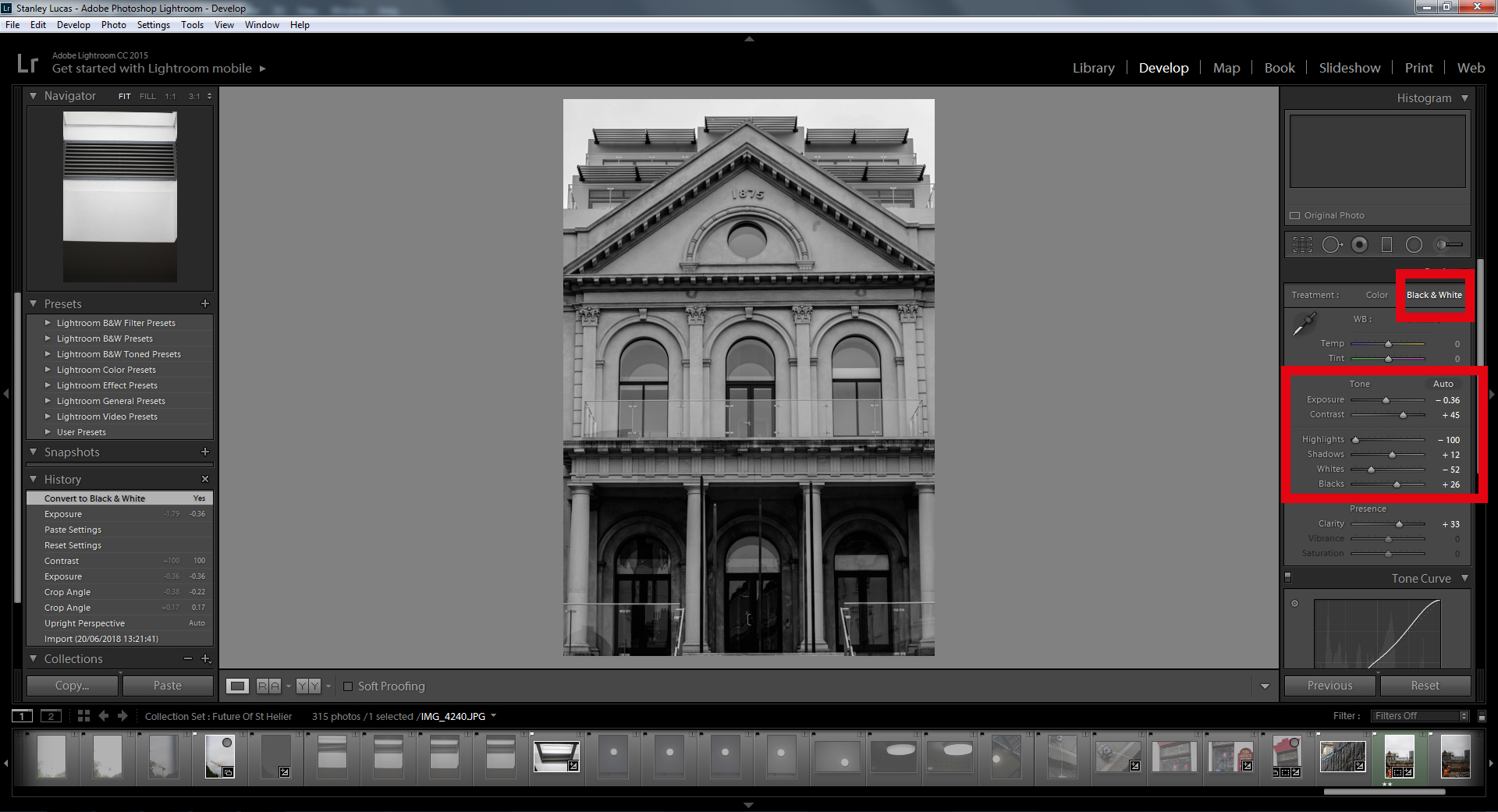 Once done I would mess around with the adjustments that the coloured selection would allow me, such as the contrast and brightness. By doing this the overall image is changed as certain features are highlighted more than they would have necessarily had if in colour.
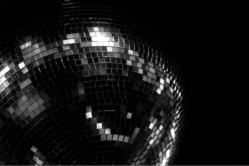
 From here I went ahead with the shoot focusing purely on what I wanted to reflect from the assigned area of town, here are my pictures from the first St Helier photography shoot:
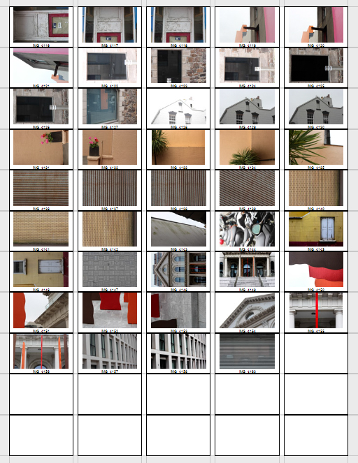
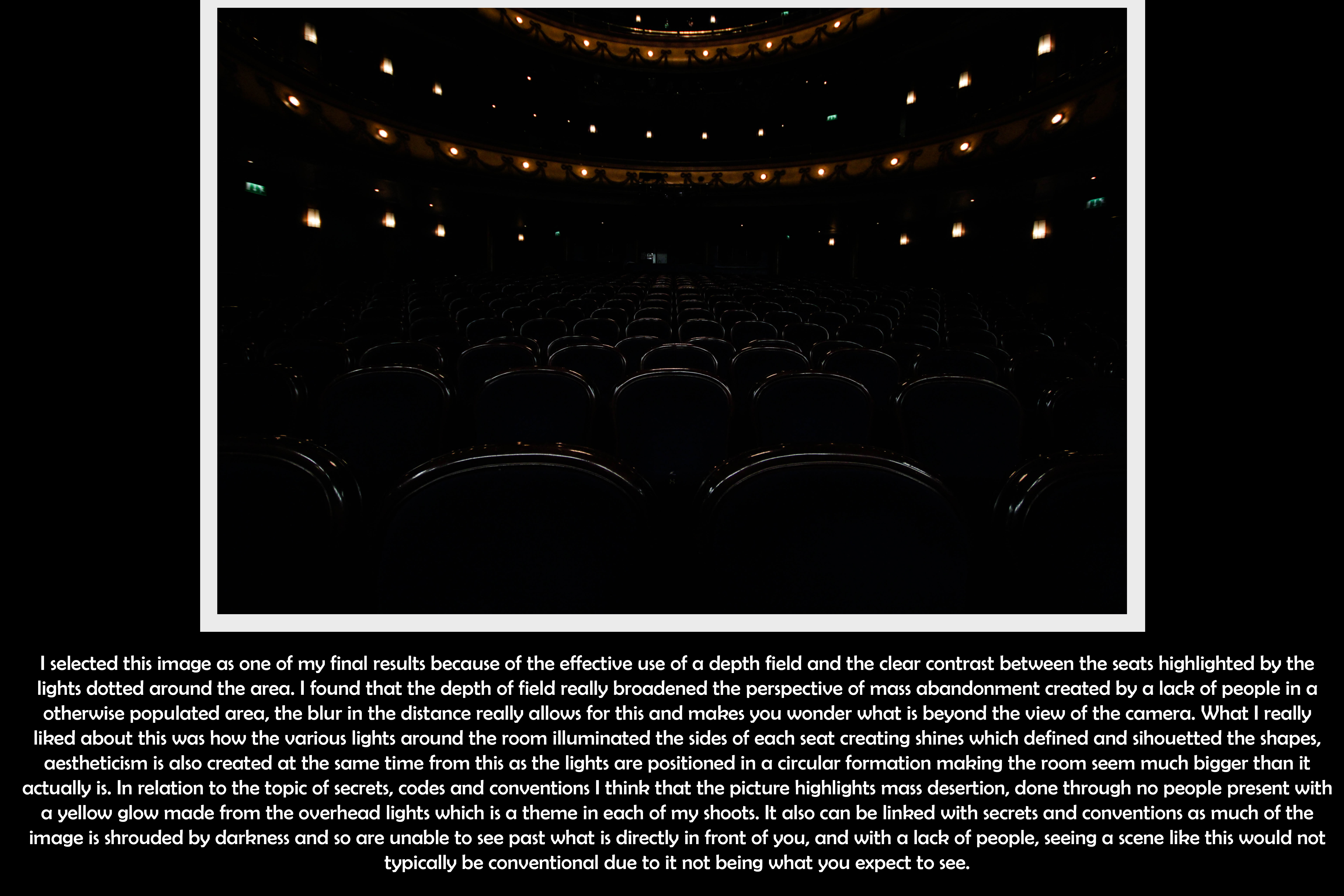
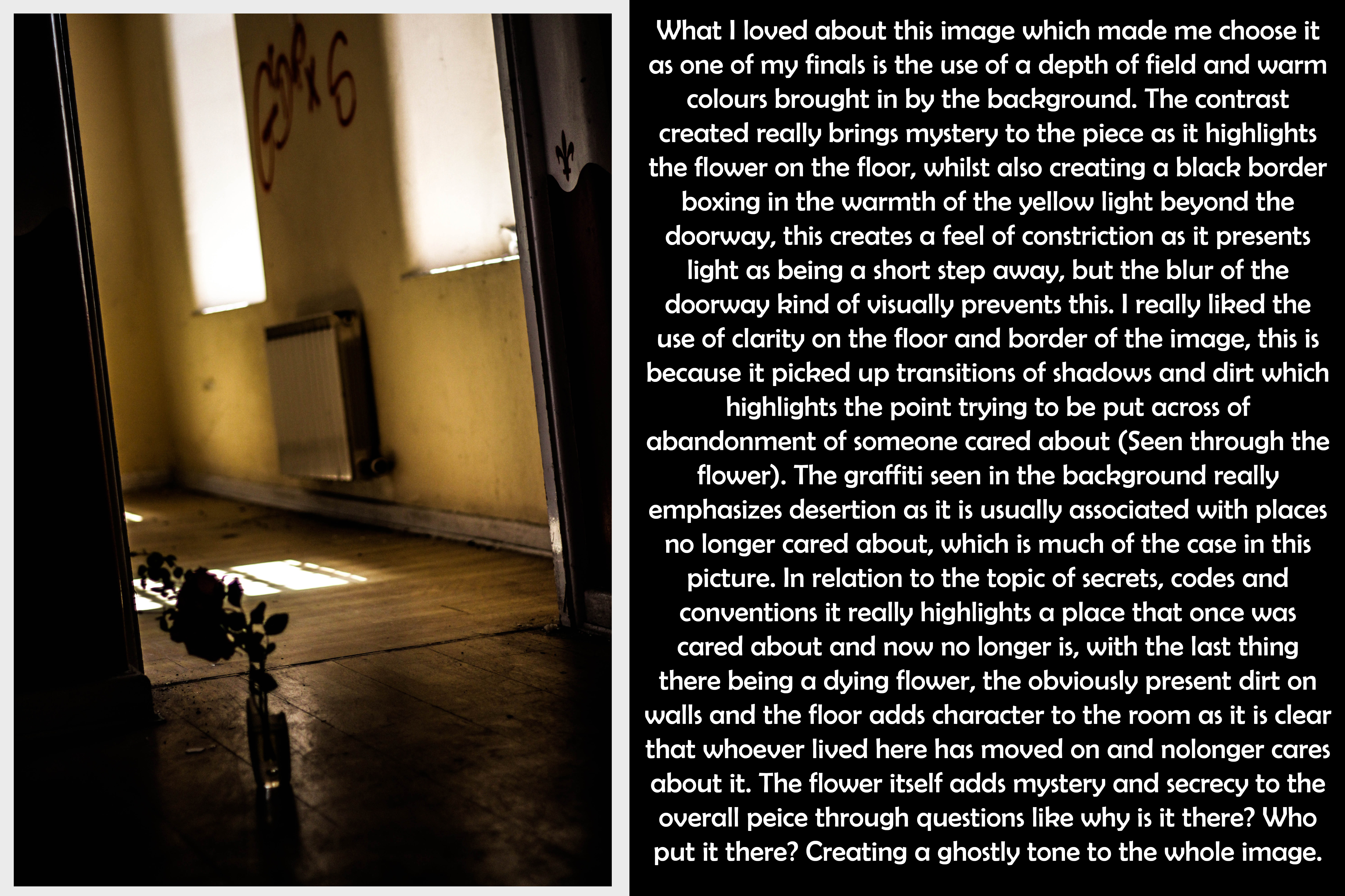
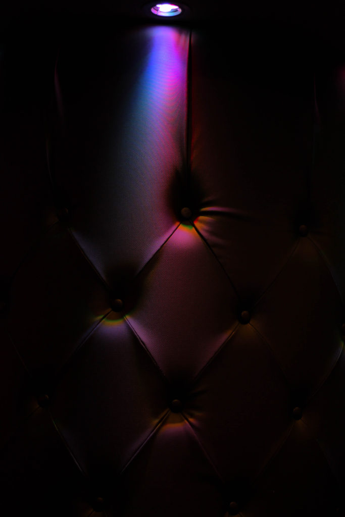 The reason I selected this image was because of the contrast between the single coloured source of light and the darkness surrounding the rest of the piece. This was made particularly effective from how the indents within the chair highlighted holes which allowed them to become reflective and a key element in the photo. The result is very abstract and so is not definite what it is meant to be, creating a kind of pattern that is carefully put together.
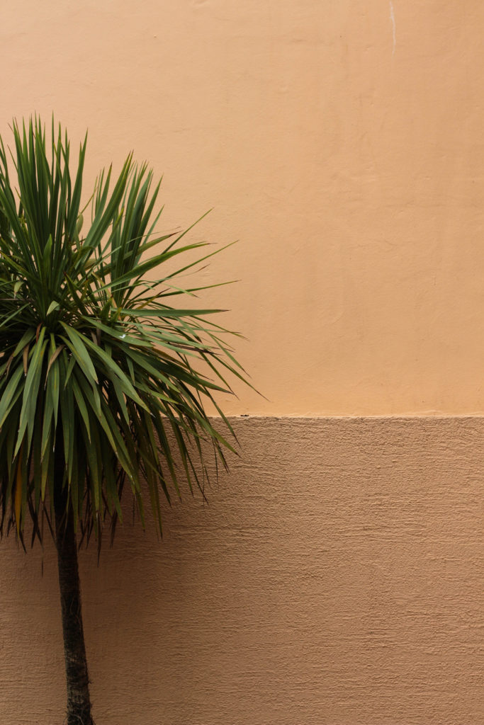 I chose this picture because of the broken symmetry present within the left hand side of the picture. I found that the boring backdrop of two contrast oranges is complemented by the green opposing tree which breaks the piece up to become aesthetically pleasing to the viewers. The exposure in the photo highlights the wall, whilst creating a dark shadow to the tree making it stand out consequentially.
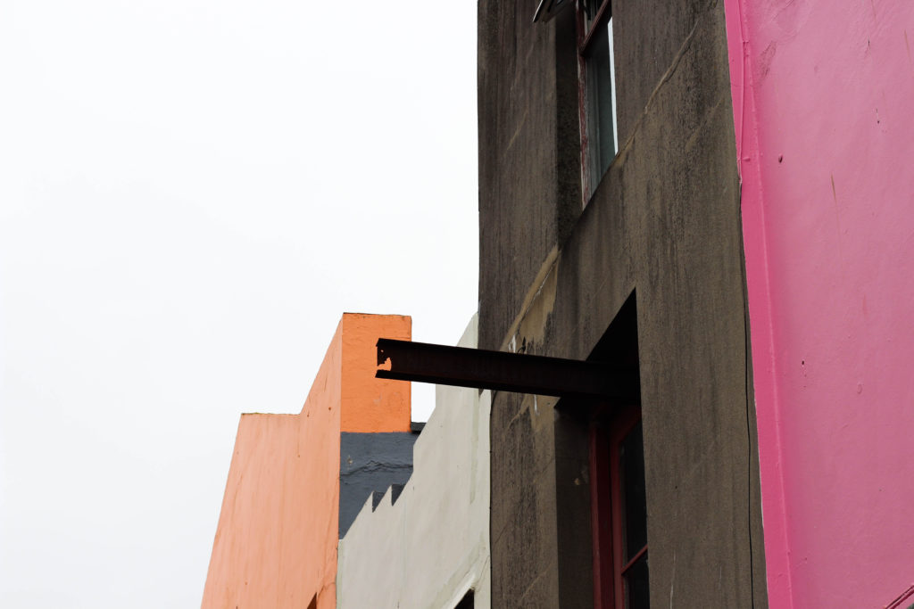 I found that the range of colours in the picture all complemented each other against the bleak sky above. The use of a slanted urban landscape creates an aesthetically pleasing result through the use of blank space which stops the vivid coloured concrete from overpowering the entire picture. There is some use of symmetry which is present through the left and right of the photograph, where half is urban and the rest is natural which can relate to the topic of Masterplan.
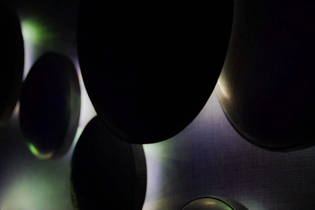
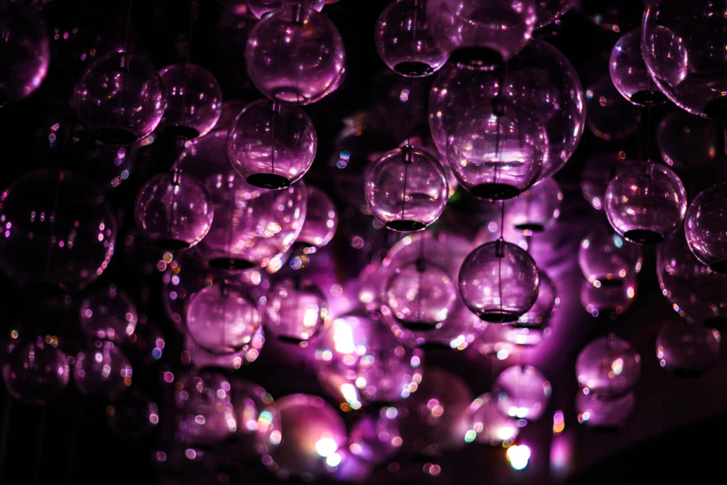
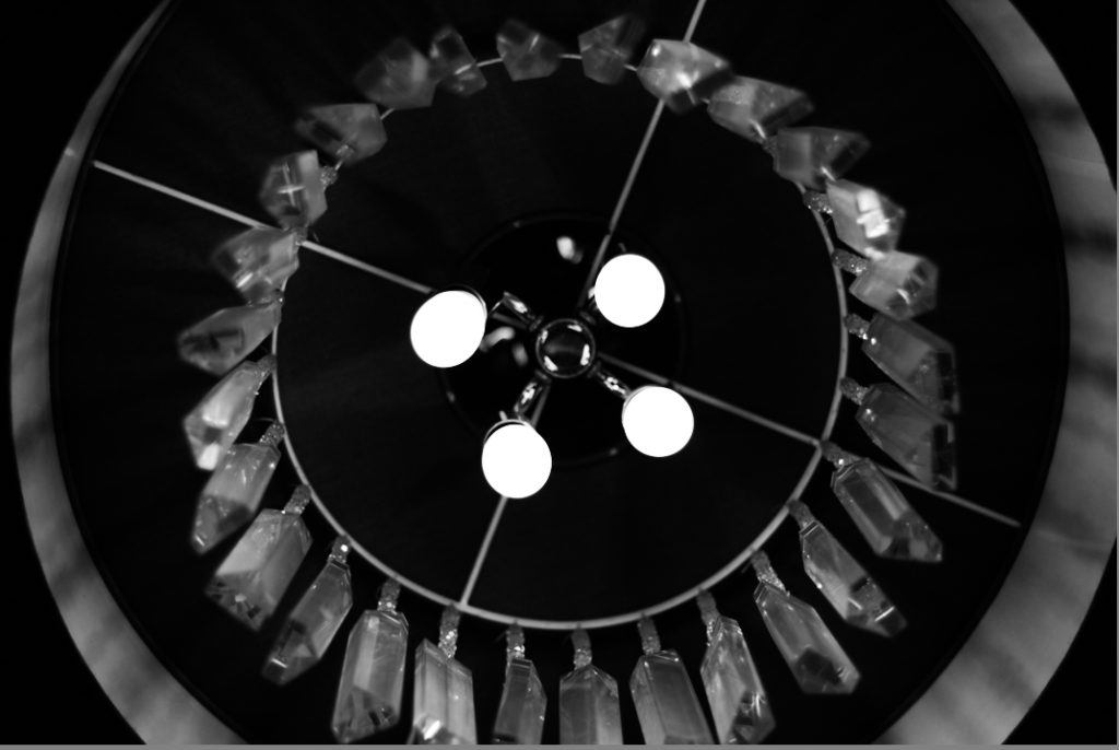
 What I liked about this photo is the use of a depth of field which centers into the middle of the piece. This creates a high form of aestheticism for the viewer as it prevents any eye-sore from occurring through any part of the image, this is also complemented by the use of a dark border which boxes the purples in and centralizes attention to the lights in the middle. The colours present within do work well with each other as only black, white and purple are present with odd tints of blue which create a sparking abstract result overall.
 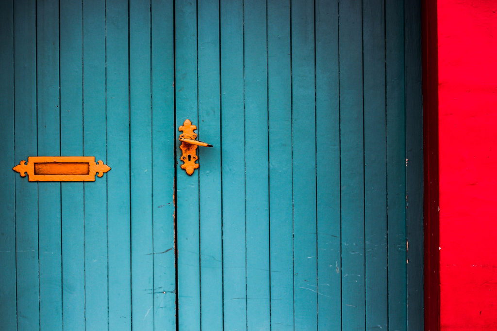 The photograph of the door to me was well composed composition wise, this is became of the continuous use of symmetry present throughout the image. The straight vertical and parallel lines within are complimented by the contrast colours of red, orange and blue, all which and blended together through the use of a black darkened border. I found that the red concrete streak on the right broke up the image from being too bland and overpowered by the blues, and so really balanced it out as a result.
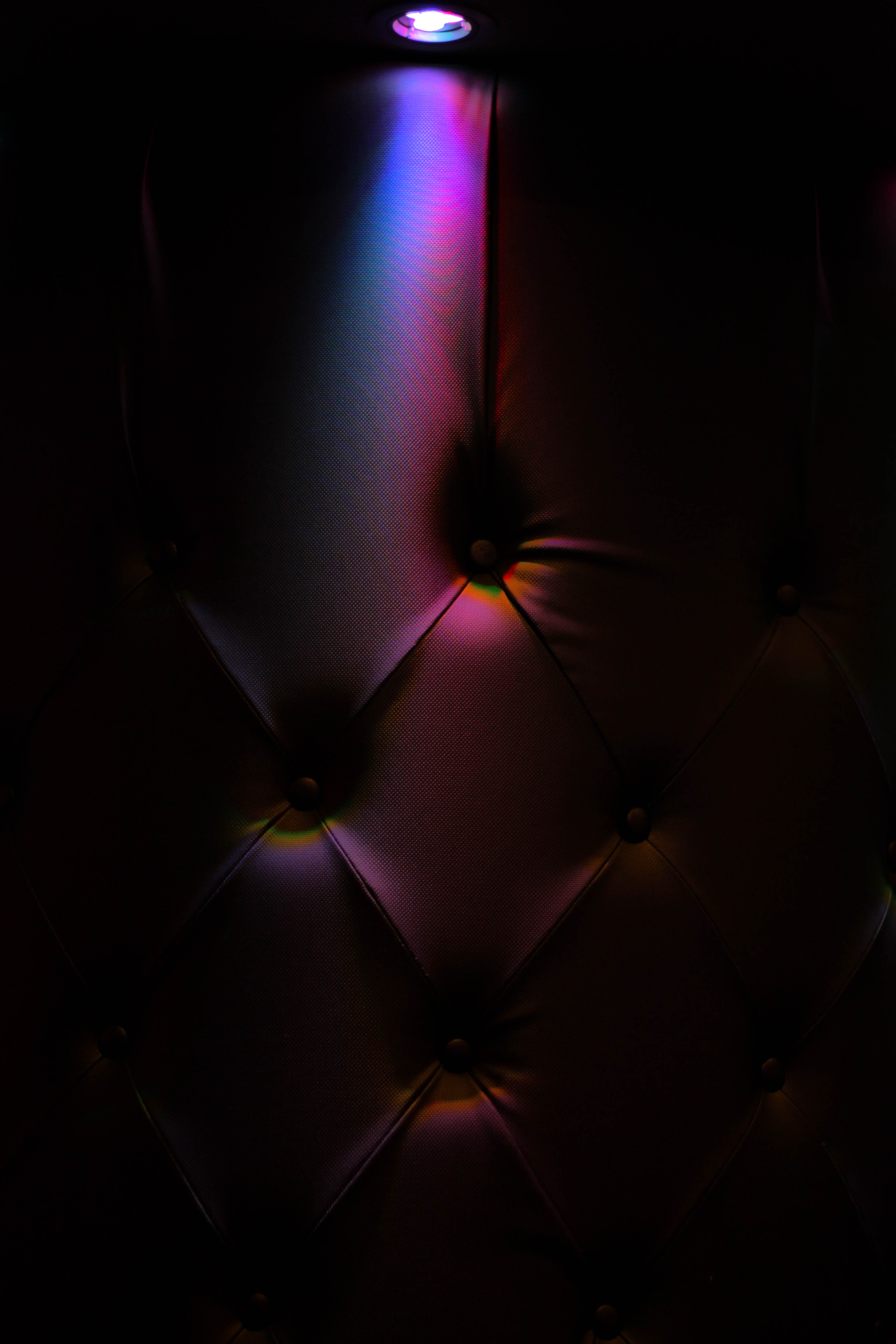 The reason I selected this as the final image for my shoot, which I thought best reflected the overall result from the future of St Helier was this image of a chair. I found that this perfectly reflected how abstract certain parts of the town were, as much of the urban areas were really contrasted against bright unique colours of random buildings. In my opinion this image represented how such vivid colours seemed out-of-place for what it was in the environment, as the chair seemed to be just dotted randomly in the middle of the darkness without any purpose or intention, much like the use of construction within St Helier. The image itself is complemented through the composition, contrasting colours, and use of a dark border to create a sense of mystery and abstract to the design which I found really brought it out as a whole.
 After looking over some of the images from Haas I decided to analyze what made the aspects inside each one so effective, to do this I chose one of his most impressive images; Motion Horses:
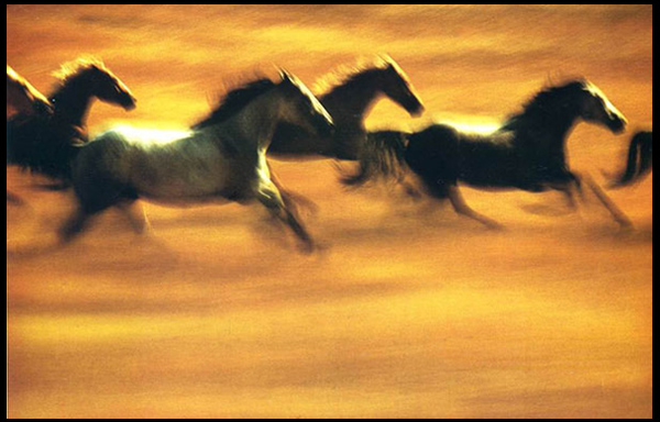 Technical: The image itself uses a vivid long shutter speed to capture the motion of the horses in action. By doing this it creates a sense of realism into how the photo would have looked to the photographer, making an aesthetically pleasing result from how the horses are contrasted sharply against the yellow backdrop of the piece. The picture seems to use a higher saturation to bring out the colours of the field and emphasize the darkness of the horses to create an almost abstract and surreal result.
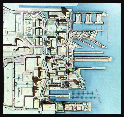
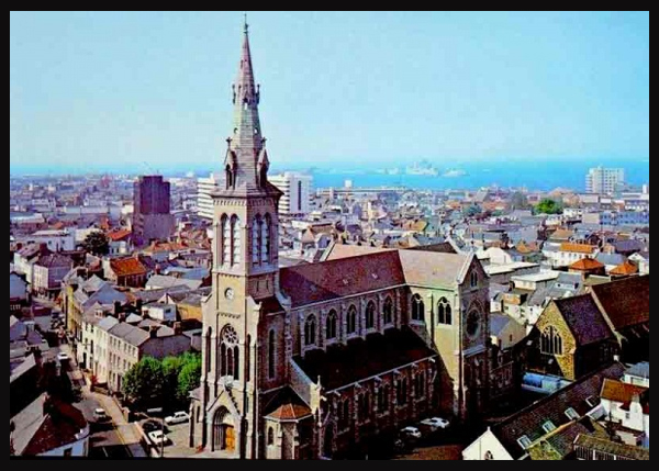
 This image represents the potential changes that will occur in certain areas, whilst also showing points of historical interest to the public which may cause debate. By doing so it provides an insight into how St Helier wishes to change over time, this gives us an idea on how we want to go about photographing these areas, as the technique of contrast could be used to identify changed features.
 My plans for the area are to photograph the variety of buildings and designs which each one seems to uniquely take up. This consists of old unique buildings such as the ones surrounding the royal square, to the more financial area which completely contrasts, by doing this it allows me to bring up the subjects of how (in my opinion) the structure of town is completely mixed with no real idea of where it is trying to go, and presented through the range of coloured buildings and glass office blocks shows the almost abstract and odd design of it all. To add onto this I plan to visit the graveyard behind the car park next to the new police station, I intend to show the randomness of St Helier and how some parts just seem to be utterly unrelated to the future that area should be heading towards.
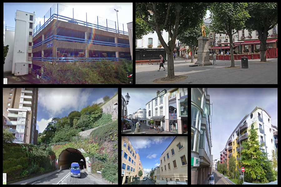 Helping me with this project are Jersey Archives who preserve historical photographs over the years to keep record of the events that have unraveled throughout Jersey’s history. Examples of this consist of the German occupation to the queens visit and even delving into modern-day events, I can use this to help me show the development of the grey area I have been given such as the old car park which has now been converted to a police station and the process which covered it. Areas that this could include is the old bus station which has now be changed into a square where various games and events occur such as the portuguese and french fairs, this would be great to capture how the use of an area overtime has been changed from a business to a place of social interest.
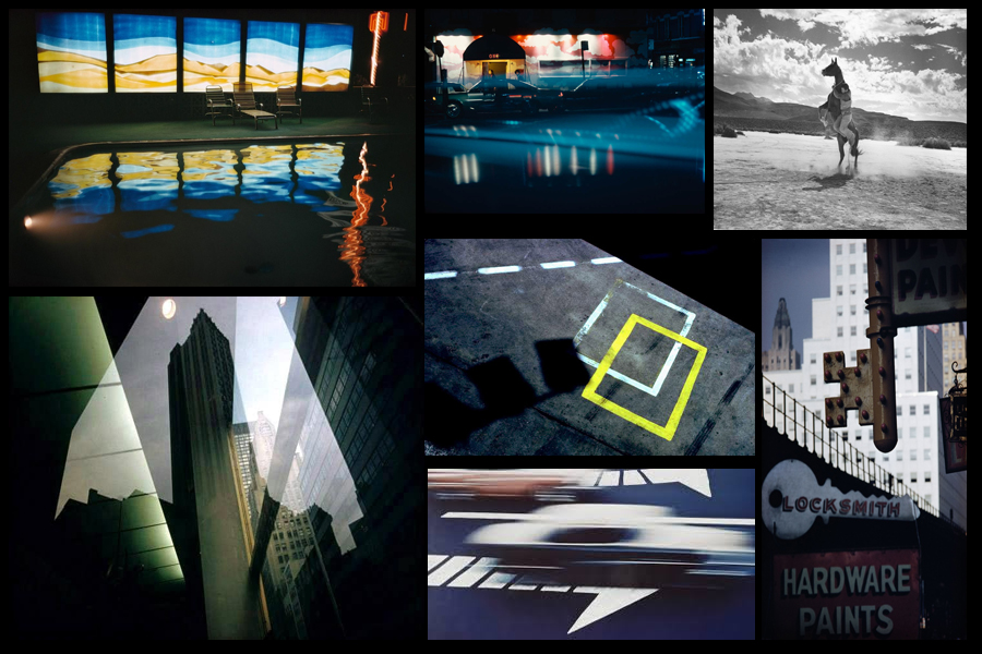 As seen above most of Haas’s images use lighting as a primary source for creating abstract and vivid imagery. I found in this case that by using this technique it would allow me to experiment with how I portrayed certain areas in certain lighting, for example I could use high exposures to create white blinding structures out of buildings, and a low exposure to emphasize the illuminating effect lamps and other sources of light had on the area.
 St Helier consists of 33,500 people, roughly 34.2% of the total population of Jersey whilst being the capital of the island, with a reclaimed area from the sea being 494 acres. The mostly urban area includes much of the activities available for people, with a quickly growing finance sector taking up a 44% growth in 2017, thousands of jobs are becoming accessible to more and more people, making it a vital part of Jersey’s future development.
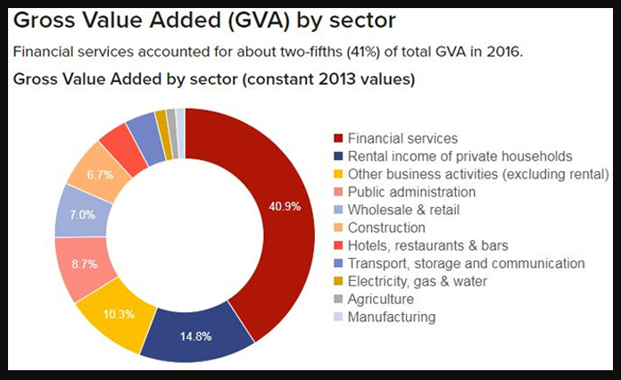 At the moment St Helier is the center of Jersey’s activities regarding tourism, finance and leisure which is evident through cinemas, operas, beaches, finance buildings etc. However I think that we need to see a greater development in the progress of the style of buildings, for example an increase in higher rising, more modern looking buildings would allow for more space for other areas to really develop such as cafes and shops due to a greater space, whilst at the same time creating an impression of a town borderline city feel. However I do feel like there is a lack of community within St Helier that can be seen in areas like Cheap Side, as I don’t think there is enough events and areas that would support this and bring the community closer as a whole, to do this cultural festivities could be introduced that would allow for this support whilst being an introduction for many people into a small insight to other ethnicity’s culture. I found that St Helier had a rather weird contrast between buildings, with many portraying an old style of architecture whilst others inhabited a more modern approach. This in my opinion is stopping the town from becoming attractive to those who live in it, as there seems to be no real structure or design to the area, rather just different designs dotting up around the place.
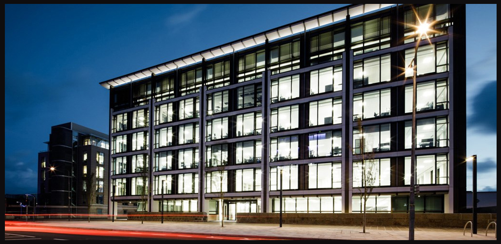
 For my shoot I would like to focus on the modernization of areas within Jersey, and the forms that they take up in comparison to the maybe more derelict areas. I think this stark comparison would allow for more abstract photography which would emphasize the differences between the modern and the old.