Future of St Helier
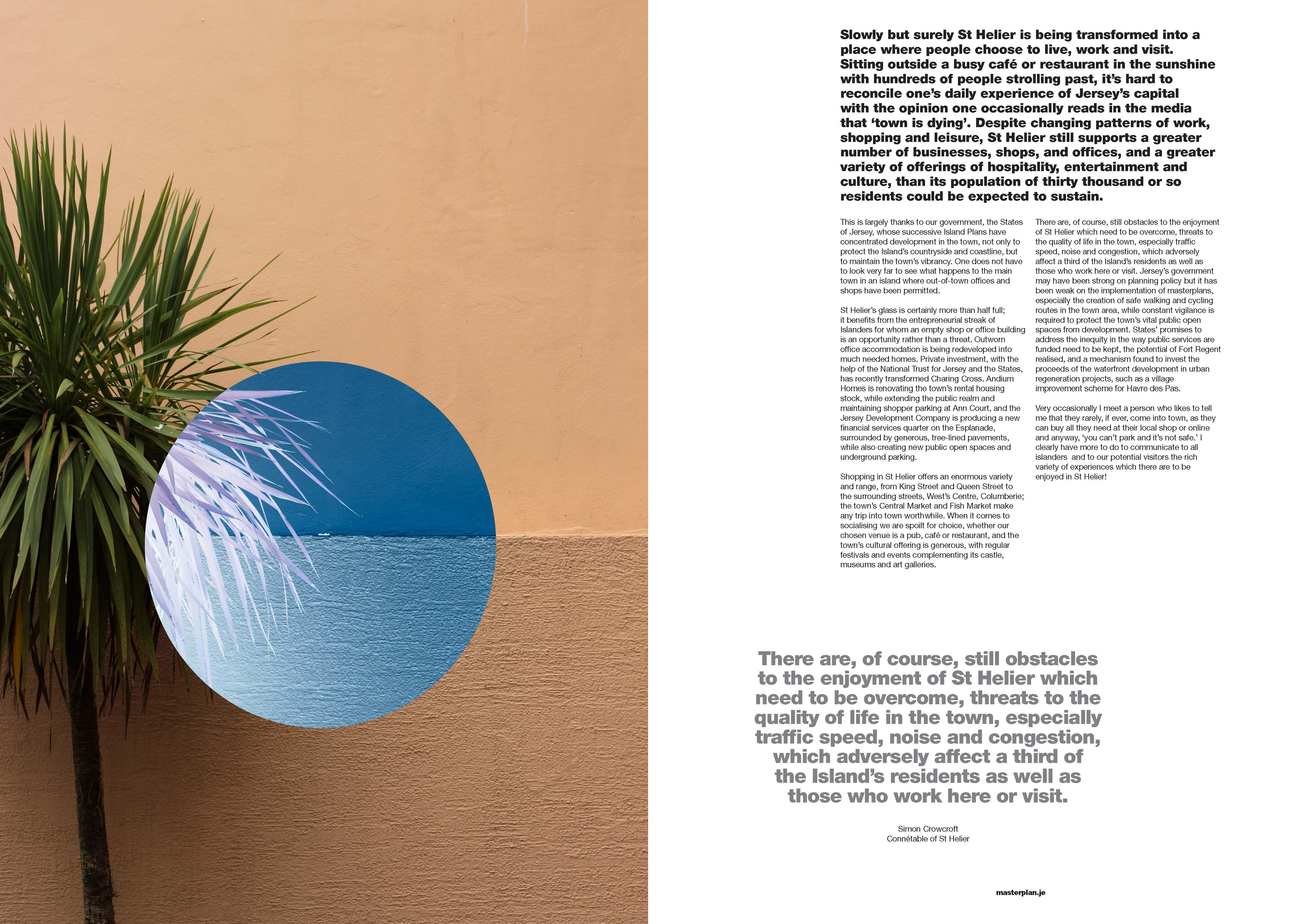
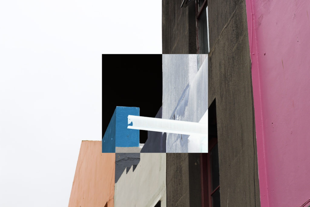
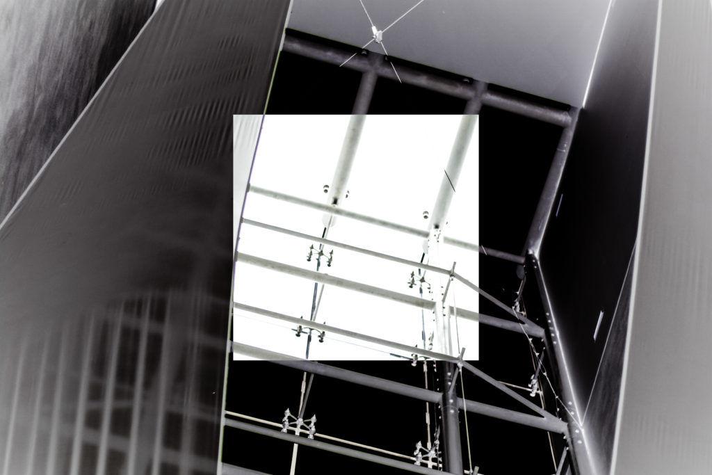
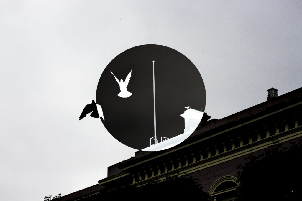
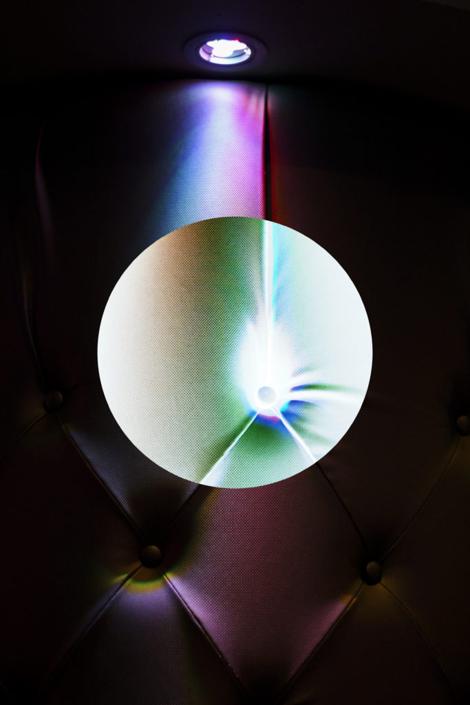
Overall I found my chosen pieces in the newspaper to be particularly effective due to them representing my best work from the shoots. I found that these images represented the vibrant colours of town and the architecture that surrounds it, whilst using the contrast to provide an insight into how these buildings are portrayed. I really liked how the images selected both portrayed my stance on how St Helier has been constructed, a mismatched area where there is not real coordination into its display.
Hoarding Installation
The unveiling of the Future of St Helier Hoarding at the International Finance Centre on the Esplanade in St Helier took place on Thursday 13 Dec 2018.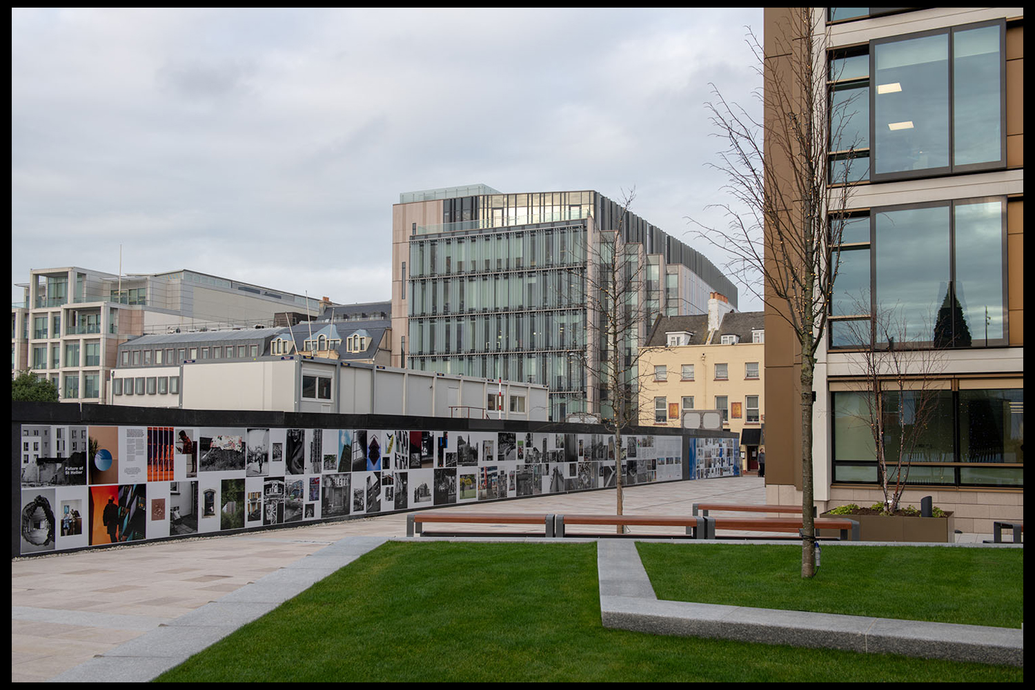 First published as a 52 page newspaper supplement in September by the Jersey Evening Post the work produced by A-Level Photography students at Hautlieu School have been transformed into a 34m outdoor installation as part of Masterplan Community Arts and Education Project
We were challenged with responding to specific areas, streets and neighbourhoods divided up along the urban vingtaines of St Helier and to explore through research, archives and photography the built-environment, urban living, diverse communities, town planning, land use and re-generation projects.
We thank all sponsors and collaborators for making this a successful contribution to the island’s cultural records and historic archives Jersey Development Company, Camerons Ltd, MJP Architects, Archisle, Lewis Bush, Photo-Archive Societe-Jersiaise, Kevin Pilley, States of Jersey and Connétable of St Helier, Simon Crowcroft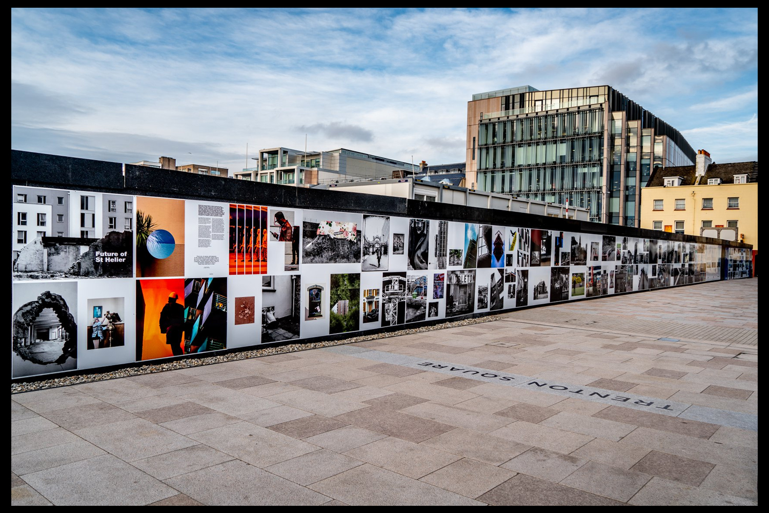 Earlier today we unveiled the Masterplan Future of St Helier hoarding display at the International Finance Centre. Lots of local media interest from Jersey Evening Post, ITV Channel TV and BBC Jersey who broadcasted live on radio talking to photography students at Hautlieu School, Constable of St Helier, Simon Crowcroft and sponsors Jersey Development Company, Camerons Ltd, MJP Architects about the future of the island and its capital. An excellent example of how a community arts and education project can generate a debate that affects all those who either live, work or visit St Helier.
https://www.bbc.co.uk/sounds/play/p06rlpdw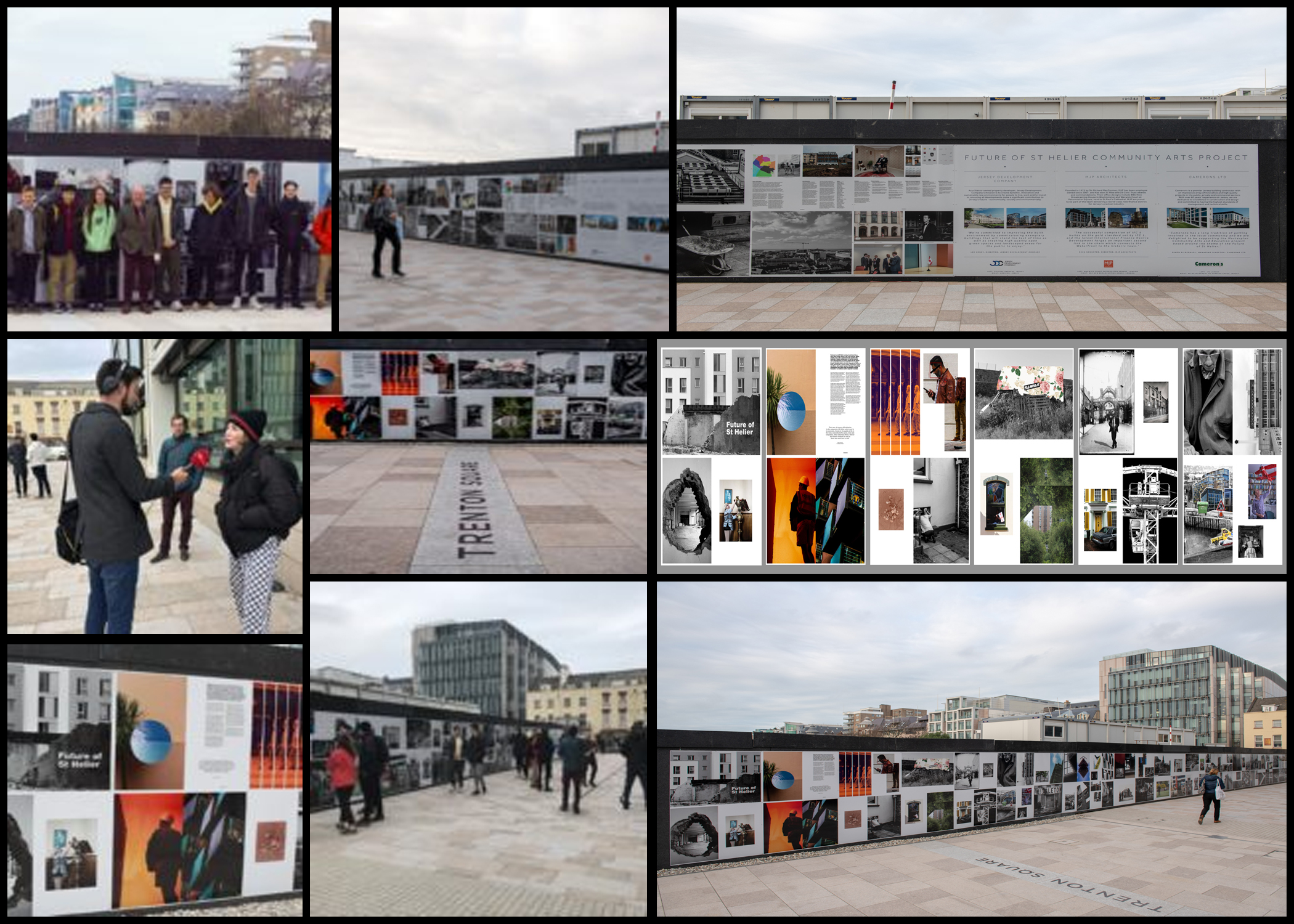
If you missed the news last night at ITV Channel TV you can catch up here with Hautlieu students talking (15m.12s) about their images on display at the Masterplan Future of St Helier hoarding on the International Finance Centre.
See link here
The outdoor installation on the hoarding around the construction site is a great way to engage the public in art and debates concerning the future of the island’s capital but, what we need in Jersey is a new contemporary art space that will provide a new venue to showcase art produced in the island, but equally also bring international art to Jersey for the public enjoyment of its residents and visitors alike.
The recent Culture, Arts and Heritage Strategic Review, commissioned by the Government of Jersey makes 20 new recommendations that will revitalise the island’s cultural infrastructure and achieve a wide range of social and economic objectives from tourism, to health and well being to external relations, to planning and environmental developments – in the hope that in partnership with Government it will enrich and enhance Jersey’s quality of life.
Let’s hope those in power who can make real changes to St Helier’s build environment will include such a new art space in the revised Masterplan of the Waterfront. All we need is political will and re-prioritising public funding for the arts. States of Jersey
Future of St Helier Newspaper
The outcome of students work was first published on Tuesday 18 September 2018 as a 52 page newspaper supplement, Future of St Helier that was printed in 14,000 copies and inserted into a daily edition of the Jersey Evening Post and distributed island wide.
Here is a video browser of our Future of St Helier supplement printed and distributed in today’s edition of the Jersey Evening Post. Hautlieu photography students were challenged with responding to specific areas, streets and neighbourhoods divided up along the urban vingtaines of St Helier and to explore through research, archives and photography the built-environment, urban living, diverse communities, town planning, land use and re-generation projects. Each student designed a page spread which was then split in half producing a fragmented image reflecting on the nature of experience and diversity of St Helier.

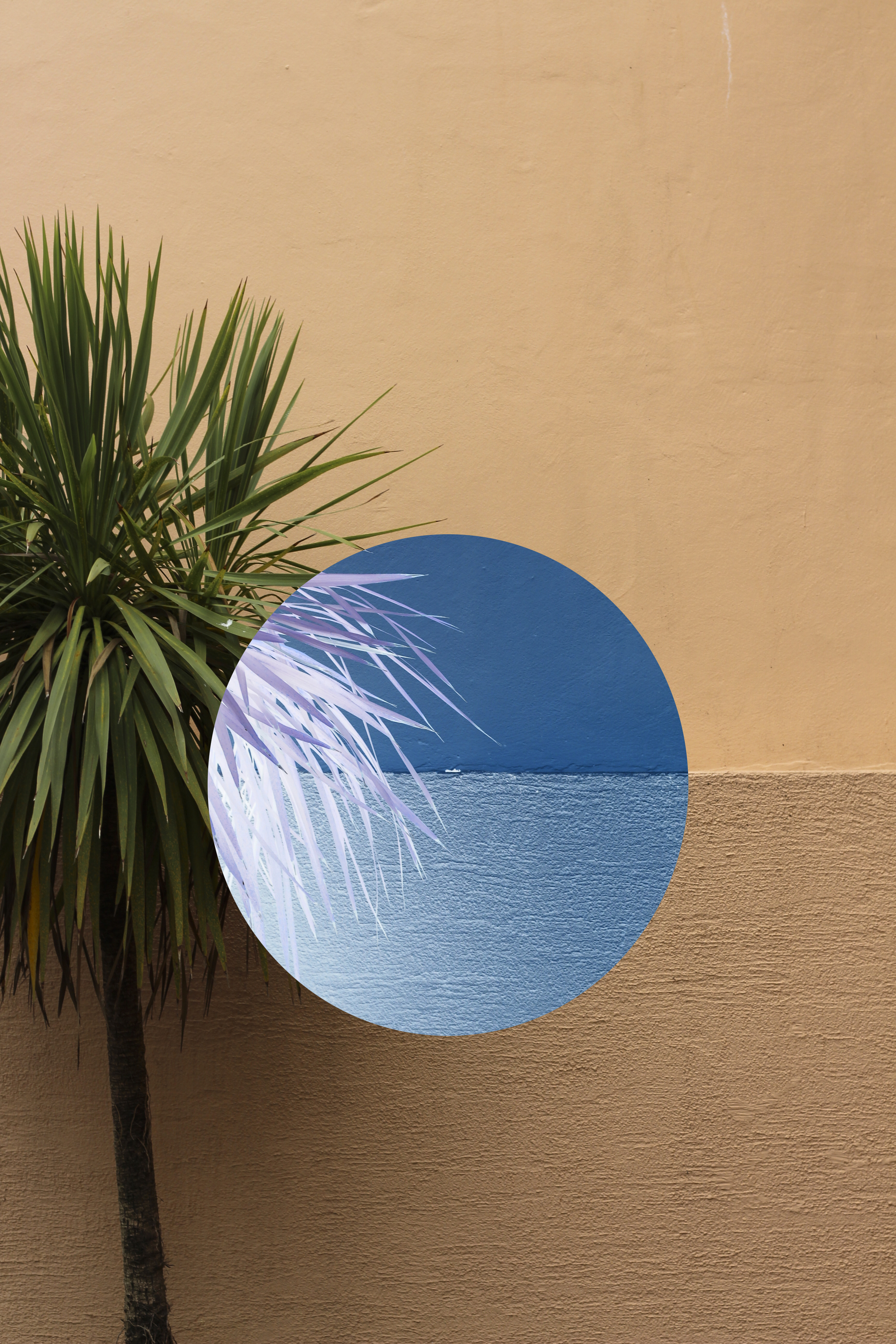
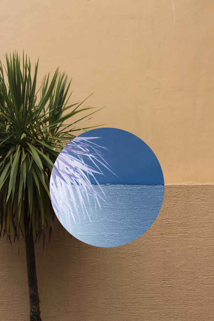
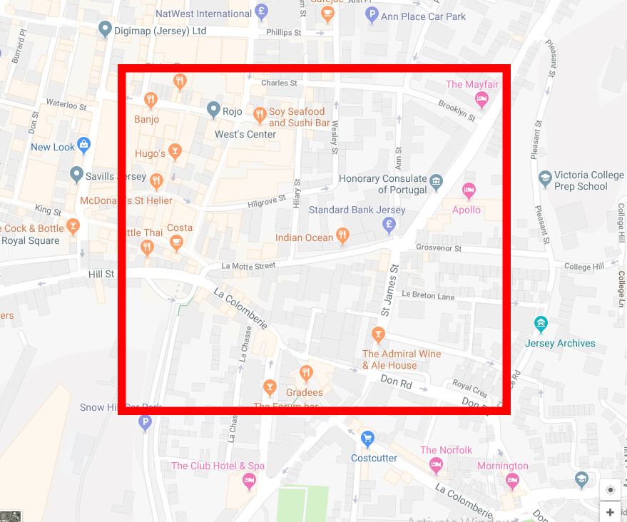
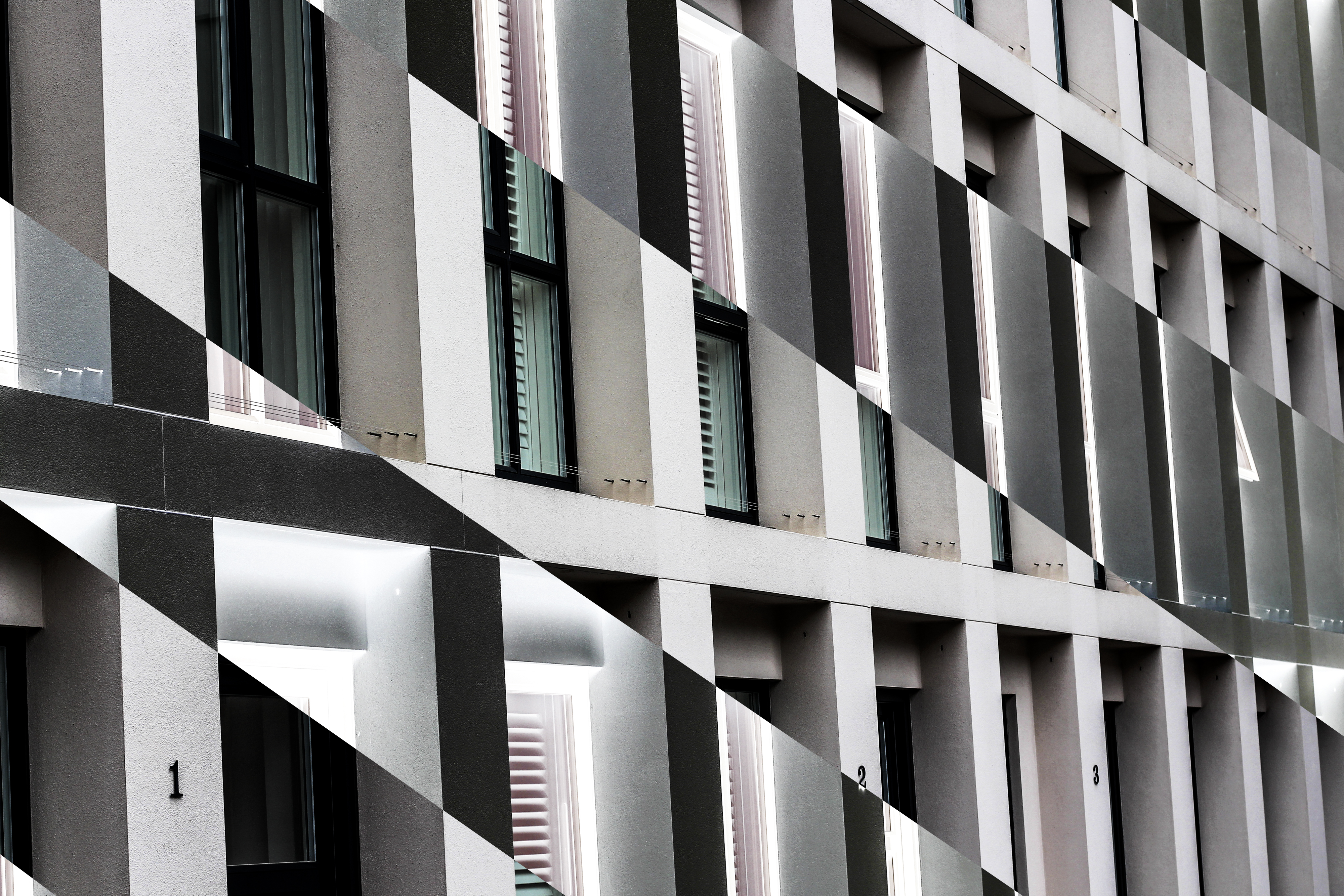 I edited the images in Photoshop, using an inverted technique which inverts the colour of the selected area, as a result changing them into an almost alien like landscape not previously recognisable. The images are actually both of the side of an apartment in which I found to consist of contrasting colours, grey and orange, something not usually associated with each due to them not mixing. Here is an aerial map of the area of the images taken:
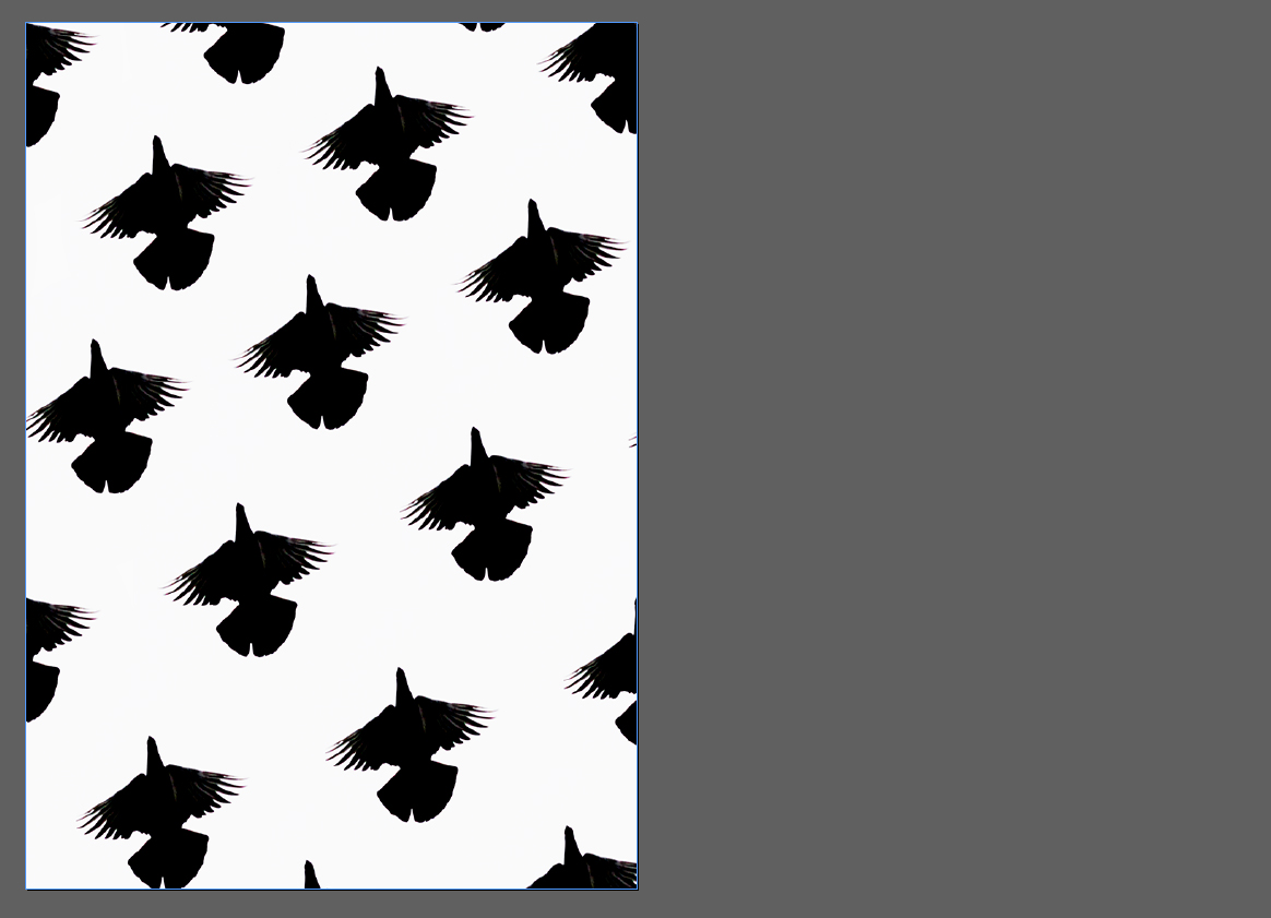
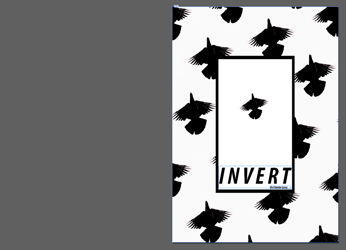 For the front cover I used the Reitam font which I separated the distance between each letter to fill any blank space in the titles area. By placing it at the bottom of the page I thought it would reduce it being the center of attention and instead make the main focus the bird design, this font compliments the stencil like outline of the birds matching the symmetrical pattern. The black box in my opinion within the middle acts as a way of bringing the whole piece together, deterring the bird pattern from being too overpowering and strong.
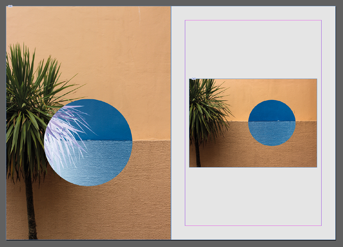 For the first two pages I found that palm tree imagery was most effective. This is because of how I thought they represented the message of inversion and the unseen world the most out of all shoots, with using two different compositions for stopping the receptivity becoming too overpowering. This was done through the use of blank space which separated the two pictures from each other whilst showing the similarities both had.
  Here I used dark lighting and unseen patterns as my main theme for the two page spread. I used this because of it reflecting the hidden beauty that can be seen in everyday objects in different light, such as lights and chairs. The added inversion created further symmetry and aestheticism which produced contrasting colours that I thought worked well with the overall pieces.
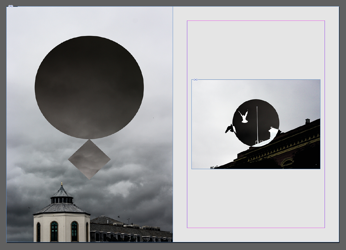 This spread explores the theme of the sky and the silhouettes created by buildings and the contrast they have between them and the environment. To do this I used two images that I thought incorporated gloomy and dull imagery highlighted through using inversion, seen through the birds and the clouds. By using nature in this spread I thought it highlighted the hugely contrasted environment that our urban world has with nature.
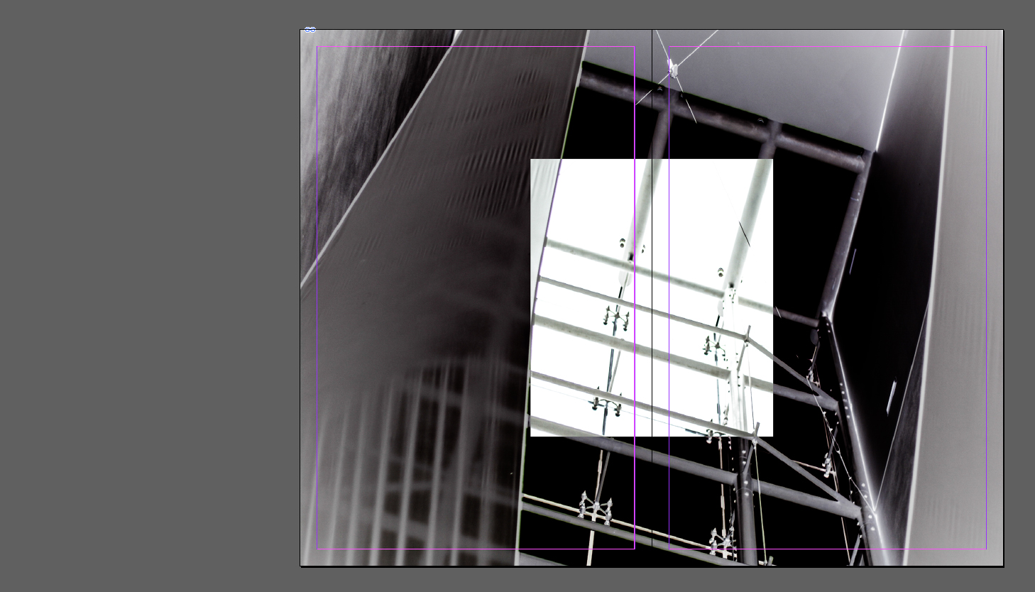
  The idea behind this double page spread was to highlight specifically the interior architecture that the majority of the buildings in St Helier possessed. By inverting the majority of the image I found that it reflected the beauty in the individual placement of beams and fabrics, which completely contrasted the previous pages which highlighted beauty in individual objects instead.
 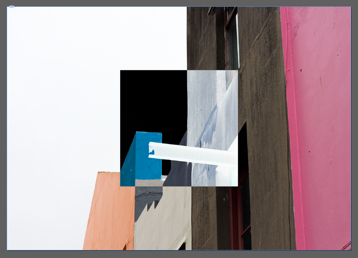 I chose this image as the second double page spread because of its effectiveness of summarizing the random structure and colour sequence that most of the exterior of St Helier has. The use of inverted square presents us with the completely contrasted difference that the structures have with their surroundings, putting across my opinion of how I perceive that town had become ill planned.
 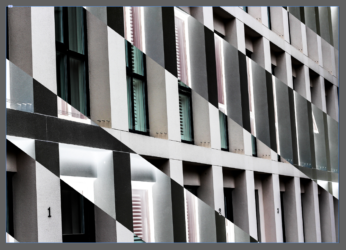 My aim for this image was to provide an insight into the symmetry and lack of development most buildings have in Jersey, where much of St Helier looks the same with continual investment into financial structures. The use of black inversion is to show how the financial industry can be seen in a black and white perspective, either loving or hating it.
 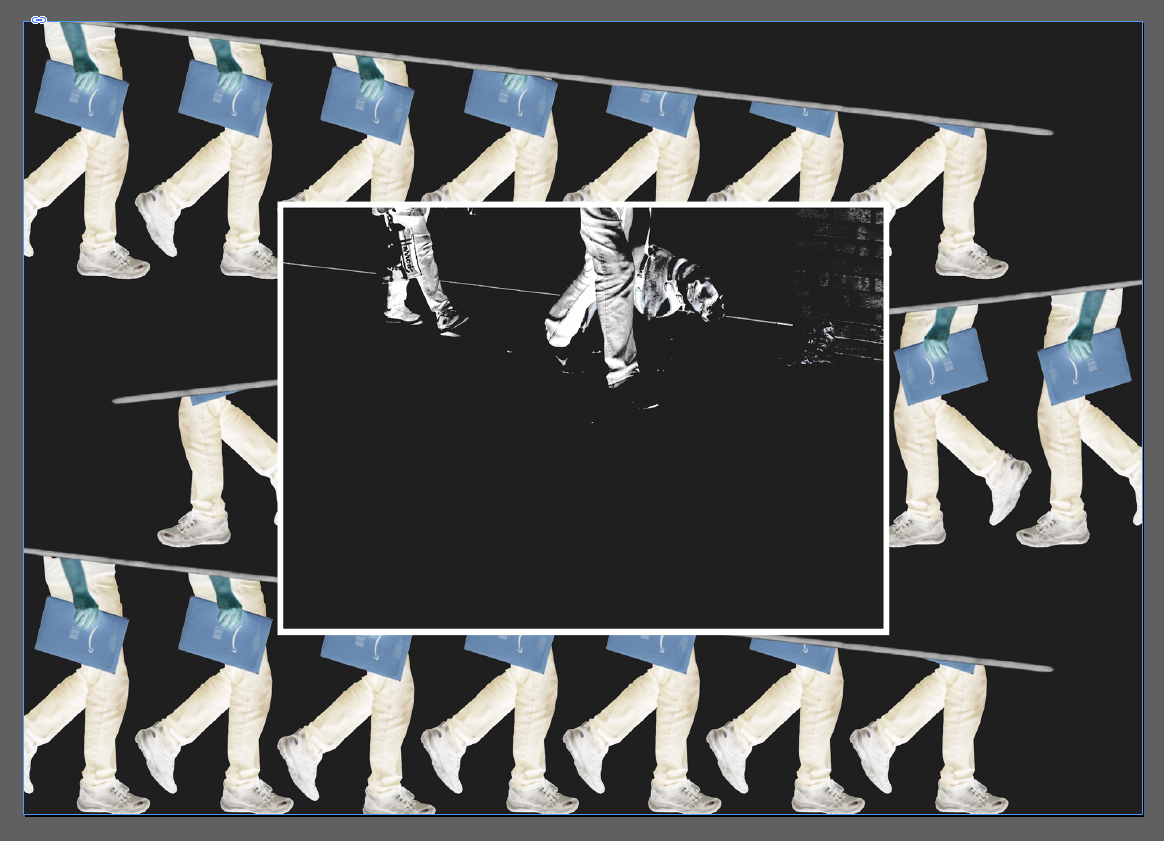 Here I created a collage of people travelling towards work, I wanted to highlight here the repetitiveness that occurred in their everyday lives, and so manipulated their pictures so that an impression of endlessly walking was created. Inside this collage I added another picture, this was to add more context from the two people walking in a line showing subtle indoctrination from the financial sector.
  Overall I was really pleased with the outcome of the zine as I thought it reflected my views about the development of St Helier. Done through the subjective topics about individual aspects of town such as the buildings, people, night life and development, I found there to be a constant recurring theme that allowed for a smooth transitioning between pages, whilst the use of composition for certain pages put across stronger ideas than others.
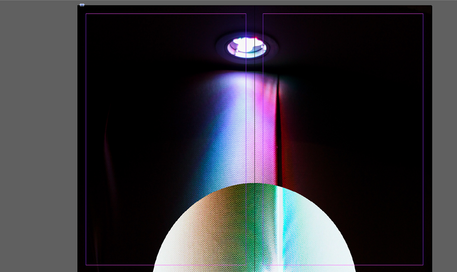
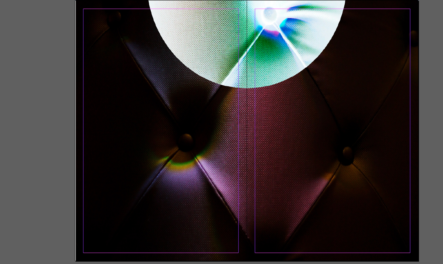 For the first layout I wanted to experiment with simplicity, to do this I thought the addition of only two images could work. By using one image as a cover page and the second as a four page poster page filler I aimed to see what a multi-use book would be like, where you could read it and convert it to a poster page. When deciding the pictures to select I had to take into account what pictures I thought best reflected the shoots so far, putting across my idea of inversion.
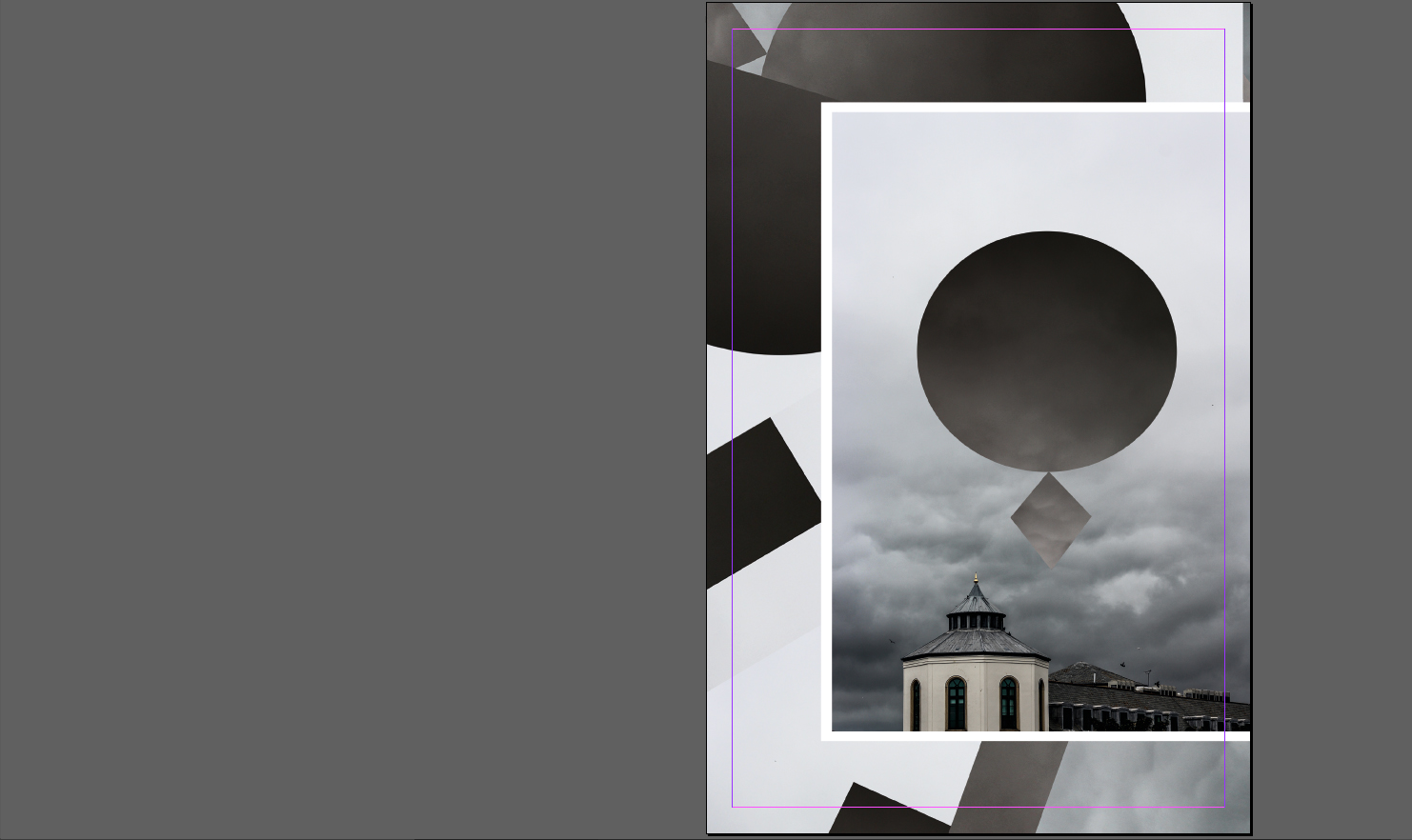

 My main focus for this layout were collages, incorporating a picture and manipulating it until the outcome was different to the original product. This is linked into the unusual presentation of the second and third page, where the images don’t match up and aren’t as aesthetically pleasing to us as viewers, however the topic of each page and the setting neutralizes this as it section is dedicated to some aspect of Jersey. Here I tried to use white and black borders effectively on certain pictures, by doing so I hoped to create a contrast between backdrop and photo, eliminating the background from becoming to overpowering.

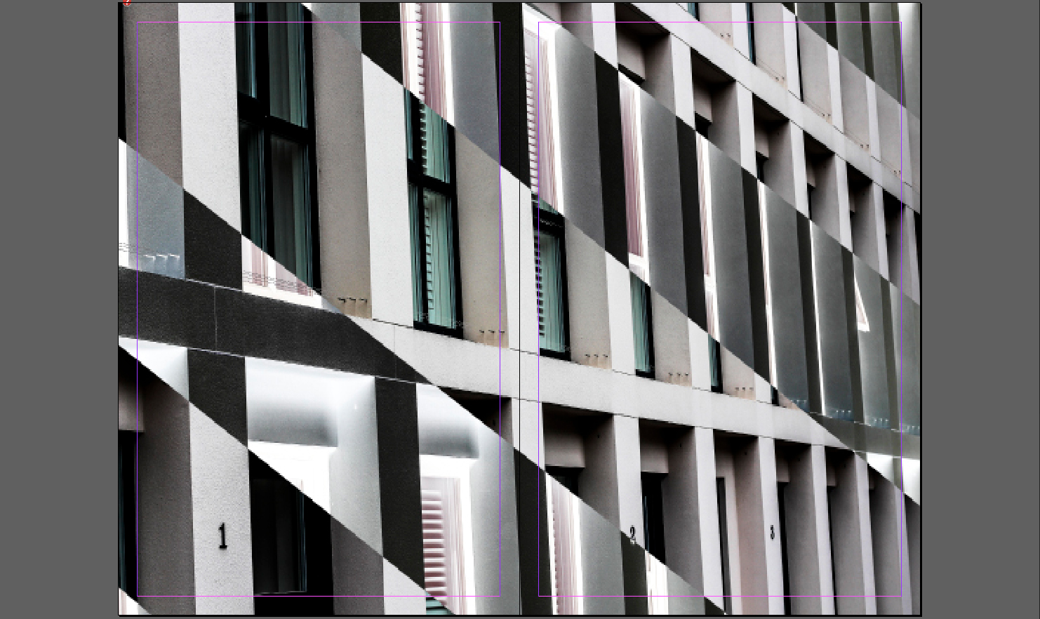 For this design I tried to mainly focus on introducing aestheticism and varying designs. To do this I used the final page as a double spread whilst using the first three as topical subjective pages, focusing on night life, buildings etc of Jersey. When making it I made sure to use white borders as I found that they were most effective when wanting to look solely at certain images, as it implicitly boxed in photos.
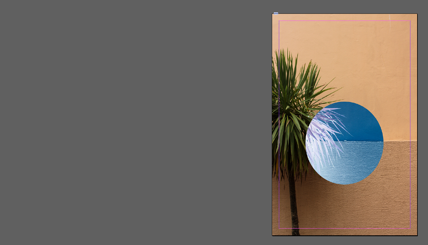
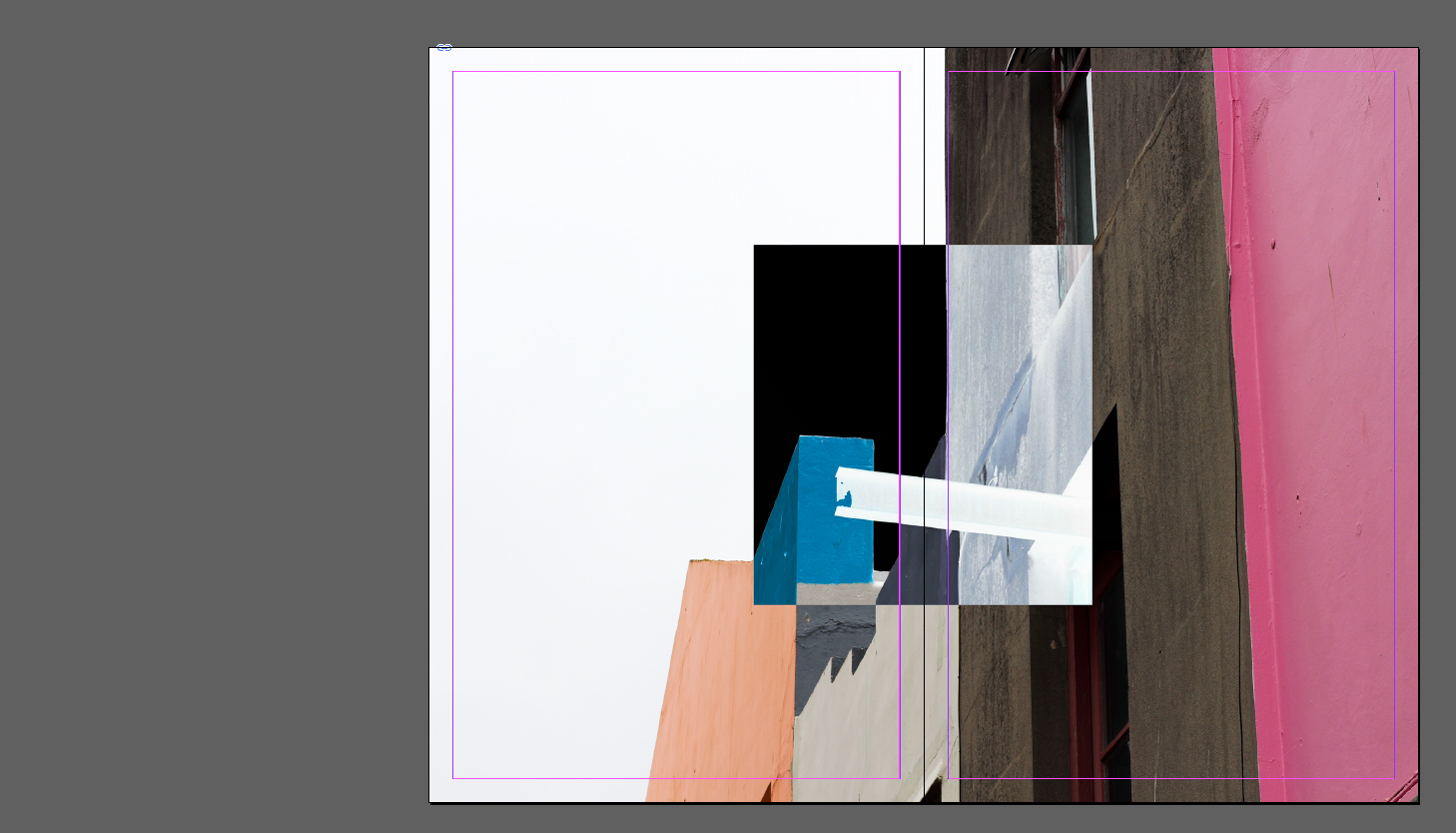
 Here I attempted to find how effective using two double page spreads and just a cover photo would be. This to me was the least effective design as there was an overwhelming lack of content and design, as the finished product just looked thrown together in a hurry with no actual idea behind it. However the idea behind it was to give the users two miniature posters which could be assembled out of the book.
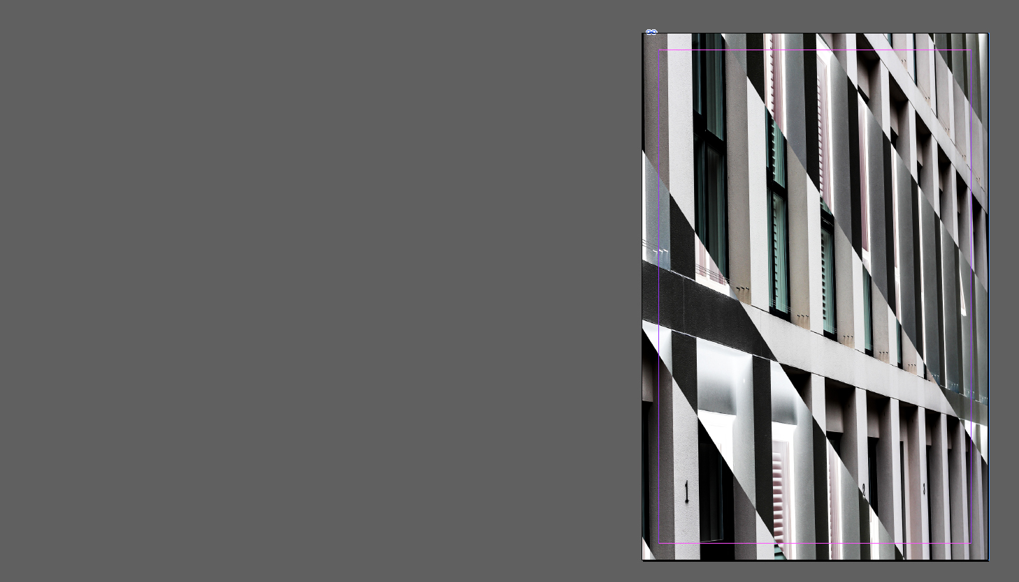
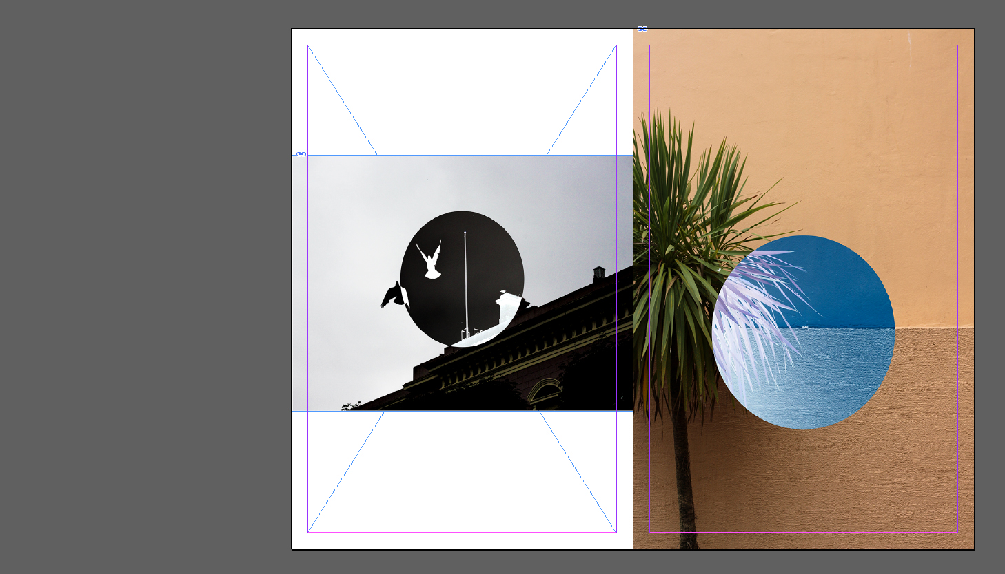 For my final design I tried moving around the layout of my previous design, this meant switching the double page spread with the two individual images on either side. I didn’t find it to be as effective however as the original as I found that the spread worked best as a last page design as it looked more like a final photograph, and the individual pictures being presented as a build up to the last piece.
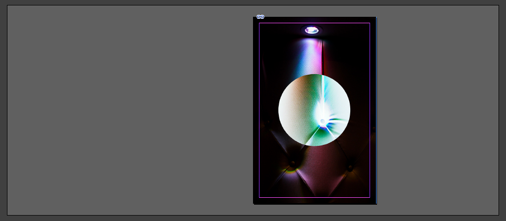
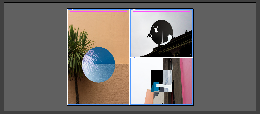
 When considering the page layouts I wanted to use a variety of types consisting of a double pages, multiple imagery and a single page to find the design most effective for what I want. Once I finished experimenting with how the zine could look I decided to create a front cover for it, to do this I would use a single picture and manipulate it on Adobe Photoshop to something I’m happy with such as a pattern. This was my result:
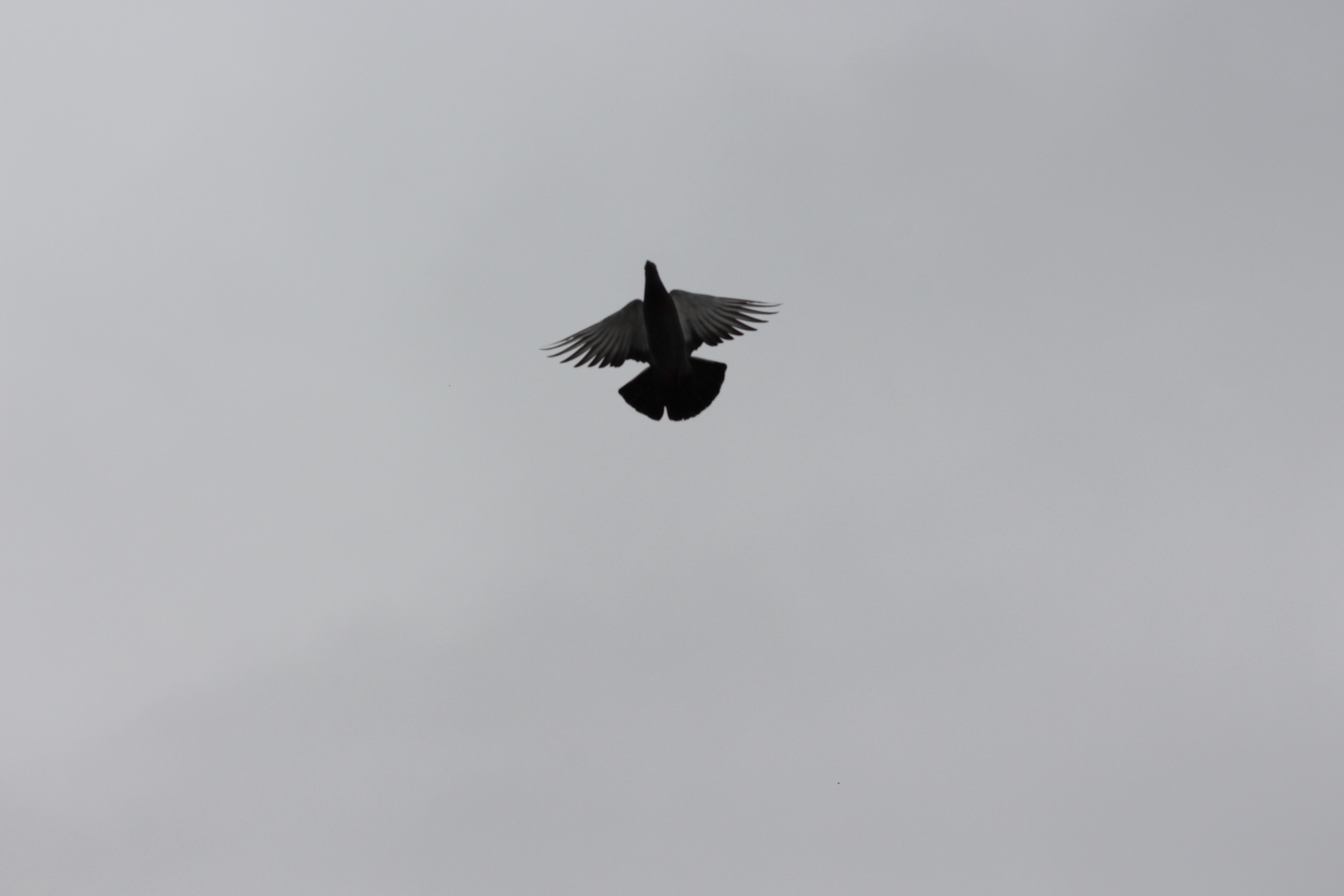 Step 1: Choose an image that could be used to create a simple graphic out of my photo shoot.

 Step 2: Using the stamp tool produce multiple prints of the bird in a symmetrical pattern.
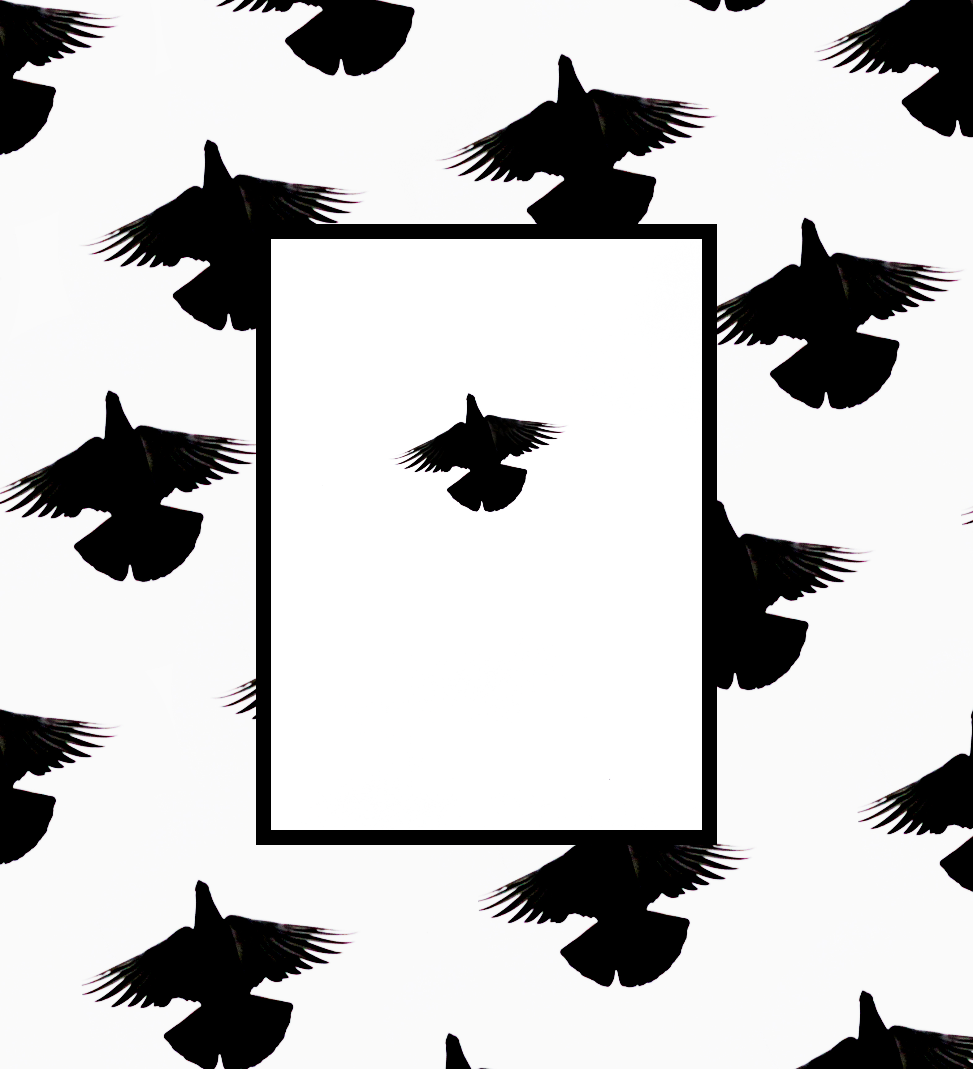 Step 3: Add a white box with a thick black border to create contrast between the original image and the design in the backdrop.
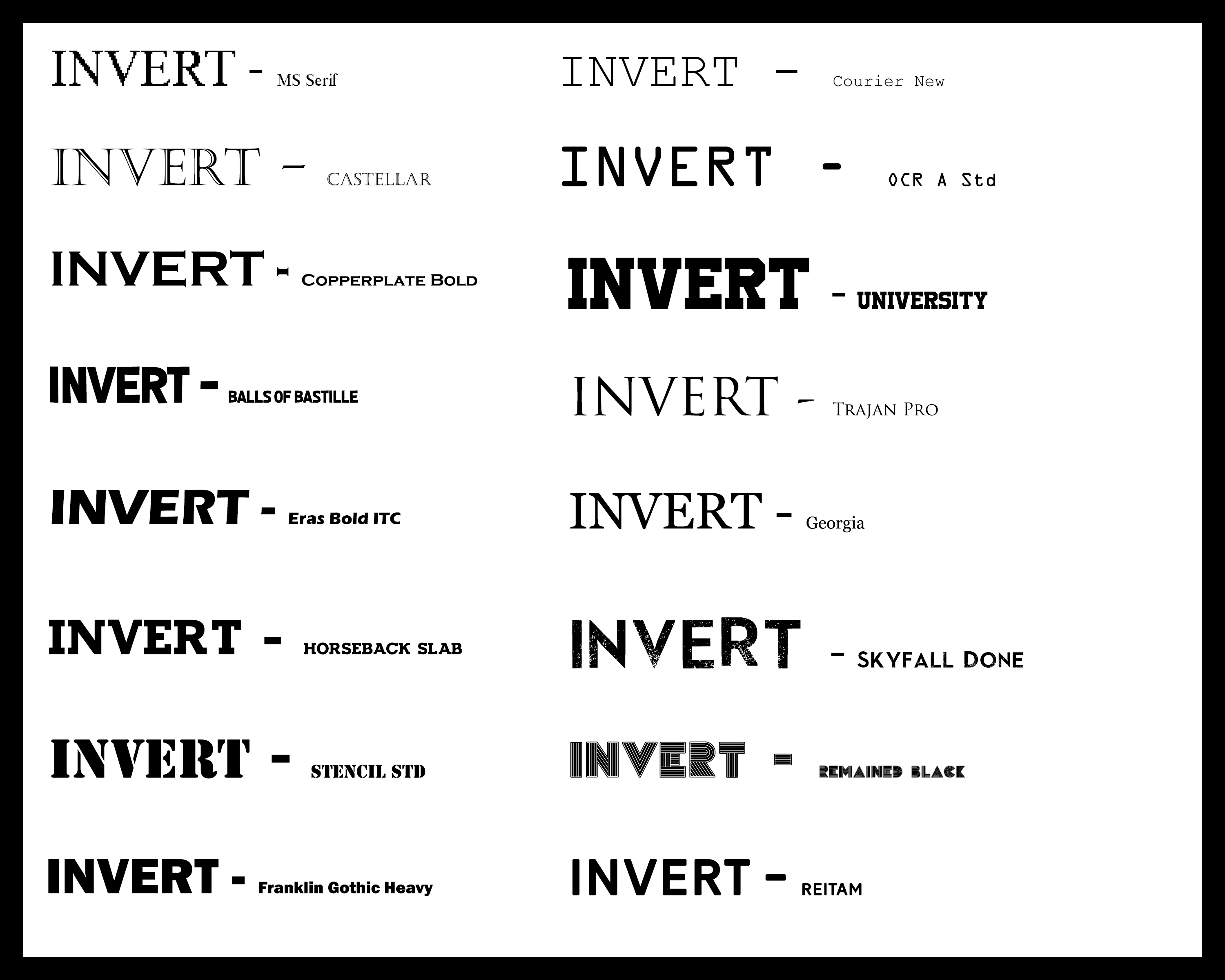 Once finished discovering different styles of font for the text within the zine I was fairly certain on the one I would choose. This was the Reitam font, I chose this because of the simplicity but effectiveness of the overall result, with the black and sharp-edged symmetry posing as an ideal thing that would draw in the attention of any viewer’s gaze straight away.
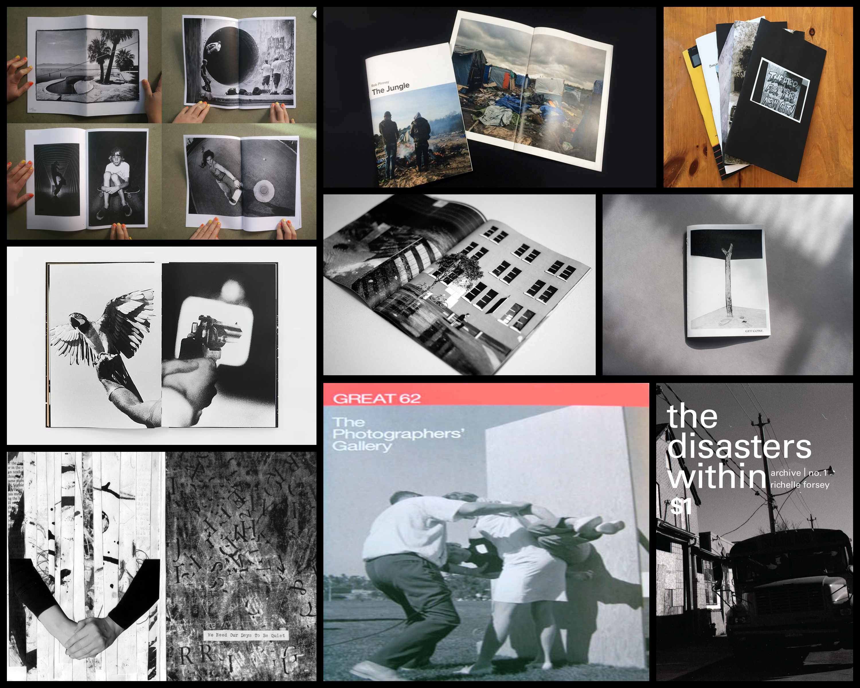 I found the overall thing that drew me into these designs and layouts were the effective use of black and white imagery, borders, and fonts which created a sense of aestheticism on front covers and pages within. A photographer that I found to be particularly useful when looking at zines was Alexis Maryon, a portrait and landscape photographer who has photographed famous and influential figures such as Amy Winehouse, Fatboy Slim, Alicia Keys, travelling world-wide as a photographer for magazines, record covers and long-term projects. Maryon’s zine called Port of Newhaven I found to be an interesting take on his perspective of circumstances regarding the conditions around the people.
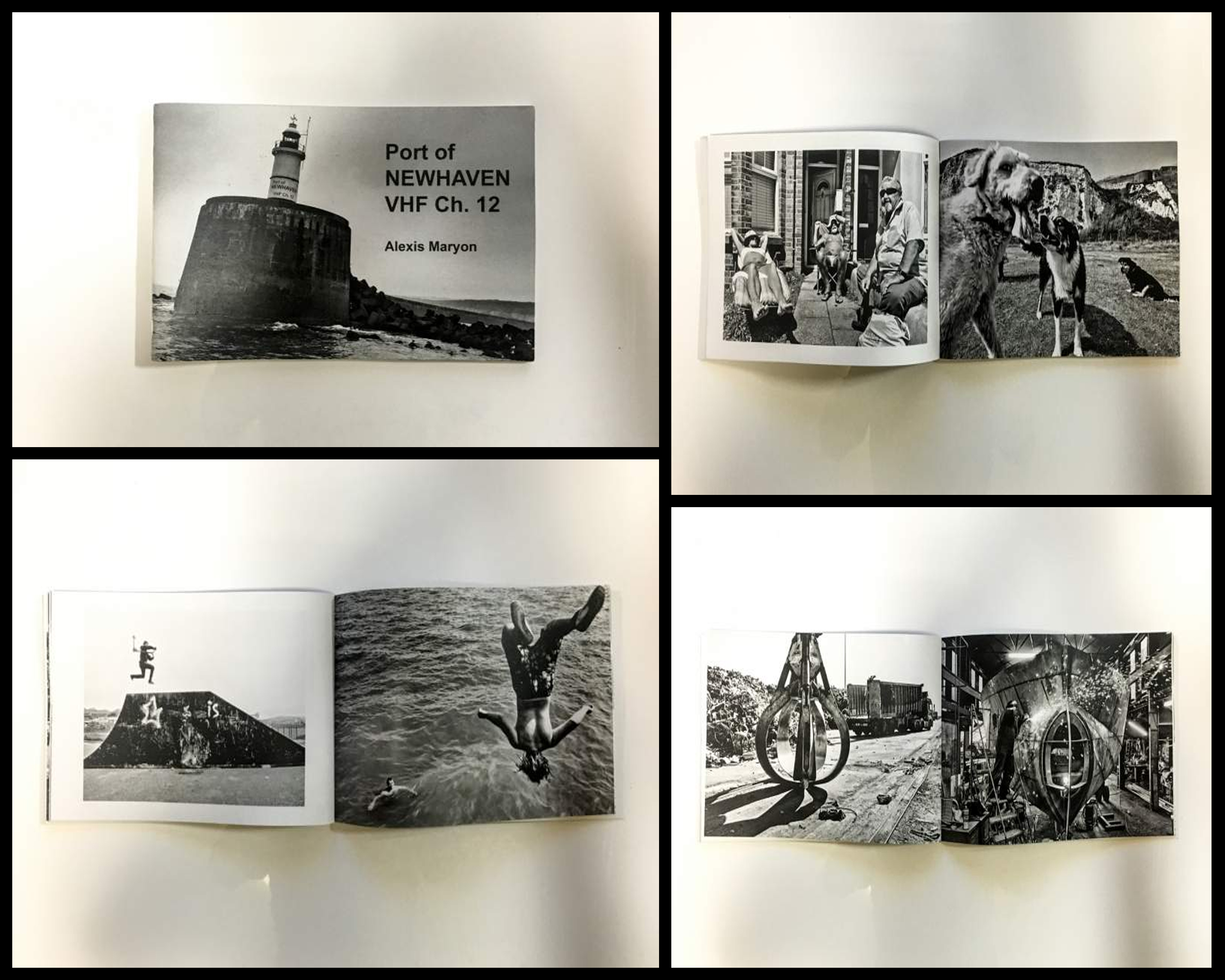 Technical: The photographer uses solely black and white photography to put across their perspective of Newhaven, using it to present the contrasting sides regarding the areas around the port. This is effective as it implicitly highlights different sectors that the port consists of and the variety of life living their, putting my definition on the people and objects rather than backdrop. A relatively high exposure and clarity have also been used to add more detail and depth into the people rather than the places, once again directing the focal point towards what is not suggested in the title, being not the place but society instead. Borders have tended to be used on left hand pages to prevent them becoming too overpowering and clashing with the opposite picture, becoming aesthetically pleasing in the process.
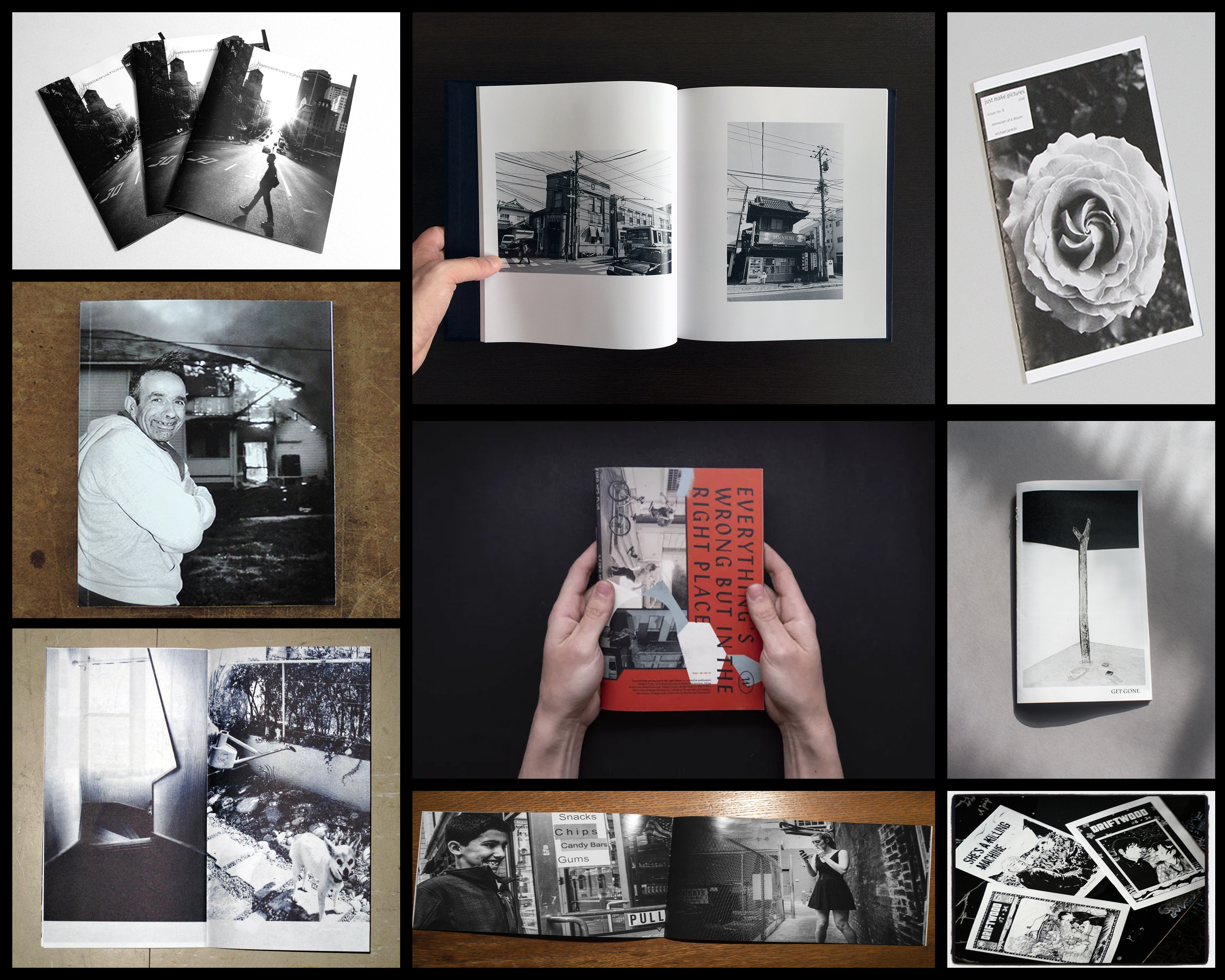 From here I will be analyzing what to me makes a good zine, and the aspects within the design which bring it out to me as a reader. By doing this it would allow me to go ahead with the actual making of my own zine, knowing what I wish to incorporate into it.
 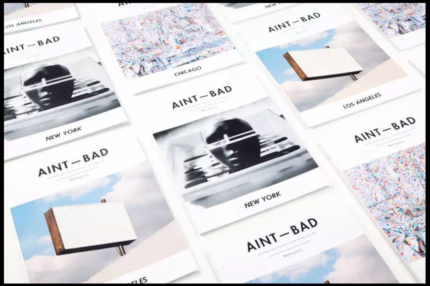 When looking over the cover of these zines titled “AINT – BAD”, I found the use of font to be particularly effective. This is because of the simplicity but boldness it uses, making it not too overpowering, but at the same time fits with the overall design of the pictures and blank space incorporated into the cover. The use of blank space also compliments the image in the center as it defines the vitals of the cover, this is done through how it acts as a natural border for the fonts and the photographs which adds a touch of complex simplicity. The images chosen for each cover I found were not too visually sore, but not too simple, meaning that they perfectly blended into the layout of the design as the mainly bleak colours worked well with the stark black of the writing.
 After I had completed this mood board I decided I should make a mind map which would reflect my ideas that I intend to use on the shoot. By doing this it would reduce the amount of time wasted walking around aimlessly and instead give me objectives that I would need to finish by the end of the shoot, producing more imagery as a result. Here are my ideas regarding the shoot:
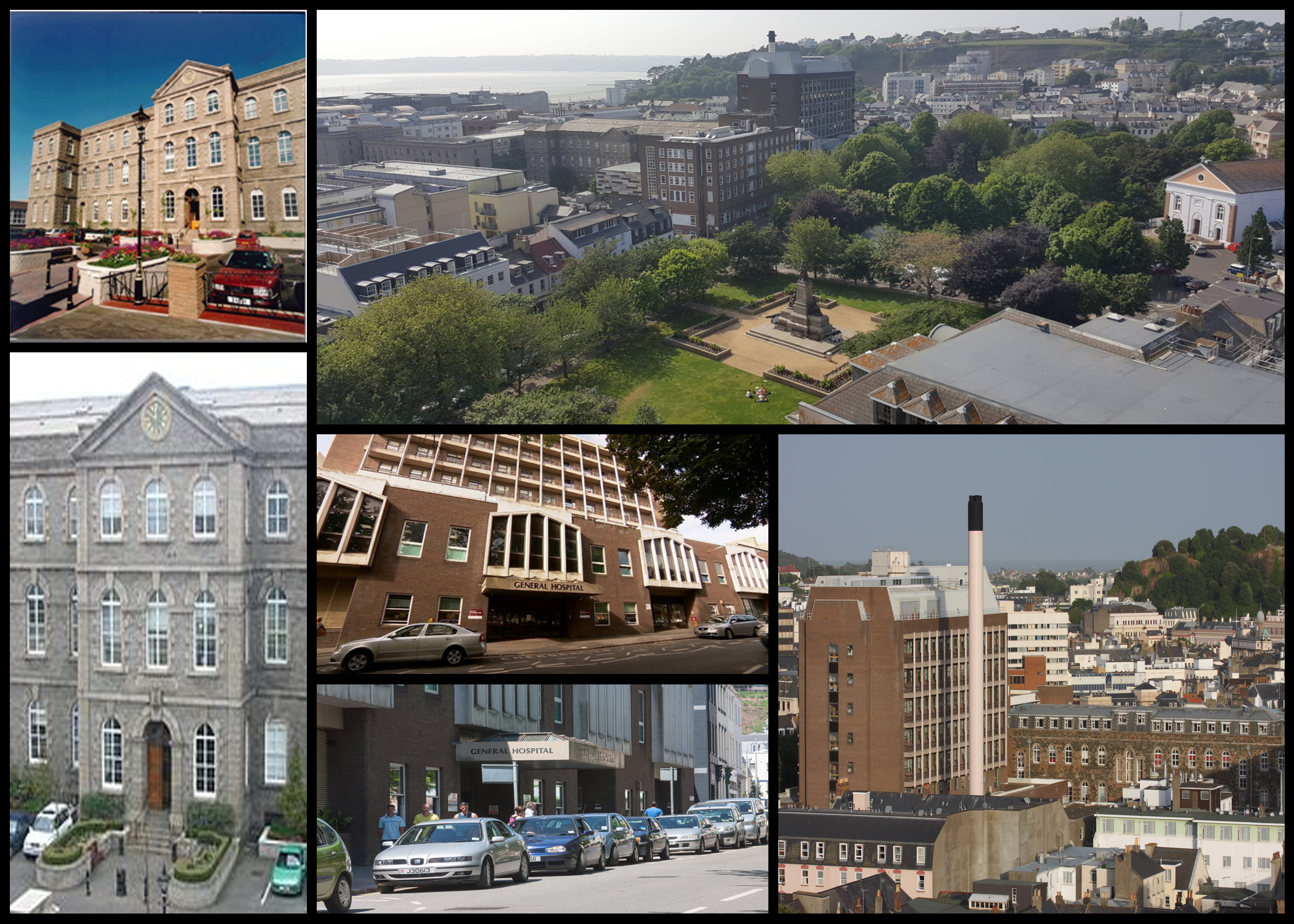
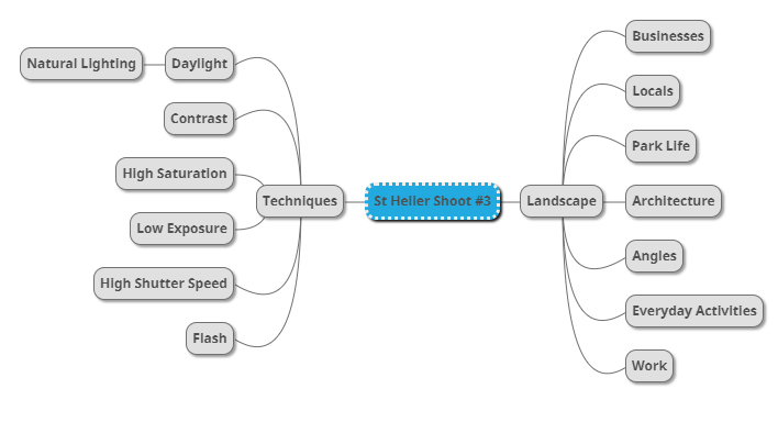 Once I had finished this I deemed myself ready to go ahead with the shoot, I would mainly be walking around the area of the hospital and car parks near it in order to capture what the landscape is really like, here are my images from the shoot:
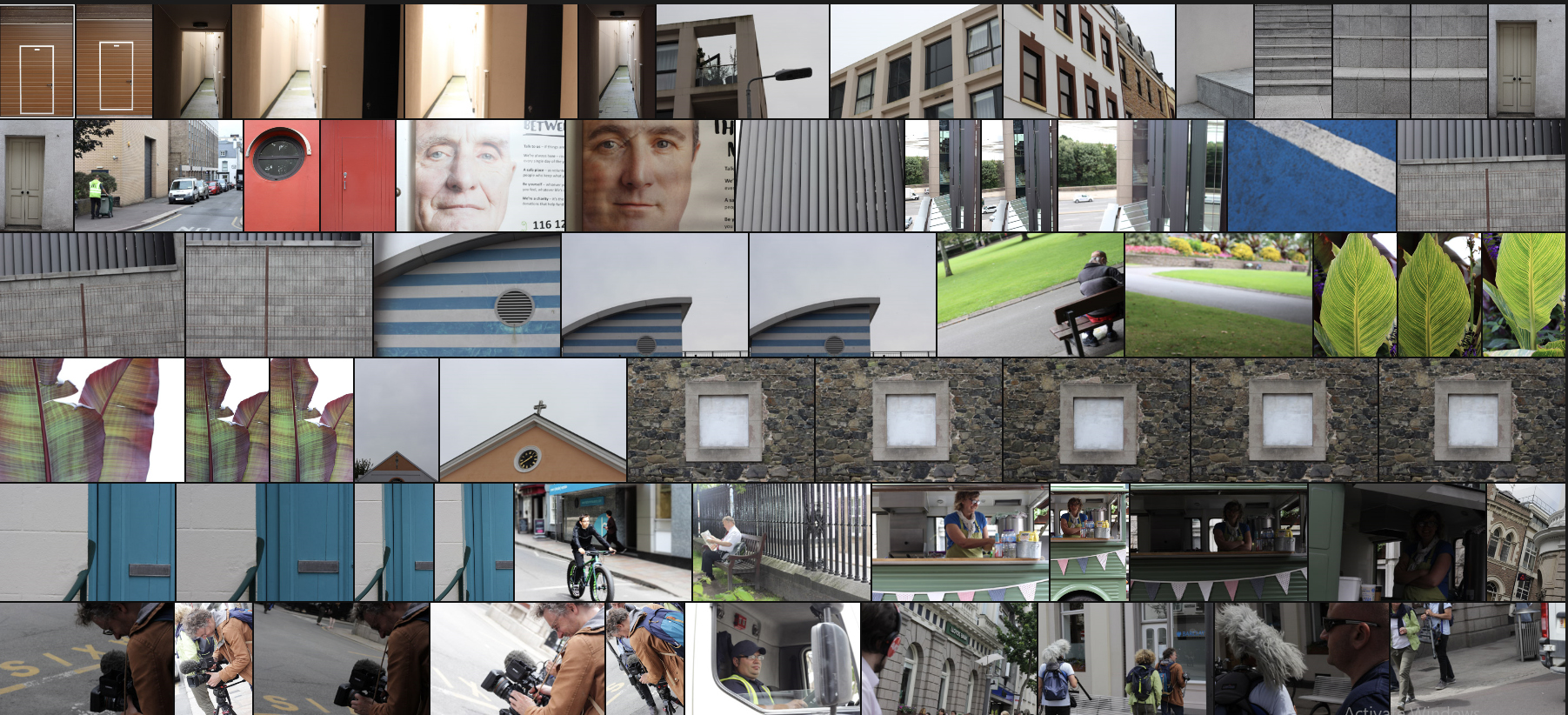 I then proceeded to whittle them down to only ten images in order to select a final image of the shoot that I thought best represented the aim and goal of the purpose. These are the ten images I selected:
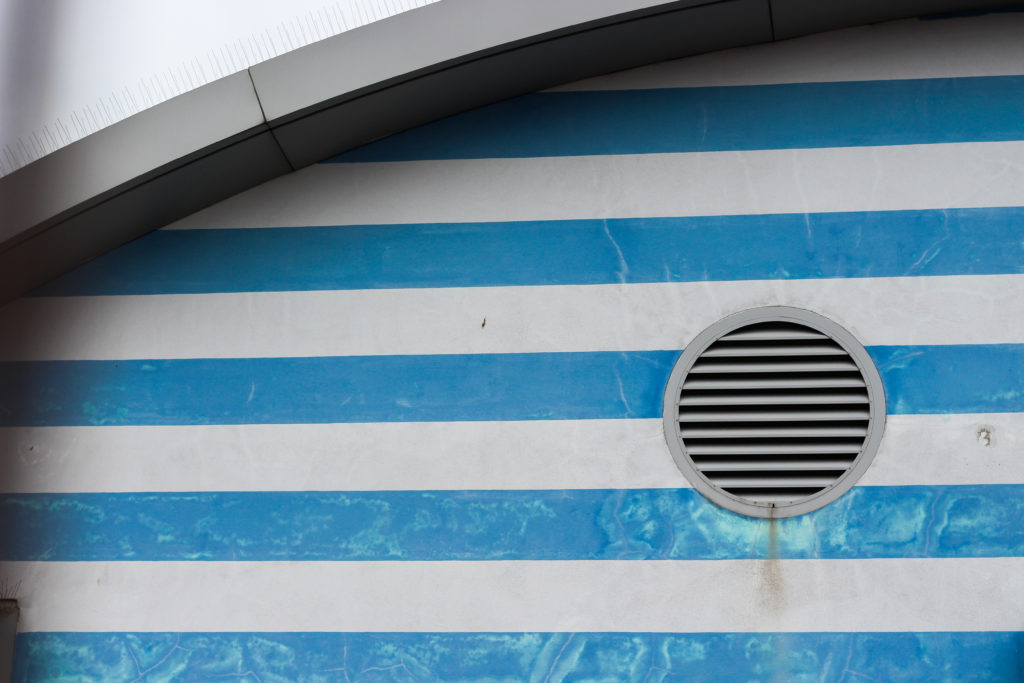
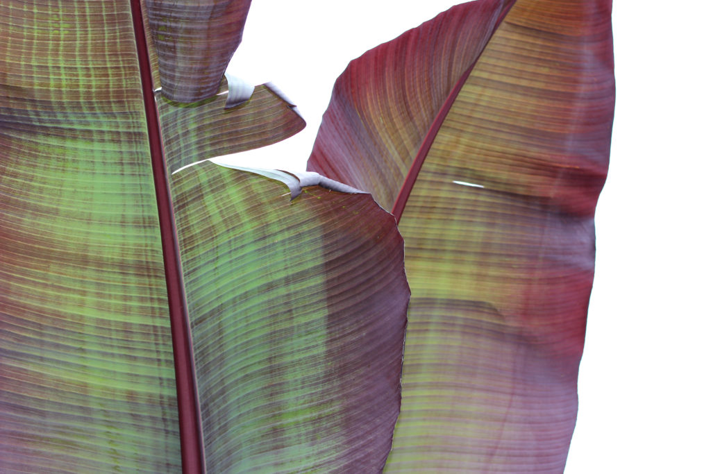
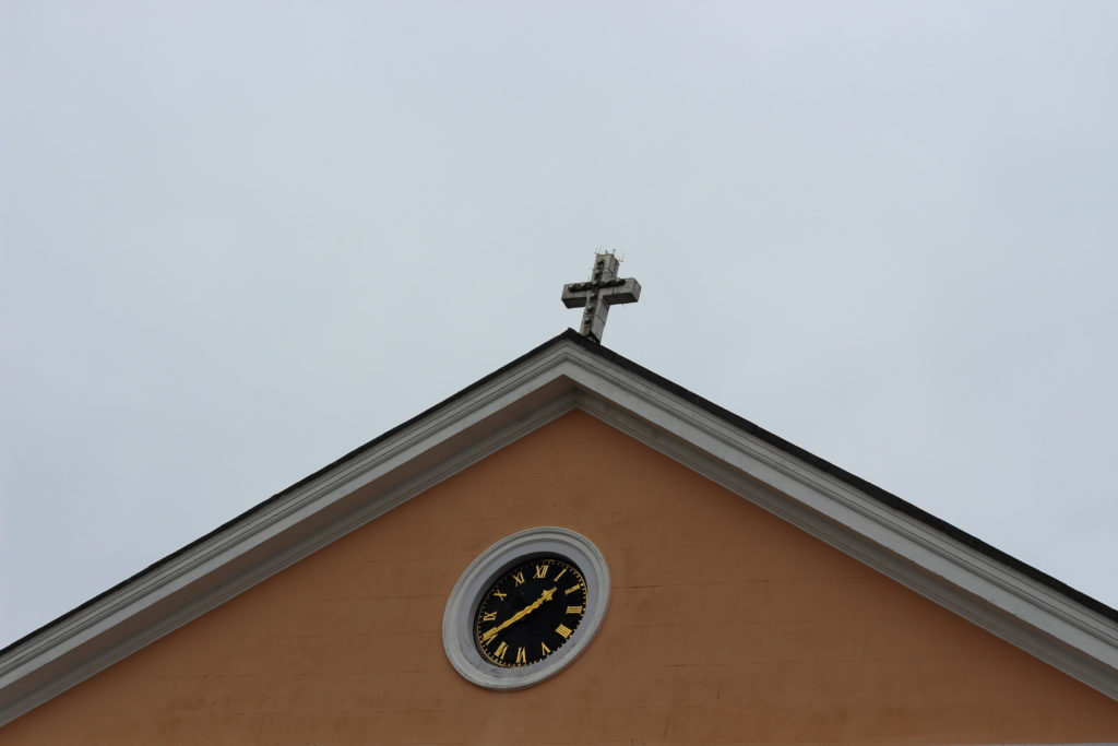
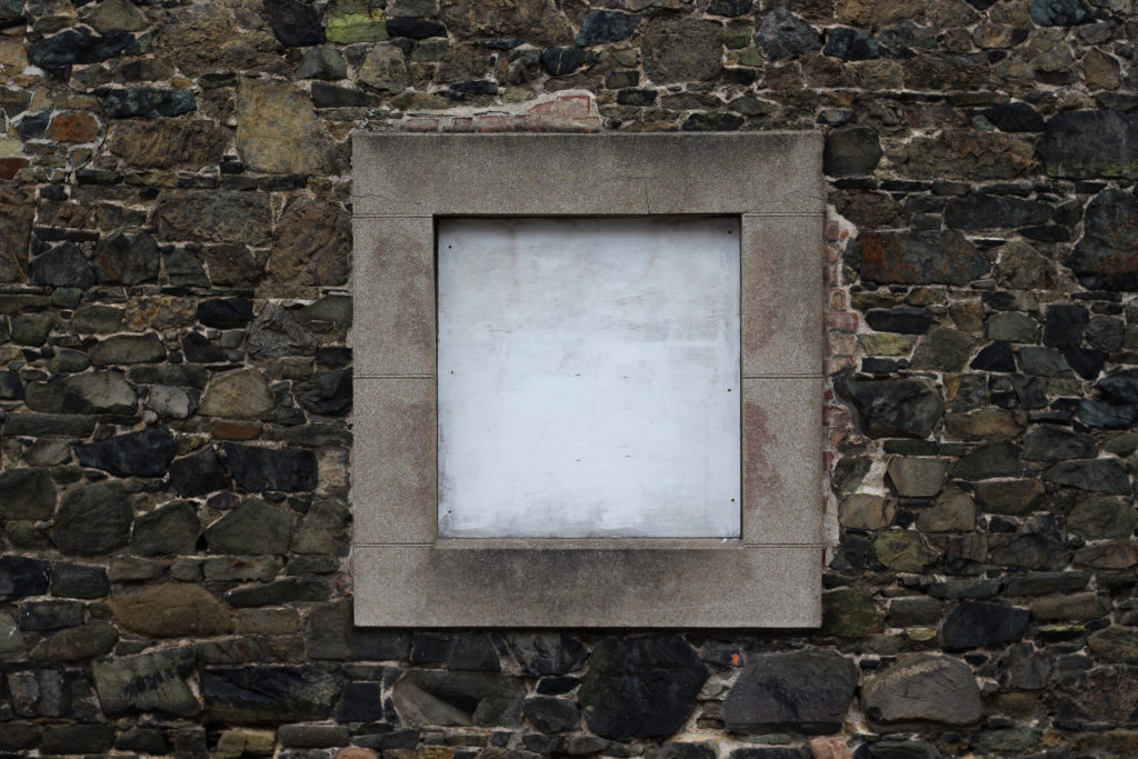
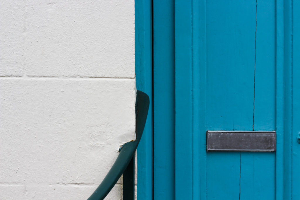
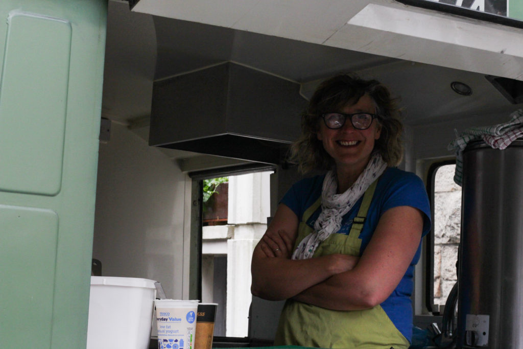
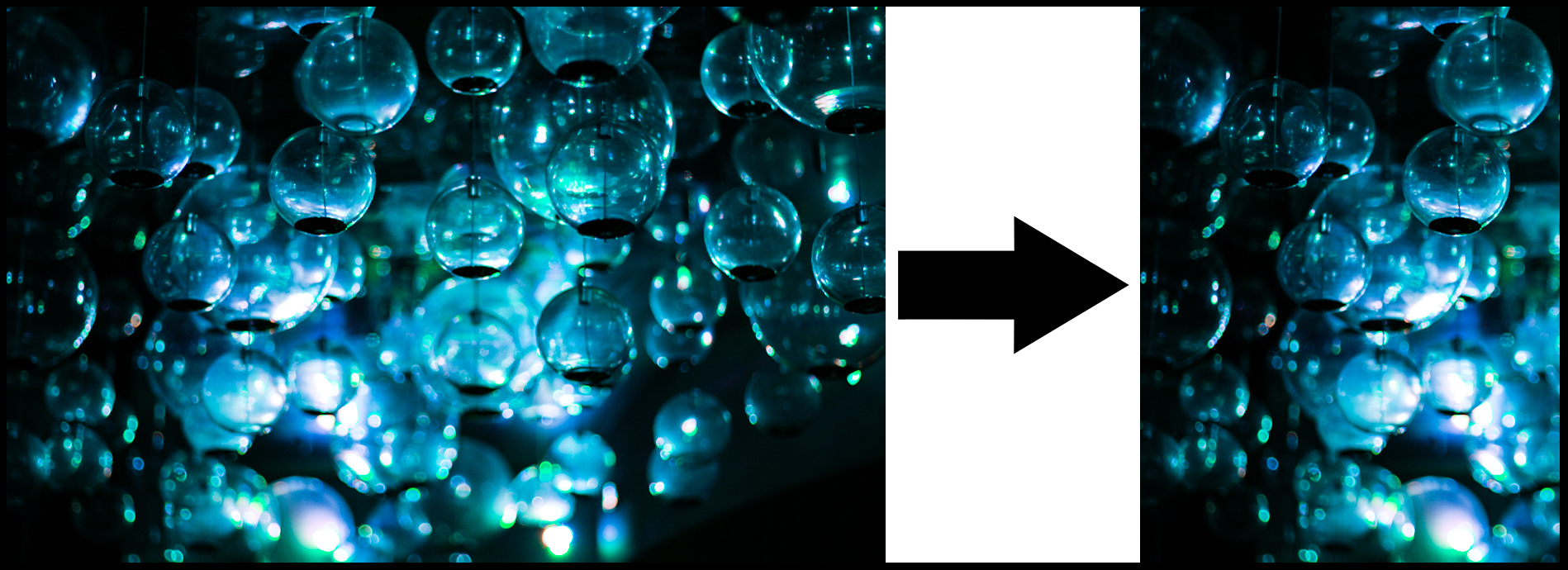 I chose this crop because of the contrast which is created between the light and dark areas of the image, I found that this framed the piece whilst stopped it becoming to eye sore for the viewer from the amount of colours and objects. By transferring it to an A4 portrait size, I realized that a smoother transition formed from the bottom right to the top left very gradually, making it look more aesthetically pleasing as a result.
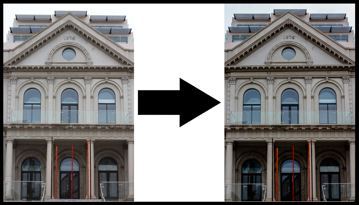 What made me crop this image was because of the symmetry which is available in the picture. To do this I straightened the image settings from the camera, which as a result but an equal distance from the border and building. It also trapped the grey sky above which contrasted the building well in my opinion and also stopped it being too overpowering.
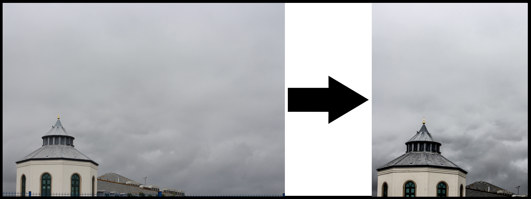 Finally for this image I made sure to crop the image to capture the tip of the building contrasted against the detail of the looming clouds above. I think this emphasized the buildings found in Jersey by how the dull colours matched that of the occasionally dull environment around it.
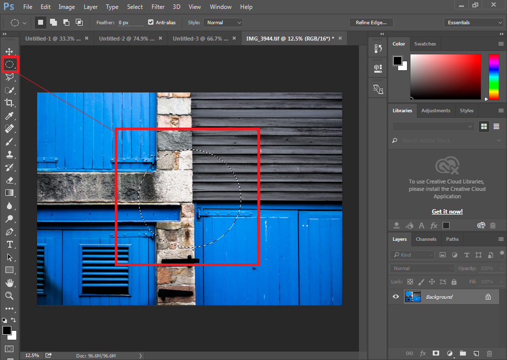 Using either the circular or square highlighter I positioned the shape anywhere on the image, choosing to do the center because of the symmetry it would create from the overall picture.
 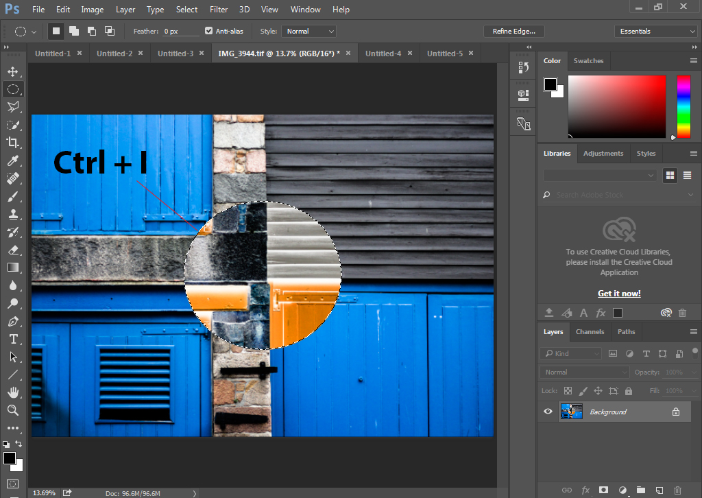 Once I was happy with the shape placement I then proceeded to press Ctrl + I, by doing this it would convert the area inside of the shape into inverted colours making an abstract effect to the piece from the layered filters.