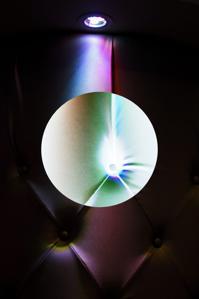
When studying methods in which I could use to put across my views of political landscape I found that rule of the camera present me with the most choice and experimentation into how I could photograph intended ideas. Examples of this could consist of methods of photography that went against the usual ways that pictures were taken, such as macro-photography, photo-manipulation and aerial photography. This topic allowed me to explore ways in which I could compose and portray things, occasionally using software to enhance the images using Photoshop and Lightroom.
For this shoot I would need to rely heavily on the way I present each picture to the audience due to conventional methods not producing the same outcome as I desired. Examples of other photographers works regarding the rule of the camera can be seen below which I will be using as a section for my inspiration in the shoot to come: One of the leading inspirations that I came across for the shoot was the photographer Donald Weber. Weber had used rule of the camera as the main focus point for many of his previous shoots, a certain example of this was named War Sand. War Sand used microscopes to identify otherwise undetectable pieces of metal that were left behind from the World Wars, creating abstract and alien like results. This would rely heavily on other technology to produce the outcome Weber desired as it used external software instead of the camera, with the camera itself only playing a small part of the final result. Here are some of the examples I found to be the most effective from Weber’s project War Sand:
 Once finished with exploring inspirations for my shoot I found that I would need to create a mind-map that would identify areas of focus when taking photographs. This time wise would help loads as it would prevent me from wasting time on the day as to what to look for, instead creating a clear picture from the start into what I should identify as my main points of interest. Here are some of the ideas that I found would have particular importance for the shoot:
 After creating the mind-map I found I was finally ready to go ahead with the shoot, taking into consideration the ideas recently drawn up and presented above I decided to focus my shoot around areas of historic relevance. This would consist of bunkers, castles etc, which would enable me to photograph unusual structures and landscapes unique to that area, with pattern and abstract being my main aims to achieve out of the entire shoot. Here I would look at how over time certain areas have deteriorated and how the surrounding landscape has adapted to fit in around it, specifically looking at rust and the area around it. Here are the outcomes from my shoot:

 From here I will select ten images that I found were the most effective outcomes from the entire shoot. By doing this it would allow a greater insight into what made me select these images and how I would select the final and best picture from the shoot.
 After looking over what I deemed to be my best imagery from the shoot I decided to select the best five photos and analyse them. By doing this it would allow me to understand how they could be related to the topic of conventions, whilst discovering what aspects within the photographs made them so effective that I chose them out of the shoot. Here is my selection of my favorite five images:
 I chose this image because of the broken pattern created by the foam on the waves that fade into the sky, I found this to be particularly effective from how the placement of the foam keeps the sea symmetrical either side of it. This is also complimented by the gradient of the sky which fades the landscape out, both of these relate to the topic of conventions from the use of a higher exposure and clarity to capture the light more vividly, producing a dream like scape as a result. Convention wise I wish to highlight the mass of sea that surrounds us on our island and how the built up areas of bunkers made by the Germans intended to use this to their advantage in their defenses.
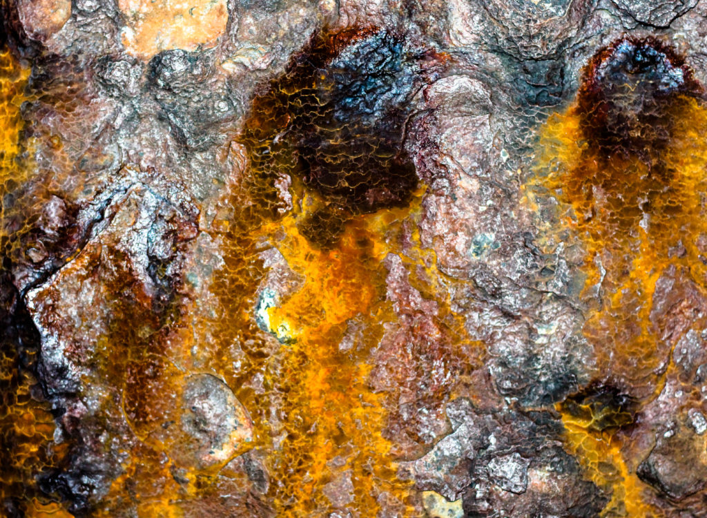
  What I liked about this image was how it highlighted the rust that now had settled on the metal surrounding the artillery covering the now ruined bunkers dotted around. This is contrasted by the high clarity which creates a particular focus on the rust of the image, portraying it almost as blood whilst making use of the dark backdrop to create a real identity of how much of the weaponry now stands in Jersey. I really like the stained pattern that the rust made on the white paint as it broke up the object resulting in an abstract after math where it’s now harder to interpret what the object used to be.
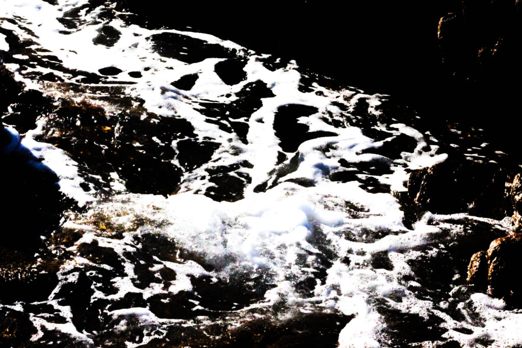
 Here I found the use of a predominantly black and white photo to be very effective in the representation I wished to put across of the tide that sweeps the shores of the bunkers surrounding the beaches. By reducing it too mainly two shades I found that it abstracted the piece and instead limited the blues and browns to only the rocks and specific areas of the water. What I really liked was the composition of the wave as it came into shore, travelling from the top left corner into the bottom right spreading out as it does so, I found this to be a great representation of how tides would have looked as the historical events that surrounded it unfolded around it.
  The reason I chose this image for my top five was because of the use of a low exposure to create a sinister and looming impression upon the commonly used doors of the German bunkers. The use of a vandalized door to me represented the now forgotten past of certain areas and how overlooked they have now become, with many being the subject of graffiti and writing, defacing what they previously stood for, defense. The composition I thought strengthened this idea as it produces the impression of order and mystery, interesting the viewer to want to understand what went on behind the doors.
  Finally the reason I selected this image was because of the aesthetically pleasing result that the sandbags lining the shores of the coast around the bunkers would be positioned and portrayed in. The netting within the picture I found broke up the otherwise boring piece which would have just consisted of brown bags, instead adding an opposing colour of green and blue to it, creating the impression that the nets are almost there to preserve and hold together the remains of the defenses previously present around the beach.
Final Image:
Overall I found that image of the sandbags surrounded in blue and green mesh fencing to be the most effective, this was down to the aestheticism and significance behind it. Composition wise the use of symmetry I found was particularly effective from how it represented the commonly seen formation that many soldiers worldwide would have witnessed where ever they were positioned, whilst the decaying bags would produce grotesque and unusual shapes. I found the contrasting colours of green, blue and brown to be effective from how they broke up the otherwise bland and uninteresting formation, instead adding a visually pleasing element to it as a result. Finally to me the use of a low exposure when taking the photograph allowed for an overemphasize portrayal of the bags which now were shaded almost sinister in looks from the looming shadows produced from the gaps.





 From here I decided to analyse one of Weber’s images, by doing this it would allow me to understand the thought process and concept behind his photography, whilst looking at the different techniques used to produce his work. From this it would allow me to create a more appropriate response for future shoots regarding rules of the camera, as it would enhance my insight into techniques used by the camera to make the desired product. The image I chose is called Vorkuta (2008):
 Technical: The image itself uses a low shutter speed to capture the snow drifting in the wind, because of this it creates the impression of an almost dreamy and surreal isolated located. This use of shutter speed perfectly blurs the snow-covered ground, making it almost feel like the buildings are coming out of the ground. A relatively normal exposure is used to create contrast against the white backdrop, accompanied with a slightly tinted black border this breaks up the blank space from becoming too overpowering.
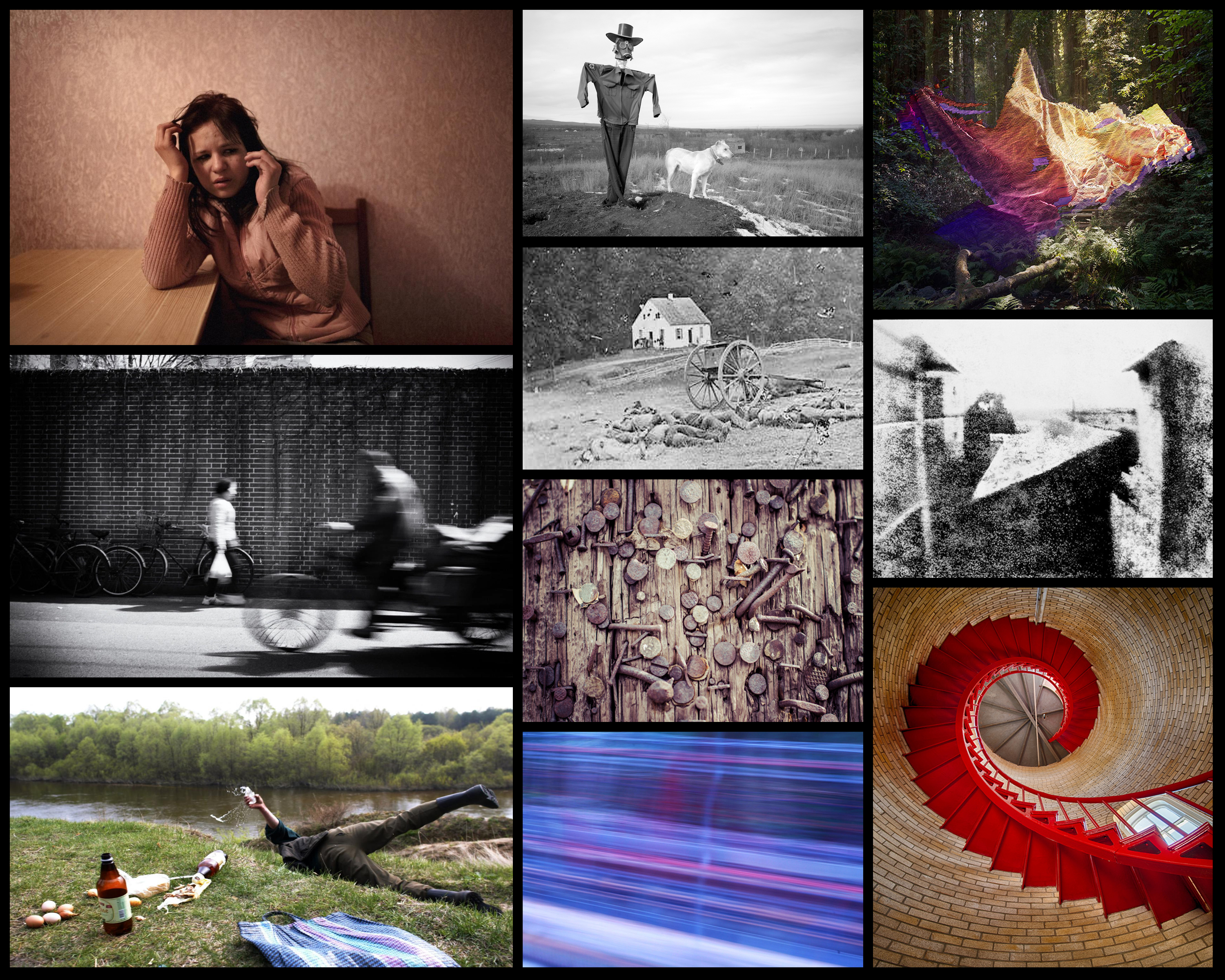 Above we can see that there seems to be a predominantly abstract and surreal theme within each photo, this is presented through bright and unusual colors composed in odd and unique ways. When studying these photos there seems to be a lot of shutter speed and exposure use, by doing so it can create scenes otherwise invisible to the naked eye allowing for aesthetically pleasing results. To understand what could be interpreted as Rule of The Camera I decided to analyse one of the images related to the topic, by doing so this would expand my stance on how I went around photographing my chosen area of political landscapes, consumerism. Here is an example of one of the many ways the topic can be explored:
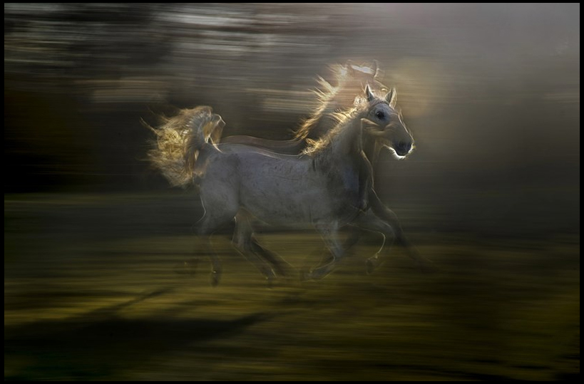 Technical: The image itself uses two overlapped images, one consisting of a higher shutter speed and the other overlying one being slower. By doing this when overlapped it creates an image depicting the horse in an act of rapid movement, the is emphasized by the blurred backdrop which wishes to capture the horse in the midst of galloping. This blur is also accompanied with a low exposure which defines the figure of the horse more against the trees, on top of this a black gradient border is used to light only the horse and a small radius around it. Due to this a more sinister feel is created outside the center of the piece, as it shrouds the vegetation from further detail.
 When looking over images of local quarries I found that the layering of the landscape appealed to me the most, as it presented the viewer with something not necessarily seen in general, being sure to attract the viewer’s attention in. This is accompanied by the use of weird and unusual machinery which when looking over provides quite a menacing intricate design, which once included with the landscape around it could compliment each other well. By presenting these images in a way that could provide evidence of harmful scarring of the environment I believe that the outcome would really highlight the granite industry.
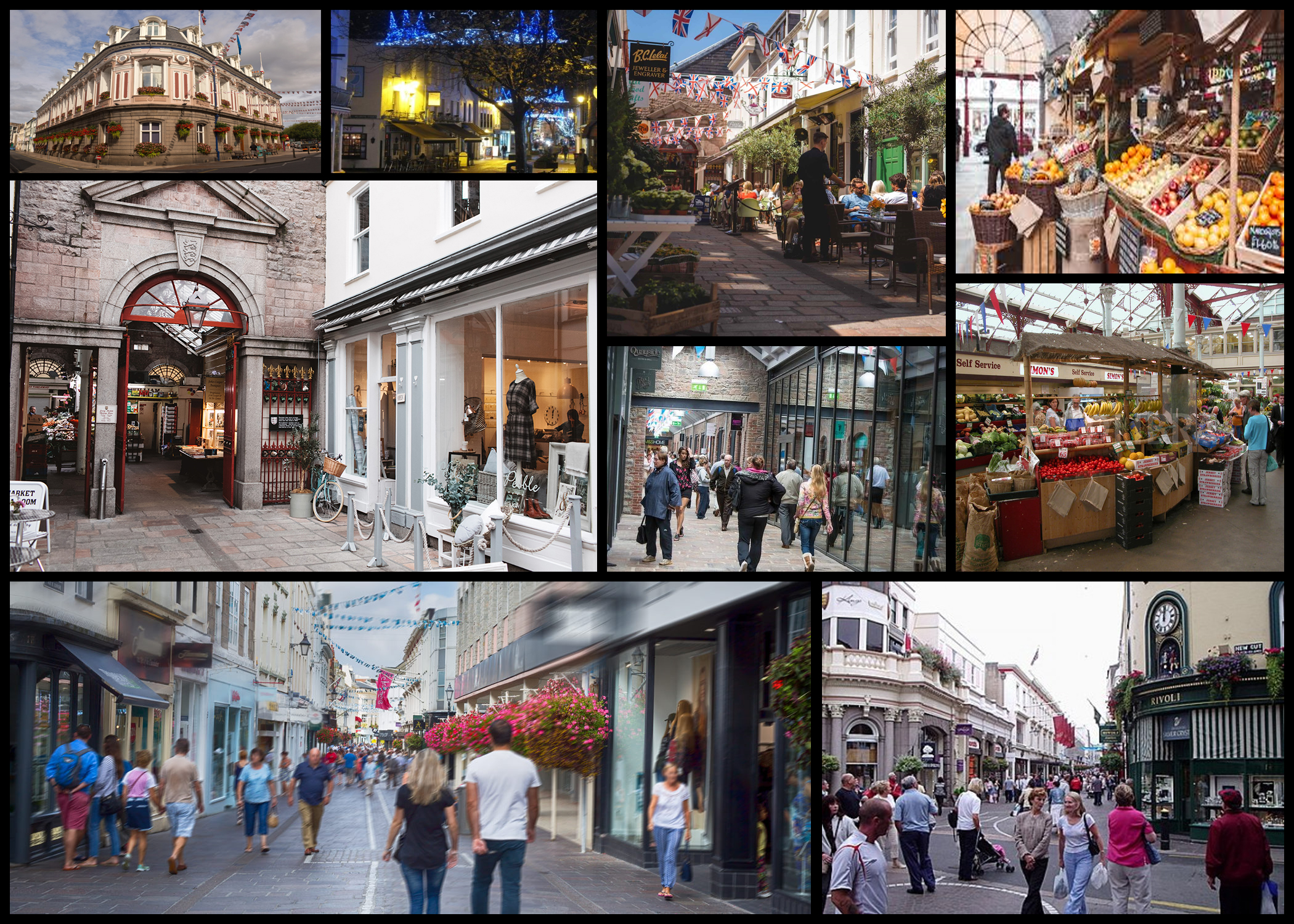 When looking over the ideas a really like the thought of going into shops and photographing lines of products and the variety of colours they could come in. I don’t think the areas in St Helier would present me with the atmosphere desired for the effects wanted when taking images, leading my shoot to probably branch out on a local level rather than island wide as the bustle would be too much. As well as this I wanted to capture the coldness of empty isles in the shop, such as the meat aisle that when left alone could provide a rather eerie look.
 What appealed to me here was the industries that surrounded the waste at the end of the road leading up to it. I found this to be a great reflection of how we ended our consumerism as the structures that consisted in the area generally had a grim exterior that the waste which was dumped there. When eventually doing the shoot I would make sure to incorporate the greenery into the picture which would provide contrast to most of the images, our environment vs industrialisation of the land.
 From here I decided to create a mind-map which could allow me to express the different areas of the political landscape that I potentially wanted to pursue. This would also allow me to quicken the process of the shoot associated with this topic, as by making a mind-map I would not waste time thinking about my focus point when doing the shoot itself. These were my ideas:
  What came to me as the most interesting stance for the subject of political landscapes was the idea of consumerism, I thought that by contrasting the source of consumerism and the outcome of it, it would give awareness to how bad the issue had become. To do this I would have to explore various areas of interest around the island, photographing them to later edit in software such as Adobe Photoshop where I would crop and change certain aspects of the piece. Another stance could be the process of retail and how the build up of consumerism is seen in everyday life over the years, this could provide a stark comparison to how the islands landscape has developed over the years and whether it can be deemed positively or negatively.
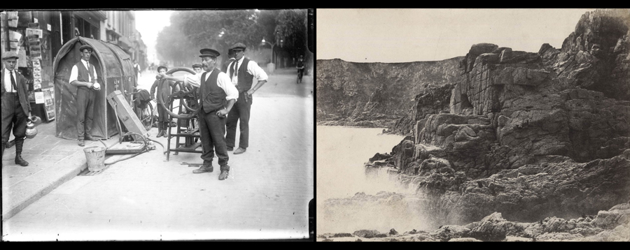 Instead of focusing on the financial side of Jersey I could instead look at the development of waste built up over time and the process towards it. To do this I would have to explore areas such as the dump and town whilst photographing how it changes and scars the landscape around us, whilst presenting seemingly polar opposite sides of Jersey which implicitly link. When doing these shoots I may decide to present my photographs in more abstract and aesthetic ways, by doing so it would not only make the images more appealing but also raise awareness towards the sheer size of the problem through exaggeration.
  Finally my last idea regarding political landscapes are the areas the surround and lead to the process of waste. Examples of this could be farmland to provide contrast to waste seen at its source, or the industrial/businesses which surround the area, giving an insight into the landscape they have become use to. To do this I will be specifically looking at the area of St Helier and the North of the island where the majority of farmland is, being the most straightforward way of present my viewpoint.
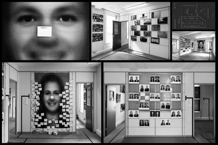
 repeated limited exposure to produce a single blended image of the chronically sick during that time period. However the further into the exhibition I looked the more political the message seemed, an example of this was the board installed filled with various people’s opinions on the financial sector of Jersey. Here by gathering opinions together to form an overall insight into societies perspective of finance it produced an un-bias result, this was because the cards originated from a huge variety of sources such as: schools, finance and retail sectors, and so allowed for feedback into how they viewed Jersey should head towards. Once again inspired by another photographer, called EJ Major, Bush sent out cards of his own in response to hers which had the written question “Love is…” on them, a direct influence for Bush whose own cards had written “Finance is…” on the front of them to engage the audience.
In addition to this photographer Clare Rae, whose work I studied in the recent Entre Nous exhibition, looked towards the female figure and the landscape around her as a form of putting across her political views of Jersey. Her form of photography described as “regaining subjectivity and controlling representation” can be linked to how the female figure was criticized regarding gender essentialism, and so the idea of a hidden female face in each image was meant to reflect this specific ideology rather than deflect it. This can be seen as directly confronting the political aspect of her surrounding environment, where her body takes up the form and representation of her “precarious relation to these environments and their narrativity“, compelling the idea of how the subjects gaze upon the image could be interpreted and the idea that could be associated to it. Causing topic for debate regarding “subject of the gaze and the
 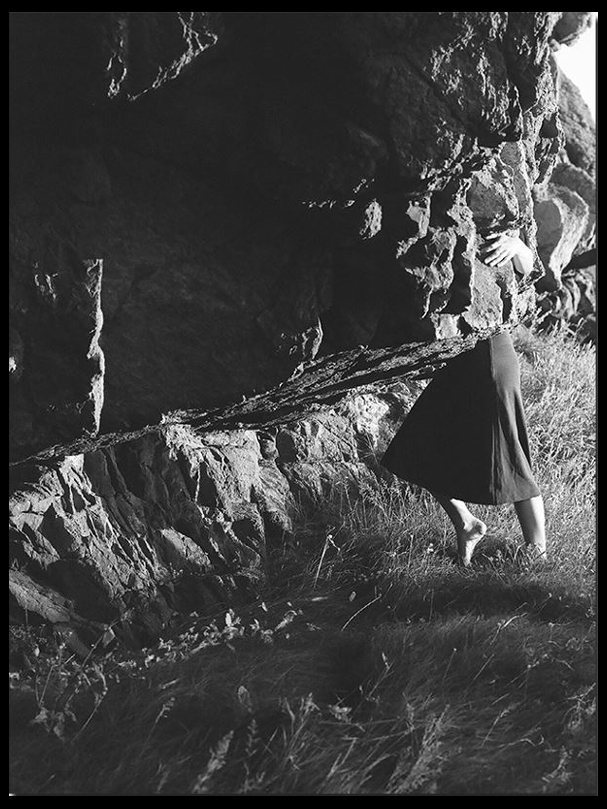 object of it” from how her uncertainty over
issues considering photographic significance and the political stance surrounding it, caused her to turn the camera upon herself and become the subject of the shoot, due to it being her standing point upon the matter. Much of Rae’s working seems to be the focus of the male gaze and the idea of subverting it through the use of female nature (seen here as passive) and male nature (seen here as dominant), challenging this perspective by how she wishes to present the female nature as closer to the environment surrounding them, but instead has been ‘dismantled’ by society as it’s progressed through the ages due to post-structuralist scrutiny.
However when contrasting works of both Bush and Rae it can be argued that their political stances are completely different to each others arguing voices. This is due to how I believe that Rae chooses to create her focal point around one particular topic, subversion of the female figure, therefore constricting her opinion to only one or two political perspectives as you can either agree or disagree. Bush on the other hand chooses the wider perspective regarding the entirety of Jersey’s society, instead looking at how the congregated opinions of citizens could come together to form an overall input into the development of Jersey as a whole. Both these standing points clash and compliment each other from how yes, both restrict and broaden their political opinion base completely, but how both look at attempting to sway the perspective and judgment of the viewers towards not what they believe but rather what each individual thinks when they view the work. Each photographer indicates the ever-developing change that has progressed in Jersey’s society, with certain beliefs and viewpoints changing as Jersey did, with some standing put against this advancement rather than join it
In conclusion it’s I believe that both photographer’s work can be classed as political through the implicit and explicit messages that most of their photos hold. Though both focus their works on different sectors of Jersey’s history, looking at individuals or entire areas, both conclude the needed or controversial change that has occurred and the distinct voices that many embrace regarding the future of not just St. Helier but the whole of Jersey and the path being headed towards. This as a result becomes a hugely political debate as both photographers do not look just at their opinions but rather those who they see as being effected by the change that should or has occurred.
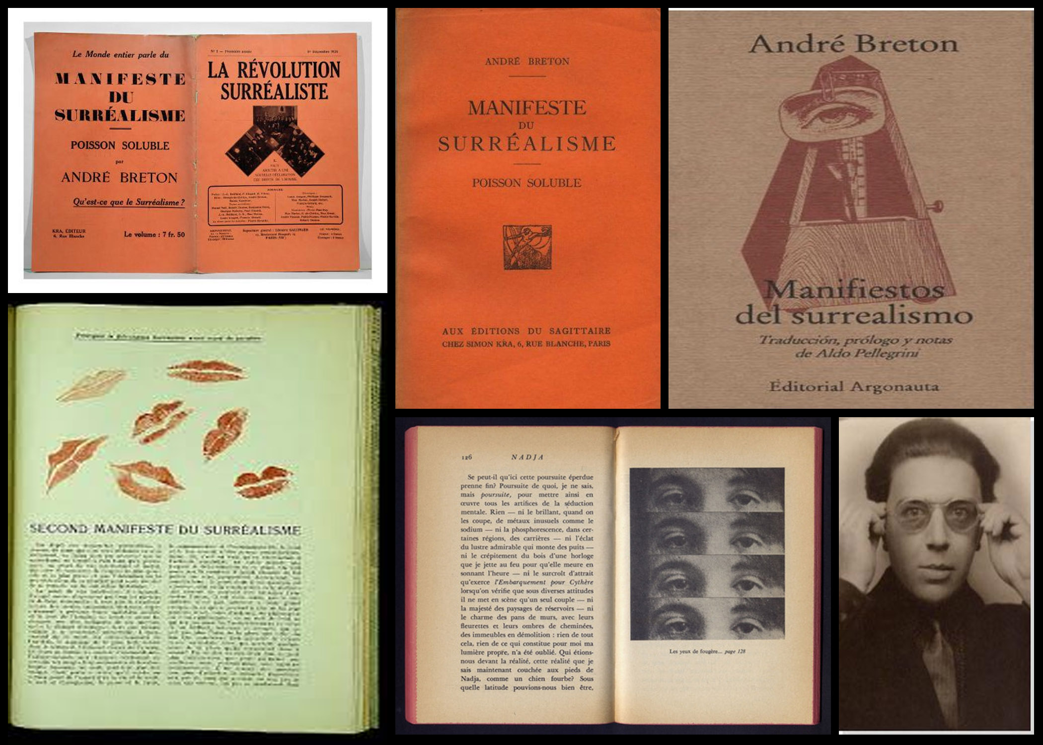
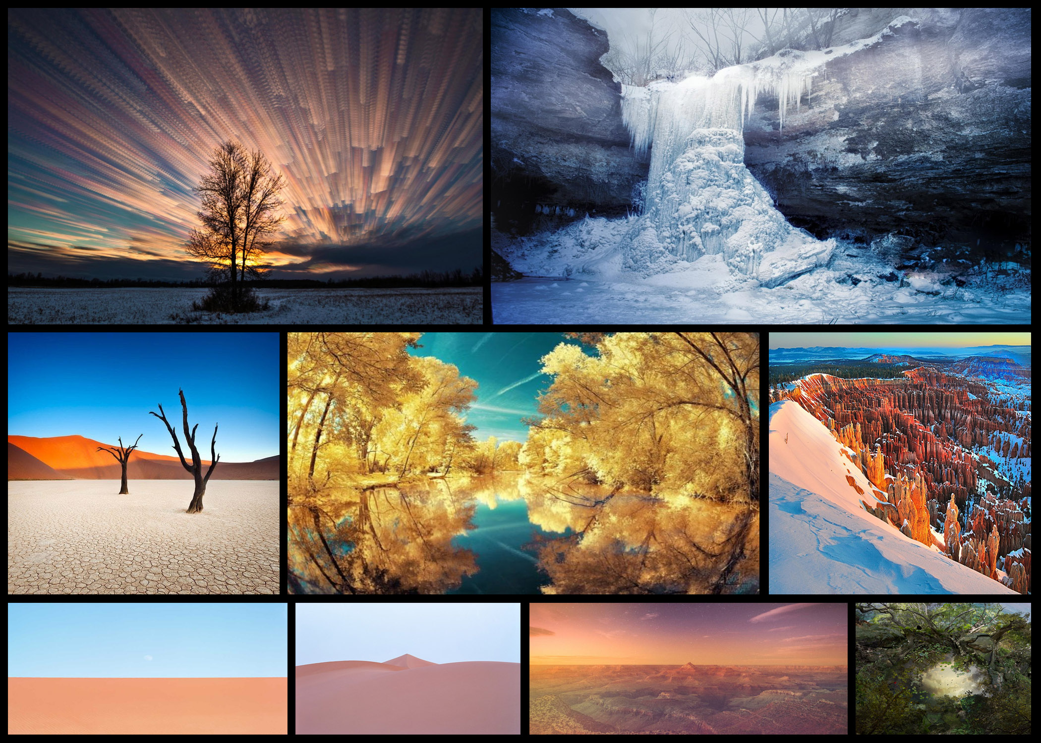 When creating my own manifesto regarding political landscape I intend to use consumerism as the basis for my work. However I would like to possibly incorporate surrealism into my work along the way, using enhancement to create dream like landscapes which don’t really reflect the true nature of that area. To do this I would be using software such as Photoshop and Lightroom to create the products desired, as they provide me with the necessary tools required. I want my manifesto to be creative, looking at varying sides of consumerism not just one aspect, allowing for diversity in my work produced. I would love to use colour and vibrancy as one of my leading aspects in the manifesto as it would provide the audience with aesthetic and appealing imagery that had a deeper meaning under the surreal appearance.
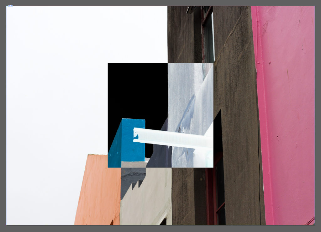
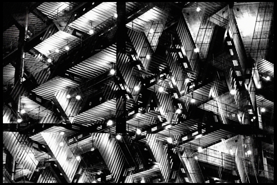
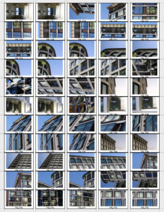
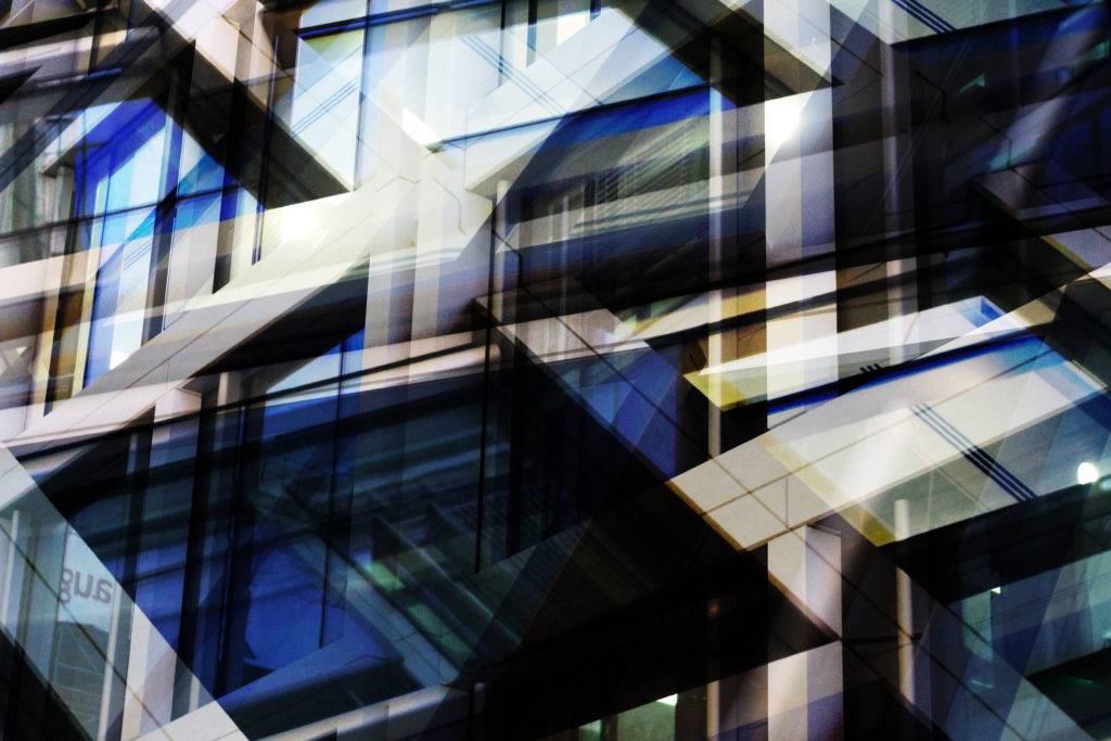
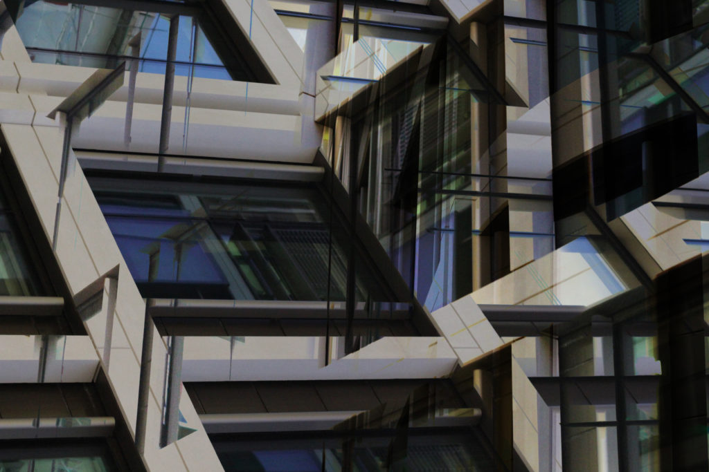
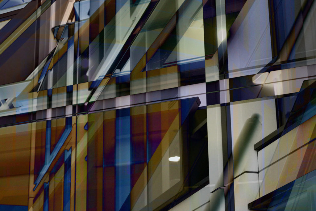
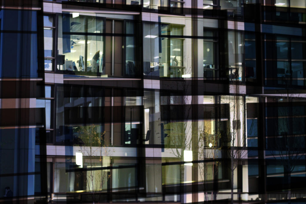
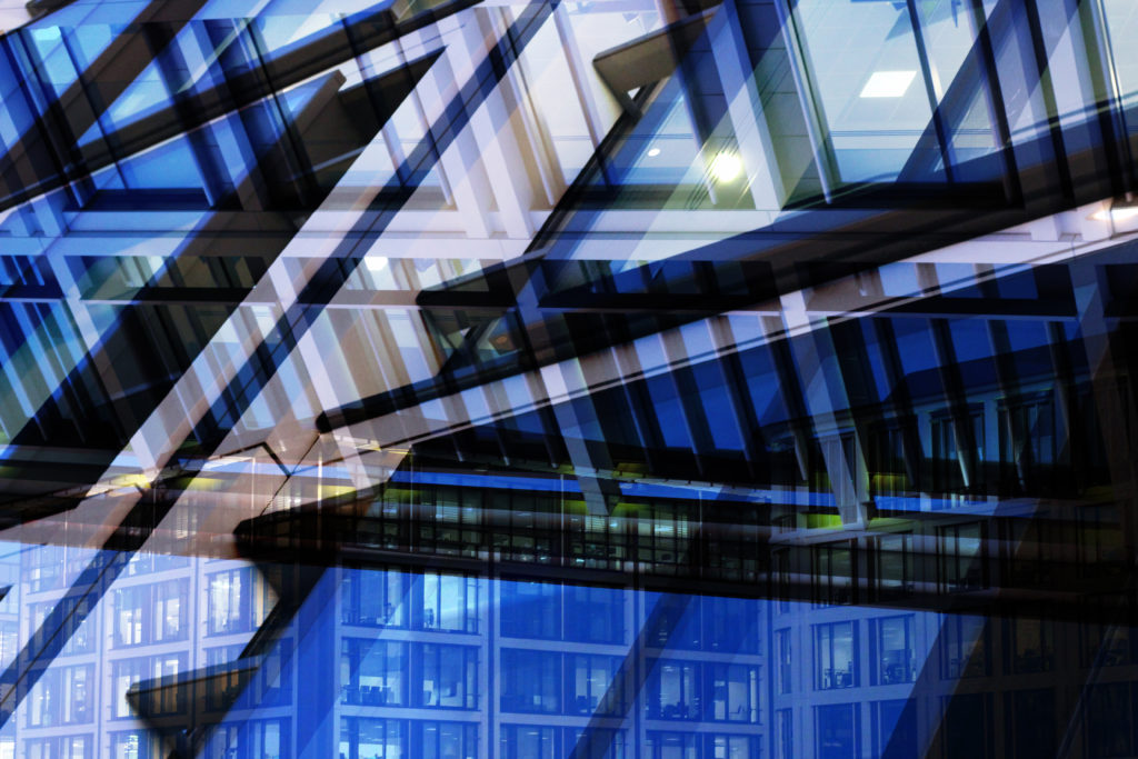
 To produce the outcomes desired I would have to make a shoot response and use software such as Photoshop to overlap imagery to create a maze like formation of the financial sector. Firstly I would have to spend some time around the finance area photographing the structure and symmetry present throughout the design of the building. These are my response photos to Lewis Bush’s work:
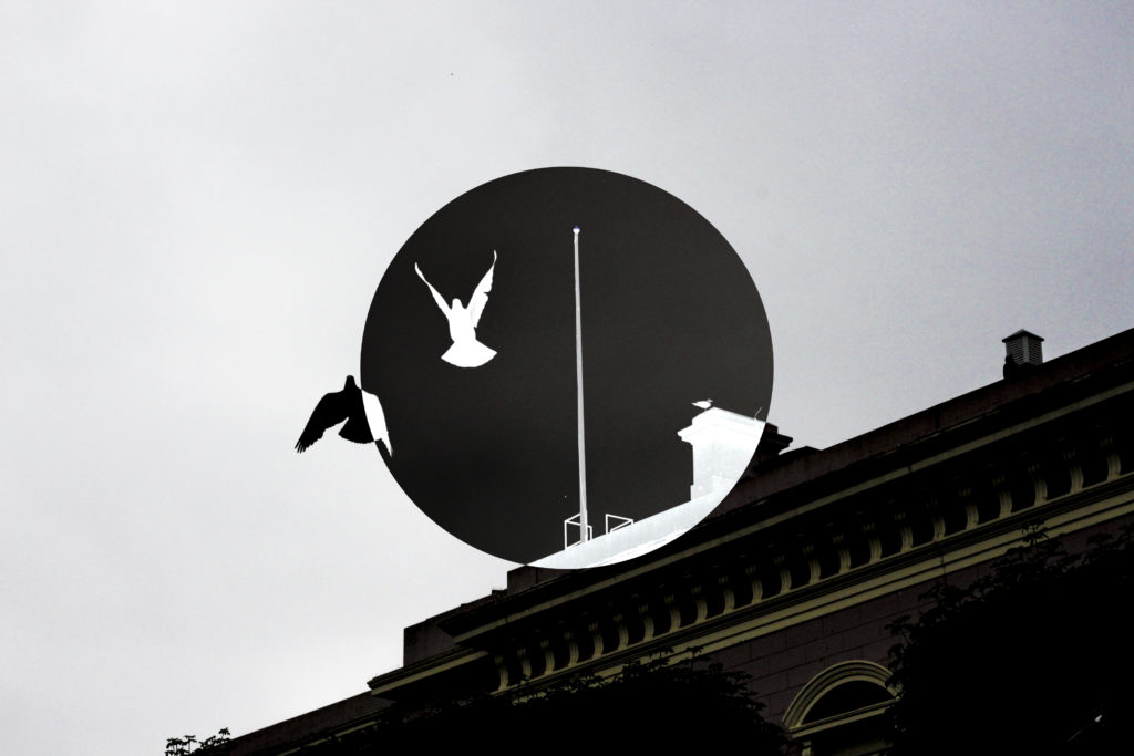
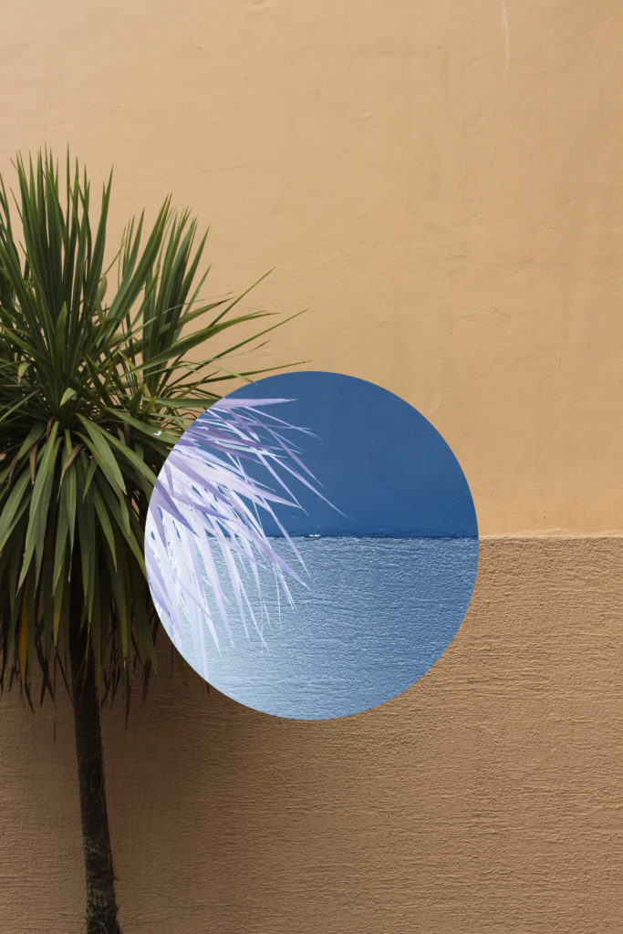
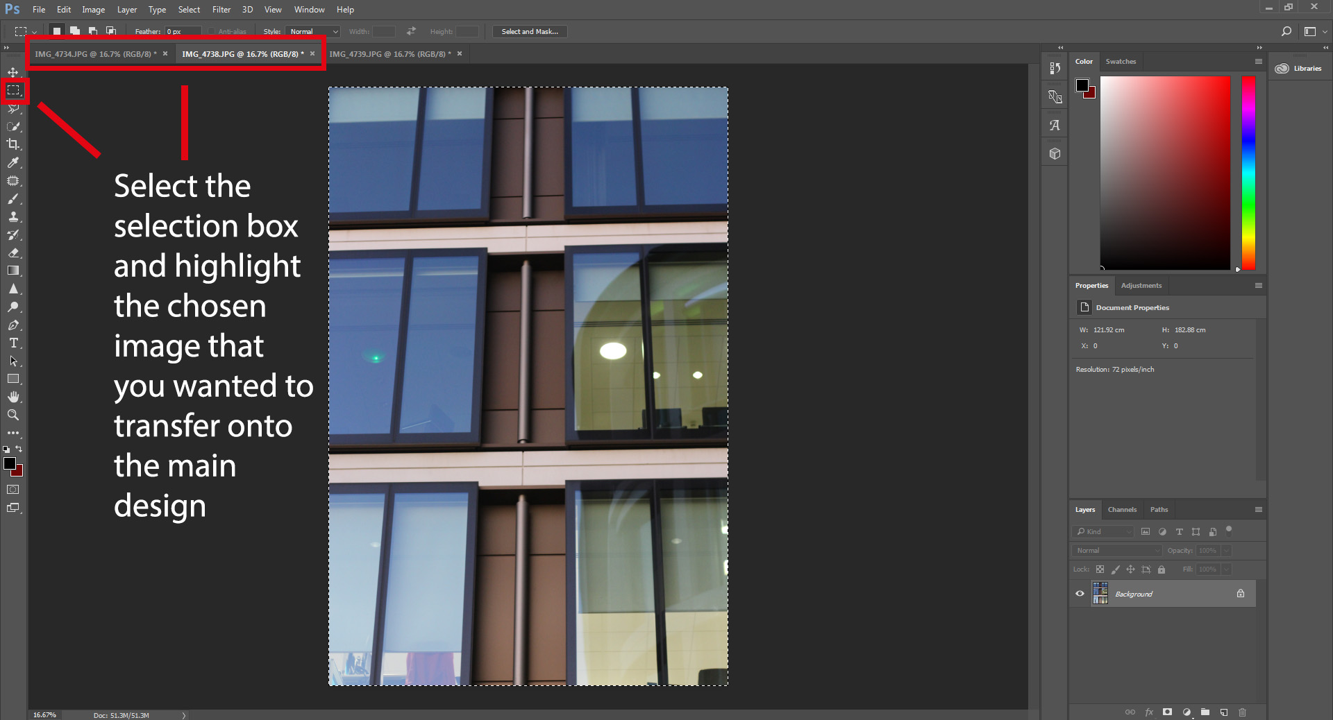
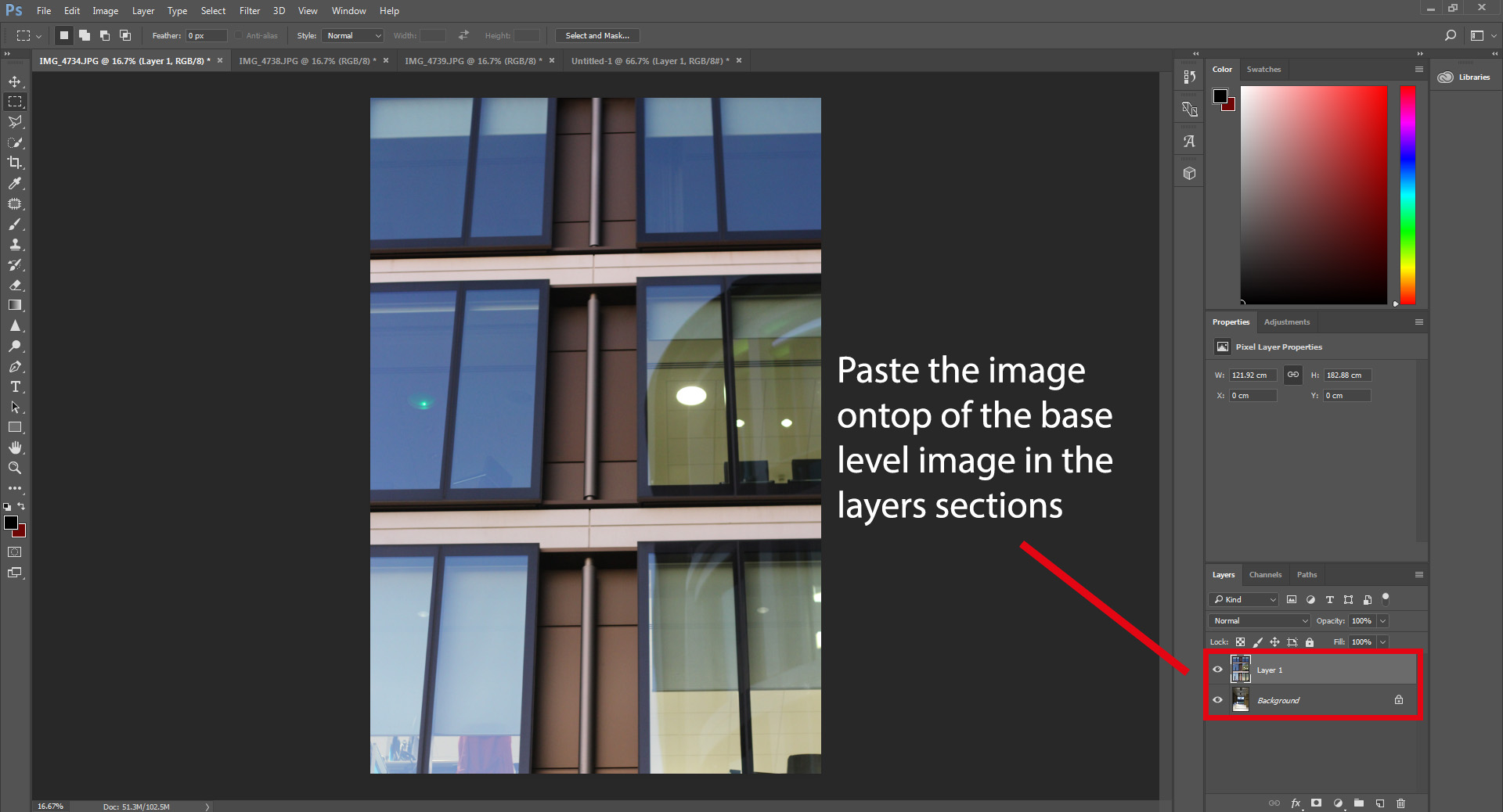
 Once done with the shoot I moved onto Photoshop to overlap the images that I wanted to see merged together. I chose to use Photoshop because of the variety of tools it provided me with that could capture and produce the outcome desired. This is my process of coming out with my final designs:
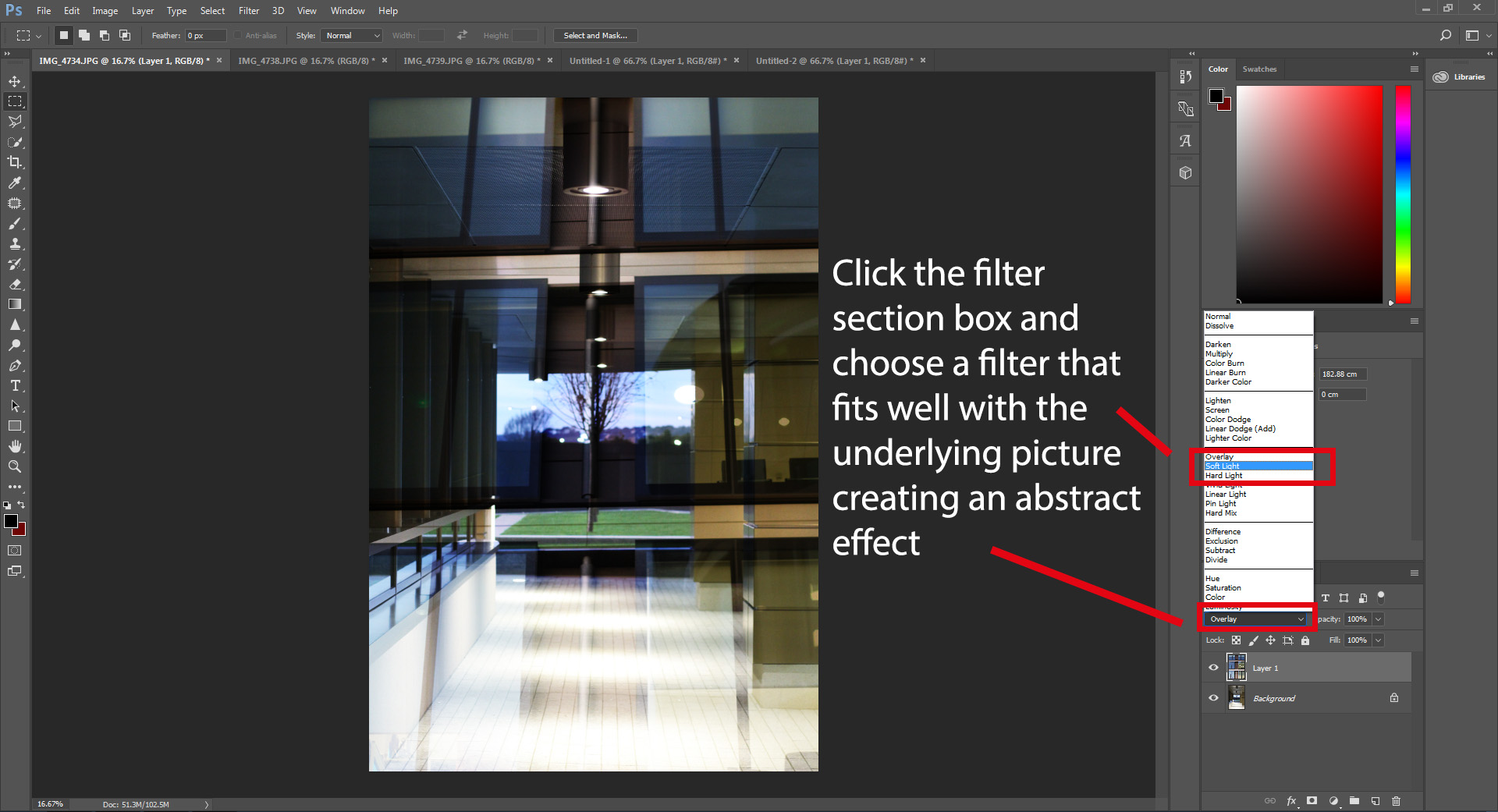
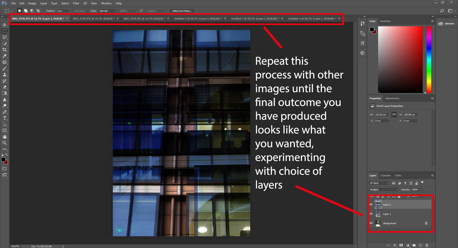 After I had finished experimenting with my images I decided on five of the pictures that I thought had best represented the response shoot regarding Lewis Bush’s style of work. These are my five favorite pieces:
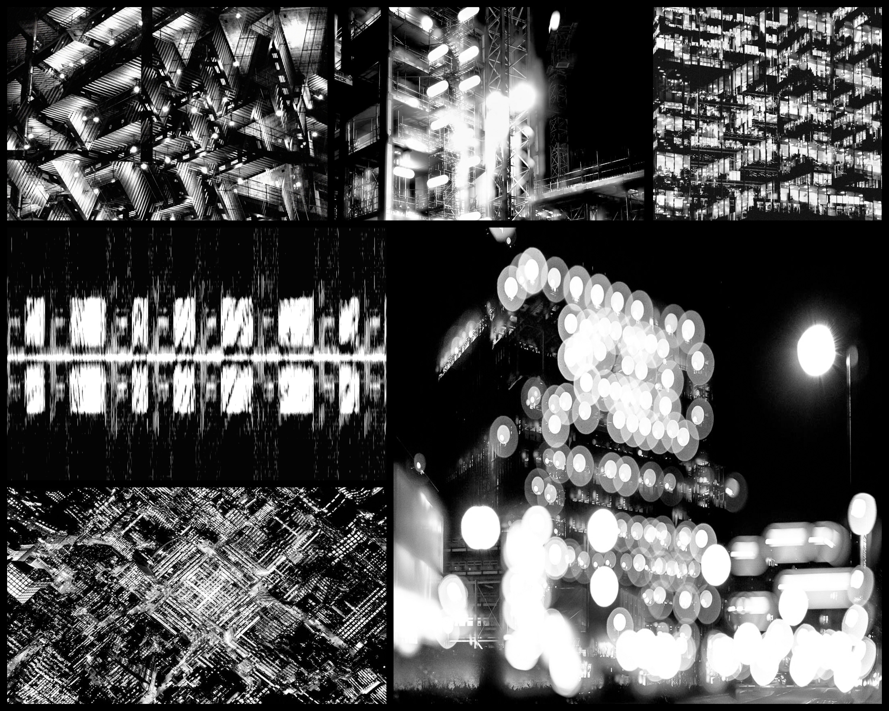
 Within his article, Rule Breakers, Bush uses an idea of ‘eight rules’ to describe the rules and conventions of photography and how they are made to be broken. This was split into the seven sections of: The Rule of Objectivity, The Rule of Audience, The Rule of Manipulation, The Rule of Reality, The Rule of Technicality, The Rule of Ownership, The Rule of the Camera and The Rule of Rule Breaking. These are where I drew inspiration from regarding my previous shoot and research about The Rule of the Camera, where I created a photo-shoot and analysed the topic of conventions. However here I have decided to analyse one of the photographs taken by Lewis Bush to find what really create a political picture which breaks the rules of conventional photography. The image I chose for this is a photo from a series named Metropole which looked at how London’s new buildings show how the city is facing a terminal decline.
 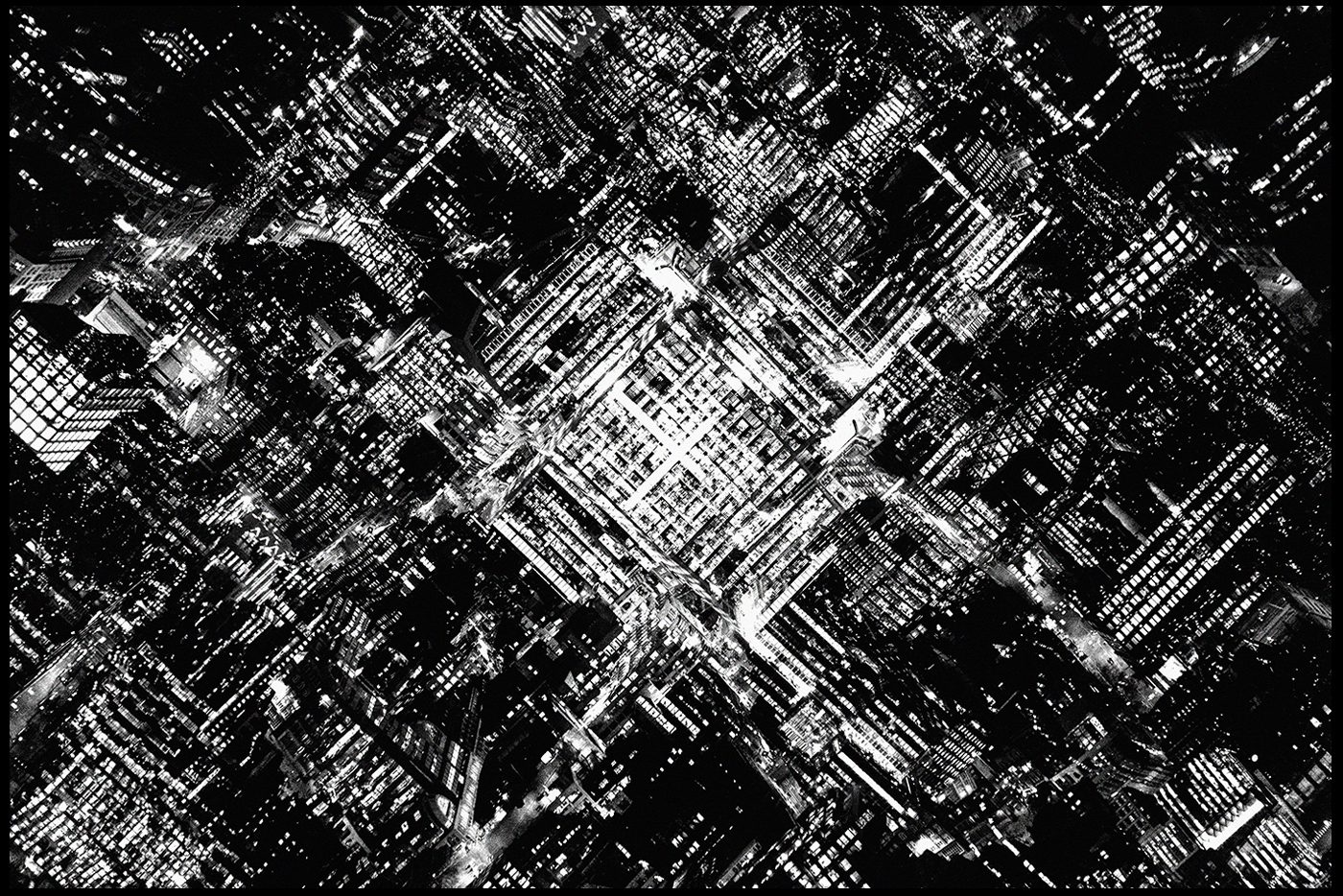 Technical: The image itself uses a threshold to create a purely black and white product which emphasizes any light present within the photo. By doing so this creates a more aesthetically pleasing result due to there now being a perfect mix of shade, with neither becoming too overpowering for the next. This is also complimented by the symmetry which the piece has been composed in, by placing the city square in the center of the piece it produces an insight into the design of that city and how it can almost be interpreted as pattern like in its layout. When taking the picture it looks like a low shutter speed was used in order to capture and illuminate any light present to the camera, this resultantly makes streams of light along roads, removing any presence of cars whatsoever.