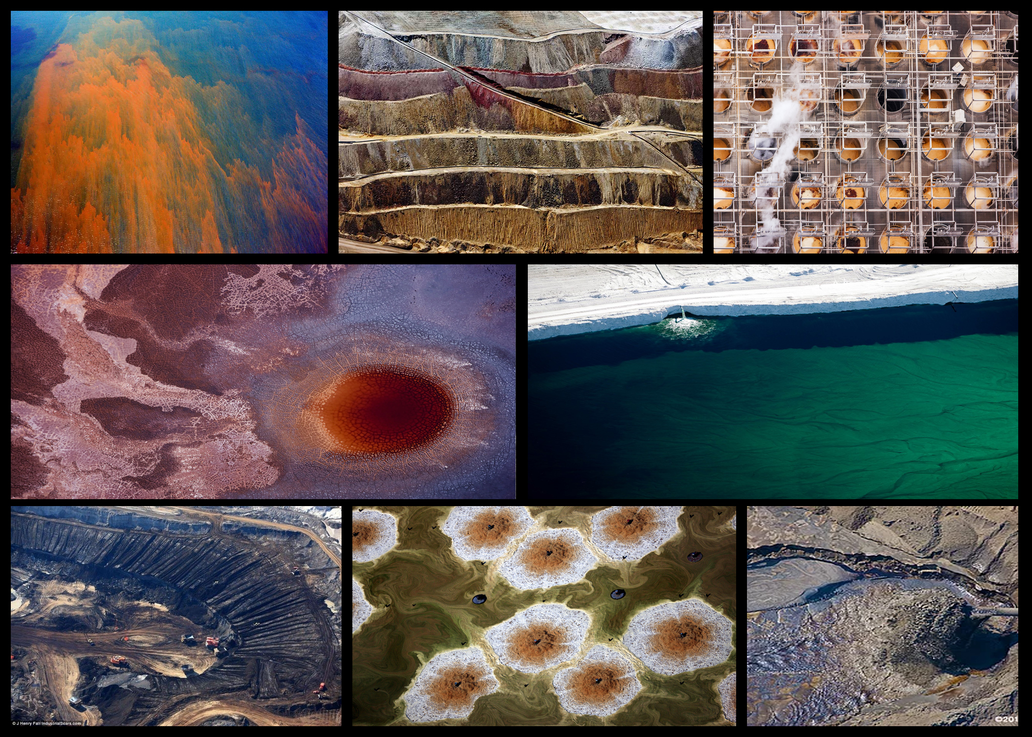
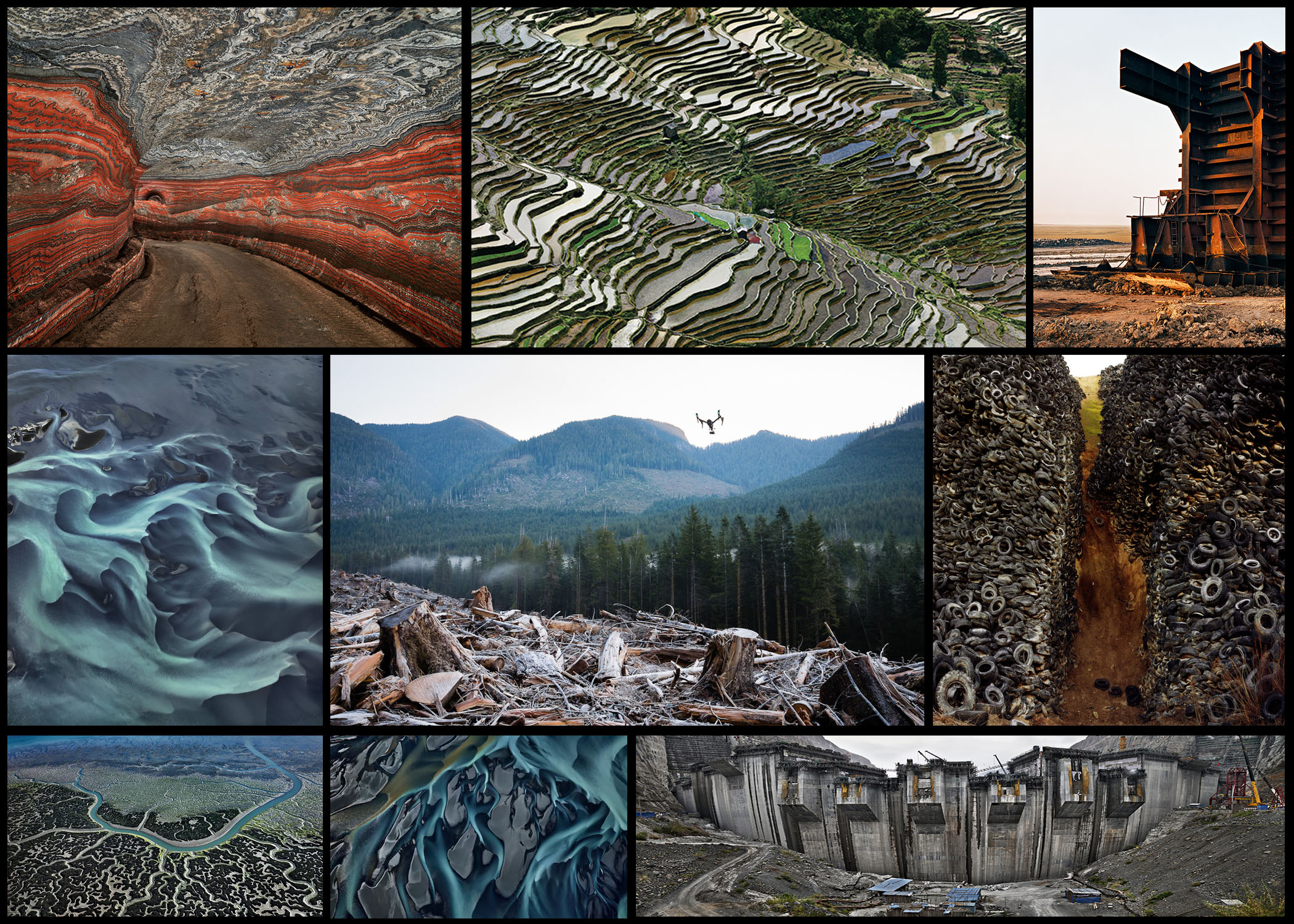
After I had explored a variety of different ideas regarding the concept of consumerism in political landscapes, I decided to travel around Jersey looking at quarries. This was because the huge change in landscape the created, whilst also being the source of consumerism towards houses and other desirable things, allowing an insight into what the process looks like. Here I wanted to exaggerate the landscape into something almost unrecognisable and abstract, using photographer Henry J Fair as my main influence regarding consumerism, changing how we perceive the products bought.
When going ahead with the shoot I decided that I should create a mood board which would explore certain ideas I wanted present when commencing the shoot itself. I particularly would like to look at the layered landscape left behind and the sheer size of it. Here are some examples of what I hope to achieve from the shoot: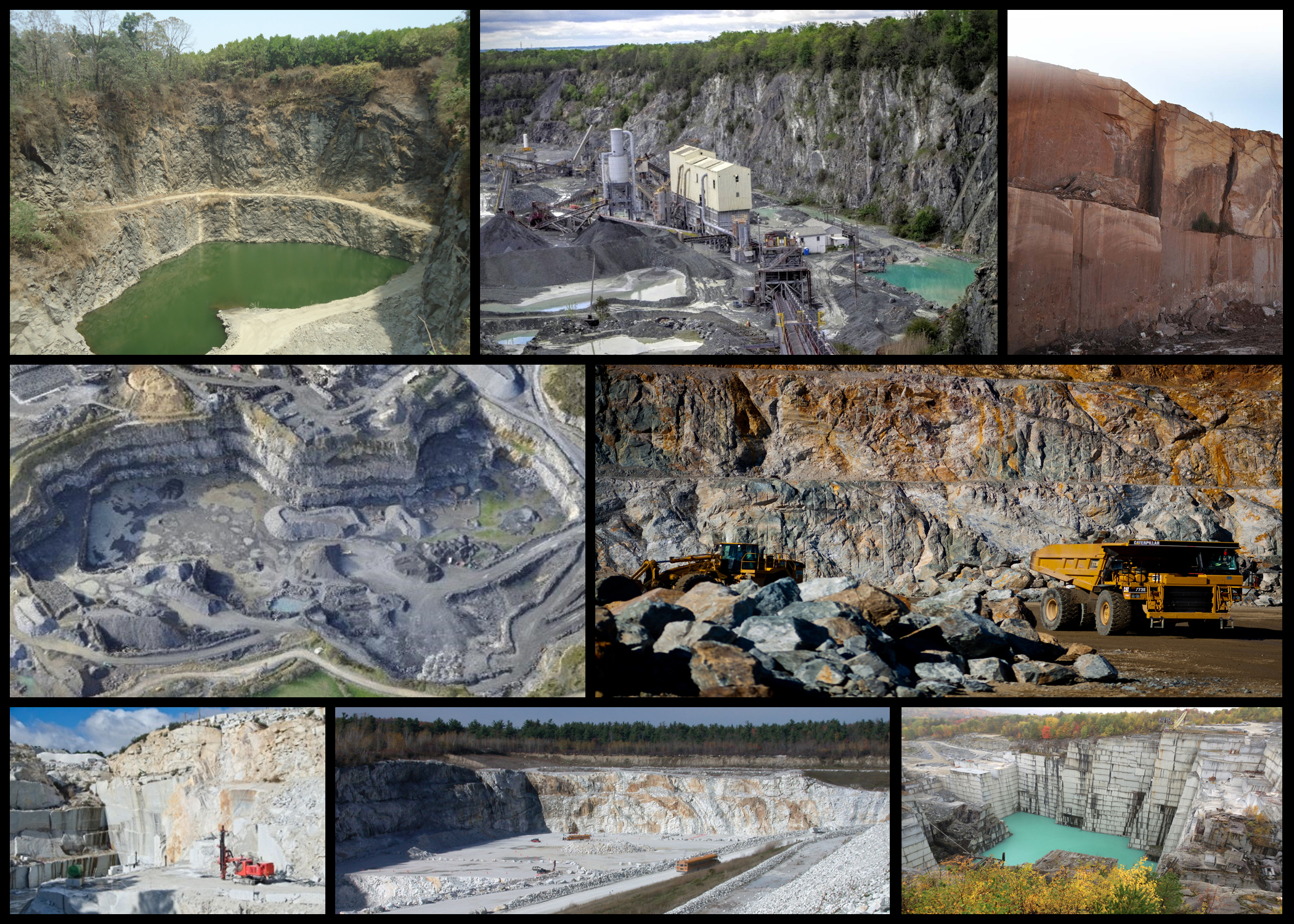 Once complete I decided to produce a mind-map reflected what I intended to photography when on the shoot. By doing this it would limit the amount of time wasted, as I would approach each site with a clear vision in my head of what I wanted. Here are my ideas seen below:
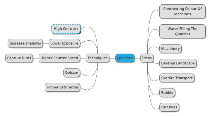
Now that the I was satisfied with the outcome of the mind-map I concluded that I was ready for the shoot itself. Using the mind-map as my reference source I decided to travel to the selected quarries photographing the identified topics. Here is my response to the topic: 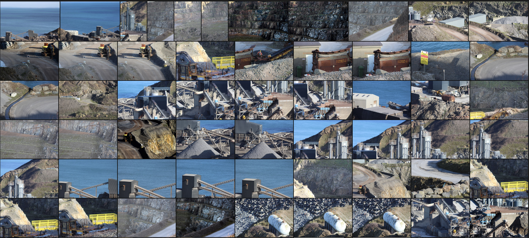
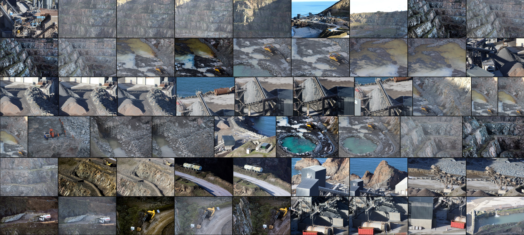
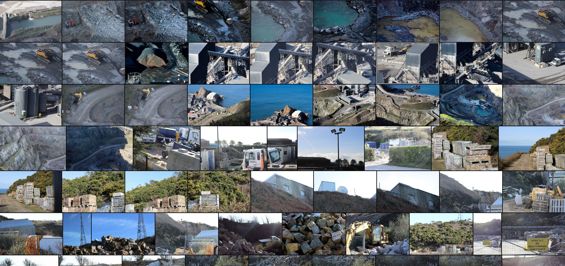
 After I finished with the shoot I whittled the images town to my favourite ten. By doing this it would allow me to more easily identify which photo was most effective, whilst giving me a broader insight into the layout and style of photography I would be choosing out of. Here are my top ten choices for photos from the shoot:
 Once I had chosen my favourite images of the shoot I then proceeded to cut it down again into only five. By doing this it would enable me to analyse each image in more detail, revealing why the image was chosen and what made it so effective for me to choose it. Here are my decisions on the best five images:
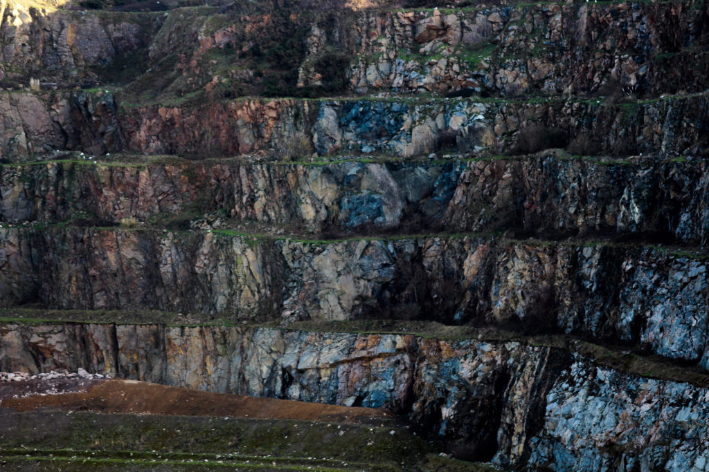
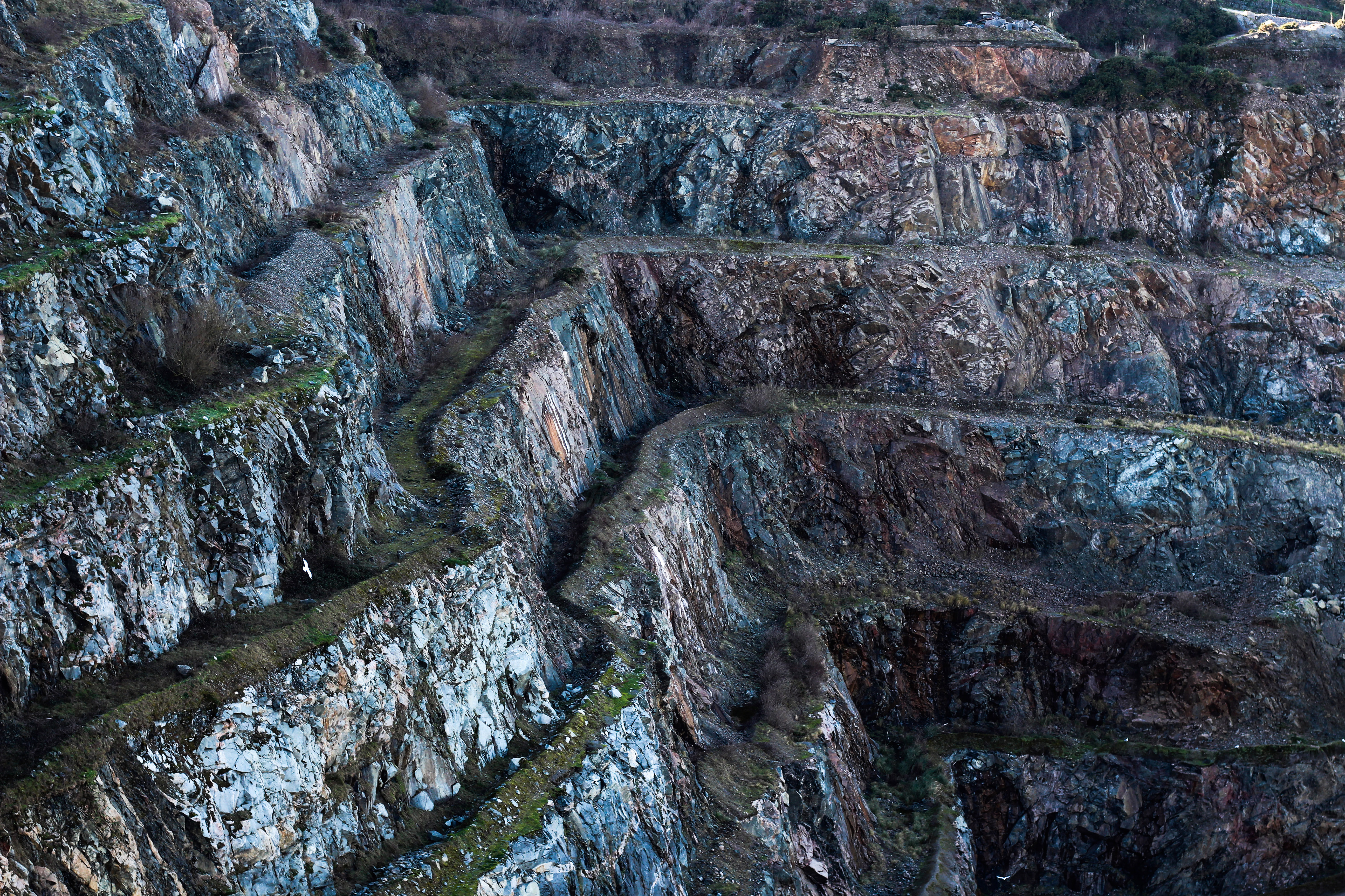 I selected this image because I found it was a perfect representation of what I wanted to achieve in the shoot. By photographing the scarred landscape left behind from quarrying I had hoped to bring awareness towards the scale that it was happening in. I thought this was done quite aesthetically, as blues and white shone through the dull rocks, not seen until I increased the contrast, whilst the stair like formation provided the photo with a much-needed variation. I really liked how the ledges broke up the cliff from becoming a continual slope, instead providing depth in the image and allowing for greens and blacks to create contrast.
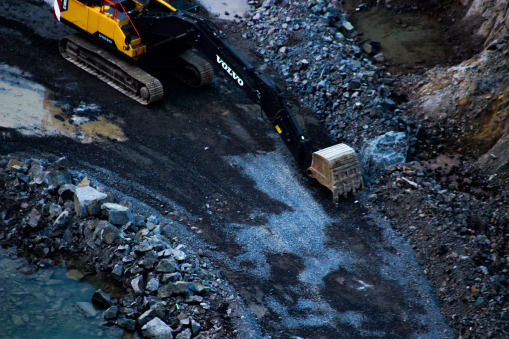
 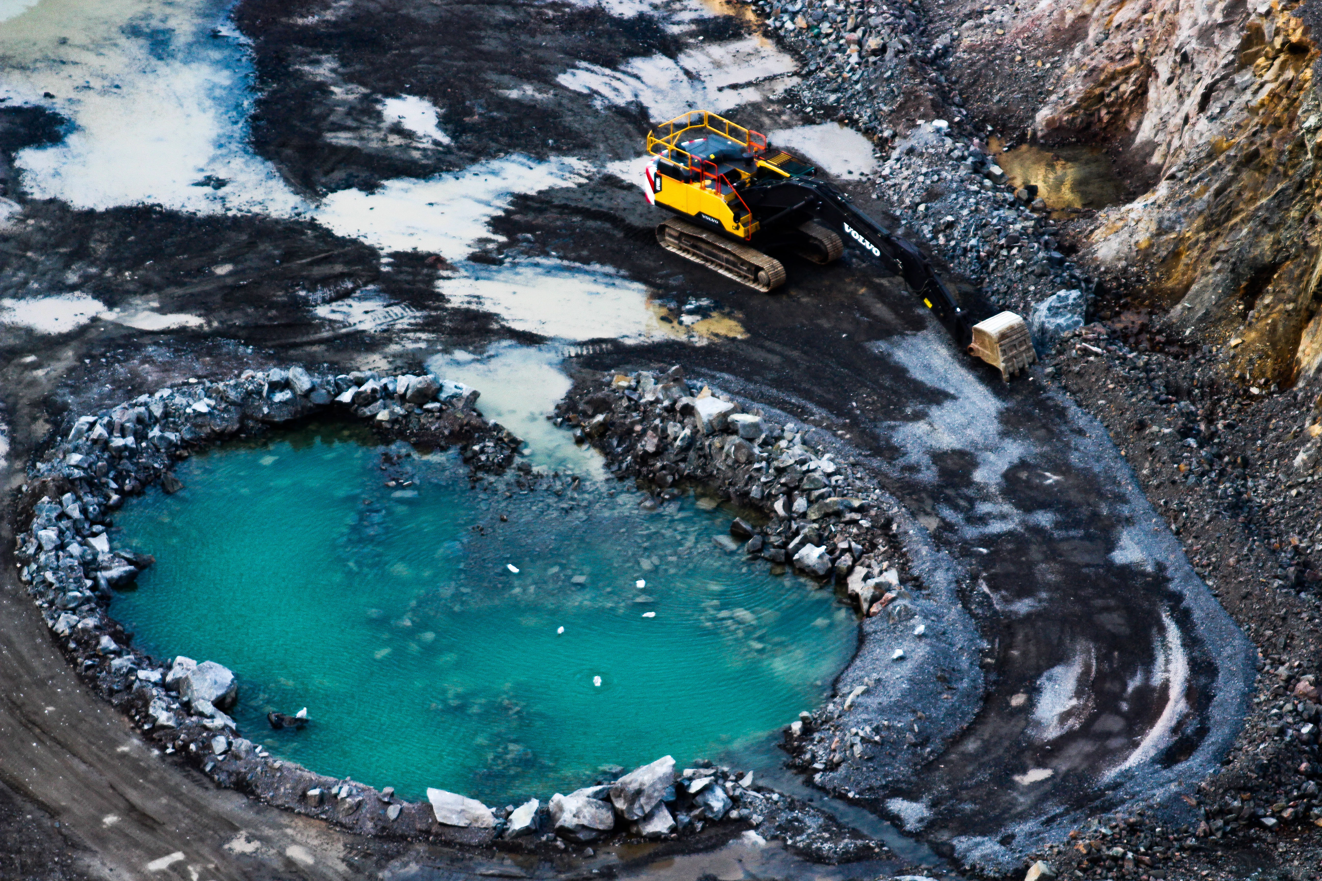 What I really liked about this image was the use of dehaze. By using dehaze on Photoshop it brought out the colours and reflections on the pool, creating a huge amount of contrast and saturation, emphasising the effects as a result. I found the yellow digger to break up the piece, providing an actual size comparison that presented the viewer with an actual scale of the matter. By increasing the saturation of the water I found it created a polluted unnatural effect, where it seems to blue to be rain or sea water, resulting in an aesthetic pool that contrasts against the rest of the landscape.
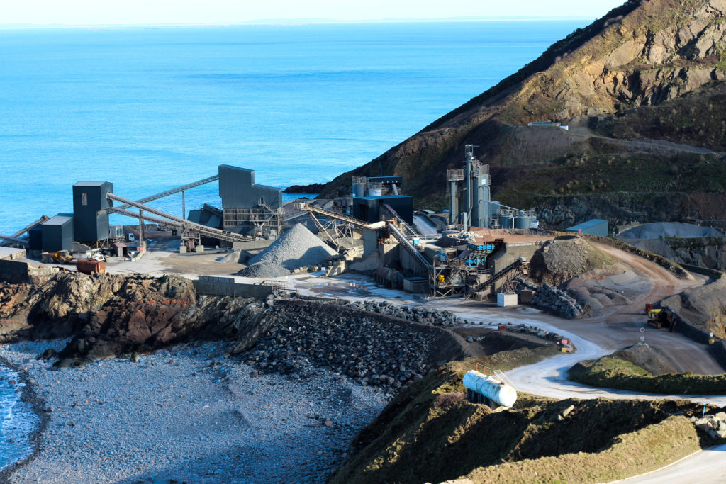
 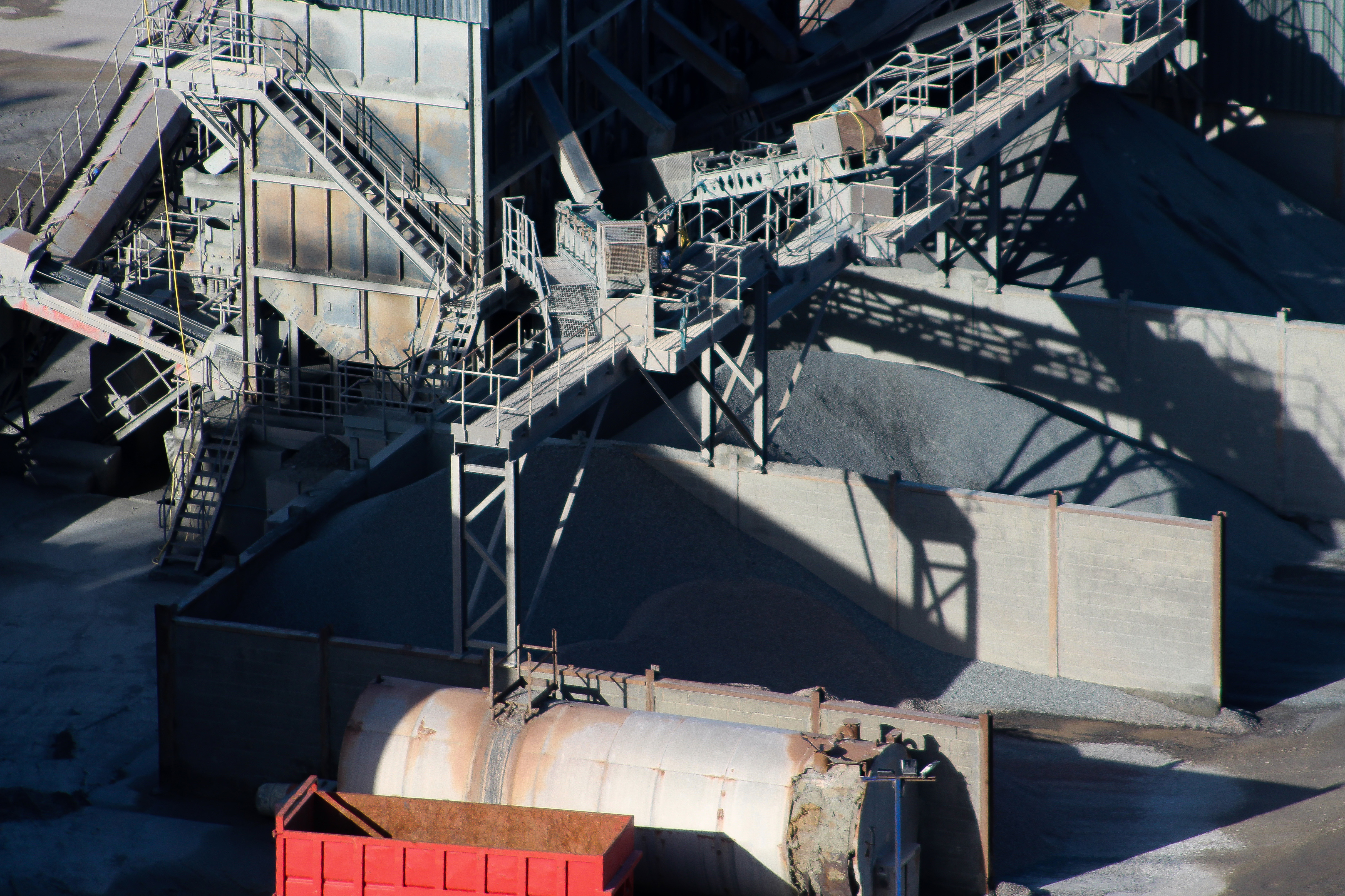 The reason I chose this image was because of the contrast created by one red container. I found that by providing a red container against a predominately black and white landscape it would add depth and break up the image from becoming too generic and unchanging. What I also found effective was the use of shadow composition that add once again more depth to the piece, stopping the more present shades like grey and white from taking over the entire image, with the intricate machinery adding much-needed differentiation into it.
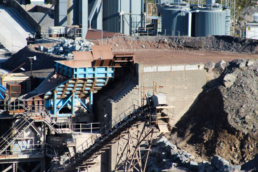
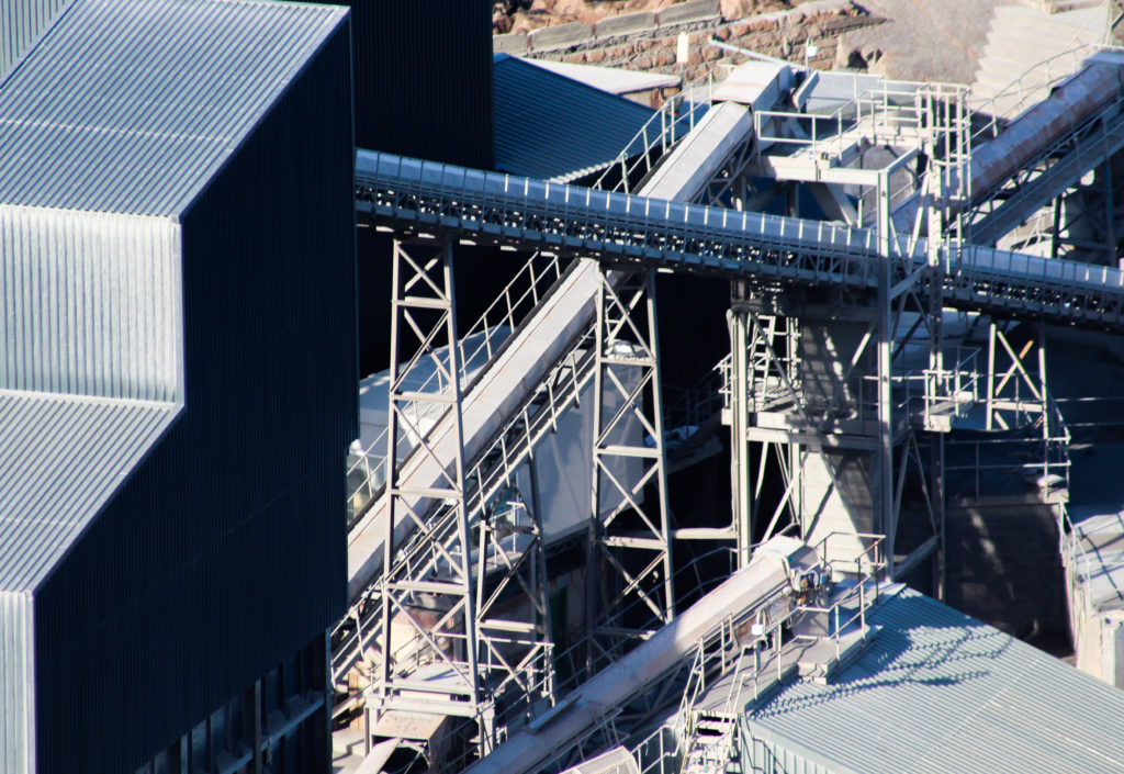
 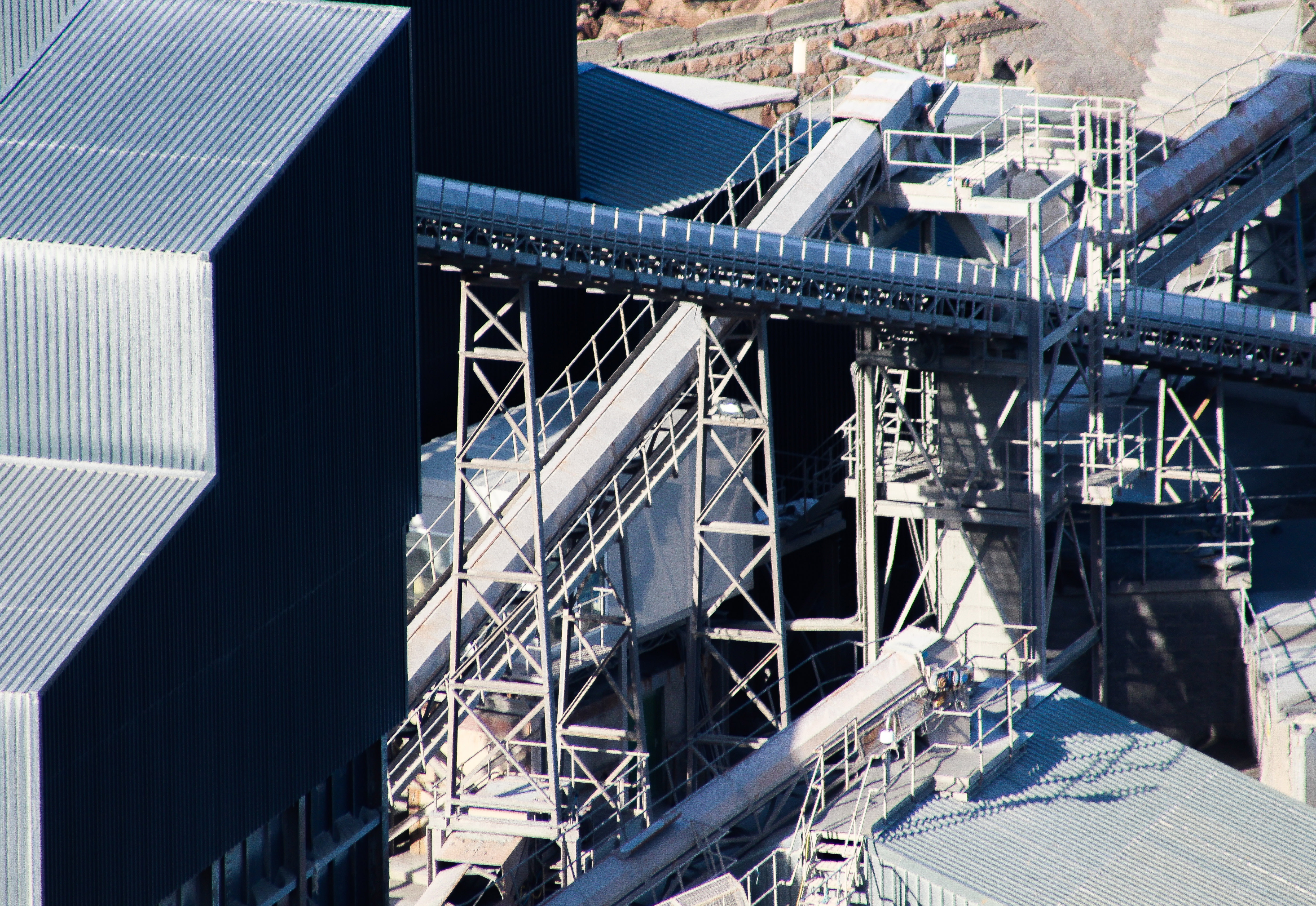 I chose this image because of its representation of the landscape within the quarry. The maze of machinery present here provides the viewer with what can be found inside the development of quarries, making a silver palace contrasted against the dull browns and white seen in the surrounding rock formations. I really liked the composition of this image especially the building on the left which covers the majority of the photo, adding an aesthetic appeal whilst breaking up the assortment of random tubes and cables. This to me was really well accompanied by blacks seen behind certain structures bringing out walkways and stairs not previous seen from that distance.
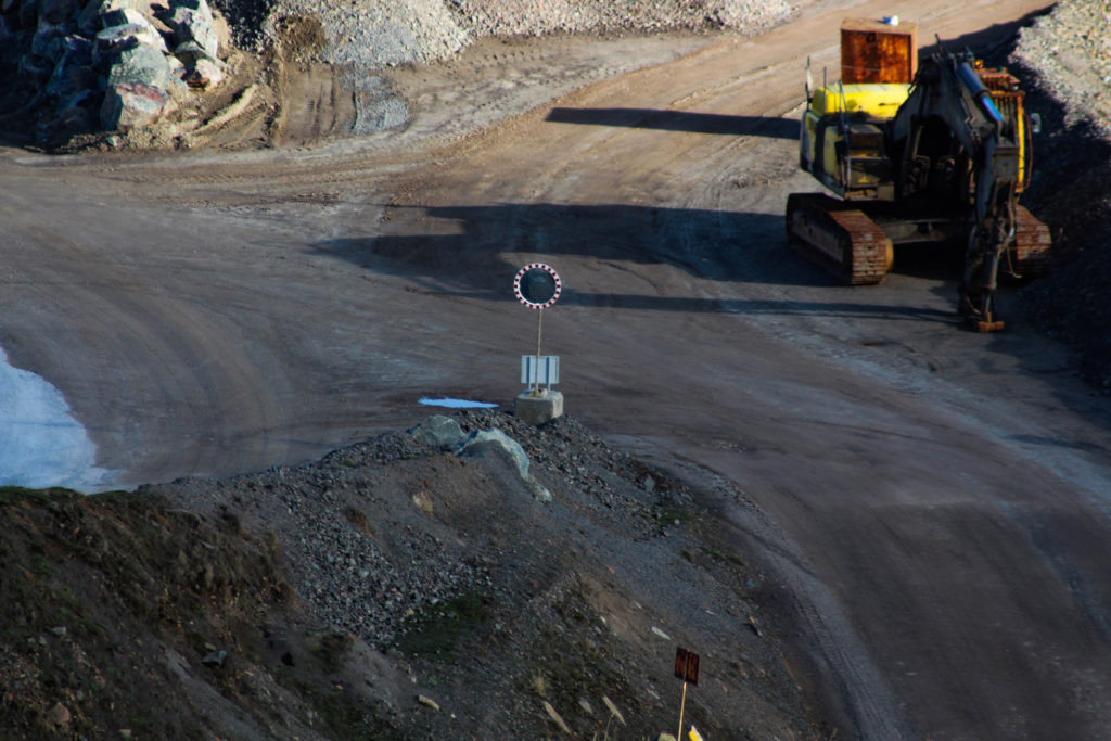
 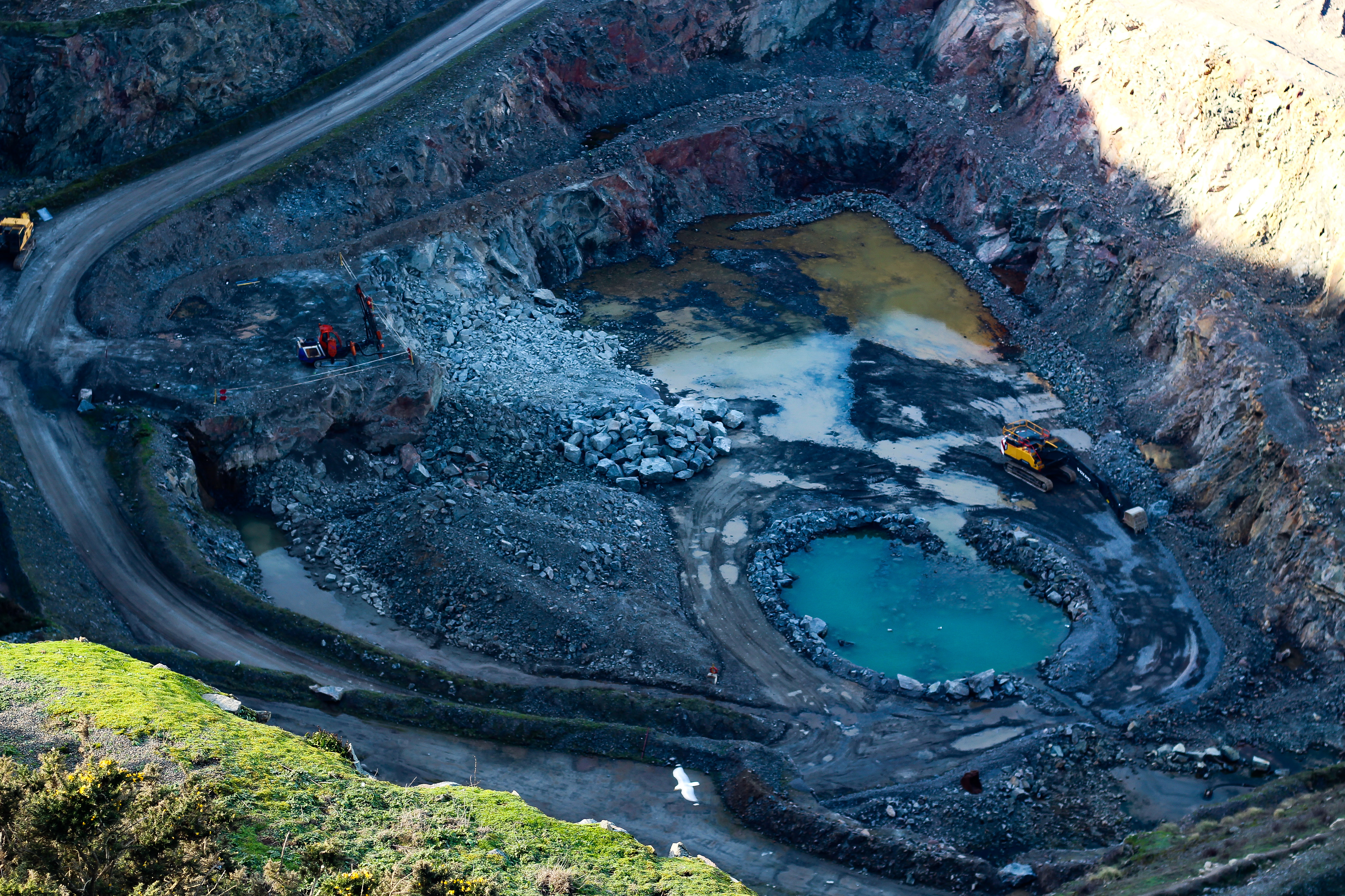 Finally I selected this image because it provided an overview to the bottom of the landscape quarrying for granite. I really liked the contrasting colours between the two pools, one being brown and the other blue which I found really reflected the pollution to the landscape caused. I found that the occasional digger present broke up the piece through a flash of red and yellow which went against the natural colours of browns and blacks. What I thought was most effective was the use of dehaze which brought out the shades of soil creating a more surreal landscape as a result, emphasising otherwise invisible aspects of the photo.
Once I had annotated each image I decided it was time to select the image that best represented my entire shoot. To do this I would have to look at the composition, colour and overall relevance to the topic of consumerism in the five image. Here is my final image that best reflected my entire shoot:
FINAL IMAGE The reason I selected this image was because I thought it had the best relevance to the entire topic of consumerism. This was because of the dehazing effect I applied on it which to me reflected the style of Henry J Fair whilst over emphasising the effects of quarrying, seen through the bright blues and browns. The yellow digger was one of the major reasons I selected this image as I found it providing a great size comparison to how big an operation quarrying actually is, and the scale of the scarring it can carry out. I found that the blue of the pool really brought together the entire piece, as it broke up the landscape and provided it with something unusual not seen by the public most of the time.






 Once I had finished experimenting with a few of my previously taken images I decided to create five that I thought best reflected the overall outcome that I wanted the best. When doing this I wanted to incorporate contrasting environments or similar ones, this way each image would reflect something similar or different, rather having no link whatsoever. Here are some of my final and favorite outcomes from this experimentation:

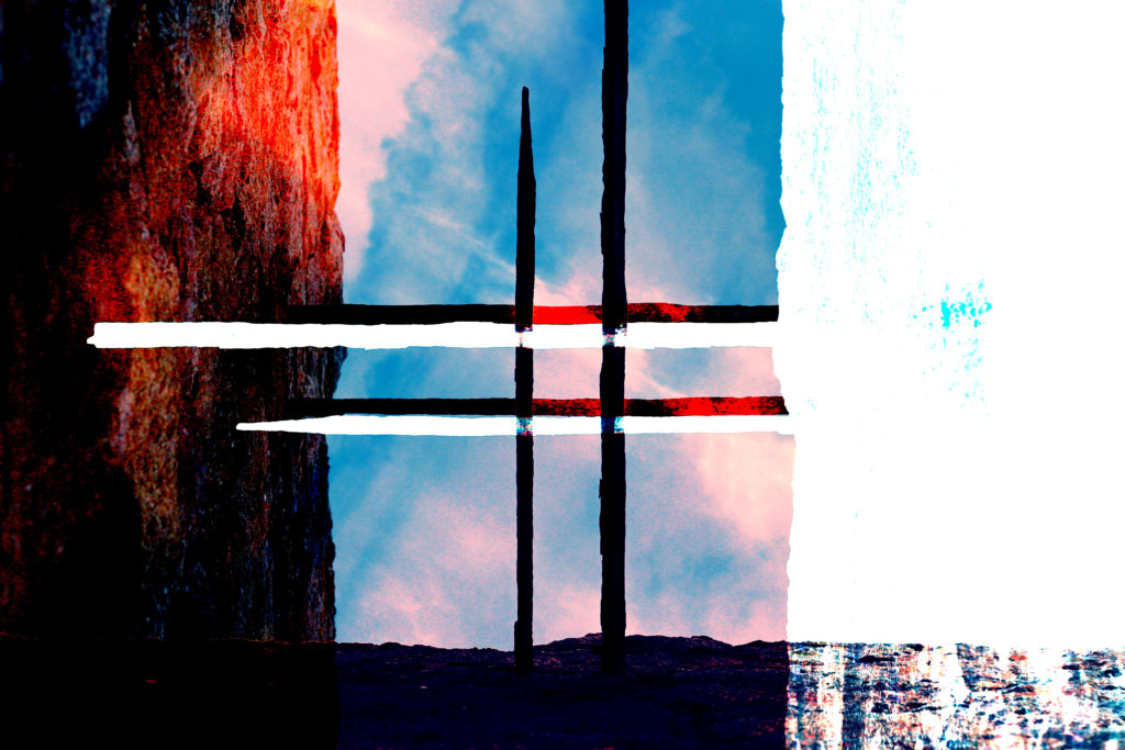

 When looking over my final pieces I found I particularly liked the ones which had a manipulated circle within the center, this was because to me it provided a contrasting perspective into the image, presenting a clearer or more distorted viewpoint. This as a result for me not only looked aesthetic but also produced a meaning behind each photograph.
 On artist I found to be particularly influential was photographer Lara Zankoul. Zankoul looks at the idea of underlying representation, and how polar opposites are represented in seven parts as symbol of the fundamentally divine nature of the medium, interrelation and dynamics. Known as Taoist the focus is mainly visual in her work, while the main theme continues to be spiritual and philosophical. When exploring her works I liked the constant use of lighting and perception of the eye to create final outcomes with a surreal twist, the hidden figure of the human body seems to be one of the main focuses of her works, much like Clare Rae’s work Zankoul hides the female face to create an unseen identity.
 Once after creating a mood-board including my favorite images in it, I decided I should analyse one of her most well-known photographs to see and understand what made it so effective as an overall image. To do this I would have to explore three areas: technical aspects, visual aspects and conceptual knowledge of the actual piece itself. By doing this it would allow me to create a response shoot to the artists of my choice in a surrealist style that I could relate to my own personal topic of political landscapes. The picture I chose from Lara Zankoul is called ‘The Unseen’ and is part of a solo exhibition regarding a series of photos.
 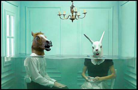 Technical: The image itself uses artificial lighting to create the scene inside the studio made room, because of this the end result makes the impression that the whole thing is subtly staged. A relatively normal shutter speed seems to have been used due to how not too much light has been let and how shadows have not become too overpowering, this as a result allows for a balanced piece where neither of the shades dominate each and instead compliment. The exposure inside the photograph in my opinion is a bit high than usual, but is done effectively to have the green/blue walls pop out against the backdrop of the two characters seated, complimenting them and filling the blank spaces with a more calming and dramatic colour.
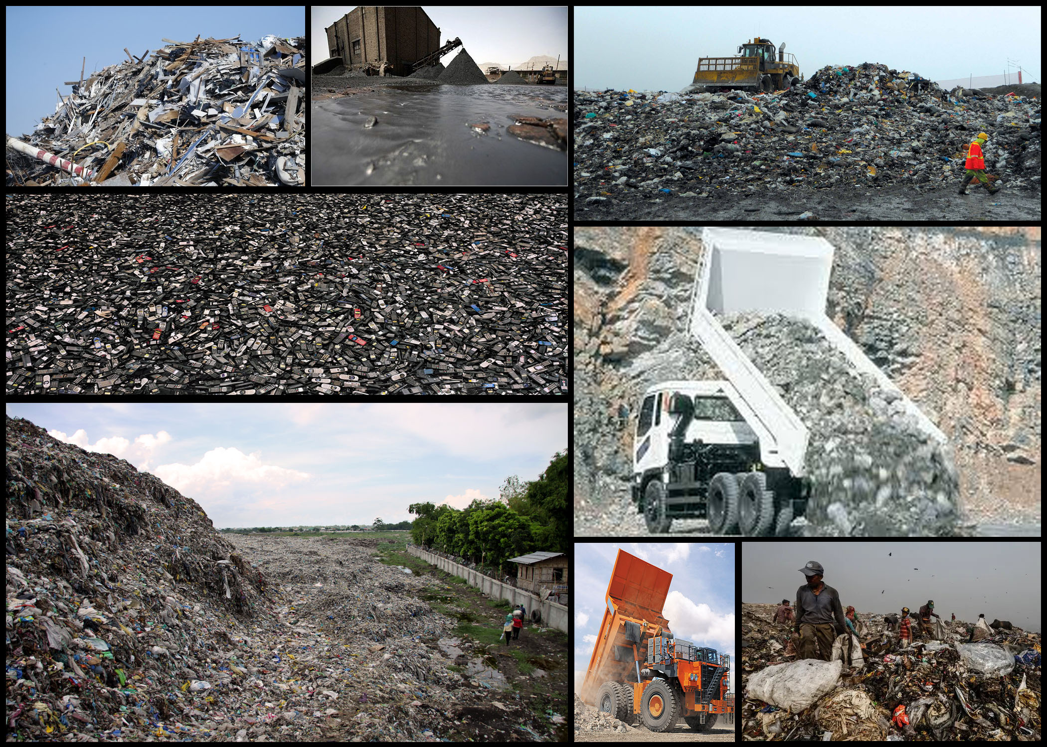


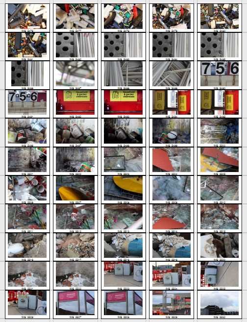
 After the shoot was complete I decided to select the ten images I thought best reflected the intentions of the shoot both visually and implicitly. By doing this it would allow me to deduct other images that I thought didn’t portray the aim of the shoot correctly or were poorly taken, here are my choices:
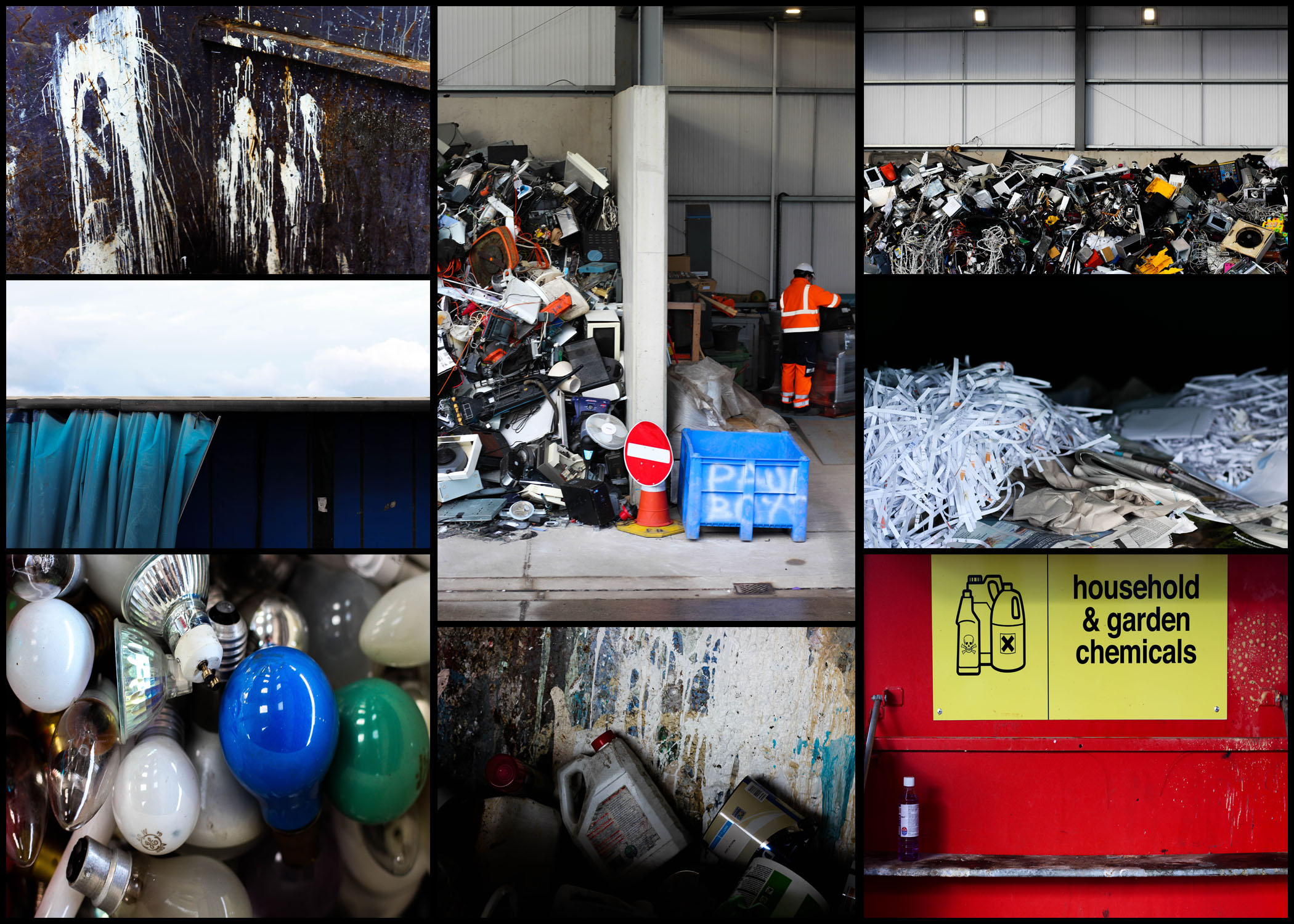


 I selected this image because of how I loved the positioning of the paint cans, this look of just the bottles careless thrown into the bin scattering paint everywhere creates an unusual background of random colours. I also really liked how the higher exposure allowed for a dark border across the bottom of the image, creating the impression of the unknown due to there being no evidence for how far these material stretch. The focal point seems to be the center paint can which is clearly defined from the backdrop by the shadows surrounding it producing an abstract effect from the area around it.
  What I liked about this image was the clear contrast and separation of rubbish and everyday life working in the area. This contrast seen through the separation of the electronics and a construction worker show evidence of how the area has adapted to suit their life around the product of consumerism. The sheer mass of the electronics almost overflowing out of their section creates the impression of disorganization, where once used they are careless thrown to the side never to be seen again. Looking at this image it is clear how much space is required to hold the waste, especially after seeing how far into the hangar it stretches.
  I found that the emptiness of this image was what attracted me to it, alongside the vivid colours which accompany it. The use of a singular chemical bottle on the shelf with the over half of the container sprayed with unknown chemicals provides a messy and unorganized look, where obviously dangerous liquids have been disposed of incorrectly, whilst the bareness of the shelf allowing an insight into how little we attempt to throw away these harmful materials. By the sign being there I feel like it breaks up the otherwise overpowering image which would otherwise be dominated by red.
  This image was chosen because of how effective it is at providing evidence towards the sheer mass of things we throw out. Accompanied by the symmetry, the random electronics thrown into a pile can be seen as an almost abstract piece in itself, which various vivid colours breaking through the dull dark grays and blacks. For me this provides a huge insight into how we treat our ever-increasing consumerism, and how once used it’s simply discarded to be lost in the endless heap of other categorized objects.
  Finally I selected this image because of its contrast between the yellow mirror and the now dirty and broken glass window. I thought that this looked very symbolic, with the new mirror that had just been thrown away providing a clear contrast between that of an old broken window, that had obviously been thrown out a while ago and had deteriorated to an almost unrecognizable image of its former use. This contrast is defined through the use of the shadow which separates each piece of glass, stopping the other into blending with it and becoming eye sore.
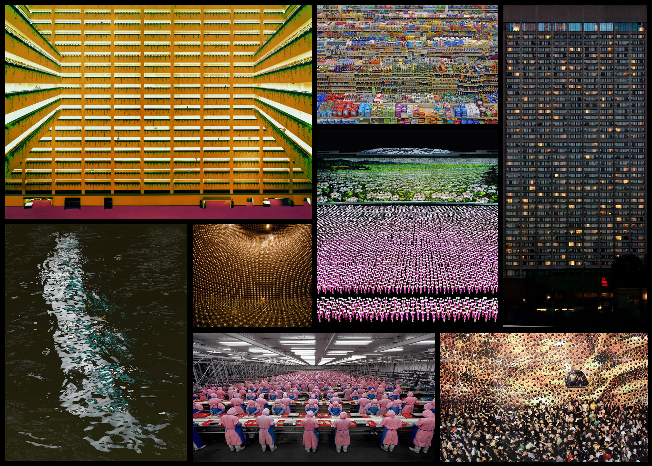 Once I had reviewed a few of his works I decided to go on and analyse one of his photos, by doing this it would allow me to understand what made his photography so effective. Whilst giving me an insight into the techniques and focuses of the style of photography he uses, and the thought process behind it. The image I have chosen is called ‘99 Cent’, taken 1999 of a local convenience store:
 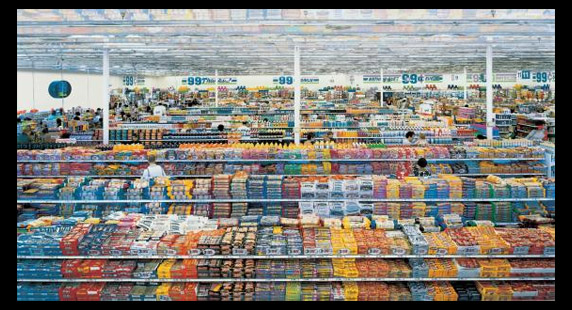 Visual: Visually this image is extremely aesthetic, with the broad variety of colours present in the shop providing a sea of rainbows to be looked upon by the viewer. This is stopped from being too consistent and overpowering through the use of obvious shelves which stops the packaging from merging with the next, the white poles which pop up occasionally also add to this through their symmetrical layout across the shop, providing clear coordination in the piece and an unseen structure in the shops structure. I love how the packaging of the food is countered by the texture of the ceiling, which seems to almost reflect the colours of the below, fading into the distance as if its never ending.
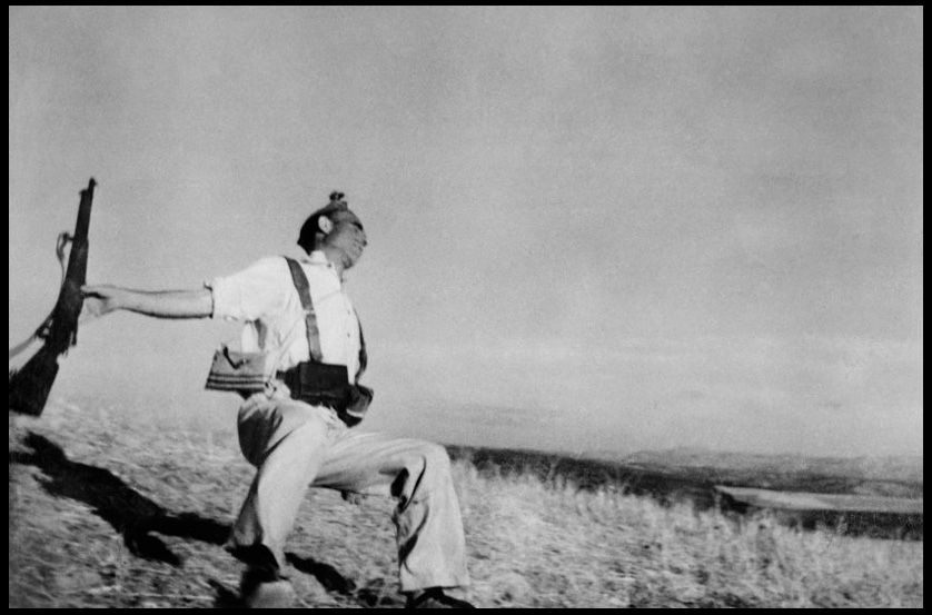 Contextual: Taken during the beginning of the Spanish Civil War, showing the moment of a bullet’s impact on a loyalist soldier, Capa’s photograph has become the emblem for the medium’s unrivaled capacity to depict sudden death. The style of photojournalism became the mark that defined Capa’s work from there on, joining the company Magnum Photos in the late 1940s. The photo itself appear to capture a Republican soldier at the moment of death, the soldier is seen collapsing backward after being picked off from a distance by a sniper. The pictured solider is dressed in civilian clothing but wears a cartridge belt, and following its publication was acclaimed as one of the greatest photos ever taken. However since the 1970s there has been significant doubts about its authenticity due to its location, the identity of its subjects, and the discovery of staged photographs taken at the same time and place.
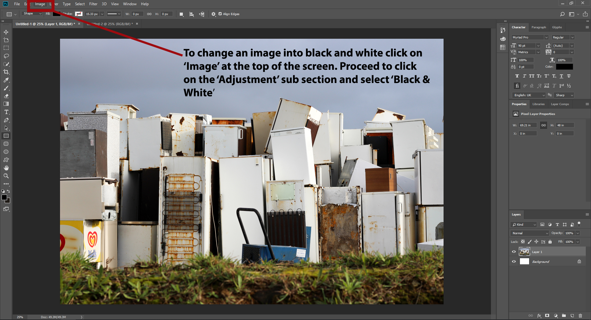
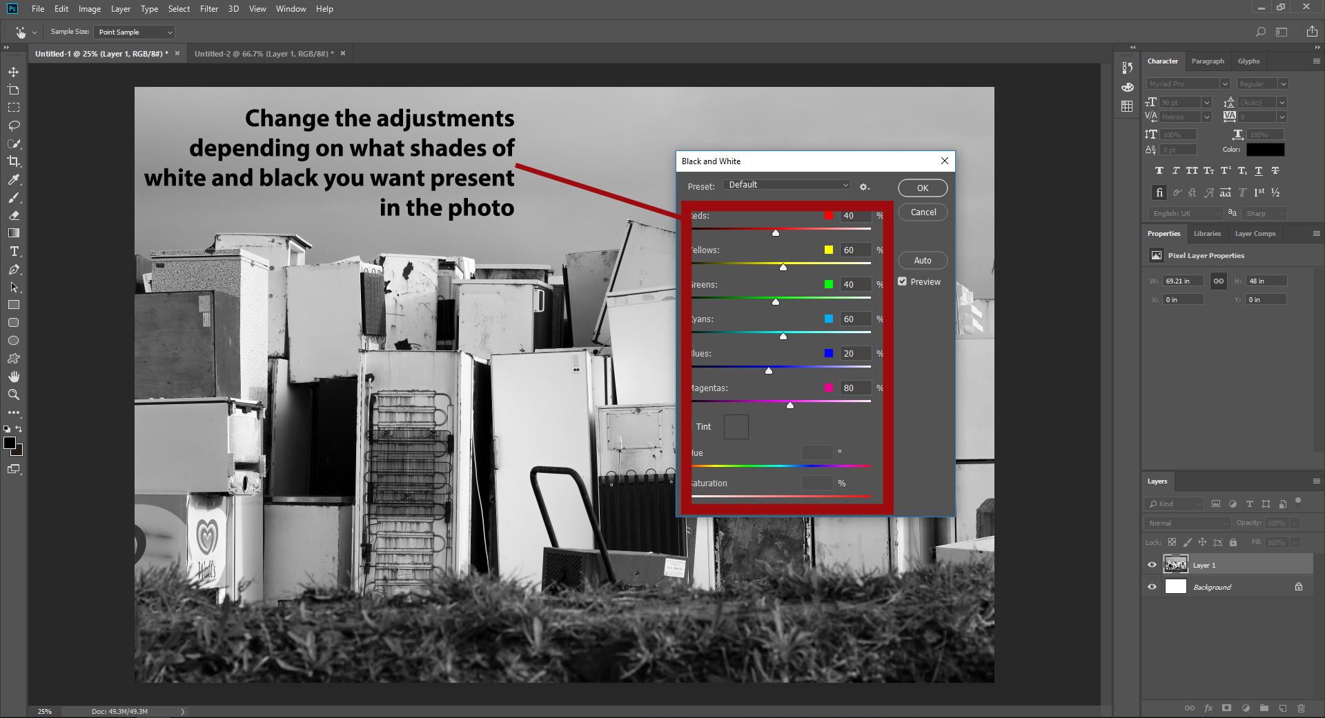 After I had experimented with a variety of different black and white settings I then proceeded to select the best images that the effect worked on. The results I wanted needed to be high contrasted and produced an impacting technique that defined the landscape through shadows surrounding the subjects within. Here were my choices for the best outcome for the black and white experimental edits:
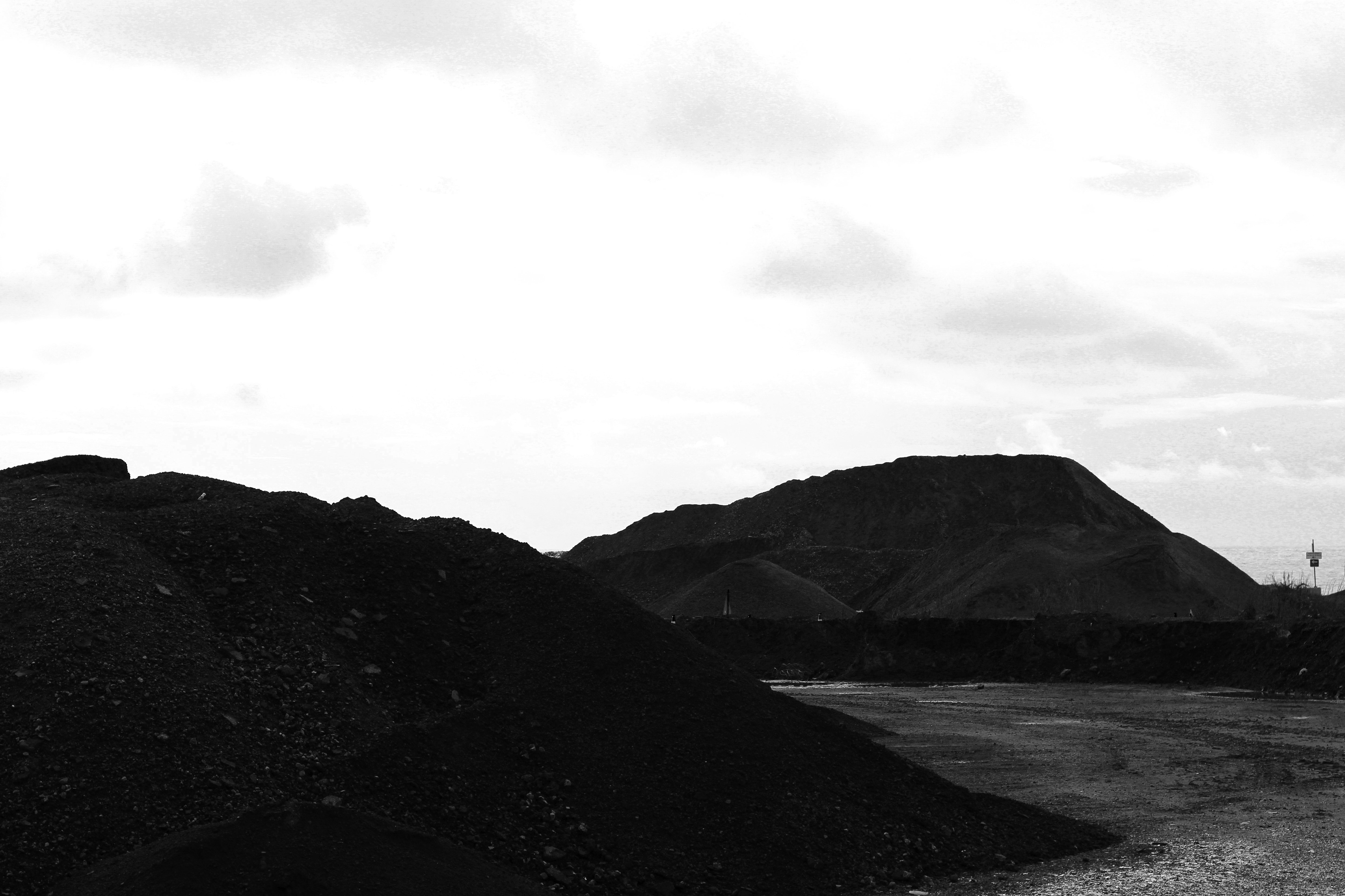
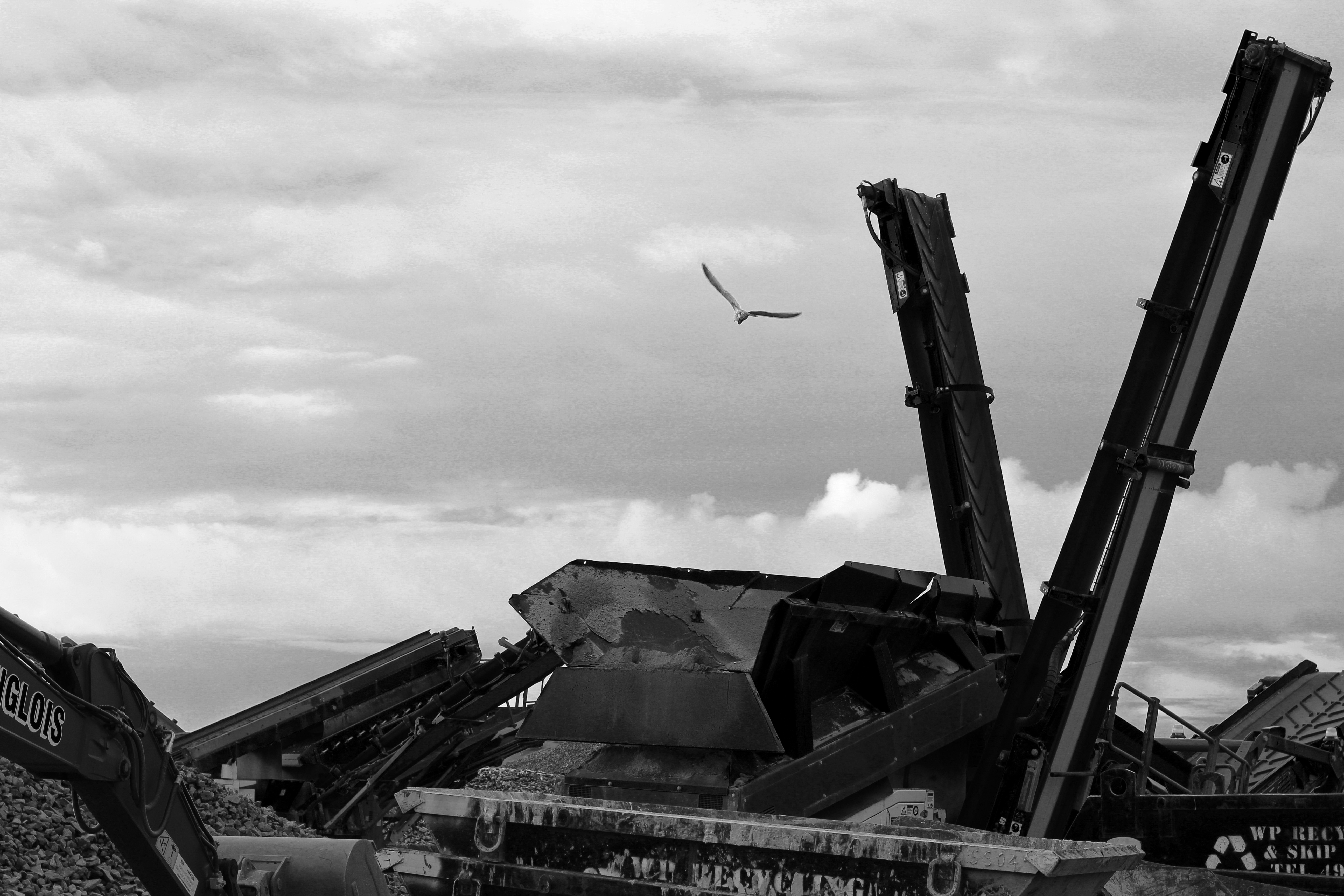
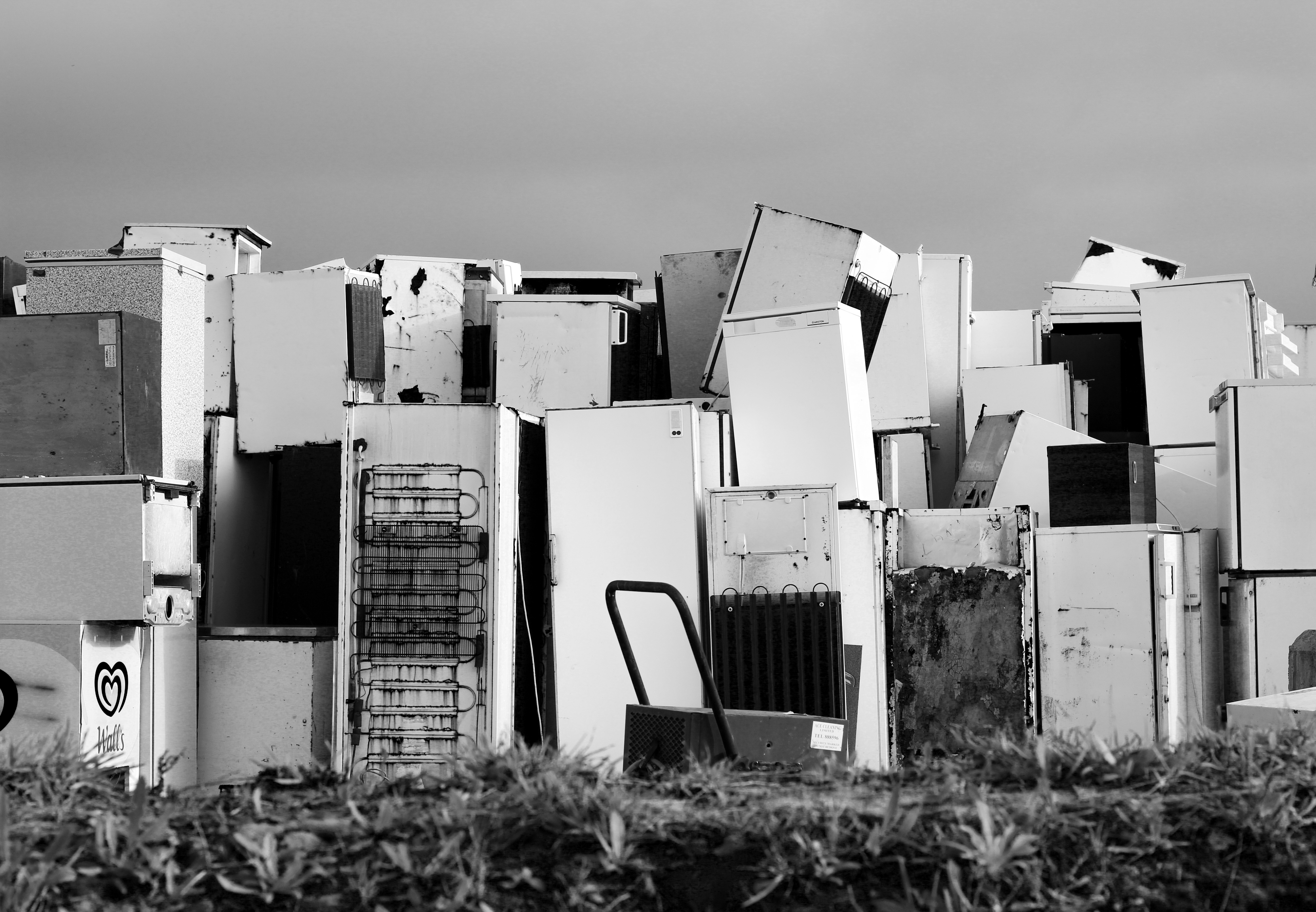
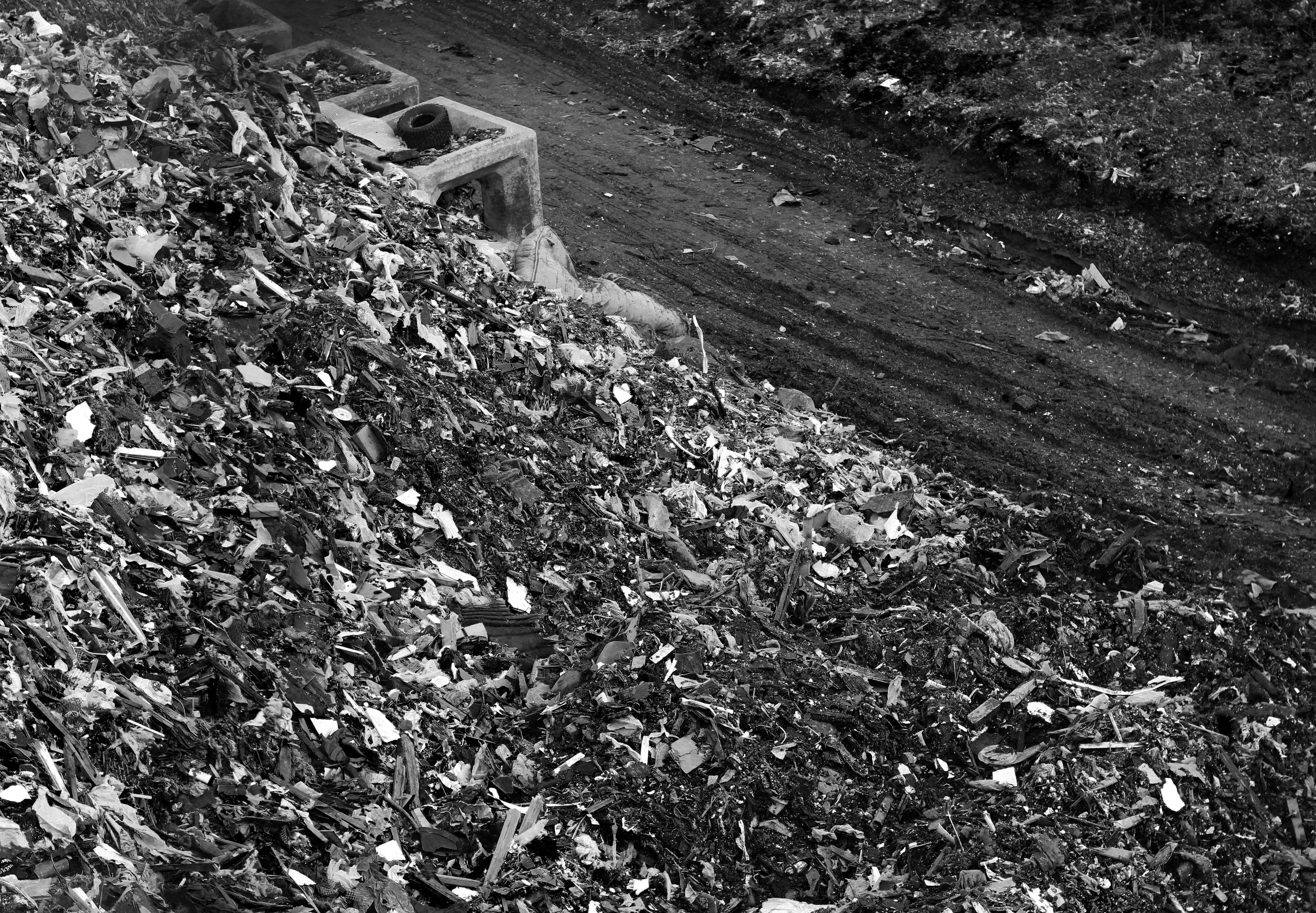 I found that the results of these edits were successful as the monochrome effected added the desired amount of shading for the landscape it surrounded, whilst providing a more straight photography stance that emphasized the destruction of the landscape in more detail due to them being devoid of any colours to distract you. For me this produced an aesthetic result that complimented the topic well as it draws to light the issues at hand in more detail.
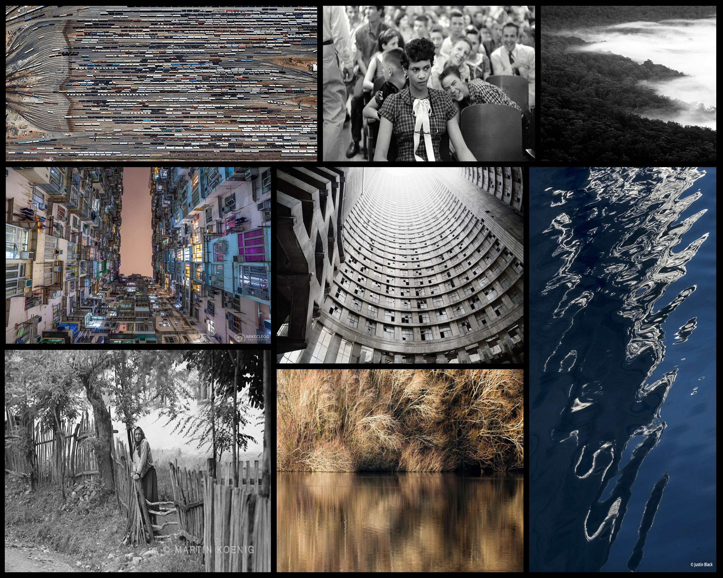 Leading examples of the certain photographers shown above interest me by looking at the subject of political landscapes in a more both a documentary and abstract approach than I would usually do. By doing this I could present my views and perspectives in a more implicit way rather than explicit, here are some mood-boards I have previously used in certain posts presenting the various photographers work:
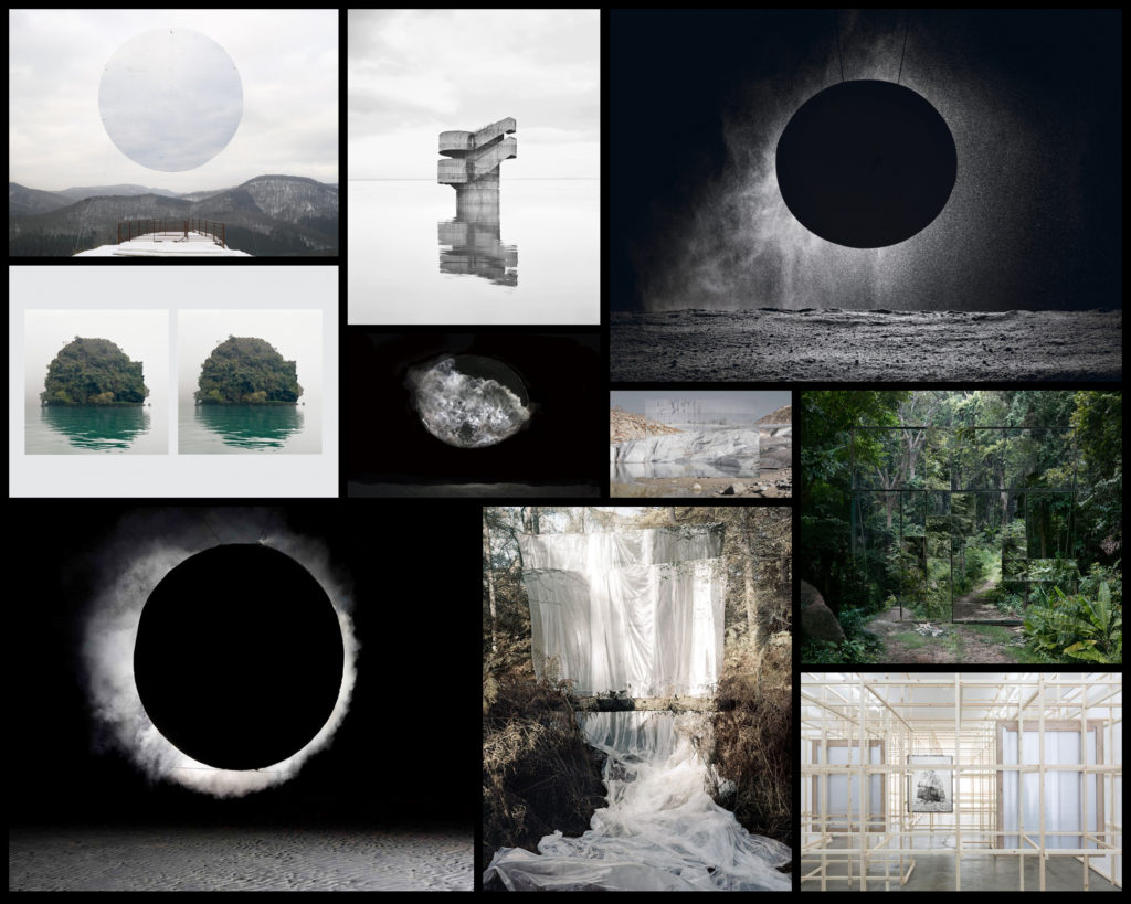
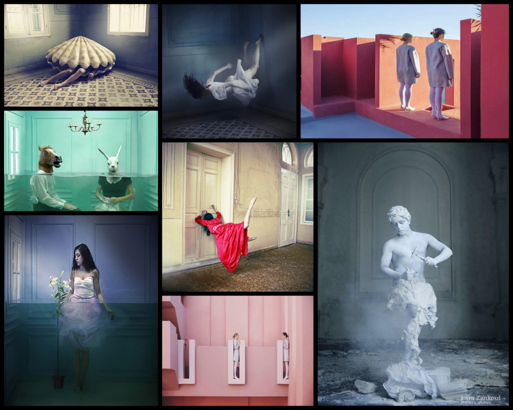
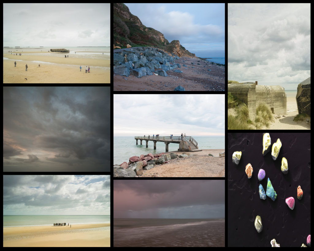
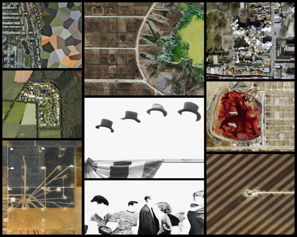
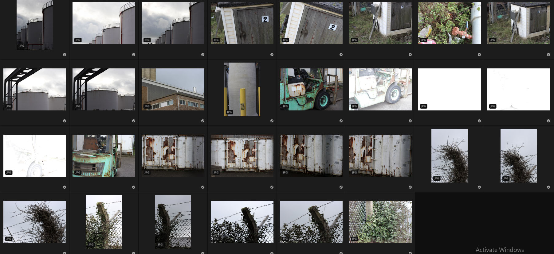
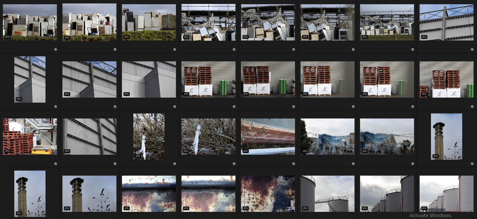
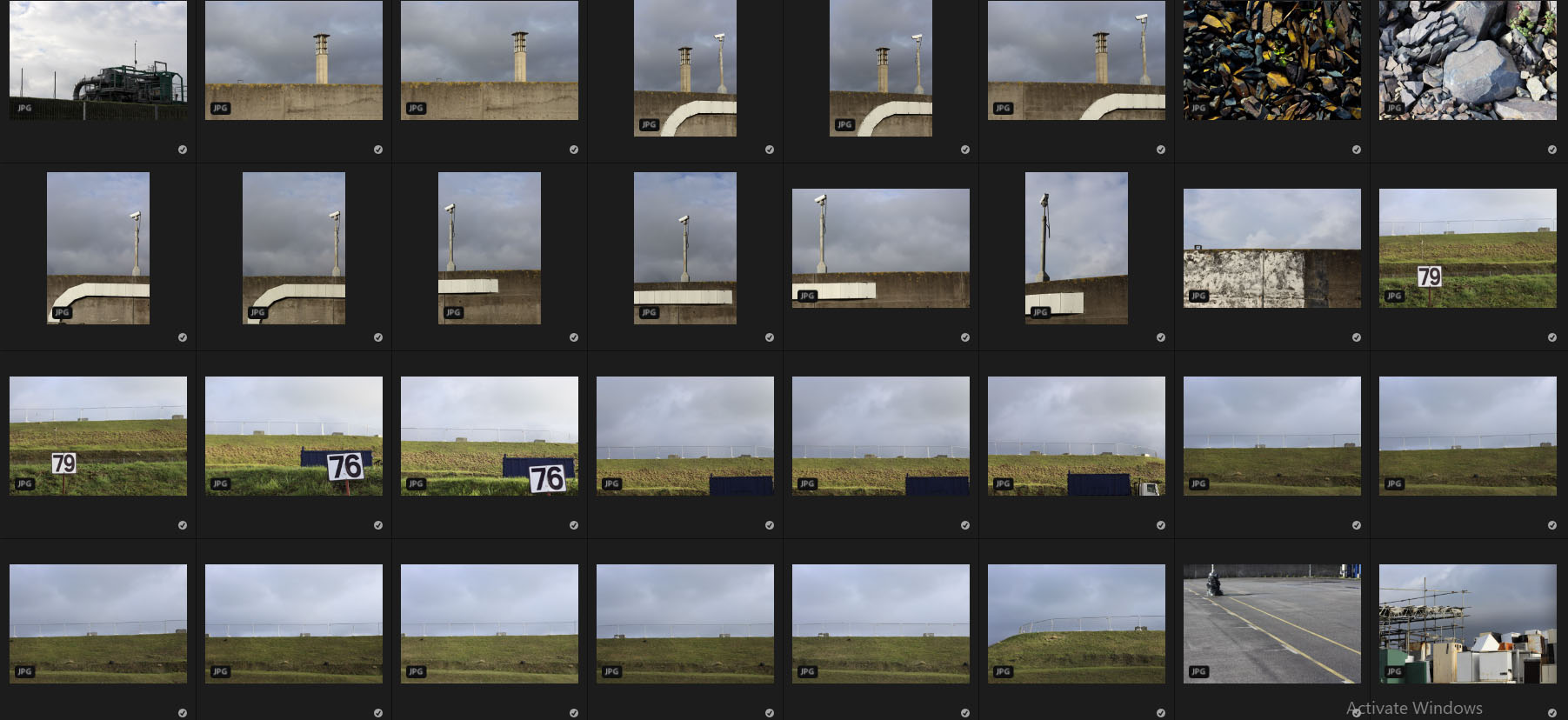
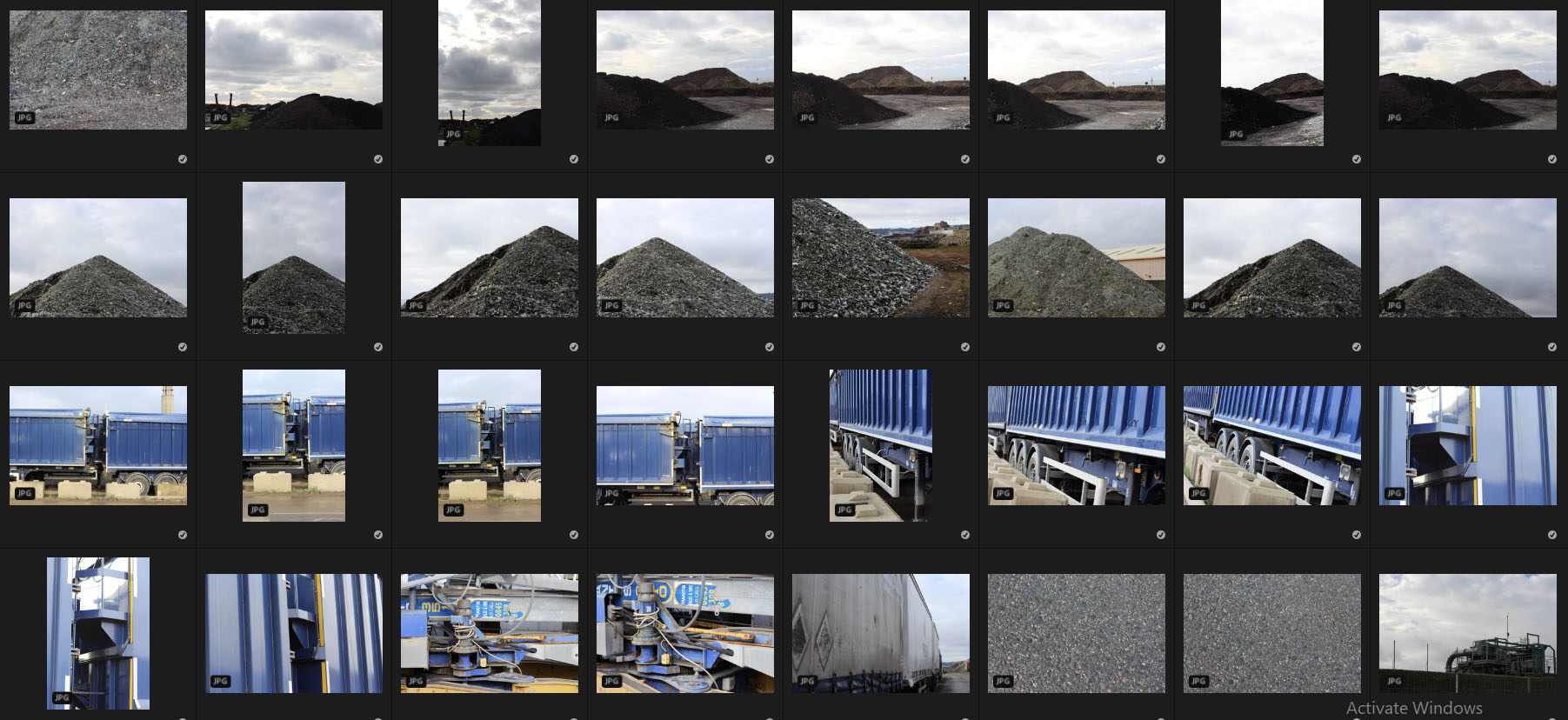
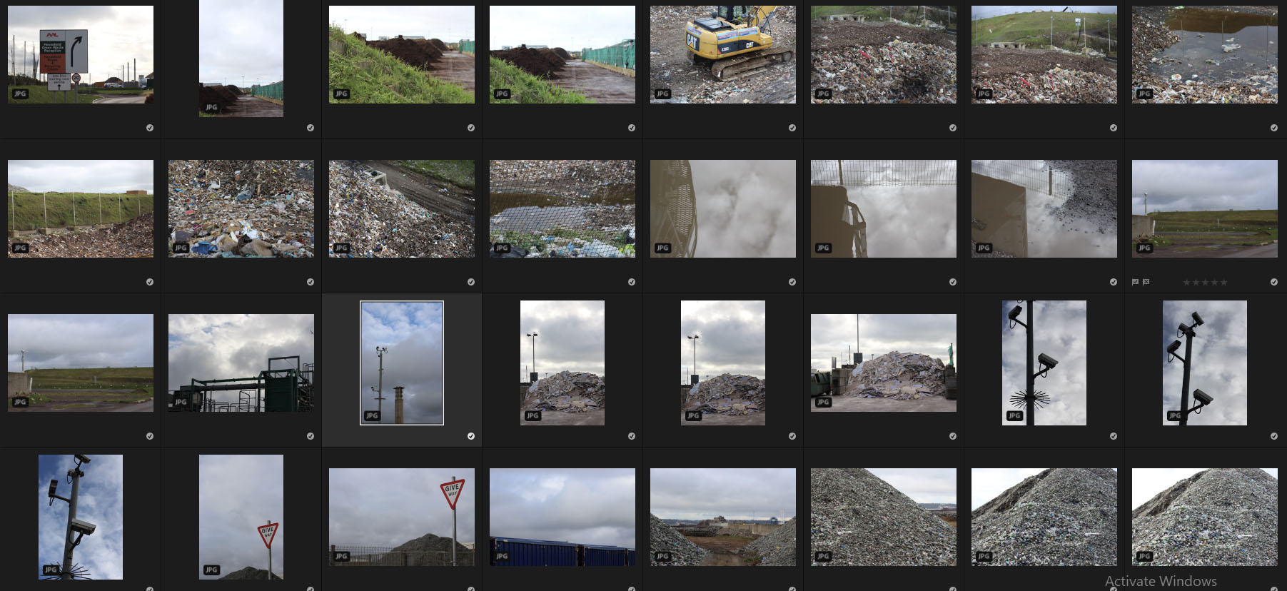
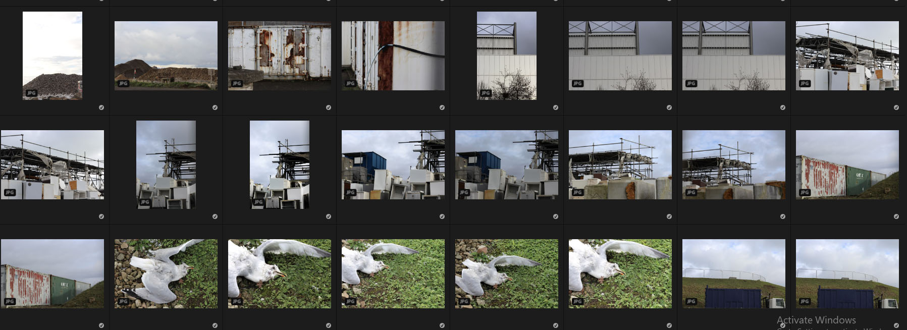 Once I had finished with the shoot I decided it was time to select ten images that I thought best reflected and represented the photos overall, and how they related to my chosen topic. By doing this it would allow me later on to select an overall best image using the method of deduction. Here are my favorite images from the contacts sheets:
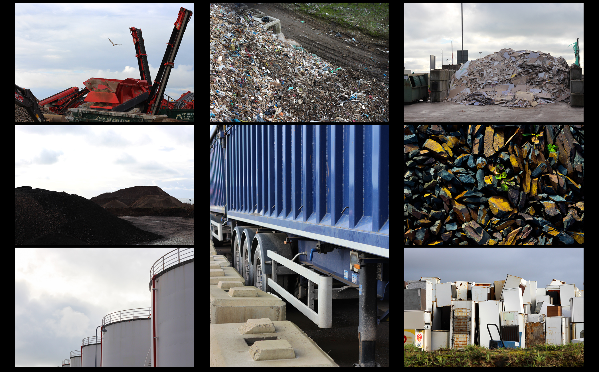 From here I then chose five of my best images out of the selection of ten, by doing this it would then allow me to analyze and study each image to greater detail, looking at the aspects that made me choose each picture. Here are my best five images from the shoot that I believe to reflect my intentions the best:
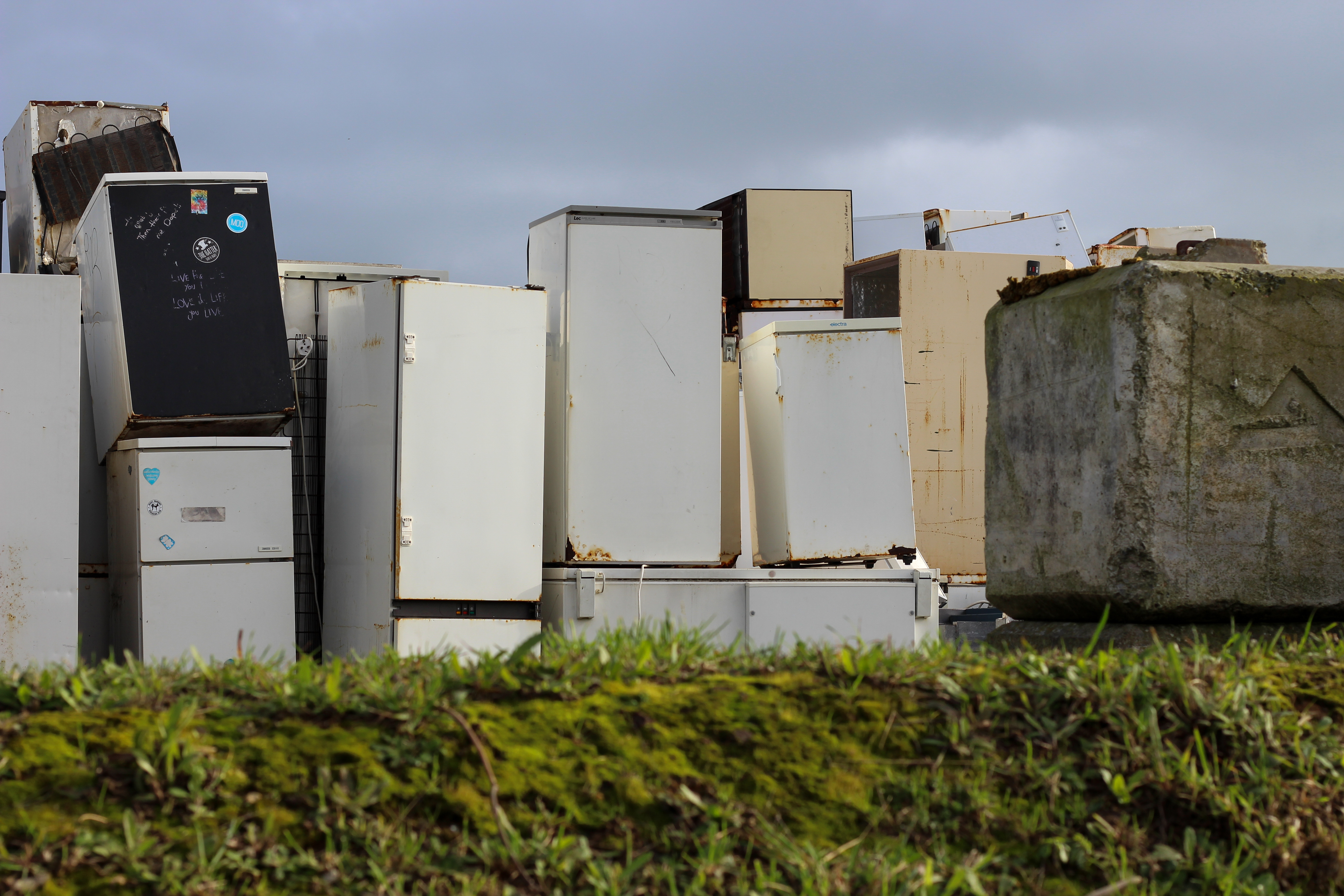 I selected this image because of the clear contrast between the green grass and the now disposed of fridges. I found that this contrast really produced an insight into how the landscape had been changed due to the process of consumerism, and how careless we have become in the outcome of out waste. I particularly liked how the concrete block broke up the generic pattern created by the sky, fridges and grass, adding a new perspective into the landscape rubbish is dumped into. This is complimented through the use of the darkened sky which casts an overlying grim tone across the entire image, preventing any chance of vivid colours coming through.
 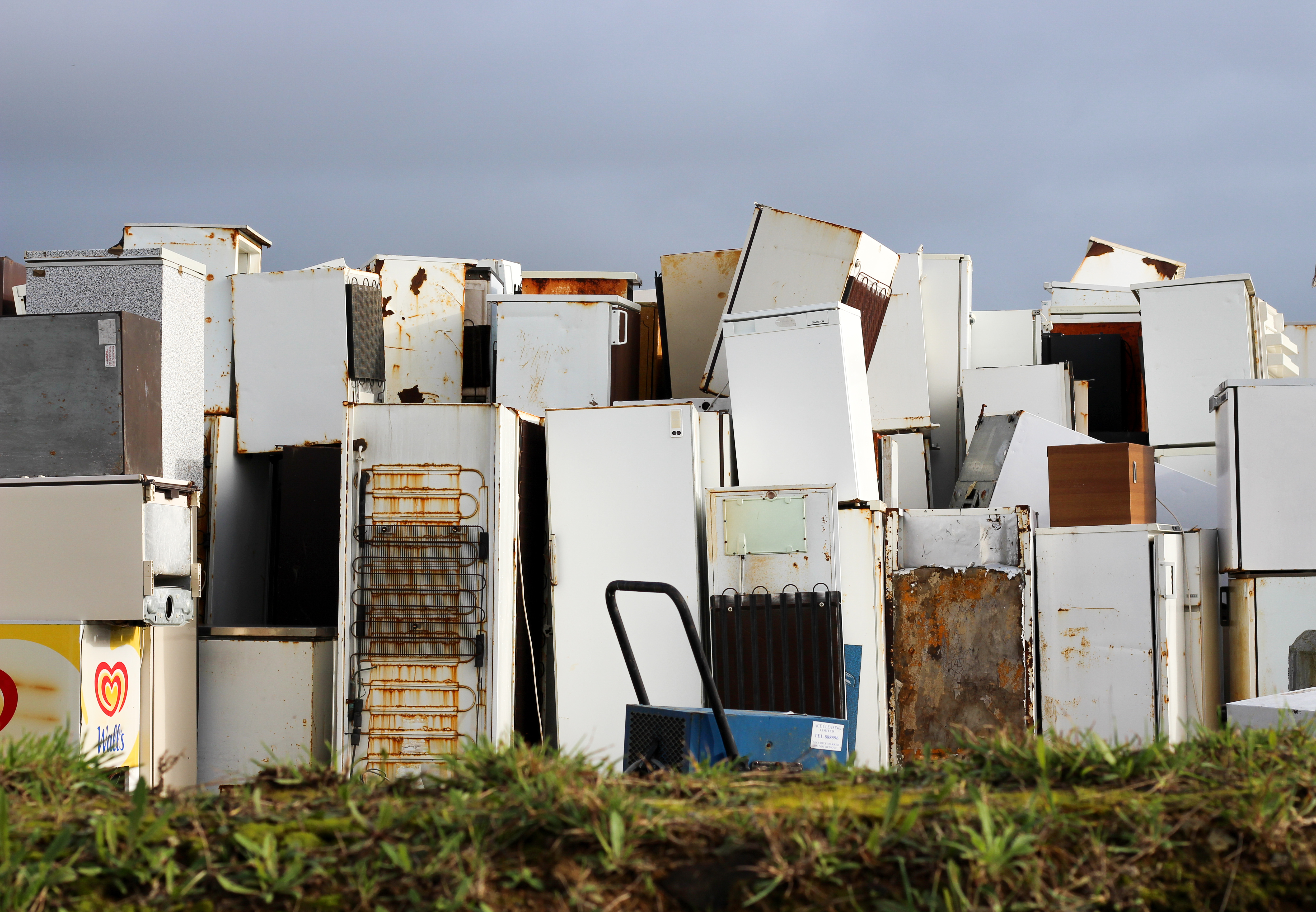 My list the first image I found that the pattern created by the sky, fridges and grass made not just an aesthetic result but also produced insights into our islands waste industry. What made me select this photo was how the blue cooler in the center of the image really broke up the symmetry and became the initial focus when skimming over the piece. I found that the wall of fridges really appealed to me as not only was it unusual but how it also reflect the sheer mass of items that have become unwanted to us.
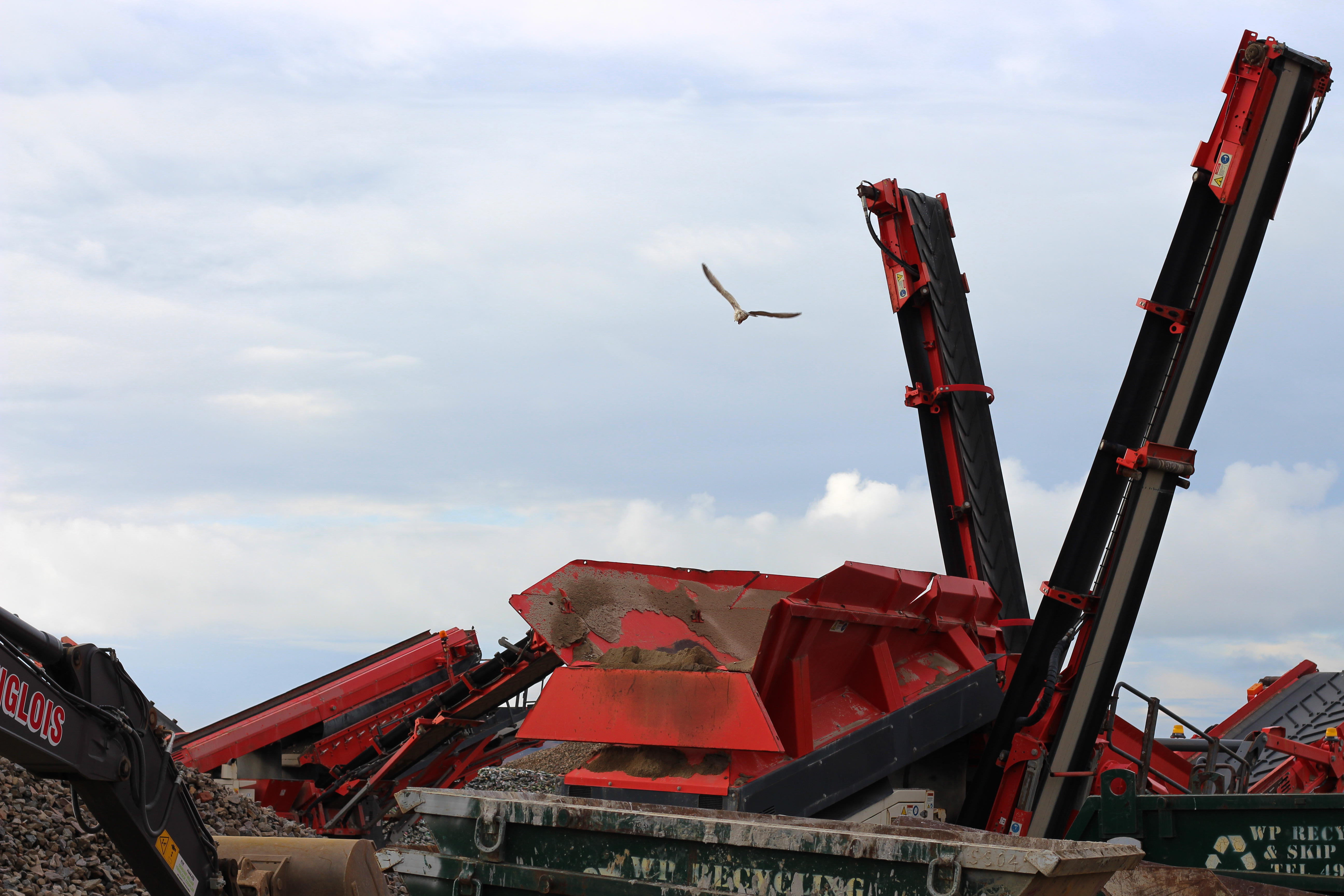 This image to me produced an impact through how the knowledge of what they are used for. The machines here are in the process of digging new landfills to dump rubbish in, in which the surrounding area is covered in seagulls living off the excess waste produced from of consumerism. The rest present in the image appealed to me through how it looked menacing and large compared to the rest of the landscape, but also how the wildlife such as the gulls centered their lives around the actions of how these machines operated.
 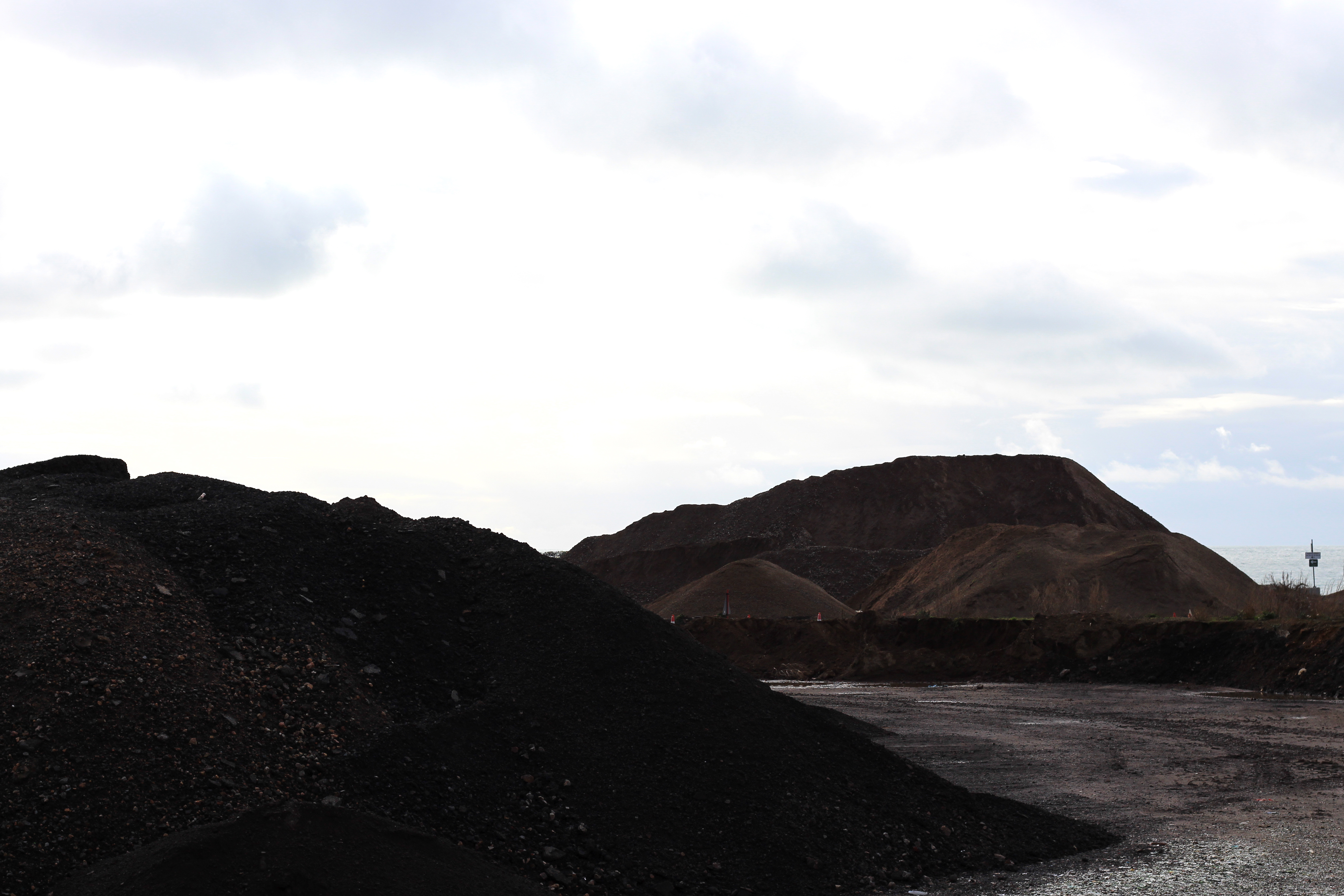 I selected this image because it shows the outcome of the machinery used above, where dirt has become mixed in with rubbish, completely changing the landscape through the piling of rubble carelessly thrown around abandoned areas. I really like the contrast between the dark colours of the dirt mounds and the clear sky, this is because of how it presents how out-of-place and unnatural the placement of the piles are, essentially scarring the landscape in the process.
 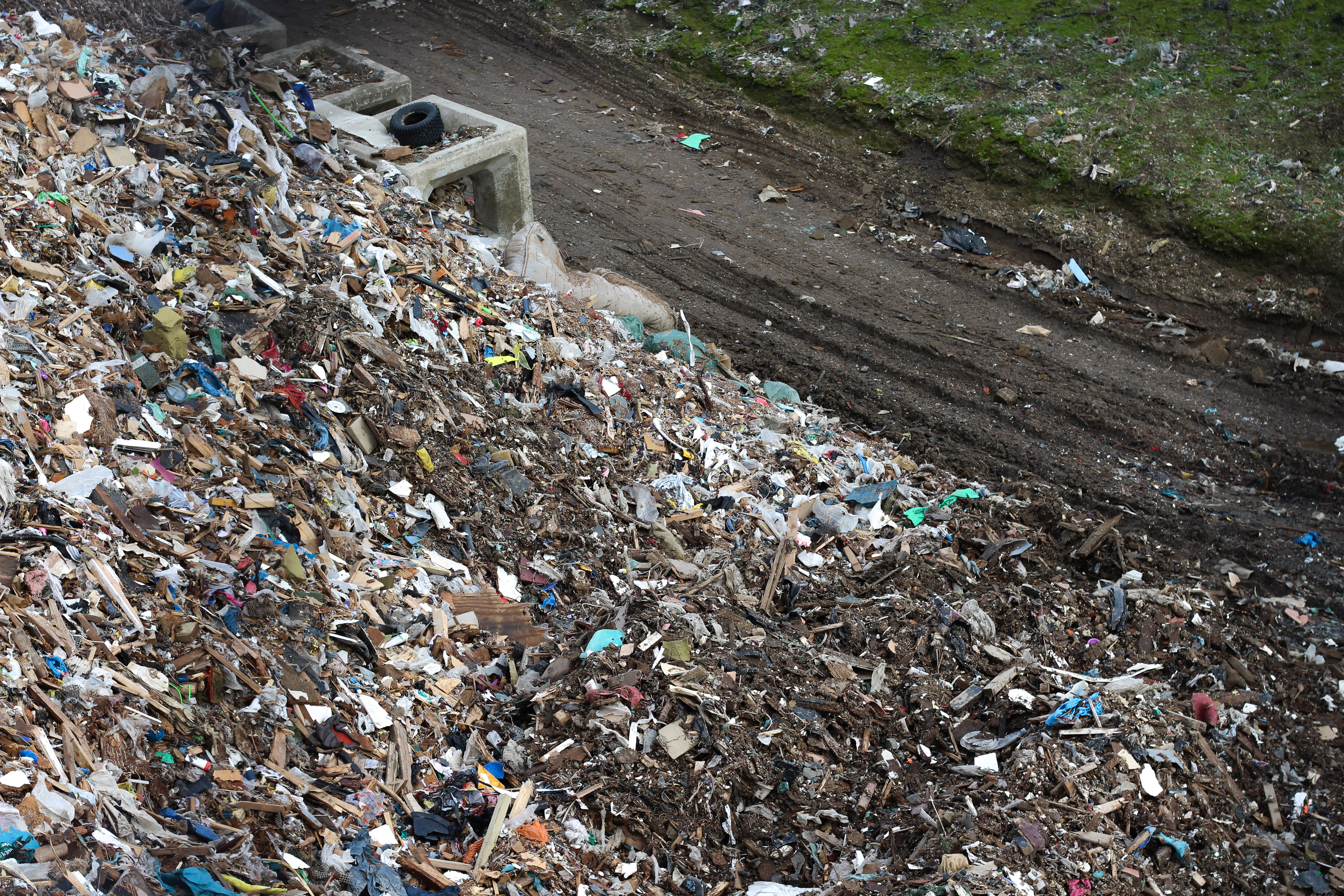 Finally I chose this image because it had the clearest contrast between man-made structures and nature in the entire shoot. This is represented through how the overwhelming pile of rubbish is overflowing across the road and only the green common, where a strip of dirt is seen as the only boundary holding back the tide of waste from flowing elsewhere. I especially like how the piece had been composed, as the majority of the picture is taken up by rubbish and the smallest section is filled with green grass, providing an insight into how we have treated out environment.
 The reason I selected this image as my favorite photo from the entire shoot was because of its composition and symmetry, whilst explicitly putting across my view of how we are treating certain areas of Jersey. What drew me in was how careless the fridges were thrown on top of each other, however at the same time creates a pattern that suggests each fridge was placed with purpose to produce this wall of white. I also really like how certain objects in the wall broke up the white pattern such as the cooler, rust and holes which pop up from time to time between the fridges.
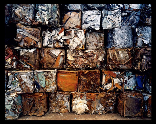
 After reviewing some of his works I decided to analyse a photography that I thought summed up his style of work the best. To do this I would be looking at three specific topics: visual aspects, technical aspects and conceptual knowledge. These would allow me to incorporate his working style into my work which I could use as influence. The image I chose was “Densified Scrap Metal” (1997):