Here is a link to my Photobook “Little Changes”

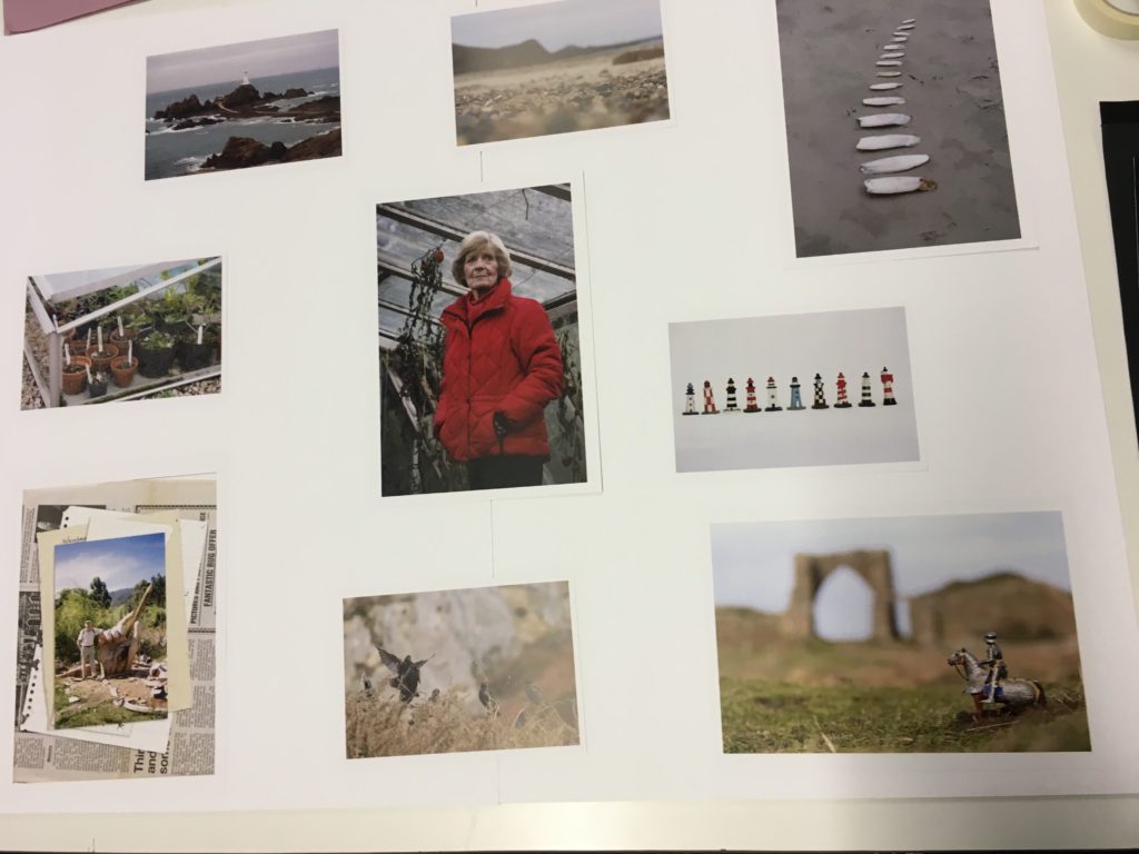
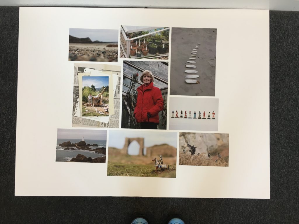
For my final presentation of the images I wanted to display them all on a white background in a collage format. I got my photos printed in a range of portrait and landscapes in size A4 and A5. I stuck two sheets of A2 foam board together to make a big canvas and background. I knew I wanted the key portrait of my Grandma in the centre because it is the boldest of all the images and draws your eyes in. I played around with different layout trying to spread them out evenly and make them all fit together without any big gaps.
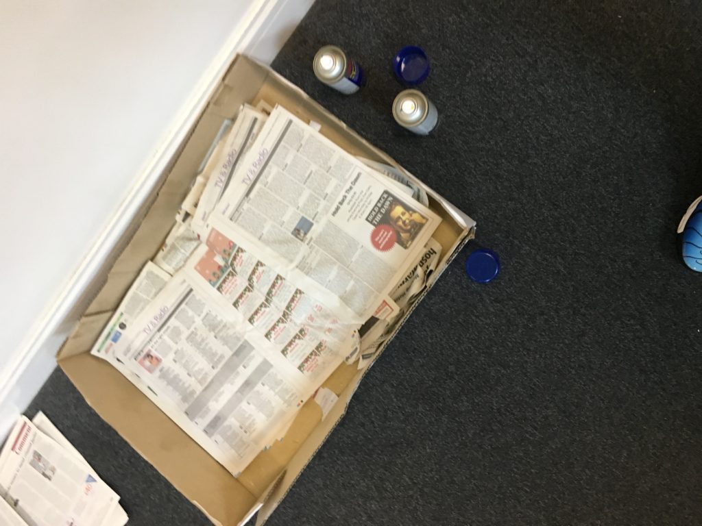
When I had decided on the placing of the images I spray mounted them and stuck them in place. First measuring the centre image and the aligning the rest up with it to make sure they were all straight. The image layout had a rough edge and were not all perfectly lined up, this was intentional to create a more natural look and to give it more interest.
After narrowing my selection of images I started bringing them into the book wright app to form the layout. I knew I wanted to split the book into 3 sections each based on a poem written by my grandpa, I would then construct the following pages as a response to the poems and create individual narratives surrounding the themes. I am looking to create a few basic templates for the format and repeat them throughout the book according to the style of each photo, this will create a more uniform and organised aesthetic.

I wrote out the poems and tested their placing on the pages, I wanted them to appear similar to how they did in his anthology, with centred writing and an a long columns. Initially I thought of placing it on the right hand side so it is right there when you open the page however alongside the image it looked more natural on the left hand side with the archival image on the right.

I experimented with the size of this archival image, firstly making it full page and then the size of a 4×6 photography that people would have in a family album. The second layout fitted the personal family aesthetic better and didn’t take away from the writing too much.


For my portrait image in the book I wanted it to be a stand alone image so the bold colours and characteristics could show. The image has a simple colour scheme but the patterns and textures are complex, with the diagonal lines on the top half of the image traveling back and the black leaves hanging down I didn’t want to take away from I by placing it next to another photo.

I played around with the placing of the image on the right hand side page, firstly I make its the tradition 6×4 photograph size but due to the style of image I don’t think it suited this. Next tried it full page which looked better, without the white border to distract from the colours. I think this image is powerful on its own and having it a big size shows it off best. The framing on the photo wasn’t quite right as the bottom of my subjects coat was just above the bottom of the frame and she filled almost the whole page. As there was excess image not shown on the pages I just moves the photo down so there was some empty space above the subjects head and the bottom of the coat was cropped out, this makes the photo more balanced.

For the third poem “Stefi’s Castle” it was very long and in the original anthology it covered two pages. To keep the format is used for the other two poems I would need to squeeze in onto one page to allow the archival image to go opposite. I tested this out and although it fitted all on one page I thought it looked over crowded.

To resolve this I split the poem onto two pages allowing the text to be centred to the page this was much more spacious and gave a more minimal effect.

Throughout the layout process I looked at an overview of all the pages to help me gat an idea of the order of the pages and how they fit together. At this stage I thought the pages looked to cluttered and random. I refined the designs to fix this and made templates so that there was a theme and structure throughout the book.

Some images I have chosen to have as double pages with no white boarder, these are images with small detail which I want to stand out more. For example this photo of the medieval character toy is mostly out of focus however the key part of the photo with most intricate details is focused and I wanted to blow it up so they were clear and almost larger than life. I wanted the perspectives in this image to to be blurred and the small toy to appear life size.


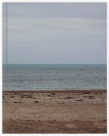
The final layout for my book displays a variety of images, from archival to natural landscapes and even manipulated images. I have constructed it with three sections each following similar layouts. The final thing I had to think about before ordering the book was the cover, I though of using an image of my Grandpa, perhaps one of the layered edits I had made using his poem notes. However I decided to use one of my simple landscapes of the beach linking to the ‘tunnelling’ poem, this is because how it links to the cover of his anthology which is a landscape painting of a beach. By doing this the colours and simple style match. The image will be a wrap around cover with the parallel horizon along the centre of the cover.
How do Rita Puig Serra Costa and Linda McCartney both share their relationships and memories with their family through the medium of photography?
Family Photos have been taken for hundreds of years as a way of capturing precious moments of people with their loved ones. In this essay I am going to look at two different photographers who have studied members of their family in their work. I will compare and contrast their work in a hope to gain a greater understanding of their photographic style and meaning behind their work. I want to look into the relationship between the photographer and their subject to see how and if it effects the the end result. I also want to explore how this relationship is communicated to an audience, and how these private and personal photos can also be seen and read by outsiders. I also want to look at the theorist Roland Barthes, a philosopher, who amongst many things wrote a book on the nature of photography, I will be looking specifically at the idea of studium and punctum and how he was affected by different photographs. The two photographers I am planning on looking at have developed their work in very different ways but both manage to show great connection with their subjects and tell beautiful stories with their work. Rita Puig Serra Costa created a book surrounding the loss of her mother, the book contains a variety of images, from portraits, still life, landscapes and archival copies it creates a broad description of her relationship with her mother and the memories she has of her. Linda McCartney, on the other hand was originally a professional photographer of celebrities until she met her husband and musician Paul McCartney. As they got to know each other and build a family she captured and shared a large selection of photographs. Being in the public eye, the family were regularly photographed however there is something very special about the connection they had which came across in the images. By researching this area I hope to gain a greater understanding of family, relationships and memories in photography to help me with my own project about my Grandpa.
Roland Barthes wrote the book ‘Camera Lucida’ talking about the nature and essence of photography, in this he spoke highly of his late mother and used photos of her as a way to cope with his grief. In the book he also looked into the effects of individual photographs on the spectator. Barthes found that most images did not move him emotionally, they simply pleased or displeased him, he called this the ‘stadium’ “Many photographs are alas, inert under my gaze. But even among those which have some existence in my eye, most provoke only a general and, so to speak polite interest” (Barthes, 1980) He also describes stadium as the parts of an image which are simply for aesthetic reasons, for example the composition and colours things which can been seen by everyone. The punctum, on the other hand is the part of an image which pricks the individual viewer, this could be through any signifier with resinates and had a bigger impact for an individual. “A photograph’s punt is that accident which pricks me (but also bruises me, is poignant to me)” ( Barthes, camera Lucida, 10 pg 27,1980) In his book he describes a photo of corpse lying on a torn up street covered by a white sheet, an image captured after a bombing in Nicaragua. This photo, to Barthes has punctum due to its emotive narrative, the success of this photo on having an effect on the audience could be simply down to skill or luck, being in the right place at the right time to capture this bleak scene.
Rita Puig Serra Costa’s book displays some of the memories she has of he mother in a delicate and personal way. The book as a whole is not intended to be seen and viewed by a large audience, but by a more niche group who can pull their own meaning from the pages related to loss and memories of their own loved ones. As a viewer of the book, not knowing the subject personally we are intrigued by the interesting narrative and aesthetic images but also drawn in to a personal story, the details of which are left open ended for us to put together ourselves. We get the sense that we knew her due to the images being so varied but specific to her, for example the archival family images seem familiar to us since every family has boxes of these stored away and help us relate to how Rita is going back to her memories, some of which purely from photos. It is interesting how a photograph has the power to spark a memory that would have otherwise been forgotten and although they only capture a split second in time, they can unravel and mean so many different things. “I remember you when I’m on my own too. You are always with me. Sometimes it’s difficult and I can’t seem to find the way. It’s as if no matter how hard I try, I can’t hold on to any memories of you.” ( Rita Puig Serra Costa’s, 2015) Here Rita talks about how the memories of her mother are fading, I see the book and photos in it as a way of her hanging onto these memories. Capturing a thought or feeling within an image and creating a visual story out of it. This book would mean a lot more to Rita than anyone else looking at it due the personal connection she has with it, however, I also think other people can derive a similar feeling from the overall sense the book gives.

This image is a double page from Rita’s book “where mimosa bloom” displaying two photographs, one a still life and one a portrait, which work together conceptually and aesthetically. The image on the right where peoples eyes will be drawn to first, is a portrait of a women with red hair, wearing a light floral shirt in front a of a textures pale blue background. The image on the left shows a type of calendar with blue and pink card, these colours have connections with the opposite image and share a pastel aesthetic. It is perfectly composed in the centre of the frame with an off white background. These are both naturalistic images showing important parts of the photographer and her mothers life and relationship. The circle shape on the left is parallel with the woman’s face and help to draw the viewers eyes to the important parts of the image. The format of the images next to one another is important, the simplicity of the image on the left doesn’t take away from the portrait too much but they compliment each other well. The Background colour of both images is in the same tone, the on the left appears white at first glance but is more of a pale grey blue which matches the blotchy, slightly darker, textured background on the right image. The portrait image looks like it was taken in natural lighting but not direct sun light, this is because of the subtle shadows on the subject’s face. The space in this image has also been represented by the foreground and background, which are distinguished with different focuses from the small dept of field. In both these photographs the subject has been placed in the centre of the frame intentionally so the page spread is balanced. Compared to real life the portrait image has been slightly manipulated to look paler and more gentle with a romanticised feel. When I look at these photos the first thing that stands out to me is the woman’s red hair which is one of the darkest parts of the two photos. The image of the left has not been much affected by flattening what we can see in real life to the 2D image because the object is flat anyway, however seeing it in a simple set up would make us appreciate it more than we would when just coming across the item in real life. On the other hand the portrait captures a split second of what was happening, meaning the facial expression pose and setting could have been very different in person. If I could ask the artist anything it would be about the relevance of the two images being placed together, I would like to know if their is a specific story behind it or if they just fit the theme and aesthetically match. The book does not explain the reasoning for the photographs in anyway other than a title page at the back of the book listing the name of each photo.

My second artist reference is Linda McCartney whose work surrounding family has also be viewed and consumed by a variety of people both publicly and privately. Wife of Paul McCartney and photographer in her own right she became known after being randomly selected to a take photos at a promotional party for the rolling stones on the SS Sea Panther on the Hudson River. She documented the event and took relaxed and intimate photos of the band, the magazine was so impressed with her candid style they published her images in an editorial feature. I am interested in the photos she took of her family over the years and the relationship she created with her subjects to make the photos so natural. “She would have the camera with her but wouldn’t hold it up in your face for a long time, so she wouldn’t be clicking all around you – she’d chat with you, take a snap, put the camera down, so you didn’t have time to start posing and feeling self-conscious. She never intimidated people.” (Mary McCartney, 2011) making her subjects comfortable and treating them all the same as she would treat her family when photographing them makes her photos so special. This image of Paul McCartney, taken by Linda was used on the back cover of his self titled album and has become a well known image. The photo of his daughter, Mary, poking out of his shearling coat will be valued most by Paul, Linda and the child herself due to their direct connection to the moment and the memories they have of the time. To fans of Paul McCartney the photo is the face to the album and may trigger personal memories of a time in their life where they listened to this music. The image reflects the message of Home, Family and love which was the albums ultimate message.
My personal response after looking at these artists work and the themes of memories and loss along with public and private images is a photographic book displaying my own memories of my Grandfather through the use of his poems as a source of inspiration. I Have decided to split my response into 3 sections each one correlating to a poem which he wrote and I have a personal connection to. Similarly to Rita I am using the book as a way of collecting and hanging on to memories of a lost loved one through the use of photographs. The book will collate a variety of mediums and types of photographs to help build up a story and narrative for the book. Archival images of my Grandpa writing poetry and playing with me as a child will help to connect the new images I make to old memories. In terms of audience, these archival images will give people who did not know him or that do not share the same memories a better understanding. I will also make scans of the notes he wrote whilst creating poems as a form of image making and use these throughout the book to show the naturalistic process and writing and bringing ideas together to create poetry. The new images I make will be a mixture of landscapes specific to those mentioned in the poems and portraits of family members who share memories on the topic.

In conclusion both Rita Puig Serra Costa and Linda McCartney utilise the medium of photography in similar ways to connect with family members, whether this is by displaying and holding onto old memories or by creating special images which show a connection between the subject and photographer. Both these photographers create work which displays Barthes idea of studium and punctum to different audiences. With Rita’s work the puncture is probably more personal to her however Linda’s could be seen as more universally meaningful to a wider audience. Finally my own work plays around with memories for two perspective, those of my grandpa displayed through the written poems and mine from the responsive photos I then created.
Bibliography
http://blog.photoeye.com/2015/02/book-review-where-mimosa-bloom.html
Photoshoot Plan: I wanted to do a photoshoot in the area that my Grandpa lived for a lot of his life, the natural landscape and environment surrounding him was very important and would of had a big impact of his writing. I will explore the area and photograph anything that links to my Grandpa and his poems.


I knew I wanted to take photos of birds (preferably a robin) for the book but I had struggled to find one to photograph at tis time of year. When I was on this shoot I found a group of coastline bird nesting in a thorn bush and decided to photograph them using my long telephoto lens. I love the mixture of neutral colours and contrasting textures in them image and how the depth of focus brings out the details in the birds. Although this photos does not directly link to the “little change” poem I think it does reflect my grandpa’s attitude and interest toward wildlife.


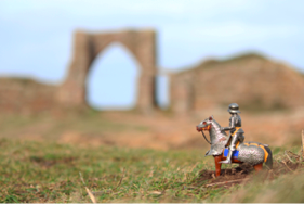
Photoshoot plan: I wanted to re do one of my previous shoots with better lighting to allow me to capture the castles feature more clearly and in higher quality. I also want to incorporate toys from the original poem in the photographs and merge memories of time spent at this castle and playing with the toys at their house.
Due to the high winds whilst on this photoshoot I struggled to balance most of the toys in the foreground of the image. I ended up having to dig the back of the horse legs into the ground to secure it whilst I took the photo. The idea with the depth of focus was to make the toy look larger than life and the castle to be slightly romanticised by the blurring and size in comparison to the toy.

The shapes of the arch in the castle mimic those on the toy castle I used to play with, i wanted to capture this in some of the photos and possibly use it beside archival images in my final book to show the parallel.

This image is a a double page from Rita’s book “where mimosa bloom” displaying two photographs one a still life and one a portrait, which work together conceptually and aesthetically. The image on the right where peoples eyes will be drawn to first is a portrait of a women with red hair, wearing a light floral shirt in front a of a textures pale blue background. The image on the left shows a type of calendar with blue and pink card, these colours have connections with the opposite image and share a pastel aesthetic. it is perfectly composed in the centre of the frame with an off white background. These are both naturalistic images showing important parts of the photographer and her mothers life and relationship. The circle shape on the left is parallel with the woman’s face and help to draw the viewers eyes to the important parts of the image. The format of the images next to one another is important, the simplicity of the image on the left doesn’t take away from the portrait too much but they compliment each other well. The Background colour of both images is in the same tone, the on on the left appears white at first glance but is more of a pale grey blue which matches the blotchy, slightly darker textured background on the right image. The portrait image looks like it was taken in natural lighting but not direct sun light, this is because of the subtle shadows on the subjects face. The space in this image has also been represented by the foreground and background which are distinguished with different focuses from the small dept of field. In both these photographs the subject has been placed in the centre of the frame intentionally so the page spread is balanced.Compared to real life the portrait image has been slightly manipulated to look paler and more gentle with a romanticised feel. When I look at these photos the first thing that stands out to me is the woman’s red hair which is one of the darkest parts of the two photos. The image of the left has not been much effected by flattening what we can see in real life to the 2D image because the object is flat anyway, however seeing it in a simple set up would make us appreciate it more that we would when just coming across the item in real life. On the other hand the portrait captures on split second of what was happening, meaning the facial expression pose and setting could have been very different in person. If i could ask the artist anything it would be about the relevance of the two images being placed together, i would like to know if their is a specific story behind it or if they just fit the theme and aesthetically match.
Photoshoot Plan: I am planning to take photos of family members who link to my Grandpa and share memories with him. I decided to take portrait images of my Gran who also shares his love for the environment and garden. This is why I want the location to be in a greenhouse, where there will be very bright lighting . I want her to wear a bight colour to stand out and display her personality and style.


After doing the photoshoot I think I have achieved the style of images I was hoping to create, the photos are simple but display a strong character in them, the location of the greenhouse worked out well due to the bight natural lighting from all angles. The colours in the greenhouse of the dried out tomato plants in the background tie in with the red jacket and scarf and contrast with the slight green of the leaves and background. One thing I might change if I were to do this photoshoot again is the unintentional solemn look to the photos. with the dead plants in the back and the slight blue tint the portraits have a slightly sad tone.


Photoshoot Plan: The third poem is called tunnelling and talks about my grandpa when he was younger and the memories he had on the beach with his parents. I want to take photos on the beach near Corbiere lighthouse which illustrate the poem and also link to memories I have of family walks in the same place.


I found cuttle fish lying in a pile in the beach and decided to arrange them in a pattern on the sand creating a leading line along the beach towards the lighthouse mimicking the walk the would have made.


I am happy with how this photoshoot turned out, although on the day the weather was over cast, I like the feel it gives the images because they look more real and show what the landscape looks like the majority of the time. The sea also look rough which gives it a dramatic feel. Also the colours that this lighting gives the images is very bright but not sunny making everything look golden more pastel and muted which is the aesthetic I wanted for the book.
Earlier in my coursework whilst looking at and creating work on collections I took photos of one of the any collections my grandpa had. small figure lighthouse which were displayed in their bathroom for years. I took Photos of these in front of an off white backdrop to show the simple details and how they all go together. I am thinking of incorporating these images with the new ones I have taken.

Photoshoot Plan: I want to take photos at Grosnez Castle, when I was younger we used to visit the ruins of this castle with my grandpa. It was in walking distance from their house so many family outings happened here. I was always fascinated by the stories he would tell me of my dad and uncle growing up in the area and historical facts. I want to take photos of the castle at dusk when the lighting has interesting colours too help give a dramatic effect. I want to show the area as I would have seen it when I was younger, as big and mesmerising.
I like the style and colours in the photos that I took because it give a romanticised effect and exaggerates the landscape however the lighting at the time was bad and the photos have a lot of noise. it was also very windy so the camera was shaking a lot this mean the long exposure images weren’t as sharp as I would have liked I want to do this shoot again and improve the lighting. I will also stay for longer and get more images of the actual castle.


