All posts by Sky Ayling-Phillip

Filters

Author:
Category:

Final Images and Presentation Ideas

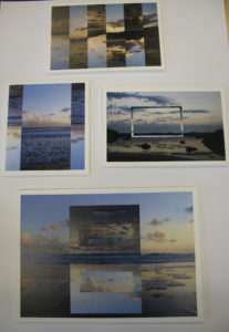
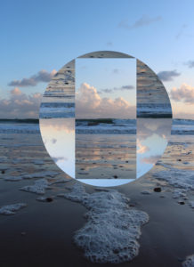
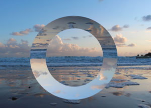
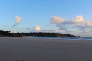
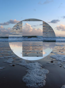
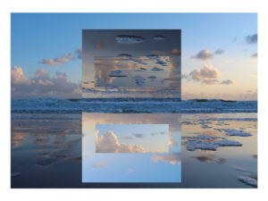
For this image I decided to print the image to the scale of A3 size, I want to sick this image onto a white foam board as I wanted to have decided to present this image by its self as I feel that this is the strongest image out of my final selection.

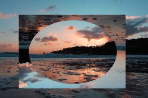
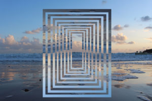
I have decided to present these image together on the same white foam board as the I feel that they do not fit with the other images but when they are put together complement each other very nicely, I have printed these to images to A4 size.
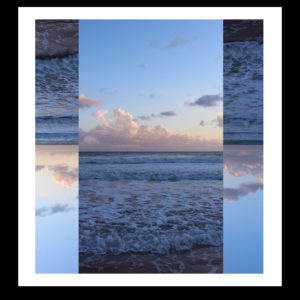
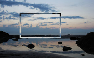
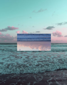
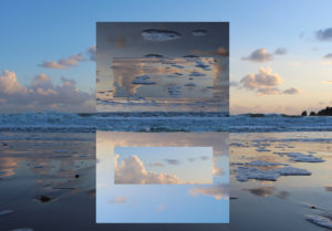
With this final image I decided to print it off at A4 size. I  plan to stick it onto a white foam board and then to stick this onto a black board to highlight the levels of contrast.

Experimentation Of Different Layouts 
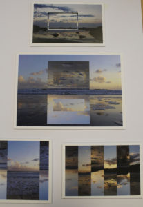
Final Layout Choice
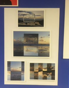
decided to change the layout of the image from being on separate pieces and card and foam, I decided to present all if the images on a white piece of card as it would be more effective as the images all fit into the same series. I placed the A3 image in the center of the card as I feel that this is the strongest image out of my final selection.  

The Editing Process

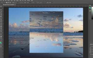
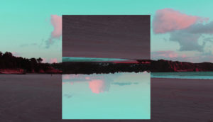
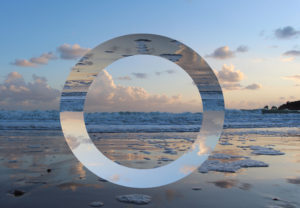
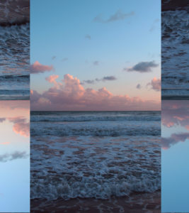
The first thing that I did when I began the editing process was selected the area of the image that Iwanted to flip upsdedown. To do this I first went a selected the rectangle Marquee Tool as this gave me the most freedom when deicing how big I wanted the area to be.

I then went into Edit – Transform – Roate 180 degrees. 

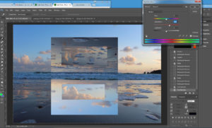
Then wanted to edit then image further to create another reflection within the image. To do this I repeated the process but with a smaller section of the image being selected.

The lastly Iwent and increased the vibrancy, saturation and contrast of the image only very slight as i felt that the image already was very strong colour and contrast wise. I felt as this step was necessary as I wanted this shoot to incorporate elements of the Romanticism genre  buy increasing the levels of all of factors, it has helped the imahge to fall into the category.

Compare and Contrast: Thye Reading

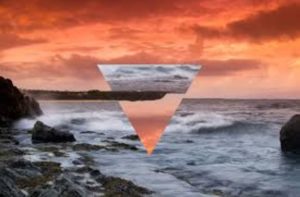
Tyhe Reading Geometric Landscape image which inspired my shoot
My response to Tyhe’s Image

Overall I think that mine and Cody’s image are very similar in looks and technical skill. When I first began to look at Cody’s images, I noticed that he would only edit his image with a triangle ontop  and no other shape which I didnt like. So I decided that I would stick to only a square/rectangle to edit my image,  The foreground of Cody’s image is very busy with crashing waves, which is one thing that I wanted to make sure I didn’t have in my images as i found it to be very distracting and I wanted the main focus of my image to be the section which has been rotated an]s otherwise the image would have been to busy. One thing that I made sure was the same when I began to edit this image was that when the image was rotated was the the land is the section that had been roasted was inline with the rest of the image.

Altered Lanscapes Photo Shoot

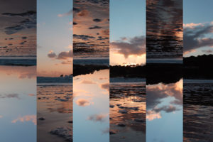
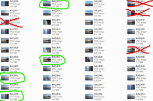
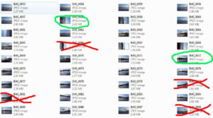
Contact Sheet 


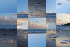
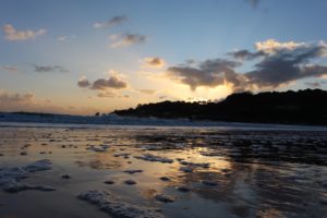
Overall I think that the shoot went well, was planning the photo shoot I wanted to gt the the beach just before sunset during golden hour so I could uses the colours of the sunset to enhance the image, however when I arrived at the beach the sunset had set. But looking back at the images I prefer having the deep contrast between the last remaining beams of sunlight with the contrasting dark clouds in the sky.

Best Images 

Experimentation 

Overall Best  Edit

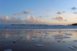
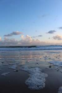
I feel that this image is the strongest outcome from the whole of the shoot. I took this image using natural lighting, as I went during the golden hour the light helped me to make the image have a Romanticism feel to it. I took this image using a high shutter speed as I wanted the crashing waves to be in focus and sharp and the image to be of a high quality. The image has a slightly cooler undertone to it because of the dominant colour of blue which has then been coupled with the neutral colours that come with the beach setting. I took this image at St Brelades bay I went to this beach specifically as I knew that when the sunsets over the land the area starts to become darker and the remaining light create a dramatic contrast in the sky. I made sure that the tide was coming into shore when I was doing the shoot. As I wanted to be able to capture the reflection of the sun setting on the wet sand which would not have been possible of the sand was dry. The first idea that I wanted to try when I began the editing process was to select a small area of the image and then rotated in 180 degrees so it was upside. When doing this I made sure that the crashing waves that goes across the middle of the image where still one continuous line. When I had done this I wanted to edit the image further as the image looked plain. I then selected a small section of the part that had already been rotated and flipped in upside so it was inline the rest of the image.

Geometric Landscapes

Mood Board The Altered Landscapes Project

For this project I wanted to focus on Geometric Landscapes and they way that they are edited to highlight the patterns and repetitiveness in everyday landscapes. However I also wanted to bring in elements to the Romanticism genre so that the images will have a overall nicer look to them

Plan For The Shoot 

Concept Genre /  Artist Location Props Shot type Lighting Settings
Altered Landscapes/ Thye Reading/Geometric/Romantisim Beach Tripod Landscape Natural/Sunset Manual focus,f/2.8-f/4, 1/60 shutter speed ISO-100

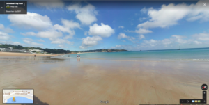
For the shoot, I am planning to go down to St Brelades beach during golden hour. Golden hour is the period of time just after and before sunset when the colours in the sky are the most vibrant. As I wanted to included element of Romanticism in the shoot, by having a dramatic sky in the backdrop of the images this will help to change the look of the image so that they fall in the category of romanticism  which is an area of photography that I want to combined with Geometric for the shoot.The equipment that I am planning to use is a single tripod as this will help to make sure that the perfect straight which is very important for geometric landscape

Case Study: Tyhe Reading

http://www.tyhereading.com/

Tyhe Reading is a professional photographer and graphic designer located in Melbourne, Victoria. With a focus on sustainability, Tyhe captures his subjects in a way that is truly representative of the experience.  He first started taking images at aged 14 but really found his passion for the subject and deiced to peruse it as a full-time career when he was 17. His photography works stems from his childhood of growing up on the Coast, admiring the natural environment in ways that had to be captured with a camera. This crosses over into his design work as he tries to incorporate his love for the natural environment and geometric structures into his designs.
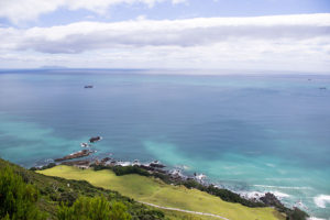
 

Image analysis


This image was taken during golden hour using natural lighting to capture the image. You can tell this because the light that is being reflected of the sea and the mist in the background of the image had a golden tint to it which would only happen during golden hour which is ethier sunset or sunrise. The shutter speed would have been around 1/40 1/100 to make sure that the waves are in focus and sharp The main focus of the image is the triangle in the centre which has then been split up into furthering different parts of the image to create a geometric effect. There isn’t much texture in this image as the waves in the foreground ae very smooth and sleek, however a bit of texture can bee seen in the background of the image with the rocks but mainly only the silhouette can be seen. Overall the image is very light the only dark tones in the the high raise of the wave and the outline of the rocks in the background

Case Study: David Hockney

David Hockney is a British born photographer, painter, draughtsman, print maker,stage designer. Related imageHe is a vital part of the pop art movement which took place in the 60’s

He attend the Royal College of Art in 1959-1962 when there he said that he took the most pride in his work.  Whilst at the college he was featured in the  Young Contemporaries exhibition which also featured Peter Blake this exhibit began the arrival of British Pop art. He was associated with the movement, but his early works display expressionist element. Image result for david hockneyWhen the Royal College of Art said it would not let him graduate in 1962, Hockney drew the sketch The Diploma in protest. He had refused to write an essay required for the final examination, saying he should be assessed solely on his artworks.
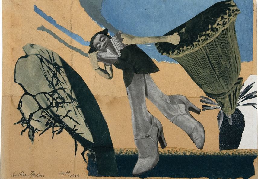
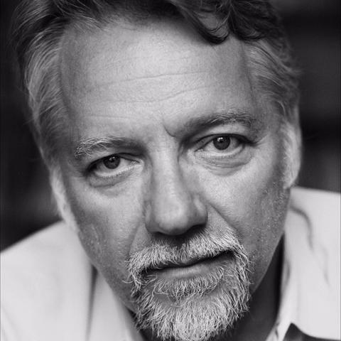
Image analysis 

Image result for david hockney photography

The images that make up this image have been taken in natural daylight, by the colour and angle of the sun it looks as if the image was taken at midday.The angles in which David took the images it makes the image very 2D is a feature of Davids work. The colours in the very saturated which is to highlight the different areas of light and shade in the image. The lightest part of the image which draws the onlookers attention to the centre of the image. This is one of Hockney’s most famous called ‘Joiners of an American Highway’. This image is made out of thousands of smaller photographs and in real life is almost 2 meters high by 3 meters wide. The full image took 8 full days for David to complete.In this image there many different textures in the image, for example, the texture of the road is very rough in contrast to the texture of the sky which is smooth.

Hannah Hoch

Hannah Hoch was a German Dada artist born in 1889, she was one of the first photographers who was artist to use photomontage. Related imagePhotomontage is a collage of images which have been cut/taken from their orignal context and place into different photographs to give the image a different meaning.

She is best known for her work of the Weimar period. Höch’s work was intended to dismantle the fable and dichotomy that existed in the concept of the “New Woman”: an energetic, professional, and androgynous woman, who is ready to take her place as man’s equal. Hoch also focused on other topics such as androgyny, political discourse and shifting gender roles, these themes creates a feminist idea surrounding Hochs work. Image result for Hannah Hoch

The Dada Movement

Dada was an artistic movement formed in 1919 in Zurich, Switzerland. The movement rejected monarchy, militarism, and conservatism and was enmeshed in an “anti-art” sentiment. Dadaists felt that art should have no boundaries or restrictions and that it can be whimsical and playful. The Dada movement had a tone of fundamental negativity in regards to bourgeois society. The term “dada” has no actual meaning the word used to describe the lack of reason or logic in much of the artwork.


Edward Burtynsky

Burtynsky was born in 1955 of Ukrainian heritage in St. Catharines,Image result for edward burtynsky faceOntario. He received his BAA in Photography/ Media Studies from Ryerson University in 1982, and in 1985 founded Toronto Image Works, a darkroom rental facility, custom photo laboratory, digital imaging and new media computer-training centre catering to all levels of Toronto’s art community.

Image result for edward burtynskyEdward Burtynsky is known as one of Canada’s most respected photographers. His remarkable photographic depictions of global industrial landscapes are included in the collections of over sixty major museums around the world, including the National Gallery of Canada, the Museum of Modern Art and the Guggenheim Museum in New York, the Reina Sofia Museum in Madrid, the Tate Modern in London, and the Los Angeles County Museum of Art in California.

Image analysis

Image result for edward burtynsky

Image Analysis 

I chose this image of Edwards as visually the image is stimulating and the composition of the image is very interesting as the image has been broken into three different sections, the sky, the yellow flowers and the big mounties.In the image the two main colours are yellow and the black are two very contrasting colour which in this example are very complementary to each other. The concept of this image could have been taken with the idea to show how much humans can alter the scene of the natural world, when humans are talked about changing nature it is looked upon in a negative way, this image could have been taken to show that it can be changed in a way that is beautiful.This image was taken in Canola Fields, Luoping, Yunnan Province, China.