All posts by Sky Ayling-Phillip

Filters

Author:
Category:

Secrets Photoshoot

Concept Genre /  Artist Location Props Shot type Lighting Settings
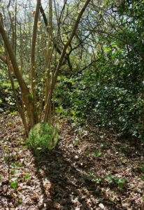
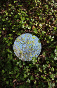
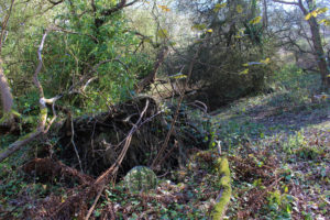
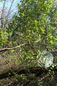
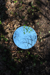
Secrets Sebastian Magnani/Reflections Woods Circular Mirror Landscape Natural Lighting Manual focus,f/2.8-f/4, 1/60 shutter speed ISO-100

To experiment with the different way secrets can be interpreted, I plan to explore the different reflections that can be made and the contrasting images can be made from this.

Contact Sheet 

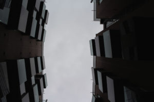
Best Images from the shoot 


Codes Case study

Dirk Bakker 

Dirk Bakker is a Dutch photographer based in Amsterdam, a city that he has lived in for over 30 years. He is one of the most popular users on the photo-sharing app Instagram.Dirk’s originally profession was graphic design and he worked in different companies and freelanced for over 20 years. He would mostly work on companies’ brochures, posters, branding, etc

Dirk has always had an interest in photography. As a hobby, Dirk enjoyed taking photos with his SLR camera. It was not until Instagram that his passion turned into a career. He has always been inspired by the lines, shapes, and patterns that architecture creates, and tries to capture the uniqueness in every picture he creates.

Image Analysis

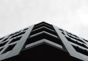
This photo has been illuminated through the use of natural daylight. The bright blue of the sky creates a colour contrast between the building which has orange undertones to it. A deep depth of field has seen to be used as the whole of the image is in focus, a slightly fast shutter speed has been used.


Codes – Case Study and PhotoShoot

What are Codes ? 

Codes are a system of words, letters, figures, or symbols used to represent others, especially for the purposes of secrecy. Codes within photography are also known as symbolic codes, technical codes or written codes

http://jakehicksphotography.com/

Born in Cornwall, he first discovered his love for photography when his father first gave him a camera, but his real interest in the subject began when he found that photography was the only path left for him as he had to fail at most of his academic subjects. His work could be described as bold, bright and colourful, as lighting colour is the main focus of his images

Image result for jake hicks photography


PhotoShoot

Concept Genre /  Artist Location Props Shot type Lighting Settings
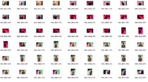
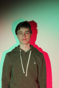
Codes Jake Hicks/Abstract/HDR Studio Tripod-Gel Sheets Portrait Artificial/Studio Lights Manual focus,f/2.8-f/4, 1/60 shutter speed ISO-100

Contact Sheet 

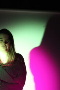
 Best Images from the shoot 

Overall this shoot was okay but I didn’t produce the outcome of images that I wanted. So I have decided that I am not going to carry on this idea, but I will use some of the backgrounds in some of the final outcomes

Secrets – Case Study

http://www.sebastianmagnani.com/

Sebastian_Magnani_2017.jpg

Born 1985 in a small village in Canton Valais, Switzerland, surrounded by mountains, Sebastian Magnani discovered photography whilst training as a media designer in 2006. After 5 years as a creative in an advertising agency, he decided 2011 to turn his passion into a profession. Since then he has been making a living as a photographer and visual artist, based in Zurich, Switzerland. Focused on portraits, editorials, advertising and several personal projects, like the Underdogs and Undercats, where got a lot of media attention and been published on many newspapers, magazines, websites and tv-shows around the globe. He has also won many awards such as  the GoSee Award, Stills, Gold & Public, 2015, OneEyeLand, Fine Art, Abstract, Gold, 2015,  both for his project entitled Reflection
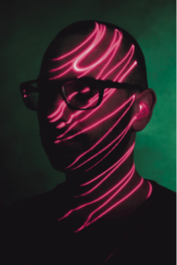
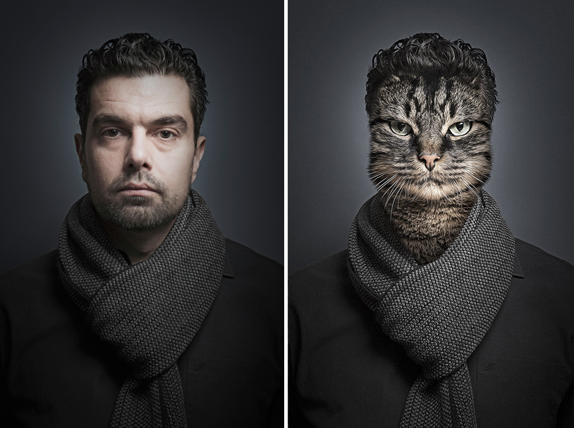
 

Image Analysis
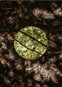
In this image, the natural lighting that is breaking through the leaves of the treetops has been used to cast light upon the floor of the forest. A shutter speed of 1/30-1/60 will have been used to capture this photograph along with an ISO of 100-200, by using these settings it allowed Sebastian to a high-resolution image with minimum grain whilst allowing plenty of light to enter the lens. The two main colours in this image, are green and brown, which gives off connations of life and death. In the reflection of the mirror, we get a glimpse, to what the top of the forest looks like, which is bright and healthy green leave deflecting off most of the natural light. Which is a contrast to what is in the rest of the frame. Which features earthy tones, of the dead leaves on the forest floor.
Conventions Case Study

Allan Edward Hilton

http://www.allanedwardhinton.com/

Allan is a London based photographer, content creator, social media strategist who quit his London office job as a Digital Marketing Manager to peruse his dream of exploring the world and develop his photography skills.

H has been an early Instagram user since 2011 who has a following of 160+. He has worked with over 30+ content creation slash Instagram related social media and pr campaigns and has consulted on campaigns for TripAdvisor and Huawei Mobile.

Image Analysis

In the image above, the main focus of the image has been highlighted by the use of the natural sunlight which is coming from the left side of the frame.This image is mostly sharp but around the edge of the image, it has started to go out of focus, as on disposable camera setting such as ISO or shutter speed cannot be changed. The visual elements in this image are the colour palette, which creates a vintage look, there are several different textures within the image. This image was taken on his trip across Australia in which he decided to only take images using a disposable camera as he wanted to capture the images which where raw and wasn’t staged

Conventions – Initial Ideas

 Conventions The definition of Conventions in society is behaviors and which are seen as acceptable or polite to the majority of society.

Journalism is the collecting, editing, and presenting of news material for publication or broadcast. Photojournalism is a particular form of journalism

Photojournalism employs images in order to tell a news story. It is now usually understood to refer only to still images, but in some cases, the term also refers to video used in broadcast journalism. Photojournalists create pictures that contribute to the news media and help communities connect with one other. Photojournalists must be well informed and knowledgeable about events happening right outside their door.I would use photojournalism to present a true view of today society

When researching photojournalism I came across Steve McCurry who is a highly respected photographer but had lost some of his credibility, as he regards his images as being documentary and capturing ‘the  truth’ but on closer inspection by members of the public it can be seen that his work had been digitally altered, or people have come forward to say that they where asked to be in a staged.

So to compact this problem I wanted to shoot my images on a disposable camera.

Image result for disposable camera

Because once the images are taken they can no longer be worked back into, so when a disposable camera is used in photojournalism the image will be the real and untouched versions.

Image result for disposable camera imagesImage result for disposable camera imagesImage result for disposable camera images

Secrets, Codes and Conventions

Key Definitions 

Code – A set of conventions or sub-codes currently in use to communicate meaning. The most common is one’s spoken language, but the term can also be used to refer to any narrative form

Secret -Something that is kept or meant to be kept unknown or unseen by others.

Convention – The way in which something is usually done.

Mind Maps 

Mood Board


My first ideas for this project is to do a separate word that we have been given, one for codes, one for conventions and finally one for secrets.


Evaluation , Critique and Analysis and Final Response

Image Analysis

This light in this image is the natural lighting coming from the sun, I took this image during golden hour which has given the sky lots of different colours. I took this image using a shutter speed 1/250 as I wanted the crashing waves to be sharp and in focus. An ISO of 200 and an aperture of  f/22, these settings made the image have lot of light.There isn’t a large amount of texture in this image as I have edited out rocks that would have given texture as I wanted the image to have a crisp look to it. The colours in this image are very brought and vibrant due to the way that I have edited them to look like this, I wanted the piece to have a very bright and light feel to it, to add emphasis on colours in the sky being created by the sunset. There isn’t a large tonal range in this image as the image is bright.I took his image down at St Brelades Bay at low tide during ‘Golden Hour’ .This is my favourite image from the shoot, what I like the most about this image id the colour palette and the reflected section of the image lines up with the rest of the image.My concept behind this image and the shoot as a whole was to take a different perspective when looking at landscape images and to make them more interesting and appealing.

Final Presentation Of Images 

My final piece is a combination of 4 images from the Alternate Landscapes project. I stuck the images onto a white foam board and then stuck them onto a large white piece of card,  By having the images backed onto white foam and then white card it helps to bring out the colour in the images and highlights the brightness in them. One way that I feel that I could have improved the overall presentation of this image, as if I had thought ahead about how I wanted the images to look as I would have printed out one more image from my selection at A4 size, I would have placed it at the top to balance out the position of the images.I think that these four images are the most effective as they all have a clear linking theme between them.

Overall I feel that this project went very well and is the best project that I have done so far. I really liked exploring different techniques in relation to geometric and the way the two come together.  Using Tyhe Reading as my inspiration for this project I feel that I have created images that have the same theme but are also successful in their own way. What I want to improve for next time would take a wider range of images at different locations and different times during the day as this effects the lighting and the overall look of the images.Overall I feel that these images work well together to show the themes of Geometric Landscapes although some of the images could have been further edited the simplicity of some of them still creates the same overall effect.