All posts by Sky Ayling-Phillip

Filters

Author:
Category:

Research – Breaking the rules of photography

In an article by photographer Lewis Bush  Eight ‘rules’ of photography that are worth breaking he says how he thinks that breaking the so called ‘rules of photography’ can be extremely useful and can lead photographers to achieve their full potential. The article suggest that by breaking the rules our are able to see the world in a new perspective and that the stories of our time are not always clear to see. 

Left: Heather Bowser holds a photograph of her father, Morris, who served in Vietnam areas sprayed with Agent Orange. Photo by Mathieu Asselin. Right: Archival material. © US Herbicide Assessment Commission. Photographic intervention by Mathieu Asselin.

Bush explains the ideas of William Eugene Smith Smith is an American Photojournalist who is extremely dedicated to his projects. In 1955 Smith traveled to Pittsburgh on what was meant to be a three week assignment, however turned into a year long ‘photographic binge.’ He came away with over 17,000 images. He famously quoted this phrase: “I didn’t write the rules – why should I follow them?” allowing him to follow his own rules and principles to follow without others setting them for everyone to follow. If rules weren’t broken then many pieces of art, photography and media would not be around. Rule breaking allows to create new, innovative and niche process when taking photography. 

Alice Wielinga born 1981 in the Netherlands  graduated from the School of Fine Arts, as a documentary photographer. With North Korea, a Life Between Propaganda and Reality, she won the Photo Folio Review at the Rencontres d’Arles 2014 and the first prize at the Fine Art section of the Moscow International Foto Award in 2015.Her personal projects have taken her from China to Cuba and recently to Pakistan.

In 2013 she started to pursue a project on North Korea. The country fascinated her for over a decade. She wanted to learn what happened inside North Korea, which seemed a bag black hole on the world map.  Where was the story on the 24 million people who live there. How does it feel to live in North Korea? And how will it be possible to convey that in a visible story?

When in Korea she found it incredibly hard to truly document the true side of Korea. “I felt that, with mere documenting, I wasn’t able to tell the story as I was experiencing it,” Because she was not happy with her images, she decided to experiment with her images and digitally merge her images of official North Korea propaganda with her own images of the country and the life that the people lead inside the isolated country.  “I see propaganda and reality as two sides of the same coin,” she says. “Propaganda is an essential part of everyday life in North Korea, and because of that a reality in itself.” 
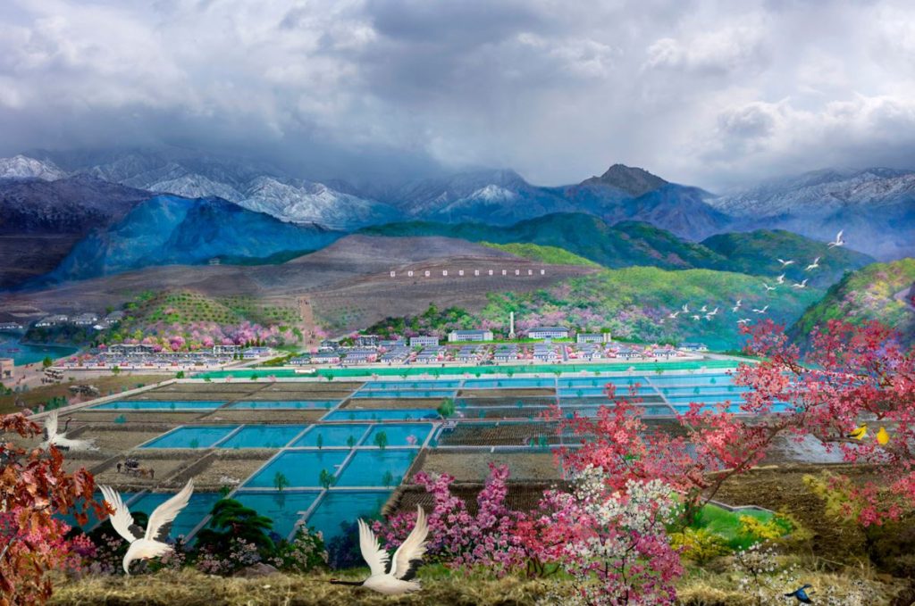
 

The Rule of Manipulation first ideas

Breaking The Rules – The Rule of Manipulation 

https://www.huckmag.com/art-and-culture/photography-2/eight-photography-rules-worth-breaking/

For this project I have chosen the third rule suggested in the article by Lewis Bush. I chose this rule because I think that I could but a lot of conceptual and abstract meaning into my images

Mood board for the project 

The main aim for this project is to show the way the way that images can be manipulated to show things in a different way, can can be changed by the producer to give of there personal feelings on a certain topic and they way that this change influence and effect others. Rather then photographing the whole view of different scenes I am going to take a more abstract view, I am going to do this by the way that I frame and capture my images. The mood boards above reflect some of the final images that I would like to produce, I have also decided that I want to use a a film camera for part of the project as I want to manipulate/experiment  the chemicals that are used in film cameras to create different outcomes of images.

For the political landscape aspect of this project I am going to focus on nature, as my landscape and the way that  nature and modern buildings are co-existing. For my first shoot I am planning to focus on colour and double exposure to manipulate my photographs, to give a dreamy feel to my images. I will manipulate the images by focusing on small sections of the image and then by merging two images together. Or another idea will be to blend to photos together, I have one image and plain such as a sunset of a small abstract part of an image paired with a normal landscape image that would see everyday. I want the photos to have a colour palette of browns oranges and yellows as it is turning into autumn all of the leaves are going to change.

Political Landscape

Definition of Political Landscape – A political landscape actually refers to the current state of things, as well as how they are looking in the future. While these metaphors are never actually used, you could say that a recession is hard work, climbing up a hill, and then a boom is the exhilaration of riding down the other side in a go cart. Political landscapes can be connected to conceptual or narrative forms of photography.

An example of an political landscape in jersey is the location of where to put the new hospital. And the resistance when it was proposed to put it on Peoples Park.

https://jerseyeveningpost.com/news/2015/09/28/new-hospital-at-the-peoples-park-no-say-islanders/

https://jerseyeveningpost.com/news/2016/01/22/campaigners-unite-to-preserve-peoples-park/

https://jerseyeveningpost.com/news/2016/01/27/peoples-park-petition-attracts-nearly-900-signatures/

JAAKKO KAHILANIEMI

https://www.jaakkokahilaniemi.com/

Jaakko Kahilaniemi born  in Finland, he received his BA in Photography from Turku Arts Academy Finland in 2014 and his MA in photography from Aalto University of Art, Design and Architecture in Helsinki Finland in 2018. He won the prestigious ING Unseen Talent Award Jury Prize in 2018 and Majaoja / Backlight Prize in 2017. He was selected as one of the Lens Culture Emerging Talents in 2017. As a freelance photographer Jaakko is specialized in portraiture, commercial and editorial photoshoots,Inheritage

His project at the Guesney Photography film festival ‘ 100 Hectares Of Understanding’. The [roject is based off the 100 hectares of land that he inherated when he was only 8.  The project  ‘100 Hectares of Understanding’ is  his attempt to understand the world around him and how man affects the surrounding world. He is willing to challenge himself to find new ways of increasing his knowledge and visual perspectives

He took inspiration from Fluxus and the traditions of Arte Povera, he  seek to encounter the forest with a playful and open approach. 100 Hectares of Understanding consists of the objects that he has found, the acts that he’s photographed, the sculptures he’s made and visual secrets that he has created.


Fernando Maselli – Artificial Infinite

http://fernandomaselli.com/en/

Photo of Fernando MaselliFernando Maselli Was born in Benos Aires in 1978, he first stuided Fine Art and then later moved to Madrid, where he began his career working for major advertising agencies in Spain, shooting professional assignments for brands like Coca Cola, Mercedes Benz, Vodafone, Toyota, BBVA. These works earned him numerous awards at international festivals such as Cannes advertising. The photographic work of Fernando Maselli explores different aspects of the formalism, deepening the aesthetic and concept as core values.

In 2008 he started collaborating with Madriz magazine, with which he developed a series of projects that illustrate the front covers and inside pages of 15 issues, projects with which he later on edited a book. In these series, with Madrid as a common feature, Maselli develops his particular vision of the city, where the symmetry, composition and light, become its most important elements.

Parallel to his commercial work, Maselli has developed a career in the world of contemporary art, being currently represented by the prestigious Luis Adelantado Gallery. His latest projects are closely related to the natural landscape, where through documentation and conceptualization processes, he seeks to captivate the viewer in a moral and sentimental reflection on nature.


Second Shoot

Contact Sheet 

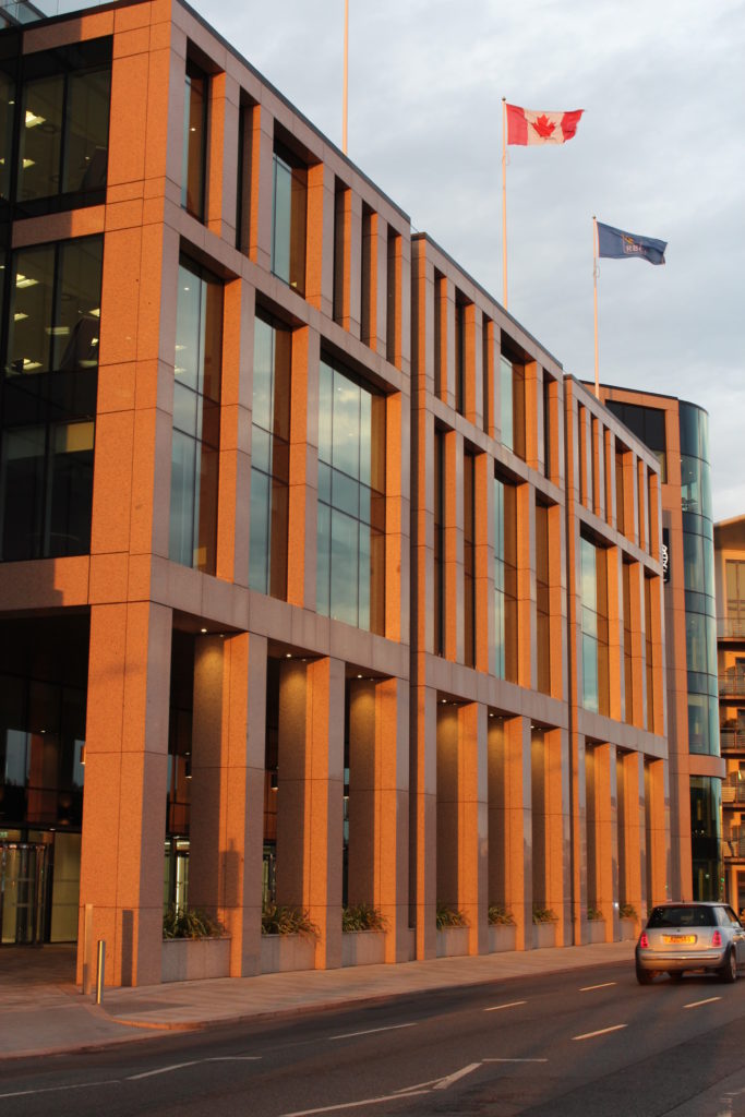
For this shoot I wanted to go when the weather was slightly overcast and not too sunny otherwise I would get reflection off the windows of some of the buildings which I thought might ruin some of the shots. But the sun did come out but it didn’t effect the overall look of the image and i did get some successful shots that I will be able to use.

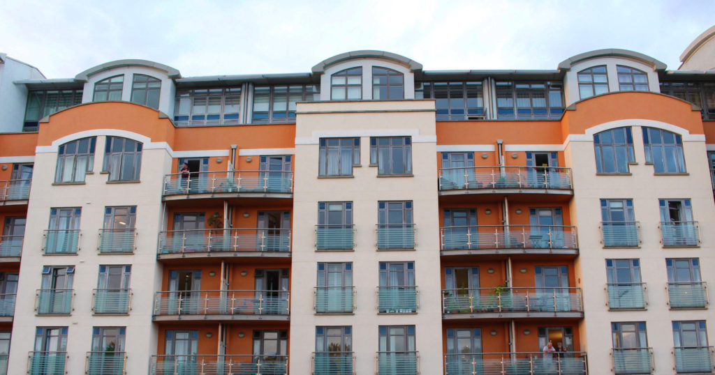
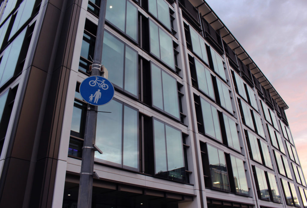
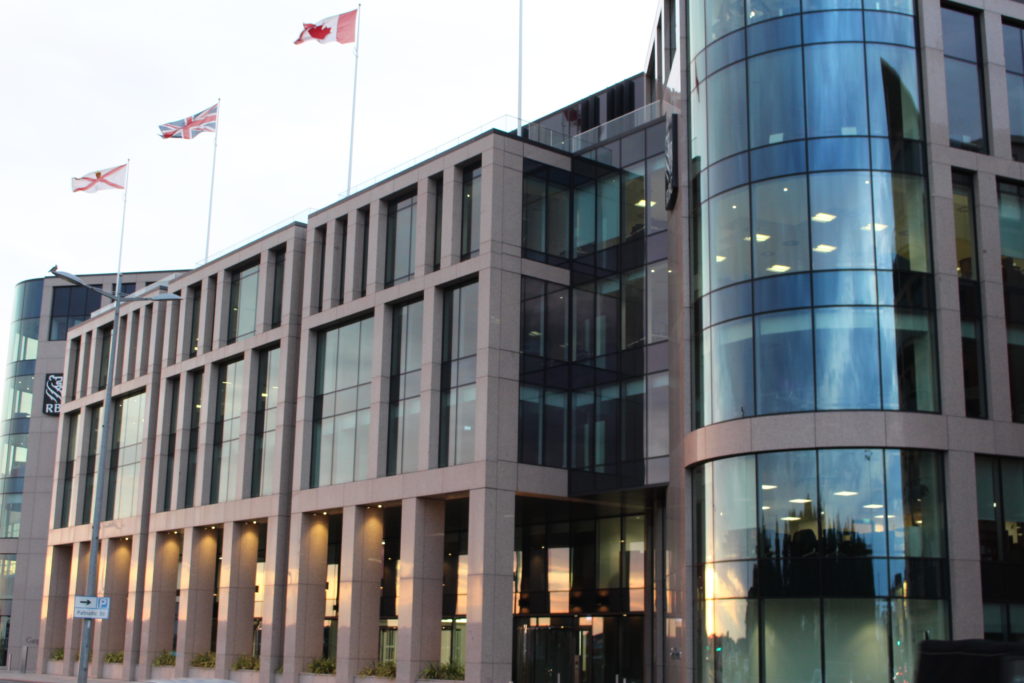
Images from the shoot that I plan to develop 

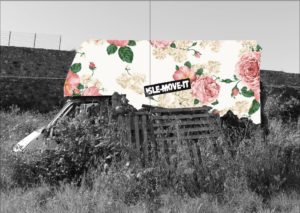
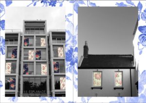
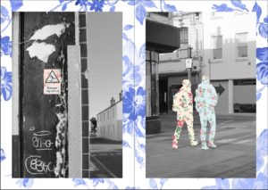
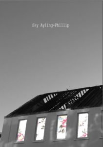
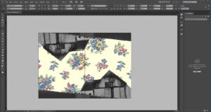
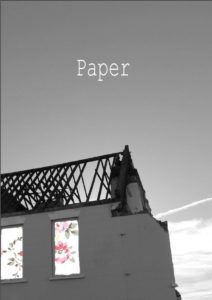
For this shoot I wanted to focus on the buildings of the finance center, as the architecture of these buildings is almost geometrical. But I mainly wanted to go and photography for the symbol reference of the images, as my idea when editing the images this to insert stereo-typically, ‘grandma’ wallpaper. As the connotation of grandparents is that they are warm, welcoming and kind. Whereas the feeling around the finance industry is that it is a harsh cold and mean environment which  is only centered on creating money and not the employee that work of the companies. So I think that having the two ideas coming together would create a clear sense of juxtaposition.  Which might make the work look  at first abstract and the audience might not understand at first, but that is what i wanted to do with this project was too make the audience stop and think about what jersey/ St Helier really is. Rather than the picture perfect images that jersey is usually associated too.

Zine Layouts

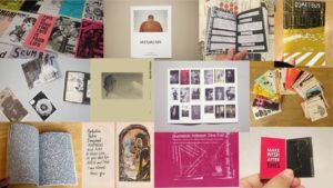
Mood Board For my Zine 

Different Possible Layouts 

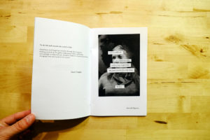
  • Not sticking to the traditional page format and mixing text and images together. I think that this layout would be good if I wanted to give some context for an image. Or if an image was abstract and I wanted to give my reasons the changes that Ihave made to the image.

  • Full Image bleeds over a double page spread, I really like the way that these images look, as I think that this layout allows the viewer to see all of the details in the image, so I think that for most of my landscape images I will display them in this format.

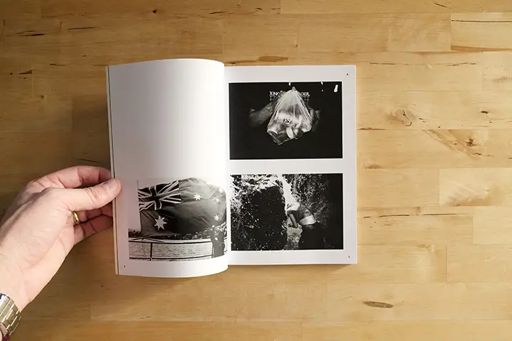
  • Two separate images paired up next to each other.I think that this design layout will look good with some images, but with others will clash so this format will be a process of trial and error to see if I like the overall composition of the images together.

Image result for zine books

  • Boarders. I think that I will use this design layout as it gives some breathing space to the zine as a lot of the images are full bleeds it can become a bit intense when viewing the images so have some blank space will help to give some contrast in the zine

Zine InDesgin Layout

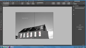
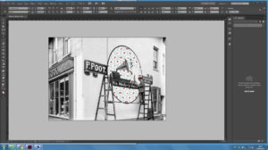
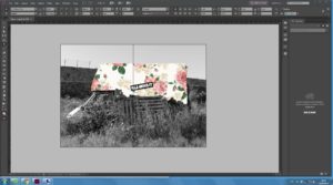
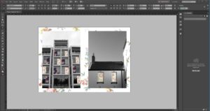
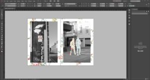
For most of the layout of the zine, I have decided to use the full bleed layout as I personally didn’t like the look of when there was lots of plain space. So on all of the landscape images, I have filled up all of the available spaces using the full bleed design layout which i think looks best for landscape images. On the four portrait images. I again got a ‘reto’ style of wallpaper that was relatively plain so it wouldn’t distract from the image which is meant to be the main focus of the page. I first went into Photoshop and brought down the vibrancy of the image and the saturation, so that the image of be less intense and easier for the viewer to focus on the main image, then places it behind the images. I wanted it to have the look as if the central image had been pinned up onto a wall. As the magazine is full on and there isn’t a lot of plain space I thought that having a subtle background behind the images gives it a nice finish.

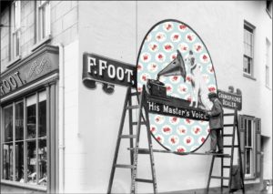
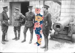
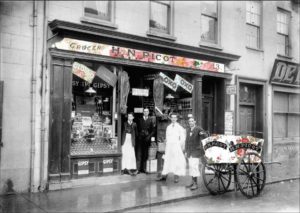
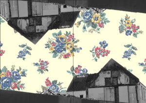
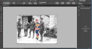
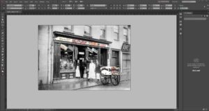
This is my final layout design for my zine, for this project I wanted to blend modern landscapes with more retro/old fashion wallpaper designs. Which was the idea that I got when on location in st Helier and what I noticed from my photos. That St Helier is trying to push its self-forward to become and very advanced tow., but you can still see the older parts of st Helier clinging on.  Using this idea, I then I wanted to combine archival images, with the ‘retro’ styles that I had found, so in my images there would be a contrast of two and old which was the main idea that I wanted to  portray with this project.


Second Jersey Photographer analysis Albert Smith

File:Albert-smith.jpgThe photographer Albert Smith

Albert Smith is the best known and probably the most prolific of Jersey’s early photographers, although a significant number of pictures attributed to him, and particularly those used for his postcards, were taken not by him, but by employees or by Ernest Baudoux, whose business he acquired when he arrived in Jersey from London

Thousands of his images survive as glass plate negatives and subjects include studio portraits and portraits of cattle. Many of his views were sold as postcards. He and his staff not only worked on commissions, but also captured many scenes of island life and events of historical importance. Nearly 2000 of his images can be seen on line in the photographic archive of la Société Jersiaise, out of a total of nearly 3,300 held in the archive.

File:E17SmithCarriageGroup.jpg

Among these are undoubtedly many not taken by Smith. Not only, as mentioned above, are there images acquired from Ernest Baudoux, and others taken by employees of Smith, but some are also dated after he closed his business in 1931. It is not clear whether he continued to take photographs after that date, which are included in the Société Jersiaise collection, and private collections, or whether they were taken by staff. There is little doubt that they have been correctly attributed either to Smith or a (former) employee, because there are photographs, bearing his signature logo, taken at the Battle of Flowers in the mid-1930s and at the opening of Jersey Airport in 1937.

Smith published a book in about 1910 of 102 Views of Jersey and the Channel Islands, which includes pictures of early Battles of Flowers, and a selection of pictures of Guernsey. Among other advertisements in the book is one for his own series of Hartmann’s coloured Jersey postcards.

Image Analysis Of Albert Image 

File:EarlyCarSmith.jpg