All posts by Orla Worthington

Filters

Author:
Category:

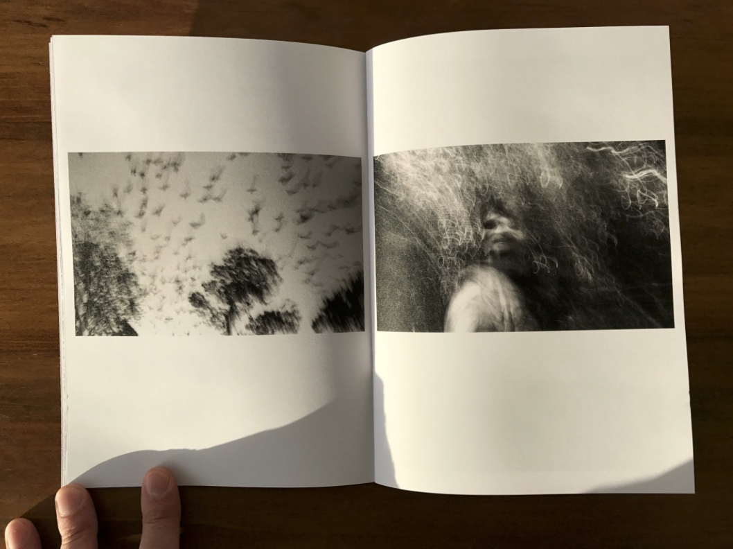
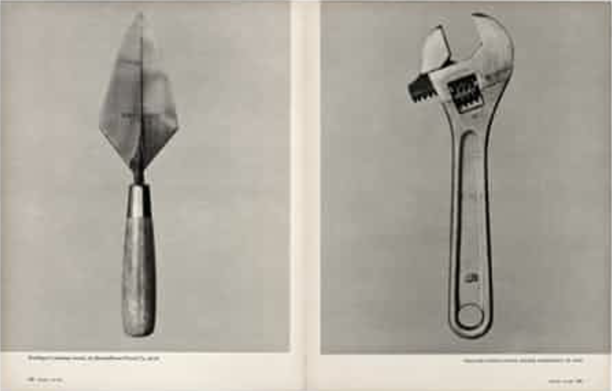
Artistic influence and mood board:Zeroten, and The Shaved Guy by Lin Yi-Hsuan
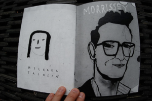
Zeroten, and The Shaved Guy by Lin Yi-Hsuan

I think this double page zine is effective due to the similarity between the base colours of grey being but the slight different shades to point out an obvious divide between the two pieces themselves.I think the text allow a more interesting composition to the piece and gives more attention to detail and I think this is something I might use within my own project, such as quotes from people within the zine talking about St Helier.  I would interpret this zine as more of a contemporary arts style inspired by the 60’s and 70’s I think the photographer was trying to communicate the way in which drawing and art can be unique and quirky and still have a message wihtin a piece. I think many poeple would judge this piece harshly and say this is not a successful due to the child like influence the artists is seen emphasising throughout his work. My work of course would not be artwork like this but I think the main importance is the synrinarity between the pieces themselves.
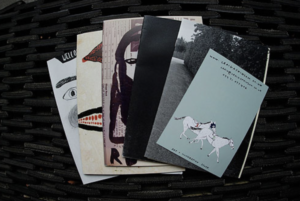
I will take inspiration form the covers over these zines due to their vibrancy and interesting drawing and imagery. It will be highly effective,especiall when I will wrap up my booklet in a cover with an interesting mark and then make another card cover with a title and an image of my own onto the top.I am fascinated within the contemporary style of this artist and although my images are not similar I think it will really help me in the long run. The colours of the  pages themselves are always the same within both pages, I think this shows cohesion within the pages and also allows the differences between each page to focus more on the tonal black and white contrasts.
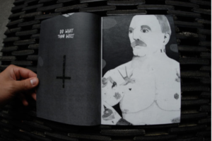
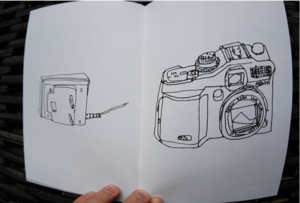
 

when looking for zines I decided to explore the well known cafe royal and the chosen pieces Craig Atkinson. I chose his work as inspiration due to the way in which it is so unique and art based. There is a strong sense of character and individuality between each of the chosen photos within the book and yet all clearly have a solar pattern and theme and continue as a narrative.I think I need to open my images and also the creativity up when designing my zine,I think the more contemporary and more abstract contrast within the colours and composition and displayed more creative and overall a lot more effective. I want to show juxtapositions of colours, size and also the type of image thsemlves I think this will attain the interest of the reader and present st helier visually and compositionally in a interesting way.

mood board:
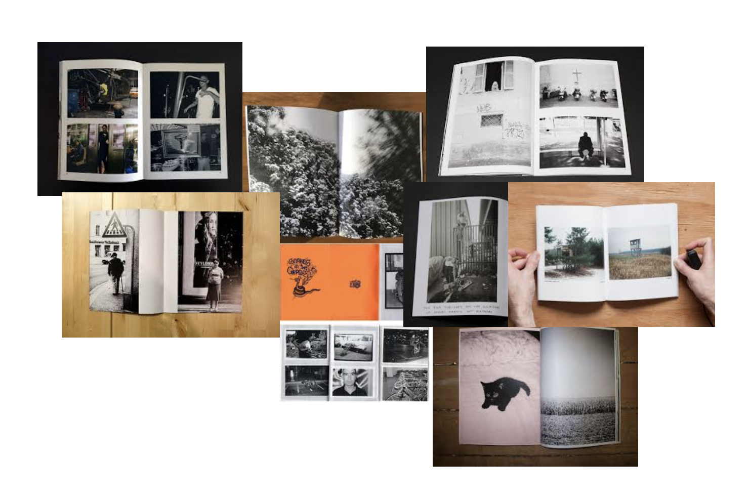
I created a mood board in order to look at a quick overview of what many zines layout are like and was I think will be the most effective and also the best composition for each page. I have taken four photoshoots so when creating my zine want to expand more on images that I might not have previosluly experimented with throughougly enough.

Analysis of a zine picture book

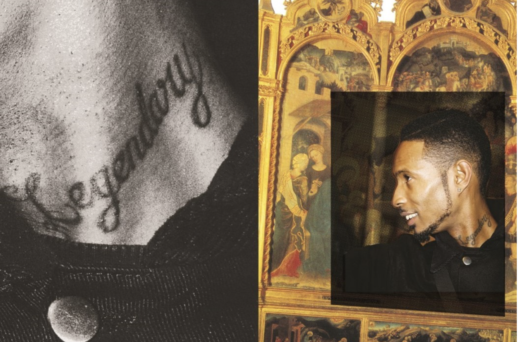
Joseph Patterson created a zine in order represent underground music as a creative renaissance of generations.The grime and hip hop scene was flourishing and he wanted to develop emerging themes and allow them to flourish within his work. The mainstream coverage of this work is typically poor and actively neglecting the scene and portraying a harmful approach to the music by the conservative media. His work shows a space that was ‘actually invested in underground music in youth centre’ they described as wanting their images less formal so a zine would be a unique format to enhance their work.

His images are a mix between a shoot on location and rarely people on stage as they do not want a featured person to be perceived a certain way in which they would not deem themselves. They use a mixture of overlapping imagery within their displays and writing quotes on some pages, usually the images have a strong contrast of time periods and the colours connecting them are overlapped between vibrant and black and whites.

This particular artist and group are typically based online which is why they launched this zine issue as it features a Longform and creates something in which you can look back at in years to come. lots of their work was inspired by DIY culture and stripping back and keeping the core elements of a photo and celebrating a passion and making your work personal by the intricate way In which you put it together and the people you surrounded yourself with. They want to highlight the importance of interconnectivity between the worlds of online creativity and physical when coming to photography.

Analysis;

I think this zine has conceptually a really interesting subject matter and narrative,although their is no chronological order or a method to which the story is being told but a representation of a current state of living for people within the underground crime music industry.It demonstrates a subjectivity of community within passions of people and the importance and influence music can have upon young people. The images itself develops the narrative construct of time and the comparison of having two highly different timeframes being presented as one (renascence and modern day) the images have an interesting composition of overlapping images to be placed upon older original works of art, these allow the placements to look more abstract and be Random in their framing but close up allow a intertwined structure to the narrative. The colours while are light do not reflect any vibrancy and come across as dim, this is to symbolise a similarity when forming to the older more dim and reserved older images. Overall I think this zine is highly effective with its message and is highly unique in comparison to many other zines.

Research and analysis of my zine

Zine; A Zine is an effective method of marketing and presenting your photography, they have been created for years there is a creative athletic collaborated wihtin the making of zines. it creates the ability to create a impact of juxtaposing and sorting images into a story in order to enhance emotion.There is an energy and ability to show yourself through the work as you make it yourself. This aesthetic enables a tactile creative freedom. I believe that zines look and feel professional and achieve a high quality when out onto thick paper and good printing, it allows a completed piece and presentation without the harsh formality to take away from the piece itself. its expressive and shows a desire of photography  throughout.

When gathering my visual inspiration I wanted to concentrate on the themes of narrative, subject,design and concept. When choosing the theme of my Zine I want to have a constant theme throughout and so not having a segregated feel to the piece as a whole narrative concept. I wanted the narrative to be the history and time present throughout St Helier, I wanted emotion and periods of time to be expressed through the modernisation and deforestation of St Helier and the people who have inhibited St Helier for long or short periods of time and the cultural impact of the area on them as a whole. This embodiment of time, emotion and urbanisation forms St helier in a unique frame which would be intriguing wihtin the prevention of a zine.

When questioning the theme of the piece I want to show how neglecting  periods of significant historical moments  such as ww2 and the occupation had upon old buildings and families within The red section of St Helier,The deep urbanisation and neglect for buildings shows a historical significance of abandonment and reflection of past times, which some elders say shares community and ethnicity within people and the reflection upon each other. However between my photos you can see a current distinction between the modern building up or architectural developmental impact upon the people  and the money in comparison to the people within this section. When using this theme of history of time to use a comparison of people and community effect and wether work or community is enhanced wihtin the specific section of St Helier.

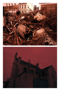
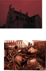
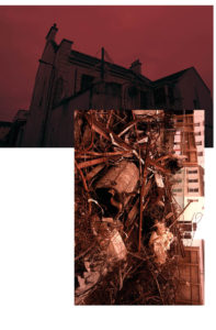
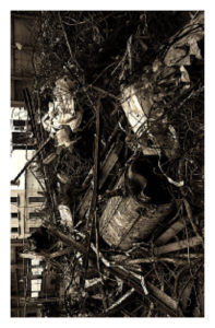
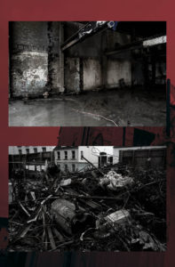
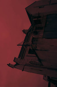
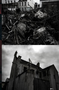
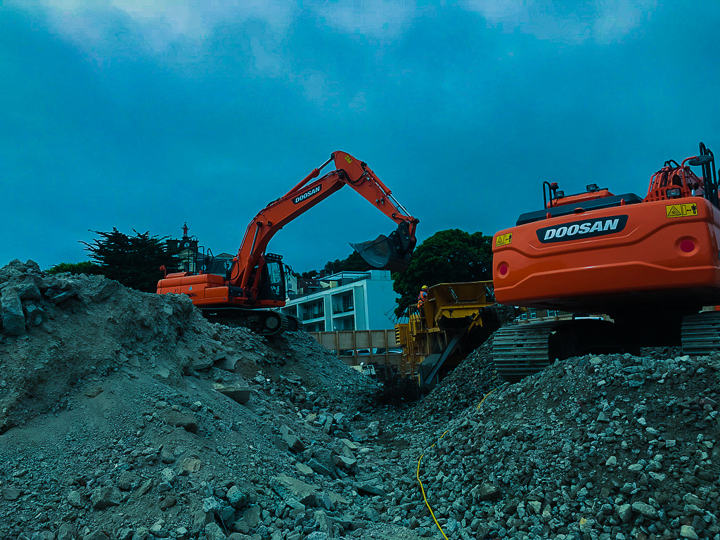
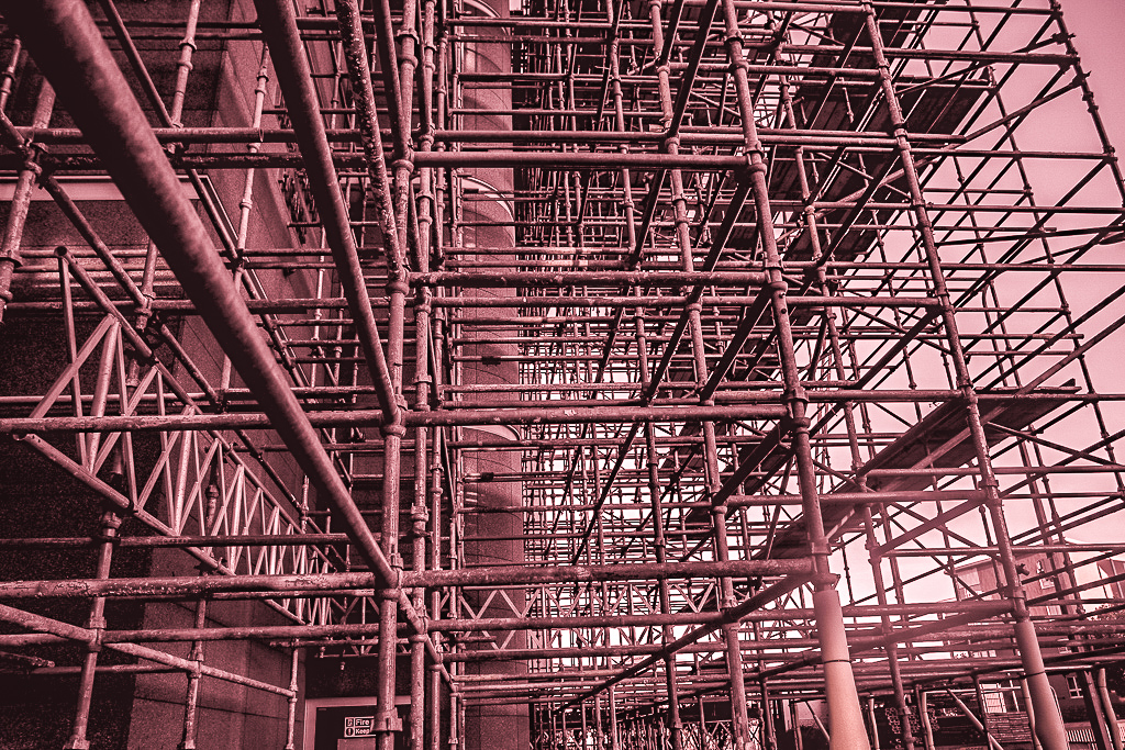
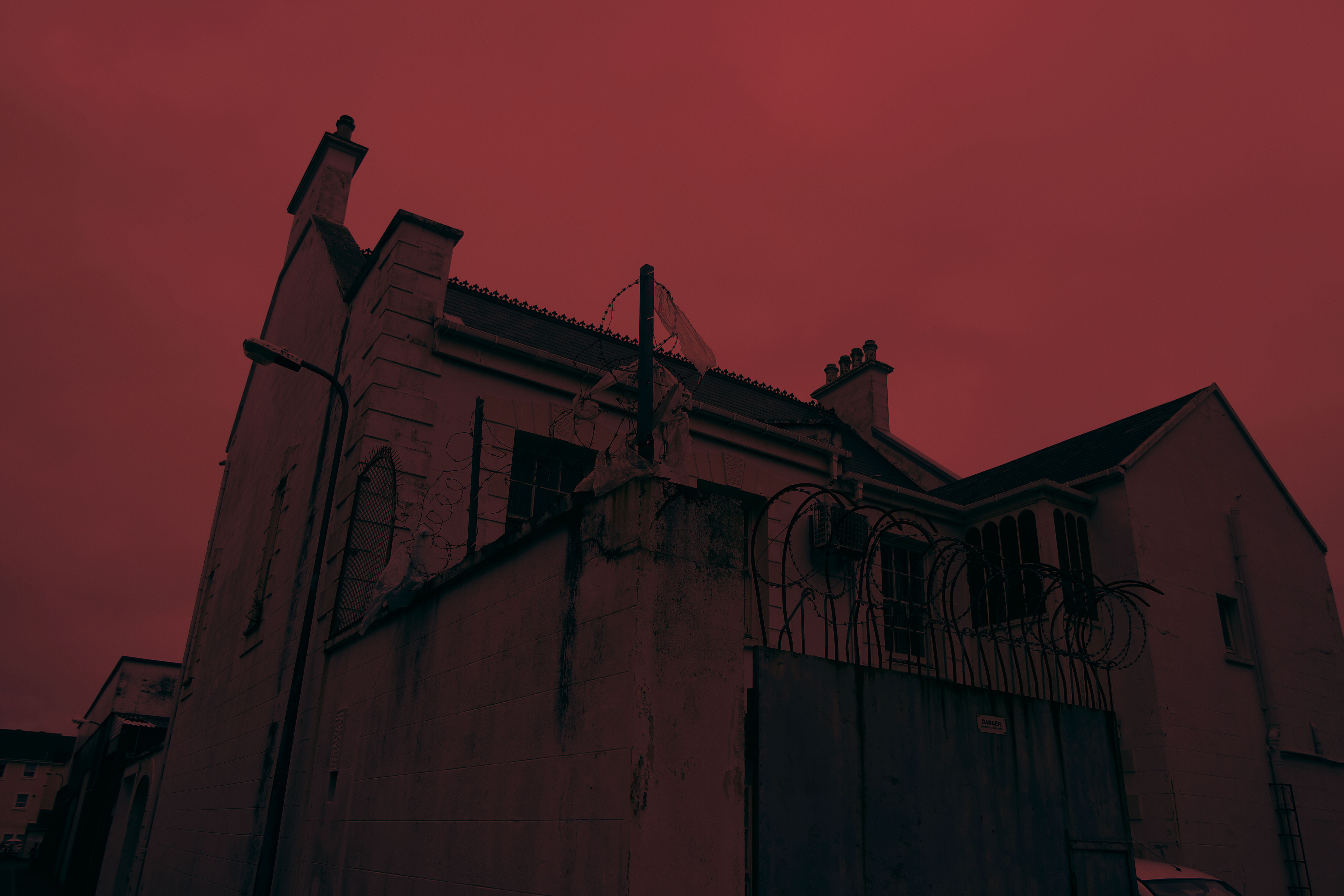
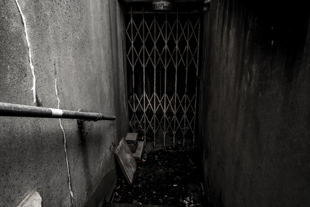
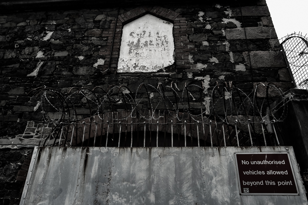
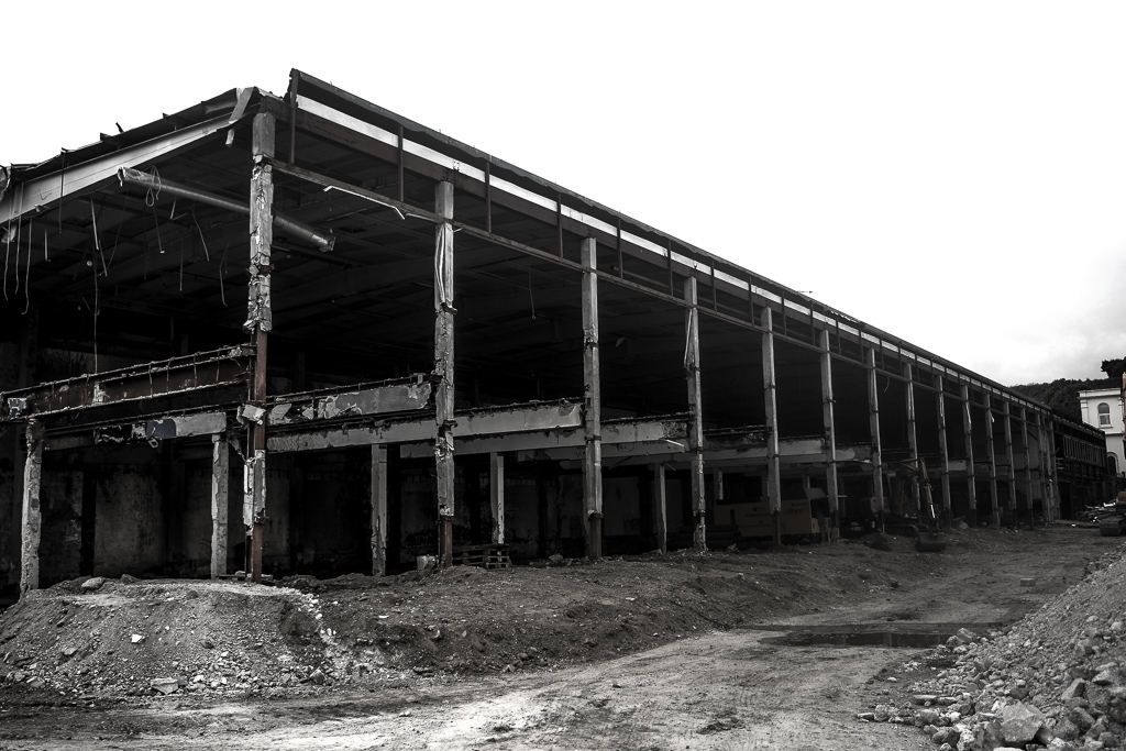
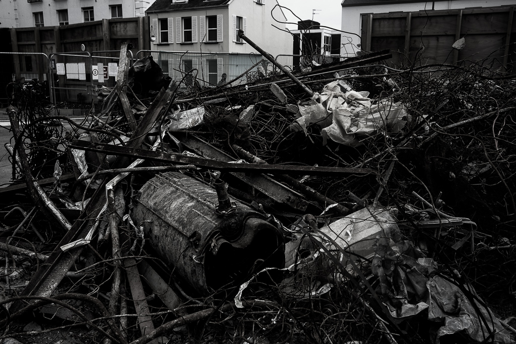
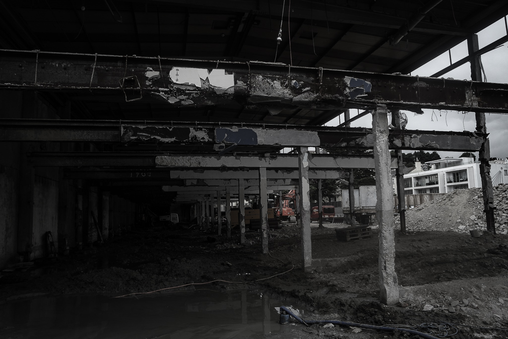
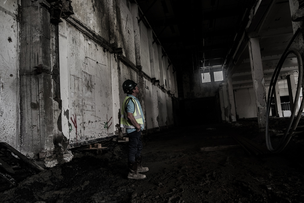
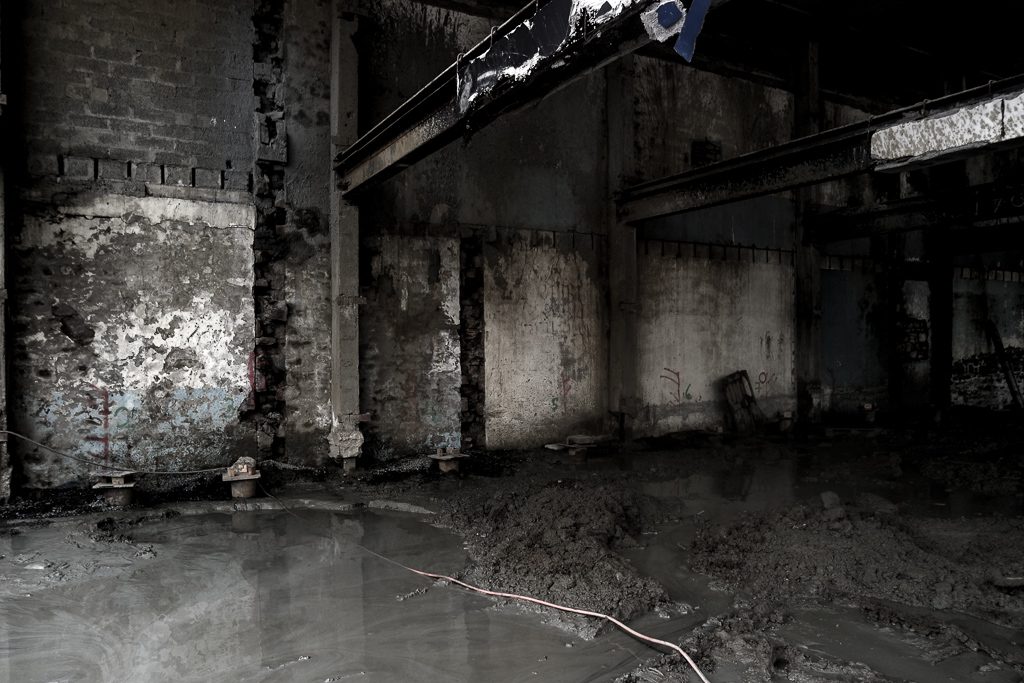
My subject matter at the start of this project was more projected upon the buildings of St helier and the different narratives of building destruction and neglect, this then illuminated the possibilities of reflecting the people who live among these communities. I think my most successful images are of the subjects of construction of buildings such as piles of rubble and construction. The thematic colour of red also connotes a historical reflection of war and how the buildings being taken should be a reflection of a movement or however an ignorance go past history.I believe in this 16 page booklet the buildings would be more conceptually pleasing and also creative a narrative more available to the reader. My whole concept overall for the Zine would be a time frame of chronological demolish rebuilding and relation fo people living in the various areas itself.


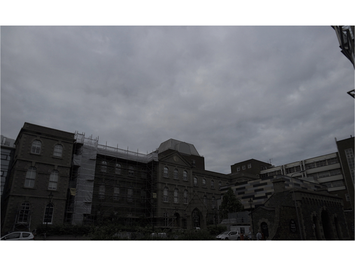
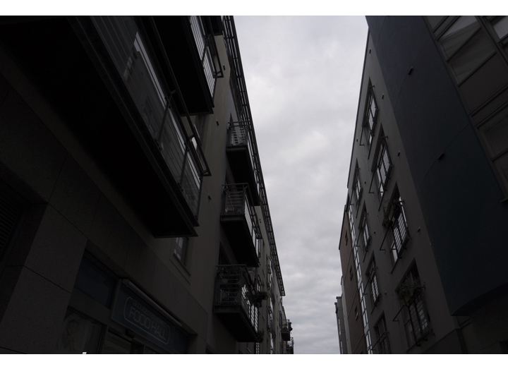
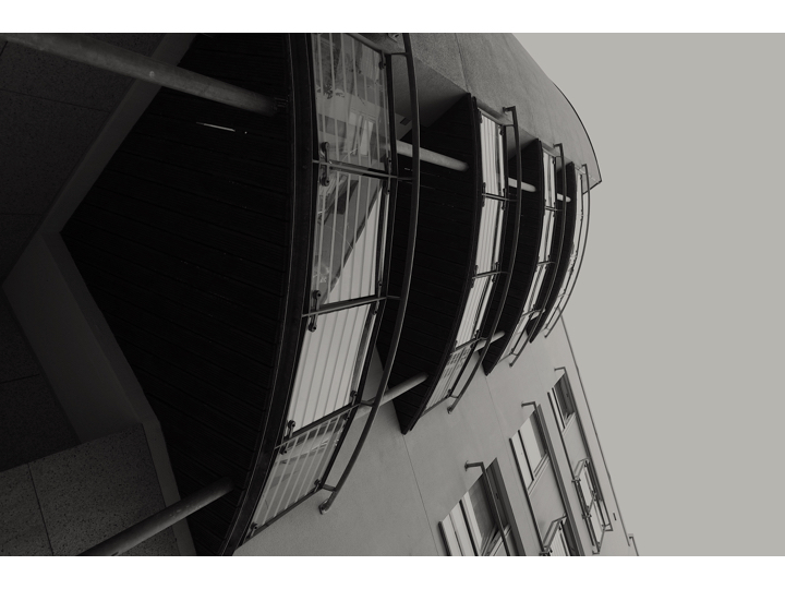
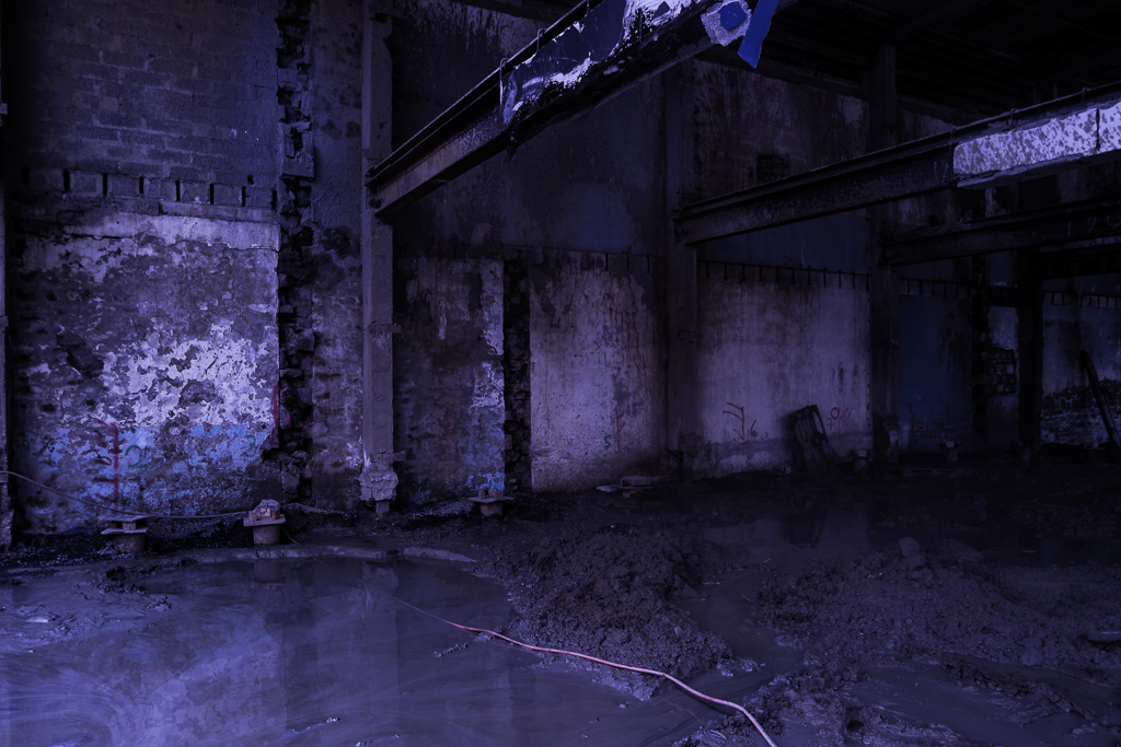
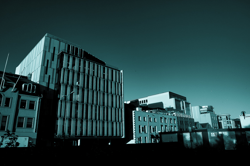
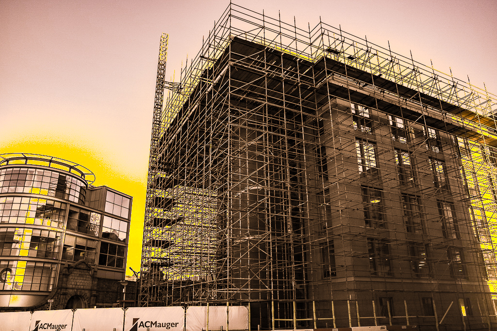
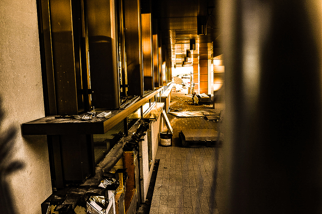
last shoot:St Helier development

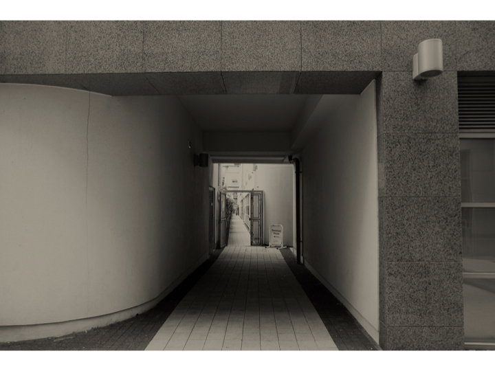
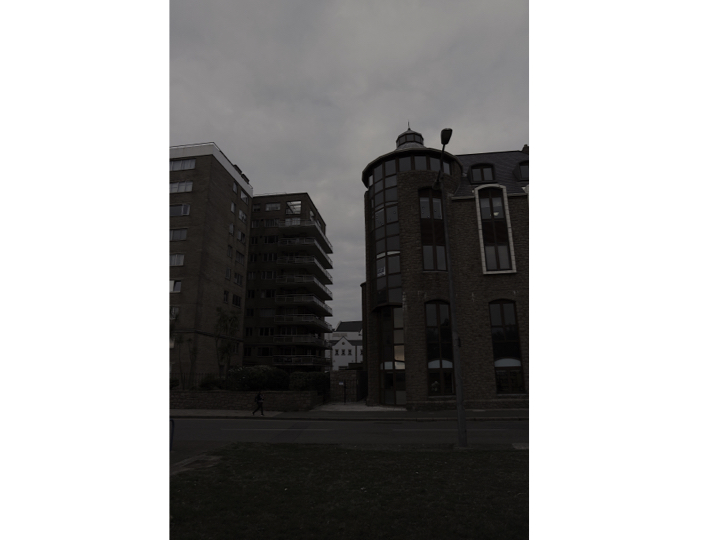
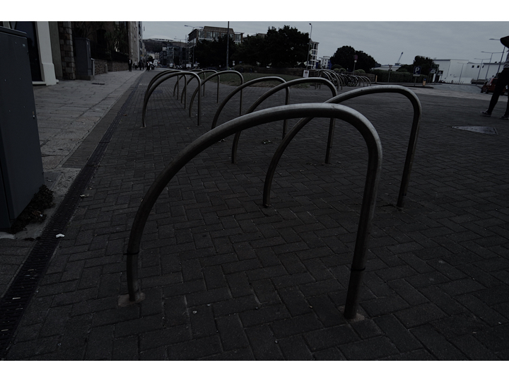
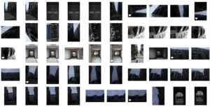
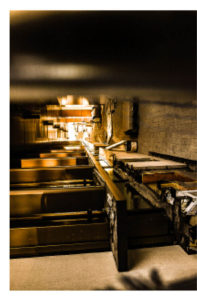
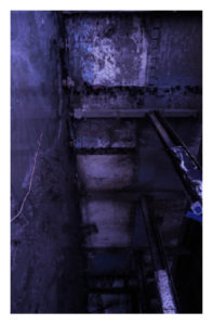
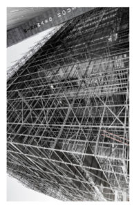
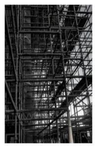
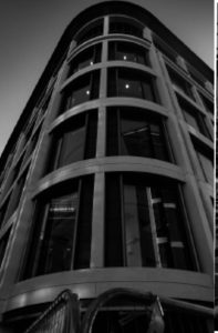
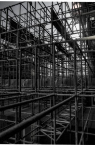
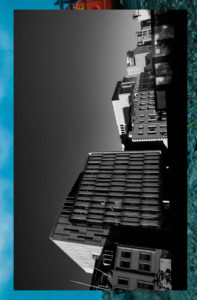
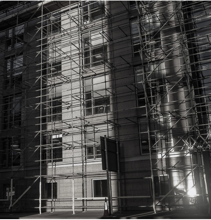
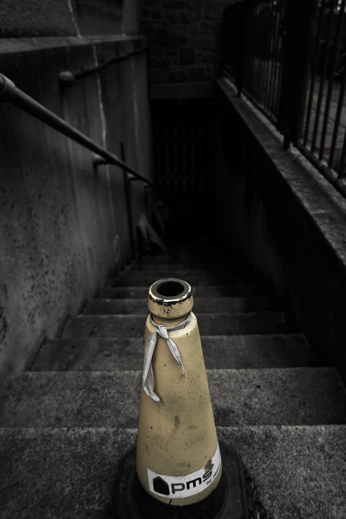
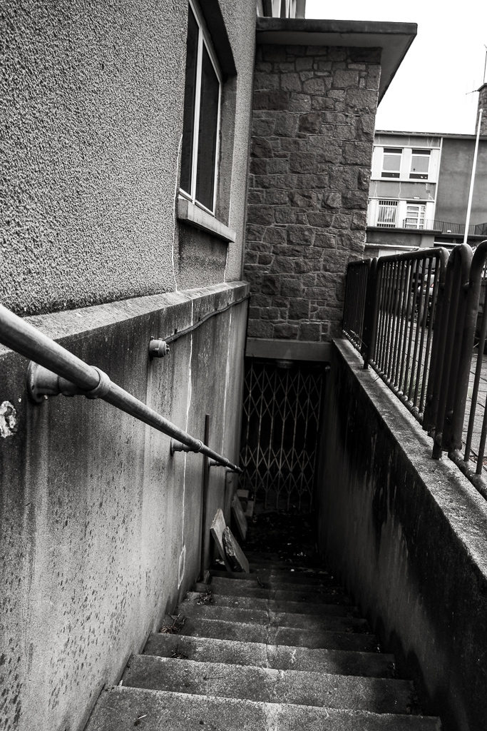
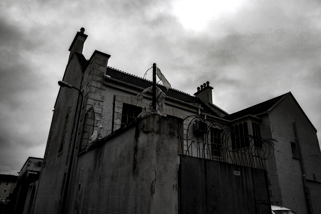
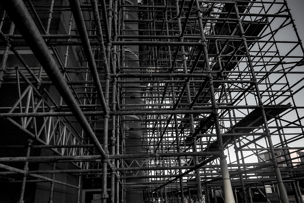
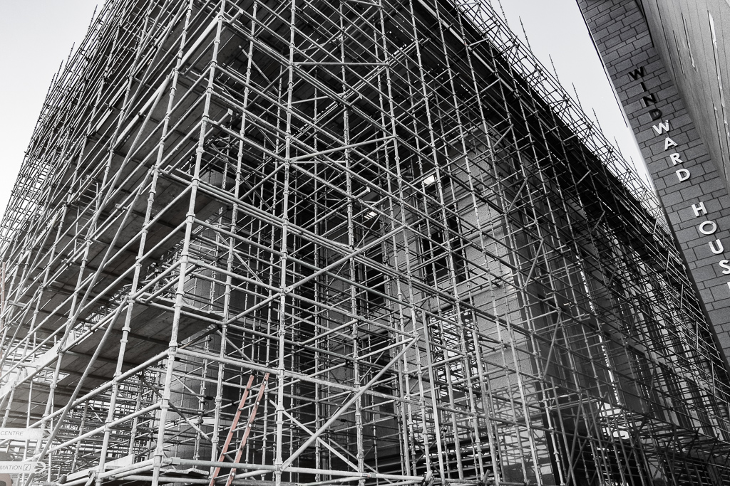
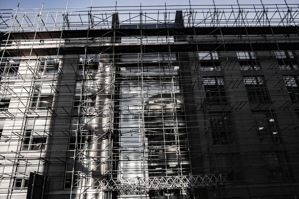
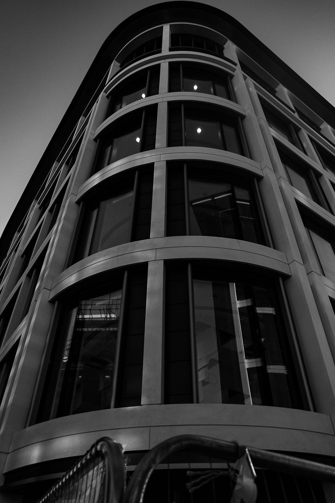
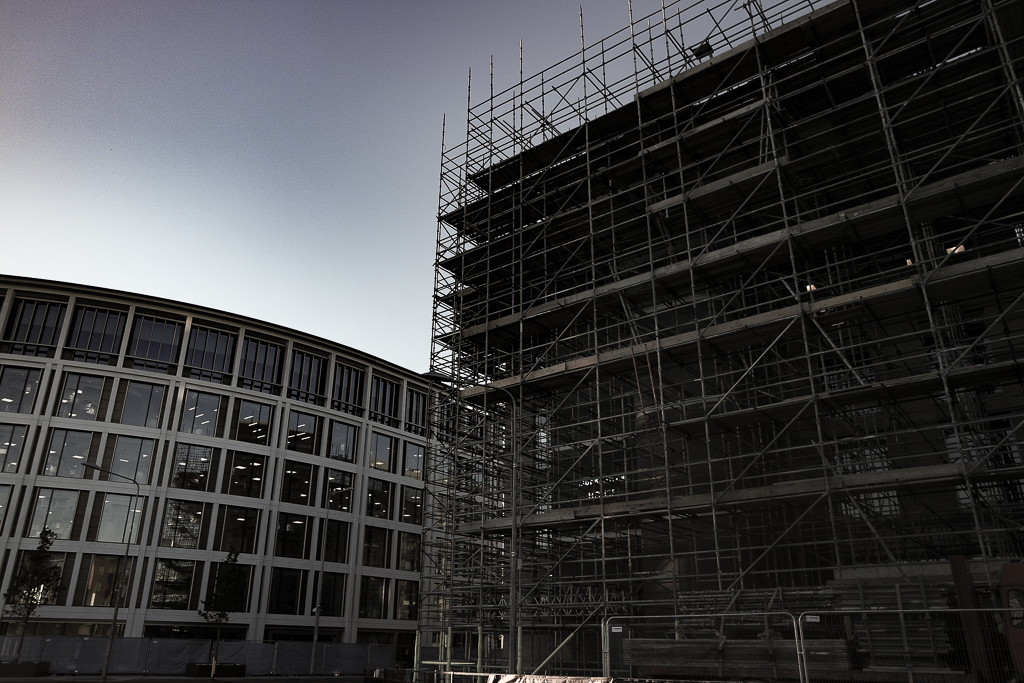
contact sheet: Evaluation:For this shoot I wanted to finalise and make sure I have been to multiple areas In St Helier and reassure the images I have are the best way to capture St Helier in a successful angle altogether.I clearly focused more on the architectural side of my narrative within this shoot and wanted to display different angles that can be turned conceptually into an idea of character  which each section holds. Within these images Morden buildings are the recurring them although you are able to see some significant monuments and buildings more neglected and so perceived as urban. When editing the images I wanted to enhance tonal features and so the composition of shadows and the angles of the edges and shadows of the building themselves. This shows a presence to the work and position the more built upon section of St Helier to have more power and authority over previous sections. Overall I will not use these images as my final and will continue to keep my previous red images as they show a more possessive narrative of destruction reconstruction modernisation and the community which lives among this constant time.
Final images and jersey archive inspiration

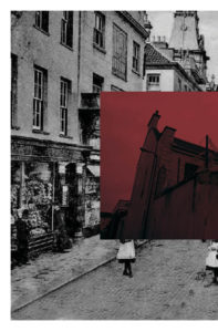
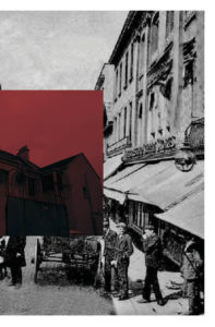
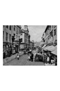
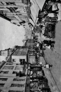
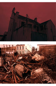
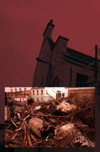
  • For my final presentations I not only wanted to incorporate my themes of the progression and modernisation of st helier but also the way in which I could demonstrate the history and st helier through the archives. I through I could express these themes tonally and show intentions of what the original images would’ve been similar to. I was inspired by themes of documentary photography, this seemingly objectivity should be the ability to convey the impression of an unmitigated image. 
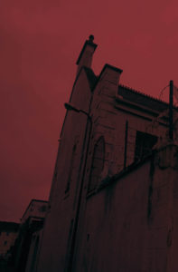
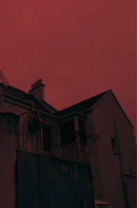
  • The images have  a range of colour overlay experimentations to show a vibrancy and show a senses of life to st helier itself. I was inspired by previous work as colour allowed a free expression and eye catching attentions to the composition nd layout of the images. Howver I think my work has many features of arcjitextual and urban landscapes better complimented wihtin cooler tones, these simplest comparisons present a pre occupation to different sides of st helier and the community and architectural interest wihtin the areas. 

Jersey archive:When thinking about jersey archive I wanted to visit area of great prominence to st helier,i think it is interesting of how time shows the development and also deterioration of an area and allows the community to be subjective upon what they think about it.

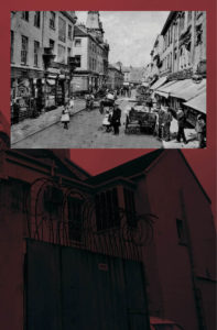
overall:My aim was to achieve a complimentary colour, composition and overall feel I want to convey of st helier.When speaking to teachers and other photogohers they agreed the most successful and complimentary images are those which represent jersey archive through the time difference of old and modern while still representing the area and mostly in an urban way. the colours I have chosen I have edited in such a way to be similar in their tones and have the same red themes throughout. all of these images demonstrate a process of destruction and reconfiguration of a landscape to form a comparison of St Helier itself.It shows a evolution of an area, time and the people living within the area itself. lastly I wanted to concentrate on the composition of he piece and experimentation within how the images can be presented to the audience with the most effective way.


The lower compositions are too segregated and do not have the correct flow to what a double age would need in a magazine. I have further experimented within that could be my final composition.i could incorporate more experimentation within the architectural construction pieces I have as these also further develop a sense of work ethic and a life to st Helier and the property development within St Helier itself.I will definitely grout and develop an additional shoot for my St Helier project in order to grab a different angle or St Helier and the modernisation and constraint changing to St Helier itself

Artist who inspired display outcomes

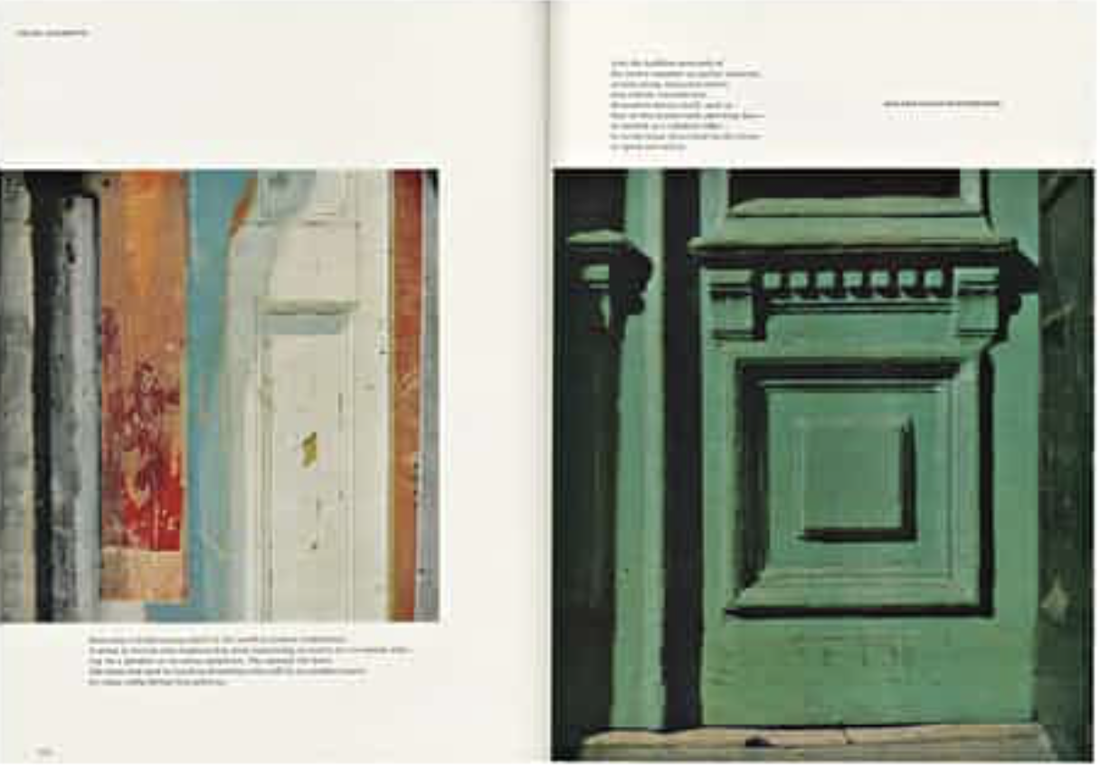
Walker Evans 

Is a photographer who mastered his work throughout magazines and the composition to which he displayed his images. He had a risk taking persona and is best known for photoessays on everything from Chicago street life.He would foucous on ‘American heritage’ and the displaying of beautiful historically important images and buildings either about to be demolished and the new urban regeneration across his state. 

Much like my own themes of modernisation and urban architecture he wanted to project the faceless construction without it being complete yet. He wanted to make a mark withn his photos and so ended up being wihtin nation Wide magazines.He started to work more alongside tech and graphic design further inspiring his interesting and dynamic presentations of his images. He is now a towering figure of photography. His unique artistic authority created a ‘small avant grade publications and mainstream titles’ his innovative and independent journalism is due to the editing and careful design layout of his images which has inspired me to experiment heavily with how I should display my own images. Evans enjoyed to caption his images which I think I could do with quotes from th epoeple surrounding the area and so creating a sense fo community for st helier itself. Evans chose magazine stories that often has elegiac qualities; the American warehouse, and these vast buildings that were prolific to the native area. 

I chose this for inspirations as the muted tones of colour ass to the sense fo transience and feelings of lost and demolished in order to rebuild the colour and life to the image. The simple composition allows the viewer to create a personalised story of what the image means to them. The images echo each other and create a modernist and poetic type feel to the overall composition. His work has an understanding of the world and the people who live among it. His tenacity and visions create an artist control and show his commitment to and intelligent reflect on the modern progressive world and pop culture which is what he was fighting to demonstrate. 

Final chosen images, edited and final display ideas


\

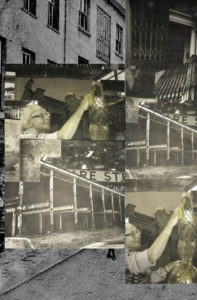
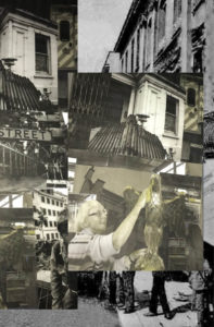
when experimenting with displays I used an array of images in order to find what images are the most complimentary to each other, through colour and composition. I wanted to use many different compositions of overlaying images with more saturated colours or perhaps a more simple display of two large images alongside each other as the images itself is enough to carry out the display.I believe I have narrowed down my images to five possible final displays,my favoured images being those with a white boarder and colour but not over saturated, I think these successful show a story of St. Helier in the more desolate areas and also the development of architecture and modernisation of St Helier overtime.

Vibrant Colour Edits

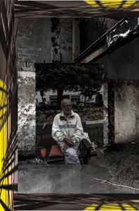
For the colour editing I wanted to ensure all of the images had strong abstract colour effects that were complimentary to the original images themselves. I wanted the colder tones to be on the images with darker shadows and lighter tones on those with stronger highlights.

SAMSUNG CAMERA PICTURES


SAMSUNG CAMERA PICTURES

Experimenting with cropping and conceptual ideas

Edits:

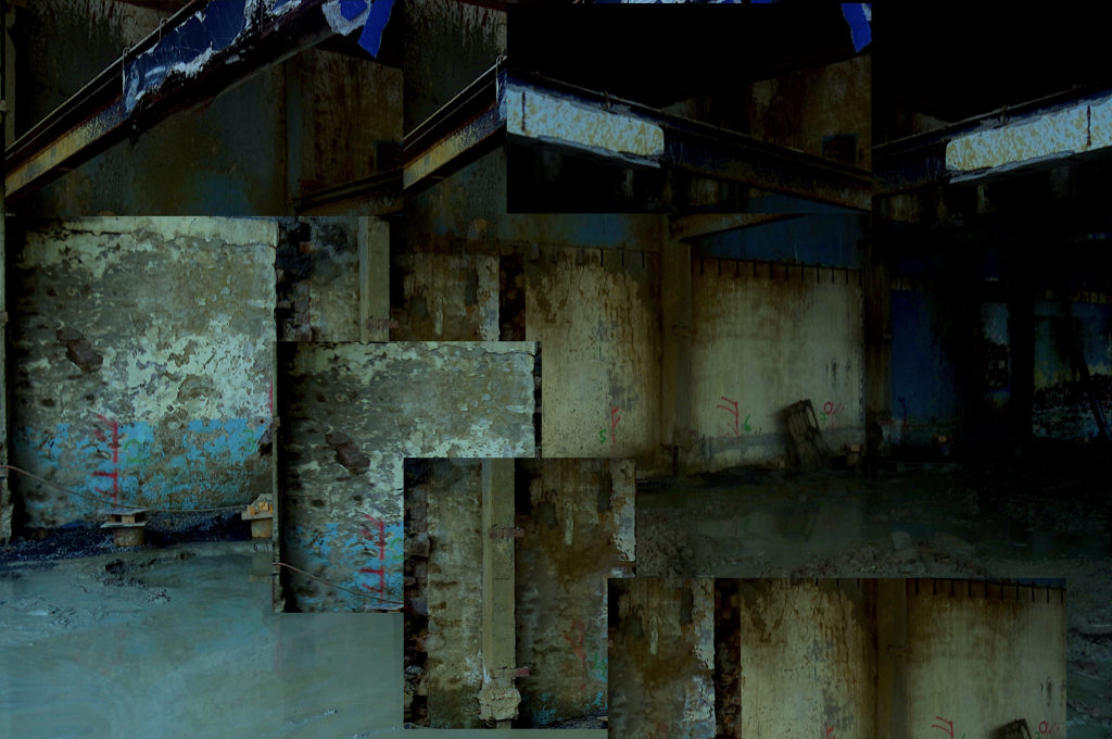
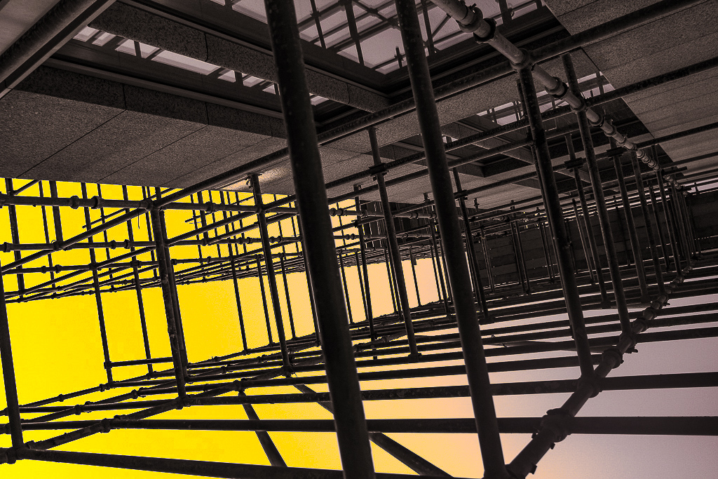
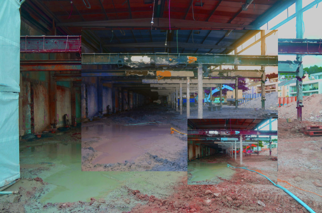
For my first images I wanted to experiment wihtin dividing and duplicating segment of the images to create a fractured dynamic, I think it creates a depth within the images and a disjointed narrative structure which is effective.My second images I wanted to extend the way in which the long corridor is exaggerated, it allows a centre point to the image. Both of these demonstrate cropping in a different manner in order to exaggerate different aspects of a piece. to either lengthen or disorganise a piece to become more abstract and present St Helier in a more iconic method.

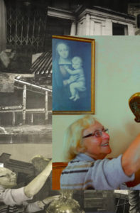
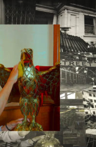
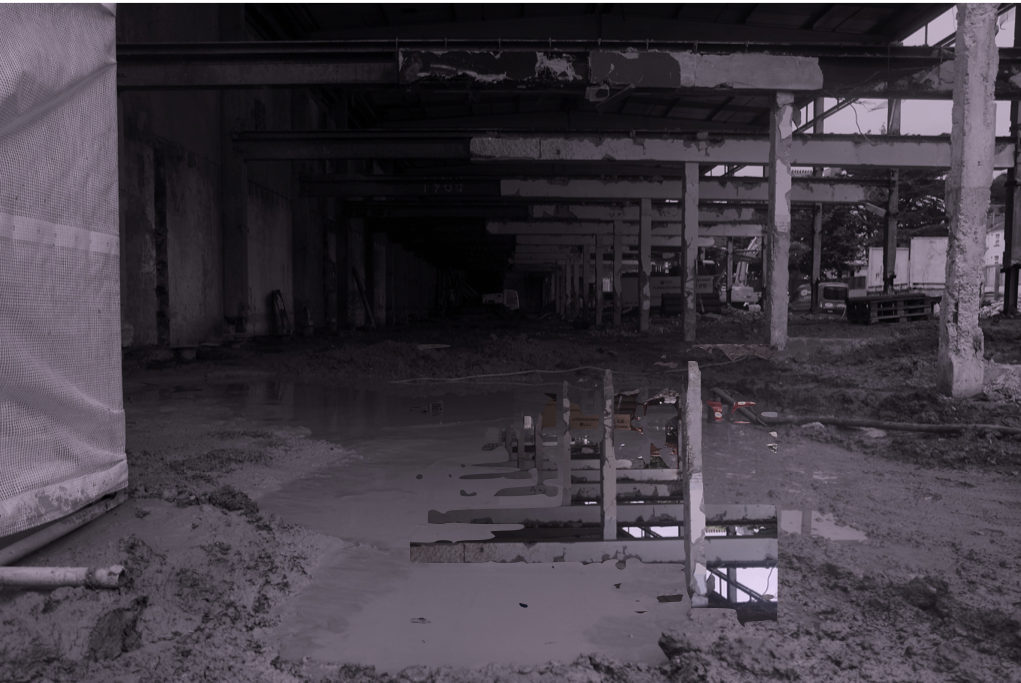
Within this image I wanted to form two images together, using instant alpha and moulding two separate environments of town together, one is of a floor covered with de constructed buildings and the other is a buildings falling down, this is interesting to me as they both symbolise the deterioration of St helier and perhaps the near future consequences for the house itself. I think it is a weird composition and almost as if this is a collage but I think this could be further experimented with and perhaps make a successful image altogether.

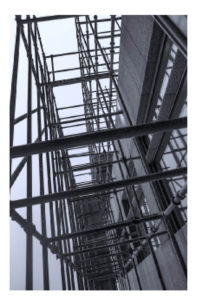
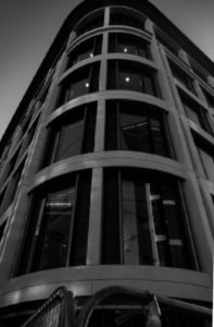
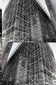
These two images I wanted to capture the design of a building in an interesting angles,I wanted the images to look as if they have an authority and power, it Presents the modernisation of a building,how the first is the development which looks bad and complicated however the contrast within the  second piece and how it looks so smooth and futuristic.This is also interesting as both images were taken next to each other in the same environment. it is a development of how cropping can be copied and expanded to create an abstract piece. 

these two images I used photoshop and cropped the shape of them in order to be more focused on a specific section of the original piece itself. it presents the same building from two different perspectives.The first shows a narrowed angle and is stretched in order to show the length of the building itself, it is also interesting as the light is centred throughout in the same mirroring shape. 

This image is similar to the previous it is a lot more abstract themes wihtin the structure and how there looks like a long extension until the horizon.it shows an industrial field,I made the tones within the images copy from different segments of the images and repeat. 

My main interest within this was to crop in on a specific centred angled gate as it has a dynamic pattern and having a highlighted  contrast to the dark wall on the right and light wall on the left. 

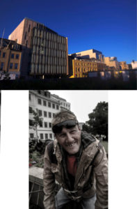
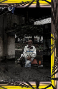
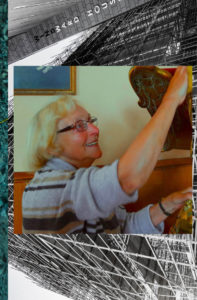
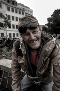
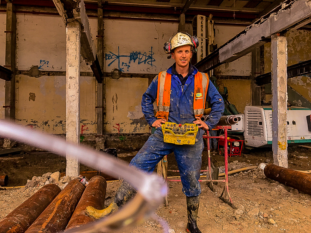
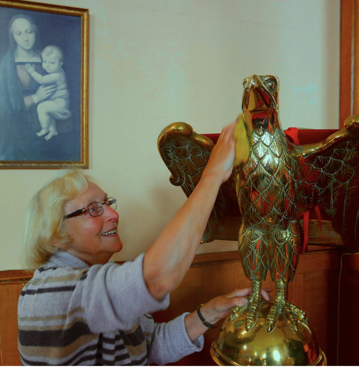
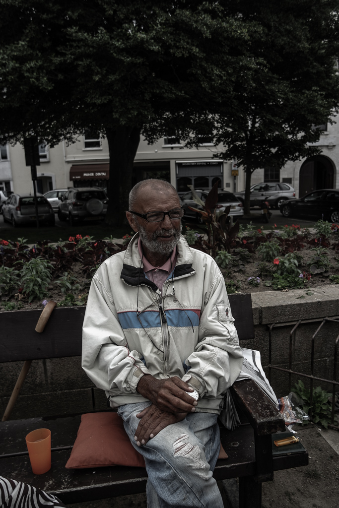
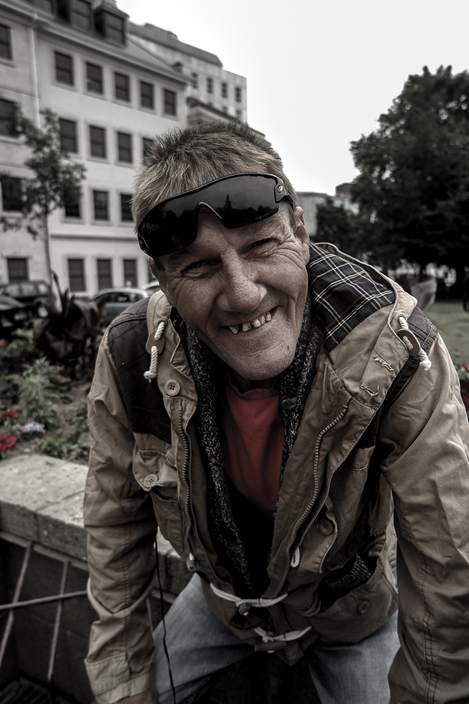
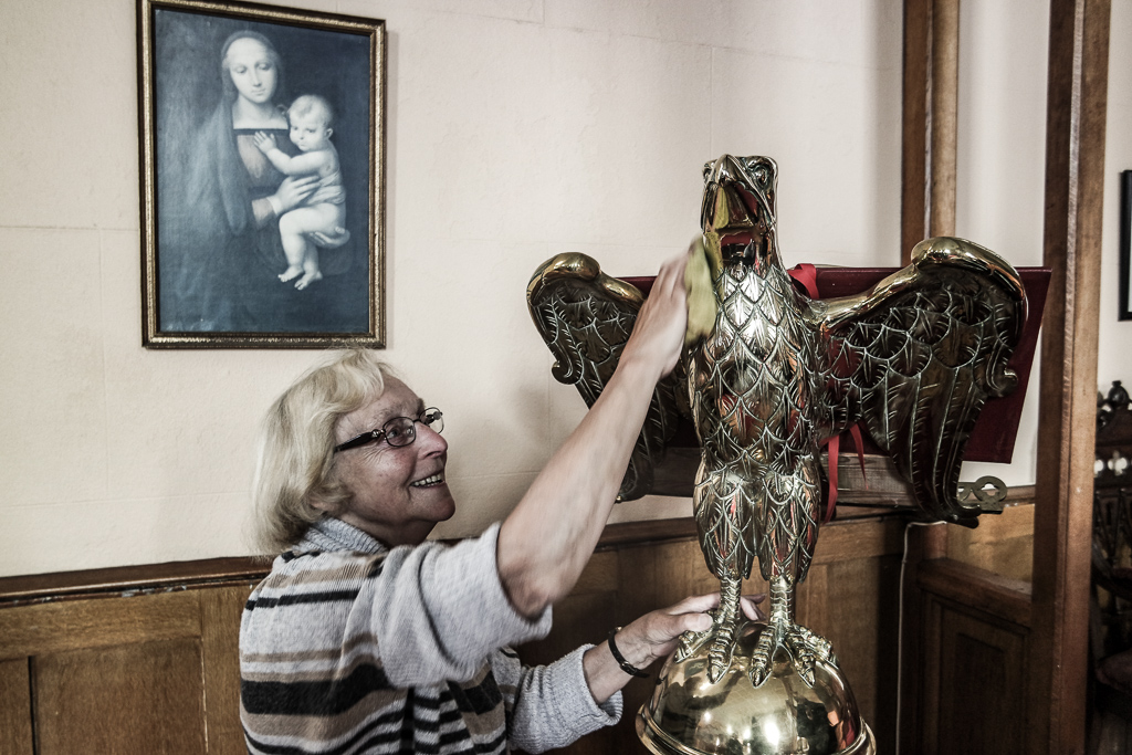
For the portrait images I wanted to purely crop the images in order to create a straight connection within the person themselves.Tthe crop allows a direct eye contact and allows the shape and proportions to be mirrored by the length of their body of the activity they are doing. 

this last images I cropped in order to look as if you were about the centre the houses it is more centred upon the left sided and I have edited off the road in order to not get distracted by the environment but purely the house and architecture themselves ,and an idea of the people who live in there.

First drafted 20 images from first Four shoots

Overall theme:

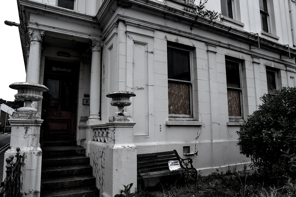
conceptual idea of development and re-development throughout history and the need for modernisation within architecture. I want to capture the development of remodelling billings and the stages through knocking them down and re-building. Addtionally this highlights the them of old vs new which I want to express through the narrative of people within the area and additionally the buildings that represents them. The concept of time can be seen through theses narratives.I will further develop this seen through the old deteriorating buildings to infer the new need for development or portray modern or iconic buildings in a futuristic light. This development of urban gentrification and dereliction shows the different types of poeple in different urban areas. My current portraits and old urban buildings have a connection of old St Helier and narrative need for development and the contrasting juxtaposition of the modern developmental shoots of St Helier and my next shoot of people surrounding the finance modern buildings.

SAMSUNG CAMERA PICTURES