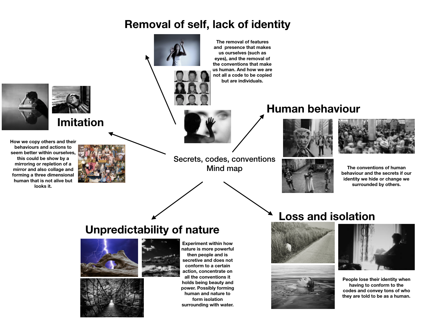
Here are the main ideas that I will experiment with and I think all of these clearly go within all the three titles yet still have a common link of humans and how they work within society.

Here are the main ideas that I will experiment with and I think all of these clearly go within all the three titles yet still have a common link of humans and how they work within society.

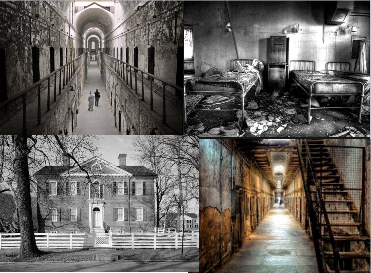

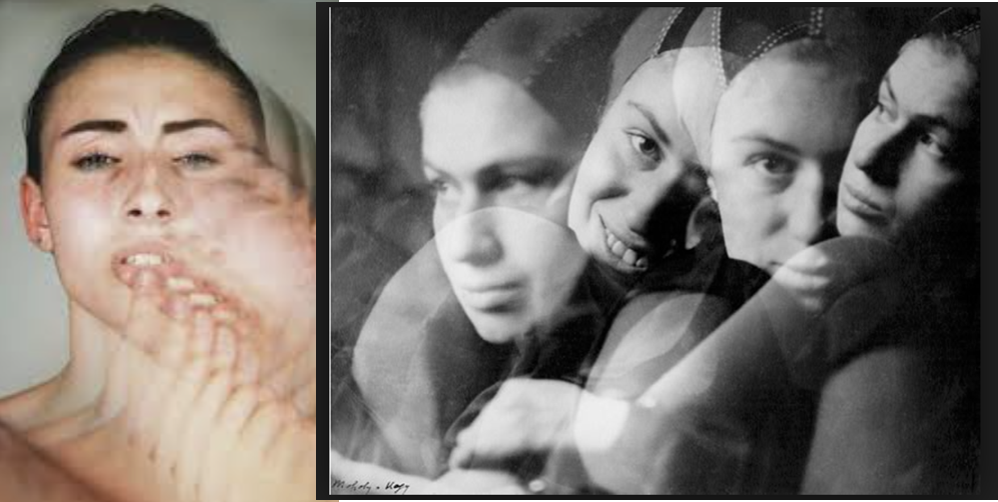
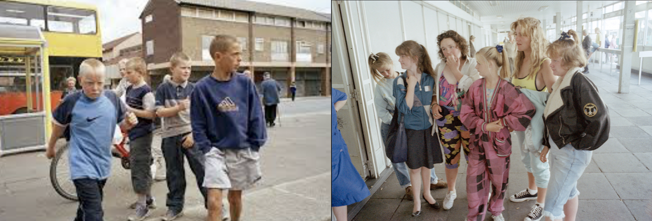

I decided it would be the most effective for the wide framed images to be in this order, this works due to the equal sizing and orderly shaping to the images themselves.The two landscapes and the portrait in the middle also allow the successful overall equal composition. I also think the most powerful image is the largest so again the most effective in this sizing order. This final presentation also works alongside with my inspired artist in the way in which it presents larger landscapes in a large size and the more abstract and delicate elements followed in suite but smaller to connote the simplicity to the images. This pattern of display also works because the lighter tones are surrounding the darkest image and the ones that is the most abstract.I could place all these cuts onto a larger white board in order to keep this as a clear set of work and additionally allow the long piece to be successful accomplished. overall all of these images display the forming of nature and architectural structures
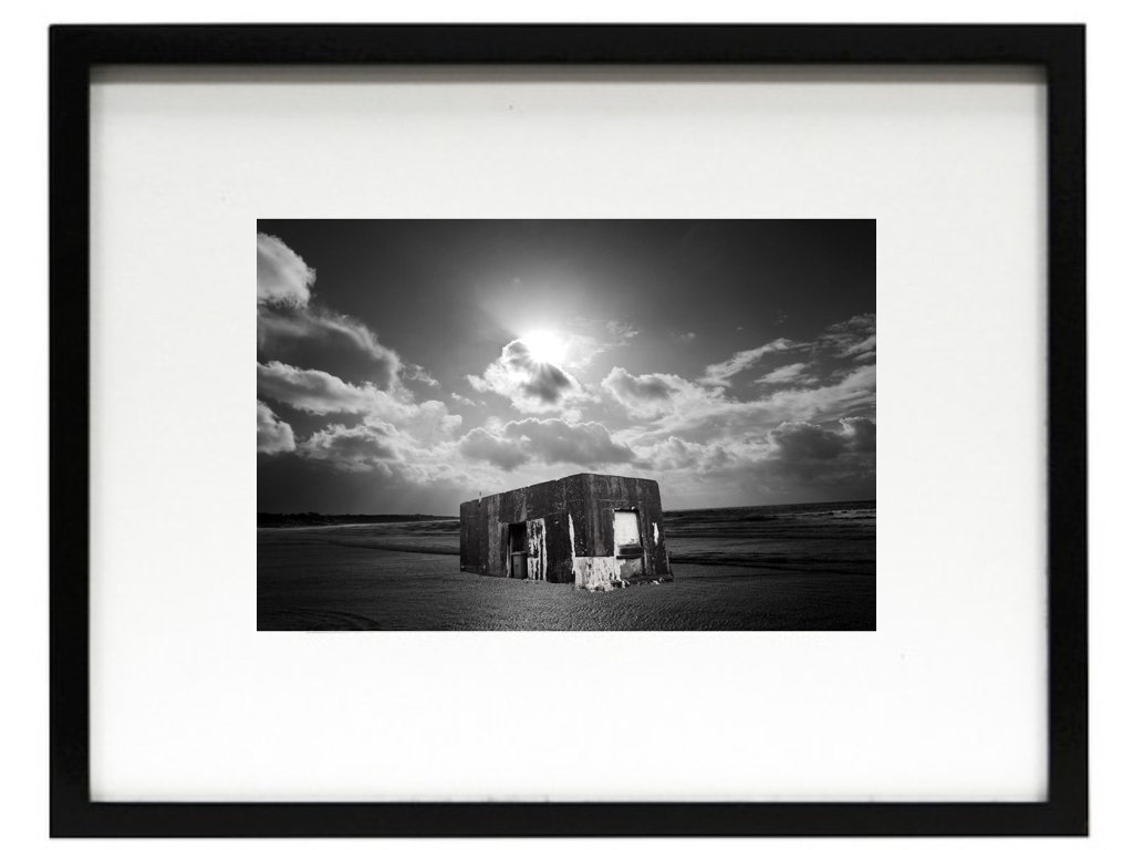
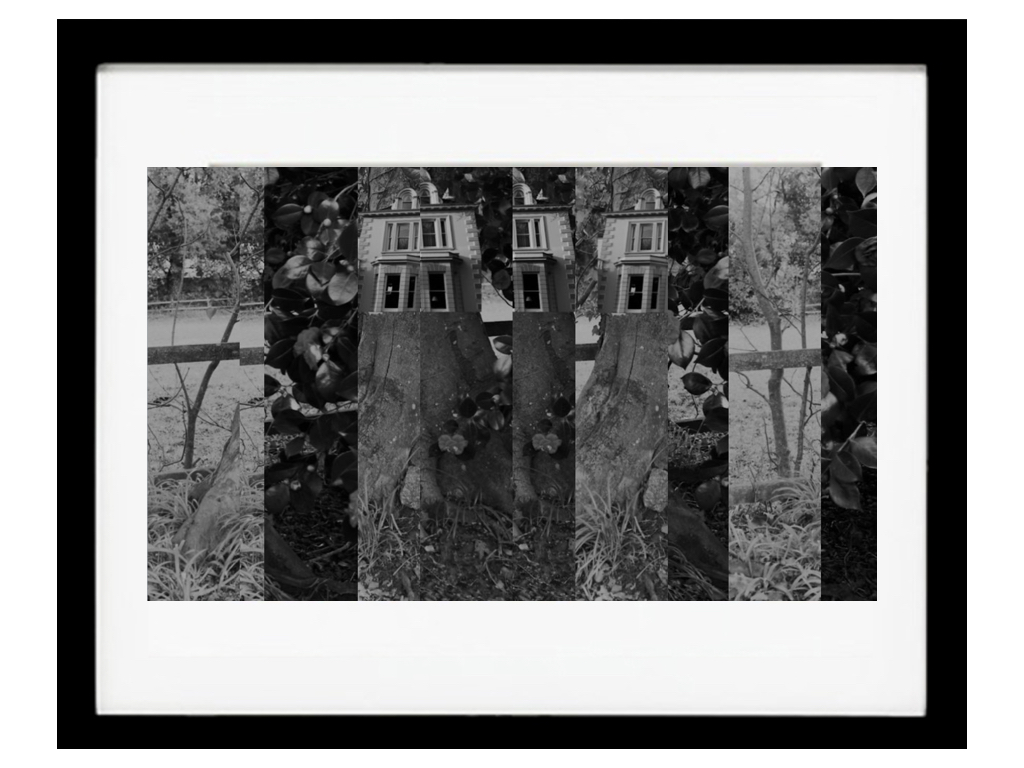
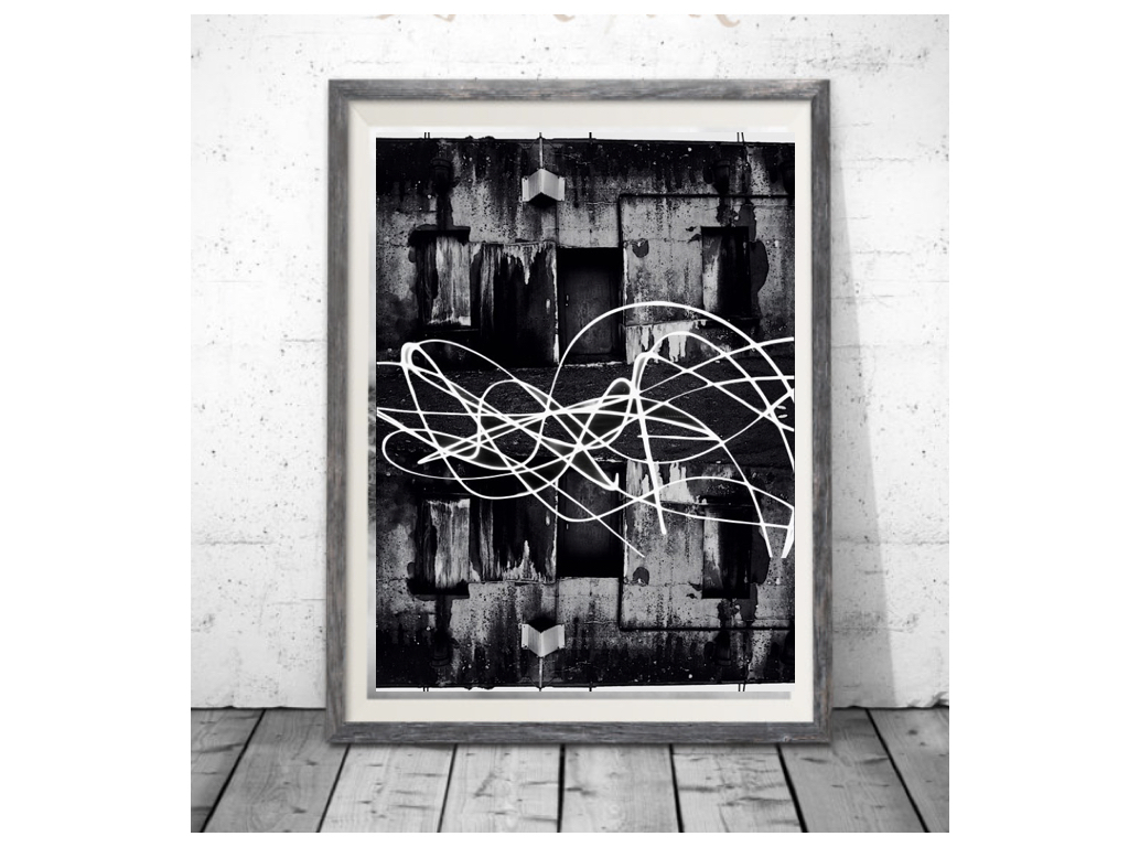
All of these I will do a window mount on mount board and leave a large white boarder surrounding the piece itself this creates a strong juxtaposing contrasts of white and dark tones and also creates a sense of harmony and a pattern to all the separate pieces. I think that tones create a finished piece it would be most effective to frame the pieces in a black frame and then hang them all in order or largest to smallest and create an overall pattern through the hanging itself. The top final image is the most accurate as the sizing is the same as i would too develop it for a finished final affect.I think the simplicity of the images is also enhanced within the frame as it too just highlights the tones without subtracting the attention of the images.
Overall I think these three pieces will be the most effective as they all have a clear linked theme of significance being;that of combining nature and then with architectural structures,they also have the same theme as my artist but i decided to use a wider range of setting combining woodland ans well as urban and sea scapes .They all have a continuing tonal range throughout being black and white continuing the same theme throughout. I also think that the display of them all will be effective as it is simple but also the second image will be cut into this style.
But also presents the ability of many different editing techniques and stretching the ability to use camera techniques as well as Photoshop abilities. The editing also allows a similar overall theme throughout and does still respond to the artists themes.
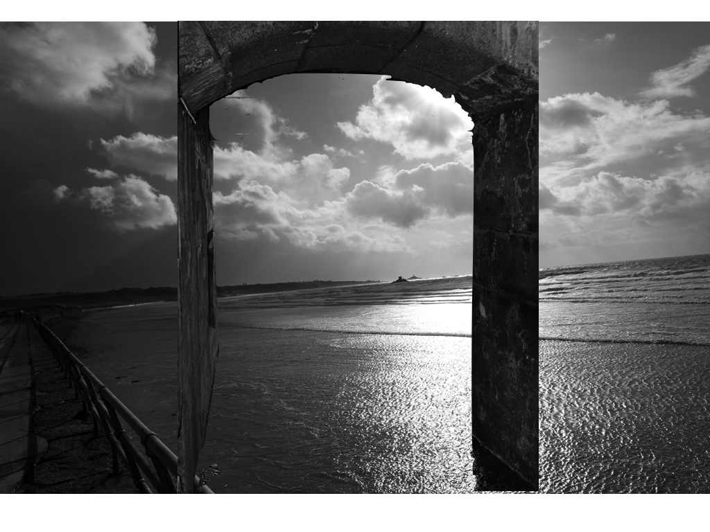
Critically I think the first image is the mostly successful,Due to the angle of the structure and also the way the light enhances the overall composition and the sea scape being effective and using the formalism lines too.Although i do think the lines surrounding the building could be edited better,as there are some issues are areas I did not intended to be there,furthermore the bottom could be possibly blended into the sea although i do not know if this would then take away the effect of the sea being present.
My second piece I decided I would not use the piece above but the original image where there are no lines present,this is because it has a better quality and you are able to see the buildings of the tree and not have to question what is happening and if it is effective. To make this piece more effective I should have blurred the house to the tree and make a stronger area of cohesion and perhaps also make the tones darker as this would be more suiting to the other images.I do not think the surrealism is as accurate to a real life scenario as the previous image but can still be seen without questioning.
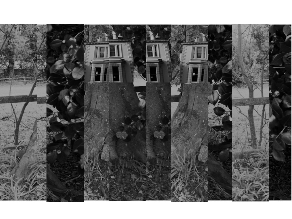
Thirdly this is a lot more abstract.This could be seen as effective or too much editing,but I do think again it present my themes in a different light overall.It could be slightly repetitive as just flipping the image is not the most in depth editing I could have done although i do think i was enhanced with the light I drew over the top with a slow shutter speed exposure,despite some sections with the previous background.
Overall I think that all my images work well together and still do show the themes of nature molding with industrial buildings. Although some could have been further edited but the simplicity of some of them still creates the same overall effect.
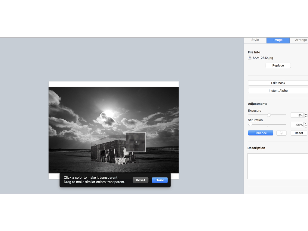
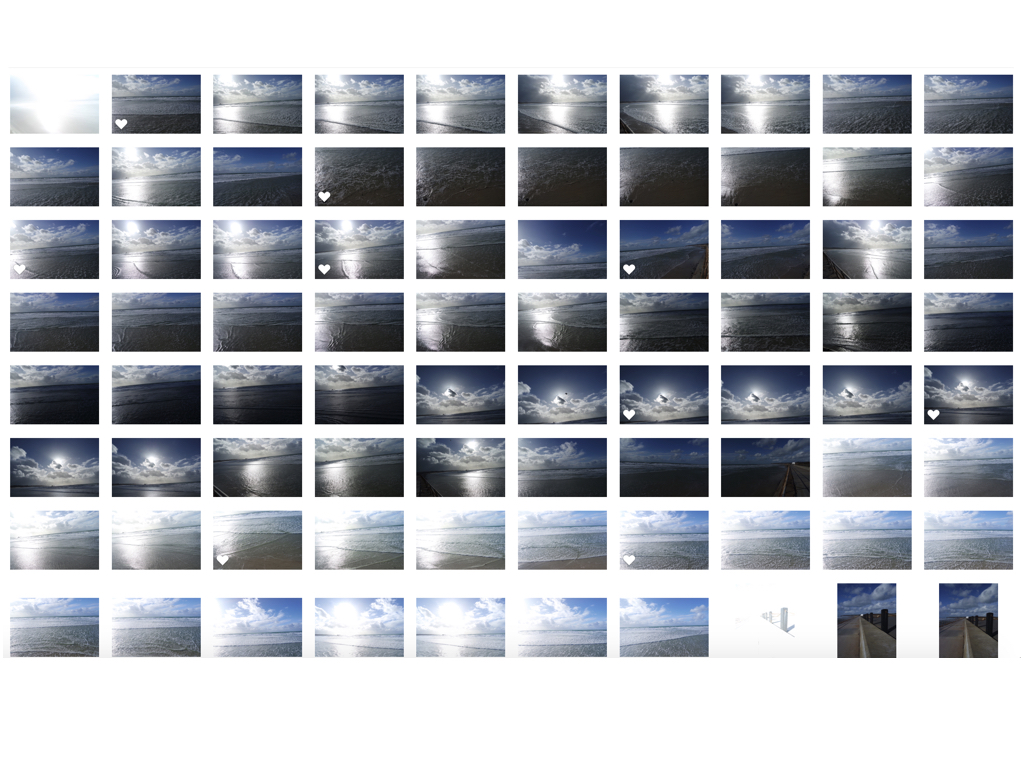
firstly when editing I went through all my shoots in order to find two images in which I think could make a successful overall composition,to do so I would line them up and think of a composition in which I could make.When I decided on the images I focused on the structural images and used an instant Alpha editing technique in order to remove the background and only use the part of the building that from a three dimensional shape and also has strong hold to its shape.I then layered the image in order to place the structure on top and arrange it in the composition middle so it looks effective on the light itself,Furthermore I edited the tonal qualities on both images lowering the saturation making the images both the same tones but creating a lighter exposure on the stature as it has a more realistic feel to the light shining on top of it.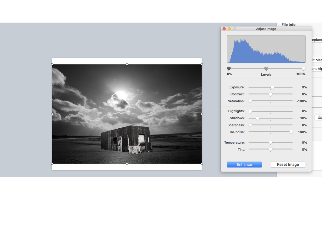
Here are the settings before I edited the images I found it important to find the same level of structure and the sea and lower half of the bulling so it looks realistic and also have surrealism within the image due to the believability.
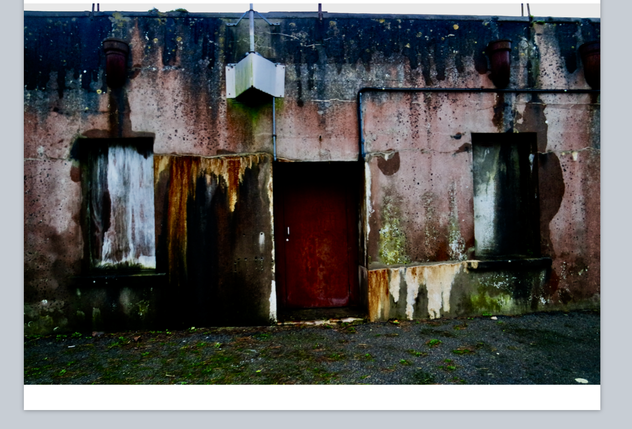
This was there original images of the houses I wanted to capture this due to all the lectures seen wihtin the building and an old sense of abandonment wihtin the image,furthermore I thought the shape and cut would work well when repeating the image due to the straight lines and form.
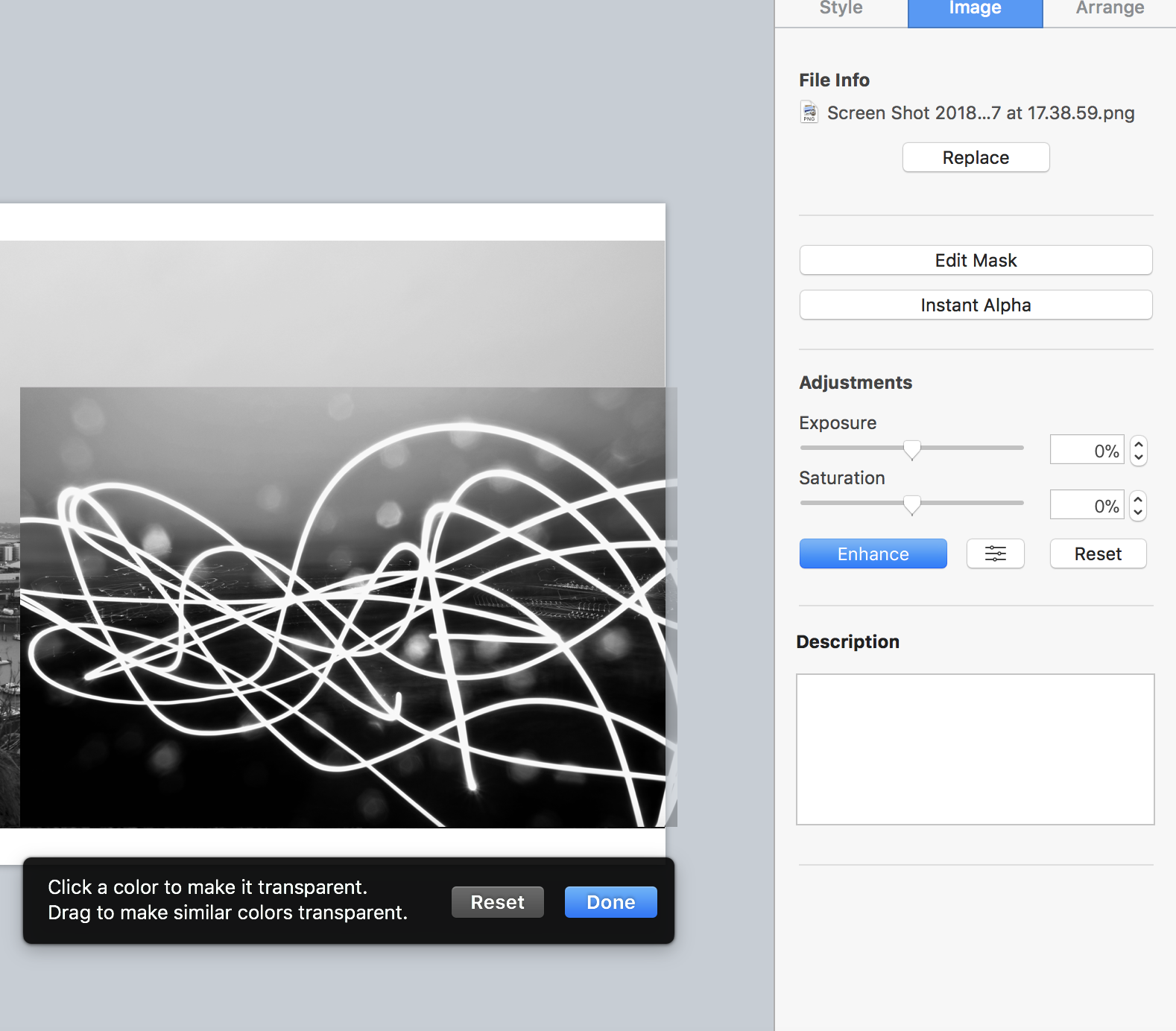 For this image I wasted to capture a slow shutter exposure on the light and show a movement over a city shaped thought it had strong abstract qualities but would look affective when layering an image.
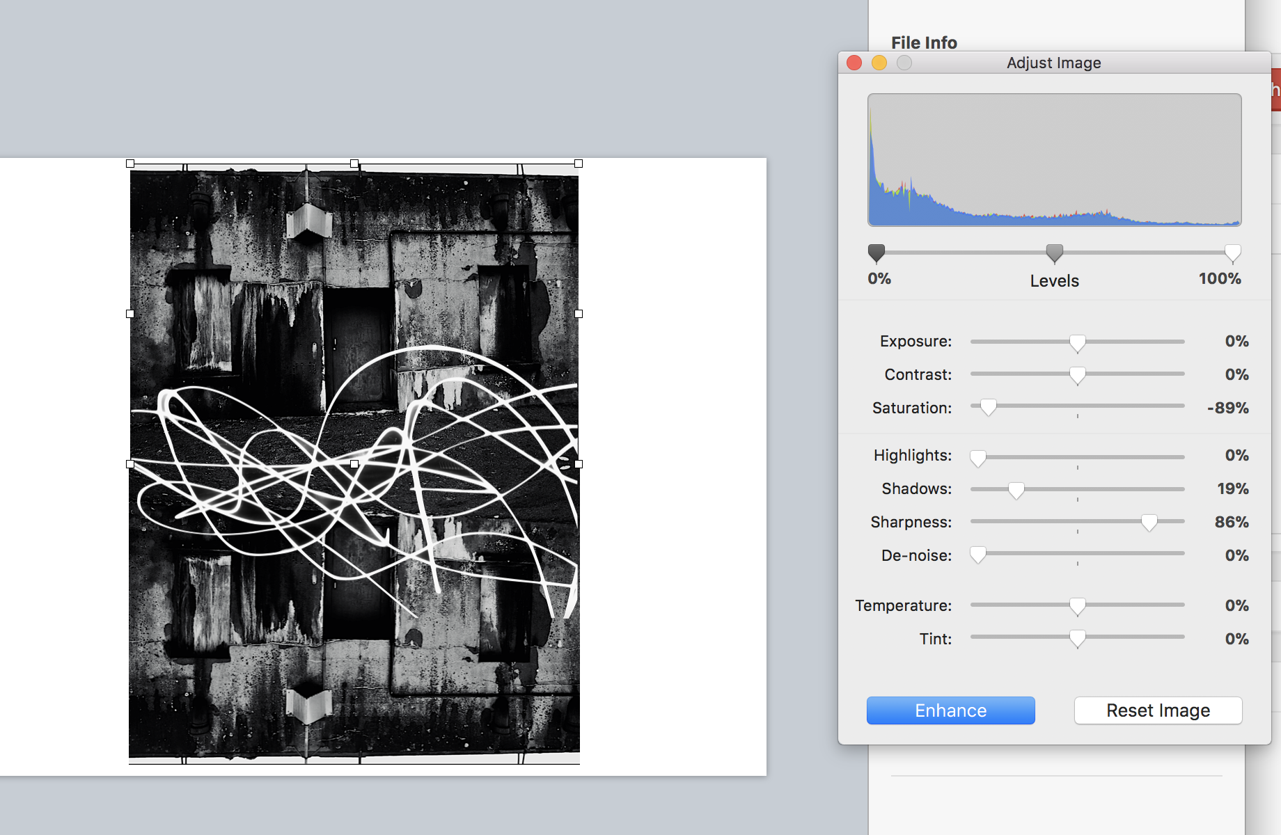
Finally I flipped and repeated the house images and adjusted the tones as above, I then used alpha once again to remove the black from surrounding the light exposure and then applied that to the image over the top structure in order to show an effective strand throughout the piece and an equal sizing.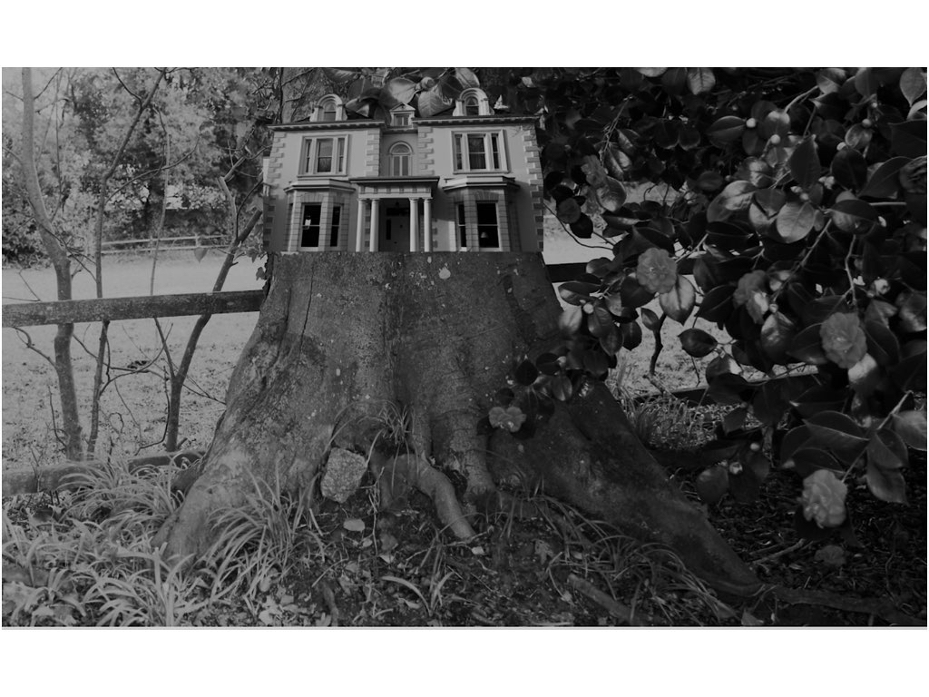
To edit this image once again I was separating the house for the surrounding background and using the dame tones to attach the images to each other,Although It was mostly important to capture the size and insure it was equal to the size of the tree itself.I wanted to additionally experiment within how I can change the lines and overall image by cutting and resizing with them into separate sections of the piece,this can be shown here:it shows different sections and different tones yet you are still Able to see the original piece itself.
For presentation I think I want separate ideas but for all of them to compliment the individuality of the image itself:for the first image due to its simplicity and power to speak for itself I think a black frame with a white boarder would be effective in a large print out ,when doing this I thought due to the dark tones to all the images they would all look best in black frames wihtin different cuts and sizes of frame and inside displays.


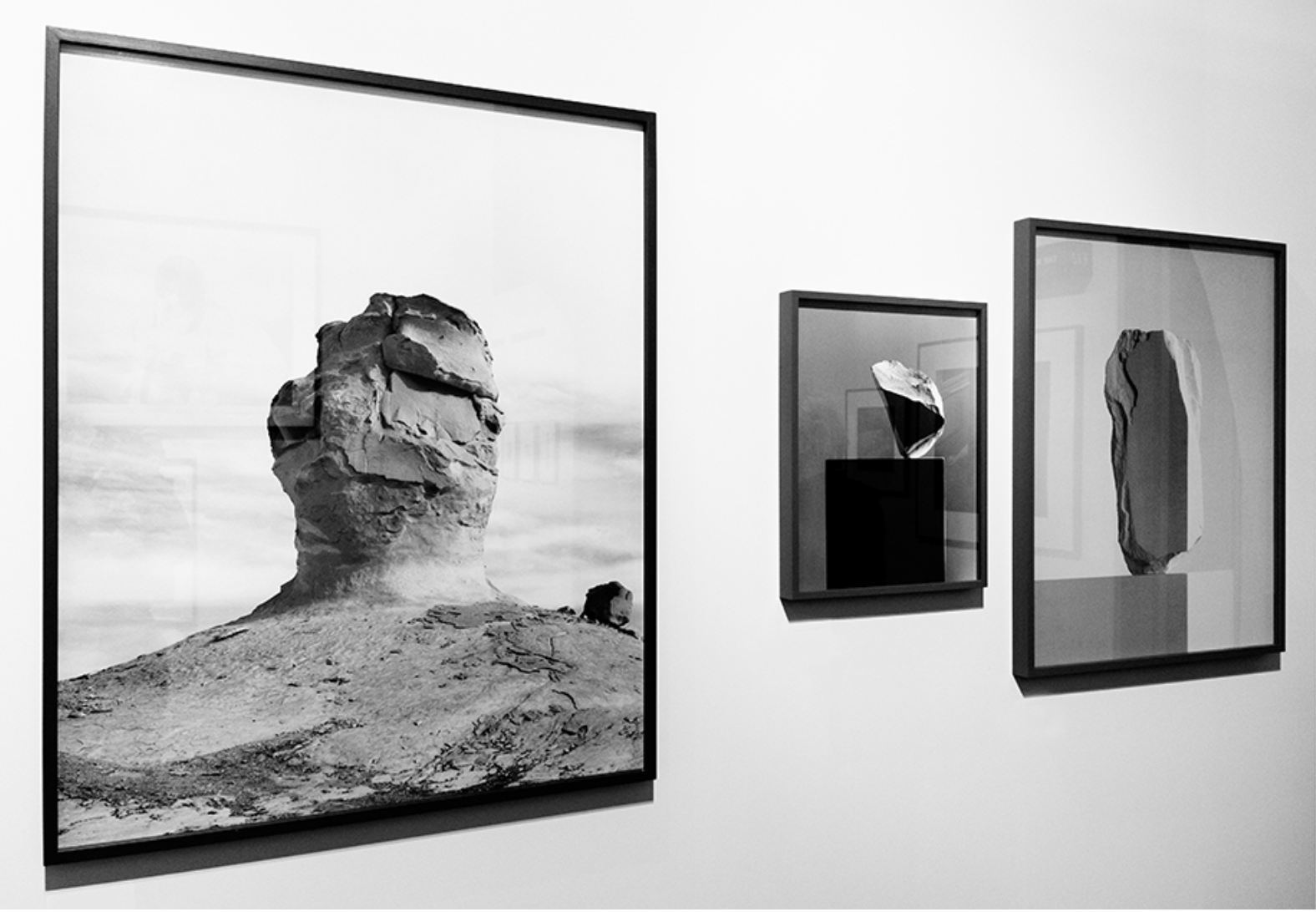
My idea was somewhat based off of this, using different sized and thickness of frames to enhance the I ages themselves but I would also include a white inner boarder to the images, as I think this looks effective.
Her work has a clear connection to my response of hers, showing structures being on water and showing themes of surrealism and mirroring techniques such as she does in water,I was too able to show a opposition of their natural equal, wether that be sea and a man made mould or a manner and a tree, and or be a city scape conflicting with an urban building,I used her sense of dimensions throughout my pieces and my final also using many different angles of interest.I think I have successful shown a sense of her ideas and format of nature though my work and through a comparison you will be able to see the same theme continuing through.
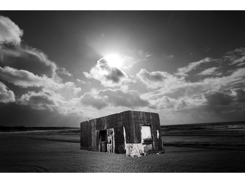
This photos come about on two separate shoots,one of which focusing on sea scapes and the other focusing on more urban industrial sculptors.I decided to edit both in a tonal black and white in order to capture a more in-sync image and an overall successful composition.The light is successful and enhances the composition of the building and overall has a surrealistic undertone and still relates to my artist and also my themed shoots.This is my favourite image and will definitely be used for a final piece.
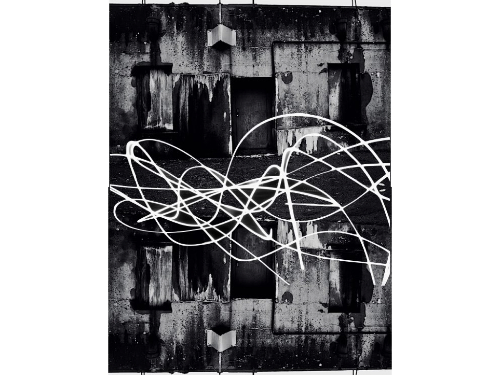
This piece is a lot more Inspired by urban landscapes and a mirroring effect enhanced by a slow light exposure seen within a city scape, it creates an abstract type of quality and overall has an interesting composition. Although there is not a surrealism aspect the tones and overall concentration on structure allows a cohesion to the rest of the chosen images.

This image was inspired by the surreal effect of joining the woods into an interesting large historical building, this is not complete with editing but still has an interesting presence and composition to the piece.

This image has a strong sense of abstract themes but the tones and editing of the original stature has a consistency of tones and compliments the environment in which it is surrounded. The editing was very much in a similar direction using the instant alpha technique to separate the building to form its original backdrop and then place and resize in order to be in line with the background of the sea. 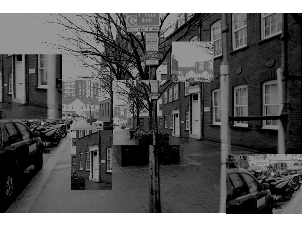
This image is again the more urban route, but still uses the same tonal editing technique and with the focus on buildings and an overall separated stature to the pieces,It is unusual in its varied segregation but allows interesting points of views throughout.
New editing ideas: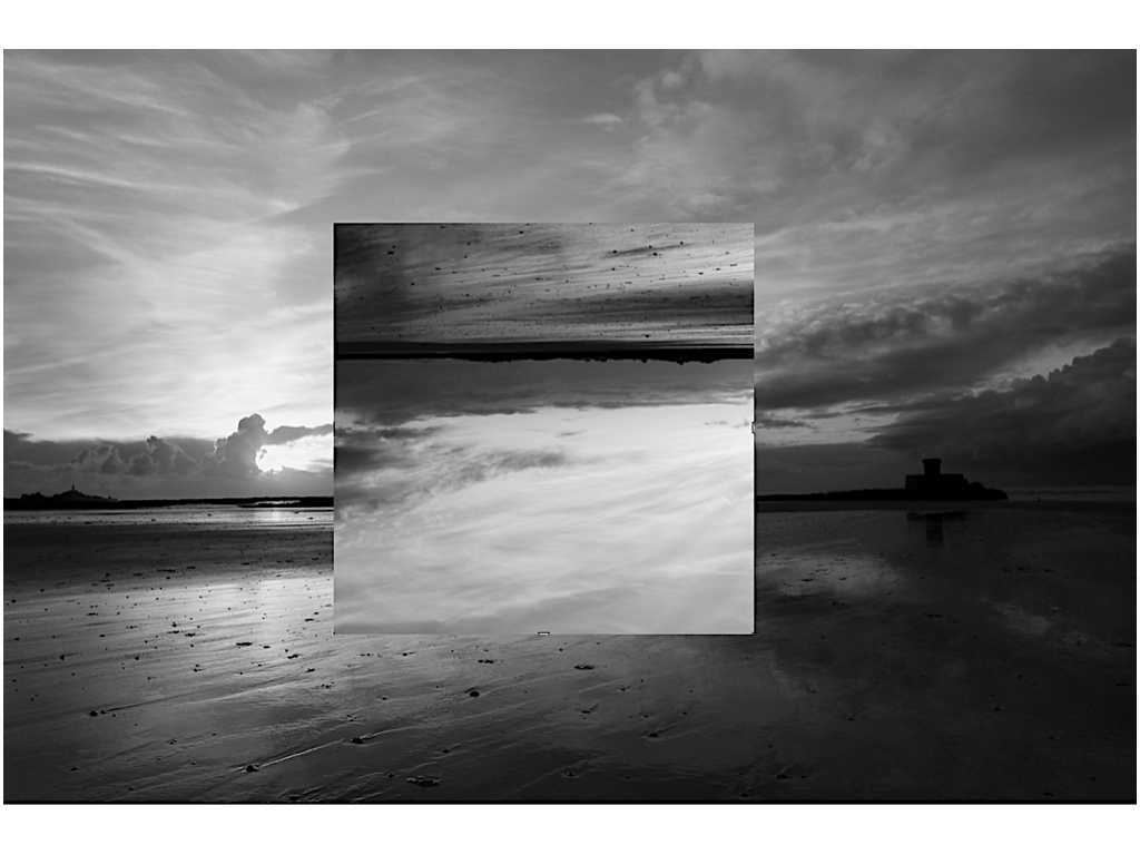 I wanted to do additional editing on this piece as I have already changed the romanticised backdrop to be an altered reality and the change of the tonal range in order to be more conjoined to the rest of the images,it presents an interesting aspect of light and still has the presence of a stature on the right hand side.
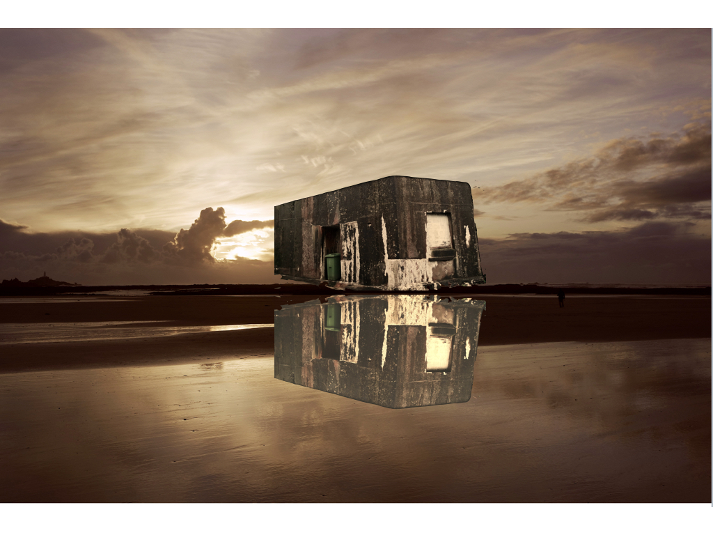
Here I wanted to try a basic mirroring technique in order to connote a reflection onto the sea again using a past romanticism landscapes did this by flipping and editing the tones of the piece,althought this is less successful as the previous as it is not edited well enough to show a watered technique.
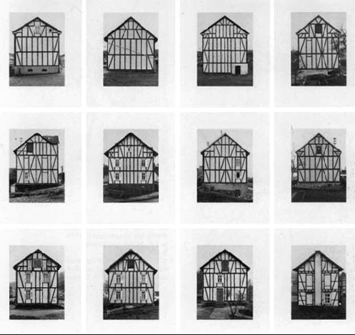
typology inspiration:
In my last project I have previously looked upon the old more historical buildings and recording them,however I want to find more interesting and landscape inspired images in which I can also develop.I was also going to develop within how I can use the natural landscape to express the way in which colour and the impact that they have but decided against it because it ill not have a specific relation to the ned of my project.
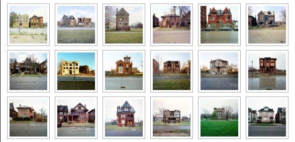
These ideas are much more modern photographers and also fit more into my interest of landscapes within natural and buildings that are purely structural. I think within these images they would allow me to explore more of what I want to develop within my final three weeks.I think this above is a good example of exterminations of the way in which stature and individuals in and areas can e interesting.
I decided to travel around and fine many houses in a similar area that all look very individual but have the same surrounding theme of environment,furthermore for the sunset images I want to capture a strong sense of color within the same beach but different areas and then also expand this to other areas within the island. I think i could show a gradual development of when the sun sets and perhaps even develop panoramic views.
This is my first shoot I discussed previously about my plane for the project,i want to go to many areas in which I can get a strong range of distinctive boiling I want to show no colours so I need to the stutter itself to speak fro all the effectiveness of the building itself.
I have already taken many images of old figures and statues so for this shoot I focused on the aspect of old historic and impressive buildings that have a great impact altogether.

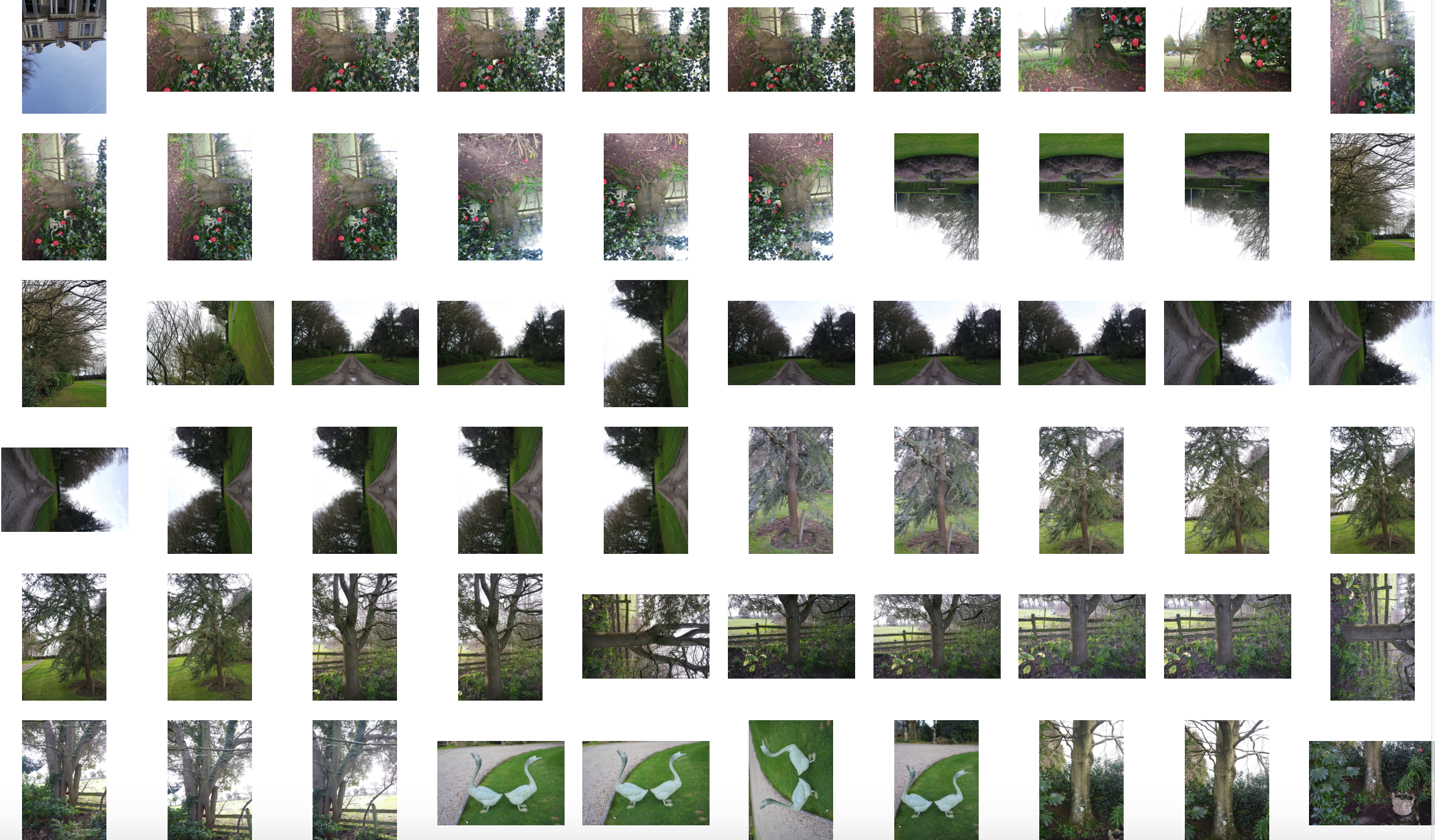
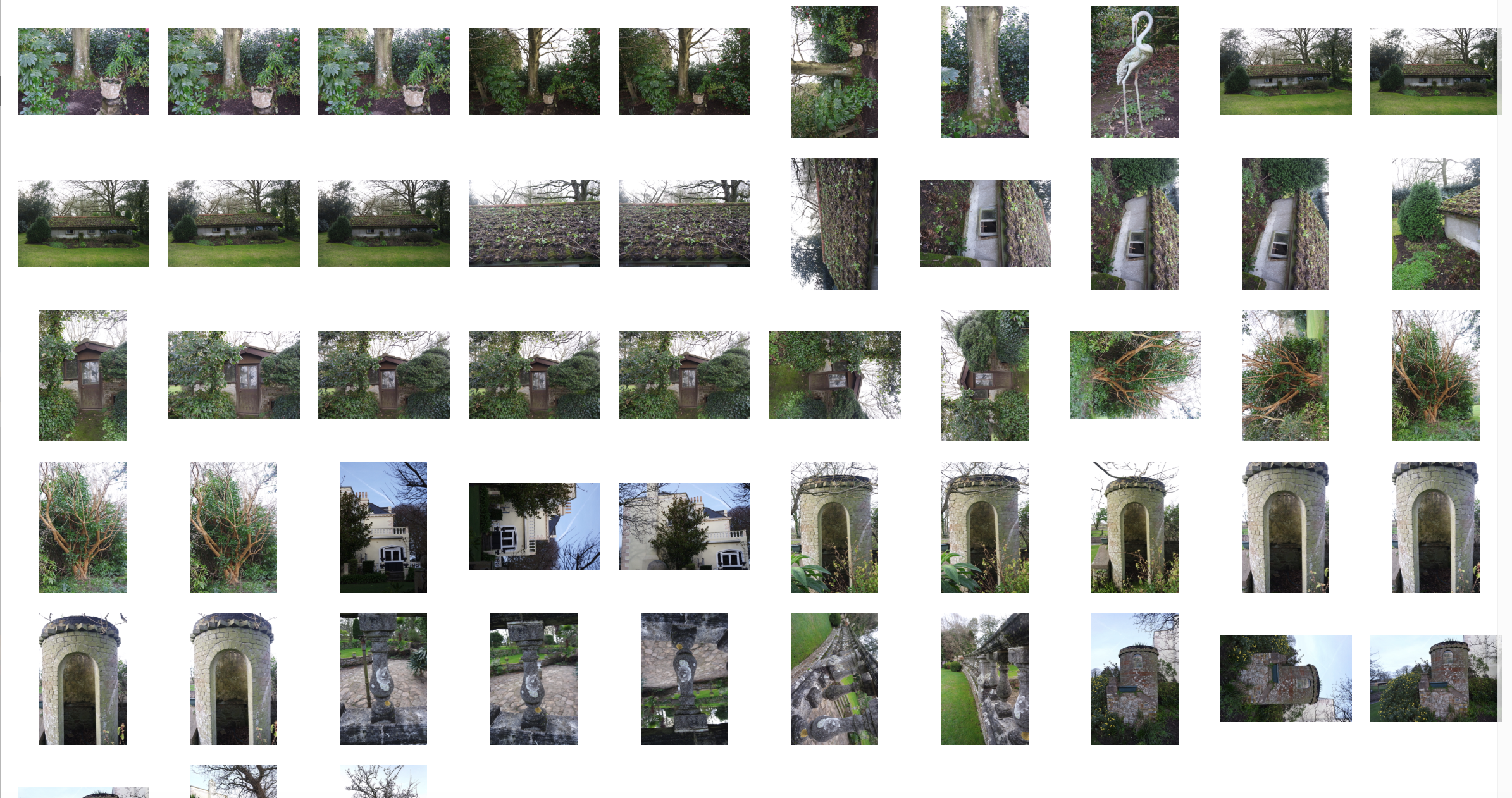
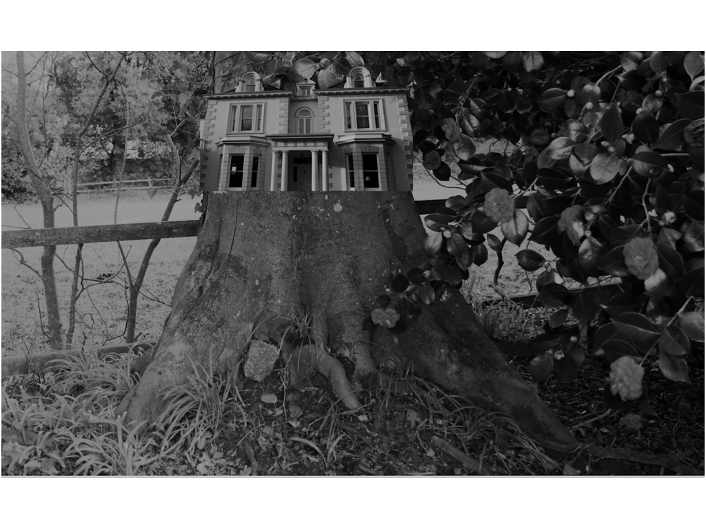
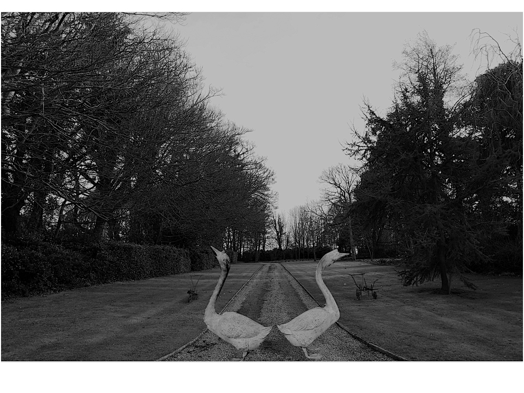

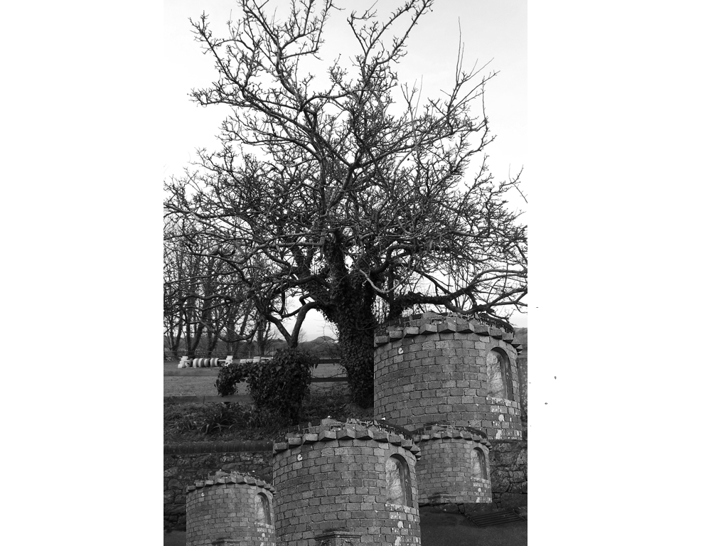
Once again for these images I was inspired by nature being formed with industrial structures and buildings,I wanted to also edit some additional themes of surrealism,althought these images are not edited to completion and will need some additional work.For the nature aspect I wanted to capture large and impactful structures and also the size of the nature itself and how it can compete with the man made structures.
I have taken a sea shoot developing on many different surfaces of water and line which I have further experimented and attached some previous images of buildings and created an altered aspect of surrealism and tonal editing.
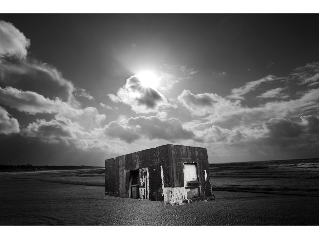
This is my favourite experimental piece so far,I wanted to capture the tones of the sea to be very calm and have a contrasting representation to what water should look like, furthermore the light allowed a direct centre view and also showed a diversity of tones throughout the piece.I then decided to add this building as the tonal range brings about a harmony to the piece and also the buildings angle itself shows a three dimensional angle creating an overall successful affect.
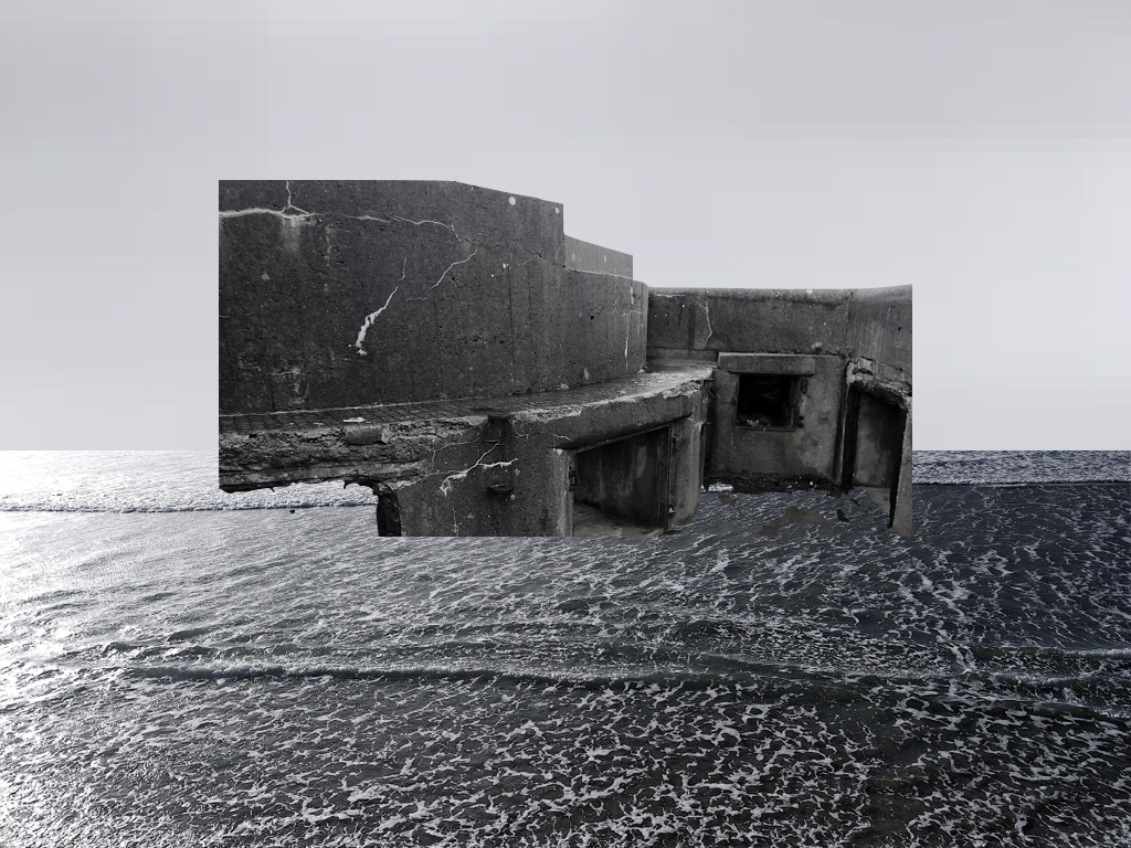
within this piece and one other I took a sample from the sea and sued this for the sky to have a same interconnecting tonal range but also a calmness to the scenario.
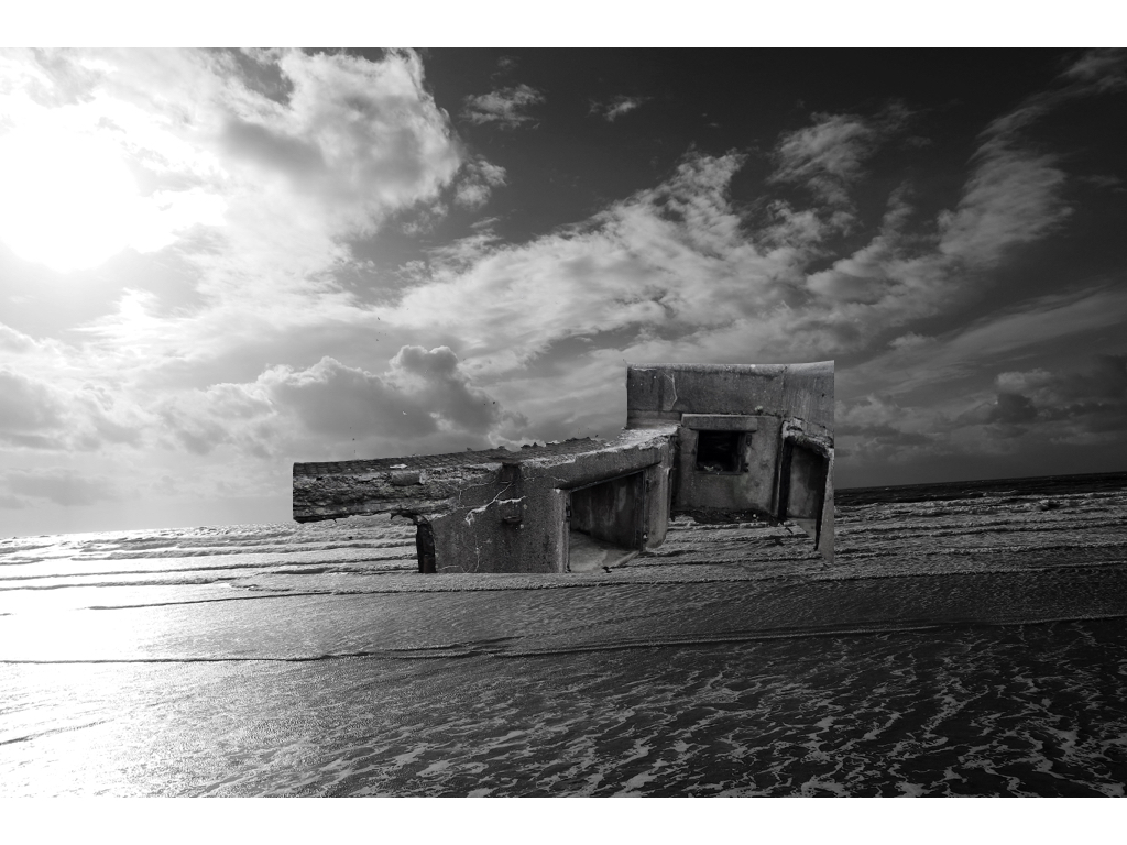
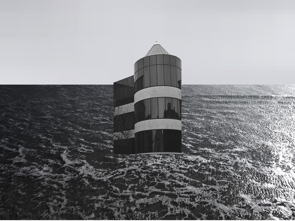
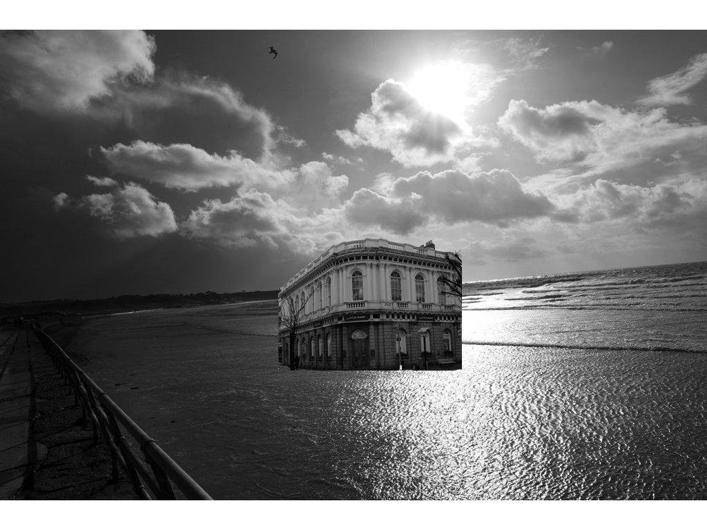
Within the rest of these images I again did the same technique of editing the original images to have the same tonal range inspired by my artist and also having an interesting strong juxtaposing industrial piece in the middle of the piece. 

These images above are pulley romanticised sea images and originals from the shoot itself, this portrays the scene previously to how it was altered.
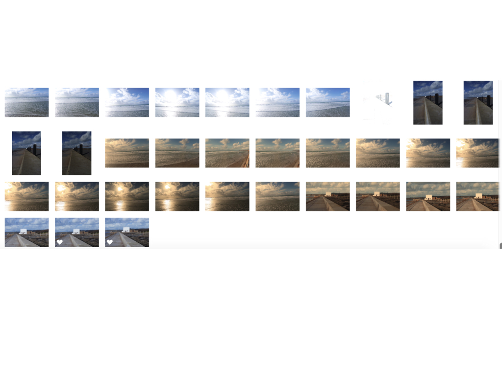
I decided to learn more about abstract and formalism as I want to produce Many of my own images that mainly focus upon a structure-being a building ,and a close up from of a whole image and scenario.I found a photographer who I thought captured beautiful images and a movement within a solid object and how he enhances these images within using light.


I believe that I am going to start focusing more upon surrealism within how nature and architecture within buildings works together,So I believe that if i do some experimentation within the lines and structure inside buildings and what surrounds me could too be efficient.I also think the color of tones will too work well within the work in which I am going to focus my attention purely within.I chose to do this small study because I do believe it will help me to access a more architectural and tonal sense of eye that will help when developing my typology study of building in order to produce my final image of forming nature landscapes and architectural urban landscapes.
Due to my plan of studying architectural and a structural sense this allows me to capture how lines and such can enhance my overall image and also how and what angles would show a more three dimensional pattern that would also benefit me as this is what my artists does too. This could also help when producing a mirrored effect within my images and finding a fine line to cross and or using a sea mirroring effect or wanting to capture the structure within a moving object.
I do think that studying this small experiment shoot has helped to develop an Idea of how I will capture the buildings and shows a sense of line using tone and light within the images. I could always possibly use some of these works in order to show how I could finish the other shots that I have done.
due to me wanting to capture an array of landscapes from sunny romanticised landscapes to more abstract light exposure night time shits I need to know how aperture works and the concentrating of depth of field in order to focus in on a specific subject matter. I will experiment with this and use it creatively and such. The F number is an optical system of the cameras lens,due to it not having any dimensions
The f-number of an optical system such as a camera lens is the ratio of the system’s focal length to the diameter of the entrance pupil. It is a dimensionless number that is a quantitative measure of lens speed, this is important as it allows you to choose what concept of how much an an image you want to capture and for what effect.
throughout all my shoots I intent to change the focal length,aperature and also the fouls distance in order to use it as a creative aspect and enhance my image without editing them.
exposure bracketing:
I used exposure bracketing when concentrating on a. romanticised and more natural landscape, this is because depending on weather you are under or over exposed it captures different segments and different details within a pieces overplayed many of my image own order to be able to have different concentrations of detail in different areas such as the example below:
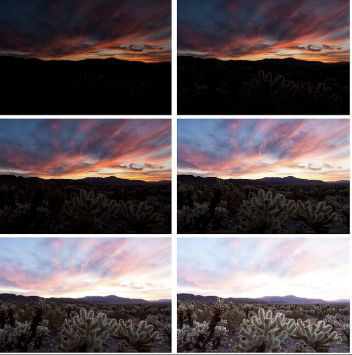
I also want one experiment within experimenting of editing sills such as using HDR Images,and making sure that I am capturing high dynamic details and capturing every element of an image. this is mainly important s prep from my romanticised images as they would be capturing light in a strong manner and also the reflections upon my images. I could do this by putting my camera into its hdr setting and allowing it to capture a high saturated landscapes.
These are my examples of using HDR and then further editing in order to emphasis the colour and how light comes through within all of the images.
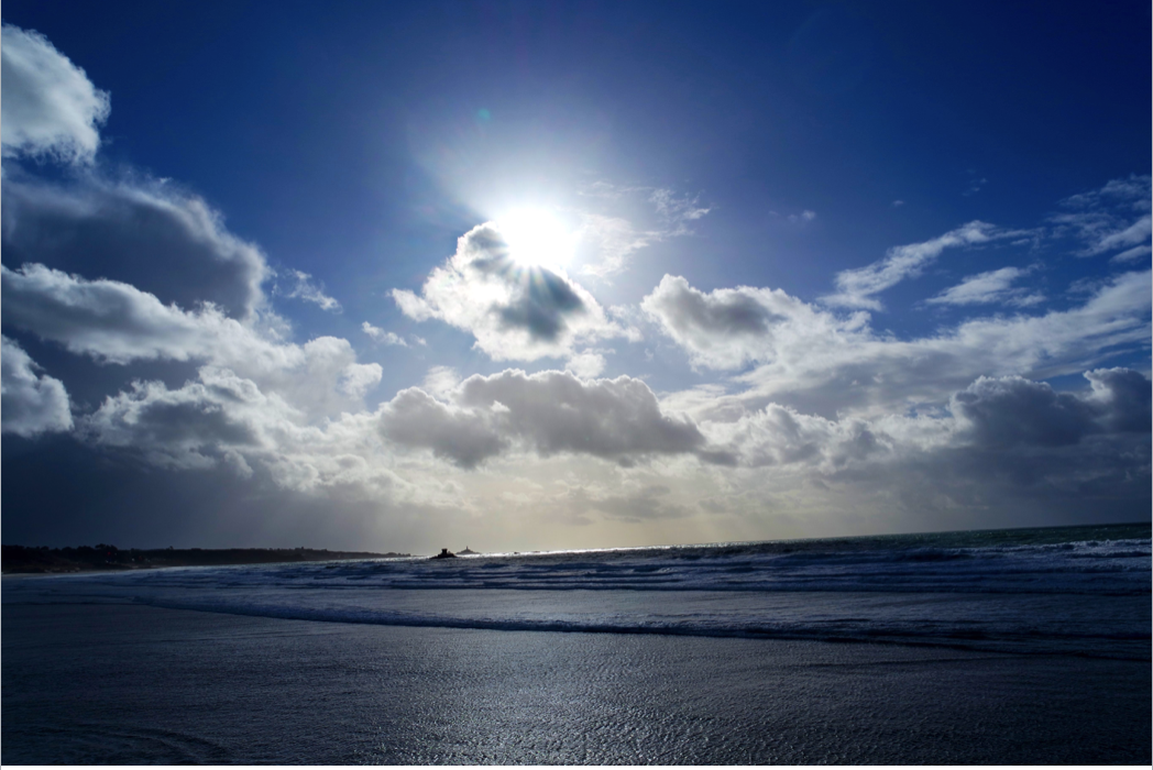
within this first image i wanted to capture a sea scape but then found that the clouds had such a beautiful movement and shape through which the sun comes through with such strong highlights that bounce off the sea, I included this within the images as I think this would also be a successful base off an image as the water has a solid movement but interesting point of texture. 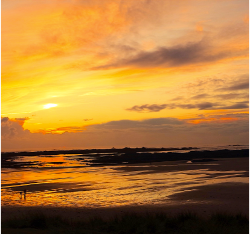
This second image has many differences, this is due to the way in which again the light is reflecting off the sea and the warm tones caused by the light but due to the over saturation has lost a presence of some of the detail.
technically both images have many features that make them successful although conceptually the first image has a more successful HDR theme parented and also presents the use in which I balanced the focal length to allow a wide image and also an equal exposure bracketing too mature the details within every aspect of the image.