A2 PERSONAL INVESTIGATION
A2 PERSONAL INVESTIGATION
final presentation:
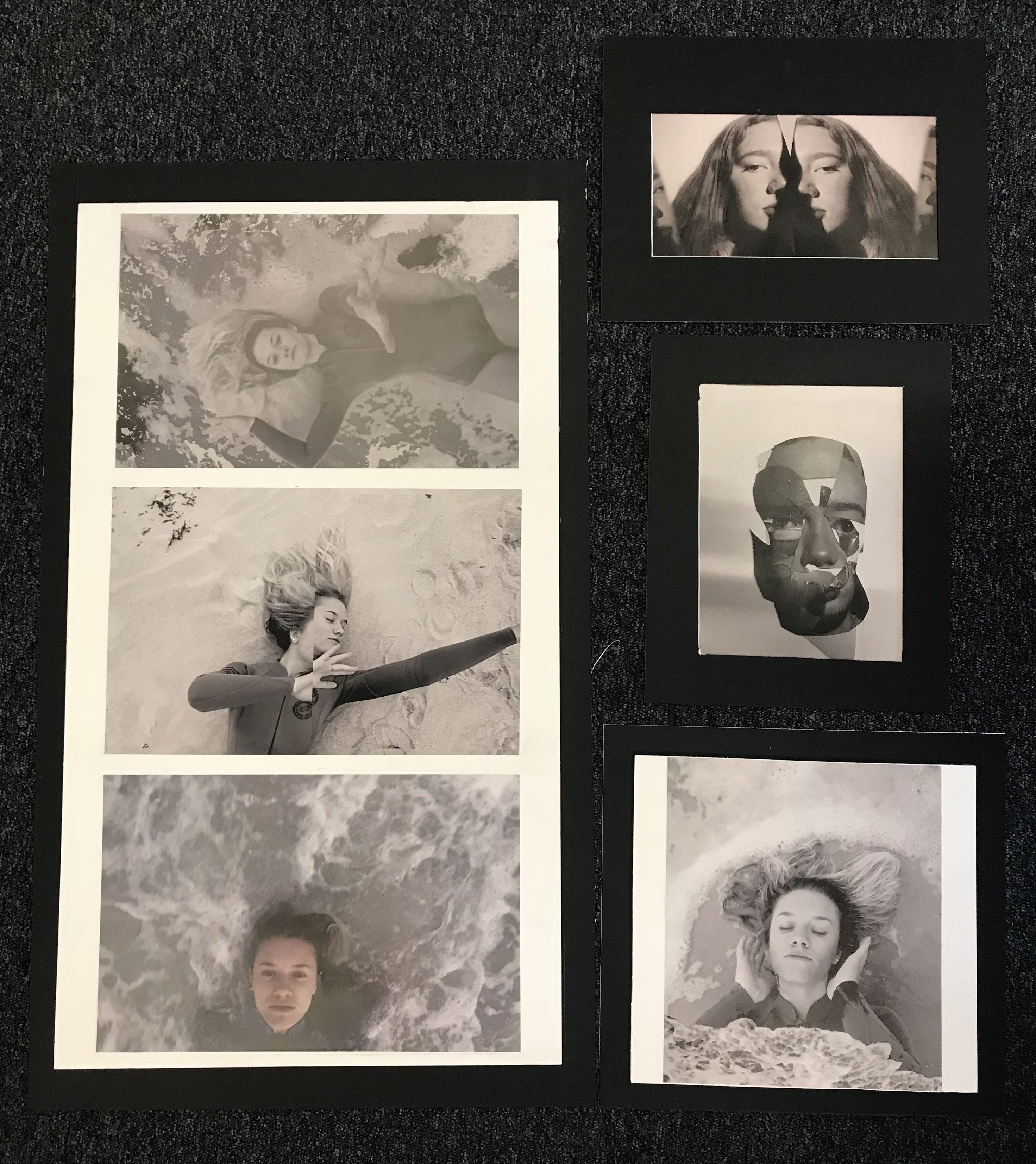
I decided to keep the same experimented final displays as my final outcomes as they were the most effective,however instead of purely mounting the two attached images I put them on a black boarder using a window mount,I do think this is more effective and suiting as the other images are also on foam then mounted onto a black frame.Overall the large set of three I think works well in the presentation and additionally the overall composition as a final set works together with the additional separate image as it acts as cohesion to the additional two images from different shoots.The large size of these a3 images on a large board has a strong impact that I think is successful altogether. I think with more experimentation my presentation could have been interesting with all the three sets of images on one very large board as all my included shoots work well together and it would allow more impact and dimensions to the piece itself.Due to my images being larger as I have added in frames the display is larger overall and so the arrangement to the images has changed to the original composition( this only being the seance row of images is longer)also because of this I did not think it was the most effective to connect the top image and the lower collaged image as the size does not work and it would not add anything to the overall final itself. I do think the frames are the most effective and especially the set of the final four images having the white inner frame.Additionally using both foam-board and window display shows both skills and also divides the sets in the most appropriate mannerism, allowing a more clear cut darker edge for the more abstract technical images then the more surrealistic experimental ones. Overall I think the frames themselves are successful as they are all in line and even and do enhance the images without removing Andy attention form the images themselves.
For my chosen final pieces I was mainly inspired by two artist being:
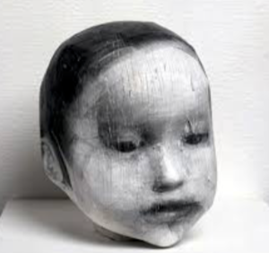
Comparison between artists work and mine:Harimas work is based around creating a 3d collage being a print off of her own image and wrapping this around a head structure to form a sculptor,I interpreted this as cutting up pieces from my portrait images and making this into a collage and then forming it in a curved manner to look 3d,I think it is quite evident to see the similarities between the pieces.And that my inspired piece works well with the techniques used.
conceptually it is an interesting piece as is symbolises different aspects of human emotion, the lighting to form a shadow is also effective as it further enhanced the three dimensional feel to the piece itself.

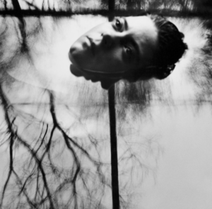
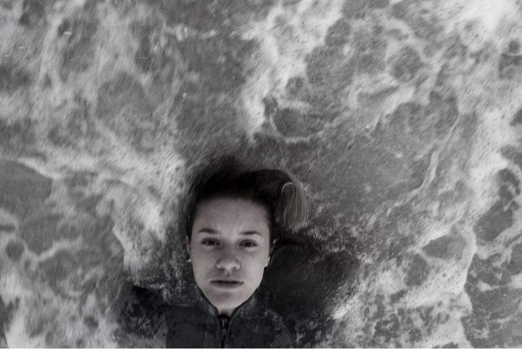
Second comparison:My main inspiration for this was themes of isolation from the behaviour of water, my image is a lot more abstract with a strong essence of movement, yet still has a similar composition and a similar facial expression to the artists work.Due to the unreliability of how the sea would be I think this is the most accurate presentation I could have to the artist. My other images all still carry the same concept of her work throughout.
Overall evaluation of project and final display:
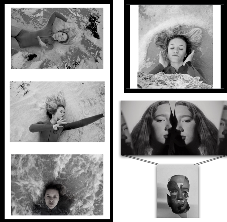
Overall I think this project is very different to any work I have done before and very diverse within itself which using collage, themes of nature and behaviour; and finally mirroring and editing techniques to remove features of a persons identity.I am happy with the final images I am left with and think they do reflect what I originally wanted to show through my work from the start. My work is clearly inspired by my artists but not a complete carbon copy,making sure to add my own technique or additional themes of human behaviour, isolation or loss of identity. when focusing on the words of:codes,conevtnions and secrets I feel as though I have touched on them all, being the ‘conventions’ of human behaviour and how we as humans are influenced through others behaviours,and also the unreliable behaviour of nature. Secondly ‘secrets’ is seen through the loss of identity and removal of features alongside the lack of presentation to people we think we know. lastly ‘codes’ is seen through the repetition of these characteristics throughout many groups of people as if it is a code to be followed. There is a large range of editing between each shoot, the shoots are more concentrated on removal of identity I edited out significant features and used this to enhance the images.I also used photo techniques of mirroring and collage ,so overall using a large combination of many different ideas.The majority of my work is purely tonal shades of black and white, this is due to this being more appropriate to the pieces and themes behind them. At the beginning of the project I wanted to focus more on surrealism and I do think I have incorporated some of these themes into my work, although I do think it has come out more of a direct portraiture observation,but with a complex presention and still does not fit wihtin the generic conventions of portraiture work.Overall I think this project is very unique and does apply to my themes and the outcomes I think all work well together.
your technical ability to record using a camera / lens: For each shoot I have used different settings on my camera, each with the different aim to either capture,motion,light or a specific focus on my images.To do so I used large lenses to be able to capture detail and movement within all my pieces,additionally I put my camera setting on macro to be able to capture the detail of the image and not have any blur as this is not the effect that I wanted to capture.your ability to select and edit images effectively: when selecting my images I wanted to give a variety of techniques and presentations of human behavior,I have done this by choosing three separate shoots. I chose my primary shoot to be focused on the combination of human and nature behavior and how when formed together present the convention of loss of identity and isolation within the water itself.I chose this shoot as it it the most creative shoot with the combination of editing and real captured shots,I think overall all the images are very dynamic and able to work as individuals too.
your ability to respond to a key artist: as previously shown my main aim for every shoot was the same theme of human behavior but my inspiration for each shoot was inspired by a different artists,although the main two artist for my final images was Midori Harima and conni imboden,both of their work is used presenting people in different mannerism and showing a more gruesome side to their personalities,I have shown their techniques using collage and additional editing techniques of removing eyes and finally submerging people within water.
Set 1;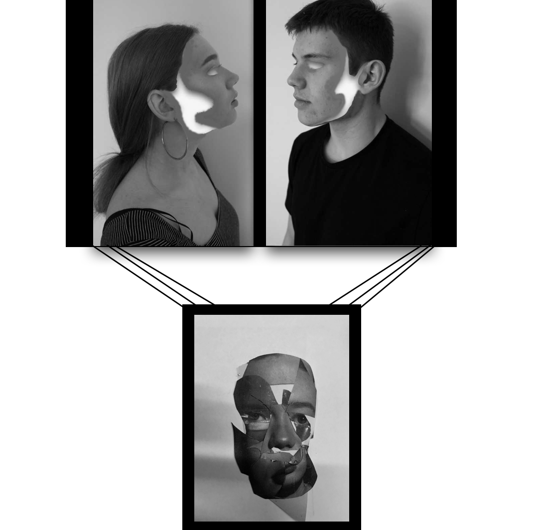
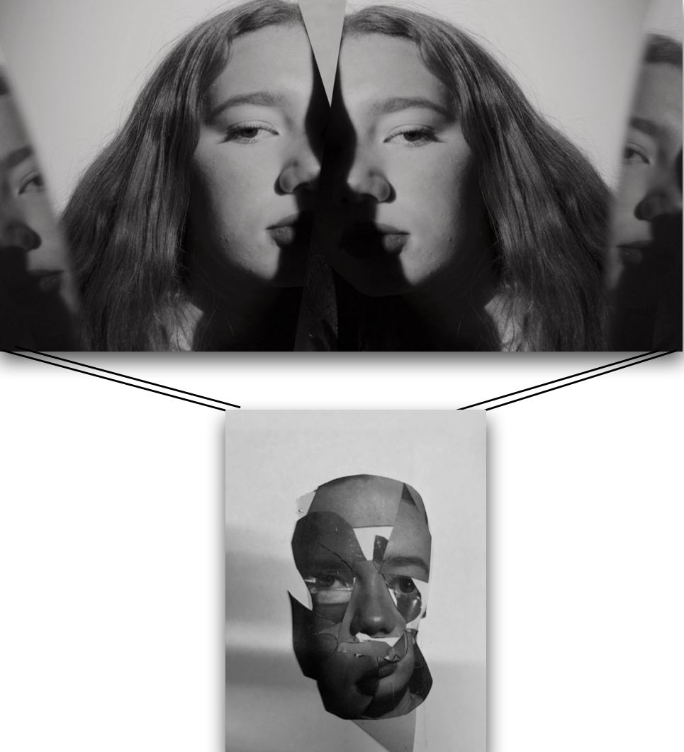
For this final outcome I want to frame all three of these images on window frames with black border, the top two I will lay across a long a3 size board with a small gap in the middle.I said earlier about these images all being highly impactful and able to have them all attached with black strings or metals bars to the image below.This could symbolise as emotion of human behaviour suspended.
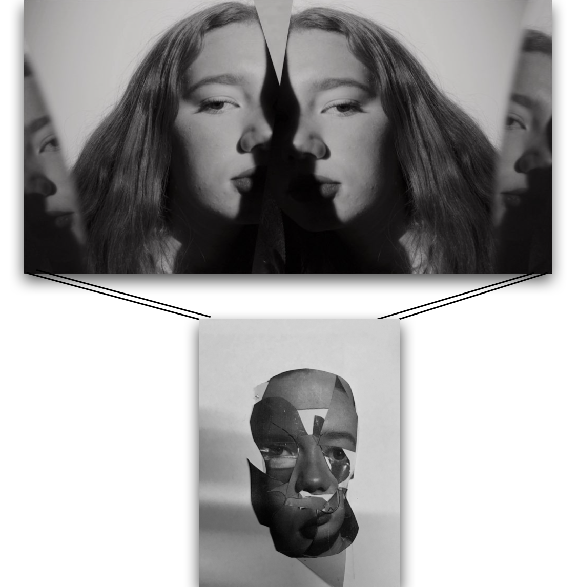
However This is the new and updated version,I think the top piece is a lot more effective and works better with the concept of hanging the image bellow,addtinally because this is the same person edited in different manner it is an interesting overall concept and I think works well.I think these two piece should be a4 size and then attached to each other with a black metal bar or black string. Both of these images will be on white board to make them have more depth and possibly a black boarder surrounding the images.
Set 2;
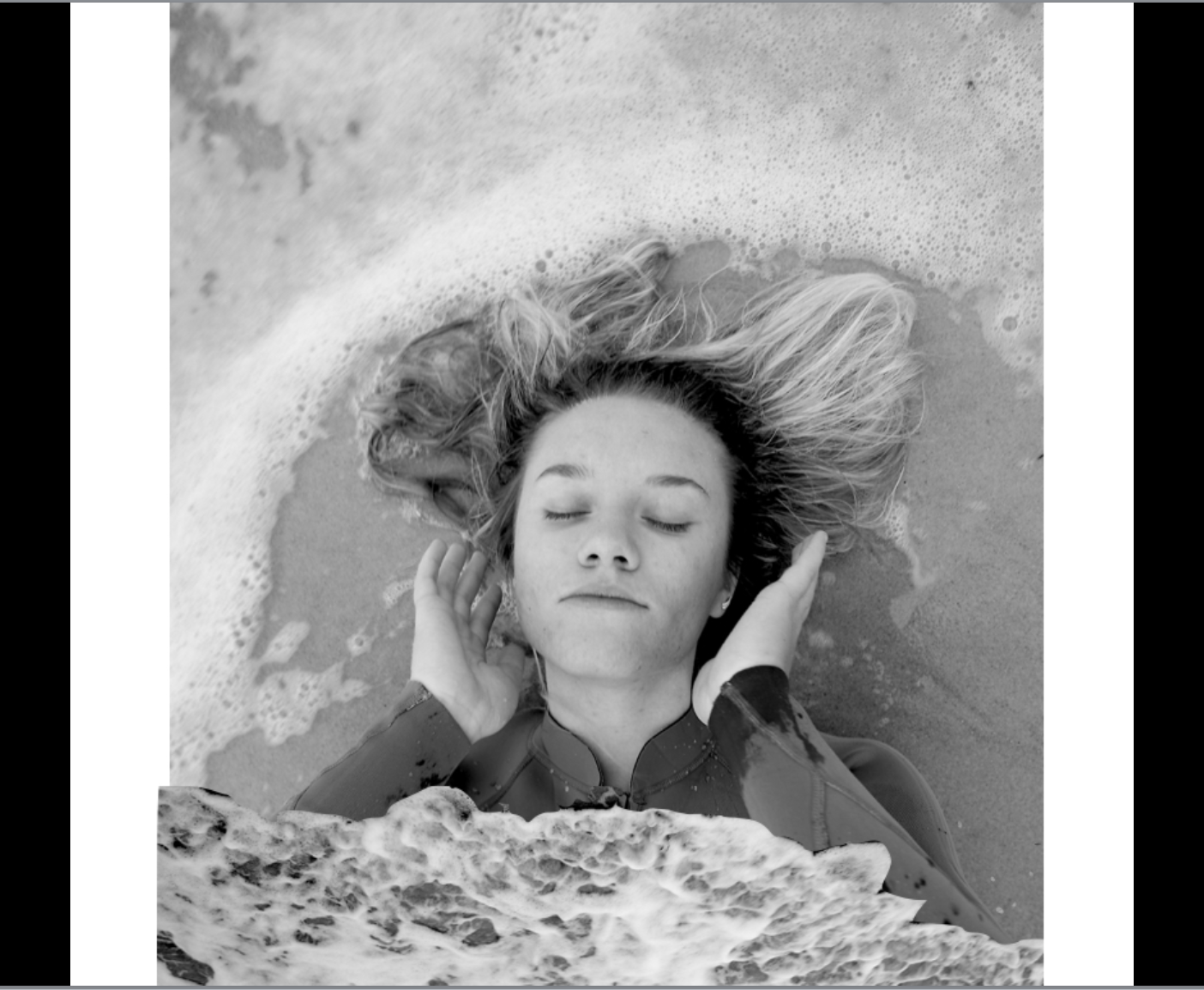
I will present this piece separately due to it not being landscape and also being more unique as it has the edited wave at the bottom and it being a portrait.The image will be a3 on white board surrounded by a black window frame.
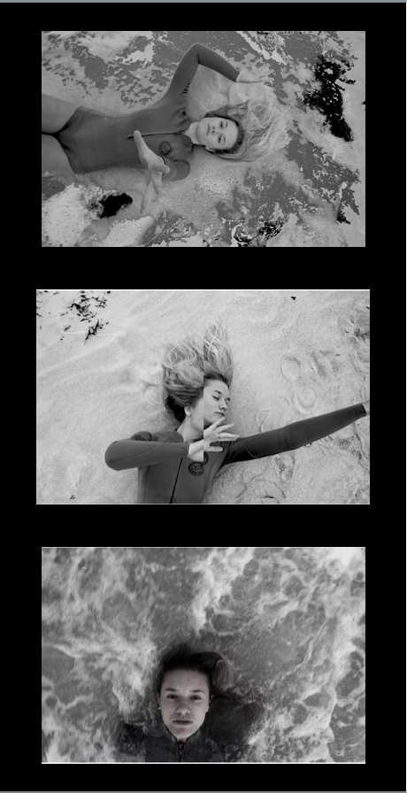
The black boarder on its own removes the light tones and I don’t think this works best.However the white and black double boarder is more visually appealing and works better conceptually. I chose this layout as all the images are alined and in from and facing a similar direction, I don’t think it would look as good going horizontal as it would be an uneven too long of a line. I would like all these four images from this set to be a3 and have. a large strong impact altogether.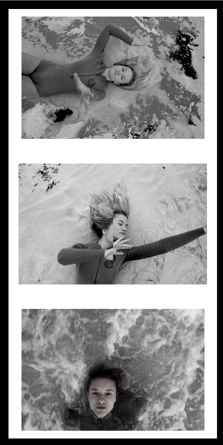
Overall this is what I want my outcome to look like, I think this overall layout is interesting and will be effective in displaying all the sets of images in the best way.
I think the inner boarder works well highlighting the images but the darker one surrounding is needed to finish off the form of the images,because of this I will put them on white board and then into a black window frame. I will do the same with all the images and then hang and present them like this:

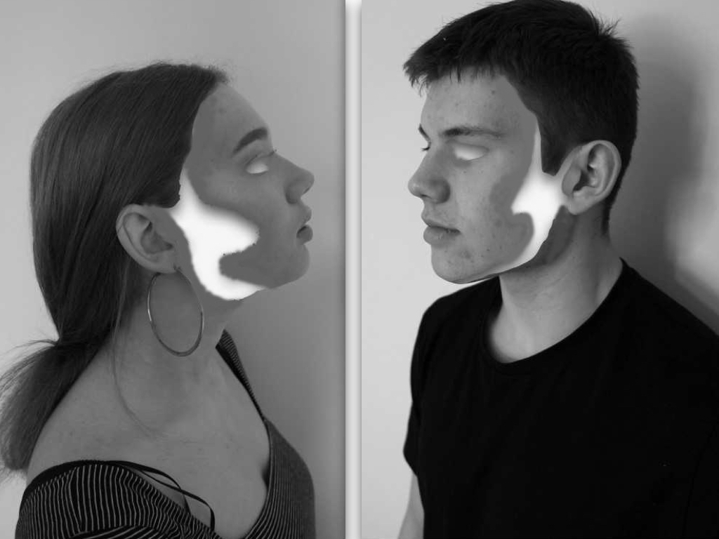
I chose this image as it contains a mirroring self removal of identity and questions the codes and conventions of people and how they act in groups when presented against another being. I think this is successful due to the tones and the removed fragments but after consideration I do not think is the most entertaining or edited to the level I would want for a finished piece.

I chose this to be a final image as it successful conveys my themes of presenting many aspects of human behaviour and emotion presenting one identity and being, due to this being a collage of a photoshoot I had done it is increasingly abstract ,tonally and yet also demonstrates a distortion wihtin people and a secret that we hold in out identity. Overall I think the composition of this image is interesting and still allows a three dimensional aspect of realism. I think this image has such a strong impact and I would want the size around a3 and to be printed on its own on a large black canvas.
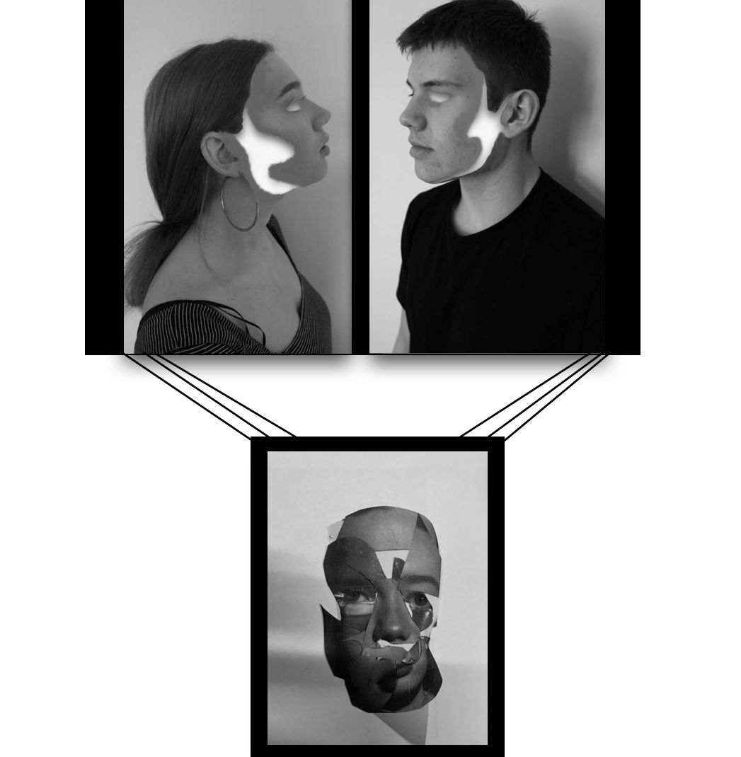
This was originally a development idea for a final piece but I have since released I do not think the top piece is the most successful, because off this I will continue on the idea of hanging the collaged face piece but accompanied with a different piece on top. 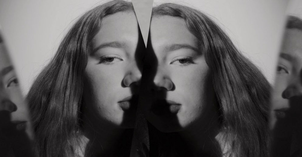
This image I have decided will definitely be accompanied with the collage piece, as it is interesting wihtin the mirror lines and the shades and again connotes a direct eye contact and a humanness mirrored of different emotions of different self, it proposes the idea what is real and if what we are seeing a a reflection of something untrue or if it is real.
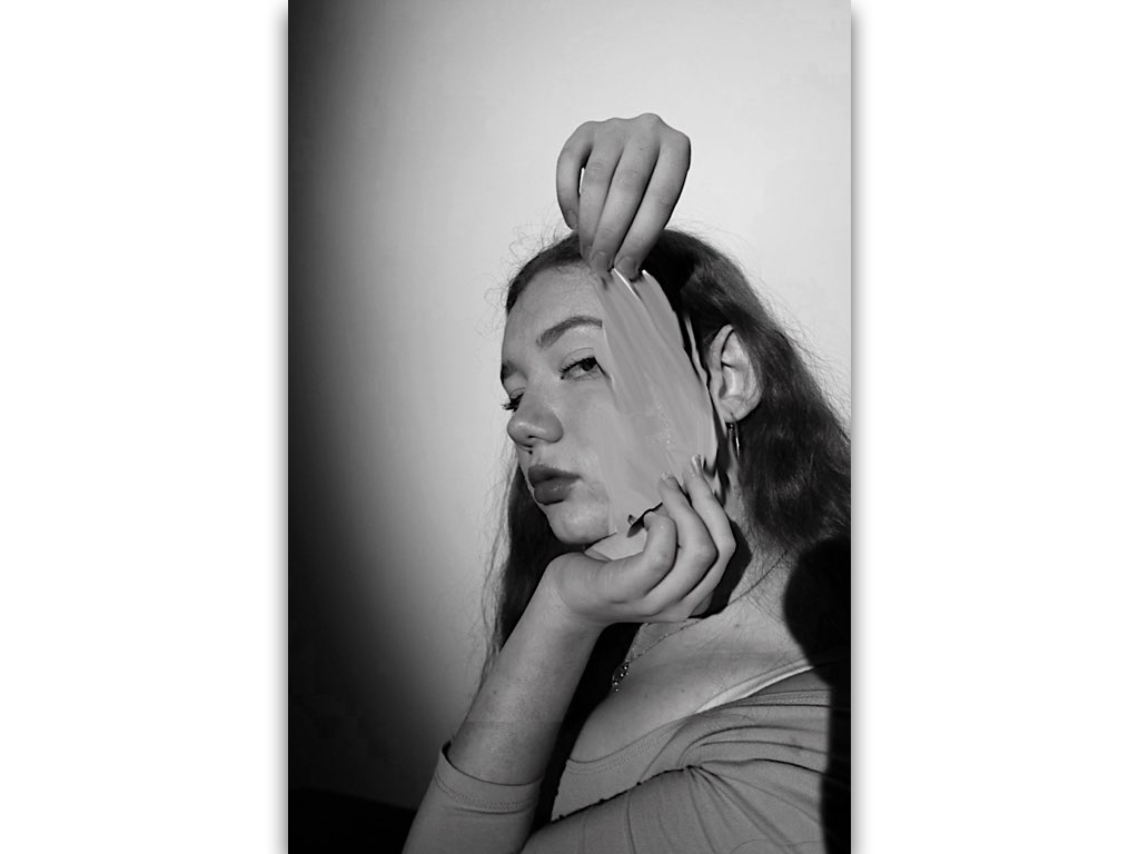
I was considering this piece as a final but then have realised it,s not the most effective due to the editing not being the best and not finished to the standard I would want, although it would work well In a series it is not the standard of image I would want to show.
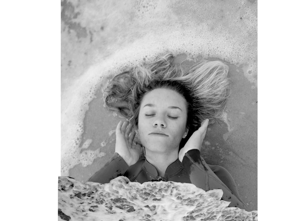
I then decided to focus on these following images as I think the moulding of the behaviour of nature and humans is more effective and the unpredictability of the water accompanied with additional editing has made a more accomplished set of images. I will have these four images as my main set, but separate this profile image and have it as its one successful separate image. I think this image is interesting with the amount of circular curves around the person, this allows a secret of hidden identity and being submerged and separated from society from being wihtin the water. Additionally the wave from below is interesting as it connotes tones of smoke and a gradually movement to the piece.

wihtin this image there is an emotion of isolation but it is highly accomplished and effective with the isolating pale tones of water contrasting to the darker face and direct eye contact to the camera.The composition works well as the face is at the bottom of the image as if it is being swept away.
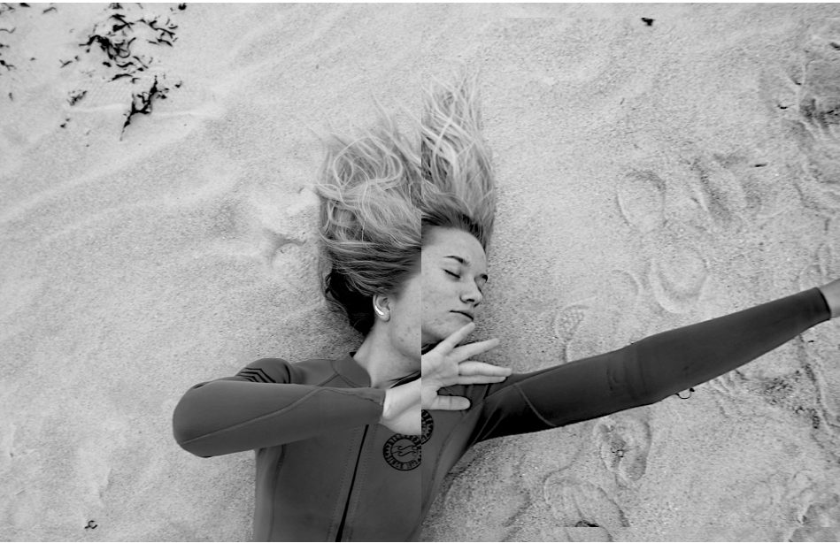
This images I wanted to show a removal of being and an aspect of trying to escape the image, this simple editing enhances the image and still holds a simplicity.I chose this because it too still sticks to my themes and will work successful among the others. 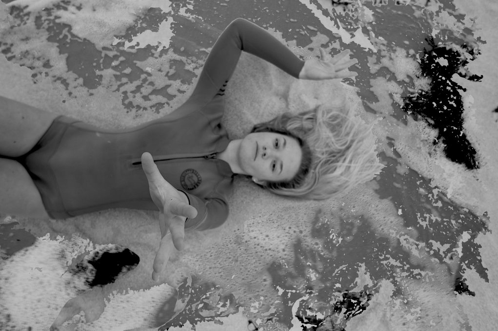
lastly I chose this images as there is a syncricity wihtin the previous and holds themes of escapism and surrleism within the hand almost coming through and out of the image, the textures on the floor also enhance a movement being surrounded by the water.Overall all these 6 photos(2 sets) of images will be successful and still convey human behaviour in two different environments and subject matters.
For this shoot I really wanted to focus again upon the conventions of human behavior being neglected and removed from being treated as a person as this is what the artist does. I wanted to edit the images in order to reflect a personal emotion onto the image and present how human behavior works through the overall representation of the image itself.
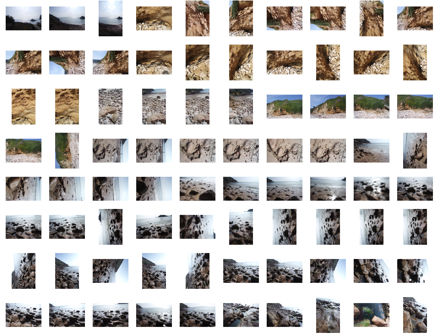
original photos,contact sheet:
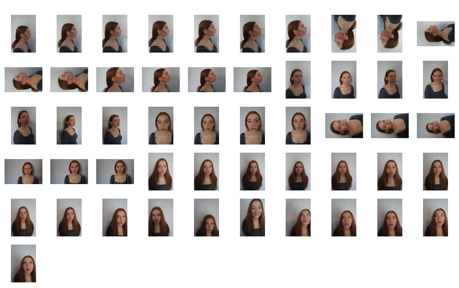
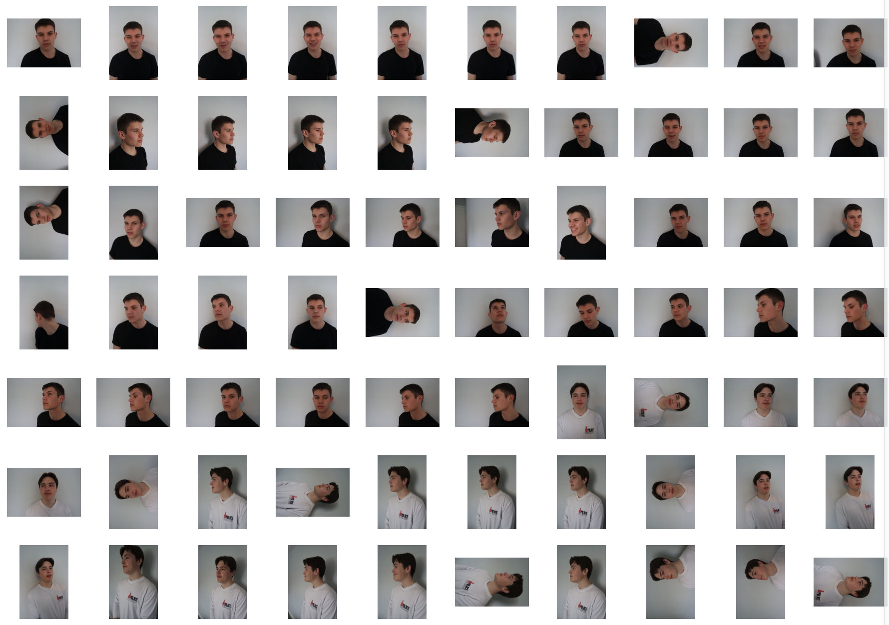
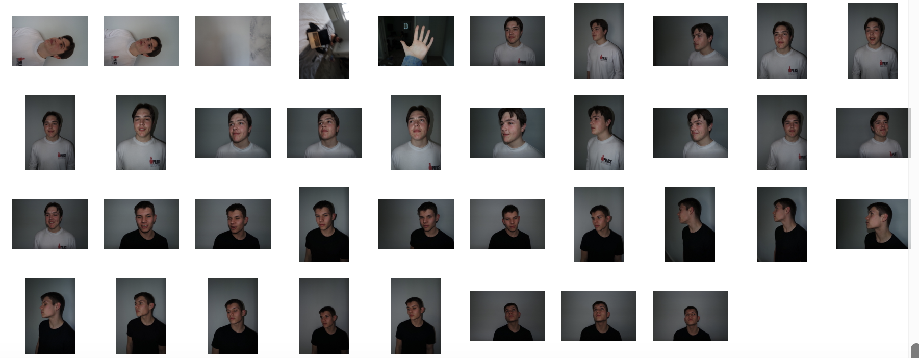
Final edits:
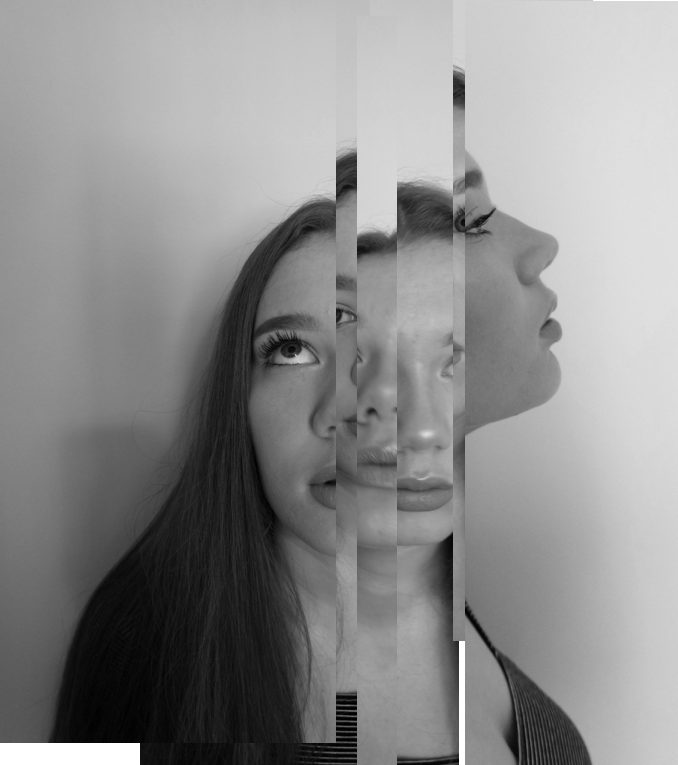
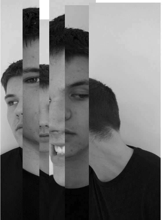
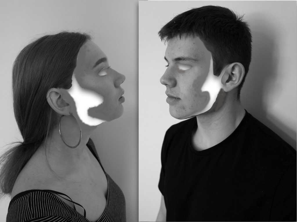
For these two images I was inspired by some of draxlers images where he cuts different profiles and angles them up in order to form a new composition of faces and a new style and angle to the original.I wanted to completely alter the images in order to create a whole different meaning behind them.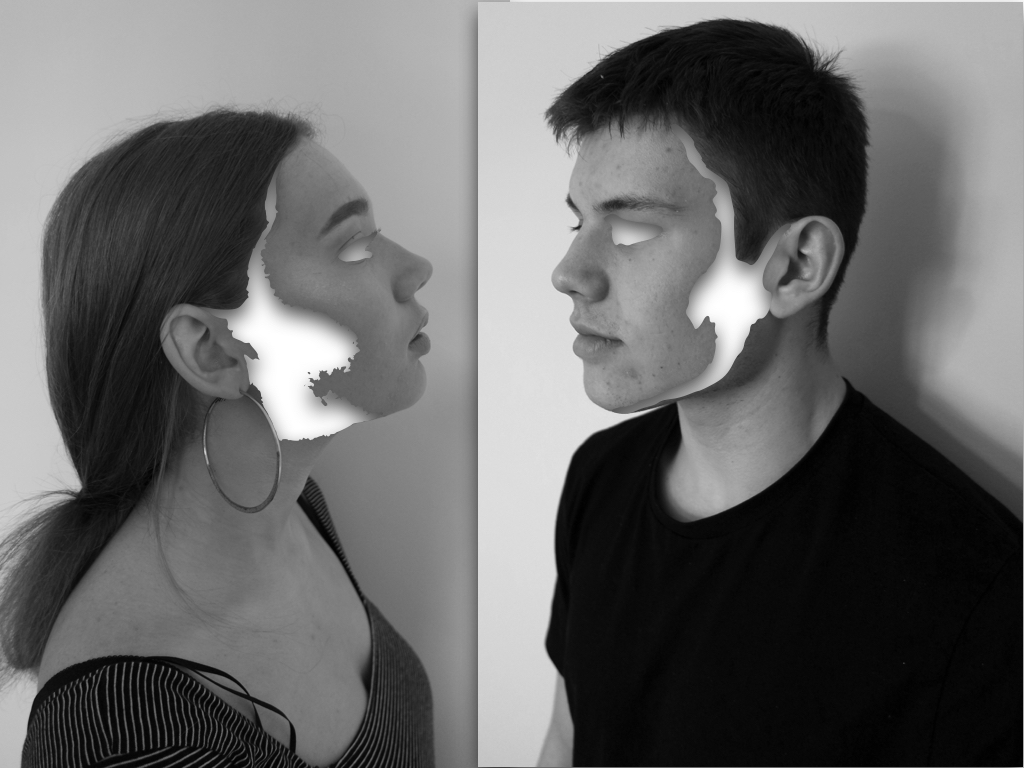
The editing for these images I wanted to connote the removal of identity and how the unique abstract purposes a complexity to human behaviour. Although there is still a strong highlighted effect of surrealism within the images,the effect of emptiness creates a sense of suspension and secrecy within the image as they no loner represent who they are.
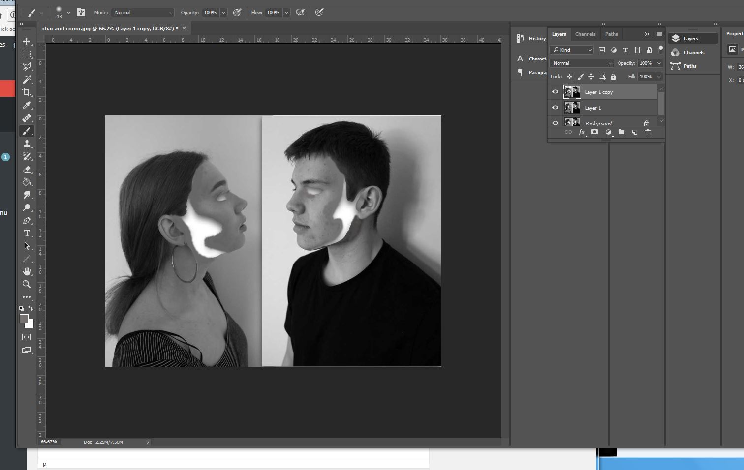
To edit the images I wanted to remove sections of structure and a flowing sense wihtin the face, In this case being the cheeks line and the side of the face,addtionally I wanted an absence of eyes wihtin the images, to do this I used instant alpha and removed sections at a time,but it was not as smooth as I wanted the overall image, because of this I filled in tonally with the brush tool with the same skin tone and rounded off the edges.This is more effective and creates a better overall finish to the images.lastly I created shade within the inside white area to create a more three dimensional real effect to the images.
Final edit:
Similarly with the previous image I wanted to remove the eye but then copy that section below to form many missing sections of eyes, again to do this I used instant alpha and then used photoshop to smooth over the image and make it seamless throughout(using the smudge tool),This image is meant to presets a mask to identity but still an absence of our real behaviour.
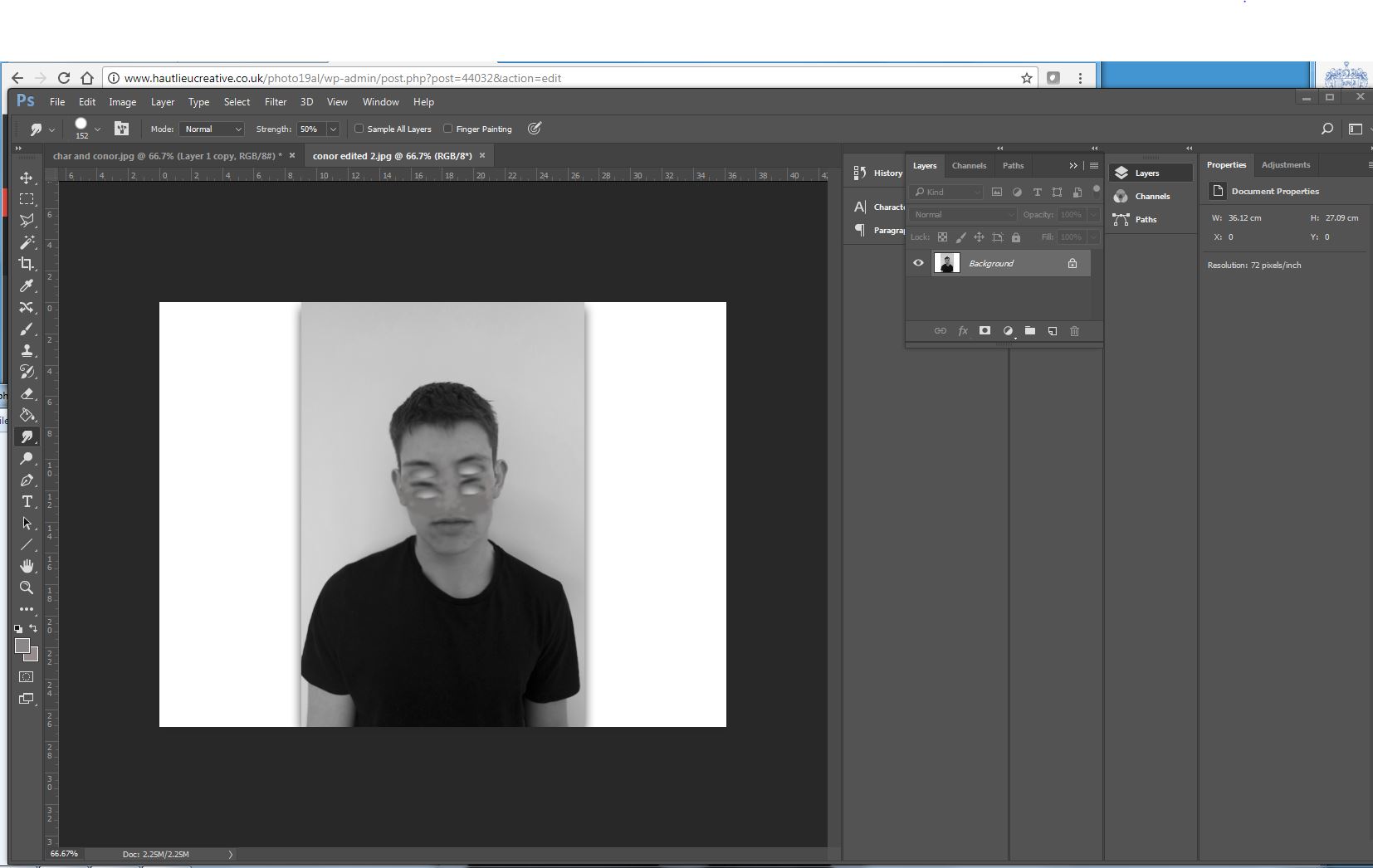
Final edit: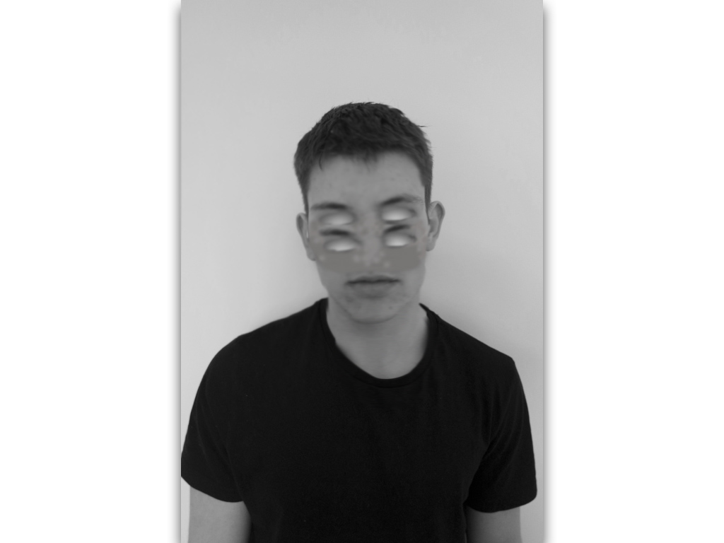
similarly I repeated this technique but wanted to form an effect of a mask so not blending the eyes in but showing a shape that has been repeated, to do so I experienced in different methods to find the most successful:

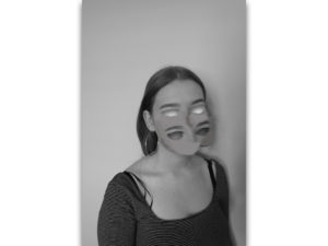
Final edit:
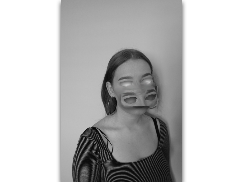
Final edit:This image is purposely experimentation to try and remove and cover a different sense of identity and not just purely eyes.
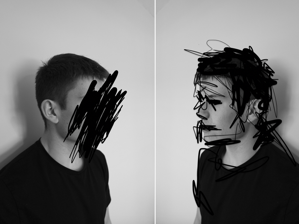
The next two images I think are less successful and more concentrated on experimentation;within these images I wanted to find an interesting composition of repetition of faces of different angles and edit them all into one to from an abstract and surrealistic piece. I did this similarly to my artists inspiration of demonstrating the combination of many different human emotions that we have and representing this in an abstract method.
Final edit:
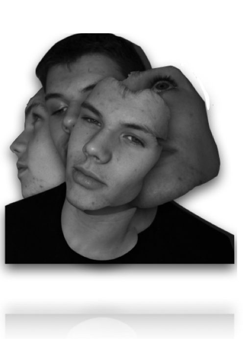
I edited the images by removing the body and editing only the sections of the faces that I wanted,I the framed them into an interesting composition and surged the lines to form a more synced piece.
Final edit: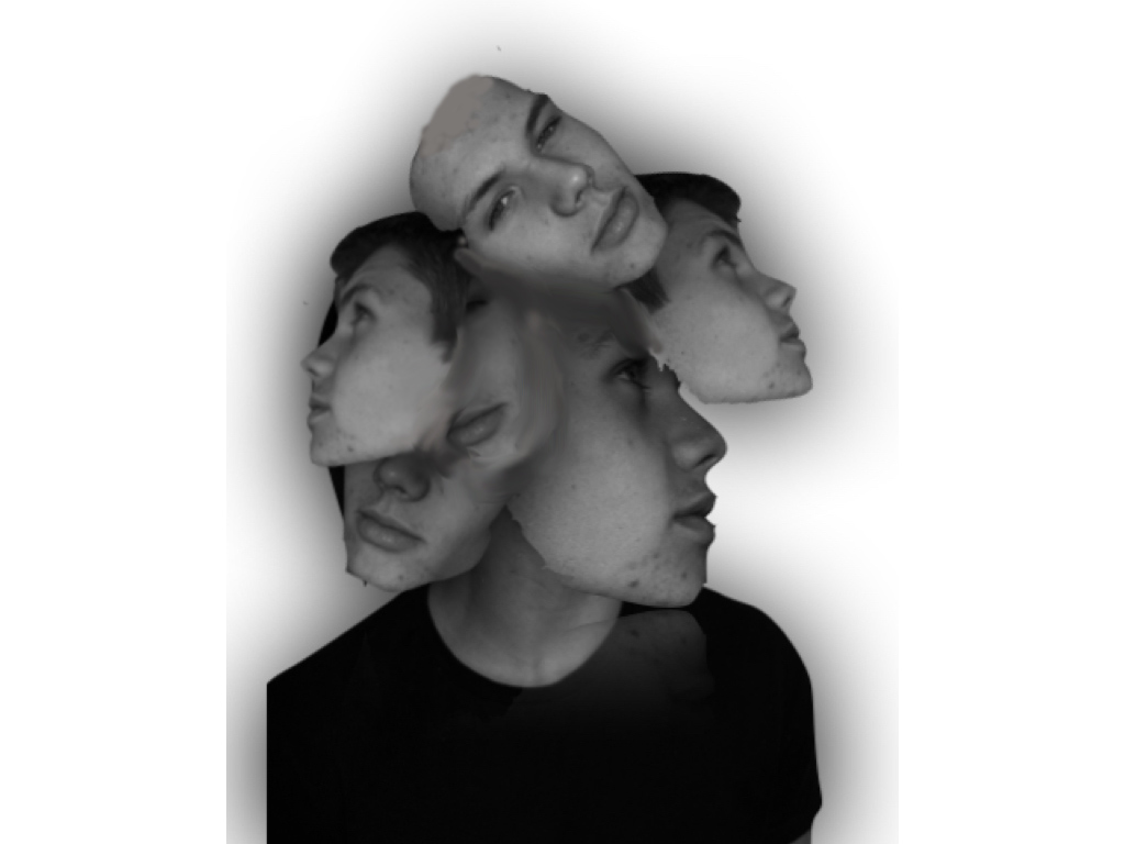
Overall I think the most successful images was the removal of facial features, this is due to the most successful editing and a simplicity but effectiveness of connection of human absence within the images themselves.
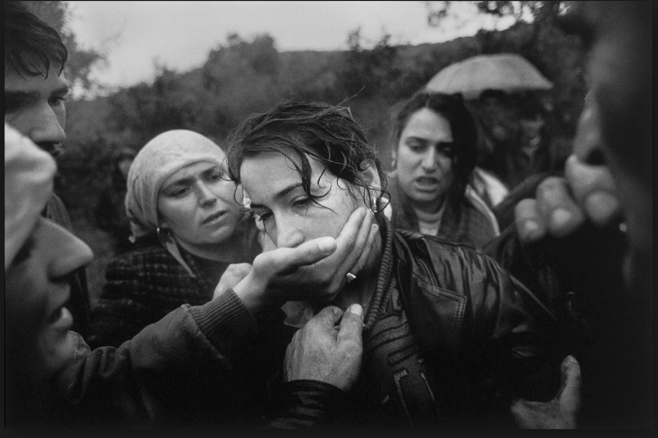
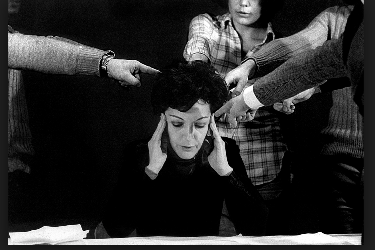
I was inspired by this image due to the composition of the piece centring the women and how she connotes a struggle of her voice being taken away with all the hands heading towards her mouth, It presents a strong relation of humans to violence,and the most important weapons we have is our voice. Although how we are expected to act a certain way due to the environment we grow up in or dependent on our gender.Furthermore the lack of eye contact presents her human emotion and how she is not addressing us directly as she is seen as powerless wihtin the image once again indicating human behaviour of fear due to others influences.
I would further develop this image in order to present more surrealist values possibly adding more hands and creating a more conceptual feel to being trapped and isolated.It again highlights the sense of human struggle and relationships people have to form due to the codes and conventions as where they were raised.
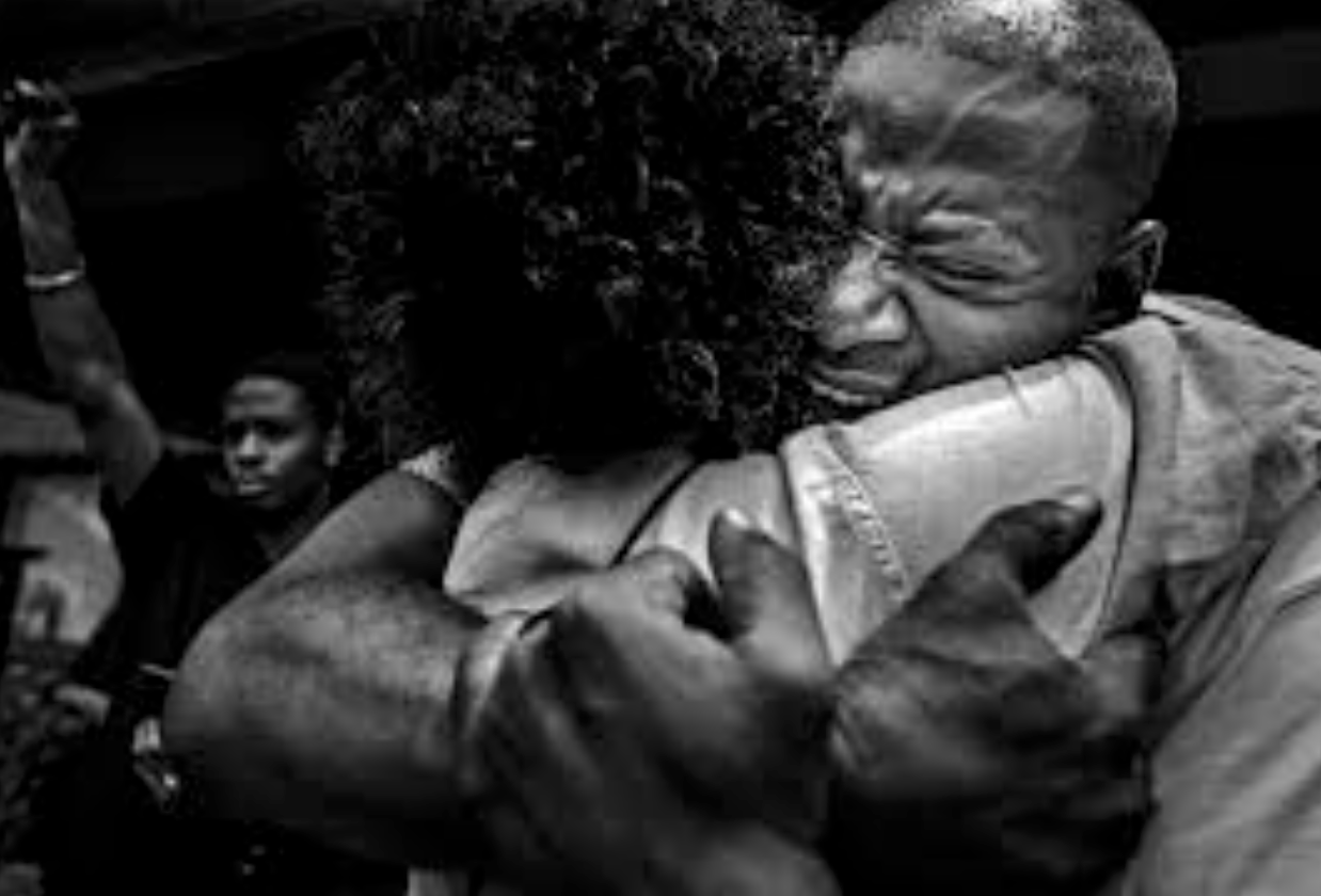
Secondly this image shows a strong sense of raw emotion and additional themes of photo journalism, it shows a presence of emotion as well as conceptual idea presenting peoples feelings and also what they want in the world.
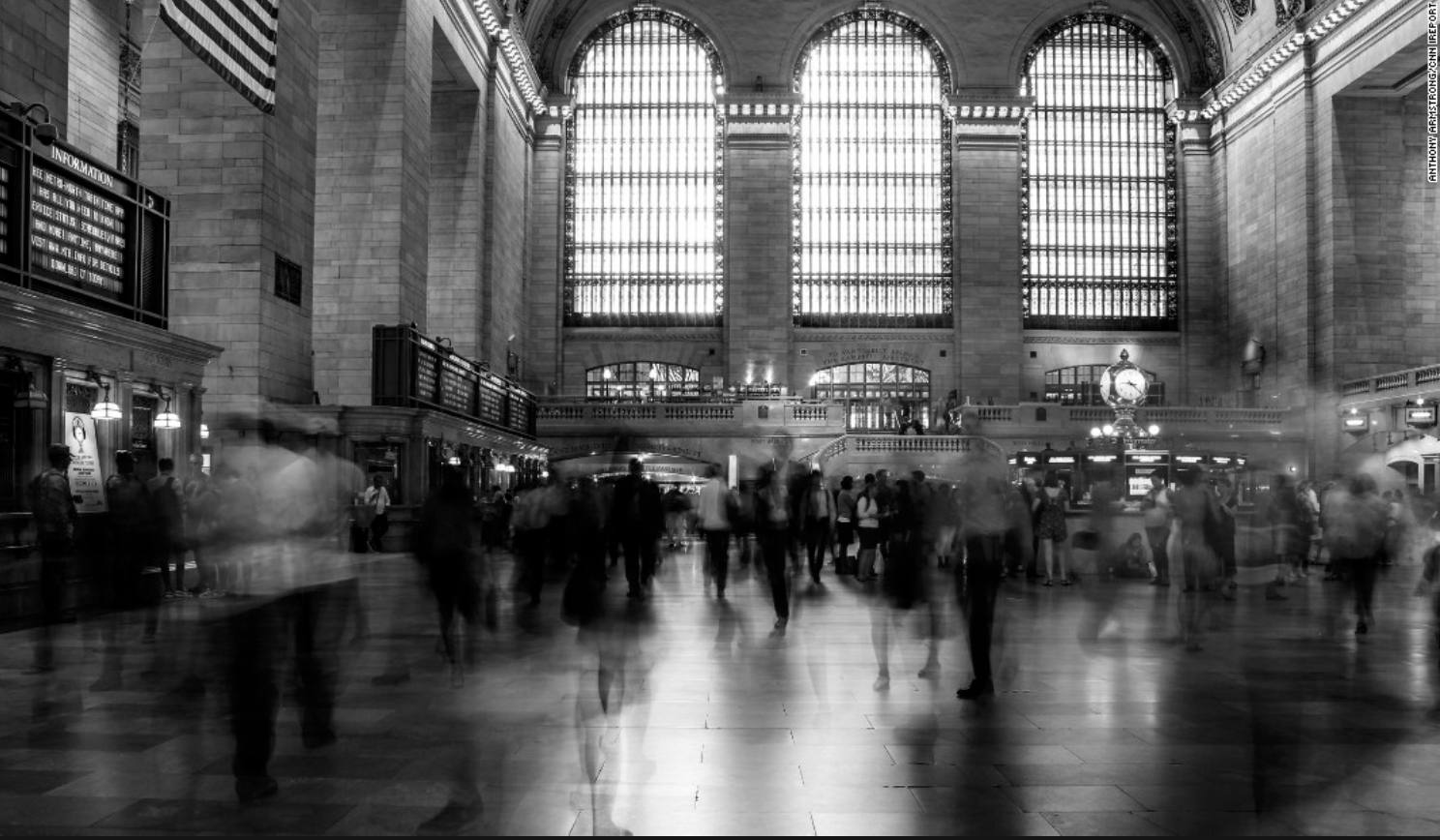
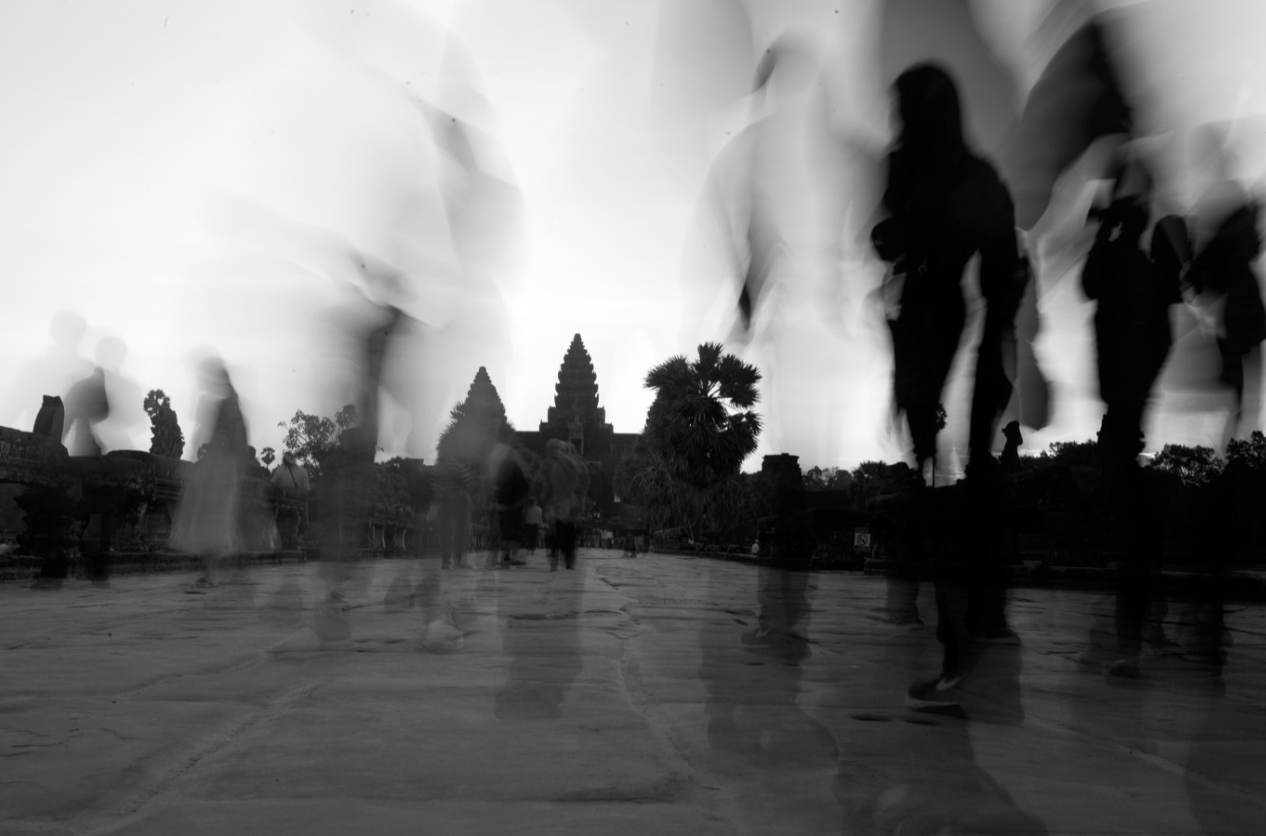
These last two images I was inspired as it tracks human behaviour and activity as one existence and conceptually how we all ignore each other and do not view each other as equal.I think this demonstrates a movement as a wide view to capture society.I wasn’t influenced by a apseicifc artists but more the means at which all photojournalism and surrealism artists work to capture people in a certain light to present a conceptual meaning of truth.
for my shoot I too want to capture truth but will additional edit the images to presents a surrealism effect such as manipulating and adding more hands, or editing the scenario they are surrounded by. locations need to be areas in which travel is highly occurring and used to presents a humans active life and actions .It also presents conventions of a persons life and a routine in which we all stick to as a society because it is how we are expected to behaviour and act as a whole group.
Ketty La Rocca was born 14 July 1938, in La Spezia, Kingdom of Italy – and died 7 February 1976, in Firenze,
Her work focus on beauty conventions and breaking them, this artist specifically also demonstrates human behaviour and the relationship people hold within each other;The art of La Rocca acts as a form of visual poetry, visual art, and performance. She explored language, images, and scenes of the everyday world. She emphasized the imagery of bodies.She examined their potential for expression. She combined hands and words. She desired to create a different language, a more visceral communion in which the physical body, gestures and the written word were intertwined. She was a leading exponent of body art and visual poetry movements.
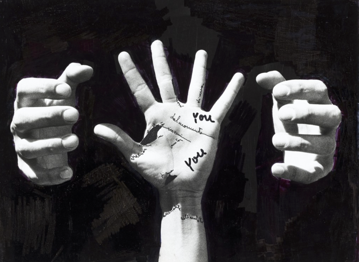 This image is almost symbolic for how we are tried and confined by a certain behaviour or have a constant fear to act or look a certain way. I think my previous idea and this artist would make a very interesting shoot altogether.

Draxler has such a strong presence through his powerful imagery and attitude of mystery. He charges his work through poignant cuts,scratches ,rips and abstract brush marks. His work typically remains within black and white pallet in order to hold the bold composition of the piece itself.I chose his work as there is such a strong abstract presence as he address his own individuality to enhance an image altogether.when talking about his inspiration he is seen saying:”There is something about defacing an image that is not mine that I dig, much like graffiti I suppose. Image denial, rebellion, a subtle violence or aggression is inherent in that process,Transforming an image from something I may not really care for into something that speaks for me is gratifying, like creation through destruction. Mine now.”
His visual influence is so abstract and even he himself has said it is his own self exploration as how he can make an image his own,In Morden societies culture everything around us is influenced by something else. Fashion and his natural environment is additionally a factor seen effecting his work.He portrays his emotion weather that being a bad or good day into his work to symbolise a numb or positive feeling.He sees himself and his work as one big a ‘human canvas’

I was inspired by his work as he influences peoples appearances and beauty through his own concentrations of his emotions at the time and how this behavior effects the image and itself overall effect.He not only uses collage and editing within Photoshop but also adds substances such as fire and a life effect captured on an image itself. he has such a strong concentration of the subject and only being surrounded by a white background.This image also connects to alternative aspects of itself,using smoke from the eyes and fire from the mouth to symbolize the artists feeling of anger and self isolation. additionally the tones are so exposed with the contrast of white and black throughout with only a glimpse of color.There is an absence of self being and identity within this photo as he has no eyes and mouth so every freedom and sense of self expression and feeling is removed,this is a metaphor for again how we have to behave within a conditioned environment of society and a code of how we have to behave and the conventions of how our voice and personality can be removed by the voices of others.

inspiration for shoot;
For my shoot inspired by his work I will be mostly concentrated on varying angles and lighting of a person and then the main aspect of the image will be the secondary development of how to emotionally enhance the image itself. This could be through editing the image,using collage,using a fire substance or a material to form texture,or possibly using Photoshop to create an unrealistic altered effect to the image itself.I want all my work to have a strong aspect of originality and also unique editing circumstances and compositions to make a detailed analysis of the piece itself and more of the meaning behind what the image symbolizes. I will experiment with the ideas developed above but then also the way in which this changes how that persons beauty conventions have been altered and how the new image mimics a feeling or tone or presence to the piece as a whole.
For my inspiration oft his sea and cave shoots I decide I would go to portlet as this is where many rocky surfaces are present,I wanted to focus on the form and structure to the pieces and additionally the water and strength and action water can produce.I wanted to capture both the water aspect and then the more rural textured surfaces of the rocks and coves within the sea bed wall. Once again I chose Tony hertz due to the way in which he demonstrates emotion and beauty through the action of nature and does this in order to have a creatively different outcome symbolising a different tone to the image itself. I additionally wanted to focus on his themes so using textures and tonal features and changing the editing and also the camera settings to create different overall feelings to each location within the beach itself.

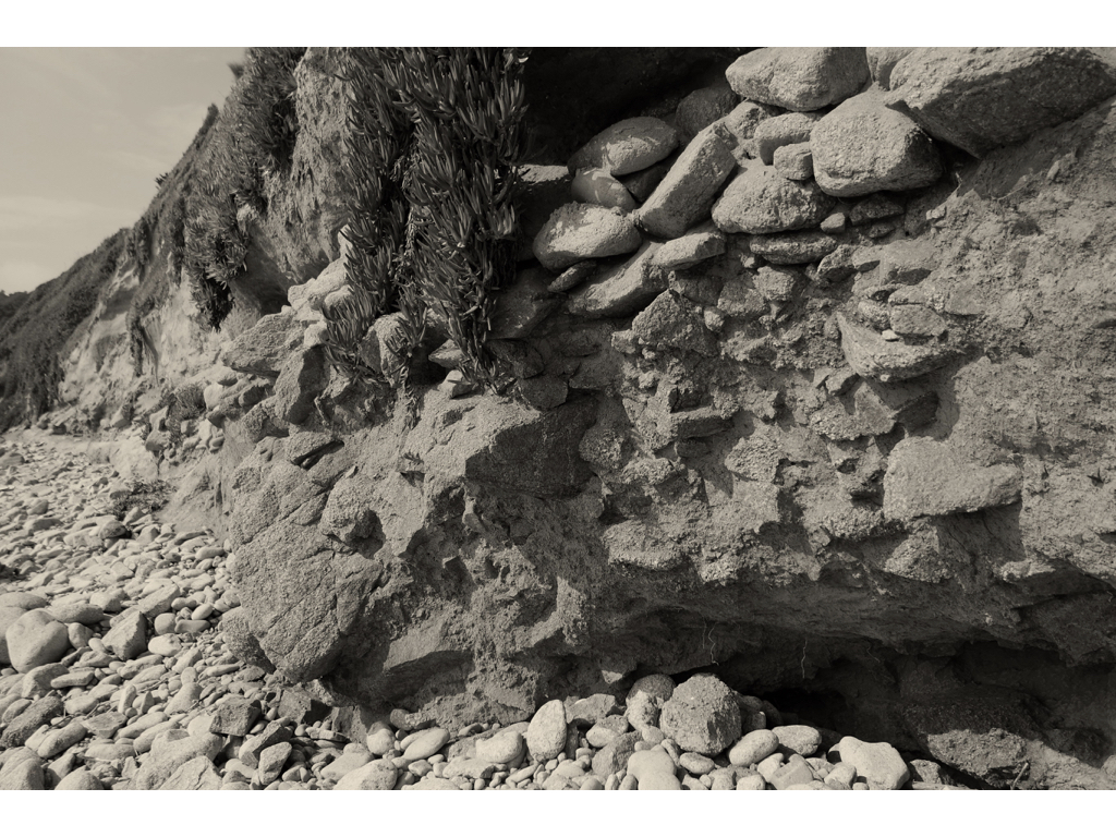 This is my favourite image,I like how there are many different textures exposed through the rock formation and how tonally from the centre the piece it gets lighter. Additionally the angle I have taken means that you see the rounded continuing wall throughout the left side of the image.Additionally this focuses on the conventions of beauty and the beauty nature holds and how it can be seen as more than just a powerful source over humans. conceptually this image symbolises a convention for feeling abandoned and a lack of life, this is an expression of human behaviour seen through the natural development of nature.
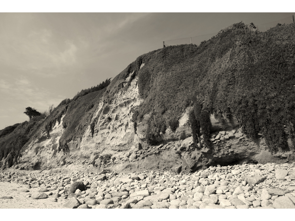
Here I wanted to capture an angle to present how large the wall is and again a romanticism and power to the image that nature holds, it presents the massive presence that nature holds over humans and also the unpredictability of behaviour seen through the masked tonal range. The pushed back tones additional symbolises a lack of safety and a possible code of unpredictability that the nature is about to change and a fear as a reaction to the scenarios isolated feel. 
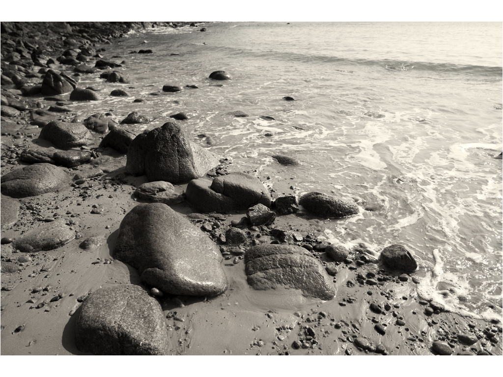
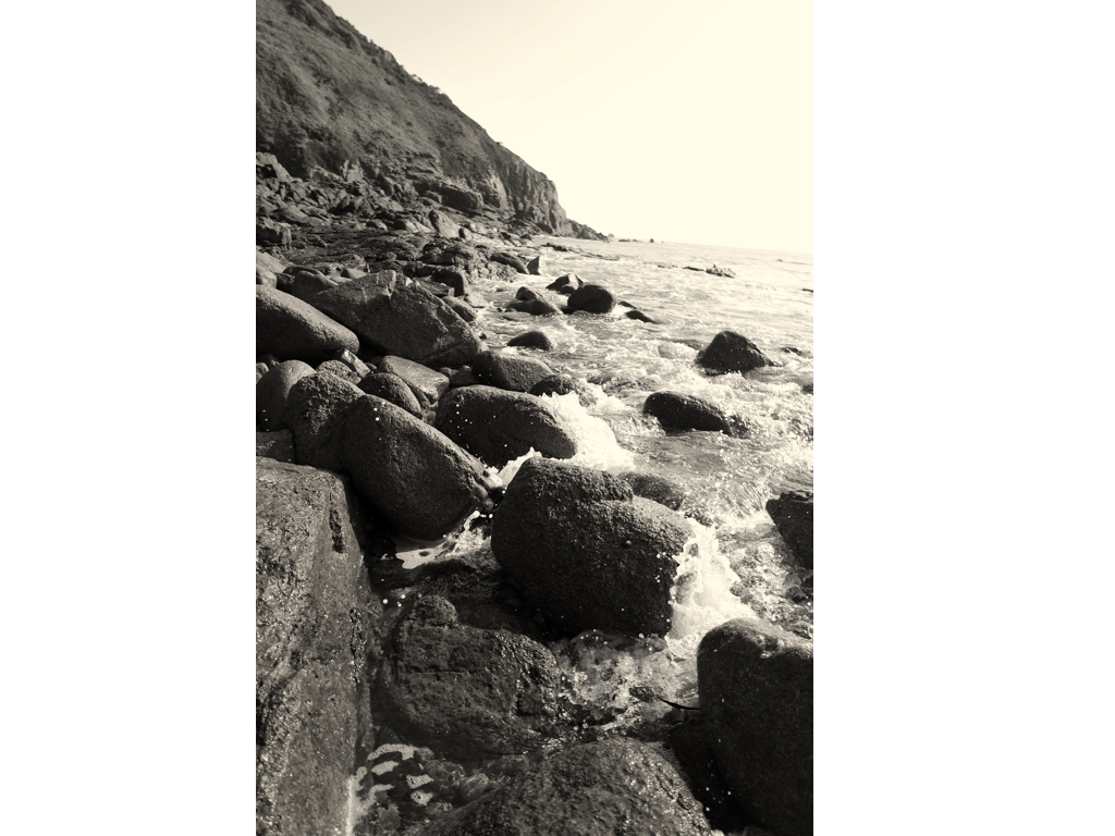
Here I wanted to capture the way in which the water has movement and power and again how the low angle enables the shoot curve and illusion of a continuing shore line.This image was taken in quick shutter speed to capture the life and movement of the water much like the artists himself .
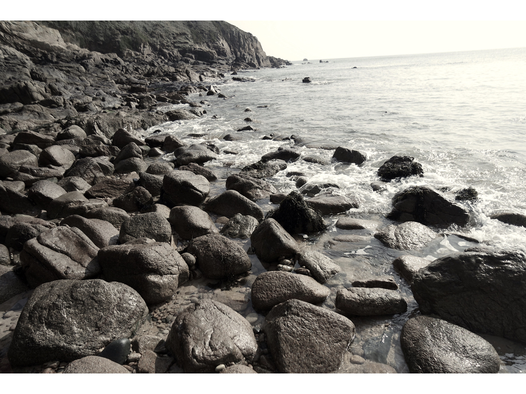
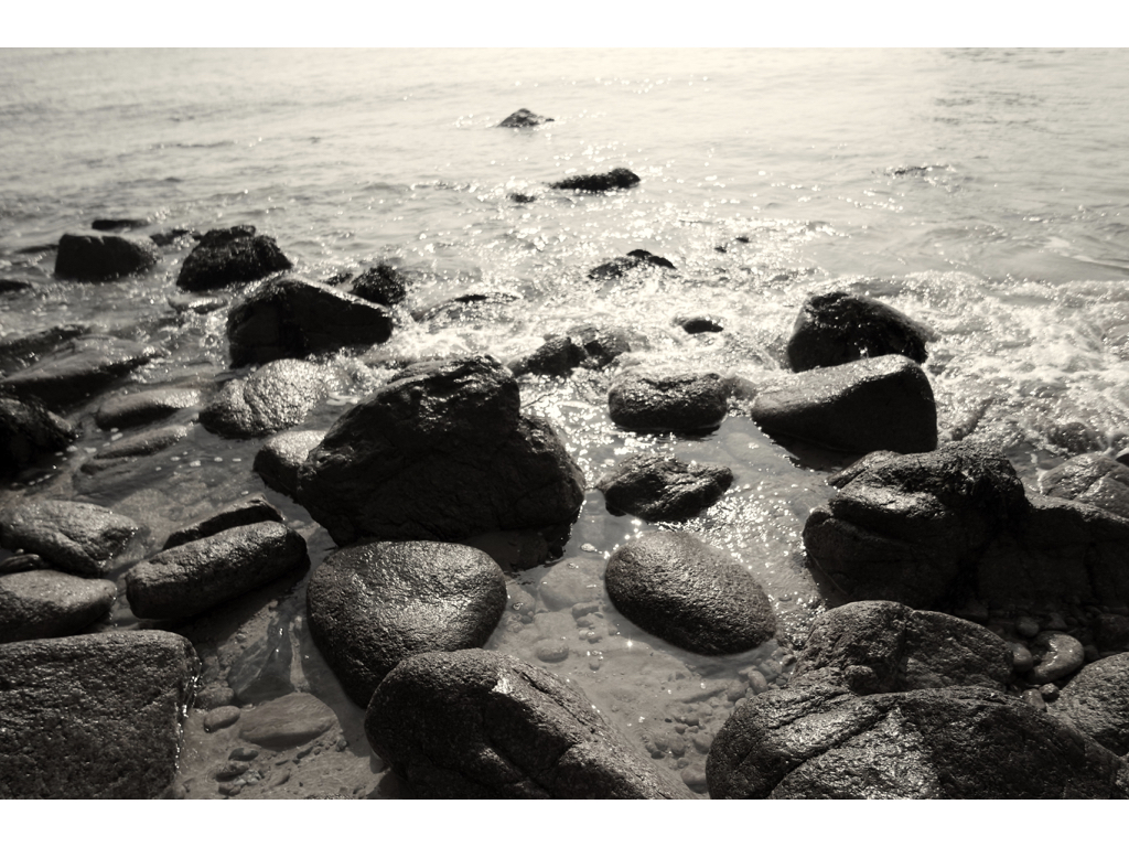
Overall I do not think I will continue to concentrate on the behaviour and power nature has over people and will revert back to human behaviours, attitudes and traits.Although like my first water shoot I could combine water and nature once again.The more rural images without water were more effective as they presented more interesting textures and showed more force and size to the image as the water was not presenting an aggressive behaviour.